When Moberg [2005] first came out, I posted up some first comments on it. I haven’t done anything on it since then, partly because of the amount of time responding to comment on our MBH articles, partly because I got stuck on some missing data sets. Hans Erren has a really neat method for digitizing graphics from pdf’s and kindly digitized a couple of series for me. I just re-plotted them against the original data and there appears to be an extremely peculiar discrepancy in the Lauritzen stalagmite series, which also shows the irritating aspect of people using "grey" and unarchived data. See what you think.
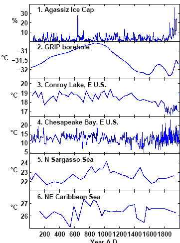
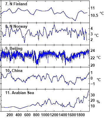
The graphs below show the "low-frequency" series used in Moberg. Tree ring series are used by Moberg for "high frequency". Here there are no data citations and I’m still missing some data.
Before discussing Lauritzen, in passing, series #1 ends in 1966 with a downtick in my replication (there is no downtick in the Moberg version). I’ll check on this later. You will notice that this series (#1), as well as #11, is denominated in %, rather than deg C and has an obviously nonlinear relationship to the other series (as does #11). Nevertheless, it is blended with the other series in a type of weighted averaging (through wavelet methods.) I discussed series #11 previously as it is a very peculiar indicator for global warming: it measures cold water plankton and as a direct measure of SST would be turned upside-down. The hypothesis is that cold-water plankton offshore Oman shows upwelling of cold water due to strong monsoons and is thus an indicator of global warming elsewhere. This may be – but the ostensible reason for including the proxy was not as a teleconnection, but because local proxies were scarce. So it’s a strange proxy.
The downtick in #6 around 1500 is bigger in my re-plot of the data than is shown by Moberg. I haven’t gone through and exactly matched scales, so these plots are indicative.
Now look at series #8. The two versions look similar; my re-plot is smoother – but the ending dates are different.The Moberg version is to the right with respect to series #7. My re-plot is from data digitized by Hans Erren from Figure 11 of Lauritzen et al, shown below. The digitization of Figure 11 ends in 1865, while the digitization of the corresponding series #8 ends in 1937! (Update: Sept. 7, 2005. I sent an email to Anders Moberg about this. He said that he used a pers. comm. series from Lauritzen which ended in 1938 and that, if I wanted information about the difference, I should communicate with Lauritzen. So it would appear that we’re dealing with two different versions of the Lauritzen series, rather than incorrect digitization by anybody)
 |
 |
 |
 |
So checking back to Lauritzen, posted up here, Lauritzen stated:
The “ÅLittle Ice Age’ (LIA). The sample was not actively growing when collected. Since TIMS dating gave an average age of 253 years for the top 5 mm with a “Åcooling’ trend in the isotopes (Figure 7), the coldest signal (–7.12″°) here is taken as an extreme LIA signal.
Lauritzen’s Figure 11 definitely shows the series as ending in the 19th century:
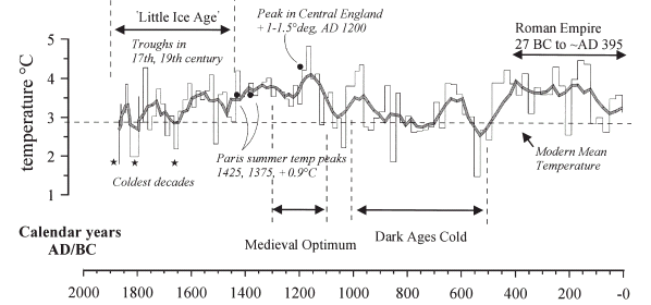
Lauritzen Figure 11. The speleothem temperature history inferred for the last 2000 years compared with known “Åhistoric’ events.
Hans also provided me with a digital version of series #8 from the Nature SI. Below is an overlay of the two series – digitization of Nature black; digitization of source red.
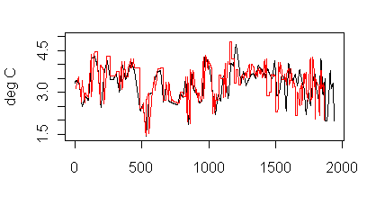
Figure 4. Lauritzen series. Black – digitization of NAture version; red – digitization of original version
Maybe there’s something that I’m missing, but it sure looks like a cock-up. Does anyone see where I’ve gone astray here?
Does the error "matter" – a question which we hear from time to time from the Hockey Team? (I de-snided that a little.) It’s hard to tell. Moberg has not archived his methods and I ahven’t replicated his methodology yet. (I am still missing some high-frequency proxies.)
There are only 11 low-frequency proxies. This allocates one of the coldest periods of the record to the 1930s, which is one of the warmest periods in the record and presumably makes that lower than it would otherwise be.
The other question from these graphs is: 20th century warmth relative to the MWP is dependent on very few individual proxies: #1, #10 to a degree and especially #11: which as I mentioned actually measures upwelling of polar diatoms.
I haven’t quite figured out Moberg’s wavelet method. I used discrete wavelet methods in our GRL simulations, while Moberg uses continuous wavelets – an odd decision for discrete series. I’m not going to bother trying to figure out how he uses continuous wavelets, since any worthwhile results should be robust to using discrete wavelets. I’m going to try substituting a record of treeline changes (either Polar Urals or foxtails) for series #11 and fix the dating of #8 and see what happens.
#10 is a study by Yang et al., where I’ve spent some time and am stuck for a couple of references from Science in China Series D – if anyone can help by sending me a pdf, I’d appreciate it. Lou, J. Y., and C. T. A. Chen, Paleoclimatological and paleoenvironmental records since 4000 BP in the sediments of alpine lakes in Taiwan, Science in China (Series D), 40(4), 424– 431, 1997.
Lou, J. Y., C. T. A. Chen, and J. K. Wann, Paleoclimatological records of Great Ghost Lake in Taiwan, Science in China (Series D), 40(3), 284–292, 1997.


25 Comments
Re. Figure 4; it just looks like much the same data but shorter. You can see it gradually slipping out of synch as it goes along. I’d suspect a horizontal scaling error somewhere in your digitizing.
I’m not sure that the problem lies with my digitizing; it looks to me like it might be with Moberg. The text says that their last measurement is dated to the 19th century, which is consistent with Figure 11. The digitization of Figure 11 replicates Figure 11 closely. Moberg’s graphic goes well into the 20th century, which doesn’t seem possible from the written text.
I’ve sent an inquiry to Moberg – we’ll see what turns up.
Checking, watch this space
Checked, It’s not me
It’s the original graphs.
I’ve no idea why Lauritzen refers to the peak in the MWP as “Central England” since the CET series only begins in 1657. Is there some other construction he’s referring to?
The series #6 “North Sargasso” is the study of Keigwin et al, which we’ve already mentioned here. You could write to Dr Keigwin for the data and I’m pretty sure from my experience conversing with him, that he’d give excellent access to his data and methodology. (Quite a contrast from the Hockey Team, I know)
John, there’s a Lamb version that goes back to the MWP.
If he used a “pers comm” data set that was different from that in the article that was referenced, then his citation was incorrect. He should cite unpiblished data or whatever. these guys are so sleazy. They think they can just sorta touch some bases and go running around the field…
TCO, I’m convinced now that it’s more than a citation issue. I’m pretty sure that Moberg’s goofed somewhere in his handling of the Lauritzen data. The difficulty now is that they will probably jointly cover it up somehow. Being Hockey Team academics, neither one of them will want to admit that Moberg has a goof. If some new series emerges papering over the cracks, I’ll be very suspicious of it and ask Nature to investigate (fat chance.)
The goof might actually make a bit of a difference in his results. Lauritzen put the low close of his series in the 19th century to match a cold period. Moberg has the same low in the 1930s, dragging down the otherwise warm 1930s.
mebbe so. but the citation issue is clear. And the frequent use of data different than what is cited is something that ought to be called out. When you read a science paper and see a citation to something that is not in the records than it’s a weaker citation and should be admitted to. When someone refers to a pers comm or “unpublished” grad student work or “in review” or even (to a lesser extent) “in publication”, I know that it’s a mildly weaker paper. (That’s fine though…people need to publish papers and be honest about the weaknesses in them.) IOW, in addition to screwing up the literature for future researchers (e.g. you) by referring to the wrong thing, Mosberg is making the paper look better than it should to reviewers/readers by not admitting that it’s based on grey data. This is a bit sleazy. It’s the sorta undergrad attitude of just touching some bases as you run around the field and considering that the way to do science rather than in accordance with Feynman’s ideals in Cargo Cult essay.
Agreed my point is rather minor…just wanted to clarify. Of course, if he’s cherrypicking, that’s even worse.
Simple question. Why does anyone believe that any or all of the above graphs, being all so completely different, show any proxy for anything in particular, and especially temperature?
That’s the first thing that Inoticed as well. The first thing that I ever did was plot up data.
Surely just totalling, and averaging them isn’t going to improve things.
Don’t these people look at whether there is any mathematical corellation between them to start with?
#12. They pretty much just total and average. In this case, several of the series are highly non-normal and these are the ones that contribute to 20th century HS-ness.
Series #11 particularly annoys me. It is percent globerigina bulloides – a cold water diatom – whose increasing percentage is inadvertently the most important world indicator of global warming in Moberg. Proximally it increases upwelling of cold water due to trade winds. It is also used as a proxy for increased precipitation in Treydte et al 2006 published in Nature 2006.
There seem to be rather too many “inadvertent” indicators in all these Hockey Stick reconstructions.
If I were a cynic, I might think it wasn’t inadvertant, but deliberate. It also goes back to how these studies can possibly be passing a proper peer review. Trade winds indeed.
By the way, congratulations on the hearing and your part in it. I watched about 6 hours of it live. Sorry to sound like a “fan” but you are now a media star.
#12
Of course they do. That’s why they do PCA. They realize there are weak correlations among proxies, so they try to isolate the distinct processes that lead to a composite signal whose composition varies slightly from proxy to proxy.
Summing multiple proxies serves to amplify the common signal in all the series to the extent that the noise in each is random and cancels through summation. It DOESN’T work to the extent that the proxies contain unique non-random signals.
Take your pick.
“We calibrated the Northern Hemisphere (NH) reconstruction by scaling its variance and adjusting its mean value so that these become identical to those in the instrumental record of NH annual mean temperatures in the overlapping period 1856-1979
Supplementary methods
link
Isn’t calibrating to strongly rising temperatures the same flaw as Mann et al?
Also, I don’t see any mention of RE, and r2 results.
Surely what we have here is more spurious correlation, and spurious calibration?
Re: #16
Will read the article on Monday to get the full context. (e.g. to see how that sentence ends, among other things)
But for the moment,
means nothing more than that: they rescaled the mean and rescaled the variance of some reconstruction vector to match that of the NH temperature record.
You disagree with rescaling for some reason? If t is temperature and p is proxy, then linear sensitivity of p to t would yield:
p=a*t+b (response function)
or
t’=(p-b)/a (restated as calibration function)
Rescaling just means figuring out values for a (which controls variance of the series) and b (controls mean). Rescaling has no effect on the shape (autocorrelation structure, information content, whatever you want to call it) of the reconstituted t’.
Maybe I’m missing something? Like I said, I need to read a few papers.
…
P.S. If you have a very specific question in mind (e.g. dependent on the context provided by some paper), but phrase it in vague or general times, then you’re not going to get the answer your seeking. If original point #14 had made reference to the paper I would have known there was context to the remark. As with TCO on the issue of how many PCs to interpret, you were after something very specific, but didn’t provide the necessary context.
Not complaining. Just pointing out that that’s why it takes 2-3 takes for me to understand what it is you’re *really* after.
Who is the best expert on PCA in the country? Somebody who knows both theory, application and misapplication.
Strict-sense PCA? It is so standard a technique you would likely get a very long list of potential candidates. Presumably you want a reviewer for something? Explain more precisely what you want critiqued and it will be easier to come up with a good list of possibilities. Are you sure it isn’t some other aspect of climate reconstruction that you want reviewed, like Mannomatic/RegEM “training” methods? Be precise.
Also, it would help to know who you’re up against if you want to go one (or more) better.
I want the name of a person who knows the thing inside and out from multiple angles. What he learned in the books to use it. The theory behind it. Closely related variants. Usage and misusage in the field.
That’s about as vague an answer as I thought I would get. I’m really not qualified to judge. But if I were stuck, I would suggest checking out names of those who contribute code to R, especially members of the R core team. If they can’t help you directly, they will know someone who can. The brightest statistician in the world may well be the guy at the top of it all, Brian Ripley. But what do I know? I used to folllow their online help group for a number of years, and he was incredibly critical, brilliantly insightful. They have an online archive where you will find questions and answers to you-name-it, including PCA. That will give you the names of the people who are giving out all the answers.
Re#17 I’m afraid I’m not a statistician, so it’s difficult to put it in correct terminology, but I have read the Wegman Report, and will use parts of it to illustrate what I mean.
1 Why use PCA at all? My understanding is it is a method for consolidating a large number of data series, but Moberg only has 11.
from Wegman:
Principal Components
Principal Component Analysis (PCA) is a method for reducing the dimension of a high
dimensional data set while preserving most of the information in those data. Dimension is here taken to mean the number of distinct variables (proxies). In the context of paleoclimatology, the proxy variables are the high dimensional data set consisting of several time series that are intended to carry the temperature signal. The proxy data set in general will have a large number of interrelated or correlated variables. Principal component analysis tries to reduce the dimensionality of this data set while also trying to explain the variation present as much as possible. To achieve this, the original set of variables is transformed into a new set of variables, called the principal components (PC) that are uncorrelated and arranged in the order of decreasing “explained variance.” It is hoped that the first several PCs explain most of the variation that was present in the many original variables. The idea is that if most of the variation is explained by the first several principal components, then the remaining principal components may be ignored for all practical purposes and the dimension of the data set is effectively reduced.
2 What is the effect of choosing a limited calibration period with rising temperatures? And any subsequent recentering?
From Wegman again:
Principal component methods are normally structured so that each of the data time series (proxy data series) are centered on their respective means and appropriately scaled. The first principal component attempts to discover the composite series that explains the maximum amount of variance. The second principal component is another composite series that is uncorrelated with the first and that seeks to explain as much of the remaining variance as possible. The third, fourth and so on follow in a similar way. In MBH98/99 the authors make a simple seemingly innocuous and somewhat obscure calibration assumption. Because the instrumental temperature records are only available for a limited window, they use instrumental temperature data from 1902-1995 to calibrate the proxy data set. This would seem reasonable except for the fact that temperatures were rising during this period. So that centering on this period has the effect of making the mean value for any proxy series exhibiting the same increasing trend to be decentered low. Because the proxy series exhibiting the rising trend are decentered, their calculated variance will be larger than their normal variance when calculated based on centered data, and hence they will tend to be selected preferentially as the first principal component. (In fact the effect of this can clearly be seen RPC no. 1 in Figure 5 in MBH98.). Thus, in effect, any proxy series that exhibits a rising trend in the calibration period will be preferentially added to the first principal component…. The net effect of the decentering is to preferentially choose the so-called hockey stick shapes.
Just to summrise. These papers Moberg, and Mann et al, seem to use the same basic strategy.
1 Find a number of different proxy (or alleged proxy) datasets.
2 Make sure you include one (Mann et al Bristlecone), or two (Moberg #1 and #11) that have a long flat line, folowed by a steep rise in the 20th century.
3 Use whatever statistical technique is available to overwight the specially selected (for HocketStickness) proxies, and drown out as far as possible the information from the others.
4 Don’t use the standard statistical tests for robustness, either ignore the inconvenient ones, or invent some new one.
5 Voila, you have a peer reviewed, multi proxy, statistically robust Hockey Stick.
PS If I had my way, every one of these Hockey Stick papers should have a qualified statistician on board, and also be reviewed by at least one.
The reason the climatologists don’t include the statisticians is because this is almost entirely statistical work, and they would have to credut the statistician accordingly.
The climatologists doing this work are merely recycling other peoples data, using statistical methods that as SteveM has shown, time and again, the climatologists have no real understanding of.
Bender: It’s not meant as a vague answer. I know that you are frustrated because you don’t know the answer or even if a person exists, but I could say the same analagous thing about crystallography and come up with a few names for you. Thanks for the R-code name.
What I want is someone who thinks about the subtleties in the method (even though it’s an “old development”) rather then just using it like a technician. There are people at the very, very highest levels of science who push the “I beleive” button. Sometimes that is fine and efficient. Other times, you want someone who always wonders what’s under the hood. In the case of PCA, the methods and assumption thinking would need someone with both knowledge of theoretical and application pitfalls.
Ok, here is a more specific request. (Still want the superman of PCA, but a more targeted request). Ross has mentioned that there are a multitude of “transforms” that can be applied to data before putting them into PCA. On this site we have discussed both subtraction of the mean (centered or off-centered) and division by the standard deviation. Ross says there are more (and I’ve even read on a blog a post by someone who advocates dividing by standard deviation twice or maybe it was twice the standard deviation…whatever). Anyhow, I want the guru of data transforms. Someone who is familiar with the general set of transforms and who can advise on the plusses and minuses of various transforms for various situations.