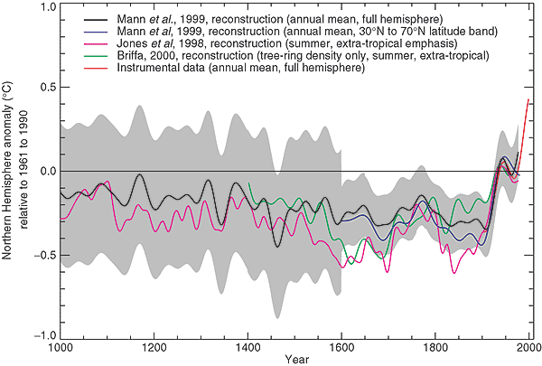
As I’ve mentioned before, you have to really watch the pea under the thimble whenever Briffa is presenting a series. I showed before how the post-1960 decline in MXD reconstructions was simply excised from the record and carried forward into the IPCC spaghetti graph where the overlay of colors made the detection virtually impossible to detect.
There’s a curious difference in the end portions in the two versions of the smoothed MXD graph shown below: you’ll notice that one of them is truncated earlier than the other. Look how the second graphic goes a little lower at the end.

Top: From Briffa et al [1998]; bottom – from Briffa et al [2004].
When I tried to figure out the reason for the difference, I ended up collating graph versions for a whole series of Briffa articles from 1998 to 2006 from 7 different journals. Was there any moral to the story? I’m not sure. But they certainly have got a lot of mileage out of the same dataset in different journals – without ever listing the sites.
Location of Sites
First, I tried to check whether the difference related to changes in the network – possibly one series included later sites in the network. So I looked at information in Briffa articles from 1998 to 2006 on the sites in his network involving 7 different journals: Nature, Proceedings of the Royal Society, Quaternary Science Reviews, Holocene, JGR, Global and Planetary Change and Journal of Climate. As you will see, some pretty similar graphics have been used repeatedly. Also, none of the 6 journals included an SI with a listing of the actual sites (and Briffa has refused to provide the information.) Since Schweingruber has archived what appears to be most of his information a couple of years ago, the obstacle to replication here is that Briffa won’t identify his sites.
Briffa started off with a network of 314 sites in his 1998 articles in Nature and Proceedings of the Royal Society. The first figure is the illustration in Nature, the caption of which reported the use of 314 sites.
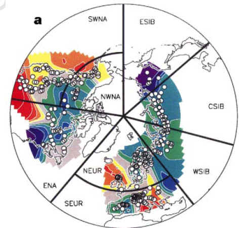
Briffa et al. [Nature 1998] Fig 1a. Definition of regions and number of sites: southwestern (SWNA, 53 sites), northwestern (NWNA, 30) and eastern (ENA, 34) North America; northern (NEUR, 46) and southern (SEUR, 72) Europe; western (WSIB, 42), central (CSIB, 31) and eastern (ESIB, 6) Siberia; all 125 sites in SWNA and SEUR form the composite region SOUTH, and all 189 sites in the six northern regions form the NORTH region; ALL is an average of all 314 sites.
Next, here is the illustration from Briffa et al [Roy Soc 1998]. There is no information in the article on the number of sites, but visually it appears to the the same network of 314 sites.

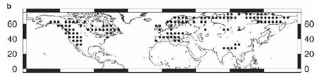
Briffa et al [Roy Soc 1998] Figure 1. The recent extent of the Northern Hemisphere tree-ring densitometric network currently under construction which forms the basis of the results discussed in this paper. [SM- I can’t locate any number in this article. It looks similar to Briffa et al Nature 1998, which lists 314 sites.]
Briffa [QSR 2000] contains no map. The only information on the size of the network is the following, which suggests that 387 sites – the number in later studies – is used:
There now exists a significant body of temperature sensitive tree-ring density data, the greater part of which has been processed at the Swiss laboratory: from trees sampled at some 400 cool and moist sites: in the western United States, Canada, Europe, Fennoscandia and northern Siberia (Schweingruber and Briffa, 1996).
Their next article, Briffa et al [JGR 2001] does not provide information on the number of sites, but the figure of 387 sites is used in several subsequent studies and the map looks visually similar to the later diagrams.
Briffa et al [ JGR 2001]
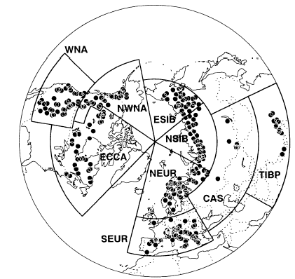
Next, Briffa et al [Holocene 2002] provided a similar diagram of sites, this time referring to 387 sites in the caption.
Briffa et al Holocene 2002. Figure 1 Location (circles) of the 387 sites with tree-ring width and density chronologies, together with the boundaries of the nine regions: NEUR = northern Europe; SEUR = southern Europe; NSIB = northern Siberia; ESIB = eastern Siberia; CAS = central Asia; TIBP = Tibetan Plateau; WNA = western North America; NWNA = northwestern North America; and ECCA = eastern and central Canada.
Briffa et al [Glob Plan Chg, 2004] once again used the 387 site network, as indivated by the legend in the following diagram:

Briffa et al. [Glob Plan Chg 2004]. N= 387 sites from legend
Briffa, Osborn and Jones are all coauthors of Rutherford et al., [J Clim 2005], which once again studies the network of 387 sites. In this case, they say that “the data in the MXD network are available online at http://fox.rwu.edu/~rutherfo/supplements/jclim2003a”, but it isn’t. The link merely directs readers to Osborn in England.
Rutherford et al [J Clim 2005] FIG. 1. Distribution of proxies for the two networks used in this study… (b) The age-banded MXD network of Briffa et al. (2001), where each dot corresponds to the center of one 5° 5° grid box.
Rutherford et al [2005] re-iterate the same igoring of post-1960, supposedly justified here as follows:
After roughly 1960, the trends in the MXD data deviate from those of the collocated instrumental grid-box SAT data for reasons that are not yet understood (Briffa et al. 1998b, 2003; Vaganov et al. 1999). To circumvent this complication, we use only the pre-1960 instrumental record for calibration/cross validation of this dataset in the CFR experiments.
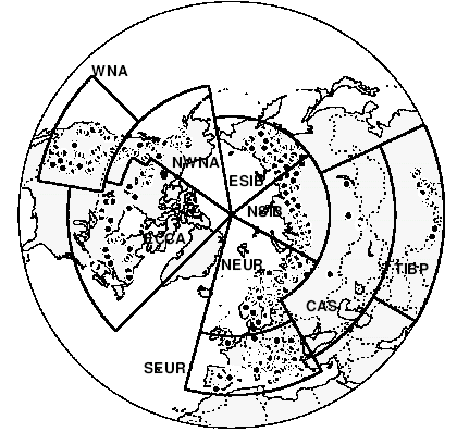
Finally, Osborn et al [submitted Glob Plan Chg 2006] show a network using 341 out of the 387 sites, with 46 sites rejected because of low correlation with gridcell temperature:

Osborn et al [submitted Glob Plan Chg, 2006] Figure 1: (a) Location (circles) of the 387 sites with tree-ring density chronologies, together with the boundaries of nine regions: NEUR = northern Europe, SEUR = southern Europe, NSIB = northern Siberia, ESIB = eastern Siberia, CAS = central Asia, TIBP = Tibetan Plateau, WNA = western North America, NWNA = northwestern North America, and ECCA = eastern and central Canada. (b) Locations of the 341 chronologies that were retained (open circles) and the 46 that were discarded (filled circles).
Time Series Versions
Next, I looked to see the different time series versions in the different articles. Briffa et al [Nature 1998] did not present any centennial graph for the NH. The first rendering appeared to be in Briffa et al [Roy Soc 1998], but the subsequent versions have much in common.
Briffa et al Roy Soc 1998 Figure 5. Series of annual and decadally smoothed standardized anomalies (1901-70 base) of tree-ring density averaged across all sites shown in Figure 1. The dotted lines are ~1 s.d. about the long-term mean. The extreme negative departures often coincide with the eruption dates of known explosive volcanoes.
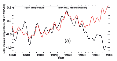
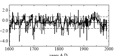
The first presentation of the series from 1400-1994 came in Briffa [QSR, 2000]. If you look carefully, you’ll see that the detail here matches the details in the 1859-1994 summary shown in the header to this post.
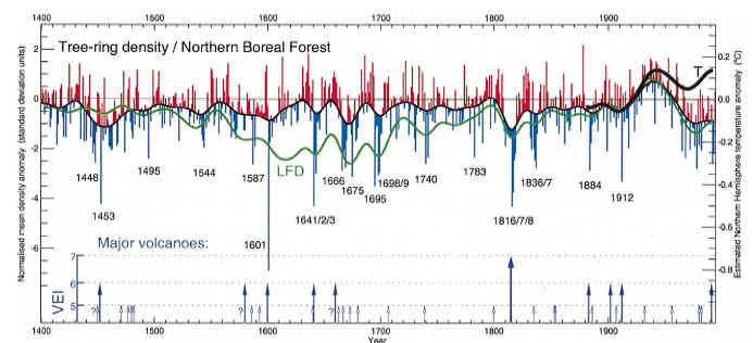
Briffa [2000] Fig. 5. An indication of growing season temperature changes across the whole of the northern boreal forest. The histogram indicates yearly averages of maximum ring density at nearly 400 sites around the globe, with the upper curve highlighting multidecadal temperature changes. Extreme low density values frequently coincide with the occurrence of large explosive volcanic eruptions, i.e. large values of the Volcanic Explosivity Index (VEI) shown here as arrows (see Briffa et al., 1998a). The LFD curve indicates low-frequency density changes produced by processing the original data in a manner designed to preserve long-timescale temperature signals (Briffa et al., 1998c). Note the recent disparity in density and measured temperatures (¹) discussed in Briffa et al., 1998a, 1999b). Note that the right hand axis scale refers only to the high-frequency density data.
The next presentation of this series came in Briffa et al [Holocene 2002]
Briffa et al JGR 2001 Figure 6. The 25-year smoothed age-banded reconstruction of the ALL temperature series with the 25-year high-pass filtered variability from the “Hugershoff standardized” reconstruction [Briffa et al 1998a], the latter shown as annual bars above and below the 25-year variations. The thin smooth curve shows the 25-year smoother observed record.
As pointed out before, a truncated version of this series was used in IPCC 2001, which also had a color scheme which disguised the actual truncation.
 |
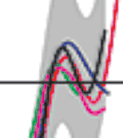 |
Left: IPCC spaghetti graph; right detail – note truncation of green (MXd) series in 1960.
The next version in Holocene 2002 was very similar to following versions as well.

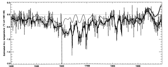
Briffa et al Holocene 2002. Figure 12(b) Observed (thin lines) and reconstructed (thick lines, with shading to indicate 6 1 and 6 2 standard errors) of the mean April to September temperature averaged over all grid boxes with chronologies in them. … (b) raw values from 1400–1994 with no observed values…
Next is the illustration of the same graphic from Briffa et al [Glob Plan Chg 2004]:
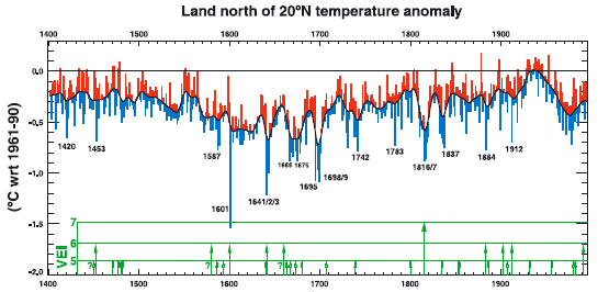
Briffa et al [Glob Plan Chg 2004] Figure 5. Estimates of warm-season temperature (jC anomalies from the 1961– 1990 mean) for land areas north of 20jN. The smoothed curve is the 25-year low-pass filtered reconstruction produced using the Age-Band Decomposition approach of Briffa et al. (2001). The Volcanic Explosivity Index (VEI) is indicated by the arrows at the bottom; “Å?’ marks those eruptions whose date is uncertain.
Rutherford et al. [2005] got similar results using RegEM methodology instead of averaging as used in earlier Briffa articles.
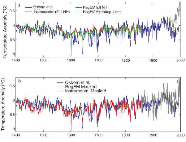
Rutherford et al [2005] FIG. 4. Comparison of summer mean temperatures based on the MXD network (Briffa et al. 2001, 2002a,b) using the REGEM hybrid-20 method and that of OSB. (a) The REGEM full NH mean and extratropical land-only mean vs OSB (see text for details). (b) Comparison using the REGEM reconstructed grid boxes that coincide with those reconstructed by OSB and Briffa et al. (2002b).
The process is described by Rutherford et al [2005 as follows:
Here we compare the REGEM warm-season MXD based NH mean reconstruction with that of OSB, the latter based on an areally weighted mean of 115 locally calibrated MXD 5° by 5° grid boxes (Fig. 1b). This reconstruction (Fig. 4) is similar, though not identical, to that presented by Briffa et al. (2001) using the same MXD data; the minor differences arise because Briffa et al. (2001) used a principal component regression of regionally averaged MXD data, rather than the average of locally calibrated reconstructions generated by OSB. ..
The latter masking of the REGEM reconstruction yields a hemispheric mean estimate that is nearly indistinguishable from the OSB reconstruction, suggesting that the initial differences evident in Fig. 4a result largely from differing initial target regions. The remaining modest differences (Fig. 4b), which are mostly evident during the relatively data-sparse initial centuries, are presumably due to the differences between methods (REGEM CFR method versus spatial average of the locally calibrated grid-box data).
Osborn et al [submitted 2006] does not show an overall average, but does show regional averages with similar shapes.

Osborn et al [2006] Figure 7: Regional-average temperature reconstructions for (a) northern Europe; (b) northern Siberia; and (c) northwestern North America. Continuous lines are the regional reconstructions published by Briffa et al. (2002a) using Hugershoff-standardised tree density (thin lines) and by Briffa et al. (2001) using ABD-processed tree density (thick lines). Dashed lines are the average of the gridded temperature reconstructions developed in this paper, using those grid boxes that lie in each region, based on Hugershoff-standardised tree density (thin dashed lines) and with additional low-frequency variations included (thick dashed lines). All series have been smoothed with a 30-year low-pass filter.No overall average.
Osborn et al [submitted 2006] also show the following interesting graphic showing the geographic distribution of the slope shortfall, which is less prevalent in the more southerly precipitation-limited climates:
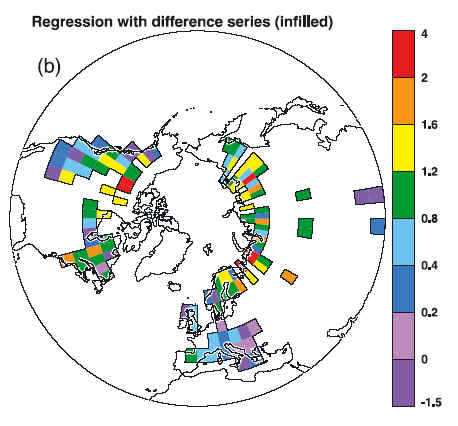
Osborn et al [submitted 2006] Figure 6(b) Pattern of regression coefficients between the difference between the smoothed, area-averaged curves in (a) and the difference between the grid-box temperature reconstructions and observations. The difference is dominated by the relative decline in tree-ring density over recent decades, and regression slopes >1 indicate the local decline is stronger than average, < 1 indicates the local decline is weaker, and < 0 that there is no local decline.
References:
Briffa KR, Osborn TJ and Schweingruber FH (2004) Large-scale temperature inferences from tree rings: a review. Global and planetary change 40, 11-26 (doi:10.1016/S0921-8181(03)00095-X).
Osborn TJ, Briffa KR, Schweingruber FH and Jones PD (2006) Annually resolved patterns of summer temperature over the Northern Hemisphere since AD 1400 from a tree-ring-density network. Submitted to Global and Planetary Change.


18 Comments
Steve
In the first two graphs the three lines (apr-sep mean temp/density/width) seem to track well until 1960 wher they radically diverge.
In later graphs we see the same thing where it is tied in the early 2/3 of the 20th century and diverges elsewhere.
What is the reason/ing for this. Is this the talk about calibration where that is where they tie the 3 runs together?
As a layman it seems to show me that the tree ring temp proxy is either a coincidence, or it matches only under certain, fairly rare conditions.
Re: Briffa, Figure [2000]
The impact of that diagram is clearly that the lower temperatures of the Little Ice Age did not coincide with increased vulcanism.
Is that correct ?
Seven journal articles, and no-one has required him to provide a listing of the sites he used ????
A new high point !
cheers
per
20 Feb 06
I wonder if the following comments have any validity? – am still amazed that Science will not release data sets!
The article by Osborne and Briffa in Science (10 Feb 06) has been widely reported as confirming AGM and in particular the IPCC’s controversial reliance on Michael Mann’s (et al.) “hockey stick” portrayal of global temperatures over the last millennium to the present. However O&B actually demonstrate that there was in fact a period of significant warmth around 1400 (without admitting that Mann et al. had not shown this), and that it was not much less pronounced (their Fig.2) than the present warming (allowing for uncertainties over whether tree rings are truly an accurate temperature gauge within not more than 1 degree C margins of error). Nevertheless O&B still conclude “the late 20th century was the warmest period during the last millennium” (p.841).
But there are other problems with their paper:
1. The authors used only those proxy records (14 in all) that “are positively correlated with their local temperature observations” (since those became available about 1850). This is a bit like joining up only those dots in a scatter diagram that fit a preconceived hypothesis, or in other words, there appears to be some cherry picking here. Why are the many other tree ring series Not “positively correlated”?
2. This leads on to the validity of the correlations as presented. Only two of the 11 tree ring series used by O&B have correlations greater than 0.5. This suggests that the null hypothesis of b = 1 for the equation TR = a + bt (which is required for use of tree rings as proxies for temperature) is not confirmed.
3. Whilst O&B rely on the equation
TR = a + bt …… (1)
(where TR are tree ring widths, and t is temperature)
for the instrumental period since 1850, since it is known that tree ring widths are somewhat correlated with – and caused by – changes in temperature, they also perforce have to rely on the somewhat more dubious relation
t = d + cTR ……(2)
for the earlier period before 1850, when we have no general instrumental temperature record, so in effect temperature is “caused” by tree ring widths. Yet O&B assume that the correlations they find between TR and t after 1850 hold for the earlier period. For that period the nul hypothesis is
c = 0
and is supposedly refuted by the correlation coefficients cited by O&B.
But if the correlation coefficients as cited by O&B are correct and both >0 but
#3 – it’s actually more than 7 – it’s 7 different journals. There is one in Glob Plan Chg and one submitted; two 1998 Nature articles.
I’ve mentioned previously and should re-iterate that Briffa has refused to provide a listing to me pursuant to a direct request.
Why does that blow-up of the colored truncation remind me of blow-ups of the typography on the Burkett memos?
=========================================================================
I find the graphic Osborn et al [submitted 2006] Figure 6(b) very interesting. It seems rather strange that there are boxes there that are separated by several color bands from their neighbors. For example, the red box in northern Canada is adjacent to a green one. This seems rather anomolous to me. Would you not expect a gradation from red through orange and yellow to f=green if this is a genuine measure of what is occuring in nature? More generally, the anomalies reminded me of Warwick Hughes’ analysis of temperature anomalies in Siberia. See his web page on this topic here under the heading “USSR High Magnitude Climate Warming Anomalies 1901-1996.” While he focuses on Siberia, it is interesting to note that the Karl figure he reproduces also has some anomalous boxes in northern Canada. Might it be that the divergences between “measured temperatures” and MXD in the Osborn et al [submitted 2006] Figure 6(b) graphic reflect more mis-measured temperatures than strange tree growth?
These folks sure get a lot of “mileage” out of unpublished data. Hmm, let’s see, I do an experiment andd report only the statistics, not the original data. How scientific!
Same ol’ question: How in the heck was that determined? Where’s the beef? A cynical guess is they just tossed out sites by eyeball that had unfavorable trends (they couldn’t toss all of those out ’cause there’d be little left except the southernmost sites). No wonder they won’t release their, ahem, “methods”.
So, tree-rings are “robust” temp proxies until 1960, and then immediately afterward they’re not. Oh, what a tangled web has been woven…
Steve, there’s more going on in the first two plots than that the end of the density line is lower. I’ve not read all the comments here yet, and so don’t know if this’s been mentioned, but the density minimum around 1979 represents about -1.1 degree in 1998 but about -0.7 degree in 2004 (reading off my screen here).
In 1998 the maximum density represents about +1.1 degree in 1945, but represents +0.4 degree at 1939 in 2004. Likewise the maximum temperature in 1990 is about +2 degrees in 1998, but only about +0.5 degree in 2004.
There seems to be either a lot of renormalizing going on, or else the modest increase in number of sites (314 to 387) has radically transformed the data set.
Maybe I’m missing something here, but it looks to me like many of these figures show that the trees are not responding to temperature the way these guys claim, despite picking only those trees which are not negatively correlated with temperature. I don’t see the hockey stick, except in the spagetti graphs. Did the hockeystick just magically appear one day? And, hey, if the data after 1960 don’t support your hypothesis, you don’t use it. That way your hypothesis has to be correct.
First graph is through about 1991 or 1992 whereas the second is through 1995. The most precipitous drop in latewood density appears to have been between 1992 and 1994 according to the second graph, with a barely discernable recovery after that.
Somewhat off topic, did anyone catch the History Channel yesterday evening regarding the Roanoke Colony? They were doing tree ring studies of swamp cyprus, and were using ring widths as a proxy – for moisture.
Maybe the buisness end hockey stick is correct! Check this study out: http://www.co2science.org/scripts/CO2ScienceB2C/articles/V7/N2/C1.jsp
Posted today in the queue for the “New Take On An Old Millenneum” thread at RC. If they actually post it, I anxiously await the discusion, if any. Could be deafening silence. We’ll see:
Setting aside for a moment any debate regarding proxies such as tree rings and formanifera, from the standpoint of cultural / archeological indicators (as well as historical accounts of things such as life ways, clothing, food and drink and the like) what are the things that tend to confirm and refute a global MWP of substantial degree (that term is somewhat loaded, but by “substantial” I mean things that have impacts similar to things thought to accompany the theorized coming warm up). For example, in Europe, people wore substantially thinner and less layered clothing during the MWP timeframe, versus what they wore during the Rennaissance, Enlightenment, Neo-Classical and Industrial Revolution time frames. That indicates the shift from the warm peak to the cold valley. Cathedrals were thought to be attractants to worship because they gave respite from the heat (even though some of them were not completed in time to reap the most benefit, we must look at the times of their initial conception / early project planning.) Take as another indicator the cultivation of citrus. Etc. What, if any, similar observations and anecdotal evidence are there in the Americas, Africa, Australia and Asia? I have not studied this and welcome what folks have to say in these regards.
by Steve Sadlov
As I recall, the Anasazi culture disappeared some time in the 1200’s, and the Mayan culture declined about the same time. Both declines have been blamed by some on drought. This might be related to the MWP.
RE: #15. It might be productive to look at cultivation patterns of the Aztecs. In their northermost / highest elevation lands, I would expect that in a global MWP scenario, they would have lost the ability to grow warm weather crops. In Asia, one would want to look at pre-Yuan China to see if there were crop failures in the north and to see if in areas south of Shanghai, citrus and, further south, tropicals, had failures. Connect the dots ….
The Chinese may have records of crickets chirping.
===================================================
RE: #17 – cricket chirping (rates) would make a really nice additional proxy.
One Trackback
[…] database (CRUTEM1) . They are computed for the regions shown below in a Briffa/CRU diagram (H/T Steve McIntyre). The legend of the diagram is also from McIntyre’s blog […]