I wrote recently about the Yamal substitution for the Polar Urals series in both Osborn and Briffa [2006] and D’Arrigo et al, 2006. This substitution is not incidental as the Yamal version had by far the strongest closing uptick in either data set, while the updated Polar Urals ring width series (1998 update) had elevated MWP levels. The substitution is not explicitly justified in either article.
The switch was first made in Briffa [QSR 2000] (which I’ll discuss below). Needless to say, Briffa [2000] did not report the updated Polar Urals results and identify the differences. Briffa just switched the series. The later studies then cite Briffa [2000] – and otherwise provide no justification for the switch. Rob Wilson has written me offline, attempting to justify the switch on the basis that the variance of the Yamal chronology is more stable than the variance of the updated Polar Urals chronology.
However, there’s no discussion of this in D’Arrigo et al 2006 itself and somehow I find this argument a little unconvincing after the fact. I’ll discuss this a little more at the end, after reviewing the original switch in Briffa [2000].
The various Briffa articles whichI’ve recently been discussing used a large collection of tree ring sites collected by Schweingruber – a network of 387 sites is reported, this seems to be a subset of the total collection – but the basis of subsetting and even the identity of the sites is still undocumented. Mostly Briffa has discussed the MXD (density) series – truncating downtrending post-1960 values. However, ring widths were also collected in this enterprise.
When you think about it, given the large population of supposedly temperature-sensitive sites, it’s remarkable how little Briffa has published about the outcome of the ring width chronologies. There was a little in 1998, as Briffa et al [Roy Soc 1998] included the following graphic showing declining ring widths from the 1930s through to 1994 and Briffa et al [Nature 1998] also had a graphic showing ring width information. But there’s precious little in the later studies.

From Briffa et al. [Roy Soc 1998]
The MXD temperature reconstruction of Briffa et al [2001] (truncated after 1960) is a common feature of the spaghetti graphs, which I’ve discussed in the past. However, a Briffa reconstruction from ring widths is also a feature of many spaghetti graphs (though not the current Wikipedia spaghetti graph). The spaghetti graph from Kerr [Science 2005] is shown below and includes a Briffa RW reconstruction.
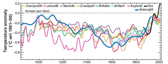
Source: Kerr [Science, 2005]
The Briffa [QSR 2000] ring width contribution to the spaghetti graphs turns out to have virtually nothing to do with the 387-site Schweingruber network. Instead, Briffa has selected 7 ring width chronologies – of which Briffa and Schweingruber appear to be directly associated only with Tornetrask. The first 4 sites – Tarvagatny (aka Sol Dav, Mongolia); Yakutia; Canadian Rockies (aka Jasper; Alberta; Icefields; Athabaska) and Northern N America (aka Jacoby treeline) were already mainstays of previous multiproxy studies (MBH; Jones et al, 1998 and Crowley-Lowery, 2000) and continue in use in subsequent studies (Esper et al, 2002; Osborn and Briffa 2006; D’Arrigo et al, 2006). (Bristlecones and Dunde are, of course, other mainstays).
Three series are introduced in Briffa [QSR 2000] for the first time and become new mainstays. There is a new version of the Tornetrask ring width series; the "reprocessed" Yamal series and the Taimyr series (also reprocessed although this is not mentioned.) These three series are used in Mann and Jones, 2003; Osborn and Briffa, 2006 and D’Arrigo et al, 2006. The Yamal series is particularly important, as it "replaces" the Polar Urals MXD series.
The figure below shows the 7 series, together with a composite, as plotted in Briffa [QSR 2000]. Digital version of the chronologies are available at Briffa’s website; measurement data for the 3 new versions have not been archived (although there is presumably some overlap between new and older Tornetrask data.) The 7-series composite shows elevated 20th century levels (although only about the same as the 11th century). Take a look at the details and I’ll comment a little more below.

Briffa [QSR 2000] Fig. 1. Northern & high-latitude temperature changes over the last 2000 years. The curves show selected reconstructions of summer (annual series a#d) temperatures or temperature-sensitive tree-ring chronologies: (a) Mongolia (Jacoby et al., 1996a); (b) Eastern Siberia (Hughes et al., 1999); (c) eastern Canada (Luckman et al., 1997); (d) North American tree line (D’Arrigo et al., 1992); (e) Northern Sweden (Grudd et al., 1999) with a shorter density-based temperature series superimposed as thin line (Briffa et al., 1992); (f) western Siberia (Hantemirov, 1998 reprocessed) with a nearby density-based temperature series for the northern Urals (Briffa et al., 1995); (g) Central Siberia (Naurzbaev and Vaganov, 1999). All series are plotted as normalised values smoothed with a 50-year low-pass filter. The bottom curve is the average of the other data sets after rescaling to give equal mean and variance (over the common period 1601-1974), also plotted as 50-year smoothed values.
Here are a few observations about these series.
First, while the scale does not lend itself readily to comparing the above results to the ring width decline from the 1930s on shown in the Nature 1998 graphic, you can see that most of the individual series actually do show a decline – although the composite on a smoothed basis is back at 1930s levels and the closing spike is either the highest or 2nd highest in the record.
But look at the details: Taimyr goes down sharply from the 1930s; even the Jacoby treeline goes down; Yakutia goes down; Tornetrask goes down; the Rockies goes a little; even Jacoby’s Mongolia series goes down a little. The only series with a distinct increase is Yamal, which has a huge increase. It’s close to Polar Urals. Polar Urals MXD (shown in grey above) goes down a little since the 1930s. (As noted elsewhere, Polar Urals ring width updated has very elevated MWP relative to modern).
So you can see why the Hockey Team has been so keen to substitute Yamal for Polar Urals. By itself, it’s enough to yield elevated closing values of this index. Using the updated Polar Urals series would show a marked 20th century decline – in line with the population decline of the Nature 1998 graphic.
Also some smaller points. Remember how the Polar Urals MXD series supposedly showed that 1032 was the "coldest" year of the millennium and that the 11th century was "cold". I’ve argued elsewhere that the 11th century portion of the Polar Urals series is completely invalid. Note the differences with Yamal.
It’s also useful to crosscheck against what Hantemirov et al [2002] actually said about Yamal before Briffa "re-processed" their data. Hantemirov pointed to AD1200-1300 as favorable (coinciding with remarks by Shiyatov about Polar Urals and Naurzbaev about a Siberian transect.
Hantemirov et al:
The more northerly tree-line suggests that the most favourable condition during the last two millennia apparently occurred at around AD 500 and during the period 1200″€œ1300.
They pay considerable attention to changing latitudinal tree lines in Yamal, saying:
It is interesting to note that the current position of the tree-line in Yamal is south of the position it has attained during most of the last three and a half millennia, and it may well be that it has not yet shifted fully in response to the warming of the last century.
They illustrate the changing treelines in two interesting figures:

Hantemirov et al 2002. Figure 12 Regional reconstruction of polar tree-line dynamics on the Yamal Peninsula since 1800 bc. The zero line indicates the position of the recent polar timber-line.
Here’s another picture of Yamal treeline:

Hantemirov et al , 2002. Figure 5 Fluctuations in the northern boundary of coniferous trees with respect to the current location of the northernmost clumps of larch in river valleys (a); and the temporal distribution of the numbers of radiocarbon dated samples (b). A proposed division of the Holocene in Yamal based on these data is also shown (from Hantemirov and Shiyatov, 1999a).
Briffa’s "reprocessed" version of Yamal does not show any warmth in the period 1200-1300, contrary to the explicit statements by Hantemirov that AD1200-1300 was the "most favorable" period in the last two millennia. However, it does show a unique uptick in the late 20th century, which is sufficient to affect the Briffa [2000] composite.


4 Comments
This is simply unbelievable. The team now has apparently now completely embraced the practice of cherry-picking. I can’t see how they can defend it. Have any of them ever responded to this question, other than to say something about controlling variance?
It looks to me like the lighter line in the Yamal graph (f) is nearly same as the longer series but moved about 150 years forward.
Who are the most prominent falsifiers of scientific results in history?
M… J…. or B….. ?
Falsify or perish is IN ! (the only option for M… J…. or B…..)
Publish or perish is OUT ? (St e … Mc .. )
I think every one already knows that this comment is not any more needed, but I could not resist !!!
When the penny drops, as it did in my case, your jaw hits the floor.