Trying to check even simple things like the correlation of individual Osborn and Briffa 2006 series to gridcell temperature always leads to complications. Today I’ll look at the situation with respect to Jacoby’s Sol Dav, Mongolia series, one of the 6-7 mainstays of Hockey Team reconstructions.
Needless to say, nothing can be confirmed. Instead of a claimed correlation of temperature of 0.40, I can only confirm a correlation of 0.03. (This is without considering degrees of freedom – there are only 5 decades of records.) Additionally, it seems that Osborn and Briffa 2006 have rested their conclusions about temperature correlations on data obtained by scanning an article, rather than using original data, in this case, seemingly using a scanned version from Mann and Jones when a digital version from Esper should theoretically have been available to them.
Osborn and Briffa claimed a "decadal correlation" of 0.4 for Mongolia, citing Jones and Mann 2003. Cross-referencing Jones and Mann, they do report 0.4, together with an annual correlation of 0.25. Figure 1 below shows the post-1900 plot of temperature (top) and the Mongolia version, archived by Osborn and Briiffa 2006.
Just looking at this raises a number of problems. First, visually it doesn’t look like there is an annual r2 of 0.25 (or decadal correlation of 0.40), so these definitely need to be tested. Secondly, and this leads into an odd by-way, the tree ring chronology "looks" much too smooth to be an annual tree ring chronology. Has it been smoothed somehow? They have another "smoothed" version of their data – why would this be pre-smoothed?
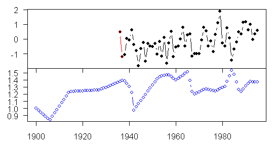
Top: HadCRU/CRUtem gridcell temperature. Bottom – tree ring site chronology (Osborn and Briffa version).
Correlations
Let’s consider the annual correlation. The appearance of the series is obviously very different. The Jacoby chronology is very smooth. Jacoby series are usually highly autocorrelated, but this is ridiculous.
If you look at the last half of the series, one’s eye is drawn to some inverse correlations: for example, a very strong inverse correlation in 1984, when there was very low temperature and very high growth. The downturn in ring width in the early 1940s precedes the downturn in temperature. The red line segment at the beginning is a difference between the CRUTEM and HADCRU versions, with CRUTEM not having one year available in HadCRU. So what’s the correlation: 0.07 overall, with a positive correlation of 0.25 in the first half and a negative correlation of -0.16 in the second half, more or less matching the visual impression of a weak relationship in the first half, eroding in the second half.
How did Jones and Mann derive their correlation of 0.25? Beats me.
The frustrating thing is that you can’t rely on a single number (and then innocent third parties like von Storch and Zorita come along and attribute correlations of 0.3 to pseudoproxies based on this kind of stuff.) If you’re interested the adjusted r2 is -0.01 for the regression yielding the correlation coefficient and the t-statistic is an insignificant 0.55.
OK, well what about the "decadal correlations". Here I’ve illustrated the Mannian 13-year filter. But if you’re thinking in decadal terms, you have a record going from 1936 to 1995, 5 decades. What are your prospects of getting a statistically significant relationship? But even with smoothing, the visual prospects don’t look very good. The Mannian decadal correlation according to my calculations is 0.03 (as compared with the claimed 0.40). If you look at the plots below, there is nothing surprising about this. The adjusted r2 and t-statistics both fail.
If you do decadal averages as opposed to decadal smoothing – which seems to me a safer way of keeping track of the degrees of freedom, you only have 5 degrees of freedom and insignificant t-statistics, but the results are terrible anyway even before allowing for degrees of freedom..
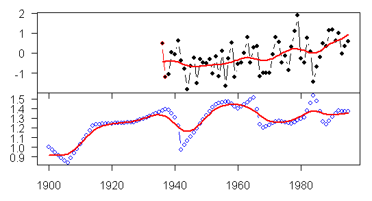
Figure 2. As in Figure 1, with gaussian 13-year filter marked in red.
In this connection, it is interesting to go back to D’Arrigo et al GRL 2001 and see what they said about correlations of Sol Dav, Mongolia to temperature:
There are very few meteorological stations in the general area of the Sol Dav site and these are only several decades in length (Jacoby et al 1996; Jacoby et al 1999). At 500 km distance and at much lower elevations (470 m), the station record for Irkutsk, Russia is the longest such series available for the vicinity of Sol Dav. The Irkutsk annual temperature record shows an overall steady rise over its length with the highest levels in the 1990s, as in the annual NH average. Gridded temperatures overlapping the Sol Dav site (45-50N, 95-100E, P. Jones, pers. comm) are almost entirely based on the Irkutsk record. As in Jacoby et al 1996, the strongest correlations were found between annual ring width indices and prior August through current July temperatures from 1882-1993 (r=0.44). Averaged over 4 years (using tree growth in year t to estimate temperature averaged over years t-3 to t, this model accounts for 33% of the variance adjusted for degrees of freedom. This finding reflects the fact that tree physiology can integrate response several years after the event…
Despite this climate/growth relationship, we do not consider this model sufficient for development of a verifiable reconstruction (Fritts 1976)
Despite these caveats, this particular proxy is used as a temperature proxy in the following studies: MBH98; Briffa 2000; Esper et al 2002; Mann and Jones 2003; Jones and Mann 2004; Osborn and Briffa 2006; and probably Hegerl et al 2006, i.e. pretty much every recent study.
[Edited] The Mongolia site was used in D’Arrigo et al 2006, where it is an important contributor to the 6-series reconstruction of the MWP (which, in this case, is pretty much identical to the Briffa 2000 selection.) As Rob Wilson pointed out in a comment below, D’Arrigo et al 2006 carried out their own independent examination of the correlation of the chronology to gridcell temperature and did not rely on calculations by Mann and Jones. They reported – see their Figure 7 – a correlation of 0.58 (much higher than Mann and Jones correlation of 0.25) to gridcell 50-55N 100-105E. This is not the gridcell in which the site (48N, 98E) is located. The protocol described in Osborn and Briffa 2006 SI specifically refers to use of the nearest gridcell, which in this case would be 45-50N 95-100E, which is what I used in these calculations. The gridcell used by D’Arrigo et al 2006 is available over a longer period (1882-1995) than was available for the actual site gridcell. This may be so but, in a first instance, it’s reasonable to presume that Osborn and Briffa are doing what they said they were doing. Rob points out that it is not known what stations are contributing to the CRU gridcell value in either gridcell. It’s possible that CRU might have changed the stations used in gridcell 45-50N 95-100E between D’Arrigo et al 2001 and the present, as D’Arrigo et al 2001 mention influence from Irkutsk, whereas the present gridcell record seems too short for this. If the correlations are unstable to gridcell selection, as they appear to be, all the more reason why CRU should reveal its station data so that these sort of issues can be resolved.
Provenance
Now what about the smoothing. Osborn and Briffa SI states:
The data sets contain some non-identical tree-ring series derived from the same sites; we have favoured series from (S3 – Mann and Jones ) because they are based on a greater number of tree core measurements than the series generated by (S1 – Esper et al 2002), while still being processed using the Regional Curve Standardisation (RCS) technique (S8) that does not remove real multi-century variability.
If one compares the digital version of the Osborn and Briffa 2006 data with the corresponding series archived as part of Jones and Mann 2004, they match exactly. So whatever smoothing exists in Osborn and Briffa 2006 already existed in Mann and Jones 2003.
Now let’s compare the version in D’Arrigo et al 2001 with a similarly plotted version from the Mann and Jones digital data (obtained here) in the figures below. If you look closely, you will see that the versions are similar but not identical. For example, look at the split ends in upspikes or downspike e.g. the one in the late 15th century – this is smoother in the Mann and Jones version than in the original diagram.
Top: Excerpt from D’Arrigo et al 2001; Bottom: plot of digital data archived for Jones and Mann 2004.
So where did the Mann and Jones 2003 version come from? In early 2004, unable to locate any version of this series, I wrote to Jacoby asking him for the data used in Mann and Jones 2003. (Measurement data was archived in July 2004 in response to a letter to NSF, which responded on this occasion.) Jacoby replied with a bilious letter about "data parasites".
You should also be aware another problem, the growing population of data parasites who produce nothing, do not understand data they use, do not present data accurately, and yet scream when all data are not served up to them. You have evidently been in communication with and about some of them.
This sounds like Dano. But, in this case, surprisingly, the target of his opprobrium was not me, but the people "with and about" whom I’d been in communication. Jacoby is also quoted in a recent New Scientist article about Mann using a site in China known to be a precipitation proxy (Jacoby seemingly unaware that MBH98 used actual instrumental precipitation series). I responded with a nice letter, politely acknowledging his field work, but still requesting the data as follows:
My only concern is that the Sol Dav data set has been applied in Mann and Jones (2003), which has been used to influence policy. If you did not wish to make the data set available due to your reasonable desire to carry out further studies, then you should not have allowed its use by Mann and Jones. But if the data set has been applied in multi-proxy studies, especially ones with strong advocacy, then the data should be available for replication and sensitivity studies without intemperate outbursts about "data parasites".
Jacoby then wrote back with the following:
To clear the record; Mann and Jones obtained the data from unknown sources, published without any authorization, and Jones is distributing the data to colleagues. And, they published in GRL. Best wishes, Gordon Jacoby
Subsequently, Mann and Jones archived the version used in Jones and Mann 2004 here with the following comment:
Column 1=Mongolia (Trees, D’Arrigo) (series scanned) years 264 2000
So this presumably accounts for the strange smoothing in Mann and Jones 2003, carried forward into Osborn and Briffa 2006 – they used a scanned version of the data. Now remember their explanation for using the Mann and Jones version rather than the Esper version –
The data sets contain some non-identical tree-ring series derived from the same sites; we have favoured series from (S3 – Mann and Jones ) because they are based on a greater number of tree core measurements than the series generated by (S1 – Esper et al 2002), while still being processed using the Regional Curve Standardisation (RCS) technique (S8) that does not remove real multi-century variability.
Now, in a first instance, one would think that whatever advantages accrued from this policy would be outweighed by the use of scanned data. But let’s consider the supposed justification itself. They’ve used a scanned version from D’Arrigo et al 2001. Did that use the RCS technique as represented here? Here’s what D’Arrigo et al say:
Conservative detrending employed negative exponential or straight line curve fits or stiff splines to remove age-related growth trends. Splines (with a 50% frequency-response cutoff) between 300 and 700 years were used in 10/99 cases. During standardization, a power transform technique was used to stabilize the variance and residuals from the fitted curves were computed to avoid potential bias in calculation of indices. The final chronology consists of 38 radii from 19 living trees and 61 radii from 32 relict trees.
The difference in the total number of cores said to have been used in Esper et al 2002 and the number documented in the other 13 sites is 112 cores, which is close to, but does not match the 99 cores that Jacoby said that he used. What accounts for the difference? Who knows? It’s the Hockey Team. But the Mann and Jones 2003 study appears to have used fewer cores based on the above description than were used by Esper. Moreover, the Mann and Jones 2003 version – scanned from D’Arrigo et al is not an RCS version of Mongolia, but one determined according to the different Jacoby methodology.
At this point, one would like to compare to the RCS version used in Esper version. But here we face another hurdle. After over 2 years of inquiry and despite the active assistance of Science during the past few months, resulting in the supply of data for 13 of 14 Esper sites, there is still one site with missing data.
You guessed it – Mongolia.


58 Comments
What was the population growth curve for Irkutsk during the latter half of the 20th Century? I seem to recall reading somewhere that Irkutsk is one of the few growth areas in Russia. Lots of IT outsourcing going in there. Previously, I believe the USSR invested in it for defences R&D. Growth can influence the grid cell data.
#1 If you go to Warwick Hughes website he has a lot of material about the Siberian grid cells’ contribution to apparent global warming. They produce a lot of it.
Sounds like Jacoby isn’t impressed with M&J’s ethical standards.
Dammit, I can’t see most of the graphs because of the side panels. But I see enough to again make me want to puke. These guys will try ANY cherry pick or weird statistical trick to get the trends they want to show. What a bunch of sh–!
#3. It’s interesting that Jones will distribute Jacoby’s data, but won’t give out CRU temperature station data.
#4. jae, the graphs are OK on my computer. It must be a resolution issue. Try a right-click on the figure of interest and then copy the url of the picture into your broswer – that should give you the figure.
Thanks, Steve, that works great.
You know, the IPCC should be addressing this problem of withholding data and methods. IMO, they should not even consider any study which is not backed up by a complete archived data set. The blind acceptance of all these questionable studies destroys the credibility of the reports they issue.
Ditto NAS. If they don’t address the problem, it will be clear that the National Academy of Sciences is unscientific!
Ive a general question about correlations: Is there a way to adjust an r value from a section of an XY data cloud (say all those points where X is greater than 200) so as to make it directly comparable to the r from the whole datset; so that one might be able to say if a relationship between X and Y breaks down when X is above 200? -Thank you ClimateAudit Homework Help Blog 🙂
#2 You refer to Warwick Hughes. Does he talk about the reports that Siberian and other Soviet era records at the end of the 20th century are problematic because the funding was related to temperature? I understand the colder it was the more money was forthcoming and therefore there was a vested interest in recording lower temperatures than actually occurred. Are these reports confirmed?
Steve
The plot of tree ring data in Figure 1 above cannot be raw data, as you say, but it cannot be smoothed data either. Smoothing by moving average cannot produce sharp corners like the ones you see here. And the remarkably smooth trends in some sections of the graph don’t even look like what would be produced by a moving average if the raw data had the kind of variability that other raw series show.
It almost looks as if they interpolated much of the data from a smaller set of observations. Interpolating between two points would produce the smooth sections like you see here.
Overall, it cries out for an explanation.
But splicing otherwise smoothed data would create the spikes. A moving average filter has its first null at 2*pi/N, where N is the size of the filter and pi is the sampling rate divided by 2. Very narrow for large N.
Mark
#12/ John Hekman, you missed the explanation – it’s scanned data. Surely scanning could account for this.
Scanned data or a scanned figure? A figure is not data…it may be a plot of the data. I think you mean they scanned the plot, right? If you scan the data (numbers), then you can make your own plot. If you scan the plot, well…
By “scanned data”, I meant digitization from scanning the print publication. Here’s what they said: “Column 1=Mongolia (Trees, D’Arrigo) (series scanned) years 264 2000”, which must refer to the figure in D’Arrigo et al 2001. The appearance of the archived “data” appears consistent with scanning. Do you agree?
Re #11, im, that explanation of data variance in the siberian records has largely been discounted. It is not that it possibly didn’t actually happen but rather that there is no evidence for the practice other than some vague “stories”. The siberian records can be criticized on a number of potential grounds, but that form of distortion is not provably extant.
Re #11: “I understand the colder it was the more money was forthcoming and therefore there was a vested interest in recording lower temperatures than actually occurred.”
Scientists letting incentives drive their research seems far more common than acknowledged.
Steve
I understand scanning to mean as Kenneth Blumenfeld described. A figure was scanned and digitized. That does not relate to what we were discussing concerning the source of the figure that was scanned. I was saying that it appears too smooth for raw yearly data. You said this too. I am also saying that “smoothing” means to me in most cases a moving average of the yearly data. But this won’t explain the sharp corners in the figure. Mark mentioned spicing several sections of smoothed segments, and I think that is a possibility.
However, splicing of segments would ruin the data for purposes of using it in regression or PCA. The results would be seriously flawed.
John: it’s the Hockey Team, remember.
16
Steve, you mean they scanned the figure from D’Arrigo et al (2001), then estimated the values from the scanned image (those values became the “data”), and then re-plotted the “data,” right?
While I would not recommend such a procedure (and certainly no advisor of mine would ever recommend it), it is a creative way around the problem of not having the hard data. You could project or maginfy the plot, and then, with a ruler, some hand-placed tick marks and a lot of patience, begin estimating each value. If that is what they did, they should have rounded to the nearest .05, rather than trying to get it down to the hundredth (as the data indicate). Not a good practice, but it should not have huge effects on the results. Their estimates are pretty good, wouldn’t you say? 🙂
#21 It can be done electronically too. I’ve used a software package called “Un-Scan-It”, which allows conversion of a scanned graph image to X-Y data by a series of mouse/pointer movements and clicks. It was convenient for replotting old (pre-computer) graphs for overlays, internal presentations, and for deep-drilling patent figures. Obiously, image and screen resolution are pretty important, depending on what you want to do with the data. But to be honest, I don’t know what “series scanned” actually means.
#21. “pretty good” huh?? They report an r2 of 0.25 “decadal” of 0.4, when the data is 0.03 or less?
#24. Hans Erren has a way of extracting digital data from pdf’s.
Steve, I said their estimates, not their statistics. Their estimates of the “data” are not bad. Without careful scrutiny, most observers couldn’t tell the difference between the two plots (one of the “data,” and one from the 2001 paper).
I find it comical that the Hockey Team’s secretiveness about archiving data results in them needing to scan each others documents to use that “data” in subsequent studies, when one of them decides not to play ball with the others and won’t furtively slip the data under the counter to other Team members.
#25. I’m not sure that I’d even agree with that. For example, when I plotted up the series on a scale that showed annual data as in the top figure, I could tell that it wasn’t a proper tree ring chronology, although it was tricky finding out what exactly was wrong with it. With the Team, you never know, it could be almost anything. Also it means that the statistics are probably meaningless. Their reslts are adequate for a cartoon but not for analysis
BTW, is the caption below the last set of graphs supposed to say “Plot of digital data…” instead of “Pot of digital data”? You did say you wanted to be less snarkly, after all .
RE #12:
I have to agree with this interpretation of the blue diamonds in the first graph. It looks like they had about 25 observations (roughly every 3 years) and they connected the observations together with interpolated annual observations. You can see that the plot appears to be made up of a series of straight lines, each about 3 or 4 years long. This would explain why there are sharp changes in direction.
Of course, this completely screws up the statistics since it inflates the number of observations by a factor of 3 or 4 (if this were actually legitimate, you could just superimpose 1,000 fake data points on each real data point and get infinitely high “significance” levels).
It is hard to believe they could have actually screwed it up this badly. Perhaps in their analyses, they used the actual number of real observations — hence the “decadal” stuff.
Or, perhaps the original plot only had observations every 3 or 4 years (connected by straight lines) and when it was scanned, they didn’t pick up on this and assumed there were observations every year (it might not be obvious from a line plot how many observations there actually are). If so, it would be an embarassingly amateurish boo-boo.
Re: #28
Steve’s spelling has been corrected. I’ve also done some editing for paragraphing and style at no extra charge.
Dear Steve,
I am currently packing to go to the International Conference on Dendrochronology in Beijing. It is a shame that you cannot make it to such a conference (they only happen about every 2-4 years). I am sure you will find that we are not part of some grand conspiracy to pull the wool over everybody’s eyes.
Anyway, with regards to the Mongolia (Sol Dav) data.
Firstly, I cannot comment on earlier studies, but I can comment on my own analysis.
As you know, for D’Arrigo et al (2006), we “screened” our data for their local signal.
The results for the Mongolia RCS chronology are thus:
Correlation with local [50-55oN / 100-105oE] gridded mean temperatures (April-October) is 0.58 for the 1882-1999 period. This is shown in Figure 7 of our paper. The Durbin-Watson statistic is 1.4. So yes, there is a little autocorrelation in the residuals from this relationship. However, we must not be too rigid in our interpretation of these statistics as (1) it is difficult to assess the quality of the gridded data and (2) it is not known which met. station data (i.e. Irkutsk) dominate that particular grid.
The 1st order autocorrelation value for the TR and temperature data are 0.875 and 0.559 respectively.
Using the method outlined in:
Dawdy, D. R. and N. C. Matalas (1964), Statistical and Probability Analysis of Hydrologic Data, Part III: Analysis of Variance, Covariance and Time-series, In V. T. Chow (Ed.), Handbook of Applied Hydrology, A Compendium of Water-Resources Technology, p. 8.68–8.90. New York, NY: McGraw-Hill.
The degrees of freedom (N = 118) can be adjusted for the autocorrelation in both series – resulting in an adj. N of 40.
The resulted p value for the 0.58 correlation is still significant at the 99% level – 2 or 1 tailed.
Mongolia is a very large diverse country. It is surely therefore not a surprise that depending on ecology and elevation, one can find both precipitation and temperature sensitive tree-ring chronologies.
I hope this clarifies the situation.
Rob
How about fertilizer sensitive chronologies?
And please, ask while you’re there if anyone ever recorded cricket chirpings as a temperature record.
======================================================
#31. C’mon, Rob, I’ve never suggested anyone is part of a “conspiracy”.
This particular post was really about Osborn and Briffa 2006 and D’Arrigo et al 2006 was mentioned only in passing. That does not mean that my comments in passing should not also be accurate, but only that the focus was on the support for claims by Mann and Jones 2003 and thence Osborn and Briffa 2006.
There are a couple of reasons for looking at Osborn and Briffa rather than D’Arrigo et al right now. First, it’s received a lot of attention and Briffa is an IPCC section lead author. Second, in part because Science responded to my requests, Osborn archived the 14 chronologies that they used and it’s possible to check what they did. You haven’t archived your data, so it’s pretty hard to examine it.
I should have made it clear that D’Arrigo et al 2006 did its own independent analyses and that any criticisms of Osborn and Briffa 2006 or Mann and Jones 2003 do not necessarily carry over to D’Arrigo et al 2006. I will edit my post to that effect.
My examination of the data showed that I could not verify claims to correlation to the local gridcell made by Mann and Jones or Osborn and Briffa. This does not in itself repudiate your analyses, it’s merely a comment on their analyses. In this case, I didn’t even need to deal with autocorrelation or degrees of freedom.
Now that you’ve drawn my attention to the matter, I note that your Figure 7 reports a correlation of 0.58. (BTW Mann and Jones reported 0.25 – if the calculation is more favorable, that hardly endorses what they did.) I see one major difference here: the Sol Dav/Tarvagatny Pass site is shown at WDCP as having a location of 48N, 98E and I used the gridcell 45-50N, 95-100E, whereas you’ve used a neighboring gridcell 50-55N, 100-105E, which has a longer record.
In the Supplementary Information for Osborn and Briffa, they stated:
The “nearest” grid box is obviously the one that the site is located in and that’s the one that I used for my verification attempt. In this case, you are implicitly suggesting that a neighboring gridcell would be better, perhaps because it has a longer series. That may be so, but that’s not the procedure described in Osborn and Briffa. You go on to say:
Yikes. Look, CRU should document which station data dominates their grids and should document their station data. That’s been something that’s been brought up many times at this blog. In this particular case, if one gridcell shows a positive correlation and another gridcell doesn’t, then you need to know what’s in the gridcell data. I don’t see how Jones can keep hiding the wienie.
This same type of gridcell problem came up with the foxtail sites. The HadCRU correlation was only 0.04 – without degrees of freedom or anything, versus Osborn’s 0.18. The difference was traced to them using CRUTEM2, although they said that they used HadCRU2. Gridcell values in CRUTEM2 started in 1888, while they started in 1870 for HadCRU2. Osborn said that the first 18 years in HAdCRU were “spurious” as there was no station data, and his results were therefore valid – excuse me?
Anyway, I’ll edit and place appropriate caveats in respect to D’Arrigo et al 2006.
I confess that I have not seen myself many chronologies and I got curious about this posting. So, I have downloaded and plotted the data myself. In my (innocent) opinion no correlation whatsoever can be inferred from this series. I guess there are in 1900-2000 about 10 degrees of freedom or so. I really hope
that other chronologies look better than this one.
Re 31. Rob,
What proportion of those series you examined were selected? My preliminary simulations showed you might expect 20% of series correlated purely by chance (http://landshape.org/enm/?p=30). Then you add the freedom to select neighbouring grid cells. If the fraction accepted was of that order then wouldn’t they be most likely just noise?
#34. This is not a representative chronology because it’s so smooth. But the chronologies are very curious beasts. And lurking beyond them are all kinds of interesting statistical issues in exactly what a site chronology is statistically. For eample, sites have both "negative responders" and "positive responders", sometimes in equal measure. Ring widths are very non-normal. The dendro people have developed some rules of thumb over the years to try to deal with very difficult statistical issues. Because they are so anxious to get to the "right" answer, there are a lot of cowboy methods. I would very much like to draw the attention of applied statisticians to the field, since I think that there are good problems and the dendro people have at their best compiled a rich database (and a lot has been archived, including by Jacoby.)
One interesting thing about tree ring chronologies is that you can often tell more or less who did them by simply looking at the time series properties. A Stahle chronology has a very different appearance than a Jacoby chronology – and they would for the same sites. So if both series are signal plus noise – the signature of the chronology-maker affects the noise.
If you look at the bristlecone plots, they are worse in a different way. These chronologies are also key to unlocking the VZ-WRA dispute. I’ve done a pretty analysis showing the residuals for each proxy against the supposed recovered "signal" and you’ll see that "noise" doesn’t really do justice to what’s going on. You’ll also see that the MBH98 reconstruction can be construed as an amplitude-attenuated version of the bristlecones, nicely reconciling your viewpoint and our viewpoint. Remind me if I don’t get it done this week.
Gee, I wish I could go to the dendrochronology meeting in China. I’ve got some questions for the dendroclimatologists that still haven’t been answered (nobody will even ADDRESS them!). I still think I can prove, theoretically, that it is impossible to get a measurable temperature signal in tree rings, when you are talking about only a degree or two.
#37 Nobody in the AGW community addresses that the uncertainties in GCM models are a good 10 times larger than the CO2 effect that everyone’s interested in, either. I see it like this, jae: [snip=- PAt, you know better.]. If one crosses one’s eyes about the irresolute theory, one enjoys all sorts of diverting passions and politically exciting arguments. People in the AGW arena live for the passion and argumentation.
Actually sending Steve McIntyre to address this conference in China would be an interesting thing. I’m surprised they didn’t invite him.
Now one of the typical problems here is that, depite Rob being a good guy, his Mongolian chronology is not archived. I’ve done an emulation of his RCS methodology and compared my RCS version against the 9 neighboring gridcells in the period 1936-1995. All the neighboring gridcells are pretty much in play by 1936. The northeast[ fixed] gridcell does go back much earlier, but let’s benchmark against the other gridcells to avoid potential picking problems. Cells are numbered hour hand N-S, minute hand W-E. The following are the correlations
MJ03 SM.RCS
cell1 0.14 0.26
cell2 0.10 0.23
cell3 0.07 0.28
cell4 0.04 0.02
cell5 0.07 0.03
cell6 0.03 0.01
cell7 0.25 -0.15
cell8 -0.05 0.00
cell9 0.01 0.11
I didn’t get anything like a 0.58 in this period, but the RCS versions differ. I used annual series and they had different lags; this is a first cut. The point is that the correlation in the overlapping period to the northwest cell is "better" than the actual cell. Why is that? When I checked the Durbin-Watson for the correlation to the northeast cell (cell3), it was 0.9, way in the danger zone. So D’Arrigo et al 2006 needs to be looked at at some point as well.
Sorry, I don’t understand this (perhaps a Canadianism?). If cell1-3 are the row north of the center, 4-6 are at the center lattitude, and 7-9 are south of the center, wouldn’t cell1 be the NW one?Steve: sorry I meant the NE one. I’ll fix.
Steve: VOG in the posts is confusing. Especially as I tend to adress you as “Steve:”. And as you don’t change the font as your colleagues at the other site do. And I still don’t like VOG, since people don’t often see the replies. Especially the person who made the original comment. (It doesn’t show up as a new comment on the sidebar).
Steve M, Rob said he used “gridded mean temperatures (April-October)” which is the apx. growing season. Perhaps this “mean” of temp yields a higher corr. than using the yearly mean. Worth investigating.
Surely if one correlates to the April-October mean, then any reconstructions and conclusions must be restricted to that period and one could not make supportable comments regarding annual temperatures without further work to establish the Apr-Oct temps to annual temps. It would appear from the significant change in correlation that Apr-Oct temps are possibly NOT well correlated to annual temps.
I noticed that difference as well in Rob’s comments. One has to wonder if they checked the annual correlation first
#44 That’s just another point that John Daly brought up about the hockey stick way back: http://www.john-daly.com/hockey/hockey.htm
#43-45. I was checking Osborn and Briffa who quote Mann and Jones, Jones and Mann. I double-checked: Osborn and Briffa say annual, Mann and Joens 2003 says annual and Jones and Mann 2004 says annual. They are the ones who claimsed that there was a correlation of 0.25 to annual temperature.
Doubtless Rob did it a different way, maybe that’s the “right”, but that’s irrelevant to what I was checking.
As to the issue of whether tree rings measure annual or summeer and what that means downsteam, that’s not an interest that I’m concerned with here. Dendro people are usually pretty get about being clear on what “target” season they are measuring. My only complaint here is that they are inattentive to the impact of the search process and the risk of cherry picking. If they usually hae a JJA target and, in a particular case, use Oct-April of the prior year, without a general z priori class of Oct-Apr species and sites, then they are at risk of finding patterns in autocorrelated red nosie.
You can look at instrumental data and see how much growing season warmth correlates to annual warmth and then make an estimate how much this transfer function increases the uncertainty for the reconstruction (as one of overall warming). Conversely, I guess you could just consider the growing season to be the area of interest. (Poor polar bears, we abondon ye…)
It would seem though that you should use an instrumental curve based on the appropriate season for training, calibration, verification, etc. Maybe trickier than we think, since winter must have some effect, since previous year can have an effect, etc. Of course, Mann with his factormatic approach might not care. He validates based on annual and then assumes that proves the proxy as a barometer of annual. Physical rationale being irrelevant. Sort of like his “climate field sensing” versus gridcell response. (BTW, these sort of games are why physics departments look down on stat tea-leaf reading and will often refuse Ph.D.’s to people who have complicated statistical discoveries without sound mechanistic physical rationale and direct proof.
TCO has made a good point. The best you can get from statistics, when done correctly, is the probability that a certain correlation is true. Even with high correlations the meaning of that result can only be understood if you have good knowledge of the underlying physical properties. In all the temperature reconstructions I’ve seen we seem to have neither.
What would your physics department think about using adjacent gridcells? Interesting physics no doubt.
re #46
How can tree rings capture the six months per year that they are dormant? It’s impossible for tree rings to capture that information – so why are PhD scientists still making this fundamental empirical mistake? And why are you the only one appearing to question this?
Re. 40. Looking at the grid cell correlations gives me another idea. IF they were independent you could estimate easily the number of cells that should correlate with a random series purely by chance. You would expect a couple, much like the results above. If not random, you would expect more cells to correlate. Not sure how to handle the autlcorrelation though.
#51. John A, they are well aware of this issue and most articles refer to summer reconstructions. You’re also mis-construing what I’m saying. I’m not taking issue with that point here.
To further confound things, in places where temperatures don’t vary much and rainfall is highly seasonal (Tropical Wet – Dry, Mediterranean, southern Marine West Coast, etc) the maximal growth may not be in the Spring and Early Summer the way it is in Humid Continental, Subarctic and various Mid Latitude climates. Which brings it back to (as jae will no doubt concur) the idea that tree rings may correlate more with moisture availability in many of the places where they have been sampled as proxies to “reconstruct paleo temperatures.”
Steve, you don’t need a graduate physics department to tell you that’s questionable. Good high school teacher is sufficient. But they would also question the work practice and scientific ethics of your not publishing, of your unwillingness to come to grips on items one by one.
#46
Parker among others showed that precipitation for the months of October/November were the best predictors of growth for the following growing season.
TCO #55, give Steve a break! [[[But they would also question the work practice and scientific ethics of your not publishing, of your unwillingness to come to grips on items one by one.]]]
OK, so he isn’t following your preferred road map. Perhaps it could even stretch as poor work practice to have scattered parallel focus rather sequential. But unethical? C’mon, such tantrums speak poorly of you and will do little to influence others.
Hire Steve a team of grad student assistants and you may help him publish more of what he’s learning. OTW, I think your “not enough publishing” rants are a waste of reader-space.
Pete:
I’ve been trying to avoid repeating the previously articulated criticisms. I just didn’t think it was fair to only say how they would gig Mann, once Steve piled on.
One Trackback
[…] We’ve been following the history of the Mongolia series for some time (see CA post here which includes some very interesting comments by email from Gordon Jacoby. Tingley and Huybers say […]