I wrote recently on the bizarre spaghetti graph from Guliya – where three inconsistent versions have been used in 2006 articles. I think that I may have a good first step at decoding this mess, as illustrated in the comparison below of the PNAS 2006, Climatic Change 2004 and Yang 2002 versions (used again in Yang 2006).
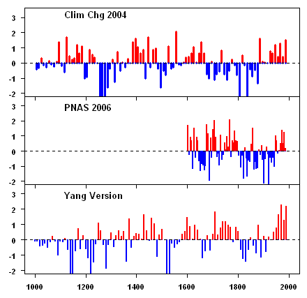
Figure 1. Scaled Guliya dO18 values for versions from Thompson et al 2006 (PNAS), Thompson et al 2004 (Climatic Change) and Yang et al 2002 (GRL).
Squint first at the Clim Chg 2004 version and compare it to the 2nd panel – it looks to me like that dates of the core have been made younger in the 2nd panel – for example, the blue values in the 18th and 19th century in the top panel all seem to be in the 19th century in the PNAS version. It’s a bit of a guess, but I think that the 1604 start date of the PNAS 2006 version corresponds to about 1400 in the Climatic Change version. On that basis, the Climatic Change version would not include any values from the MWP from 1000-1200.
The Yang version also looks to me like it’s dated younger than the Climatic Change 2004 version. The downspike in about 1250 in the Climatic Change version looks like it occurs about 1450 in the Yang 2002 version. The 20th century values in the Yang version are at “anomalous” levels, but are not anomalous in the more recent PNAS version. What accounts for the difference?
And of course, Thompson won’t show the sample data. Now Al Gore has used Thompson’s hockey stick, so I doubt that there’s anyway short of a court order under which Thompson will release the sample data to reconcile this mess.


17 Comments
I can’t really see the time shifting in the 1000 to 1400 period that you speak of. But the changes of red and blue from about 1650 to 1800 really catch the eye. I hope there is a response.
There’s nothing wrong with re-dating the core per se. If Thompson has got a new viewpoint, good for him. The problem only arises when it’s done secretively, without any discussion or disclosure and without provide the materials on which the change in dating was done.
Now I’ve just looked back at the NAS Panel report and their Figure 6-1 is based on the Climatic Change version (although they cite the PNAS study and Thompson is thanked as a peer reviewer of the report). They stated:
Perhaps the 1900 years is a misprint for 1000 years as only 1000 years is illustrated.
Your assessment seems right to me, although the down-spike at ~1250 in the Climate Change version seems to occur at about 1530 (not 1450) in the Yang version. PNAS looks like CC 2004 compressed to 400 years, but also missing everything below and including the negative anomaly near 1200.
The last two positive anomaly spikes in the CC 2004 version at about 1100 look like the two spikes that bracket 1400 in the Yang version. Each set has the lower spike at the earlier date. But that means everything below about 1280 in the Yang version has no counterpart in either of the other two versions. It looks like newly appended data.
So that’s interesting: The CC 2004 years missing from the PNAS version are the years appended in the Yang version, but with different data.
So, let’s see: PNAS is 1000 years of CC2004 compressed to 400 years, eliminating Medieval warmth. Yang is 900 years of CC2004 compressed to 700 years but with 200 years of new data appended onto the Medieval tail, showing that years 1000-1300 were anomalously cold instead of anomalously warm. Hmm … that may solve the mystery. It’s all meant to help
Overp… someone get rid of the MWP.I can’t see anyway to “slide” the charts so that they line up. Neigher amplitudes or frequencies line up very well. There seems to be something besides a dating problem, IMO.
#4. Right. It looks something like a compression of both axes in the PNAS 2006 compared to the Clim Chg 2004 with maybe some other manipulation of the dO18 values in addition.
My eye sees it a bit difference. I think the big downward patch in Climate Change in the 1200s corresponds to the 1600s in PNAS and the 1500s in Yang. But none of them, I think, should be considered linear distortion of the others.
#6. Dave, I agree with that spotting – I intended to say something consistent with that in the thread. What do you think of the spotting in the other tghread?
Sorry guys, I haven’t had a chance to post the annual data yet from Yang et al. 2006. I’ll do so over the weekend.
I’m not convinced that the resolution to the different curves etc. can be found in an explanation that involves re-scaling of the dates. Between 1600 and 1992 we are told that there are distinct annual layers in the Guliya ice core. The age model should be robust and thus any stretch or compression of the profile should be minimal over this period.
Frankly, I am mystified as to why there are several versions of this profile still being published. Clearly there are several data sets floating around…one held by the Chinese and which seems consisitent from publication to publication. The other posted by the Thompson group which seems to vary from publication to publication.
re: #7
It looks like a fit, but it’d sure be weird to be that far off. Again, why can’t they let us see the raw data?
Paul, there’s a version for the 20th century in Tan et al (Ann Glac 2006), which looks different again.
There’s an interesting knock-on impact for Dasuopu – a proxy attributed to precipitation in the original article, but now added together with the others and called temperature. It has the biggest contribution to HS-ness in the Thompson HS. They only appear to have published data back to “AD1000” for this proxy. The Science 1997 article covers completely different issues than for Dunde or Guliya – it’s the Team, so you have to wonder why?
Now let’s suppose that Dasuopu is dated a couple of hundred years fresher than the Clim Chg article – moving parallel to the seeming downdating of Guliya. Then there is no data to even speculate on the Thompson HS in the high MWP of 1000-1200.
I plotted out the Dulan tree ring series from Yang. One can sort of compare the two (but you can do this with anything.) Anyway at the section of the Dulan series that corresponds to where Dasuopu is cut off, there are very elevated values. Dulan is a precipitation proxy (See my post on Treydte et al for a picture of Dulan juniper.) So I’ll predict that the unpublished section of the Dasuopu core immediately preceding the present cutoff date of “AD1000” has elevated dO18 values. Add this to my list of predictions.
Steve, I agree that there seems to be a degree of careful ‘excision’ of data from longer records, truncating at points where it becomes difficult to sustain an argument were an extended period included etc. It seems to me that the odd profile is that associated with the Climate Change (2003) article, and now you say that there is a further one by Tan et al.
I’m ready to post my version of the annual d18-O record from Guliya as digitised from Yang et al (2006). Using this I’ve calculated 5 year averages for the same periods as Thompson et al. (2006). The two would appear to be in agreement. There are some mismatches that could be accounted for by either small variations in the ‘age model’ used by the different groups, or equally by errors in my digitisation. Any way you will see when I post the plots.
As a guide to the similiarity in the data here are some simple descriptive statistics based on the 5 year averages:
Yang et al (2006) Thompson et al. (2006)
average -14.45 -14.22
std dev 1.21 1.23
max -11.75 -11.52
min -17.54 -17.06
The only way the discrepancies can be resolved is by getting Lonnie Thompson to release the full data set. Here I want all the 12,500+ isotope analyses, dust, SO4 and Cl analyses etc.
I’ve written to Thompson and Yang asking if it would be possible to have a copy of the data. I’ve also written to the editors of Science, the PNAS and Annals of Glaciology seeking their support in getting this data set archived, pointing out to them that there are important discrepancies between the different data sets and that these materially affect the interpretation and subsequent use of the data as proxies in palaeoclimatic reconstructions.
Can anyone tell me how best to post some graphs here? Many thanks.
http://www.imageshack.us/ if you don’t have an own website.
here is an example of a free website host
http://geocities.yahoo.com/
RE #12
Paul,
See this thread.
In case the link didn’t work: http://www.climateaudit.org/?p=701
Original image:
Thompson et al 2004 (Climatic Change, first graph) and Thompson et al 2006 (PNAS 2006, second graph)stretched by 50% with WORD gives this: (the 50% ratio is troubling)
re: #15
Right. But then the earlier part still has to be stretched more to line up well. That’s why I said in #6 that the distortion didn’t seem to be linear. So who knows what’s going on without the raw data to look at?
The age increases exponentially by depth in glacier estimates. For example, in a glacier that’s 120 meters thick, the first 100 meters might be ascribed to the last two centurues. So if they adjust estimated accumulation rate, it is highly non-linear and has a much bigger age-scale impact on earlier levels.