I pointed out a few posts ago that Antarctic temperatures had been declining during the period of satellite measurement.’ IPCC 4AR Second Draft says that “recent warming is strongly evident at all latitudes in SSTs over each of the oceans“.’ “Strongly” seems to be a new favorite word – think of all the times that Holland and Webster use it. Given the declining trend in Antarctic (satellite) temperatures, I wondered whether this statement was actually true.’ I looked at both Mears-Wentz and Christy data.’ Surprise, surprise – recent warming is not evident over all latitudes – much less “strongly evident”. Here’s a graph of trends from Mears and Wentz which shows increasing temperatures over most parts of the world, but declining trends in the Southern Ocean – which seems to flatly contradict the claim in the 2nd Draft (of course, they may cooper this up between now and then).
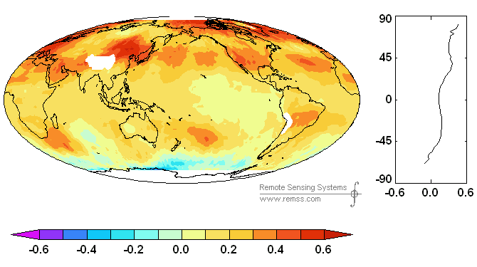
Figure 1. Gridcell temperature trends (Mears and Wentz)
Spencer and Christy have provided monthly averages for 5 ocean latitudinal bands, which I’ve plotted below, going from S to N, showing the decadal trend in deg C/decade. Again there is a slight declining trend in the South polar oceans, with slight increasing trends in the south extratropical oceans and tropical oceans.’ I would not be inclined to say that recent warming is “strongly evident” in the 2nd and 3rd panels and would be interested as to what test is implied for “strong evidence”.’ The results are quite different for the north extratropics and especially the north polar oceans. Squinting at the plot of the north polar ocean temperatures, the results don’t really show a uniform trend. Although the temperature increase is clear enough, it seems to occur almost in one step in the mid-1990s – this would seem to be as distinct as any of Holland and Webster’s regime changes. However, it’s a mug’s game trying to tell the difference.

Figure 2. Satellite temperatures for ocean latitudinal bands from MSU.’ http://vortex.nsstc.uah.edu/data/msu/t2lt/uahncdc.lt
Now it’s true that satellite evidence shows increases over most latitudes, but not all latitudes.’ They easily have had a substantial statement that avoided over-reaching. So why wouldn’t they simply report that southern oceans are an exception?’ I can’t help but think that it’s tied into the polar amplification thing. If high-latitude southern oceans show a cooling – contrary to expected polar amplification of warming – it doesn’t look good. So even though these oceans constitute a small portion of total ocean area and a relevant true statement could easily have been made, the statement is fudged (or is likely to have been fudged unless it’s coopered up). It’s the sort of thing that drives one crazy about IPCC.


91 Comments
And why I’m disposed to think that IPPC reached conclusions BEFORE reviewing the data. The UN is not about to let this chance for domination slide by.
There could be a game of sematics going on here. For example, “recent warming is strongly evident at all latitudes in SSTs over each of the oceans” does not mean ‘recent strong warming is evident at all latitudes….” That is, the way they worded it, “strongly” refers to the evidence and not to the warming. So, they could be wording the text in such a way as to say one thing but get everyone to infer something else. Net result: the medium is the message, the message is the subtext, and the subtext is factually misleading. You’re an astute and very expert reader, Steve, and it looks like their wording got past even your filter. Guess how reporters and political aides will read that.
It gets even better than all that, though. If you plot the southern ocean data since 1995, you’ll get a small warming trend. Therefore, we have a play on “recent”. It could mean ‘since 1979’ if the trend since then is warming, but could also mean ‘since 1995’ if a shorter trend is necessary to show the desired result.
Since 1995, all the oceans show some warming, but not the same amount. The south polar ocean is warming the slowest of all, and the north pole by far the fastest. In fact, since 1995 the north polar ocean is warming 7 times faster than the south polar ocean, and the tropics are warming only slightly faster than the south polar ocean. So, even if the data are tendentiously truncated, the disparity of the poles is a serious problem for GCM polar amplification.
What’s even better is that since 2002, i.e., the most recent 5 years, the entire southern hemisphere — tropics and south polar ocean, both — plus the tropical ocean itself, all show a distinct cooling trend. Only the northern extratropics and north polar ocean show warming.
So, it’s clear that “recent” means what the IPCC wants it to mean: restricted to about the last 12 years, but not the last 5 years or the last 30 years. Thirty years: a very long time for IPCC climates.
Not to beat my own drum here, but I’d like to ressurect the term: “ends-justified data manipulation” to describe the IPCC process.
You’re being too generous, Steve (as usual). It’s not that the IPCC is trying to drive anyone crazy. snip That should drive you to anger. Not to say ethical despair.
I’ll just repost something I posted at Climate science about papers from the late Reginald Newell. They seem like interesting papers, but I only have access to the abstract. He seems to have identified a 22 yr cycle in SST’s. He also drastically reduced the trend in SST over the period 188-1988. According to Richard Lindzen, he lost his NSF funding because of that. If someone has those papers, I’d be interested.
The first one is: “Possible factors controlling global marine temperature variations over the past century”, by Wu, Zhongxiang; Newell, Reginald E.; Hsiung, Jane, published in Journal of Geophysical Research, Volume 95, Issue D8, p. 11799-11810. The abstract reads:
“Data from the Global Ocean Surface Temperature Atlas (GOSTA), which includes 60 million ship reports for the 1856-1988 period, have been used to study global night marine air temperature (MAT) and sea surface temperature (SST) interannual variations. Linear regression has been used to establish trends over two periods: 1888-1988, a period often used for land station analyses, and 1856-1988. For global MAT the trends for the century beginning in 1888 computed for these periods are 0.49°C and 0.29°C, respectively. Stepwise linear regression is used to relate the marine time series to three physical variables thought to influence surface temperatures, namely, changes in solar radiation output, changes in atmospheric transmission for solar radiation, and changes in the global surface pressure field. Indices of these variables used are new computations of solar irradiance, atmospheric turbidity at Sonnblick, Austria, supported by sunshine records from Japan, and the Southern Oscillation Index (SOI). When MAT and SST series are examined for the globe, northern and southern hemisphere separately, the largest fraction of the variance (45% for the global MAT, 35% for global SST) is accounted for by turbidity changes, while the tropical east Pacific shows the largest fraction (45% for MAT, 49% for SST) associated with SOI changes. Modeled solar irradiance variations contribute the second most important factor in controlling marine temperature fluctuations in the southern hemisphere. The tropical west Pacific SST is relatively insensitive to the three parameters, in accordance with previous suggestions that the temperature there is limited by evaporation. When the residuals are examined after account is taken of these factors, the global MAT trend for 1888-1988 is reduced to 0.24°C. With the present approach the apparent twentieth century temperature increases can be viewed as partly due to a recovery from cooling at the turn of the century, probably associated with volcanic activity. ”
The other one is: “Global marine temperature variation and the solar magnetic cycle”, by Newell, Nicholas E.; Newell, Reginald E.; Hsiung, Jane; Zhongxiang, Wu, published in Geophysical Research Letters, Volume 16, Issue 4, p. 311-314.
Abstract: “Global and hemispheric marine temperatures for 1856-1986 have been subjected to harmonic analysis. We investigated a prominent 22-year peak in the Fourier Transform by subtracting from the raw data the inverse transform of the periods longer than 26.2 years (the fifth harmonic). The shorter periods that remain are dominated by the 22-year period the approximate amplitude and phase of which we determined with a 10-year running mean filter. We suggest that this period may be related to the solar magnetic cycle. The low frequency data show a major dip centered around the period 1905-1910. The results should be considered in any analysis of global marine temperature for trends. ”
I’m wondering what we would find were we to revisit those data today.
Once again, the dreaded straight line fit to a non-linear system. Talk about attributing the wrong model to the data. What I see when looking at the figures is: trendless noise for the top three panels; N. Extratropic, trendless noise until 1998 (El Nino) then a step up by 0.25 C to a new level of trendless noise; and N. Polar same as N. Extratropic but the step is 0.75 C at 1995.
Why do you think the 1998 El Nino is only evident in the Tropical and N. Extratropic?
The North Polar region changes are the main component driving the increase in the global average temperature numbers. The north polar region has increased in temperature by 3.5C since 1880 while the global average temperature has increase by 0.6C.
But if you go back to 1769, there has not been an increase in temperatures in the North and if you go back to the MWP when the Vikings were in Greenland, maybe temperatures have actually gone down. The north polar region just has long period swings and maybe the entire increase in temperatures since 1880 is just an artifact of the long period swings in arctic temperatures.
If you go back even farther, even the ice ages of the last 2.5 million years start when the north polar region cools off enough so that that the snow doesn’t melt in the summer, glaciers build up and push south, albedo goes up and we are in an ice age. Maybe the arctic is just more succeptible to the AMO, or subtle changes in earths orbit and inclination.
Maybe the arctic swings are the driver of the climate and CO2 has very little to do with it.
May we conclude that if you are the IPCC authors, that you want to carefully choose a time duration so that a straight line fit of the data generally shows an increase but does not look too ridiculous?
#4 — You’re right, Paul. I went back and fit each of the ocean data sets with an arbitrary polynomial. The R^2’s improved substantially (no surprise) but more interestingly every single series looked like a partial cycle. Not one of them was a full 2-pi. Linear trends are entirely spurious.
#5, Jeff: I have to confess that I am an unworthy skeptic, according to the arrogant ivory tower folks, such as Judith Curry. I have a PhD and have worked as an Associate Professor at a major university, but I am evidently lacking in some other credentials and skills she thinks I have to possess in order to be a “genuine skeptic” (LOL). But I just can’t resist commenting:
Calm down, dude, it’s could be due solely to the Solar connection, or to a combination of man’s influences plus Solar. The AGW extremists still have have not explained the Roman Warm Period, MWP and LIA and all other “climate changes” in the last 3000 years. I’ve not seen any explanation so far, only STUPID claims that they are localized phenomena. I think the IPPC and the scare mongers are ignoring these “drastic climate changes” (to their detriment in the long run!). Dr. Mann’s “disposal” of these temperature swings doesn’t work anymore, and they don’t have ANY proof that the modern warming is not due to natural variation. That is EXACTLY where we are in this debate. NO MORE, NO LESS. Unless the drastic climate swings in the last millenium are disproven, there is no compelling reason to believe that the current temperatures are not mostly, if not all, “natural.” And since the RWP, MWP and LIA are documented by the history books, we don’t even need any of the elegant psudoscientific proxies to confirm them. This whole issue is really not as complicated as many think, I think.
I noted a decade or so ago that the more modern SST compilations find steeper warming. I have a page with some early graphics at;
http://www.warwickhughes.com/sst/
Comments above re wording of IPCC docs reminds me of the Jones et al 1986 classic in their Southern Hemisphere paper; “.. very few stations in our final data set come from large cities.”
Have a look at their stations;
http://www.warwickhughes.com/cru86/shinv.htm
Urb and Population columns added by me from GHCN data.
The RSS global map above is 1979-2004.
I assume the UAH time series are to end 2006.
Last year I asked RSS about updating their maps / data and it was clearly not a top priority.
Seeing the post is about ocean temperatures, I have made an SST trends map on the GISS website for the period of the RSS map above.
If you go to;
http://www.warwickhughes.com/sst/giss06.htm
A page that was the subject of some tirades on CA last year.
Scroll to bottom and click on new link dated 24 Jan 2007.
I’m surprised (OK, disappointed) that the oceanic warm spots on the map above don’t match closer to the ocean surface gyres. I’ve been expecting a close correlation between sluggish and hence highly polluted water and stratocumulus reduction.
I can see some connection though.
JF
Warwick, could you calculate a decadel trend map for the 12/1978-11/2006 period from the HadCRUT3v data set? It would be interesting to compare that to this UAH LT trend map.
Perhaps due to nonlinearlity – or to long-memory. It is known that aggregate series are prone to spurious trends or cycles. Strong low-frequency components, evident in this data, could be due to trend, cycles or long-lasting positive correlation. At any rate, it seems dubious to call this data “strong” evidence. If they want to fit a linear trend, why don’t they quantify the “strength” of this evidence? Where is the discussion of the significance of the fitted trend? Where is the discussion of the quality of the fit? These are basic questions, ignored I suspect, for a reason.
I fear we have placed too much emphasis on teaching linear regression and neglected other forms of stochastic modeling. When all you have is a hammer, everything looks like a nail.
Jean S, your wish is my command. HEre is a quick graphic. These are done with a minimum of 50 measurements. I’m surprised by the absence of values in so many Arctic gridcells and will need to go back and look at the data to confirm this result. Lots of interesting patterns. Obviously the Southern Ocean gridcells need careful examination as well.
Thanks Steve! Hmmm… the great warming in Mongolia seems to gone unnoticed by the satellites. Also central Africa and the populated part of Brasilia look interesting…
#16. Siberian warming has been a favorite topic of Warwick Hughes. I posted about this in connection with Mongolian tree ring series last year. Irkutsk – a CRU “rural” site, appears to dominate this area.
“I think the IPPC and the scare mongers are ignoring these “drastic climate changes” (to their detriment in the long run!).”
Maybe they are going on the notion that in the long run they are all dead (or at least retired). If my instincts are correct, we probably have one more solar cycle of warming before things cool significantly. This gives them about another 10 years of time to indoctrinate the people, get the “correct” political team in place and the academics on that wagon maintain their grants.
Then when the cycle 25 cooling comes about, they can say “hey, we were right! And the policies we put in place are bringing down the temperatures and reversing the warming!”. But what they aren’t telling people is that global cooling is much worse of a problem than warming. But they will all be retired by then so there is no career impact. Put another way, they have only to gain in the short term and nothing to lose in the long term except to leave the latecomers holding the bag.
I can’t say that I have ever seen such a systematic attempt at so many levels across so many countries to intentionally misinform the public for political gain.
#18 George says “But what they aren’t telling people is that global cooling is much worse of a problem than warming. ”
I agree with George on the issue of cooling and supply the following link showing frost-free days over the “breadbasket of the world”.
http://atlas.nrcan.gc.ca/site/english/maps/archives/5thedition/environment/climate/mcr4037
The current frost free period over the western Canadian grain belt is approximately 100 days. This is marginal for the production of the prefered crop for the masses, high protien hard red wheat. The average annual temp in Saskatoon SK is 1.5C. They enjoy approx 105 frost free days per year. Any drop in temp would reduce this as well as reducing yield due to reduced degree-days. A drop in temp of 2C would mean that conditions are favourable for the formation of permafrost. This is not good for growing wheat. With all of the speculation (and billions$ spent)as to what might happen if the temperature rises it is surprising that there has been no mention of the other possibility, a concept that was popular in the late seventies.
RE: #19 – It is interesting that the AGW hysteric crowd seem to want to ignore real threats (geopolitical issues, future inevitable periods of global cooling, etc) and get all hyped up about a worst, worst case scenario based on bristlecones and flawed climate models. They are either fools or are overtly steering attention away from real problems. Personally I think it’s the former.
Paul Linsay (posting 4):
“Once again, the dreaded straight line fit to a non-linear system. Talk about attributing the wrong model to the data. What I see when looking at the figures is: trendless noise for the top three panels; N. Extratropic, trendless noise until 1998 (El Nino) then a step up by 0.25 C to a new level of trendless noise; and N. Polar same as N. Extratropic but the step is 0.75 C at 1995.”
Quite apart from the fact that I fail to see that a “straight line fit” in time bears any relationship to whether a system is linear or nonlinear, you are confusing two things: model-fitting and deriving a simple statistic. Modeling-fitting involves selecting a function which you think might fit you data, deciding A-PRIORI (NOTE the emphasis) what some statistics of the residuals (e.g. the variance and possible the autocorrelation properties) are expected to be, doing the fit and then comparing the statistics of the resultant residuals with the a-priori estimates – if they are similar then the model is deemed “good”, otherwse it is “bad”. In the case presented here, I can see no evidence of any a-priori statistics so THIS IS NOT MODEL FITTING.
What we have here is the derivation of one simple statistic from the data – the trend is just a weighted mean of the data points (where the weights vary linearly from negative values at the start to positive values at the end). It is no more mysterious than the simple average, which is just a weighted mean, where the weights are all constant. The trend is simply a measure of perceived increase over the record length – in this case it is certainly NOT a model.
Perhaps this will help to explain what I mean. In the time-series shown by Steve there are TWO parameters which have been fitted to the data, and not one – the mean and the trend. The mean, the trend and the residual are orthogonal to each other (or non-covariant). There is no fundamental difference in importance between the mean or the trend – one gives a measure of the overall temperature, the other gives a measure of increase over time. So would you honestly accept that the statement “Talk about attributing the wrong model to the data etc. etc.” could be applied to the mean as well? Of course not – doing a linear regression does not mean that I am assuming that the “uncontaminated” data follows an exact straight line, any more than extracting a mean indicates that I am assuming the “uncontaminated” data is a constant!
Re #21
Jim Barrett,
I might know if I agree with you on this one if I had a better understanding of what you’re trying to communicate.
In the plots SteveM created above, he presumably plotted a linear regression best fit to the time series, which is the trend in red. This is the answer to the question “If there is a linear trend to the data, what line best fits the data.” This is a first order model of the data, based on the assumptions inherent in the regression. That is what a trend is, a simple model of the observed data.
A model is a mathematical representation of the observation. The degree to which the model faithfully reproduces the observations is a measure of its goodness of fit. Plotting the linear regression is the first step in the model fitting you describe above. If your a priori standard to judge the model as ‘good’ or ‘bad’ is visual assessment of the residual, then Paul has already done so and judged the linear fit to the North Polar as bad.
I don’t think Paul is proposing a zeroth order fit (mean), rather a 2nd order or higher approximation would more fatithfully reproduce the observed data.
And (last observation – first observation ) / record length is a measure of perceived increase (rate) over the record length as well.
Steve M, regarding the map in your post, could you post the R code you used to generate the map?
Many thanks,
w.
“With all of the speculation (and billions$ spent)as to what might happen if the temperature rises it is surprising that there has been no mention of the other possibility”
Oh, it gets worse. When you add in production of ethanol from corn and see the impact to world grain prices you begin to realize that what that group is asking us to do is burn up Latin America’s food supply. And it gets really bad if there is a major cold snap or drought that hits both food and fuel prices. This is a group who would go so far as to burn up the world’s food supply to avoid nuclear electricity. Looks like a cynical game of population control disguised as “environmentalism” to me. I believe world corn prices are now at near record levels and Mexico is upset about tortilla prices and this is just getting started.
Earle Williams (posting 22):
“That is what a trend is, a simple model of the observed data.”
Sorry but no. Perhaps you could understand a bit better if I give you a very simple example. First you need to accept that there is no fundamental difference between the estimation of a trend and the estimation of a mean: they are both weighted averages over the input data. If you accept this, then let’s just consider the mean (after all, trend estimation is not that different from dividing the data in the middle, taking the mean of each part, taking the difference and dividing by half the length of the record – so it is very similar to just taking a mean).
So – suppose you have 100 apples of various sizes. The standard deviation of their (accurate) masses is SDM (“M” for mass). Suppose you also have a weighing machine of known accuracy – let the standard deviation of a single measurement of mass be SDE (“E” for “error”). Now let’s ask two questions:
1. What is the total weight of apples?
To answer this I weigh every apple, take the mean weight and multiply the result by 100. To estimate the uncertainty in this estimate, I calculate the standard error of the mean (SDE/sqrt(100)) and multiply this by 100, giving a standard error in the estimate of total mass of SDE x 10. This is COMPLETELY INDEPENDENT OF THE SPREAD IN THE MASSES OF THE APPLES, SDM. Indeed, SDM may be of the same order as the masses themselves (i.e. some may be as large as twice the size of the mean while others may be the size of pinheads). Paul Linsay may be able to say of the residuals (which, assuming independence, have a standard deviation sqrt(SDM^2 + SDE^2)): “trendless noise ….. then a step up ….. to a new level of trendless noise etc. etc.”, but that HAS ABSOLUTELY NO EFFECT ON THE FACT THAT THE STANDARD ERROR IN THE ESTIMATE OF THE TOTAL MASS IS SDE x 10 – i.e. IT DOES NOT DEPEND ON SDM, HOWEVER LARGE IT MAY BE.
2. Are the apples all the same mass?
An approximately equivalent question is: is SDE > SDM? If this is so, then it would be reasonable to assume that the apples are all of the same mass, since our measuring machine is unable to detect any variation in the mass – i.e. that the MODEL “all the apples are of the same mass” is a valid one. Now we know SDE already and we can estimate SDM from the standard deviation of the observed masses and an adjustment for the “instrumental error”, SDE (making the reasonable assumption that the instrumental error is independant of the actual mass being measured) :
SDM^2 = (standard deviation of observed masses)^2 – SDE^2
and the model is a “good” one if SDE > SDM.
So (1) INVOLVES NO MODEL and is independant of the spread of the masses, SDM, while (2) DOES involve a model and the result depends on both SDE and SDM.
(1) and (2) are totally different questions!
Why don’t you just calculate the sum of the values?
re #26 (Jim B): No, that’s not your model, that’s the null hypothesis in a test. The only model you have in your example is in your “weighting machine”: you assume a linear model, i.e., x_measured=x_true+noise. After several readings, I still failed to understand the point you are trying to make about the original post and/or Paul’s comment (#4). Contrary to your claims (#21), the (global linear) trend is a fit of your time series to the simple linear model, please consult any (introductionary) text to time series before posting any more ramblings. The point Paul is making is simply that the trend is overly simplific model to the situation in hand to draw conclusion like “strongly evident”.
#21, I was thinking in terms of a physical model. Does it make sense to draw a straight line through the time series when non-linear systems do far more complicated things? An example that is very apropos is the PDO where there is a sudden step in temperature in 1976 but no trend before or after.
Re #26
Jim Barrett,
Your detailed discussion of weighing apples is interesting but not as apropos as, say, a regular counting of apples on a tree. So if you count the apples every day, week, year, whatever, you generate a time series of observations. Plotting those observations over time would result in a graph similar to those in Steve’s post.
The observed data can be modeled as the combination of two time series, where x is the time scale: the trend T(x) and the noise N(x). Using successive degrees of order to fit a curve to the data you can identify the trend T(x). If the observations are nearly static then the zeroth order approximation, the mean, is the trend T and the variance is the noise N. If the value of N as determined by whichever method you choose is too high, then the next order approximation must be fit to the data. Linear regression is the next order mathematical representation of the observed data. Identifying a trend, ie. a non-zero slope in the regression, is the first step in understanding the physical processes driving the observed data.
Anyways, getting back to the thread topic and addressing my comments to no one in particular, visual inspection of the residual from the linear regression in N Polar shows it to be pretty large. So Paul Lindsay’s suggestion of a step function is apropos. Of course the next step would be to develop a physical explanation for that function. Also the high frequency changes at both poles is nearly an order of magnitude greater than for the tropics and extra-tropics. Is this due to a greater variance in the raw observations? Spatial variations like this trigger my curiosity.
Re #30
My mistake, that should read Paul Linsay. Sorry Paul!
Earle
RE: #25 – Deep ecology, Sanger, etc. Hand-in-glove fit.
Check out:
http://dieoff. org
To get the full impact you need to drill down into the site and read the articles and papers posted there. There are (figuratively, ethically and morally speaking) monsters among present humanity.
Doh!
http://dieoff.org
I have just posted on my site http://www.warwickhughes.com/blog/ a comparison of 2005 global T anomalies for the three main climate research groups. “Huge variations now between the 3 main global T datasets”
The new HadCRUT3 data has quietly revolutionised the IPCC global warming landscape by abandoning many far northern grid cells. Areas that have been part of the backbone of CRU IPCC GW trends for 20 years. I am thinking that SST’s (and particularly southern) are a new battleground now.
There is nothing wrong with a linear model per se. The trouble is in assuming that the trend-line can be extrapolated.
The right way to do this is as follows:
Take a part of the data (say the first 2/3s). Compute the linear model that minimizes error (say in mean squares form). You may then test the model against the remaining data and test the hypothesis (the line) predicts the data at a 95% confidence interval.
This will tell you whether the model (the line) is worth the inferences it encourages (a specific upward trend).
Obviously with an ever more complex polynomial you can fit the first 2/3s. By withholding some of the sample from the fit, you will be able to detect ‘overfitting’–in which case you would engage have a dubious model.
Warwick, your interesting blog page got me to thinking about the Zonal Means. These are usually used to show “polar amplification”. Here’s the GISS version, from 2005:
From this, it definitely looks like polar warming. Thinking about it, I decided to calculate the error of the zonal means. Here are the zonal means with errors:
A few comments on this plot:
1) The confidence intervals are 1.96 time the standard error of the mean.
2) They do not include the underlying errors in the gridcell values. If they did, of course, they would be wider.
3) Several zones in the southern hemisphere have CIs of zero. This is because in the entire zone, there is only one gridcell with data …
4) None of the zonal means are statistically different from any other zonal mean.
w.
UC (posting 23): You say “And (last observation – first observation ) / record length is a measure of perceived increase (rate) over the record length as well.”
Thank you – that illustrates my point exactly. “Your” method is a perfectly valid method of trend estimation – a simple first-order finite difference. In the present case, it is not a very good one as it only uses a very small proportion of the data – however it is a valid technique nevertheless. It is not very different from estimating a linear trend (which is just a weighted mean where the weights themselves are a linear trend) – in your case the weights are -1/L for the first point and 1/L for the last point (where L is the record length), and zero for every other point. So is anyone seriously suggesting that the “model” you are applying here assumes that the “uncontaminated” data is just a negative spike at the start of the record and a positive spike at the end with nothing in between? Of course not – “your” method is just another way of estimating something which we loosely define as “trend”.
Earle Williams (posting 30): You also illustrate another of my points well when you say “If the value of N as determined by whichever method you choose is too high, then the next order approximation must be fit to the data”.
So what do you mean by “too high”? Model testing can only proceed if you have some criterion for deciding when the “noise” (I would call it the “residual”) is “too high” – and this requires some A-PRIORI estimate of what you think the “noise” should be if the model is a “good” one. Nowhere in this thread is any such A-PRIORI estimate given, so Paul Linsay’s claims (posting 4) that the trend estimation is “the wrong model to the data” is quite unfounded.
Jean S (posting 28): I think you all need to get together and decide what you mean by a “linear model”. From the tone of several of these postings I would suggest that there is a feeling that the word “linear” is here applied to the “linear” trend – i.e. to:
y_measured = A*x + B + noise
where A and B are constants.
Further, Paul Linsay (posting 4) referred to “the dreaded straight line fit to a non-linear system” – can anyone explain what this meant? Paul’s discussion of the data as “trendless noise for the top three panels ….. trendless noise until 1998 ….. then a step up by 0.25 C to a new level of trendless noise …..” is in no way incompatible with your definition of “a linear model” as “x_measured=x_true+noise” – in your definition, he is just replacing one “linear model” with another “linear model”. However, you seem to be agreeing with Paul so, as I said, you all need to get together and decide what you mean by a “linear model”.
Finally, if you want to behave like a pompous prat and say “please consult any (introductionary) text to time series before posting any more ramblings” at least make sure you are on firm ground.
Steve: it would be interesting if you could clarify something. A number of posters seem to be blaming the authors of the AR4 for a misuse of trend estimation. However, what they actually said was:
“recent warming is strongly evident at all latitudes in SSTs over each of the oceans”.
NO MENTION WHATSOEVER OF THE WORD “TREND”!
You then appear to have downloaded data from Spencer and Christy, which you plotted as a panel of five time-series. To this, apparently YOU added least-squares regression lines (in red).
Is this summary correct? If so, can you or someone else please indicate why it is the AR4 and NOT YOU, who are getting the criticism for “the dreaded straight line fit to a non-linear system” (posting 4, with the added criticism: “talk about attributing the wrong model to the data”), “the trend is overly simplific model to the situation in hand” (posting 28) and “does it make sense to draw a straight line through the time series when non-linear systems do far more complicated things?” (posting 29) etc. etc.?
I do wonder sometimes …..
re #39 (JB): The linear trend is by the definition fit of your process to the linear model you just described. That you could find from any introductiory text. As far as I understood, Paul meant that calculating a trend in the time series in question (which are results of nonlinear processes, and likely nonstationary etc.) does not support the strong conclusions made by IPCC. The trend is usually the first thing is done for the time series (as explained to you, e.g., by Earl in #30), and it can be rather meaningless. So calm down, and study a bit more before posting more ramblings about things you obviously do not understand.
#37
So you have some kind of model that tells that my method is not very good? We get the same result if the linear model is perfect.
I am trying to fit a linear trend to data. Just like you. Why my method is worse than yours?
Hmmm, maybe I should use all the data. Let’s take the ‘average trend’, take trends of each year and then average them. For example, with 5 data points:
D=[-1 1 0 0 0; 0 -1 1 0 0 ; 0 0 -1 1 0 ; 0 0 0 -1 1];
M=[1/4 1/4 1/4 1/4]
M*D
ans =
-0.2500 0 0 0 0.2500
Oops. This is the same as my first method! 🙂
The point of my post – and I’m not speaking for other commenters – had nothing to do with fitting trends. The illustration from Mears and Wentz in the post (theirs not mine) and similar things from CCSP show decadal trends. Whether they are “trends” or step changes, the Antarctic has not been going up in a trend or otherwise. That’s all I’m saying – and is thus not evidence of “polar amplification”.
RE: #36 – High latitude surface records are even more suspect than the overall class of surface records. The places where stations can be maintained in high latitudes are few, far between, and drastically more developed, relatively speaking, than the surrounding vast wilderness. Consider the massive value of heat flow between human stuff and the great beyond, in such places when the wilderness is at -60 Deg F?
UC (postings 42 and 43): Your almost incomprehensible postings only suggest an aim to be perverse and obstructive , rather than to provide serious discussion. If you gave me some substantive argument, I would perhaps have something to respond to.
re: #46
I’m afraid, Jim, that you’re the one who comes across that way. People would be more patient with you if you didn’t insult them constantly. You may be trying to turn over a new leaf, but if you really want to be cut some slack, you first need to recognize that the sort of insults you’ve specialized in throwing around ever since you first showed up here were wrong and you regret having made them and then people will stop treating you like you’ve treated them in the past.
But I must say that in any case, you’ve not really shown a high level of technical espertise in your arguments Not that I’m claiming I have it either, but Jean S, for one, definitely has shown it. If he tells you you should look in an introductory text in a subject, then you should. Otherwise show due humility toward those who can hand you your head on a plate mathwise.
#46
I don’t like your tone. Just answer to #27 and #42.
‘When I use a word,’ Humpty Dumpty said, in a rather scornful tone,’ it means just what I choose it to mean, neither more nor less.’
‘The question is,’ said Alice, ‘whether you can make words mean so many different things.’
‘The question is,’ said Humpty Dumpty, ‘which is to be master – that’s all.’
Alice was too much puzzled to say anything; so after a minute Humpty Dumpty began again. ‘They’ve a temper, some of them – particularly verbs: they’re the proudest – adjectives you can do anything with, but not verbs – however, I can manage the whole lot of them! Impenetrability! That’s what I say!’
— Lewis Carroll, Through the Looking Glass
Btw, for the record, Jim Barrett, a mean and a linear fit are not fundamentally the same. A mean is, by definition (aka the sample mean, or algebraic mean) the unweighted average of a data set. A linear fit is a model that attempts to fit straight line to a set of data via one of several methods. The most common are a) minimize the average distance in the y direction of each point to the line b) minimize the average distance in the x direction of each point to the line or c) minimize the perpendicular distance of each point to the line. None of these are simply “weighted averages,” since any weighted average is nothing more than a constant (i.e. a weighted average cannot show a “trend” or any line other than a constant).
Hence Jean’s comment on introductory texts. BTW, Jean is using English as a second language, so pointing out spelling/grammar errors on her/his part is a rather childish ad-hominem. In fact, from what I’ve read from Jean, his/her grammar and spelling are actually better than most English as a first language people.
Mark
The lower panel in the figure (far left) compares this smoothed SST record for the ocean surrounding New Zealand with the land air-temperature record over the last century. The graph shows that SST has risen by about 0.6°C over the last 100 years, but cooled slightly over the past 10–20 years — probably caused by more and stronger El Niño events than previously. In contrast, land air temperatures have continued to increase.
http://www.niwascience.co.nz/pubs/wa/09-4/warming
UC:
In reponse to posting 27: you may either calculate the sum or the mean. They are rather simply related, so I treat them equivalently. I find little difficulty in multiplying or dividing by 100 – do you?
Next trick question …..
In response to posting 42:
“So you have some kind of model that tells that my method is not very good? We get the same result if the linear model is perfect.”
If I could devine the question here I would endeavour to give an answer.
“I am trying to fit a linear trend to data. Just like you. Why my method is worse than yours?”
Firstly, neither method is “my” method. However any weighted average of a series of numbers, in which the weights are antisymmetric about the central value, gives an estimate of the trend. No set of weights gives the “best” estimate of trend as there is no unique definition of what a “trend” actually is (I guess one property is that is it positive if the numbers are monotonically increasing). However I would judge that a method that uses weights that are mostly finite is better than a method in which only two weights are finite (the end ones) and the rest are zero (I think you would call this “your” method). I leave you to work out the standard errors in the trend for the various possible methods, given a set of a-priori uncertainties for the input values – if you do this, you will find “your” method is not exactly stunning.
Dave (posting 47): You say:
“But I must say that in any case, you’ve not really shown a high level of technical espertise in your arguments Not that I’m claiming I have it either, but Jean S, for one, definitely has shown it. If he tells you you should look in an introductory text in a subject, then you should. Otherwise show due humility toward those who can hand you your head on a plate mathwise”
It would be good if you could just point to something I said which was incorrect. Or does the fact that Jean S says so make it true?
Mark T (posting 50): This is the kind of posting which really irritates me. You say:
“A linear fit is a model that attempts to fit straight line to a set of data via one of several methods. The most common are a) minimize the average distance in the y direction of each point to the line b) minimize the average distance in the x direction of each point to the line or c) minimize the perpendicular distance of each point to the line. None of these are simply “weighted averages,” since any weighted average is nothing more than a constant (i.e. a weighted average cannot show a “trend” or any line other than a constant).”
I know very well the different ways of estimating a trend, thank you, and have done them many times. If you knew even a tiny bit about the subject you would know that none of (a), (b) or (c) are “the most common” methods of fitting a “straight line to a set of data” – in fact I’ve never seen ANY of them used seriously. I think what you mean is “minimize the average of the SQUARED distance ……” in each case. If you make that correction, then you will find that methods (a) and (b) are equivalent to defining the trend as a weighted average over x (in case (a)) or over y (in case (b)). For the simplest case where the a-priori uncertainties are the same for all data points, in case (a) the weights are just the x-coordinates (after first removing their mean) divided by the variance of the x-values. I’ll let you work out case (b) for yourself.
And where on earth do you think that I pointed out “spelling/grammar errors on her/his part” (i.e. Jean S’s)?
#52
Thank you. Now we can continue.
So, you calculated the sum.
What residuals? You calculated the sum, right? Maybe these sound like trick questions to you, I don’t care. I just don’t understand your example (#26). Maybe it is me. Don’t answer if you don’t feel like.
You said that my model is not very good. And I asked why. I think that without a model my method is as good as any other.
Yes, just give me the model, and I’ll work out the standard errors.
Just to avoid definition problems in the future: standard error is the standard deviation of the sampling distribution of the statistic, right?
#54
Have you read any papers on Least Absolute Error Regression?
Actually, very topical, I think.
Re #54
The allegedly anonymous individual wearing the cloak of Jim Barrett,
Smoothing the data as you describe, a weighted mean, is not a trend nor is it a linear fit. Pretending to know what you are talking about doesn’t make it so. Using CAPITALS for emphasis doesn’t make your point correct, and referring to arguments that have no response to as incomprehensible indicates that you are in way over your head.
It’s apparent that you have little sense as to what you are going on about other than to argue for the sake of arguing. You disregard all elements of discussion that don’t fit your argument and latch onto any word or phrase that you feel supports your hopeless cause.
Now, dear person using the name Jim Barrett who claims not to be a Jim Barrett, I challenge you to address the subject of Steve McIntyre’s article. Anything substantive you can add in that regard would establish some technical credibility on your part. And who knows, it may even help whatever agenda you’ve got with regards climate science.
to Jim Barrett
I would like to ask you a genuine question about your method of determining a trend.
What you seem to be doing is determining the straight line (or some other polynomial) which minimizes the square of the distance (or some other function) between it and the data points. However each of the distances is given a weight before the minimization takes place. So in the fitting of the line, some data points are given more importance than other data points. Is this a correct description of the method you are describing, at least to the level of starting a discussion?
A second question regards the applicability of this method. In standard linear regression, all of the data points are given the same weight. What applications benefit from the use of these differing weights and what are examples of the weighting functions?
to Jim Barrett
I also see that you write about uncertainties in the values of the data points. So one application that could benefit from your method one in which lower weights could be given to more uncertain data. Is this correct?
I can’t respond to all the postings since my posting (54) – I don’t care to waste my time continually explaining the obvious. In that posting I said quite clearly:
“For the simplest case where the a-priori uncertainties are the same for all data points, in case (a) the weights are just the x-coordinates (after first removing their mean) divided by the variance of the x-values.”
I’ll try one last time. If you are fitting y to m x + c (where m and c are constants), where the uncertainty is assumed to be only in y (i.e. Mark T’s Case (a), after correction) and is assumed to be constant (so no additional weighting has to be done during the regression process), then the bet fit (in a least-squares sense) is given by:
m = mean((y-mean(y))(x-mean(x)))/mean((x-mean(x))^2)
where “mean()” represents averaging over the data set. This is absolutely standard linear regression as learned in the early stage of any statistics course. However, what I think most of you fail to grasp is that m is therefore simply the y-values multiplied by the weights (x-mean(x))/((x-mean(x))^2) – i.e. a simple weighted average. To save some of you rushing to the keyboard to “prove” I am wrong, having noticed that I seem to have omitted a mean(y) from my definition of the weights ….. just recall that any constant times mean(x-mean(x))/((x-mean(x))^2) is zero.
I don’t see how anyone can dispute the above – it is the most elementary statistics. I, for one, am certainly not going to labour the point further.
Re my posting (61): to save you all rushing to point out how wrong I am, when I said “….. m is therefore simply the y-values multiplied by …….”, I meant to say ” ….. m is therefore simply THE MEAN OF the y-values multiplied by …….” (where I have used capitals not for emphasis but just to show my correction).
Sure, i agree (for a least squares estimate), but…
If you mean the trend line is a weighted average of the data set over x (or y), then that statement is incorrect. At least, it is not a simple “weighted average of the data” as we are further manipulating the data (and the mapping is not linear, either, though the line is). This is where Jean’s comment probably came from (can’t read Jean’s mind). Either way, making statemetns like “a mean and a trend are fundamentally the same” is laughable, and you should expect people that understand why this is laughable to point you to introductory texts.
Mark
When you responded to Jean and used, without quotes, the word “introductionary,” which you as well I know is incorrect, as if you wanted to point out the error.
Perhaps it was a simple mistake. But given your otherwise abrasive attitude and strange comments, I’m going to err on the side of “troll.”
Mark
to Jim Barrett
Will you please respond to my posts 59 and 60. Where are the weights sued in your method? What weighting function is used.
Mark T (posting 64): You say “When you responded to Jean and used, without quotes, the word `introductionary,’ which you as well I know is incorrect, as if you wanted to point out the error. Perhaps it was a simple mistake. But given your otherwise abrasive attitude and strange comments, I’m going to err on the side of `troll.'”
Oh dear. I did like everyone else does on here – it’s called “cut and paste”. My job isn’t to correct spelling. If I’d wanted to point out the mistake (which I’d never even noticed), I’d have written “sic” after it.
This is what I mean when I talk about “conspiracy theories” etc – you guys can see impure motives in anything!
Palmer (65): read “Fixing the Facts to the Policy” posting 152.
Mark, you might want to reread Jim’s post #39 on Jean’s comment, he definitely directly quoted Jean,
This site is definitely starting to feel like RC in reverse. Anyone who has an even mild opinion in support of AGW is immediately jumped on by 3 or 4 posters demanding answers to seemingly trivial/unimportant questions. It’s disappointing.
Posting (68): Thank you Mike. You put it well with “anyone who has an even mild opinion in support of AGW is immediately jumped on by 3 or 4 posters demanding answers to seemingly trivial/unimportant questions”.
Jim Barrett has been trolling in here since he arrived and somehow we’re (I’m) to blame?
You are correct, perhaps I was mistaken, and I even stated that. However, given Jim’s willingness to insult just about everyone else in here, it is difficult to side with him in any position.
Mark
Actually, I’m hammering on you because you’ve been rather ignorant to several posters that obviously have a much better grasp on the math and science that you or I do. That you’re a believer (obvious by your first statement), is of no consequence. That is more humor than anything in my opinion.
Mark
Jaye Basse (#154 and #178):
> I just finished scanning a bit of the CDAT code. That stuff is pretty amateurish
> When was this stuff written…1973?
> I took a look at the first bit of code I found there…typical of code written in
> an academic environment, sloppy and unprofessional.
Cheap shot, Jaye. A few years ago I did a re-write of the Princeton Ocean Model (POM), which is one of the commonly-used ocean models (though not, I think in coupled climate models). I could have made the same kind of comments about the original code – Fortran 4, lots of “GO TO” statements, everything written in upper case, few comments, etc. So I converted it to Fortran 77 (I know, still not a “modern” language but still an improvement), included many comments (roughly 30% of the lines were comments, I think), removed virtually every “GO TO”, structured the code much better and much else. At the end it looked much better and many people thanked me for making it much easier to work with (even though it is probably still not nearly as consistently written as the product of a professional software house). I also did substantial testing of the code during the development phase and a comprehensive set of tests is done automatically each time I make any code change.
The interesting thing I found was this. During the whole revision process I found many bits of code that you and I would probably call “crap” (as it didn’t conform to the particular programming norms of the day). However, what I didn’t find was any actual programming error which would have caused the original version to give results any different from the revised version — both “old” and “new” versions were effectively functionally identical. Now I can’t speak for the bit of code you were looking at, but one of the strengths of “community” models like POM are that they get used by lots of people, who over time do a significant amount of debugging. So – even if a bit of code was “written in 1973” doesn’t necessarily mean it is bad – it may be ugly but age may actually have made it rather robust.
Jim Barrett, part of the confusion is that you seem to be using totally different terminology than anyone is used to.
To me, an average (or a mean) is a single number, which is the sum of all of the values divided by the number of the values.
A weighted average or a weighted mean is again a single number, which is the sum of each of the values times a “weight”, divided by the sum of the weights.
Steven Wolfram’s MathWorld agrees with this definition exactly, as does Wikipedia. A weighted mean is a single number.
Now you come in with your own definition, that a least-squares linear regression fit (as calculated by, say, the “linear model” function in “R”, note the name) is not really a linear model at all, it’s a weighted mean. However, “R” calls a least squares regression fit a “Linear Model“, as does Wikipedia. The Encyclopedia Britannica cites:
Since you are disagreeing with all of the authorities I can find with your claim that a linear model is not a linear model but a weighted mean, and are trying to push your own definition of “weighted mean” in the face of a crystal clear, firmly established historical definition, I am not surprised that people have recommended that you consult a statistics text. I am surprised, however, that given the number of people who have disagreed with you, you persist in your claims. Read the Wikipedia entries for “Linear Model” and “Weighted Mean” I cited above for starters, then come back and we can start over. Your claims simply are not true. A weighted mean is a single number. A linear fit is a model. Jean S says so. I say so. UC says so. More to the point, Encyclopedia Britannica says so. MathWorld says so. Wikipedia says so.
Given that you are swimming upstream against centuries of mathematical usage and commonly accepted definitions, your response to a most cogent recommendation from Jean S was surprising:
Bro’ … I got bad news for you, he is on firm ground …
w.
to Jim Barrett
Jim Barrett says
I thought you were making a signficant statement about trend and linear fit that may have been hidden in misunderstanding. Now I know that you were not. Now I would tend to concur with other commentators on the quality of your statistical postings.
Why do you use the means outside of the brackets in the numeratator and denominator? Summations would have sufficed and this is the usual way in which this form of the linear regression slope formula is expressed
re: #72
So, is your “probation” up, John?
Anyway, you make a good point. But there are still a couple of problems. First, when one of those errors were spotted in the past which resulted in the current “robust” code, either more time or expertise were required to fix the problem than would have been with more modern programming practice. Second, the same is the case when code from the ’90s or later is also written using bad coding practice. Worse, it’s easier to make coding mistakes when it’s not possible to easily recognize that an innovation you’ve introduced at point X may break code at point A which has been around for 25 years.
As an over-simple example, if the old code was based on there being a 16 bit processor in use and it used some sort of bit-masking relying on the fact, and as a result there are now some stray low-level bits floating around which don’t cause a problem, you might try calling this old code for some super-duper data-cruncher routine designed for 64 bit processors and suddenly the occasional error appears when one of those bad bits suddenly has significance. So it may be easy to fix in either the old or new code, but it really should be done in the old code, I think you’ll agree, since you don’t want everyone using the old code for new purposes to have to put in the new fix. So basically it’s nice to have the old code as accessable and transparent as possible.
re 72
j Hunter says:
in regrard to a rewrite of the Princeton Ocean Model
For what it is worth this is the same methodology used by Microsoft. There are daily builds and there is extensive regression testing done on each build. Microsoft is actually better than that described because the testing is done by dedicated testers to system requirements.
Would anyone believe that this system ensures the generation of bug free code which runs stably and predictably?
Steve M. Re #15,
Your figure 1 is a great way to display surface temperatures because it doesn’t distort area but only distance. Are you able to convert cylindrical projections like the one in #15 to those like figure 1? I’ve been trying to use openGL and c but haven’t had success yet.
#77. That picture is clipped from an article. I’m afraid that I don’t know how to do it. You might browse through the package “fields” in R which may have such a function.
John G. Bell, you ask about the map in Figure 1. It is a Mollweide projection. Took me a couple days to figure out how to do it in “R”. It requires the mapping packages “maps” and “mapproj”. To draw the map, use
map('world', projection='mollweide',orient=c(90,0,0),interior=F)map.grid(labels=F,col="black",lty=1)
To plot the colors, you need to convert the lat/long corners of your gridbox to Mollweide coordinates. Put the “x” and “y” (long and lat) coordinates for the corners of the gridbox into two vectors. If the left, right, top, and bottom of the gridbox are xl, xr, yt, and yb, use:
x=c(xl,xl,xr,xr,xl)

y=c(yb,yt,yt,yb,yb)

temp=mapproject(x,y,"mollweide",orient=c(90,0,0))

xn=temp$x

yn=temp$y
Once you have assigned the color for the box, plot the box with
polygon(xn,yn, col = color, border = NA)At the end, I overplot the map to make the map lines clear:
map('world', projection='mollweide',orient=c(90,0,0),interior=F,add=T)And end up with this:
Hope this helps …
w.
Re #79: Willis,
Nice work!
I’ve done something to the same end. My effort is in c with openGL and requires the use of gimp as well as various image format conversion utilities inorder to crop the maps out of their original jpgs and change them into bitmaps. I take the area distorted maps produced by cylindrical projection, we often see them when someone wants to emphasise the artic and antartic areas, and transform them into area undistorted rectangular maps.
If you are interested I will send you the source and makefile as well as examples. It would be easy to improve my code, but the results are accurate. Get my email address from Steve M. or John A. I got the code to work yesterday and the maps look quite nice. The results I’ve obtained clearly show how the original maps mislead.
John B, I fear I don’t have the resources here to compile C sourcefiles, but I’d be interested if you have it as an application. Sounds like a valuable tool.
Are you using “R”? If not, it’s worth the effort, and it’s free. Steve M. encouraged me to learn “R”, and it has been invaluable.
w.
All you need is a copy of Linux. It comes with gcc. 🙂
Mark
I haven’t tried to run Linux on my mac … does gcc run under Unix?
w.
Seeing as Mac OS 10 is based on FreeBSD (with a Mach kernel, IIRC), I’m surprised it doesn’t come with gcc.
This Apple page makes it sound like it does come with it. Try opening a terminal and typing “gcc –version”.
Ah, my Apple-owning friend chimes in:
Me: do Macs come with gcc installed (OS10)?
Him: not by default, but it ships on the OSX DVD (#1) – so, if you want gcc (and all the other tools), stick the DVD in, there’ll be a folder ‘xcode tools’ or something, and you just run the installer
gcc along with all the other gnu software is freely available for Windows too. Just go to http://www.gnu.org and look for the Windows binary distributions.
Willis,
Ach, I have done nothing more than create an application that makes a Gall-Peters projection out of a Mercator projection. Are Behrmann and Gall-Peters projections two names for the same thing? They are both equal-area projections. Perhaps “R” knows about them?
I’ve made available an unmodified surface temperature anomaly map and an area correct version of the same map on the internet. The area distorted original map was much more alarming. Mercator projections are a fraud in this context.
Re #88 Everyone should take a look at John’s two maps, and note the differences in visual impression.
I wonder which projection is used by GISS? Let me guess…
88: Really interesting. Certainly the climate scientists are aware of this effect….
#18: Solar irradiation is already slightly declining, while next Solar cycle is expected to be weaker or much weaker than previously thought. In the meanwhile, since 2003 oceans show a slight but clear cooling trend (I must be precise: we cannot say it is clear because it is below error range; but, since someone is saying that GW accelerated in the last decade, or that the warmest year of the millenium is so for 0.01°C with a 0.1°C error, I think we could call it “clear”). So, I would bet we would have not to wait 15 or 20 years, but right in the next years we should see a slight decline in global temperatures, led both by Solar cycles, and Earth’s cycles (indeed oceans appear to have medium-time temperature cycles): but how much and how fast, I cannot tell you, I studied astronomy but not astrology 😉
But it is curious that, having had a stable decade in global temperatures, someone is telling that in 2010-2012 we should see a new sudden temperature rise like 1998: it is exactly the same period where, basing on just natural cycles (mainly Sun’s ones), we should expect cooling to begin acting sensibly. So, we should wait just 5 years to know who is right and who is wrong: and for then, almost everyone will be still alive.
In the event of cooling in the next decade, outside the worst ever figure for climatology and maybe all science, I would bet on other possible explanations: man-made pollution is leading cooling (e.g. sulphate emissions from China and India); water feedbacks have not been modeled in the right way, but the thoery is good, and anyway Mankind is guilty of every climate change, and anyway now a “cold doom” will soonly arrive; we have just to wait some year (decade, century, millenium) more for the “hot doom” to arrive; it is a global plot, financed by warmongers and oil companies, against environmentalists and IPCC-UN.