IPCC AR4 is going to report that the difference between present temperature and late 19th temperatures is about 0.8 deg C, as opposed to the 0.6 deg C in TAR. This difference seemed a little higher to me than temperature changes from 2000 to 2005 (the last reported years in the respective reports) and I thought that I’d try to figure out why.The first complication is locating a digital version of the actual temperature series used in TAR. I’m sure you’ll recognize the series. This is from HadCRU2, but the earliest version that I could locate at CRU here had been updated to an end date of 2002 and was slightly different in detail – not hugely different, but annoyingly different. It’s possible that the series is archived somewhere and I failed to locate it, but I’m pretty good at finding digital data and I couldn’t find a 2000-2001 vintage version of this series at CRU or WDCP. The earliest version that I was able to find ended in 2001 – aversion located at John Daly NH here. In order to proceed, I averaged the NH and SH versions and got a better match to the IPCC TAR version. It’s pretty amazing to me that the iconic version used in IPCC TAR is so hard to find. (BTW if anyone knows of an archived version, please let me know.
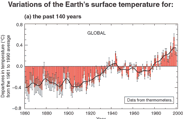
Figure 1. Excerpt from IPCC TAR
I downloaded HadCRU3 global data from CRU and compared it to the earlier version in the graph below (5-year smooth). Red is the TAR version (or as close as I could get) and black is HadCRU3, which itself is updated from the AR4 version.
Notice the lowering of all past temperature estimates since TAR. So the “late 19th century” values have been lowered by nearly 0.1 deg C, with this revision accounting for about half of the increase from 0.6 to 0.8 deg C change. What is the reason for the change? I haven’t parsed the publication of HadCRU3 because of Jones’ obstinate refusal to provide station data and the resulting inability to replicate results. If it ever becomes possible to see what they did, I’ll spend more time at it. For now I merely observe the difference.
One of the most remarkable aspects of the general lowering of past values is that this included temperature data into the late 1990s – the most recent period reported by IPCC TAR. Average values for 1996-2000 were reduced by 0.05 deg C in the late version, with one individual change in the 1990s exceeding 0.1 deg C. I haven’t investigated the reasons for the change in CRU estimates in the late 1990s, but others may be interested.
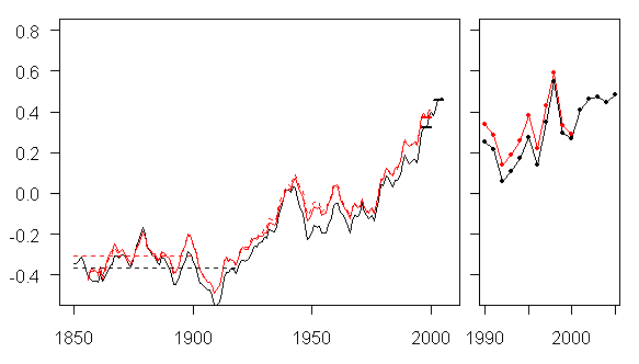
Figure 2. Comparison of HadCRU2 (IPCC TAR) and HadCRU3 GLB temperature series.


108 Comments
IPPC could at least mention that we are coming out of the Little Ice Age. Even if the data are correct (which I really doubt), so what?
It might be useful to make a list of precise questions that Jones should answer.
It’s the new shortened (iconic) hockey stick. No bristlecones used this time. Time to move on from the MWP. Even if it does exist, so what, the upswing since 1900 is, say it with me now …. unnnnnPRECEDENnnnnnnted. I hate to say it, but team AGW have apparently won this round.
It’s called “Changing the present by changing the past”.
Also I cannot believe that there is not a concerted protest at the secrecy that surrounds this statistical composite from Phil Jones. You’d think that figures as widely quoted as this should be public (in the same way the satellite record is), but you’d be wrong.
Why scientists tolerate this nonsense, or even support the secrecy, is beyond me.
Hmmm… so I guess that what the World Meteorological Organisation publishes isn’t good enough. Not that surprised really by this latest attempt to justify their hysteria. Its the sort of revisionism that would make Stalin blush.
Look, no doubt they received some last minute updates from the 19th century that made their data more valid. The public needs to get a lot more panicked than they have done. It was my understanding that instead of 0.8 degrees, the increase was to be changed to 8.0 degrees C. The end justifies the means, no?
An important subtlety in the revision involves the period 1950-1975. This was an Inconvenient Era – one in which global temperature declined despite rising CO2.
The explanations offered involve aerosols and environmental laws and so forth. These never gelled into a smooth-flowing argument.
Therefore, change the record!
In Figure 1, the black (average) line declines from 1950-1975. In Figure 2 the black line slightly rises 1950-1975 then accelerates.
This revised history is more, um, convenient.
(One of the next steps is to smoothe the World War II hump, perhaps attributing it to reporting problems.)
Methinks that the UNs IPCC is now an institutionalized propaganda effort for True Believing ACW.
Since the “Summary for Executives” comes out months before the actual underlying science, and since TAR was loudly criticized for abusing and distorting and misreporting the actual science, why should anyone go along with “trust me!” expletives? Not I.
There’s some interesting stuff on SATs here.
The temperature trend since the release of AR3 has, at best, been steady or, worse, even dropped. Now, if AR4 would report the same amount of global warming six years later, well, someone might start to ask annoying questions like “so the temperature has been steady for 6 years…is that in compliance with the models?” So they audit the records, and conveniently discover that the true global warming since pre industrial time is not 0.65 but 0.8 deg C.
This may indeed be true, but in the mind of the public this will be received as yet another increase in global warming. We will start to hear 0.8 C ad nasium, and it will be almost impossible to explain what’s actually behind this new number. Game, set, and something that’s starting to look like match: IPCC.
If anyone, at any point, has questioned the determination of IPCC, they should be well past that point now. I’m.
This is great stuff Steve, we see now that Hadley have compensated for cutting out many of Jones far north high warming grid cells by adjusting older data.
We now need to find where these adjustments to older data are distributed.
One point though on your decision to choose HadCRUT2 as the best representation of the global trend in TAR.
Is not CRUTEM2 (the land component) derived from Jones & Moberg 2003, too recent for the TAR.
Looking at the TAR refs at http://www.grida.no/climate/ipcc_tar/wg1/094.htm
I can see no ref to Jones & Moberg 2003.
As you say, it would be great to find the digtal time series used to make the TAR Fig.
We need an institute that can be trusted to collect, archive and publish all of this data.
It is becoming more obvious every day that the current crop of global warming researchers cannot be trusted to be the sole keepers of the data, models, research publishers etc.
It would cost a lot of money but a funding source must be found. Obviously, Exxon can’t be the source, the federal government under the current President cannot be the source. But there has to be an entity that is “untaintable” in the global warming media spin sense that could do it.
As to the 0.8 degree change, any information as to the claimed range of error or confidence levels? And if so, have they changed from the prior, what was it, +/_ .025 and no stated confidence levels?
I’m sorry, I think that was +/- 0.25 range of error.
Soviet dissidents used to quip, “The future is known. It’s the past that’s always changing.”
Actually, it’s interesting that if you take the whole data set of average global temperatures from 1856 to 2006, and you draw a linear trend, you get a rate of 0.049C per decade. If you detrend, you can see a 60 year cycle of about 0.25C amplitude on top of that. We are currently at the top of one such cycle. So you could argue that GHG’s will give us a 0.5C warming over the next century, but “natural” variations will modulate that by +/-0.125C.
Bottom line: you can get any number and any trend you want if you work hard enough at it, and chose your start and end date.
Thank you Francis Ouellette. I think you’ve answered my question.
Maybe they asked Nicholas Stern to help them. IPCC TAR had to be a bit careful, but as Stern has explained on the BBC program investigating his report, he is not constrained by the need to be careful so he can extract higher quality data. 😉
Incidentally, have you ever worked with the numbers showing the CO2 emissions? U.S. and other countries:
http://cdiac.ornl.gov/ftp/trends/emissions/usa.dat
http://cdiac.ornl.gov/ftp/trends/emissions/
The U.S. CO2 emissions in the period 1910-1940 were about 4 times lower than in the 1970-2000 period, and the ratio is even more pronounced for other countries. Still, the warming trend in the graph – see the HadCru graph, for example – looks virtually identical in both cases. The weak cooling 1940-1970 is completely unexplained. I think that this paragraph itself would be a good enough reason to dismiss any theory that the CO2 emissions were a crucial player to determine the temperatures in the 20th century.
The 0.1 degree issue aside, the HadCru data seem to confirm that 2006 was the coldest year since 2001 (and colder than 1998). Do I read it well?
http://motls.blogspot.com/2006/12/2006-probably-coldest-year-in-last.html
Steve,
You may now find August 2001 versions of hadcrut.zip, and tavegl.dat at
http://www.john-daly.com/hadcrut.zip and
http://www.john-daly.com/tavegl.dat respectively.
Re 7 ‘The WWII hump’.
Has anyone offered an explanation of the hump?
Here’s mine. I’d expect lumpy data as the cause of the warming — the huge amount of fuel oil spilled as a result of war at sea — will be unevenly spread in space and time. I predict that North Atlantic warming was most pronounced and seas unaffected by sinkings will show less warming and their warming trend will have a lag as the oil gradually spreads right across the entire ocean surface. Land areas which are normally affected by on-shore breeze driven strato-cu cooling will also show marked warming during the relevant period. Albedo will fall.
Does the data exist?
So, the PETM, albedo changes, warming since 1850, the false anthropogenic isotopic signature and now the WWII hump. The oceanic surface pollution theory of global warming is, in a qualitative sort of way, well-legged. I’d love to see someone run one of the models incorporating it. Hell, I’d like someone to cuff a passing post-grad and set him or her to crunching just a few numbers to see if they stand up.
Lest anyone is getting worried about my health, I’ve checked in the bathroom mirror and I don’t yet seem to be frothing at the mouth. However, in Woollies the other day I found myself lingering over the green biros…
JF
The Fig 1 graph really annoys me. I’m totally convinced the AGWers are cooking the books to get that rise which I believe is primarily caused by inaccurate surface temp records, i.e., they’re not adequately compensating for land use changes and UHI.
Many of your questions on changes between HadCRUT2 and HadCRUT3 can be answered through reading Brohan et al, 2006. You will also see a error model which discuses uncertainties etc. A pdf version of this is available from hadobs.org. If you look here you can find other data sets and information on them.
Please stop referring to the IPCC when you refer to these datasets (or other work). They are done by small and individual groups of scientists rather than some vast global conspiracy.
Simon Tett
Re: #24
Dr. Simon Tett. Hadley Centre for Climate Prediction and Research, writes:
Mind posting a link? A quick tour through the site doesn’t reveal it.
#25: http://hadobs.metoffice.com/hadcrut3/HadCRUT3_accepted.pdf
RE #24 Thanks for the link. I’m interested in learning more about the “homogenisation adjustments” – anyone know of papers which give details on this topic? My Google search so far has had minimal results.
I am surprised to see that, “…for most stations only a single series is archived, so that any (homogenisation) adjustments that might have been made (by National Met Services or by individual scientists) are unknown” (page 6). If I read that correctly, the actual historical readings for most stations have been essentially lost, because it is unknown which are actual and which were adjusted.
I’m unclear what, if anything, was done to account for the urbanisation effect (UHI). What I think I read is that they accept an urbanisation effect of 0.055 C per century, which seems modest.
Interesting paper, I hope that greater detail is available.
I always find it interesting how past data (before significant industrial activity) is always “corrected” downward(MWP, proxy data of all sorts, the infamous hockey stick, the current example) while recent temperatures are always “corrected” upwards (satellite, proxy data of all sorts, the current example). This might be purely my incorrect perception, but without any kind of deep analysis, it’s the general feeling I get, and I made that it is barely that — just a feeling. I remember especially feeling this way when satellite data was revised upward, I couldn’t help but think of myself how it seemed everyone was looking for possible reasons the satellite data might have been too low (even though it matched very well with weather balloon data) and what do you know, a few individuals searched hard enough and found some decent reasons to justify altering the temperatures upward. I suspect that if you look hard enough you could see reasons for altering the temperature downward to. This kind of constant alteration, well, it kind of stinks. It’s not a conspiracy it’s not falsification or anything like that, I’m certainly not claiming that, however it just feels like people are desperately looking for validation and they let this bias their view quite consistently and regularly.
Sorry, should have read that over more closely. I’m using voice-recognition and voice-recognition makes several mistakes with similar sounding words. I will be sure to read over my postings much more closely in the future
Dr. Tett, thank you for pointing out that the HadCRUT datasets are produced by “small and individual groups of scientists” rather than “some vast global conspiracy”. I think most people on this site don’t view the IPCC as a “vast global conspiracy”, but rather as a group of well-meaning people using dubious methods and data.
Perhaps, as one of those scientists involved with the HadCRUT dataset, you could comment on your unwillingness to share your raw data and your methods, so that your results could be replicated. I have read the papers you referred to above, many times, and they are far too vague to allow anyone to replicate your methods. In addition, without the raw data, replication is obviously impossible.
Also, I have a couple of questions, if you would be willing to take a few moments.
1) Your data are all expressed as anomalies, that is to say, the monthly gridcell temperature less the average gridcell temperature for that month. Out of the 2592 gridcells covering the planet, about 90% (2288) have some monthly data. Of these gridcells with data, about 6% (136) have 12 months of data or less. How do you calculate the gridcell average monthly temperature when you have less than one year’s data for that gridcell?
2) Here is a chart of the temperature anomalies for March of 1850.
Global coverage is about 18%, most of it ocean temperatures. (You can trace the tracks of the mariners, Europe to Cape of Good Hope, and the like.) However, since most of the variation in temperature is over land, and since most of the land does not have any data for that month, your estimated standard error of the monthly anomaly for that month of two tenths of a degree seems optimistic. Can you really estimate global temperature anomalies that accurately with almost none of the land area data?
3) In particular, to estimate the errors you are using 20th century EOFs on extremely sparse 19th century data. How have you estimated the inherent errors in that procedure?
4) In your procedures, you state that you “infill” temperature data if 5 or more of the surrounding gridcells have data. Given the at times radical difference between temperature anomalies and trends in adjoining gridcells, what is the justification for this procedure? While it might make sense on the ocean, where temperatures are much more correlated, on land it will introduce another error of unknown amount.
5) Is there a dataset available on the web which shows which gridcells contain actual temperatures, and which contain best guesses?
Many thanks,
w.
Re: #24
Dr. Simon Tett., Hadley Centre for Climate Prediction and Research, writes:
Let’s examine this.
1. The data sets are prepared by small and individual groups of scientists who work for a government organization, the Hadley Centre, a Met Office component, with an About Us statement that reads:
The Met Office Hadley Centre is the UK’s official centre for climate change research. Partly funded by Defra (the Department for Environment, Food and Rural Affairs), we provide in-depth information to, and advise, the Government on climate change issues.
2. Under current Hadley Centre undertakings, we find:
Met Office scientists are making a contribution (as authors and reviewers of the reports) to this internationally important report (IPCC Fourth Assessment Report) which will be released in stages through 2007. The management of the report on climate change impacts, adaptation and vulnerability is carried out in the Met Office Hadley Centre.
Thus, whether or not there’s a vast global conspirancy, there is a strong link between the two organizations and their products. You’ll have to forgive us, then, if we refer to IPCC when referring the datasets created at a government organization contributing to and supporting the IPCC’s mission.
There are 10 references to HadCRU and/or CRU in the above short note, which makes the origin of the data set amply clear. The illustrated graphic was prominently used in IPCC TAR; if it were not used in IPCC TAR, I wouldn’t have mentioned it. To lever the above note to allegations of a “vast global conspiracy” is completely over the edge.
Re: #26
Thanks.
(#26)
Figures 10 and 12 are the interesting ones:
1) uncertainties in smoothed data, how those are estimated?
2) what happened at sea 1945 – 1946, sudden 0.3 C change?
Willis, take the same gridcells from other years so you can compare sparse mean vs. global mean changes.
UC, thanks for your suggestion. My question was, if we only know the temperature anomaly over 18% of the surface, and most of that is ocean, how large is the error in a global temperature anomaly estimate? My sense is that the error would be much larger than 0.2°C, which is why I asked.
Your method will only give the difference between the global estimate and the sparse dataset estimate, not the actual error of the sparse estimate compared to reality. However, it’s an interesting statistic in its own right, I’ll calculate it and report back.
w.
Re #30 Willis Eschenbach,
Great graphic. Yes, little data from land but even less from the poles. Most of the surface temperature anomoly is thought to be in the poles but how much do we know about their temperature history?
[moved to More Unthreaded]
It would be interesting to compare a temperature plot (1860-present) from a subset of the Hadley or NCDC US data which holds population and landuse constant with the global average and US temperature records. I’ve seen records from individual cities but never an average from an extracted subset using only those stations in towns/cities/ rural areas where there has been little population growth. Has anyone seen such a comparison done? I realize there are more sophisticated ways to adjust for UHI effects, but I’d still love to see temperature plots compared in this way.
38,
John Daly used to have such a plot for California. It showed a fairly linear progression in warming
as you went from small cities to large, over the last (I think) 100 years.
I couldn’t find that study, but I did find one covering South Africa.
http://www.john-daly.com/s-africa.htm
On those error ranges of smoothed data, I think I don’t understand what has been done. If we take the very simple observation model
y=s+n
(observation is true value plus noise), and apply a linear filter, (I guess that 21-term binomial filter is linear) we’ll get
f(y)=f(s)+f(n)
and this of course reduces variance of n, but it also affects s. On annual basis, the error will be
f(s)-s+f(n)
and we need a statistical process model (essentially, how well we can predict s) to estimate this error. On the other hand, if those error ranges are not annual data error ranges, then the figures are misleading (to me).
BTW, CA slow again, too many sceptics online 😉
Dr. Tett,
The paper you mentioned would be more believable if it didn’t cite Donald Rumsfeld.
38,39: Here is a summary of similar articles.
UC, the difference between the 1950-2006 global average temperature (area adjusted mean) calculated from the sparse dataset and the 1950-2006 global average temperature calculated from the full dataset has a standard deviation of 0.15. Their published average monthly error over that time is 0.07.
Here’s your oddity for today. This shows the HadCRUT3 area-averaged measurement & sampling (m+s) error (available here). Note that this is not the global error, but the error per unit area.
Note the errors during the US Civil War (1861-65, red), World War I (1914-18, green), and World War II (1939-45,blue)
The oddities are:
1) it appears that the errors have a strong monthly component, higher in the Northern Hemisphere winter.
2) There are large jumps at various times in the record. While some are due to wars, I see no obvious reason for the others.
3) The errors around 1860 are less than the errors in 1940.
Things only get murkier when we look at the global coverage of the HadCRUT3 dataset over the period:
This shows the relationship between coverage and average error during the wars, with coverage dropping and error rising. However, this relationship does not seem to exist at other times. For example, both coverage and error have dropped post 1990. In addition, both coverage and error are higher during the winter, and lower during the summer. Why is that?
Clearly, I don’t have a full grasp of what’s going on here. All comments gladly welcomed.
w.
Willis, can you describe the calculation in more detail so that I can see what it means. (I know that we were going to organize a way for you to archive scripts here, but I’ve had so much bother with site crashes recently that I haven’t attended to it.)
Willis, I’m really confused here. How does HadCRUT3 manage to cover so much of the earth’s surface? I was under the impression that the stations were all land based, 30% coverage, plus whatever occasional information was available from ships. Seventy percent in the 1980s seems very high.
Interesting bit on the Tyndall Centre. Dodgy Dossiers at Number Watch: http://www.numberwatch.co.uk/2007%20January.htm
Steve M, I’d be glad to. I use a fragment of your script to get the values of the errors from where I have the file on my computer.
ve=open.ncdf("HadCRUT3_m+s_error.nc")teste
Then I calculate the area averages for each month:
# full list error average

eavg=c(1:1884)

for (i in 1:1884){

	eavg[i]=areaavg(instre[,,i],latfactor)

	}
I use a function “areaavg” I wrote that takes a 72×36 array of gridcells, averages them by latitude, multiplies each of the latitude averages by a latitude factor for the area of the particular band, and sums them to get the area-weighted average.
areaavg =function(x,lf) {temp=colStats(x,average)
ssum(x*lf)/ssum(addna(lf,x))
}
This in turn depends on a few other special functions.
“average” is “safe” average function which ignores NA values.
average = function (x) mean(x,na.rm=T)ssum is a “safe” sum function, same deal.
ssum = function(x) sum(x,na.rm=T)addna is a function which adds “NA” values to an original array wherever they appear in a template array
addna=function(original,template) original+template-templateThis is needed because at times not all of the latitude bands have values.
latfactor is the area of each of the latitude bands as a percentage of the whole
lats=test$dim[[2]]$valslatfactor=c(1:36)
for (i in c(1:36)){
latfactor[i]=zonefraction(lats[i]+2.5,lats[i]-2.5)
}
This depends on the function “zonefraction”, which takes two latitudes and calculates the area between them
zonefraction=function(lat1,lat2) abs(2*pi*(sin(radians(lat1)) - sin(radians(lat2)))/(4*pi))The calculation of the area covered works the same way. The only difference is that I first convert all cells with data to the value “1”, leaving the cells containing “NA” untouched, by doing this:
gridpresent=instr/instrFrom there out, it’s conceptually the same as area averaging, except I use “sum” instead of “average” to get the area weighted sum, and divide by 72 (the expected sum if all cells have data) to give me the percentage.
Got questions? Ask’em …
w.
Paul, the oceanic coverage (according to them) is not bad. From Uncertainty estimates in regional and global observed temperature changes: a new dataset from 1850:
However, I have not looked at how they actually produced the HadSST2 dataset. The fact that “datasets can be produced on a grid of any desired resolution” means that they’re doing some serious interpolation of some kind, and it also means that we don’t know how good the coverage actually is.
It appears that in both cases, they are using EOFs to estimate the temperature at any point. However, the EOFs need to be created from a complete dataset, which means a computer generated dataset … seems awfully circular to me.
w.
Efficient work, Willis, thanks! If you have time, it would be interesting to see the sparse average and full average data.
Where did you get this info?
Coverage / sampling error:
In the figures green is error due to coverage and red due to sampling error, i.e. these two are separated.
So, in figure 12, the bottom plot shows the UHI effect, right? 🙂 Ok, ok this is serious. Smoothed Sea data looks convincing, oceans are heating up. Only problem to me are those smoothed uncertainties.. 0.1 std error in 1850 using couple of wooden buckets.
RE #43: Willis, you said “In addition, both coverage and error are higher during the winter, and lower during the summer.” I don’t know why coverage would be higher in the NH winter, but I can hazard a guess on why the error is higher. In playing around with my local weather records I noticed that there was much more variation in the winter data – both daily means and record highs and lows. It is hard for a summer heat wave to get much above 100 here (average daily highs in the peak of summer are around 91), but a winter cold snap can plummet 10s of degrees below the normal lows (around 13), and even (as it did earlier this month) 10 or 15 degrees below the all-time daily record (we have a 120 year instrumental temp. record).
Re: #43
Willis E, thanks again for piquing my interest by way of your analyses and graphics. I am not sure at this point how one would relate the monthly error per unit area to the green error bars that HadCRUT3 shows in their historical temperature graphs displaying the annual average global anomaly. Showing the coverage and error graphs together and the major war period relationships is a good start.
Looking at the lack of coverage during the earlier years of the temperature series, intuitively, for me, implies relatively larger green error bars than I see. Perhaps on more detailed analysis I would understand better. Lack of coverage in the earlier years would also increase the opportunity for biasing the results towards what was covered. Are there any assumptions or guesses about such biasing? What if one applied a similar coverage analysis to the dearth of temperature proxies used in reconstructions from the published literature that are taken so seriously in the climate world?
I keep thinking that there have to be some a priori assumptions made here but I have not dug sufficiently deep to understand what they might be. I have noticed that the HadCRUT papers on errors take special note of disclaimer that while they deal statistically with known unknowns there could be unknown unknowns. Of course the unknowns about the HadCRUT process for me are the validity of the statistics used for the known unknowns and any assumptions dealing with unknown unknows. I can certainly see where the HadCRUT people could relate to Donald Rumsfeld.
UC, thanks for your post. You say:
The error information is from the HadCRUT3 web site.
Here are the sparse and full average data:
I was surprised by the match between the full and sparse averages. At that point, we’re at a dead end, because we don’t have any access to the raw data. However, the errors are still larger than those claimed in the HadCRUT3 references.
w.
Gentlemen,
I am just an old organic chemist who is wondering —
Am I am missing something? The “global surface temperature” record put out by Jones et al, widely used to ‘confirm’ ‘global warming’, seems to me to be a bit of a misnomer. What actually does this temperature record represent? The dataset is hardly a random sampling, nor sufficiently accurate for the result (0.8?0.6?0.56?) claimed (i.e lots of inherent problems, such as: site record inconsistencies, variable maintenance of stations/equipment — e.g. irregular repainting of temperature boxes, accuracy of reporting/equipment in former Soviet states, changing local environments, variable urban heat island effects …). Furthermore, the sampling number is much too low to provide any degree of confidence (I believe the surface area of the globe is ca. 200 million sq. mi., while the number of temperaure data points is a few thousand?). I always thought that unless a mean was derived from randomly sampled data and that the size of the data pool was sufficiently large to reflect the variability of the population being examined, you had better take your result with a grain of salt — apparently this is no longer true. To me it appears to that the Jones data compilation is really a temperature record of a composite city, which is a far cry from being an accurate representation of the average surface temperature of the Earth. Also, the fact that the raw data has not been made public, to my mind, should cast serious doubt onto any arising claims. A quote I rather fancy and which seems applicable here is: “All science is numbers, but not all numbers is science.” (unknown)
re: #53
I basically agree, but to be fair, I’m sure most of the sorts of errors will cancel out over time and space. We’re not concerned about exact temperatures, after all; just how the the temperatures vary with time. So if at any time 25% of the stations have boxes which are badly painted and therefore read hotter than they should, it won’t really matter as long as the % of bad stations is constant. The only errors we need to be concerned with are those which are likely to vary in one direction over time. And there, the preemenient problem is human footprint. As long as the human population is growing, it’s likely that the number of humans near any given station is increasing and that is most likely going to make the station warmer.
RE: #54
ca. 1850:
– No electrical grid
– No use of concrete or asphaltum to pave roads and other areas
– Farming mostly at subsistence or barely profitable levels in most places, done by Man or beast of burden
– Few dams or man made lakes of any consequence
– Industry heavily concentrated in most populated areas of Europe and the eastern 1/4 of mid North America – sum total of it is miniscule, in terms of output and energy dissipation / soot emission / dust creation
– Irrigation agriculture largely limited to the Middle East, a few Mediterranean areas. No motorized pumping, mainly focussed on cash crops.
– Populations of many tropical areas very low – impacts of slash and burn agriculture have not really begun
– In mid and high latitudes, heating of structures limited to one or two rooms, done primarily during morning hours, using open hearth and stove mechanisms using radiative and self convective flows from wood, peat, coal and dung fires.
– Etc
Present:
– Massive, still growing, overburdened electrical grid now reaches all populated mid latitude areas and many areas in the tropics, as well as areas near roads in high latitudes. Where the grid does not yet reach, use of portable motor driven generators, photovoltaics, wind and hydro power supplies local power distributions as needed.
– All weather paved roads grid the surface based on need in most low land / industrial / arable regions and penetrate many other areas. Remaining unpaved roaded graded and in many cases packed and coated. Extent of grade controlled land is massive – most populated and many arable areas. Parking lots, pads, walkways extend paved areas dramatically.
– Small and subsistance farming nearly obsolete. Large corporate farms dominate.
– Most rivers have dams, flood control wiers, locks and other man made flow controls. Huge areas of fresh water are man made.
– Industry exists in most urban and even some rural areas and is growing. Includes a myriad of types ranging from classical heavy types through to non traditional knowledge types. Massive tracts of suburban and exurban land solely devoted to this usage.
– Irrigation agriculture is done wherever entry costs are justified or subsidized and transported / mined water available. In developed countries, remaining arid areas are either uneconomical to farm or protected habitats.
– Populations in tropical areas dominate global distribution. Slash and burn agriculture has greatly expanded and peaked, and is now being replaced by aforementioned industrial / scientifically managed agriculture.
– In most mid and high latitude locations, dwellings are climate controlled, nearly all commercial / industrial buildings and certain agricultural and pastoral ones as well. In tropical areas climate controlled structures are prominent and on a steep increase. Where cooling apparatus is installed it is typically overused. For heatings, forced air, radiative and heat pump methods are in vast usage with space heating on the decline.
#55
Exactly how does an electricity grid affect temperatures?
RE: #56 – Are you serious that you missed the point of what I wrote? I was responding to commentary about the vast increase in human footprint. Here’s a clue, what does the electrical grid beget …. that’s the only clue I’ll give, I’ve got no time for lower division undergrad / high school level discourse.
#57
CO2?
Now could that just be causing the warming?
#58 Steve’s comment is about the UHI effect. The presence of the electricity grid means that electricity is being used and thus heating up the area immediately around the station. This heat will affect the temperature measurments. The question is by how much. This is a question I am interested in, because I have worked with several stations and seen several others, both rural and urban. All of the stations I have seen have been compromised in one way or another but I have no idea how to quantify it.
RE: #59 – Close. My point of the grid is that the grid begets a general high level of civilization and advanced state of development. That general state of affairs also means that overall levels of energy flux, thermal energy flux to be exact, comes along with it. Electrical and electromotive circuitry dissipate heat directly. Friction generates heat as well. Once a society benefits from such development, an entire way of life springs forth that is, well, energetic. From the dark toiling, immobile past of 35 year life spans, we flower into a race of rennaissance men and women, living to 70, 80, 80, 100, who knows the limit? We expect an energetic existance. In addition to the energy, motion and force multiplier of electrical work, we also have stand alone motors with their own fuel supplies, to accomplish the most work intenstive tasks. This is a transformational shift which has occurred, for us and our environment. And with the odd exception, which tends to diminish as we become more elegant, the transformation tends to symbiosis. We crave Eden and build mini Edens. All of it results, net, net, in greater energy flux in the first 1000 meters above local ground level, and particularly in the first 100 meters. How can one deny this? It is naive to assume that the introduction, mostly during the past 150 years, of this energetic existence to a greater and greater percentage of the surface of the earth and even on the seas, had not resulted in an innate postive thermal bias. Bring 10 computers into a room and see what happens. This is so intuitive, that it makes many so called climate scientists seem all the more exposed in terms of real agenda.
Re: 60
“This is so intuitive, that it makes many so called climate scientists seem all the more exposed in terms of real agenda.”
What is the “real agenda” of “many so called climate scientists”?
What is the “real agenda” of “many so called climate scientists”?
good question. to me, it appears to be to assign blame on humans via CO2 production, despite a likelihood that other “anthro” causes (ie UHI and other increased heat fluxes) contribute at least as much. the attribution to CO2, and thus hydrocarbons, allows a blame to be squarely placed on “big oil”/”big motors”…
This abstract has some interesting numbers, even though it is (gasp) based on a computer simulation. The value to me is that it gives some feel for the possible global impact of variation in the thermohaline circulation (THC).
The THC has an estimated flow of 18 Sv (18 million cubic meters per second) and is thought to vary by perhaps 2 Sv. The computer model indicates a global temperature impact of 0.05C per Sv, or 0.10C for the estimated range of the THC.
The paper supports the thought that the THC strengthened in the latter part of the 20’th Century (my impression is that the strengthening occurred around 1992-1995). If so, then a substantial part of the global warming (0.15-0.20C/decade) over the last decade or so may have been due to strengthening of the THC. This assumes, of course, a fairly rapid response of the global temperature to the THC.
I’m looking for an internet copy of the full report.
Re: #60. Where does this 35 year life-span stat come from? Sounds like an urban myth to me, you sure year it repeated a lot. The truth is that infant mortality in the past was very much higher, but those that lived went on to pretty much the same age as we do now.
RE: #61 – The agenda is deep ecology. In some cases, riding along with it is an intense hatred of Judeo Christian, traditional Western Civilization and capitalism.
RE: #64 – Are you mad? Have you no concept of history? I guess you must never have learned about the mortality caused by disease and more violent things, in the bad old days? (Typical Luddite, anti technological, anti human progress bias at work, no doubt …. “the good old days were better, let us turn back the clock to the wonderful romantic days of pit toilets, hand pumped / drawn water, smoke filled kitchens, immobility and mud. Ah yes, those were the good old days indeed!”)
Re: #30 Willis,
Do you know who was measuring daily temperatures in what appears to be North Dakota in 1850?
Re: #60 Steve,
Does this help?
From http://weightoftheevidence.blogspot.com/2006/02/life-expectancy-beyond-statistics.html
Jeff, you ask:
Unfortunately, until Jones releases his data, I fear nobody will know that … except of course the inner circle of climate acolytes, sworn to secrecy, and recognizable only by their secret handshake and the number “666” tattooed on an intimate part of their anatomy …
w.
After reading one of Willis E’s posts on the subject and digging deeper into the HadCRUT3 2006 error paper, I found something that really piqued my interest. It involves the 95% uncertainty ranges for anomalies for land based and SST global temperatures, the differences that one sees between the two, the differences one sees on going to smaller areas and on going from the monthly, annual and low frequency smoothed time periods.
To better make my point I will display a table below that give some 95% uncertainty ranges for various global regions on monthly, yearly and smoothed time scales for the years 1850 (1875 for one case), 1925 and 2000. The years were selected to give a reasonable measure of how the uncertainties changed over the time period from1850 to current time.
The smoothed graphical presentations in the error report are reported to be from the use of a 21 element binomial filter. I am not sure how the uncertainties are calculated from the smoothed data or how one should interpret them.
What might be unexpected are the large differences in land and SST uncertainties that favors the SST data with the much smaller uncertainties. SST measurements, while having distinctly less coverage of the ocean areas, more than make up for that by having much less variation in time and space than do land measurements.
The table below contains the 95% uncertainties in degrees centigrade for the time periods listed in the column headings. I visually deciphered the uncertainties from the HadCRUT error report graphs. The first column indicates whether the uncertainties are from monthly (M), annual (A) or smoothed (S) data and from which of the global regions that comprised: global (G), southern hemisphere (SH), northern hemisphere (NH), global land only (GL), global oceans only (GO), and finally for the area bounded by (50-55N, 0-5W) in central England (CE)
Region/Period 1850 1925 2000
S-G 0.25 0.25 0.20
S-NH 0.25 0.30 0.20
S-SH 0.25 0.30 0.20
S-GL 1.2 0.50 0.35
S-GO 0.25 0.20 0.20
M-G 0.80 0.50 0.40
A-G 0.35 0.25 0.20
A-GL 1.5 0.60 0.45
A-GO 0.35 0.30 0.20
A-CE 1.5 1.3 1.2
What I find particularly interesting about these data and uncertainties is that since 1980 there has been a divergence between measured SST and land based temperature anomalies with the land based anomaly increasing at a significantly faster rate than the SST anomaly. The SST anomaly, has, of course, as noted previously a significantly smaller uncertainty.
The other is how fast the uncertainty of the temperature anomaly increases on going from the oceans, where practically nobody lives, to land, where most of us live, and then again the increase on going from the entire global land area to localized areas, where again we all actually reside and will be affected by temperature changes. I am not certain if this is the effect to which RPjr and RPsr refer when they talk about being particularly concerned with localized climate changes.
I need to follow up on the local uncertainties and would appreciate any help on where to look. I have looked at historical temperature records of relatively nearby cities in Illinois and found that in some cases the trend was upward and in some cases it was actually downward over the past 70+ years.
I want to show that table again. It worked in the preview???
Region/Period 1850 1925 2000
S-G 0.25 0.25 0.20
S-NH 0.25 0.30 0.20
S-SH 0.25 0.30 0.20
S-GL 1.2 0.50 0.35
S-GO 0.25 0.20 0.20
M-G 0.80 0.50 0.40
A-G 0.35 0.25 0.20
A-GL 1.5 0.60 0.45
A-GO 0.35 0.30 0.20
A-CE 1.5 1.3 1.2
Last attempt!!!
Region/Period 1850 1925 2000
S-G 0.25 0.25 0.20
S-NH 0.25 0.30 0.20
S-SH 0.25 0.30 0.20
S-GL 1.2 0.50 0.35
S-GO 0.25 0.20 0.20
M-G 0.80 0.50 0.40
A-G 0.35 0.25 0.20
A-GL 1.5 0.60 0.45
A-GO 0.35 0.30 0.20
A-CE 1.5 1.3 1.2
Re #69
Table reads ok. In other words, because ‘global’ land surface temperature samples (A-GL) were subject to an inordinately high amount of uncertainty (1.5) during the earliest period (1850), it is possible that the true global land surface temperature was actually higher than what the sample mean indicates. i.e. The rate of A-GL temperature increase might be over-estimated.
Aside from the issue of sample error (directionless), one also wonders about sample bias (directional). Surely this has been addressed in the literature?
#72 Bender,
I don’t think so. Please show me where it has. I would be most interested.
Bias errors are discussed in the HadCRUT description document, in Section 2.3.3. They consider two kinds, UHI and thermometer exposure. Unfortunately, rather than adjusting the dataset based on their estimate of the error, they are merely folded into their other errors (M&S, etc.), which seems strange to me.
w.
Re: #72
The table reads ok in the preview, just like my graphics do but then sometimes I do not get what I see in the preview (as is the case here). It is frustrating, since I assume I have completed the procedures correctly and then I waste space attempting to obtain the correct information in the final post(s). For the table, I used pre at the table start and /pre at the table end, all in the brackets .
The point of my post was to show the lack of correlations of land temperature anomalies and their wide variations with time and space and particularly when compared to SST anomalies. The grid (5 degrees by 5 degrees) sampling error is calculated in the HadCRUT paper using the average correlation of temperatures within the grid, the standard deviation of the station to station means within the grid and the number of stations reporting in the grid area. The grid to grid uncertainties are calculated by sub-sampling at various coverage (representing the changing coverage over the years ‘€” I think) a sample of grids with more complete coverage for 50 year periods. Most of these uncertainties, outside those smaller ones that, for example, are attributed to biases changes in measuring techniques, derive from the variations in space and time of the temperatures measured.
I have not read any critics of the methods used in HadCRUT to calculate these uncertainties so I do not know how well founded the methods are in statistics. I have read papers with pros and cons on how the UHI effect is handled, but nothing that I judge as definitive.
Ignoring these questions for the moment, the HadCRUT data seems to show that climate changes with respect to temperature have probably had and will have in the future very localized effects on land areas and I would like to get a better perspective on the phenomena.
That’s interesting…
I found this on a german blog:
there seems to be also some fiddling with the temperature curves for the USA of GISS-data. I try to give a short translation:
the blogger found the following graph
/Users/gmischol/Desktop/GISS_USA/Giss1999b.jpg
here the temperatures in the 30’s and 40’s seem to be higher than even 98. This graph then dissapeared from the homepage.
The raw data look like the graph above
/Users/gmischol/Desktop/GISS_USA/rawdata.JPG.jpg
after adjustments it looks like this
/Users/gmischol/Desktop/GISS_USA/afteradjustment.JPG.jpg
looks pretty different. So when you overlap these two graphs you see the adjustments
/Users/gmischol/Desktop/GISS_USA/overlap3.jpg
the red curve is the version of 1999 and the blue one is the last version. So again similar to HadCRU they lowered the values in the 30’s and 40’s and moved the values in the 90’s upward. I wasn’t able to verify this information myself. Does anybody have a graph of 1999 on his computer?
Sorry this went completely wrong. Is there no way to paste pictures which reside on my computer into a post?
Thanks for the help.
#76 I think all the graphs etc are here.
Page 18
Okay, we really need to get this raw data posted and archived somewhere. The data before Hansen starts manipulating it.
This is what I have been saying for awhile, how can we trust the Hansen’s of the world to hold and control the data, manage the models and call us deniers when we question the evidence (that has been adjusted by countless number of “Hansen-procedures”.)
The 1930s US temperatures are higher than 1998 in the raw data.
The 1999 chart of US temperatures (through 1998) is here . I don’t see a table with the numerical values.
MarkR
thanks for your help
John Lang
thats my point I wanted to make. What’s the reason for correcting the raw data in a way that the 30’s get colder and the 90’s hotter?
To fit the data to the theory?
I can imagine that the raw data may need some correction, but this is just weird.
Is this right?
In chapter 2 of Uncertainty estimates in regional and global observedtemperature changes: a new dataset from 1850 on page 6 I found this:
There seems to be a very bad error here. The authors seem to be confusing the standard deviation of the population (the monthly temperature readings) with the standard deviaton of a single thermometer reading.
When computing the standard error the result should be s/sqrt(60) where s is the standard deviation of the monthly temperature readings but the authors used .2C, the standard deviation of a single thermometer reading.
I picked a location at random and found the standard deviation of the 30 readings to be ~10F or ~5C giving a standard error of ~1.9F or ~1C and NOT the .03C that the authors calculate.
Am I missing something here? I find it hard to believe that an error this glaring got through the process of peer-review and no one has spotted it since it was published.
#83,
I believe that you are correct. If a single thermometer is off by 0.2C today, it will be off by that same 0.2C tomorrow.
The equation you mention works for multiple thermometers, it does not work for multiple readings from the same thermometer.
#83,84
If there are no errors due to bias, fluctuation in the bias (environmental dependence, aging, etc.), and scale factor inaccuracy, we can use
and taking the average leads to
where is the part we want to know. Reminder is the error, and if those are uncorrelated (no bias-like errors) we’ll get
and thus
same as in the paper. But if the monthly average is obtained using mid-range, then it gets bit more tricky to compute..
Sampling issues were not included in the above, i.e it was assumed that sampled equals
  . There seems to be an interesting trade-off between mid-range (inefficient estimator of the true mean) and arithmetic mean (sampling problems)..
Those interesting in changes in Hansen’s temperature graphs should check out Hansen et al (1981):
http://pubs.giss.nasa.gov/abstracts/1981/Hansen_etal.html
Compare those graphs (Fig. 3) to the current version:

For instance, the difference between the temperature height in 1940 and low in 1970 in northern latitudes is about 0.5C in 1981 version whereas now it seems to be about 0.3C. In low latitudes (1981 version), there are three peaks (around 1930,1940,1960) that are higher than 1980, but in the current version two of those peaks have disappeared and even the existing one (1940) is below 1980. In southern latitudes, there is a lot of variation between 1900-1930 in 1981 version whereas the currrent version is almost flat. Also the mean of 1910’s is about the same as the mean of 1960’s in 1981 version, but in the current version there is over 0.2C difference. And so on…
#87
We’ll lose the concept of time soon. It will undoubtedly get warmer in the future, but also past temperatures will get colder in the future. 🙂
re: #87
You know, it’s starting to remind me of plate tectonics. In the middle of the ocean (the present) you have a big spreading center (warming) and as you get farther and farther from the center things sink and level out.
If I have 100 numbers, take an average of them X. If I then add 0.2 to every one of those numbers, take a new average that
number is going to X + 0.2. It doesn’t matter how many number I have in my sequence. If every single one of them is off by a
certain amount, then the average is also going to be off by that same amount.
#83-86. I think Nilram is right. In principle, if one is measuring the temperature of a stationary system then the error of a series of N measurements is sigma/sqrt(N) where sigma is the thermometer error. Monthly temperatures are certainly not a stationary system. For example: The summer/winter temperature variation is about 40F where I live. This means that on average the temperature change from the beginning of the month to the end of the month, for every month, is about 7 F. The population standard deviation is probably a more correct way to report the error than the thermometer error.
#83
The quote is correct.
When calculating the mean monthly temperature, we are not really interested in the standard error of the daily temperatures, as we have measured the entire population of days in the month. What we are interested in is the uncertainty in the mean due to inaccuracies in the individual thermometer reading. Provided that this uncertainty is constant (i.e. not a function of temperature), then the uncertainty on the mean will be 0.2°C/sqrt(60).
#84
The 0.2°C is the standard deviation of the error, not a bias, so the measurement will not always be wrong 0.2°C.
92,
So a given thermometer, can be wrong by a different amount, each time you read it?
#93
All measurements are subject to error, including temperature readings from thermometers, even if the instrument is unbiased.
#90
Yes, that’s what happens if the error is bias-like. In Brohan et al. analysis it is implicitly assumed that the measurement error is uncorrelated, and scale factor error is negligible. (I don’t think that the former is a valid assumption)
#91
Variation of the true temperature is needed when we’ll start discussing the sampling error. If they use only two measurements per day (not min/max), the sampling error will probably be much larger than the measurement error (if it is 0.2 C and uncorrelated in time). If they use min/max, then we have more complicated problem.
New here and a novice on the science. I have on and off over the past 40 years been compiling weather observations, synops,metars, etc. I do not know if these observations are used for climate data, but a temp of say 20.5C is coded as 21C, 20.4C coded as 20C. Also in the past few years a lot of these temp readings have changed from glass thermometers to remote sensors. With the remote readings you can see the temp fluctuate at least 0.5c in less than a minute. The observation is sent off and then the temp changes at the same time. If that temp is used as the max for the day, it may have only been for a few seonds. I don’t know how often the remote sensors are calibrated. With the old screens, if you were a bit slow, i.e. dropped your pencil ! the temp could rise more than a degree, thus effecting the maximum thermometer…
I am an Australian scientist who has worked with measurements of nature for 30 years and who has been deeply involved in statistical interpolation methods like geostatistics from David’s school in France. Among other things, geostatistics enables an estimate of how far apart observations can be before they cease to have value in predicting nearby values. Their utility in grid cells and their interactions and error calculation is obvious.
I have also obtained early Australian temperature records used by East Anglia (Jones et al) as well as those NOT used by them which are far more numerous. In other words, many Inconvenient Truths of the early temperature measurements were dropped out of the modelling. Warwick Hughes should be rewarded for his work in revealing these blatant misuses of data.
So I am sceptical of the data that goes into climate models because I have proof that it was used selectively – and still is. Phil Jones last year emailed me that he could not reconcile Australian land surface records with nearby seas, but he could with New Zealand. By this time the IPCC climate models would have been at the printers.
The BIG question for me is this. Can one estimate the heat effect upon the globe by using a maximum and a minimum daily temperature, or alternatively one taken at noon and another at midnight? I think not. The SHAPE of the temperature curve through the whole day has to be quantified to measure heat. If there are many clouds, the daily curve might be slender, for example, compared with the next day even though the max and min were the same. In other terms, the reconstructed temperature record needs many temperature readings each day at each location, not just a couple. It is heat flux change that is the primary target, not changes to max and min temp.
The next big worry is that heat is part of a spectrum and that behaviour in the infra-red need not be the same as behaviour in the ultra-violet and there are plausible reasons why correlations could be poor. Once again, it is the flux of heat that is the primary target and this has to be broken down into a series of say 20 wavelength spans before one can start to comprehend the mechanisms at work.
I am not certain if the flux of heat is being measured according to the above propositions, but I doubt it and I know that early temperture records are deficient this way. They are therefore unreliable and should not be used for reference to change. Compare like with like.
There is enough uncertainty in the two observations above to throw the whole climate modelling concept into complete disbelief. I think that the better scientists working in the field know this, and resign. We are left with the dross to educate the world to the New Order.
Two typos corrected above.
Geoff,
I agree that in an ideal world we would be measuring the dynamic heat changes of the planet in order to gain a complete understanding of the global warming effects that drive climate change. Unfortunately this would be very difficult to do on a global scale.
Temperature measurements are used as a proxy for heat changes. While this is incomplete it is better than nothing. The problem is that without knowledge of the water vapour content a large uncertainty is introduced into the understanding of the heat energy changes. But if you accept these limitations then temperature is indeed better than nothing.
A continuous trend of temperatures during a day would indeed be better for statistical analyses of temperature trends, but if you only have the daily maximum and minimum temperatures have to make dew (;-)). You can only hope that the differences between a continuous temperature data set and a max/min temperature data set will average out over time and area. Of course this too increases the uncertainty in our understanding of the heat energy changes.
In my opinion, one of the greatest failings of the IPCC process is in glossing over these uncertainties and thereby foregoing the responsibility of identifying ways our understanding of the whole issue can be improved. The IPCC would have been more credible if they had started out in their First Assessment Report making recommendations on how our understanding of the issue could be improved.
They could have said something like:
The fact that they do not make these kinds of assessments is very revealing. The IPCC is not there to recommend science policy.
I have a question for you. What is your opinion of the GISS assertion that a single weather staion will record climate changes that are representative of the climate changes in a 1,200 km radius?
Hi Jeff Norman, Thank you for your considered and courteous reply. Isolated as we are out here, it could be that I was saying things that all have known for years, but I can see real dangers using spot temperatures as a proxy for heat flux.
The matter of the spectrum of heat appears obliquley in Al Gore’s book where he stated that rabbits and fish were going blind in Patagonia from the extra UV radiation from the hole in the ozone layer. At that time in the late 19080s there were virtually no continuous measurements of UV flux to the global surface so I cannot see the basis for the assertion. So far as I know, there is still very little systematic data on the incidence of UV light which of course carries its own particular physical effects as compared with (say) visible light, like effects on vegetation and resulting albedo.
I have never studied the predictability of temperature at a point from one 1200 km distant and so I am not qualified to comment with experience. My intuitive feeling is that you might get away with a radius of 20 km. The geostatistics that I have used were for the prediction of ore grades in mineral desposits pierced by a few drill holes. The question was how far apart the drill hole should be for confident interpolation of grades. Then there are the later steps of averaging and smoothing and lopping anomalously high spot values – there is a whole science that is so important in the mineral world that it had made and broken large companies who did it well or poorly respectively.
Back to your question, I am not an atmospheric scientist but I often wonder what moves in the pyhsical sense. When there is a high pressure cell moving over the land, does it take its own bundle of air with it, or does it simply move through the atmosphere like a wave from a pebble in a pond? Until I can come to grips with simple concepts like that I cannot hazard a guess at extrapolation over various ranges. My feeling would be that the average size of a low or high pressure cell would be about the absolute limit to the diameter in which predictability was possible, because discontinuities like fronts between highs and lows break the pattern.
I one did some severeal-day investigations of the flux of radon gas passing from below to the air above. The alpha particle measuring devices were positioned some 250 mm below ground, so I put some long-stemmed thermometers 250 mm into the ground adjacent. One of my geologists had just had a new family addition and was awake most of the night, so I got hourly readings for 4 days. The radon showed a maximum release in the hottest time, about 3 times the release of the coldest time of the day. We concluded that radon behaved in much the same way as water vapour, though we did not measure the humidity alongside the temperature. This was near the equator and I am sure that there are large changes in water vapour release in the course of any 24 hours. It is factors like this that make me worry about using temperature rather than heat flow as well. The temperature from our professional weather station a km away did not correlate particularly well with the temp at 250 mm depth. Certinly there was a lag of about 3 hours, but one was much more steady than the other.
Of course, they both look pretty steady when you add 273 degrees C and convert them to degrees absolute.
Cheers for now
Geoff Sherrington.
Re #43, measurement and sampling errors. Surely the error in reading the thermometers must average to nearly zero if they are randomly distributed across thousands or tens of thousands of reads. Error from biased thermometers is more likely, and would not necessarily average out to zero, based upon a limited number of manufacturers in the early years. Even this error is unlikely to be very great given reasonable quality control efforts by the manufacturers or purchasers. Excluding UHI effects, the greatest source of error has got to be sampling error, with about 11 percent of the world covered in 1862 for example, and that thinly and sporadically. An estimate of this error could be made. One possible estimating method would be to use only those data gathering locations comprising the 1862 temperature record (or modern day surrogates), aggregated as they were to come up with the 1862 temperature, to analyze the 2000 temperature records and arrive at a test average global 2000 temperature. Ditto for other years. The difference between the average for the old sparse locations and that for the more complete modern record would give some insight into the sampling error for the older data as compared to the newer data. Might even give some insight into modern data sampling error.
Hi Joe, re 101. Australia had something over 100 weather stations in 1890. I agree with your point that bias in particular thermometers would affect the history and also that plus or minus errors on a spot basis would tend to average out. What worries me is that the original data used by Jones at al of East Anglia to spark the global warming debate used only about a dozen Australian stations. I have a list of numerous that they deleted, courtesy Warwick Hughes. Of the dozen that were selected for modelling, most showed an increase since 1950 that was more than noise, even by eyeball analysis. This raised the heat island objection because most were capital cities with high growth rates. The rejected, more remote stations showed on average a slow increase in temp from 1890 to 1930, a dip from 1930 to 1950 and then either level or a slight rise to the time in 1980 when Jones started his data analysis (some even showed a drop). Phil Jones says the main difference was the change to different types of weather station design, but if the weather stations were all deficient by modern standards for the first 50 years, their TREND would be useful if their LEVEL was not. Jones and later workers have essentially dismissed a lot of this early data and started their analyses anew from 1950, which is an inflection point upwards on a lot of Australian data. I have deep suspicion that the data were selected impartially and that suspicion continues. Before I will believe in man-made global warming, I will want to see that selective sampling has been eliminated…
Mr. Sherrington:
Sampling bias is of course something very different from classic sampling error. I was talking about the HadCru error estimates, and even with a biased sample, the error introduced just from the small and limited in locaion sample can be estimated by comparing the results with those achieved with a larger and more complete sample.
Other errors introduced by any bias in sampling can only be identified by redoing the work without the bias, or at least portions of the work (say Australia) and deriving a correction factor to be applied.
By the way, the cool graphic in #30 above suggested to me no samples in Australia in March 1850.
Joe E
And Australian data forms such a large part of the Southern Hemisphere model. I think there is a dot for Hobart Tasmania, but most stations started reporting about 1880-90, as I recall from past graphhs.
When mathematicians are presented with sparse data, or data irregularly distributed, they often have to interpolate values between data points. This involves some assumptions. One of these is, “How far distant can a point be before it loses its predictive power for the reference point?” This applies to global temperatures, rainfall, humidity, cloud cover etc. It is more or less a trivial exercise that need not last for more than a year or two, to lay out a grid of say 100 x 100 weather stations in and around a large city preferebly one with hills and water (Say San Francisco or Sydney). From readings taken at each of the 10,000 points, at the same time of day, several times a day and night, one could work well-known mathematics that estimate predictability and uniformity and hence allow the drawing of contour lines for visual presentation. This would be a trivial cost to execute and it would take a geat deal of ucertainty out of current guesses. The whole complex would need to be the size of the artificial cells that currently break up the globe for modelling purposes. It would in turn place limits on cell sizes that were meaningful, not just wishful.
I see exercises like this as far far more important than economists like stern whipping up the hysteria at a hugely grater cost of a hugely lower knowledge base. It’s a bit like learning the alphabet before making words.
Re #104:
A good suggestion Geoff.
An indication of what will be observed can be related by those who have an outside temperature reading device in their car as we do.
For example, just yesterday, between 2:15 and 4:15 I drove 185 km from Marulan NSW to Sydney’s lower north shore. When we started out, I noted that the temperature was 26 Deg C. It progressively dropped to 19 Deg C, then increased to a peak of 31 Deg. Around Liverpool it was around 26 Deg C again, then as we passed Sydney Airport it increased to 30 Deg C. As we passed along the Eastern Distributor to the east of the city centre, the temperature dropped back to 24 Deg C, increasing to 26 Deg C when we arrived home.
While at the upper end of the normal range fluctuation, the experience yesterday was not unusual. I also note that temperatures in the far west of sydney are generally both higher and lower than they are on the coast.
This is suggesting that your proposed exercise will find a great deal more complexity in the temperature isobars and will demonstrate the folly of trying to use 1200km square grids.
re 105,
Which is precisely the point I wished to make. The majority of the greenhouse approach is to accept a theory then look for support for it. This mistake is as old as science, yet people persist. This time they maintain the rage by saying that the sky will fall in or some similar major catastrophe will happen. Do you notice the expressions of dismay by some writers who discovered that 2006 globally (by present methods of estimation) was cooler than 2005 and only the 11th hottest year in their data set? Do you notice how many people concentrate on disaster if there is climate change, rather than on benefit? I have seen this politicisation of science before after our company found the Ranger uranium mines in 1969. Ignorance has held this country’s nuclear program back by a quarter of a century, which could run into half a century. At least we substituted nuclear around the world with our uranium instead of coal and oil, saving some 500 million tonnes of CO2 by my rough count, at essentialy no harm to anyone. Geoff.
Wow. You guys and your global warming. Did you know were actually in a cooling trend? Its true. If you would look at all the facts indtead of just what you want and look at them for longer than the past 100 years you would have data that contradicts what you are all panicking about.
I need some feedback on the stats I did with Global temperature data.
When I examined the Global temperature graph from Hadcrut from 1880 to 2008 I found the two more or less sustained periods the temperatures went up were from 1911 to 1944 and 1976 to 2008. Now according to IPCC and HADcrut the temperature changes after 1950 are due to CO2 (anthropogenic), and those before natural. So I computed the trend from 1911 to 1944 which came to +0.161C/Decade and that from 1976 to 2008 which came to +0.168C/decade. No anthropogenic signature seems to be discernable there. Can you check my figures and comment on this? Thanks
I needed to check the facts in the debate whether Global temperatures have stopped increasing since 1998. So I computed the trend from 1998 to 2008(using the slope of the linear regression line) I found that HADcrut gave a trend of -0.006C/decade, UAH -0.05C/decade and GISS +0.1C/decade.
I also heard that the 1998 temperatures were abnormally high because of the biggest el nino ever and 2008 had a el nina bringing the temperatures down and thus the trend is distorted.
Then I plotted the Graph of the slopes of the Global temperature curve from 1976 to 2005, against the years. I found in every case (HADcrut, GISS and UAH), this curve slopes downwards from 1992 and the downward slope increases from 1999.
What is the significance of this? Does this mean that the warming is slowing? And even reversing as it crosses the 0 line into negative territory?
I will be grateful for your feedback.
3 Trackbacks
[…] if the IPCC says so…. It can’t be wrong can it?. [Do read the comments!] […]
[…] https://climateaudit.org/2007/01/26/hadcru-temperature/ […]
[…] observed the changes in GISS over the past 7 years. Jean S draws our attention to the changes in GISS temperature history since Hansen et al […]