According to the National Climatic Data Center (NCDC),, covered here, a new Beta version of the U.S. Historical Climatology Network will be released next year. They say that the new data set uses
“recent scientific advances that better address uncertainties in the instrumental record. Because different algorithms were used in making adjustments to the station data which comprise both data sets, there are small differences in annual average temperatures between the two data sets. These small differences in average temperatures result in minor changes in annual rankings for some years”.
One of these “minor changes” reverses the order of 1934 and 1999, with the relative change amounting to 0.45 deg F. And, in fact, the new changes are on top of some other puzzling changes which had already moved 1999 well up the league table.
Here’s the top part of the table comparing the top series in the two versions:
| USHCN V1 | USHCN Version 2 undergoing beta testing |
|||
|---|---|---|---|---|
| 1. | 2006 | 55.01 | 1998 | 55.09 |
| 2. | 1998 | 54.94 | 2006 | 54.95 |
| 3. | 1934 | 54.91 | 1999 | 54.61 |
| 4. | 1999 | 54.53 | 1934 | 54.54 |
| 5. | 1921 | 54.49 | 1921 | 54.37 |
| 6. | 1931 | 54.34 | 1990 | 54.37 |
| 7. | 1990 | 54.24 | 2001 | 54.35 |
| 8. | 2001 | 54.23 | 2005 | 54.28 |
| 9. | 1953 | 54.18 | 1931 | 54.20 |
| 10. | 1954 | 54.13 | 1953 | 54.10 |
Contemporary Reporting
But even the USHCN V1 data shown here has already been adjusted substantially from contemporary reports. First here is a report from August 1999 on the 1998 annual results. Hansen stated:
The U.S. has warmed during the past century, but the warming hardly exceeds year-to-year variability. Indeed, in the U.S. the warmest decade was the 1930s and the warmest year was 1934.
Here is a graphic from the news release – I’ve been unable to locate a digital version of this dataset. In this image, the 1934 temperature is almost half a degree C (C not F) warmer than 1998, which was not even in second place.
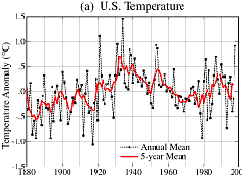
From Hansen 1999 News Release.
Next, a contemporary account of 1999 said that it was the approximately the 10th warmest year:
The temperature in the United States was also warm, about 0.7°C above the 1951-1980 average (Figure 3). 1999 was approximately the 10th warmest year of the century. The warmest years in the United States occurred during the dust bowl era, with 1934 being the warmest year.
However, in the table shown above, 1999 had moved into 3rd place (in the 20th century standings) in USHCN V1 and then continued its retrospective advance up the league table by vaulting into 2nd place in USHCN V2 Beta. And to think that only 7 years, it ranked in 10th place.


68 Comments
Seems they are discrediting the Dust Bowl years. What a big mistake. They were far worse than anything during the 90s and early 00s. When we actually do see another situation like the 1930s again, it will be nasty, people won’t expect it. This is the danger of finagling data to make the period 1990 – present appear warmer than actual, it belittles past periods which were in fact warmer, and makes people complacent. The ethical considerations are interesting.
Maybe this is up-and-up, but I have become so cynical of climate science that I can’t help thinking that it looks just like selecting the proper proxies to make the MWP and LIA “go away.”
#1 I don’t grasp your reasoning on this one.
How will this make people complacent? The GW people are constantly saying things are worse now and are going to be worser. That hardly seems likely to make people complacent.
A little eyeballing makes me sure the new curve will produce a smooter rise and thus match CO2 levels better. It will also make the post-WW2 cooling ;ook less prominent. Who would have guessed?
The cliche ‘the future remains the same, only the past changes’ comes to mind.
All the 1990’s/2000’s dates are tweaked up, all the earlier dates tweaked down.
Imagine that!
All except 2006, tweaked down a smidge .06, perhaps to make 1998’s ascendance more digestible.
“it looks just like selecting the proper proxies to make the MWP and LIA “go away.””
Manufacturing “concensus,” that the 90’s/00’s were the “hottest” ever, creating the appearance of “crisis” that a “tipping point” is near, which can be averted by present legislation in America enacting carbon trad…ok, no politics on science threads. 😉
#1. I don’t grasp your meaning. How will this make people more complacent?
People are being told that today is worse than before. And that it will soon be worser. It seems to me that must reduce complacency.
When I went to the article and looked at the revisions it seems that the overall pattern is to downplay the years before WW2, increase recent years, and reduce the effect of the post WW2 cooling. The net effect is a curve which rises more smoothly. And it will, no doubt, more closely agree with the rise of CO2.
Who would have guessed?
1954 really gets hit. It moved down about 7 notches among the 25 warmest years. Oddly enough, its warm companion, 1953, stayed in place.
The cliche ‘the future remains the same, only the past changes’ comes to mind. It often does on this topic.
In the US at least, 1934, 1931, 1921 and 1953 were at one time all higher than the record year of 1998.
I just don’t understand how they can continually get away with rewriting history like this. There really should be an science ethics committee that can stop this from happening.
If they get away with it again, every new year will become a new record.
Worrisome, but no surprise. Balling and Idso published a paper in GRL in 2002 (DOI 10.1029/2002GL014825) entitled “Analysis of adjustments to the United States Historical Climatology Network (USHCN) temperature database.” The abstract states:
“The United States Historical Climatology Network (USHCN) temperature database is commonly used in regional climate analyses. However, the raw temperature records in the USHCN are adjusted substantially to account for a variety of potential contaminants to the dataset. We compare the USHCN data with several surface and upper-air datasets and show that the effects of the various USHCN adjustments produce a significantly more positive, and likely spurious, trend in the USHCN data.”
They found that the trends in the unadjusted temperature records are not different from the trends observed using the satellite-based lower-tropospheric temperature record or from the trend of the balloon-based near-surface measurements. They go on to conclude that given that no substantial time of observation bias is contained in either the satellite-based or balloon-based measurements, and given that the time of observation bias is the dominant adjustment in the USHCN database, the present set of adjustments spuriously increase the long-term trend.
The issue of exactly how station data adjustments are made has been a concern to many climatologists for decades and, I suspect, likely to continue being a concern.
RE: #3 – Because very few alive today can actually remember the 30s. If you lock into people’s minds that the 90s are “the warmest ever” then they’ll beleive the Dust Bowl years were better than the 90s. So what has happened is, people’s expectations have actually and ironically been made more soft by this sort of language. Not if but when we get hit with another 1930s. people will be taken by surprise because in their minds, years like 1998, 2003 and 2006 were supposedly worse than the Dust Bowl years.
Recall this paragraph from Brohan et al , page 6:
“For some stations both the adjusted and unadjusted time-series are archived at CRU and so the adjustments that have been made are known… but for most stations only a single series is archived, so any adjustments that might have been made are unknown.”
In other words, Hadley reported that they lost track of what data received (homogenisation) adjustments. That has the same effect as misplacing the original data, such that no one can go back and reconstruct what the actual historical temperatures were.
I hope the NCDC doesn’t have the same uh-oh with the original US temperature records.
#10. It makes me ill to read stuff like that. That’s probably why Jones won’t release his data; he’s lost too much original data and is embarrassed to have this in the sunshine. Hey, they’re the Team. Why should anyone expect them not to lose part of their data.
RE #10 There is an interesting aspect to the discussion of homogenisation adjustments in Brohan (pages 6 to 8). The paper states that the most common reason for an adjustment was a station relocation from a (typically warmer) city to a (typically cooler) rural airport. The chart indicates that adjustments on the order of 0.5C were common, and were generally adjustments which lowered (cooled) the older temperature data.
Yet, later on, Brohan seem to have some skepticism about UHI effects and seem to suggest a only small impact (0.05C/century) on the long-term trend.
Which is it?
George Orwell, “1984”
You mean to tell me that Hadley CRU does not have the origninal temp data? That they only have data that has been tweaked and
don’t have the origninal? Man, this is just sickening. Yet we’re ready to pass legislation. Oh boy…
Nice find, John A. There’s always a “good” reason why past temperatures have to be reduced, isn’t there?
#9: thanks. I’m sorry for the (near) duplicate posts #3 & 6. I sent #3 and went to visit my daughter. Upon return #3 hadn’t posted yet and I wrote #6. (I think that is what happens when you ARE old enough to remember the dust bowl.)
Anyway, I remember seeing my father occupied for a few minutes outside. And when he stepped away. You could see where he stood outlined on the sidewalk.
You write: ‘Not if but when we get hit with another 1930s. people will be taken by surprise because in their minds, years like 1998, 2003 and 2006 were supposedly worse than the Dust Bowl years.’
Actually a replication of the dust bowl would be hailed as strong evidence of GW. Heat, no rain, wind. The entire Great Plains is subject to such anyway – the first farming disasters there came before 1900. The huge aquifers and dams have masked the natural effects for sixty years. But the aquifers are being exhausted and the dams are dependent on snowfall in the Rockies.
Enough of that.
This adjustment business seems very serious. When algorithms are used to generate mass changes the original data may not be recoverable by simply knowing the algorithm and the output. It depends upon the procedure.
Loss is even more likely when one data set ‘A’ is relied upon in calculating adjustments to another ‘B’. Data A may itself have been adjusted, or equally bad, it may be adjusted later.
Re #16, K
Sorry, I don’t understand that. What was the outline ?
Re #15, Steve
History is being rewritten in order that the dominant scientific hypothesis (and attendant political cause) is not imperilled by reference to facts.
I’m just shocked that no-one appears to object.
Re complacency.
When you tell people over and over that the current climate is bad and getting worse because it is warming, how do you suppose people will respond when it starts getting cooler. I imagine that they will be relieved. And how do you suppose that people will respond when the doomsayers start decrying the cooling. I imagine that people will respond like the villagers in the boy who cried wolf.
But they won’t know it is actually colder because USHCN, GISS and the Hadley Centre will just keep rewriting history and will be continually telling them all the time “last month was the hottest on record.”
That is the point of this thread. We will never know it is actually colder until a new independent data record organization is established.
General question: Why HadCRUT starts from 1850? Why not use all the data instrumental data (before 1850 there must be some data)? Maybe sparse set, but uncertainty levels can be increased accordingly..
More detailed one: (#10,#11)
Brohan et al, on UHI
So, need to read Folland et al (my bolds)
So, need to read Jones 1990
Hmmm.
1) However, because some cold biases are also possible in adjusted semi-urban data, we conservatively model this uncertainty as symmetrical about the optimum average. ???
2) We have not accounted for other changes in land use as their effects have not been assessed. ???
I don’t understand how this correction is made, is there UHI correction applied, or is just put to uncertainties? If there is UHI correction, is it applied to global mean, or locally?
BTW, Jones 1990
Monthly mean: from daily mid-ranges, or hourly-sampled average?
I remember that just when Congress was getting ready to debate the bill banning CFC’s, NASA “suddenly” discovered new data
that showed that a huge ozone hole had formed over the Arctic, and was drifting over the US. A year or so later, after the CFC
ban was safely in place, NASA re-examined the data, and “discovered”, that they had made a few mistakes in calculating the data,
and that there never was an Arctic ozone hole. So Sorry.
Why do I get the feeling that the politicians a ginning up the data, once again?
Steve,
Digital versions of GISS USA temperatures, as of the indicated dates:
http://www.john-daly.com/usatemps.006 6-17-2000
http://www.john-daly.com/usatemps.103 3-11-2001
http://www.john-daly.com/usatemps.408 9-08-2004
http://www.john-daly.com/usatemps.606 6-27-2006
http://www.john-daly.com/usatemps.702 2-16-2007
Meanwhile, their referring to the current version of USHCN as
version 1 is odd, since the earlier version at
ftp://cdiac.esd.ornl.gov/pub/ndp019/
would better deserve that label.
The current version at
ftp://ftp.ncdc.noaa.gov/pub/data/ushcn/
has some similar adjustments, and some rather different adjustments
than the earlier version, which George Taylor has stressed.
Let me add that in both of those versions, the adjustments are clearly
distinguished from the unadjusted data, but the number of changes of
adjustments is large, and unsettling. A quick glance at the USHCN
station history file indicates that the approximately 1220 USHCN
“stations” resided at about 7,000 locations over the periods of record.
In addition to differences of locations, other differences complicate
any attempts to calculate suitable adjustments.
It is frightening to realize that we may no longer be able to find the original data. We now have a series of adjustments to adjustments to adjustments. Since the adjustments have been adjusted, the process of trying to retrieve the original data set from what currently exists is akin to decrypting a very complex code.
If a bank did these sorts of adjustments to your check book balances because they felt that they needed to correct your past spending patterns, you would be outraged. What would the reaction be if the bank then said that they were sorry but due to a server crash, they had lost all the original check and deposit images; but don’t worry they would correct the adjusted balances by further tweaking?
#21. I asked Jones in the past for the data used in Jones 1990. He said that it was on a diskette somewhere and it would be too hard to track down.
Re: 21 UC
Parker used daily Tmin to calculate monthly average temperatures in his paper which claimed that warm windy nights proved that there was no UHI.
I am not certain whether this is standard usage at HadCRU, but with a steady decrease in diurnal temperature difference over the past 150 years, the use of Tmin provides an added bonus which the use of Tmax, or an average of the two, would not provide.
Adjustment…Ie found a Spanish? weather site named Tu Tiempo…
Compare their monthly values with Nasa-Giss or/and USHCN V 1/2…
Big Brother is a very split personality it seems…I am going through
Mr Hansenⳳ? adjusted? US “rural” weather stations from west to
east most of the West of Missisippi done 7 out of 250 or so have
the guy with the termite-infested leg …Albert Goreⳳ 2005 as the
warmest year … 6 of them in NW Nebraska…Impressing…Gentle
Women and Gentle Men (To use the same big words as the IPCC SPM guy did
2 weeks ago…) We may have (90% probability)a case of of “unintentional” “fraud”
of some 10% of humanity…Basically middle class, middle aged people
with fairly dull lives like myself…If warming hysteria gets even
worse I plan a world stand-up tour…named “BBTRCFOGATPB” Which every
intelligent person real-lies means BRINGING BACK THE RIGHT CLIMATE FOR
OUR GRANDCHILDREN AND THE POLAR BEARS…
Re #17
He’s referring to the outline that the dust left.
Steve,
I looked at the 25 warmest years at your link. Looking at all 25 warmest years, I went down the the first column (V1) and looked to see whether the same year was higher (warmer) or lower (colder) on the new beta data version.
As I got past the first ten, I realized that I could predict that if the year were prior to 1986, then it would be lower in V2. If the data were after 1986, then the V2 ranking would be higher. 1986 moves up on V2. Two years, 1987 and 1921 did not change. There are two exceptions, 2006 and 1998 swap positions. In addition, 1941 drops off the V2 chart and 1995 is added to V2.
I would expect that in a stochastic process that deviations above and below the mean would be randomly distributed. Logically it would follow that adjustments due to “recent scientific advances that better address uncertainties in the instrumental record” would likewise be randomly distributed. I would certainly not expect that all data before a certain date would be adjusted lower and all but one of the years after that date would be adjusted higher. Clearly, the selection method for these adjustments is not based on the temperature data, but rather on whether it was taken before or after 1986.
One could argue that this is simply a coincidence. If roulette or craps games operated with this sort of coincidental predictibility, the Las Vegas casinos would have vanished long ago.
#25
Without data, Jones 1990 is next to nothing. No figure showing rural data vs. gridded data.. Just Table 1 claiming 5% significant trends. I don’t know whether UHI matters or not, but combined with bucket corrections it is quite interesting topic 😉
#30. I did a couple of posts on bucket adjustments near the start of the blog http://www.climateaudit.org/?p=226 http://www.climateaudit.org/?p=231 . I don’t think that nearly enough attention has been paid to the bucket adjustments and people interested in UHI would do well to transfer some attention to SST data. Although here the original data is even more inaccessible.
I recall some discussion that some gridcells that were entirely at sea appeared to show the influence of coastal seaports. It looks like the newer HadCRU versions contain more and more “optimal” smoothing so that it’s going to get harder and harder to disaggregate the data.
#21: The continued reliance on Jones et al (1990) to ‘disprove’ global land-use impacts on the gridded data amazes me. In the new SPM, page 4, they say: “Urban heat island effects are real but local, and have a negligible influence (less than 0.006°C per decade over land and zero over the oceans) on these values. {3.2}”
Where does the 0.006 number come from? Ultimately from a conjecture in the conclusions of Jones 1990. That paper examined Eastern China, Western USSR and Eastern Australia. In the 1st region they found an upward bias in the urban data (despite allowing cities of up to 100,000 people to be classified as ‘rural’)–the urban series was the only one with a “significant” trend (who knows how they did the t-test). In the USSR sample they found one of two pooled rural-urban data series had half the post-1930 cooling trend observed in the rural series (which includes towns up to 10,000). They didn’t find any difference in the eastern Australia data. They also tabulated some earlier results showing urban US data had a larger trend than pooled rural-urban US data and concluded:
Despite tabulating a sizable effect in 2 of 3 regions they somehow conclude it is observed in none of them. Their only fig leaf is that almost none of the trends are significant, up or down. But on that basis, for those who want to use these findings to imply something about the whole world’s land mass, their paper equally proves the absence of any 20th century hemispheric temperature trends. Then they conclude:
The “0.05/century”, or 0.005 per decade, thus appears in the 2nd-last paragraph of the paper, without derivation, as a conjecture for the entire land-base of the world. And, as noted above in #21, ever since it has been recycled regularly into new papers and reports (ie IPCC 2001) which are then, in turn, cited as further support for it.
RE: #13 – What Orwell wrote! 🙂
Hansen documented major adjustments to his GISS series for the USA in this paper:
Click to access 2001_Hansen_etal.pdf
The paper is interesting because it details the corrections recommended by the Karl team, and the extent to which Hansen took them on. He accepted most, but increased the very low adjustment for urban warming.
Another interesting feature of Hansen’s paper is that a trend is calculated for “unlit” stations as determined by satellite imagery. The raw trend is minus 0.05 degrees C (i.e., cooling) over the 20th century, but adjustments are then applied to bring this up to plus 0.35 degrees (pages 7 and 20 of the pdf).
Despite claims that recent times have been hotter than the Dust Bowl years, the years 1930 to 1937 still account for all-time record high temperatures in 24 of the 50 US states:
http://en.wikipedia.org/wiki/List_of_all-time_high_and_low_temperatures_by_state
#17,27,28
#27 is correct. Dust (dirt really) collected around his shoes as he stood. After seventy years I can’t recall why he was standing outside or the color of the sky. To me the dust pattern was only a momentary curiousity.
#28. Definitely. The adjustments are not to calibrate. There is a pattern and, and among other things, it cools those troublsome 1930s. That is not to say that adjustment is never justified. History may help a little here.
In the 1930s cities were not building much and an increased heat island effect would not be expected. And even in WW2, the 1940s, there was little downtown growth; resources were being used for war, not urban buildings.
A significant event of the 1950s was new airports. Many of them in rather small cities. At the same time massive airports (large heat collectors) were being built near larger cities. Moving the weather stations to new airports would have an effect. I suspect calibration improved and also recording standards.
Little can be done about tinkering with data. Those believing in an adjustment will always make it and defend it. But much can be done about making sure original data is not lost. That is where effort should be made.
RE #35 Large airports are not only heat collectors but are also large open areas, where nightime breezes blow. Nightime breezes mix (cool) surface air with (warmer) above-surface air, elevating nightime temperatures.
Older temperature stations in more-sheltered locations would not experience as strong of a breeze, and thus less mixing, and thus lower temperatures.
Even if they are manipulating the data set, are not the individual meteorological station’s data still available…untouched? I know here in Minneapolis (KMSP) that access to each days high/low/precip is available since 1890. I am pretty certain each weather service office has it’s own data set for the local meteorological station. If worse came to worse couldn’t we just request the raw data from individual NWS offices?
RE: #37 – That may be what’s required. Sad, if so.
Re #37,
Four days ago I stumbled on an NCDC website that has a file of about a
gigabyte of daily min/max and prcp data from 32815 stations of 135
countries.
I hope soon to put together a summary of how much of which kinds of data
are included for what time periods for which stations.
#39 JerryB, sounds like a gold mine to me – I hope you have burnt backup copies onto CDs or something.
I don’t mean to sound cynical, but once it’s known someones accessed it, the original might just disappear into thin air or be secured so only ‘approved’ people can get access.
#32
Indeed, it seems to be the Jones 1990 value 0.05 C / century recycled again and again. In Folland 2001 et al. it is just doubled to get ‘2-sigma’. In Brohan et al it is 0.0055 C / decade, but they use Jones value as 0.05 C for 1900-1990 period. 0.05/9 = 0.0055555555555555…
BTW, there’s an interesting news article on clouds and global warming in Nature 27 Sep 1990. (Next issue after Jones article):
‘The question of whether clouds would substantially change the prediction of global warming caused by the accumulation of carbon dioxide in the atmosphere has been much debated, not least because there is no simple way of answering it with precision while back-of-the envelope calculations exist on either side and are memorable, even compelling. That is why the issue has been about for twenty years.’
Should we say 40 years by now?
Re: 36, David,
I agree with you about the effect of mixing over airports. I also believe that urban areas have more verticle mixing than rural areas due to the fact that urban buildings cause increased turbulence which increases mixing.
When I read Parker’s paper stating that warm windy nights prove the UHI does not exist, I disagreed with his conclusion because it appeared to me that he was only considering two dimensions. I believed then and now that warm windy nights over urban areas are caused in part by vertical mixing.
Parker’s assumption was that the warmth was blown into urban areas by the wind. I assume that the warmth comes from vertical mixing and that the source of this warm air over cities is the cities themselves. I therefore believe that Parker’s conclusions are wrong. Far from refuting the existance of UHIs, I beleive that Parker’s warm windy nights prove that UHIs exist.
#31
0.3 C bucket adjustment? Check Brohan et al Figure 12. Green error in the sea temperatures is coverage error, not measurement error.. So quite accurate adjustment, the red band is not very thick.
There are claims of great accuracy.
Tom Nelson (poster #37, I suspect) linked his Ivory-bill Skeptic blog to this website, so I believe whatever is stated here.
The entire AGW case rests on a causal relationship between global temperature and atmospheric CO2 concentrations.
There are monthly values for CO2 concentrations from Mauna Loa and there are monthly temperature anomalies from satellite data from 1978.
If these two data sets are correlated there should be at least a 50% correlation for the AGW case to even be possible!
It would be a very good exercise to correlate these two data sets independently and see if the results match the 22% correlation that I have been made aware of.
If this is the case then there is positive proof that AGW is wrong using the very data that the AGW group cherry picks to make their case ie 1998 highest temp ever on record but not the temp drop from 2005 to 2006.
Norm K
On an entirely different note, the tropical Pacific looks like it’s trying to switch in a cool La Nina direction. Click on the “assorted plots” button of
http://www.pmel.noaa.gov/tao/jsdisplay/
and look at the lower image. The lower image is a temperature cross-section of the Pacific, at the equator. Note the blob of cool water rising on the right side (Eastern Pacific). Equally interesting is the coolness on the west (Warm Pool) side.
The surface winds don’t appear to support a full-blown La Nina , at least yet, but cooling is underway nevertheless. 2007 may continue the flatline global temperature pattern of the last five years.
And on another entirely different note, there’s a news story this morning about an Australian paraglider that was sucked into a thunderstorm and rose to 10,000 metres (32,000 feet). The temperature there is about -40C and the air pressure is about one-third that of the surface. Updrafts and downdrafts can be 80km/hr and occur side by side.
The paraglider lived, amazingly, but with frostbite injuries. That was the ride of a lifetime.
#42
I’m sure there can be some mixing due to the heat isle effect itself. On relatively calm nites when heat isle is most noticable
the relative heat of the city compared to the coolness of surrounding grasslands etc…the heat differential will cause some draw
of the air into the city. However, from my observations (20 yr meteorologist) if it is clear and calm it is usually calm in the city
as well, but there likely is some draw from the cool surroundings into the city and then vertically mixed some. However if it is
a large-scale synoptic forcing that is driving the wind the temp difference between city and rural is greatly reduced, even on clear
nights but there is still some UHI that is noticed even on these nights. It is dependent on wind strength. In any event, I live in
Minneapolis/St.Paul and have observed that UHI can be as great as 7-10F on clear calm nights but the overall averaged UHI signal is much
less of course but I would suspect imperically that it is likely magnitudes more than GISS or CRU has corrected for.
Each site needs to be gone over with a fine toothed comb in order to see what is really going on. I mean, if were going to take one
meteorlogical station and statistically fit it to a large area to represent said area, well we have a lot of work to do put it that
way.
#42
-Parker’s assumption was that the warmth was blown into urban areas by the wind. I assume that the warmth comes from vertical mixing and that the source of this warm air over cities is the cities themselves. I therefore believe that Parker’s conclusions are wrong. Far from refuting the existance of UHIs, I beleive that Parker’s warm windy nights prove that UHIs exist.-
This is poppycock! Warm air at night does not originate in surrounding rural areas relative to city. Warm air is NEVER blown into a city at
night from rural in a neutral airmass. If a warm front or airmass change is occurring then yes, of course but otherwise no.
I looked at temperature data from Huntley Montana. This location was chosen because it was about 20 miles from where I live and is a small rural agricultural community. Simple yearly averages were done and then plotted for 2 30 year periods which appeared to be close to the same. The average yearly temperature for 1912-1942 was 46.2 and from 1976-2006 was 46.1. Long-Duration Drought Variability and Impacts on Ecosystem Services: A Case Study from Glacier National Park, Montana talks about how Glacier appears to be influenced by a 60 year oscillation caused by the PDO. Huntley’s temperature records also show a strong 60 year oscillation.
Montana has been a drought for the last 7 years. Fort Peck Reservoir which is 134 miles long is over 30 feet below full pool. In Montana severe drought lasted from 1928-1939 with an average rainfall of -25% below average. Our current drought has lasted from 1999-2006 and is -16% below average. Average is based on records from 1951-2001. I hope our current drought does not last another 4 years.
JP,
What was your source for the Huntley data?
NDCD
re:49 Should have been AMO not PDO.
Re 46
The paraglider pilot was actually a German girl, in Australia for the world championships. They were able to download the complete log of the flight from her GPS. She was sucked up at an average speed of 20m/s, peaking at 33m/s. She lost consciousness for about an hour, topped out at 10,000m, came to at about 6,000m and was able to pilot the rig (which was covered in ice) to the ground. A Taiwanese pilot was sucked into the same storm and killed.
This comment constitutes a correction to my comment #23:
Something odd (no number for 2006) about the usatemps.702 file,
which I downloaded from http://data.giss.nasa.gov/gistemp/graphs/Fig.D.txt
a few days ago, got me wondering. I double checked the original, and
it matched; still no 2006 number.
So, I went back to the page at http://data.giss.nasa.gov/gistemp/graphs/
and found that the link has changed to
http://data.giss.nasa.gov/gistemp/graphs/new.Fig.D.txt
and that version has a 2006 number. It also has changes of numbers
for prior years, including the 2005 number being closer to what it was
last June. However, the numbers for several years have changed by
0.1 C, or more.
I should add that when I downloaded from the old link, I
did so by using my bookmarks. I do not want to suggest that
the link changed within the past few days.
seems you have discovered what is truely AGW ….
It appears the the output of USHCN V2 has been posted at
http://www1.ncdc.noaa.gov/pub/data/ushcn/
I prematurely hit the submit button on my previous comment.
A quick glance gives me the impression that while there are
many new numbers, most of the numbers are the same as with
the previous version, and that the raw, and TOB adjustment
numbers are unchanged (but for rounding error. they seem
never to round the same way from one issue to the next).
Another quick glance gives me the impression that the new
numbers have not yet been added to GHCN.
Comparing averages of differences between the recently
posted USHCN monthly mean numbers, and those previously
posted, gives me the impression that the new numbers may
not be from USHCN V2. The average differences are very
small, and their directions seem not as one might expect
from the NCDC web page referenced by Steve at the top of
this thread. I’ll post a couple of graphs either later
today, or tomorrow.
Graphs comparing new/old USHCN adjustments are at
http://www.john-daly.com/ushcnrac.htm
My guess is that the recently posted data are *not* from
USHCN Version 2, but that’s just a guess.
SteveM,
Regarding USHCN updates:
At the CDIAC USHCN site, you find a USHCN update with data through 2002,
but at the NCDC USHCN site, more recent updates have been posted.
At ftp://ftp.ncdc.noaa.gov/pub/data/ushcn/
an update with data through 2003 was posted in early 2005 (it has since
been replaced). A copy of the mean data has been placed at
http://www.john-daly.com/hcnmea03.zip
in case you would like to review it.
In August, or September, 2006, USHCN updates through early 2006 showed
up in GHCN, and at GISS, without having been posted at the NCDC USHCN
site (or at CDIAC).
Then on March 1 of 2007, an update was posted at
ftp://ftp.ncdc.noaa.gov/pub/data/ushcn/
but did not get included in either GHCN, or GISS, as far as I can tell.
I discussed that update briefly in comments 57 – 60 above shortly
thereafter.
Jerry, in the file ftp://ftp.ncdc.noaa.gov/pub/data/ushcn/hcn_doe_mean_data.Z archived on MArch 1, 2007, the latest information is Dec 2002. Do you have an exact URL for any USHCN archive with later data?
Steve,
I just re-downloaded that file, and looked at it in a text
editor, and the 2003 to late 2006 data are there.
When uncompressed, the file size is 80921600 bytes including
line feeds, and has 558080 lines. Do those numbers match
what you have?
I downloaded it again and, yes, I’ve got 555080 lines. Funny thing is that the version that I have dated 5/27/2006 is smaller, but, as you observe the CDIAC version is different and older than the NOAA version and maybe that’s the difference. I’ll update my ushcn records accordingly; thanks.
Good. Since it appears that that update has not been added
to GHCN or GISS, and since there are some differences in its
adjustments relative to other USHCN updates, it may be of
very limited, or no, value to you in the comparisons that
you have been doing, but I did want you to be aware of its
existence.
My guess is that GHCN and GISS are awaiting the release of
USHCN V2 data.
Re 32, 41, see my page
A few years back I saw satellite images of Atlanta showing it creating it’s own thunderstorms. No heat island ‘fer sure’.
The most interedting confession in Brohan et al is at the top of page 3
” It is always possible that some unknown error has contaminated the data, and no quantitative allowance can be made for such unknowns”
They then have the gall to refer to the espert on this subject, Donald Rumsfeld, who in his June 2002 speech composed the following delicate poem
“As we know, there are known knowns;
There are things we know we know.
We also know there are known unknowns;
That is to say we know there are some things we do not know.
But there are also unknown unknowns
— the ones we don’t know we don’t know.”