We’ve observed the changes in GISS over the past 7 years. Jean S draws our attention to the changes in GISS temperature history since Hansen et al 1981.
I’ve tried to re-plotted the current Hansen data – right frame – in the same format as Hansen et al 1981 Figure 3. This is not as easy as it seems because Hansen et al 1981 does not include information on centering; no digital version seems to be available; and the modern zonal versions commence in 1900 rather than 1880.
I’ve updated the graphic to also illustrate an interesting 1998 version of Hansen’s data which has proved helpful in trying to figure things out. The left panel below is a plot of the 1998 version (black) centered on 1901-1970. After thinking about this for a while, it became clear that the reference period had to cover most of the century or else the position of the NH series in Hansen et al 1981 could not be replicated. I think that the black version of the NH series is pretty well matched to Hansen et al 1998. Notice that Hansen et al 1981 picked 1880 as a starting point and that this neatly truncates from view a temperature decline from 1866 to 1880 (which was in the original data version). Just a coincidence, I’m sure.
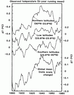
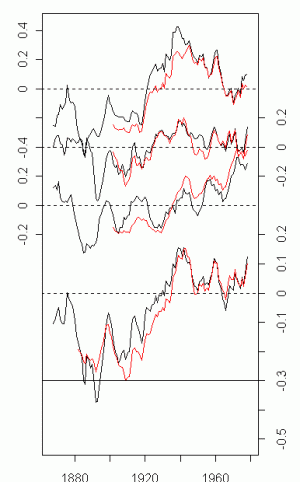
Left: Figure 3 from Hansen et al 1981; right – Latest GISS data plotted in same format over same period. Most recent version is truncated at 1900, while earlier version went to 1880. The 2007 and 1998 data has been re-centered on 1901-1970. I’ve not been able to locate information so far on the reference period for Hansen et al 1981 and this may need re-drafting.
This shows that there doesn’t seem to have been much adjusting of the north (N of 24N) series up to 1998, but it has been adjusted down between 1998 and 2007. However, there do seem to have been adjustments to the other two series between 1981 and 1998, as well as between 1998 and 2007. One of the very important reporting changes between 1998 and 2007 is the truncation of the period 1880-1900. Notice the particular impact on the tropics, where 1998 results show late 19th century values similar to closing 1980 values, resulting in no net change between 1880 and 1980 in the tropics. What do you suppose the reason was for eliminating the reporting of zonal measurements for 1880-1900 in the most recent results?
Jean S observed:
For instance, the difference between the temperature height in 1940 and low in 1970 in northern latitudes is about 0.5C in 1981 version whereas now it seems to be about 0.3C. In low latitudes (1981 version), there are three peaks (around 1930,1940,1960) that are higher than 1980, but in the current version two of those peaks have disappeared and even the existing one (1940) is below 1980. In southern latitudes, there is a lot of variation between 1900-1930 in 1981 version whereas the currrent version is almost flat. Also the mean of 1910’s is about the same as the mean of 1960’s in 1981 version, but in the current version there is over 0.2C difference. And so on…
UC observed:
We’ll lose the concept of time soon. It will undoubtedly get warmer in the future, but also past temperatures will get colder in the future. 🙂
Hansen et al 1981 stated of the left panel:
A remarkable conclusion from Fig 3 is that the global temperature is almost as high today as it was in 1940. The common misconception that the world is cooling is based on NH experience to 1970. Another conclusion is that global surface air temperature rose ~0.4 deg C in the past century, roughly consistent with calculated CO2 warming. The time history of the warming obviously does not follow the course of the CO2 increase, indicating that other factors must affect global mean temperatures.
The adjusted GISS temperature is a little more consistent with the “course of the CO2 increase” and less consistent with solar changes, with the largest differences occurring in southern latitudes, about which the least is known. I wonder what back-up is available for the southern series. However, from a statistical point of view, because these adjustments have such an impact on the eventual fit, it’s getting to the point where a statistical analyst may have to ask whether GISS adjustments to pre-1980 temperature should be counted as a degree of freedom in their modeling.


77 Comments
Here’s the script (revised using 1901-1970 centering for now), showing both 1998 and 2007 versions, (which relies on a prior collation of the GISS data – which is in an annoying format):
Incredible and disgusting. This is not science; it’s dirty politics under the guise of science.
I’m new around these parts, so please forgive me if this has already been done or discussed, but I’d be interested in seeing comparison plots of 1981 temp vs CO2 and new GISS temperature and CO2.
In 1981, they forgot to make an important step in their evaluation of the graphs: to remove and subtract scientists and thermometers that were stooges of oil companies – as demonstrated by the fact that they disagreed with some of the commandments of climate change. These errors have been retroactively fixed.
More seriously, in the graphs, I am much more impressed by the “improvement” of the global average – the bottom curve. While the old version shows a very clear cooling between 1940 and 1970, the new version has changed it to noise. I guess that they had to be pretty careful which thermometers were corrupt by oil companies and which were not, in order to get so much better a result! 😉
The data modification “tubes” at the “Ministry of Truth” ……
We are the priests, of the temples of AGW. Our great computer models, fill our hallowed halls.
George Orwell would be proud.
When commentators say we should be afraid, very afraid of these temperature trends (changes?) maybe they have a point — at least, if not afraid, it makes me very curious.
While these adjustments see very little effect from UHI, it appears that a significant amount of change comes from changing station locations e.g. from a roof top to a grassy area. If I have read correctly it appears these changes are adjusted on an individual basis by looking at “step” changes in temperature that correspond to location changes by comparing the temperature change with other stations in the area — and with areas that can be rather broadly defined, as I recollect. These changes would appear to have all gone, on net, in one direction. Has anyone seen a review/critique of these adjustments methods?
The other large adjustment (Time of Observation or TOB) came from changes in the hours used for determining maximum/minimum daily temperatures (the standard being midnight to midnight). These adjustments had a net one way increase of approximately +0.3 degrees C. While these calculations for adjustment would appear straight forward, I would be curious if the calibration of this effect has been reviewed or critiqued (outside of the immediate and interested parties).
I guess what puzzles me most is that these one way adjustments continue to be made even in recent times and for even recent measurements.
Wow, I thought that scientists had to be careful as the act of observation affects the results of their experiments but this is about altering data to re-enforce a personal belief system. I suspect that Jim Hansen actually believes the current data is real and accurate. Thats considerably more scary as it suggests a Messiah complex. In Al Gore, you can understand it but a trained scientist?
There are reasons for these adjustments – as Ken points out, the Time-of-Observation bias is perhaps the most important. The idea of the Time-of-Observation bias is this: the daily mean temperature in US HCN stations seems to be the average of the max and min over a day (I’m not 100% sure of this definition). If the reading is done in the late afternoon, then a warm afternoon, can affect both the day leading up to the afternoon and the day after the afternoon, while if the reading is done in the morning, a warm afternoon affects only one reading. If the time of reading is changed from afternoon to morning, then this will downwards bias the record. Karl, who turns up on many topics, originated this adjustment. In some articles, the meta-data is questioned and they try to estimate time-of-observation from the pattern of the data. They argue that there has been a systematic bias towards more morning measurements in the recent observations relative to the earlier observations.
So there’s a reason for the adjustment – I think that the concern arises because they seem to try a lot harder to find a downward adjustment for early readings, while they seem to be content with very weak UHI analyses such as Jones et al 1990. Since the adjustments are pretty much equal to the effect being measured, there’s every reason to analyse the entire adjustment process – including UHI.
The TOO adjustment would apply to the US, but the big story here is really the SH adjustments, where I doubt that it applies. The big adjustment is probably in SST – a topic which deserves much more analysis than has been done (and has been analyzed far less than UHI).
Something looks not quite right about this. Look at the chart of new GISS temperature anomalies. The line on the bottom looks exactly like the southern latitudes line just above it, but stretched over a larger scale. Also, the bottom line is at about -.45 at year 1900, but none of the others above it are that low.
Since the temperature variation in a day is somewhat sinusoidal, I think it would be much more indicative of an “average” if they actually took the rms of the hourly (or whatever scale) readings were. Taking a simple temp(time a) – temp(time b) average is silly if that’s what they’re really doing.
Mark
The two lower curves in the right frame are identical for some reason,
the lowest one is only vertically stretched. There must be a mistake here.
Mark T. (#13), would you explain a little further, for people (like me!) who don’t follow your reasoning?
As I understand it, the readings are not hourly, but twice
Yeah it does look like the bottom graph is the wrong one. Here are links to the current tabular data for GISS
Land-Ocean
http://data.giss.nasa.gov/gistemp/graphs/Fig.A2.txt
Meterological Stations
http://data.giss.nasa.gov/gistemp/graphs/Fig.A.txt
Re #14
The reason is clearly that the further in time you go, the colder the past becomes.
To me the most striking feature is the reversal of the slope of the southern latitudes between 1940-1970. In the 1981 figure the slope appears to reflect a slight cooling trend (all three latitudes appear to show a cooling trend). The ‘adjusted’ version the slope of the southern latitude appears to be a warming trend, while the others maintain a slight cooling trend. I find that remarkable, from cooling to warming in one easy step. I’m skeptical that reasonable adjustments would have made such a huge difference.
Seems to me if we’re interested in the consequences of climate, we should look at temperature AND at how long a given temperature was sustained. Thus if the daily temperature is recorded as a continuous curve on a chart recorder, what we’d want for comparison is the area under that curve, i.e., the integral.
John West (#19), I would agree, except for state changes. What is really desired is presumably the integral of heat content. I don’t know if that data is available. How far back does humidity data extend?
Re #13,
For most of the historical record, most weather observation
stations did not record temperatures hourly. Today, hourly
observations are quite common using automated equipment.
Still at many stations, a min/max thermometer set is used,
and the mean is calculated as (min+max)/2. It also appears
that many stations do not record min/max, or at least do not
forward that information to GHCN, but report only their
calculated mean, which may be based on three, or four,
observations at set times of day, plus some bit of arithmetic.
About thirty percent of GHCN stations report mean, but not
min/max.
Choosing some time to take a reading, then picking another time 12 hours later does NOT give you an average temperature for the day if the fluctuation is not completely symmetrical about the times you choose. Also, since a typical plot of temperature over time resembles a sine wave, but not quite, even picking a max and min point might not provide an “average.”
Doing an rms is actually not really a good way, either, as that is intended to measure power/energy in an oscillating wave, where the negative actually contributes energy, though the “average” of all the points in a sine (biased around zero) is actually zero. Realistically, if they want to take an average, they should really probably just do an arithmetic mean on all those points. In such a case, the “average” temperature would really be the center point of a sine wave (as would max/min) if it were perfectly shaped.
Immaterial other than providing finer resolution in the result.
Mark
John,
That’s sort of what an arithmetical mean is. Each sample of a continuous curve is the area under that curve, and each of the areas is summed, then divided by the number of areas for normalization.
Mark
It seems to me that a much better estimate of climate change could be made by simply averaging all the ocean temperature data, forget the land-based stuff. Sea water temperatures give a good idea of heat content, not just temperature. I think Roger Pielke has suggested this.
The bottom graph is the southern multiplied by 2, according to Steves script. Probably a typo. The real difference is not as striking. I did a comparison with the top graph found here and the 1900 and 1960 peaks are unchanged between 1981 and today. But the temperatures between 1910 and 1940 has been lowered by 0.1 C similar to the recent HadCru update. The -81 graph also lacks the 0.1 C uptick from 1978 to 1980
re #6,7
We’re in the land of Oz here guys. Pay no attention to the man behind the curtain!
#25. Martin, the reason that it’s multiplied by 2 is that Hansen changed the scale of the bottom plot – look at his graphic. Multiplying by two is what’s needed to adjust for the scale change; I’m pretty sure that I’ve done it correctly.
#27. Steve, I understand the multiplication by 2. But it is still the temperature for the southern hemisphere:
…
lines(1880:1982,filter(giss$mid[(1880:1982)-1879],rep(.2,5))-0.4)
lines(1880:1982,filter(giss$south[(1880:1982)-1879],rep(.2,5))-0.8)
lines(1880:1982,filter(2*giss$south[(1880:1982)-1879],rep(.2,5))-1.5)
…
The last line should probably be:
lines(1880:1982,filter(2*giss$global[(1880:1982)-1879],rep(.2,5))-1.5)
or similar.
#28. Got it. I’ve edited and changed. Shows the benefit of putting code online. (IT also makes it much easier for me to keep track of things.) The revised graphic (now online) does not have the same degree of GLB change as the version up before. MArtin, the difference looks to me to be at least 0.2, rather than 0.1 – when you compare the early 20th century, don’t let your eye be drawn by the 1880s values which are not included in the current info. But the difference is definitely reduced.
It looks to me that Hansen data ends at around 1978 and lacks the final uptick of 0.1 dB from 1978 to 1980. I am also quite sure that the anomaly is calculated towards different reference time periods. Present reference period is 1951-1980, while 1981 reference seem to be more 1911-1940. If you align the plots at 1978 they look more similar. The ajustment between 1910 and 1940 seem to come entirely from southern hemisphere. Does anyone no the reason for this? Is there some kind of adjustment that is unique for the southern hemisphere?
What would happen if you removed the stations (Cooperative) that did the once or twice a day measurements and used only the ones with the max/min readings. I would think that you would get rid of the significant bias (.3 or whatever they used) Can anyone run that or is the data in seclusion?
#30. you’re right that the reference period is probably different. I checked the original article and didn’t notice what they used. It might be 1951-1970. I agree about the SH – it would be interesting to backtrack through the various updates to see what they’ve said.
#30:
I somewhat disagree. There is also over 0.1C difference in those dates in northern latitudes. It seems to come from lowering of the values in 1930’s (which would explain some of the 0.2 difference afterwards) but I may be wrong. Also the sudden 0.2 drop in 1940’s in the current low latitudes version begs for an explenation.
Re #20,
Sara,
Much precipitation data exists for long periods at many locations, but
comparatively few, I would say relatively very few, stations made
humidity measurements.
Re #31,
Gerald,
I don’t know what would happen, but let me mention a couple of items.
The USA Cooperative stations use min/max sets, and (most) have been doing
so since early 20th century. Previously, they did such things as
sunrise/sunset readings, or tri-daily readings such as 7 AM, 2 PM, and 9
PM, and then did a weighted average using the 9 PM reading twice, and
dividing by four.
The numbers of min/max stations get fewer, faster, the further back in
time that you go.
For many purposes, any of several methods of estimating a ‘mean’
temperature can be fine, but changing the method makes for comparison
problems, and for min/max stations, changing the time of observation
makes for comparison problems. Also, changing the station location
makes for comparison problems, and such collections of historical
temperature data as GHCN can be very fuzzy about locations. It also
does not include time of observation information for min/max stations.
I was just looking at NOAA’s ‘Tides Online’ site (http://tidesonline.nos.noaa.gov/), which has chart-recorder type displays of air temperature, water temperatire, etc. for ports along all U.S. coasts. Some of the air temperature curves are deformed sinusoids, others (like San Francisco right now) not at all.
RE: #34 – A point I brought up earlier, and will restate. Min – max averaging would be OK if all stations were in the same or similar climate zones. But what has happened over time, is that whereas, ca. 1900, most stations were in North American Humid Continental and Euro Marine West Coast, today, there are many newer stations in Mid to Low latitude arid and semi arid zones. These latter have notable non sinusoidal diurnal temperature plots during substantial portions of each year. The general bias would be for min max average of such stations to be above the arithmetic mean. So, the overall population of stations has come to be increasingly affected by a growing subpopulation of stations in climate zones very different from ones in Eastern North America and Western Europe.
NCDC changed their method of calculating average temperature anomolies in 2006. The methods are provided by the link on this page (Smith and Reynolds, 2005). I tried to wade through it, but I don’t have the statistical background to understand it well. Maybe this is old news, but just in case…
Re: 17
John,
Actually Hansen has only made past tempertures colder up to a point.
When you run recent data through a Mannamatic processor, the LIA is higher and the 1930s are lower. Notice how the “new” pre-1930 Global Mean seems to oscillate around -0.3. The “old” data showed an upward trend form 1880 to 1940 followed by a cooling trend form 1940 thorugh 1970. The Mannamatic processer which Hansen used corrected these non-HS anamolies in the data.
Now the Global Mean temperature shows a nice warming trend from 1880 through 1980.
Does anyone know if the blue bars in the figure

are the error bars? They do not appear in the cited Hansen et al (2001).
Roger Pielke, Sr. has published a paper (Pielke and Matsui, 2005) on a possible cause of a warm bias in the minimun nocturnal observed temperature. Basically, an increase in downwelling long wave IR, for whatever reason, would cause a larger temperature increase on a night with still air than would outherwise be expected.
This statement appears on the page linked to above. I wonder if some folks have used the erroneous data, thus causing confusion.
I put the two plots in the same image.
It is really a huge difference.
re #38
Perhaps one unstated goal here is to eliminate what was a near perfect correlation between solar cycle lengths and temperature — A Real Inconvenient truth for the Team.
There are so many revisions of history floating around that I’ve lost track of sources. Is this global anomaly chart from this report sourced from GISS, USHCN or Hadley?
Thanks
To paraphrase Santayana, historians are greater than God because they can change history and He can’t.
All these problems were well discussed, including ways of dealing with missing data, in Conrad and Pollak’s 1960 book “Methods in Climatology.” No doubt simplistic and inadequate by today’s standards, it did outline the problems, of weather data and appropriate scientific handling for reasonable results. My point is none of this is new in the climate community and for me underlines the distortion and hijacking of the discipline that is becoming more apparent everyday. The disclosures are far from over.
I recall several months ago Willis E waxing eloquently about the different purposes and fidelity of temp measurement, say 50 or 100 years ago, verses the purposes today of depending on it for GW assessment, and the resultant claims of understanding the state of GW change to tenths of a degree. This thread underscores that rather well.
Here is one of the two most acclaimed temp gatherers / interpreters trying to correct lousy data. No doubt someone needs to do that, but it is obviously difficult to make good corrections without really knowing exactly the extent of error and differences between collection locations and methods then and now. You just aren’t going to get a result within tenths of a degree. Even if you are completely honest and ethical and not introducing any ideological bias.
If you can’t get the accuracy with the measured temps, you certainly aren’t going to calibrate the accuracy of any proxies against temps within tenths of a degree. I believe this demonstrates well the lack of a sense of reality in climate science.
As mentioned, I’ve lost track of global temperature versions and revisions. So, this may be duplicating something already used at CA, but nevertheless I’ll mention that here is a 1997 global temperature version I came across several months ago.
The time series values are given towards the bottom of the webpage, at this link .
#46
BINGO! Very well said. To think we can statistically manipulate meteorlogical station data to within 1/10th of a degree C and call
it a Global Mean Temperature is, for this meteorologist…silly.
All of the IPCC reports are in our Public Libraries here in NZ. Are you telling me that Jones research is what has been used for the models predicting the end of the world and he refuses to release the research data to show it can be replicated?
Is that the long and short of it?
#42 These graphs are anomalies, not absolute temperatures. Since the reference time periods are different there will also be a difference in vertical offset. This offset difference is of no importance and intereset. I think this is a more fair comparison:
I think the main difference is that the temperatures from 1910 to 1940 has been lowered about 0.1 C and the graph from 1980 lacks the 1978-80 data. The 1950 temperature has also been lowered by 0.1 C and th 1965 dip increased. These differences are all similar to the recent HadCru update.
In a word, YES.
Bob
Why use 23.6 degrees north and south as the segment boundaries? Seems to me that divides the globe 30% north, 40% middle, and 30% south. Wouldn’t about 19-20 degrees be the proper division area-wise?
Re; 51
ARE YOU SERIOUS?
#50. Martin, how do you do the overlay of the new plot on the jpg? Can you do the SH in a similar way for us as that looks like the most interesting (as we’ve discussed)?
What reference period did you use here? I couldn’t locate one in Hansen et al. I’ve experimented with a few different reference periods and haven’t been able to get one to work for all the series.
#54, Just some “photoshoping” in Gimp. I haven’t used any specific reference period. I just make the graphs have about the same average. If the adjustments made by Hansen/Giss since 1981 affects the total average from 1880-1980, there is no way for us to know since we only have anomalies graphs. I don’t know if the vertical offset in the graph below is correct, it is only a guess.
Martin, the problem that I get working from reference periods is that I can’t get all of them to match at the same time. I’ll try again tomorrow.
Do they have to match at the same time? My guess was that the anomaly is calculated as the offset from the average over the reference period for the specific regions. So, if you adjust the values for the southern hemisphere, that will affect the anomaly and vertical scale offset for the southern hemisphere, but not the other regions. But if the anomaly is calculated as offset from the global average, then I agree.
So, as I am thinking, there is no way for us to know if the souther hemisphere temperatures has been adjusted downwards for earlier years or upward for later years. I just assumed the former.
Re #44,
David,
None of the above. It’s from NCDC (National Climate Data
Center),which is part of NOAA. Also, keep in mind that
the USHCN data is only for the 48 contiguous USA, so if
something is ostensibly global, then it would presumably
be based on more data than resides in USHCN.
Perhaps we need to find one really good example where we have all the raw data going back to 1880 and we know temperature measurement techniques were carried out adequately over the period.
We then compare that to the current record in GISS, HadCRUT etc. Someone mentioned they had Toronto’s raw data in earlier thread. This might be a good example for Steve. Maybe a Toronto newspaper will post it up so that the public can be made aware of what is going on here.
Re # 59
Thanks, Jerry. That being the case, then this NCDC temperature global anomaly data also changed a few years ago. The 1997 version (referenced in #47) is somewhat different from the current version .
I understand that techniques and information can improve over time, so revisions can be warranted. But, what struck me as odd is that the NCDC 1945-1975 global cooling has now disappeared while most of the rest of the time series is unchanged.
Their older version showed some decline over that period whereas the current version shows no trend. Basically they “cooled” 1945-1960 relative to 1960-1975 and changed the trend.
Related to that, the second half ot the NCDC 20’th century no longer has a distinct circa-1976 inflection point in the temperature record. The 70s and 80s are now smoother. Sudden trend changes (like that of the older version) are, in my opinion, hard to explain using the CO2/aerosol reasoning. Sudden changes are more like a signature of a natural climate mode change.
I will deeply wonder about the NCDC motives if they next discredit/rewrite the data from the World War II era and that 1930s and 1940s warm hump is reduced or removed.
Maybe some clarity — typical amateur observers check a min/max thermometer at the same time every day (I did ~11PM) and those values would be the high/low for that day. There were some winter/early spring occasions when a strong cold front was pushing thru at 11PM when checked, and the “min” would be the current temp & also the next day’s “max”.
I’m suspicious about the assertion that more observers changed from evening to morning than vis-versa. This seems like a big “correction” & an opportunity for possible abuse.
Here’s a discussion of time-of-observation bias from deGaetano of NOAA
I’ve edited the plot here and updated tghe code in #1. I located a 1998 version of the GISS information (not at GISS) and this was helpful in adopting a reference period of 1901-1970, which looks as plausible as I can think of right now.
RE 63:
Thanks, Steve_M — that’s a comprehensive explanation.
Tracking these old papers is fun:
Hansen 1981:
Hansen 1987:
http://pubs.giss.nasa.gov/abstracts/1987/Hansen_Lebedeff.html
Jones 1989:
USA Today and Hansen resurect the Hockey Stick.
http://www.usatoday.com/weather/climate/globalwarming/2007-02-27-scientists-un_x.htm?csp=24
Look at the chart at the top of this article.
It makes the hockey stick seem a paragon of accuracy by comparison.
re #67: Let’s give the proper credits: I think the graph is Mann&Jones (2003) (until 1855), then spliced with Jones’ HadCRU and finally extended with IPCC projections. So it’s mainly prof. Jones you should thank 🙂
#67,68
And remember that the past values are based on ‘scientific estimates’. They forgot to include CIs from MannJones03, but that’s not a big problem in scientific estimates. BTW, MannJones03 Fig.2 is probably the best example of divergence problem. But in the absence of a substantiated explanation for the problem, I’ll make the assumption that it is likely to be a response to some kind of recent anthropogenic forcing 🙂 Climate science is so fun.
Here it is:
http://www.geocities.com/uc_edit/divergence.html
It is art. 40 year lowpass and everything.
67: MarkW, The last real data value is 2000 on that graph, also. It should show a relatively flat line for the past 8 years, but then, it would take a little work to update it. The Team has no time for updating, since they have to move on…
Re: 43
From what Science organization did you get that SunSpot Chart from? The Max Planck Institute shows something similar.
43: Here. And here’s an even better one. But please realize that this figure has been criticized severely because of errors and the correlation appears (so far) to be weak since about 1985. I have not given up on it, however, since more solar cycles are needed to accurately establish the location of the last few points on the graph (due to a 1,2,2,1 filtering of the data).
Darn it, in my 71 I meant to refer to 70, not 67. I did notice that the figure referenced by 67 actually shows a leveling off in temperature for the past few years, but then it zooms on up in the future. This is almost comical. Wonder if the models show the leveling, followed by a rapid increase…To me, this, alone, shows deceit.
In reply #43 george h. says:
May I please have a citation for the appended graph?
Thanks.
I couldn’t help but notice the following quote at Wikipedia in the section on John Christy and the MSU data.
This particular quote was added by
# 67 — If you move your mouse over the graphic, you’ll find the temperature from year 200 to 1800 is known to four significant figures, which admirable precision descends to a mere three significant figures during the 1800-2000 Jones measurement era.
With that sort of high accuracy proxy result available, I can only wonder that anyone thinks there could be any uncertainty in the AGW conclusion.
There’s also a pretty irony when the mouse pointer graphic informs us of Medieval grapes in England with temperature change flat-lined. Reason seems to have fled those parts.
Re 61: If you look at the thirties and forties hump without the bucket correction, you will find that the hump begins in 1939. If we are trying to explain aspects of change it is going to be necessary to clean up the ‘corrected’, ‘adjusted’ or otherwise ‘fudged’ data. Clean data will give us the chance to tease out the underlying causes. Adjusting data — because, for example, it makes your computer model produce the right land temperatures — will obscure the subtle causes.
Take out the bucket correction — there’s a CA thread on this — and you can see the WWII signal loud and clear. Climate was experimented on by the huge oil spills released by the Battle of the Atlantic and we can see the response, we can even do predictions by using the data and we can hypothesise about the PETM using the data. It may be rough and ready science, but to my mind it’s a lot better science than fiddling your data to fiddle your results, which how I interpret much of what is going on. I know this may sound nit-picky, but the integrity of the data is vital: without it all the computer models are junk, all the scares are junk, all predictions so much hot air. Defend the data and the truth will be found. Allowing the data to be corrupted and controlled will mean the end of climate science.
JF
3 Trackbacks
[…] McIntyre finds something fishy happening with NASA’s records of historical temperatures. This deserves investigation. Filed […]
[…] point shaving is the key question here. I’ve also discussed Hansen adjustments to past data here […]
[…] McIntyre. Hansen then and now (Climateaudit.org 23.Feb 2007) (McIntyre se snažil pečlivě vyřešit otázku srovnávacího období, tzv. nulové hladiny, […]