Climate scientists didn’t bother checking the Hockey Stick, but they are showing great diligence in going through The Great Global Warming Swindle.
Nathan Rive (archive here) is the newest entrant; he has cross-checked one of the graphics in Swindle against the original graphic in Lassen and Friis-Christensen and found a discrepancy between the graphic and the original article. BTW I obviously endorse such cross-checking. I focus on the studies cited by IPCC simply because I have limited time and resources, but it’s a good idea to cross-check Swindle or Inconvenient Truth (which I’ve spent relatively little time on).
Rive observes a divergence problem in the solar cycle correlations. I agree that divergence in these sorts of studies is a serious problem as do most CA readers. So I hope that Rive will spend some time with the more serious divergence problem in proxy studies.
Here is the comparison between two graphics showing the problem identified by Rive (endorsed by Friis-Christensen). As you see, the original graphic on the right has a discontinuity in the solar cycle series during the 17th century – the Maunder Minimum period, while the Swindle graphic doesn’t. Rive made some over-the-top allegations of “fabricated” data – something that I haven’t noticed him saying about Mann’s extension of the Gaspé series. In this case, I presume that someone along the way didn’t notice the discontinuity in the solar series and assumed that the two series overlaid one another (as you sometimes get with computer generated graphics).

Thus the graphic on the left. It’s an embarrassing error to be sure. However, given that there’s a plausible explanation for the error, I would counsel some caution by Rive and Friis-Christensen about alleging that the producers of Swindle “fabricated” data. That’s the type of over-reaching that could easily backfire.
On Durkin’s side, the error must be rather frustrating since the section with the solar cycle discontinuity corresponds to the Maunder Minimum and there were lots of ways that they could have talked through that. But this is climate science so errors and ironies abound.

I don’t know Rive but he put me on his circulation list for a mass email today publicizing his statement. After confirming to my own satisfaction that there was an error, I wrote Durkin urging them to set a good example to climate scientists by forthwith acknowledging any error and amending the release accordingly. Perhaps he could turn an embarrassing situation to his advantage by showing a willingness to admit and correct mistakes – a practice that would surely contrast favorably with the behavior of the Team.
BTW I’m not particularly impressed with this particular correlation anyway, now that I look at it. I don’t think that the Groveman and Landsberg 1979 reconstruction should have been used in 1995.
Update: May 1, 2007: In response to my email, Martin Durkin replied, acknowledging that an error had occurred and that a correction would be made as follows:
You can confirm, if anyone’s interested, that we’re changing the graphic for all future transmissions and the DVD version.
The Divergence Problem
The Rive statement wanders into silly speculations about the producers rummaging through Be-10 records. I cannot imagine that this happened. It then criticizes Swindle for inadequate disclosure of a Divergence Problem – in this case between solar cycles and temperature after 1975. They say:
The sunspot cycle length data in the L+FC graph shown on the screen stops in 1975. To demonstrate that both solar activity and temperature increased simultaneously from 1975 to 1985, Friis-Christensen and Lassen in their original 1991 paper included partially filtered and even unfiltered data for the last points in the graph. Updated calculations by Lassen and Friis-Christensen (2000) [JGR, 105(A12): 27493-27495] confirmed this trend between 1975 and 1985. However, they also explicitly concluded that after 1985 the temperature continued to rise while the sunspot cycle length flattened out, and thus no longer correlated with surface temperature. This point was not included in the narrator”¬’¢s statement.
It’s pretty interesting to see a climate scientist treat insufficient disclosure of a Divergence Problem as a serious failing. Personally I agree 100% that such problems need to be fully and completely disclosed, whether the author is Durkin or Mann. I’m not sufficiently familiar with the data here to opine on this particular divergence, but, on the basis that there is a divergence between solar cycles and temperature post-1975, I agree that this should be fully disclosed, just as Mann should have disclosed the verification r2 of 0.01.
This reminded me of the cynical IPCC TAR truncation of the Inconvenient Divergence in the Briffa et al 2001 reconstruction. By now, the Divergence between ring widths, densities and temperature in the last half of the 20th century is notorious. I’ve done what I can to publicize the problem. Briffa et al 1998 mentioned the problem in passing as follows:
However, although temperatures rose again after the mid-1960s and reached unprecedentedly high recorded levels by the late 1980s, hemispheric tree growth fell consistently after 1940, and in the late 1970s and 1980s reached levels as low as those attained in the cool 1880s. Over the hemisphere, the divergence between tree growth and mean summer temperatures began perhaps as early as the 1930s; became clearly recognisable, particularly in the north, after 1960; and has continued to increase up until the end of the common record at around 1990. The reason for this increasingly apparent and widespread phenomenon is not known
Here’s a nice graphic showing the Inconvenient Divergence (there’s much else that can be said about this figure, but for now let’s just observe the Inconvenient Divergence).
What happened to the Inconvenient Divergence in IPCC TAR? It was deleted. Now this was hard to see because of the coloring in the spaghetti graph. I discussed this previously here showing the following blowup of the IPCC graphic:

In AR4, there are no fewer than 3 reconstructions in the IPCC spaghetti graph with 1960 truncations: the original Briffa et al 2001 truncated series; Rutherford et al 2005 which used the Briffa network and also truncates in 1960; and Hegerl et al 2006, which uses a different network but also truncates in 1960, presumably also due to an Inconvenient Divergence. IPCC was unable to completely ignore the Divergence Problem and says:
Others, however, argue for a breakdown in the assumed linear tree growth response to continued warming, invoking a possible threshold exceedance beyond which moisture stress now limits further growth (D”¬’¢Arrigo et al., 2004). If true, this would imply a similar limit on the potential to reconstruct possible warm periods in earlier times at such sites. At this time there is no consensus on these issues (for further references see NRC, 2006) and the possibility of investigating them further is restricted by the lack of recent tree ring data at most of the sites from which tree ring data discussed in this chapter were acquired
and, on one side of its mouth, acknowledges a problem, but elsewhere disregards these caveats in its estimation of confidence intervals.
However, this is one side of their mouth and elsewhere they proceed to disregard this caveat by, for example, publishing confidence intervals that pay no attention to this pretty serious problem.
Also if you read closely, they show that they are aware of the post-1960 truncation (they should be; as a reviewer, I specifically asked that post-1960 values be shown on the spaghetti graphs), but they dance around admitting it as follows:
In their large-scale reconstructions based on tree ring density data, Briffa et al. (2001) specifically excluded the post-1960 data in their calibration against instrumental records, to avoid biasing the estimation of the earlier reconstructions (hence they are not shown in Figure 6.10), implicitly assuming that the ”¬Ëdivergence”¬’¢ was a uniquely recent phenomenon, as has also been argued by Cook et al. (2004a). p. 473
OK, let’s grudgingly grant Briffa the 1880-1960 period for calibration. That does not imply that IPCC TAR or AR4 are entitled to delete the Inconvenient Divergence. If Briffa’s calibration on 1880-1960 has yielded unbiased coefficients, then IPCC should show the post-1960 reconstructions – Inconvenient or not. In this case, their failure to do so is not inadvertent, but intentional as the matter was specifically and clearly brought to their attention with a reviewer request that post-1960 values be shown.


58 Comments
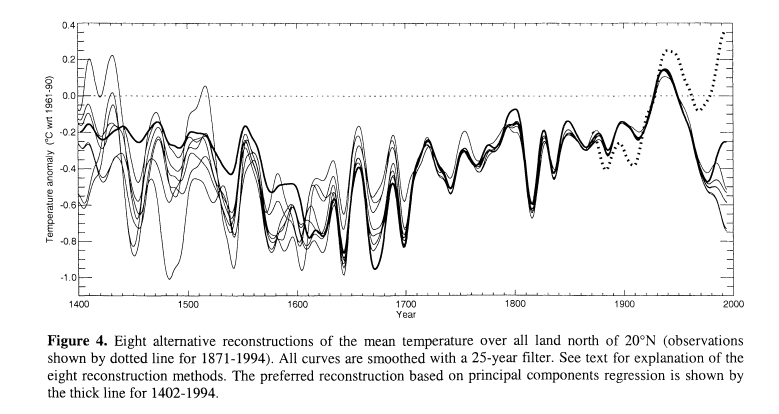
(semi OT)Figure 4 is somewhat disturbing. Especially vis a vis what happened after the peak of the 1930s. You don’t see too many things like that earlier – caveat emptor regarding the accuracy of the earlier value ranges. But assuming that the post 1930s downward glitch is truly diffferent and is a portent (clearly somewhat of a pessimistic interpretation on my part) – once again, highly disturbing.(/semi OT)
The other notable thing that is hard to miss is just how strongly “1800 and froze to death” (e.g. 1813 – 1815) shows up.
It is truely unfortunate that the error occured and I agree that Durkin should disclose the error, it may make people more critical of other errors in other films and tv shows. While watching “An Inconvenient Truth” I noticed that the CO2 and Temp graph shows an error in the right hand (oldest) record of CO2 actually showing that the the CO2 level falls then goes back in time as it rises again then goes forward in time to fall once more. This is obviously an error in producing the graph, but it does show a lack of attention to detail, just as Durkin’s graph does.
Rive says: “This is associated with the Maunder minimum period, which featured few sunspots, and from which obtaining a solar cycle length from sunspots is not possible.”
This statement is definitely false. You can track the solar cycle through the Maunder Minimum using sunspot observations.
It seems the approach to the critisism to the errors in these two contending documentaries are clearly being shown in different ways by the media, and this criticism is being presented to the publics eye by the people who have a special interest in their own cause.
As a catastrophic AGW sceptic, I think that Swindle is geting more of a constructive disection than the one by Al Gore. So, in a way, I think thats good.
But I’m a dreamer.
Hopefully not the only one.
I found this paper on the history of sunspots most interesting, with a detailed look at the number of of observations the sunpot history is based on, including the MM.
Historical Sunspot Observations: A Review , J. M. Vaquero
Abstract
Early observations of sunspot were realised by the naked eye. Possible utilization of these records for studying the long-term change in the Sun is discussed here. Other historical sunspot observations with camera obscuras are also discussed. Moreover, the best record of the behaviour of the Sun exists for the last four centuries thanks to the observations of sunspots with telescope. These observations should allow us to know the number, position, and area of sunspots as well as some relevant episodes (Maunder Minimum, optical flares, etc.). Rudolf Wolf developed the first reconstruction of solar activity in the 19th century. The next reconstruction was made by Hoyt and Schatten in 1998 by improving the database and using a new methodological approach. Here some mistakes, pending tasks and minor improvements are discussed.
Oh, now I see it, the added piece of graph. 😉 Thanks for explaining me the point, finally. I didn’t notice that improvement of the solar graph when I watched it – and I have watched TGGWS a few times. Removing the improvement won’t have a significant impact on the point of the movie.
Even without the improvement, I still think that the graph shows the solar-cosmic theory in better shape than it is. Nevertheless, I must admit that after seeing a couple of other graphs, the theory looks much more suggestive than what I thought before I studied these graphs. See some of the major graphs here:
http://motls.blogspot.com/2004/09/sunspots-correlations-with-temperature.html
I remain agnostic about the true explanation. Gray says that everything is about the ocean circulation. Who knows.
Some of the observed solar correlations don’t have a simple interpretation but they still seem visually convincing – such as the correlation between the period of the 11-year cycles and temperature. When I summarize it, the amount of non-trivially looking correlations behind the solar theories is much higher than what I’ve seen behind the CO2 theory, except for the Vostok correlations that we know to have causation in the opposite direction.
The amount of critical eyes directed at the skeptics exceeds the critical eyes directed at the alarmist-friendly theories roughly by three orders of magnitude. It’s so far from something that would seem as an objective science approach that such critical but biased eyes probably don’t help to make progress in the overall scheme of things. If one wants to look for imperfections somewhere, surely he will find them. Climate science is a collection of imperfections, almost by definition. In science, such a search for errors should be balanced, otherwise it is a form of cherry-picking that is destined to lead to skewed results.
I think that this comment is obvious but it seems likely that many alarmists explicitly disagree with that.
I don’t think the Durkin graph is as it is described, and I don’t think the mistake is as Rive described it.
Link to graph
Re. #4 – While you can easily identify the Maunder minimum by looking at the sunspot number (i.e. sunspot emeergence fell to almost nil), the Friis-Christensen reconstruction is done using solar cycle length (which varies slightly around the 11 year mean). The solar cycle length cannot be determined during the Maunder minimum because of the lack of sunspots.
Generally speaking, the links between solar activity and mean temperature are convincing through the various different reconstructions. The interpretations tend to link the sunspot cycle with both increased solar irradiance (through facular brightening) and the reduction in cosmic ray flux (through increased “open solar flux” – that is, an increased heliospheric magnetic field strength). The output from the solar physics community strongly suggests that the solar forcing cannot explain the observed changes (which are currently being argued about here…). The point being that solar forcing doesn’t look like the answer for GW.
(Just my 2 cents, of course.)
For a recent review see: Solanki and Krivova, Solar irradiance variations: From current
measurements to long-term estimates, Solar Physics (2004) 224: 197’€”208.
For insight to open solar flux changes: Rouillard, A., M. Lockwood, and I. Finch (2007), Centennial changes in the solar wind speed and in the open solar flux, J. Geophys. Res., doi:10.1029/2006JA012130, in press (http://www.agu.org/journals/pip/ja/2006JA012130-pip.pdf).
A book of interest is “The Sun, Solar Analogs and the Climate”,
Proc. Saas-Fee Advanced Course, 34, by J.D. Haigh, M. Lockwood and M.S. Giampapa, eds. I. Rüedi, M. Güdel, and W. Schmutz, Springer, ISBN: 3-540-23856-5, 2004.
Of the things I like about this site is that many of the people I see posting here aren’t saying how the world should be.
With respect to TGGWS, I have to ask. The combination of the revelations (to me) that the ancient ice core records show a delay of hundreds of years between temperature rise to CO2 rise, and then much later subsequent temperature fall to CO2 fall.
Together with some information I picked up from Mr Carl Wunsch, that oceans have a long latency period in their behaviour with respect to temperature and CO2 uptake/release, (which may be cut out of the DVD release of TGGWS, if some Scientists have their way).
Add to this, we can’t fully understand the implications of the Milankovitch orbital variations
Or volcanic emissions.
I really don’t expect Durkin to do anything else but just release the film he made, and why not?
But if he has (had?) the time, I hope he will put in some pithy special features about this whole, post, debate. I know he is capable of doing this. If not, then he is just Al Gore writ small.
This field is still pretty active. Its a little unfair to focus so much energy on a 1991 publication when, though it has been historically widely cited, bears little relationship to current work. Contrast this with the Jones 1990 paper that deserves scrutiny because it is represents the foundation of recent methodologies.
See for some simple reviews on solar influences: Svensmark 2007, Courtillot 2007, etc, etc.
See also Valev 2006, which posits in detail a correlation between solar activity and geomagnetic variation. I do caution you: much of this work is being done on the fringes.
MarkR, that x-axis only goes to 1860. The one above goes to 1550.
(This one goes to 11.)
#12 Bender
The graph Durkin fiddled with does not seem to be about sunspots at all, follow the link in #8 to see another version. The graph 7a, is from one which is temperature v temperature. Another entirely different graph, 7b, is about sunspot activity.
#13 Oops, I put the wrong graphs up, should be:
I think that Durkin (researcher) used the wrong graph altogether to illustrate sunspot, and then fiddled with it.
The reciprocal of the length of the solar cycle is a general indicator of solar eruptivity and magnetic activity – instead of plotting the reciprocal, charts often show the length decreasing upwards rather than increasing.
More support for the relationship between solar cycle length and temperature:
A plot showing the change in temperature at Armagh Observatory since 1796 and the simultaneous changes in the length of the `11-year’ sunspot cycle, adapted from the article ‘A provisional long mean air temperature series for Armagh Observatory’, Journal for Atmospheric and Solar Terrestrial Physics, Vol 58, p1657-1672, 1996, by C.J. Butler and D.J. Johnston.”.
http://www.arm.ac.uk/press/200years-on-the-Net.html
Double oops. #13 #14 I think I misread the text with the graphs. Please disregard.
This divergence problem is with what temperature series in the latter part of the 20th century? Is it Jones(or other like data)or Christy(MSU)temperature series. This could be more evidence that the Jones, etc temperature data is corrupted. The MSU data show nearly flat data up to 1998 (Big El Nino) and that is what the solar data shows. So where is the problem?
Steve,
Quibbles over discrepancies less than the instrumental acurracy, or detection limits, are instally dismissed by me.
You guys are quabbling over minute differences that may be mathematically reasonable, but for crying out loud, those results mean diddly squat in the real world.
People, relate your comments here to physical reality, not the arcane world of metaphysics.
In response to my email, Martin Durkin replied, acknowledging that an error had occurred and that a correction would be made as follows:
Louis,
I think the point here is that Team HS and others are devouting considerable time and effort going after the data/processes of a skeptic, but fail to show similar due diligence when auditing each other. In light of the errors discovered by M@M concerning Mann’s PC1, and the fact that much of the “science” of AR4 isn’t open to public archiving, and the continued use by the IPCC of Mann’s PC1, a person would have to be fairly naive to take the IPCC at its word.
Heck, not even HadCRU can list what stations they use to update thier monthly surface temp database. Let Pfizer try doing that in a civil case when asked to show thier test data.
I urge everyone to pay attention to Friis-Christensen’s statement:
The breakdown of the correlation between sunspots and temperature is used ad nauseam as an argument against a larger solar role in 20th century warming. Read RealClimate for example. Yet, as Steve points out, the same argument does not seem to hold for the divergence problem, or for the simple fact that CO2 and temperature do not correlate during the 1940-1975 period. Thomoas Kuhn has described how, when faced with “anomalies”, scientists tend to refer to ad-hoc hypothesis to salvage a theory. In this case it’s either aerosols, or CO2 fertilization, or what else. But the anomalies are real, and they may indicate a more serious flaw in the theory. The same applies to any solar theory. There is a breakdown in correlation after the late 1980’s. Which just goes to show that, as Friis-Christensen aptly points out, correlations are but a clue to an underlying physical mechanism. One must then elucidate such mechanism before proceeding further, and, for example, including the mechanism in climate models.
There could be many physical reasons why the global temperature stops correlating well with the solar cycle at the end of the 80’s. GHG’s are one of them. Other human influences on climate are possible, as repeatedly pointed out by Roger Pielke Sr. It could also be that the mechanism linking the sun and the climate is just not linear, and past a certain level of solar activity (which is what happened lately), we enter a different regime. There could be a feedback or threshold effect that we’re not aware of. I have a paper somewhere (too lazy to look for it this morning) that has analyzed the correlation between the sun and the climate using wavelets, and they do see a change in the pattern at the end of the 20th century. There is still a correlation, but it seems to change phase or something. Phase changes have been noted by others whenever there was a big volcano eruption, like the Pinatubo in 1991.
So there is plenty of “juice” left in the solar-climate link research program. Whether that program will be allowed to proceed or will be censored by the pontifs of AGW is an important question. Do we let scientific progress be conditional on political and ideological rectitude? Many argue that we are in a “post-normal” science era, where anything goes, as long as it suits a particular point of view. That would indeed lead us to disaster.
OT (but not quite): I’ve just seen the movie “The lives of others”, a german movie about how everybody was spied on in east Germany. All in the name of the good socialist state. Having known many former east-germans (especially scientists), I know that this was just too real. Is that what we want?
Why do we have to take the Jones(or non MSU)temperature series as the bible of real temperature changes. Too many scientists just take this as the gospal. These data series which can’t be verified are then used in various studies for comparison purposes. Studies that use this data end up with either wrong conclusions or discrepancies that may not exist. I would rely on studies that uses truly rural and well kept sites for any temperature comparisons. Studies that have used this rural data come to quite different conclusions than the ones using Jones type data. MSU data also seems to be valid for use in studies.
It seems like Jones,etc fudges their data and then everyone else fudges their studies to agree with that data. Then by design one ends up with the fabricated AGW senario we have in front of us with nothing more than just circular logic all pined down to faulty data.
Let’s see, where have I seen this type of double standard before? Oh yes, in religion and politics. If catastrophic AGW is a religion or political movement, this double standard would all make sense.
This type of double standard in criticizing the faithful vs. criticizing heretics is common in religious hierarchies or political autocracies. It’s certainly not science.
Just because there is a correlation breakdown between solar activity and surface temperature doesn’t really mean much to me, considering how terrible surface temperature records or for modern data, much less for data 50 years and older. How does it correlate to satellite and baloon data? To Ocean data?
#18,
The entire warming of the 20th Century is less than the detection limits of the ground based temperature network.
It looks to me as if there have been plenty of twenty-year divergences before in the hundreds of years over which this correlation has been estimated.
Has anyone done an analysis of the length of past divergence?
This reminds me of regression models to explain stock prices and other financial series. The model can “explain” 95% of the variance of the dependent variable, yet when you try to use it to forecast a little into the future, you find out just how much they can diverge and still have a 95% model.
Re: #125
I would say that the warming is greater than the method detection limit, but less than the quantitation limit. The detection limit is usually defined as a three sigma change. Reliable quantitation has to be more on the order of ten sigma. My off-the-cuff estimate of sigma for the surface temperature record is 0.1 to 0.2 C.
That depends on whether you believe 2500 temperature stations on 5 to 10 percent of the earths surface, is adequate to determine the temperature of the whole globe.
And that’s before you get into the issue of stations only recording max and min daily temps prior to 20 or 30 years ago.
That’s also before you get into the issue of lack of a constant environment around most stations over the last 100 years.
My personal guess is that if we know the temperature of the earth within 2 to 3 degrees 100 years ago, we are very, very lucky.
MarkW:
You nailed something that bothered me about this discussion from the beginning – the unstated measurement error for all temperature data. There seemed to be a basic assumption that all errors were constant and would cancel each other out when aggregated. I remain extremely doubtful about this fundamental assumption. The UHI in effect is an argument that these errors are not in fact constant and therefore cannot cancel each other out. It is like trying to do particle physics with a yardstick!
The issue of whether our sampling of temperatures around the globe, or even regionally are truly representative has always bugged me also. I am a computer scientist, not a statistician, but I think I have a good grasp of what a representative sample is. For example, when I hear that we have had the record year in the U.S., even while we froze here in the west, I wonder how temperature records are assembled and weighted to make them truly representative of the entire United States (Same for the earth as a whole). Obviously the population density is greater in the east, and there are likely more weather stations there than in relatively sparsely populated west. I have always assumed that these issues are taken into account, and I am sure attempts are made to do so. Just seems to me this would be a difficult task, fraught with uncertainties and potential errors.
I think I can add a thing on solar activity and Earth mean temperature.
It may be not so true, in my opinion, that correlation of solar activity and temperature has broken so suddenly in recent times.
First of all, because it should have broken since 60 and not 20 years: there was a solar activity all-time maximum in the ’50-’60ies, when Earth was slightly cooling.
But there was also a slight solar minimum in the ’70ies, then now we are still over this level.
Solar activity is indeed slightly declining in the last years, but not so fast. Moreover, if the Earth were so sensible to short-time solar activity, we would see 11-years temperature cycles (with slight temperature changes).
Dr. Theodor Landscheidt, who unfortunately passed away in 2004, was right to predict Nino/Nina events by foreseen solar activity: he predicted a strong Nino, which would have brought to a sharp rise in Earth temperature, in 1998; then a short cooling, preceding 2002 Nino event which would have brought temperatures to rise again. He predicted a global cooling before 2030, with weaker Ninos, because of declining solar activity, but he added as well that Nino events would have brought temperatures up when they would have happened (indeed we had Nino, weak in 2005, stronger this winter, but not at 1998 record).
One can say that 2005 was probably the hottest year on records (despite no one could claim it rightly, because we are discussing about 0.01°C precision on a 0.1°C uncertainty): but they were ground records; I think (maybe because I am an aerospace engineering graduate, maybe because we cannot reduce solar system to a backyard thermometer) only satellite records should be used to evaluate solar influence, and the kind of predictions Dr. Landsheit gave. Actually, 1998 remains the hottest year on records for MSU series; moreover, the major part of last year warming was in Arctic regions (similar to ’30-’40ies period, which indeed was just before last cooling) while 1997-’98 event was overall in equatorial and tropical regions, which indeed are the more sensible to solar fluxes (because of the very high albedo of polar regions – albedo that, according to recent NASA studies, has not changed in the Arctic, reducing snow/ice but increasing clouds).
In the end, we are often discussing about small short-time variations of solar activity (which, anyway, might be not so strictly correlated to solar heat flux) e.g. an 11-years cycle maximum sees about 1W/m^2 more in the space surrounding Earth than the cycle minimum. But, reconstruction of solar activity based on isotopes, suggest a very strong solar forcing for XXth century: we should have 4W/m^2, that is to say 1W/m^2 on the ground, more than Little Ice Age.
best regards
P.S.: it seems that 2002 and before satellite data showed no relevant gap between heat incoming to Earth and heat outcoming from Earth, but just the same growth of both them; a thing which would indeed confirm global warming (even if satellite warming is “different” from ground stations one) but which could also imply that no relevant greenhouse effect has been added to our planet. Unfortunately, even if Hansen’s ruled GISS reconsidered in recent months some AGW issue, I have not found confirms nor denials to these 2002 data, so if anyone can give me such confirms/denials, I would be gratefull. (Hansen denies that 2005 is affected by Nino: we are discussing if 0.1°C is so important, so why judging irrelevant it just because weak, but even not so short? And why should 2005 be more noticeable than 1998: 1998 Nino gave a major boost to rising temperatures, while 2005 is much more similar to preceding years – or am I wrong to think that deltaT is to be considered for heat fluxes?)
Picking up on Francois’s statements (#21): Is it reasonable to expect a continuous correlation with any one forcing factor, be it CO2, solar, ocean cycles or something else? The IPCC does this to their detriment; a mistake that will eventually lead to their downfall.
To assume that temperature will continually track with one particular variable is to deny that climate is complex. Since we all agree that climate is complex, we can not expect temperature to track with one variable. Arguments that a particular variable is unimportant because the correlation to temperature is not continuous, are not valid for either side, however, correlation can give us the relative strength of each variable if all variables are considered. Combining solar, CO2 and ocean cycles together gives a pretty good explanation of 20th century warming, and reveals CO2 is not the dominate factor in global warming.
I will try to submit a more detailed hypothesis in the unthreaded’ discussion in the next day or two.
Here is an AP story about Arctic sea ice melting much faster (3 times faster) than predicted by the computer models used by the IPCC, complete with a blurb from Gavin Schmidt. The numbers seem to be contradictory where in one case it says the ice is melting at a rate of 7.8% per decade (since 1953) and later says 1.8% per decade. I think some peer review is desperately needed here as this sounds mighty suspicious to me.
Melting Ice
Sorry meant to put this (#33) in unthreaded #9
The sea ice data has been “adjusted” just like the temperature data was adjusted.
Here is what the arctic sea ice trends looked like before it was recently “adjusted”. The current 2007 sea ice level was adjusted downward by 1.25 million kms. I’m sure William Chapman of the Cryosphere Today and the University of Illinois (which has been keeping a database of arctic sea ice conditions since the 1950s) was pressured into accepting the NOAA “adjustments” (probably because this study was coming out.)
In case, the chart doesn’t show up, here is the link.
Oh damn, I posted the wrong link.
The above chart is what the sea ice trends look like NOW.
This is what they looked like BEFORE the adjustments. As you can see, 1993 was the lowest sea ice extent and the 2006 level was higher than even 1990 for example.
#35
Looks just like what NOAA recently did with the surface temp history for the 20th Century. After thier “adjustments” the 1930s cooled, while the 1990s warmed. These guys don’t miss a trck.
Re #36, John Lang
What is the excuse given for these “adjustments” ?
Re #33 I’ve read the paper and did not find much that is new or surprising. In a way it’s actually nice to read a paper which acknowledges that much, possibly most, of the Arctic ice decline since 1980 has been due to natural variability (record NAO, ongoing positive NAO, Pacific influences, possible PDO and thermohaline factors (my addition to the list) and so forth).
The way I read it is that the models don’t handle such natural variability well and, to the extent the models underestimated the ice decline, it’s probably due to their underestimating the natural variability.
While that natural variability has acted to reduce ice extent, things can (and likely will) swing in the other direction at some point, favoring Arctic ice formation in the future. To what extent, no one knows. And, the ongoing rewriting of the historical data isn’t helping things.
Something about the solar divergence problem: Is there one?
If there is, obviously it should be reported, but my point is first that because we are talking about an 11-year cycle, we don’t have that many data-points the last 30 years. This is a big difference compared to tree-proxies. So the analogy isn’t that fair. The data that the Swindle graph was based on, was corrected by Laut already some years ago. However one or two points which don’t match are no divergence yet. And if they are, it would still only indicate that other factors (e.g. CO2) influence climate as well. What a surprise that would be 🙂
In the end after the predictions faded away because cycle 22 actually ended it turned out 22 was an extremely short cycle despite whatever models may have predicted.
http://standeyo.com/Geo_Solar/Solar_Cycles_22_23/Solar_cycle_22.html
Now compare this to the 20th century temperature curve …
But as stated, solar alone doesn’t drive climate as we know. See also page 6 (E.g. figure 5) of
http://www.hm-treasury.gov.uk/media/272/EB/Solar_Cycles_24_and_25_and_Predicted_Climate_Response_22nd_October.pdf
A Czech geophysicist Ladislav Křivskའ(just deceased) was interested in historical data about solar activity. He found years ago a relationship between the 80-year solar cycle and precipitations in Central Europe (published in 1953) based on the meteo observations from Prague Klementinum (since 1784). He found that the more solar activity, the less precipitations there was. Shortly before his death he said that he expected Sun entering a long period of low activity now and therefore maximum precipitations occurring around 2025.
He also wrote an article about the possible danger of asteroids for the life on Earth long before it became a Holywood favorite, in 70’s.
John (#35)
That is a neat site: Seems to be reasonably objective in the presenting of data, i.e., low hysteria quotient.
The novel Frankenstein was written during a solar minimum. The reason for writing it? The Shellys were at the lake for the summer and it rained every day, for a month or more. Just read the novel sometime and look at how ice and cold are a recurring motif. To me, proxies that match written records hold more value than proxies that can be contortured until they show a certain point of view.
Re #40
With regard to solar cycles, I have come across a paper by Landscheit “Solar activity – a dominant factor in climate dynamics”.
http://www.john-daly.com/solar/solar.htm
Landscheit describes a great many cycles, and I found the paper quite difficult to follow, but it might me of interest to some of you more technical guys.
The Glenn Beck Show on CNN will be airing at 7 pm, 9 pm and midnight ET THIS EVENING a special documentary they have prepared ‘€” “Exposed: The Climate of Fear; The Other Side of the Global Warming Debate”. See http://www.glennbeck.com/tv/. My guess is that it will be the usuals. The Toronto Raptors aren’t playing tonight so I guess I’ll watch,
Whoa… that this would appear on CNN, during prime-time no less, gives me hope. As I recall, it was a CNN meteorologist that advocated revoking licenses, right?
Mark
46: I’m also amazed that CNN is hosting this type of program. It may have something to do with the fact that Fox News’ ratings keep going up, while the other networks keep going down…Maybe my super-liberal AGWarmer brother in law will be tricked into watching it.
#43
The problems with ancedotal evidence is the limitations of the local observer. If in 1660, a Dutch farmer recorded that the past growing season was the coldest in memory, with frosts occuring as late as May, his memory only extends a few decades. We could surmise that night time temperatures did in fact fall below freezing in May. A quick check of grain prices for that year (if available could verify his records). The problem is that most farmers in most parts of the world never kept records. Also, Mann et als have conceded that there was a LIA, but that it was only a local event, not worldwide. He could get away with this because much of the world was uninhabited, or was so sparsely populated that any human records are meaningless.
On the other hand, NOAA has published, in my opinion, some rather misleading data. NOAA and other organizations seem to use a moving timescale when doing average temperature comparisons. Most recently they use the 1960-2003 average when doing temp variations. In the past, I have seen 1870-2000 averages. Or 1850-1990 timeframe. This sliding timescale appears to truncate any warming that preceeded the Second World War. The 1960-2003 time frame also accentuates the rather cold climate we had during the last negative PDO. Therefore, the beginning of the time series saw “below” average temperatures (avr for 1960-2003). Since 1976, the positive PDO has enhanced some very intense warm ENSO episodes. The resulting HS of surface instrument readings is therefore misleading. So, if you ever wonder how Central Canada can be 2 or 3 degrees “warmer” than average in March, but at the same time produce air masses that create record cold March temps for the Northern Plains, look at how NOAA crafts thier temperature anomalies. It all depends on what the meaning of “average” is.
Re 40, I have updated that paper hosted on the HM Treasury website. Warwick Hughes has kindly hosted an updated presentation on his website at: http://www.warwickhughes.com/blog/?p=102
There is no need for anyone to go on tiresomely about how insufficient changes in Total Solar Irradience are to have any effect on the Earth’s climate. Svensmark has demonstrated that the GCR/low cloud link is powerful enough to do anything required of it.
NASA’s solar cycle 24 prediction panel published their predictions recently. They note that “We’re still a long way from solar minimum.” They go on to say,”due to the absence of expected signatures of minimum-like conditions in March, 2007
– no high-latitude sunspots yet observed with the Cycle 24 polarity
– the large scale corona has not yet relaxed to a simple dipole
– the heliospheric current sheet has not yet flattened
– activity measures, e.g. cosmic ray flux, radio flux, and sunspot number, have not yet reached typical solar minimum values
NASA is saying solar minimum in March, 2008. But if that were to happen, we should have already seen a sunspot from solar cycle 24. My estimate is that solar cycle 23 will be 13 years long and that therefore solar minimum will be in May 2009. I am backcalculating that from an expected amplitude of solar cycle 24 of 50.
HAmmell and Lockwood GRL Apr 19, 2007 : Suggestive correlations between the brightness of Neptune, solar
variability, and Earth’s temperature
They make the following judicious comment about assessing interesting visual correlations:
49: If the cycle is 13 years long, we will probably have another global cooling scare!
46,
It was a weather channel weather babe who wanted to disbar everyone who disagreed with her.
49,
Don’t tell that to Jimmy D, he’s busy trying to convince everyone that the idea that cosmic rays affect the climate is irrational conjecture.
While at the same time telling everyone that we know everything that we need to know about aerosols in the atmosphere. Not just in the present, but as far back in the past as you want to look.
Oh yeah, that was it.
Mark
“The Toronto Raptors aren’t playing tonight so I guess I’ll watch”
neither are the leafs! 🙂
go sabres!
#47
Show him this link: Is Global Warming a Sin?
[url=http://www.lifeofearth.blogspot.com]Global warming news[/url]
[url=http://www.lifeofearth.blogspot.com]Global warming issues[/url]
I have been looking into the swindle recently and came across this:
http://www.predictweather.com/articles.asp?ID=36