In the complaint about Swindle by Risk Management Solutions Ltd., endorsed by a gaggle of 37 professors, they allege that the Swindle graphic of 20th century claims in connection with 20th century temperature change contains the following misrepresentations:
Measurements from meteorological stations that have been published by NASA and other agencies show that the there was an overall slight decline in global average temperature between about 1940 and 1976, but much less than that shown on the graph presented in the programme.
and
this graph does not correspond to any figure for global average temperature that has been published by NASA
(This is one of many claims about misrepresentation in Swindle, but one where I happen to be familiar with the data and in a position to evaluate it. In connection with 20th century temperature change, they also argue that the Swindle failure to discuss aerosols is a “misrepresentation” of a fact or view, an issue which I may return to on another occasion.)
When a corporation, which has contracts with major insurers, makes highly visible public allegations like this, you’d think that they’d go to the trouble to ensure that the claims are correct. Likewise, when 37 climate scientists sign onto the claim, including temperature specialist, Phil Jones, you’d think that they’d also go to the trouble to ensure that the claim is correct. When they go on to argue that communications with the public – into which category their Open Letter to Martin Durkin published on a website surely qualifies – should have proper due diligence, you’d think that they’d double check that a specific claim like this was true.
But hey, this is climate science.
Since the matter is in controversy, I spent some time collecting as many different versions of the Hansen data as I could locate, including a version from Willie Soon used in the Robinson article referred to in the complaint, from which the Swindle graphic appears to have been derived.
First here is the amended graphic referred to in the Complaint, showing a temperature decline from 1940 to the mid-1960s which was discussed in the program by two scientists.

Figure 1. Revised Swindle Temperature Graphic
As noted above, Risk Management Solutions and the professors said that no temperature decline of this magnitude occurred in any Hansen global data. For reference, here is Figure 1 from Hansen and Lebedeff 1988, which shows a temperature decline that visually has considerable similarity to the Swindle version. Certainly the similarities are sufficient that you’d think that Risk Management Solutions and the 37 professors would exercise a little caution before making allegations of misrepresentation to a government agency.

Figure 1 from Hansen and Lebedeff 1988
In order to check this apparent similarity, I explored a little for versions of the Hansen and Lebedeff data, trying to collect some vintage data in case later versions had “adjusted” the earlier data. Here is a plot of 7 such versions for 1880-1990, one of which (the smoothed version) was the Willie Soon version.

Hansen versions: 1. Manually transcribed version from hard copy listing in Hansen and Lebedeff 1987 ending in 1985; a version ending in 1987 from http://www.stat.unc.edu/faculty/rs/s133/Data/hansen.dat; a version ending in 1994 at http://ingrid.ldeo.columbia.edu/SOURCES/.Indices/.HANSEN/.Global/.Annual/Temperature/T+exch+table-+text+text+skipanyNaN+-table+.html ending in 1994 (with 1951-1980 mean subtracted); a version from ftp://disc1.gsfc.nasa.gov/data/inter_disc/surf_temp_press/old_tmp_dev/giss_glb_ts.txt ending in 1996; a version from
ftp://disc1.gsfc.nasa.gov/data/inter_disc/surf_temp_press/tmp_dev/giss/giss_glb_ts.txt ending in 1998 and the version presently online at http://data.giss.nasa.gov/gistemp/graphs/Fig.A2.txt ending in 2006.
From these versions, I calculated an 11-year running mean and then added 0.4 to match the anomaly-scale of the Swindle graphic (the Soon version is in red.) The Swindle version appears to match the Hansen version archived by Willie Soon up to a change in level (which is irrelevant to the issue of 1940-1965 temperature decline). As someone who’s looked at a lot of data and data versions, my own opinion is that the Soon version is a version of the Hansen data. Thus the claim that the Swindle data is not derived from Hansen data appears false to me. In addition, I would say that they used a “grey” version of the Hansen data, but the use of “grey” versions is endemic in climate science and, if all climate scientists who use grey data were to be disciplined, you’d have the entire Team in the dock for a start.
As to the allegation by Risk Management Solutions and the 37 professors that the decline in the Swindle graphic is “much larger” than in the Hansen “global” data and must be derived from some other series e.g. NH, it is my opinion that the decline in the Swindle graphic is exactly consistent with being obtained from Hansen “global” version and this particular allegation is simply false.
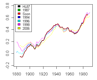
Versions from above figure, after 11-year running mean filter. Note the close match between the Soon version used in Robinson et al and the Hansen and Lebedeff 1987 version (using data transcribed from the hardcopy).
I hope that Risk Management Solutions is more accurate in their day job of consulting for Swiss Re and other major insurers. You’d think that Phil Jones would have been able to recognize a Hansen and Lebedeff graphic. When people endorse due diligence before making public statements, you expect them to have carried out the analysis that I carried out here before making public allegations to an official body. Making false allegations seems more like “risky business” than risk management.
Update: May 7
Some of the RMS comments were about the relationship of the Swindle graph, which we’ve shown to be based on a 1992 version of Hansen and Lebedeff 1988, relative to the 2006 Hansen versions, suggesting that the Hansen and Lebedeff 1988 global version (Swindle) was “more” like the present-day NH version, or even the present-day US version, than it was to the present-day GLB version. In order to evaluate this comment, I’ve re-plotted the data using an 11 year running mean filter, as in Swindle, comparing the HL1988 versions of global and NH to present-day global, NH and US temperatures.
It is readily seen that the mid-century decline in the continental US in current GISS data is much greater than in any of the NH or GLB versions. Thus, the allegation that the HL88 version is “more like” the continental US version is simply a spitball.
If you compare the two GLB versions (red and black), one notices that, during the past 18 years, Hansen has shaved the GLB temperatures in the 1930s and increased them in the mid 1960s, thereby reducing the mid-century decline. While these changes may or may not be meritorious, because Hansen has so many fingers in the pie – adjusting temperature data, making climate models, lobbying for policy changes – the adjustments have not been carried out by an “independent” person. The Hansen adjustments (and similar Jones adjustments) need to be closely examined by someone independent and, until that is done, I think that one should not assign any greater validity to the re-written data than to the original data.
A second interesting point: if you look at the HL88 NH version against the 2006 version (two shades of green), you’ll see much less adjustment in the mid-century period. So the adjustment process has taken place mainly in the Southern Hemisphere and those are the adjustments that an analyst should examine first. While there has been relatively little mid-century adjustment to the NH series, the late 19th century NH values have been adjusted upwards quite considerably. I haven’t studied these adjustments, but these would also need to be looked at in a full analysis.
Back to the RMS letter: is the Hansen version from the early 1990s “more like” the present-day NH version or the present-day GLB version? I’m not sure what the meaning of this sort of beauty contest is, but I’d be hard-pressed to say that Hansen 1988 GLB series is “more like” the Hansen 2006 NH version than the Hansen 2006 GLB version. I think that we can all agree that Hansen has definitely shaved the point spread between the 1930s and the mid-1960s during this period and the validity of this point shaving is the key question here. I’ve also discussed Hansen adjustments to past data here .


263 Comments
The phrase “grasping at straws” comes to mind. If anything, their continual public rants only serve as a detriment to their own credibility, which is near non-existent to me anyway.
Mark
Great Work Steve! If none of the 37 have done what you just did – that says a lot about the integrity (or non) of the climate science.
A look at RMS Weather Risk page shows talk of modeling short term weather risks and their use in ins. contracts and derivative financial devices.
http://www.rms.com/Weather/
But nothing here about global warming/long term events at all. Curious, I found this on their site dated Feruary 1, 2007
http://www.rms.com/newspress/pr_2007_0201_climatechange.asp
an announcement which makes it appear, to me, RMS is a newbie for AGW schemes and devices.
Hey, don’t these fellows have fiduciary duties ‘n’ stuff to make sure their information is accurate? They could be late comers, and like those at the end of any bubble, they have the most honor and respect (and money) to lose. Therefore perhaps the overreaction to Swindle
In other news, on the front page of todays Wall Street Journal (above the fold too!) “Global Warming May Be Spurring Allergy, Asthma” starting, “There’s growing scientific evidence that global climate change is linked to the dramatic rise in allergies and asthma in the Western world”. Yes, they attribute a non-global problem to AGW. Creative. I had hopes for the WSJ, but when I saw their criticism of carbon trading/AGW relegated to a small weekend editorial some months ago I figured they could very well join the carbon bandwagon.
However The Nation has not: Is Global Warming a Sin?
Steve:
As Gerald indicated, great work yet again.
By the way, speaking of Risk Management and insurance, I would trust oil companies any day over insurance companies: when I buy gas I get it right away but when I buy insurance all I get is a promise to pay!!
LOL. I hav’nt seen the words “resounding consensus” before.
There should be about 37 very embarrased professors. I hope some of their students are reading this blog.
AGW is a huge new profit center for insurance companies if the skeptics are correct. However, if the believers are correct the insurance companies will lose big money due to catastrophic events and then stop underwriting climate related policies. Seems to me that RMS knows the insurance industry will be reaping big profits.
#5, Jae,
It is hilarious, but just to be clear, that specific quote comes from an RMS pr announcement about exploring AGW financial instruments, i.e., it’s not from the witchhunting complaint signed by the 37.
Reid, # 6.
Love your cynicism, IOW the truth.
May I observe the following:
The attacking is becoming more venemous and in this we should perhaps take some comfort. Only when a snake senses danger does he attack. The forked tongue the snake is showing is telling.
Wow, that’s quite an agreement. I admire Martin Durkin, he’s clearly an unusually wise guy, but don’t tell me that the filmmaker has personally run the filters as you did. 😉 There must exist a version of the graph somewhere that is already what he needed. What about asking him how he exactly got it?
#9. They transcribed the figure from the Robinson et al article as the professors allege. This in turn derived from the digital Hansen version that I got from Willie Soon, who was one of the coauthors of the Robinson article. That’s why I focussed on Willie’s digital version – I guess my commentary didn’t make that clear.
Risk Management and 37 professors were correct to trace the provenance of the graphic to Robinson et al, but seem not to have considered the possibility that the graphic in that article was an accurate rendering of actual Hansen data. Thus their claims that the Swindle graphic overstated Hansen cooling are inconveniently false.
It seems to me that this is a very easily tested proposition. Take the data points from the peak and trough of the Swindle graph, and regress them on the data points of Hansen. One could test it for a linear restriction in which the intercept is 0.4 and the slope is 1.0. I’d bet that we cannot reject the hypothesis that Swindle graph is significantly different than the Hansen graph.
#11 I think I said that wrong, but I think it should it be clear what I meant.
#6
Consider that in response to AGW our governor is requesting that the state help make insurance affordable.
Well what a great way to produce profit: oversale the likelihood of catastrophe; and if it occurs the state has helped pay for it (I wonder how, sarcastic grin); and if it does not happen, you will have recieved all those premiums and state money. This type of behavior of persons asking and politicians giving is as old as time.
Thanks for your patience, Steve #10. Now I get it. If I read your text carefully, it would have happened earlier.
The argument about full-disclosure is silly. Full disclosure MUST occur. There can be no rational argument against it other than a very low factor of confidence in the work. I have always understood that the progress of science was based on questioning, challenging and fierce open debate. The ludicrous stance that somehow a consensus shows the truth of the science shows exactly the opposite. Einstien said after publishing his theory on Special Relativity: “It will take only one person to prove me wrong”. It was many of those attempts to prove him wrong which helped prove him right. Open debate is not a good thing for science, it is an integral and essential part of science and debate cannot be open unless full disclosure is made.
What’s interesting, at least to me, is, if you take these eye-balled points from the two graphics, Hansen’s shows less annual increase than Swindle’s:
Chart 1888 1985 °/year chg
Swindle: 0.00 0.70 0.0072
Hansen: -0.40 0.18 0.0059
Here is a chart from a 1975 National Academy of Sciences report entitled “Understanding Climate Change”.
My guess is that this chart is the most accurate historical record we have. The temperature drop experienced from the Krakatoa volcanoe in 1883 and the 1930s temperature records as well as the drop from 1940 to 1970 (at least) are visible even though Phil Jones and James Hansen have subsequently written these variations out of the record.
Theater of the absurd. The pot calling the kettle black. Hilarious.
Over the past 15 years there has been an endless stream of TV shows, radio programs, newspapers, magazines article, news reports, etc. laden with distortions, exaggerations, and misrepresentations of science in support of AGW. The media onslaught became even worse after the Feb 2, 2007 IPCC release of the Summary for Policy Makers (SPM) without the prior or simultaneous release of the scientific basis for the SPM. The IPCC refused to allow the public, the press, and scientists to check the scientific basis for the claims at a time such scrutiny would make a difference. As a result, the media blitz of AGW propaganda and misrepresentations is virtually non-stop now.
Along comes one of the rare TV shows that takes a contrary view (The Great Global Warming Swindle). In response, Bob Ward and 37 professors get on their high horses and thunder across plains to trample this tiny sprout. Here is an excerpt from Bob Ward’s complaint letter:
These words should have be written in hundreds and hundreds of complaint letters about the “misrepresentations by broadcasters of the scientific evidence” for AGW. If Mr Ward is serious about wanting to correct misrepresentations by broadcasters in favor of AGW, then he won’t get any risk management work done…he will be spending all day every day writing letters to broadcasters who misrepresent scientific evidence for AGW.
Here’s is another excerpt from Bob Ward’s complaint letter:
Mr Ward can copy and paste that paragraph when he sends a complaint letter to Al Gore requesting “profound amendments” to “An Inconvenient Truth”.
As for the 37 professors, please be sure you are seated before your read this excerpt from their letter:
How noble and brave for the 37 professors to complain about quality control of a TV program! The 37 professors proclaim that quality control is in the public interest.
What great courage it took for the 37 professors to request quality control of a TV program.
Perhaps 36 of the professors are working up the courage to write a similar letter to Phil Jones, requesting that he allow for the quality control requested by Willis Eschenbach and Steve McIntyre. Or, perhaps not. Maybe the 36 professors think that quality control of a TV program is more important to the public interest than quality control of Phil Jones’s research on climate change.
#17 Can you provide a full caption for this graphic and its citation?
Steve #19
ISBN 0309023238 / 9780309023238 / 0-309-02323-8
Title Understanding Climatic Change A Program for Action
Author United States Committee for the Global Atmospheric Research Program
Publisher National Academy of Sciences
Edition Hardcover
Quoted in the Wikipedia article on Global cooling at http://en.wikipedia.org/wiki/Global_cooling as Figure A.6 from
Metadata of the graph – 600à—300 (20,674 bytes) (Figure A.6 from the 1975 NAS report “understanding climatic change”: A program for action. Northern hemisphere surface temperature from 1880 to 1968. Data from Budyko (1968) updated by Asakura after 1959 (indicated by dashed line on graph).)
Just wondering what a network analysis by Wegman might show about the 37 endorsers.
Ok, so they have a problem with the temperature reconstruction used by Swindle. How do they feel about the sea-level prediction
in Al’s power point presentation? This entire exercise is pitiful.
Re #15
How science works is one thing. How policy works, another.
It’s the bridging process that was, and still is, the problem here.
At first, science is used to build policy.
But once the policy train has left the station … science only gets in the way.
Wow, a misrepresentation of the criticism of the misrepresentation.
The claim is quite clear:
“Global average temperature decreased between 1940 and 1980, and so could not depend on atmospheric concentrations of greenhouse gases, which increased over this period.”
They are not alledging that the cooling never took place they are saying that TGGWS said that this decrease showed that GHGs couldn’t affect climate in this period of time. It is in clear English yet, Steve, you think that this is just about the cooling episode. This becomes even clearer in the titled “misrepresentation”. Yes, the 37 scientists are criticising the data that was used but this is because it doesn’t seem to corespond to any of the recognised sources of instrumental temperature records ie. NASA or HAD-CRU. Instead it seems that the OISM graphic was selected partly for its exaggerations of the pre 1940 warming and the post 1940 cooling and partly because that graphic ends in 1988. This should be clear from actually reading the Bob Ward critique.
TGGWS fail to mention that there are good reasons for the cooling that occurred during the 1940-1970 period, and the Bob Ward letter makes this very clear here:
“It has been well-established in the scientific literature that the period of cooling that was most evident over North America and Europe between about 1940 and 1976 was largely due to increased concentrations of aerosols (particularly sulphates) released into the atmosphere by industrial processes, such as the combustion of coal. These aerosols lowered the amount of solar radiation reaching the Earth’s surface, for instance by scattering sunlight. The concentrations of these aerosols have been shown to be highest in the Northern Hemisphere, close to their industrial sources. A paper by David Stern, published in the journal Chemosphere’ in 2005, showed that sulphurous emissions around the world increased sharply between 1945 and about 1989, since when they have declined markedly. Sulphuruous emissions peaked in North America and Europe during the 1970s.
Models that take account of natural factors, such as solar activity and volcanic aerosols, as well as anthropogenic factors, such as greenhouse gas emissions and aerosols from industrial processes, are able to reproduce the record of global average temperature over the twentieth century. The accuracy of the model results is reduced when the effects of man-made aerosols are removed.
By failing to even mention the effects of man-made aerosols, the programme misrepresented the scientific evidence on the causes of changes in global average temperature during the 20th century.”
I hope that this final section makes it very clear that the misrepresentation is not in the claim surrounding the cooling but in the insinuation from TGGWS that there is no physical explanation for this and thus that GHGs could not be affecting climate at the same time. The point is that aerosols and GHGs were both affecting the climate in this period and that aerosols dominated overall (with a bit of help from volcanoes). Steve, you need to make this point clear as its not at all obvious in your post.
Your article reads like Chinese whispers. The original quote from Bob’s letter, with regard to the cooling period, reads as follows:
“Measurements from meteorological stations that have been published by NASA and other agencies show that the there was an overall slight decline in global average temperature between about 1940 and 1976, but much less than that shown on the graph presented in the programme.”
This confirms for anyone who reads it that Bob and co. acknowledge that a cooling does take place, so how come you are claiming that actually deny its existence within the space of few lines here:
“As noted above, Risk Management Solutions and the professors said that no such temperature decline occurred in any Hansen global data. For reference, here is Figure 1 from Hansen and Lebedeff 1988, which shows a temperature decline that visually has considerable similarity to the Swindle version. Certainly the similarities are sufficient that you’d think that Risk Management Solutions and the 37 professors would exercise a little caution before making allegations of misrepresentation to a government agency.” [My emphasis]
Bob and co. actually say:
“However, this graph does not correspond to any figure for global average temperature that has been published by NASA, and differs significantly from the graphs appearing in its recent publications and on its website (see: http://data.giss.nasa.gov/gistemp/graphs/).”[My emphasis]
There is no mention here that the cooling does not exist it merely says that they “differ significantly” as your final figure appears to confirm. Perhaps you could correct the wording of the post to make it clear to readers what Bob Ward actually writes.
Paul H, I just had a look at the Swindle graphic and the “final figure”.. the drop in temperature seems identical to me. The Swindle graph drops from approx +0.5 in 1940 to approx. +0.35 in 1967 or so. All but the black line in the “final figure” drops from approx. +0.50 just after 1940 to somewhere between +0.30 and +0.35 a little before 1970. The black line appears to drop slightly less – maybe 0.1 rather than 0.15 – but otherwise all the rest appear to match the Swindle graphic quite accurately.
So why are you claiming that the final figures differs significantly from the Swindle graphic? The only way I can see that you could make that claim is if you only look at the black line, and not any of the others. Is there a reason the black line is more valid than, say, the red one?
Peter H,
Please produce the aerosol record for the 20th century, and then we can all agree with you.
The paper by Stern (assuming I have the right one) doesn’t say what you say it does:
Abstract: Global anthropogenic sulfur emissions increased until the late 1980s. Existing estimates for 1995 and 2000 show a moderate decline from 1990 to 1995 or relative stability throughout the decade. This paper combines previously published data and new econometric estimates to show a 25% decline over the decade to a level not seen since the early 1960s. The decline is evident in North America, Western and Eastern Europe and in the last few years in East and South Asia. If this new trend is maintained local air pollution problems will be ameliorated but global warming may be somewhat exacerbated.
http://econpapers.repec.org/paper/rpirpiwpe/0504.htm
Oops, my previous post was addressed to Paul H, not Peter H.
#25,26. What I had in mind when I said “no such temperature decline” was “temperature decline of this magnitude”, which (I think) is clear from the overall text and graphics. However, I realize that this lent itself to misinterpretation and I’ve changed the text to the latter, which conveys my argument more clearly. Thanks. I’ve also edited the text to indicate that they also objected to the lack of mention of aerosols, which I may discuss on another occasion as there is another gaffe here by Risk Management and the 37 profs.
But on to the substantive allegation of the Risk Management Solutions letter. They say that the decline shown in the Swindle graphic differs substantially from the decline in the underlying Hansen data. They are wrong about this simple point – which is the point of my post. Later in the day, I’ll post up my collation of the Hansen versions together with the collation script to prove this. The numbers are conclusive. Risk Management and the 37 professors should have checked the numbers.
A collation of various Hansen versions including the Willie Soon version is here and the collation script with annotation on original sources is here
IPCC AR4 Second Draft, chapter 2, page 30, says:
We’ve spent a bit of time on the curiosities of Chinese temperature data lately. It has risen sharply in the 1990s concurrently with the dramatic increase in Chinese aerosol emissions. Although Phil Jones continues to withhold the identity of the Chinese stations used in HadCRU – a refusal which seems inconsistent with the policies that he endorses in the Risk Management letter – it is becoming increasingly evident that he only uses urban centers in the 1990s.
Nicholas,
The red line clearly does not follow the path of the black line, if it did then I might agree with you. How can you say that they are the same? They both begin in 1880, yet there is 0.2oC difference in them at this point. At other points there noticeable differences between thick red and thin black.
Why does it not follow the path of the red line exactly? If the two did follow each other then TGGWS might be justified in claiming that the data they were presenting was from NASA? Why did TGGWS not use the NASA version, a version whose methodology is relatively transparent (compared to OISM)? How is anyone to reproduce that thick red line, the one that is from OISM? I’ve not ever seen a published methodology for this graphic? Perhaps Steve should spend some time chasing after OISM to try and reproduce their figure.
James Lane,
We’re talking about aerosol now, aersols were a key point in Bob’s letter, yet Steve makes no mention of aerosols. Bob’s letter states the following:
“It has been well-established in the scientific literature that the period of cooling that was most evident over North America and Europe between about 1940 and 1976 was largely due to increased concentrations of aerosols (particularly sulphates) released into the atmosphere by industrial processes, such as the combustion of coal. These aerosols lowered the amount of solar radiation reaching the Earth’s surface, for instance by scattering sunlight. The concentrations of these aerosols have been shown to be highest in the Northern Hemisphere, close to their industrial sources. A paper by David Stern, published in the journal Chemosphere’ in 2005, showed that sulphurous emissions around the world increased sharply between 1945 and about 1989, since when they have declined markedly. Sulphuruous emissions peaked in North America and Europe during the 1970s.”
The abstract says:
“Global anthropogenic sulfur emissions increased until the late 1980s. Existing estimates for 1995 and 2000 show a moderate decline from 1990 to 1995 or relative stability throughout the decade. This paper combines previously published data and new econometric estimates to show a 25% decline over the decade to a level not seen since the early 1960s. The decline is evident in North America, Western and Eastern Europe and in the last few years in East and South Asia. If this new trend is maintained local air pollution problems will be ameliorated but global warming may be somewhat exacerbated.”
I do not see a huge difference between the abstract and the excerpt from Bob’ letter. It’s not what I say it does its what Bob and co. claim it says, and anyway a read through of the paper shows that it confirms these things. The reference list at the back would be a good place to start if you want more information. Volcanoes also contributed to the cooling between 1940 and 1970, especially in the 1960s.
Steve,
Thanks for making those changes. There is a substantial difference between the TGGWS line (thick red) and the other lines in that final figure in 1880. Seeing as TGGWS relied so heavily on claiming that the pre-1940 temp. rise was so large this is a problem for them because it isn’t apparent in any of the other recognised and peer reviewed reconstructions.
Thx
Paul
#24
Paul H:
I looked at the Stern paper. I need to read it more closely but I think he is being a bit optimistic with respect to trends in
sulfur emissions (see his estimates for China wrt other estimates – his is 30% lower). Do you have source for more recent data on sulfur emissions?
#24 off topic sorry first post but wrt Bob Ward’s explanation of the cooling: why, then, is everyone getting so het up about the fact that China is about to surpass the US as CO2 emitter when they will be contributing significantly to “increased concentrations of aerosols (particularly sulphates) released into the atmosphere by industrial processes, such as the combustion of coal.”? A cooler world awaits, then, doesn’t it?
I’ve re-plotted the figures and added a legend. I did one other important re-plot. I’d plotted the Soon version used in Robinson et al in red with line width=2 to distinguish it. This was plotted after the version from the transcription of Hansen and Lebedeff 1987 hard copy and completely overprinted it. I replotted the HL 1987 version after the Soon version in black with line width 1 to avoid another over-writing and, as you see, far from the Soon version being different from all other Hansen versions, it is an exact match to Hansen and Lebedeff 1987.
I believe that this is a complete response to the points made in #31 and I’d appreciate an acknowledgement of this. It’s pretty amazing how thoroughly Risk Management and the 37 profs dropped the ball on this.
I’d like this thread to be restricted to the temperature graphic. I’ll do a separate thread for sulphates.
Paul H, if aerosols explain the 1940-76 cooling, how come Stern asserts that aerosols increased 1945-89? I mean really. There is no historical aerosol record, and Stern’s evidence contradicts the hypothsis that the 1940-76 cooling is due to aerosols. I guess the argument is tha the CO2 forcing has gradually overtaken the aerosol forcing, but this seems to be just speculation.
I have to agree with Paul H’s sentiment in #24, sort of…
Why would Martin Durkin elect to use an old version the NASA/GISS/Hansen global temperature trend, one that ended in 1988 or there abouts?
Why would SteveM bother to recreate Durkin’s graph and leave the question begging?
Why would the Climate Audit peanut gallery give all of this a pass?
That said, I do have to disagree with some of Paul H’s post #24.
Earlier this year I downloaded the GISS annual global surface temperatures 1880 to 2006. I coverted the tabular data to whole degrees Celcius (is comes as hundredths) and calculated a ten year rolling average for the NH and the SH “centred” on the fifth year. I plotted the annual differential temperatures and the ten year rolling average for the NH and the SH.
This is what I see from this rather recent NASA data set.
Between 1908 and 1940 temperatures in the NH and SH increased. For the first ten years they increased together at the same rate and then the NH started warming at a faster rate. By 1940 the NH had increased 0.17°C more than the SH. This is the warming that the IPCC does not attribute to AGW. Something other than greenhouse gas forcing warmed the Earth between 1908 and 1940.
Starting in 1941 both the NH and the SH started cooling. The cooling was at pretty much the same rate between 1941 and 1951, -0.13°C in the NH and -0.12°C in the SH. The uniform distribution of this cooling suggests that Ward et al’s claim that this cooling was caused by aerosols is not correct. Something other than aerosols cooled the planet between 1941 and 1951.
In 1945 atmospheric CO2 concentrations started increasing and yet the global cooling trend continued. This is the meat of Durkin’s (and other’s) claim that CO2 and temperature are not correlated as well as we are lead to believe by those like Paul H who apparently believes we know all we need to know to commit to global strategies to reduce greenhouse gases in the atmosphere.
In 1952 temperatures in the SH started increasing and continued to do so right up to 2001, the end of the ten year rolling average, an increase of 0.48°C.
The NH continued to cool until 1975. It is this cooling that I could believe was caused by aerosols. Between 1975 and 2001 the NH warmed by 0.69°C.
Between 1908 and 2001 the NH warmed by 0.98°C and the SH warmed by 0.67°C.
Between 1941 and 2001 the NH warmed by 0.47°C and the SH warmed by 0.36°C.
Martin Durkin is a television producer who understands that there is information that undermines the assumed correlation between CO2 and global temperature. He elected to use a simple graphic that demonstrated this in a way that his audience would better understand.
Ward et al claim Durkin is misrepresenting the data when in fact they should know that the data is not as clear cut as they would hope it is. But then it isn’t really about the data is it.
In the end, Durkin is selling a television program. What are Ward et al selling?
Pass?! That’s a bit presumptuous. One can’t spend all one’s time debunking derivative material when there’s so much primary literature to wade through.
With the changes made by Mr McIntyre, it is now clear that although the creators of the Swindle, probably ‘played ab bit’ with the data, and are indeed not as careful as one would want with the reference to what they did, their main point is completely unaffected by this. Even if the curve should be a bit less steep or so, the issue remains, that the AGW-theory has a hard time explaining this. Or at least needs to add other factors to the models.
OK, I won’t go into the sulfur-thing as Mr McIntyre asked, but I’d just like to mention that in his reply
http://www.telegraph.co.uk/news/main.jhtml?xml=/news/2007/03/18/ngreen218.xml
He says this
This is obviously incorrect, but the fact remains the SO2-curves and presumed cooling-effect match much worse than any differences between the Sindle graph and the Hansen data …
The main point is just that the cooling-dip is something which doesn’t fit that well in the AGW theory.
You ask:
Look, I can’t do everything in the world and spending time on this stuff is not what I want to be doing. If Risk Management and the 37 profs had objected to Durkin using old data, then I would have dealt with that. But they denied that Durkin had used Hansen data at all – which is false and readily seen to be false. That’s something that I am able to test numerically.
The other questions are speculations which I try to avoid. I don’t see how the Team can object to people using old data or grey data versions. Think of Mann and the obsolete proxies. Why does the Team use bristlecones and obsolete proxies? Because they know what they look like and what sort of answer they will generate.
My speculation as to why Durkin used obsolete data in this case is that he used a lot of fairly old articles in other cases e.g. the Lassen and Friis-Christensen solar article. Now I think that there is a subtle argument for examining the older articles closely – once the IPCC got in full bore and people were trying, for example, to “get rid of the MWP”, you might believe that there was a fork in the road and you have to retrace things from a pre-Mann position to get a proper perspective.
In the temperature data, we’ve seen a process of back-adjustment to older data. So there’s a good reason to examine the versions prior to the adjustments so that one can understand exactly what’s in the adjustments. I don’t think that this was Durkin’s reasoning, but I would definitely want to compare the original versions before relying on the versions after later adjustments.
If one were holding a beauty contest between this and the Team’s use of obsolete proxy, which is the uglier? I don’t know. I think that I’d be harsher on the IPCC using obsolete data.
#40. There is nothing in the reconciliation presented here to suggest that they “played a bit” with the data. That is a strong statement and what is your support? I can match HAnsen and Lebedeff data to the Soon version , which in turn matches the Swindle version. It’s not like Mann inserting values into the Gaspe series so that it would be included in the AD1400 roster or Mann (or Wahl and Ammann) withholding the adverse verification r2 results.
Re: #39 bender,
You are correct. I should have said: “Why would the Climate Audit peanut gallery who have responded in the thirteen hours since SteveM first posted this up give all of this a pass?”
My point is that many of the people who participate in this forum act as a Greek chorus, never challenging the narator and leaping upon those who do (did you leap?). In my opinion, these knee jerk reactions provide those who disagree with SteveM’s thesis an opening to redirect the thread into rhetorical forays that are used as criticisms of Climate Audit. It is one of the hazards of a mostly open blog forum.
Re: #41 SteveM,
Sorry, I did not mean to ruffle your feathers (too much ;-)). I meant the questions to be a rhetorical ploy to draw Paul H into a discussion of the data and the implications of the data.
Perhaps if your original article had said something along the lines of; I don’t know why he used what he did but it is in fact NASA/GISS/Hansen data so Ward et al are incorrect in their assertin of Durkin’s misrepresentation.
Did you read the rest of the post? If you had you would have seen my specualtion as to why Durkin might have used the plot that he did and why this is not necessarily bad.
Thanks for clarifying that Jeff. Your opinion has been duly noted.
The Greek Chorus
Let me try this again. “Why I Flunked Al Gore” by Caleb Rossiter, American University.
Why would RMS and the 37 climate scientist do such a thing? Well, in my view all one needs to do is consider that when the MSM, if they haven’t already, picks up on the RMS/37 [complaint/letter] what will be the size and nature of the viewing/listening audience as compared with that of climateaudit? Someone or group from the alarmist side simply needed to come up with a plausible story and mix in some expert testimony and ta-da – end of issue as far as the general public goes. How long did it take for the alarmist camp to attempt to “discredit” the Swindle flick? And how long will it be until someone or group does the same to Glenn Becks CNN program of this week? I’d guess at least a couple of weeks or so. With every passing day, i’m convinced that this is no longer about concerns re: the earth’s climate – pure and simple, for some, its a useful methodology to redistribute western wealth, social engineering, and for others money and power.
don’t stop Steve, don’t any of you non-alarmist even think about walking away or giving up your positions on this “issue” – not until you’ve won and the Team, et.al have been shamed
#4 and #6
Listen, while I’m no fan of RMS and think their actions are disgraceful, as someone who earns his living in the industry I feel compelled to come to its defense. Most of you would not be able to own a home if it wasn’t for the insurance industry, nor buy or drive a car, and the oil industry would have a much smaller marketplace in which to sell their oil if the spreading of risk provided by insurance wasn’t available for people to invest in and establish new businesses.
Also, prices are always driven by actual loss experience. While promoting global warming catastrophe exagerations could offer short-term windfalls, the rebound effect would create a significant soft market which would devastate the industry. Like most business entities, the insurance industry prefers stability and predictability, and also requires a sufficient captial surplus to remain viable and solvent.
#47. I’ve been in business most of my life. I’m not criticizing the insurance industry. I think that there’s a chance that Bob Ward didn’t clear his letter with the brass at Risk Management Solutions and that they might well have preferred not to be embroiled in defending Ward’s letter. Maybe I’m wrong and they’re delighted with it, but most corporations prefer a lower profile and any “risk management” consultant would have observed that there was risk to filing this complaint. Having said all that, RMS is now stuck with the complaint, as are the 37 profs.
AIT was shown at my daughter’s school. She came away saying that she disliked the movie, although she still ‘believed’ in man made global warming. All the reference to Al Gore’s life was irrelevant and made her suspicious. She also picked up on the reference to SARs – what did that have to do with climate change she asked. My daughter is in Grade 8.
I have been trying to post links to 2 articles on Al Gores AIT without success. One was written by Caleb Rossiter of American University and is titled “Why I Flunked Al Gore”. The other is titled “Falsehoods in Gore’s An Inconvenient Truth” and can be found at johnstonsarchive.net.
The Gang of 37 may get more than they bargained for from this attack on Durkin. In all of the back and forth about which Hansen graph and which Hansen “data” were used, maybe a few light bulbs will go off for a few people taking a closer look at this. I mean really, the 37 are now asking the British authorities to rule on whether this is a misrepresentation when
THE DATA ARE NOT AVAILABLE TO LOOK AT!!!!
#49
Why I flunked Al Gore
It’s all very scientiffical, to be sure. Indeed, the very paradigm of scientiffiness.
37 signed. How many were asked but declined?
Nobody reports negative results.
53: And of the 37 that signed, I wonder how many know diddly squat about climate science. This “trick” is all too common in academia. Even back in the 70’s when I was teaching/researching at a university, I was asked to sign letters of concern about subjects I knew little about. I never signed any that pertained to areas outside my field of expertise, but a lot of the professors did. It looks like they are still doing it.
Can someone direct me to where I can get the primer information about the temperature timelines, how they get the temperatures and the associated issues with them?
Thanks
Steve M,
Can you start a separate discussion on the aerosol subject, I have a lot of stuff about that topic…
Sam #47
My apologies – I was using a rhetorical device. I do believe that Insurance Companies serve an incredibly valuable service. But in terms of trust, insurance companies require us to trust them in any transaction far more than do oil companies. To loop back to the issue at hand, trust is the coin of the realm in most interactions and transactions. We trust scientists to tell us the truth and to guarantee that trust is not abused we set up mechanisms, e.g., replicability, to ensure that they do tell us the truth and our trust is justified. What many on this site have reminded us of is the wisdom of the aphorism, “Trust but verify.” It is unseemly to demand that others be “audited” when you are unwilling to be “audited.”
Re:#54
There is nice demonstration how innocent pedestrians are signing for environmentalist petitions, in this case for banning of dihydrogenmonoxyde. I hopefully believe that 37 professors in question are of such garden variety.
Re 47
“Listen, while I’m no fan of RMS and think their actions are disgraceful, as someone who earns his living in the industry I feel compelled to come to its defense. Most of you would not be able to own a home if it wasn’t for the insurance industry, nor buy or drive a car, and the oil industry would have a much smaller marketplace in which to sell their oil if the spreading of risk provided by insurance wasn’t available for people to invest in and establish new businesses.
Also, prices are always driven by actual loss experience. While promoting global warming catastrophe exaggerations could offer short-term windfalls, the rebound effect would create a significant soft market which would devastate the industry. Like most business entities, the insurance industry prefers stability and predictability, and also requires a sufficient capital surplus to remain viable and solvent.”
I am also in the industry. RMS are in the business of devising and selling mathematical models that enable insurers and reinsurers to estimate their maximum exposure to a given peril, for example earthquake, wind , flood and storm. If they get this wrong, they can face bankruptcy as did many US insurers after the San Francisco Earthquake of 1906 and as Lloyd’s of London did when hurricane Betsy struck New Orleans in 1965 causing insured losses of about $20 bn (in modern $). Ironically, Betsy caused similar damage to Katrina in that the levees were breached and there was a devastating mix of wind and flood damage. As we know, the levees were never raised or strengthened.
Following the WTC which resulted in the largest single event loss ever for the industry, models became even more important and are now a requirement of regulators and the rating agencies. The interesting thing is that much the same faith is now put into these models ‘€” there are three or four major vendors plus many reinsurance brokers/consultants using and adapting them ‘€” as there is in the GCMs used by the IPCC et al.
So are they better? They have a less difficult job to do in theory since they are designed to predict the financial value of insured loss when a given event happens. They do not have to predict when and if the event will happen. If this looks simple after most disasters, e.g. Katrina/Rita, the modelers announce estimated losses and they are normally in ranges of tens of billions of dollars different. Indeed, after Katrina, one of the modelers said that the reason their estimate was out was because the model could not deal with two events. Two events? Yes, the hurricane itself and then the storm surge that overtopped the levees.
The models also have difficulty in dealing with business interruption which cannot be fixed to addresses and underestimated the demand surge that drove construction prices up after Katrina. And so on.
Naturally, the modelers say they have learnt their lessons. We shall see. I might also add that if insurers prefer stability and predictability, they are in the wrong business since they are taking that risk away from their insureds.
So why is someone from RMS involved in this imbroglio over TGCWS? Well, the modelers, as well as many in the insurance industry are, at least in public, fully paid up members of the AGW brigade. I think Lloyd’s still has the original HS on its website. Exactly why is not clear. If we look at hurricanes, rating should be based upon the fact that they will always come. Sometimes more than you expect sometimes less. Yet the market rises and falls. Indeed, it is now markedly softer after the quiet 2006 season’ in the US. If 2007 is quiet then rates will fall further. If, as the experts’ (Gray) say, it will be active’ rates will rise and some may withdraw from the business. But after the next quiet spell, insurers will come back. Sorry I’m droning on. In essence, the modelers have a vested interest in predictions that AGW will make severe weather events more frequent and more destructive so that they can devise and sell better models. It’s just capitalism.
#59. Paul M, tort law is also part of capitalism. If, as you say, RMS has a vested interest in this, to the extent that RMS has made false statements against another business, then they are running the risk of committing a business interference tort.
Because of the risks of committing a tort, a business that was managing the risk of making such allegations, would, at a minimum, get lawyers involved and you wouldn’t see such a self-indulgent set of spitballs as RMS sent out. They’d ask RMS – how do you know that these guys didn’t use a version of Hansen’s data? They’d ask – what due diligence have you done? If RMS sent this complaint out without proper legal advice or proper due diligence, then this does not speak highly of their “risk management” skills.
I repeat a question asked earlier by Paul H. Why does the TGGWS graph look so different to the graphs at
http://data.giss.nasa.gov/gistemp/graphs/ ?
Why did the programme use such out-of-date information, and why does this page waste all this time and effort proving that it did indeed do so? The issue is about divergence from the current NASA graphs. That is what you need to explain. That is what the “gaggle” of professors are pointing out. Why do you misrepresent what they say?
Re #55,
DanC,
Let me ask you to state your question more fully, or at least
to reword it to clarify what you are seeking.
“TrueSceptic”, there are a number of different, conflicting “global” temperature graphs available. Some are synthesized from surface temperatures in various (and often unauditable) ways. Others come from satellites or balloons.
I don’t think anybody knows which is the “right” one (or indeed if any are accurate). Some of them look quite different to others. What’s worse, some of them change over time – even the historical temperatures are “adjusted” decades later! So, there are many explanations why two different people could come up with two different looking historical “global” temperature graphs, both in good faith.
Hm, I had a look at the graphs “TrueSceptic” linked to, they look rather suspect to me.
Why are the 1930s (“dustbowl years”) so low relative to modern temperatures? Many records I’ve seen rank temperatures during that period, at least in the USA, as high or higher than temperatures today. Certainly, I have not heard news of a new dustbowl (which I realize is related to precipitation as well as temperature, but still..). It seems to me like someone has some explaining to do.
#61. First of all, I “don’t need to explain” anything in connection with this program. I had nothing to do with it.
Second, as someone with experience in business, I take legal letters to regulatory agencies very seriously. If RMS wished to make an issue out of the fact that Durkin did not use an up-to-date version of the Hansen data, then it was open to them to raise that issue. They didn’t do so. Instead, they made the stronger allegation that Durkin did not use Hansen data at all. While Durkin used a grey version that had passed through a couple of hands, in my opinion, it’s Hansen data and the RMS allegation is simply false on this count.
Secondly, the decline in temperatures from 1940 to the mid-1960s in the Swindle graphic matches the relative decline in the Hansen data that they used and differs little from subsequent Hansen versions.
It doesn’t seem to me like later versions of the Hansen data have changed the 1940-mid1960s decline very much. In earlier postings, we’ve noticed the tendency of recent compilations to adjust readings from the 1930s downwards – revising history as it were. The adjustment process in the temperature record appears quite biased to me, but that’s just an impression. However, in this case, the changes don’t seem material on the issue of the decline from 1940 to the mid-1960s, so fresher data could have been used.
Again, if RMS is going to argue against the use of obsolete versions, then the same argument should be applied to proxy reconstructions. Think back to the discussion of the Juckes submission where Juckes chose the more obsolete of two available versions. In his case, he had an incentive to avoid the Polar Urals Update with a big MWP. So if you’re going to be upset over SWindle use of old versions, you have to take Juckes (and Mann) to task as well.
BTW I’m not endorsing how Durkin did this; I’m commenting on the RMS attack. Perhaps they should have attacked on alternate grounds. But that’s not what they did.
But fear of risk is to RMS what oil is to Exxon. Is due diligence always in a company’s interests?
#66. I would say – due diligence and care is always in a company’s interest. Academics with tenure can say something silly and “move on”. Companies can’t. They are stuck with bad decisions so care is more important to them than to an academic.
That’s why I’m surprised that RMS has got involved with this complaint. It’s possible that it was a bit of free-lancing by Ward, but it seems to have gone out under the company name. This wouldn’t be the first time something like this happened. But Ward had ostensible authority and used the company name into it.
I just wanted to thank Steve for providing us the benefit of his most valuable commodity: time.
For we non-scientists, it is of great import that we are confident or skeptical of information provided us, and Steve’s commentary on the AGW issues have proven extremely useful, as is the discussion he supports here.
Clearly there is much to discuss on the subject of AGW, and those that want to say “Case Closed” are far from correct.
Thanks again Steve!
PS: If I was in the insuring business, I would be hoping to sell lots and lots of elasticly priced AGW Risk Coverage. All cash in, almost no chance of payout…
TGGWS fail to mention that there are good reasons for the cooling that occurred during the 1940-1970 period, and the Bob Ward letter makes this very clear here:
“It has been well-established in the scientific literature that the period of cooling that was most evident over North America and Europe between about 1940 and 1976 was largely due to increased concentrations of aerosols (particularly sulphates) released into the atmosphere by industrial processes, such as the combustion of coal. These aerosols lowered the amount of solar radiation reaching the Earth’s surface, for instance by scattering sunlight. The concentrations of these aerosols have been shown to be highest in the Northern Hemisphere, close to their industrial sources. A paper by David Stern, published in the journal Chemosphere’ in 2005, showed that sulphurous emissions around the world increased sharply between 1945 and about 1989, since when they have declined markedly. Sulphuruous emissions peaked in North America and Europe during the 1970s.
But vas it this sulphurous emissions as lead to this decline in temperatur?
Another reasons you can find in this link : http://ansatte.hials.no/hy
If same thing happen from 2006 and the next 9 years, will this end the CO2 theory ?
Karl:
Since it looks like you are familiar with Yndestad’s work perhaps you could summarize here – it looks very complex. I am particular interested in what he says or would say about Arctic sea ice and the Greenland glaciers. DOes he explain the difference between Greenland temperatures and glacier melt?
#69, Karl. Search for Douglas Hoyt’s comments on this site about aerosols. He made measurements a decade ago that refute the explanation.
I’ve put up a new post on aerosols and RMS and would like aerosol discussions to be on that thread.
Re #69 – The aerosol theory causing cooling is similar to the CO2 theory causing all the warming – both are associations on a chart, but little scientific proof.
I think this will explain a little more. Cut from Yndestads work.
The wavelet analyses of the polar position time series in the y-direction has identified a lunar
nodal spectrum of about 4* 18.6 = 74, 18.6, 18.6/3=6.2 and 6.2/5= 1.2 years. The 18-yaer
cycle has the same cycle time as the earth’s nutation. The earth’s nutation is a 9 arc degree
wobble of spinning earth’s axis in a period of 18,6 years (Pugh, 1996) this wobbling is caused by a gravity interaction between the eart, the sun and the moon. The 18-year cycle has the same phase as the lunar nodal cycle. This phase indicates that the 18-year phase polar movement is caused by a gravity force from the moon and the earth’s nutation.the phase-reversal in 1960 indicates that the 18-years is influenced by the more powerful 74-year harmonic cycle.
The position of the pole has a stepwise displacement in the y-direction in the years 1890 and
1960. the step came at about the same year as the 74-yaer Barents sea ice cycles had shifted toward a negative value and the74-year Greenland ice extent turned from its maximum to a negative direction. This connection leads to the hypothesis that a long-term stepwise displacement of the y-direction will lead to a inflow of more Atlantic water to the Arctic Ocean and long term reduction in the extend of the Arctic ice cover.
End off cut .
We also have a 55 years cycle, that cycle increase the temperature from the bottom in 1970
The 18,6 year cycle and 55year cycles had its maximum inn 2006,and can this led to a decrease in temperatures? Time well tell.
The theory is this change in eart axis led to stepwise more sun over land area, or warming artic and cooling Antarctic and return , a mini Milancovichs cycle.
Thanks Karl, #74 interesting post.
Wow. Nice hatchet job, Steve.
I’m glad that you linked the original letter, even though most of the previous comments didn’t bother to read it. I thought it was interesting where you decided to start and end your quotes of the letter. You quoted them as saying,
“Measurements from meteorological stations that have been published by NASA and other agencies show that the there was an overall slight decline in global average temperature between about 1940 and 1976, but much less than that shown on the graph presented in the programme.”
and
“this graph does not correspond to any figure for global average temperature that has been published by NASA”
and they actually said, (bold my emphasis, italic your quoting)
“The programme broadcast on 8 March on Channel Four presented a graph, attributed to “NASA”, purporting to show “World Temperature ‘€” 120 Years” between about 1878 and 2002, plotted against some unspecified measurement of temperature change ranging in value from about -0.05 to 0.70. The graph showed an almost continuous decrease in temperature between about 1947 and 1976.
However, this graph does not correspond to any figure for global average temperature that has been published by NASA, and differs significantly from the graphs appearing in its recent publications and on its website (see: http://data.giss.nasa.gov/gistemp/graphs/).”
So what the letter is saying is that this graph –

differs strongly from this graph –
You did not speak to the original Durkin graph, which the latter of your quotes addresses, but instead use the ammended graph. I would be interested to read your comments regarding comparison of the two graphs mentioned in the letter. I would additionally be interested in your comments regarding the original graph representing 1986 data as present/current/now temperatures.
The former quote speaks to the ammended Durkin graph,
“In a subsequent broadcast on More 4 on 12 March, the programme presented a slightly different version of the graph instead, with the title “World temperature ‘€” 110 Years”. Compared with the graph in the earlier programme, the misattribution to NASA was omitted (but not replaced with any other attribution), and the scale of the x-axis was altered such that the graph covered the years from 1880 to about 1990. Despite this change in the x-axis scale, the shape of the plot remained the same as originally broadcast, such that the apparent decline in “World Temperature” was this time shown to occur between about 1940 and 1967. This graph corresponds very closely to Figure 12 of a paper by Arthur Robinson and Zachary Robinson of the Oregon Institute of Science and Medicine, with co-authors Sallie Baliunas and Willie Soon of the George C. Marshall Institute, which was published in the September/October 1998 issue of Medical Sentinel’. A version of this paper is posted on a website set up by Arthur Robinson to accompany a petition against the participation of the United States in the Kyoto Protocol.
Measurements from meteorological stations that have been published by NASA and other agencies show that the there was an overall slight decline in global average temperature between about 1940 and 1976, but much less than that shown on the graph presented in the programme. The two different versions of the graph purporting to show “World Temperature” in the programme most closely resemble plots published by NASA and other organisations for average temperatures in the Northern Hemisphere, and particularly North America. However, graphs of average temperature in the Southern Hemisphere show overall increases during the period between 1940 and 1976, albeit at a lower rate than the periods immediately before and after.”
So it looks like the letter speaks to Durkin misrepresenting Northern Hemisphere temps as World Temps, and then you fall into the same pit.
I forgot to include the following when discussing the differences between the Durkin graphs (both old and amended) in comparison to the most current NASA data.
“Durkin’s graph indicates that from 1880 to 1940 global temperature increased by more than 0.5 deg.C, while the data from NASA GISS indicates a mere 0.3 deg.C. Durkin’s graph also indicates that from 1940 to 1975 the planet cooled by nearly 0.2 deg.C, while the NASA GISS data indicate a cooling of only 0.1 deg.C.”
Rushed work on my part, I also forgot to include a link at the end showing NH and SH hemisphere temps. Certainly “World Temps” should look at both and not just one.
#76. I commented on the amended graph because it had been amended prior to the RMS complaint, which refers to the amended graph. You quote RMS as follows:
As shown in the figure above (and I’ve supplied data and script to support this), the Swindle graphic “most closely” resembles (indeed is identical to) an 11-year filtered version of Hansen and Lebedeff 1987-88 data, which is the reference in the Robinson et al article.
You say::
This is an allegation, which, in my opinion, is disproved by the match to Hansen and Lebedeff global data from an older vintage. I am not “misrepresenting NH temperature as World temperatures”. I am merely attempting to track and document data versions – something that RMS should have done before making these allegations.
Please re-read the post carefully. Also please examine the data versions and script that I’ve provided for documentation. Again I’m not endorsing the Swindle arguments; as I’ve noted above, these are issues that I’ve not discussed at the blog. I’m not saying that RMS couldn’t have made valid criticisms had they carried out the due diligence that they urge on Durkin. I’m merely saying that these particular allegations appear untrue to me and inconsistent with the standards of due diligence that they advocate.
re 76, 77, and 78
I suppose that this shows how low that this debate has sunk. We are now parsing words in letters like lawyers who try to hide the truth behind a welter of specifics. Conjunctions piled on top of conjunctions to create minute points of fact that have no bearing on the broader issues.
Now look at the major point that is supposed to provide a Perry Mason moment:
Nearly 0.2C cooling — FALSE it was only 0.1 —
An astronomical O.5C warming — FALSE it was merely 0.3 —
Is there no end to this perfidy??
ks,
I don’t understand your point in #76. Steve writes that:
in response to the letter’s
Are you arguing that:
1) The Hansen and Lebedeff data is not global?
2) The H&L data is not “published by NASA”?
3) The “revised Durkin graph” does not match the Soon data graph?
4) The Soon data graph is not based on H&L data?
Nice work. I was mucking around in the nasa data the other day. I came across this
http://data.giss.nasa.gov/gistemp/station_data/
I was a bit dumbfounded by the chart showing the number of stations?
I’m not suspecting anything but why the big drop? just curious
#82. If you read through some of the posts a while ago on Chinese and Australian stations, you’ll get a feel for what I believe is the explanation. In the early 1990s, GHCN collected some non-urban stations from various countries including Russia, China and Australia. People have surmised that stations have shut down. While some may have shut down, from the examples that I’ve studied, most of these stations are still in existence, but for some mysterious reason, it appears to me that results from many operating stations have not been collated in the GHCN collection (and thus not in GISS). I have no idea why the collation is so incomplete. I need to cross-check this further but this is what I think right now.
Re #82,
steven,
At the page to which you linked, the item
“b.the number of reporting stations as a function of time,”
could use some elaboration.
During the early 1990s, a series of efforts were made to
gather old temperature data. Those efforts led to gathering
data for many years from many stations. Meanwhile, other
arrangements were made to provide continual updates of data
of many stations, but those arrangements included fewer stations
than the numbers for which old data had previously been
gathered.
Mr. McIntyre, the quote you use, “this graph does not correspond to any figure for global average temperature that has been published by NASA” applied only to the original graph, which you did not mention. Later quotes did apply to both. Since “this graph” refers to the graph originally aired – http://tamino.files.wordpress.com/2007/04/stemps.jpg – it is still very true that the non-amended graph does in fact, “not correspond to any figure for global average temperature that has been published by NASA” Hansen and Lebedeff, 1988 or otherwise. The complaint is accurate.
Mr. Palmer, if you consider pointing out 25 years of cooling wrong by 100% and the 60 years of warming wrong by 60% to be “perfidy”, then yes, there is no end.
I’m arguing that Durkin’s graph is based on the Soon data. I am further arguing that if you look at current NASA data the graph looks like Northern Hemisphere data and not Global data (which is exactly what the letter says).
As seen by Northern Hemisphere data here –


and Global data here –
I would be interested in anyone arguing why the H&L 1988 data is better than the 2007 NASA data. If I had more time I would look into the possibily of a NH bias in the H&L 1988 paper, but I don’t have the time atm.
Posts 63 & 64: what would you suggest? Please post links to graphs or tables that are considered reliable and up to date.
The contentious graph shown in the original TGGWS claimed to be from NASA but had the X-axis altered to suggest that it was recent although the “real” graph ended in 1988! The revised version, which I haven’t seen, has apparently removed all attribution from the graph, so what would we check against?
At the end of my first paragraph I should’ve thrown in, “I’m merely saying that your particular allegations appear untrue to me and inconsistent with the standards of due diligence that [you] advocate.”
ks, let’s establish one thing first. The Swindle graphic coincides with HAnsen and Lebedeff data from the early 1990s via Willie Soon. I’ve examined the data and provided a collation. If you agree with this, then we can proceed. If you do not agree with this, provide numbers or evidence showing otherwise and we can also proceed. But no arm-waving.
Let’s then consider this sentence:
HAnsen and Lebedeff 1988 was a HAnsen graph; the decline in Hansen and Lebedeff 1988 exactly matches the downturn in the Swindle graphic. Therefore the above allegation is false, since measurements published by NASA in the early 1990s exactly matched the decline presented in the program.
The version exactly matches the HAnsen and LEbedeff global version from the late 1980s-early 1990s. Since this is an exact match, it is closer match than to present NH measurements.
You alleged that they misrepresented NH data as global data. They didn’t. They used an old data version. It was open to RMS to make that complaint which would have been accurate, although whether it is an offence is another question. Instead of making a complaint that they could back up, they made a different complaint: that the graphic was not based on Hansen global data. Had they complained about the use of older data versions, then one would comment on Juckes’ unapologetic use of obsolete data, which none of the profs seems to have minded.
As to whether Hansen’s (and Jones’) re-writing of past history through downgrading temperatures in the 1930s is a valid adjustment, I think that these adjustments are very much open to question. Of course, to answer whether these adjustments are valid, one would need to examine every aspect of the Hansen (and Jones) data sets and calculations – Jones as one of the 37 endorsers, could reasonably be asked what stations he used – something that he’s been unwilling to disclose so far – and this would be a very welcome aspect of this inquiry, should it proceed to discovery.
#74,
Nutation??? sounds a little squirley to me. ;*)
Let me simplify my point further. The complaint alleges 2 things.
1) the original, 120 year graph with the (NASA) tag on it “does not correspond to any figure for global average temperature that has been published by NASA.”
2) the amended, 110 year graph “most closely resemble plots [recently] published by NASA and other organisations for average temperatures in the Northern Hemisphere”
Meanwhile, the main thrust of your original argument is – the amended 110 year graph does correspond with a 20 year old figure published by NASA with a dataset ending 22 years ago via Willie Soon. I’ll grant you that. Since your original post does not address either 1) or 2) I would say that you made an error when you concluded that the complaint was inaccurate. It could have been your intent to misrepresent the complaint, or it could have been an honest mistake of ineptitude. If it is the latter, I expect that you will update your original post in the name of accuracy. Otherwise, I would conclude it was an intentful misrepresentation.
Additionally,
Is shown to be true by http://data.giss.nasa.gov/gistemp/graphs/Fig.A3.lrg.gif

and
#91. Now that it seems to be agreed that the Swindle graphic is a Hansen GLB series from the early 1990s, closely related to Hansen and Lebedeff 1988, I’ve updated the post, adding a graphic comparing Hansen 2006 GLB, NH and US series to Hansen 1988 GLB and NH series. It is clear that Hansen has shaved the point spread in the GLB between the 1930s and the mid-1960s. We’ve already observed this in connection with Phil Jones. The validity of this point shaving is surely the most important issue here, especially given that Hansen is wearing multiple hats: climate modeler and collector of temperature data. I think that these important functions should be clearly separated if people are building policy on this stuff.
The other interesting observation is that the point shaving occurs almost entirely through SH adjustments, where the data sets are not as extensive.
RE #92,
Steve,
As you indicated in the update, Hansen does adjust (station
level) data, but he is not a collector of that data as you
suggest in comment 92; he gets it from GHCN, as well as
from USHCN, which provides GISS a slightly different set
of adjustments than those provided to GHCN.
Hansen adjustments were also discussed here http://www.climateaudit.org/?p=1175
The updates look to be headed in a more accurate direction. However, there is still the quote in reference to the original 120 year graph, “this graph does not correspond to any figure for global average temperature that has been published by NASA” which seems out of place since the 120 year graph is not presented nor discussed in the post.
I’m going to have to pick on another line.
But what they actually said was,
and as evideneced by http://data.giss.nasa.gov/gistemp/graphs/Fig.A.lrg.gif they were correct. They did not say that all published NASA data show the slight decline. So if your concern is of the difference between the Soon graph (derived in part from the Hansen data) used by Durkin and the 2006 Hansen data, then your concern is not with the accuracy of the RMS complaint.
ks, I don’t know whether you’ve had any experience with litigation (if you haven’t, you’re lucky.) All I can say is that statements like the one you make below would be laughed out of court.
We agree that the RMS complaint said:
We agree (I think) that NASA data from the late 1980s and early 1990s shows the decline in global temperature illustrated in the Swindle graphic.
You then say:
Well, I think that in a legal proceeding, they would have to show that all published NASA show the slight decline, not just some NASA versions show the slighter decline. If some NASA version show the illustrated decline, then, in my opinion, this aspect of the complaint will fail. Not only will it fail, but the judge will snicker.
If I were handling the RMS complaint, I wouldn’t have put this particular claim in the form that they did. They’ve gone a bridge too far and now are really forced into arguing that the Swindle graphic couldn’t have come from NASA data – an unwinnable argument as they’ve framed it.
RE #41.
Steve M, Thanks for replying in more detail, sorry I missed out on the latter part of the discussion I was away for a couple of days. I had a bit more time to think about my earlier criticisms and I think I need to apologise for getting my point mixed up. Ward et al are making the criticism that the data used by Durkin wasn’t from NASA, and as you’ve shown this is a false claim and I should have taken a bit more care to realise this. This still doesn’t make Durkin’s use of that figure OK and I think this is why I jumped in too quickly. I’ve written a long critique on this graphic myself in a letter to OFCOM and my criticism focused on the following:
* It appeared out of date compared to NASA-GISS and HAD-CRUT.
* It was poorly cited, NASA? I read NASA and I assume that it’s going to be the most up to date NASA version of the data. It didn’t seem to be.
* It wasn’t clear that the data had been smoothed. Thank you for determining this, but the question remains: why did they use an out of date smoothed version of what is normally recognised in the scientific community?
* The data ended in 1988.
I only ever made these points in my letter. Ward et al seem to have jumped a little further than I did in making some unsupported claims specifically with regard to the fact that they think the data doesn’t look like the NASA data. Maybe their point isn’t very clear and has been poorly made; so maybe they’re trying to say it isn’t the latest version of the NASA-GISS data; or maybe they’re claiming it was completely fudged. If it’s the former then in a loose sense he was correct, the data didn’t appear to be [the most recent versions of] the NASA datasets (insert my bracket in Ward’s claim and it becomes a valid point). If it’s the latter then, Ward should have done better. Either way, I don’t think Durkin did the right thing by using the data he used. He should have cited the most up to date versions of the data and any changes that were made should have been clear for all to see. By making these choices Durkin opens himself up to some very valid criticism. If a practising scientist selected a 1987 data set over more recent versions, failed to cite it correctly, altered the appearance of the data without a clear explanation and didn’t include the data from the last 20 years then I think we’d all be asking serious questions about their professionalism.
re: #93 JerryB,
This may more a semantic than real problem. I collected stamps for many years. What does it mean to collect a stamp? Do you have to either go to a post office and buy it new or cut if off mail and soak the stamp free from the paper? Does it mean stamps or collections obtained from a stamp dealer aren’t truly being “collected”?
Depending on just what was intended, “collecting” temperature data might mean actually reading thermometers, or it could mean going to a station and copying over their data or it might mean accumulating data from someone. I think in Steve’s case, he clearly mean that Hanson collected data from various sources (dealers in data as it were) and used it for his calculations.
Re 97
Er, I think that is exactly the point about much that appears on this site. The HS and variants thereof are discredited yet no publishing or archiving of data or adjustments or mentioning of careful selection. Or is it OK for Gore to literally make up the science. There was a cooling, it does not conform to the view of CO2 advocates and then an unsupportable statement is made about SO2.
Admittedly, I would prefer that Durkin got everything exactly right but hey as Steve would say this is climate science.
The TV is awash with unscientific nonesense of all sorts normally of the sort that if you eat meat you will/won’t get cancer etc. Perhaps Mr Ward should contact Ofcom about that. Also, who do you suggest that i complain to about the RIT being sent to and shown in schools all over the UK?
By the way, I would doubt that Ofcom has any competence to arbitrate on TGGWS.
Cheers
Paul
Unless it’s climate science. We’ve had many examples of different aspects of this with Mann, Juckes, etc.
It’s climate science. Crowley, Mann, Juckes are just as bad. I don’t say this to justify Durkin, but to observe that any precedents will also apply to the gander.
You think that’s bad. Look at a standard accepted by NAture in the Mann corrigendum. We had observed that Mann had used Paris precipitation data in the New England gridcell. (The rain in Maine falls mainly in the Seine). They also used Toulouse precipitation for South Carolina and the origin of Bombay gridcell precipitation remains unknown. In the Corrigendum , they listed the following as a “minor correction”:
Where in NOAA? Now the fact that Nature acquiesced in this type of crap doesn’t justify poor referencing by someone else, but if stuff like this is accepted by the premier journal from professionals, then it has to be taken into consideration in complaining about Durkin.
Also, consider the Thompson hockey stick in Inconvenient Truth. If OFcom is going to get into the business of wading through data versions, then you tell me where I can locate consistent original Lonnie Thompson data from which I can reconstruct the Inconvenient Truth hockey stick
If you’re going to complain about Durkin’s citing practices, so be it. But be careful what you wish for, because any precedents are going to be very uncomfortable for someone.
Oops, after the first phrase quoted from Steve those are my words below…. Sorry that I messed up the HTML tag.
If only the same passions for scientific and empirical rigor and precision were manifested in reviews and discussions of Gore’s docudrama.
I have a “simple” request for KS. Please go over the Gore movie line by line.
Re #98,
Dave D,
When Steve M wrote: “… especially given that Hansen is
wearing multiple hats: climate modeler and collector of
temperature data. I think that these important functions
should be clearly separated if people are building
policy on this stuff.”
I guessed that he might be suggesting that Hansen collected
temperature data in an active manner, such as a stamp
collector, rather than in a passive manner, such as taking
whatever USHCN and GHCN gathered and provided. The former
would allow cherry picking; the latter would seem to preclude
cherry picking, and would seem not to be much of a hat to be
concerned about.
#104. The conflict is in the analysis of the temperature data to validate the models. Self-deception is real easy when you believe strongly in a particular theory, e.g., AGW driven by CO2. I don’t what it’s like in other fields, but for the last hundred years in physics, experiment and theory have been well separated making it hard(er!) to do this.
Steve!
EXCELLENT WORK!! the Global warmers are now in desperate stop-at-nothing mode. It is shameful how the GW gravy train is corrupting science, so in a way one might ask how come RMS could only find 37 yes-sirs. The most distressing thing is how many so called science journalists follw the lies of the GWers so blindly.
You may have heard of various challenges to make the IPCC publish actual temperature graphs to go with thier CO2 graphs. A UK MP (Steve Jones) has now asked questions in UK Parliament last week. Get in touch for details and some of the missing graphs (in a Presentation I produced which is making the IPCC uncomforable). via me: piers weatheraction.com
– All best Piers Corbyn
Piers,
Presumeably you’re not one of the scientists complaining that he was misrepresented by being included in Swindle, are you?
#97 Paul H
Good Lord man. The whole debate about the Hockey Stick is littered with examples as bad or worse by the “Hockey Team”. RealClimate, the NAS, the Democrats, Al Gore ,Nature , assorted “Scientists”, all give the Hockey Team a free pass, and yet you start banging on about a choice of graphs which all demonstrate the same thing, for a period of time, the temperature fell while CO2 rose.
Talk about not seeing the wood for the trees.
Mr. McIntyre,
Since we agreed that the first claim in post #90 regarding the original Durkin graph to not correspond to anything from NASA was correct, let’s establish some things before we proceed on the second claim.
1) the most recent NASA data for global temperature shows much less (approx half) the decline in global temperature from 1940 to 1976 – http://data.giss.nasa.gov/gistemp/graphs/Fig.A2_lrg.gif
2) the Durkin graph for global temperatures (Soon, et al 1998) closely resembles the most recent NASA data for Northern Hemisphere temperature – http://data.giss.nasa.gov/gistemp/graphs/Fig.A3.lrg.gif
3) the graph for Southern Hemisphere temperature shows overall increases from 1940-1976
These are the 3 points in the paragraph cited. “If you agree with this, then we can proceed. If you do not agree with this, provide numbers or evidence showing otherwise and we can also proceed. But no arm-waving.”
And Mr. Machnee
You’ll have to explain that, because the relevance is lost to me (if not most every sensible person reading).
#109 ks
Oh Dear, it’s not Martin Juckes again is it?
Re #109
Entity ks,
(not assuming anything as to gender, hence I do not know whether Mr. or Ms. is appropriate. perhaps M.?)
You may not be aware, but thare are many people on this planet who feel that the Al Gore movie is full of inaccuracies and mistruths regarding the state of our environment and the certainty to which we can ascribe the actions of mankind as the primary cause of all the bad parts of our current environment. Mr. Machnee, no doubt, is one of those people. Many of these people, myself included, are bemused if not surprised at the zealous attention to detail that many AGW proponents are combing through the Swindle video looking for inaccuracies and mistruths. These same proponents refuse to acknowledge the problems of the Gore movie. Perhaps this is the context and relevance that you were unable to discern from Mr. Machnee’s post.
This is speculation on my part, but as I count myself one of the sensible people reading this thread I thought I would convery the relevance that I gleaned from it.
kind regards,
Earle Williams
I’d phrase it differently:
1) During the past 15 years, Hansen has shaved the difference between the 1930s and the mid1960s in his GLB graph. At this point, I have not investigated the basis for Hansen’s point shaving and I doubt that you have. There are some strange adjustments in the GHCN database, including adjustments rejected by Rob Wilson- see recent post on Rob Wilson.
2) I disagree that the HAnsen 1988-Swindle GLB series “closely” resembles the 2006 Hansen NH series. The series have many points of difference and can be readily distinguished by someone like myelf who looks at data. However the Swindle graphic and Hansen 1988 GLB do closely resemble one another – they are virtually identical. Any allegation that Durkin had misrepresented the modern NH series as the modern GLB series is false and should be withdrawn. IF you or RMS want to criticize the use of obsolete data, fine, but then that opens the way for much criticism of Mann and the Team.
3) It appears that most of Hansen’s shaving in the GLB series in the past 15 years was done in the SH but I haven’t examined the data versions.
I appreciate the well spoken words, Mr. Williams. I guess by relevance, I meant relevance of going point by point in AIT to discuss the graph at hand. I’ve never quoted AIT in my posts thus far, nor used the film as evidence of anything. So I’m not sure why it was brought up, nor how going line by line would further anything except eating up Mr. McIntyre’s bandwidth.
Mr. McIntyre,
You didn’t disagree with #1 and #3 as I stated them, so I await you looking at the numbers with respect to each point. Speculation and conspiracy aside, you haven’t given any reason to disagree with my assertions that
– the most recent NASA data for global temperature shows much less decline in global temperature from 1940 to 1976 than Durkin’s graph
– the graph for Southern Hemisphere temperature shows overall increases from 1940-1976
Perhaps by “shaved” you meant “corrected previous errors”? Since you haven’t investigated the numbers, it would be premature for you to conclude that the 1998 Soon data is more likely valid than the 2006 NASA data (if I understand your inferences correctly, this is what you are implying). I tried using your google bar to search for Rob Wilson, didn’t find the mentioned post. [link please]
as for #2 – you claim points of difference that you have/can distinguish. feel free to fill me in. As for Durkin misrepresenting the modern NH series, I was not trying to speak to his intent. I believe he made an amateur mistake using outdated global data that resembles the most current NH data. Perhaps you would find the phrase, “Durkin mistakenly presents Northern Hemisphere temps as World temps” more accurate to what I was trying to say?
ks, you started out by saying:
now you say:
Your allegations are false, not because of intent or lack of intent, but because they miss the point. Durkin did not “present” or “misrepresent” NH temperatures. He presented an older version of Hansen GLB data. You can twist words all you like, but you can’t turn older GLB data into current NH data. We’re talking legal proceedings here and this sort of game will get thrown out.
Once again, if you wish to criticize the use of an older version, then do so but stop casting the allegation in terms of misrepresenting NH temperature. I don’t have time to keep picking the same spitball off the wall and if I don’t keep replying to this, don’t take that as agreement.
ks,
The reference to Wilson is in today’s post, called:
GHCN Adjusted Data Isn’t Good Enough for Wilson
Excellent, Piers (#106). You exposed to public scrutiny IPCC’s Missing Temperature sleight of hand trick. At the weatheraction.com website, I read your letter to David Miliband, Sir David King and Prof Sir Martin Rees. You presented a commendable call for action to correct the problem. Well done!
#101
Seldom do I get blindsided into a great gut-wrenching laugh. This one did it to me. Thanks
#106
Piers
I can’t identify an MP called Steve Jones on “They Work For You“. I can find David, Helen, Kevan, Lynne and Martyn Jones, but no Steve. Martyn Jones has a researcher called Steve Jones though.
OK, I have some simple questions, but I don’t think they have simple answers.
1) Is newer data necessarily “better” (more accurate) than older data? You’d hope so, but…
2) How do you tell which of two different versions of a “global temperature” is the more accurate?
3) Where are the confidence intervals? I KNOW there are many sources of error, why isn’t it shown on most/all instrumental average graphs?
4) Given that there are many ways of “processing” the data, and it’s not always clear which adjustments are valid, what’s to stop someone from trying various adjustments, all of which may be somewhat justified, and keeping ones give them the result they are looking for (e.g. greater warming trend) and discarding the rest?
It seems that the real complaint here is that Durkin used an old series.. and the claim is that this old series is less accurate than newer ones. But what isn’t made clear, is the basis for thinking that this is necessarily true. Is it just assumed?
Steve M,
Let’s get back to basics here. Bob Ward said
Misrepresentation: The programme broadcast on 8 March on Channel Four presented a graph, attributed to “NASA”, purporting to show “World Temperature ‘€” 120 Years” between about 1878 and 2002, plotted against some unspecified measurement of temperature change ranging in value from about -0.05 to 0.70. The graph showed an almost continuous decrease in temperature between about 1947 and 1976.
However, this graph does not correspond to any figure for global average temperature that has been published by NASA, and differs significantly from the graphs appearing in its recent publications and on its website (see: http://data.giss.nasa.gov/gistemp/graphs/).
As I understand it, you assert that this claim is false. I assert that it is valid: NASA has never published that graph, as shown in TGGWS, i.e. with the distorted X-axis. It matters not that you, or anyone else, can find a graph that looks similar: the distorted X-axis makes it different. Graphs are meaningless without numbered axes.
Re #114
What I said in #113
And it isn’t a false allegation, his graph looks like
http://data.giss.nasa.gov/gistemp/graphs/Fig.A3.lrg.gif much more than it looks like http://data.giss.nasa.gov/gistemp/graphs/Fig.A2_lrg.gif
And why are you still speaking to legal proceedings? Isn’t this a science blog?
#120. My discussion was of the amended graphic. I made no comment on the unamended graphic. The original graphic appears to have dilated the x-axis on the right. I emailed and added my two cents worth urging Durkin to correct the error. He said that it occurred during the graphic preparation and amended it promptly. Even RMS notes the amendment. In most walks of life, if someone corrects something willingly, no complaint remains, but, hey, this is climate science.
#121. You said a variety of things in #113. You also said as a conclusion :
In my opinion, this allegation is incorrect. As I’ve said before, if people wish to present a complaint on alternate grounds about using outdated data, then that’s a different issue and I’d prefer that you don’t ramble quite so much:
I’ve plotted up various versions. In my opinion, the HAnsen 1988 GLB series also resembles the Hansen 2006 GLB series. I do not see the potential resemblance or not of the Hansen 1988 GLB to the Hansen 2006 NH series as a cause of complaint. This is something that is incidental and would not be relevant to a tribunal. The cause of complaint would have to be the use of outdated data.
BTW I don’t have a horse in this race. If climate scientists think that Durkin’s use of outdated Hansen versions is an offence, I’d be quite happy to apply that precedent to other cases. Just remember to be careful what you wish for.
#122 I still fail to see how you are in any way showing Ward’s claims to be false. You appear to be attacking a straw man.
re 122
You mean Ward’s claim are strammen and have no merit. Many would agree with that
#124 No. Please reread Ward’s complaints about TGGWS and then Steve M’s criticism.
re 125
I have read them. My observation of 124 still stands. SM’s observations have demolished any ostensible credibility in them. This is the cause of my confusion over what constitutes strawmen.
Let’s review the bidding on this. The salient paragraph is:
Within the corpus of NASA graphs, the Swindle version “most closely resembles” the Hansen-Lebedeff GLB version from the early 1990s, from which it was drawn. (It’s virtually identical.) So the allegation that, within the corpus of NASA plots – which is the universe specified, it “most closely resembles” NH and particularly North American plots is untrue. The allegation that the plot “particularly” resembles North America is “particularly” untrue.
Some Hansen/NASA version of the GLB series, including the current one, show a lower decline than the Swindle graphic, but other Hansen/NASA versions, including the older one from which the Swindle graphic was taken, shows the exact decline illustrated. I read the truth of the first sentence as requiring that the claim be true for all NASA GLB versions and not merely some versions. I’ve got more legal experience than most readers. I can’t imagine that any tribunal would take this sort of complaint very seriously.
For what he was trying to do, Durkin would have been better off putting the two versions up side by side and raising questions about how history is being re-written to make the temperature series fit the models better, rather than using an old series as is. My hunch is that there’s a little hair in these adjustments; I don’t know that, but I’m probably going to spend a bit of time in the next few months probing the matter. But if use of old data is an offence, then what’s sauce for the goose is sauce for the gander and someone had better send the memo to Martin Juckes. And, once again, the people who are piling on about old data had better be careful what they wish for.
It seems clear the paragraph is making an allegation of misrepresentation by Swindle, a claim that Steve is refuting, without getting into detailed semantics.
Re #109 I have a “simple” request for KS. Please go over the Gore movie line by line.
You’ll have to explain that, because the relevance is lost to me (if not most every sensible person reading).**
I do not see why you missed it, while others got it. Just take each statement that Al Gore makes in the movie and diligently check the scientific background for accuracy, then comment. Sort of like you are doing with Steve M, but do a better analysis.
“Measurements from meteorological stations that have been published by NASA and other agencies show that the there was an overall slight decline in global average temperature between about 1940 and 1976, but much less than that shown on the graph presented in the programme.”
As a lay person reading this, I would have to agree with Steve M’s interpretation of the ordinary meaning of it. Presumably the letter was also intended for the broader public as well. The alternative interpretation advanced is splitting hairs.
A further exchange between Durkin and Ward of RMS from the Scotsman is now online here – thanks to Wm Connolley’s Stoat for the link. In case one is uncertain about the exact parsing of his meaning in the original letter, here is what Ward says:
I guess whether one considers Hansen a “reputable source” is very much in the eye of the beholder. Obviously Hansen and Lebedeff 1988 shows the precise decline shown in Swindle.
This is pure disinformation on Ward’s part as the program showed neither. The graphic “particularly” did not look like North American temperatures.
#127 on courts
Don’t think it would get that far. Once depositions were taken, and the “discovery” by both sets of lawyers that an outdated version was used, it would be questionable. Your comment of the changes that different persons, entitiies, such as Mann, Juckes, NASA, etc., would be enough to have a judge rule it out, is correct. A great example of this was when Ophrah was sued by the Texas cattlemen Assn, and won. Producers do have the right to present data to make the point they want to make, as long as it is not knowingly false, etc, as you suggested. They do not have to give equal time. As the judge said, they are welcome to get on TV and make their case, and if they could do as good a job as Ophrah maybe people would listen to them. Also, for an incompetent design claim, the fact that just two are changing what is essentially the same data, if there is not a substantial difference in the designs, the one party cannot claim the other was incompetent and succeed. This is recognized as a frivilous suit. What the posts by you indicate is just that, different positions that can reasonably be held. And I agree, making such a claim to a Regulatory, or other agency, could and should backfire. They do take claims seriously.
For KS, it appears that it is an outdated, but not necessarily incorrect graph. The producer did correct this as the quote Steve has at the top that comes from the complaint. So let’s see if we can resolve some of this. From Section 5:
So the first thing we note is that equal time, or showing every view is not necessary. So if they showed or even talked about the other side, then presented why they thought the other guy was “swindling”, they have met due impartiality. The funniest thing about this is that all these other programs, not just AIT, is that the Swindle people can easily claim that their title is all the due diligence they need since it is the other party that is not following Section 5. And that these persons have been so busy not following Section 5, that the general public already is already familiar with their side, but the side of persons with opposite but valid arguments have not been heard. The point, they used the word “Swindle” and did signal to the public what the approach was going to be.
And several of the posts point out that some of the science has not been that well documented by those who are claiming AGW, taking Durkin to account would be a hard position for those 37 to hold. That Durkin did as well or better than some of the science that was belittled, but we need to hold the Durkin accountable when there are serious problems on both sides is laughable. Durkin need only defend the work by pointing out both sides have problems, but one is “swindling” and that is the one he chose to highlight in his work.
One last time, let’s take a look at what was said.
Looking at the data – http://data.giss.nasa.gov/gistemp/graphs/Fig.A2_lrg.gif
Was it published by NASA? Yes.
Does it show much less decline in global average temperature between about 1940 and 1976 than the graph presented by Durkin? Yes.
It looks like an accurate claim from here.
Since I can’t spend all of my time looking at only one of your claims, I’m gonna have to move on from this discussion to some of your other posts.
The (110 year) graph presented by Durkin is essentially identical to data presented by Hansen and Lebedeff 1988. Most interesting to me is why Hansen in 2006 shows “much less decline” in global average temperature between about 1940 and 1976 compared to Hansen’s version of the same period in 1988. I appreciate that science marches on, but historical records generally stay where they are.
ks, perhaps you should read this “adjustment” made to the NASA GISS temperature data (paper by James Hansen of GISS) in 2001.
Click to access 2001_Hansen_etal.pdf
This is the best explanation of the “adjustments” made to the temperature data that GISS, GHCN, the Hadley Centre have published.
In this second “adjustment” to US temperature data, Hansen “adjusted” US temperatures from 1900 to 1950 DOWN by 0.1C and “adjusted” the temperatures from 1990 to 2000 UP by 0.25C.
This is only one of many “adjustments” made to the global temperature data. By my reckoning of all the changes made, (the most recent in 2006 by 0.2C) they account for 0.7C of the total increase of 0.8C in temperatures since 1900.
Maybe the changes are all justfiable. Maybe they are not. Maybe we shouldn’t rely on GISS data anymore since other than the link provided above, there is no rationale or back-up provided for the other 5 changes that have been made.
From the Scotsman
So therefor the answer to global warming is more sulphate aerosols?
Surely a price well worth paying to avert the flooding, the famine, the pestilence, the extinction of the polar bears?
What a corner the warmers have painted themselves into.
We can, according to their “research”, save the planet by producing more nuclear power, and sulphates.
re 133
you left out the portion
It looks to me that your fundamental problem is not with Durkin but with the rules of elementary logic.
Mr. Palmer,
“This graph” applies to the 120 year Durkin graph from the original broadcast, which this post does not address. This post addresses the 110 year Durkin graph from the amended broadcasts. Read the complaint linked in the first sentence to see for yourself.
Mr. Lang,
I’m currently reading that Hansen paper as well as http://pubs.giss.nasa.gov/docs/1999/1999_Hansen_etal.pdf . Perhaps the 1999 paper will explain some of the 5 changes that aren’t mentioned in the 2001 paper. Perhaps both papers will answer the questions of Mr. Lane in post #134.
Also Re 137
After post #90, Mr. McIntyre removed the parts of his original post regarding that quote. However, he left the quote itself even though in post #95 I noted it was irrelevant to the 110 year graph being discussed.
However the following statement is also true:
RMS claimed:
As noted above, a version of HAnsen’s data shows the decline. I’m surprised at your view that Hansen and Lebedeff is not a reputable source, but I’ll reluctantly go along with you just to be agreeable.
No they don’t. http://www.climateofdenial.net/?q=node/3
Any graph that may appear similar to Durkin’s graph that has been published by NASA has evolved substantially since publication.
Click to access 1999_Hansen_etal.pdf
Click to access 2001_Hansen_etal.pdf
Mr. McIntyre, you are trying to argue a technicality that does not reflect the current state of scientific knowledge.
#141. See the link in 131 where Ward of RMS says exactly that.
Of course, I know that Hansen has changed his graph since 1990 and has shaved the 1930s highs. I remarked on the shaving of the 1930s even before there was any discussion of this program. Whether Hansen and J”adjustments” for UHI etc make any sense is a completely different issue and one that’s been discussed extensively.
Unless you’ve got something new to say, please stop saying the same thing over and over. For legal purposes, such as a complaint to a regulatory agency, I believe that the wording would be taken technically and literally, as one of the lawyers online has agreed. You may think otherwise – that the tribunal will try to figure out RMS meant to say. Look, I’m not arguing for the use of this particular graphic – I’m arguing for precision in expression if you’re filing legal documents. In my view, and in Pittman’s view above, all Durkin has to do to refute tis part of the complaint as it stands is show that it comes from a baon fide HAnsen data (regardless of whether it’s an older version).
BTW one more time, the graphidoes not resemeble North American data as RMS alleges.
Enough of this unless you’ve got something new.
Re # 83
I am not used to this type of communications so please do not excommunicate me if I have broken some rules.
The following is an exchange of emails I had about Australian temperature data with Phil Jones early 2006. I have tidied it up as much as I can because that’s what Phil seems to do with actual data. There are two key graphs from Warwick Hughes that I know not how to insert here – can I please be guided?
In my summary, there is a reluctance to answer direct questions with direct answers and a lot of red herrings thrown in. Readers can deduce what they like from the exchange, where Phil says he no longer has the data used in early papers. Contrast this with the statement next from Australia’s Bureau of Meteorology (Blair Trewin, April 2006 email to me):
“At last count there were 74 stations which have at least some digital
temperature data (mostly monthly) available in 1890 (my comment – this must be a typo meaning 1980), plus a handful of
stations which had opened and closed before then. The data from these
stations should be publicly available (and I can’t see any reason why
any data that was available in the mid 1980’s would not be now – in fact
the reverse would be true). It is likely that a number of other stations
(possibly about 100) took at least some pre-1890 temperatures, but most
of these records were probably short and of doubtful quality.
I think Phil Jones may have digitised some monthly data himself for the
1986 data set – I know this is true for Alice Springs as we only
digitised the 1879-1924 data from there in the last couple of years.”
Here is the email exchange between Phil and me. Start from the bottom and read up.
Geoff,
I’ve found another paper you should look at. I can’t get the
pdf as it has been back-scanned yet. It is a paper by
Neville Nicholls et al. in the International Journal of Climatology,
Vol 16, 705-710 (1996). This talks about the exposure of
early Australian temperature data in the different states.
One of the most interesting of the comparisons of the
screens (old and new) was undertaken at Adelaide for
over 60 years. Whether Adelaide has an urban effect is
irrelevant to this. The two screens are the same site.
There is a plot (Figure 1) of the difference. The figure caption
isn’t very clear but the text is. The plot is for the difference
between the Glaisher/Greenwich stands which were common
in most of Australia up to the 1910s and the Stevenson screen.
For minimum temperature the difference is relatively small
and has little seasonal cycle (Stevenson warmer by about 0.1 deg
C). For the maximum though there is a marked seasonal cycle,
with the Stevenson screen cooler by about 1 deg C in summer
months, reducing to about 0.2 cooler in winter months.
I realise this is just Adelaide, but this is the longest set of
paired readings anywhere in the world. It clearly indicates
the old screens are too warm. Maybe other shorter comparisons
were made in other areas.
There are similar problems in Spain before about 1900. Here
they just switched to Stevenson type screens between 1900 and
1910 (varying between sites) with no overlap. However, there
are pictures of the old stands (based on a French model) with
dimensions/instructions etc. So what a group has done is to build
two new ones and install them at the sites of two stations (La Corunna
and Murcia – opposite sides of Spain to get a little idea of differences
in the different climates). The results from 2 years of overlap show
remarkable consistencies between the two years and some
similarities between the sites. The maximums are much more
affected – also about 1deg C warmer in the ‘rebuilt’ old screens
compared to the conventional ones. Minimum temperature differences
are on the opposite sign and much smaller – very similar to Adelaide.
Finally, if you don’t think you can compare Australia with NZ,
then compare Tasmania with NZ. Many Tasmania records are
near to the coast and they should agree with SSTs around
the island, when averaged to annual or decadal values.
I’ll be away next week at a meeting in Europe. I’ll likely have
some email but little time, so will only be answering the more
urgent emails. I’ll be back to the normal the week after.
Regards
Phil
At 07:39 31/03/2006, you wrote:
Dear Phil,
You wrote
Back to the early Australian data: I mentioned the other day that
there are problems with the early Australian data. If you look at the
pdf I sent earlier (Figure 2, panel f) you’ll see that climate models
given SSTs can’t reproduce Australian land temps (the black line)
prior to around 1910. The models can in other continents of the world.
Most importantly for Australia, they can over NZ. etc.
An important geographical difference between Australia and New Zealand is
that Australia has a hot interior and New Zealand has a cold interior. If
you consider weather stations near the coastline, the daily shapes of the
weather logs (id examined say hour by hour) might well be different, so
that an analysis of the maxima and minima might not reflect heat flux
comparably in both countries. If the land and the nearby sea have
different thermal inertias, this could well explain the differences you
are reporting. But this is only a guess as I do not know your present
detailed methodology. The same comment applies to all historical analyses
based in maxima and minima, be they daily, monthly or yearly. They are
merely indicators of flux and in the final analysis might all be
inadequate for reconstructions.
Seems to me that there is a need to devise contemporary experiments that
look at the hourly patterns, in places that geostatistics has established
a probability of connectivity and predictability.
>Geoff Sherrington.
>From: Phil Jones
>To: Geoff Sherrington
>Sent: Tuesday, March 28, 2006 8:53 PM
>Subject: Re: Early global temperature data
Geoff,
The Australian data were not available to us in the mid-1980s. Even
if they were we were concentrating on getting data and back data for
other parts of the world (particularly the tropics, Africa and South
America, where we didn’t have anything). Just because data are
available in a country doesn’t mean we have them. The Australian
Weather Bureau now releases lots more data than it did. In the
1980s, it was releasing about 40 stations.
As an aside, your expectation that we had the data isn’t
unusual. We get requests from a number of scientists in countries (mainly
developing ones or from the ex-USSR and eastern Europe) to
send them their own national datasets. Their met services haven’t
got their own national data digitised in many cases, although the
situation is improving, but only slowly.
We searched the literature in the 1980s, but more importantly
searched a number of data archives (proper archives such as libraries),
particularly that at the UK Met Office to digitise additional data. We
also managed to get some from national met agencies. We continue
to do this and add in new datasets as and when we get the data.
For example, Canada has a project to homogenize all their
station and precipitation (daily and monthly) series. They sent us
all the final adjusted series and we include them in our database –
about 250 series. We got the data through scientific contacts at
meetings in the late 1990s. All the adjusted data are not in the
GHCN archive in Asheville, partly because they (Asheville) have
never asked for them. If you ask for Canadian data now you get
the adjusted data, but only from Environment Canada. NCDC (Asheville)
and GISS still use the unadjusted Canadian data.
We do the best we can, but we’re not some global archive.
I guess NCDC is the official archive as recognized by WMO and
GCOS, but they don’t have resources to fund anyone chasing
countries for improved past data.
>
Back to the early Australian data: I mentioned the other day that
there are problems with the early Australian data. If you look at the
pdf I sent earlier (Figure 2, panel f) you’ll see that climate models
given SSTs can’t reproduce Australian land temps (the black line)
prior to around 1910. The models can in other continents of the world.
Most importantly for Australia, they can over NZ.
I would suggest you look at NZ temperatures. The attached
paper sort of does this, but only as a part of other regions
of the S. Pacific. There are earlier papers by Folland and/or
Salinger on NZ temperatures. What is clear over this region is that the
SSTs around islands (be they NZ or more of the atoll type) is that
the air temps over decadal timescales should agree with SSTs.
This agreement between SSTs and air temperatures also works
for Britain and Ireland. Australia is larger, but most of the longer
records are around the coasts.
So, NZ or Australian air temperatures before about 1910
can’t both be right. As the two are quite close, one must be
wrong. As NZ used the Stevenson screens from their development about
1870, I would believe NZ. NZ temps agree well with the SSTs and
circulation influences.
Finally, geostatistics is being used somewhat in climatology.
It isn’t being used in climate modelling – which is using GCMs and
RCMs. You seem to have a broader definition of climate modelling.
Regards
Phil
>
>
>At 01:11 28/03/2006, you wrote:
>>Dear Phil, I continue to assert that there were well over 100 long-term
>>surface weather site records from Australia available to the public in Australa because I have been in touch with a scientist who compiled some of it into a paper. The data frequently extend back to the 1880s.
In Jones et al 1986, I have quickly counted the actual Australian
stations used and found 34 or so. Some of these start in the 1880s
(especially those in Graph 2 below, where a steady temperature increase
is shown on average) but about half or more, by eyeball, start about
1951. I have lived in several of these places before 1951, so they are
not new towns.
>>
Two graphs derived from this 1985-1990 period follow. They show the
potential for wrong results through selectivity and the potential for
artefacts from population use of energy near weather stations (heat
islands). The absence of Stevenson screens cannot dismiss the Graph 1
cooling trend from 1882 to 1951. Of the 25 stations in graph 1, only
Darwin was in Jones et al 1986. That means that 24 plausible data sets
were excluded. (There were ore than that).
What a coincidence that all these averaged data show a slight increase
from 1951 onwards, the same cutoff year as applied by Jones at al in many
other cases. Surely there is a strong case for the start point for
calculations of changes in climate to extend back to the 1880s and not
suddenly commence in the 1950s.
There is a whole mathematical branch of statistics named “Geoststistics”
which is particularly suitable for discerning if an observation at one place has predictive value for another location. (e.g. for comparing nearby stations for heat island effects). Do you know if this method has been applied to climate modelling?
Regards Geoff Sherrington Scientist, Melbourne
GRAPH 1
1413f51.jpg
Geraldton, Narrabri, Hay, Albany, Rottnest Island Lighthouse, Walgett,
Deniliquin, Bourke, Cape Naturaliste Lighthouse, Coonabarabran,
Echuca, Cooma, Darwin, Moruya Heads Pilot Station, Omeo, Dubbo, Alice
Springs, Gabo Island Lighthouse, Bathurst, Strathalbyn, Mt. Gambier,
Yamba, Wilsons Promontory Lighthouse, Newcastle Signal Station, Cape
Otway Lighthouse.
GRAPH 2
1413f61.jpg
Sydney, Melbourne, Brisbane, Perth, Adelaide, Hobart
>>From: Phil Jones
>>To: Geoff Sherrington
>>Sent: Monday, March 27, 2006 8:57 PM
Subject: Re: Early global temperature data
>> Geoff,
First, I’m attaching a paper. This shows that it is necessary
to adjust the marine data (SSTs) for the change from buckets
to engine intakes. If models are forced by SSTs (which is one
way climate models can be run) then they estimate land
temperatures which are too cool if the original bucket
temps are used. The estimated land temps are much
closer to those measured if the adjusted SSTs are used.
This doesn’t address in any way your questions, but
I thought I’d send it to you.
Back to Australia: there is a serious problem with Australian
temperatures before the early 1900s because of the screens
used. Unlike NZ, the various Australian states didn’t switch
over to Stevenson screens very early and when the change
occurred it was different in different states. The work
undertaken by Neville Nicholls and the student sought to
find the 200+ best stations across the country.
We’ve not rejected any Australian stations. The ones we
use from BoM though start around the 1900 period. All
of those we had in the early 1980s we still use. In Fig 2
of the other attachment, there is a time series for
Australia. We have adjusted some, but these adjustments
cancel. Since the paper in 2003, we’ve added in lots more
Australian data, as I mentioned before. The trend of
Australian temperatures though has not changed in
its overall character. In the mid-1980s the extra data
(above the 40 or so) were not available to us.
Climate models don’t use observational data. They are
longer running versions of weather models. They don’t get given
any observational data – except in the case of the SSTs in the
first paper I’ve attached. As I said this is one way climate models
can be run. Another way is to include the ocean, so they determine
their own SSTs.
Regards
Phil
At 23:31 24/03/2006, you wrote:
I was working on early Australian temperature records going back to the
1880s when the first global models were being constructed. I share the
general concerns in this Internet quote, but not necessarily the figures:
The central contention of these pages is that for over a decade the IPCC
has published global temperature trends distorted by purely local warmth
from Urban Heat Islands (UHI’s). These spurious trends have been promoted as “smoking gun” evidence of greenhouse warming. The data were
generated by Dr. P.D. Jones and others (1986, 91 & 94), mainly from the
Climatic Research Unit (CRU) of the University of East Anglia at Norwich
in the UK. The CRU and the IPCC claim that our atmosphere has warmed by
0.6 to 0.8 degrees Celsius since the late 19th Century, and ascribe
most of this to an enhanced greenhouse effect.
For example, most of the early data from the 1880s to the 1950s were
rejected because the weather stations were not housed in approved cases
or were otherwise deemed unreliable. There were over 100 weather
stations available, but in the first model(s) only about 10 were used
from Australia, most in large cities.
Today, there is a most unscientific trend to ignore the raw data and to
apply statistical algorithms to improve the data. This has the danger of
generating artefacts and I have no doubt that it does. In particular,
heat island effects continue to cause problems and the maths i have read
for their correction are highly suspect.
The early Australia data might not have come from approved weather
station cases, but very many of the sites showed a slight temperature
reduction from ca 1880 to 1950. The weather station cases would not have
been the cause of this uniform decrease. These data are valuable,
because, properly used, they extend back in time the trends that are
apparent and potentially allow the resetting of a reference starting
date for Australian surface temperatures around 1880 instead of 1980 or
whatever is the current backwards limit for “acceptable data” now.
We thought that the maximum and minimum surface temperatures for
Australia had imperceptible to slight downwards change from 1880 to 1985
or so as recorded by the bulk of the stations, especially when sudden
discontinuities were removed if they happened at different times at
different locations or were documented as instrument changes.
In short, I feel that the early climate models used selective data to
stampede the policy makers into belief in global warming, prematurely.
What say you to that?
Geoff Sherrington
To: Geoff Sherrington
Cc: Sheppard Sylvia (SCI) ks918
Sent: Saturday, March 25, 2006 4:20 AM
Subject: FW: Early global temperature data
Dear Geoffrey,
We no longer have the Australian station date we were using in the
early 1980s. At that time we had a limited network. In the 1990s,
the Australian Bureau of Meteorology began issuing a lot more
station data each month. Up to that time it had been about 40
stations internationally. Through contacts with personnel in Melbourne,
we got access to the back data from all the new stations, so added
these. In order to use temperature data, we need historic series
with at least the 1961-90 base period. We now have access to over
100 stations from BoM in real time.
I wish more countries would release more data in real time like
Australia. Some have, but not that many – and none release extra
data in Africa, South America and southern Asia. We have
managed to get extra historic data though in South Africa, Argentina
and Brazil. We got the latter, though, on the agreement that we
didn’t pass the data onto others, but we can use them in our
gridded data. This condition also applies to a number of
European countries – again only historic data, no real time. Australia
is the only country to make additional data (additional to the about 1500
exchanged by Met Services) to us in real time.
I have looked back at a publication where we adjusted station
records for homogeneity in the mid-1980s. We didn’t omit any
Australian series then, but adjusted the following sites:
Darwin, Townsville, Thursday Island, Gladstone, Forrest,
Adelaide, Sydney and Norfolk Island. We still have these adjustments.
In the mid-1990s, we compared our Australian temperature with
a series developed by Neville Nicholls (then of BMRC, he has retired
in the last few months and now works at Monash) and a student
he had. Over the period from 1901-1992 we had a correlation of
our two series of 0.92 and with no difference in trend over these
92 years. This work was done before we got the additional
station data (so in effect we had about 40 stations, whereas
Neville and the student had almost 200). I can’t recall the student’s
name (Simon ?).
So, I can’t send you anything. We don’t have the earlier station
data now.
Regards
Phil
From: Geoff Sherrington
Sent: Fri 3/24/2006 12:09 PM
To: cru@uea.ac.uk
Subject: Early global temperature data
I seek the figures which were used from Australian weather stations at
the start of your climate modelling work in the 1980s. I seek to know
the first set of Australia weather stations used in modelling, plus the
set that was rejected and if possible, the span of data by years (or
the data itself) for each of the stations considered and eventually
used initially.
Is it possible to obtain this information?
Regards
Geoffrey H Sherrington
Scientist
#143. I’ve collated this into chron order and posted as a new thread.
As noted in this thread, there’s been a curious near-disappearance of the inconvenient 1940s-1970s cooling trend. Another temperature curiosity that I’m beginning to wonder about is in Antarctica.
Antarctica has failed to warm, which has been a bit hard to explain by conventional AGW. Even the recent RSS satellite lower-troposphere temperatures ( link ) show no rise and perhaps even a slight fall. However, I’m noticing a rather dramatic warming ( see 90-day anomaly and 7-day anomaly maps ) in the recent reported surface data, which diverges from the satellite data.
Maybe Antarctica is indeed undergoing a dramatic warming trend or maybe someone is recently adjusting the way temperatures are estimated there. I don’t know. It is a vast area with few surface reports, so estimation is, no doubt, a key part of the reported temperature.
Something to watch.
#145. If you parse AR4 for their handling of Antarctica cooling, it’s very cute. By recollection, the Second Draft said that the models did a great job on 6 continents and illustrated these good results; no illustration of Antarctica. I’ll have to check this in AR4 but I’m sure it will be the same.
#122, 123, 127
Ward said
Misrepresentation: The programme broadcast on 8 March on Channel Four presented a graph, attributed to “NASA”, purporting to show “World Temperature ‘€” 120 Years” between about 1878 and 2002, plotted against some unspecified measurement of temperature change ranging in value from about -0.05 to 0.70. The graph showed an almost continuous decrease in temperature between about 1947 and 1976.
However, this graph does not correspond to any figure for global average temperature that has been published by NASA, and differs significantly from the graphs appearing in its recent publications and on its website (see: http://data.giss.nasa.gov/gistemp/graphs/).
You said (top of this thread)
this graph does not correspond to any figure for global average temperature that has been published by NASA
(This is one of many claims about misrepresentation in Swindle, but one where I happen to be familiar with the data and in a position to evaluate it. In connection with 20th century temperature change, they also argue that the Swindle failure to discuss aerosols is a “misrepresentation” of a fact or view, an issue which I may return to on another occasion.)
When a corporation, which has contracts with major insurers, makes highly visible public allegations like this, you’d think that they’d go to the trouble to ensure that the claims are correct. Likewise, when 37 climate scientists sign onto the claim, including temperature specialist, Phil Jones, you’d think that they’d also go to the trouble to ensure that the claim is correct. When they go on to argue that communications with the public – into which category their Open Letter to Martin Durkin published on a website surely qualifies – should have proper due diligence, you’d think that they’d double check that a specific claim like this was true.
and from #123
#120. My discussion was of the amended graphic. I made no comment on the unamended graphic. The original graphic appears to have dilated the x-axis on the right. I emailed and added my two cents worth urging Durkin to correct the error. He said that it occurred during the graphic preparation and amended it promptly. Even RMS notes the amendment. In most walks of life, if someone corrects something willingly, no complaint remains, but, hey, this is climate science.
By your own admission, your initial accusation was a straw man attack.
Truescepic or should I say TrueBeliever, your comments are tiresome. They remind me of Martin Short’s sleazy lawyer character on Saturday Night Live. Like many commenters have said, where were you and your handlers when AIT misrepresented climate science? If you truly believe in the science maybe you and the rest of the 37RMS crew could apply pressure on Phil Jones to hand over the temperature data for auditing.
#122, 123, 237
You claimed (near top of thread)
As noted above, Risk Management Solutions and the professors said that no temperature decline of this magnitude occurred in any Hansen global data.
Where does Ward say this? He did say
Measurements from meteorological stations that have been published by NASA and other agencies show that the there was an overall slight decline in global average temperature between about 1940 and 1976, but much less than that shown on the graph presented in the programme
Looks like another straw man to me.
The vibe I am getting from Truescepic is that he is either part of RMS or a hired legal – public relations professional. His only goal it seems is to trip up Steve in a semantic manner. He is hoping to get a comment from Steve that can be used against him in public relation campaign.
Truescepic, you argue like a lawyer not a scientist. Not that there is anything wrong with that.
I characterized the complaint as follows (which I believe to be the only reasonable interpretation of the quote:
Ts argues that this interpretation is a straw man. I disagree. Any doubt as to the reasonableness of this interpretation is removed by the following quote in the Scotsman exchange previously referred to:
On the basis that RMS view Hansen as a “reputable source” , this sentence requires that no temperature decline of the magnitude shown in the Swindle graphic is shown in any version of Hansen global data. The claim is refuted by showing a Hansen GLB data version that has a decline of this magnitude. End of story.
#148,
Please stick to the point. This thread is about Steve McIntyre’s criticism of Bob Ward’s complaints about TGGWS. My points are not to do with the validity or otherwise of the AGW theory; they are to do with the techniques used by people when attempting to discredit others. “Straw man” arguments are one such ploy.
AIT has nothing to do with this, and your attempt to divert the topic by bringing it up is an example of another ploy used by people without much of an argument. It is also tiresome.
Your unwarranted personal attack is duly noted also.
#151
The same applies: I believe that no reasonable person would read this as “no graphs have ever shown…”. The use of “shows” implies current information. I do accept, however, that your interpretation is possible, if somewhat unfair.
One could characterize the situation as follows: in 1990, at the time of the first IPCC report, when there was still a consensus believing in the MWP, Hansen believed that there had been a sharp decline in global temperatures in the mid-20th century of the magnitude illustrated in Swindle. During the 1990s, more or less during the period when the Hockey Stick was introduced and popularized, Hansen altered his estimates of 20th century temperature eliminating much of the decline that he had previously believed in, by reducing temperatures in the 1930s and increasing temperatures in the 1960s, primarily by adjusting the less documented southern hemisphere. Copies of the older graphic were replaced with the altered version, so that, at present, at the NASA website, there is no digital version of the seminal Hansen and Lebedeff 1987-88 data and no evidence that only 16 years ago they had believed in a temperature decline of the magnitude illustrated in Swindle.
If the legal case for Durkin is that out-dated and since corrected data refutes a quote in a media article, I see why he hasn’t filed against RMS. The claims in the formal complaint are substantiated in post #133. I take the lack of legal action by Durkin as sufficient evidence that your claims are flimsy at best and would have little chance of being upheld in court, despite your assertion to the contrary.
#153 From the complaint of Ward
From #153
Your quote in #153
One of the problems is to consider that from Ward’s statement the claim that from NASA and other Agencies “an overall slight decline”. Does this mean that unless you are from NASA or some unspecified agency, your work cannot be considered? Next what is “an overall slight decline”? Did it decline or not. It did. Does “no graph… from a reputable source” mean NASA and the unspecified agencies? Only these are reputable? I guess scientific research and discussions must come to an end except those employed, licensed or accepted by NASA and the unspecified agencies. The use of “shows” does not necessarily imply current information at all. One can say “This graph from Newton shows the relationship of orbits and gravity” and it is correct usage of the verb. If Ward’s complaint that the programme did not use the most recent data/theory and was therefore flawed, then programmes such as this would never be finished as science moves on, which undercuts your assumption that “”shows” implies current information” if so interpreted in such a strict manner.
The last is also for KS and #153
The whole claim that the graph shown was bogus because of .1C vs .2C and .5C vs .3C is in fact an unsupportable argument for claiming a violation of science or Section 5. It is only an argument of which is better. There seems to be a lack of understanding about data, its accuracy, model error, data error, and propagation of errors. If one were talking of an instrument that measured 100C+-1, and there was a 100% or 60% error, you would have a valid argument. But if what we have here is a good instrument for the time of 1880 to 1970, with potential errors much greater than the .1C and .2C that must be used to get the figures of 100% or 60%, then what we have here are two equally justifiable presentations of data by the data. Other factors may or may not be included in the different presentations.
#155. There are many reasons not to litigate. You obviously don’t know what’s involved in litigation.
As to the evidence that Hansen believed in a decline of this magnitude in 1990, the evidence is rock solid. I’ve collated the data from the original article and put it online. If you don’t believe my transcription of the hardcopy data, do it for yourself. It’s got nothing whatever to do with lawsuits.
Re: #155
ks,
Why and/or how is the curve “out-dated”?
Do I have to recalculated the solar constant every year (yes but that’s another story)? Where is the explanation that states how TT-88 is inferior to TT-07? (TT=Temperature Trend)
I could see why they would be different: some of the individual Station data sets used to derive the overall TTs were not continuous throught the entire period and therefore could not be included in the newer derivation. According to the GISS Surface Temperature Analysis web page there was something like 4,000 temperature records in 1990 while there were less than 2,000 temperature records in 2000. The percent coverage of the world’s surface also decreased during this period.
Based upon this I think you would be hard pressed to demonstrate that the TT-07 wasn’t inferior to the TT-88.
Consider each published TT as a data point. Would it be proper to discard the data points that don’t match your hypothesis?
Given that the period in question is 1940 to 1975 and the TTs cover this period, why would one be considered superior to the other?
Would you agree to an approach where the various TTs were averaged together?
Re #158. Spell check anyone?
ks:
Have you ever had the misfortune to be personally and directly involved in a significant civil action? On my slim experience it is an
enervating experience that can be paralyzing. Countersuits are entered into carefully and largely for tactical legal reasons. Most of us just want the whole thing to go away. On the other hand, in the hands of unscrupulous individuals, lawsuits are weapon used when the instigator cannot get whatt they want through fair competition (or genuine scientific discourse). This lawsuit, in my mind, clearly belongs to this latter category.
I suppose I am off topic, but here goes:
Do you guys really think OFCOM will “investigate” the claim?
It would be interesting if they did:
a) OFCOM (and the 37 seekers of Truth) would get the media and the
public opinion against them,if only on censorship issues.
b) There would have to be a hearing of sorts : equal time for a group
– that does not exist
– that consists of cranks, naysayers and the like
– on the payroll of the oil industry (borrowed joke).
I would like to thank the complaintants for 2 reasons;
1)they are digging their own graves.
2)they have given Durkin more time to polish (and expand ?)the arguments.
I would also like to thank Steve McIntyre for his informative and highly
enjoyable website, and also the (mostly) pleasant contributors.
Reading Hansen 2001 is quite illuminating, particularly given the context of other CA topics.
Isn’t it fascinating that they fail to quantify the uncertainty levels of their work?
The closest they come is on p8: “temperatures…separated by 60 or 70 years the uncertainties in various adjustments (urban warming, station history adjustments, etc.) lead to an uncertainty of at least 0.1°C.”
So they admit uncertainty of “at least” 0.1 in an adjustment totalling 0.3+. Made up of five individual adjustments. What is the actual uncertainty/confidence level for each error source? It’s one thing to recognize a source of fuzziness in a picture. It’s quite another to claim the ability to restore the picture to sharp clarity after the fact.
Seems a bit arrogant to claim “the record was wrong before; we have now corrected it.” More accurate would be: “we have identified five sources of potential error adding up to at least 0.3°C over the last 100 years.”
Such humility would be particularly appropriate now that we’re seeing a variety of other potential systemic errors popping up. Here’s a beginning list:
Sources: Hansen 2001, Anthony Watts and Lars Silen
* Time of Observation Bias: 0.2+ (Hansen 2001)
* Max/Min Temp Methodology: 0.03+ (Hansen 2001)
* Station History (Moves): 0.15+ (Hansen 2001)
* Missing Data: 0.1+ (Hansen 2001)
* Urbanization: 0.07+ (Hansen 2001)
* Electronic Heat Island (EHI): ??? (Watts and Silen — Addition of electronic instrumentation)
* Pack Rat Effect (PRE): ??? (Silen noting use of enclosures as storage unit)
* Modern Paint Effect (MPE): ??? (Watts)
* Rural Pavement Effect (RPE): ??? (Watts)
* Equipment Farm Effect (EFE): ??? (Watts noting stations near a variety of 20th century equipment additions, even including an incinerator)
One can’t simply sum these error source because several are also time-based. (E.g. missing data was long ago, time of observation changes are presumably recent.)
To this observer with professional experience in careful handling of quantitative data, it’s the height of folly to presume we can retroactively identify and correct such serious errors, on a large scale, and presume that we’ve actually improved the accuracy of our data sets. Even more so when we presume (as they have) that USA data was wrong but non-USA data is not in need of such corrections.
I will extend my photography analogy a bit more. Yes you can take a poor photograph and electronically remove noise, electronically sharpen the photo. The result is much nicer to look at. But is it a more accurate representation of reality? Hardly. It simply is a better fit to what we want to see.
The ultimate form of observation bias.
FWIW…
Same applies to Briffa-Osborn Variance Adjustment, result looks better, but it is not more accurate (I’d say less accurate)
I thought it might be helpful to clarify some points in relation to this interesting discussion.
First let me make clear the status of the documents. The complaint to Ofcom and Channel Four about the programme claims a breach of the Ofcom Broadcasting Code, which specifies that “Facts and views must not be misrepresented”. It was submitted in my professional capacity, but does not necessarily represent the corporate views of RMS. Neither Ofcom nor Channel Four have yet ruled on the complaints from me or the other 200 or so people who have made submissions. I suggest that anybody who thinks this conflicts with the international freedom of speech rules should read the information available on the Ofcom website.
Second, the letter that was sent to Martin Durkin, who is managing director of the company that produced the programme, appeals for the company to correct the misrepresentations before distributing the DVD version. The Ofcom Broadcasting Code does not apply to DVD version of programmes, even if they are advertised as being ‘as seen on TV’. The signatories signed in their professional capacities but the letter is not necessarily an expression of the corproate views of their host organisations, institutions and companies.
So far Mr Durkin as acknowledged just one of the misrepresentations (that volcanoes currently emit more carbon dioxide than human greenhouse gas emissions. However, he has not given any undertaking to me that any changes will be amde to the DVD version of the programme.
Now for the specific point examined in this thread.
I am grateful to Steve for confirming that the graph shown in ‘The Great Global Warming Swindle’ was not taken from either of the Hansen and Lebedeff papers in 1987 and 1988 but instead appears to have been published in a paper by Arthur Robinson and co-authors in the journal ‘Medical Sentinel’ in 1998. The journal advertises itself as ‘The Official Journal of the Association of American Physicians and Surgeons’ and the paper can be obtained with some effort. A version of the paper is available online on the website set up by Robinson to campaign against the United States ratifying the Kyoto Protocol.
I am grateful to Steve for confirming that the graph in the paper by Robinson et al has been derived from the data that was published in the two papers by Hansen and Lebedeff and the paper by Hansen at al in 1996, which are all referenced in the caption for the figure in the Robinson paper. Steve shows that Hansen and Lebedeff published a graph displaying both the data for individual years and the five-year running average. The paper by Robinson et al displays the data in the form of an elevn-year running mean, alongside a plot purporting to be of atmospheric carbon dioxide concentrations. I am happy to acknowledge that the plot in Robinson et al (and therefore in the programme) uses global rather than northern hemisphere data published by Hansen and his co-authors in the three papers. However, I still maintain that the graph published in Robinson et al does not resemble very well the graphs published in the Hansen papers – the use of an 11-year running mean leads to many chnages in the trend of the data. However, I am happy to acknowledge that the graph in Robinson et al also does not resemble the graphs published for Northern Hemisphere temperatures. As far as I can tell, the paper by Robinson et al is the only one that plots an 11-year running mean. Perhaps Steve could offer his thoughts on the relative merits of running means of different time periods.
However these clarifications do not affect my original complaint, which was that the prorgamme misrepresented the state of scientific knowledge by failing to even mention the effect of aerosols during its discussion of the slight cooling between 1940 and the 1970s and instead suggesting that it wa evidence that carbon dioxide concentrations do not affect global average temperature. I see that you have started a sepaarte thread about aerosols, so I will make some additional points there.
RE: #164 – Why did you take the legalistic approach? What is your dog in this hunt?
If it’s only a matter of how you felt about errors and misrepresentations, it seems to me that it would have made more sense to simply write a paper refuting what you needed to refute.
Re: #164
The point that Steve M makes to me in this and other similar threads (and doing so without defending “Swindle”) is the lack of consistency in some acamdemics’ criticisms of popular writings. To me it simply points to the scientists biases as advocates.
My first impressions of works such as “Inconvenient Truths” and “Swindle” are that they need to be taken with a grain of salt and in light of their rather one-sided views of things. When Steve M provides his analysis at this blog the true worth of these discussions come to the forefront and point to some rather glaring uncertainities uncovered, e.g. the changing temperature series and deteriorating correlations with temperature in reconstructions. Like all reasonable discussions the process frequently provides few answers and more questions and uncertainties. I guess that is why I cannot come up with a number for Bender’s A in his AGW poll or even the uncertainty of that number — it keeps changing for me.
#164.
Thank you for your thoughtful letter. None of the issues raised in Swindle are ones that I’ve published on or have been ones that have been core issues at this blog. I dislike arguments when people talk at cross-purposes and enjoy disentangling knots, which was the reason why I investigated the exact provenance of the data here.
It’s nice that you’ve told us that the complaint does not “necessarily represent the corporate views of RMS”; what’s relevant is whether you’ve told this to Ofcom and what you’ve said on your own website. The complaint to Ofcom was signed using your title as an official of RMS. It didn’t arrive as a complaint from Robert Ward, 11 Green Lane, East Gore, Sussex. It’s not going to be all that easy to unring this bell. In a worst case scenario, if there was a business interference tort action, RMS would surely be named, regardless of anything you did or said now to disassociate RMS from the letter and, in my opinion, it would be impossible for RMS to extricate itself from such a tort action. This is different from saying that there was a business interference tort or that there would be any actionable damages, merely that your comment here would not suffice to disassociate RMS if such an action were commenced.
Because this letter was sent in your “professional capacity”, regardless of whether the views are “necessarily” shared by RMS and even though you personally hold these views sincerely, it’s easy for a third party to say that RMS is employing you professionally to make and pursue the complaint; you are certainly spending time on it and they are paying you. So telling climateaudit readers that this is not “necessarily” the view of RMS is not going to unring this particular bell.
In passing, if you are drawing a salary from RMS in which part of your time is spent on this sort of activity, it makes it rather hard for aggrieved warmers to complain about (say) Myron Ebell, if you are, in effect, being employed professionally to spread FUD (Fear, Uncertainty, Doubt) about what Durkin said ‘€” regardless of the validity of your complaints. As an aside, I can’t imagine why RMS would want one of their employees to be professionally involved in this particular cat-fight. If you want to do it on your own time and your own nickel, perhaps by taking a leave of absence, I could see the corporation reluctantly acquiescing in your doing this, but I must say that most corporations that I know prefer to stay out of the spotlight ‘€” and you can be sure that the spotlight on RMS and its clients will only increase.
A couple of points on the temperature history.
First, you express concern that the use of an 11-year running mean rather than a 5-year running mean “leads to many changes in the trend”. I don’t think that this is an issue or even a quibble. Sometimes decadal averages are used in climate articles. One can find all sorts of smooths in climate literature. Many series are decadally smoothed. If I were asked for an opinion on this issue, I could effortlessly show this. In your shoes, I would forget this as an issue. It’s a non-starter.
Second, all parties seem to agree that the data can be tied to Hansen and Lebedeff GLB data from 1992 or so. Accordingly, references to the OISM article are, using the terms of a Law and Order episode, prejudicial rather than probative. If it’s Hansen and Lebedfeff data from the early 1990s, then it doesn’t matter that it was also used in the OISM article and mentioning OISM is just prejudicial. Of course, climate science debate typically deals in the prejudicial rather than probative, so you would hardly be unusual. But it would be nice if your complaint and your website avoided the temptation and focussed on the salient question: whether Durkin had a duty to use up-to-date versions of the Hansen data.
IT would be interesting if a producer like Durkin were held to have such an obligation, given the pervasive use of obsolete data by climate scientists. IT’s a precedent that I would seek to apply elsewhere. We had an interesting exchange here a few months ago with Martin Juckes who was adamant that, in cases where there were older and newer versions of a proxy series, that use of the older version was less biased. The truncation of the Briffa series in IPCC TAR and AR4 is delicious example that I’m going to be spending time.
Personally, I think that, if one is going to present an older data version, this should be explicitly stated, that the newer version should also be shown and that the differences are briefly discussed. I’ve been highly critical of the use of obsolete data by climate scientists in the past and do not endorse it in Durkin’s hands.
The other thing that you should realize is that there is a highly plausible amendment open to Durkin on this topic that would comply with this aspect of your complaint and arguably make his own presentation more powerful. In his shoes, I would use the early Hansen and Lebedeff data explicitly qualifying this as what Hansen thought of temperature change in 1990. He could then seque into this part of his presentation. However, I would later show the contrast between the old data and the new data, observe that Hansen has shaved the spread between the 1930s and the 1960s, observe the conflict between Hansen as a modeler and as publisher of a recognized temperature index and use this to raise further questions. I would also use this as a wedge to get into the obstructionism of the temperature people e.g. Phil Jones’ refusal to even identify the station locations used for his recent data, even when confronted with Freedom of Information Act requests.
If Durkin did this, I think that he would be bulletproof to this aspect of your complaint and the program convey an even more depressing picture of climate science practices than it does already.
Substantively, I think that there needs to be considerable scrutiny of Hansen and Jones’ adjustment of past data. I am definitely concern about bias in the adjustment process. It would be effortless for Durking to ridicule Folland’s adjustment of buckets. I’d already raised questions about the adjustments prior to Swindle. So I’d be quite happy if this issue was in the spotlight.
re: #164
It is an interesting question what is considered a “fact” in relation to the Ofcom code. When Hansen talks about “tipping points” of the climate system, this is completely without peer-reviewed support and is not within any consensus. He could be right, but under your view of facts, he should not be allowed to say it. As another example, the World Meteorological Organization states emphatically that no link between hurricanes and climate change can be made at this time. Should official weather reports be censored for saying they are? To back away from the controversial, when continental drift was proposed it was in violation of the consensus for decades–should it be allowed to be discussed on tv? If gastric bypass surgery is an “accepted” medical procedure, should someone be allowed to argue that it is dangerous? Should vegetarians be prevented on tv from arguing that meat is bad for you? In the most general sense, science requires that any and all facts, models, theories, and results be open to critique. Yes, even “facts” can be wrong. It was “known” 100 yrs ago that inferior peoples should not be allowed to breed, thus eugenics programs were established. It was “proven” that ulcers were caused by stress, but now if you get one you take antibiotics. Thus to answer the question “should Durkin (or Gore) be allowed to show films with incorrect facts”? The answer is that of course they should! But if they make a foolish film they open themselves up to ridicule. Note that Steve on this blog is not advocating censorship of Mann or Jones et al, merely transparency and data availability. I do not believe the Ofcom code was meant to settle scientific disputes.
#167 This is why I keep coming back to this place! Great Post.
Craig’s addition in #168 holds equal merit.
Mark
#154 Yes, but Bob Ward was criticising the TGGWS that was broadcast, not some other programme that might have been made instead. The original mislabelling of the graph might have been a genuine mistake, but as you have shown, the graph does have provenance, so why omit attribution in the corrected version, when it does actually deserve it?
There was an opportunity to make a genuine case here, namely why has the data this graph represents since been adjusted so that more recent graphs look different, especially in the post-war slope? Sadly, TGGWS didn’t even address this, which would have entirely justified the use of a graph ending in 1988 in a 2007 programme.
The overall impression of TGGWS is one of carelessness, even shoddiness, and missed opportunities. There are real questions to be asked of climate science but instead we got something embarrassingly poor.
re: # 171
You may or may not be correct; I haven’t watched the show and may not, but where are those on the warmer side who are saying the same sort of thing about Gore’s movie? I haven’t watched it either, but know from the quotes and pictures I’ve seen that it’s in the same category. Further, from cases where I’ve heard complaints from warmers about a book or article and I’ve later been able to read it, generally the complaints are out of proportion to the errors which may exist.
#171. The comment in #154 was not intended as a rebuttal to Ward’s criticism. I was just musing about an alternative storyline that would have done what Durkin wanted while being bulletproof.
I agree with the point in your paragraph 1 – why wouldn’t they label the corrected graphic where the provenance was secure?
Your para 2 is not dissimilar to some of my posts. As to your 3rd para, I agree with your comment about carelessness. But there was carelessness in Inconvenient Truth – he hasn’t bothered fixing the incorrect flooding of Holland where they misread satellite imagery even though that’s been known for a while. On data provenance, think of the number of people who are frothing about provenance of Swindle series. But can anyone tell me the exact provenance of Gore’s new hockey stick?
#156 Science does indeed move on, as does the documentation in which it records that progress. In a field recording and theorising about an ongoing process, it would be absurd to assume that an arbitrary “snapshot” from the past has some unique truth over and above everything that has gone on since, especially when it is not even described as such.
There have not been muliple “updates” of Newton’s law of gravity, so it remains current, with the proviso that relativistic effects are not significant.
A better example would be to make claims about, say, the treatment of AIDS and mysteriously exclude data from the last 20 years whilst making claims about the present.
173: Steve M,
You know that you’re not allowed to question AIT, it is the true and given word from on high, it is infallable.
#172 I intend to watch AIT in the next few days. I’ll see how it stands up (from a layman’s perspective).
FWIW I want AGW not to be true. The consequences are something we don’t really want to risk if we have any influence on the matter.
#173 I agree with you: this was an example where TGGWS could have done something useful but chose not to.
I’d take warmer over cooler any day. Balance the negatives with the positives and I’d be willing to bet that the latter far outweighs the former. Russia would dearly love to be able to plant crops (well, more crops). Another degree isn’t going to bury the coastlines under water, either, and the doom and gloom weather predictions are nothing but alarmist propaganda.
Mark
It’s a no brainer, GW (of any kind) would be my choice vs GC, if asked to choose. GC brings famine, drought, war and death.
I find it disingenous to talk of TGGWS as careless, etc. Take the first paragraph of #171. From what was said in the complaint, first, the graph was changed. Second I did not see a requirement in Section 5 “due diligence” that attribution was necessary. In fact, reading explicitly states:
If one does not have to give equal time to every veiw etc…of every argument, including such claims about attribution in the complaint shows a lack of understanding of the mechanism of the complaint (Section 5) that was chosen. Simply showing a graph of the other side most briefly, or even just talking about the AGW claim, then spending much time showing an unattributed graph is within “due diligence”. In fact, they could have taken temperature SD’s, for the inaccuracy for 1940 thermometers, and legitimately claim using known to be valid statistics, it could actually look like this… In which case, the temperature difference could have been made to be .4C and .5C. And then point out that we are talking of a 0.6C total in 100 years by some (unattributed) sources.
In paragraph 2, I do not see that they did not make a genuine case here for the media used. A TV docudrama is not a scientific publication. In fact it is accepted for this media that simplications to make a point are considered acceptable. Note in the quote of Section 5 it explicitly recognizes the type of media effects the presentation. Your comment though useful for good discussion is not germaine to the complaint. So all the discussions and counter discussions one can see on this and other blogs about SOx (or other items in the complaint) can be used to show that the Ward complaints are without merit because of the media. In fact, it is apparently difficult to present almost any argument about Climate Science without getting dozens of intricate arguments. The media chosen cannot and from Section 5 is not expected to address such intricacies.
For paragraph 3, in that TGGWS has stirred such publicity and further has led Ward to complain in such a fashion that the public light may shine on his work; and whether AGW claims have been done in an adequate enough fashion to justify the potential hundreds of billions of dollars to change human activities that are being comtemplated by governments…I daresay it may be quite a success. Remember from Section 5 “the likely expectation of the audience as to content”, a docudrama long on facts but short in entertainment is a failure. Look at AIT, won public accolades and is a force to be reckoned with that is full of error when it comes to the intricate. May TGGWS do as well!
http://news.independent.co.uk/media/article2521677.ece
http://folk.uio.no/nathan/web/statement.html
ks, there is a post on this topic already http://www.climateaudit.org/?p=1513 that was discussed 10 days ago. So please comment about Rive on that thread. I sent Durkin an email urging him to correct the error and he replied promptly saying that he would. He also said that Friis-Christensen was satisfied with the amendments.
RE#167 I’m not sure why you are so doubtful about my comments on the status of my complaint. Like you, I use research on climate change in my day-to-day job. A number of people that I have contact with professionally have asked me whether the Great Global Warming Swindle presented an accurate piecture of our state of knowledge. It appears to me that the programme has caused more confusion and misunderstanding than enlightenment and so I thought it would be better to clearly articulate my objection to the misrepresentations through a complaint to the broadcast regulator. I would also suggest that if I had submitted the complaint without declaring my professional interest in this subject, then I’m sure the blogs would have been awash with accusations that I had concealed a vested interest. For the record, my vested professional interest in this is that the public should wherever possible receive accurate information . I trust that vested interest is shared by everybody else on this blog.
I can’t agree with your argument that the 11-year running mean isn’t important. It clearly represents the raw data in a different way than the original authors chose to. As I mentioned, I haven’t found any other papers that have used an 11-year running mean. If you know of any then please let me have the references. And this is not an academic point, because I think it is clear that the graph presented by Robinson et al indicates that the period of cooling stopped in about 1966. I think that is less clear from the graphs published in the Hansen papers, which is obviously an important consideration when it comes to attributing the cooling to any particular factors.
And I don’t accept the argument that mentioning the provenance of the graph used in the programme is “prejudicial”. It seems to me that it would have been straightforward for the programme to have acknowledged the source, particularly as it had created so much confuson in its first broadcast by showing a different version of the graph and attributing it to NASA.
I think the difficulty with the programme is that it sets out to make one central point about the science, namely that the evidence shows that carbon dioxide can’t be influencing global average temperature, and that solar activity is the only main driver. But rather than examine the science in an objective way, the progamme tries to shoe-horn it into the central point. The programme-maker could indeed have examined some of the interesting aspects about the evidence, but instead he decided to make a programme about his own beliefs.
I could respond to your other points but I feel the prospect of finding further common ground between us seems unlikely. However this has been a useful discussion.
Bob, re #183, if you truly mean “For the record, my vested professional interest in this is that the public should wherever possible receive accurate information . I trust that vested interest is shared by everybody else on this blog.” then why did you not lay exactly the same complaint about “An Inconvenient truth”
You didn’t, thus your hypocrisy is exposed. You have no credibility to criticise one side only if that is your interest. You are undoubtedly correct that “the prospect of finding further common ground between us seems unlikely” as you are not interested in discussion, but only censure any objection to AGW.
Bob in #183 says:
By simply eliding the particular perspective of the program, Bob’s complaint becomes something I think is very much in line with CA’s perspective and one with which Bob would find much common ground here. If only, as Ed says, he could honestly bring himself to feel the same way about so much of what is published lately in AGW “science”.
AFAIK it clearly applies to Hockey Team pubs, AIT, IPCC TAR/AR4 and so much more.
Re #183 Bob Ward says: “A number of people that I have contact with professionally have asked me whether the Great Global Warming Swindle presented an accurate piecture of our state of knowledge.”
Bob, what is the procedure to get you and your team to analyze Al Gore’s AIT? You have had professional contact with numerous scientists on this site. If they wrote you a letter detailing all the scientific mistakes in AIT would you examine the film for the sake of an accurate public debate?
#183
The (ab)use of N-year running mean has been discussed here quite a lot. ( see e.g. http://www.climateaudit.org/?p=1396#comment-103616 )
IMO the problems are
1) not very good frequency response
2) arbitrary selection of N, which together with 1) brings up spurious correlations, Ex1, Ex2
It is good that this problem gets air time here, people get more and more interested on filtering theory..
Holland and Webster use 9-yr MA in the figure 1., and 5-yr MA in Figure 2. (in Heightened Tropical Cyclone Activity in the North Atlantic: Natural Variability or Climate Trend?) . Is 9-year close enough?
UC, a quick check on google scholar:
Scholar Link
throws up 121 references, even though I’m sure many papers would refer to this type of filter differently.
Picking the first one:
“Solar Irradiance since 1874 Revisited”, S.K. Solanki and M. Fligge, GEOPHYSICAL RESEARCH LETTERS, VOL. 25, NO. 3, PAGES 341-344, FEBRUARY 1, 1998
Sounds peer-reviewed to me, the text says:
If you are looking for low-frequency solar effects, the 11-year mean will clearly place a notch in the frequency response right over the sunspot cycle, which may be intentional when analysing solar behaviour (much like a 1-year mean places a notch in the seasonal frequency response). If you put a filter on one set of data, then it is essential to apply the same filter to the other data set (to make an apples-to-apples comparison).
Applying such a filter may have scientific consequences, which need to be understood and discussed, but to use it as a reason (or even part of a reason) for censorship is pure madness (IMHO).
I am a professional engineer. The foundation of my understanding of climate science is based upon my engineering education in processes and process control. In my mind I see climate as a compilation of numerous processes that involve heat and mass transfer.
Anthropogenic Global Warming (AGW) is alleged to be the result of a western industrial infrastructure. It is my profession that created this infrastructure and there is an expectation that it is my profession that will resolve the alleged problem.
This is my stake in this debate.
It is my impression that few engineers who have followed the AGW story truly believe AGW is real or as bad as it is sometimes proposed, though some find it convenient to profess a believe in AGW if it coincides with something they are planning.
The AGW process is described greenhouse gases accumulating in the atmosphere, heating the atmosphere (particularly in cold/dry places like the poles and winter) and subsequently heating the surface (especially in those particular places). It is apparent to me that this is not happening and that perhaps the evidence for AGW is not as conclusive as some would have us believe. It is also suggested that there are some who attempt to control the data in a way to support the case for a policy response to AGW.
That’s me in a nut shell, why I believe what I believe. This is why I am more concerned about the Al Gore movie being shown in classrooms to a captured audience than I am about the Swindle program being available on television or the Internet and made available on DVD.
I have no reason to doubt that Mr. Ward sincerely believes that the Swindle is a gross misrepresentation of the science. I am curious as to why Mr. Ward believes what he apparently believes.
Does anyone know Mr. Ward’s foundation?
Re: #188
I might add that I have been involved in numerous projects that were managed in just this way.
178 Are you saying that GW is happening, and that we should do everything we can to help it along?
Even if we could make it warmer only where we would like, would that be a good thing? Ecosystems are highly complex and things can go spiralling out of control until a new equilibrium is reached.
The likely outcome is that higher temperatures in places already suffering from drought and famine would become even poorer, and that the increase in size of deserts such as the Sahara would be accelerated.
Re: #183
Establishing common ground at this blog would probably require you to, at least, note that the IPCC reports do something similar to what you see in your comment below. Just a mention of Inconvenient Truth in this context would have been helpful also. Many, if not most programs and publications on AGW seem to start with conclusions and work backwards. It would be naive to think that any one of these efforts is unique and thus the requirement that the viewing and reading public remain ever skeptical and vigilant.
Nothing in post I’ve ever made would allow you to draw that conclusion. The question itself is a straw man.
The other sentence in your comment is immaterial as it relies on the straw man as its basis. However, this one merits attention. The assumption that higher temperatures will necessarily cause drought and famine to both increase is pure speculation at best, completely incorrect at worst. The “extremes will only get more extreme” viewpoint of the climate is such a narrowly constrained view of the climate that it cannot hold. This is nothing more than alarmist propaganda without basis in science.
Btw, there are cold deserts, too.
Mark
Re #182
Sorry, Mr. McIntyre. I’m new to the site and I am still working on getting to past arguments. Thank you for pointing me in the correct direction.
A quick question, if I may… why do you still have the statement:
when it applies only to the 120 year original graph that you do not mention in your original post?
192: Mark
It looks very much like the Sahara is in retreat. Burkina Faso is greening, water tables are rising in Niger.
#183
“I think the difficulty with the programme is that it sets out to make one central point about the science, namely that the evidence shows that carbon dioxide can’t be influencing global average temperature, ”
This is yet another strawman on your part.
Nobody ever said that CO2 “can’t” affect the global average temperature. And Swindle certainly made no such attempt.
They did state, and correctly so in my opinion, that the sun is the major driver of climate and CO2 only has a small impact.
#183
“I think the difficulty with the programme is that it sets out to make one central point about the science, namely that the evidence shows that carbon dioxide can’t be influencing global average temperature, ”
LOL. It seems to me that the extremist-AGWers also have a central point, namely that CO2 is influencing temperature. The problem is that they have no real scientific evidence that this is the case, so they rely on models, arm-waving, and an unscientific almost religious appeal to a nonexisting “consensus.” Can you produce references to any science that actually demonstrates clearly that anthropogenic greenhouse gasses are causing significant warming? I keep looking for some, but haven’t been able to find any. All I find is models, broken hockeysticks and vague IPCC language that uses terms like “likely,” “very likely,” etc. And it seems that the temperature records are so undependable that we don’t even know how much warming has occured. On the other hand, I find hundreds of good scientific articles that indicate that the current warming is probably due to natural cyclic phenomena. Has my bias just clouded my vision?
#198. Yes.
I thought that Swindle showed the greenhouse effect more accurately than AIT. Where AIT pictures GHGs as a reflective surface returning heat to the ground, Swindle shows the GHG layer heating and re-radiating. So rather than GHGs being a “space blanket” they are shown more as a thermal mass, demonstrating that the tropospher should warm first and faster. AIT misses this point.
If you want to see another approach to the Swindle issue, go over to http://climatedenial.org/ but don’t expect to post any rebuttals, their policy is not to accept postings from sceptics. I tried, no traction.
#197: the sun is certainly the primary driver of climate at the larger scales. But the qustion is, what has been the primary driver of climate variation over the last 50 years? The sun doesn’t seem to be quite enough to explain it.
I posted my submission to climatedenial.org on my blog here.
202: mzed
What specific climate variation are you refering to?
199: Sigh. It’s very possible. I am currently reading “The Source” by Michener, and he does a very good job of demonstrating how this happens to people and societies. I’ll keep trying to get my head out of the cloud.
jae, you lack the analytical rigor that one needs to avoid taking unwarranted leaps of faith. You invest your faith too readily in solar as an alternative mechanism, and composite sinusoids as a pattern. In your #198 you dismiss modeling on principle, and this is where you go wrong. You ask for evidence, but insist it not be model-based evidence. The problem is that models are the means by which data are interpreted. If you dismiss modeling, you will never be able to discern truth from fiction when it comes to GW. You can not stand uncertainty. You want to hold a strong opinion. So you revert to faith-based approaches to viewing the world. Hence your incurable bias.
My advice is to take a course on basic climatology at your local university. Learn to accept uncertainty. Appreciate that science is a rational, methodical approach to uncertainty reduction.
Forgive me, I am somewhat new to blogs.
I thought this thread was about the complaint by 37 professors form the lead. See very top.
I need some direction. The original complaint is almost without merit as per Section 5. I just wonder what #206 and “leap of faith” have to do with the starting post, and several of the other posts. I thought we were discussing Swindle and the complaint (top thread has link for this complaint). Perhaps all have concluded, as I have, that the complaint is without merit. Perhaps not. The complaint is a regulatory issue and many posts concern certain assumptions or certain claims, but do not address the regulatory issues. Whether the science is true, or false, is secondary to the complaint, since the complaint cited regulatory requirements. Regulatory issues must be met in a regulatory complaint. Proof? Otherwise EPA, your local enviro regulator, could not function, since by defintion they are regulators.
Advise me. I thought that the regulatory criteria and requirements for such a claim by Bob Ward was worth a discussion in and of itself, seperate from a discussion of which science was better. The complaint deals not with perfect science, but how we publically discuss or argue a position, with a differing opinion. AIT and Swindle present an excellent oppurtunity in how we as humans relate to science and regulations. For proof, it is considered fact that Hammurabi’s code about stoning someone who constructed a building that failed in less than ten years, was the first engineering and regulatory requirement. Apologies to the Chinese who apparently had rules for crop planting as much as 7,000 years ago.
#207. John Pittman, there’s an incredible centrifugal tendency in blog comments which can be frustrating. Also most people don’t have any idea of how regulators work and make unwarranted assumptions. I appreciate your comment as you’re one of the few commenters who understood the flavor in which I was appraising the RMS regulatory complaint. I’d frame the post a little differently now and there are some other sections of the complaint that I’ve not discussed but the original perception remains: while RMS thinks that Swindle is a shoddy document, they’ve produced an equally shoddy complaint.
jae, I think you are like me and you have an automatic distrust of what people have to say when you discover that they are twisting the truth in order to try to prove something to you. It isn’t proof that they are wrong but when I “smell a rat” (and this field seems to be full of rats) I immediately become extremely skeptical, more so than I would normally be. Rats can include hypocrisy (e.g. criticizing Swindle but not AIT), treating uncertainties as if they are fact, hyperbole, appeals to authority, obfuscation, refusal to provide data, incorrect description of methodologies, continuing to use discredited proxies or studies, etc. Can you really blame us for emotionally rejecting a hypothesis which is promoted in these ways? The problem is, I suppose, that science is not supposed to be emotional. But, who is turning this into an emotional issue? It’s not the skeptics, I can assure you of that.
Re: #189, #200
The ground always warms the atmosphere, not the other way around. Solar radiation heats the ground which then radiates at longer wavelength. An asphalt parking lot on a sunny day is much warmer than the air above it. Example: at the Spanish F1 Grand Prix practice session Friday afternoon, the track temperature was 40F warmer than the air. Some of the long wave radiation emitted by the surface is absorbed and then re-radiated in all directions by the atmosphere. As altitude increases, the temperature and pressure decreases so there is much less water vapor, as a function of temperature and pressure, and less CO2 and other absorber/emitters as a function of pressure only, so there is less absorption/emission of radiation and less total radiation as altitude increases until at some altitude absorption is effectively zero and incoming and outgoing radiation are closely balanced. Adding ghg’s to the atmosphere raises this altitude, effectively increasing insulation.
The temperature and pressure gradients in the atmosphere are mainly caused by the thermodynamics of adiabatic expansion, not radiation absorption/emission. I’m pretty sure that the faster warming of the middle troposphere in the tropics predicted by the models is due to a reduction in the lapse rate (decline of temperature with altitude) caused by increased specific humidity at higher temperatures. Because the temperature declines less rapidly with altitude at higher water vapor content, it looks like it’s warming faster compared to the surface. Look up “moist adiabatic lapse rate” for more information. Why this faster warming doesn’t seem to be happening is an unresolved question. It could be temperature measurement errors or modeling errors or both.
Adding CO2 and other ghg’s to the atmosphere is like adding insulation. The temperature inside the insulation has to go up to balance the heat flow from incident solar radiation, which hasn’t changed. But it’s the heat source that creates the temperature gradient across the insulation. No heat is generated by the insulation and the heat flow is always from warmer to colder. A (non-electric) blanket doesn’t warm you, you warm it.
Of course that completely ignores clouds, Hadley circulation, specific and latent heat transfer and all the other complexities of the real atmosphere. I remain unconvinced that the climate sensitivity to doubling CO2 is as high as the upper end of the IPCC range. However, I also believe that the it’s greater than zero.
#207 Thanks John. Your comments are a breath of fresh air.
#208 Thanks Steve
A little backgound, I am am somewhat new to this media. I spent an hour dutifully typing in my accomplishments, then lost it it cause I am used to a different media. Sorry. For Steve and Bob:
I have been an engineer for 20+ year. I have specialized training in more than 20 different regulations from 6 to 60 hours per year. I have submitted and had accepted speciality computer programs/models concerning physical and biological systems to regulators. I have BS Chemical Enginering and a BS Biology. I almost have degrees in English, Math, and Chemistry. I was a colllege sophmore in Geology. I have been on advisory/stakeholders lists for laws and regulations. I have reveiwed laws and regulations prior to their enactment or abondonment. I have written secret papers that even I can’t read in the nuclear field. I have been trained in nuclear, phys/chem, bio water, bio toxicity, water distribution, NPDES, CAAA and Title V, Cercla, RCRA, Waste Mininization, SPCC, PSM/RMP, BMP, SPCC, SOD, Hazmat, DOT, BMP, Emergency Prepardness [Homeland Security], HAZWOPR, TSCA, ground water modelling, toxicity and treatment, and other regulations. I was acknowledged by a Professor Emeritus, Dr. Wade Batson, of Univ of South Carolina, as a meritous student. I made one semester National Dean’s list.
As typical of the posters here and elsewhere, I have been listed in Who’s Who in Scientists and Engineers. I have more than 25 sucessful wastewater designs in over 4 states, more than 8 retrofits in 3 states, and have been semi-retired with respect to public accomplishments since 1996. I have trained PE’s even though I am not a PE. I have argued in depositions and consent hearngs and information hearings (we were about to sue the state for misapplication of the regs, and I was lead in the suit) concerning the meaning of the regulations. I have been disposed, sued, have been a witness to send murderers and weapon criminals to jail. I have other accomplishments that may or may not be germaine to this blog. I may not be the best about commenting on regulations, but as far as I can determine, I am the most qualified to give practical comment about regulations on this blog except for Jim Edwards. Bob and the 37 have their fannies hangng in the wind.
However I am just one of the thousands of engineers. and not the best, who will be reveiwing Steve’s, Bob’s, and others work, as the politicians try to make AGW REAL. I am in the middle. Forgive me AGW proponents…I am NOT impressed, I NEED THE DATA TO GIVE TO MY BOSS. And those thousands of engineers more accomplished than me, will soon be demanding the data. According to this blog they may not exist. And Real Climate looks like 1960 Pravada, the height of Soviet interference (sp), lying, before the Wall collapsed.
210:
The theory of global warming is that tropospheric temperature should rise faster than surface temperature unless I’m reading people like Lindson wrong.
From what I have read, CO2 is not an insulator, but an absorber of IR at specific wavelenghts, if all the IR emitted from the surface is absorbed by x amount of CO2, adding more will not have a measureable effect. Like someone standing in front of your tv, two people standing there will not have 2 times the effect if the first person already blocks the whole view. Given that senario, CO2 is not like insulation where more is better at trapping heat. CO2 absorbs IR at one frequency then re-radiates at another, back to the surface or into space. I think.
I will admit freely that I may be wrong and would welcome the opportunity to revise my thinking.
I will also go so far as to state that I have no idea what water vapour does as an insulator.
193 Wrong! I simply asked if you thought so, as you seem to be in favour of it. I made no assertion and did not draw any conclusion.
207, 208 Yes, any blog or forum tends to spiral off when posters try to introduce their own pet ideas. In this thread we have seen several attempts to divert attention away from Ward and TGGWS to AIT, for example.
As I see it, this thread is about Bob Ward’s complaint about TGGWS and Steve McIntyre’s criticism of that. I contend that, whilst not perfect, Ward’s accusations are largely valid and hardly shoddy, whereas TGGWS contains numerous gaffes and misrepresentations. I also contend that Steve could have worded his criticisms better.
Honestly, and you can take this as an ad hom if you like, no true sceptic should want Martin Durkin on his/her side. He’s an impediment to any rational, sceptical, enquiry.
As a layman who reads this blog, I would just like to put the comment above in the perspective of climate science as it is shown here. This is a science in which analysis is done on the relationship between tree ring growth and temperature with no underlying physical model just a blind assumption that it is somehow linear and first order. Climate science also provides a unique definition of uniformitariansm’ as an assumption as the constancy of current and past conditions of particular tress rather than the more traditional assumption of the constancy of the laws of nature.
jae is someone who comments on a blog. Climate science makes policy recommendations that are intended to have profound effects on the economy and on broader societal and political relationships. jae may dismiss the modeling principle but with example of climate science one may reasonably conclude that he is quite justified in rejecting it as it is practiced and not as it is assumed.
This seems to be what practicing scientists would like science to be. The people who actually study science, the philosophers and sociologists of science, see something quite different. Science is practiced for many reasons and for many objectives. One of these reasons may be the provision of confirmation for deeply held social beliefs; to provide a coherent structure on which to shape a better society.; in other words to practice politics.
#215. In this case, I think that AIT is a reasonable comparandum in the sense that AIT has been given a free rids by climate scientists, who are all over Swindle. This is not to justify the errors in Swindle: it was knowable in advance that any criticism of climate scientists would be severely scrutinized and much better proofing should have been done. In particular, two embarrassing errors have been attributed to the graphic artist (the initial dilation of the x-axis on the temperature chart and the Friis-Christensen graphic). In my opinion, the allegations of fabrication are unwarranted and should be withdrawn, and while Durkin has undertaken to fix both graphics (and has fixed one of them), I think that two such errors is far too many. One is too many, but things happen.
On the other hand, some of the criticisms are not much better. I find it annoying to see critics avoid the fact that Swindle actually used Hansen data, albeit a vintage version, raising a red herring of that the data was generated elsewhere. MAybe this post needs to be re-written, now that the provenance is agreed on.
I haven’t discussed the Wunsch complaint, but this is a trifle in my opinion. From Wunsch’s point of view, he may have thought that it was going to be a different sort of show, but there’s no Ofcom complaint out of that.
I haven’t posted on the troposphere issue. HOwever, I don’t think that the complaint is, in any way, justified on this count. Swindle presented the views of qualified scientists. The CCSP report relied on by Ward resolves nothing. The summary relied upon by Ward is inconsistent with the body of the report.
People make mistakes. That’s why auditing, proper disclosure and due diligence are important. Maybe the precedent of climate scientists critiquing Swindle for errors will be applied to other things.
#213, John Nicklin
Yes, CO2 is an absorber / emitter, but that doesn’t mean it can’t act like an insulator in the atmosphere. The conceptual problem here is that popular depictions of CO2 in the atmosphere show it as “THE” CO2, as if it’s a single agent acting in unison – sending some block of heat randomly up or down. Sometimes one gets fed the idea that there is some kind of blanket in the sky that acts like a reverse trampoline to send heat down. These models are good for getting the point across quickly, but are obviously lacking.
The heat ‘trapping’ behavior is a difussion / statistical mechanics problem. Think of a million people standing on a field. If I kick a beach ball into the group and they start hitting it from person to person, it could take hours for the ball to be hit away from the mass of people in some random direction. Even though no one person holds onto the ball for more than 1/10 of a second, you could say the people [i.e. – the CO2] are collectively ‘trapping’ the beachball [i.e. – a photon of IR heat energy]. It’s the continuously changing direction of the ball that causes it to get ‘stuck’, even while it’s moving. This is really little different from the difussion of heat through fiberglass or foam insulation. Heat DOES move through insulation in your walls, it just takes longer than a straight shot through empty space. As you described, double CO2 wouldn’t necessarily give you double effects – the same diminishing returns are true of insulation in your walls. You get the most bang for your buck with the first couple of inches.
Add to this meandering heat transfer the possibility that an excited CO2 molecule runs into one of the many N2 or O2 molecules and transfers kinetic energy to it – giving it higher temperature. So there are ways for heat that is constantly being absorbed and emitted to be effectively trapped in a region of the atmosphere, because we are really talking about a kajillion or so interactions between energy and matter in some region of space.
The quantum behavior is often counter-intuitive, but the SUM of the quantum behavior is equal to our daily experience. Dewitt Payne said above [#210], “No heat is generated by the insulation and the heat flow is always from warmer to colder.” The first part is right, but the second part is technically incorrect. Heat WILL flow from an ice cube to a pot of boiling water, it’s just that there are many orders of magnitude more heat that is flowing in the opposite direction. An individual phonon of heat energy doesn’t carry a thermometer and say ‘I can’t go that way, the temperature’s higher there and I can’t break the Law of Thermodynamics.’ Energy moves. More will come from a hot place than a cold place. It’s the NET heat flow which is always from warmer to colder.
That is what people mean when they say that heat flows from warm to cold.
206: Thanks, grandpa bender :). I can deal with uncertainty, and I just think there’s too much of it regarding AGW to be spending trillions of dollars in trying to do something about it. BTW, when I mentioned models, I specifically meant GCMs, not models in general. One can’t live without all kinds of models. I like the solar ones best :).
RE #215
Yes AIT has been drug into the proceedings. No I don’t believe most here believe that the reluctance of the climate science community to apply the same level of scrutiny to AIT as they seem to be doing with Swindle absolves Swindle from the responsibility of being accurate. However, it is relevant to understand and expose the motives of some of these pundits. The apparent fact that AIT isn’t receiving the same level of scrutiny from those dissecting Swindle is, imo, proof of their motives. Namely they are primarily concerned with certain policy goals that uncontested works such as AIT affords them, not advancement of a certain branch of science.
#215
#217
In my opinion, Ward’s complaint is without merit, which in the US has a definite meaning, and should be rejected. If someone is trying to contrast difffering opinions in TV or like media, complete accuracy, while desireable, is not required. Including opposite details is not required. Just mentioning the opposite theory while espousing a theroy meets Section 5 explicitly. See the quotes below, especially
From Section 3 2002:
Well, well… I think we should thank Bob for starting this complaint. After all the 2002 explanation of OfCom clearly and the Section I have quoted above, shows that AIT should be rejected by many of the posts such as Ward’s. I disagree, I think Ward should voluntarily withdraw the complaint and state that the inaccuracies of Swindle are best addressed with a different mechanism. Please note that the code explicitly allows personel or subjective veiws.
However, perhaps the IPCC needs to clean up their reports and offer explanation of differing veiws. Where as it is not applicable for a TV drama, including discussions by dissenters in a written form to be used by policy makers must be included. The IPCC have not met the requirement of these sections because of the audience. It would be ludricous to claim that policy makers do not need to be prepared to answer dissenters, when after veiwing the cost, there will be many influential business {industrial) people wanting AGW claims to be proven wrong or at least not definite enough to pass regulations. I am going to see if I can find a regulation pertaining to written communication, since it appears that this code is for visual media like TV. Anybody have any suggestions where to look in the UK code? Maybe there is a higher standard than personel for information that is submitted to policy makers; especially if the UK helped fund IPCC.
#204: I am talking about the changes in the average mean temperature of the Earth’s atmosphere over the last century or so. (And to a lesser extent the oceans, though it doesn’t feel like we understand enough about ocean temperature to say with certainty what’s going on in them).
#216: “Science is practiced for many reasons and for many objectives. One of these reasons may be the provision of confirmation for deeply held social beliefs; to provide a coherent structure on which to shape a better society.; in other words to practice politics.”
Yes, of course, but the overall scientific process is still the best way to minimize the effects of those subjective motivations.
218: Jim
Thank you, that makes sense and seems to be a good analogy.
#223
As long as no one tries to shut down the debate and everyone makes their data and methods available.
Re: #218
Jim E. I like the ball field analogy very much. It’s a lot more intuitive than other examples like: it takes about a million years for a photon to diffuse from the center to the surface of the sun. If you increase the number of people on the field, it will take longer for the ball to leave the field, I think. Also, if you increase the size of the field while maintaining the same population density per unit area, it will take longer. In terms of simulating the atmosphere, put walls along the sidelines and the south end so balls cannot leave the field except at the north end. Then throw balls over the field from the north end to the south end at a constant rate to be caught and thrown north over the wall onto the field at lower velocity from the south end to represent incident solar radiation and black body reradiation. A person on the field who catches a ball must throw it again in a random direction. Any ball leaving the field toward the south end bounces back onto the field. Then the rate of balls leaving the field at each end represents the radiation flux or black body temperature at each end. With no people on the field, the number of balls entering and leaving at each end is the same (assume no friction and perfect elasticity). Add people and more balls will reach the south end and be returned to the field than leave the north end and the rate of balls leaving the north end will be the same as the rate of balls being thrown to the south end. Even fancier, have a gradient in population density with more people at the south end than the north. You could even have collisional excitation and dexcitation by having agents moving on the field who cannot catch or throw, but who can accept or pass along a ball if they bump into a catcher/thrower. The important thing to note is that even if all balls entering the field from the south are first caught within a few feet, adding people to the north end will still increase the time it takes for a ball to leave the field at the north end and increase the rate of balls that leave and re-enter from the south end.
I should have been more specific and stated net heat flow, which is indeed what I meant. As far as collisional dexcitiation, a nitrogen or oxygen molecule can also collide with a carbon dioxide molecule and excite emission. There’s a pretty broad spread in velocities at any given temperature (Boltzman distribution).
#224 John Nicklin:
You’re welcome; I’m glad it worked for you.
#226 DeWitt Payne:
As Jaye [#219] stated, when you said the heat flow, of course you meant the net heat flow. I meant no nit-picking criticism of your commentary. I was merely trying to relate the common phrases one reads here to principles of statistical mechanics. You were a convenient example. That’s why I said “technically incorrect”; I’d have to be real A## to call your statement incorrect.
I’m glad you like the analogy; you figured out how to make it almost as complex as the troposphere ! Don’t forget to add something to model changes in humidity…
Re: #210 DeWitt Payne,
Sorry, I was just trying to keep it simple. GGs slow down the heat transfer from the surface (yes, an insulator) allowing the surface to be warmer than if there were no GGs. It is all based on temperature differentials. Increase the temperature in the troposphere and the surface will respond by warming even though the surface remains warmer than the troposphere.
Heat up the surface and the troposphere will respond by warming up.
This is why the MSU troposphere temperature measurements are so inconvenient, because they suggest (even the RSS interpretation) that the troposphere is responding to a surface warming.
re: #27
I’m sorry I missed the statistical mechanics discussion. This is one of my pet peeves. If people fail us make the “net” distinction, it’s not, IMO just a semantic problem but a physics one. Failing to recoginize the actual transfer of energy in both directions makes it possible for people to misunderstand what is happening in a particular situation and end up with the wrong model of the physical situation. Further it makes discussion of multiple body situations almost impossible to do.
217 I don’t know the status of AIT in the USA, but in the UK it is seen as a film (and now DVD) made by a politician, whereas TGGWS was broadcast as a documentary on a mainstream TV channel. As such, it is obliged to adhere to certain standards with respect to the public interest, and that is why it has been criticised. Using data ending 19 years ago, either because of carelessness or with the cynical intention of giving a false impression of recent temperatures, is hardly trivial and criticism of that is in no way a red herring.
Respected and diligent sceptics such as you should be far more critical of TGGWS.
Do you have a thread on AIT? I’d like to see what the problems are.
Re #230 True Sceptic says: “I don’t know the status of AIT in the USA, but in the UK it is seen as a film (and now DVD) made by a politician, whereas TGGWS was broadcast as a documentary on a mainstream TV channel.”
AIT has the same status in the UK, the US and the world over. It is a documentary. If it is a political film why is it being shown in schools? I thought American political propaganda had no place in UK and European schools.
Gore won an Oscar for best documentary.
You are not a true skeptic TrueSceptic. You are a true believer, a climate inquisitor.
TrueSceptic (#230)
I am not sure I understand the distinction between film and documentary. If AIT is the former and the former is not required to have “scientific truth content” – merely “entertainment content” why is it being sent to all schools as if it had “scientific truth content”?
While I disagree with a lot of what TrueSceptic has said on this thread, his distinction here is correct. TGGWS was produced as a television documentary for broadcast in the UK, which makes it subject to OfCom regulations. AIT was produced in the US for theatrical release, and therefore is not (at least until broadcast in the UK, when I guess it might).
TrueSceptic, as to the problems with AIT, the NY Times ran an article a few weeks ago detailing how even scientists who support the general conclusions of the film admit that it is exaggerated and erroneous. Here’s a link:
232 In this context, the salient point is that it was broadcast. We have quite strict rules about this. Example: ‘The March Of The Penguins’ is a film with various errors, but no one made any official complaint because it was “just” a film. Had it been broadcast as a documentary on either BBC 2 or Channel 4, it would have been challenged.
Do we need some levity now? Try this
Really? I don’t think Al went home with an Oscar that night unless Davis Guggenheim gave it up to him. Al faked winning by running up onto the stage with Guggenheim.
233 Thanks, I’ll have a look.
TrueSceptic (#234)
Fair enough. So when AIT is broadcast we can expect similar complaints from those complaining about TGGWS? Can Gore et al side-step the issue by labelling it a docudrama?
Do you know of recent science oriented documentaries that have been subject to these regulations – if so, which ones and with what consequences?
233, 237 I’ve now read the NYT article. It seems that Gore is guilty of exaggeration in specifics rather than outright falsehood. Does he go beyond the most pessimistic projections, are just beyond the IPCC “consensus”?
237 Is 10 years ago recent enough?
http://www.ofcom.org.uk/static/archive/itc/itc_publications/complaints_reports/programme_complaints/show_complaint.asp-prog_complaint_id=40.html
There might be others but that one is well known, for obvious reasons.
TrueSceptic:
Many thanks for the reference. When TGGWS was broadcast was there a debate or an oportunity for rebuttals?
#229, Dave Dardinger
I think it’s easy and natural to make shortcuts when writing in a blog like this. My sense is that a good chunk of blog space and noise could be avoided if we were more precise, as you advocate. I’m sure it must be really infuriating to get a gotcha! elementary lecture from somebody b/c your posting left out a word. Precise wording also helps distinguish people who really don’t understand from those who are being a little lazy. More precision and less gotcha is a good thing.
#230
I do not see such a distinction in the regulations Ward used for the complaint. However, as I have posted, both Swindle and AIT explicitly meet requirements in that one can express opinions in a documentary. After veiwing the whole TGGWS, except for some errors that should have been avoided, I really don’t understands Ward’s complaint. But I wonder if errors have to be corrected in such a literal manner. It does not seem reasonable.
Not using superceding studies does not represent a clear misrepresentation. There are studies that show similar temperature. In fact, one would hope that the IPCC 1990 graph was based on some science. One can have differing opinions and clearly not vioate Section 5.7.
Mislabeling a graph unless harm can be shown is simply an error. The attribution was corrected as Ward admitted, an error on the X-axis does not change the point that the programme was making. The making of that point complies.
Section 5.7 does not require every detail be examined. The graph and its discussion still comply.
Well, I watched it. It was obvious that those interveiwed expressed their opinions and beliefs which according to the 2002 explantions is allowed. Not everybody necessarily agrees on any subject, nor are they required to; it is allowed by OfCom code.
This may be the only good point in the complaint. I wonder how the code handles errors. Section 5.2 indicates significant mistakes in news acknowledged and corrected on air quickly. I think the DVD should be edited. After all rather than talk of volcanoes, the Swindle could use the estimates of ocean carbon as much or more than all fossil fuel reserves.
This is the opinion based on his and others veiw of the evidence. All of Bob’s comments about this is his and others opinions. The code does allow opinions. By the way, the complaint did not include that there has been a general reduction in the time dependency for climate changes that started about 1949. Since that time, geologists, not just AGW proponents, have been arguing the potential of a rapidly changing climate, by 1960 a 5 to 10C change in under a thousand years was proposed. By 1981, it was being proposed that a 5C increase in as little as 50 years. By 1992 it was being proposed that temperature swings of about 5C in 3 to 5 years occurred in Greenland.
I think Swindle and Bob’s complaint might need to review recent findings about how fast climate can change, whether it is natural or manmade. Howerver, since this is not required by the code, it is just a quibble on my part.
As someone who has been trained in dealing with the public and with news media, I feel sympathy for Professor Wunsch. However, the placement would have to violate Section 7, such as 7.3 or 7.6. It is not that he did not say, but how they edited their broadcast to show their own opinions. However, with the different discussions of the role that Clathrates have posed in different geologic occurances, and their opinion that it is not manmade CO2 that is causing the problems, I can hardly see that them including Prof Wunsch is somehow a violation of the code.
In Bob’s next complaint
Not necessary to the code. Though truly, I wish Swindle had done a better job of attribution, but do not see this is a requirement in the code as much as just good practice. However if one were to ignore media constraints that are listed in the code, and take a very strict view on errors, Swindle should correct errors before they publish the DVD.
Nice summary. Did you check out Trueskeptics reference? It is short, but it suggests that your conclusions are in line with how this body operates.
RE: But hey, this is climate science.
What do you mean?
242 I’m sorry if that’s a little sparse. You might be unaware of
http://en.wikipedia.org/wiki/Martin_Durkin_%28television_director%29#Against_Nature
which would be useful to know.
FWIW I was taken in by that series at the time. I was much more trusting/credulous then. 🙂
TrueSceptic:
My comment was simply at the brevity of the official report – again thank you for the link. My assumption is that the response to Rob’s complaint, whether prop or con, will be equally as terse.
Thanks for the excellent discussions posted here. Under normal circumstances I would just see the AGW mob as a bit of a laugh – I clearly remember the ice age scare in the 70 ‘s, however when you are a potential victim of AGW hysteria then your mind becomes much more focussed. Here in Palmerston North the local Council has made devious attempts to inflict a huge wind farm on a sensitive ecological area and on hundreds of residential properties, using the bogey of global warming. The result has been that we have had at considerable expense to take the matter to the High Court. We will probably have a decision by the end of June. You can find out more about this issue at
http://www.turiteareserve.org.nz
There are comments and interesting links on the photostream on page two. – Flora and Fauna.
re #244
I see that what I posted in #241 is in general, the way the code is enforced by the synopsis in Wikipedia. I do not condone Durkin’s Antics, but as noted he is not an accredited scientist but a film maker. Contrasting him and Al Gore is “apples to apples.” However, when Bob Ward and the professors have certain sceintific errors in their complaint, I think that that is noteworthy. One of the most intersting is the first claim about misrepresentation. As the start of this thread indicated, it is a valid graph in several ways. The interesting part is the text of the complaint is that it was superceded. A point for all, if the knowledge base is changing so rapidly, then isn’t giving advice to policymakers or complaining about shoddy work with work that has not been accepted as the only legitimate veiw, by definition, premature. In explanation, the aerosol argument was brought up. However, there is not agreement in the literature about the claimed decreases. I have posted in the other thread that there is the study Ward referenced, there are other studies that indicate that emissions were flat or actually increasing that disagree with the referenced work, or has not been proven with real emissions data. Thus, the referenced work MAY one day be considered correct, at present, it would indicate that Ward’s complaint may not be at the level of expertise that one would wish for, or by implication he held Durkin to.
bernie #239
It was decided (I’m not sure whether by Channel 4 or by OfCom) that as TTGWS was a polemic (Durkin admits this, it isn’t meant to offer a balanced view), that a pro-AGW documentary should be shown the previous evening. I happened to catch a bit of Monbiot droning on about how we are all doomed (DOOMED!!!!).
239 No, but C4 have promised that there will be a follow-up programme of some sort. I haven’t seen a date for that yet.
I may be flogging an ad hominine horse but I am still curious about Mr. Ward’s background. He seems to be the principal in this complaint. What makes him suitable for this aside from strongly held views and having a number of climate scientists as friends and/or acquaintances?
Does this mean that every time AIT is shown, TGGWS will be shown too? If so, wonderful! I think the general concept is idiotic – but you can’t say this outcome, if it is applied fairly, won’t lead to greater debate. And how can it not be applied fairly, when its whole point is forcing there to be balance? To do otherwise would be extremely hypocritical.
The US used to have a policy that required news agencies to air alternative views to their opinion pieces. It isn’t just moronic, it’s a violation of the 1st amendment. House dems are (were?) trying to resurrect such policies because they don’t want to have their views drowned out in the media (hardly a fear, IMO). In general, those that are in charge don’t want the other side to get their own soap-box for fear of losing control. It is too bad that there are “sides” in regards to climate science.
Mark
The complaint by Ward and the 37 shows a surprising concept of what is required in public discourse. The code to which he refers under his complaint seems to me to relate to slandal and libel. to apply such a code to a discussion of scientific issues is very curious. Every national Geographic special must (because of the TV medium) simplify issues and the science, including leaving out complexities and showing simplified graphics. Constantly, people make statements on TV about the number of homeless, the trend in crime rates, or the % without insurance that are simply fabricated. Since these distortions do not slander someone, they are not actionable (though unfortunate). Is Ward suggesting that all such factually incorrect “speech” be subject to legal action?
Re: #227
You asked for it. We have two (or more) kinds of catcher/thrower. Blue, representing water vapor, are predominant at the south end but their density falls off rapidly as you go north. Red, carbon dioxide, are fewer in number but don’t drop off as fast as you go north. At the south end, red is only a small fraction, but becomes approximately equal to blue at the north end (this gets rather complicated as the ratios have to be corrected for the differing absorptivity of the two molecules, but the ratios should be knowable in principle). Now each type of catcher/thrower can only catch balls that are traveling in certain velocity ranges, and only throw at certain velocities, some of which overlap. In addition, at the south end, all the jostling and doppler effect (everybody’s moving faster at the south end) allows catching and throwing over broader ranges. The speed range of balls coming off the south end is such that about 10% of the balls near the middle of the velocity range are not caught at all. Also, some of the balls coming in from the north are caught as well. The fastest ones are caught by some of the otherwise non-thrower/catchers (oxygen UV absorption) and some of the slowest ones are caught by red (I think, or maybe blue or both). We could also make the number of blue catchers proportional to the rate of balls coming off the south end, but that’s the subject of a different thread.
# 228, If you take the unlikely situation of an instantaneous doubling of CO2, then the troposphere will indeed warm significantly faster than the surface, but given the observed rather rapid response time of the atmosphere to volcanic eruptions and El Nino/La Nina events (much less the sun rising and setting each day), I don’t think ghg’s are going up fast enough for this to be observable. I still think it has more to do with water vapor and latent heat of vaporization. But that’s my opinion, I don’t have any numbers. Given the range of errors in the radiation codes found in some of the GCM’s, I don’t entirely trust their numbers either.
242:
This is an effort to silence, or at least buffer, the conservative radio and TV talk shows. It really bothers the libs that they cannot keep a pro-liberal program going; whereas there are dozens of successful conservative programs.
It’s a problem when (1) buffoonery is more entertaining than earnest social concern, and (2) the appetite for entertainment is seemingly insatiable. (Wait, I think I see a tippy runaway positive feedback here.)
I guess An Inconvenient Truth is a little off topic here, but I just want to report that the sea has not yet risen to engulf Southwest Florida, where I live. In fact, the sea seeems be just about exactly where it was 5 years ago.
Also, malaria has not developed yet into a big problem, unless of course it is being hidden. No cases have been reported in the media.
Homeowners insurance with wind damage is available, even on the beach. Mr. Ward’s markeing budget needs to be increased, as some of the insurance carriers have not noticed his concerns. Free publicity is not sufficient apparently.
While most of the US population appears to have accepted AIT as gospel, the coastal county where I live is expecting a 60% increase in population over the next 20 years. There is no mention of a mandatory boat ownership requirement. Thus the agreement with Mr. Gore’s vision is not 100% yet, at least among our county officials.
The Florida electrical utility is planning a huge coal fired power plant to accomodate estimated future demand. They too seem to have ignored the message, as clearly once all of the big cities are under water demand for electricity will decline. I note that the plant is coal fired, even here in one of the sunniest parts of the country. The utility officials and the state regulators seem to have ignored the science (or magical thinking) that says solar is the way to go.
Once again science seems to be running ahead of conventional thinking at least on the local level. We Floridians will just have to wait for our country’s famed central planners to issue regulations. I have every confidence that the Corps of Engineers can build a levee system to protect us.
jae, I was going to make a comment regarding how liberal the MSM is, but I figured it would be getting too far off topic.
Your comment was jamming till this tidbit. As a former resident of Missouri through much of the 90s (think floods in the early 90s) and even the Florida Atlantic coast from 1995 through 2002, I can attest that I would _never_ trust the COE to build sufficient levees, particularly for the doom that the Reverend is predicting. 😉
Mark
RE: #259 and related previous – of course, the real issues impacting the Atlantic/Gulf coast are tectonic subsidence combined with coastal erosion / wetland destruction not rising absolute sea level (in fact, this latter seems like it may be neither rising nor falling right now, as the long rise after the great melt peters out). Interestingly, the Florida Peninsula may be somewhat exempt from the subsidence due to being close the plate boundary between the North American and Caribbean Plate. In the nearby Bahamas, there are even emergent features. So much for Chicken Little.
I calculated an 11-year running mean and then added 0.4 to match the anomaly-scale of the Swindle graphic (the Soon version is in red.) The Swindle version appears to match the Hansen version archived by Willie Soon up to a change in level (which is irrelevant to the issue of 1940-1965 temperature decline). As someone who’s looked at a lot of data and data versions, my own opinion is that the Soon version is a version of the Hansen data.
3 Trackbacks
[…] is a lot of optimism. We've seen a very good … market research, surveys and trends Risk Management Solutions Ltd and the 37 Professors « Climate Audit endorsed by a gaggle of 37 professors, they allege that the Swindle graphic of 20th century […]
[…] and the IPCC TAR Spaghetti Graph Our text for today remains: If a practising scientist selected a 1987 data set over more recent versions, […]
[…] an Australian scientist, sends the following email exchange with Phil Jones in early 2006 (original post here). Geoff […]