Our text for today remains:
If a practising scientist selected a 1987 data set over more recent versions, failed to cite it correctly, altered the appearance of the data without a clear explanation and didn’t include the data from the last 20 years then I think we’d all be asking serious questions about their professionalism.
This was, of course, put forward in the context of Swindle, but surely IPCC is a bigger fish to fry. Let’s apply these principles to IPCC.
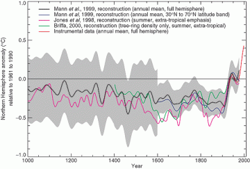
Let me refresh by showing the IPCC spaghetti graph one more time. It purports to show the MBH99 reconstruction, the Jones et al 1998 reconstruction, the Briffa et al 2000 reconstruction and the CRU temperature history, against a background of MBH confidence intervals. The detail shows the truncation of the Briffa MXD series, which is hard to spot in the spaghetti graph.
 |
 |
IPCC TAR Figure 2-21 with blowup.
Let’s suppose a diligent reader or reviewer consulted the reference Briffa et al (QSR 2000). He would have observed the following reconstruction. The NHD1 reconstruction (archived at WDCP) has negligible centennial variability and is not the source of the IPCC graphic. The green LFD reconstruction shown in the Figure is nowhere archived, the calculation is not explained here and, in any case, differs from the IPCC version – most notably, the data for the last 34 years is is not deleted as in the TAR figure.

Briffa 2000 Fig. 5. An indication of growing season temperature changes across the whole of the northern boreal forest. The histogram indicates yearly averages of maximum ring density at nearly 400 sites around the globe, with the upper curve highlighting multidecadal temperature changes. Extreme low density values frequently coincide with the occurrence of large explosive volcanic eruptions, i.e. large values of the Volcanic Explosivity Index (VEI) shown here as arrows (see Bri!a et al., 1998a). The LFD curve indicates low-frequency density changes produced by processing the original data in a manner designed to preserve long-timescale temperature signals (Bri!a et al., 1998c). Note the recent disparity in density and measured temperatures (ⷩ discussed in Bri!a et al., 1998a, 1999b). Note that the right hand axis scale refers only to the high-frequency density data.
Briffa et al (JGR 2001) presents another version of the reconstruction in their Figure 4 as shown below. Again, this is not truncated. The reconstruction diagram shows a bewildering spaghetti graph merely from MXD alternatives. I do not understand how a scientist can present a diagram like this and, in the next breath, report confidence intervals that are anything other than an envelope so wide as to be meaningless, but that’s a story for another day.

In the spaghetti graph for Briffa et al 2001, the inconvenient divergence is deleted for the first time. In the archived information for Briffa et al 2001, the inconvenient divergence is deleted. What happens to the IPCC spaghetti graph if the deleted data is restored? Because there is no archived version of the deleted data, it has been a time-consuming job to emulate the Briffa reconstruction sufficiently to make a precise replication of the IPCC spaghetti graph. (I tried a couple of years ago and made a pretty good estimate, but this one is more precise.) My emulation is below.
The restoration of the excised Briffa data is shown in green. In my opinion, the difference between the appearance of the altered and unaltered data is “substantial”. The alteration of the data makes the proxy reconstructions appear far more uniform than they really were. Not only was there no “clear explanation” of the alteration of the data, but the citation was to a reference where the data had not been altered. Can you imagine the hysterics if Durkin had done this?

A Redone IPCC TAR Spaghetti Graph.
This is not the only puzzling aspect to the data. The 1960-1990 level in this graphic requires an adjustment to the MBH99 data which has a 1902-1980 level. In this replication, I’ve adjusted by the difference between the CRU NH temperature in 1961-190 and 1902-1980. This results in a noticeably different level for the MBH graphic. How was the MBH99 series re-leveled? There is no explanation and, at this point, I have no idea. As previously noted, the Swindlesque S-curve in the MBH99 smoothed version cannot be replicated using the stated smoothing filter. How was it done? I have no idea. The end-period padding for the Briffa series appears almost certainly to have used the end-period mean rather than the known divergent values. This leads to a slight difference over and above the truncation. The temperature series only goes from 1902 on (as in the MBH99 archive), with 19th century values not being shown in the original version (but are shown here). Why were these excluded? Hard to say.
The deletion of inconvenient post-1960 values has also been done in AR4, not simply with the Briffa et al 2001 version, but also with the Rutherford Mann 2005 reconstruction and the Hegerl et al 2006 reconstruction. As a reviewer, I requested in the strongest possible terms that the untruncated data be shown. This request was ignored. (Of course the lead author was Keith Briffa, who with Michael Mann, was the architect of the original deletion of post-1960 data.)
In AR4, there is an allusion to the deletion of the post-1960 data (as opposed to TAR where it was concealed), but it is merely a pretext and does not justify the removal of pertinent data. I notice that I’ve been criticized recently for being suspicious of adjustments to the temperature record. In the case of CRU, these adjustments are carried out by one of the coauthors of Briffa et al 2001. Based on examples like this, of course, I’m going to be suspicious of their adjustments. (This does not mean that the adjustments are invalid, only that they need to be examined in very close detal.)
As for this particular case, I submit that the deletion of values of the Briffa MXD reconstruction from 1961 to 1994 meets all of the criteria set out by Paul H above: removal of data which alters the appearance of the graphic without a clear (or any) explanation by IPCC and with an incorrect citation. In IPCC, no questions are asked about the professionalism of the authors. Briffa was appointed lead author of the section in AR4.


59 Comments
The caption for Briffa’s Fig. 5 includes the following:
Hmm, I wonder just how sensitive trees are to solar insolation. This indicates that density is VERY sensitive, perhaps outweighting temperature?
SteveM,
The right hand sides of the graphs are hidden by the side bar.
Most plants are optimized to the amount of light they receive during the course of the day, so they get more light than they can use at noon, and they burn off excess NADPH via the mitochondrial uncoupling protein. The amount and size of the stems f the leaves is the major change that occurs with different light levels.
If the light is lowered they increase the amount of space their leaves cover, this is an investment they could put into actual growth of the trunk (the long term investment strategy), a high proportion of the fixed carbon that goes into supporting the leaves is lost every fall.
Low light expirements show that “ all species allocated proportionally more biomass to stems and less to roots, but the same to foliage, compared with the high-light environment”. So in low light expect very less trunk growth.
(http://cat.inist.fr/?aModele=afficheN&cpsidt=2376605)
One other thing that I suspect people haven’t wondered about is what do trees do after a late frost? A late frost will kill off their fruiting bodies, so the trees will be sterile for a year. So they will have a whole growing season where they don’t have to invest in reproduction and growth, but just growth. It might be possible to have wider rings in species vulnerable to frost and short ones in frost resistant trees, both indicating an average summer and a cold snap in spring.
Maybe the title of this thread should be ‘Swindle of the IPCC TAR Spaghetti Graph.’ Doesn’t changing one little word make such a clarifying difference? 🙂
I remember back when you first posted on the truncation of Briffa 2000, Steve, and recall being unable to parse the meaning of it. My mind felt numb. In retrospect, my reaction came because the evidence of such sheer dishonesty in science was too hard to accept. After an adult life-time of hewing to the principle of objectivity, to see the bedrock of science flouted on that scale by institutional scientists was more than I could countenance. I’ve since become more hardened.
What really put me over the top was Hansen’s 2006 PNAS paper, personally reviewed and passed by Ralph Cicerone, as discussed at CA here and here (among other places, e.g.). I guess Dr. Hansen has never been less than 99% sure that he’s right.
Re #3 This has in fact been studied. Frost can impact foliage as much as fruit, and in this case the effect on growth will be negative. Val La Marche got his start studying frost rings.
Back on topic: I am glad to see the focus here on the true size of the confidence envelope. That’s the lever to push on. Although I also think it is a mistake to let the Team get away with starting these reconstructions at AD1000. That date is oh so convenient for avoiding the AD910-990 warming trend.
RE 2:
Truncated graphs on right side of screen. I solved this be selecting ‘View’, ‘text size’, ‘smaller’ (instead of ‘medium’).
These results, if totally confirmed, are astounding. Surely, there is scope for getting these published – in a peer-reviewed journal. It would need a summary in clear ‘layman’s’ terms. And you would need to try and address potential counter-criticisms in advance.
Steve, with reference to Nature’s recent withdrawal of its invitation, maybe, just maybe they would be interested in the above analysis. Or maybe it is just too inconvenient.
Now with my plant physiologist’s hat on, Doc Martin (#3) referred to late frosts. My understanding is that these are significantly increased in a “volcanic winter”. The repercussions of this are clear. During the active growing season the photosynthetic machinery is rather sensitive to low temperatures, particularly when combined with high light- which are exactly the conditions you would expect following a clear (and frosty) night. The light reactions of photosynthesis are purely photochemical and have a temperature coefficient (Q10) of 1.0, which means that they are insensitive to temperature.
Conversely, the dark reactions have a Q10 of over 2- typical of enzyme-mediated reactions. What this means in practice is that a combination of high light and low temperature results in energy harvesting by the light reactions that greatly exceeds energy use by the dark reactions (which are temperature limited). If the resultant excess energy cannot be dissipated safely (as heat) then you get damage to the photosystems. This phenomenon is known as “photoinhibition”. That is the inhibition of photosynthesis by light. Damage can vary from easily repairable (24 hours) to total destruction (and death) of the leaves affected.
My feeling is that this mechanism could play a major role in trees’ responses to “volcanic winters”.
PHE,
Thank you.
The data after 1960 shows that Tree Rings can not be used as a definitive temperature proxy. Every scientist has to agree with that now.
Tree Rings measure growing conditions for that particular tree in that particular location in that particular year only. Little understood is that trees themselves have huge genetic diversity. A pine forest might have hundreds of different subspecies and different genetic sub-types within it.
Until we know how every “growing condition” affected that particular tree in that particular year and we know how that particular tree responds to those conditions, we can say nothing about temperature.
The truncation can only be described as one last shot at keeping the myth alive before the study of the dendrochronology-temperature link is discontinued. The science doesn’t support it.
10: John L
As a biologist by training, I was thinking along the same lines. Few tree species are without some genetic differentiation. Only members of the poplars spring to mind at the moment as an example of a clone forest where almost every tree is a clone.
My other thoughts were around tree rings as a proxy for temperature. As shown elsewhere, tree rings don’t show the same fluctuations that instruments do in recent times, why should we expect them to be accurate in previous times. Measuring tree rings just tells you what the growing season was like. Was it wet or dry, cool or warm, nutrient rich or poor, what was the health of the soil, etc. Trees and other plants don’t respond soley to one paratmeter, rather, they resond to a complex web of growth promoters and inhibitors. Using a tree as a thermometer is, in my mind, extremely inaccurate.
Re 11:
It was very warm here in January and one of the evergreens actually noticeably grew that month with new light green needles. It is also likely a new and narrow tree ring was formed. To proxy scientists, it would look like a cold year when actually it was a warm January.
I expect that your warm January would have that effect, at least on the dendroclimatologists. ;^)
There are just too many factors at play. Was your warm January a sign of AGW?
The Mann, Briffa, etc and co. cannot be the only people who’ve tried to use tree rings as a temperature proxy. Surely there is a dendrologist two on the other side of the world, who has no links with the IPCC group who can comment on this subject.
do I count?
“tree-rings can be used as valid temperature proxies” and please feel free to quote me on that
actually, I do not count, I crossdate
This discussion has been going on for about two years here, and the dendros have had every opportunity to address these issues. I think Steve M now has their attention, and they are beginning to study the “divergence problem.”
To all other signal analysts and electrical circuit stability folks, I’d have to say I find Figure 4 to be highly disturbing, assuming of course that it gives some sort of indication of general climate “goodness” (good, here, meaning, not as cold …. since we are in an interglacial, not as cold is definitely a good thing, in my book …).
For everyone else, caveat emptor, one man’s instinctive, horse’ sense reaction, developed over 25 years of dealing with complex electronic circuits, not the climate system. YMMV.
I’d add that, while some may react with a feeling that divergence between boreal tree rings and apparent ambient “natural” global surface temperature since the mid 20th century, my own reaction is not so certain. While I think that BCPs and other arid and near arid zone trees are poor temperature proxies, I would be open to trees in other places being reasonable ones over the broad swath of time. Therefore, I’d have to ask the question, do you trust the surface temperature record? I don’t.
Oh boy, not enough coffee yet, that should have read – I’d add that, while some may react with a feeling that divergence between boreal tree rings and apparent ambient “natural” global surface temperature since the mid 20th century means we can’t trust the boreal tree ring data as a proxy, my own reaction is not so certain.
15: Rob
“tree-rings can be used as valid temperature proxies” Rob Wilson, 2007
I am curious as to how you determine temperature from tree rings, so if you could shed some light, I wouold appreciate the new info.
I just quoted you. You have no way to validate that tree rings are proxies outside of the known temperature record, and even within that record, the results are suspect.
Mark
Please discuss tree rings and temperature on another thread and there are many such. This issue was not raised by me in this thread and is a diversion in this context.
What we are talking about here is the deletion of the 1960-1994 Briffa MXD results by Mann, Briffa and IPCC.
This latter bit is really what I was getting at by “suspect,” though you are correct, it is out of the context of the thread.
So, should we now expect Ward to file a complaint about the IPCC’s willingness to delete/alter known data sets?
Mark
Sorry about getting off-thread. This truncation issue is very serious. Can you imagine what would happen to a company that promoted its stock by showing a truncated stock value chart?
Looking at Fig 4, the divergence between the observations and the thick black line could be explained as an artifact of UHI on the temperature record.
Sorry to be OT in #25, did not see SM’s note when I posted
Howard:
I am not sure your comment is that off-line if what we are interested in are the reasons for truncating of the 1960-1994 Briffa MXD results by Mann, Briffa and IPCC and the avoidance of recognizing the divergence problem. UHI may be a shot in the dark — but it leads naturally to a nasty scenario for Jones et al though offers some hope to dendro: Namely suppose that tree rings are OK temperature proxies (with limitations for certain species!!) but since they come from areas where there is likely zero UHI, then they could diverge markedly from any temperature series that is distorted by UHI effects.
Seems like Briffa is faced with a heads you win, tails I lose situation – in Chess the equivalent of a fork – do you want to lose the tree rings or the temperature series. Nasty choice for lead author of a section in AR4!! Solution – eliminate the 1960-1994 Briffa MXD results.
Steve, if this is still OT my apologies – but I think the only obvious thing left to discuss is Briffa’s “motive” and the failure of reviewers to catch the truncated data.
The Spaghetti Graph according to New Scientist (latest issue, 16 May 2007):
http://environment.newscientist.com/channel/earth/climate-change/dn11646
http://environment.newscientist.com/channel/earth/climate-change/dn11646
29: Jos
Do I have to say it? There arguments are for the uninformed and can be refuted. They have no evidence on there side if the evidence is used properly. They are very sophomoric.
re: #30
Which would probably be a useful exercise if someone has the time and expertise to do so. If someone here would do so it might be useful to post the individual refutations on a AuditBlog site which John A could set up and then the pages could be linked here so anyone interested could post remarks and work the bugs out of the the refutations.
Of course some of the refutations would be of the form: “X is a strawman. I.e. a knowledgable skeptic would never say that. Instead the skeptic position is Y”.
#29
The are many surprising statements in this issue of New Scientist. Here is just one example. Concerning the Little Ice Age, New Scientist has this to say:
“Take the frost fairs held when the River Thames in England froze over, which are sometimes hailed as proof of how cold it was during the so-called Little Ice Age (…). The slowing of water flow by the old London Bridge is now seen as a crucial factor in the freezing of the river, which explains why the river did not freeze in 1963 even though it was the third-coldest winter in England since 1659.”
http://environment.newscientist.com/channel/earth/climate-change/dn11644
This seems a very odd statement to me because at first sight, a bridge with very narrow arches (such as the Old London Bridge) will cause the water to flow faster. The flow of the river will not be slowed, but acceleterated, at least underneath and around the bridge. Elsewhere along the river, the flow will remain unaltered, because the watermark and rate of water flow will remain the same.
Moreover, there are a lot of other European rivers without such a narrow bridge, that often frooze during the Little Ice Age, but not nowadays. Jan Buisman has published a lot of material on this topic.
It is so time-consuming to debunk such weasel-wording.
The facts are:
(1) The uncertainties are larger than they are letting on. They are not aware enough of the true uncertainty. Moreover, merely being “aware” is not enough. You have to share that awareness with policy-makers.
(2) The uncertainties that were “highlighted” in those and subsequent works were undocumented and were very likely incorrect. The graphical representation is highly misleading. The uncertainties themselves are uncertain, so there should not be a hard line bounding the ucnertainty envelope. IPCC Fig. 6.10c is an improvement, but is still not quite honest.
(3) NAS cannot be interpreted at face value; you have to read between the lines. The stick is broken.
(4) What’s with the fixation with the year 1000AD as a starting point for comparison? I insist it be 900AD.
etc.
#32 is OT.
No, they’re just activists with a strong opinion. I used to subscribe since they are willing to post non-conformist stories about many areas of science that other rags won’t touch, but they tend too much toward opinion, rather than science, particularly when it concerns the environment.
Mark
I have not read the papers, and I apologize if I am heading off in an imaginary direction. But it seems quite likely that unless the studies are very old (done with slide rules) the calibration periods of some of the models included the period for which the data is being deleted. Clearly the calibration period gives the best correlation with precip or temp or whatever is being modeled of any period shown. It is hard to imagine papers written in 1998-2000 relying on studies calibrated entirely on data preceding 1960. I don’t know the reason given for leaving the data out, but a reason suggesting that the data is unrepresentative calls into question the calibration process and the model it produced. The data should have been left out of the calibration also.
Sorry again for all the speculation in this post.
#33
But in the TAR WG1 SPM the Graph is clearly marked with this information, so the policy makers have been told:
Now you may dispute whether the uncertainties have been accurately assessed, but that is the considered view of the scientists. Given that there is still no evidence of a globally extended MWP, and given that these reconstructions are hardly the cornerstone of the debate why the argument.
#32
If you’ve ever built a dam on a stream, you will find that upstream, the water deepens and the flow slows down.
Re #37 That is precisely what I’m disputing: the accuracy of that gray zone. Thank you for clarifying and stregthening my point.
#39
You can dispute it till you’re blue in the face but it won’t make a global MWP appear. But your more serious charge is to suggest that the scientifically considered uncertainty was hidden from policy makers, which it wasn’t.
The problem with the bridge theory for the frost fairs is that in most cases when London had a frost fair, other rivers in Europe also froze over such as the Seine or the Rhone in Europe or the Wye and other rivers in England. How does the London Bridge cause the Seine to freeze over?
A second problem wuth the bridge theory is that they had frost fairs before the bridge was built.
#39
I wonder if the claims of warm period in China, with the warm period in SW North America count? How about claims of glacial retreat in South America, New Zealand about the same time? In fact, I find it confusing to deny the historical record. To me, to claim such would be to invalidate the use of proxies. After all, one need only assume that the present warming trend is like the MWP except this time it covers the world. Thus, we can expect that, in general, most, if not all, areas of the world, are going to cool and go back to the condition of variance (as in MWP time period, and by similarity, all time periods), if you accept the assumption that the MWP was localized. Also, it is easier to assume that whatever caused the MWP is causing today’s warming. Because if you don’t, you need to explain the MWP, how today’s is somehow different; and to be accurate, you have to measure MWP cause, explain why it is different, and measure today’s cause with the potential of both the cause of MWP and present conditions taken into account. Otherwise your position is untenable. Allowing someone to throw out the MWP, allows the assumption that all these proxies reflect only local conditions and do not give an estimate of global conditions, and allows someone to throw them out as well.
By deleting the post-1960 values of the Briffa series, they made these reconstructions appear much more unanimous and consistent than they really are and they concealed the divergence problem. In a business prospectus, this would be an offence. You could argue that the divergence was irrelevant, if that was your view, but you’d have to present it and let the reader decide. For people that aren’t used to this field, this deletion is really quite shocking. It doesn’t mean that AGW is or isn’t happening, but it’s very bad practice and should be condemned.
#40 wrt AR4 I agree, and I wanted to indicate as much earlier. I simply ran out of time. In my original comment #33 I was “projecting” back to glossy pamphlets that were based on MBH98. And, as another example, the error bars that Webster et al. do not include on their hurricane frequency trend lines. This not in policy documents but in the primary literature. Frightening. Then there are the Hansen model predictions – no error there either. So forgive me, I was indeed extrapolating back in time and outward to other domains. So technically, you are quite correct. However my original point stands. In fact, it was me that even congratulated AR4 on doing a better job with Fig. 6.10c than in the past.
Sorry, no blue today.
Steve Milesworthy, also be sure check out the New Scientist article discussed on another thread. No gray zone confidence envelope in sight.
In my albeit relatively limited observation of the literature the 350 or so year length of the “MWP” seems to be an issue – so when you say “about the same time”, it turns out they actually mean not the same time. When Greenland was under colonisation by the Vikings, New Zealand was going through its coldest 90 years in the last 1100 years between 993 and 1091, and warm periods only occur for some of the time (1137-1177 and 1210-1260). See “Evidence for a “Medieval Warm Period” in a 1,100 year tree-ring reconstruction of past austral summer temperatures in New Zealand”, Cook et al. GRL. While the Quelccaya glacier in the Andes arguably seems to show warm periods, the Huascaran glacier does not.
Evidence of localised warming is easier to understand because, if correct, its warmth can be due to heat coming from elsewhere on the planet.
However, given that currently pretty much the whole atmosphere is warming, that the ocean surface is warming, that the bulk of the ocean is not cooling, one has to ask where the energy is coming from.
If there really were a global MWP equivalent in scale to recent warming then, yes, there is a possibility that what caused it could happen again, but that is different to saying that it is happening again.
On the face of it, it would have been better to describe the divergence issue in the context of this graph. I don’t think it is wise to try and use it to defend the laughable GGWS though.
#41
At a guess, London Bridge is just one cause of the river freezing. I would guess that most rivers in Europe will have been altered by development, particularly to become more navigable, and this would tend to speed water flows. Maybe the urban heat island has an effect too 🙂
#47. Please don’t misconstrue what I’m saying. All I’m asking for is consistency in standards for public discourse. If Ward and Risk Management Solutions object to Swindle on the basis that their use of a dated graphic without commentary is misleading, then I’m OK with that precedent. All I’m saying is that what’s sauce for the goose is sauce for the gander and IPCC is a much bigger fish. The deletion of adverse Briffa data was intentional. The continued deletion of adverse Briffa data in AR4 was done in spite of an explicit reviewer request that the data be shown.
You are assuming an interpretation of the proxy evidence. Cook’s tree ring evidence from New Zealand cannot be relied on as an MWP index: it has negligible correlation to local temperature (and was even rejected by Mann and Jones 2003 as a candidate). Other than Lonnie Thompson, many specialists interpret tropical O18 in the Andes as a precipitation proxy. If there is inconsistency between Quelccaya and Huascaran, this may point to problems with the proxy as opposed to climate interpretations. If you go back to my posts on Guliya or Dunde, you will find huge inconsistencies between Thompson versions. Thus one Guliya version may have a warm 12th century, while another version has a cold 12th century. Thompson has refused to provide sample information to reconcile this dog’s breakfast. No Thompson data should be cited in a scientific article until this fiasco is resolved.
At this point, I’m not arguing that a MWP is established world wide, but that the arguments against it are flawed. Bristlecone ring width chronologies are lower in the MWP – and this is the main factor in several of the multiproxy studies. However ecological evidence in Califoria points to a warm MWP (Miller et al 2006) and mega-drought, and narrow widths in MWP bristlecones can be plausibly interpreted as evidence of dryness. The Mannians do not bother reconciling discordant data and prefer to rely on repeated assertions.
46: Steve Milesworthy: If you have not done so, you might want to check these summaries of studies showing a distinct MWP all over the world.
#49
Jae, The co2science MWP project is where I’ve got some of my references from.
I do recall that the co2science summaries of the papers I read were rather partial to say the least. For example, they were happy to mention the favourable information about the Sajama glacier but not the two other Andes glaciers nor the three Tibetan glaciers mentioned in the following Thomson paper.
http://www.co2science.org/scripts/CO2ScienceB2C/data/mwp/studies/l2_sajama.jsp
Given the author, I guess I don’t need to tell you that its conclusions actually aligned well with the Hockey Stick and “support meteorological evidence of a significant 20th century warming”.
#46, I did not know that the data for the actual age was available in all cases. I was assuming that many of the proxies only had approximate dating, such as ice cores, and that the differing years could be approximately reconciled by the error in the dating technique.
#51 Why assume when you can read the blog? It’s even got a search tool.
google CA for “resolution” or “annually resolved”. The topic has been discussed dozens of times.
Thanks Bender. I will read awhile.
#41,
Additionally, the bridge still existed after they stopped having frost fairs.
#38,
Deeper water freezes more slowly.
#40,
CO2science has an archive of papers from all over the world showing the existance of a worldwide MWP.
50:
?? Your link is to the co2science summary, not Thompson’s paper. As I recall, Thompson papers are taboo around here, because they cannot be audited.
Steve,
You are right on the ball. The first job of a scientist is to apply the method. Stating assumptions and inaccuracies/uncertainties
makes it science and the truth. Not doing that means you made a mistake. Continually either means you have missed it completely and
haven’t checked your work (or no-one is telling you otherwise) or you are intentionally perpetrating it.
That’s just lying.
MC
I assume this is referring to “plate 3” in the paper, p. 2938.
Steve: Yes. But as I noted in recently (Heartland presentation), I subsequently noticed that the deletion of post-1960 can be traced back earlier to Briffa and Osborn 1999 ( a short comment article).
Was it a *reviewer* who suggested the truncation? Who reviewed this paper? Did Mann review it? Did *he* suggest the truncation?
[Keith, throw him under the bus while you still can.]
5 Trackbacks
[…] discussion of these issues is at Climate Audit here here here and more recently by Jean S […]
[…] discussion of these issues is at Climate Audit here here here and more recently by Jean S here. Jean S and UC report at CA that the puzzling end point […]
[…] 15 May 2007: Swindle and the IPCC TAR Spaghetti Graph […]
[…] McIntyre has had a bee in his bonnet about this figure for a long time, as seen in a 2007 ClimateAusit post comparing Briffa and other IPCC authors to Martin Durkin of Great Global Warm…. […]
[…] the bidding first. I recently discussed the truncation of Briffa et al 2001 in the IPCC TAR spaghetti graph here. Below I show what the TAR […]