There is some recent discussion of Marysville and Orland at Eli Rabett and Tamino. The gist of their arguments is that the failure of NOAA to implement their promised quality control doesn’t “matter” since the problems get adjusted out in the adjustment software so that trends at Orland end up being similar to trends at Marysville. Tamino says:
Not only are the graphs strikingly similar, the trend rates are nearly identical.
One thing that you have to watch (as I’ve mentioned before) – GISS adjustments are not used in GHCN (and thus not used in CRU or NOAA NH calculations.) The relevant series for CRU is probably the GHCN adjusted series (which is usually similar to GISS raw), but since CRU won’t disclose their data, this is just a guess. Eli observes that GISS results come out in the wash about the same as CRU; why they do so is presently an unexplained Caramilk secret although the accounting would be trivial if the methods were properly disclosed.
While I looked at adjustments for these stations at the time, I’m a bit more familiar with the adjustment sequences now and thought that it would be interesting to re-visit and compare the Marysville and Orland adjustments in a similar format to the Arizona adjustments.
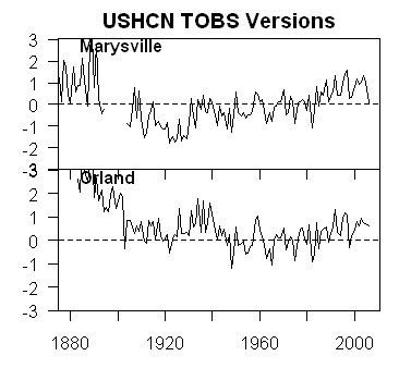
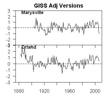
First here are plots of two Marysville and Orland versions – USHCN TOBS on the left and GISS adjusted on the right. In the TOBS version, we see an almost characteristic difference between two classes of site – the Orland site has a rather high 1930s, comparable in some way to Grand Canyon, while the Marysville site has higher recent values than the 1930s, similar to Tucson though not quite so dramatic. In the GISS adjusted version, the two versions are much more similar – a point observed by both Tamino and Eli. However neither investigated the adjustment sequence.
 |
 |
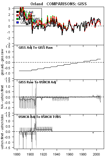
The figures below illustrate the adjustment sequences for Marysville (left) and Orland (right). Again, the patterns are somewhat similar to the adjustment sequences for Tucson relative to Grand Canyon, but with some interesting differences. GISS made a substantial UHI adjustment for Marysville, the result of which past values were increased relative to recent values. But look at Orland: here GISS has made a negative adjustment (something that I observed on a previous occasion). The Orland station seems to have been in the same location since at least 1909 – why should there be a negative UHI adjustment to Orland? This is goofy. The trends will come out similarly, but Hansen’s wrecked what seems to be good Orland data to get there.
In both cases, GISS raw versions match USHCN adjusted moderately well – so the Hansen Y2K problem observed in the Grand Canyon and some others series doesn’t come into play here.
In the bottom panel, there are USHCN adjustments to the TOBS data, which have the effect of lowering values in the 1930s relative to modern values by about half a degree C. (There is no material change in elevation of the Marysville station).
 |
 |
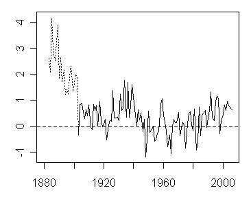
The station history for Orland does not show any moves since 1909 (with an identical elevation since 1883). Aside from looking sensible now, it has an excellent history and should be somewhat of a gold standard. So the question for me is: shouldn’t this be the sort of station that is used to benchmark nearby stations with flawed histories, rather than trying to do a whole lot of adjustments to all the stations. Here’s the Orland TOBS version (showing pre-1902 values in dotted lines since it looks like there may well be some sort of unreported discontinuity there).
Interestingly, Orland, despite its seemingly adequate rural appearance is not itself a lights=0 GISS site. California USHCN sites with GISS lights=0 are: BRAWLEY 2SW, CEDARVILLE, CUYAMACA, DEATH VALLEY, ELECTRA PH, FAIRMONT, FORT BRAGG 5N, HAPPY CAMP RS, INDEPENDENCE, LAKE SPAULDING, LEMON COVE, NEEDLES FAA AP, ORLEANS, SUSANVILLE AP, TEJON RANCHO, WILLOWS 6W and YOSEMITE PARK HEADQUARTERS. Some of these sites have been discussed previously and many are now surveyed at surfacestations.org. Lake Spaulding for example has many inappropriate aspects to its history. Why anyone would intentionally use Lake Spaulding to “fix” Orland is not at all clear to me? To the extent that this is what the GISS clergy are doing, then this sort of behavior should definitely be discouraged.


37 Comments
Steve, as always, clear and interesting work. Do you understand why there is a “stepwise” adjustment from GHCN raw to GHCN adjusted, rather than a smooth adjustment? In addition, why are the lengths of the steps different at the two locations?
w.
#1. No idea why. The GISS Orland adjustments are implemented in each calendar decade with year beginning in December so there’s a little end-point jitter. AS you observe, the GISS Marysville adjustments are implemented more frequently. Why? Another Caramilk mystery. Maybe it’s something to do with MBH99 confidence intervals, also unexplained.
Gee, I wonder why they don’t provide their methods.
I have heard this argument before – something about the difference between quantitive and qualitative results. I first heard it in climate science in a presentation by Michael Schlesinger at a conference in Edmonton Alberta (September 1987). He was a modeler as keynote speaker a developing trend that was to dominate climate conferences for the next several years. The subject was “The Impact of Climate Variability and Change on the Canadian Prairies.” The paper was titled “Model projections of the equilibrium and transient climatic changes induced by increased atmospheric CO2.” He had put the same data into five models and presented the results for temperature and soil moisture in map form. He was challenged vigorously over the mathematical representation of the atmosphere as the basis for the models, the inadequate formulation of the atmosphere in the models, but mostly was challenged on the model outputs being different. He admitted there were regional diferences so someone pointed out that entire continents were diferent. He replied, yes they’re quanitivley different but work because they’e qualitatively the same. When asked what he meant he said they all show warming. Someone then pointed out that it would be a surprise if they didn’t since they were all programmed to show an increase in temperature with an increase in CO2, essentially ceteris paribus.
When comparing sites why do so many pick the 1961-1975 to present for surface temperature comparisons? Is the start of the industrial age chopped liver? The 1975 to present matched fairly well without correction for those two sites. The 1900’s to 1960’s didn’t compare well at all. When comparing sites I think 1906 to present data (2006) for a hundred year history or the time frame of the shortest lived site should be used.
The TOBS Orland from 1909 to present should be used in global temperature reconstructions. Other stations should be discarded. If you have to make any adjustments to a station, then it means the site is of doubtful utility for climate change monitoring.
Global temperature reconstructions should only use stations like Orland, or Valentia and Armagh in Ireland.
Does anyone else notice the sidebars beginning to ‘creep’ over the text, obscuring part of the posting?
Both on the main page and on this article too.
Browser disclosure: using I.E. 6.0 here at work.
I’m getting that too Jim. Using IE7 here.
Ya know, I like Tamino’s site because I’ve learned a thing or two. But I won’t comment anymore. Maybe he has to work and that is all it is — dunno — but the following has been in the moderation que for 14 hrs. I assume it is rejected by Open Mind.
———–
I’ve followed this project from the start and as a volunteer have 10-12 stations under my belt. All told we have about 230+ completed, or 19% of the 1220 USCHN sites. I think that is pretty good considering we’ve only been at it 2-3 months.
Why were those particular stations shown on the front page of the surfacestations.org web site? I’m almost certain it is because they were the first two or three surveyed by Anthony Watts. That’s all.
A reader correctly points out above that the charts are from the GISS web site. I do not know if the various adjustments were done beforehand.
OK, subjective qualifiers like “good” and “bad” should probably read:
“good” = in compliance with NOAA’s own siting guidelines
“bad” = not in compliance with NOAA’s own siting guidelines
Presumably NOAA put some thought into these guidelines?
You can talk all you want about parking lots not affecting trend. Hey I understand the argument, but the guidelines nonetheless specify a distance of 100 ft from any paved or concrete surface. Sounds reasonable to me, but if you don’t agree, talk to NOAA. Air conditioners aren’t specifically mentioned, but the notion that a station can be anywhere near an a/c is just silly.
There is only 19% to draw conclusions from but from what I’ve seen NOAA/NWS/GISS certainly hasn’t “worked hard to identify any problems…” Rather, it appears to me that they haven’t put the first effort into basic quality assurance.
BTW, my experience so far is that the NWS Coop stations in the back of private residences (I commend these people) are demonstrably better sited than the remainder, which tend to be at government facilities. Maybe someone can take an observation such as this and do something constructive.
Not quite, the gist of the argument is that the trend at Marysville has been adjusted to match that at rural stations within 500 km (including Orland). That means that the raw trend (over 100 years) at Marysville is not reflected in the gridded data
#10. Eli – GISS raw data more or less equals USHCN adjusted data, which looks like it blends some portion of urban data back into rural data like Orland. Otherwise please explain why Orland data gets screwed over in the USHCN/GISS adjustment process.
RE 11.
The other thing to consider are the other high quality sites close to Marysville.
Specifically, the agriculatural site at Colusa, 20 miles away. This site, like Orland, is well
sited. It shows a trend that matches Orland: NO TREND. So, basically, they jack the good sites
up and jack the bad sites down and call it homogeneity.
Now Hansen never looks at these type of sites. If he did, he would see that Marysville IS THE ANOMALY.
Wedge the good sites up ; wedge the bad sites down . and then argue that they match.
The hansen hokey pokey.
You shift the good site up,
you shift the bad site down,
you do the hansen pokey and you
turn self about.
that’s what it’s all about.
RE 10
The gist of the argument seems to be cherry picking. 1975 to present after correcting Marysville is a fabulous match which means squat. 1900 to present looks like the real deal. It is industrialized trends right? How about 1998 to present trends? 1943 to present trends? Give me a slope and I will pick the date. Try setting a real standard like you are trying to find the truth. It is “manmade” start when “manmade it.” Or is that just too layman a thought?
RE 12, I just happen to have Colusa, even though its not USHCN nor GISS, I felt it worthy of a visit, right after I took those now famously argued over pictures in Marysville.
See Colusa here
Colusa is at a sewage treatment plant, but somebody at least thought about placement a bit, or at least it appears so. Prevailing winds are from the south, so they mounted MMTS on the south fence so that it wouldn’t pick up heat from the ponds to the north. On the downside, we have nearby metal buildings and nearby crop rotation.
On the plus side, its in the middle of nowhere about 3 miles SW of town center surrounded by open land.
Re # 12
“Wedge the good sites up ; wedge the bad sites down . and then argue that they match.”
This really is the heart of the matter here. The homogenity process must assume to some extent that the biases are balanced, i.e. a zero mean. That justifies adjusting an urban site with a rural site, adjusting a rural site with an urban site. In the same manner. micro-site issues are corrected using adjustments with other sites. Unfortunately, the biases aren’t balanced. There are no rural cooling islands and I’ve yet to see a temperature sensor next to a leaking liquid nitrogen storage tank or ice block disposal site.
The adjustments should only use data from good sites to correct stations with contaminated data (discarding the data from the contaminated sites would happen in the real world). Looks like the adjusters also use data from compromised sites to adjust the good sites. No wonder they match.
This entire scheme really makes one wonder. It’s getting hard to beleive this is just garden variety incompetence.
re 14 there is another Colusa as well, in the agricultural network. Found it on the
UC IPM web. It matches, trend wise, the Colusa you refer to, but is a tiny bit cooler.
The bottom line is that there is no justification for adjusting Orland.
No station move. No evevation move, no switch to MMTS, no uhi adjustment.
Nothing. Other than this. It had to “match” the trend of the grid which is .8C/century
according to Gavin.
I’ve looked at most of the sites in Anthony’s database. The things which concerns me the most are the presence of structures/trees and concrete/asphalt. A nearby structure/tree affects nighttime radiational cooling (partially blocks the ground’s view of the sky) and concrete, as discussed here, stays warmer (stores/conducts/radiates heat) than grass or typical soil.
These tend to cause higher nighttime minimum temperatures.
The effect on daytime temperature is more complicated and could go either way, depending on albedo, wind blockage and whether the sun is blocked.
I forgot to note that trees and shrubs tend to grow, buildings tend to increase in number, concrete/asphalt albedo tends to change and the heat-related properties of soil beneath concrete/asphalt tends to change.
So, not only is there an initial effect from locating temperature sensors in bad places, there is also a risk of introducing long-term trends (generally upward) from factors like those listed above.
The answer is, put the sensors where the standards say they should be.
Orland had to be adjusted because otherwise it would show that the warmest decade of the 20th century was the 1930s, and we can’t allow that, can we. It is very funny to see Tamino trumpeting the fact that after adjustment the two sites show the same trend. Anyway it is good to see Anthony getting so much publicity.
The obvious answer is just to use the rural sites as Douglas says in #6. No fudging required. Some good rural sites can be found in Iceland (no air-conditioners there!) where temperature records go back over 100 years. And according to Hanna, Jonsson and Box (Int J Climatol vol 24 p1193, 2004), “The 1930s was the warmest decade of the 20th century in Iceland”.
RE: #19 – As evidence of the mother of all Icelandic peaks being in the 30s, I present the fact that polar bears now arrive there during some years due to brief periods of complete closure of the Greenland Strait. That was not happening during the 30s. Got Weatherby .460 mag?
RE19 Publicity is not my goal. Getting people to talk about and investigate the issue is.
Rabett and his merry band of rodents have been doing just that, as have many people here. I know it’s also reaching Mann, Gavin, and Hansen as I have been getting feedback from journalists whom have been asking them questions.
Hansen believes his lights=0 rural sites are the answer.
But he hasn’t seen them first hand up close. Happy Camp, CA a lights = 0 site was one I just visited. As rural as you can get, but yet it has another count that has some bearing on it’s record. I’ll have it up soon.
Interesting
The GeoProfile metadata, exposure of instruments, and measurement bias in climatic record revisited
Rezaul Mahmood *, Stuart A. Foster, David Logan
Department of Geography and Geology and Kentucky Climate Center, Western Kentucky University, Bowling Green, KY 42101, USA
email: Rezaul Mahmood (rezaul.mahmood wku.edu)
*Correspondence to Rezaul Mahmood, Department of Geography and Geology, Western Kentucky University, Bowling Green, Kentucky, KY 42101, USA
Keywords
GeoProfile ‘€¢ instrument exposure ‘€¢ measurement bias
Abstract
Station metadata plays a critical role in the accurate assessment of climate data and eventually of climatic change, climate variability, and climate prediction. However, current procedures of metadata collection are insufficient for these purposes. This paper introduces the GeoProfile as a model for documenting and visualizing enhanced spatial metadata. In addition to traditional metadata archiving, GeoProfiles integrate meso-scale topography, slope, aspect, and land-use data from the vicinity of climate observing stations (http://kyclim.wku.edu/tmp/geoprofiles/geoprofiles_main.html). We describe how GeoProfiles are created using Geographical Information Systems (GIS) and demonstrate how they may be used to help identify measurement bias in climate observations due to undesired instrument exposures and the subsequent forcings of micro- and meso-environments. A study involving 12 COOP and US Historical Climate Network (USHCN) stations finds that undesirable instrument exposures associated with both anthropogenic and natural influences resulted in biased measurement of temperature. Differences in average monthly maximum and minimum temperatures between proximate stations are as large as 1.6 and 3.8 °C, respectively. In addition, it is found that the difference in average extreme monthly minimum temperatures can be as high as 3.6 °C between nearby stations, largely owing to the differences in instrument exposures. Likewise, the difference in monthly extreme maximum temperatures between neighboring stations are as large as 2.4 °C. This investigation finds similar differences in the diurnal temperature range (DTR). GeoProfiles helped us to identify meso-scale forcing, e.g. instruments on a south-facing slope and topography, in addition to forcing of micro-scale setting. Copyright ⧠2006 Royal Meteorological Society.
——————————————————————————–
Received: 28 March 2005; Revised: 10 November 2005; Accepted: 12 November 2005
Digital Object Identifier (DOI)
10.1002/joc.1298 About DOI
Related Articles
Find other articles like this in Wiley InterScience
Find articles in Wiley InterScience written by any of the authors
Wiley InterScience is a member of CrossRef.
All Content
Publication Titles
Enter words or phrases
Advanced Search
CrossRef / Google Search
Acronym Finder
International Journal of Climatology
Enter words or phrases
Select a Field All Fields Article Titles Author Full Text / Abstracts Author Affiliation Keywords Funding Agency References Article DOI
Vol: Issue: Page:
Need a reprint?
Paper or electronic reprints are available for all content published on Wiley InterScience. Inquiries can be submitted online.
Find out more about reprints
Let’s see.
The data aqre adjusted to make them all similar. Hmmm. Looks like fixing the data to me.
Anthony # 21,
Using the lights = 0 and the topographical map approach is just another way of saying I don’t wanna get off my lazy duff and go do real science out in the field.
If (and since this is climate science, “if” ) GISS adjustments are to the average trend of unlit stations within 500 km, then Marysville and Orland are both being coerced to the average trend of virtually identical networks. I checked the population of GISS-unlit stations within 500 kn of each. There were 21 GISS-unlit stations within 500 km of Marysville. All 21 were in the Orland radius, which had 2 extra stations from Oregon just within 500 km:
884 355162 72683003 MALHEUR REFUGE HDQ OR 7 43.28 -118.83 4109 487.0582
885 355362 72693006 MCKENZIE BRIDGE RS OR 4 44.18 -122.12 1478 492.7971
Tamino marvelled that the Orland and Marysville GISS-adjusted trends were so similar: of course they were, they were both coerced to the essentially the same target. If they had been coerced to any other common trend (stock prices), Tamino could have made the same observation.
#25 – The adjustment doesn’t seem completely unreasonable as a means of generating a corrected view of a contaminated sample, given a population of correlated samples. Take the mean trend, and encourage your target sample to fit the same trend.
That would be a good approach if what was required were an improved accuracy for the one site where the collected data had been contaminated. I believe that Steve is using a variation on this approach to identify specific stations which have been over fitted.
I have a feeling that the error of taking population corrected data and re-using these as if they were un-correlated samples has been made before, and in a more scientific field, but I can’t remember where.
Re #22
steven mosher (and John A to fix),
Please don’t put a person’s email address in plain text in your post. Unscrupulous webcrawlers farm email addresses and we don’t need to be adding to the world’s spam problems here.
TIA,
Earle
re27.
my bad earle. I thought I clipped the reference down to the abstract only.
SteveM can snip without complaint from me
Was this a quote from a scientist or an alchemist? Sounds more like the later.
I think it was on either Anthony Watts’ site or in the Surface Stations site where he was able to provide an interactive map of Australia’s surface stations. I looked in on a bunch and it looked like they were near airports but at least they looked they were way out in remote fields. They also looked like they had antenna systems, possibly for remote recording, which could be giving more reliable info.
The point is that Australian continental mean temperature did show an increase in temperature with time. But now I’m wondering – based on the apparent UHI effect we’re seeing here which is muddying up the waters, is it possible that the Australian data is being tweaked as ours are to show that increase? Particularly since I’ve read a number of times that the
Southern Hemisphere is not heating up. So why the temperature increase? Or could it be the temperature increase was accurate, at least for the Australian continent?
I’m going to try to tap back into that site again.
(#27,28 — his email is already spam toast: he’s posted it numerous times on web pages. It gets 40+ google hits. Not that I disagree; this is to emphasize: folks, don’t post email addresses in the clear! Do it once, and your mailbox will quickly receive all the junk you can imagine.)
Has anyone ever calculated the average global adjustment similarly to the average global temperature?
Sean, thank you for your post stating:
The problem is not that they have adjusted Marysville downward (in line with your suggestion), but that they have also adjusted Orland upwards … what’s up with that?
w.
RE 32.
Hansen does this in his 2001 paper, I believe.
However, what you want to look at is each and every adjustment. We have to reverse engineer the
process, so a global report is of no consequence.
You can find his 2001 paper at Goddard. I wont link. too lazt. Just google Giss temp
click on publications or authors and select Hansen
browse around in the virtual stacks
#34, thank you.
I’m amazed that the largest overall adjustments have been made to the unlit stations, the largest category, and that about half of the 20th century temperature increase can be attributed to the adjustments. I see that the TOB and Max/Min and SHAP Data adjustments are larger for unlit stations than for peri-urban or urban stations. This magic just doesn’t make sense to me.
re: #35
I think the mindset of the adjusters is that the current temperatures are by definition correct and that therefore it’s necessary to adjust the past to match the present. Since they won’t entertain the possibility that the current readings are biased, they have to change readings that normally would be considered good as gold. Since this is all done below the radar screen and they don’t have to justify their preconceptions, it hasn’t been much discussed except by “deniers” up to now. This is one reason surfacestations.org is so important. Regardless of what sort of bins are found to throw individual stations into, people will finally wake up to the fact that the surface record needs to be examined in detail and questionable procedures changed or justified.
Which is why the auditing is going on. Trust is earned by providing replicability and welcoming the replication.