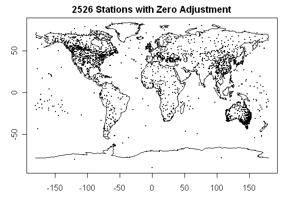
Here’s something interesting: I’ve collated the GISS raw(dset=1) and GISS adjusted (dset=2) versions and then calculated the range of adjustments. The largest positive adjustment was over 8 deg C and the largest negative adjustment is greater than -6 deg C. I separated out the stations that had no adjustments (max adjustments under 0.01 deg C either way) and plotted their locations in the first figure. I then plotted figures showing stations with adjustments. (Nearly 40% of the 5990 stations with adjustments had zero adjustment.)
Here’s a plot of the stations with zero GISS adjustments. Notice the difference in pattern in North America between the stations with zero NASA adjustment and the stations with non-zero NASA adjustment (for now, I’ve not examined whether the difference between only positive, only negative and two-sided adjustments is relevant.) There’s a sharp distinction at the Canadian-US border with Canadian data being almost entirely NASA unadjusted, while US data is all adjusted to some degree. This has nothing specifically to do with USHCN adjustments as these have all been done upstream of the NASA adjustments.
Hansen et al 1999 describes their adjustment as follows:
An adjusted urban record is defined only if there are at least three rural neighbors for at least two thirds of the period being adjusted. All rural stations within 1000 km are used to calculate the adjustment, with a weight that decreases linearly to zero at distance 1000 km.
I must say that I find it hard to picture an implementation of this adjustment that yields the different patterns in the figures below.
Maybe Hansen’s adjustments have something to do with border security and you have to clear customs to get adjusted by NASA. Who knows.
It’s not just the Great White North. Look at the predominance of unadjusted data in Australia and China – I guess Hansen didn’t get the memo that there was urbanization going on in China. Maybe someone will send him a picture of Shanghai then and now.
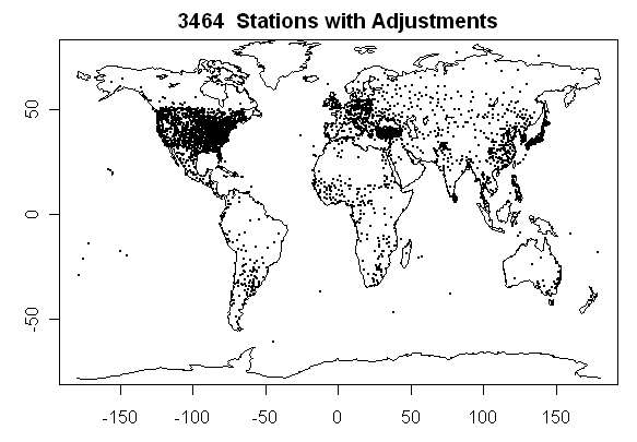
Here’s the same graphic for stations which had adjustments.
I’ve added a comparison showing the difference between the last 10 years and the 1930s – I need to figure out a way of showing the color coding, but it’s the usual color coding – red hot and blue cold. As you can see, the pattern in the U.S. is different.
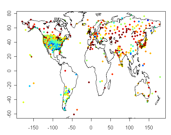
Here’s Chris’ version:


146 Comments
Steve:
Given how important rural stations are for adjustments can you repeat the same plots for rural stations? If these are
getting adjusted then there is possible amplification effects.
Steve, all positive (and negative) adjustments are not equal. Is it possible to do an analysis showing how many stations had positive adjustments post 1980 and how many had negative adjustments pre-1960? I think it would be interesting to see how many of the negative adjustments were performed to early data and how many postivie adjustments were performed on recent data in a way that would increase the trend.
the quick dirty conclusion its that surfacestations must be on to something because the USA stations must have a lot of flaws to need so many adjustments. Looks like the USA accounts for more that 2% of the adjustments.
In your quote Hansen defines how the urban stations are adjusted. How is he adjusting the rural stations? Can those adjusted Antarctic stations really be urban?
It appears that very few of the non-continental stations (i.e., those in the middle of the oceans) have any adjustments? If so, might they provide a valid sub-network for looking for trends?
Wow, I just looked at that again. Only two stations in Alaska with any adjustment? Pt. Barrow and other places up there in the far northern oil fields are the absolute poster child for extreme UHI effects from the boom in development. And there is no adjustment at all? Wow.
I love the second plot. It should be a contest question!
Is the a picture of:
A) Starbucks Locations
B) Places where AGW skeptics keep their Exxon money.
C) Double Adjusted Weather Stations
D) All of the above
One consistency analysis for precipitation is the so-called “double mass curve analysis” where the cumulative annual precipitations at a station are plotted against those of another station or the average of more than one station whose data are deemed to be homogeneous. However precipitation data are absolute values while temperature data are relative (to a datum). Would anyone know if this method is applicable to temperature if for example one calculate annual degree-days and cumulative values. I do not have a proper dataset handy to test this. Am I taking gibberish in the case of temperature? Anyone?
Hansen said:
Am I missing something, or is this completely ridiculous? By this, you would be making substantial adjustments to Los Angeles by looking at the temperature in Fresno. The local climate can change completely over the distance of 500 km. I don’t get it. How did he arrive at 1000 km?
Steve,
Have you ever plotted the global temperature profile of the naked (raw) data and overlaid it with adjusted data? I think for average folk, this may well be a true revelation how climatologists interrupt reality. There are many reasons to adjust near-ground temperature data so one is comparing apples to apples, but with the law of large numbers in effect, literally thousands of sites globally, the random variable, in this case temperature, variance should cancel out.
RE 8.
here are some approaches
Click to access Prezentation_SW.pdf
RE 9
Since the surface temp is “illusive” the only thing that matters for
Climate studies is the long term trend and “anomalies” over big swatches of the globe
( swatches that match the granualarity of the Models)
For the purposes of “calibrating” GCM and making press releases Los Angeles
could be averaged with Yellowknife
12, I understand that the primary thing of interest is the trend, but the station data itself, to use Lubos’ terminology, is “unphysical”. Is that about the size of it? And what’s the point of correcting data that has no physical reality?
The other thing is that since coastal stations will be averaged with inland only (since there are no ocean stations to speak of), the net effect of this will be to overstate the inland temperatures and understate coastal temperatures. This will give a higher result than reality. No?
RE 11, Steven many thanks
RE: #13- The understatement of coastal stations would be of particular interest in places like the west coast of North America, the Southern Ocean coast of Australia, Chile, and NW Africa, where the contrast between the coast and inland is huge during summer. Some days it’s 50 or 60 degrees F of difference from coast to the hottest inland locations (the classic for me is always San Francisco versus Death Valley – a distance of less than 200 miles.
This might be the most damning set of graphics ever
posted on CA. How, how, how can this possibly be the
result of the neutral application of neutral adjustment
criteria?
This might be the most damning set of graphics ever
posted on CA. How can this possibly be the result of
the neutral application of neutral adjustment criteria?
Steve, I overlaid your graphics on an image of the Earth at night showing city lights. If you look at this animated graphic that has the zero adjustment graph, you can see where China, India, much of Japan, Australia, Europe, and Canada are not adjusted, even though those countries rival the US in brightly lit cities. Meanwhile, the US has hardly any unadjusted sites.
Just doesn’t make sense.
Here are the other graphics (be patient, as each is a meg in size, but they had to be large to show details)
Zero adjustment
Two-sided adjustment
Positive adjustment
Negative adjustment
All combined in one image
If you provide the graphs as EPS images that I can resize without having the datapoints get all fuzzy, I’ll recreate the images and they’ll look much sharper.
Re: #18
That is fantastic graphics Chris, dare I say it, cool.
One thing that jumps out as a glaring problem for global near-ground temperature measurement is the lack of sites in India. A country with a billion people and a handful of temperature sites, whats up with that?
#18. Chris, it’s things like this that make this online “seminar” rather fun. Would this work better if I plotted the stations with a smaller pch so that it was a little less muddy?
2: Agree, and maybe a suddivision up&down in the 1940s to 80s flat/cooling should be considered.
18: TERRIFIC work … affects of subdivisions from #2 & other suggestions will complicate things.
20
Steve, the images are 1100 x 550 pixels, if you can give me the graphs at that size with smaller points, much more detail should pop out.
RE 13.
Don’t make me defend the “average temp” thing or the anomaly method or the
avergaing of sites 1000KM apart. I’m just trying to explain the approach.
In Hansens defense if I had a model that Output data on a 5deg*5deg grid basis
and if I was trying to calibrate it, I’d normalize temps over a 5*5 grid.
AND IF my main metric were climate sensistivity I’d be interested in Anomaly
and Delta C .
Again, don’t make me defend it.
RE 18.
Chris What’s the pixel resolution there? 1 minute?
What are the virtues of just doing a model from totally raw data?
Be selective – pick stations that have good histories (as far as you can tell) – but just do a straight up ‘as observed’ data model. In a large data set variance will knock all but the most extreme errors out. (this is why I suggested being selective of the sites – use the site or dont but dont muck with the data of the sites you do use) The reason I suggest this – is that if you’re assumptions are wrong about a site – wouldnt your adjustments exacerbate the errors in the data?
24
I don’t know what the resolution is as it isn’t listed where I got the original image. Maybe you’ll have better luck, it’s here. The super-sized image (40 MB TIFF!!) is here.
Chris, I’ll post up an ASCII file with stations, lat and long tomorrow, with adjust class.
It’s important to remember that tha USA has more weather stations in country than any other country, so any plot will large pixel size will in fact make the USA look blotted out.
Steve, perhaps smaller pixle size would be in order to minimize the blotting.
Re: 28
http://www.unur.com/climate/giss-station-locations.html 🙂
Sinan
Re: 3 “must be on to something because the USA stations must have a lot of flaws to need so many adjustments.”
Giving NASA some benefit of the doubt, my hunch is they are most familiar with the US data and its associated problems. Thereofore, they are able to justify the tweaks more so than with the other data. It still begs the question, if our network represents a ‘high quality’ network, then a
Re: 3 “must be on to something because the USA stations must have a lot of flaws to need so many adjustments.”
Giving NASA some benefit of the doubt, my hunch is they are most familiar with the US data and its associated problems. Thereofore, they are able to justify the tweaks more so than with the other data. It still begs the question, if our network represents a ‘high quality’ network, then a) Why does it need so many adjustments, b) Why does the rest of the world (presumably lesser quality) get by with little or no adjustment?
great job!
If I were King my jester induced pucker factor would be rising.
Chris C (18)
Superb graphics!
What we really need to see is a global temperature graph of unadjusted data. Is this possible?
Steve-
A question on your terminology, and a few questions on the data:
1. A “positive adjustment” means adding a temperature increment to a past record, e.g., in the context of urban warming to make past years warmer. A negative adjustment thus subtracts a temperature increment. Correct?
2. Also, can you take the integral of all adjustments? To what degree is it “temperature neutral”?
3. Finally, how difficult would it be to show an overall trend graph for each of your four graphs above?
Thanks!
#33
As a dumb geologist in the exploration business, THAT was something I always wanted to look at. A graph of the raw temperature data which I am confident enough about to venture that any variation will be within instrument error.
And the prepoderance of unadjusted data in Australia and, what the southern boundary of Canada?
Ullo, ullo, ullo, there is something rotten in climate science.
#35 Follow on
A rule of thumb in trended data – if minor adjustments to base levels result in “drastic” changes in results, meaning results are highly sensitive to error levels, tells me that the trend is not robust.
Since climate science has this peculiar method of subtracting a 30 year arbitrary period of average “factor, temperature?)from the data, then (expects a broadside from JEB), then the resulting number is basically the variation of the observation about the mean of chronological data.
This is baloney.
It’s extrapolation of statistics beyond its domain.
I can relate to it in the sense of mathematical manipulation of numeric data (assays etc) with rock types in boreholes, but the idea that climate is defined as a 30 period of weather requires some further thought. (As a geologist, 30 years is something that a geological flea could not think about).
Just a few fleabites of thought.
Roger (#34), I was wondering the same thing: What are the definitions of “negative adjustment,” “positivive adjustment,” and — particularly — “2-sided adjustment”?
A couple of other thoughts: 1) Is there a data set showing the change in “lightedness” (e.g. from 1973 — that’s about when satellite data begin? — to present; call it “delta-lights”) over the globe? It might help to identify “hotspots” likely to exhibit large-magnitude UHI changes. It would be interesting to see how trends in the raw data over the same period plot against delta-light, as well as how trends in the adjustements plot against delta-lights.
I wonder which would show a larger correlation?
Given all the micro-site issues that have been disclosed here and on Anthony Watts’s website, I would not expect to see a strong signal…but it would be interesting either way.
I happen to think the rural heat island effect is comparable to the UHI effect. The only place you will find a global warming signal uncontaminated by local effects is in pristine natural environments unchanged for the last 150 years. Unfortunately, there are few if any such sites. As Jonathan Lowe and others have pointed out, historically temperature gets measured in places people are interested in and have some effect on.
The only places I am aware of that are unaffected by human activities and where temperatures are measured are in Antarctica and islands in the Southern Ocean. All of which show no warming over the 20th century.
I’d be interested in seeing the ‘global warming’ trend from such pristine sites.
Steve:
I have the same question as to “positive”and “negative” adjustments.
Louis:
I absolutely agree on the sensitivity issue. Adjustements can be another way of cherry picking.
Phillip_B:
UHI is a subset of possible site adjustments.
Chris:
The charts are really neat. Can you create one that just shows all stations?
One thing that struck me from the “lit” map is that it does not appear to accurately map population densities or at least population density maps would be a better measure of UHI. I just don’t buy the moderately lit Mid-west compared to say Sao Paolo/Rio conurbation. Brazil is smaller than the US and is rapidly approaching the same population and the population is heavily concentrated along the coast.
Re: 38 There seem to be lots of “rural” sites in the USA that show little or no trend. These tend to be sites surrounded for some hundreds of feet with relative open space, few buildings and little pavement, often at the edge of towns that show little or no adjacent growth. See unadjusted date for Arcadia Fl for an example. Could be there is some small positive UHI effect offsetting a negative trend, but that seems less likely than a simple lack of UHI effect.
Looking at some large cities in Fl there also seems to be a limit of increase in adjacent urban density above which there is no more growth of UHI positive bias, which seems intuitively sensible. Murray
Steve, I think an absolute sum of changes per year for the US would help zero in bands of years that need particular attention. In terms of variance, this often helps someone who is doing quality control to zoom in to the areas that need the most attention/explanation/study. Often these areas by definition have the most problems and therefor offer the most possible solutions. After that, the ones that don’t have problems (adjustments) have a chance to reveal more aboput the ones that have adjustments. Such questions as to why so many, why so large, is there a difference between the large and the many. Gems can sometimes be found this way.
Steve,
While these scatter maps are striking, it is visually difficult to determine underlying reasons for adjustments. Certain the logic of using neighboring sites is shaky, at best since conditions can vary considerably.
It would be interesting, possible is another issue, to create similar maps based on the following categories:
– urban site
– suburban
– exurban
– rural/undeveloped
I would be highly “skeptical” of a process that includes any adjustments to the last two categories unless it was to correct faulty equipment or a movement from one category to another to reflect changes in land usage.
Ian,
The law of large numbers only works if the data is iid. In the case of the land surface temperature data I think you would have a difficult time showing that it meets that criteria. Think about it: how can the errors be identically distributed with all the different types of instruments in use and the different data collection techniques (manual versus automatic, pros versus volunteers, etc.)? Then think about station moves, UHI, known microsite issues, and it quickly becomes obvious that the data is not iid. How far off is anybody’s guess, but I think you are on pretty shaky ground if you are going to depend on the LLN to reduce the varience in this data-set.
# 18, Chris, that is fantastic!!!
Another map that would be interesting to see is a map of stations as they come on (and off) line in the 19’th, 20’th and 21’st century.
Paul,
You sound like someone with a vested interest in the adjustment statistics. You are likely correct though. A z-test, or t-test, or some other statistical test may indicate that near-ground based temperature measurements are NOT independently and identically distributed (i.i.d.). This is a supposition and not proven, although my gut tells me the data is not i.i.d. as you suggested. Nobody has done this because we are still arguing about what all the independent variables are.
However, as Curtis alluded to in #25, what if the known bad sites were removed from the data set, then perhaps the sum of the variables might have a finite variance and maybe even approximate a normal or Gaussian distribution. Remove bad sites and plot raw data, then overlay same site source adjusted. It would be interesting to see what trend if any appears. I know I would like to see it (anybody else like to see it?). As far as I know, nobody has done that.
BTW, my reference to the LLN was more own subtle cynicism coming out. Anyone who is a regular reader of this blog knows about the many complications of taking a simple near ground temperature measurement and comparing that measurement to another location. The latest NASA (Hansen) debacle is case in point.
Steve, amazing work!
>> A country with a billion people and a handful of temperature sites, whats up with that?
Given the situation, they aren’t that interested in weather prediction.
GISS MONTHLY MEAN GLOBAL SURFACE TEMPERATURE
For some time I have had difficulty in accepting that any manmade greenhouse gas generator could generate so much extra gas in such a short time as to raise the entire global temperature anomaly [station] by some 0.82 degrees C in only 7months from mid 1997 to early 1998
Look at 1998
YEAR + MONTH STATION
1997.54 0.19
1998. 0.57
1998.12 1.01
The only source of such an immense amount of heat assuming that the figures are correct is the sun and the electrical energy that it puts out via solar storms, solar flares, certain planetary alignments and during the passing of certain comets. It is coincidental that there was an X9.4 flare in NOVEMBER 1997, 14 of X size flares and 95 M size flares spread out throughout 1998. No wonder it was so warm in 1998. There was a lot of solar electrical heating taking place.
Look at 2002
YEAR +MONTH STATION
2001 .96 0.63
2002.21 0.98
We had 11 solar flares of X size from June 2001 to Dec 2001. The largest and latest being X 6.2 and X 3.4 in December 2001
Look at 2007
YEAR + MONTH STATION
2006.71. 0 .66
2006.96 0.81
2007 .04 1.1
We had a very large X 9 in December 2006
These three were the three highest temperature anomalies on the global scale. Solar electrical energy is the prime driving force for global warming. Greenhouse gases account for only a small part of the heating.
The real problem with some of the greenhouse gases[ so2,no2, etc] is their pollution. Everyone has totally forgotten this. Now we are spraying sulphur dioxide and aluminum into our atmosphere to cool the climate or for military purposes but we are poisoning our atmosphere even more.
Steve,
I think many of the Canadian stations have already undergone numerous adjustments from the raw data to the final data. The adjusted Canadian data is then given to GISS and no further adjustments are made, so it gets classified as “no adjustments”. This may be true of other countires as well.
An interesting way of looking at the data.
How about:
1. The US and Europe have very dense populations and large numbers of sites. Therefore they have exponentially more chance of an urban station (population > 50000) being near 3 rural stations.
A plot of population density is instructional particularly with respect to the US Canada border:
2. In many parts of the world stations haven’t existed for long enough (2/3 of the time) to meet the criteria. (I don’t know whether this is true).
3. In many parts of the world there aren’t enough rural stations to do adjustments. I recall reading a paper on China UHI where the authors complained that there weren’t enough rural stations to do their calculations.
4. In many parts of the world metadata is not good enough. (I don’t know whether this is true).
Doug said:
“I think many of the Canadian stations have already undergone numerous adjustments from the raw data to the final data. The adjusted Canadian data is then given to GISS and no further adjustments are made, so it gets classified as no adjustments. This may be true of other countires as well.”
You’re saying that the Canadians have their own “code” or method which may or may not match Mr. Hansen’s?
#47, response in Unthreaded. Matt, be polite, do not post in any old thread. Your post has nothing to do with this thread topic.
Douglas Hoyt says:
There is a paper describing adjustments to Canadian data here. My understanding is that the “raw” data archived for the public on the Environment Canada web site is unadjusted. I haven’t had a detailed read of this paper yet, but thought I’d throw it out there for discussion.
Steve #50
I think you are right and that there is a fundamental lack of stations that meet the official definition of rural, i.e., less than 10000.. Brazil has 47 GISS stations and only a single truly rural station (Population less than 10000 (2006)). The rural station is an island off the coast of Brazil!!
In addition, I doubt that many of the rural stations actually meet the presumption of low population and low growth. Take Norman Wells in the NWT, the number of dwelling increased by 80% between 1981 to 2006, from 420 to 761. Clearly the town is still small, but that kind of growth leads to a lot more modern infrastructure, IMO.
Hi Steven,
Great work. I would be interested in seeing your graphs with an alpha channel for each data point, maybe 0.25 or so, so that one might be able to tell what is going on in the more populated areas. You could also use the magnitude of the adjustment as a coefficient for the alfa channel. I als also really like Chris’ graph. Keep ot coming.
I think its safe to leave Norman Wells as a rural site. As long as the buildings are away from the weather station would they have an effect? and in colder climates would the buildings need to be further away from the weather station?
Interestingly the town is built on permafrost – so every building is on stilts and is at least 3 feet off the ground – otherwise heat from the building would thaw out the permafrost and the building would sink.
55 Curtis says:
I’m less concerned about the rural/urban designation for those northern sites as I am with microsite effects due to changes in ground cover. I recently visited Environment Canada climate stations at Cambridge Bay, Kugluktuk and Rankin Inlet in Nunavut, and found a standard design that consisted of instrumentation installed on a ~2 m thick gravel pad. Not unusual up there, to keep the active layer from moving down into permafrost when building roads and such, but completely changing the land cover characteristics.
I think there is potential that modernization of these stations may have caused heat storage effects and a step change in temperature regime compared to whatever was there previously. I will post photographs over at surfacestations.ca in the next couple of days. Kugluktuk/Coppermine and Cambridge Bay are GISS stations but Rankin Inlet is not.
I also note that the Yellowknife station is listed as “rural” but is located at an airport with quite a lot of adjacent industrial development. You can see a Google image of the area here.
Gunner,
You said in #46, Given the situation, they [India] arent that interested in weather prediction.
What situation are you referring, the fact that a vast majority of Indias population exist in abject poverty? China by the way, not including the cosmopolitan cities of Shanghai, Beijing, and Hong Kong, managed to accrue a substantial network of temperature stations and data, relative to India anyway, despite the heinous communistic regimes in place at the time. As an example, we might consider the Mao era, when 30 million people starved to death because of his brilliant Great Leap Forward economic plan. Even then, China somehow managed to take temperature measurements, albeit there were many gaps in the metadata record and some people now believe the overall data is suspect (or so I have read).
India, on the other hand, is the largest liberal democracy on the planet (over one billion people roughly one sixth of the planets population), yet they seem unaware (the government that is) of the relative importance of sample stations for near ground temperature measurements. It costs money and trained people to set up temperature monitoring stations, but one assumes that the government made a moral decision to feed the masses instead of building temperature measurement infrastructure. Sadly, that was not true in historical China. This must have been the governments motivation. Regardless, I found it surprising when I looked at Steves plots of a general absence of stations in India. Maybe GISS does not have the records.
We have a comparatively small geological land area on the planet, India (2.2% compared to Americas 6.5%, see link for surface area estimates
http://en.wikipedia.org/wiki/List_of_countries_and_outlying_territories_by_total_area), and contains roughly one sixth of the planets population with virtually no network of near ground historical temperature measurements. NASA is using near ground historical temperature measurements to show how human activity is causing global warming. Does anyone else see this as problematic?
Ian
Nathan:
It is great that you have been to these critical sites and seen them first hand – have you posted them on Anthony Watt’s site?- When I looked at Cambridge Bay I saw the same local dramatic increase in the number of dwellings. I also thought that many of these sites were chosen because there were military installations close by (EWR sites). Is this correct?
As for Yellowknife, the last 25 years looks like this:
Yellowknife
Year Pop’n Dwellings
1981 9,483 3,234
1986 11,753 3,894
1991 15,179 5,020
1996 17,275 5,807
2001 16,541 5,795
2006 18,700 6,616
This pretty much confirms your observations about both the growth and the fact that Yellowknife should have been reclassified as a Suburban location at least. However, they seem to have stopped using it in the GISS series in 1990.
Ian,
No vested interest, as such, I just get tired of seeing that old claim trotted out to explain where the .1 degree centigrade precision in the averages comes from. As far as I’m concerned, if they are making claims based on the law of large numbers, then the onus is on them to prove the data is iid. At this point it appears that it is assumed that the data is iid, however I think there’s enough evidence to bring that assumption into doubt, so a proof on their part is required.
By and large, it looks like we agree though.
Steve,
I’d be extremely interested to see a graph of the average monthly adjustment to the dataset by month.
And also the average annual adjustment, by year.
I suspect that some relevent info would jump out.
-Thanks.
#56 Nathan
I was teasing about the thermal island.
I was unaware of the gravel pad that the weather station is built on, but under the circumstances its probably necessary. I tried to google for the thermal properties of gravel – crushed stone, but didnt come up with anything useful. Ive seen pictures of airport weather stations in the southern US built on gravel pads as well. (Austin Texas I think) I cant say 1 way or another how much difference gravel makes to temperature.
The Yellowknife airport is a lot bigger than I expected it to be. but still has a lot of dirt and open ground, as long as the new weather station is far enough away from the asphalt it should be accurate. (its probably on a gravel pad also) … Come to think of it, when you walk down a gravel road you dont feel the heat wave coming off the road like you do when you walk down a paved highway or street… Gravel definitely would be a better store of energy than the surrounding terrain – especially when we’re comparing with permafrost ground – but I have no idea how to quantify it.
Ian, you make a lot of unwarranted suppositions.
#57 >> What situation are you referring, the fact that a vast majority of Indias population exist in abject poverty?
No, the cost of the infrastructure is minimal, and India has hardly invested anything in infrastructure, for a variety of reasons. I was actually referring to the fact that weather in India is well known and regular, and people are more exposed to it, and used to it. You seem unaware of the reason why weather stations are put up: people are interested in the weather. No interest, no stations.
>> China by the way, … managed to accrue a substantial network of temperature stations and data
Centralized planning + more interest in the weather = stations.
>> India, .. seem[s] unaware (the government that is) of the relative importance of sample stations for near ground temperature measurements.
You have a completely myopic view of the purpose of these stations. I realize that you live and breathe CA and either AGW or anti AGW, but you should get out more. 🙂 You seem unaware of the relative UNimportance of ground temperature measurements. They are for weather purposes. And at this point, as far as climate studies go, there is even less reason to construct such a network, since for climate purposes, satellite covers it all, and Indians know it.
Btw, one flaw in the AGW strategy is that they forgot about all the international scientists who cannot get US grant money. I read one article from an Indian glacier expert who complained that he read in the western press about shrinking indian glaciers. He said he knows all the other experts, and they know nothing about this shrinking. No bribe, No AGW.
>> one assumes that the government made a moral decision to feed the masses instead of building temperature measurement infrastructure. … This must have been the governments motivation.
Yea, that must have been it. NOT. You’re reading a lot into things. Indian Govt is not in charge of “feeding the masses”. There is no reason for this network you speak of.
Steve, I applaud the work you’re doing in this area. I think the fundamental thing to remember, and which I think your work is clearly illuminating, is that analysis of adjusted data is, in reality, analysis of a theory – the theory that makes the adjustments. And so models, projectsion, etc., that are based on adjusted data are no longer analyzing the data, they are in fact analyzing someone’s theory of what they think the data are, as opposed to what the data really are.
The data are the data. If some data can be shown to be invalid, normally those data points should be discarded. An exception would be if it can be proved that there is a consistant deviation because of a known deviation in the measuing device; say, a thermometer is known to be off by +0.5 deg. But if the data are invalid because of uncontrolled circumstances. e.g., uncalibrated thermometers, varying environments, etc., then any attempt to adjust it is a waste of time and meaningless. There’s no way to ever know what the real data are in those circumstances. It’s pure fantasy.
Keep up the good work.
Richard:
Excellent points. The reality is (a) much of the record has been impacted by uncontrolled circumstances and we are already woefully short of rural locations which are needed to audit other manipulations of the data and (b) the champions of this data set are using it “as is” and their use is driving scientific and policy conclusions. Given these issues, I think Steve’s audit strategy is appropriate so long as nobody tries to rehabilitate flawed data as opposed to using it to raise questions about other possibly flawed data. The latter os how Steve caught the 2000 jump. When they “corrected” the data that certainly did not mean the data was validated.
Curtis:
If you are right about Yellowknife, it is too bad they stopped using its data in about 1990.
#63 >> then any attempt to adjust it is a waste of time and meaningless. Theres no way to ever know what the real data are in those circumstances. Its pure fantasy.
Wow, someone finally blurted out the truth. Thank you.
Sorry about the flippancy Steve, but post 63 reminded me of an old rhyme my mother taught me many years ago and I can’t get it out of my head til I post it:
Oh, what a tangled web we weave
When first we venture to adjust
Darn, it my mother made that rhyme.
Gunnar,
It may surprise you, but we likely agree or more things than our rhetorical communication would indicate. Indias reason for having so few weather stations is not intuitively obvious. So what, we agree to disagree on this one small point. I will even grant you that India may have fewer weather stations because Indias weather in modern history has been rather predictable. Perhaps it is not important to them because it rarely changes, I do not know.
On a different emblematic note, I was wondering out load at the end of my last post that if Indias so-called Hanseian AGW footprint is not being sufficiently measured, because there are so few stations, how is it that GISS is so confident of the Global temperature profile if they are missing one sixth the global population.
Richard Wright,
I like your thinking. I was trying to say what you did in #45 but you said it better.
I am a newcomer to this site. A very interesting problem and discussion.
I would like to see more discussion about how science can better help with the political decision mankind faces.
My perspective is political. How can temperature data answer the questions (1) Has global climate been getting significantly warmer and if so, (2) is human activity the cause. The job of the objective/unbiased scientific community is (a) to be confident in the answers it provides to the political world and (b) to convince the political world that the answers it has delivered reasonably represent the truth.
From what I gather in this discussion the fundamental problems with current scientific studies of historical global temperature are (A) data source (station) selections, (B) data series adjustments, and (C) theories of averaging.
Conclusions based on adjusted data do not convince the political world. Conclusions based on selected data sources for which selection criteria and standards are not understood and agreed by the political world do not convince. Data point averaging may be accepted if the data points are from globally representative sources, apparent upon inspection by the political world.
Can an analysis be constructed and executed that takes this approach?
I am a newcomer to this site. A very interesting problem and discussion.
I would like to see more discussion about how science can better help with the political decision mankind faces.
My perspective is political. How can temperature data answer the questions (1) Has global climate been getting significantly warmer and if so, (2) is human activity the cause. The job of the objective/unbiased scientific community is (a) to be confident in the answers it provides to the political world and (b) to convince the political world that the answers it has delivered reasonably represent the truth.
From what I gather in this discussion the fundamental problems with current scientific studies of historical global temperature are (A) data source (station) selections, (B) data series adjustments, and (C ) theories of averaging.
Conclusions based on adjusted data do not convince the political world. Conclusions based on selected data sources for which selection criteria and standards are not understood and agreed by the political world do not convince. Data point averaging may be accepted if the data points are from globally representative sources, apparent upon inspection by the political world.
Can an analysis be constructed and executed that takes this approach?
Tom Still,
There’s a third question, which I think is more important: is a warmer climate a problem? Perhaps a warmer climate is beneficial. Perhaps it is better for some and worse for others – probably. The presumption by Al Gore and others is that change is bad, that the current climate is ideal. Prove it. This is one of the excellent posts the head of NASA made in that much maligned interview.
In the 1970’s, scientists predicted a new ice age and that it would be disastrous. Now they predict warming, and it will be disastrous. The point is that lots of people are afraid of change. Change = Disaster sells. Science is about proof. Proof comes by repeatable experimenatation. This is totatlly lacking in global warming “consensus”.
http://www.imd.ernet.in/doc/obs_surface.htm
Here you will find a list of the numbers of sites by type of the Indian Meteorological Department.
Have a look round the site.
It appears only some of the major centres are shown on the map. This may be a factor related to the structure of data collection and reporting particular to India.
Indonesia, given its physical geography appears to lack stations as well but, given the poverty of my bahasa, it appears to have 167.
Both were colonies and have a second tier of government.
India has one surface station per 1.8M people and Indonesia 1 per 1.5M.
Re: #10
Randomness in observation stations, their geography, their location in the global atmospheric circulation patterns, and much more are not at all random relative to the temporal and temperate responses of the atmospheric gasses.
The comparatively fixed patterns of certain substantial and relatively fixed features of the environment remove a substantial degree of the randomness.
Yes, some suspect that this is what Dr Hansen has done. Science has to be done strictly by the rules of the scientific method once political considerations are in the mix, the outcomes are no longer going to be trusted. Again we can look at the global warming debate as an example of this. We dont trust their argument and policy proposals, because we dont trust their science…
D. Patterson,
Have a look at #43 and #45.
In #71, Tom Still wrote in part
I wish I could be that optimistic about the rationality of the political world.
From where I sit in Pasadena, California, the political world is all too ready to believe any story that suits its politics of the moment. AGW is a current hot topic, and no politician ever wants to be on record as for dirty air, unsafe water, and dead and dying constituents. Combined with the kook fringe AGW supports that are promoting the “denier” label and worse, you have California racing to be able to claim that they are part of the solution and refuse to hear that there may not be a problem to solve.
Phill Parsons #73
Thanks, interesting link.
Steve Mc
This must be one of the most emphatic illustrations to be seen on this vexed subject. It should be compulsory viewing for every school teacher.
You are a winner.
What happened to inland India – almost no stations. Or did they get blackballed for making too many telemarketing calls?
The issue of the number of stations for climate purposes is a function of the area and variability of regional cliamate and has little to do with absolute population, except in so far as population is associated with UHI. I suspect that the small number of stations is OK for Indonesia, less so for India. The number of stations in the UK and US is probably excessive IF they met the standards for a weather station. In fact I would hazard that we could get a better read of climate trends if we just went with genuinely rural stations.
I have a question for anyone familiar with the GISS site. They provide two lists GISS and GHCN. They also provide individual station data through the “find a station” tool. Does that tool use the more complete GHCN data set or the GISS. I assumed that it was the latter, but I was trying to pull Canadian Arctic stations last night and noticed that the GISS data does not contain some of the stations that you can pull individual data for. Can anyone elucidate what they are doing?
Oddity in the GHCN v2 data for Canada?
I just ran into something which I find puzzling: I decided to plot a time series of average annual temperature for each country in the GHCN in the most naive way possible. I just averaged all observations in each year.
This is the resulting plot for Canada:
The red line is average annual temperature in tenths celsius (left-axis) and the gray line is the number of WMO station ID’s contributing to the average (right-axis).
I was baffled by this graph. I do not claim its correct. I had imported the GHCN v2 means file I had downloaded on August 8th into an SQLite database, so I ran the following query:
If I have not made some outlandish error, there are a total of only 132 observations from Canada for all months of 2006:
C:\Home\asu1\Src\ghcnv2.2> mygrep 403 2006 20070814.v2.mean
4037110100032006 47 40 31 61 94 128 147 148 137 103 32 48
4037110900042006 51 33 46 76 103 131 147 140 122 83 40 43
4037160000052006 35 -5 14 48 86 131 172 184 164 118 88 42
4037172700052006 -106 -133 -34 44 116 175 190 161 119 52 14 -68
4037181600052006 -146 -158 -48 26 94 147 166 144 109 45 -19 -106
4037190600062006 -209 -207 -109 -34 53 86 132 108 67 22 -59 -138
4037190700052006 -223 -228 -129 -56 10 57 112 109 63 20 -48 -108
4037191500052006 -274 -261 -197 -131 -36 50 97 92 35 -20 -133 -215
4037191700062006 -345 -355 -328 -249 -68 21 64 33 -43 -127 -267 -339
4037194500062006 -194 -124 -110 47 97 163 173 151 102 14 -192 -128
4037196400062006 -174 -113 -112 7 68 122 142 115 81 12 -127 -86
C:\Home\asu1\Src\ghcnv2.2> mygrep 403 2006 20070814.v2.mean |wc
11 143 858
Here is the Canadian data in the GHCN v2 for 2005:
4037104300052005 -241 -229 -150 -48 96 137-9999-9999-9999-9999-9999-9999
4037110100032005 35 45 60 76 113 137 151 159 136 92 59 61
4037110900042005 44 44 69 81 114 133 146 152 126 91 51 48
4037160000052005 -11 -7 5 43 68 107 162 185 176 137 90 43
4037172700052005 -182 -111 -59 35 94 176 194 177 133 73 -15 -106
4037180300062005 -79 -54-9999-9999-9999-9999-9999-9999-9999-9999-9999-9999
4037181600052005 -214 -122 -82 7 80 128 173 144 108 49 -20 -121
4037183600072005 -216 -159-9999-9999-9999-9999-9999-9999-9999-9999-9999-9999
4037186700062005 -214 -149 -102 42 88 143 186 159 114 49 -38-9999
4037190600062005 -268 -209 -155 -42 47 91 126 113 70 28 -60 -167
4037190700052005 -257 -249 -180 -77 25 63 96 106 74 35 -55 -165
4037191300062005 -267 -258 -195 -43 -11 78 146 128 67 10 -95-9999
4037191500052005 -339 -284 -213 -132 -63 39 87 83 17 -19 -126 -238
4037191700062005 -340 -330 -347 -272 -86 48 72 49 -47 -198 -270 -345
4037193800052005 -267 -308 -254 -128 -53-9999-9999-9999-9999-9999-9999-9999
4037194500062005 -220 -118 -37 52 120 138 157 145 99 20 -85 -137
4037196400062005 -196 -104 -18 29 97 129 137 132 80 8 -78 -76
The apparent drop in the number of observations for Canada in the GHCN v2 was a revelation to me (as I had just been mass processing the data so far).
Given that Canada has the fourth highest number of WMO station ID’s in the GHCN v2 data set (see my post), I think it is significant how little actually data there are from Canada in the recent years.
Sinan
PS: FYI, I may not be able to respond to any comments until Sunday evening (EST).
Please this regard the comment about SQLite in my post above. I forgot to delete those lines after deciding to look at the most recent ASCII file I had.
— Sinan
Sinan, interesting. I’ll try to take a look.
BTW in the classic hockey movie “Slapshot” starring Paul Newman, the thugs were the Hanson brothers.
Thanks, Steve. I might be offline the next few days but I will try to look at this in more detail as well.
— Sinan
Re: #75 Ian, can you explain what you have in mind?
My naive conclusion on looking at the (marvellous)graphics above (comment 18) is: the bulk of the data for the conclusion that _global_ temperature is rising, comes from _the US_. Given the paucity of stations elsewhere, US data have to be a substantial part of the whole. But it would be _impolitic_ to say this openly…
#86. No, this is incorrect. The U.S. data shows little change between the 1930s and recent years, so the increase comes from the ROW.
Sinan,
That is a very revealing graph. There are some oddities with the oddity. At a quick glance, I see no evidence of any warming trend in Canada during the 1930s or 1940s (which we know was a global trend, well, or so we have been told) and no discernable El Nino effect in 1998 (which we also know was a global trend). This may be a result of averaging over years, not sure. Curiously, it looks like the past several years have been bitingly cold in Canada. I know around my parts at least, Mississauga Ontario, I would not characterize the last six or so winters as particularly cold, but that is mere anecdotal.
With GHCN/WMO reducing the number of Canadian sites (from about 825 by 1975 to near zero by 1992), where there is a clear negative slope beginning around 1850, this must surly increase the appearance of man-made-up global warming. A group of detached, objective, non-partisan scientists at GISS would never do such a thing, would they? Say it aint so.
I’ve edited this post, replacing the graphics for a couple of reasons. The revised graphics change the pch size and I’ve only showed one graphic for stations with adjustments; I’ve also re-done analysis to combine versions at the same location that were not combined in the Hansen dset1 version (And which were skipped over in the first-pass analysis).
I’ve also added a comparison between temperatures in the past 10 years and temperatures in the 1930s, with at least 48 measurements, sort of along the lines of Ken Mankoff’s GISS graphic for the U.S., except for the whole world. The contrast between the U.S. and Central Asia is quite dramatic. Is this climate change or differences in measurements? One would like to see some analysis of Central Asian temperature protocols and stations before placing too much weight on this.
Even less distance can have fairly drastic climate differences. Where I live in Oak Harbor, WA we get about 26″ annual rainfall.
70 miles south in Seattle they get about 36″…
Steve, just one question regarding the last image “showing the difference between the last 10 years and the 1930s” using the “usual color coding – red hot and blue cold.”
I’m having difficulty accepting the chart. Is it saying that the last 10 years [actual or adjusted?] readings are quite a bit cooler for the last 10 years in the eastern and central U.S. than in the 1930s? And why would that be when the rest of the world appears so much warmer?
Can you clarify what this chart is depicting?
D. Patterson,
Re: 85, I was thinking out load so I have not fully thought through the methodology. Once Anthony Watts et al complete their magnificent site survey and the scientific commons move toward some agreement between good and bad sites, we will have passed the first hurdle (1-2 years maybe?). But in the mean time, why not purge known bad sites from the metadata and plot raw data of remaining good sites (no adjustments). On the same graph overlay the same dataset (same sites), but this time with NOAA and GISS adjustments included, so we can juxtapose raw data to adjusted data. As to which sites are known or presumed bad, I do not know, that information will come from Anthony and his team.
#91. That’s what the graphic shows and this is evident in other sources as well. Why is that? I think that this is the salient issue: Hansen says that it’s “regional” climate change. Perhaps it is. But it seems that they are a little too quick to accept Central Asian temperature readings at face value. Have their been changes there? Do they have their own version of HO-83 thermometers? Who knows? Has anyone ever seen a DETAILED report on this – of the type that Boeing would do if confronted by this type of anomaly in something that concerned them? Oh that’s right, climate scientists don’t “do” engineering. So I guess we’ll never know.
#86 & 87
To give credit where it’s due, Warwick Hughes has long pointed out that much of the warming in the ROW is due to bad data in the former USSR.
RE 93. SteveMc
You mentioned Boeing. One thing that has been clear to me from my first
day on CA is the Aerospace guys get it.
The AGW crowd wants to fly the planet.
1 Their sensor system is flawed
( what’s my altitude and attitude)
2 Their Vehicle dynamics code is undocumented and grossly oversimplified.
( see climate sensitivity )
3. Their proposed Control inputs ( cease emmitting) are the Crudest
form of control ( Bang bang)
4. The feedback from control inputs won’t be witness for decades.
That plane can’t be flown.
Fascinating to look at the colour-coded diagram. Looks like one of those Eli Rabett fences has been installed along the Canadian border!
#81,
I’m shocked at the apparent cooling trend in Canada. What am I missing?
Also, I think the drop in stations makes perfect sense. That’s just about the time that satellite coverage became available. As such, perhaps weather folks are using those, or maybe the amateurs who typically put up these stations aren’t as motivated to do so, since the information is more easily (perhaps because of satellite data?). I don’t think there is anything suspicious about this part. Despite what you think, climate studies are not the focus.
Very, very interesting.
It’s frequently noted that the US is just 2% of the total area of the globe, but it appears from the plots above that the US represents some 80% of the total temp record when you factor number of stations TIMES the number of months reporting.
Can anyone with the data in a easily digestible form more accurately quantify that 80% figure?
Steve, as in your August 25th, 2007 at 9:42 am post, and the “get rid of MWP as regional”, it appears that regional, for those on the island, is anything that shows current world temperature estimates are not the warmest in 10,000 years. But by their argument, doesn’t this really say that all climate is regional? I notice, that at RC, they give Pielke short shrift; but in their arguments, they do what he says should be done with data that challenges their AGW theory. Strange.
Sinan,
You have not made an outlandish error.
Numbers of Canadian stations for which the GHCN V2 raw mean temperature file
contains data for the indicated years:
1999 38
2000 38
2001 38
2002 28
2003 25
2004 25
2005 17
2006 11
Sinan:
I tried to leave you a message via the form on your website, but I got a “500 Internal Server Error” response.
I just wanted to point out that when you said “this regard”, I think you meant to write “disregard”. They sound similar when spoken, so it’s an easy mistake to make.
Nicholas.
There seems to be a lot of stations and adjustments in Turkey.
Re: Color Graph #3
Great graph, but can you use smaller spots to try to keep one color from covering another?
Thanks,
Richard
I notice that southeast of the Phillipines, you have a red dot next to a blue dot. It seems like this is unlikely and it probably indicates a measurement problem. Perhaps it is worth investigating. I also see other places in Africa (Rhodesia?), Siberia, and elsewhere where discordant trends are side by side.
I’ve updated the animations comparing the city lights of Earth at night with your new graphics, Steve.
2526 Stations with Zero Adjustment
3464 Stations with Adjustment
2526 Unadjusted Overlaid on 3464 Adjusted Stations
Comparison showing the difference between the last 10 years and the 1930s
The last one comparing the previous 10 years with the 1930s suffers from overlarge points, so much of the information is hidden.
Re 93 and 95,
As a Boeing Systems Engineer I appreciate the kind reference to my employer. From first-hand experience I can tell you that Boeing is the most technically-ethical company that I’ve ever worked. It’s that way because Boeing treats it as just that, ethics. If we do shoddy engineering with commercial aircraft, military aircraft or space vehicles, people can be killed. At a minimum the customer can lose hundreds of millions of dollars in delays and lost revenue.
It has everything to do with the corporate culture starting right at the top. Violating specs, ignoring procedures and applying mysterious adjustments that can’t be explained just isn’t done. It may not get you fired, but it’s certainly career suicide. It looks pretty clear there isn’t a similar culture at NOAA or GISS.
On the otherhand, we still do statistical analysis with 50 MB Excel workbooks so there is room for improvement.
re: 106, just a nit from another (former) employee. Boeing does have a company-wide license for SAS. There are other stat paks as well.
I’ve actually seen some whining about the Data Quality Act on GW sites…which is pretty rich given the mil specs that government contractors work to (not to mention DCAA)
RE 107.
As I have noted before learning SAS requires a loss of 10 IQ points on
Average and you might end up working in Logistics…. Shudders
http://mensnewsdaily.com/2007/08/20/why-would-anyone-trust-nasas-climate-data-now/
A rather hash assessment of the global warming argument. Is it too much to hope that this attitude will catch on in the mainstream media? (probably)
#106. If I was responsible for a government department and could do one thing to clarify the climate debate, it would be to try to hire Boeing (or a similarly skilled engineering company) with an adequate budget to do a top-to-bottom assessment of Gavin Schmidt’s climate model or one of the other models and give a full report on what it could and couldn’t do. Something that would be a truly independent assessment and not a journal “peer review” that didn’t check anything other than spelling.
I mentioned in another post ( comment #23) that I have been looking at Erbogacen in Siberia. This is a rural station with data going back to 1936. Actually, there is data available for parts of 1913 and 1914. GISS combines seven separate records to form a single record for this station, and I have been using the station and its records to try to better understand how GISS combines the data.
My early analysis of the station showed that the combined record had each month of 1913 and 1914 0.1C colder than the single station of record that actually measured temperatures during those years. I wondered how this was possible since only one station recorded a temperature during those years, and no station recorded temperatures from 1915 through 1935.
Further analysis seemed to indicate that from 1936 to 1990 that the combined record was biased 0.05 to 0.1C colder than the station averages, and from 1990 to present no bias was applied.
I obtained a copy of HL87 which describes the process of combining the station data, and I wrote a simple visual basic program for Excel (OK, you can stop laughing now) to combine the data as defined in that paper. Unfortunately I cannot paste the graph images into this post, but the results were surprising.
If I subtract my results from the combined GISS results, I should get zero. Instead, I find that my results are warmer from 1936 to 1990 and cooler from 1990 to present than the GISS results. The difference is not huge – on the order of 0.05C to 0.1C – but it is obvious. As acknowledged by HL87, the order in which stations are combined influences the final result. So, I tried an number of alternative orderings and was still not able to replicate the GISS data. I have not yet tried an exhaustive analysis of all possible orders.
I would be happy to send anyone a copy of my program for review to ensure I have not made an error – of course I would need to also send the HL87 description of the algorithm. I am pretty sure my code is clean. One piece of opinion that I would like back should someone take me up on my offer to look at my code is, what are the probable coding errors one could make in applying the HL87 bias algorithm? I tried a few that popped to mind and was able to get closer to the official results, but I just could not converge on 1936 to 1990.
#111. I’ll bite. Email it to me. Also specify the exact URL of the data version that you’re using. I can probably wade through the Visual Basic.
Steve (#111) … will do. Give me 24 hrs to collate the information, make sure my vbasic comments are complete, and check the URLs one last time…plus I need to split some wood tomorrow AM. Find an error, and I buy you a beer next time I am up your way (I do get up there now and then).
Of course an error in my program is likely…I can’t even get the comment numbers right.
re *93, 95, 106, & 110
To further the comparison with aerospace, there are lots of participants in the aerospace development and test process that can say no. If you do not have data that is comprehensive enough and accurate enough, and unanimously accepted as good enough for what you are doing, you do not get to go to the next step in the process. That applies to engineering, manufacturing, first flight, the internal flight test program, agreement from a civilian or military government flight worthiness authority, the end customer’s flight test and acceptance, and the end customer’s ongoing maintenance operations.
If a serious problem or question surfaces from any of a large group of participants during the process, and it cant be immediately explained, you typically stand down until it can be. The process didnt end up this way because people love bureaucratic hurdles. It ended up this way because a lot of people have died under less burdensome processes.
Relating back to climate science, anything with this scope of global funding and focus, I believe, merits the same level of scrutiny. The IPCC is establishing global policy based on data and models. It astonishes me that the scrutiny of these data and models all comes from the same climate science club, or social network as Wegman described it. I guarantee you that aerospace management, engineering, safety, QA, test, government, and end customer, are not all in the same social network. They are not connected philosophically, personality wise, nor agenda wise.
When critical data is identified as bad, it is thrown out and recollected, probably with an improved method. An aerospace development team would not bring critical data to the table with gaps, and inconsistencies in collection methods, and adjustments, and adjustments to the adjustments, for approval to go the next level. The team would go forward with their tail between their legs and ask for more budget and schedule to get better data.
Sometimes projects get cancelled because of this, sometimes businesses take significant financial hits, but that is the way it works. Even for the evil, greedy, profit monger, (insert you own negative here), corporations there is too much at stake to do otherwise. The Challenger was an unfortunate example of when someone who was qualified to say no, apparently wasn’t given the authority. In climate science there is a very small group with the authority to say no – you can see that in the way responses to IPCC report questions are addressed.
It is obvious to me that because of the importance of climate science, at some point big time scrutiny will come to it. They would be best served in the long run by opening up to a little CA scrutiny in the short run. They will fair far better with taking a few lumps now; letting independent scrutiny help clean up their skeletons. Convincing each other that CA is just big oil in disguise, and that they need to hold their cards close and not let any outsiders see the details, is setting themselves up for large, late, and discrediting revelations down stream.
In this case, I think that the various Erbogacen versions are not necessarily different stations but different scribal versions of the same record covering different periods – no different than scribal errors in (say ) Byzantine manuscripts of ancient Greek authors. HEre’s my quick plot of Erbogacen,
Here’s the script (giss.dset1 already loaded)
I also checked that the adjusted and raw versions were identical (they were). This site is reported up to July 2007.
re: 108…LOL, either that or a stat guy…maybe like Edward Wegman?
cf.
http://www.galaxy.gmu.edu/papers/astr.html
Need e mail address for Steve McIntyre. Send pics of 36″ slabs of 200 million year old petrified wood conifers with over 200 near perfect tree rings. Cambium is excellent all the way around. Two matching slabs highly polished available. Get a weather report 199 million years before mankind around to record it! These are highest quality. In my home for 15 years. Time for new owner.
Thank you, Charlie
charliemcguire@hotmail.com
Re 107
Thanks for the tip about SAS. Most of the Excel workbooks are inherited from existing programs and have been “improved” over the years. Not pretty, but they’re adequate for our purposes. With a couple of new programs just starting I’ll have to take the hit on the IQ points and take the plunge.
Regarding an aerospace-like review of the modeling (and throw in the climate network while we are at it), I can’t see it happening unless one of two things happens:
1) A major scandal is exposed that is splashed all over the papers and Congress forces a review. For the life of me I don’t know what this could be. MBH seemed huge to me and the national media all but ignored it.
2) GHG reduction laws are implemented that are so draconian the public revolts. The AGW crowd understands this so their approach will be incremental to minimize the backlash.
At this point, the cost for this stuff is probably only a few hundred million in a multi-trillion dollar federal budget. There is no customer in the classic sense to force the NOAA/GISS to submit to design reviews, data reviews, failure review boards, etc. It’s an interesting dichotomy as the government is not shy about hiring consultants to police the contractors when they are the customer.
Re 115
A nice exposition that points out that especially in this theater of political science, the scientific method must be adversarial, not concensual. Over at real climate the Gavin gives more evidence why. In Gavins exposition
“An Insensitive Climate?:
A paper by Stephen Schwartz of Brookhaven National Laboratory accepted for publication in the AGU Journal of Geophysical Research is already getting quite a bit of attention in the blogosphere. It argues for a CO2-doubling climate sensitivity of about 1 degree C, markedly lower than just about any other published estimate, well below the low end of the range cited by recent scientific assessments (e.g. the IPCC AR4 report) and inconsistent with any number of other estimates. Why are Schwartz’s calculations wrong?”
Note Schwartz is declared WRONG. And the reason Schwartz is WRONG? Follow the link of “published estimate” in the above paragraph and one finds the following confession by Gavin
…”In essence, I was using my informed prior beliefs to assess the likelihood of a new claim that climate sensitivity could be really high or low.”…
Why is Schwartz WRONG? In essence, because his answer doesn’t agree with Gavin’s “prior beliefs”
Gavin then prattles on about using baysian inferencing to improve an estimate by combining loose (less accurate?) and stronger (more accurate?) constraints, without presenting an example of where this kind baysian inferencing has actually produced a better estimate of a now well known physical measurement. I can certainly give a counter example the mass of Pluto. if prior estimates to 1987 had been combined using baysian inferencing the answer would still have been ridiculous (see the following link for an enjoyable read on the pitfalls of concensual science
http://sciencepoliticsclimatechange.blogspot.com/2006/08/impending-disappearance-of-pluto.html ).
Folllowing Gavin, baysian inferencing of estimates of the mass of Pluto, prior to the actual measurement of the mass of Pluto, would NEVER have produced a more accurate estimate for the mass of Pluto, regardless of the informed prior beliefs of Pickering, Lowell, Nicholson, Mayall, Eckert, Brouwer and Clemence, highly respected professional astronomers, all.
Gavin’s reliance on “prior beliefs” makes my point the method in climate science has to be adversarial, NOT concensual.
Re 120
Whoops, typo, should have been 1978, not 1987 for the measurement of the mass of Pluto…
Jeff C. August 25th, 2007 at 11:35 pm ,
Jeff,
A Republican staffer in Congress in a report probably seen by all the C. Critters – published (on the net) a whole list of sceptics with urls. Each clickable link had a small blurb next to it explaining the particular point being made.
http://epw.senate.gov/public/index.cfm?FuseAction=Minority.Blogs&ContentRecord_id=84e9e44a-802a-23ad-493a-b35d0842fed8&Issue_id=
Congress on the R side is already on to these mopes.
I forgot to mention CA got a mention (Steve M. actually).
And Anthony Watts.
Sorry for the shorties. I need some coffee. LOL
Re: #44 : There is an animation of the annual change of station locations at the university of delaware site: http://climate.geog.udel.edu/~climate/html_pages/air_ts2.html – it’s a rather large mpeg and may not work on some browsers – I have a couple of images from it in my page on global temperature measure (Fig 3-9): http://www.appinsys.com/GlobalWarming/GW_Part3_GlobalTempMeasure.htm
During colonial times the Dutch had a much more intensive precipitation network than these maps show for the T network. Also true for India. It could be as someone pointed out above that in the tropics its always warm so who cares about a T-network. The old World CliData books (bound volumes by decade as I recall- do not have them at hand) by the USWB gave precip, temp, and air pressure on a monthly average basis. There were a lot of discontinuities in the data due to wars and revolution from about 1940 forward. I had occasion to use the original Dutch daily precip data that were in printed bound volumes – however I have no recollection whether temperature data was included.
In India there should be colonial met data for at least Madras, Bombay,Calcutta, New Delhi – at least precip and pressure, and probably temperature. Amd post-colonial I would expect these same to still be monitored; whiel the colonial staffs were the administrators, the working staffs were local and at least in Indonesia they continued their work.
>> Its that way because Boeing treats it as just that, ethics.
I once worked for Sundstrand, with Boeing being a major customer. I can confirm that the above statement is absolutely true. It was always made clear that if an employee did not feel totally comfortable with an engineering situation, they did not have to sign off on it.
RE 120.
Gavin is referencing a baysian paper on climate sensitivity
http://www.realclimate.org/index.php/archives/2006/03/climate-sensitivity-plus-a-change/
Click to access GRL_sensitivity.pdf
Re: Nicholas
Thank you Nicholas, for pointing out the CGI problem. My hosting provider was just recently taken over by another company. They moved all the web sites to new servers. As a result some of the library paths changed and I need to find time to fix the contact form.
As for “this regard”: You are correct, it should have been “disregard”. It was written in haste as I was trying to pack. I know, people rarely misspell when I post in blogs and I am now really embarrassed.
As for the number of stations, thanks to JerryB for verifying that my numbers were correct. I am going to post something on this on my web site next week.
— Sinan
re 128
Thanks, I had followed the chain of links from “other estimates” to “plus ca change” where Gavin defends his “prior beliefs” as
“Of course, my application of Bayesian thinking was rather informal, and anything that can be done in such an arm waving way is probably better done in a formal way since you get much better control on the uncertainties. This is exactly what Annan and Hargreaves have done. Bayes theorem provides a simple formula for calculating how much each new bit of information improves (or not) your prior estimates and this can be applied to the uncertain distribution of climate sensitivity. ”
I had expected “other estimates” to link directly to a list of papers, not first to another Gavin opinion piece (i.e., blog) linking to
other like-minded opinions pieces (i.e., blogs) for “other estimates” before eventually linking to the Annan & Hargreaves paper.
And still, application of the basian theorm only works if the domain of guesses (estimates) includes the real value, not when the real value lies outside the domain of guesses (estimates).
RE 130.
SteveMc has been looking for works on climate sensitivity.. I thought the annan
paper would make a interesting kick off. PLus Annan on his blg has pointed out
a couple of mistakes in scwartz ( one statistical)
The baysian method appears a nice way to maintain status quo.
Re 131
It reminds me of Moliere’s play “Bourgoise Gentleman”, about a nouveau riche peasant who hires a Philosophy Master and in a famous exchange between the Philosophy Master and Monsieur Jourdain is one of the funniest jokes of the play where Monsieur Jourdain’s discovers that he has “been speaking prose all my life, and didn’t even know it!”
i.e., Gavin’s been doing “baysian inferencing” all his life and didn’t even know it!
53 bernie says:
August 24th, 2007 at 10:25 am
Population 10000 or less = rural; that’s the accepted def? Who’s? And 10000/what area? Unqualified, that’s a meaningless statement.
62 Gunnar says:
August 24th, 2007 at 1:47 pm
If I understand this right, it’s the most astonishing thing I’ve read at CA: Why does NASA/GISS cling to those problematic surface stations? Pielke Sr is right – we should be looking at average heat content of the TS, and not obsessing over surface temps.
If I have this wrong, someone please advise.
PaddikJ August 26th, 2007 at 11:32 pm,
I think Gunnar is correct. If I understand your point you seem to agree with him.
For climate our temperature measurement system should be buried in the ground and lowered into the ocean. In order to measure energy stored and heat flows. Satellites should be able to handle the atmosphere.
So we could do something like Ein-Eout=Estore (of course you might want to rearrange that so that the sign is conventional – I don’t know the convention in this case).
Simon
#133. If they want to understand the historical record, I think that some very detailed studies on the effects of urban encroachment etc. using modern CRN equipment would be very useful. How much does asphalt matter in a practical way? The only such study that I’ve seen at Asheville showed a material impact of airport runways even for a pretty good looking ASOS site.
PaddickJ:
The satellite record is likely what needs to be focused on. Surface temperature records should be viewed as essentially
proxies for heat content in order to provide a needed historical perspective. The focus at CA I think is too create enough concern that the records are opened up and reworked in a way that everyone feels makes sense (and to avoid what happened to the tree-ring data where mysterious inclusions, exclusions and manipulations have lowered their truth content and legitimacy.)
#135
Yeah, but in the description of the adjustments they assume the move of stations to airports causes a lower temperature since they are moving from the city. At the very least it seems as if the Asheville study would imply they are overcompensating.
bernie August 27th, 2007 at 6:31 am,
I think, because the heat capacity of air is so low, you can’t determine heat flows very well by the method you suggest unless the recording frequency of temp measurement goes way up.
If climate was my interest I’d find the “constant” temperature transition point in the ground and string thermometers (electronic of course) at above and below that level below ground. From watching the change in those temperatures over time climate change could actually be determined. Heat flows too. Similarly for the sea. Let the earth or water do your averaging for you.
Measurement 4 ft above ground (or what ever the standard is) to get the high and low for the day has so little climate information that it is tantamount to useless for climate observation. Or heat flows either. The only reason to keep doing it that way is that we have always done it that way.
Simon:
Clearly it is a new ball game if climate scientists decide to amend the construct they want to measure to heat content – alas I am out of my depth as to what the best method should be. But the existing temperature record will still be of value from an historical perspective. How that record should be adjusted to provide a proxy for the new heat content construct will have to be determined. My guess based on the inconsistencies so far unearthed is that the current adjusted GHCN and GISS series will be of minimal use.
Baysian logic works, when the bettors have experience with all kinds of different permutations. I would be interested in the bayesian opinion of horse bettors, each with ten years daily experience at a given track. They would have experience with all kinds of inputs, conditions, and outcomes. Climate scientists, and would likely come up with winning numbers over time far more often. On the other hand, climate scientists have no such first hand observation of variable conditions in their field of expertise.
What you will get using baysian logic with climate scientists is a restatement of prevailing opinion in a new form.
The Nature of Scientific Evidence, Taper and Lele, Editors, U. of Chicago Press, 2004, discusses whether the use of Bayesian statistical analysis is appropriate for scientific evidence. One salient example, WRT to data is the following (page 80):
“Although the subjective Bayesian approach is highly popular among philosophers, its dependence upon subjective degrees of belief, many feel, makes it ill-suited for building an objective methodology for science. In science, it seems, we want to know what the data are saying, quite apart from the opinions we start out with. In trading logical probabilities for measures of belief, the problem of relevance to real world predictions remains. Leonard (L. J.) Savage, a founder of modern personalistic Bayesianism, makes it very clear throughout his work that the theory of personal probability is a code of consistency for the person applying it, not a system of predictions about the world around him [1972, The Foundations of Statistics, New York, Dover, page 59].” [Emphasis added.]
134 M. Simon – August 27th, 2007 at 3:51 am, and subsequents:
Thanks for the feedback. Yes, I agree w/ Gunnar, if we have the satellite technology to track avg. heat content of the TS that was the major part of my question. Surface temp is only a rough proxy, even if it were well done. I was astonished (again!) to learn from Dr. Pielke that IPCC uses such an utterly simplistic metric no consideration of mixing and layering, of differing RHs, or specific heat. Unbelievable.
Someone correct me if Im wrong, but if avg TS heat content can be accurately tracked by satellite, simultaneously w/ Surface Stations, and if TS layering & mixing is well understood (& I realize thats a pretty big if), then shouldnt it be possible to compare the two over fairly small regions maybe even to individual stations derive correction factors, and then work backwards? Station histories & land-use changes would def. complicate matters; how much I couldnt say Im already out of my depth.
While the historical perspective is important how else can we know whats normal? I cant understand why NASA/GISS would continue to rely on those problematic surface stations if there is accurate, trouble-free satellite technology available. Thats really flabbergasting (unless they think surface temps vs. are a better indicator of the planetary temperature than TS heat content; but that would also be flabbergasting). I must be missing something; surely, that’s not the case.
Hello Steve,
the following line of code throws a function-not-defined error:
x=anom(test)Could you please post, what packages you use?
Thanks
Tomislav
Casual Observer Comments:
No one seems to mention this so I will at the risk of being clueless –looking at the countries with double adjustments, I wonder if the sites that are not adjusted simply don’t have enough information or consistency to merit adjustment. Not that the adjustment algorithm worked out to zero, but it was deemed too problematic to apply the algorithm.
So maybe the graphs above say nothing about the temperature or the data, but only indicate the site information available or the record keeping skill of the countries such as USA, Japan, Turkey, UK, and Germany where there seem to be a lot of adjusted sites?
Re comment 87: Just caught up. If it’s the ROW which shows warming, then the data need even more auditing, especially in the LDCs! How much comes from the latter??
Re: Ian:
I think it is related to the fact that I averaged all the monthly data within each year. I would not attach much meaning to that average as its magnitude will depend on which particular months/stations have missing data. If mostly cold months or colder stations are missing data in a year, the average will be low and vice versa.
In addition, the fact that the average is being calculated data from fewer and fewer stations stations after 1990 would increase the volatility of the average. I just checked the locations of the stations which contributed data in 2006. They are all in remote-looking places. Just based on looking at their location using Google Maps, a few of these places look like they would be pretty cold.
Here are the links to the GHCN v2 graph on my site for these locations.
71101, 71109, 71600, 71727, 71816, 71906, 71907, 71915, 71917, 71945, 71964
I was, and still am, baffled by the fact that only 11 (and these particular 11) stations in Canada contributed data to the GHCN v2 in 2006. After all, Canada is the fourth most prominent country in the GHCN v2 (by 5-digit WMO station id count).
Unfortunately, NCDC’s “Global Climate at a Glance” tools are not working for me. I would have like to see what kind of anomalies these select few stations produced with respect to the 1961-1990 reference period.
— Sinan