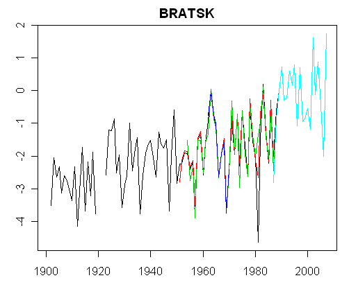
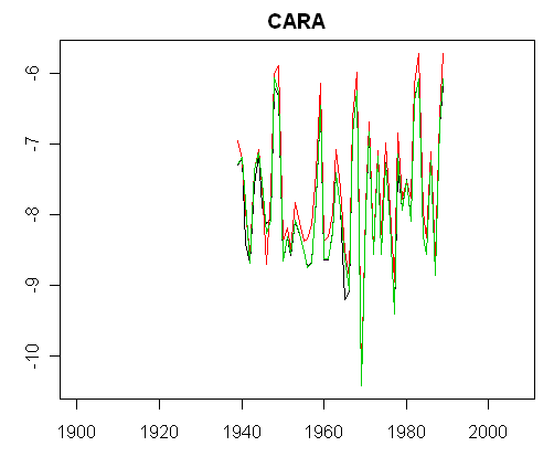
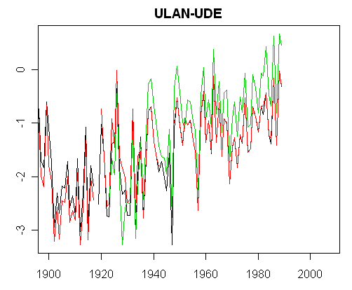
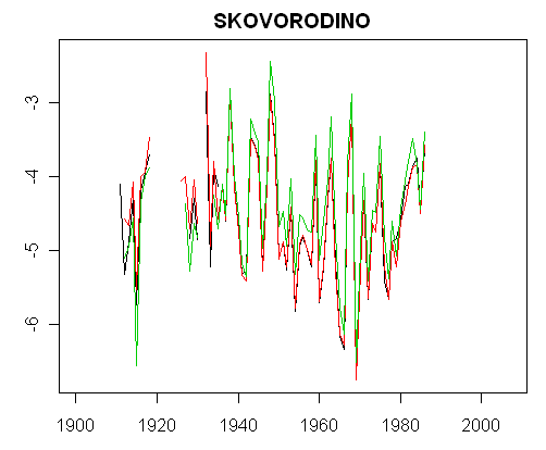
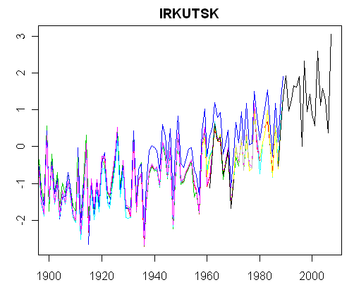
We have some firm sightings of Waldo in Siberia, as Warwick Hughes has long told us. There are very remarkable differences between temperature series depending on the site in Siberia. When Gavin Schmidt or James Hansen encounter differences of this order of magnitude between the U.S. and the ROW, they ascribe it to “regional” climate change – a pattern of temperature change in the 20th century which has left temperatures in the U.S. with relatively little change since the 1930s, while there has been much larger increases in the ROW.
There is a remarkable microcosm of this pattern in Siberia, where cities like Irkutsk and Bratsk have experienced sharp increases, while other sites have experienced relatively little change – a pattern no doubt ascribed by Schmidt and Hansen to “regionalization”. Here are a few plots :
For a little less muddy version, click on the image. These are all dset=0 versions before Hansen combining and adjusting. If you think about these series in statistical terms purely as time series – forget about the temperature history: think of these plots as different realizations of regional climate average plus “error”. What kind of error process could yield such diverse realizations?
 |
 |
 |
 |
 |
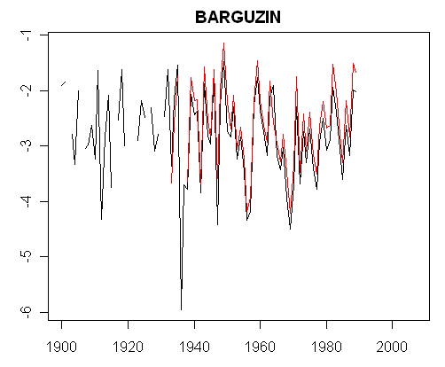 |
If you posit that these time series are realizations of a gridcell plus noise: what kind of noise would be involved? You can’t add white noise or low order red noise to some sort of “true” gridcell composite and get Irkutsk on the one hand and Skovorindo on the other. An econometrician looking at the residuals from such an enterprise would observe highly autocorrelated residuals and conclude that the process had been mis-specified or perhaps that some of the data was bad. In this case, the cities (Irkutsk, Bratsk) would be the obvious candidates for exclusion.
Of course, Hansen says that he’s adjusted for urbanization. At this stage, I’ve not examined his adjustments in detail. It’s possible that this particular step is well described and will replicate easily. So far, we’ve had extreme difficulty even figuring out how Hansen combines nearly identical series, so who knows what perils lurk ahead.
To give a flavor of the Hansen adjustment, here’s the Hansen gridcell containing Irkutsk. You can see that the adjustment in this case removes the trend up to the 1980s and leaves it intact after the 1980s. At some point i the future, we’ll try to figure out why.


66 Comments
We also have a sailor stuck in the ice off the coast of Siberia, who was convinced that Arctic ice was a thing of the past. How much faith some people have.
Re: adjustments:
It is likely due to the stations showing no warming ending in the 1980’s and therefore Hansen has no information to use to do the adjustment for years after that.
Re: Allan Cheetham. All the more reason to discard stations based on station history and metadata rather than adjust relative to surrounding “good” stations. We need an Anton Watzov!
So let me get this straight. This is raw data?:
And this is combined/adjusted?:
Re: #3 — The problem is the lack of “good” stations -i.e. the lack of useful data.
It is always interesting to compare the annual averages with the monthly averages. The following graph shows the monthly averages (red) and annual averages (blue) for Irkutsk. Most of the recent warming is in the winter months. My guess is people in Irkutsk would welcome “global warming” (even if it is actually UHI warming). They’re still not quite up to “room temperature” in the summer.
assuming Hansen wanted a hockey stick starting in 1980
why 1980?
Dear #6 Windansea, it could have something to do with the fact that he wants to compare recent warm years with the average of the 1951-1980 period, see e.g.
http://www.sciencedaily.com/releases/2005/02/050212195102.htm
I have followed this debate for some time, and I have a question:
Steve McIntyre,
Do you, at some point, plan to organize and lay out in great detail all your objections to the data collection/manipulation in one long post/paper? I think the work that you and others on this site have done is quite impressive and necessary, and it would be a shame to have its effect diluted because it is not at least periodically brought together into a more comprehensive whole. One of the tactics of the “opposition” is to ignore the entirety of the objections raised, and rather to focus on those criticisms most easily addressed.
Steve – you refer to the “Hansen gridcell” – how does he define a grid cell?
The IPCC defines them based on the 5×5 degree grid. The following figure shows the Irkutsk region and two 5×5 degree cells. Irkutsk and Hatgal are the only stations in [50-55 x 100-105] and since Hatgal has close to no data, that leaves Irkutsk. The adjacent cell [50-55 x 105-110] has more stations, but most end in the 1980’s (only Ust Barguzin continues later). This one station also greatly affects the resulting “average” (see
http://www.appinsys.com/globalwarming/irkutsk.htm for more details, including grid cell averages all stations in these 2 grid cells.
Alan:
I think you have a good point. I believe Hansen goes beyond the 5X5 grids since he allows rural stations to influence urban center at 1200km.I was looking at the list of stations around Irkutsk as well. Perhaps we should do a 9 box grid centered on Irkutsk and look at all the stations in that 9 blocks – that should allow some spotting of the influence of Irkutsk on the surrounding rural stations, or vice versa. WHat do you think? Will your site act as a resource for setting this up?
#6 and #7. The answer is Lockwood
http://www.pubs.royalsoc.ac.uk/media/proceedings_a/rspa20071880.pdf
Conclusion:
Re # 9
You show the grid cell as a rectangle. If the sides are measured in degrees and assuming the projection is not distorted in longitude (miles per pixel east west are constant as you go north to south) the actual shape should be more of a trapezoid with the bottom about 64 percent of the sides with the top about 7 percent shorter than the bottom (assuming dlong(mi) = 60*(dlong)*cos(lat). That would seem to put BARGUZIN outside of this cell. Do they distort the cells to make them equal area or have I made a wrong assumption?
Thanks #s 7 & 11
found more answers in Steve’s post “Bring the proxies up to date”
http://www.climateaudit.org/index.php?p=89
quotes Mann
Most reconstructions only extend through about 1980 because the vast majority of tree-ring, coral, and ice core records currently available in the public domain do not extend into the most recent decades. While paleoclimatologists are attempting to update many important proxy records to the present, this is a costly, and labor-intensive activity, often requiring expensive field campaigns that involve traveling with heavy equipment to difficult-to-reach locations (such as high-elevation or remote polar sites). For historical reasons, many of the important records were obtained in the 1970s and 1980s and have yet to be updated.
Re: #4 and #5 Irkutsk raw in #4 and Irkutsk monthly in #5. Something is seriously wrong here. these are not the same data at all. Compare 1920 for exaple.
#4 Irkutsk raw has clear warming of both min and max temperatures. #5 in effect only shows slight warming of the mins. (Also note a near 20 year cycle in the mins of the mins – solar??).
Alan, where is your data in #5 from? Murray
#7 From the readme file at ftp://ftp.ncdc.noaa.gov/pub/data/ghcn/anom/README_GRID_TEMP.txt:
(my emphasis) This appears to be a different base period.
Re 13 windandsea:
Upon returning from his summer vacation Steve M commented …
#16. Stay tuned for news on the Starbucks Hypothesis.
#4. The bottom graphic is the GISS gridded version, which reflects two forms of averaging: first the adjustment of adjustment of each station to the “rural” stations, an adjustment that we’ve not begun to analyze in detail and then an averaging of stations to get the gridcell. CRU (HadCRU3) does it quite differently as the gridcell can be traced pretty much to the stations, whereas HAnsen has so much averaging and adjusting back and forth that it will be a real struggle to replicate this gridcell calculations.
re #3 Alan Cheetham. The graph with monthly averages fascinates me.
Tho it might be OT could you explain exactly how the vertical red bars are derived? (BTW it seems a good way to see those “pesky 11 year cycles”)
RE 9.
The best I can say is read Hansen87.
The method:
Figure2. You have 80 “boxes” of equal area on the surface ( area on the sphere)
These are NON SQUARE if you are look at lat/lon… ( again spherical geometry stuff)
These 80 Boxes are then SUBDIVIDED 10*10 into equal area sub boxes… The boxes are non square
especially at the poles.. Again, think area on the sphere
The typical box will be about 200KM on a side…
THEN FOR EACH SUB BOX
USE all stations 1-N within 1200KM of the CENTER of the box
{1200 KM measured how? in 2D or on the sphere?}
ORDER The stations from Longest record to shortest record.
{ longest? With or without infilling?
Longest Uninterupted?. Also a long record 1200km from the center
is “better” than a slightly shorter record near the center?}
COMBINE The Longest Station record with the Next longest station record until all
stations within 1200km of the sub box centroid are processed.
COMBINE using a function based on distance.
End that sub box;
THEN
MERGE all 100 sub boxes based on equal area weight
UNLESS a subbox has no station within 1200KM
And after that I stuck knitting needles in my eyes
Re: #12 — The 5×5 degree rectangles are approximate but very close since the image behind is from Google Earth which still has a slight curvature when zoomed in to that level, but is almost flat at that level. But they are only slightly off. Barguzin is located at 53.6,109.6.
Of course 5×5 degree cells vary in area all over the world since the length of one degree of longitude depends on the lattitude. The IPCC weights each grid by the grid area in calculating a global average.
Uhh….shouldn’t he have used a geodesic? Did it occur to him to consult a mathematician?
Re: #14 and #19
Re: #14 — The monthly data in #5 is GHCN v2 data from the Royal Netherlands Meteorogical Institute climate explorer. #4 shows annual average (unadjusted and adjusted) whereas #5 shows monthly data in red (with the unadjusted annual average plotted in blue).
Re: #19 — The red “bars” are the plot of data for each month (they only appear to be bars because of the plotting of so much data on that time scale, but are actually mothly data points connected by lines).
Re: #20
It seems that Hansen / Lebedeff 1987 is not available online. But I have Hansen 1999 and he explains the method there. It is as follows:
So the method differes from IPCC / CRU in the grid size as well as weighting. Also in terms of converting to anomalies CRU uses 1961-1990 whereas Hansen uses 1951-1980.
It seems odd to me to use every station within 1200 km. For example, I live in Seattle and just 200 km away across the Cascade Mountains the temperature trends are very different. But I guess it is a good way to hide regional differences by doing so much averaging.
HAnsen and Lebedeff is available online. Check at http://data.climateaudit.org/pdf/others/ before you give up. HL87.pdf.
Re: #25
Thanks Steve. Hansen 1999 refers to a 2 x 2 degree grid and then
whereas Hansen 1987 refers to the 80 equal-area regions.
In Hansen’s current procedure, are the 2 x 2 grids first calculated and then the 80 equal-area regions and then the latitude bands, or does Hansen go from the 2×2’s to the latitude bands ?
[snip] Release the code Hansen.
Irkutsk is hotter because of all the army units stationed there. Every time I play “Risk,” I put lots of units on Irkutsk — and I know I’m not the only one. Just add up the hundreds of thousands of “Risk” players every day putting armies in Irkutsk and you can see that its this man-made global warming that his having the noted effect.
Socially conscious people everywhere can do their part to prevent global warming by refusing to play “Risk.”
*snark off*
Sorry, couldn’t help myself.
Bucky Fuller did an icosahedral projection map that is somewhat famous.
He said the areas were distorted by 6% which was invisible to the naked eye.
#1 Larry wrote:
I think it was time this myth was put to bed for 2 reasons:
1) The yacht involved is not and has never been stuck in the ice off the coast of Siberia.
2) The sailor is not and has never been an AGW proponant, nor did he use global warming as a basis for his voyage.
The real story is actually far more interesting than the weird yarn doing the rounds on the internet – see:
Spot the Real Moron
For some interesting background info see the Alpha Global Expedition website:
http://www.alphaglobalex.com/Default.aspx
For the latest direct from the Arctic see the Alpha Global Expedition blog:
http://agx.firetrench.com/
Click to access distro_peakrevandgistemp_070907.pdf
http://data.giss.nasa.gov/gistemp/sources/
I think it might have been John Daly several years ago who pointed out that in Soviet times in Siberia supplies of heating oil were allocated (from Moscow) according to temperature. There was strong incentive for local weather services to tweak temperature reports down a degree or two in winter. The allocation system ended abruptly in late 80s, so no more incentive to exaggerate the cold. And what do we see in the data after 1989? hmmmm…
Re: #28
Although this is OT to Irkutsk, I have some contradictory information. When I played Risk (it’s been about 30 years) I took North America and put many armies in Central America to defend it. However, the following figure indicates that I had armies with a cooling effect:
In fact, my armies drank margaritas when they were stationed at Puerto Limon.
Regarding #31 above… is it just me or is there a component of “be careful what you wish for” involved?
I’m wary of a Jester pulling one or more legs, but the links do seem to go to legit places, and are duplicated from Hansen’s own home page which I checked from an independently saved bookmark… Interestingly, the GISS home page has been (silently) revised to indicate that source code is available, and by implication has always been available.
A quick glance shows a fair amount of Fortran and Python to wade through, along with some C and a fair pile of shell scripts. Those files I glanced in did have comments, but it is clear that a serious analysis would require steeping in their internal jargon. Clearly not something I’m going to dive into any further tonight…
The first question to ask is whether this source code dump really is relevant to the questions being addressed. That question alone could take a few hours to answer.
Re # 34
Not a climatologist so not up to date on references. Did do some software development to allow accurate base maps of the world on any common chosen projection. Easy to find points 1200 km apart where it was yesterday compared with base and midnight when base was midday. So TOB corrections need care. Easy to find places where a station is 1200 km or less from base several times at once.
I have yet to see a reference that properly justifies 1200 km as a range of influence. I am bewildered by use of linear weighting when area relates to distance through a square power. My working hypothesis would be that errors like these, with sparse station density, could explain why the polar regions show the largest apparent temperature anomalies on the globe. Is there a climatology explanation based on physics?
#22, #29
The point on geodesics is well taken. Astronomers use geodesic gridding to handle very large and complex datasets of sources on the sky. An example is Alex Szalay’s HTM (Hierarchical Triangular Mesh), used for indexing, and determination of areal overlaps and nearest-neighbour problems. The code is published and freely available.
http://www.sdss.jhu.edu/htm/implementation.html
It strikes me (as a non-climatologist) that HTM would be a saner way to grid and process surface temperature data than an arbitrary rectangular grid.
#31, 34 & 35
Hansen has admitted that Waldo is not in S. America nor Africa!! – He says lack of reliable data. I say because his model confounds non-UHI and UHI effects.
It looks like they have made an initial pass at freeing the code. Congratulations to Steve and all the others who persisted in forcing Hansen et al to play by the rules of scientific inquiry, finally. I await the verdict on the code from those who (a) have unix-based operating systems (b) are familiar with how to interpreted uncommented FORTRAN and PYTHON.
At the same time I think we should continue to carefully scrutinize what happens at actual stations, particularly the hypothesized hotspots in and around the Arctic Circle.
Here is a direct link to the page for downloading the source code mentioned by Ross Berteig in comment #34. Link
A cursory examination shows at least some files were last updated within the past couple days.
re 34. the 1200km figure comes from H87. He did a correlation study..
Answer to my own question regarding SSTs:
http://www.hadobs.org/
For example, I live in Seattle and just 200 km away across the Cascade Mountains the temperature trends are very different.
To be fair comparing the climate differences of western Washington to eastern Washington is a pretty extreme example. You would be hard pressed to find such a contrast between regions so close anywhere else in the world.
Re 41:
Not that hard pressed. In Canada, Coastal British Columbia vs 200 km into the Interior, in France the Bordeaux wine districts vs the continental climate type Dordogne 200 km inland, in Sweden coastal Skane vs Smaland 200 km inland all come to mind as comparables.
All of the mountain states and province and Countries from Alaska to the tip of South America come to mind. And many areas in the rest of the globe.
When Steve gets to how GISS calculates the long term climate trend everybody will be able to stop worrying about how much stations that are labeled urban efect climate change. A fifty degree increase in UHI will not make one bit of difference to the grid cell trend, if the code does what Hansen says. Microsite issues at rural stations and stations mislabeled as rural when they are not will effect the trend.
I’m curious if there’s a list that shows the number of temp. station across Russia? I’m trying to asses the number of stations compared to those still in operation, and then which ones that are current up to 2007 lack gaps in the record. I’ve been trying to use the NASA resources but I can’t find a list and the station selector makes it virtually impossible to make a clean listing of RUSSIAN stations.
The concept of using sites 1200 km away, even weighted, seems crazy. That’s about from Washington, DC to Maine. Somehow the climates don’t seem very homogeneous. Even from Washington to Rockville (maybe 20 mi) has significant climate differences . I’ve seen it raining east of DC and snowing in Rockville. Western Maryland has cross country skiing when we’ve got bare lawns. I’ve been in Denver in clear weather and in a blizzard on the other side of the Eisenhower Tunnel. Can someone explain what he’s basing this on?
joshua corning September 8th, 2007 at 1:36 pm
The plains of western Nebraska vs the mountains of Colorado might come close.
RE 46.
The basis is found in H87. He did a correlation study. Look at the Hansen Bias Thread.
r2 was .5-6 at 1200km in the NH and .3 in the SH
42, California, Chile, Australia, Sahel, Himalayas/subcontinent, etc…
Hansen thinks the world is a flat checkerboard. The globe is divided into squares!! I mean c’mon, now. Wouldn’t a geodesic make a little more sense? For an “earth scientist”, he needs to get out of Manhattan and see what the real earth looks like.
RE 45.
on the Giss temp page you will find a link to all Russian sites.
Download to Word. Search the list, you should find a country code
for Russian sites, the do a find.
Sorry RE 45.
On Giss you will find a link to ALL sites, downlad and search for the russian sites
RE 45.
http://data.giss.nasa.gov/gistemp/station_data/v2.temperature.inv.txt
Russia elements start with the number 222xxxxxxxxx
re 46 Barry if you cant find the H87 paper I will explain a little bit.
Hansen is primarily interested in the trend. So he looked at a sampling of
stations in the US and Europe and measured how well they correlate.
I’ll make up a dumb Example
SITE 1 SITE2 (200km) SITE3 (1200km)
10 20 10
12 24 9
12 24 8
10 19 8
So Site 1 ans site 2 “track” each other, going up and down while site3 is on
its own program.
So the weather is different but the climate is similiar.. Or something like that
Read Hansen87
Is Waldo also in the UK, Germany and Japan?
#45
Try this Russian link in English – it’s a list of 1341 stations with downloadable data.
Sorry, bad link, better copy/paste it:
http://meteo.infospace.ru/wcarch/html/e_sel_stn_all.sht?country=176&mode=stn
#9
Interesting – according to the above linked server, Barguzin, Kjahta and Ulan-Ude (downloadable data from 1998 since this very day) exist and collect data even now…
Thanks for the links guys.
So they actually have 1341 stations but NASA only lists 151 (my count)??
Is there a reason for this? Since I seen discontinued stations in NASA’s selector data I can’t imagine it being mereley because the 151 are the only ones still operating.
Makes me wonder who picks what stations are included, what the complete data equates to graph wise or if this is even in the IPCC.
It amazes me what you guys are being put through to merely understand the way they’ve been interpretting the data all this time. Cheers.
The NASA problem isn’t picking 151 stations out of 1341. Let’s presume they preferred stations with long records, well sited (ahem, ahem…), so the choice in itself is nothing wrong.
However, I wonder, why the data were truncated in 1980’s when the stations were clearly operating well into 90’s or they are still delivering data 4x daily.
M. Simon: re #47: “The plains of western Nebraska vs the mountains of Colorado might come close.”
Here in Southern California, we have coastal, inland, desert, and up to 11,000 foot mountain climates all within 75 miles of the coast.
I remember driving in ’02 from the Gold Country in northern California to Oakland. A 2.5 hour drive. When I started it was 98. In the Central Valley, it hit 106. When I got to Oakland, it was 63. It went from 102 to 63 in a span of 20 minutes.
A Broad-Brush Search for Waldo
Well, I figured that if Waldo was hiding anywhere, it would have to be in the cities. So I did an analysis of temperature trends versus brightness.
I first figured out the trend for every station in the GHCN V2 dataset (13,471 records). Then I averaged the trends of the stations in the same location. (Yes, I know this leads to some inaccuracies, since shorter datasets are likely to have more radical trends, but like I said, it’s broad-brush.) After averaging, I eliminated all of the stations that are not in the GISS station list. This left me with a total of 6,229 records.
I then did a scatterplot of the results, along with a 95% confidence interval of the values. Here’s the result:
The red lines are the 95% confidence intervals. Diamonds without red lines have too few data points to calculate a CI.
There are four obvious outliers at the left end of the scale. Other than those, there is a clear relationship between brightness and trend, with high trends being exclusively associated with brighter locations.
It is also worth noting that 93% of the records have a brightness of fifty or less …
At this point, what would be nice is a list of the stations which are currently being used for the GISS temperature dataset. Does anyone have that list?
So me, I suspect Waldo is having a drink at the corner bar in some major metropolis, surrounded by the bright lights of the big city.
w.
#61. Willis, I’ve posted up a file http://www.climateaudit.org/data/giss/giss.info.dat to which I’ve added columns for mcdw, ushcn and sod, showing reported duplicate number. It’s tab-separated ASCII.
Most of the GHCN network, as you well know, has not been updated in years, so the MCDW network is really what needs to be analyzed to understand recent trends.
This is also going to be the core of the CRU data if and when that’s ever reported, so any efforts on the MCDW network won’t be wasted.
#61..Willis. So you took a linear trend for all the stations, over whatever recording period they may have? Then averaged all of those trends to get ~0.1-~0.15 deg C/decade. So wouldn’t that imply a 1 to 1.5 deg C per century, recognizing that it is rough. Please help me if I misunderstand…thx
Steve, thanks for the info, that’s exactly what I needed. Here’s a graph of the station numbers by year, the trends of the stations in existence in that year, and the (current) lights of those stations.
Note that the “Lights” is the lights as of today, not the lights during the year shown on the graph. Looking at the “Lights”, we can see that in 1900 most of the stations were in what are now large cities, then rural stations were added up until 1970, then rural stations were closed down, slowly at first then with a jump in 1990.
The most radical change is in the number of stations with no data for 2007. The oddity is that the majority of the stations with no data during that year had low overall trends, causing the remaining trends to jump upwards. This may, and I emphasize may, be the result of slow reporting, as some stations worldwide may only send in their data on a yearly basis.
w.
Steve: Interesting.
PEople say that the rural stations have been “closed down” and some may have been, but I suspect that a lot is due to GHCN simply not compiling rural data in the past 15 years. The U.S. funded collection of Chinese, Russian and other data around 1990 and only undertook to update the collections “irregularly” and, it appears that no such irregular update has occurred subsequently. Thus the reliance on the automated airport system for subsequent results.
You need to disaggregate this for U.S. and ROW.
USHCN data lags the automated airport data by about a year and this is the main 2007 difference.
nrk, thaks for the question. You say:
No, because many of the stations weren’t in existence for the entire period of record. Median record length is only 58 years, while the database spans 125 years. Nor are they evenly distributed during the time span, many of them missed periods of declining temperature. Finally, there is no area-averaging, so some parts of the globe are over-represented, and some under. Like I said, this is very broad-brush, and thus can’t be compared to an estimate of global temperature. All we can do is compare it to itself, to see how it has changed over time.
w.
Just looked at some of the papers in the Steve’s link to a journal where Mann appeared as Referee 2. There’s a new paper about 15 kyr BP southern Siberia temperature record from pollen (near Bajkal lake, (52°47´ N, 108°07´ E, 458 m a.s.l.). Seems that Waldo was there at least thrice and once with temps higher than present.