Anthony Watts has posted up a quality assessment of the USHCN stations here. John V presented some graphics in the comments thread here and below is my first pass – this comment is not intended to exhaust all possible cross-cuts of the data is merely the first thing that I looked at.
I compared the USHCN TOBS versions for the CRN=1 stations and CRN=5 stations, converting all series to 1961-1990 anomalies and then doing a simple average. Another cut will weight them regionally, but my guess is that such results will not vary much from the ones below. The first figure shows the annual averages for sites classified by quality: CRN1 = “good”; CRN5 = “worse”.
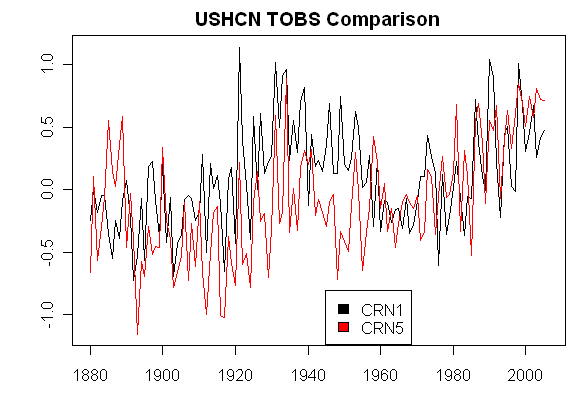
The next figure shows the difference between the two series. At a first look, there is a material difference between the two versions, with the main difference between the CRN1 and CRN5 series arising in the 1950. For comparisons between the 1930s and 2000s, the differences are material, but for comparisons over the past 30 years in the U.S., the differences are less.
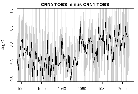
If this result holds up, then one could conclude that there is an actual bias differences between CRN1 and CRN5 quality and that the cooling bias from trees and shrubs accounting for one class of QC failure is insufficient to offset the warming bias from QC failures resulting from asphalt, urbanization etc. A simple comparison like this does not say whether the bias is arising from microsite issues or more general urbanization.
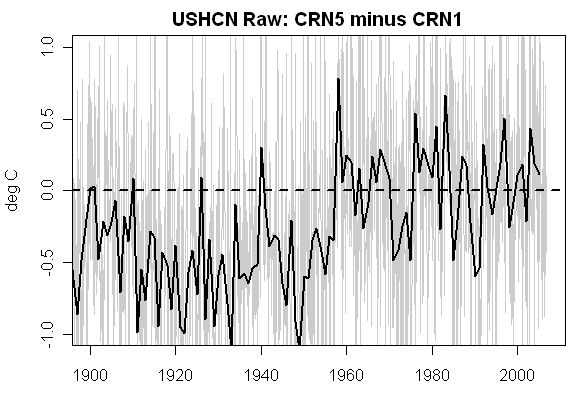
UPDATE: For completeness, here are a few more comparisons: USHCN “raw”: so the change in the 1950s is not due to changing TOBS adjustment as one reader wondered:
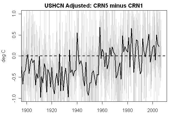
NExt here is the USHCN adjusted version, showing a little attenuation of the difference:
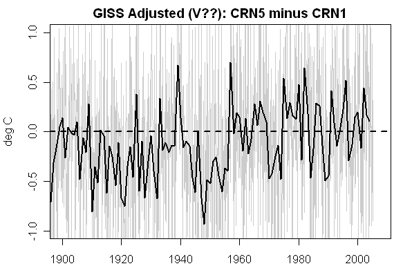
Here is the GISS adjusted version from the collation of GISS adjusted data into USHCN sites. This is not from the September 10 NASA adjustment vintage – I’m not sure offhand whether it’s from the pre-Y2K NASA adjustments or the post-Y2K adjustments. It’s hard to keep up with the dizzying pace of Hansen adjustments: I would have annotated my downloads a little differently had I realized that the adjustments would be so frequent. In any event, there is still an effect in whatever NASA version this is, but it’s considerably attenuated. In fairness to Hansen, for his U.S. data, he makes an effort to adjust for urban effects – whether his lit-unlit criterion works as well as it might is a different story. On the other hand, as far as we know, Jones makes no attempt whatever to adjust and the problems noted here are going to be more applicable to Jones than to Hansen.
And as I’ve said repeatedly, the real issue in all of this is the ROW (where’s Waldo?) The ROW trend is much different than the US trends: the most interesting result of this will (in my opinion) be, not so much a major revision of US temperature history where one already has pretty warm 1930s (but there will be an effect there), but the information on variations in trends resulting from site quality differences than need to be included in ROW calculations and confidence interval calculations.


174 Comments
So while, as you say, this is preliminary and it’s a bit early to be looking for attribution, it’s possible that the entire warming trend, at least in the US, is from UHI increase and/or site deterioration. I think we’ll all be looking at this closely. Now, where’s that press release! (You can bet that at this stage the AGW protagonists would have gotten not just a press release out but held multiple press conferences with all the usual suspects attending.)
The site quality rating is not a constant. Most sites have had significant locational movement and equipment changes. Though it is interesting that there is a (likely statistically significant) difference between station quality levels of #1 and #5, the history is more complex than that simple assumption.
Auditing (a Western Civ invention using typical partitioning of complex systems to allow improved understanding) frequently includes an analysis of variances. The obvious, data driven, variances are those associated with changes in annual Min, annual Max, Monthly mean, Monthly min, Monthly max, Seasonal mean, Seasonal min and Seasonal max temps. A Study of these constituent trends in an attempt to explain the larger trend would seem to be the next logical step to take in Global “Science”. I haven’t seen much effort along these lines from the mainstream “scientists”.
The changes in the source(s) of the available data outlined in the above paragraph would need to be explicitly delineated in any thorough analysis of just Watt is going on.
Global “Science”–> Climate “Science”
One plausible assumption is that the CRN=1 stations have not gone from formerly urbanized to rural. Some of the changes are unidirectional. So if a site is CRN=1 presently, it plausibly was throughout its history. Look, no one here is assuming anything or trying to jump to conclusions.
This sort of analysis should have been done by the people who have been paid to do it.
Another point that people always need to keep in mind is that the U.s. record is very different from the ROW (where’s Waldo?) – so one might very well find much less urbanization and microsite impact in the USHCN network which has already been through one level of quality control – obviously not perfect, but still a substantial effort was made – to the ROW network where there is negligible evidence of comparable quality control – and, in the case of China, evidence that key QC efforts (e,g, something as simple as inspection of station history at all stations in network) were not done and claims to have done so were misrepresented in Jones et al 1990.
I asked previously but didn’t see a response: Could someone estimate what % of the earth’s temp record (# of stations X avg length of record) is from the US? Is this >60%?
Matt,
I’d guess that there has been some sort of areal weighting so that no matter how many stations/km^2 there are, the global #(s) is(are) not biased by local data collection intensity.
“This sort of analysis should have been done by the people who have been paid to do it.”
Apparently this sort of analysis should have been(be) done by those with an open mind and some training in the scientific method along with appropriate physics/statistics/field work. Given the luxury of being not paid could actually provide necessary independence.
Steve, a much more informative examination would be rural class 1 & 2 verses rural class 3, 4 & 5. This would compare the reasonably good sites with the sites that have a significant possibility of microsite bias, and only include those sites that are going to affect the long term trend. Because of the eqipment problems at ASOS stations, these should be excluded from the comparison.
It is an odd thing. Scientist are used to their data getting more precise and accurate as technology advances. But here we seem to see technology (Latex Paint, electronic thermometers, etc) causing the accuracy and precision to deteriorate and to do so in a way that is weighted in one direction. I can’t think of another example where this has happened. I can sorta understand how the scientists initially overlooked this possibility and just assumed that more recent data is more precise and more accurate. And I can also understand how once they became invested in their theory, they became unwilling to re-examine first principles (RTFM). Its difficult to see your life’s work dissolve before you because of an oversight as simple as this. But that’s the nature of the career they choose — Darwinism at work.
Re: #1 “Now, wheres that press release!”
The current research being done by McIntyre and Watts does need to be better publicized. The Wall Street Journal might be receptive to publishing information on the ongoing investigation, and their circulation is roughly twice that of the New York Times.
The Wall Street Journal op-ed section has covered GW issues in the past. The following excerpt from an op-ed concerning Mann’s hockey stick, from the July 14th, 2006 WSJ, as presented at http://www.climateaudit.org/?p=749 illustrates their openness on the subject. “Further, Professor Wegmans report upholds the finding of Messrs. McIntyre and McKitrick that Mr. Manns methodology is biased toward producing “hockey stick” shaped graphs.”
The op-ed Guidelines for The Wall Street Journal at http://opinionjournal.com/guidelines/ states: “All op-eds should be directed to the Editorial Features Editor, Robert Pollock, at edit.features@wsj.com.”
As a subscriber to the WSJ, I’ll opine that the journal tends to keep its news articles and op-eds separate as compared to some other publications.
Legend on first graph corrected.
Is this raw or adjusted data?
It might be helpful to note by the graphs that 1 = good, and 5 = bad.
The pre-1940’s heating trend in inconveniently higher in the CRN1 data. If I remember correctly, this hump got smaller in Hansen’s later revisions and coincidentally fit his AGW model better. How does this data compare to Hansen’s data?
#12. TOBS-adjusted version. The station history adjustment seems very problematic to me.
If we assume that the CRN1 data is more accurate, then the “unprecedented warming” since 1980 doesn’t look as unprecedented.
These charts represent a significant fraction (7% of the total stations) (19% if one assumes Anthony Watt’s survey is sufficiently random.)
It is a significant result, the differential is quite large. Poor siting might have contributed up to 1.0C in the trend.
I’m assuming we will see CRN4 as well soon (representing 55% of stations surveyed so far.)
Do we have an idea what the geographical distribution of the respective sets are? I find it difficult to believe that there was more of a difference in the 1930s than the 1990s; I suspect that there’s a mean climate difference that needs to be controlled for.
Then looks like the adjustment was altered in the 1960s…
What does the CRN1 leaderboard look like? Has 1998 moved to 4th or 5th place?
A few question:
What is the effect of the overwhelming number of crn=5 compare to crn=1?
It would be interesting to see the difference between rural crn=5 and crn=1?
It would be also interesting to know the difference between rural crn=1 and urban crn=1?
Re #19
What jumps out at me is the difference prior to 1960. The two groups were trending away from each other then suddenly got closer together and switched places (5’s got warmer than 1’s) and this is before Hansen massaged the data. You would think a discontinuity like that would have been flagged in the QA checking. Do they just keeps the old data and add new or do they rerun the TOBS on the whole data file? Why would TOB adjustments affect 5’s and 1’s differently?
TOBS-adjustments, can anyone explain a good reason to make such an adjustment? It does not make since to me since the goal is only to get the trends, not the actual temperature.
The pattern of the 5’s minus the 1’s in the second graph generally shows low values up to 1960 and higher values after that time. It suggests that the “adjustments” that have been made for factors other than TOB have been made more to one group than to the other. This pattern would not occur if there was just a fixed or trended quality difference between the 1’s and the 5’s. Rather, it appears that either the 5’s were reduced in the earlier period or the 1’s were increased in the earlier period (and vice versa for the later period). Either way, the adjustments look to be biased by station quality.
Steve, do you have any information about why there is this systematic difference in adjustments, since the Team did not have Anthony’s photos to use for quality adjustments. Are the 5’s more urban, and did Hanson mostly reduce urban series in the period before 1940?
The number of stations used to generate the anomaly averages is rather small, especially the CRN=1 group. How about combining 1 & 2 (which should be very similar in quality) and then comparing to 5 so at least the n in both is nearly equal?
CRN=5 58
CRN=4 215
CRN=3 69
CRN=2 36
CRN=1 17
Unrated 9
Total 404
Sorry, after submitting the last comment I remembered that the series are only adjusted for TOB, otherwise they are “raw.” So I am puzzled. It looks like the 5’s minus the 1’s trends downward from 1900 to 1940. Why would this be? And why would there be such a shift in the difference after 1960? Is there a pattern to the adjustment for TOB? Does it affect mainly 1’s or 5’s?
If I understand the graphs correctly, would it be fair to say, based on the most reliable or “CRN1” station data, that the current warming cycle’s temps peaked in the late 90s and have been falling since then?
Note too that more than half of the CRN=1 stations are at airports. See Watt’s spreadsheet referenced in the first line of Steve’s post for details.
So all the microsite issues at CRN5 sites caused the 1950s to be recorded as cooler than the better CRN1 sites?
Should not an analysis here be carried out using ANOVA? What are the variances within each of the 5 classifications?
An interesting oddity.
The 1950 figure is interesting. I realize this is “raw” data, but we also need to be
aware that Hansen99 used 1950 as the hinge point for his bilinear adjustment.
I always assumed this: Hansen picked 1950 because it allowed him to flatten out the warming
prior to 1950. If you look at Giss you see a rise from 1910 to 1940, then a dip to 1950.
If you want to cool down the past and use a linear method, 1950 is the best leverage point
.. the cooling after the rise..
he changed this in H2001.
Weird..
Also,
An interesting oddity.
The 1950 figure is interesting. I realize this is “raw” data, but we also need to be
aware that Hansen99 used 1950 as the hinge point for his bilinear adjustment.
I always assumed this: Hansen picked 1950 because it allowed him to flatten out the warming
prior to 1950. If you look at Giss you see a rise from 1910 to 1940, then a dip to 1950.
If you want to cool down the past and use a linear method, 1950 is the best leverage point
.. the cooling after the rise..
Weird..
Also,
Would it be useful to insert the two trend lines (red and black) into the first chart?
Steve, can you or Anthony provide a map of the locations of the 1s and 5s? As somebody said, it almost looks like a climate phase change at 1950 or something. If all of the 1s are on or near the west coast, I would suspect PDO shift or something. I can’t think of a reason for urban sites to suddenly get alot hotter over the course of a year or two, so it seems likely that the shift is related to the rural sites getting alot cooler.
Or if CRN=5 sites correlate somewhat with urban sites, urban sites received a different TOBS adjustment?
Wait…in looking at it, the 1s seem to show the familiar rise in the 30s that we have come to expect. But the 5s don’t. I can only think of one thing and that is air pollution. If you assume that the 5s are more urban and the 1s are more rural, then there would have to be some mechanism by which the urban sites were cooled during the 20s to the 40s while the rural sites were not as affected. The only thing I can think of right away is coal burned to power industrialization. If I am not mistaken, after WWII, the 50s and 60s saw a large changeover from coal to oil as a fuel. Assuming oil would put out less particulate matter and less sulphur when burned, is the signal we are seeing in the 5s a combination of sulfate and particulate matter in the atmosphere cooling the urban locations?
The only other possibility I can think of is that the rural locations may be skewed high in the earlier period by the effects of irrigation if most of the 1s are in rural areas where agriculture is present. The irrigation would lower the temperature during the reference period (1961-1990), making the 30s hotter in rural location, while the urbanization around the 5s would cause the reference period to be hotter, making the earlier temperatures look cooler by comparison. I am not sure why it would cause such an inflection point in the 50s, but perhaps that is just the effect of a combination of multiple events making it look like a step change.
An easy way to check for that last possibility is to use a different reference period…perhaps 1900-1920? Or 1900-1990?
Re #10: As a subscriber to the WSJ, I know that Richard Lindzen has published several critiques of the IPCC, Gore and their work on the op-ed page there. Does anyone know if he’s following the progress on this website? He might be the perfect person to encapsulate what is going on here.
My training is in history and English. I have, therefore, a limited understanding of what is going on here. That said, I get the distinct impression that what you all are doing is crucial historically and scientifically.
Interesting that the CRN5 graph shows a declining trend during the Great Depression, then an upward trend that starts just after 1945.
The cooling of the class 5 stations in the early portion of the century is easy.
something I HAVE BEEN BITCHING about for weeks. HANSEN 2001
The strong cooling that exists in the unlit station data in the northern California region is not found in either
the periurban or urban stations either with or without any of the adjustments. Ocean temperature data for the same
period, illustrated below, has strong warming along the entire West Coast of the United States. This suggests the
possibility of a flaw in the unlit station data for that small region. After examination of all of the stations in this
region, five of the USHCN station records were altered in the GISS analysis because of inhomogeneities with
neighboring stations (data prior to 1927 for Lake Spaulding, data prior to 1929 for Orleans, data prior to 1911 for
Electra Ph, data prior of 1906 for Willows 6W, and all data for Crater Lake NPS HQ were omitted), so these
apparent data flaws would not be transmitted to adjusted periurban and urban stations. If these adjustments were not
made, the 100-year temperature change in the United States would be reduced by 0.01°C.
OK. Now.. Check the list of Class 5 Stations that are California, Oregon or Washinton.
29 of 56.
Early century West Coast Cooling. Apparently for some stations the cooling trend was so
Anomalous for Hansen to Excise records ( mostly prior to 1929)
Many stations in the southcentral and southeastern US showed a marked drop in temperature around 1958-1960. See Tuscaloosa as an example. (Whether it is real or just a measurement/data problem I don’t know, but it appears to happen at many southern stations to varying degrees.)
If the class 1 stations are predominantly in the southern US then the circa 1960 shift may reflect a regional phenomena moreso than a data problem.
Something to check.
Everybody,
Before jumping to conclusion from the graphs, go see what Anthony Watts has posted up a quality assessment of the USHCN stations. LINK IS AS THE TOP OF THIS POST. The spreadsheet has locations for all the stations. Simply find the CRN=1 lines and look at the State and lan/lon.
Some speculation. Since we only know a snapshot of the state of the CRN =1 or CRN = 5’s (they may have been much different 100 years ago) this is more of a WAG.
Retorical question. What was probably the most significant change in America in the 20th century? The introduction of the automobile to the mass market. Cities especially became clogged with cars. If you assume 1’s are urban and 5’s are rural they start to diverge in the teens up through the 50’s. What happened in the 50’s? Suburbanization. Rural sites were affected by creeping urbanization driving the temps up to where they met and exceeded the 1’s. So if you take the difference between the 1’s and 5’s for the 20’s through 50 as about .5 deg and call that the uban bias you’d take away most of the post 1950 warming.
Re #40
“Early century West Coast Cooling. Apparently for some stations the cooling trend was so
Anomalous for Hansen to Excise records ( mostly prior to 1929)”
The Data are the Data.
The work of the Scientist/Engineer is to explain why the data change, not to explain why to change the data.
QED
RE 44.
Hey, I’m just reporting what Hansen did. He took 5 west coast stations and deleted their early data
because of “cooling trends” in the early part of the century. These sites show up on anthony’s
list.
1. interesting comparisons West coast Class 1 versus West coast class 5.
Oh, another interesting difference.
Class 1&2 at airports: 19 out of 50 odd stations
Class 5: 1 at 50 odd stations.
A fun cross cut: class 1&2 Airport Versus : Class 1&2 Non Airport.
#43, You have it backwards…1s are higher quality and should be more likely to be rural…while the 5s are poor quality and more likely to be urban.
Dude (or ROWG like me),
I think I’m on your side. No attack intended. Check out the data at surfacestations.org –> Norris_MT and explain what is going on (I don’t know, but can speculate with the best).
RE 48.
No sweat keemosabi..
One thing folks need to remember. A site becomes class 5 over time.
Culd be everything before 1950 is a class 1 or 2. Take a look at the Arizona
historical pictures.
This sea change from 1950 to 1960 in steve’s charts needs explaining.
Maybe After 1950 aircraft travel picks up. Maybe those 19 class 1&2 sites at airports
See a big change after 1950.
Lots of fun cross cuts through the data
Steven, 40, 45, 46
Sounds like a key thing, doesn’t it? If the stations are balanced against each other to determine which ones are aberrant, then clusters of stations are going to throw things out of whack.
Imagine the following scenarios of a group of 10 stations:
Two each of each class
Ten of one type class
Three of three types of class and one of another
A random cluster
etc
5124542133 is going to look different than 2222233335 or 1111555522, right? Especially if you start thinking about the order they’re in. You have to start getting into their locations in relation to each other in the case of mixed clusters. And then the shapes. Are they in an alternating circle? Are they in some line? Are they randomly dispersed?
Think 1 1 2 2 3 3 4 4 5 5 versus 1 2 3 4 5 5 4 3 2 1 versus 1 2 1 2 3 5 3 5 4 4 versus 2 3 5 1 2 5 4 1 3 4 etc and their shape combinations, and it starts to get a little scary…
Re #47
One would think that, but my speculation is based on the number of airports in the 1’s. A comment I saw on one of the websites (don’t remember if it was GISS or USHCN) was that they assumed moves to airports induced cooling since they were comming from the downtown area. Given that airports were much more prevalent after WWII I would assume that’s when many of these moves occurred, along with the institution of ASOS systems later on. The 5’s were originally rural sites that, by the time they were surveyed (ie now) had become urbanized. So the temps at the 1 sites don’t rise as fast since they’re farther away from the UHIE, for awhile anyway, and may have better siting than previously, but the 5’s (which were much more rural in the early part of the century and could have been ones or twos) are now right in the middle of the UHIE and their temps are rising. So what we see now for site quality may have been reversed in the first part of the century due to site moves and urban enroachment.
#46
Just to muddy the waters still further, from Brohan et. al:
re:51
I think, again, this is getting mixed up. Do try to keep it straight
5 = LOW QUALITY, many assumed to be urban, under effect of UHIE
1 = HIGHEST QUALITY, assumed to be rural/free from UHIE
and of course, keep in mind that you can’t easily speculate on the past since, as has been mentioned, the quality will have changed over time, and we do not have records of that.
re: myself, 53
Oi, I proved my point well: it is I who misunderstood 51 and thought he had it backwards. Apologies 🙂
I understand you reasoning for considering the 1s as “urban”, but not the reasoning for considering the 5s rural. The shift of many sites from cities to nearby airports may indeed be a big part of the decline of the 1s since so many are airports. I wonder if there is enough site history info for the airport sites to make a reasonable guess at the correction for site changes.
Re 54
? Sites rated 1 are good now, and 5’s are bad. What were they 100 years ago? They probably were not where they are now.
See #52 I don’t think the sites moved to the airport are better than where they were before, I think they just aren’t getting worse as fast as before, and I don’t think the present 5’s were would have been ranked that in the past as they are now because of the urbanization around them. It’s a speculation and the only way to prove it may be historical data like the archival photos of the Tucson site. I think the hypothesis fits what we’re seeing though IMHO.
Re #55
I don’t think they would qualify as rural now (doesn’t Hansen use the term peri-urban?), but I think they may have been in the past. Go to surface stations and look at some of the 5’s. I think you’ll find a lot of them are in places where it was once country that has had asphalt and concrete grow up around them. Tucson is one example. Changing to MMTS and moving the site closer to buildings and concrete also has a microsite effect equivalent to urbanization. Moving the site from a field to the top of a roof is another example. Even places like sewage treatment plants and firestations would probably experience the same change from a more rural to more “urban” condition.
UK observations suggest that the early 20th century “urban” recordings show a -‘ve UHI due to the severe atmospheric pollution, high number of fog days etc (this may not apply to USA) in the early part of the century London could expeirience over 30 fog days per year!
Now the air has been cleared, the Sun can get through, we have a +’ve UHI effect. London only gets about 3 fog days per year.
This effectively increases the UHI differential when annual mean temps are calculated. To my knowledge no correction has been attempted for this.
And another thing! In UK
I tried to compare sunshine hours recorded to see if the atmospheric pollution could be spotted, only to find this comparison is impossible as they changed the recording instrument from Campbell-Stokes to Kip and Zonen at various stations at various points in time.
The Campbell Stokes recorder gives much higher readings to the Kip and Zonen and no correction seems to be applied, subjectively (applying my own correction) it looks like the last twenty years have seen unprecedented levels of sunshine duration and a strong upward trend.
As mentioned, stations in the southeastern US seemed to have experienced a noticeable temperature drop around 1958-1960, one which is not so evident outside of the southeast. Here’s some geographical data:
Class 1 stations in the southeast: 8 of 17 (47%)
Class 5 stations in the southeast: 3 of 58 (5%)
So, there may be a geographical bias in the class 1 to-date data which affects the trends. As Steve M says, this is simply a first look.
I also find it interesting that 5 of 18 (28%) of the class 1 stations are in the western US (west of 100W) while 40 of 58 (69%) of the class 5 stations are in the west. It’s the western US which has the greatest reported warming.
The sudden upward step-change shift of the “CRN5/CRN1” difference (around 1958) is pronounced, more so in the raw data than the adjusted data, which indicates the USHCN adjustments “distribute” the shift, making it seem more evenly time-dependent than the raw data shows. A sudden shift often has meaning, though, and so I think a first objective should be to look for explanations for a data shift in the raw data, which is likely linked to some real change that occurred in a short period around 1958, (or, more cynically, to foul play with the raw data), before interpreting the effects of the official adjustments.
As noted above, Anthony Watts’ data is a snapshot of today, so it includes no information on the history of these sites. The CRN5/CRN1 difference is biased negatively before 1958, but after 1958, the bias disappears so that differences between the CRN5/CRN1 are pretty evenly distributed around zero. So it’s very odd that modern station-siting problems appear to correlate not with a modern bias (after 1958), but rather with a cooling bias (before 1958).
One thing to investigate is station move histories, asking what might have happened across many stations in the late 1950s that caused either the CRN5 device readings or CRN1 readings to show a sudden step-change. A hypothesis is that most stations (rural and urban) had become corrupt (near buildings and asphalt, etc.) before 1958, giving a high-temp bias across the board, then the ones now rated CRN1 were, through some coordinated effort, moved to less biased (cooler) locations. This hypothesis would apply if there were a decision in the late 50s to move many stations from city centers to airports, for example, where the moved stations would generally meet standards (current CRN1), while the remaining stations remained biased (CRN5). This could potentially explain the step change from cooling bias to no bias in the CRN5/CRN1 deviations.
On the other hand, more cynically speaking, someone could have unofficially corrected raw station data of sites that demonstrated an unorthodoxed trend, thereby conforming this data to that of surrounding stations that already demonstrated the orthodox, post-1980 warming trend (such as CRN5 sites do). This would explain the odd convergence of CRN1 and CRN5 sites into an upward, post-1980 trendline.
By the way, THANK YOU, Steve McIntyre and Anthony Watts, for all your excellent work!
http://www.swri.org/3pubs/ttoday/fall97/heat.htm
Airports.
Recall Parkers station selection. almost exclusively airports.
Sadlov will like this.
Click to access 1999-ISB.pdf
Perhaps the Stevenson Screens in the USA received a fresh coat of paint between 1957 and 1958, which had marked different thermal properties than past coatings. This would account for the step change. Lacquers were the technology of the day prior to the 1950s. Shortly after the 1950s, enamels became widely used and commercially available. The cross-linked nature of enamels retains heat energy better than linear aliphatics. Just a thought.
Ian
#63 Moist air is a better heat conductor than dry air.
Intyeresting paper though.
These surface temperatures should be thrown out. There are, it appears, only two potentially valid means for measuring global temperature: the atmosphere or sea temperatures.
Parker’s completely discredited by these two papers.
As for what changed in 1960 or there abouts. Wasn’t that the essential unveiling of a vast majority of the phase 1 interstate highways? Prior to 1960, the US Hwy system still ruled. But after it was the highest rate of openings of new interstates. I’d have to imagine 1960 – 1965 had to be the peak. It was not a symmetrical peak. It rose gradually from 1948 – 1960, then steepened significantly 1960 – 1963, then declined gradually 1963 to the present. Just a thought, who knows.
Steven,
It would be interesting to contrast the temperature changes that occurred when the names were changed from air field to airport. I would imagine there might be a rather close correlation between temperature change and total passenger departures and arrivals. Adding all that acreage of parking didn’t cool anything off.
I am not a climate scientist and therefore should shut up and accept the wisdom of the gods.
Oh, wait a minute, I am an educated person who can read and think critically.
I have been following this site for some time, occasionally trying to make some witty repartee. However, I must say, that, even given the hysteric’s slight of hand, I am utterly astonished by the continual revising of codes and data sets that is going on, unannounced, by a government employee. For whatever reason, Hansen is busier than an Enron accountant in trying to … cover his tracks?
He is manifesting all the classic signs of an experimenter, not finding the result matches his publicly acclaimed theory, scurrying around in the decimal points to salvage his reputation.
Isn’t it time to publicly call him on this?
Headline: NASA scientist fudges data.
Although this is very interesting, I think we should remember that Mr. Watts is conducting a volunteer-based census. Thus, the results so far may not be random. It seems reasonable to suppose that the first 33% of the survey are the locations which it is easiest for the volunteers to reach. If so, it may be that even the 1’s we are looking at now are more influenced by UHI effects then 1’s generally (airport locations, etc.). Also, the overall quality of the sites may improve (but not necessarily if Mr. Watts’ observations regarding cabling issues are correct).
69, If my state of Washington is any indication, you’re partially correct. A lot of rural stations have been audited, but the few stragglers that remain are way out there where nobody ever goes. But then again, I think that Washington may have been more heavily audited than most states. A state that has been lightly audited may very well have urban sites overrepresented.
The International Geophysical Year was in 1957-58. Perhaps the greater attention being given to the measurements had some effect.
RE 66.
Well for air travel Enplanements went from 10K in 1950 to 60K in 1960,
#70 You have a good point for discussion. I live in Ottawa, Canada, and extracted a list of the Canadian stations, with the intent of doing the same investigation that Watts is doing.
1. There are very few Canadian stations.
2. Those in my area have not suffered urbanisation, as have most Canadian stations not suffered.
Remember, Canada is the second largest country in the world and has only 10 percent of the USA, which is the third largest country in the world.
This whole land surface temperature thing is meaningless. Just way too many variables.
10 percent of the USA population PIMF
73, that’s another issue, but what 69 was suggesting is that the audits themselves are probably urban-heavy, simply because they’re easier to do.
RE 75.
That’s easy to test. Take all 1221 stations. see how hansen classifies them
( Urban/Small Town/Rural) see how the percentages match against those surveyed.
The biggest gap I can see from looking at the lists is the difficulting people have had
surveying AFB… air force bases, because of security concerns.
Re #66
Yes there was the interstate system but that was only part of it, post WWII was the suburbanization of america. I live just outside of Washington D.C. and this area was farmland in the early 50’s. It’s all roads, shopping centers, and suburban housing now heading towards highrises and condo’s. National Airport was built just before WWII just across the river from downtown, flying DC3’s. Now it’s 737 and Airbuses. Just up the road from me US 95/495 interchange has been rebuilt to be 23 lanes wide when you include the on and off ramps. The 495 beltway was only build in the mid 60’s. Rural towns such as Fredricksburg and Frederick Md are now commuter suburbs of DC, and this is all post 50’s. This is what I believe is the reason behind all those sites being 5’s in the latter half of the 20th century where they weren’t in the first half. If I’m right then areas that haven’t suburbanized shouldn’t show the same patterns that appear in Steves graphs.
re: Steve McIntyre #4
I understand you are being cautious and don’t want to jump to conclusions; so I will. Given that Anthony Watts’ site assessment is fair and your charting is correct:
1. When you compared sites assessed as bad, verses sites assessed as good, there was a significant difference. If .8 C warmer is enough to panic the world into changing economic and political policy, the difference in your charts is definitely significant.
2. The significant difference points to far less warming, as the bad sites warm and the good sites don’t, at least not nearly as much.
3. Hansen’s adjustments, intended to improve bad data, did. But there is still a difference between good and bad; the bad sites still warm, and the good sites don’t, or at least not nearly as much.
Not only is the US not warming as much as ROW, it’s not hardly warming at all. Is it so difficult to come to the following conclusion?
The 0.8 C global increase over the last 100 years is bogus!
Re: 79
The melting of the Arctic ice cap is not bogus. There has not been a time in the historical record when the Northwest Passage has been open, as it is now. The surface temperature record signal can be argued about, as in this blog, but the signal from Arctic ice is unequivocable.
Re #80:
But is it an aberration? The historical record is very short. Was the Northwest Passage open during the MWP? Does anyone know?
If the northwest passage was open in, say, 1934, would anyone have known?
#80 Eric. Don’t you think that an accurate temperature record is in everyones interests?
#80 Eric:
The Antarctic sea ice extent is the likewise by far the greatest ever measured – is the Antarctic ice signal also unequivocable?
Anyway, I suggest this thread stays on topic, or Steve will soon come along and start snipping!
The rest of you, keep up the good work of examining the surface record – I cannot do much here, but have been reading with interest and do appreciate the value of your work in the current climate!
Mark #82:
I’m sure that Erik in #80 agrees that an accurate temperature record is in everyone’s interest. I presume that’s why he posted the comment he did: if a reconstruction of the temperature record fails to show warming for the Arctic over the last few decades, it’s probably suspect. A revision that showed the Arctic cooling over that time period would at least want for some mechanism to explain the inarguable loss of ice.
That said, it’s worth pointing out that the ‘historical record’ he refers to is the _satellite_ historical record, starting (according to the press releases) in 1978. It’s also accepted (I think) that there was also a great loss of ice in the North Atlantic during Medieval Warming Period during which there where farms in Greenland and the like. The question, for then as for now, is whether this is a global or regional phenomenon, and whether it is likely to spiral out of control even though it didn’t last time.
#80 Eric:
Great point. If this is an unprescidented arctic melting (say in the last 700+/- years) and the temperature record used to calibrate and validate the GCM’s that finger CO2 are wrong, then what?
Perhaps the melting is due to other factors besides carbon dioxide. Without a reasonable baseline record, how do you expect to diagnose the underlying cause?
Realclimate (sic) is proposing a quad. bypass for a problem that might just be a bit of indigestion.
Re: 82
Of course an accurate temperature record is important. I’m impressed by the work going on here. It seems very helpful. I’m not impressed by the constant barrage of accusations of fraud on the part of NASA scientists.
None of these issues address my point. Surface temperatures are only part of a larger picture. Will everyone be willing next to audit the ice area and thickness records? Are those scientists fraudulant and changing their data to fit the hypothesis? What about the species migration data? Why isn’t everyone rushing to critique that data? It could be considered the most important evidence for global warming. What about global glacier melting? I never hear a hue and cry arising about the problems with that data. Why not? Does everyone agree that it is solid? Does everyone agree that the sea level is rising?
All this statistical analysis of temperatures seems pretty fun, but the fervor seems misplaced.
I found some time tonight to do a little more analysis.
I’ve got some interesting results, but first some possible reasons why SteveMc’s CRN5 trends differ from the CRN1 and GIS trends:
Geographic Distribution:
The first image below shows the geographic distribution of the stations with different site quality ratings. There is a clear western bias in the worst stations (CRN=5) and a clear southern bias in the best stations (CRN=1). Since SteveMc’s plots were generated using a simple arithmetic average of all station histories, they do not consider this geographic distribution.
Due to the low number of CRN=1 sites, I have done most of my analysis using CRN=1 and CRN=2 sites. The image shows the combined distribution of CRN=1 and CRN=2 sites. It is closer to the CRN=5 distribution.
Biases from Stations Coming Online:
When a new station is added, the relative temperature of that station affects the trend (when calculated as an arithmetic average with no corrections). For example, imagine if ten sites in Florida were added in 1995. These sites would be warmer than the national average and the arithmetic average would give a false warming trend.
The image below shows the average temperature (deviation from overall average) for each station on the date when it was added (offset to give an overall average of 0). The lines are a running average of all average temperatures. There are some clear problems prior to about 1910. This “station addition bias” has a minimal effect on the trends after 1920.
Note: In my results (coming in the next post), I add a constant to each station equal to the difference between that station’s average temperature and the overall average temperature. It is a single constant added to all readings from that station — it does not introduce any trend but does remove the station addition bias.
Before I get to the results, here’s my procedure:
I calculated the 1-year and 5-year average temperatures for the continental USA. The calculations were done by overlaying a 0.5 x 0.5deg grid over the entire area and calculating average temperatures at each grid point for every month from 1880. The grid temperatures were calculated from surrounding stations with readings available for that month (if no reading for the month then the station was excluded for the month).
As per GISTEMP and due to the low number of stations, I used a 1000km radius for averaging the grid temperatures (with the weight of each station declining to 0 at 1000km).
As I described above, I applied a station offset to each station. The offset was calculated by averaging the difference between the station temps and the overall temps (entire lower 48) for all months with station temps. This gave a scalar value which is added to all station readings. I’m probably not explaining this very well, and I’m sure somebody will accuse me of introducing a trend.
As a side note, I think this station (series) offset is a simple and easy way to offset any station series (as apposed to the GISTEMP method). No estimates are required. Each series is offset to correct for regional climate averages (not trends). It requires a lot of computation but computation is cheap.
Ok, now for the results…
The first plot shows the 5yr average temperature for the lower 48:
– red line is for stations with CRN=1 and CRN=2 (CRN12, the good stations).
– green line is for stations with CRN=5 (CRN5, the bad stations).
– blue line was downloaded from GISS on Sept 14, 2007 (GISS).
The agreement between the results is very good for all sets.
The next plot shows the differences between GISS and the CRN12 and CRN5 results. Trendlines have been added.
– GISS shows less warming over the century than CRN5
– GISS shows slightly more warming over the century than CRN12
Finally, the plot below shows the 20yr trailing trend in degC/decade for CRN12, CRN5, and GISS.
I think these plots speak for themselves, but here are my conclusions:
– There is good agreement between GISS and CRN12 (the good stations)
– There is good agreement between GISS and CRN5 (the bad stations)
– On the 20yr trend, CRN12 shows a larger warming trend CRN5 in recent years
To be honest, this is starting to look like a great validation of GISTEMP.
The next step is probably to look at the subset of rural CRN12 stations. Can anybody get me a list of these?
Never mind about the rural stations. I’ll just use Google Earth to find them…
Why didn’t I think of that before. 🙂
RE 76
I classified all the stations according to Hanson’s criteria and this is what I came up with.
Surveyed thus far (roughly):
rural – 13%
periurban – 67%
urban – 20%
Yet to be surveyed:
rural – 18%
periurban – 67%
urban – 15%
#89
If I understand them well the Gistemp data are not so reliable:
if we assume CRN12 as our best guess of “the real temperature”,
I see in the second graph that for the warm 1930 period GISS introduces a 0.1-0.2 degrees negative correction, so these years are somewhat “deflated” in comparison to present,
and then possibly – at the very end of graph – I see also a 0.15 degrees “inflation” of present temperatures.
These “small” corrections are jointly enough to create a quite different look of the whole graph:
without them the decades around 1930 and 1990 are both warm periods,
but 1930 is perceptibly the warmest one
(look at the CRN1 black line in the first graph in the opening article)
but after these corrections, the reverse seems true:
the present decades looks the warmer ones, and it’s easier to “read” in the century an upward trend.
One could suspect that, the “anomalous” temperature trend from 1930 of the CRN12 unlucky minority was spotted by thr GISS normalization/unbiasing algorithms, which immediately proceeded to put the errant stations trend more in line with the wise majority.
Re ref in # 63
Author Sheridan notes a change in recording methods at high quality stations to hourly, starting in 1948. Does this mean that T max and T min were observed differently each day from then on as they adopted the new hourly system over ensuing years?
Invitation to go back to GO and look at year 1948-9.
#88 et al
John:
Very impressive and clean presentation of your results. Did you try non-linear distance weights?
It certainly looks like the variation in station quality does not greatly change the overall GIStemp picture.
I have a great picture of fuel use, but I can’t figure out how to post it. Can someone tell me. It is a jpg file.
#93 Bernie. Is this a double act?
#86. John V – that’s a useful analysis and the possibility of geographical effects was one reason for the caveat expressed in my notes, To be consistent, could you convert the stations to monthly 1961-1990 anomalies and show the results?
In terms of one of your questions on what, if anything this analysis will show about the ROW trend, keep in mind that USHCN stations have already passed one cut of quality control. They are represented as “high quality” stations. No such representations have been made for stations in China – they may be good, they may be bad, they may have had accurate records throughout the turmoil of Chinese history, they may not. I don’t know how you’d even begin to place “confidence” in the Chinese record in the absence of such analysis. Of course, Jones et al 1990 claimed to have done such analysis, but this was a misrepresentation as observed separately by Doug Keenan and myself.
re 87.
Nice work John. A couple of points.
1. When stations come online I believe Oke has noted that it takens some time for the ground cover
to grow in under the station, So it might be cool to study how long it takes a new station
to stablize to the rest.
2. The heavy concentration of west coast class 5s concerns me becuase of the early century west
coast cooling. See my comment above. (also,Lake spaulding, for example. Prior to 2002 it was well
sited, after 2002 it moved and became a class 5.)
3. The heavy cncentration of ASOS in Class 1 also concern me. To pick these out you have to
look at names. The issue here is whether ASOS should be class 1. CRN guidelines are met
but other study suggest a bias due to aircraft activity.
Finally, I think your approach is a lot more open and accessible than Hansen’s
RE #87
There is a Google Earth kml file on surfacestations.org that maps all of the sites.
Good work, John V, on illustrating the geographical distribution problems of the initial data.
You might want to look at just the western US (stations west of 100W or 105W) and compare CRN12 with CRN5 there. There seem to be enough stations present to allow a meaningful comparison and the region is relatively climatologically homogeneous (at least moreso than including the eastern US). That may illustrate better the effect of CRN12 versus CRN5.
John V Thanks again for posting analysis.
Since I’ve made my work and datasets available online, would you make your R-scripts (or commands for whatever program you used) and datasets used available also?
99, I don’t know if climatological homogeneity is a safe assumption in the Rocky Mountains, or near the West Coast. I don’t think it’s a safe assumption anywhere in the US over a distance of more than, say, 300 km. It’s more the exception than the rule.
As I read the difference graph, about a century ago the GISS temperature averaged about 0.2 degrees warmer than the CRN5 site average, but now the GISS temperature’s average is no greater than that of the CRN5 average. Shouldn’t we expect the CRN5 average to exceed the GISS average, and also expect the excess to be about the same over time? Aside from being inverted, the graph seems to indicate increased homogeneity of the measurement sites. I’m a bit color blind, but I think that I have correctly distinguished the plot involving the CRN5 sites.
102, because the location sets are different, we can’t expect the means, mins or maxes to be the same between CRN1 and CRN5. You have to keep that in mind when looking at the curves, because it appears that the CRN5 stations erred on the low side in the early part of the century, and got better with time, but there’s not much logical reason to believe that that’s what really happened. It’s very hard to concoct a theory to explain that.
Much more plausible is that if you correct the two sets for different geography (and I don’t know how to do that, just saying hypothetically if it could be done), what you’d end up with is close correspondence in the earlier part of the century, with CRN5 stations ending up substantially warmer toward the end of the century. That would be a lot easier to explain.
John V: There is something fishy about your graphs. The divergences peak in the past, but as we go further back in time the CRN quality classification being done _TODAY_ has less meaning. Consequently, I’d expected the categories to converge, not diverge.
I believe this is a problem with your reference period selection, you seem to be pinning the series together in 2000 which is the same as assuming there is no modern microsite effect.
Larry, 103.
Yes, I understand that what my lying eyes see is hard to explain with a theory, but that is what I see. Is not the analysis done to derive GISS intended to do just what you hypothesize, i.e., to correct for the geography? My point is that something seems amiss.
John V (#86): You may be mistaken in emphasizing the geographic distribution of the sites. If you compute the graphs using the anomalies method, the constant component of the geographic bias is removed.
I think what’s needed here is a pairwise comparison approach. For every CRN=1 site, pair it with a near CRN=5 site. Fix a linear approximation to each time series, record the slope. Then compute students t to determine the significance of any difference between the trends.
This process can be repeated using GISS’s post-adjustment time-series.
Jon, 104
I see that by adding an offset to one or the other of the series you could get the convergence to have occurred at the beginning of the series, and by so doing, it would have caused the difference GISS-CRN5 to become increasingly negative, meaning that CRN5 has an excess that has built up over time. That explains part of my problem. But why should the relationship change? I guess my picture is that what is urban today would have, for the most part, been urban in the past, while the chart seems to indicate that the character (of the urban sites, presumably) has changed over time. Is the answer that the CRN5 set of sites is dominated by sites that started out rural and have over time become urbanized?
#85 Erik, you are playing rhetoric here. Yes, of course all sources of measurement should be verified and checked (audited). The problem is most of them are so woefully lacking. We’ve only even known of th “North West Passage” for 150 years, let alone measure its ice thicjkness.
Surface temperatures are a lesser part of the picture, IMHO, but the satellite data doesn’t extend 10 millenia.
All that fervor is emanating from the global warming hysterics. No one one this side denies that perhaps the sun is getting a little more active, and tree lines are shifting; they have before and they will again.
Apologies. I have spent too many posts on rhetoric on this site. Go ahead with your discussions.
RE 106..
Yes Jon, That’s similar to what I’ve done in the past with sites like Marysville ( 5) and companion
sites like willows ( well its a 3) and Orland ( a 1) and Colusa and on a site by site comparison
I have never failed to see to a divergence betweens the 1s and the 5s.
Now that would be an interesting study!
Anyways, The Orginal John V, was an Open Source guy so in due course he’ll free the code.
In fact, I bet his simplified method will be better than Hansen’s simplified method or maybe
something close to it.
107 – 108,
There are a lot of stations that were on the exurban outskirts and are now in the inner suburbs. That’s not a safe assumption, and this is at the heart of the whole UHI issue. If the sites never changed in character, there wouldn’t be an issue.
Thanks for all the feedback everyone.
I am away from my computer right now so can’t add much more information.
Anthony Watts:
I will release the code and data asap (by the end of the weekend for sure — it depends on finding some time to package and upload it). For the record, I did offer to release the code previously but got no response. I decided to stop repeating myself this time.
I am confident that my program accurately calculates the average temperature from the stations used in each analysis. It will be beneficial to get more eyes on the code though. The goal is an accurate and open analysis that everyone can trust.
SteveMc #96:
I have some (very rough) ideas on how to extend these results to other parts of the world. However, my code should be reviewed before I try extrapoloting from its results.
Jon #104:
I suspect that the divergence increases in the past because the data quality was not as good and there were less stations. There’s no use debating until the code is reviewed and accepted.
=====
A couple of notes about the code:
This is a very young program so you can expect it to change frequently for a little while. Some changes will be to fix bugs. Others will be to add features. In both cases, I will post revision notes and code differences whenever changes are made.
I am not sure what license I will use for the code. It will have a limited-use license until I can settle on the most appropriate license later. For any open-source geeks out there (like me), please don’t give me stress about the initial license.
=====
Yikes. I’m using too much of my family time here. I better go…
MarkR:
I am not sure that my conclusions about JohnV’s analysis are different from anyone else’s except, to date, yours. With what amounts to a small number of CRN = 1 stations and geographic differences, there is obviously room for error. However, I repeat my earlier question, what empirically are you taking exception to? This is not an anit-AGW site, its an anti-normative science site, i.e., conclusions first, then we will get the data to fit.
Re: R DeWitt (#106) wrote:
The relationship changes because we are only observing the site quality today. Going backwards in time the set of sites marked CRN=x will become increasingly a random collection of sites. (Roughly speaking, I suspect there is some autocorrelation in site quality).
I don’t feel we’re really touching urbanization issues with this CRN classification. i.e., the CRN definitions permit CRN=1 sites in urbanizing areas.
My feeling is that adherence to siting guidelines is not per-se important, but changing siting quality within a time-series _IS_.
RE 112.
Thanks John V. If you like Linux and are committed to FOSS, then I may have something
interesting for you to hack on, especially if you like the embedded world or are in the software
business. What’s your background? Anyways, I don’t want to make this into a recruiting message.
If your interested or curious drop Anthony or SteveMc a mail. They have my mail and I can tell you about it.
RE 114.
Anthony When I was thinking about this grand data structure for station time series
data one puzzle to me was the Metadata for stations.. Now, I’ve been to NOAA and looked at
there presentation… is there some way we could TEASE some of that into the Xcell. or
do we just have to manually go through the NOAA junk?
Also, you have to think about this. You ranked Lake Spaulding a 5. I agree. But prior to 2000 or
was it 2002 it was a 1 and prir to 1926 or so, it was so cold Hansen deleted the record.
Jon, 114,
I agree. I was using the word “urbanization” as shorthand for deterioration of site quality (or improvement in site quality if you wish to argue that the old sites were affected by being placed at in the output of air conditioners-that’s a joke, Son). In any event, as someone has already noted, to the extent that we can regard this sample of CRN12 sites as the gold standard, GISS has done a reasonably good job of avoiding ill effects from the change in CRN5 sites.
Re: #106
After seeing that the distributions of the various class sites would not lend itself at this state in the process to doing ANOVA, the above approach seems more logical to me.
I have been remiss in a proper study of the available data and now feel that conclusions and my criticism of them are premature. I will predict that we (or better, you, who are doing the analyses) will learn something in this process that will be only peripherally related to goals of it.
For example, from the Hansen and GISS statements on this matter they must assume that the quality classifications will only provide a random sampling of anomaly temperature measurements that should all be within their CL for their time series, given any increased uncertainty arising from reduced spatial coverage. The paired stations should minimize uncertainties due the coverage error and geographic differences in temperature trends.
Jon:
I agree, JohnV’s analysis does not touch the UHI effect at all, since a CRN = 1/2 station can exist in an Urban area. Micro-site effects and UHI effects are separate. What is also intriguing is the apparent difference between CRN=1 and CRN = 2 sites as suggested by the data display in the other main thread on the topic (#157). Again though there are a small number of stations and variations in geography (and altitude?).
#104 Jon:
My previous answer about the relatively larger deviations in the early record was incorrect.
All of the plots are temperature deviation from their own 1951-1980 mean (per GISTEMP).
Therefore, the differences in absolute temperature are larger the further you get from 1951-1980. This has no effect on the trend.
#120 John V.,
I’m a little confused by your remarks in #120 and #112. I suggested “you seem to be pinning the series together in 2000”. I made this remark on the basis that your graph crn12_crn5_giss_diff.gif appears to pinch at the year 2000. Are you using the year 2000 to normalize the averages?
Re: #106
Can you prove that assertion?
Re116, Mosh If you can point me to the sources, I’ll add as much relevant data as possibl to the excel sheet
123..
Ah… I’m just trying to think about how to put the station change info in…
California is far more complete than most states, but may well have the worst stations when all is said and done.
Re #123, 124
I think what’s necessary is a relational database. Mysql is probably a good choice although a GIS database would be better. Mysql will run on PC’s or Unix machines and supports SQL, although a front end could be built to hide that from the user. Anthony, I think you said the photo database in in Mysql? I’ve been thinking about this for some time, but haven’t had the time to do anything about it. The data from your spreadsheet could be entered into it along with the history data in a separate table. The spreadsheet could then be regenerated from the database very easily. It would also allow you to slice and dice the data as you please. I think it should be designed to handle global data since I see this effort winding up investigating the ROW.
There are a couple of data sources for history data that I’ve found but they don’t seem to correlate, and I had been meaning to ask what the group thought. Here is an example:
The CDIAC file has more information than the NOAA file (see 1931) if I am reading it correctly. So someone would need to decide which source to use.
NOAA MI3
49122 UKIAH 0.3 SSE CA 39.15 -123.2 7259 633
049122 01 UNITED STATES CA MENDOCINO +8 UKIAH 19310101 19870930 39 09 00 -123 12 00 623
049122 01 UKHC1 UNITED STATES CA MENDOCINO +8 UKIAH 19870930 19890810 39 09 00 -123 12 00 633
049122 01 UKHC1 UNITED STATES CA MENDOCINO +8 UKIAH 19890901 19980401 39 09 00 -123 12 00 633
049122 01 UKHC1 UNITED STATES CA MENDOCINO +8 UKIAH 19980401 19980701 39 08 52 -123 12 37 633
049122 01 UKHC1 UNITED STATES CA MENDOCINO +8 UKIAH 19980701 20010711 39 08 52 -123 12 37 633
049122 01 UKHC1 UNITED STATES CA MENDOCINO +8 UKIAH 20010711 99991231 39 08 48 -123 12 37 633
049124 01 UNITED STATES CA MENDOCINO +8 UKIAH 4 WSW 19510809 19550901 39 08 00 -123 17 00 1903
049124 01 UNITED STATES CA MENDOCINO +8 UKIAH 4 WSW 19620709 19880405 39 08 00 -123 17 00 1900
049124 01 UKIC1 UNITED STATES CA MENDOCINO +8 UKIAH 4 WSW 19880405 19980401 39 08 00 -123 17 00 1900
049124 01 UKIC1 UNITED STATES CA MENDOCINO +8 UKIAH 4 WSW 19980401 19990101 39 08 07 -123 16 32 1900
049124 01 UKIC1 UNITED STATES CA MENDOCINO +8 UKIAH 4 WSW 19990101 20040811 39 07 38 -123 16 21 1820
049124 01 UKIC1 UNITED STATES CA MENDOCINO +8 UKIAH 4 WSW 20040811 99991231 39 07 38 -123 16 21 1820
049125 01 UNITED STATES CA MENDOCINO +8 UKIAH 4 SW 19391201 19510930 39 07 00 -123 15 00 1401
049126 01 UNITED STATES CA MENDOCINO +8 UKIAH 4 W 19550901 19620709 39 09 00 -123 17 00 1552
049127 01 23275 UKI UKI UNITED STATES CA MENDOCINO +8 UKIAH FAA AP 19490901 19490930 39 08 00 -123 12 00 630
049127 01 23275 UKI UKI UNITED STATES CA MENDOCINO +8 UKIAH FAA AP 19490930 19500101 39 08 00 -123 12 00 630
049127 01 23275 UKI UKI UNITED STATES CA MENDOCINO +8 UKIAH FAA AP 19500101 19610101 39 08 00 -123 12 00 630
049127 01 23275 UKI UKI UNITED STATES CA MENDOCINO +8 UKIAH FAA AP 19610101 19760901 39 08 00 -123 12 00 630
049127 01 23275 UKI UKI UNITED STATES CA MENDOCINO +8 UKIAH FAA AP 19760901 19760930 39 08 00 -123 12 00 619
049129 01 UNITED STATES CA MENDOCINO +8 UKIAH MASONITE 19521101 19580228 39 10 00 -123 12 00 620
CDIAC
049122 CA 01 UKIAH MENDOCINO
049122 01 01 1877 09 30 1892 110100000000000 39 09 123 12 999 999 620 9999 999 UKIAH 000000000100000000000000000000000000 9999 9999 1000000000000000 DR GEORGE MCCOWEN 00
049122 10 01 1892 09 30 1924 000000000000000 39 09 123 12 999 999 620 9999 999 UKIAH 010000110000000100000000000000000000 9179 0405 1010000000000000 DR GEORGE MCCOWEN 00
049122 10 01 1924 99 99 1925 000000000000000 39 09 123 12 999 999 650 0001 SE UKIAH 010000110000000100000000000000000000 9179 4005 1010000000000000 UKIAH FIRE DEPT 01
049122 99 99 1925 09 06 1930 000000000000000 39 09 123 12 000 WNW 650 0001 SE UKIAH 010000110000000100000000000000000000 9179 0305 1010000000000000 UKIAH FIRE DEPT 03
049122 09 07 1930 01 05 1931 000000000000000 39 09 123 12 900 E 650 0001 SE UKIAH 010000110000000101000000000000000000 9179 1805 1010000000000000 UKIAH FIRE DEPT 02
049122 01 06 1931 05 22 1935 000000000000000 39 09 123 12 800 000 650 0001 SE UKIAH 110001110000000100000000000000000000 9179 0305 0010000000000000 UKIAH FIRE DEPT 01
049122 05 23 1935 11 20 1939 000000000000000 39 09 123 12 000 000 650 0001 SE UKIAH 010000110000000100000000000000000000 9179 0305 0010000000000000 UKIAH FIRE DEPT 01
049122 11 21 1939 99 99 1940 000000000000000 39 09 123 12 000 S 650 0001 SE UKIAH 010000110000000100000000000000000000 9179 0305 0010000000000000 UKIAH FIRE DEPT 01
049122 99 99 1940 03 14 1947 000000000000000 39 09 123 12 000 SSE 650 0001 SE UKIAH 010000110000000100000000000000000000 9179 0305 0010000000000000 UKIAH FIRE DEPT 01
049122 03 15 1947 02 13 1952 000000000000000 39 09 123 12 001 SE 623 0002 SE UKIAH 010000110000000100000000000000000000 1717 0305 0010000000000000 UKIAH FIRE DEPT 00
049122 02 14 1952 10 14 1953 000000000000000 39 09 123 12 800 000 623 0002 SE UKIAH 010000110000000100000000000000000000 1717 0305 0010000000000000 UKIAH FIRE DEPT 00
049122 10 15 1953 03 12 1959 000000000000000 39 09 123 12 900 S 623 0002 SE UKIAH 010000110000000100000000000000000000 1717 0305 0010000000000000 UKIAH FIRE DEPT 00
049122 03 13 1959 03 16 1970 000000000000000 39 09 123 12 900 NW 623 0003 SSE UKIAH 010000110000000100000000000000000000 1717 0305 0010000000000000 UKIAH FIRE DEPT 00
049122 03 17 1970 04 28 1974 000000000000000 39 09 123 12 000 W 623 0003 SSE UKIAH 010000110000000100000000000000000000 1717 0305 0010000000000000 UKIAH FIRE DEPT 00
049122 04 29 1974 01 27 1984 000000000000000 39 09 123 12 000 000 623 0003 SSE UKIAH 010000110000000100000000000000000000 1818 0305 0010000000000000 UKIAH FIRE DEPT 00
049122 01 28 1984 09 29 1987 000000000000000 39 09 123 12 000 000 623 0003 SSE UKIAH 000000000000000100000100000000000000 1818 0305 0010000000000000 UKIAH FIRE DEPT 00
049122 09 30 1987 08 10 1989 000000000000000 39 09 123 12 003BE 633 0003 SSE UKIAH 000000000000000100000100000000000000 1818 0305 0010000000000000 UKIAH FIRE DEPT 00
049122 09 01 1989 99 99 9999 000000000000000 39 09 123 12 000 000 633 0003 SSE UKIAH 000000000000000100000100000000000000 1818 0305 0010000000000000 UKIAH FIRE DEPT 00
Well I stepped up to the conclusion cliff in #78 and John V just stepped up and pushed me right over it with #86 and on. Hmmmph! Nice work John V.
I am not so sure my conclusion is wrong, just this thread and the second look thread took some wind out of substantiating it.
I loved #79. Run for the ice!!!
Re 79: reply on unthreaded.
JF
“Re: 79
The melting of the Arctic ice cap is not bogus. There has not been a time in the historical record when the Northwest Passage has been open, as it is now. The surface temperature record signal can be argued about, as in this blog, but the signal from Arctic ice is unequivocable.”
But what you won’t read in huge headlines in the Mop&Pail et al is the opposite is true in the southern hemisphere.
“That’s right, according to the University of Illinois Polar Research Group website The Cryosphere Today:
“The Southern Hemisphere sea ice area has broken the previous maximum of 16.03 million sq. km and is currently at 16.26 million sq. km. This represents an increase of about 1.4% above the previous SH ice area record high””
rtr http://www.americanthinker.com/blog/2007/09/global_warmings_polar_oppositi.html
#106 Jon:
I calculated the US48 average by gridding the US48, calculating the temperature in each grid cell, and averaging the temperature over all grid cells (each weighted by its area). This approach is guaranteed to remove any geographic bias. (Assuming my code is correct — I will get it online for review soon).
#121 Jon:
The convergence of the trend lines in the year 2000 is a coincidence. If you integrate the differences from 1951 to 1980 you will find they result is 0.
#127 John Norris:
Your post #78 really motivatged me to finish my analysis that night. So thanks to you too. 🙂
#112 John V.
Waiting with bated breath.
Randy September 16th, 2007 at 6:52 am says:
Except for 1903-06, 1940, 1957, and 1977 among others.
Northwest Passage.
They are now resorting to flat out lying. Desperation has set in.
re #130 John V.
We all have our areas of expertise and life roles. Perhaps mine is to jump to conclusions. Let me know when you are seeking additional motivation.
John V (#130): Thanks for clarification.
In #87 John V. wrote
So, you were trying to emulate GISS’ method using GISS data for the CRN1,2 stations versus GISTEMP?
Why are you calculating Gridbox temperatures when there are not enough CRN1 stations to calculate a 0.5 X 0.5 deg. Gridbox?
I would prefer just sticking with the raw temperature data (with TOBS maybe) and averaging from there.
I’m not Kidding, If John V can take Anthony’s data ( 50 stations out of 1200)
and MATCH NASA, then when he publishes his code we might just have an independant
standard. Giss temp becomes an obsolete heap of fortran, and the Open science community
has what it needs. An independent auditable method.
HadCru Needs to Match JohnV.
136. John V is doing something that’s more like how CRU describes their technique, as opposed to GISS. GISS methodology, as you’ve observed consists of using all rural stations within 1000 miles to adjust station data, then calculation of lots of little gridcells with more blending and averaging until, as you said appropriately, you felt like sticking knitting needles in your eyes. Most of this blending and averaging and swirling around probably doesn;t amount to a hill of beans and is mere Wizard of Oz manoeuvres.
The issue with GISS, in my opinion, is going to be the statistical properties of their Bias Method when you don’t have a network of decent rural stations extending back to the 1930s. As soon as you take away the framework of stations like Orland and substitute a framework of stations like Shanghai, things change.
So it’s relevant to understand what GISS actually does in these contexts and John V has made no claims as to replicating this context,
Only if the media listen to JohnV …
Oops. 138 refers to 136.
John V has created his own code based on the description of the GISS/NOAA algorithms. That is not “auditing” in the sense used here of examining code for errors, but it is the normal procedure for checking results. Note also that John said that his program will evolve with time, relatively rapidly at first. Again, quite normal but if the code is maintained it will still change tho perhaps more slowly over time.
IEHO however, the issue remains that you can classify a station at this point in time (and maybe a few years back), but it is impossible to say what the station was like 50 or 60 years ago. Thus each current classification is probably a mix of classifications and it would have been a great surprise to see much difference between the various current classes. Probably the best clue would be to look at the station records and see when the observers changed.
Finally, much has been made about the decrease in the number of stations over the past 20 yrs or so. OTOH, stations have been automated so there are many more daily observations. We have more measurements at fewer places. Not necessarily a worse situation. Another interesting thing would be to figure out which stations were closed and try and get some idea of why.
All credit to John V.
Steve: Eli has mischaracterized things here as he does so often. The reason why I’ve asked climate scientists for source code is because they all too often do not describe their methods accurately and the inaccurate descriptions sometimes conceal substantive errors in methodology. In our first assessment of the impact of problems in MBH98, Mann screeched that we had incorrectly implemented his methodology – a screeching endorsed by Josh Halpern, as I recall.
I had no interest in pointless controversy over whether some bizarre MBH98 step had been correctly guessed at or not. Since the documentation in MBH98 was manifestly both incorrect and incomplete, I asked Mann to examine source code in order to understand what he actually did, as opposed to what he said he did. There was a bit of code accidentally left on his site and it explained the bizarre error in his “principal components methodology”. Without this crosscheck, it would have been much harder to see exactly what was wrong with MBH98. However, once one could see what he actually did, it was much easier to reconcile seemingly inconsistent results.
If people like Mann and HAnsen accurately described their methods, it might not be necessary to look at their code to see what they did. But they don’t and so it is. This is not unique to climate scientists. The principle of archiving code to show what was done is established in econometrics. It is regrettable that Eli has decided to ally himself with the defence of poor methodology.
Again, the greater issue is obviously statistical methodology and it is a tremendous waste of time trying to sort out poorly described methodology in order to even get to that point.
Excellent point Eli!
Fewer stations more readings. Compared to four readings per day in the old days that have been recorded as max and min only, in most cases, in data bases. Due to a variety of conditions and events, the data included in the megadata has been averaged to monthly data to compute annual data. Often that monthly data required averaging of missing data to calculate some data for calculating the annual average. Were monthly data that was not complete estimates were required to calculate annual data in many cases. TOB factors have been incorporated to adjust the older data to match more accurate digital stations, that in the early days had data that was not that accurate.
It would be simpler to just add a 0.25 C error range to the temperature history and drop the corrections for TOB than to go through all this.
(I apologize for cross-posting in two threads. My promise to release code was made in one thread, but the conversation has since moved on to another).
I don’t have much time so will have to wait until tomorrow to respond to any comments (if required). It’s been a very busy weekend but I’m finally back at my main computer. Although I had hoped to nicely package my analysis program on a website with documentation, I will not be able to do so tonight.
However, I did promise the code, so here it is:
http://www.mediafire.com/?axgoyij7snt
(I will get it uploaded somewhere better tomorrow)
The zip file includes:
– the executable (OpenTemp.exe)
– source code (in the src directory)
– input data (v2_mean.txt, downloaded from ftp://ftp.ncdc.noaa.gov/pub/data/ghcn/v2 on September 12, 2007)
– batch files to run the program
– my result files from running the program
A few notes:
– run the program (OpenTemp.exe) to see a list of command-line parameters
– it is written in C#
– it requires Windows 98 or later
– if you want to play with the code, download and install Microsoft’s Visual C# 2005 Express (it’s free)
(http://msdn2.microsoft.com/en-us/express/aa700756.aspx)
– if you just want to run the program, you may need to install the .Net framework
(http://www.microsoft.com/downloads/details.aspx?FamilyID=0856EACB-4362-4B0D-8EDD-AAB15C5E04F5&displaylang=en)
– it is currently hard-coded to the USA lower 48 states
– additional output options and a re-factoring is required
– the license is restrictive right now but I plan to open it up
I think it’s important that we don’t clutter up this thread and SteveMc’s site with discussion about my code. I will setup a proper forum for discussions tomorrow, and will post a link when it’s ready.
Most military bases have a public relations officer. I would think that if you could contact this person and explain your intentions, you would be allowed access, or they might assign a private to do it for you.
Applause
Why is GISS not doing this?
Re: #143
“…they might assign a private to do it for you.”
Only rarely will you find Army personnel involved with meteorology, and then it will typically be an NCO (Non-Commissioned Officer) and/or Officer.
When the U.S. Air Force was established in 1947-1948, The U.S. Army transferred the Air Weather Service from the Army Air Forces to the new U.S. Air Force and concluded an agreement whereby the U.S. Air Force Air Weather Service would continue to support nearly all U.S. Army meteorological requirements with U.S. Air Force Air Weather detachments located as attachments to the appropriate Army headquarters.
The Air Force does not use the rank of Private in their nomenclature, and their enlisted meteorological personnel have all been promoted to ranks and grade levels (E-4 to E-8) greater or much greater than an Army rank of Private by the time they are certified to conduct meteorological operations. Furthermore, the Air Weather Service (AWS) was renamed the Air Weather Agency (AWA), and their typical operational units (detachments, flights, and squadrons) have a relatively very high proportion of officers to enlisted men, so visitors are very likely to encounter officers with ranks ranging from a Second Lieutenant (Grade 0-1) serving as a forecaster to a Colonel (0-6) serving as a unit commander. It should also be remembered that many of these officers, especially those older officers found in the U.S. Air Force Reserves and Air National Guard, have long and distinguished careers in meteorology with many being university professors who literrally wrote the textbook being used to teach new civilian meteorologists. So, anyone who wants to seek assistance from these Air Force and the occassional Army personnel would do well to recognize the training, service, expertise, and proper rank these people have attained versus trying to describe them as a mere “Private.”
All of the foregoing is also true of the U.S. Navy aerographers, enlisted and officers, who certainly cannot be respectfully addressed as a “Private.”
It should also be noted that the proper point of contact when seeking access to certain information and facilities located on a military reservation (base, station, etc.) is the PRO (Public Relations Officer). The base or unit PRO can arrange escorts and access or arrange for photography by the base photography contractor or military photographer. Generally speaking, the military prefers to arrange for public disclosures of information and photography through the PRO for the purpose of compliance with all Federal regulations regarding such disclosures. Military personnel who are not trained and occupied as public relations officers typically do not have the expertise and authorization to handle such compliance requirements, except in individual special circumstances. So, let the PRO be your guide to accessing any meteorological facilities on military reservations.
I didn’t say that the private would be involved in meteorology. I was just talking about getting someone to take a few pictures of an installation on base. Assuming they weren’t willing to let you go do it yourself.
Re: #146
Using the nomenclature of “Private” presumes you are going to be meeting with Army or Marine Corps personnel on one of their “installations or bases.” Anyone can do as they like, of course, but no one should be surprised to find themselves being treated as someone who is seeking favors while remaining embarassingly ignorant about the subject they are asking about. For example, the ASOS Network is operated by the National Weather Service (NWS), the Federal Aviation Administration (FAA), the Air Force, and the Navy. The NWS and FAA personnel do not use military ranks. Private (PV1, Grade E-1), Private (PV2, Grade E-2), and Private First Class (PFC, Grade E-3) are Army ranks; and Private (PV1, Grade E-1) and Private First Class (PFC, Grade E-2) are Marine Corps ranks. The Air Force does not have or use “Private” as any form of rank. The Navy also does not have or use “Private” as any form of rank, except for the part of the Navy known as the Marine Corps. Although the Navy’s Marine Corps does have the ranks of Private and Private First Class, the personnel having these ranks do not have any training or responsibility for the performace of meteorological observations, photography, or public relations officer duties. The Army’s personnel with the ranks of Private and Private First Class do not have any training or responsibility for the performace of meteorological observations, photography, or public relations officer duties; and the Army does not have any responsibility for ASOS sites or reporting. The Army’s Signal Corps weather observers are principally tasked to support field artillery operations, tactical field operations, and other meteorological taks which do not involve the operation and maintenance of fixed meteorological stations for synoptic surface observations. Land surface observatons are generally the area of responsibility of the NWS, FAA, and USAF, and their “installations and bases” do not have “Privates” who can be summoned for any purpose whatsoever. I’m sorry, but they just don’t have any Privates for you; and if ask for some Privates, they may look at you sorta funny (wry grin).
Things move fast around here. Let me see if I can catch up…
=====
#106 Jon:
I think your pairwise comparison approach could yield some useful information. I will look into doing something like that.
=====
#135 John Lang:
I wasn’t necessarily trying to emulate GISTEMP. I simply took the GHCN unadjusted data and calculated the average temperature without applying any corrections. There was much excitement about the poor quality ratings of the stations, so I wanted to investigate the effect of the ratings.
Admittedly, 0.5×0.5deg was probably much finer resolution than was required. However, smaller grid boxes give smoother gradients between stations and should theoretically yield the best results. The only downside is that more CPU time is required, but the whole analysis takes only a couple of minutes anyways.
In my opinion there is too much risk of geographical bias. A quick look at the GISTEMP map of temperature anomalies (link below) shows that geography is very important.
Click to access 2007+2005+1998.pdf
=====
#137 SteveMc:
The gridcell technique is just a more thorough way of weighting the regions, similar to your East vs West analysis in the next article. The 1000km radius does seem overly large, but is necessary because of the small number of stations. Regardless, if you applied the 1000km radius to a region with stations every 100km, it would not change the result since the weighting is linear by distance.
John V
You compared unadjusted GHCN data to GISTEMP and found them in good agreement. Doesn’t this tell you that GISTEMP is contaminated by all of the things that the adjustments are supposed to eliminate?
JS:
No, it doesn’t.
I compared the best stations (according to surfacestations.org) to GISTEMP and found them to be very close. I compared the worst stations to GISTEMP, and found that they showed a warming trend.
The GISTEMP results are close to the results from the top 13% of all US48 stations.
There have been a lot of accusations here that Hansen et al are fudging the numbers to show an artificial warming trend. My results show the same trend with the best stations and no adjustments applied.
#150. John V – I’ve been critical of Hansen’s recent switching of accounting methods but I haven’t said that he is doing so to “show an artificial warming trend”. If you’re referring to me, there are enough words of mine here that you don’t need to re-state them. I haven’t suggested that the recent re-statement has anything other than a minor impact on the appearance of graphs. About the only thing that it affects is the leader board.
I did not allege that Hansen had changed his methodology with this in mind. I don’t know this. I said that it was quite possible that the change in methods had been planned for many months and the timing was merely unfortunate. Sarcastic perhaps, but it’s possible.
I’m very critical of them doing the change with no notice. At a minimum, it shows complete contempt on their part for users of their data.
Personally I’m baffled as to why they changed the data input at this particular time. In Hansen’s shoes, even if the change had been previously planned, I would have held off the change. Perhaps you have an explanation for the change.
As to what motives Hansen had for altering the methodology at this particular stage, you tell me.
John V # 150,
Sorry sir, JS and Kristen are absolutely correct. GISTEMP is adjusted. You compared GISTEMP to unadjusted data and found them, using your words, “in good agreement.” You then said it was beginning to look like a “great validation” of GISTEMP. Now that the error in your interpretation has been pointed out to you, you need to admit the obvious, even though it is not in keeping with what you hoped to accomplish.
Mr. McIntyre,
As a person that would normally not be involved in your blog other that the fact that I have crap else to do, I applaud your efforts.
Pleasantries out of the way, Hansen, other than the fact he tends to speak and/or blog before thinking, has not indicated to that he is involved in any conspiracy to alter reality. He is overly zealous and almost as chatty as my significant other which is not an asset.
The futile task he is attempting with the global temperature average is daunting. His belief that the accuracy of the record he has directed others to compile may be with in +/- 0.2 degrees Centigrade is amusing but not an indication of fraud.
In many ways I admire Hansen’s ability to polish the turd that is the US historical temperature record. Regardless of the elbow grease the product remains the same. Prior to 1980, the record was less odiferous. Since then the stench has increased. Corrections should be made to emphasize the the accurate (that would be the low tech stuff) and corrected the geeky stuff (that would be the first few generations of digital stuff that required analog input).
If anyone had the where with all to record the “RAW” data, a global temperature average with accuracy on the order of +/- 0.5 degree C might be obtainable. Based on my observations, from missing and illegible hand written data, to erroneous data input, to early instrumentation error, to digital instrumentation errors, to revised digital instrumentation error, to micro site errors, to UHI influence, to micro site influence, to overly robust corrections for not fully understood errors (the corrections for initial digital implementation seems to have effected non-digital applications) and finally to error in compilation of missing data (December gift), a SWAG of +/- 1.0 error is generous(Do the math).
Other than that everything is just hunky dory.
John V,
Have you generated the same plots but using adjusted data instead?
One could of course argue that actually, no adjustments are needed 😉
#151 SteveMc:
I was not referring to you. I was referring to many of the comments in response to your articles. I should have made that clear.
“Im very critical of them doing the change with no notice. At a minimum, it shows complete contempt on their part for users of their data.”
Agreed.
“Personally Im baffled as to why they changed the data input at this particular time. In Hansens shoes, even if the change had been previously planned, I would have held off the change. Perhaps you have an explanation for the change. ”
I’m baffled too.
However, this discussion had been about problems with GISTEMP and the quality of stations used. It was not about politics. It was not about straw man arguments. GISS is tone deaf to the politics of this community, but that does not change the shape of their (or my) graphs.
“As to what motives Hansen had for altering the methodology at this particular stage, you tell me.”
I have absolutely no idea.
#152 Paul:
See my reply to Kristem:
http://www.climateaudit.org/?p=2069#comment-138962
“even though it is not in keeping with what you hoped to accomplish.”
What I hoped to accomplish was a comparison of the best stations against the worst stations. What are you trying to accomplish?
#155. thanks for confirming that we’re on the same page – the chips will fall where they may.
I do not assume that every paper is wrong in every aspect. It would be crazy if that were the case. In proxy discussions, I’ve posted on papers that seem interesting to me, as well as Mann-type papers that are flawed.
If parts of HAnsen’s methodology seem to work, as I’ve said before, I’ll report that to readers here and am happy to provide a forum where others can report practical analyses on details in the papers under analysis here. The more the merrier.
gee, steve, you are awfull sensitive about who is allowed to insult who. playing favorites again?
D.Patterson,
I don’t know where you get off with this stuff.
It was an offhand suggestion regarding how another poster might be able to get data on a weather station that happens to be located on a military base.
You first completely misread my first statement, then instead of acknowledging your error, you go off on yet another rant detailing ranking systems of the variours military branches.
John V. #
Because many of the CRN 1 and 2 sites are located at airports in large cities, which are affected by UHI, I would expect that GISSTEMP would have adjusted this out and should be cooler than unadjusted temperatures. However, your graph shows GISS warmer than CRN 1, 2 and in very good agreement with unadjusted temperatures, so yes, it is obvious that GISTEMP is still contaminated by the biases that it should have removed.
I would also expect GISTEMP to be much cooler than CRN 5 (CRN 5 is above or next to an artificial heat source) but your analysis shows them to be within .1 and .2 Deg. C.
Your argument that CRN 5 warm stations might be countered by some other CRN 5 cool bias is impossible
John V, like Parker, believes that UHI is sufficiently “blown away” by the wind so as not to matter. In other words, he wants to move on from UHI.
John V has asked probing interesting questions. Like a good scientist/engineer he has restrained
himself from making definative univocal conclusions.
I’ve walked through Johns code: clean. I’ve slogged through Hansen’s code and my toes are full of
old dog poop. Hansen should hire John.
You got an issue with John V? Read modify write.
I’ve got no issue with John V in the technical sense. (I always find it interesting to check out people on other blogs and forums. That can be quite telling.)
re 88:
John Could you draw that graph with 1901-1930 as the reference period? Brings out the recent trend diffrences better.
or, even better, can you post the three time series so I can do it myself?
#160 SteveSadlov:
When I first arrived at this site, I had too much confidence in the GISTEMP code. The problems that have been found and the state of the code cured me of that. It also opened me to the idea that the temperature record could be badly skewed. I became more agnostic about the warming trend.
I wrote my own analysis program so that I could process the data with no mystery steps. I opened it up so that everyone can review it and we can fix it if there are problems. I included lots of ouput from the program so that intermediate steps can be audited. I have included lists of which stations were used.
My pre-conceived opinion on this subject does not matter. With all due respect, neither does yours. All that matters is the data and the results.
RE: #165 – I fully expect you to walk the talk. Here, and elsewhere.
sorry to nag you JohnV, but do you have http://www.inturnsoftware.com/downloads/crn12_crn5_giss.gif in tabular format?
#167 Hans Erren:
All of my results and code for the plost in this thread are here:
http://www.opentemp.org/_results/20070916_Release.zip
The raw GISTEMP data is available here:
http://data.giss.nasa.gov/gistemp/graphs/Fig.D.txt
(go one level up for the source page)
John V, it certainly seems to me that since you’ve been here you’ve come to a few realizations. And you’re doing a great job too. Keep it up!
I don’t care what the truth is, I just want to know what it is. The truth, the whole truth, and nothing but the truth. 🙂
re 169.
Ditto on Sam U.
Re: #168
John V., thanks for the data — and it will not require me to break the Excel habit just now. I down loaded the CRN12 and CRN5 data last night and will do my favored analysis as time permits.
thanks!
I notice a weird behavior of the crn5-crn12 annual difference between 1983 and 1997
thanks to John V.
very good work. as always.
Sod, you might want to look at the following links and determine for yourself whether we have moved beyond John V’s initial work. I would much appreciate hearing from John V again on this matter.
Remember the thread was titled a “First Look…”
Post #52 here:
http://www.climateaudit.org/?p=4852#comment-320818
and Post #130 here:
http://www.climateaudit.org/?p=3169
One Trackback
[…] Yesterday, I posted up a first look at differences between station histories classified as CRN=1 (good) versus CRN=5 (bad) – a simple comparison of averages, noting that other factors may well enter into the comparison. […]