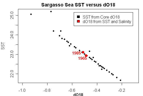
Recently Keigwin’s Sargasso Sea dO18 temperature reconstructions have been mentioned in the climate public eye. Keigwin’s reconstruction famously has a warm MWP as shown below. This reconstruction uses modern dO18 measurements at Station S to calibrate two cores (with modern Station S values specifically shown in the graphic below):

I observed last year that the Juckesian version of the Moberg reconstruction had a very different appearance using Sargasso Sea instead of Arabian Sea G Bulloides and using Indigirka instead of Yamal – a point that I re-iterated recently in light of the final Juckes paper. I discussed Juckes and the Sargasso Sea last year and in my Review Comments at CPD. We’ve discussed the Juckesian pretext for withholding the results with Indigirka. His pretext for excluding the Sargasso Sea SST reconstruction from dO18 is that the data ends in 1925 (a point was recently picked up at realclimate).
The Sargasso Sea series used by MSH2005 is sometimes mistakenly presented as having a 1975 data point representing the 19502000 mean, but the actual end point is 1925 and so this series is also omitted.
Today I want to discuss exactly what is and isn’t in the Keigwin Sargasso Sea data, amending some first thoughts based on clarifications provided below by several readers. Keigwin (1996) (see here) archived a data set with SST, salinity and dO!8 values from 1955 to 1995 here . Keigwin 1996 says:
As expected, the effects of decreased SST and increased salinity during the late 1960s combined to increase the dO18 value of equilibrium calcite. Over the full 42-year series, linear regressions between the SST, salinity and dO18 values show that temperature accounts for about two-thirds of the isotopic signal ( r2 = 0.61), whereas salinity accounts for one-third (r2 = 0.29). Thus, by comparison to sea surface changes during the past several decades, it is reasonable to interpret the foraminiferal isotopic data mostly in terms of SST change.
This statement, combined with the data set, looks like a calibration set. The above discussion – in which variance is allocated to factors – looks very much like a conventional statistical analysis. As I observed in my first cut at this:
The statistical model from the two-factor model is so uncannily accurate (r2= 0.9988) that I’m wondering whether some of the data here has been forced somehow. Actual and fitted dO18 values are shown below: you have to look very closely to see any discrepancy. The dashed line is not simply a replot of the data: you can notice some very small differences. I’ve never seen any proxy model that is remotely this accurate – so it is puzzling. Some time, I’ll try to check whether (say) the salinity measurements are forced and that’s why the model is so accurate.
My surmise that the model was forced was correct, but I missed what was being forced. The explanation is latent in the article – it’s just that what was being done was something that I hadn’t expected. Keigwin forced the dO18 values from SST and salinity measurements at Station S and then did a regression using the forced data set.
In order to gauge the influence of the annual variability of SST and salinity on the oxygen isotope ratios that might be recorded by surface-dwelling foraminifera at Station “S”, I calculated the 6% value of calcite precipitated in oxygen isotopic equilibrium with seawater (Fig. 3) (26).
What exactly does this calculation do – I guess that it somewhat quantifies the expected contributions of salinity and SST to dO18 variation, given the measured variability of SST and dO18. Here’s a way of representing the calculation which clarifies things for me: the black points show reconstructed SST from core sediments against the dO18 of the core sediments (in a linear relationship according to the reconstruction transfer model), while the red points show two 20-year averages of reconstructed (“modeled”) dO18 from measured SST and salinity using the Deuser/Keigwin methodology. Keigwin observed that core dO18 values (which integrated decadal periods) were outside the range of modern (estimated) values from Station S using current transfer models. His plot shown above amalgamates the modern and core data along these lines.
While I was looking at this data, I became intrigued with some of the properties of the original calibration of dO18 to SST in the Station S data set, which illustrate rather nicely some of the issues involved in reconstructions of any kind. The dO18 values here are forced and that’s why the model is 100% accurate. But let’s suppose that we actually did have a 100% accurate model and see what the effect of not knowing salinity does to the error structure of SST reconstructions. These are just thoughts right now.
Two-Factor dO18 Model
Although dO18 is used to reconstruct SST, the actual physical relationship goes from SST and salinity to dO18. As an experiment, I tried a simple regression of dO18 values against SST and salinity data as follows:
fm=lm(dO18~SST+Sal_psu,data=sarg.mod)

First, let’s look at the dO18 model (note that we’re fitting dO18 here rather than SST) if we just use SST for the reconstruction, as shown below. You can readily see that the model using only SST is less successful and that the residuals from the model leaving out a factor have positive autocorrelation (and a failed Durbin-Watson statistic.) This is a rather nice demonstration of how the Durbin Watson statistic gives evidence that a salient factor has been left out of the model. In econometrics, this is evidence that the model is mis-specified – a statistical method that Juckes et al for example simply repudiated without providing any statistical authority. Juckes’ say-so was high enough authority for editor Goosse, I guess. In this case, there is a fair amount of autocorrelation in the salinity data and this carries forward into the residuals from the incompletely specified model.

The above plot illustrates the situation for the modeling of dO18. However in climate studies, the procedure of interest is the reverse: the use of dO18 as a “proxy” to “reconstruct” SST. A common strategy is the use of “inverse regression” of SST against dO18 -even though the physical relationship is the opposite. I use the term “inverse regression” here as it’s used in calibration statistics off the Island. There’s been much made of inverse regression in climate science (von Storch, Juckes), where the term “inverse regression” does not coincide with “inverse regression” as used in conventional statistics, but to describe a variant of partial least squares used on the Island in various guises- a topic that I’ve discussed here. If the calibration is done from the regression of dO18 against SST, this is called “classic calibration” in calibration studies. For the discussion here, don’t worry about the terminology in the various studies, but about what is being done. Here I’m regressing SST against dO18 as shown below:
fm.inv=lm(SST~dO18,data=sarg.mod)
The figure below shows the SST reconstruction (top) and residuals (bottom) using inverse regression based only on SST – a defective model to be sure, but a model containing some information. I’ve also shown the reconstruction using variance matching. In a univariate case, this simply dilates the reconstruction a little, in which the price for matching the variance is the increase in the average size of the residuals. As you can readily see, the autocorrelation in the reconstruction residuals is intimately related to the defective model (in which the autocorrelation of the salinity is imposed onto the residuals.) You can also see that the variance-matching reconstruction and the inverse regression reconstruction are intimately related, with the one just being a dilation of the other.
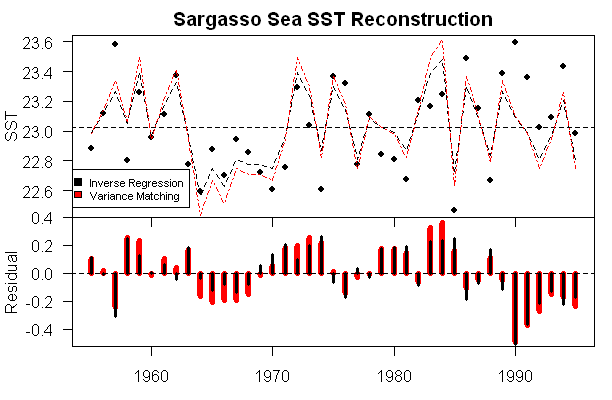
Thus, estimating the confidence interval of the reconstruction depends on the size of the impact of unreconstructed salinity. Because the mis-specified factor has considerable autocorrelation, the confidence intervals cannot be calculated in an elementary way. A common recipe in climate studies is to estimate the reduction in number of degrees of freedom. While the approach is not absurd, the devil is always in the details. I think that the salient question is: how many measurements are needed in an average so that the probability of the average error being within 
It should also be a little sobering to see how large the errors are in this case when one factor is unavailable for a proxy where, in this case, due to forcing, the model is specified to 100% accuracy. The standard deviation of the residuals was 0.2, while the standard deviation of the SST was 0.29 – this is in a perfect model with unknown salinity. If the dO18 model explained (say) 50% of the variance in the model, then these errors would have to be added in. I’ll do the calculations some time to try to figure out where the model “breaks even”.


41 Comments
To me, this is what the “climate audit” is all about: re-checking existing records against the “iconic” charts.
It still bothers me that several charts show averages that stop at 2000. If the 2001-2007 data is added, wouldn’t this would change the center line?
For example, there is a lot of talk on various blogs about the NH melt, and the “anomilies”. How can you compare the “current” to an “average” stopping in 2000, when there have been several years after, showing lower values? It seems to me that in order to see the anomalies, you need to have the “average” end as close to the “current” as possible.
Am I way off base here, or what?
Kind of funny how well the first graph matches up with figure 3 in this paper
Click to access icecores_palaeoclimate.pdf
Ice Cores and PaleoClimate
Katrine Krogh Andersen, Peter Ditlevsen and Jørgen Peder Steffensen,
Department of Geophysics, NBIfAFG, University of Copenhagen
Just chance, I am sure, that the Greenland ice core data shows a MWP a LIA a Roman Warm Period, etc. just like the Sargasso Sea data, and according to the paper, it matches up with Antarctic data from the law dome bore hole. Random chance completely, has to be since no hockey stick is apparent and we all know that the appearance of a hockey stick is the ultimate, ne plus ultra, test of data integrity.
I’m a bit confused about your wondering about the second graph. The legend on the right side explicitly says “predicted oxygen isotope ratio”. Why wouldn’t it simply read “oxygen isotope ratio” except for the fact that the bottom trace was calculated based on salinity and SST?
Station S data should be available from http://bats.bios.edu
Its perhaps not too surprising that the PREDICTED d18O values in figure 2 can be modelled by the salinity and temperature data, since these data would have been used to calculate the PREDICTED d18O.
So there is no need to worry that the “salinity measurements are forced”.
#1: I’m rather cynical regarding the continuous trunkation of graphs to 2000. given that there has been no upward change in global mean surface temperature since 1998, I can only assume that the trunkation is performed to hide data inconvenient to the AGW hypothesis.
It irks me no end to hear about “temperatures continuing to rise” when we have now had eight years with NO temperature increase.
#6
Some people just cannot be satisfied.
This graph is from a paper published in 1996. It would be rather impressive if it had values for a further decade.
“eight years with NO temperature increase” What do you want, doubting Philip? A new maximum temperature records each year, or would every other year suffice. There is no expectation, except amongst sceptics, that new maxima must occur this frequently. On short time scales internal variability rather than external forcing dominates the climate system. Smoothing the data to damp this inherent noise reveals that temperatures are continue to rise.
#7, this was a general comment, not one relating to this particular graph. In any case, in an era of ” temperatures are higher now than they have ever been before, and are continuing to rise ever faster “, I would expect a new record at least every few years.
In any case, the previous warming period was only 23 years long: the current period of no change is already over a third as long as this.
“Smoothing the data to damp this inherent noise reveals that temperatures are continue to rise.” there has been no rise for eight years, so any smoothing which says there has has been incorrectly carried out.
And by the way, according to the satellite data (about the only high-quality data there is), the southern hemisphere has not warmed over 28 years. Hardly “global warming”:
#7
RichardT: The trouble is that the “believers” (as opposed to the “deniers”) tend to hold up anomalous single values for all to see when those values support their arguments. For example: When 1998 was “the hottest year on record,” it was heralded by the scare-mongers as a sign of rapid, recent warming. Yet, the correction isn’t often talked about. That being the case, it’s only natural for a “denier” to point out when such anomalous values are not present.
The IPCC guys use some pretty short time intervals in their reports (e.g. 18 years) and conveneiently arrange it so that those timespans begin at very low temperatures and end at high temperatures. Often, if you go forward or backward by so much as a year, you can obtain a drastically different slope. Yet, when a person from the other side of the argument uses a similarly short time interval, they are blasted.
You can’t have it both ways!
What does smoothing the data do other than smoothing the data? If someone smooths a sine wave on the up slope to the value at pi/4 does this mean that the value can increase beyond unity?
What physical principal is smoothing revealing in the case of the temperature data that is not also applicable to teh sine wave?
richardT says:
“October 15th, 2007 at 4:44 am
#6
Some people just cannot be satisfied.
This graph is from a paper published in 1996. It would be rather impressive if it had values for a further decade.”
And that was my original point: has the author of the original paper (or anyone else) gone back and done a “where are we now” update? Updating the charts would only make their case stronger, wouldn’t it?
Why make predictions based on a 10-year-old chart, when newer data exists?
Updating the proxies is one thing. Re-checking data to confirm or deny theories brought forth in papers is another.
Re 10 Stan Palmer
Clear point, well expressed.
I have never seen such unbelievable graphs as are in the intro to this section. r2 of 0.9988 does not come from natural earth science data IMO. It comes from a computer.
The author should have some quality control data on the accuracy of dOxygen18. Replicate analysis are needed for precision estimates and an absolute calibration is needed for accuracy of isotope ratios – before much can be said about reconstructions of climate data. As for SST, it can mean just about what the author wants, depending on how the measurement is taken – what time of day or year and how the wind blows.
The whole basis of oxygen isotopes to proxy temperature is very much more shakey than authors are presenting. The initial theory for fractionation is qualitative, while the results are quantitative to 3 sig figures. That does not align, except to wishful thinking.
#12
Exactly right.
Read the paper, especially footnote 26.
Richard T, thanks for the comments. I’ve re-stated this note to reflect these comments. As I observed, it looked like something was being forced and, as you observe, it is the modern dO18 which are not measured but calculated. I got wrongfooted by Keigwin’s discussion of allocating dO18 variance between SST and salinity, a calculation where I was presuming would use actual data – but, as you observe, the dO18 data is modeled and then the variance is allocated. I was expecting something more statistical, but anyway it is what is.
The impression that I want to give is that reconstructions which are made ignoring salinity do not have an i.i.d. error structure and this affects the confidence interval calculations , not just for individual years, but for decadals as well, with the confidence intervals converging substantially more slowly than i.i.d. This is with a perfect model. If the model is imperfect, then it would be an interesting calculation to try to estimate honest confidence intervals.
Richard, let me make sure that I understand this correctly. Aside from instrumental error, it would seem that what you’re saying is that the dO18 is an accurate indicator of water temperatures, but not air temperatures. Is that what you’re saying?
#19
The data are entirely correct, and I have absolutely no objected to them. It was the interpretation in this post, now corrected, that was in error.
#18
I never said this. d18O is a useful proxy for SST, provided salinity variability is small relative to temperature variability. But it is not perfect.
The reconstructed chart is also interesting ( to me, that is) in that it appears to show all 3 major climatic periods of the past 4000 years. ‘the climatic optimum’ circa 4000 – 2500 BC, the Maunder Minimum, circa 1500 – 1700?, and the MWP; some achievement that !
RE: #17 – I’ll throw in a few EE analogies along the way … think of what Sargasso represents. It is the slowly circulating water which reflects the slowly circulating air at the center of the semi persistent high pressure center. Take any wave (e.g. event biased toward higher frequency content)and it will get “filtered” out. Only long wavelength events will make it to the center of such a feature. In an electronic circuit, this would be low pass filter. Since the middle of a high pressure center of such magnitude and persistence is a place that experiences very little weather. I cannot think of a better place to measure climate, especially the thermal component of climate.
Re: #22
And you obtain an R^2 = 0.25 and a p value = 0.17. Let us just say that the time period is not sufficiently long to define a trend over it with any good confidence.
Steve —
What is the leftmost point in the graph in your original post above? Is it 2000? Or is it 1975, because only the centerpoint of each half-century is plotted? Or is it 1925, if (as intimated on the anonymous RC page you appropriately link), “before present” here is on the C-14 scale in which 1950 (the approximate year C-14 dating was conceived) is by definition “the present”? (And if the latter, why would O-18 dating use the C-14 reference date??)
If the data is taken only every 50 years, how is it possible to calibrate it to instrumental data which probably only goes back 100 years (and at most 150 years…)??
— Hu McC.
#45. I believe that the left point of the graph is 1975. The Station S data go from 1955 to 1995, I believe that the point shown for Station S is the average of Station S data – either as a direct SST average or, more likely as a reconstruction from modeled dO18.
The calibration of ocean sediment data is not by correlations to instrumental data, but by a physical model in which dO18 is hypothesized to respond to temperature. The ocean sediment information looks very intriguing as a way of getting information on past climate. ONe of the obstacles for millennial history has been fairly coarse sampling of most ocean sediment cores, but there’s more interest in millennial results now e.g. Newton et al 2006, Richey et al 2007.
SteveMc I’m lost. Was there some actual rationale for not splicing the records together? or rejecting
the splice? I think we’ve gotten a bit off track with debates about temp records and missed the
fundamental methodological question you raised.
I still say (if I said it; I’m unclear on this issue) that no matter how good your reasoning or logic, if it’s built off of a faulty foundation, it doesn’t matter.
The basic question then becomes if, regardless of any other factors, is there some sort of meaning to a year of monthly averages of some sort of global mean reading? Is that in 19xx the anomaly was .xx correlate with that in 19yy, zz years later, it was .yy?
If fishes were wishes.
#10. Exactly right. In this case, the noise IS the data.
#21
The data file for figure 4b dates the most recent data point to 25 yr BP. By definition, the present in BP (Before Present) is 1950 CE. So the last sample is dated to 1925 (but see figure 4b figure caption as to how the raw data has been treated).
Steve McIntyre:
I understand you moving the discussion of Southern Hemisphere temperatures to Unthreaded, but why did you leave Philip’s comment and remove my rebuttal?
Philip’s comment:
My rebuttal:
Steve: Because I do not have an infinite amount of time and because my editing software is not ideal. There ae zillions of temperature threads – why be so annoying as to hijack a technical point on Sargasso Sea dO18 for discussions of temperature? And yes I will move this when I get a chance.
John V I think both of our posts will eventually be moved to off-topic, but I think you fail to consider the vast error margin, when asserting that there is an upward trend.
Nearly all years since 1995 fit within the error margin, and there is serious debate on how increasing sulfate emissions in South-East Asia and other non-CO2 forcings have affected the records.
And also, let’s not forget the Y2K error, and the reality that the global data is far from perfect, and may contain many errors (e.g. Pielke has opionated that there is a UHI caused warm bias in the records).
We will be wiser in 2020, but at the moment it is impossible to assess.
Buddenbrook:
You’re absolutely right about the error margin. As I’ve said before, I only brought it up because Philip’s statement was completely wrong. I’m surprised nobody else corrected Philip but many have corrected me.
Re: #29
Because you know better.
#26
JohnV, your “rebuttal” quotes from an article that says: “This is a close match to the temperature trend over the last 30 years (0.15°C from 1975 to 2007)”
1975 was the coolest period since the warming in the 1920s/1930s.
The CRU says this is the global temperature over the last 5 years:
2003 0.465
2004 0.444
2005 0.476
2006 0.422
2007 0.437
Flatline from 2003 to 2007. A slight cooling.
No rise.
As for the Southern Hemisphere …
2003 0.371
2004 0.299
2005 0.329
2006 0.288
2007 0.254
Almost back to 0.0.
#30 Bruce:
Ok, so you have a problem with choosing 1975 as the starting point for a warming trend. It shows the warmest possible trend for a significant period of time. I can understand that. However, when the global warming trend since 1998 matches the warmest possible trend doesn’t that mean something?
A rhetorical question: Why choose 1998 as the starting point for a trend?
“#31 John V. says:
October 16th, 2007 at 9:08 am
#30 Bruce:
Ok, so you have a problem with choosing 1975 as the starting point for a warming trend. It shows the warmest possible trend for a significant period of time. I can understand that. However, when the global warming trend since 1998 matches the warmest possible trend doesnt that mean something?
A rhetorical question: Why choose 1998 as the starting point for a trend?”
And back to original question at the same time: Why stop the averages on charts at 2000? Is it because adding the last 5-6 warm years into the average will RAISE the average, and make the max temps appear lower than before?
henry:
I don’t know which charts you are referring to. GISTEMP uses 1951-1980 to define “average”. HadCRU uses 1961-1990. Changing these dates moves the lines up and down but does nothing to the trend.
“33 John V. says:
October 16th, 2007 at 9:40 am
henry:
I dont know which charts you are referring to. GISTEMP uses 1951-1980 to define average. HadCRU uses 1961-1990. Changing these dates moves the lines up and down but does nothing to the trend.”
You are “zero-ing” in on my point. Agreed, the trend wouldn’t change. But now, we’re supposed to be .6 degrees above average. If the zero line increases, we will be
Somehow, my computer dropped half of my comment.
I’ll try again.
You are zero-ing in on my point. Agreed, the trend wouldnt change. But now, were supposed to be .6 degrees above average. If the zero line increases, we will be less than the current .6 degrees.
But then the AGW’ers would have to deal with a new round of “denialist” letters, having to explain how the max dropped from the last chart.
The people here probably have a better math background than I do. So try something: take the GISTEP or HadCRU data, and re-average using current data. If the discussion is right, the trend won’t change. The average (zero line) will go up, making the current temp less than .6, and make the temps from the LIA appear lower (even colder) than average.
A very good post Steve but it highlights the problem with all these climate proxies except direct temperature measurements and satelite data: I haven’t seen the defined relationship between the main proxy variable and temperature. I can’t take dO18 values and plug in environmental conditions and get a temperature out. I can’t take a tree ring width, input some environmental factors and get a local air temperature measurement. As someone posted before you can take mercury rising in a tube and use that to measure temperature around the mercury. So the question is why are we getting worked up about proxy trend fitting? It is just a distaction from the fact that there are few defined (if any) relationships between specific natural data and temperature.
We must understand this first. I’m a physicist and I have yet to see proper characterisation and repeatability in proxy data. For example, something like, “according to controlled studies, and using the emprically derived formula X, which takes account of a number of environmental factors, this series of tree rings Y translates to a temperature variation Z with an error of E” followed by “recent studies using other sites have shown good agreement with predicted values etc etc”. Can anyone give me the equation relating dO18 concetration in ocean sediment with temperature and salinity? And can this be repeated in a controlled experiment like in a huge tank.
Now some might say this is biology, or dendrochronology and it can’t broken down into components like that. Well if you are going to use a proxy then yes you have to and when you do quote the accuracy as well. Don’t hide behind correlations and PCA for ‘general trends’. Show me the relationship and the methodology. This is missing from all these proxy data ‘reconstructions’ so at the moment its interesting in a mathematical way but it doesn’t tell me anything. It should be disregarded. This means realistically we do not have an significantly accurate measure of past tempertures beyong the inception of direct measurement. This is quite depressing and worrying considering the hoo-haa over CO2 forcing.
Some of you may disagree and I’m happy to be wrong, but only if you can show me the defined relationships for each proxy and quote the errors.
#36
Try something like http://dspace.mit.edu/html/1721.1/36830/12-740Spring-2004/NR/rdonlyres/Earth–Atmospheric–and-Planetary-Sciences/12-740Spring-2004/916A110E-95F2-4157-A78F-3A07E9614D0C/0/paleo_lec_01.pdf
for an introduction.
#36
That brings up another wrinkle – there are people out there that take the results of every study and bump them against the temp record, trying to find the “magic chart” showing a close correlation to the surface temp.
Once it does, it’s added to the growing list of “supporting data” as proof, and never brought up-to-date.
If it doesn’t, then it’s torn apart as “denialist” data.
We’re seeing the same thing on the other blogs. Some studies (and their authors) go through a grinder, while others are never reviewed.
RE #20, #21, is the time-scale of these graphs found by C-14 dating of the carbonate in the sediments? If so, it could account for the “before present” (i.e. before 1950?) time scale on the horizontal axis. But it is well known that C-14 dating of shells and marine mammal bones is not as straight-forward as dating tree rings or terrestrial herbivore or even carnivore bones, since the C-14 proportion in the ocean is not the same or as uniform as that in the atmosphere, and since the food chains may be quite long.
#39
The age-depth model of each core in the study is based on over a dozen radiocarbon dates on planktonic foraminifera (near the bottom of the food chain). As you say, there are more problems with marine radiocarbon dates than terrestrial ones, this is due to what is known as the marine reservoir effect (isotopic equilibration of CO2 between the ocean and the atmosphere is too slow to equalise their isotopic composition). This reservoir correction varies spatially and temporally (high near Antarctica and was higher near Norway in the Younger Dyras than now), but is unlikely to have changed much in the surface waters of the subtropical North Atlantic in the last few millennia. The dating error for this study due to uncertain reservoir corrections is probably small relative to other dating uncertainties.
RichardT, #40, writes,
Then if the horizontal scale on Steve’s graph in the original post is the C-14 pre-1950 “Before Present” scale, shouldn’t Station S per Steve’s #21 be at -25 yrs, ie at 25 years “After Present”??
In any event, a big flat spot in the dendrocalibration curve makes it very hard to use C-14 to discriminate dates from about 1640 AD to 1940 AD. I trust that C-14 is only used for the dates before 1640, and “dead-reckoning” stratigraphy is used to fill in the gap from then to the present.