Surprisingly, I don’t think that I’ve written previously about the Al Gore Hockey Stick. In Inconvenient Truth, after a segment discussing glaciers, Gore stands in front of a Hockey Stick graph for the last 1000 years and tells his audience that “Dr Thompson’s thermometer” had shown the inconsequentiality of the Medieval Warm Period and, [in the book Nov 13], that “Thompson’s ice core record [was] one of the most definitive” confirmations of Mann’s Hockey Stick. [The text in the book says:]
Lonnie and his team of experts then examine the tiny bubbles of air trapped in the snow in the year that it fell. They can measure how much CO2 was in the Earth’s atmosphere in the past year by year. They can also measure the exact temperature of the atmosphere each year by calculating the ratio of different isotopes of oxygen which provides an ingenious and highly accurate thermometer. The team can count backward in time year by year – the same way an experienced forester can read tree rings – by simply observing the clear line od demarcation that separates each year from the one preceding it as seen in this unique frozen record. The thermometer to the right measures temperature in the Northern Hemisphere over the past 1000 years. The blue is cold and the red is hot. The bottom of the graph marks 1000 years ago and the current era is at the top.
The correlation between temperature and CO2 concentrations over the last 1000 years – as measured by Thompson’s team – is striking. Nonetheless the so-called global warming skeptics often say that global warming is really an illusion reflecting nature’s cyclical fluctuations. To support their view, they frequently refer to the Medieval Warm Period. But as Dr Thompson’s thermometer shows, the vaunted Medieval Warm Period (the third little red blip from the left below) was tiny in comparison to the enormous increases in temperature in the last half-century – the red peaks at the far right of the graph. These global-warming skeptics – a group diminishing almost as rapidly as the mountain glaciers – launched a fierce attack against another measurement of the 1000 year correlation between CO2 and temperature known as the “hockey stick”, a graphic image representing the research of climate scientist Michael Mann and his colleagues. But in fact scientists have confirmed the same basic conclusions in multiple ways with Thompson’s ice core record as one of the most definitive. (AIT, The Book)

Figure 1. Scene from AIT, with Gore standing in front of a hockey stick graph.
[added] The transcript here (and I don’t vouch for the transcript) is a little different than the book, but clearly attributes the graphic here to oxygen isotope calculations from Lonnie Thompson:
The ice has a story to tell and it is worldwide. My friend Lonnie Thompson digs cores in the ice. They dig down and they bring the core drills back up and they look at the ice and they study it. When the snow falls it traps little bubbles of atmosphere. They can go in and measure how much CO2 was in the atmosphere the year that snow fell. Whats even more interesting I think is they can measure the different isotopes of oxygen and figure out the very precise thermometer and tell you what the temperature was the year that bubble was trapped in the snow as it fell.
When I was in Antarctica I saw cores like this and the guy looked at it. He said right here is where the US Congress passed the Clean Air Act. I couldnt believe it but you can see the difference with the naked eye. Just a couple of years after that law was passed, its very clearly distinguishable.
They can count back year by year the same way a forester reads tree rings. You can see each annual layer from the melting and refreezing. They can go back in a lot of these mountain glaciers a thousand years. They constructed a thermometer of the temperature. The blue is cold and the red is warm. I show this for a couple of reasons. Number one the so called skeptics will sometimes say Oh, this whole thing is cyclical phenomenon. There was a medieval warming period after all. Well yeah there was. There it is right there. There are one there and two others. But compared to what is going on now, there is just no comparison. So if you look at a thousand years worth of temperature and compare it to a thousand years of CO2 you can see how closely they fit together. Now, a thousand years of CO2 data in the mountain glacier.
Today I want to spend a little time examining this particular graphic, as it has some intriguing mysteries.
Here is a closer view of Dr Thompson’s Thermometer, as Gore describes it. It starts just after 1000 and, according to the graphic, ends in 2000. It is denominated in deg C. The Medieval Warm Period (not labeled in this version, but labeled in the book) is identified as occurring from about 1360-1370. Another interesting detail is that the resolution of Dr Thompson’s Thermometer appears to increase in the 19th century. In the 12th century, the graph looks like it has decadal values (and this is characteristic of Thompson), but the resolution in the 19th and 20th century is more detailed – this change in resolution within a chart is atypical of Thompson’s usual style. Another interesting aspect of the graphic in the 20th century is that the polygon style shows both positive and negative values simultaneously (indicating some error in the plot coloring algorithm).

Figure 2. Dr Thompson’s Thermometer from Inconvenient Truth. As noted below, the y-axis is labeled incorrectly here, but is corrected in the book. The labels are inverted in the DVD.
Now I’m pretty familiar with Thompson’s work and have discussed it here from time to time – see Thompson category, but I don’t have any idea where Dr Thompson’s Thermometer can be identified in any of his publications. This is not to say that Thompson hasn’t produced graphics that look somewhat like this, but I can’t locate any provenance for Dr Thompson’s Thermometer. (If anyone does know, please tell me and I’ll amend this.) Thompson has published composites of dO18 series standardized to a mean of 0 and standard deviation of 1 (“Z-scores”). In Thompson et al (Clim Chg 2003), Thompson illustrated a “Z-score” composite of 6 cores (3 Andean: Quelccaya, Sajama and Huascaran; 3 Himalayan – Dunde, Guliya, Dasuopu). In Thompson et al (PNAS 2006), a new Z-score composite of 7 cores (adding Puruogangri) was illustrated. The style of the PNAS graphic was quite a bit different. In this case, Thompson archived the plotting data (which are decadal averages, inconsistent with other time series as seen below – and not the same thing as a proper sample archive). However, they do permit the re-plotting of the PNAS version in a style like the AIT graphic, which I’ve done below for comparison.
The grossest features carry forward, but there are some interesting differences in detail, as can be seen by comparing the version below to the AIT version.
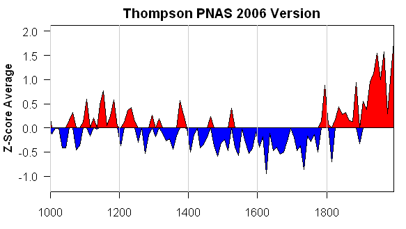
Figure 3. Re-plot of “tropical composite” data used in Thompson et al (PNAS 2006)
The PNAS version is denominated in Z-scores: how did this get converted from Z-scores to deg C? I don’t know. I presume that this is done through variance matching or something like that. But surely the calculation needs more justification than that. The IPCC AR4 stated in respect to dO18 from tropical ice cores:
There are very few strongly temperature-sensitive proxies from tropical latitudes. Stable isotope data from high-elevation ice cores provide long records and have been interpreted in terms of past temperature variability (Thompson, 2000), but recent calibration and modelling studies in South America and southern Tibet (Hoffmann et al., 2003; Vuille and Werner, 2005; Vuille et al., 2005) indicate a dominant sensitivity to precipitation changes, at least on seasonal to decadal time scales, in these regions.
Even Thompson himself (in Thompson et al (Science 2000) stated that the Dasuopu core was a proxy for monsoon intensity:
A high-resolution ice core record from Dasuopu, Tibet, reveals that this site is sensitive to fluctuations in the intensity of the South Asian Monsoon.
So what was the basis for Thompson going from Z-scores to deg C? If it was through some elementary variance matching, to my knowledge (and I’ll amend if I’m wrong) no calculation yielding the curve illustrated in AIT has appeared in any peer reviewed literature.
Secondly, there are many differences in detail. Look at the location of the Gore-“Medieval Warm Period” in AIT – a one decade period around 1360; it appears cold in the PNAS version. In the PNAS version, there are some cold downspikes in the 17th century: where are they in the AIT version. The 11th and 12th century MWP in the PNAS version, while not loud by any means, are considerably attenuated in the AIT version: why? It’s not obvious to me.
Dunde Versions
The idea that there would be inconsistent versions of something from Lonnie Thompson is not something that will surprise previous readers. Here is a collation of different “grey” versions of one of the components in the above graphic (Dunde). Dunde was drilled in 1987 and is a staple of multiproxy studies. It has about 3000 samples containing not just dO18 values but relevant dust and chemistry information. Thompson has refused to archive original sample data. I’ve made many efforts to get this data but have been rebuffed by Thompson himself, the National Science Foundation, Science magazine and the National Academy of Sciences (both in their capacity as publishers of PNAS and in their capacity as organizers of the Surface Temperatures panel). This is important data which cannot be duplicated by third parties – Thompson has an obligation to archive all sample information and NSF and the journals have an obligation to require him to archive it: none of them are living up to these obligations. Maybe Al Gore could ask him.
The results of different Thompson versions of Dunde make a spaghetti graph all by themselves. Note that one version with annual data ends at a very low value. This inconsistency is not isolated to Dunde – as you can see from perusing the posts in the Thompson category.

Dunde Versions. Heavy black – Yao et al 2006 (3 year rolling average); thin black – MBH98 (annual); red – PNAS 2006 (5-year averages); blue – Clim Chg 2003 (10-year averages); purple – Yang et al 2002 (values in 50 -year intervals); green – Crowley and Lowery 2000 (original in standardized format, re-fitted here for display by regression fit to MBH98).
Bona Churchill
In 2002, Thompson took a new ice core at Bona Churchill. We haven’t heard anything about it. On previous occasions, e.g. here , I’ve predicted that 20th century values at this site would be lower than 19th century values – using the mining promotion philosophy that if Thompson had had “good” results, we’d have heard about them. The prediction has a little more teeth than that as dO18 values at nearby Mount Logan obtained and already published by Fisher et al went down in the 20th century. In this case, Fisher et al attributed the decline in dO18 to changes in water source provenance. Fair enough – but how then can one be sure that changes in dO18 in the tropics are evidence of global warming as opposed to changes in precipitation (as argued by Vuille as noted above) or regional precipitation.
And what would have happened to Dr Thompson’s Thermometer if Bona Churchill had been averaged in? And, oh yes, can anyone tell me where I can find a publication of Dr Thompson’s Thermometer as illustrated in AIT?


162 Comments
You seriously can’t figure this one out?
Check out the y-axis labels of Gore’s graph… are their inverted or what? What is the zero value?!?
For completeness, you may consider asking him. His response (or non-response) may be interesting.
Re #2, how dare you joust with the consensus, you jester!
What strikes me about the graphic:
– As Steve has noted, the change in time resolution around 1840 from smoothed/annual/decadal to monthly, indicates a splice with a temperature series, maybe the NH mean anomaly. But splicing a glacier to NH temperature without telling the audience what you’re doing makes it misleading, especially if there is no underlying publication that establishes the two series are significantly correlated.
– There is probably another splice in the 20th century. Up to about 1920, values are either above the line (red) or below (blue), indicating a single mean series. But after that they are both above and below, so something was changed at that point. Maybe the kids who prepared the graphic switched to another data source with error bars, and they accidentally used the upper and lower error bars rather than the mean, which would also explain why the line seems to jump around 1920. It’s hard to say what they did, and no doubt Gore hasn’t even noticed despite seeing the graph a zillion times.
– The degrees go negative as you read up the axis. They go from +1 in the mid-1800s to 0.0 today, en route to -0.5 at the top of the axis. This graph seems to be proving major 20th century cooling.
This, above all, casts a big shadow on climate science. If the leaders in that field were true scientists, they would help force the archiving. Their long-term reputations are on the line, because of this nonsense.
#2. Jean S – you’re right. It looks like he’s screwed up his y-axis. He’s got negative deg C on top.
Aside from that his zero doesn’t coincide with the coloring as one expects: I didn’t notice that in my first pass. The coloring is centered at 0.5 deg C (perhaps minus 0.5 deg C?)
Funny how after all that’s been written about AIT, the simple fact that the Nobel Prize Winner got the source of his main chart mixed is relatively unknown.
The labels on the tic marks are in reverse order. This error is fixed in the book, but not the other one. But you really don’t know where the graph comes from? You’re not kidding around here?
Has he added the instrumental record on the end, without removing the Thompson data, which is why there are simultaneous negative and positive values in the last century?
He doesn’t have the scientific background or education to understand such a concept either way. That his word is taken as gospel by so many baffles me.
Mark
Isn’t it MBH — mistakenly attributed to Thompson?
LOL. It must be Mann’s graph, not Thompson’s!
#10
No, then the ice core line would be smooth, not jagged.
#9. Tim’s right that he error is corrected in the book. I would have thought that the DVD had gone though enough editions that they’d correct the error in new DVD prints. In the book, the 0 mark is at the correct spot.
Here’s the Thompson version in the NAS panel report, which appears to be drawn from the same data as the PNAS article re-plotted above.
15, that presumes that there’s someone involved with the film who knows the difference. IIRC, Hansen was the scientific adviser.
SteveMc … a previous post of yours wondered about why this is left vs. right … regardless of the validity of your concerns, and the details of those concerns, you will now be the AGW-is-a-conspiracy crowd’s favorite. They love attacking and making fun of Gore. It’s turning into a cottage industry.
I’m not saying your concerns might not have validity. And i’m not saying they aren’t worth discussing, all I’m saying is get ready for some of the looniest of the loons to come out of the woodwork.
#10. Tim, it’s an honest question. Gore doesn’t provide any sources. I’ve looked in what seem to me to be the most logical articles, but I could have missed something obvious. So any information would be welcome. Again, I’m looking for the exact version, not just something more or less similar.
There have already been a few here for a while, though many no longer post thankfully. Of course, this thread has already… ahem. 🙂
Mark
I don’t see a globally warming 30s or a globally cooling 70s. Equally in the AIT book some charts have sources and others do not. This chart which is in fact repeated twice (p63 and again on p64-65) has no source. Moeover, with such regionally concentrated and small samples houldn’t the relationship be with these regional temperatures and not globally – or is dO16/dO18 a “well-mixed” or global constant measure?
It’s MBH99 + the instrumental record. The simultaneous positive and negative at the end is because there are actually two graphs there.
Figure 7d from <a href=”http://bprc.osu.edu/Icecore/Abstracts/Thompsonetal-climatic-change-2003.pdf” rel=”nofollow”> Tropical Glacier and Ice Core Evidence of Climate Change on Annual to Millennial Time Scales</a> Climatic Change, Volume 59, Numbers 1-2, July 2003 , pp. 137-155(19)
This graph is actually Mann’s “Hockey Stick” and is not based on Thompson’s ice core sample, although it does appear to have come from one of Thompson’s papers. If you look at Figure 7 in Thompson’s 2003 paper (available online at http://bprc.osu.edu/Icecore/Abstracts/Thompsonetal-climatic-change-2003.pdf ), you will see four graphs that run from 1000 to 2000. Three of those graphs are of the ice core Z-score made by Thompson.
Graph (d), which is identical to the one in Gore’s AIT so-called “Dr. Thompson’s Thermometer”, however is clearly labelled “Mann reconstruction (1000 – 1980) Jones (1864 – 2000).” Did Gore knowingly misattribute this to Thompson’s ice core samples or was he just sloppy?
Background — MBH99
Foreground — AIT
Looks like a match to me?
Gore’s graph is NOT Thompson data, it is Mann et al. and Jones et al. data. The graph is apparently based on fig. 7(d) from Thompson et al, 2003, Tropical glacier and ice core evidence of climate change on annual to millennial time scales, Climatic Change, 59:137-155. But this particular graph is Mann et al. data being compared to the Thompson ice core data.
The smoother curve up to the late-1800s is the Mann et al. reconstruction for the northern hemisphere (Thompson cites Mann et al., 1999, Northern hemisphere temperatures during the past millennium: Inferences, uncertainties, and limitations, GRL, 26:759-762) appended to the Jones et al. observed series for the northern hemisphere (Thompson cites Jones, et al., 1999, Surface air temperature and its changes over the past 150 years, Reviews of Geophysics, 37:173-199).
So the irony is that Gore is defending the Mann hockey stick by comparing it to what he says is Thompson ice core data, but which is really a version of the Mann hockey stick–with an enhanced hockey stick aspect produced by combining two totally different data sets (reconstructed plus modern instrumental record).
So he says “MBH99 was attacked, but it’s okay because it was validated by various other proxy studies, including Thompson’s” and then shows MBH99 instead of the Thompson record. That’s pretty funny.
Thanks, Tim. I see why you thought that I was joking. I took Gore’s text at face value and have been trying to match it to Thompson’s data and got wrongfooted.
As you observe, it’s just a smoothed version of Mann spliced with Jones instrumental data that has been re-centered. Here’s the graphic from Clim Chg 2003 that Tim refers to – oriented in the same way as the AIT graphic. Notice the splice of proxy and instrumental that Mann says that climatologists never do. I’ve posted on this before.
Thompson et al 2003. Figure 7d. The measured (Jones et al., 1999) and reconstructed (Mann et al., 1999) Northern Hemisphere temperatures are shown in (d) and are plotted as deviations (◦C) from their respective 19611990 means.
This is pretty amusing: of course, I should have recognized that this was the Mann hockey stick spliced with the Jones instrumental record. Me of all people. But I took Gore at face value that he was using Thompson’s thermometer. Spot the Hockey Stick indeed. Too funny.
re: #22 Tim,
So Gore or his helpers took a graph from a Thompson article and attributed it to him even though it wasn’t his work but was in the article for comparison? Interesting! Certainly worth a Noble Piece Price.
LOL – that is too funny; and to get there it took circuitous ‘bait and stitch’ tactic.
BTW, was this factoid, that Gore used Mann aliased to Thompson to support Mann, pointed out in the crits of Gore in print or video before? For that matter, has Tim pointed it out on Deltoid?
Steve, if you haven’t already started changing it yourself, you should use a cross-out font on Dr. Thompson and add Dr. Mann in the title.
Don’t worry about it, it is often hard to wrap your head around Gore’s idiocies.
32, Ja, ja, der Hockeystick-Graphen has us all laughin…
So in all of the articles which point out errors, untruths, and half-truths about AIT, nobody pointed out Gore’s false attribution of his chart to Lonnie Thompson’s work rather than MBH99? How very cute – justify MBH99 using “Thompson” as independent verification, when “Thompson” is actually just a plot of MBH99. The things I could prove with with such circular methods! I can see why Gore was such a poor science student.
I wonder what else folks like Tim Lambert who found this error so glaringly obvious kept silent about? And is there going to be a “Gore Mucks It Up Again” thread courtesy of Mr. Lambert?
Heh, just to translate #32:
Al Gore proves global cooling…
and doesn’t even notice. The following image shows Al Gore in the Oscar and Nobel prize winning documentary “An Inconvenient Truth” in front of his hockeystick graph.
When we look more closely:
Well, er…
How they missed this is almost as puzzling as how Gore won the Nobel PEACE prize.
Carving a Hockeystick.
Pennstate Mann
That’s what you get for not keeping your eye on the puck.
Gore must be the team’s goalee. His job is to get the puck out of there.
Don’t worry Al. Your screw up is covered by “the method doesn’t matter because the results are correct anyway” logic.
Well, I guess it is a logical step. The team have used the same proxies with minor changes in methodology, or used the same methodology with minor changes in proxies to produce “independent” studies. It is only a small step to claim the same proxies and same methodology can be used to independently verify a study.
Michael Mann:
You mean 2002, not 2003, for Thompson’s phantom Bona-Churchill ice core? His CV shows 2002 expedition not 2003. http://www.geology.osu.edu/faculty/cv/thompson_cv.pdf
Interesting to note that over the past few months algore has been positing that he has been fighting global warming for “30 years.” Correct me if I am wrong as I was just a child at the time, but from all I have read–in 1977 there was major concern over global cooling, such that we were to only have a US population of some 20 million by 2000.
I suppose this, as with all of his other indiscretions, algore will simple refuse.
Yeah, Love Canal, Internet, inspiration for ‘Love Story,’ etc., etc…
Steve, I think you need to change the title of this thread to: “Al Gore and Dr
ThompsonsMann’s Thermometer.Would that be called a manometer? If so, he’s measuring pressure, not temperature.
#36
How far we have evolved!
“Somebody mention hockeysticks?”
guys, i know that all of this is very funny.
but please take another look at the graph on page 151 of the Thomson paper.
and for a second, try NOT to ignore 7 (a), (b) and (c)
Click to access Thompsonetal-climatic-change-2003.pdf
Piltdown Mann.
Too bad he wasnt from sussex it would have made a tremendous irony. bad method+right result=
bad science.
Thompson published about lack of volcanic ash in 2003 ice core. Is temperature record in there too? “1500 Years of Annual Climate and Environmental Variability as Recorded in Bona-Churchill (Alaska) Ice Cores” http://adsabs.harvard.edu/abs/2004AGUFMPP23C..05T
Even the title of the graph is an example of astoundingly careless data presentation. He’s got to be talking about temperature anomalies or deviations from some reference point yet the graph is simply titled “Northern Hemisphere Temperature (Celsuis).” Brrr.
Re #1. This response reminds me of the song by Chicago: “A man came up to me and asked me what the time was. That was on my watch, (but) I said: Does anybody really know what time it is? Does anybody really care?” I wonder if readers at your own blog respect this 1970’s kind of communication: “You seriously can’t figure this one out.” Give us a break. Or wait a minute – this Mann-Thompson SNAFU has been common knowledge in your camp all along, hasn’t it?
As a bird of the southern hemisphere, I must also protest at the obsession with northern temperature reconstructions. Did Al Gore even mention in his film that these strange graphs of his depict only 50 per cent of the Globe? At least I did not notice this half-truth when watching the film for the first time. Can I have half of my ticket price back?
RE#44, glad I looked again at 7a, 7b, and 7c. I see there are Southern Hemisphere ice cores, whilst 7d is Northern Hemisphere only. Minor technicality, eh? But add it to the list.
Re #44: 7a, 7b, and 7c are plots of z-scores for isotope ratios. They are not temperatures. Showing that they (sort of) track Mann’s discredited temperature reconstruction (7d) proves nothing. So what’s your point?
sod
Good point. This is the first time I have read this article so I looked. The only thing that is unambiguously discernible is the increase in the anomaly in the 20th Century. What others here may already have discussed in detail is the value and precision of ä18Oice as a global temperature proxy – Thompson himself seems to indicate that it “could” be a temperature signal as opposed to a precipitation signal. Until I increase my understanding of the theory behind the measure comments on the validity of 6 ice cores to measure the global temperature record not to mention the apparent weak correlation among the 6 proxies over the the length of the record are probably superfluous.
Re 34: For what it’s worth, I had mentioned this misattribution by Gore on my AIT review:
http://www.johnstonsarchive.net/environment/gore.html
This is representative of what Gore does with graphs–over half the graphs in AIT the movie are misrepresented data one way or another. I agree–with logic like that, why is Gore held up as a science authority?
Re #44: If you look at the six ice core series Thompson gives, the hockey stick average he gets is driven by two of the six–one each from South America and Tibet. Four of the six show Medieval Warm Period temperatures very similar to modern temperatures. The paper shows averages for each region and for all six, which coincidentally results in an atypical hockey stick in each average.
The British High Court Judge was only shown 20 errors and he did not have time to look in deatil at those. He asked for th most glaring 10.
By the way Congratulations on the award. I admire the work that you do. I have just started my own blog and you are my first link. If you can spare the time come and visit at http://climatescience.blogspot.com
RE#52, you certainly answered my “?”. It was a good catch. Maybe others did, too…having graphics (like this thread) may have left a better impression.
Is anyone surprised that this turned out this way and ended up so obfuscated? You can almost smell the desperation
So let’s detail the issues:
1. Seems “everyone else” already knew about this blatently misdirecting point.
2. The graph 0 point is wrong in the film.
3. The Y-Axis is inverted.
4. At first, it seemed the Z-Score Average was turned, somehow, into temperature.
5. The graph was supposed to be from Thompson himself so everyone was looking at Thomson’s data.
6. The chart says it’s temperature, but it’s temperature anomaly.
7. The chart is only for half the world.
8. In reality, the graph is a smoothed version of Jones measured data spliced onto Mann reconstructed data.
9. MBH99 is being used to prove itself by saying it’s from Thompson.
10.
I give up.
“Well, it is from Thompson; we didn’t lie, we never said originally from Thompson….”
“You’re {nit picking} {cherry picking} {a denialist}!”
re 57.
Imagine if Kristin made such an error. Can you hear the rabbett screachings?
I’m baffled by:
Rearranging:
Bad science – bad method = right result?
Nitpicking Wegman, I’d have to ask how we know that the right result was ever obtained? Was there a prior belief that this fulfilled?
I think there was.
Do rabetts screech? I thought they just wiggled their noses.
Steve writes,
“In 2003, Thompson took a new ice core at Bona Churchill. We havent heard anything about it.”
Was it really 2003, not 2004? Or did he go twice? Here is a National Geographic article from August 2004:
The Vanishing World of Lonnie Thompson
And some Q’s and A’s in the same issue:
The Ice Man
Sample:
Mann really believes this is all industry-funded misinformation, doesn’t he? Still waiting for my check…
Mark
61, That’s kinda humorous, in a demented sort of way. Saving glaciers in a freezer for posterity.
#52 Robert Johnson:
Yep, your site is where I first learned the little factoid about graph being MBH. Lol, I thought everyone else knew already.
BTW, I have personally enjoyed your site very much. Your critique of AIT is as detailed as I’ve ever seen. I also liked your articles on ice and sea levels.
Re#60, they do. My dogs and I came across a bunny hutch one night. Scared the crap out of me.
Re#64, now that I think about it, it does sound familiar. But I think that when I’d initially read the wrong graphic was presented, I thought it was simply an error of using the wrong plot. The issue of attributing an independent temperature construction to Thompson in support of Mann, when it is actually a Mann graph being used in support of itself…that’s something I hadn’t caught from any such lists from AIT.
RE: #44 & $49
A minor point.
3 cores in 7a are Southern Hemisphere
3 cores in 7b are Northern Hemisphere
7c is composite of North and South Hemispheres
7d is Northern Hemisphere only
What difference would it make if there was a composite of North and South Hemisphere temperatures?
RE 60.
Rabbett in distress:
[audio src="http://www.western-rivers.com/downloads/Rabbit%20Distress.mp3" /]
This is more pleasant:
[audio src="http://www.western-rivers.com/downloads/Beaver.mp3" /]
or this:
[audio src="http://www.western-rivers.com/downloads/BeaverEating.mp3" /]
Since I’ve been reading CA, I’ve started to find statistics rather interesting. Can someone recommend a primer or some books that would be great for a beginner (I did a basic statistics course at University with my Psychology course, but nothing that helps me to fully understand some of the things going on here). It would be great if SM could put a section on this site with links to explainations of methods for the interested reader. I’m sure many of us would appreciate it.
So we look at the graph, and see the warming recently is about the same as the cooling before; so what causes that to happen, exactly. Still waiting on a clear answer to that one….
But let’s look at the bigsmall factor (or is that the smallbig?) Well, now that’s a .7 trend so that’s all that’s important. Okay. Why is .7 a big deal over 125 years? It’s so damaging to the planet! Okay, fine. What about the fact there’s an error in the supposedly perfect US temp record for the last few years of the record? Oh, that’s just a few tenths of a degree correction, nothing much. Besides, it’s only the US. The most measured, supposedly best adjust US? It’s just the US, are you stupid? The error doesn’t matter. Why does .7 matter then? It’s huge, you denier scum! What’s the margin of error in the measurements? There isn’t one, they’re perfect!!!!!! The science is settled!
By the way, can I have the formula that gets 2.5 C from a CO2 doubling? No, it’s hidden in the same place I keep my data, and you’re not a climatologist. You haven’t taken the super double secret oath of fealty, go away! It’s in the description of the code! You’d be wasting your time looking at it!
And so on and so forth. I wonder if their arms get tired with all that waving….
🙂
Why are all of these “hockeystick” graphs composites? Why not put thermometer readings on one graph, and each proxy on its own separate graph? Seems to me they are just using that as a technique to cherry-pick the data.
Ron, I think the simple answer is the “SH” as we call it has a lot more water. Since the satellite measurements of the surface water are less scary, including them reduces the amount of warming. That’s my take on it, although I probably have that wrong….
Go to http://www.ncdc.noaa.gov/gcag/gcag.html and you can run graphs with trendlines for:
NH land/sea (GHCN-ERSST) for -180 to +180 and 0 to +90
SH land/sea (GHCN-ERSST) for -180 to +180 and 0 to -90
Then run just the land for both of the above (just GHCN)
So Gore uses Mann’s graphic instead of Thompson’s, and Tim Lambert knew but said nothing? Did Mann know? Did Thompson know?
This makes much sense to me, since it fits my “dryer-is-warmer” thesis.
sod, re #44. Let me see if I understand your point. We should ignore Gore’s mislabelling Mann’s hockey stick as Thompson’s ice core data and look at the ice core Z-score graphs 7 a), b), and c) because they confirm the temperature history in the 7 d) “hockey stick”. And we know the validity of the Z-scores as a proxy for temperatures because Thompson (2003) shows a correlation of his Z-scores with the temperature reconstruction in 7 d). Is that about right?
This is not the only mis-assigned part in AIT of course. The animated sequence of the polar bear – searching for a large platform to stand on, only to find it’s small, weak and disintegrates easily when he attempts to use it – should have been in the autobiographical section.
Mosher, you have outdone yourself this time. (/funny referees hand signal) Quipping – 15 yards from the spot of the foul. (\hand signal)
Pennstate Mann is way too funny.
And here I thought he would at least try to pretend like he got some facts right. Silly me. Of course, I don’t usually expect politicians to do proper research and check their facts. If they did, they would constantly embarrassing themselves out of office. Not much incentive there. Public policy should be based on real science and accurate data. But hey, until then, at least good people will put forth the effort to call them on it. Keep an eye out, everyone!
yes. some guy on the David Holland discussion just send me over to “CO2 science”. i followed one of their links and hit this paper:
Click to access Buentgen_2005_CD.pdf
all the graphs have HOCKEY STICK form. their “larch data” supports the HOCKEY STICK and Mann.
did they use the same false statistics?
got the same wrong trees?
are part of the same scientist conspiracy?
(please note their C° and Z-score graph on page 149)
The Mann and Jones curves aren’t exactly spliced, they’re overlaid. But the Thompson et al. Fig 7 caption (extracted in #27) is incorrect in saying that the T anomalies are relative to their respective 1961-1990 means. Rather, the mean is defined from 1902-1980, as stated in MBH.
Steve walks the walk and talks the talk – his data and methods and what he’s doing why are totally open and explained in detail (why all this harping on papers that take years to finish sometimes being more valuable than investigating the basis behind the subject, I don’t know.) When mistakes are pointed out in his work they are few and promptly corrected. Contrast and compare, ladies and gents.
jae, aside from questioning the meaning of the anomaly on a global averaged basis, that’s one of my other key points is the seeming madness of focusing on CO2 and trying to make it the only factor in the mix, and ignoring the other effects of such things as the other GHG, particulates, clouds, etc. But the blind spot, not taking into consideration that that it takes a lot of energy to evaporate water, and as the dominent GHG, there’s a lot of it, and in the feedback loop, it handles a lot of any extra energy and therefore much of the effects are moderated by it (in one direction or another) (much like aerosols handle a lot of the GHG in certain ways). While the simplest explanation is usually true (and you can’t get more simple than CO2=Warmer) that depends on taking it all out of context, in making the mistake of thinking you can take the very complicated subject of weather and turn it into a simple cause/effect relationship with anything. The fact is, we really don’t know anything much.
Oh, and for those of you who would say “But you don’t even understand that weather is not climate” I would answer back “What does climate come from, genius? Martians? The baking of cakes? A Tesla invention? Midgets?”
I get sick of that bit of illogic, all this stuff is weather-related, and if somebody can’t tell that tracking temperature anomalies isn’t related to weather, I don’t know what is. Why core trees? To see how the weather was at one point in time in a location, over time. How do weather patterns change over the long term? Don’t they teach anyone critical thinking any longer?
Next time you see it, this is the answer: http://dictionary.reference.com/browse/climate
“Don’t you even know that weather and climate are different things?”
“No, really, they are the same thing pretty much. They’re two aspects of the same thing separated by time. You can’t have climate without weather, or one is long-term and one is short-term, however you’d like to think of it. Climate is the usual weather. Be a dear, please stop waving your hands now.”
Oh, and anyone that calls Steve “a denier” is either A) Ignorant of the site and what he says and does. B) Deluded. C) Insane. D) Holding an ulterior motive. E) A prima donna. F) Uninformed. G) A conspiracy theorist. H) Unable to take off their own personal blinders. I) Lacking in intelligence..
Some of those can be fixed. Others, can’t.
There’s also something rather interesting going on in Gore’s version of the ice core record.
Go to YouTube and search with the followig text: Gore Don’t believe the “Truth”
Any comments?
#68 ask you a question… i repeat it myself… please!!! a tip, only one book!!
thank you in advance
you most likely will not agree with him, but Tamino has an excellent starting post on this topic:
http://tamino.wordpress.com/2007/11/05/analyze-this/#more-465
[snip]
As far as statistics, I’ll give a couple.
http://www.statsoft.com/textbook/stathome.html
http://davidmlane.com/hyperstat/index.html
There’s an online R tutorial link someplace around here.
78,sod: did you read the conclusions in the paper you cited?
Among them:
This sure doesn’t sound like a hockey stick to me. Do your hockey sticks have big wiggles in them? I applaud these authors for discussing some of the uncertainties involved here.
I haven’t read “How to Lie With Statistics” by Darrel Huff, but it seems like a good starting point for some introductory issues. Caveat emptor!
yes, i read that. but i decided to grant you the samll pleasure to point this out. did you take a look at the graphs?
HOCKEYSTICK?!?
Let’s take a close look at the Buentgen el al paper.
81: can you provide a link? Youtube top search points to a CBC interview, is that it?
http://nl.youtube.com/watch?v=Jux2xMucqdk
Do rabetts screech?
It has teeth like this…..
#78: Why not try searching this site for “Esper”?
Hans – try this
http://nl.youtube.com/watch?v=pxuS67UOs0A
RE 76. I have not yet begun to undo myself… err out do myself.
I don’t know if the piltdown man episode has dawned on anyone else. But when I read the rantings
at the ferengi site ( I thinks I gots that name wrong) it occured to me that they should
KNOW the harm that bad science does. Witness the harm of the piltdown hoax. The hockey stick
is the piltdown man of climate science. Think about the analogies. Trying to reconstruct a past.
Splicing skeletons together..
Science of the past is more subject to hoax than science of the future
I will leave that as an Aphorism for now.
Hey sod,
I can not see any link between z-score and temperature given by the graphs on p149.
Bohms physical temperature readings certainly dont match it.
The only two graphs which approximately follow the “study” are Frank05 and Luterbacher04. Luterbacher is multiproxy, and is probably influenced heavily by tree rings, and Frank05 is – yes – tree rings (even the same location, the Alps). So when you look at the agreements between those 3 its not surprising they are measuring the same thing and using the same dubious extrapolation of temperature.
Lambert finds much that is hidden.
I would say “Like his brain?” but he’s a pretty smart guy and knows what’s going on in the most part. He’s just Steve’s arch-enemy and everything.
Perhaps you will find it in a power point presentation linked here:
http://nsidc.org/news/events/IPY_APCV/abstracts.html
Scroll to near the bottom and you will find:
Click “See presentation”, it’s a hyperlink to the Thompsons’ power point presentation.
I haven’t looked at it, no time right now.
Maybe others will want to look too.
The abstract expressly states “Bona Churchill” ice cores are considered.
It is essential to determine whether the abrupt climate changes underway in the Antarctic Peninsula (AP) over the past few decades reflect, in part, a response to anthropogenically driven, globally averaged warming or whether they lie within the natural range of past climate variability. Records providing the necessary time perspective may be reconstructed from chemical and physical properties preserved in the regional ice cover and ocean sediments. Comparisons are made among the geographically dispersed, annually dated ice cores records from the Antarctic Peninsula, the tropical Quelccaya ice cap (Peru) and Bona-Churchill (southeast Alaska) over the past 500 years.
Someone with more computer skill than myself should make a nice graphic…Piltdown Hockey Mann…skating across the ages with his stick
The ownership of the Dunde ice core could well be by China. The ownership of the data derived from it would presumably depend on a written agreement (that I have not seen). If Lonnie Thompson continues to refuse to release data, I do not think that this would amuse the Chinese Academy of Science. I used to know one of the Directors, but he’s now retired. Steve, why not explain to the Academy what is being done with their core and ask if they are satisfied that they have recieved full reports from Thompson, which they might pass on to you. There are very dignified and intelligent people heading the Chinese Academy.
I’d like to point out what seems to me to be another problem with Al Gore’s temperature graph.
The graph seems to be using a convention whereby temperatures below 0.5 are displayed with a blue background, and above 0.5 with a red background. At the left hand end, between 1000 and 1400, the blue temperature below the 0.5 level turns red 3 times as it breaks through the 0.5 level. Fine.
But what is going on at the right hand end of the graph? Over the past 50 years or so, blue temperature beneath the 0.5 level appears to be breaking through the 0.5 level on 4 or 5 occasions, and for consistency with the left hand end of the graph, there should be red peaks at each occasion. Instead there is single rising peak covering the whole 50 year period, when there should be 4 or 5 quite separate red peaks during this period. There should never simultaneously be both red and blue temperatures.
To me it looks like someone probably thought that the correct graph didn’t look dramatic enough, and decided to colour in the the whole of the 50 year period to emphasize the warming. Or maybe I’m simply completely misreading this graph. You tell me.
RE 100. I tried something similiar today but beclowned myself.. more than usual
The best of the Gore/Mann graph on p.65 of AIT is that it shows clearly the
recent divergence between the proxy record and the instrumental record.
David Holland noted how IPCC’s TAR suppressed this divergence, at least Gore
shows it. Given the evident inverse correlation, would it not be reasonable to suppose that
ALL the Gore blues should have reds above them?
#81
Put it another way (not original with me): Climate is what you expect, weather is what you get.
Remember that the curved hockey stick became prevelant in the early 70’s, just as the temperature of the NH took a reversal in trend direction. Coincidence? More likely causal. Just check the R^2 over that limited period. 😉
Re my post #102, I could maybe understand what’s happening at the right hand end of Gore’s graph if he’s actually plotting 2 lines rather than one (Is #104 suggesting this?). Steve’s post #27 shows the Mann and Jones instrumental data graphs overlying each other, creating an upper bound and a lower bound with a gap between. If the lower bounding line is used for under-0.5 blue temperatures, and the upper bounding line is used for over-0.5 red temperatures, then maybe Gore’s graph appears. But Gore’s graph says “temperature” on it, not “temperatures”.
Actually Steve’s Thompson PNAS 2006 Version graph of Z-score average, which uses the same red-blue convention, also shows slight red-blue overlap. But it looks like it may be an enhancement feature of the graphics software used to draw it, since it seems to be consistent along the entire graph, unlike Gore’s.
This is maybe essentially a presentational issue.
sod, re 79: Yes??? Thompson, as claimed by Gore, is an independent confirmation of Mann’s hockey stick becauase (a) Thompson shows that his ice core measures also show hockey stick pattern and (b) Thompson is proven to be a good temperature proxy because he shows a strong correlation with Mann? In simpler terms, A proves B, and B proves A, thus we have independent proofs of both A and B. You can’t be serious.
BTW, the paper you linked (Buentgen) does not prove that either Mann or Thompson are good proxies for long-term proxies for temperature trends. All it does is show a moderate correlation (0.44 to 0.52) between measured tree ring growth of his study and those of Mann, Briffa, and Esper. Buentgen shows a much weeker match with other temperature measures and proxies. What’s the logic here, A is similar to B, therefore C?
re #58 Sam Urbinto
Pretty amazing. Steve McIntyre finds a plot on a slide in AIT that smells fishy; and a few hours later the slide is understood and trashed. I am amazed by both the Nobel Prize winner’s botched use of the slide, and the speed and confirmation for which the blog process took it apart.
Go sniff out another questionable AIT slide Steve.
Without even getting into specific methods proxies and methods, Buentgen et al is limited to a few sections of the Alps and not representative of the globe. And if we wanted to look at something representative of Europe, why not just use the CET?
It shows recent warmth which tops the record, but certainly no hockey stick. In fact, it suggests temps as of around 1990 were approximately the mean of the entire 1659-2000 period.
So why doesn’t reality show a hockey stick?
Steve McI, in lead article, referring to
the detail of the AIT graph, notes,
Comparing this to the Thompson/Mann+Jones graph in #27,
it appears that the AIT graphic has shaded in the area between the greater or lesser of the two graphs and the axis when both are present. This has the effect of exagerating the coolness of the late 19th century while exagerating the warmness of the recent 20th century, and often gives both colors at once, with no error in the algorithm.
CP also Dirac’s comments @ #102.
RE 84.
Sod a bunch of us have said nice things about Taminos primer. YOU JUST DONT KNOW IT.
Someday I will introduce you to my uncle Toby and father Walter. You Won’t get this.
Yorick might.
sod:
yes.
JUST wanted to see this laid out a little cleaner; I guess we should give sod the benefit of the doubt as a troll -er- newbie (AFAICT) since mid Sept.
#110 Hu McCulloch: “Comparing this to the Thompson/Mann+Jones graph in #27, it appears that the AIT graphic has shaded in the area between the greater or lesser of the two graphs and the axis when both are present. This has the effect of exagerating the coolness of the late 19th century while exagerating the warmness of the recent 20th century…”
That’s what I concluded eventually. Gore’s hockey stick plots a single temperature from 1000 to 1850, and then two temperatures from 1850 to 2000, using the lower of the two to plot relatively cold (blue) temperature anomalies, and the higher of the two to plot relatively warm (red) temperature anomalies. The result is an exaggeration of temperature anomalies by ~0.2 degrees over the past 150 years.
In fact, what it suggests to the eye that is subconsciously following the exaggerated trends, is that temperatures were plunging in the late 19th century, before they suddenly leapt upwards a whole degree over the last 75 years of the 20th century. Which is very alarming. After all, if falling temperatures suddenly swing over to rapidly rising temperatures, then given the rate of change of the rate of change of temperature, they might well rise by 5 or 10 degrees over the next century.
A further suggestion of this graph is that climate started behaving radically differently from about 1850 onwards, with prior relatively slow changes in temperature being replaced by entirely new large and rapid oscillations in temperature, hitherto unseen for nearly 1000 years. Which is even more alarming, because it suggests that we might reach some ‘tipping point’ where the increasingly wildly oscillating temperature simply flies off the top (or bottom) of the scale.
You have to admire them. It’s a masterpiece of graphmanship. This graph has got so many terrifying trends implicit in it that it ought to be mounted and framed next to Picasso’s Guernica, which currently resides in the UN headquarters.
In fact, according to Al Gore’s hockey stick, if temperature was falling by about 0.5 degrees per century until the early 20th century, and then rose 1.0 degrees in 75 years, then given the acceleration of temperature rise implicit in this, temperatures might well rise 100 degrees over the next few decades.
So why hasn’t Al Gore been warning people that they face being boiled alive over the next 10 years?
Is it at all possible that there is a skeptical mole in Team Gore that put the errors in on purpose?
Jeff,
There’s no need for conspiracy theories, is there?
Books on statistics
first:
Practical Statistics Simply Explained (Dover Books Explaining Science)
by Russell Langley
second:
Using R for Introductory Statistics (Hardcover) by John Verzani
i am not 100% sure that i understand waht you are trying to tell me. people on this page have written a LOT of comments, that imply ZERO relationship between the HOCKEYSTICK and Thompson.
i just tried to remind them of the facts.
Büntgen avoids most of the “faults” that people claim to find in the Mann graph, but his result IS a HOCKEYSTICK.
agagin, i m not sure what you complain about.
Click to access Buentgen_2005_CD.pdf
i was just warning the guy, that Taminos page might not 100% confirm his oppinions. no harm meant.
be assured that i m vaguely familiar with the story of Mr. Shandy.
I’m a little late on this but the first impression is the impossible + and – fluctuations in the most recent data – impossible. Second is the obvious grafting of two disparate data sets. Third is the fact that the graph isn’t centered on zero.
One of the best examples of presentism I’ve come across – it’s inept and tells me that whoever made it didn’t understand it.
Gee, even the BreX guys were more sophisticated than this but then, financially, they were small beer compared to this scam.
#113 Dirac:
Just a short note on Picasso’s Guernica. The original resides in Madrid, at the Museo Reina Sofía. What they have at the UN is a tapestry copy 🙂
Sod, you pointed to one case study temperature reconstruction in Alps. But, if you are interested in real comparison between MWP and CWP temperatures, please look at http://www.co2science.org/scripts/CO2ScienceB2C/data/mwp/mwpp.jsp. Here, you can find most comprehensive list of paleo-studies worldwide, showing basically MWP was a pretty much warmer than CWP. Some two or three studies show CWP warmer, but this in about 2 or 3% of overall number. So, it’s possible that CWP was warmer than MWP on some places, but you also have to bear in mind that many places around the world in the last 30 years exhibit cool1ing. But it is not proof that planet as a whole is in global cooling these days.
Your attempt to discredit Al Gore is outrageous. A Nobel prize couldn’t have screwed his graph’s y-axis !
Here is what was in the film:
re 93:
Indeed another proof that AIT was a rush job, see also my analysis of “flooding holland”.
http://www.ukweatherworld.co.uk/forum/forums/thread-view.asp?tid=5609&start=1
#98
Follow the Money
Good find!!
The presentation is interesting. My brief look at the couple of Bona Churchill data charts suggests that Steve McIntyre’s surmise is correct – no visible hockey stick. In addition some of the charts for other locations produce a far less compelling picture of the isotope record. I was also dismayed by the lack of any serious explanation of why the O18 isotope record reflects temperature as opposed to any other factor. They do present present what appears to be very weak correlations with the precipitation record but do not present a similar calculation for the temperature record which I found odd.
IMHO the presentation is well worth a closer look by the resident digitizers – in the absence of other data — there is also references to a number of “in press” publications. I am not sure whether these are now published.
At the risk of a political comment (disclaimer I’m not an American), AIT is Al Gore’s personal view of GW. It’s a garbled mishmash full of factual errors and mis-representations (my favourite was the ships marooned in the Aral Sea), which says nothing about GW as a real problem. However, the eagerness with which GW believers have promoted it, speaks volumes about their detachment from reality and the science.
Lonnie G. Thompson, Ellen Mosley-Thompson
It is essential to determine whether the abrupt climate changes underway in the Antarctic Peninsula (AP) over the past few decades reflect, in part, a response to anthropogenically driven, globally averaged warming *or* whether they lie within the natural range of past climate variability.
If “the science is settled”, then why isn’t he “moving on”?
re 98:
Not for thin internet connections! The Thompson presentation is 81 Mbytes.
#126
Bender
The whole presentation has an equivocating tone to it – except that glaciers deserve further careful study. I think Thompson knows his data is not unequivocal in its support for AGW.
Gore’s modification of the original Mann hockey stick changes its original shape somewhat. What he and his science advisor(s) have generated is more like a Jai Alai basket, or xixtera. See http://en.wikipedia.org/wiki/Jai_alai.
#113
From a graphic design perspective the AIT graph gives the strong subconscious message of icicles in 19th century and fire-jets in 20th century.
Background material.
The graphic content of AIT was made by presentation specialists Duarte Design. It uses Apple’s ‘Keynote’ software and not Microsoft’s ‘PowerPoint (as is often claimed). There is an article on the design company and specifically its work on AIT here And a piece about the film (and Apple’s part in it) on the Apple website here.
Duarte Design puts ‘Apple’ at the top of its list of clients and for many years has designed the company’s keynote material for the legendary product launches by CEO Steve Jobs. ‘Legendary’ because Jobs is famed (and envied) for what is know as his Reality Distortion Field (RDF) – in which his public presentations make even the weakest idea appear compelling to an audience. This is recognised as such a vital ingredient in Apple’s success, that many business analysts wonder how long the company could survive without Jobs as its focal point.
Al Gore – nursing a reputation for his ‘wooden’ public appearances – joined Apple’s board of directors in March 2003.
Steve,
If you wanted confirmation as to why the Mann Hockey Stick is so central to the claims of AGW and greenhouse gases causing climate change, re-read what Al Gore said in AIT:
That is what upset PZ Myers, Michael Mann and the IPCC and why they can’t let go of their precious Hockey Stick. The supposed correlation between global temperature and CO2 is a key belief in an all encompassing belief system that David Henderson memorably called “global salvationism“.
Without the Hockey Stick, the supposed correlation between CO2 and temperature disappears.
Its a key totem of a belief system, which is why it appears to be immune to scientific disproof no matter how well founded. Think of it like the Turin Shroud, a fake from the 13th Century that is still venerated even after modern dating techniques unambiguously give a date more than a thousand years later than it was supposed to exist.
Ahem. ‘PennState Mann’, though hilarious, unnecessarily demeans a fine institution. ‘Piltdown Mann’ is iconic, though this academic catastrophe already dwarfs that one. Disclaimer: I have an interest.
=========================================
RE 132.
I had to do it. The hilarious thing was finding a picture of the piltdown man carving a stick.
I think if people read the history surrounding the piltdown man they will see some interesting
similiarities between that hoax and the hockeystick. And sorry if I offended the Penn staters here. But I could not help myself
#98 & #124
Looking behind the PowerPoint graphics in slide 62 of the Thompson presentation (see #98’s link), the answer to the source of the data is apparent. The slide includes the following graphic with citations that fade in:
Note the “N.H. Temperature Reconstruction” (blue segment) at the top with attribution to Jones and Mann, Rev. Geophys. 2004 and note the attribution for the “Meteorological Observations” (red segment) to Jones and Moberg, J. Clim. 2003.
The overlay of the last 1000 years of this chart on the iconic AIT graphic shows fairly conclusively what the source of the data was… no conversions of ice core Z-scores to degrees C.
RE 132 and Piltdown man: Cribbed from the unofficial home page:
Why then was the fraud so successful? Briefly, (a) the team finding the specimans (Dawson, Woodward, Teilhard) had excellent credentials, (b) incompetence on the part of the British Paleontological community, (c) the relatively primitive analytical tools available circa 1920, (d) skill of the forgery, (e) it matched what was expected from theory, and (f) as Millar remarks, the hoax led a charmed life.
Credentials
As a matter of practice, a fraud or hoax is much more likely to succeed if it appears to be validated by an authority. In general, one does not expect a professional in a field to concoct a hoax. Experience teaches that this expectation is not always met.
Incompetence
Although the team had excellent credentials none was truly competent in dealing with hominid fossils; their expertise lay elsewhere. The British museum people, Woodward and Pycraft, made numerous errors of reconstruction and interpretation. The only expert in the expanded team, Grafton Eliot Smith, was strangely silent about some of the errors.
Primitive analytical tools
It is hard for us today to fully grasp how primitive the analytical tools available to the paleontologists of that time were. Chemical tests and dating techniques taken for granted today were not available. The analysis of the details of tooth wear was less worked out. The simple knowledge of geology was much less detailed. The importance of careful establishment of the provenance of fossils was not appreciated. In short, the paleontologists of 1915 were an easier lot to fool.
Skill of the forgery
At the time there were virtually no hominid fossils finds except for some of the early Neanderthal finds. The reconstruction of human evolution was very much an open question. The Piltdown specimens fit one of the leading speculations. The forger knew what anatomical and paleontological tests the specimens would be given.
Meeting Theoretical Expectations
As Hammond points out, a key reason why the hoax succeeded was because it fit in very well with the theories of the time. Boule had recently (erroneously) discredited Neanderthal man as being close to the main hominid line (1908-1912). Elliot Smith felt that the large brain case would have developed first. Sollas did not, but did strongly support mosaic evolution, i.e., features appearing in patches rather in a smooth transition. It was his opinion that human dentition developed before the human jaw. Woodward and others believed that eoliths (supposed very early stone tools) indicated the presence of an early, intelligent hominid in England. Piltdown man, with his large braincase, his simian jaw, and his near human dentition fit the theoretical picture.
And with the hockey stick, it defies Arrhenius’ law. Oh, well…
135, They missed a big one. The hoax was successful because everyone involved wanted to believe it! If they didn’t want to believe it, it would have been shot down in short order.
Sam #72
Thanks for the link. I followed it and was able to produce the graphs. The NH and SH Land temperature differences were easy to see.
#134
Nerck
Good job extracting the graphics from the Thompson presentation. Can you pull up the Bona CHurchill ones as well?
Also the variance between the Tibetan and Andean series make me a bit doubtful at simply combining them together. The Andean chart in iself when compared to the Jones and Mann temperature proxies raise all sorts of questions as to what the O18 isotopes may actually be measuring besides temperature.
In #45, sod requests that we:
His point being that the ice core data showed hockeystick-like plots, thus confirming the Mann reconstruction. This may be, if you only look ‘a little closer’. If you look closer still and consider all we know about climate change, this argument falls apart. Ultimately, the Thompson paper is a great example of cherry picking data that supports a preconcieved notion (namely humans are the primary driver of recent climate change) while ignoring the much larger body of evidence that does not support the preconception.
It is well documented that 20th century warming was much more pronounced in the northern hemisphere than in the southern hemisphere even though CO2 is a well-mixed gas throughout both hemispheres. AGW supporters rationalize that the difference is the result of the slow response of the oceans, which make up a much larger percentage of the southern hemisphere surface area. This rationalization seems reasonable and is even supported in graphs (a) and (b) in the referenced Thompson paper. 20th Century z-scores are twice as ‘dramatic’ in the Tibetan Platue ice core (b) than in the Tropical South America ice core (a).
Since the continents haven’t moved all that much in the last 1,000 years, one would expect to see a similar ratio of z-score magnitudes throughout the entire graph comparison, not just the 20th century. The Tropical South American ice core clearly shows an MWP and an LIA. The Tibetan z-scores look like noise, with no discernable trend until 1900. Looking only at these two graphs, one would have to conclude that the Southern Hemisphere was more responsive to climate change forcings than the Northern Hemisphere up to 1900, when the sensitivity ratio between hemispherers suddenly flipped. Since there is no way to physically account for such a flip, we must assume that one or both of the ice cores are not representative of the climates of their respective hemispheres.
Since AGW supporters have often argued that the well documented MWP and LIA were Northern Hemisphere events and not global climate changes (a questionable argument at best), the most logical conclusion is that the Tibetan ice core is not representative of Northern Hemisphere climate. Using this core to indicate anything about global climate change would be bad science. Combining this core with any other (plot (c) in the Thompson paper) would be meaningless.
Suppose we replace the Tibetan ice core with a proxy record that is far more likely to be a good representation of Northern Hemispheric climate over the last 1,000 years. The Sargasso Sea reconstruction comes to mind:
This graph is in degrees C, but it is not difficult to imagine what the z-score would look like. Perhaps someone else has a link to a z-score graph of the Sargasso Sea over the 1,000 years for a more ‘apples to apples’ comparison. At any rate, using this proxy eliminates the contradictions. The sensitivity ratio to climate forcings between the Northern and Southern Hemispheres becomes consistent through the entire 1,000 year period. It also supports the AGW argument that the MWP and LIA were mainly in the Northern Hemisphere.
Now imagine Thompson’s graph (a)added to the Sargasso Sea proxy instead of the Tibetan proxy and the new graph (c) would look nothing like a hockey stick. It would look like a sine wave with 20th century temperatures very similar to those of 1,000 years ago, and a significant cooling inbetween.
So AGW supporters have a choice: They can look at the Thompson article and say it supports the Mann reconstruction, but would then have to admit that it contradicts their argument about the climate sensitivity ratio between the hemispheres and the notion that the MWP and LIA were confined to the Northern Hemisphere. Or they substitute a proxy that supports our understanding of the ratio of hemispheric climate sensitivity and their understanding of the MWP and LIA, but invalidates the the Mann reconstruction and the notion that there is anything anamolis about 20th century warming!
So far, they have choosen to ignore the contradictions in their arguments in favor of their preconceived agenda.
Of course, they may argue that I am cherry-picking the Sargasso Sea proxy (even though it is in good agreement with the majority of paleoclimate studies). But if this renders my argument invalid, then it also renders Thompson’s argument invalid. The only difference is that I have ignored far less data than Thompson, while keeping my argument logically consistent with other sets of observable data (like hemispheric climate sensitivity).
RE 137. Larry, even the Journal Nature plays a role! ( same place where Mann published)
Here is where I come down. One can believe in evolution as I do and still see the piltdown
man as a hoax and bad science. The theory Doesnt get knocked down because of the hoax.
Similiarly, one should be able to accept GW or even AGW and recognize the hockey stick for
what it is. The “hoax” comparison is a bit harsh on Dr. Mann. I think he made a mistake. But carrying
on as he has in light of what experts have said takes it to the level of “willful ignorance”
For grins here is the Nature connection:
“The Piltdown fossils were dated with this test in 1949; the tests established that the fossils were relatively modern. Even so, they were still accepted as genuine. For example, in Nature, 1950, p 165, New Evidence on the Antiquity of Piltdown Man Oakley wrote:
The results of the fluorine test have considerably increased the probability that the [Piltdown] mandible and cranium represent the same creature. The relatively late date indicated by the summary of evidence suggests moreover that Piltdown man, far from being an early primitive type, may have been a late specialized hominid which evolved in comparative isolation. In this case the peculiarities of the mandible and the excessive thickness of the cranium might well be interpreted as secondary or gerontic developments. ”
There is a lesson here for all the people who believe in Popper and falsification. Falsification is not
a one bit phenomena. By that I mean A theory is not falsified by showing one bit wrong. See the
passage above and witness the “epicycles” of rationalization.
#139. I pulled out the Bona Churchill graphic. I opened the presentation in OpenOffice and could get the graphics from that; but I couldn’t get them when I opened it in native PowerPoint.
141, that sound soooooo like Conneloy trying to argue that the demise of the hockeystick means that climate sensitivity is higher than expected. Heads I win, tails you lose. No matter what you do, it supports their theory.
[snip]
The shocking thing is not that Tim Lambert of Deltoid knew about this all along and didn’t tell anyone. (See #1.) After all, it’s not his job.
Nor is it shocking that Al Gore didn’t catch this error — he didn’t even notice that the y-axis was labeled upside down.
What would be shocking would be if Lonnie Thompson never publicly corrected this. He was supposedly the science advisor on this film, and has surely viewed it on at least one occasion. If the guys in Graphics picked up the wrong graph, these things happen all the times, but it would then be his responsibility to set the record straight afterwards.
So where is his public statement about this, and how did it get so thoroughly overlooked?
Nobody gets this.
The “errors” don’t matter. Not the small errors, not the big errors. The human capacity
to ignore a mismatch is highly variable. More here later
#144 Hu McCulloch
“how did it get so thoroughly overlooked?”
Because the purpose of this movie is political not scientific, and as these famous quotations say “Politics is war without bloodshed” (Mao Tse-Tung ) and “In war, truth is the first casualty” (Aeschylus)
You guys are so silly, it’s OBVIOUS what the units of the Y axis are!
They’re units of good! I’ll explain… See, Hell is hot – I mean everyone knows that Hell is in the center of the earth and that it’s hot, it’s beyond question. Thus when you get hot, it’s bad – it’s not good! So when the temperature increases, it’s less good – thus the scale goes negative.
Conversely, when it gets colder, that is good, because as you know Heaven is above and it gets cold up there. So when the temperature decreases you get more good.
I really can’t believe the lack of understanding of obviously BASIC facts here…
/sarc
144, how many times have one of the minions at RC said that the science doesn’t matter, because polar bears are dying? If you try to look at it from their perspective, the scientific details become frivolous.
#133. Is that a picture of Piltdown Man? Where did you find it?
Re: 36
Steven Mosher: Thanks for “PennState Mann”. Best laugh I’ve had in a long time.
RE 151. Yes it is Piltdown. See the caption at the bottom. man of Sussex.
I should have explained.
Google images piltdown man
Google images rutot will find several:
That rendering of Piltdown Man tells me a lot more about Homo Sapiens than it does about PM. It reminds me of something Feynman said:
Which gets back to what I was saying about the power of wanting to believe, but I don’t want to go OT.
RE 155. Yes Larry.
The small snip from the article in Nature said it all. With Piltdown you had a fact
that fit the theory and the fact was false. But you could NOT crowbar that fact out of the theory
for DECADES. Even though the theory would stand if the fact were removed. Irrational.
Then, even after the bones were dated, and were shown to be relatively young, the tendency was
to retain the fact in the theory. Even though it was superfluous.
Fundamentally there is ALWAYS a tension between observation and theory. ALWAYS and forever.
Given this tension there are three biological responses:
Ignore the observation. Reject the Theory. Pretend the conflict
does not exist.
#83 Shore,
I started with Using R for Introductory Statistics by John Verzani and then transitioned to The R Book by Michael Crawley for a more detailed understanding of R. I also bought a book called The Cartoon Guide to Statistics, as I am visual learner. R is used a lot here and relearning basic stats with R will be big help if you become a regular at Climate Audit.
sod, re #118: Yes, they all show hockey stick shapes, but that isn’t the issue. The issue is what legitimacy, if any, do they have as proxies for long-term temperature trends. From Thompson (2003):
Thus Thompson used the similarity between his composite of six ice core samples with the Mann-Jones temperature reconstruction to support his view that his ice core measures could be used as a temperature proxy. But if the Mann-Jones reconstruction is in error, as shown by McIntyre and McKitrick, then Thompson’s ice core measures also have no validity as a temperature proxy. Gore was using Thompson (even if he picked the wrong graph) to support Mann’s temperature reconstruction, but Thompson’s validity as a temperature proxy is based solely on its similarity with Mann.
The same goes for the Buentgen paper that you cited. All it shows is a moderate correllation between various measurements of tree ring growth and any claim that it has for a proxy for long-term temperatures is that it is similar to Mann.
BTW, if you look closer at the Thompson paper, not all of the ice core measure show a hockey stick shape. The composite in 7c is the closest to the 7d Mann-Jones plot, but this is driven by the much stronger post-1800 deviations in the 7b Tibetan ice cores. The South American ice cores plotted in 7a, in contrast, shows a LIA between 1400 and 1840 and, more importantly, a MWP between 1000 and 1400 that is similar to the current period.
Thompson also shows the measures of each of the six samples. Figure 5 shows the three sites used in the 7b Tibetan plateau graph. Of the three, only Dasuopu shows an elevated 20th century deviation from its millennial average, and even in this case most of the rise occured at the beginning of the century. It is this one case that is driving Thompson’s composite graph.
So even if ?18Oice deviations can be used as a temperature proxy, only one of six sites measured by Thompson would show an unprecedented 20th century warming, but one that occured in the early part of the century. The is hardly strong support for an unprecedented global post-1950 warming.
Which one takes the least effort? Ignorance? I’ll take that one.
Re: Steven Mosher’s hockeystick-carving homonid.
This needs some music. Recommend “Thus Sprach Zarathustra”.
Also, isn’t this hockeystick just a bit… well, primitive?
#171: http://www.climateaudit.org/?p=2304#comment-155519
Interesting how Thompson discusses the 5000 year old plant debris. It might have been mentioned on this forum before – any plant debris found in glaciers obviously comes from a warmer past (higher tree-line) Just date the debris. There are plant samples collected and dated by reserachers. Take for instance Jörin and Schlüchter’s work in the Alps. Good evidence of how fast glaciers (and temperatures) did change in the past.
here a link to two publications I found – one in English and one in German
http://achangeinthewind.typepad.com/achangeinthewind/2005/06/index.html
Click to access ad_2004_06_12.pdf
here a quote for the panic crowd:
Steve: I did a fairly careful look at Thompson’s plants last summer. Check the Thompson category.
Re 178. Not any more. Then I did. I was wrong.
I’ve reviewed the paper: Short and Sweet!
Big problem for me: Where’s the stinkin’ Hockey Stick? I need my Hockey Stick!
#160, Plant material in glaciers is indeed compelling evidence of a much warmer past.
Joe Bastardi at Accuweather pointed out when Dark Night..err An Inconvenient Truth was first released that the hurricane spawned by the chimney is bass akwards, assuming it is supposed to represent a tropical cyclone in the Northern Hemisphere.
Is it possible that Gore is dyslexic?
5 Trackbacks
Al Gore beweist Global Cooling…
… und merkt es nicht mal. Das folgende Bild zeigt Al Gore in der Oscar- und Nobelpreis-prämierten Dokumentation “An Inconvenient Truth” vor dem berühmten Hockeystick-Graphen.
Betrachten wir den Graphen ein wenig genauer:
Na, erk…..
[…] http://www.climateaudit.org/?p=2328#more-2328 […]
[…] hockey stick and refuted its critics. Except it wasn’t from ice cores at all, it was just a reprint of the hockey stick itself. Yes folks, he made it […]
[…] Al Gore’s hockey-stick graph that he claimed represented established science? In the late 20th and early 21st centuries, […]
[…] https://climateaudit.org/2007/11/09/al-gore-and-dr-thompsons-thermometer/#comment-116266 […]