Hansen et al 1988 noted very sensibly that there were radically different approaches to some physical problems in GCMs and looked forward to the “real world laboratory in the 1990s” providing empirical information on these conundrums. One such conundrum were temperatures offshore Antarctica. They noted that their model showed a strong warming trend in sea ice regions bordering Antarctica while Manabe’s model showed cooling after CO2 doubling, a difference hypothesized to arise from differing ocean heat transport assumptions.
This was a fairly posed observation and I thought it would be interesting to see how things turned out in the next 20 years, not, as criticism of the 1988 model, but merely to see whether subsequent information shed any light on these questions. In an earlier post, we inquired about Waldo in Antarctica . Today his cousin Hansen.
First here is an excerpt from Plate 2 from Hansen et al 1988 (lowball Scenario C not being shown in this excerpt) showing the decadal mean temperature increase relative to the control run mean for Scenarios A and B in the 1990s for DCF and JJA. The forcing history has been closer to Scenario B than to Scenario A; but, in the absence of such a graphic in Hansen et al 1998 showing the 2000s, perhaps Scenario A in the 1990s can be interpreted as an rough approximation to Scenario B in the 2000s. (I’m not placing any weight on this interpretation here, merely noting it to guide your eye.) I want you to look today at the offshore Antarctica area, where Hansen expressed uncertainty about his physical parameterizations. We can talk about other areas on other occasions.
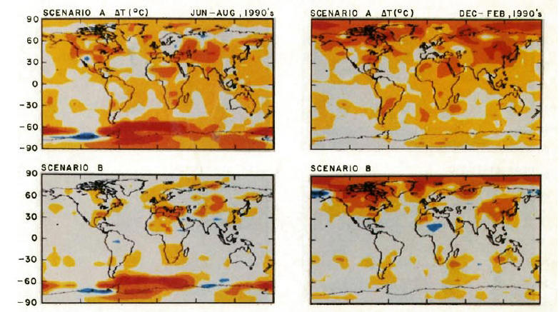

For comparison, here is an IPCC AR4 figure showing 1979-2005 tropospheric trends. This is an annual basis, while the Hansen figure shows two seasons. So you’ll have to “add up” the colors in the Hansen figure to compare. But, for a qualitatitive impression, it’s easy enough to do. John Christy pointed out yesterday that you need to multiply troposphere trends by 1.2 to match surface trends so keep that in mind – though the discussion here is only of patterns. There’s not much texture in the DJF offshore Antarctica in the 1990s, so most of the texture comes from the JJA period shown in the left bottom Hansen figure above; these changes would be attenuated when an annual average is taken.

I’d like you to look at the pattern of increase and decrease around Antarctica in each figure. In the real world, there is a a cooling area off Antarctica to the south of Africa, a warming area to the southwest of Australia and another cooling area on the bottom right of the graphic reaching up towards New Zealand.
Now compare this to Scenario B in the 1990s. As noted above, most Scenario B texture offshore Antarctica occurs in the SH winter (JJA), where we see almost the reverse pattern to the one predicted in Hansen et al 1988. Off to the bottom right of the Hansen figure (bottom left panel) we see strong warming predicted in the area SW of New Zealand where cooling occurred in the real world; we see cooling predicted in the area to the SW of Australia where warming occurred in the real world and we see strong warming predicted south of Africa, where cooling occurred. At the Antarctic Peninsula, Hansen predicted negligible change in summer (DJF) temperatures. In the area south of the Atlantic just to the east of South America, both model and result were warm.
What struck me here was the “remarkable similarity” in the geometric pattern between the model and the outcome, with lobes southwest of New Zealand, southwest of Australia and south of Africa nicely matching. The only defect from a modeling point of view was that these predictions offshore Antarctica had the wrong sign. So to the extent that Hansen was wondering about his Antarctic sea ice model in 1988, it looks like some wrong choices were made for this particular aspect of his model. It would be an interesting inquiry to track how the GISS sea-ice module was modified in subsequent versions as to the sea-ice module.
I note that there is also a problem in sea-ice formation in the more recent ECHO-G model which I noticed in their data, but haven’t discussed previously.
I am not suggesting that a mis-step in modeling Antarctic sea ice in Hansen et al 1988 (especially where uncertainty was noted at the time) invalidates other aspects of his predictions. However as to Hansen’s predictions for offshore Antarctica, I would certainly not regard them as “eerily” prescient and indicate the need for a little caution in other parts of the package to understand better what aspects have stood the test of time and what haven’t.
One of the retorts to observing any inaccuracy in a model always seems to be – well, the error doesn’t “matter”, we get the same answer anyway. My instinct from mathematics is then: well, if you get the same answer for doubled CO2 both ways, surely there is some sort of relevant simplification that would assist in laying bare the mechanics of the GCM in question. My instinct in all of this is that the GCMs are an interesting intellectual exercise, but a needless complication of the relevant physics for developing policy on doubled CO2. I’m not asserting this ex cathedra; it’s merely my instinct at this time.


60 Comments
If I may, Steve, I think the reason for making models which create certain regional patterns is so that they can get an idea of the effects regionally, so they can go to the newspapers with “our models predict 1, 2, 3.” For instance, greater warming at the poles, which would imply rapid ice melt. Now, I know that the main contribution to sea level rise is thermal expansion but the media doesn’t. So when you say “The ice will melt more rapidly” becuase of stronger polar trends, people listen. Or, say they predict intense warming in the American Southwest, and thus more Dust Bowl era style droughts, or the shutdown of the THC, cause a big chill in Europe.
Getting to Antarctica, it is hard to see what scare story they’d make of this. It looks to me (just eyeballing here) that the trends in Western Antarctica for Scenario A would add up to cool, but Scenario B might be about right there. On the other hand, they definitely don’t have Eastern Antarctica correct. My sense is that any similarities are coincidental. It is unlikely that the models will produce some trends that match for the right reason if the rest don’t. So the reason for similarities can’t, in my opinion, be that the got the way it works just there correct.
Steve: I do not believe that this sort of attempt to assign motive has any value or relevance to this discussion. The model produced what it produced. There are valid reasons for producing regional models unrelated to newspapers and I have no doubt that these valid motives motivated the original research.
Take a 100 black and a 100 white marbles, mix them thoughly and dump them in a jar. You would likely find numerous ‘clumps’ of white and black marbles that give the illusion of a pattern.
I am not convinced that any apparent match between the spatial response of the observed vs. the actual is anything than a random outcome from a model that is numerically biased towards producing ‘clumps’.
You’re right, I see the pattern you’re describing and it seems to be a very strong negative correlation between prediction and observation. Of course, when looking at an entire globe it is easy to find patches that fit or do not fit a preconceived pattern. But the mismatch you are describing here applies to the entire Antarctic region. It seems quite robust.
It is interesting when you consider that the GCMs also fail to account for the degree of Arctic warming in the 1930s-40s – a fact that Hansen mentions in one of his papers, and which RCmike attributes to “internal climate variability”. One wonders about the accuracy of polar ocean convection in these GCMs.
Any volunteers to digitize these maps and compute the spatial correlation in the Antarctic region? That would help address some of Raven’s skepticism.
Typo: The first 1998 should probably be 1988.
Steve: Fixed
#1
What Steve says in a reply is quite true. I would like to add that when you try to ‘politic’ the issue, it detracts from the very arguments you make. (Some that I find quite interesting.)
My take is that neither side of this ‘knows’ anything at this time with enough empirical confidence to be making any claims one way or the other that should be effecting policy.
What differentiates CA from RC is this very issue of tone, and an apolitical attitude is where science begins.
“a difference hypothesized to arise from differing ocean heat transport assumptions.”
I’m curious as to what sorts of assumptions we are talking about here. That is, what sort of assumptions do they make, or could they make, which would result in what kind of warming patterns?
Also, I wish to apologize for trying to attribute a motive to these things. I’m sure that they have valid reasons for producing regional models. And I didn’t say that it isn’t valid to be scientifically curious about regional effects of global warming, so I’m understood.
Raven, I completely agree that comparing a few clusters in model trend output to actual clusterings is pointless, with the caveat that if they all match well and can be shown to do so for the right reasons, then the comparison is justified. I’m curious to know whether the reason why the models produce their specific output is the same reason why they match some regional trends, or if the matches are coincidental.
The visual impression I get is that Hansen’s model missed the Atlantic AMO/thermohaline changes in the 1990s. These changes brought warm surface water northward towards the Arctic, to downwell, while upwelling cool water in the Antarctic circumpolar region.
(My conjecture, FWIW, is that such a switch, while it may seem temperature-neutral, may produce an appearance of global surface warming, mainly due to the larger land area of the NH.)
#20 that’s very perceptive
Besides you might just get out of Steve’s Hair. Great site Steve – has the potential to get some really good stuff going and if people know about it keep your discussions a little more “clean”.
This is another important thread that is starting to go awry. The anti-modeling sentiment now outweighs the Antarctica content. Maybe excise the bolus before it gains critical mass?
Focus, people. Do you agree with Steve’s observation or not? This is the key observation:
Don’t bother commenting unless you first say ‘agree’ or ‘disagree’ to this observation. The tally so far is:
Raven: skeptical
David Smith: agree
bender: agree
David Smith has also suggested a potential explanation: Atlantic THC change in mid 1990s, not predicted by GCMs. Agree? Disagree? Supporting literature?
bender says:
If you look carefully you will see the observation only holds true for the southern pacific ocean. In the southern atlantic the model predicted a solid band of warming yet the actual results show warming on the west and cooling on the east. The ‘inverse’ pattern only holds true if you shift the cooling patch south of africa west into the atlantic.
Look at it another way. Models and reality tend to produce clumps in the spatial graphs that are associated with landmasses. The antarctic has three land masses close to it so one would expect to see no more than 3 clumps in any spatial plot. The model and reality produced 2 clumps yet only 1 of the clumps really overlaps. That is why I believe that there is high probability that any sem-realistic model would produce a similar pattern match.
For me the bigger issue is the error in the sign. Than demonstrates that there are fundemental problems with the model.
#33
GISS data shows virtually no substantial warming anywhere south of 24 deg N.
Hansen’s models predicted more warming than there actually was, and his model was the most wrong in the area with the noisiest historical data and the area that had the least warming.
No pun intended, but I don’t think it’s any deeper than that. I don’t know what category that puts me in.
The question that I find most interesting at this point is exactly why Waldo seems so fond of Siberia and the arctic circle.
The issue here is whether a model that produces invalid predictions at the regional level as Hansen98 clearly does can tell us anything of value about global climate (specifically surface temperature). The IPCC claims such models can and do produce valid global predictions without valid regional predictions. I am now coming around to the view that in climate such models are not possible, primarily because climate processes aren’t (mostly) uniform across the planet.
A model that produces invalid regional predictions will produce invalid global predictions (whatever that means), at least over decadal timescales. Over longer timescales the argument that there are global effects indepedent of regional effects is probably stronger, and a model that is wrong at the regional level over decades may produce valid predictions at century timescales. (But this is an untestable claim as a practical matter)
Bender, The color grid charts never register with me. It’s weird. I would rather see the numbers
and not the colors.
The other thing is I think it would usefull to do an “error” grid of sorts.
Basically a difference of model versus Obs on a grid level… versus time.. which is
a nasty plot you cant draw.
#16 If you get the obs and pred on a common grid then I will show you how I would portray model discrepancies in a single graph.
These maps illustrate one of the fundamental problems with evaluating GCM model outputs (and there are also vertical layers, and time, and seasonal maps one could draw). The problem is that anyone can look at them and see whatever they want in terms of model vs reality–good, bad, confusing. It does not boil down to a t-test or R-square or %mortality (like in medicine) but is rather multi-multi-dimensional (not a typo). How do you properly test such predictions?
Thus I am thrilled that Steve has tackled this issue.
#15 You scared me! I thought that was Phil saying that!
The issue is what is causing the Antarctic misfit, if indeed there is one. It is possible that it something simple, easily remedied, and that the reparation has little impact on predictions at global secular scales. It is also possible that it is something deep and irreparable. That you fix the poles and the tropics go askew.
Model failure to predict weather noise at intermediate space and time scales does not necessarily imply they are invalid for predicting GHG response at global secular scales. But I’m not going to get into it here. If you want to argue that GCMs are invalid, take it elsewhere. There’s been a major cleanup here already becasue of that diversion.
#12 The SOI teleconnections around Antarctica are all very weak. I realize you are pointing at NZ, but that is one small part of large region.
#13 I got what you meant about clumping the first time around, Raven. I agree. The more spatially autocorrelated the two variables being cross-correlated, the lower the correlation significance. Digitize the data and I’ll do the stats, which will answer #18’s question. I think the (-) correlation will stand up as significant despite the clumping. And I have an eye for such things. (Remember my prediction that including SA in the regression model would not alter McKitrick’s result one little bit. I was right. And the RC peanut gallery was wrong.)
I’m not so sure that’s true. There’s more warming observed than predicted in the Arctic now, and also in the 1930s-40s. And I think the data are sparse up there too.
That’s not a diagnosis, it’s a dismissal. If the model is not working, it’s not because it’s dead; it’s because it’s sick. What’s the malady?
RE 18. You look at the detailed model. You see that at the level of reprsentation ( the grid)
that it doesnt match anything. SO, You average to the contentential scale, then the global scale… So you spatially
average stuff until the answer gets closer. Then if your “forecasts” are off in the short term, you
look at long term trends… Temporal averaging…
And so you have two smears: a spatial smear and a temporal smear. Fundamentaly you have all this
wonderfully detailed physics integrated at 5 minute increments, turned into two pieces of MUSH:
+2C over the next 100 years.
Two knobs.
“Two knobs” sounds like a dead rapper.
#22 Smearing in space and time is done because this is presumably the appropriate scale for estimating external forcing effects from well-mixed gases. I don’t think they do it to hide low predictive power at regional and sub-secular scales. As I said earlier in #19, low predictive power at regional and sub-secular scales, where internal variability dominates, does not necessarily imply low predictive power at global secular scales, where external forcings may dominate.
Don’t dismiss the GCMs. Audit them.
re 20 Not as simple as it seems.
#25 nothing is as simple as it seems. care to expound?
Turner et al 2005
There are “problems” here with the Giss dataset ie No QC or audit trails(station id etc).which are identified in the above paper.
Now what is interesting is
i)Secular trends in Ozone levels to the tropopause height in this region.
ii)Secular trends in the solar cycle with the ozonosphere(excluding CME forced catastrophic degradation)
iii)Quasi- stationary ozone waves due to displacement.
I wonder if Steve McI suspects some sign error in the algorithmes by Hansen?
Wrong sign could also be due to wrong interpretion of some physical processes.
Steve: I don’t have any views or guesses at the moment. At this time, I don’t know how the models work.
Re 11 Bender
Agree, disagree or sceptical? There is another. Insufficient data.
Correct me if I’m wrong, but working with gridded data and 5 degree cells, as one approaches the pole the cell size gets smaller (geometry) and the sampling density become sparse (few inhabitants). Thus, the grain or texture of the graphics changes substantially from that in populated areas near the Equator.
As I’ve noted before, errors from spherical geometry become trickier.
Steve was emphasising the differences in sign of a half dozen main blobs or regions whose main mathematicsl input might be interpolation. We really do have to move away from pictures and models, back to absolute data, as I for one am starting to get confused between reality and artefact. That’s my 2 bob’s worth.
To which I’d add it was a bit silly to try to do a GCM extension to this region in any case. Most of the result is guesswork, which is shame because the area has critical importance in global understanding. It’s just undermanned and undersampled and has no reference area to check it against.
Re: JJA vs DJF:
Post says:
Three points:
1) Upon closer inspection, as Raven notes, the anomaly centres don’t coincide perfectly so there are some sizeable areas where the patterns correlate, others where they negatively correlate. e.g.1. Immediately South of S. Amer the anomaly is positive in both model and obs. e.g.2. Between S. Africa and S. Australia the anomaly is neutral in both model and obs. That’s going to bring the spatial correlation up quite a bit from negative.
2) I think it is pretty dangerous to compare the summer JJA model to the full year observed, especially given (1). There are many areas around the globe where summer and winter predicted responses are opposite. The summer and winter observed around Antarctica could potentially be very different.
I’d feel alot better about this comparison if (1) seasons were compared straight up, (2) a spatial correlation was computed. As it stands it’s hard to say if there’s anything here *really* noteworthy.
Of course, even a zero correlation is a non-trivial result! It’s just that a negative correlation would be a *really* interesting result.
3) Over-riding all this. Why have the modelers not done this analysis already themselves? (Or maybe they have…)
Steve: #3. I suspect that there’s some consideration of this sort of thing in subsequent models; I’m not familiar with the literature. However, if (say) the next GISS version changed the module, one would hope that the next publication clearly stated the module change and the reason for changing the module. We probably have prejudices on how candid or non-candid they were in discussing such shortcomings, but we’ll see.
#29 Geoff Sherrington said: “Correct me if I’m wrong, but working with gridded data and 5 degree cells, as one approaches the pole the cell size gets smaller (geometry) and the sampling density become sparse (few inhabitants). Thus, the grain or texture of the graphics changes substantially from that in populated areas near the Equator.”
Agreed. Using a rectangular grid, you’d expect numerical modelling artefacts around the poles anyway. How big they would be in a model with many, many interrelated parameters is very difficult to say.
If you re-run the model on (say) an equi-area triangular grid, and the behaviour around the poles comes out completely different, then you know your existing model has problems.
Bender protocol: agree.
Craig in #18:
Some fields would turn to Cosine similarity at this point, (and see also http://en.wikipedia.org/wiki/Vector_space_model), but it may be this approach is difficult to extend to time series.
Isn’t the issue here a problem with the theoritical approach.
It’s not that the model churns through its iterations and produces increasing temps at the high latitudes. Its that the first principles built into the models, the basic theories on global warming, predict there will be more warming at the poles.
The models just report the parametres which they are built upon. In this case, the theory is not working.
#21
I didn’t say “sparse”, I said noisy. The data south of 64S is much noisier than the data north of 64N. And my observation that the goodness of fit is going to be different as you slice and dice it(latitude, season, max temp, min temp take your pick) still stands.
In some sense, yes it is a dismissal. Unlike some others, I consider scenario B a dismal failure as a projected warming scenario. It looks to me like Hansen had not only the forcings wrong, but the sensitivities as well.
Did he fail to appropriatly account for ENSO or other ocean cycles? Probably.
Is that the only reason the model fits poorly? I seriously doubt it.
A few points
1. I don’t think it’s very productive to spend much time wondering what went wrong with a 20 year old model. Obviously modelers have not sat idle since 1988 and more recent models may already have corrected for whatever shortcomings there were in the 1988 model about Antarctica. Literature review, someone?
2. Steve asks an interesting philosophical question about models. Is a GCM more useful than a simple 1-D or 2-D model to estimate the forcing? I disagree with his conclusion about the simpler models. Sure, you can maybe estimate the forcing, in W/m2, from a simple model. But the problem is that it’s usually a forcing under very idealized conditions, say clear sky, or with some assumed level of cloudiness. And the forcing does not necessarily tell you how many degrees of warming you’re goint to get. That’s yet another step. In the actual world, and the modelers are the first to recognize this, the main problem is the clouds, and the net feedback effect. Most of the uncertainty in estimating the number of degrees of warming does not come from the estimation of clear sky forcing, but from the feedback, and the effect of clouds. You may get so many W/m2 of forcing, but that might as well be amplified, or counterbalanced by a positive or a negative feedback that we don’t know about. So the route to understanding that climate scientists have taken is via the GCM’s.
3. Given that we need GCM’s, there remains the question of how, when, and why we should trust them. One problem is the large number of parameters, many of which are close to pure guesses. Getting the right answer for postdictions with a given set of parameter values is clearly not enough. One should define a “parameter space” that gives the correct answer, and attempt at reducing that space as much as possible. Then look at the “prediction space” resulting from that parameter space. If the prediction space is too large, obviously the model is useless.
4. In the end, criteria are needed to assess the models, not just audits. There is a trend in the literature to compare models between each other, as if agreement between models implied validity. I think modelers and climatologists know that they’re fooling themselves by doing that, but they have precious few other tools, because it’s very difficult to compare models with observations. Yet in the end, that’s the only way to go. I would love to hear what honest modelers and climatologists (they do exist) have to say about that.
Bender, I would love to have an answer about what went wrong with Antarctica. Yet I don’t think that posters on this blog, however knowledgeable they are, can do a better job than modelers or professional climatologists. Whatever some of the posters here may think, there is some value in spending 5+ years doing a Ph.D. and spending most of your working hours pondering these problems. That’s not the problem with climate science. The problem is the insidious bias that has seized the community, and distorted the scientific process. That’s why audits and this blog are useful. Not to reinvent the science.
Always enjoy your comments, FO.
I understand the point but disagree, mildly. It would be terrific to validate the new models. When will you have the data to do that? About 20 years from now! Climate science is not like other fields where validation can be done through experimentation or spatial replication. One planet. You must sit and wait for data to accrue. You make reference to the “20 year old model”, but it is in some sense a broader validation, or evaluation, of a long-standing research program, or paradigm.
Besides, what if it is the emissions input scenarios that are out of whack, not the response sensitivities? That would give me a lot more confidence in today’s GCMs than if the opposite were true. I find it hard to believe that no one has proposed or conducted this kind of analysis. Whether this is auditing, reinventing science, or innovating science depends on what has already been done. Hard to say without full disclosure of past program activities.
Bender,
Thanks for the comments. You ask when will we have the data to validate today’s models. But we have much more data now about the past 20-30 years than we had 20-30 years ago about the former 20-30 years. One maybe good thing about all the global warming scare is that there has been a large, and ongoing, effort to collect more data. Satellites are a good example, but there have been countless projects to improve our data sources. So we are in a much better position now to assess models than we were in 1988. Of course, post-diction does not guarantee pre-diction. As I said, we have to minimize the parameter space. I think that assessment of models based on objective criteria is still in its infancy. Modelers seem to make it up as they go along, but there is a difference between being able to program something, and being able to assess the validity of an entire model. It’s another science altogether. I don’t know to what degree other professional experts are involved in that.
Apparently, one of the main problems facing the climate science community is the separation between the modelers and the “field” climate scientists, between those who take the data and those who should use them in the models. It’s just not the same people, not the same groups, and to a certain extent, they have different languages and different cultures. It’s a common phenomenon in science. In this case, modelers have succeeded in establishing themselves as the “obligatory point of passage”, to quote Latourian language. That means that all climate scientists must validate their claims through models, and modelers have the last word on the “truth”. RealClimate is a good example of that. For those interested, that is described in a recent paper, “Parameterizations as Boundary Objects on the Climate Arena”, by Mikaela Sundberg, in Social Studies of Science, Vol. 37, No. 3, 473-488 (2007). Here is the abstract:
#37 Thoughtful commentary. Would you agree: modelers should be service providers, not the gatekeepers/arbiters of truth?
#38 Bender, who am I to decide who should do what? Science is as social an activity as politics or commerce, and it follows its own dynamics given the context and the personalities involved. James Hansen has had a strong influence, and maybe things would have worked out differently if he had not been there, or Al Gore, or Michael Mann… Furthermore, you probably know as well as I do how difficult it is to do interdisciplinary science, even within the same field. There exists a tension in climate science between modelers and empiricists, as there exists one in physics between theoreticians (à la Lubos…) and experimentalists. I was mostly an experimentalist, and it was hard enough to interest the theoreticians to your data. But when I did theory, it was just as hard to find people to do the experiment for me!
Could it be that the sign of the GCM anomaly isn’t inverted but the data is shifted longitudinally (i.e., shift the cold spot just west of S America to just west of Africa)? Mis matches like this are the sorts of things that programmers should be looking at to make sure that the code is correct. If it isn’t a coding problem there may be a physical reason why the model doesn’t line up with measurements (i.e. somebody might learn something). Not sure it will happen since they’ve invested too much of their reputations in their pronouncements based on the present and past versions of their models.
@40 BW
These patterns are emergent properties of a large set of coupled equations. There wouldn’t be any direct mapping from code to output.
Just wish people would not ignore cloud forcing as providing by far the best understanding. We always seem to have this assumption that clouds just respond passively to climate changes. When we see obvious changes in the solar plasma field then the cosmic-ray flux must change and low level cloud formation becomes an active, forcing factor.
Steve ,living in Australia ensures one can be up to date on Antarctica, sea Temps are rising rapidly,(if not the air),and melting the sea Shelfs of very thick and ancient ice,From BELOW ,this confirms the predictions about water currents carrying heat down from the north,this can only accelerate,Tours sincerely c.Stewart(B,Ag.Sci.)
43, Cam.
Can you point us to a relevant up-to-date dataset? All the SST data I’ve been able to find seem to show T’s decreasing over the last 5-7 years, and Cryosphere Today shows a positive (though not statistically significant) trend in SH sea ice extent since 1979.
Re # 43 Cam
I’m Aussie too, but if I wanted to get your message across I’d do this.
I’d calculate the sea temperature required to melt ice from below.
I’d look up data to see if such sea temps have been measured.
I’d calculate the energy input needed to raise sea temperatures enough to melt ice at various latitudes and discern if that energy be extracted from greenhouse mechanisms.
An energy calculation is more valuable than an anecdote.
Hansen in Antarctica
Tempting, very tempting.
If “climate change” as understood in a negative context by the IPCC is driven mostly by GHG increase, then Hansen’s model certainly should have been confirmed by reality. If “climate change” is in fact a combination of effects from GHGs and innate oscillatory mechanisms in the ocean-atmosphere-etc system, then all bets are off. For example, it could be that in the early days of thinking they were seeing a hockey stick, climate scientists used this “result” to help build their models. When in fact, the rise they thought was a hockey stick was actually a combination of a long term oscillation and poor paleo interpretations. When the osciallation flipped during the 90s, naturally, an opposite sign term would have kicked in.
Does anyone want to place bets on Jan 2008 being the coldest month in X(place bets) years?
If the last 3 months of 2007’s monthly anomalies are any indication
+.55
+.46
+.39
we might expect it to be around +.32
The lowest it’s been in the last 30 years is 1982 when it was .01 (At least according to GHCN 112/2007 + SST: 1880-11/1981 HadISST1 12/1981-12/2007 Reynolds v2880-using elimination of outliers and homogeneity adjustment) The last time it was in the 30s was .38 in 2001 and the last time it was appreciably lower than that was 2000 at .17, although it’s been in the 20s a number of times in the 90
Answer to Bender’s question – kind of agree, though I don’t think it (the anticorrelation) is important. First no models give good regional decadal predictions everywhere so I wouldn’t expect it to match. Second, even if they were capable, none of them have adequate starting conditions. Third, if you watch climate model animations you see blobs of red and blue appear and disappear and move – they have their own modes of climate variability which are not going to match the real ones – even a 10 year snapshot is likely to be different.
Comment about construction of models. They are usually compared against GHG neutral datasets – ie. the scientist is looking for appropriate climate at various levels of detail, appropriate modes of climate variability, etc. They don’t run the models with any particular GHG concentration, though they do aim to get it into balance. When they are happy with the model, they do the scenario runs.
Now if there were a model with a decent climatology that produced global warming followed by global cooling without significant external forcings, that would be interesting.
Steve Milesworthy says:
This claim sets off a whole pile of alarm bells. Are you saying that the models are calibrated using a temperature record that has be manipulated to remove the GHG effect? This would require some big assumptions about the size of the GHG effect and would virtually ensure that the models provide no useful insight on the effect of GHGs (other than reproducing the assumptions that were used when the data was created).
Can you provide more background/links on your statement?
#51 Raven
It’s a good question and I need to check exactly what done. When I say GHG neutral, I mean without changing GHG forcings (the assumption being that over the period when the climatology was determined, the change in GHG impact is relatively small).
The (radiative) effect of GHGs has a physically tested basis, so it’s not an assumption. What the models are trying to establish is the impact of increasing the GHGs as compared with initial values.
Steve Milesworthy says:
The basic response of GHGs is well known. The net effects of water feedbacks are not. Any adjustment to a dataset to remove the effects of GHGs would likely attempt to remove the effects of the water feedbacks as well.
I realize I may be reading too much into the term ‘GHG neutral dataset’ but I would like to find out what it really means.
Bump.
For John V, since he did not chime in in this thread.
Or then again, you could always check the Emission Database for Global Atmospheric Research
John V, here’s a good place to talk about model-data comparisons in the Antarctic.
Here is another picture in contrasts from the Antarctica.
http://news.mongabay.com/2007/0215-antarctica.html
Image and caption text courtesy of Josefino Comiso of NASA-GSFC..
#57 Look at the warming around the peninsula. Does that match the model predicitons cited by John V?
#58 bender:
I mentioned *average* Antarctic model trends, once, five days ago.
I said they showed less warming in the SH and Antarctic than the Northern hemisphere.
That’s all I said.
Let it go.
The spam post above is equally awesome. Talk about unintentional comedy. Please, moderators, leave it in place!