Hansen et al 1988 reported that they expected extra warming in the SE United States, a theme that was mentioned in his testimony in Washington in summer 1987. Hansen et al 1988 stated:
there is a tendency in the model for greater than average warming in the southeastern and central U.S. and relatively cooler or less than average warming in the western U.S. and much of Europe in the late 1980s and in the 1990s. …
We also notice a tendency for certain patterns in the warming, for example, greater than average warming in the eastern United States and less warming in the western United States. Examination of the changes in sea level pressure and atmospheric winds suggests that this pattern in the model may be related to the ocean’s response time; the Atlantic off the Eastern U.S. and in the Pacific off California tends to increase sea level pressure in those ocean regions and this in turn tends to cause more southerly winds in the eastern U.S. and more northerly winds in the western U.S. …
Monthly temperature anomalies can be readily noticed by the average person or ‘man in the street’. A calibration of the magnitude of mode predicted warming can be obtained by comparison of Plate 6 with maps of observations for recent years as published by Hansen et al 1987 using the same color scale as employed here. This comparison shows that the warm events predicted to occur by the 2010s and 2020s are much more severe than those of recent experience such as the July 1986 heat wave in the southern U.S., judging by the area and magnitude of the hot regions.
Here is a an excerpt from Hansen et al Plate 2 illustrating the model output which supported this observation. Scenario B is the one that corresponds more closely to actual forcing. I’ve shown Scenario as well, on the basis that Scenario B is only shown here for the 1990s and arguably Scenario A in the 1990s yields insight into Scenario B in the 2000s. The salient point of the diagram here is the structure of the “dipole” clearly visible in A in which there is cooling in the western US and warming in the eastern US. In Scenario B, the dipole is less evident, but is perhaps directionally there as well.

There are many interesting aspects to this. Remember Michael Mann’s claim in regard to bristlecone pines – that the southwestern U.S. is a “sweet spot” for measuring climate change. In Hansen’s model, the southwest U.S. has very anomalous behavior. For some reason, in Scenario A in the 1990s, it is one of only a couple of regions in the entire world where Hansen’s model predicted cooling. Seems like an odd sort of “sweet spot” for measuring global temperature.
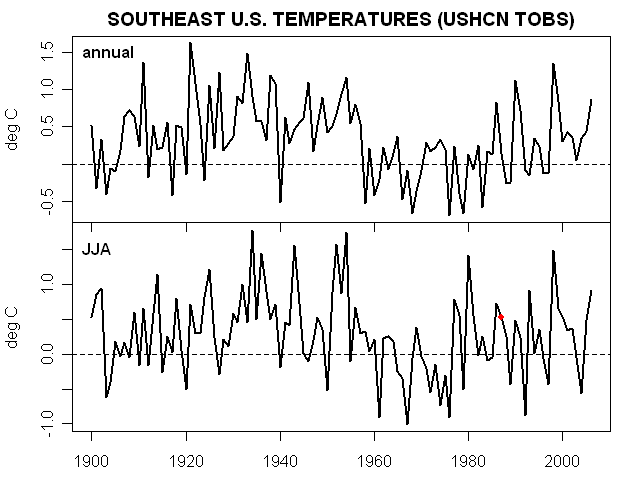
Now here are several plots showing observed trends. First here is a plot that I did earlier based on USHCN TOBS data (annual here rather than summer – I’ll try to do summer as well some time, but this is what I have on hand). Again one sees sort of a “dipole” structure between the eastern and western US that resembles the dipole structure in the Hansen et al 1988 model with one small problem – the sign of the change is reversed.

For someone that’s worried about whether my calculations of 20th century trends are accurate, here is a figure from AR4 also showing a cooling trend in the southeast and a warming trend in the west.

Actually AR4 even has a map that supports the point for JJA temperatures from 1979-2005, as shown in the graphic below:

I also did a quick calculation making an annual and JJA average for all USHCN stations (TOBS) that were located east of 100W and south of 37N as a rough approximation to the southeast. Here’s the result that I got. Based on this calculation, the number of warm summers in the period 1987-2007 is greater than the period 1951-80 (“climatology” in Hansen et al 1988) but not greater than the period 1920-1940 for example.
Average calculated for USHCN stations east of 100W; south of 37N ; red is 1987
Again I’m not saying that any of these details disprove GHG forcing. However Hansen specifically discussed the southeast US both in his article and emphasized it in his testimony and the actual results should be at least canvassed briefly before saying that Hansen is the new Nostradamus.
It’s also interesting to contrast the presentation of this topic in Hansen et al 1988 with Hansen’s 1988 testimony here. The description of warming in the eastern U.S. in the testimony tracked the corresponding text in the original article quite closely as you can see in the excerpt below:
in the late 1980s and in the 1990s, we notice a clear tendency in the model for greater than average warming in the southeast U.S. and the midwest….In our model this result seems to arise because the Atlantic Ocean off the coast of the U.S. warms more slowly than the land. This leads to high pressure along the east coast and circulation of warm air north into the midwest or the southeast. There is only a tendency for this phenomenon. It is certainly not going to happen every year and climate models are certainly an imperfect tool at this time. However we conclude that the greenhouse effect increases the likelihood of heat wave drought situations in the southeast and midwest U.S. even though we cannot blame a specific drought on the greenhouse effect.
But there is one noticeable difference between his 1988 testimony about what the model predicted for the United States and what was mentioned in the corresponding text in Hansen et al 1988. See if you can find it.


158 Comments
In several years of lurking & perusing various climage blogs & websites, it seems that Hansens’s predictions have been off more often than not. OTOH, his boosters often claim that his predictions have been, well, prophetic. I wonder: Has anyone actually tracked his predictions (or other GCMs, for that matter)? It would be interesting to see an actual score card.
Steve: I’m not sure I get your meaning when you say “Nostrodamus.” It seems that you are using it synonomously with “prophet”, ie: accurate predictions, when the usual meaning is: predictions that are so vaguely worded as to be neither verifiable or falsefiable (thus the related term, “nostrum,” a vague saying or prophecy). Could you please clarify?
Almost forgot: I can testify to 15 or so years of mild winters here in Colorado. The ski industry has suffered and spent millions on snow-making equipment, where formerly, one of Colorado’s proudest claims was the most reliable snow fall in the lower 48. The last two winters have seen a return to “normal”. Newcomers b**ch and complain, but I exult – I love winter; even in a walking cast.
re: noticeable difference
1987 testimony seems to be referring to Scenario A, Hansen et al 1988 better fits Scenario B?
Hansen etal states that the winds will be southerly in the east. Testamony says northerly winds in southeast and mid west which would have brought more moisture out of gulf.
Steve: Something else.
SE USA
Yes, I noticed that little blue spot in the “sweet spot” of the SW US the first time around in the last post. Curious.
or ‘eerily prescient’
Steve: Hansen’s supporters, even Gavin, seem to be less nuanced than Hansen himself was in his writings of 10-20 years ago.
Phil: See ENSO
Re #9
Why?
I mentioned previously that Hansen et al 1998 was a fair-minded review; it noted that the “business-as-usual” scenarios of the 1980s used in many projections and by IPCC were too high. I plan to comment on it, but it’s worth reading. Hansen’s academic writings have much of interest. I’m not pointing out these pattern defects to say that everything is “wrong”; only that not everything is “right”. Whether the aspects that are not right “matter” is a different question that I’m not in a position to comment on right now.
Phil: NOAA CPC says less rain in SE when ENSO neg.
“However we conclude that the greenhouse effect increases the likelihood of heat wave drought situations in the southeast and midwest U.S.” Sounds ‘eerily prescient’ to me …
Steve: Only if you adduce evidence that there was an actual increase in observed data. You’re welcome to do so. The temperature observations do not show enhanced warming in the southeast.
#7 Refers only to the sidepoint paragraph about the SW US.
In terms of the big picture, I have noticed that too – that the SE is cooling and the SW is warming – and I did not realize just how strongly that opposes the 1988 predictions. It is quite remarkable isn’t it?
There are a number of papers coming out, it seems, on surface hydrology – some of them by my old friend Alan Robock. And one has to wonder if the warming of the SW is not associated with a simultaneous drying that is not predicted in the 1988 scenarios. (jae, this is your cue. 🙂 )
ENSO and PDO are much stronger regional forcings than GHGs are a global forcing, so maybe the ill fit of the Hansen model is just this. You can’t expect to get the regional details right unless you’re getting ENSO right.
That’s going to be a problem in any attempt to validate these models. You need to disaggregate the various effects or you risk throwing the baby out with the bathwater.
Prediction: By the time I post this comment there will be 4 +/- 2 cross-posted comments saying ‘this proves the GCMs are junk’. It doesn’t. I think the correct interpretation is that ‘internal weather noise’ is pretty powerful stuff at subcontinental sub-secular scales. We need to be careful analysing these outputs.
#12 Exactly my point.
#13 Ok, so my prediction was wrong. The GCM haters haven’t found this thread yet. (Don’t you love post-hoc revisionism?) I think #10 has a properly balanced perspective. These mismatches are very interesting. What they mean is a good question.
Nobody’s picked up the difference between the testimony and article yet. It’s funny how hard it is to notice things like this sometimes and how obvious they are when pointed out. I only noticed the difference that I have in mind because I was typing up excerpts from photo-pdfs and was using the article typing for a headstart on the testimony typing and there was some extra text not used in the testimony – and it was interesting what was extra.
#16 I noticed it, but didn’t give it much thought.
#16, #17: OK, I give up. What’s the difference you’re referring to?
Re #16 Steve M, pls. extend your “contest” by an hour so latecomers like me can take a stab. I’ve been repairing cars today and just stepped inside.
One thing Hansen forecasts in his testimony is an increase in “hot summers” in Washington. That should be checkable.
#18 Actually, I spoke too soon.
Re-scanning the documents, the only possible difference I see so far is in how far along the warming trajectory Hansen thought we were. In the paper he says:
and in the testimony he says:
But I’m not sure that’s what Steve is pointing at. They’re not exactly contradictory statements.
bender says:
A hammer is a very useful tool if you have a nail to drive. It is a useless peice of junk if you have a screw.
GCMs clearly have some of the basic physics right because the produce spatial plots which look realistic even if the correlation is not perfect.
However, getting the spatial distribution basically right is not good enough. What we need to know is the magnitude of changes because it is the magnitudes that drive the policy changes – not the spatial distribution.
RE 16. It was the the first thing that struck me. However, onece the regional prediction
fails, they resort to the golbal.
Bender and I have been mulling this over. My sense is this. They simulate at the grid, they
should validate at the grid. Mushing spatial and temporal measures POST HOC, is not good
practice.
I “know” what they do. They simulate at the grid. They compare at the grid. If things dont look
right, then Compare at greater spatial scales and temporal scales.
They take multiple bites at the apple. But dont account for this in hypothesis testing
Cue Bender:
Testimonty:
He then goes on to draw the firm conclusion that this is the case. But in the 1988 paper he said:
and this does seem contradictory. Causal association could not be concluded in the paper, yet was concluded in the testimony.
In 1998 had warming exceeded natural variability or hadn’t it?
(The paper and the testimony might have been written at different times , so you wnat to be sure to adjust for the data that came in the intervening months.)
It looks like the testimony was tweaked just the tiniest bit to push it over that edge.
The paper was playing on ’10’. But the testimony went to ’11’.
Is it possible, Steve M, to change the ‘1998’ in #23 to ‘1988’
That is a dangerously common typo. Because there’s lots to say about 1998 too.
While the ENSO pattern is certainly a contributing factor to less wintertime rainfall, another effect is to the absence of summer time rainfall. This, ironically, is the result of the absence of land-fall by summertime tropical storms, an important source of precipitation for what would otherwise be a dry season in the South.
I should mention that “dry” down here is relative. Normal rainfall for the South is between 36″-60″ rainfall annually. Most areas that are in “drought” have had at least 30″ of rain in the last year (compare Seattle norm of 36″ of rain) and just a few heavy wintertime rainfalls from returning to normal levels. Even “drought stricken” Atlanta had 32″ of rain last year.
I should also mention that water shortages aren’t simply associated with a lack of rainfall. Changing demographic patterns and associated water usage changes have more to do with the shortfalls than rainfall.
If I am not mistaken the model actually predicts a cooling in the SE of the USA but the testimony refers to a warming.
Steve: Nope. We’re talking differences between the article and the testimony – the model predicts warming.
The testimony drops the reference to the model showing “less warming in the western United States” and the model’s explanation for that.
Steve: Bingo. The article actually mentions “relatively cooler or less than average warming in the western U.S. and much of Europe in the late 1980s and in the 1990s” – note the mention of Europe as well. I guess that time constraints didn’t allow him to mention this. 🙂
#27
But the plot above shows a red blotch for both scenarios A & B.
#28 That is true, but that is a textual difference, not a substantive difference. Obviously the two documents must be different because one is 10 times longer than the other. If you were to add that statement into the testimony it wouldn’t change anything, would it?
OTOH in the testimony he does make case for more frequent hotter summers in Omaha, NB – which he doesn’t do in the paper. So he’s revved up the case for warming a little bit by pulling out the western US and inserting Omaha. Substituting cherries for apples to bake a cherry pie?
let me try … in the testimony, that I only had a quick look at, there’s only mention of more than average warming, and none of less than average warming, or even cooling … this might give a new meaning to the mathematical notion of “average” 🙂 …
and thanks for bringing all this to attention; I read that the model predicts: “less than average warming in the western U.S. and much of Europe in the late 1980s and in the 1990s” … now, since the trend towards the 2010’s goes the same direction (England should be really cold !) and since all I read here in Belgium is that the last few years have been the warmest on record, either the model has some finetuning to do, or, if this is less than average warming, I wouldn’t want to be in the other parts of the world with more than average warming …
the world’s other model makers and future foretellers, those on Wall Street, recently have had some kind of wake up call … the climate model makers will have a same one, but surely and unfortunately after it will have cost me a lot, and in money and in grey hair …
FTR: My #29 & #30 were crossposted with Steve’s replies in #27, #28.
Congrats Peter Hartley.
Aside: It is pretty indisputable that in both these documents (paper, testimony) Hansen is promoting scenario A as a “business as usual” scenario. He doesn’t use that phrase in the paper, for obvious reasons – it’s a colloquialism. But in the paper he states: “scenario A assumes that growth rates of trace gas emissions typical of the 1970s and 1980s will continue indefinitely”.
It seems to me most GCMs predict warming in the SW US…in fact, more warming there than any other region of the lower 48 states.
Of course, Gavin will tell you he doesn’t have a problem if GCMs can’t match reality on “scales less than continental.”
Don’t I get some credit for the above, since the cooling in the western U.S. and Europe is apparent in A but not in B?
@#33
OTOH:
That, to me, sounds more like “business as per the 1980s”.
Which makes Scenario A sound more like “business as per the 1960s”.
According to this interpretaiton, he is choosing his “BAU” scenario to suit his circumstance. Playing it conservative in the literature. Revving it up a bit in testimony.
Steve: Compare this to Myles Allan’s press release on the climateprediction.net results, which caused even RC to disavow their fevered press release. In business, you can’t disclaim responsibility for a press release because of fine print elsewhere.
In his 1998 article, Hansen states that the “business as usual” scenarios of the 1980s and IPCC were over-statements. He was doing so, in part because of the Michaels-type criticisms where Scenario A-type results were being held against observations, with Hansen arguing reasonably enough that the relevant test was Scenario B. In some dialogue on this topic at RC, Chip Knappenburger observed that one of the lessons of this episode was that extreme IPCC scenarios such as A2 should not discounted from assessments. This seemingly plausible observation provoked the following hissy fit from Hansen’s pit bull, Gavin, whose master was apparently still sulking about a newspaper article in 1998 by Knappenburger’s associate, Pat Michaels. (Long memories, these folks.)
23,
Mosher, that’s your cue for a Python vid.
Steve: Excellent! Also, bender’s point (#33) seems right.
If I were working on the Hill, I’d be tempted to prepare questions for Hansen about both of these discrepancies.
Likely he would not defend the 1980’s model results — they are, after all, decades out-of-date — but I don’t see how he could avoid having to explain why we should believe his current predictions when his former predictions were so far off the mark. That might lead to an honest discussion about the true uncertainties — Hansen understands and can discuss this as well as anyone, despite his apparent reluctance to acknowledge the issues — and the limits to prediction in the field of climate science.
If Congress chooses to move forward on addressing AGW, it should do so with its eyes open to the uncertainties and corresponding risks.
#37 I recall that exchange. I thought Chip’s questions were very good, which is what prompted my entry into the debate. My substantive questions there remain unanswered.
@#36 “Myles Allen’s press release” – could you be more specific?
Up in the 20 th Century Trend (USHCN TOBS) map the red squares bother me. Start with Tucson, AZ. I think by now we all know the story of the error prone temperature unit which was installed there, and the resulting record high temperatures it recorded. Which then leads to the question of how many more of the red squares are from the same cause, and thus, due to the area averaging I *think* the HCN uses, how much of the Southwest is incorrectly represented as warming?
Another red square is in the Northeast corner of AZ, where a big new coal burning power plant went in (St. Johns, AZ) in the late 1970s. Cause and effect? Who knows? Representative of average area temperature, well, I guess the HCN thinks so.
39,
He’s already distancing himself with references to the Amdahl V/6 mainframe that he used.
I also noticed no mention of the western United States in the opening statement of Hansen’s 1988 testimony (but, I do not have the entire transcript to know whether Hansen addressed that region upon questioning or entry of written remarks).
The authors in Hansen et al. 1988 write that 1) these regional patterns in warming could be modified by major changes in “ocean heat transports” which affect warming and cooling wind patterns, 2) they assumed in their ocean model that such transports would not change significantly, and 3) the assumptions about ocean heat storage and transport were based on then available knowledge and modeling abilities producing a “first result” against which later results may be compared.
The foregoing leads me to ask whether there has been any significant change over the years in ocean heat storage or transport to warrant the observations in the 20th Century Trend (USHCN TOBS) and the AR4 figures presented by Steve.
#45 It is noteworthy that Arctic warming in the 1930s-40s and today, the 2000s, is mentioned specifically in two Hansen papers as regions where warming is far in excess of anything predicted by the models. This will contribute significantly to the GMT anomaly. I should dig out the papers and identify the exact statements.
#46 I’m referring to ocean heating. That’s the tie to #45.
The US NCDC divides the continential US into nine regions. Three of the regions are shown in the red outline here and constitute the area in which the model predicted increased summer heat waves.
I used the NCDC summer (June-August) average temperature data to select the hottest one-third of summers in each of the three regions, 1900-2007. I then plotted those hottest summers by year. The three regions are combined onto one plot, shown here .
I see no evidence of a long-term upswing in extreme summers in the southeastern third of the US. The 1990s and 2000s are higher than the 1950-1980 period but are not up to the extremes of the 1930s-1950s.
“However we conclude that the greenhouse effect increases the likelihood of heat wave drought situations in the southeast and midwest U.S. even though we cannot blame a specific drought on the greenhouse effect.”
Heat waves would make sense, but given that Antarctica is a Desert, I don’t quite follow how Warm=Droughts. This is an interesting graphic, by the way:

(I know, whole US versus specific regions. Anyone got that? I’m looking)
It seems to me that the problems with regional patterns arise from inability to predict they way oceans will behave. That is, hurricanes and ENSO etc throw off certain statements like these. Still, it is interesting that the pattern of warming is different than that anticipated. Where’s the “precautionary principle” when its really needed?
I don’t know … but I thought that we were experiencing heat and drought in the southeast:
http://www.noaanews.noaa.gov/stories2007/s2917.htm
Steve: Eric, please show a trend analysis, not a summer. Hansen certainly never argued that one summer meant much one way or another.
#50
So you don’t believe the NCDC trend data?
#50
secular trend vs. three year anomaly. apples & oranges.
54:
evidence
#55 What does that mean – “evidence”? You want evidence that Steve M’s graphic above is for the 20th c. trend, and evidence that the current drought in the SE.US is a product of lack of tropical storms in the last 2 two years?
Maybe you didn’t understand what I was saying? The two maps display opposing patterns because they cover different time scales.
You aren’t suggesting that the current drought in the SE.US is a result of global warming, are you?
Moshtradamous:
drought will come to land of bush.
As well as the wet and the wild.
Hot when cold is needed.
Cold when hot is planned.
Where there is ice
There will be none.
And where there is none
Snow will fall.
The wind will blow stronger
But in a way unseen before.
Suprising the unprepared
But not those whose knowledge is deep.
Thus spake moshtradamous.
Re #47 The model forecasted “heat-wave drought situations in the southeast and midwest” which, of course, involves temperature and precipitation. The temperature pattern for the southeastern 1/3 of the US was given in #47. Here is a look at precipitation.
The chart plots the dates of driest 1/3 of all summers in the three NCDC regions. For 1951-1980, the “climatological” period, there were 34 such dry years. For 1989-2007 there have been 16 such years, which would work out to 25 dry years over a 30 year period.
Re#50, #53, you would have to define “cold.”
Winter droughts typically don’t have a direct and observable effect on agriculture (not the “growing season” for most farming products), so that’s probably why it seems like a non-issue to farmers. Also, most agricultural areas in the US see their highest water table during cool/cold months. Even if the precipitation is on the light side, the evaporation rate is, too. Things are less forgiving with the water table and evaporation during the spring and summer. If you don’t get a lot of rainfall during warm seasons, you’re going to see stress rather quickly.
And yeah, there are “cold droughts.” There are droughts which last for years, covering all seasons. You can’t just look at the water cycle for a month or two during a heat wave. A lack of winter precipitation impacts drought conditions for the upcoming spring and summer.
http://www.nc-climate.ncsu.edu/climate/nws.nc.drought.update.20071107.pdf discusses current drought conditions in NC and notes the importance of winter rains in removing their drought conditions. And don’t forget the contribution of the lack of rainfall from tropical storms over the past two years in the southeastern US (which does get mention, at least the 2007 hurricane season).
53: Wind shear … who could say.
The precipitation time series for Atlanta, Georgia is here . One dry year hardly a pattern makes, as Yoda would say.
Interestingly, the warm months (June-November) in Atlanta have become wetter while the cool months (December-May) have become drier. The net of those trends is a slight increase in wetness.
56 — no doubt.
#57 Exactly. Who could say. This is precisely what refutes your #49. The attribution you are trying to make in #49 is untenable.
60: You are reading too much into things.
Here’s one for bender:
Steve M’s writeup includes a plot of Southeastern US Temperature. It includes an interesting apparent major temperature shift circa 1958. I’ve seen this late 50s shift in many of the individual southeastern station records so I don’t think it is a compilation artifact.
I know of no explanation.
This is to satisfy your fondness for two-word review.
It’s my two word review of what you have to offer.
#61:
It’s more likely that you haven’t read enough.
Here are top-10% hottest summers and top-10% driest summers .
Earlier plots covered the top 33%, so these top-10% are the exceptionally hot or dry summers.
Hard to see any increase over the long term.
David, from one of us out here seated in the bleachers, very interesting data; your work and your efforts are appreciated.
My pleasure – the raw data is available from this NCDC site , which has a user-friendly graph feature for standard plots.
That would be “Hardly a pattern one dry year makes”. May the forcing be with you, Sith David.
re 54 (Mosher)
You are now officially a GCM.
Global Climate Moshtradamous
http://www.yodaspeak.co.uk/index.php
In 1988, Hansen wrote consistently about “the global warming”. Not being a native English speaker, I don’t understand why the definitive article was subsequently dropped. Maybe it was necessary to broaden the concept, to move towards (the) climate change.
re: 54 – Fine indeed that collection of nostrums is; proud would Master Nostradamus be, his own to call them. Done well you have, young Jedi.
There is an important typo in #37.
Should read as:
And Knappenberger’s suggestion is perfectly reasonable. If multiple scenarios are being used to generate some expectation, then the scenarios should be weighted according to their plausibility. ‘B’ therefore receiving the highest weight, A and C much less. Gavin dodges the helpful suggestion in a distasteful ad hom and then by using ‘uncertainty’ on the scenarios as a cheap defense (even though Hansen was willing to rank the probabilities as early as 1988!). Amazing how the team can pull together and assign numbers to uncertain probabilities when it suits their purpose, but not when it suits someone else’s.
This proves that the A scenario was exerting undue influence on policy.
The fundamental problem with the IPCC scenarios is that their likelihood is not considered. Scenarios A1FI and A2 are simply not going to happen. For a realistic population growth (with likelihood estimates) see eg Lutz, W., W.Sanderson and S.Scherbov, The end of world population growth. Nature, vol. 412, 543-545 ( 2 August 2001).
Click to access Lutz%20population%20Nature.pdf
Inside, models circle tracks.
Outdoors, thermometers crack.
Choo Choo Choo Choo.
===================
Hansen at al were playing brain dead when entertaining own economic models for future carbon emissions.
There is best-informed world authority, named International Energy Administration, which issues yearly predictions in energy (carbon emissions) consumption. From 2006 IEA report:
http://www.iea.org/Textbase/press/pressdetail.asp?PRESS_REL_ID=187
interesting… A 2030 BAU output of 40 GtCo2 = 10.9 GtC.
Compare this with the SRES emission scenarios
http://www.grida.no/climate/IPCC_tar/wg1/521.htm
Steve,
Thank you for this analysis. I agree with you that Hansen’s inability to get the regional warming/cooling issues correct does not disprove the possibility of GHG forcings at work. But I do think it proves Hansen’s intent to [snip] policymakers about the capabilities of the GCMs. Any lie tends to be thought of as “more believable” if it contains lots of details.
In 1988, Hansen knew about the problems with the computer models but the policymakers and others in his audience did not. If they had known about the “cold equator” predictions by the models (and that they are thrown out as unphysical), Hansen could have expected to get some very pointed questions about why he thinks this particular modeling run is clairvoyant when he ought to know he was just plain lucky it did not come out with a cold equator as well.
Policymakers come away from the testimony believing the GCMs can reliably predict global and regional warming with at least a regionally significant resolution. This was untrue in 1988 and it is untrue with today’s GCMs. The GCMs get regional climate predictions wrong more than 50% of the time.
According to Kevin Trenberth “we do not have reliable or regional predictions of climate”. See this article by Bob Carter. An article in Nature admits that regional predictions are not reliable. So, if we know this is true in 2007 – surely Jim Hansen knew it in 1988 when the models were not as well developed.
I got to about #16 and couldn’t look any more so:
To a large degree, the drought in the SE has been caused by a lack of hurricanes. I thought AGW was supposed to cause more hurricanes????
#22 and #23;
How do you guys do that??
83. we are teleconnected
Wikipedia has a pretty decent article up on Tropical cyclone rainfall climatology. Here is the rainfall distribution from Hurricane Dennis from 2005:
One major storm (and usually there are several in the SE) can have a huge effect on annual regional rain fall patterns.
MarkW:
That’s what Al Gore says, I guess. More correctly, it is supposed to increase their intensity and duration.
Troll food?
Just one storm gave 5″ of rain (about half the annual deficit) to an area roughly the size of the “drought stricken” region of the SE.
I think that’s a pretty definitive slam dunk.
Carrick, let me know if you find any evidence of that! (hurricane intensity/duration increasing & correlated with temps/SUV’s)
Does anyone actually have a graph like mine above but for the South East?
David, by the way, nice graphs, but might I suggest graphing the non-extremes to? I might do it later, but everyone gets their knickers in twist when I don’t use R (But them’s the rules! No downloading programs.).
Andrew:
I think if you look at the historical data, I believe there is some evidence for that. Especially if you don’t try and finagle the data to fit preformed conclusions (not addressed to you). That means one compares regional rather than global temperature: The argument is based on latent heat, a local quantity, so using the global temperature makes no sense in this case.
Regionally the two warmest periods in the last 100 years for this region also saw more intense Atlantic storm activity. Keep in mind that regionally the US was as warm or warmer in the 1930s as it is now (the two most active periods were circa early 1930s and circa 1995-2005).
I personally know that the SE US has been in and out of drought fairly heavily since at least 85 (approx. 85-88, 2000-?, and 2004 – present), but I cannot find any record of this history. In fact, parts of the Mississippi were drying up in the late 80s-early 90s, making it tough for barges to pass. In any case, the history must exist … any info. would be appreciated? Also, has anyone seen the fairly recent study that says that wind shear is likely increased by AGW and may actually reduce the number of landfall hurricanes and tropical storms? Does the plot thicken …?
89: Correction … I do see a history of the ongoing regional drought pattern in the farm press … but no where else. I wonder if this has anything to do with the way water is allocated in the SE — a pattern of allocation that may now be driving the region into a (very dry) brick wall?
And, there are a lot of drought stories (mixed of course) … dating the drought to perhaps ’84 in GA. But, with all of this, I cannot find a comprehensive survey on drought in the region … ?
http://topics.nytimes.com/top/news/science/topics/drought/index.html?query=SOUTHERN%20STATES%20(US)&field=geo&match=exact
What does the “white” mean in the map of the US labeled 20th century trend. I am asking because Northern Vermont shows a warming, and the Adirondack park, which is accross the lake, is white. I had noticed that the Burlington station showed a warming trend while the Plattburgh station, within about twenty miles or so, shows no warming trend. If ever there was an area to test theories about economic development and UHI, it would be the Adirondack Park, a significant area where development has been all but frozen since the 19th century.
Also, could drought lead to some surface cooling through evaporation?
Hi Eric. You can research some of your drought questions by going to here , click on the “regional” button, click on “Southeast” on the map, and then click on “precipitation” in the pulldown. You can check annual, seasonal or monthly patterns for the Southeast. You can also go back to the first page and look at states (Georgia, for instance) or cities to look at smaller-scale detail.
Greetings ALL:
Having read Hansen et al ’88 over the weekend, I’d like the big brains to consider the following:
Hansen testifies before the Senate in ’87.
Hansen testifies before the Senate again in ’88.
Hansen et al 1988 published in JGR.
Met stations reporting (used?) in GISS decrease in number by nearly half while temperature anomolies increase by half.
Change-over in thermometers begins (?) in 1991.
Other adjustments in adjustments over the years, etc.
This all does imply the possibility of the fox raising the eggs…….but,
While reading the ’88 article I happened to have a graph showing the inverse relationship between temps vs. reporting stations. At my desk this morning I didn’t have the graph for reference. While searching for the provenance of a graph I came across Tim Lambert’s Deltoid blog interchanges with Ross McK in April ’04. Tim had suggested the same test of temperature that I envisioned over the weekend- i.e., backtracking the global temps using only those stations currently reporting to compare temps then reported to temps that would have been reported if the lesser number of reporting stations were used historically.
Before asking any other questions regarding Hansen ’88, I was wondering if this has been done by anyone, either here or another location, and if not, why not. If yes, could someone lead me to it??
I’m curious here mostly because my instinct would be that having followed Anthony Watts’ depictions of a number of stations and their historical (and current) locations, this test could possibly define, or elaborate whether the UHI effect is being properly treated sufficiently in GISS and other temp reporting.
Thanks,
CWells
David, do you know if there is an ascii version of this data set? I can’t even figure out a robotic way to get year-to-year images to hand-digitize it with (it looks like I would have to crawl through and save the image for each year manually, what a pain).
Eric, I’d like to see water usage demand over time also. I know there are number of important changes in water usage with agricultural practices, which compete with a growing population in these areas. Even if you didn’t have an increase in dry weather, these other factors would create more frequent water shortages on dry years.
In the US, the station population at present is comparable to the station population in 1990. There is a myth that stations were shut down in the 1990s around the world. What seems to me to have happened and everyone seems to miss this is that in 1991, the US DOE funded a collection of historic station data round the world leading to many non-airport stations being collected. This has not been updated since 1991 or so and subsequent ROW data is from the MCDW (primarily urban airport) network. Any bias in this network would seem to be upward.
That’s a myth? Wait, a lot stations in Asia did disappear, correct?
Carrick, thanks for the info. I note also that US temps happen to be correlated OK with AMO.
David, although that link was intended for eric, it will be helpful to me to, so thanks! 🙂
Thanks Steve. That is very useful information.
Is it possible to estimate what percent of the Earth’s surface is represented by airport-based temperature measures?
Here are side to side comparisons for temperature:
and precipitation:
I don’t remember whether Steve has a graphic for hurricane frequency versus year. That’d be interesting to overlay with SE temperature.
100:
I wonder what happens to the trend if you chop 1960 to about 81 out?
Carrick,
http://www.aoml.noaa.gov/hrd/tcfaq/E11.html
http://www.climateaudit.org/?cat=32
(The Climate Audit section on hurricanes, and, as warning, data quality pre-satellites is suspect, but there are some posts about it)
I must presume that SE warming was predicted based on the view that AGW would expand the Hadley Cells’ N-S dimensions resulting in the southerly flow driven by the Bermuda High reaching farther northward. So, what had happened, in reality, the “mean” Hadley Cell dimensions since 1950?
RE: #48 – There is a paper (sorry, no time to find link) written by Held et al, which interpreted the 1980s / early 90s Sahel drought as an effect of GW. I think that was an error in logic. Such an interpretation is at odds with the Sahara Pump concept.
In perusing Karl et al (1996) regarding US extreme weather I noticed that the authors created something called the US Greenhouse Climate Response Index (GCRI) (see page 288). The GCRI uses five “fingerprints” of global warming combined into an index which is to show whether the US climate is changing in accordance with AGW hypotheses.
The index incorporates data on temperature and precipitation:
(Excerpted from this summary )
So, I figured this must be a neat and useful index. The Karl paper goes thru 1990 so wouldn’t it be interesting to see an updated index, thru say 2006? (The excerpted article above goes only thru 1995.)
Well, I’ve googled but have not been able to find an updated version. I did find that GISS had created a Common Sense Climate Index but
It’s discouraging that indicators developed specifically to show the greenhouse fingerprint on US climate are apparently not available. They could be a key weapon in the arsenal of information needed to inform the public and policymakers.
* Can anyone find an updated version of GCRI? (Thanks in advance)
* If both indexes are on hiatus or been euthanized, why? What would they show if updated?
#89
Eric, the Mississippi River drying up would have very little to do with a drought in the South. It would however have everything to do with a drought upstream. Google ‘1988 Midwest drought’ to shed further light on the subject.
106: No doubt. Drought through the SE and MW.
The 1988 Hansen model sure did miss the train on its prediction for temperatures in the SW US.
The numbers from 2007 from NASA show warming across the US (in relation to the 1950-1980 mean).
http://earthobservatory.nasa.gov/Newsroom/NewImages/images.php3?img_id=17902
but what is the take-home message here?
David Smith, it’s possible that they went away from these “fingerprints” when they realized they weren’t very robust measures of AGW. Anyway, that’s my guess.
Eric, if I understand what you’re asking, you’re concerned about the low temperature period from 1960-1980 and its affect on the linearly regressed trend. That of course is a legitimate concern. However, for this data, it is clear that we actually have two warming trends (one for the early 20th century, the other for the late 20th century) punctuated with a cooling spell.
Put another way, it probably doesn’t make sense to try and fit a linear trend to this data. But if you did so in a robust fashion (L1=minimum absolute deviation versus L2=least squares fit) you actually get a more negative slope, not a less negative slope. The reason is that L2 puts a heavier wait to the “edges” of a data set (and also weigh outliers more heavily). Generally, L1 does a better job of capturing the most significant trend in a data set (in this case the temperature drop from circa 1935 until 1980).
Anyway, I’ve figured out how to access the data in text form (assessed by selecting table view, duh) and here’s the results of my fits:
Again, I don’t think the 100-year linear fits have much meaning. The magenta line (15-year trend) is a lot more meaningful.
Sorry didn’t notice until after I clicked the submit button…my legends are reversed. L1 is blue line, L2 is dashed greenish line.
Re #109, #105
Thanks Carrick, that’s an interesting thought. I don’t know on what basis they’d decide that the greenhouse index is non-robust other than that it did not give the pattern they expected to see.
If so, that would seem to be like Steve M’s stories of mining promoters withholding adverse mine results.
I’m hoping that an updated US Greenhouse Climate Response Index (GCRI) indeed exists somewhere on the internet and that I simply have overlooked it.
5,000 Quatloos to anyone who can find the updated GCRI.
Steve Mc,
I know you’d like to believe the number of stations used has been fairly consistent, but it doesn’t appear to be the case. The stations may still exist, but it appears there has been quite a reduction in the number used. I’d like to have been a fly on the wall when those decisions were being hashed out.
I downloaded and reformated station information from GISS a couple weeks ago. Here’s a googledocs link everyone can view. Unfortunately, if you try to save it to your drive you lose the formating.
Saturday I downloaded the temperature data (dataset 1) for all stations that the above link says the record ends in 2006. I’ll send you a copy. 98% of the 1000+ stations are US. Mostly rural with long records. Only a couple of them have an annual temperature for 2006. The vast majority seem to end with March, 2006. If you look closely at the middle graph on this page you can see they actually show a big reduction with a vertical drop. The 1998 figure looks to be about right, but they start showing a broken vertical drop at that time. I presume those breaks are supposed to indicate loss of stations for different years since 2000 when the graph ends. They turned it into a caricature of a graph. Kind of like they hope you won’t notice due to the line being so close to the graph border. If they redraw the graphs up to date the continuous reduction would be obvious.
There are evidently only somewhat over 1000 stations with data for 2007 as of two weeks ago. I really don’t believe they simply haven’t updated yet.
I checked GHCN v2.mean and they also did a big station reduction early in 2006. Their existing station population is about the same. Since GISS uses their data they probably did it simultaneously.
Steve: Why would you say: “I know you’d like to believe the number of stations used has been fairly consistent”. I don’t think that at all. There is a large reduction in stations used in 1991 or so. My point is that I’m not convinced that stations were closed, as much as they haven’t been collated by GHCN. As to the inclusion of recent data, you have to be careful with the sources. Most USHCN stations continue but their inclusion in GHCN composites by NOAA and CDIAC is sometimes very delayed.
#Bob Koss 112
The document information can be copied and pasted to Excel very easily. Formatting the cells containing station IDs as numbers with no decimals removes the exponential format that they are converted to when you paste them
ca: 100 Carrick says on January 28th, 2008 at 1:56 pm:
[100-year temperature chart]
??? I must have missed something. A slight decline in temps? Is this “global”? I skimmed back several posts but couldn’t find it. Where does this graph come from? Which data set(s)? What happened to +.7-.8C in TwenCen? I just looked again; I must have missed something.
_________________
ca: 104, SteveSadlov says on January 28th, 2008 at 3:44 pm
For the benefit of us sideliners, could you provide a quick description of the “Sahara Pump”?
________________
ca: 105 David Smith says on January 28th, 2008 at 9:43 pm, approximately:
The so-called indexes have either not been updated, or are “in progress.”
Nut shelled, a regularly updated index is to test nostrums, er, predictions against actual measurements, no? Why on earth would they want to do that?
RomanM,
RE: 113
Thanks for that. I thought there should be a way to do it. I tried saving to disk and then putting it in the spread-sheet. Don’t know why I over-looked a straight copy/paste. I’ve done it that way occasionally with other data files. Mush be getting punchy in my advancing years. 😉
Unfortunately the limit is the smaller of 10,000 lines or 100,000 cells. Otherwise I’d put the actual temperature data up on google docs. This is the first time I tried it. It’ll be occasionally handy for distributing small stuff.
Jim # 67 I like the “in the bleachers”. You are at least down in front. I’m up in the nose bleed section trying to get past the introduction section of “Climate Audit For Dummies”
#115
Bob, I can avoid using the clipboard on my computer (XP, IE7, Excel 2007) by right clicking on the web page containing the data. On of the menu options is “Export to Microsoft Excel”. I tried it and it worked without a problem keeping formatting, etc. Presumably this would allow larger data sets to be downloaded.
PaddikJ, this illustrates the danger in preparing a figure in a hurry. It should have had the title “Southeast United States Average Temperature”.
Global mean temperature indeed has increased over the 20th century.
David Smith:
It’s also possible that the global climatology models don’t exhibit these fingerprints. I’m just trying to be fair here.
We both know there is a considerable amount of hype in the AGW community, and I’m speculating that some of these indexes came out of people taking hype seriously, just as their demise from when the indexes quit working.
Personally, I’d like to hold them to their hype, so I’m with you on finding these fingerprint indexes and get them updated. That way they’d be forced to put up or shut up, instead of speculating that every time some odd weather occurrence happens that AGW is to blame (e.g., the Brooklyn tornado).
RE: 117
Excel probably added that option to your right-click menu when it installed. I don’t have excel and don’t have that option with my XP IE7. Same company. So why not do it?
Those row and cell figures I gave above are the maximum size google will accept. So it’s only suitable for small databases. Still useful though.
The only limit on what you can copy/paste to the clipboard is computer memory. I’ve put 40 meg on the clipboard in the past with no problem.
Maybe the Northern Hemisphere.
According to the CRU, as of Nov/Dec, the Southern Hemisphere is back to the 1961-1990 average. snip
Bruce,crossing that boundary seems to be a regular occurance:
http://hadobs.metoffice.com/hadcrut3/diagnostics/hemispheric/southern/
(See the last image)
Why are you obsessed with this? (and BTW, it seems to have a positive trend over the century!)
http://www.junkscience.com/MSU_Temps/SHeman.html
Back on topic with you!
109: Carrick
Thanks!
I was reading “Thin Ice” this AM (Lonnie Thompson, etc.) and something in the book made a light bulb flash on inside my head. Apparently, just around 78-79 (give or take) high altitude, low-latitude glaciers started retreating all over the world — almost in snap fashion. Enter my light bulb re climate in the SE.
At about the same time, my aged grandmother and other old timers like her (who farmed tobacco and other crops in the old ways since they could crawl in the dirt) began observing and talking about how much the weather had changed … extra hot … extra dry … extra wet … all mixed up and at odd times when compared to the old patterns they knew and had inherited.
Now, these were people who went to grade school at most (or less in grandma’s case) and who watched little or no TV (in fact, we got approximately 1.5 channels in fuzzy B&W on a good day when I was a kid) … or read newspapers. What they did do … was listen to the radio. My point in any case is that these folks had no political axes to grind or predisposed mental leanings vis-a-vis climate change back then (especially since climate change was not even an issue “back in ‘em days” as grandma would say).
Now, I know this is not scientific by any stretch, but it is interesting to observe that something started to happen to climate at about that time (78-79) because at least (according to these canaries in a coal mine … the glaciers … and the old time farmers) something snapped and was consistently and utterly different from before. Was it AGW? I simply could not say. Coincidence? Again, I could not say.
At any rate, I thought that it was an interesting observation (even if tangentially related to Hansen’s climate projections in the SE) and wondered if there were any sociological studies or histories (known to any of you out there) that may have reported on any similar phenomena or observations in the SE or abroad?
Could make for a nice social science dissertation at any rate …
Eric re the 78-79 “something changed”–1976 or 77 is when the Pacific Decadal Oscillation flipped to warm phase and stayed there until this past fall. PDO affects el nino/la nina and arctic climate. Maybe your old timers were in touch (probably spent more time outdoors than we do now).
Eric:
My father grew up in Kansas in the 30’s and 40’s before moving away in 1947. Just this past Christmas I asked him to describe the climate in Kansas. To some it up, much warmer winters than now, and very little precipitation in any season than now.
The winters in the midwest of the mid 70’s were particularly severe, so I would suggest that perhaps your grandmother’s perspective was more influenced by the (then) recent history than by any past that involved the 30’s and 40’s.
Craig already pointed out the PDO shift, but eric, I don’t really think anyone lives long enough to really “notice” climate change. People like to think something unusual is happening to them, that this generation is “special” somehow. Like people who think the biblical apocalypse is coming (not saying it is or isn’t or anything, and not intending to insult people’s beliefs), but the thing is that this sort of nonsense, anti-Copernican garbage, IMHO. I suspect that, if they weren’t imagining things, they were “tuned in” to PDO, however.
The switchover in the anomaly is about 1977 at +.13 There have been no years since that with the global mean anomaly in the negatives. In fact, since 1970, only ’71 ’74 ’75 and ’76 have been negative for the year.
1976 had 11 out of 12 months in the negative:
1976 -8 -11 -27 -16 -29 -14 -13 -19 -11 -29 -11 0
1977 had 2
1977 10 15 15 19 29 23 20 17 -5 -5 13 1
No month since 1976 has had more than 3 negative months. There have been no negative months starting in 1993, except for Feb 1994 at -.05 So what happened in 1977?
Warious periods have had various “streaks” in years. From 1880 to 1936, all yearly anomalies were negative. From 1937 to 1985 it looks like it hung around -.20 to +.20 mostly, with what looks like about 65%+/35%- or so (eyeballpark). Nothing between 1919 and 1987 was larger than .30 either positive or negative. Nothing since 1995 has been under +.3 except 2000 at +.2
So the first 57 years were all negative, the last 31 have been all positive.
The 50 year 1881-1930 trend is +.1 (-.3 to -.2)
The 48 year 1930-1977 trend is 0 (0 to 0)
The 31 year 1977-2007 trend is +.5 (+.05 to +.55)
Eric and Others
You might find this of interest:
Click to access taylor.pdf
Drought and El Nino, the Benner Cycle, the Gleissberg Cycle, and much more from Elwynn Taylor, Professor of Ag Meteorology, Iowa State University
Eric, the bit issue with respect to glacial retreat is that it has been happening at least since 1850, if not before. The problem here is that AGW wasn’t thought to have started until circa 1975; however; much of the ice loss in these fields had occurred by then.
Clearly natural forces must be playing a role in addition to a human forcing term.
David Smith , January 27th, 2008 at 7:06 pm
The problem with using Atlanta is the UHIE. It has had tremendous growth and appears to be generating it’s own thunderstorms, which might explain the increase in summer precip. It would be interesting to see a gridded plot of the precipitation around the city environs to see whether the precipitation is uniform or biased downwind.
Many thanks for the comments. I will follow up on the ideas presented.
Andrew
The top graph looks dramatic.
The middle one makes me wonder what caused the dramatic 1910 to 1940 (30 years) warming of almost 1C or the even more dramatic .9C warming in half the time (15 years) 1860 – 1875.
It seems to me the smaller warming over the 50 years period from 1950 to 2007 is not terribly dramatic compared to earlier warming.
Now that the temps in the Southern Hemisphere have returned to the 1961-1990 average, maybe real scientists will take a look at the really dramatic warming that occurred earlier.
Andrew, any idea what caused the earlier warming? We can rule out CO2. And I think CO2 can be ruled out in the SH too.
If off topic please put in right area, but I think this may be significant: Seems to be an inexplicable large melt of Bering and Chucki Ice in NH since 27/01/08 anyone notice? Is this normal?
Today 30/01/08
1. Warm currents
2. Underwater Volcanic activity (warmer water)
3. Shows ice is thin and maybe AGW’ers may have a point?
Link
http://arctic.atmos.uiuc.edu/cryosphere/
because melt appears to be central rather than peripheral suggest underwater effect?
Probably an ignorant question, deals with plains modelling hotter than mountains. Too long since I sat in a classroom.
If the temperature at high elevation is the same as ground temperature, the two places differ in their ability to conduct heat (say to a thermometer) because the atmospheric energy-laden molecules are more dilute. Same concept applies to tropical troposphere thread elsewhere on CA, where temperatures mismatch predictions. Their heat capacities are different. Is this difference between temperature and heating capacity in models?
If you look at the NorthEast on Steve’s map, you can clearly see many cities show up as heat anomolies. Of course many cities are missing too. Most of the missing cities show up on this list of 25 biggest population losing cities.
Buffalo and Rochester, missing, Albany, growing city, there. Look at Boston, and NYC.
Re #134
I think you’ll find it’s an imaging anomaly since it doesn’t show up in the graphic data.
PaddikJ,
Your statement that the last two winters in Colorado have been “normal”, is not accurate. Temperatures have actually been running well below normal.


Gunnison is averaging a miserable 0F for the month.
http://www.wunderground.com/history/airport/KGUC/2008/1/1/CustomHistory.html?dayend=30&monthend=1&yearend=2008&req_city=NA&req_state=NA&req_statename=NA
And snowfall has been spectacular. Possibly headed for an all time record at some ski areas.
http://www.wolfcreekski.com/snow.asp
@Geoff:
From: http://www.engineeringtoolbox.com/air-properties-d_156.html
The specific heat of dry air at
-50C is 1.005 KJ/kgK
0C is 1.005 KJ/kgK
40C is 1.005 KJ/kgK
100C is 1.009 KJ/kgK
Heat capacity of gases are also relatively unaffected by changes in pressure similar in magnitude to what you expect from the sea level to the tops of mountains. The amount of water in the air and it’s tendency to evaporate and condense has a much larger effect.
I don’t know if the models assume the heat capacity of air is constant, but I suspect the account for energy involved in the phase change of water.
Geoff, I’d like to add that the main transport of heat in air is from convection not thermal conduction. If you block conduction (e.g., in a greenhouse-the kind you grow things in), it’s actually quite a good insulator.
The glass fibers used in insulating a wall of a home have a much higher thermal conductivity, 1.1 W/(m•K), than air does, 0.025 W/(m•K), so the air that is actually what acts as the insulator; the glass fibers just prevent the air from moving and transporting heat.
To answer you question succinctly, yes they do include the local atmospheric state (e.g., pressure, density as well as temperature) in computing the properties of the air. It is a small correction near the surface, but changes are dramatic by the time you reach the top of the atmosphere.
Sam – I know you know this, but I can’t resist pointing it out. Nobody’s “grandma” is going to be “detecting” global average temperature anomaly trends with her senses.
I also suggest that you calculate those same trends that you did globally for each of the eight latitude bands tracked in GISS. You might be surprised by what you find.
The NASA/GISS ModelE code browser and the MODULE CONSTANT are the subject of this short post. It looks to me like the thermophysical and transport properties of the gases in the atmosphere are assumed to be constants. I suspect the same goes for the other fluids and materials that are included in the model. The thermodynamic EOS properties are very likely functions of the state of the materials, pressure and temperature for example.
Very likely the latent heats for phase change are accounted for. But as noted in the post, the energy associated with water vapor is not included in the ‘conservation of energy’ calculations.
Corrections appreciated.
#137 Thanks wrote an email but no reply yet. Its still there
Dan it is so easy to implement the variations in the thermodynamic “constants” properly, that if it’s not implemented, the reason must be that the variation isn’t large enough to matter, compared to other sources of error.
In his 1981 MIT talk, Feynman pointed to the EPR effect as evidence that there were things in Quantum theory that could not be imitated exactly on a classical Computer.
[Quote] I’ve entertained myself always by squeezing the difficulty of Quantum mechanics into a smaller and smaller place, so as to get more and more worried about a particular item. It seems to be almost ridiculous that you can squeeze it to a numerical question that one thing is bigger than another. But there you are… it is bigger than any logical argument can produce[/quote] Feynman 1981 MIT
Feyman/Fredkin/Deutsch where are you? The Global Warming folk have gone so far down into the noise (Complex-Wave forms) that they are looking at themselves
http://www.americanthinker.com/2007/11/enso_variation_and_global_warm.html
Eric #124- just a snapshot. Google the author if you think he is a lightweight.
http://www.realclimate.org/index.php/archives/2006/11/amqua_aapg/
go to response 3 and follow the link. absolutely damning!!. do the much vaunted “models” predict changes like this ???
regards
Re # 139 lucia & # 140 carrick
Thanks for the info on temperature and density of air. I’m not sure from your terminology that you have fully grasped the point, and I know enough of the physics of circulation and radiation. I’m intrigued by the effort needed for satellites to get accurate T measurements with sunlight streaming past, in the (sometimes) quiescent area above the tropopause. The protective sunlit foil can register 50 deg C while the air temp is minus 50 deg C. There are so few molecules to pass on energy to temperature devices that one wonders how conductive heat from gas to thermometer can be measured at all. It’s this italics part that worries me, not water vapour etc.
For the hot plains versus the cold mountains of USA, the T differences that Steve raises are small and it would not surprise me to find a silly effect like this – probably not exactly this – is the cause.
BTW, the first post I ever put on a blog was rubbished because I asked if GCMs were contrained to obey the equations of state. “It’s more complex than that….” was the answer.
# 140 :
Meant to say convection here ?
@Geoff–
I thought your question was whether the GCM’s account for variations in the thermal conduction of air when predicting climate.
But, I guess your more concerned about the accuracy of the thermometer measurements at the top of mountains? Or thermometer measurements somewhere in the troposphere? Because of radiation?
Maybe you could clarify your question about inaccuracy of thermometer. Are you worried about a lowered air density affecting the accuracy of a thermometer in a weather balloon? Or the top of Mount Kilamajaro? Or in Denver?
Ideally, thermometers on the ground generally require a radiation shield, and sometimes some amount of ventilation. This is true at even at sea level, so radiation shields are routinely used.
So… I guess,if you could clarify your questions, we might be able to answer.
Re 149 lucia
Let’s take a mercury thermometer. For it to change, it has to take energy from the surrounding air to the mercury (via glass). Let’s say the thermometer is in darkness and the air moves past it, so sunlight photons are excluded. When the air is not dense, lacking the STP 6 x 10^23 particles per gram molecule, there are fewer interactions per unit time and the work available to heat the mercury is lowered. In the extreme case, if only one air molecule hit the thermometer each day, it would hardly change.
Does this get the point over? I don’t have the capacity to calculate a similar effect on mountaintops to see if it is trivial. Also, the effect would vary with wavelength according to the operating principle of the temperature transducer (glass bulb bolometer, thermocouple, etc).
Geoff– You are discussing issue that arise when we switch from viewing the gas as a continuum to viewing them as individual molecules. The dimensionless parameter of interest would be the Knudsen number which describes the ratio of the mean free path of molecules to the characteristic length of an object.
If you are only worried about using mercury thermometers on mountain tops, I’m reasonably sure you are worrying about something the continuum assumption is just fine. I think the pressure only drops about a factor of 2 or 3 at the top of Kilamajaro. With respect to worrying about non-continuum effects for mercury thermometers with conventional dimensions, this drop in pressure is entirely unimportant.
If you’re worried about something else, the physical issue you are describing is real, and people do deal with this. (Based on conversations in “unthreaded”, I get the impression Larry sometimes does.)
Re #105, #111
OK, I now offer 10,000 Quatloos to anyone who can locate the updated Greenhouse Climate Response Index.
For good measure I’ll toss in the keys to a ’98 Toyota Sienna minivan (slightly used)
Re #105, #152
I’ve started looking for data which will allow me to construct a reasonable update to the GCRI (see #105), in case an online update is unavailable. I’m doing this element by element.
One of the five elements is diurnal (daily max to min) temperature range. In AGW hypotheses the diurnal range decreases, as greenhouse gases have a stronger warming impact on nighttime than daytime temperatures.
In my search for data I noticed this paper which covers global (not just US) trends. Here is a key excerpt, which shows the global diurnal trend (DTR, the blue line).
Remarkably, in a period of rising global temperature, a rise which is attributed to AGW, the global diurnal range is moving sideways.
I suspect, based on a coarse global map in the article, that the US was also trendless.
Not much support for AGW there. Maybe the other elements will provide the smoking guns.
Yes, sorry.
I’ve been exploring the US Climate Extremes Index since I’ve been unable to find an updated GCRI. It’s been somewhat frustrating, because I can’t replicate all of their charts from their raw data, so I haven’t been able to do the “slice and rearrange” I’d like to do. Before I file away my notes, though, I’ll mention a few broad-brush things.
The Extremes Index is an attempt to show whether, over time, the US climate is becoming more “extreme”. It looks at data involving
1. maximum temperatures,
2. minimum temperatures,
3. drought/wetness,
4. “floods” (amount of rainfall from heavy rains)
5. dry spells/wet spells
Basically it looks at the period 1910-2007, calculates the values that constitute “extreme” (usually the 10% largest and 10% smallest of the population) over that almost-100 year period and then notes for each year how much of the US (area-wise) experienced those “extreme” conditions. Over the entire period the average, by definition, is 10%, but individual years vary from that. One looks for patterns in the time series.
I’m sure I’ve explained that poorly. The link gives other verbage to explain their approach.
Now, an initial point is what is meant by “becoming more extreme”. To me it’s a widening of the range. For example, an increase in the spread between the 10’th percentile and the 90% percentile would mean, to me, that the climate has become more extreme.
The definition used by the Extreme Index, however, is sensitive to shifts in the mean if the population is (more or less) normally distributed. At first glance that may not appear to be the case, because their methodology combines “much above” and “much below” for a measure and it might seem that a shift in the mean would simply cause more “much above” and equally less “much below”, thus offsetting any shift in the mean.
But, if the population is (more or less) normally distributed then then offset is only partial. Here is a normal distribution, with the mean and the “much above” and “much below” regions marked and it’s based on a population of 100 years. Now suppose that the mean shifts by 0.5 for the next twenty years. Those twenty years barely affect the overall population so that the values which define much-above and much-below barely change. However, those those twenty years with the mean shift have seen many of their temperature measurements slip into the “much above” category due to the shape of the normal distribution curve.
I’ve tried to illustrate those thoughts here .
Now, as time goes on the overall population mean will also shift and this effect will diminish. But if one is looking at say a thirty year period of mean shift out of a 100-year population then the mean-shift effect is quite noticeable. One just needs to understand that what’s being observed is the mean shift.
This has a curious effect. If the mean US temperature rises by 1C then that appears as an increase in the Extremes Index. If the mean remains there long enough to affect the base population and then then mean drops by 1C, back to the original temperature, then that second shift also shows up as an increase in the Extremes Index. Damned if it warms, damned if it cools.
My main point is that it’s important that a casual user of the Extremes Index understands what’s being shown. There’s no right or wrong in this, as I see it.
I have some more notes concerning recent aspects of the index, for later.
#155, David. You also have to take into account the behavior of random walks, which are highly unintuitive. For example, it’s quite possible to flip a fair coin and get a very long string of heads. A short observation period would make you think the coin is biased when in fact it’s not. You’re definitely dealing with short observation periods with weather data.
amazing similarity. backward looking models trying to predict the future. incomplete models being shown to be useless, even dangerous
the above is from http://globaleconomicanalysis.blogspot.com/
regards.. NK
thanks for this great opportunity
One Trackback
[…] McIntyre von Climate Audit untersuchte anfangs 2008 Hansens Prognosen aus dem Jahr 1988. Die Temperatur-Prognose nach Szenario A von Hansen et al. sah […]