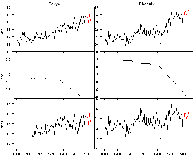
In my discussion of Peruvian stations, I noted several examples of negative urban adjustments. A couple of readers inquired as to whether there were any examples of the opposite effect. In fact, Hansen et al 1999, the primary reference for the present-day GISS adjustment methodology provides using two such examples (the only ones discussed): Phoenix and Tokyo. Here is their Figure 3 showing the adjustment process for both sites. Hansen provided the following discussion of these sites:
The measured and adjusted temperature records for Tokyo and Phoenix are shown in Figure 3. These are among the most extreme examples of urban warming but they illustrate a human influence that can be expected to exist to some degree in all population centers. Tokyo warmed relative to its rural neighbors in both the first and second halves of the century. The true nonclimatic warming in Tokyo may be even somewhat larger that suggested in Figure 3 because some “urban” effect is known to occur even in small towns and rural locations [Mitchell 1953; Landsburg 1981]. The urban effect in Phoenix occurs mainly in the second-half of the century. The urban-adjusted Phoenix record shows little temperature change.

Hansen et al 1999 Figure 3. (a, b) Measured time series of temperature for Tokyo, Japan, and for Phoenix, Arizona; (c, d) adjustments required for linear trends of measured temperatures to match rural neighbors for the periods before and after 1950; and (e, f) adjusted (homogenized) temperatures.
As an exercise, I updated Hansen et al 1999 Figure 3 using current GISS values for Phoenix and Tokyo, shown in the figure below, drawn after the style of the earlier figure. The Phoenix adjustment has been reduced slightly in the earlier portion of the series by about 0.3 deg C, resulting in a slightly increased adjusted Phoenix trend relative to 1999. My guess is that the increased Phoenix adjustment results from changes in the USHCN adjustments between 1999 and 2001. These changes ended up increasing the trend in the USHCN network – and presumably the trend in Code 1 stations used as a comparandum for Phoenix was also increased.
There has been a slightly larger reduction in the Tokyo adjustment – the current adjustment at 1905 is about 1.2 deg C, while the 1905 adjustment in the 1999 version looks to be about 1.7 deg C – for an reduction in UHI adjustment of about 0.5 deg C between 1999 and 2007. In addition, the adjusted series has been shortened from an 1885 start to a start around 1905. In both cities, the adjusted trend is higher in 2007 than it was in 1999.
I’m not suggesting any malfeasance – I presume that both these effects occur from the operation of the GISS algorithm; but exactly why the algorithm has produced such changes seems to be a relevant question and one that is not discussed anywhere by GISS.
I also checked the rankings of Tokyo and Phoenix among all UHI adjustments – ranking by the largest total adjustment for each station. In the present network, Phoenix ranks 3rd overall and, is, as Hansen says, an “extreme” case. Tokyo is in the top 80 or so, but is not in the top 10.
In my earlier post on Peruvian stations, I identified some high negative UHI adjustments and have been criticized for selecting extreme cases to discuss. I disagree with this comment from the point of view of data analysis, something that I pride myself on: analysis of extreme cases helps groundtruth any algorithm to see whether it makes sense. It’s something that I routinely do this on many data sets. In this case, Hansen had already done analysis of extreme positive cases and was able to develop a highly plausible interpretation of the results.
Interpreting the negative urban adjustments is more challenging – I’ll return to this tomorrow.


116 Comments
Can I interpret this to mean that you have calculated the adjustments for all stations? There were a few requests for that info on one of the “Peru” threads.
I’d appreciate it if you could provide a link to those results. Thanks.
Also, if there’s little difference in effort, a text file would be more portable than a binary .tab file. Thanks again.
SteveMc:
If it’s less work, your R code would be at least as useful as the data. It would save me a few hours on the steepest part of the R learning curve *and* prevent me from bugging you for more data.
Sorry for the rapid-fire requests.
Steve, very interesting as always. I am assuming that the second figure is the actual UHI adjustment you calculated as the difference of unadjusted and adjusted datasets?
An oddity between the two figures (yours and his) is the eventual shape of the adjustment amount for Tokyo . Hansen et al. are applying a curious adjustment, comprised of two straight lines with a hinge point in 1950. They start in the present (1997 or so per the graph) with an adjustment of zero. They draw a line from (1997,0) back to 1950, whose slope is the difference in the linear trends of the two datasets over the 1950-1997 period. Then the same procedure is repeated for the period from the start of the record to 1950, the difference between the trends over that period is computed. A new line with that slope is drawn, starting in 1950 at the end of the first line, and ending back in 1880 or wherever the record started. And there’s your adjustment.
As I’m typing this, I keep thinking of new things that are fundamentally wrong about this approach. The use of linear trends. The arbitrary choice of 1950 for the hinge point. Sensitivity to endpoints. Choosing a cold hingepoint. The existence of natural multi-decadal swings longer than 1950 to 2000. But that’s not the oddity that struck my eye in your untitled Figure regarding Tokyo’s trend.
Note that they have kept the value of the hinge point for the Tokyo adjustment the same (1950, 1.1°). Note also that somehow, the older data now needs less change in UHI adjustment … But neither of those are the oddity.
The oddity is that they have moved the zero point. For Tokyo, it was moved back to 1985 or so. And for Phoenix, it was moved out to 2002. That’s the part I don’t understand.
Some possibilities. First place I’d check is in my own work, make sure the datasets are not jumbled somehow, that I haven’t been moving too fast and munged something. Next is some kind of error when they applied the adjustment, they input the wrong start point. Third is that it is an artifact of multiple adjustments. I don’t know.
However, this revealed to me an underlying mathematical problem with this algorithm. What do you do when you get past zero? If your figures are correct, that would mean that the way they are calculating it, past the algorithm start date (nominally 1997, but could be anywhere between at least 1985 and 2002 for an individual station), past that start date there has been no change in the UHI adjustment!
If true, that could explain at least some of the difference between the satellites and giss records post 2000 … and for Tokyo, post 1985. Is that the case? Perhaps you could tell us.
But it still doesn’t explain why the start points of the two adjustments are fifteen years apart.
Always more mysteries, thanks for a great post.
w.
In the case of Tokyo there are five extra degrees of freedom (3 slopes and 2 hinge points) added due to the algorithm. I wonder how all the extra degrees of freedom across every location impact tests of significance of warming?
The population of Tokyo stopped growing in 1965.
http://www.populstat.info/Asia/japant.htm
re#5, but population is not necessarily the best marker for energy use. I suspect that this has continued to increase sinnce 1965.
Is the GISS “algorithm” unavailable for inspection?
I would like to see the actual formulas and corresponding code. What are the absolute (and relative) magnitudes of corrections corresponding to various factors? At the moment I’m interested in quantifying the local effects of population growth, economic development, land-use change, and localized alteration of surface reflectance. I assume the “GISS algorithm” attempts to account for such factors.
Presumably corrections do not depend upon observed temperatures. But it would be interesting to check that, too.
Hans, always good to hear from you. You say:
Although official Tokyo figure plateau, I’d bet you very large dollars that “Greater Tokyo”, whatever that may be, is a heck of a lot greater today than it was in 1965 …
In any case, it doesn’t explain why the Tokyo adjustment goes to zero in 1985 (not 1965).
My best to all,
w.
Yes that is surely right .
The population of Paris hasn’t practically changed for the last 30 years .
The population of the Greater Paris that covers a definition used by french administration has increased by 1.3 M .
And the population of the Paris urban area that is not administratively defined so it must be calculated by hand if somebody was interested has increased still more .
On top comes an increase of energy consumption per capita that’s even harder to get from the statistics but it is there and not negligible .
Steve:
Can you identify the “rural” neighbours for Tokyo and Phoenix?
“The exception proves the rule” can be better stated as
“The exception tests the rule”
Electrical Sales and Number of Customers (pdf) for TEPCO (Tokyo Electric Power Company) 1975 – 2005 (FY).
It is good to see such high numbers used in the UHI adjustment. Maybe these are the two extreme outliers (given they were highlighted in Hansen 1999) but my impression was that negative UHI’s adjustments were not this high. The average is only 0.05C.
I note most studies show the UHI for a very large metropolitan centre would be or even exceed 3.0C.
Following up with a question I asked in a different thread, what is the statistical benefit of using a site whose trend has been adjusted to match the trend of its rural neighbors? Once the adjustment has been made, isn’t all low frequency information content for that site been nullified? I realize that if one is interested in higher frequency fluctuations, the adjustments are helpful, but for long term trends, is there any benefit to improving the regional or global trend estimation?
“The Exception Probes the Rule”
I would be interested to see what the CA team makes of the temperature record in Singapore.
Is this an atypical “urban heat island” effect given the transition from Jungle to Concrete and tarmac.
Record from GISS shows interesting negative trend with subsequent positive trend. How is it adjusted?
There was clearance of tropical forest for agricultural use followed by intensive construction: factories, roads, high rise buildings, land reclamation, etc
Look at GISS Singapore 1880-1984
and then Singapore Changi 1981-2008
James:
That is a very interesting set of data. Presumably though it covers a region.
Willis the hinge point is variable accoring to H2001. I have not figured this out in the code yet.
TAC; the algorithm is in GissTemp, step2, routine Papars.f
What does the “mean of rural neighbors” in the updated data set look like?
18,
Go to Gistem station ssearch page, and search e.g. Tokyo. GISS shows the Tokyo data, and by clicking the asterisk (*) symbol, you get the neighbouring stations. In Tokyo case, about 30 more or less urban sites, and 8 rural sites. Quick look through the rural sites shows no great trend in any direction, at least in my eyes.
If GISS is after a temperature index that abstracts from UHI, it makes no sense to adjust clearly urban areas to have the same trend as their rural neighbors, and then include them in the average. All you are doing, at best, is double-counting the rural neighbors.
It would make more sense for this purpose just to set aside the urban stations, and then to compute your index from the rural stations entirely. It may be hard to find a “pure” rural station nowadays, but at least this would be a big step in the right direction.
Of course, urban temperatures are important, since that is where most people live, so it would be useful to have separate big city and mid city indices to see how they’re doing, and to promote discussion of how to fight UHI. This obviously has nothing to do with global CO2, and so doesn’t interest the IPCC, but measures like higher albedo roofing and paving materials, plus more trees and parks could be useful steps. In particular, it makes good sense for one’s own AC bill to paint black tar roofs aluminum. If this makes the neighborhood cooler for your neighbors, so much the better! Likewise, why is no one urging homeowners to select light shingle colors, or to drive light colored hummers?
I agree with Hu. Why ARE they using the urban data, when plenty of rural sites are in the area? It makes no sense to me.
#17, I started an emulation of the method last fall and can do a hinge-point calculation. I haven’t compared my emulation from the verbal description to the code, but will post on this some time.
#20. I think that one reason why cities are included in the network is that the post-1990 network is much more strongly dominated by urban airports, because of the failure of GHCN-Monthly (And thus NASA) to collate information from rural stations even rural stations that submit daily to GHCN-Daily. The most logical approach to all of this seems to me – as we’ve discussed before – to try to isolate the BEST of the best stations – ones in a rural setting, ones with excellent metadata and consistent observing methods and build out from them.
Thinking about it, I think that there would be a lot of utility in actually carrying out experiments to test adjustments for data sets where there are known discontinuities and where the step discontinuity is estimated. Even if parallel instrumentation was not done at the original transition, wouldn’t it be better than nothing to carry out a parallel test for a few years and check the estimates?
I realize Hansen is using anomalies for his trends but why adjust the older temps up and instead of adjust the UHI infected temps down?! Whether it matters or not it, it’s just physically wrong. You would think that a scientist would find that inelegant at least. Is there a reason that’s been explained that I’ve missed in these discussions?
Hu and JAE
The problem is that the “rural” stations may be just as prone to UHI effects – both micro and macro-types. I think Steve Mosher on another thread pointed this out. Steve emphasized that the correction is based on the trend of the rural stations. If they are also growing wrt population and presumably local heat/cooling sources then correcting for these by referencing “rural” stations makes little sense. What you need is a station that is definitively not subject to any micro and macro UHI effects that are related purely to human activity.
I think that’s exactly what should be done.
Take the stations with the fewest “problems” and see what they say. IMHO, the best way is to plot each station individually and see what the trends are. Man, that would be a mess of data, though, but it would clearly give rural vs urban trends. Also, it seems to me that when you move a station, build a building beside, it, pave around it, put in a new thermometer, etc, etc, you no longer have the same station. This should be treated as a totally new station to avoid contaminating the data and having to do all this “adjusting.”
RE 22. I’m going to try to document the ajustment Algo this weekend, as best I can
My sense of this is that data MAY have been thrown at the meat grinder without
careful checking of the peculiarities of the algorithm ( extreme case testing).
we will see.
These are the missing images from my post #15
(There is something wrong with the image linking in the reply box – I have had to alter it to get this working in preview). Sorry if this is off thread…Alan
THe problem is that it is human nature that when the data “looks right” you stop massaging it.
Substantial warming trends is what the team expects to see, so when they get the data to represent that, they stop looking for possible problems. This is why peer review and auditing is supposed to catch. The problem with peer review is that this data has been reviewed only by people with similar biases in regards to what they expect/want the data to look like.
And since everybody they know/trust has already looked at the data, they dismiss out of hand the need for independant review.
As near as I can tell, the algorithm is ok. The problem is that the algorithm assumes that your “rural” stations are pristine. No UHI, no microsite problems, etc. However the team did ZERO due diligence to ensure that their “rural” stations met this requirement.
They ran the algorithm, the result was what they expected to see, so they declared case closed.
Steve Mosher #26
You may know this already, but Subroutine getfit, which is called by the the FORTRAN program papars.f, is where the fitting of trend lines all starts. getfit calls subroutine trend2 and that seems to try a bunch of hinge points, computes 2 trend lines and selects the hing point that yields the smallest RMS error. I’m not inclined to go through that FORTRAN in detail, but you sound like you are. So good luck.
getfit is in the Step 2 folder in file t2fit.f and trend2 is in tr2.f
Steve writes:
Isn’t one the genuine conclusions of the Hansen’s work that ‘rural’ isn’t the right proxy? You need to be concerned about land use changes too. e.g., clearing the surrounding area for agricultural purposes.
RE 24. Yes. The conceptual problem everyone has bought into is that there are three
strata of UHI. RURAL, small town, and Urban.
Some simple questions:
1. which causes more WARMING TREND: Adding 10000 people to a city of 5000
or adding 10000 people to a city of 5 million.? The population effect on UHI is Log.
2. Which causes more warming trend, Adding 100 tons of concreete to a town that
has none, or adding 100 tons to a city that has millions of tons.
Since Hansens adjustment LOOKS AT THE TREND you have to consider the log response.
Then again, you could always go look at what the weather stations around Tokyo said within the last half hour. Calm, humidity between 53 and 78 %,no precipitation, elevation from 0 to 334 feet.
Question: What temperature is it in Tokyo right now?
43.9
41.7
31.9
42.4
40.5
43
44
47
36.7
38.0
39.7
That’s right, it’s 43, because that’s what it is at the airport.
http://www.wunderground.com/cgi-bin/findweather/getForecast?query=tokyo+japan
SteveMc:
Re #2 —
How about jus a snippet of R code? A smidgen? A wafer-thin hint? 🙂
Brazdil, Budikova 1999
A quick examination of the available information largely through Wikipedia, those 8 rural stations around Tokyo are not what you might say uniform. The missing population data probabably reflects a small town.
Rural Town, Population, Location, Pop Year,
Ajiro, ?, Island, , Tourism
Irozaki, ?, , ,
Karuizawa, 18281, Mountains, 2008, Tourism,
Kawaguchiko, 486062, Lake?, 2006,
Miyakejima, 2884, Active volcanic island, 2006,
Nikko, 92181, Mountains, 2008,
Omaezaki, 36877, Coast/Peninsula, 2005,
Oshima, 9000, Active volcanic island, 2005?,
Takada/Joetsu City, 206,175, ?, 2008,
Also to the point made by Steve Mosher: Oshima’s Mayor notes
“The social infrastructure of Oshima town has greatly improved, as the result of having tackled the overall island business promotion including the Infrastructure improvement of harbor, roads, water service and the disaster prevention with the many warm supports of others.”
Pofarmer #25
MarkW #28
Appraial of “fewest problems” should be blind to the data. Helps to protect against massage where “fewest problems” turns out to be “right trend”.
How do you identify the station with the fewest problems if you haven’t taken any time to identify what problems might exist, or if you haven’t checked the stations to determine whether or not problems exist.
For example, SteveMc has demonstrated that in Peru, Hansen didn’t even follow his own guidelines in labeling towns rural or not. Nor did he bother to double check the population data that he was using to see if it was accurate.
For another example, nobody knew about any of the problems that AW has uncovered with his survey, until the survey was started.
The only solution is solid auditing with auditors who are truely independant.
Another problem with those “rural” stations is that most of the data ended in 1990 and are not useful for correcting the present data. My 1st look found 3 station to 2008 and one of those is no longer rural. Both of others are volconic tourist attraction so population may not be a good indicator of there “rural” status. I think of places with summer populations of 500000 and winter populations of less than 10000.
Larry
See #36
Some of the place names are fairly common so I checked Lat and Long where available.
Looking at the top graph for Tokyo the temp. rise from 1900 seems fairly linear. Where’s UHI? Tokyo prior to WW2 would have been a fairly modest city in terms of concrete structures. More likely the traditional timber and paper Japanese type dwelling. Tokyo’s business centre would not have had the concrete monstrosities it has now.
just a thought.
regards.
my point is that none of the rural stations for tokyo are really a good proxy for fixing the UHI of tokyo without further investigation. The stations whose data ends in 1990 can not verify post 1990 UHI effects. One has moved over 10000 population so has its own UHI issues and the last two are tourist attractions whose population my not reflect its true nature of the UHI there.
steven mosher, you say:
Thanks, Mosh. Doesn’t help with the two questions, though:
1) Why is the zero point for Tokyo in 1985?
And much more importantly,
2) DId the adjustment in all of the UHI-affected cities go to zero at some point, as is shown in Tokyo and Phoenix, with no further UHI adjustments after that date?
w.
MarkW: ….”The only solution is solid auditing with auditors who are truely independant.”
Yeah, but then they must be a shill for the oil companies (or whatever lame dismissal is the soup de jour.) Speaking about that, one day I was in a restaurant and asked what the soup de jour was, and they said “Soup of the day” and I said I’d have it.
The other two paragraphs are right on; claiming to adjust them when there’s proof you are doing one or more of the following:
a) Don’t follow your own rules
b) Get things backwards
c) Hide or obfuscate your methods
d) Have no idea the status of the station
e) Have no idea the location of the station
f) Have no idea the type or level of contamination (or not)
This is rather evidence that you don’t have a high quality reliable network and you can’t adjust for whatever might be wrong. Isn’t it?
So whatever the anomaly is supposedly telling actually is, it’s wrong somehow in the first place. How do you read the temperature off a broken thermometer? 🙂
re: #34 John V,
Have you downloaded R to your computer and set it up? Assuming so, there are a number of R scripts available you can play with. They’re in the categories box on the UL corner of the page under, unsurprisingly, “Scripts”.
#42 Larry T
We agree. The potential variation in UHI at these surrounding rural locations is such that only 3 or 4 locations are even candidates for creating a baseline trend.
The GISS data suggests that for the four potential rural locations (i.e., no evidence that the population is greater than 10,000 – though we knoknow little about the population trend) indicates the following:
Ajiro – no discenrible trend, data ends in 1990
Irozaki – no discenrible trend, data ends in 1990
Miyakejima – downward trend, data ends in 1990
Oshima – two series with apparent significant jump in reading: no trend for 1940 to 1990; no trend for 1993 to 2008
We need some Japanese contributors to Anthony Watts project to clarify what we are actually looking at.
The data for the other locations is also interesting with the clearest upward trend occurring in the locations with the larger populations!:
It should be noted that I do not know which stations were actually used to adjust the Tokyo data, These 9 stations are the ones that are designated as rural and are closest to Tokyo. Other more genuinely rural stations may have been used.
Oops. I am not sure what happened. Perhaps someone could post these GISS images so that the point can be ilustrated.
http://data.giss.nasa.gov/cgi-bin/gistemp/gistemp_station.py?id=210476550002&data_set=1&num_neighbors=1
points to a temp directory which is regularly flushed.
If you want a more permanent imagelink, and you don’t have a website, you can post a copy of the image on an
image server like http://www.imageshack.us/
steps:
copy gissgraph to your desktop as gif
upload your copy to imageshack
paste the provided imageshack link in you messge using the img button
imageshack is a free service.
example:
http://data.giss.nasa.gov/cgi-bin/gistemp/gistemp_station.py?id=210476770010&data_set=1&num_neighbors=1
I have 2 more that show the same thing here in MN.
Two Harbors surveyed in July 07 and this is the plot listed.
http://gallery.surfacestations.org/main.php?g2_itemId=15906
Plot from GISS now.
http://data.giss.nasa.gov/cgi-bin/gistemp/gistemp_station.py?id=425727450020&data_set=0&num_neighbors=1
Cloquet surveyed in July 07 and this is the plot listed.
http://gallery.surfacestations.org/main.php?g2_itemId=15289
Plot from GISS now.
http://data.giss.nasa.gov/cgi-bin/gistemp/gistemp_station.py?id=425727450010&data_set=0&num_neighbors=1
Cloquet’s pop is 11,200.(GISS listed as 11,000)
http://gallery.surfacestations.org/main.php?g2_itemId=3889
This town is 17 miles West of Duluth.
Two Harbors’s pop is 3600(Giss listed as rural)
http://gallery.surfacestations.org/main.php?g2_itemId=3937
This town is 20 miles NE of Duluth, right on the shore of Lake Superior.
Interesting.
#45 Dave Dardinger:
Thanks for the link to sample scripts.
I have R installed and have poked around a little bit. I’m even looking at the documentation.
I try to avoid re-inventing the wheel (when not necessary). SteveMc’s code would be useful as a reference to working with his GISS dataset .tab files. Hopefully he’ll be able to provide it this weekend.
Conceptual question from an engineer, not a climatologist regarding average global temperature:
Why are the temperatures regarded as needing adjustment before averaging?
The temperature is what it is. Or is it?
If the average air temperature of the earth is desired, it seems a straightforward algebraic average of all the stations weighted by an area that is defined by half the distances to the closest stations would give a truer global average. I don’t see that adjusting for UHI is relevant to obtaining the global temperature average.
probably a naive question, but hopefully there is a simple answer. Any explanations?
I understand from other posts about individual station adjustments for TOBS, station moves, etc.
I was looking at the geographical distributions of the stations.
A few comment.
The Ajiro and Joetsu City locations may be within the magic 1200km but from a geographic perspective I see no rational for assuming there is a correlation with Tokyo temperatures.
Ajiro is the island on the other side of Shikoku (the 4th largest Japanese Islans) and Joetsu City across a mountain range facing the Sea of Japan.
Kawaguchiko, Nikko and Omaezaki are obviously urban areas if you look at the satellite but it would depend on where the sensor is located.
Irozaki, Miyakejima and Oshima look pretty rural.
Karuizawa is urban but there is a lot of tree cover which could have interesting effects.
One thing to keep in mind when looking at temperature trends in Japan – places like Nikko are way more developed than would be implied by their raw population figures because they draw huge numbers of tourists.
The nearest rural station to Phoenix with long term data that is also most recent is Roosevelt. An interesting feature of these data sets is that NOAA and GISS often make quite different adjustments to the data. The following figures (unadjusted blue, adjusted red) show Roosevelt first from GISS (top) and from the NOAA GHCN database. GISS introduces a warming trend whereas NOAA does not.
Raven:
As I suggested in #36 and #46, there is no way to know which station were used to adjust the Tokyo data. All I know at the moment is that only 3 or 4 of the stations could possibly be legimately used as a “control” or “comparator” to identify the relevant UHI trend. There may well
be other appropriate rural locations that are further away from Tokyo and could legitimately act as “comparators”.
The issue here goes back to a basic question: the idnetity of the the rural stations used to adjust Tokyo or other potentially UHI impacted locations
Raven:
As I suggested in #36 and #46, there is no way to know which station were used to adjust the Tokyo data. All I know at the moment is that only 3 or 4 of the stations could possibly be legimately used as a “control” or “comparator” to identify the relevant UHI trend. There may well
be other appropriate rural locations that are further away from Tokyo and could legitimately act as “comparators”.
The issue here goes back to a basic question: the identity of the the rural stations used to adjust Tokyo or other potentially UHI impacted locations
re: #50
What possible logic could adjust a rural site like twin harbors? And only adjust recent years, not the 2000 baseline move (presumably a site change).
It almost seems like (I know it isn’t possible, is it?) a trend line is chosen and then the data is adjusted retroactively to match the trend line.
Same question for #54 – why are rural sites being adjusted by GISS???
In this case, what basis does GISS have to say that the Roosevelt temps pre-2002 are somehow wrong and need to be adjusted?
And why do all ajustments to rural sites seem to lower historical temperatures?
The cynic in me says: is easy to get “correct” historic temperatures if I “know” the actual trend line before addressing the data.
The measured temperature at Phoenix look a step plot and somewhat similar to the one I found at Quatsino. How does one know that the real temperature plot is exactly what happened and should not be adjusted?
Re Jay, #58,
Offhand, it looks like the Phoenixes are having their trends reduced to match the Roosevelts, while at the same time the Roosevelts are having their trends increased to match the Phoenixes.
Net UHI “homogenization” adjustment: Zero?
Bernie says:
Where is this information? Embedded in the computer program?
RE43 argg. WILLIS!!, you are asking me to explain Hansen Fortran. It’s funny I sit down
to detail the algorithm and then find something less painful to do, LIKE STICK NEEDLES IN MY EYES.
you asked for it willis. As best I can figure The Rural stations are combined into a single “trend”
for the region around the urban site.. Weighted by a 1/R function … and then this Rural
trend is subtracted from the Urban Trend and a BIAS is created. Then then two legged bias adjustment
is constructed by the subroutines called GETFIT and TREND2.
subroutine getfit(nw)
COMMON/FITCOM/W(900),X(900),F(900),CF(900),DF(900),ZFP(20),ZR(20)
1 ,FPAR(20),DELTAP,DFSTOP,X0,TMEAN,RMEAN,TFMEAN,RMSFIT
2 ,YR(900),TS(900),TSFIT(900),RMSP(20),KPFIT(20)
3 ,KPAR,NXY,NCP,NWCYCL,NITERS,NFIBNO,LISTIT,IDW
REAL*8 W,X,F,CF,DF,ZFP,ZR,FPAR,DELTAP,DFSTOP,X0,TMEAN,RMEAN,TM3
REAL*8 TFMEAN,RMSFIT,YR,TS,TSFIT,RMSP
nhalf=nxy/2
RMSmin=1.e20
do n=6,nxy-5
Xknee=x(n)
call TREND2(x,F,nxy,Xknee,9999.,2,2, ! input
* sl1,sl2,Yknee,RMS,sl,Y0,RMS0) ! output
if(RMS.lt.RMSmin) then
RMSmin=RMS
xmin=Xknee+X0
fpar(1)=sl1
fpar(2)=sl2
fpar(3)=Xknee
fpar(4)=Yknee
fpar(5)=sl
fpar(6)=Y0
rmsp(1)=RMS/nxy
rmsp(2)=RMS0/nxy
end if
end do
c write(nw,*) xmin,RMSmin/nxy
return
end
AND NOW, the winner of the JEG AWARD for reinventing the wheel. The trend fitting routine.
I am out of needles and eyes, substitute your own.
SUBROUTINE TREND2(xc,A,LEN,Xmid,BAD,MIN1,MIN2, SL1,SL2,Ymid,RMS,
* SL,Y0,RMS0)
C**** finds a fit using regression analysis by a line
C**** with a break in slope at Xmid. Returned are the 2 slopes
C**** SL1,SL2 provided we have at least MIN1,MIN2 data.
C**** Linear regression data are also computed (for emergencies)
REAL*8 xc(*),A(*)
REAL*8 sx(2),sxx(2),sxa(2),sa,saa,denom,xnum1,xnum2
INTEGER kount(2)
sl1=bad
sl2=bad
Ymid=bad
sa=0.
saa=0.
do k=1,2
kount(k)=0
sx(k)=0.
sxx(k)=0.
sxa(k)=0.
end do
do 100 n=1,len
if(a(n).eq.BAD) go to 100
x=xc(n)-Xmid
sa=sa+a(n)
saa=saa+a(n)**2
k=1
if(x.gt.0.) k=2
kount(k)=kount(k)+1
sx(k)=sx(k)+x
sxx(k)=sxx(k)+x**2
sxa(k)=sxa(k)+x*a(n)
100 continue
ntot=kount(1)+kount(2)
denom=ntot*sxx(1)*sxx(2)-sxx(1)*sx(2)**2-sxx(2)*sx(1)**2
xnum1=sx(1)*(sx(2)*sxa(2)-sxx(2)*sa)+sxa(1)*(ntot*sxx(2)-sx(2)**2)
xnum2=sx(2)*(sx(1)*sxa(1)-sxx(1)*sa)+sxa(2)*(ntot*sxx(1)-sx(1)**2)
if(kount(1).lt.MIN1.or.kount(2).lt.MIN2) return
sl1=xnum1/denom
sl2=xnum2/denom
Ymid=(sa-sl1*sx(1)-sl2*sx(2))/ntot
RMS=ntot*Ymid**2+saa-2*Ymid*(sa-sl1*sx(1)-sl2*sx(2))+
* sl1*sl1*sxx(1)+sl2*sl2*sxx(2)-2*sl1*sxa(1)-2*sl2*sxa(2)
C**** linear regression
sx(1)=sx(1)+sx(2)
sxx(1)=sxx(1)+sxx(2)
sxa(1)=sxa(1)+sxa(2)
sl=(ntot*sxa(1)-sa*sx(1))/(ntot*sxx(1)-sx(1)**2)
Y0=(sa-sl*sx(1))/ntot
RMS0=ntot*Y0**2+saa+sl*sl*sxx(1)-2*Y0*(sa-sl*sx(1))-2*sl*sxa(1)
return
end
RE:57
If you look closely you’ll see the past was warmed. After 2000, the plots are about the same. First plot has the scale from 0-7 C and the current one goes from 1-8 C. Same goes with Cloquet.
RE 30. Wkkruse. Sorry I missed your comment otherwise I would have referred Willis to it.
You Know the code quite well, as I recall you corrected my earlier mistake about the Name(31:32)
issue. In any case, As much as I whine and complain, it IS fun to go through other peoples code.
It’s easy to be a critical, it’s easy to get things wrong. So I appreciate you help
#46 Bernie…Miyakejima “data ended in 1990” IDTS At Tu Tiempo data ended 5 days ago…
So can some R-expert scrape the data?? This is NOT Miyakejima AP I believe! First
20 days of Feb LOWEST TMAX SINCE 1991 (2001 MISSING) 1. 2008 12.3 C … 2. 2002 14.3 C
…3. 1997 14.8 C … 1998 had 19.6, 19.2 and 19.0 C, that lil’ boy down south warmed..
I should mention that this station was 1.0C colder Feb 1986 than
the AP one according to TT …
Steve: All these series are scraped into the R-objects giss.dset1 and giss.dset2 online at CA/data/giss
#63 steven mosher:
It’s indecent to post Fortran in a public forum. That is only *ugly* language. A good programmer can put lipstick on it, but you never want to get too close.
There’s something that confuses me here. The TREND2() function computes two trend lines joined by a single hinge. The shape of the adjustment should therefore be *two* straight lines. The Tokyo adjustment in the article that starts this thread has *three* straight lines. What gives?
RE 66. JohnV I have not got that far yet. I keep getting distracted by other things… So I figure
The best thing is to do a block diagram of the code and try to understand it. And then explain it to folks. Dan Hughes is looking at it, Conard has a grasp, and wwkruse seems to know it.
I just want to distill it for other folks. I’ll try to do that this weekend. At least the top level
routine.
The hinge point thing, I think, will be a problem for Hansen going FORWARD. As years go by the hinge point can change, So year by year the slopes will change and you may get weird adjustments.
Anyway, Let me know when you have another update of OpenTemp. I’d rather hold off doing any data
runs until you are ready and we are on the same rev.
#67 steven mosher:
I don’t have any plans for OpenTemp updates, so get to it! 🙂
Looking at the code I just don’t see how two hinges could be created. Maybe getfit() is called more than once?
I’m tempted to dive into the GISTEMP code and port the whole thing to Java, C#, or Matlab/Octave.
I wish I had the time.
Staffan:
I am not sure which location you are referring to. I found this. Did you have another link?
Re #52:
The question is not naïve. The problem may be that simply averaging raw (or TOB adjusted raw data) leaves little room for manipulation.
Change-point analysis is designed principally to detect the most statistically likely inflection points(s) (hinges?) in a continuous data stream. Perhaps the GISS selection on where to start their “adjustments” is based on this presumably objective method.
The idea of using population data, or energy consumption data, or any other data that uses such a parameter to account for UHI effects is fatally flawed by its implicit assumption that the individual elements of the parameter selected are evenly distributed across the areas from which the parameter is measured since the temperature sensing device is a single or tightly compacted group of sensors located at a single point within that area. A CRS or MMTS is rarely located at a point within an area that truly represents the average of temperatures throughout that area even if the area being represented is geographically small. For example, a “rural location” with only one small segment of paved surface that just happens to be at the site where the instruments are located, in no way represents the average temperature of the whole area. In other words, 100 sq m of pavement, if at the sensor site, would show very little difference if the entire remainde of the area that the sensor represents had been covered by zero or thousands of square meters of pavement.
I get the impression that many posters to this site fail to realize just how local an area is actually represented by a sensor sampling the air 1.5-2.0m above the surface. Under calm conditions, and especially with clear skies, differences of more than 5°C can occasionally be measured within a 30m radius.
Finally, if one wants to see how temperatures vary with height (0.6-10m) at different locations within the same climatic region, check out the FAWN (Florida Automated Weather Network) site which reports temperatures continuously in real time, and even provides graphical time series of the data which include Temperature, Dew Point, Soil Temperature, Wind Direction and Speed. Note, for example, how temperatures varied between ~0.6m and 10m last night under light winds and clear skies. Also note the differences between truly rural sites (mostly in citrus groves) and some more urbanized areas.
Academics should get out there and look at the sites and the raw data as it is being recorded while at the same time observing the local environment and weather conditions.
RE 69 Bernie…Tnx! Same station 47677 (AP=47377) but another DB Via Dutch
KNMI GDCN, the coordinates TT have are a little different (move??)
The AP is clearly warmer Jan 1990 10.5 whereas 47677 9.7 C Aug more than
2C warmer … AS noted before, airports are conciderable heat absorbers and
also warmer at night due to more wind Pacific small islands’ airports are
used by Hansen?? IF SO, nice lil’ bag o’ cherries…
#71. PAcific island stations are very important part of the GISS and CRU networks.
Given the comments by aurbo in #70, it seems rather silly to even try to calculate an average global temperature. Take the significant temperature differences that can be found within a few feet of each measuring point and combine them with margins of error of several degrees in the measuring equipment, and what do you have left?
I went to the Florida site linked in aurbo’s comment and found one station with three different temperature readings of 56, 57 and 59 degrees.
While I truly appreciate the work Steve and others do here, the more I read here the more I scratch my head in wonder that this subject receives so much funding and attention in the first place.
There just seems to be way too much noise in the raw and adjusted data to come anywhere close to finding the signal within.
Am I missing something? Or should I just shut up and read in silence?
Steve: The issue is important and you can’t just throw up your hands.
Mosh, sorry to cause you pain. You say:
Actually, I was hoping Steve would answer those questions because I doubted they’d be in the code. And having placed my eyes at serious hazard by reading the code, I can’t find the answers there. The TREND2 algorithm appears to get the endpoints as inputs and not mess with them, it just juggles the hinge point for the best fit. And in Hansen’s figure, the endpoint for the Tokyo adjustment is at 1997.
The real question I was hoping Steve could answer was, what happens past that endpoint? In the Tokyo data, it seems to go flat after that point, and the same is true in the Phoenix data. If this is widespread in the dataset, it will impart a false warming trend in the result. I don’t know how much it would change it, but some …
w.
Re #73:
Each FAWN station measures temperatures at 3 levels: 2ft, 6ft and 30ft. On windy or cloudy days, these temps are usually quite similar. Under clear skies and nearly calm conditions they can vary quite a bit with the surface (2ft) temperature running higher than the 30ft readings. On a clear and calm night the pattern is reversed with the surface temperature dropping below both the 6ft and the 30ft temperature.
When comparing temperature readings from nearby stations under similar wind conditions, the 30ft temperatures may agree fairly well. The 2ft temperatures will vary depending upon the character of the surface material below, the presence or absence of clouds and the local micro-climates.
Steffan, thank you for your comment, viz:
I live on one of the aforementioned Pacific small islands, and have lived on others in the past. In general, there is very little sign of any overall trend in the mean temperature datasets I have examined (Hawaii, Fiji, Solomon Islands). I suspect it is because the winds ensure that the air being measured is not that long removed from the ocean, and the ocean temperatures haven’t changed much. I would be cautious about accusations without thorough investigation of the underlying facts.
w.
Steve M, I downloaded giss.dset1.tab and the giss.dset2.tab files, expecting them to be tab delimited text. Instead they’re some kind of binary format (the stuff that looks like Martian). What am I missing here?
Thanks,
w.
re 72:
Indeed, the pacific is the largest waterbody on earth. The pacific basin is dominated by ENSO. Hence the global temperature anomaly is dominated by ENSO (But European temperature is not). Pacific island temperature registrations are therefore instrumental to the global temperature anomaly.
aurbo said: I get the impression that many posters to this site fail to realize just how local an area is actually represented by a sensor sampling the air 1.5-2.0m above the surface. Under calm conditions, and especially with clear skies, differences of more than 5°C can occasionally be measured within a 30m radius.
The above statement gets to the basis of my point. If temperatures can and do differ so dramatically between nearby sensors, then isn’t the whole idea of taking measurements from sensors hundreds and thousands of miles apart to create a global average temperature kind of pointless?
I don’t want to hijack this thread so I’ll just ask, can anyone point me to research explaining how the concept of a global average temperature is scientifically legitimate in the first place?
Thanks in advance and I’ll stop posting such rookie questions.
RE 74. I;ll see if I can figure out the end points
An excellent resource for UHI visualization is Weather Underground’s maps of personal weather stations. This map shows downtown Minneapolis 3-6 degrees warmer than outlying areas at 7:30 CST. There are about fifty stations updated continuously in Minneapolis.
http://www.wunderground.com/stationmaps/gmap.asp?zip=55401&magic=1&wmo=99999
Re Dogwood (79):
Of course the global average temperature is not certain at all. One can only hope that the different errors introduced by thermometers not necesarily being good representatives of the area their data represents, more or less cancel each others. But it doesn’t have to be like that of course. Also we cannot forget that human welfare is dependant on many more things appart from temperature, and temperature itself is only important in the areas which are populated.
So the thing is not getting an average global temperature, but to guess wether the temperatures are rising or falling. Yo cannot know how real your averaged global temperature is, but as long as you don’t change the immediate proximities of your thermometers, you can assume that, if its data’s average temperature goes up, so will do the real average temperature. So it is more useful for calculating trends. And the trend in the global temperature is important because its changes can influence the climate.
The big BUT is that you need to make sure that the proximities of the thermometers do not change, and if it does you have to reflect precisely how it is going to affect the trend of the thermometer, and take that part away. This is what Hansen tries to do. But he is doing it wrong, because:
1) He fails to correctly classify which stations are actually having UHI issues.
2) He assumes that a station located in a town of
I have an interesting test to be used with the FORTRAN code. Make a station with temperature readings going down and have a disconuity jump of a couple degrees up(sensor change/move) then continues on downward change. Also do it in opposite direction. This the kind of boundary testing that i apply to my own code.
re 83. QC checks for GISSTEMP are done prior to input.
In a nutshell Gisstemp is just a piece of code for taking QCed data and computing
a time series of spatial averages.
In a nutshell.
This leaves two questions: was the data properly QCed. Is the averaging done correctly.
MarkW #38
I agree. CA and SS are helping to showing how it is unsatisfactory to use a mechanistic approach for identification of stations and adjustment of raw data (maybe call this technique “data enHansenment”?).
The basic research of station QA is a minimum requirement for setting (and stating) the criteria to justify how the data is used.
If Tamino has done something useful in the last couple of days, it is to show how easy it is to fall into the trap. Falling data trend … obviously suspect. Tell you what, there’s a couple of sites within x-thousand miles with the right trend. Correction done, SNAFU!
I just wanted to add how it is preferable for the basic station research to be blind to the data. Protects you from your own data massage. Creates extra padding between your conclusions and bias.
Re Dogwood (79):
(continued after an error send order)
2) He assumes that a station located in a town of
(Really sorry to send again, but there was an issue with using a math symbol in my post and it wasn’t sent properly)
2) He assumes that a station located in a town of less than 10000 inhabitants has non-poluted data. Even if he could correctly say which stations are in such places, it is untrue that the stations would be free of any UHI effects.
3) His algorithm fails to find and ignore big sudden steps of temperature probably caused by station moves or changes in the surroundings, because so-classified-rural stations are thought to suffer not such problems and are not corrected at all, no matter what they show. And even worse, the incorrectly induced trend may be used to further incorrectly modify a trend in an urban station.
re 85. this is the data meatgrinder approach. It is NOT unique to GISSTEMP. essentially
an algorithm is constructed to rectify a problem ( UHI in big cities). This algorithm
is tested and appears to do sensible things. Then the algorithm is applied to the entirety of
the dataset. THE MEAT GRINDER. odd cases, extreme cases, and outliers will abound. DUH.
There is nothng new or special in this.
When calculating an annual mean from monthly mean data should the months be weighted by their respective number of days? What about Leap Years?
Why again does the GISS annual mean for a given station not equal the average of the monthly means (either weighted or unweighted months)?
Thanks for the response Nylo. Much appreciated.
#87 Nylo
In general I absolutely agree with what you say. However, IF those generating these estimated global temperature trends were explicit about which stations they were using then it should be possible to construct a trend using, in Steve McI phrase, ‘the best of the best” stations. Whether that can be done with the current level of claimed precision I doubt, but it still provides a means of determining whether it will be getting warmer or not over the next few decades. Of course, it might be far better to simply use the 3 or 4 “apparent” rural stations around Tokyo than the Tokyo stations themselves since keeping these problematic UHI infected stations in the data series adds little but significant statistical and theoretical complications. My understanding is that this is a crucial part of the argument for Jones to release his data.
The new and much smaller and more select set of high quality stations in the US is supposed to finesse the UHI issue. We shall see.
P.S. If anyone has a progress report on the new network I would be interested in hearing about when we can expect some data that would allow a comparision with the existing network.
steven mosher says:
But the question becomes: how many outliers and odd cases does it take to invalidate the algorithm? Can it be quantified? For example how many urban sites need correcting? As the number # of oddities approaches the number of urban stations then the usefulness of the algorithm must approach zero.
Steven Mosher, In the Step 2 folder is a file called padjust.f which is another FORTRAN program that seems to do the actual adjustment to the station temperature series. The code contains no comments to describe what it’s doing. But Subroutine adj is given the hinge point and the slopes of the 2 lines determined by the call to getfit from papars.f. This subroutine computes an adjustment that is added to the raw time series. The adjustment is made only when an if condition is satisfied. This if condition might explain why there are no adjustments at the end of some of the urban records. I wish I could help more with the actual variables involved, but they just take a lot of work to sort through.
By the way, do you understand the equations for SL1 and SL2 in subroutine Trend2? They’re similar to standard linear regression equations, but not quite.
RE 93. I dont know. The blunt club that hansen applies to the baby seal of Rural
sites is too much for me to bear. hehe. Anyway, The algorithm is never tested
in isolation.. In short crudely speaking it does this.
Urban Temp UT= Climate Signal + UHI Signal + Weather Noise.
Rural Temp RT = Climate signal + Weather Noise.
Average the “rural sites” in the vicinity. Tave. (Not spatially weighted but distance weighted
from the center. problem, two side by side rural sites at the same distance contribute
equally to the weight table )
Then
(U-Tave) = UHI signal. then Subtract that from the Urban Site… Guess what? The Urban kinda ends up
looking like the Rural. DUH. Problem, the urban sample is no longer an independent sample.
Urban should just be dropped. And then live with the uncertainity due to spatial coverage.
Other Problem. Urban and Rural are categoriezed by grossly inadequate categorical properties.
If the hansen method is secure in estimating the polar regions from stations 1200KM away,
then pick the most pristine, longest lived, least changed, stations. That would be a fun test.
steven mosher says:
Take a look at this post and tell me if you think Hansen’s polar estimates have any relevance:
http://www.climateaudit.org/?p=2721#comment-213085
It appears that Santa’s workshop will be melting and freezing at the same time.
re 96. That’s your elephant.
My point is this. GISS estimate the polar regions based on sparsely distributed stations.
Yet every time I suggest, culling the bad stations in the US, the alarmists think thats
unwise. Giss is better than Hadcru because GISS estimate the Polar regions…. ( a few good stations! its all you need) but when I suggest that a few good stations is all that CONUS needs you’d think I’d killed a Polar bear.
RE81 Hey, hey Patrick these personal stations should
also like the professional ones be taken with
some bag of salt…Kodaira, a city just W of Tokyo
had some +2.8C at 12.55 today, Atsugi 40 km S of Kodaira
“had” at the same time +23.9C(!) and 7 minutes later 20.0C ..
Now around 3.30 in the night Kodaira records -3.7C whereas
Atsugi has +6.1C ….The nocturnal difference is plausible
not the midday one …Kodaira can be too low in the day
and Atsugi too high …In central Germany read Berlin
2nd half of 18th century was warmer than last 17 years
LIA had a break there and came back early 19th century,
if late 18th century had had our time’s roads and heating
so on, the winters would have been less cold so
annual temp records would only to be dreamed of …NOW!
So back to my nagging claim: We have to start from scratch
with outback thermometer “farms” Surely One such farm
in say 25.000 square km, 17-18 in Sweden would suffice?
Staffan’s notion is one that I’ve often thought about too. Problem is that we really need them to have started at least 50 or preferably 100 years ago. We have to make do with what we’ve got, and this is clearly not a fixed set of time series. All the evidence in CA seems to point to professional climatologists having little idea of how to establish data that will be accepted by everyone who works in the field. The amazing survey of US sites now being undertaken (by dedicated amateurs – many thanks to them) has highlighted some dreadful practices, which as a retired industrial scientist I can hardly credit. “Engineering Quality”, as Steve McIntyre has often written, is conspicuous by its absence in the field of climate science.
RE99 Robinedwards … of course I don’t think
the old stations should be closed, I don’t think
you think I think so either…But with these new
thermometer farm networks we would 1. Have reference
points 2. The farm arrangement exposes the high
local variability, I must hereby thank Hinkel et al’s
Barrow AK (as an old DX-er and mail carrier I use the
postal abbreviations…) UHIE survey of 2002-03 winter
I think. With some private urban networks you realize
that local variability is much bigger than GW, especially
the AGW…73’S DE SL
From synthstuff I got a pointer to Climate Skeptic where a couple of observers familiar from the recent review of Miami AZ do a simple test of UHI at… Phoenix AZ.
For those that skipped the links, they slapped a datalogger on the roof of their car and drove through the city on the freeway. Simple, blunt, and potentially effective. To the naked eye, it looks like the graphs above and the measurements both line up around 3C as the current UHI effect for Phoenix.
I’d like more than two days of observations myself, but the technique seems a lot faster than the current method of guestimating UHI.
Alan:
The issue is not UHI per se but the change in UHI over time if we are to correct a data series. However, if we are going to eliminate sites with pronounced UHI then I guess your technique will work.
If you’re taking direct measurements of ‘the UHI effect’, then you can turn around and use that self-same data to come up with a more accurate model of UHI based on anything you’re able to measure today. (population, %asphalt, #-of-starbucks, whatever).
There appears to be a lack of ‘designed direct studies’ as opposed to ‘post hoc data mining studies’ in this area.
Steve,
I agree that the issue is important, but there are times that you have to realize, that no matter how badly you want to, you can’t make a sil purse from a sow’s ear.
The answer is, it depends.
As few as one outlier could disqualify the algorithm. That’s why you have to examine the outliers to determine why it failed.
An outlier could identify a flaw that is contaminating all of your data points, or it could be that the outlier is bad data and needs to be disgarded. There’s no way of knowing until you examine the outliers and determine what the problem is.
It’s this last step that the Team seems to have not done. As soon as the algorithm appears to work on their test set, they then apply it everywhere and “move on”.
Speaking of Tokyo and Phoenix, I charted the top ten stations as reported at wunderground for the spot temperature for both city’s current readings at the same time for both:
http://www.climateaudit.org/phpBB3/viewtopic.php?f=3&t=151
Of course, the stations might not be in the city itself but nearby cities. I didn’t check that.
But hey.
SAM:
What exactly did you do?
I went to the Wunderground website and looked up the two cities by name. In the case of Tokyo, there were 10 stations. So I also took the top 10 listed for Phoenix. Then I graphed them. Oh, they’re in centigrade. I took the average (I think Tokyo was 4.85) but I didn’t keep them.
For example, here’s Tokyo. It looks like the stations are updated about every 1-30 minutes.
http://www.wunderground.com/cgi-bin/findweather/getForecast?query=tokyo+japan
This is the summary for ITOKYOOH1 at Ohta-ku
Current: High: Low: Average:
Temperature: 44.2 °F / 6.8 °C 46.8 °F / 8.2 °C 44.1 °F / 6.7 °C 45.6 °F / 7.6 °C
Dew Point: 22.0 °F / -5.6 °C 23.7 °F / -4.6 °C 20.9 °F / -6.2 °C 22.1 °F / -5.5 °C
Humidity: 41% 41% 37% 39%
Wind Speed: 1.0mph / 1.6km/h / 3.0mph / 4.8km/h – 1.3mph / 2.1km/h
Wind Gust: 9.0mph / 14.5km/h / 11.0mph / 17.7km/h – –
Wind: North – – North
Pressure: 29.75in / 1007.3hPa 29.75in / 1007.3hPa 29.73in / 1006.7hPa –
Precipitation: 0.00in / 0.0mm
Solar Radiation: 0 watts/m^2 /
UV Index: 0.0 /
You can also check the every 15 minute readings for the day (and actually any day with data)and d/w/m/y stats. (For example, in 2008 so far, that station has a high of 15.4 C a low of -1.7 C and an average of 5.9 C
What that means, eh.
Oh, in case you didn’t know, the Solar Radiation: 0 watts/m^2 / and UV of 0 for Tokyo is because it was about 4 AM local time when I took the readings. I think only rapidfire startions have that.
As an example for Phoenix, KAZPHOEN78 is showing 88.00 watts/m^2 / and a UV index of 38, and it looks clear. Looks to be in the middle of town.
About This PWS:
Lat: N 33 ° 30 ‘ 55 ” ( 33.515 ° )
Lon: W 112 ° 4 ‘ 8 ” ( -112.069 ° )
Elevation: 1131 ft
Hardware: Davis Vantage Pro 2
Software: ALWS 1.0-beta
http://www.wunderground.com/swf/Rapid_Fire.swf?units=both&station=KAZPHOEN78
I think this is really cool stuff.
re: #109 Sam,
Camelback & Central is a few miles north of downtown. But Phoenix has a huge area, so it’s still pretty close to downtown.
Sam:
When you say the top 10, “top” of what? I just want to be clear in case replication at other locations might produce something interesting.
Bernie: When you go to the wunderground web site, scroll down the page after looking up a city.
All the weather stations for that city (and it looks like, suburbs around it or maybe even nearby towns) are listed there. So it’s probably the metro area. I guess. The “top 10” is simply whatever is at the top of the list. It doesn’t seem to change.
However, you could sort the stations by name (or temp or whatever) so you’d always get the same ones, as long as they were listed. Given the variation over an area, I really didn’t concern myself with anything other than demonstrating the large variation (certainly more than .8 C !) 🙂
IF UHI is a major contributor to the temperature rise seen by the ground stations since say 1900 would it be reasonable to conclude that at some point in time the urban stations could swamp the few remaining rural stations, the UHI effect would then become irrelevant from that time on as all the temps would be taken from a level playing field. Could this have already occurred as temps appear to have leveled off since 1998.
More likely, the switch in mean monthly anomaly means from mixed to almost exclusivly positive that happened between around 1975-1990 has created a new level in the playing field.
UBAN HEAT ISLAND AND ITS FEATURE IN ADDIS ABABA (A CASE STUDY).
Bisrat Kifle, National meteorological agency
Addis Ababa, Ethiopia.
The total population increase in the 18 years (1967-1984 was 739, 591 and the annual mean maximum temperature in the same period became warmer by 1.7 degrees C. The annual mean maximum temperature attained lts peak in the year 2000. It is interesting to observe that the urban population was also the highest in that same year.
Click to access P_6_11.pdf
Thanks for this information, Japan is very concerned over climate change.
One Trackback
[…] adjustments outside the U.S. even begin to deal with the problem. Posts were here here here here here […]