A few days ago, I showed some plots showing distribution of weights arising from principal components carried out on data from a region arranged as a line segment (think Chile). Today I’ve done a similar analysis for a square shaped region again assuming spatial autocorrelation governed by distance. In this case, I made a regular 10×10 grid (I was prepared to do a finer grid, but the results seem clear enough without going finer) and then did a SVD decomposition of the spatial autocorrelation matrix. I then made contour maps of the coefficients for each PC (called “eigenvectors”), which showed pleasing and interesting geometric symmetries, something that one doesn’t see discussed when PC analysis is applied abstractly to tree ring networks.
Update: Hans Erren observed below that the patterns here are the well-known Chladni figures, known as eigenfunctions of the wave equation for a square plate. This seems to be a related but different derivation: since the wave equation and uniform spatial autocorrelation both generate Chladni figures, they must be doing the same thing at some level and references to such an explanation would be welcome. End update.
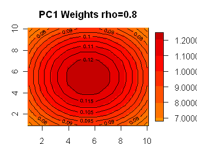
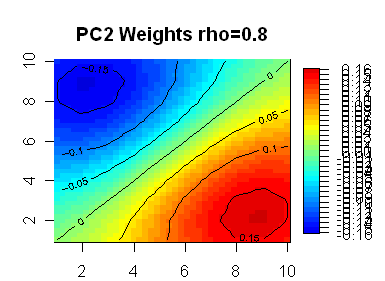
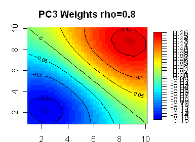
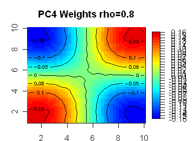
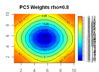
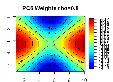
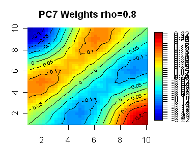
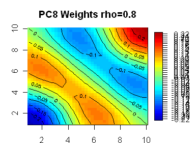
Here are 8 plots showing weights for the first 8 PCs, with the first PC being highly symmetric. In the line segment case, the PC weights appear almost certainly generated by sin(kx) functions. My guess is that the functions in the square case are also sine functions of some sort – the first one looks like it has radial symmetry, but I don’t know what formulas would generate the lower ones.
 |
 |
 |
 |
 |
 |
 |
 |
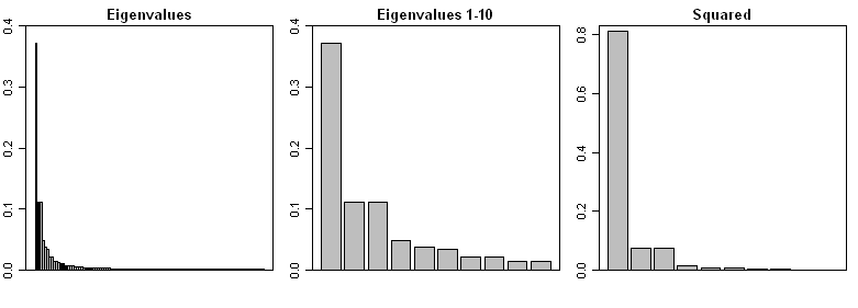
In addition, here is a barplot of the eigenvalues from the above decomposition: the network has 100 sites. The left panel shows all 100 eigenvalues with lower order patterns obviously being very small. The middle panel shows the first 10 eigenvalues; the PC2 and PC3 which are symmetry-breaking have indistinguishable eigenvalues. I’m pretty sure that, in an empirical situation where one has a spatial autocorrelation and a rectangular grid, the empirical PC2 and PC3 would readily get mixed; the “plane” resulting from the PC2 and PC3 would be fairly distinct, but little meaning could be attached to the symmetry-breaking weights.
The right panel shows the square of the first ten eigenvalues (normalized), showing a remarkable concentration of weight on the PC1. Given that the network is constructed with spatial autocorrelation, it makes sense that the relevant “signal” is in the PC1. By the time that you get to the PC4, you are dealing with an inconsequential proportion of weight.
Maybe my rho is higher than realistic; I’m experimenting still. But if the rho is plausible and we re-apply this back to the NOAMER network, which I’ll try to get to some time, this means that, under the model here, one would not expect a PC4 to contribute much to the weighting of the network. The weight of the NOAMER PC4 is significantly higher than the PC4 in this model. So in Preisendorfer’s terms, this should be a “ringing bell” for the examination of exactly why the PC4 is over-contributing to the network?
In this case, we know that the PC4 is made up almost entirely (all but one) of Graybill chronologies? As we’ve discussed elsewhere, this raises questions about both 1) aside from bristlecones, are there are problems in what Graybill did e,g, Ababneh’s failure to replicate at Sheep Mt? 2) are Graybill’s bristlecones actually recovering a signal unavailable to other trees in the network? 3) is that signal relevant to temperature?
All of these questions have been asked before. The only fresh context here is an illustration of what PC weights look like given geometric uniformity. The methodology is also perhaps a simple and interesting way of generating some interesting looking eigenfunctions.


34 Comments
PC5 is mis-scaled for display.
Hope this helps, I remember this demonstration from physics class
quoted in:
http://sharp.bu.edu/~slehar/webstuff/hr1/hr2.html
see also:
http://en.wikipedia.org/wiki/Ernst_Chladni
nice youtube clip
Hans, thanks for the refs. It’s interesting that the shapes can be generated by PCA. Here’s my script for generating and plotting the figures
library(fields);library(akima)
f= function(x,y,i=i0,j=j0,rho=.8) rho^ sqrt( (x-i)^2+(y-j)^2)
K=10
test=rep(list(NA),K^2)
for (i in 1:K) {
for (j in 1:K) {
i0=i;j0=j
k= K*(i-1)+j
test[[k]]= outer(1:K,1:K,f)
}}
R=array(NA,dim=c(K^2,K^2))
for (k in 1: K^2) R[,k]=c(test[[k]])
W=svd(R)
#now plot the kth figure
k=k+1
Z=cbind(as.numeric(gl(K,K)),rep(1:K,K),W$v[,k])
if(sum(Z[,3])<0) Z[,3]= -Z[,3]
gridded = interp(Z[,1],Z[,2],Z[,3])
ylim0=range(gridded$z,na.rm=T);ylim0 # 0.007698207 0.200473573
y0=ceiling ( max(abs(ylim0))/.05) *.05;y0
breaks0=seq(-y0,y0,.01); N=length(breaks0)
layout(1)
par(mar=c(2,3,3,1))
image.plot (gridded$x,gridded$y,gridded$z,col=tim.colors(N-1),breaks=breaks0,xlab=””,ylab=””)
contour(gridded, add=TRUE)
title(main=paste(“PC”,k,” Weights rho=0.8″,sep=””))
hans. that was absolute zero.
Cool Utube.
When MBH believers say that the hockey stick appears in PC4 (obviously with BCP’s and Gaspe present), are they saying literally that there is a hockey stick if weightings from the PC4 distribution (shown above) applied to the data produces a hockey stick on its own, or are they saying that all-summed-together (ie PC1 + PC2 + PC3 +PC4), a hockey stick appears after the inclusion of the PC4 weightings ?
In the AD1400 network, 20 of 22 series don’t have a HS shape. Mostly they just look like noise. There are ONLY two series with HS shapes – the bristlecones (be it PC1 or PC4) and the equally questionable 1984 Gaspe series, which was not replicated.
The series aren’t summed. They are regressed against the temperature trend. So the possibility of spurious regression is rife.
As 6 asked. Does the PC4 hockey stick appear if BCP and Gaspe are removed? As in not regressed with the remaining tree-ring and remaining proxies. I’m not sure Steve answers this question in 7.
Steve writes, #7,
If one has regressed 22 proxies on temperature, the next step should be to do a chi-square (or F) test to see if the joint hypothesis that all their coefficients are zero can be rejected. Out of 22 proxies, 2.2 on average would be individually significant at the 10% level, and 1.1 on average at the 5% level. But (unless the proxies have already been cherry-picked), there will only be a 5% probability that the joint test statistic will be significant at the 95% level if none has any real explanatory power.
I didn’t notice such a test go by in MBH98 or 99. Perhaps Tamino can find the page number?
Hans, lovely patterns and youtube. Watch the breadcrumbs in the pan base next time you deep fry crumbed cutlets. Or just melt a small block of butter slowly and watch neat patterns emerge.
I have been fascinated for years about how Nature gets maths into plant growth and have even given an international paper on it. But it was more pretty pictures rather than incisive maths analysis with explanations, which continue to defy me. Words like parastichy and Lucas phyllotaxis and packing theory are found in the literature – see e.g. “Quantitative Analysis of Sunflower seed packing”, George W. Ryan, J. L. Rouse and L.A. Bursill, J. Theor. Biol., (1991) 147, 303-328. John Rouse was an old friend. Having seen some of the complexity of the sunflower head and discussed some maths, I have naturally been interested in tree growth rings and influences on them. My first post grad job was running analysis of variance on weight yields from pots of plants given measured mixed doses of nutrients in careful factorial experiments.
Steve, when you use the square grid you have potential edge effects but they do not appear to disturb the symmetry of PC1 plots, which I would expect to be upset (by intuition). I wonder what would happen if you extrapolated values outside the square (no jokes please!) so that the outside was a mirror image of the interior, if you get what I mean, folded back for a small distance. One way we experimented with end effects on running line means was to extend the weighted reflection of the last n/2 values where n values were in the running mean and recalculate with the taper added. It has no basis in correctness, but it avoids a sudden stop at the edge with only 1 value in the running mean. It’s all guessing, like assigning physical factors to PCs when there is no physical experiment to relate them.
Another thing we did for extrapolation of line data was to guess at a next value (say where a hole had stopped in ore) and run repeated semivariograms so that we came up with a guess number that least affected the semivariogram. You can then do it for the second number out, then the third, etc. to the point of sillness. I guess there is an inversion method that calculates the guess numbers better than taking an eyeball and iterating.
Guessing is the final degradation from lack of information. It can make some images prettier but I don’t condone it at all. It’s not bankable.
Steve,
A standard reference text for POD is Turbulence, Coherent Structures, Dynamical Systems and Symmetry by Holmes, Lumley, and Berkooz. Chapter 3 on “Proper Orthogonal Decomposition” has results I think you will find useful (particularly Section 3.3.3 on Symmetry). The POD eigenfunctions of a homogeneous system are simply Fourier modes.
Cheers,
— Pete
Great graphs, Steve! I was trying to do something similar with my clunky tables in my comment on the “More on Toeplitz Matrices…” thread, but obviously 1 graph is worth a thousand bits!
What these show is that if you have a spatially autocorrelated network with nothing else going on, the PC’s are basically all just mathematical functions that give an increasingly complex smoothed approximation to the realization. The first 8 above would make a great weather map for the evening news or USA Today after put together with their empirical loadings using local temperature.
In a climate proxy network, we could expect that many, if not most, of the PCs will have such interpretations. However, if there are other climatic and/or environmental factors present, some of the PCs might be picking up those as well. For treerings, I have in mind precipitation, insolation, CO2 fertilization, budworms, species, airborne dust of agricultural fertilizers, which side of the mountain the tree is on, bark loss, and perhaps even temperature.
Even if none of the PC’s is related to temperature, we can’t just look at all 22 t-statistics to tell us this, since their test size is only valid when a single test is being done, and the probability that one out of 22 exceeds the 5% test size far exceeds 5%. To say that the network has some significant explanatory power would require first doing a chi-square or F-test on the hypothesis that all the coeffients are zero, properly taking into account the spatial and other autocorrelation that is undoubtedly present. In particular, you can’t just observe that PCs # 2, 4, 7, 10 and 13 or whatever have the best correlation with temperature, form an index from them, regress it univariately on temperature, and then look at the t-stat for the index, since this strategy is rank data mining.
If one believed (as is reasonable) that only the first few PC’s could be important, it might be legitimate to examine them in order of their eigenvalues. Thus PC1 could be evaluated on the basis of its t-stat alone. But then PC2 could be included only if it is individually significant and PCs 1 and 2 are jointly significant. Like wise, PC4 etc should be included only if it is individually signficant and PCs 1, 2, 3, and 4 are jointly significant. When there are no more low-order PCs that pass this test, it may be safe to discard the remainder and use only the first several that passed.
Thus the order of the PC makes a big difference for how it should be evaluated. PC1 may be evaluated just on its own t-stat, whereas PC4 requires the joint significance of PCs 1 – 4, plus its own t-stat. Undoubtedly there is a BCP factor present in the MBH proxy data set, but whether it is PC1 or PC4 is not irrelevant to its significance for temperature.
Wow … mimics the behavior of an enclosure (e.g. radio ‘waveguide’) excited by (or in) higher ‘modes’ (e.g. at higher frequencies) where the multiples of the wavelength can exist.
John Scales, Linear Systems online here has some interesting images including the following. The first shows the first few eigenfunctions from a rectangular drum and illustrates an interesting effect when eigenvalues are very close. In the square case, the eigenfunctions highlight the diagonal, whereas a slight change in geometry results in horizontal and verical gradients being picked up.
The reason is that they are linear combinations of one another and readily slide into one another. Scales illustrates the summation here.
In these cases, Scales derived the patterns by solving the wave equations, which was possible here.
What seems possibly interesting about my approach is that I got the same eigenfunctions not from the wave equation, but from spatial autocorrelation – I’m sure that they are the same thing in some sense familiar to people in the area, since they yield the same results. The advantage of the spatial autocorrelation approach is that you can easily define the covariance matrix using ONLY the property of uniform spatial autocorrelation (covariance should equate more or less to the inner product integrals that one sees in the wave equation based analyses) and then trivially do a SVD on the resulting matrix.
I experimented with a hexagon using nothing more than an autocorrelation approach and chopping off matrices outside the hexagon. This gave many eigenfunctions that had 6-fold symmetries and looked pretty, but the algorithm that I was using also contoured a lot of eigenfunctions with 4-fold symmetry. My guess is that the contouring function is biased somewhat towards horizontal and vertical connections and will contour some things non-optimally if you really have 6-fold symmetry, but that’s just a guess.
Obviously the generation of Chladni figures from the wave equation is well known and while it hardly seems possible that there’s anything very original about getting the Chladni patterns only using spatial autocorrelation, I haven’t seen precisely this derivation. So any links or suggestions are very welcome.
The principal eigenvectors are not much different than bivariate polynomial functions of x and y.
The first eigenvector is basically just a constant (that bulges a little in the middle).
The next two are basically linear terms in x and y, or equivalently (x-y) and (x+y). These get identical eigenvalues, since the are contributing equally to the overall fit.
The next 3 are basically 3 linear combinations the 3 quadratic terms, xy, x^2, and y^2. xy works well by itself, and so comes in as PC4. (x^2 + y^2) works better than x^2 or y^2 by itself, and so comes in as PC5. Then (x^2 – y^2) picks up the remainder of the quadratic effect.
The next 4 should be essentially 4 linear combos of the 4 3rd order terms, x^3, y^3, x^2y, and xy^2, etc.
The bulge in PC1 is evidently due to the fact that the perimeter is assumed to be correlated to the unobserved values outside the 10×10 grid, which eventually have conditional expectations equal to the unconditional expectation of 0. Hence if we know that average temperature (or treering width or whatever) in our grid is 1 unit above normal, our best guess of the individual temperatures is that they are a little higher than 1 unit in the middle, and a little lower on the perimeter.
If I remember my Applied Maths correctly, the Chladini figures (and many other solutions for the wave equations) come from setting a boundary condition such that something = 0. The solutions give resonance patterns, which are ideally things that the system can do all on its own (with a little bit of energy), with nothing driving it from outside. Of course in practice you need to provide energy to replace loses to friction, sound, etc, and by adjusting that energy input (frequesncy, location) you can make the figure you want. However it is still a free oscillation, not a forced oscillation.
I don’t know what the corresponding statement would be in PCA. My first thought was that in a climate system it would correspond to the natural changes of the climate system, with no forcings from external sources, but my second thought was that this is too simple. Anyway, that’s my 2 bits worth.
Peter
IMHO it is the geometric boundary condition (in this case a square) that yield the harmonic eigenfunctions.
http://en.wikipedia.org/wiki/Eigenfunction
Caveat, my math is rusty. 😉
This is a figure from “Folding and fracturing of rocks” by John G Ramsay. 1967. Might ring a few bells for geologists of a certain age!
This is a figure from “Folding and fracturing of rocks” by John G Ramsay. 1967. Might ring a few bells for geologists of a certain age!
Link to image for two dimensional interference patterns
Probably does not advance Steve’s work, but I can generate the #18 AlanB type pattern in a few minutes at the keyboard, plus specified angles, if useful or requested. (old geochemist).
Steve, when you did your PC contouring, did you have data outside the square and if so, did you delete it? I’m rusty as heck and struggling to follow the deeper significance of the story.
I suspect that off-the-shelf contouring patterns for hexagonal data will try to force rectangular shapes. The search shape we mostly used for 3-D mining work was an ellipsoid, usually with different principal axes A,B & C and weighting to zero at the edges. This also has rectangular implications, but then we mined rectangular blocks.
Of course hexagons tile in 2-D. here is another shape likewise (derived from the stoppers in volumetric flasks in the lab) that also tiles. Who knows where this study can lead you?
These figures appear naturally in Quantum Mechanics when considering a particle in a square potential well .
The potential inside the well is 0 and infinite outside .
Solving the Schrödinger equation , yields a set of Eigenfunctions Psi n,m (x,y) corresponding to Eigenvalues En,m (energy of the state with quantum numbers n,m) .
The function Psi(x,y) n,m . Psi*(x,y)n,m . dx.dy (Psi* = conjugate of Psi) gives the probability of presence
of a particle with given quantum numbers n,m in a volume dx.dy at x,y .
Representing graphically Psi(x,y) n,m . Psi*(x,y)n,m gives the charts of the distribution of the probability density for every quantum state that are like your charts .
Your first chart (PC0) represents the ground state (n=m=1) and the following represent the states with higher n,m so with higher energy .
The normalised wave Eigenfunctions are given by :
Psi(x,y) n,m = Sqrt (4/L²) . Sin [n.Pi.x / L] . Sin [m.Pi.y / L] where L is the side length of the well .
As one can see , there are symmetrical figures obtained by permutating n and m what corresponds to degenerated states with the same energy because energy depends only on (n² + m²) .
If the well is rectangular and no more square then the degenerescence is broken (energy depending then on (n²/Lx + m²/Ly) and the figures loose their symmetries even if they qualitatively still look the same as the square case .
I don’t know what you did exactly because I am not so familiar with PCA but what the figures suggest to me is that it is equivalent to 2 independent harmonic oscillators .
Therefore there must be mathematically somewhere an equivalent of the 2D Schrödinger equation e.g there must be some functions F1 (x) and F2 (y) such as d²F1 /dx² is proportionnal to F1 and d²F2 /dy² is proportionnal to F2 .
Farther F1.F2 must be an Eigenfunction of some operator representing the system (Hamiltonian in the quantum case) .
Pushing the analogy a bit more , if the system was not a perfect harmonic oscillator in a square potential well , one could always write the hamiltonian as a sum of the square well hamiltonian and a perturbation hamiltonian .
The Eigenfunctions would then be perturbated and the charts would be deformed – the measure of this deformation would give a measure of the strength of the perturbation .
The only property that I used was uniform spatial autocorrelation and a square region.
My guess is that 2 independent harmonic oscillators result in a structure with uniform spatial autocorrelation.
Mathematically, my guess (and I’m just guessing) is that you’ve got the necessary/sufficient backwards i.e. you can have uniform spatial autocorrelation without equivalent of the 2D Schrödinger equation E.g. a Stahle tree ring network on a square region looks like it can yield these sorts of eigenfunctions, but obviously Stahle tree ring chronologies would not satisfy a Schrodinger equation.
However, my guess is that the Schrodinger equation will also result in something that has uniform spatial autocorrelation – probably the time series of some state at each point: does that make any sense?
I think it is simpler than that Steve. A wave equation of whatever description imposes a correlation on a field of some sort (across time or space). That can naturally be approximated to some degree by an autoregressive model. For example a single frequency oscillator can be well modelled by an AR(2) process capturing both the frequency and linewidth variations. The spatial solutions for wave equations in things like lasers, microwave cavities, drum skins and so on can likewise be approximated to a good degree by an arbitrary AR model… the simplest I guess being y(x) = c*y(x+1)+e, that is just proportional to a neighbour point plus noise. With a wave equation you can often get analytic solutions (like Hermite-Gaussians or Legendre-Gaussians in laser modes) and then an AR model will look something like a slight distortion of these. So there is a natural expectation that your autocorrelation eigenfunctions look a lot like eigenfunctions from other physical devices. The figures shown in #14 above look a lot like laser modes (TEM00, TEM01, TEM10, TEM11 etc) and if you misalign the laser mirrors slightly you blend them into your off-diagonal example. I expect if you setup a circular space and did your autocorrelation on a sufficiently fine scale you’d find circularly symmetric patterns like Legendre-Gaussians. It doesn’t matter where the spatial wave-equation comes *from*, if it is typical of physical fields then it will have eigenfunctions that look something like those shown in all the examples above, simply because a wave-equation imposes a correlation on the field that can be approximated by an AR model. The exact shapes and their level of distortion from the ideal depend on the geometry assumed for the problem.
Very nice videoclip Hans.
Information like this keeps me sharp.
#24. chefen, thanks for the comment. I think that we’re on the same page here. From a strictly math point of view, it seems to me that you can have spatial autocorrelation without a wave equation but a field controlled by a wave equation has spatial autocorrelation. But I’ve not studied the matter and am merely guessing. Is the converse also the case: if you have spatial autocorrelation, can you always find a wave equation to describe the field?
#26
“if you have spatial autocorrelation, can you always find a wave equation to describe the field?”
I doubt it in an analytical sense, wave equations are particular second order PDEs. It seems unlikely that you could find such a PDE for every possible spatial autocorrelation. But I imagine in many cases you can find a wave equation whose eigenfunctions look a lot like those for your particular autocorrelation if you allow for noise terms.
#27. That seems likely to me also. All of which is additional support for the point that it’s the spatial autocorrelation that is “really” the cause of the Chladni type figures – the wave equation being a particular case.
Another thought occurs. The definition of the autocorrelation matrix looks a lot (exactly?) like a quantum mechanical probability density matrix. Many systems are homogeneous in certain axes so the prob density matrix is often Toeplitz, or can be rotated to be so. The comparable eigenfunction forms are then only to be expected and it is perfectly natural to see wave equations yielding an identical behaviour. Proof, as ever, is left as an exercise for the reader.
Allow me to generalise: If you would use cylindrical coordinates phi,r, constrained on a circle instead of using cartesian coordinates x,y , constrained on a square , I expect the solutions to be Bessel functions. For spherical coordinates lambda,phi,r, I expect Legendre functions.
I have been pondering this for a while. It seems odd to me that this particular analysis is dominated by spatial coordinates. After all it is an analysis of data in three variables, temperature and position. But that is what PCA is supposed to do, find an orthogonal basis set to describe the data, but in such a way as to have the variance dominated by the first few elements of that set.
There are lots of ways to describe data using functions or sets of functions. That allows the scientist to pick the math that best suits the science. If I were to be handed sets of temperature data over time, and told to use PCA analysis, I probably would have just thrown all the data together, and come up with a basis that is a mixture of temperature and time. Maybe the first element of the basis would have most of the structure that I want to pull out of the data. Not a given, but worth trying.
If the data were a lot more complex, PCA could also be used to simplify the representation of the data, and to show me what part of the data is redundant. Thus I could use the results to build a simpler set of data that represents the original data, maintaining its greatest variances.
I have a bit of trouble in my mind trying to expand this concept to sets of data. Can I call each set of data a separate ordinate and develop a basis set as a function of these data sets? And what on earth is orthogonality between these sets, especially since they are definitely non-orthogonal series of time data?
Maybe they are misusing the math, or maybe it is a brilliant and powerful generalization. But, the result won’t pick out which data sets best represent the planets temperature. Instead, it will pick out and emphasize which data sets best represent the variance inherent in the aggregate.
There will be strong correlations between latitude and temperature. There will also be correlations between altitude and temperature, and altitude is positional. It also makes a difference which side of an ocean one is on, if one is near an ocean or land locked, etc. Steve is right to consider these, they are hidden features of the sets. One could use these techniques to clean up larger data sets, say smoothing the data over area like in weather maps to get better areal averages of temperature to use in getting the global average temperature. But, how on earth can one use so few data sets, with such a poor representation of the earth to even dare claim that they can tell us the average temperature of the earth?
It seems to me that this is a sophisticated slight of hand. A technique was found that was best suited to emphasize particular data sets over other data sets. The result was then presented as proof that man has set himself on a runaway train to temperatures that were higher than the world had ever seen.
Is there a mathematical generalization of this technique to use sets as ordinates?
If valid, has anyone demonstrated that this is an appropriate technique to use for this situation?
Has someone included latitude, longitude and elevation as well as time, and used PCA in the normal way in their analysis and averaging of the data?
Thanks for the stimulation.
Just published in Nature Genetics: A critique of PCA on spatial data as used in genetic population analysis.
It points out some pitfalls and recreates some of the same patterns Steve has derived.
http://www.nature.com/ng/journal/vaop/ncurrent/abs/ng.139.html
PCA patterns
#32. Does look like the same effect, doesn’t it? I’ll take a look at the article some time.
Re: #32
From the linked article summary:
Well there it is – they said it. Do we conclude the same for the subject of this thread?