Relatively up-to-date radiosonde data is available from the Hadley Center, tropical (20N-20S) is here. Ratpac and Angell are not up to date. The tropical troposphere has been a source of disputes recently, but I haven’t seen any discussion of up-to-date radiosonde data, [Note: Luboš has a current discussion on radiosondes.)
You will recall the diagram illustrating a hot spot around 200 hPA in the tropical troposphere. Here’s a diagram from realclimate which is the first figure in their post entitled “Tropical Troposphere Trends”.

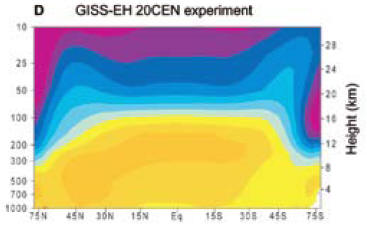
Figure 1. Graphic from realclimate said to show the effect of doubled CO2 using GISS Model E.
Here’s a simple plot of tropical 200 hPa radiosonde data to March 2008 from Hadley Center.

Only one month in the entire history of the radiosonde record since its commencement in January 1958 had 200 hPa and 150 hPa anomalies below -1.2 deg C. It was March 2008. The trend since January 1979, the start of satellite records, is -0.025 deg C/decade. Yeah, I know that it’s just one month, but it’s still a “record”. It would be interesting to calculate the odds of a negative record on the hypothesis of (say) a positive trend of 0.1 deg C/decade. (Note that these data sets are highly autocorrelated and that ARMA(1,1) coefficients are both significant with an AR1 coefficient of over 0.9 in an ARMA(!,1) model – something that reduces “significance” of any trend quite noticeably).
Note: As observed below, the GISS graphic shows the effect of doubled CO2, while the increase in CO2 levels since 1960 to date has been 20%, and about 15% since the start of satellite records in 1979. On the basis of a logarithmic impact, the first 20% increase accounts for about 26% of the impact; and the 15% increase since 1979 about 20%. So it should be noticeable in either data set. In other posts on radiosonde data, I’ve observed that there are many issues with inhomogeneity in radiosonde data.
More: CCSP 1-1 and HadAT Radiosonde Data
The U.S. Climate Change Science Assessment Report 1-1 , a report to which Douglass et al 2007 were in part responding, contained graphics illustrating both HadAT radiosonde data trends from 1979-99 and GISS projections over the same period, so it’s interesting to compare their results to the updated information here.
First here is a graphic from the CCSP report, which, inter alia, shows their calculations of HadAT radiosone trends for 1979-99, followed by my calculation of the same trends for 1979-March 2008. It’s interesting that the HadAT pattern hasn’t really changed that much even with the incorporation of 10 more years.


Top – Original caption: Figure 5.1: Vertical profiles of global-mean atmospheric temperature change over 1979 to 1999. Surface temperature changes are also shown. Results are from two different radiosonde data sets (HadAT2 and RATPAC; see Chapter 3) and from single forcing and combined forcing experiments performed with the Parallel Climate Model (PCM; Washington et al., 2000). PCM results for each forcing experiment are averages over four different realizations of that experiment. All trends were calculated with monthly mean anomaly data. Bottom — HadAt trends.
The CCSP report stated:
The pattern of temperature change estimated from HadAT2 radiosonde data is broadly similar, although the transition height between stratospheric cooling and tropospheric warming is noticeably lower than in the model simulations (Figure 5.7E). Another noticeable difference is that the HadAT2 data show a relative lack of warming in the tropical troposphere,66 where all four models simulate maximum warming. This particular aspect of the observed temperature-change pattern is very sensitive to data adjustments (Sherwood et al., 2005; Randel and Wu, 2006).
Below are their illustrations of GISS model projections 1979-99 compared to HadAt actuals. I’m not in a position to comment authoritatively on these graphics, but here are a couple of points that I find interesting. As I understand it, the top of the tropical tropopause is ∼18.7 km (70 mb). The GISS model shows warming right up to ~ 16 km (100 mb), both in the doubled and 20th century graphics, with cooling in the “blue” color code up to 25 km (25 mb). HadAt radiosonde data shows warming up to only about 12 km (250 mb), “blue” cooling from 12 km (250 mb) to 16 km (100 mb) and “purple” cooling from about 16 km (100 mb) to 25 km (25 mb) and higher.
The actual locus where additional CO2 has an immediate impact is at altitude, as more CO2 causes radiation to space to occur at a higher and colder altitude according to the Houghton heuristic cartoon. Getting the sign wrong in the 12-16 km is definitely a bit inconvenient and is not mere nit-picking and you can see why they are looking so hard at the observations to see if there’s some important inhomogeneity.
 |
 |
Karl, T. R., Susan J. Hassol, Christopher D. Miller, and Willieam L. Murray. 2006. Temperature Trends in the Lower Atmosphere: Steps for Understanding and Reconciling Differences. Synthesis and Assessment Product. Climate Change Science Program and the Subcommittee on Global Change Research. http://www.climatescience.gov/Library/sap/sap1-1/finalreport/sap1-1-final-all.pdf.


152 Comments
Typo in the second paragraph: “hop spot”
Actually, that was not a typo. The Modelers KNOW it is there, yet, every time someone looks for it, it has HOPPED somewhere else!!
I blame Lubos and his wormholes!!
Lemme see, the ground temp from -30 to 30 ranges from 1-2.2c. The hop spot is 3-14.6c. This data adjustment, and its rationale, will be a story for the grand kids!!
Steve this negative trend only appears in obsolete data sets and is very misleading. You should be using RAOBCORE 3.7 at the very least if you want to be taken seriously.
jeez, you claim Steve is using “obsolete data sets” – what part of “to March 2008” do you not understand?
Carl, I think jeez has omitted his /irony tag. I think RAOBCORE is only up to version 1.4, although it looks like they may need a new version with some additional adjustments to the data.
The Real Climate link claims that rising temps in the tropical troposphere are not a signature of GG based warming, but of warming due to any causes. Obviously from the charts in Steve M’s posting, this tropical trop warming is not happening. But is the underlying point true? Is it true that tropical trop warming will happen if it warms, from any cause including GG? This was the point of McKittrick’s T3 tax proposal, was it not?
[irony]29.25 years of data isn’t climate. It’s simply weather noise. It takes 30 years data to be considered climate[/irony]
Better Carl?
I am beginning to be wary of commenting on these web pages as I just keep on exposing my naievity, but; reading realclimate’s explanation of this data I am reminded of Econometric explanations of inconsistencies between observed and model predictions of economic events. I soon came to the unacademic opinion of such explanations that “…these people are making it up as they go along.” I concluded that the reason for the inconsistencies was because there were genuine inconsistencies and hence there were real problems with the models.
In short- and ignoring high level statistical manipulation of the data- is it correct that there are inconsistncies between the radiosonde measurements and model predictions? Because if it is and CA is correct in stating: “…The trend since January 1979, the start of satellite records, is -0.025 deg C/decade.” then realclimate must be making it up as they go along.
Yes … I feel much better now … was just having a senior moment 🙂
The models are not wrong, there is simply no warming in the tropics at the surface:
http://junkscience.com/MSU_Temps/UAHMSUTrop.html
Martin J asked:
RealClimate’s defense against this is to point out that the models give a very wide range of predictions, including some models that predict trivial-to-no warming in the troposphere. Thus, since the range of model predictions overlaps the radiosonde data, they conclude there is no discrepancy between the two. See here for RealClimate’s response.
Taking the Hadley Centre radiosonde data 1958 to 2008 as referenced, and sourcing a Nino3.4 monthly dataset.
There is a clear relationship between “200hPa T anomaly” and “Nino 3.4”, especially if a lag of three months is incorporated in “200 T Anomaly”. (I tested one to five month lags).
with no lag – correlation 0.56
with 3 month lag – correlation 0.71
Applying a 5 month moving average to both elements:
with no lag – correlation 0.63
with 3 month lag – correlation 0.80
A strong dip into negative territory is therefore not unexpected (assuming we have appropriately identified causation) following a significant La Nina.
Interestingly “year” also correlates positively – correlation 0.33
Combining “year” and nino3.4 as predictors in a MLR “explains” about 70% of the variance of the “200hPa T anomaly”. At 95% confidence levels, there is a 0.3c to 0.4c increase in T at 200 hPa for the 50 years 1958 to 2008, based on the “year” coefficient.
“If the pictures are very similar despite the different forcings that implies that the pattern really has nothing to do with greenhouse gas changes, but is a more fundamental response to warming (however caused).”
What if the observed warming is caused by land use changes and data adjustments? What do the models say about that type of “warming”?
It is astonishing to see science in the face of totally contradictory information being completely mum about the whole thing. It is truly a “emperor has no clothes moment.” Anybody with half a brain has got to be stunned. It seems like science is like the deer caught in the headlights or maybe the dead person twitching is a better analogy. While the arms keep moving (the press) seeming to act as if the theory is alive the brain is dead. There is no possibility of life and yet the nerves keep firing autonomously and people might think the person is still alive (the press and the general public) but the doctor looking at the brain scans realizes it’s over.
Realclimates answer to this “miss” is that the error bars are too small and 50 years of data that shows no trend is neither long enough nor are our instruments accurate enough to see the “warming” that has to be occurring. The other explanation is that winds appear to be picking up in this part of the atmosphere and that this hides the warming that is there. Personally I find both explanations “grasping at straws” sort of like the dead person analogy above when the relative says: “I saw him open his eyes.” He’s alive. He’s alive. I’m sorry to have to relate this news. No. It’s dead. The last theory that realclimate has proposed for this problem is that some of the AGW theories don’t have to have warming in this part. It’s not any of the models that the IPCC used or that are constantly run at NASA and other places but there are theories of AGW that can live without this “hot spot”. It all seems so much like grasping at straws.
It is so funny to me that as the science has collapsed the politicians are being asked to make ever more religious statements about CO2 and the “warming.” They are asked constantly now: “Do you believe in global warming?” and like they need to say it or appear to not have “religion” or to be blasphemous they need to say “Yes. I do with all my heart believe in this global warming. I do. I do.” It’s become a religious invocation at this point. A requirement to be a decent human being to say that it is warming. Essentially we are being told there is heat in the system being generated by CO2 but we can’t show you where it is. It’s hidden. Is this like Jesus hiding from us too? He is in “heaven”. Where is the CO2 heat? Is it in “eco-heaven and will come to us on eco judgement day?”
I feel I am watching a long slow video of a car accident and being unable to take my eyes off the collision and subsequent damage.
If you look at these charts above you see that 1998 was indeed an anamolous year. The El Nino that year was clearly a monstrous event, a 100 year El Nino. It created the backdrop that allowed this global warming hysteria to take hold. Without that event it would have been much harder to argue that the globe was warming. It made the hockey stick come to life. There is still the indisputable warming at the north pole but several very good scientific reports have shown that this has been because of a combination of 2 factors. 1) NAO (the north atlantic oscillation) which shifts energy between the equator and north pole of the atlantic over a 40 year period and 2) increasing soot in the snow at the north pole from industrialization and “aerosols” is providing material for the solar radiation to reduce the snows irradiance.
#14. I wouldn’t make triumphalist claims like this for a variety of reasons. It’s pretty hard to detect a 0.1 deg C/decade trend from noisy and autocorrelated data like this even when it’s there. Also, it’s hard to put a whole lot of faith in the radiosonde time series as there are many issues with homogeneity. And the likelihood is that there will be a fairly rapid recovery from this particular downspike.
I intentionally refrained from drawing any moral from this time series. Probably all that one can say is that, had it gone the other way, we would have heard about it endlessly.
Also in terms of stock market analogies, MBH98-99 was bought virtually at the top of the temperature bull market in 1998.
Can someone tell me if any of the AGW predictions have been found correct? To me it seems that they haven’t but I don’t have a thorough enough understanding of the subject. I read realclimate when such things happen and they seem to say, “Yes just what we thought.” or, “It fits the theory” when there or no predictions, or, “The data is wrong.” I say this because as a sceptic from the very beginning we are going down a black hole of public spending and taxes and none of us seem to be able to roll back the tide of political belief that global warming is MM.
Gerry Morrow
Steve: Serious people believe that it is an issue. There’s a lot of promotion and hype, but that doesn’t mean that, underneath it all, there isn’t a problem. No one’s shown that it’s not an issue. The hardest part for someone trying to understand the issue from first principles is locating a clear A-to-B exposition of how doubled CO2 produces a problem and I’m afraid that no one’s been able to give such a reference to me – the excuse is that such an exposition is too “routine” for climate scientists. That’s the first attitude than has to change.
Martin,
There are several types of modeling. One type is an engineering model that needs to be predictively accurate. Another type is a science model that uses theory to explain what we see. As much as theorists are trying to come up with “the” perfect theory, and as experimenters are trying to make precise measurements, we are actually highly suspicious of ‘perfection’ from both. Like Newton’s laws of gravity, a really, really, good theory will explain most of what we see. But even the smallest of aberations can lead to even better theories, such as Einstein’s. As scientists vie to be the one who understands the world best, our initial theories often only get us in the right ball park. Real science is supposed to have an intense competition of theories whose survivors provide the best understanding and predictive power of the world around us. Science without this extremely skeptical competition goes nowhere. And sometimes, good predictive theories prove dead wrong when we become capable of exploring and measuring even better.
There are also a wide range of fields, some of which more easily lend themselves to this form of investigation. These are often called the “hard” sciences. Human behaviour hasn’t been one of them so far. Quite often, knowledge of economic theory will actually change behaviour in a way that invalidates the theory. Or the rules get changed in the middle of the game. Or happenstance messes things up.
There are also fields, even in “hard” science that are so complex, that even with detailed knowledge and deep understanding, we just aren’t able to hand of to the engineers predictively useful models that enable technological advances. We actually made successful fission reactors before we made fission bombs, but though we quickly were able to follow up with fusion bombs, half a century after the H-bomb we still don’t have fusion reactors. And the Sun makes it look so easy.
Climate science is an amalgam of many different branches of the “hard” sciences, quite a few of which are as equally difficult as MagnetoHydroDynamics has been for the fusion scientists. This makes it an odd mixture of being a new science where scientists should be competing fiercely for the basic understanding, yet being constrained to use the already existing, extremely complex understandings of the older better understood sciences it has encompassed. Look just at weather. It is so complex, that it needs the best supercomputers to give us basic predictive powers. And yet though they say they have power to predict 10 days ahead, how often do they get it right 3 days in advance, or even that morning?
But some scientists have also discovered that they can raise money by scaring people. And that they can use those scares to influence the results of politics. Both of these undertakings require that they not seem wrong. There is nothing like having egg on ones face in the world of politics. Those scientists become activists, as trustable in their science as [snip – phrase strictly forbidden here] Note, I don’t say right or wrong, I just say biased and untrustable.
The remaining scientists, all of which would rather be competing in the fray of ideas, find themselves pressured and trapped into conformity. The very tools they have built to protect themselves from bias, and to weed out the biased and untrustable, have been turned against anyone who dares contradict. Worse, they were fooled into going along at the beginning. “I want to be trusted as an expert in my field, so I will trust others as expert in theirs. But that guy just absorbed my field and many others. He claims a broader expertise. I can’t know if he is really using my fields theories right. If I speak up, I can be made to look foolish by his referring to someone elses field. Safer to be quiet and go along.” But going along and being quiet makes the activists look right and gave them power.
Getting back to economics, Steve comes from a field that directly influences the value of investments. Snake oil salesmen existed long before. And the guy who lost money on a stupid mistake thinks he has been tricked. Good Ole Boy systems of trust and review have proven too weak to catch stupid mistakes, let alone weed out the real snake oil salesmen. So higher standards of proof are required. This protects the prover from jail, as well as protecting the investor from fraud. And when Steve looked into this field, he found gross failures that would never make it through court in his field. And when he pointed this out, he was attacked through those same mechanisms that are being used to cow critics, whether or not they are scientific. Long ago, I tried to defend those mechanisms of scientific peer review, and Steve blistered me in response. I have since come to see that he was right in doing so.
The theory could still have value. But it has been misused. We have seen nature come out of a little ice age without help from mans fires. We have also seen Multi-Decadal Oscillations, and a very strong recent El Nino / La Nina peak. On the upswing of these events, the activists denied the existence of natural variability. And now that we are seeing downsides, they grab onto natural variability to claim things are worse than they seem. A real scientist would try to seperate out the smooth underlying warming that is supposed to be happening from the natural variability. That makes it difficult to see. If he is successfull, he advances our understanding so that it explains more of what we see. If not, he needs to go back to the drawing board. But, it may also be that the data is not good enough, or it has not been good for long enough, to be able to make any conclusions at all. In which case, the data takers need to go back to the drawing board, and the rest of us need to be more patient.
But the activists can’t let any of that happen. We must act on their politics right away. Skeptics are put down as deniers. The data is sacrosanct, and every correction makes things look worse. Thus true science is killed.
I usually prefer it when government does not meddle, but we need our governments to say that they will not give money to scientists that will not follow procedures that can stand up in court. And, that they will refuse to take advice unless proper procedures have been followed, data has been made available for open review, and that it has been successfully defended through a period of tough scientific scrutiny.
Steve
I make the following comments on the radiosonde data.
1. The diagram from realclimate showing the “hot spot” in the tropics is obviously for one of the models (GISS).
2. I have looked at the up-to-date radiosonde tropical data from the Hadley Centre which is updated about every 3 to 6 months and have computed the temperature trends for 1979-2004. The changes appears to be small in regard to the trend values that we published [Douglass et al. 2007] as the table below shows. In particular the trend at 200 hPa for 1979-2004 is -0.045 deg/decade whereas from the older data set it was -0.032 deg/decade. Still no evidence for the “hot spot” in the up-dated data.
——— table of trend values———–
Trends(milliºC/decade) (1979-2004) from HadAT2 tropical (20N-20S) radiosonde data from Douglass et al. (2007) and from up-to-date data [June 8, 2008]
1st column:Pressure(hPa). 2nd column:Douglass et al trends. 3rd column: trends fom updated data
850 61 56
700 28 17
500 14 5
300 75 66
200 -32 -45
150 -147 -169
100 -431 -439
————————————-
3. RATPAC radiosondes? There has been no update of this data since we published our Paper. Again, just as in the Hadley radiosondes, this data does not show a “hot spot”
4. The Thorne paper in Nature Geoscience online (May 25, 2008) presents a new comparison of the radiosondes with the models.[Fig 1]
a. His plot of Hadley and RATPAC trends are very close to what Douglass et al. published. The conclusions in 2. and 3. above are unchanged.
b. Thorne shows new radiosonde trends from Haimberger [RICH and RAOBCORE 1.4]. We discussed the structural problems of these data in the addendum to our paper and explained why we did not use them [posted as comment #21 in the Leopold in the Sky with Diamonds thread].
c. The main point of Thorne’s article is the new paper by Allen and Sherwood in the same Geoscience issue in which they produce trend values from an anaysis based upon wind data. We have commented on some of the problems in the previous Sherwood paper. In addition, Roger Pielke Sr. has some very strong comments on these two papers in his blog, Climate Science, of June 2, 2008 which I encourage you to read.
I finally figured out that the graphic Steve showed was the 100 year forecast for 2 x CO2 – and compared it against the 50 year trend of a roughly 20% increase in CO2 – so I’m not sure thats an entirely fair comparison.
What does a 25% increase look like – albeit on 100 year time scale?
Increases on the order or 0.8 to 1.2c (shocking scaling on this diagram) over 100 years compares reasonably well with 0.3 to 0.4c over 50 years.
However – I agree with Steve that there probably isn’t the level of quality in the data to actually prove anything here (especially with simple multiple linear regressions).
Darn it – I cant see that image
It is really not credible but the IPCC records are changing as they go.
The IPCC troposphere figures can be found in http://www.ipcc.ch/pdf/assessment-report/ar4/wg1/ar4-wg1-chapter9.pdf
figure 9.1.
When I first copied them to a web page I have ( in Greek), Figure 9.1C was called the “CO2signature”, but it was from a wiki page reference, so about a month or two ago I went and copied the real thing from the IPCC site. It then stated next to figure C, so it drew the eye: Greenhouse including CO2, and an arrow to show the hot spot with a CO2 on the figure. Today I chased the original link to put it up here, and the attention is taken away from plot C, though the caption still says :well mixed greenhouse gases. CO2 seems to have become a dirty word ( for how long?)
Really.
So, in the IPCC reports the hot spot appears only with the inclusion of CO2, though they are slowly hiding it. Creeping back corrections again.
The IPCC.ch site does not have a search that I can see, so it is extremely hard to chase a specific datum that one remembers from reading all those 800 pages of the physics report( which I have, my hackles have not settled yet).
I am sure the models can be twiddled to give us no hot spot in the tropics, but I would like to see what the temperature predictions for the next hundred years will be in that case. I strongly suspect they will be normal.
16 Steve’s comment
It is fairly routine to find about 1.25C of climate sensitivity, but no-one has been able to show more than that (including Phil, who is now rather quiet).
Anything more than that is arm-waving re a mythical positive feedback from water-vapor. All there is beyond arm-waving is a questionable interpretation of Pinataubo’s effect.
Steve: Pat, try not to go a bridge too far. Serious people believe that there is an important feedback from water vapor. That’s the $64 question and unfortunately you won’t be able to find a detailed A-to-B exposition of these effects in IPCC AR4. That doesn’t mean that they are “mythical”. I also don’t mean to suggest that there aren’t issues, but let’s not overstate things here either.
Re: #6
Fred, I have had this question after reading Gavin Schmidt’s exposition for the tropical atmospheric warming at RC comparing a 2XCO2 warming via GHG forcing and an equivalent amount of warming via solar forcing. Schmidt’s zonal and vertical color maps look much the same in both cases of forcing with the obvious exception of the stratosphere that shows significantly more cooling in the case of GHG forcing.
Looking at similar maps from AR4 for the current state of our climate one could be led to judge that the affect of GHG forcing to date would give a signature of warming in the tropical troposhere that would different than solar forced warming. I have reviewed the general literature on this subject and not found any definitive explanations.
The general case is that, according to the climate models, warming in general will be enhanced in the tropical troposphere and this is probably the region where temperature trends can be most accurately measure — and I think this is what Ross McKitrick general argument states. Nevertheless, we need Ross or someone to explain and source how the tropical troposphere is a good indicator for CO2/GHG forcing, since the McKitrick T3 tax was to be placed on CO2/GHG emissions.
Re the ‘hot spot’:
That image is for calculated radiated warming, and is not trend data. A similar hot-spot shows up at 200mb in the detailed IR calculations of Clough and Iacano (1995). I believe it is due to the fact that radiative transfer in the high-absorption part of the CO2 15u band is upward from below the tropopause and downward from above it, so there is an accumulation of radiated energy there.
Steve: I think that you’ve grabbed the wrong end of the stick. To my knowledge, the image shows trend data (or equivalently temperature change) and has nothing to do with Clough and Iacono 1995 – which is a very interesting article though.
Re: #12
Joshua, I am not clear what you mean by 200 hPa anomaly. If you are referencing the 200 hPa anomaly only, that would not be telling in the present discussion as it is the ratio of temperature trends in the troposphere compared to the surface that are being considered. I was under the impression that the troposphere temperature fairly well followed the surface temperature “noise” on an annual basis.
I also am assuming you are referring to the tropical troposphere.
The satellite data shows some atmospheric warming at lower altitudes (northern hemisphere only for some reason) and some cooling in the high stratosphere (although volcanoes seem to be the trigger for changes in the base temperature levels in the stratosphere.)
These kind of temperature changes are predicted in the climate models so at least part of the climate model predictions seem to be holding up.
The real problem is only a few of the model predictions are showing up consistently in the observations. It seems to me the models need to be more consistent before we start building 100-year-out economies, planning to shut-down our power generating facilities and legislating large carbon cap and trade taxation systems.
So we just need a model that deals with the inhomogeneity and finds the warming.
Re#11, if there is a weather and/or climatic event, rest assured there is a model that demonstrates it is consistent with AGW.
My comments about the Sherwood-Allen story, with links to Pielke Sr etc.:
http://motls.blogspot.com/2008/06/sherwood-allen-and-radiosondes.html
Best wishes, Lubos
Steve,
In #21 reply, you mentioned the effects of water feedback as the $64 question. Do you know if they apply it to calculations involving the effects of changes in TSI?
As I understand it, the increased water comes indirectly as a result of an increase in heat, that causes yet more heat, which feeds back on itself a few times, and ends up supposedly quadrupling the total temperature increase. If true, that should apply to any increase in heat, even from an increase from our major heat source, the sun. Instead, I have the impression that they have ruled out the contributions from changes in TSI without including the same feedback mechanisms that they apply to CO2.
Thanks in advance for checking on this.
Re# Michael Smith (11) James Bailey (17): Thank you for your comments especially James’s thorough overview. The conclusion I draw from what you are saying is that issue here is on of professional/academic standards and that perhaps the standards that one finds in some quarters of the climate debate are not those one would expect from a rigorous scientific discipline.
While Steve MacIntyre’s cautious attitude toward pronouncements is undoubtedly the correct path, in my humble opinion, this really is starting to feel more like this:
#17. From the mining business, I am also well aware that snake oil salesmen sometimes are right. Murray Pezim had the Hemlo gold mine and Robert Friedlander Voisey’s Bay. I bought stock in the penny mine that eventually became Hemlo very early on and sold way way too early because I didn’t trust the promoter. My mistake. I would have made a lot of money back when it went a lot further than today. So I’m always conscious that just proving that someone is a snake oil sales man is not the end of the story.
In a way, I’ve been interested in cases where you could have made better decisions with proper due diligence. At Bre-X, the promoters didn’t retain drill core at site – a universal practice – saying that they had some assaying method that required all the core. That should have scared the wits out of the mining analysts as there have been many no-see-um gold scams. Any mining analyst should have walked away from the project as soon as he couldn’t see the data.
Now some climate scientists seem to resist data archiving more out of orneriness than anything else. I would like to see that sort of attitude stamped out and for “good” climate scientists to take the lead in reading the riot act to their ornery cousins.
Part of the problem is that these folks have led such insulated lives that they don’t really understand how bad this looks to people who live lives in the trenches.
I’ve added a section to the head post, noting that the U.S. CCSP 1-1 showed both the HadAT trends and the GISS projections for 1979-99. I’ve excerpted these with a discussion.
I agree with #23.
Y-scale is pressure (atmosphere levels)
X-scale is latitude
Color code is the temperature plotted into the X/Y space.
There is no reference to time at all thus how can this be construed as trend data? Looks like a one-shot reference to a doubling of CO2 perhaps?
However, I get Steve’s point. If one removes the specific temps from the color code and leaves the colors to mean a general trend, then the hot spot area should be warming more than anywhere else.
re: Snake Oil
Even a broken clock is right twice a day…
23 Steve’s comment
According to RC:
It’s calculated change in temperature with doubled CO2, but that is quite different from observed trend over time.
#33, 35. The realclimate graphic is from their post entitled Tropical TRoposphere TRends, a point that I added to the text for clarification. The temperature change for CO2 doubling by altitude has a direct linear relationship to the modeled temperature trend by altitude. It’s not “quite different”. The color coding conveys the same information, which is probably why Hansen’s original bulldog used the graphic in the first place. Pat, you’re splitting hairs here and there’s no hair to split.
Here’s the Hovmoeller diagram of tropical 200mb temperature anomalies since January 2007:
Time is the y-axis while latitude is the x-axis. Time moves downward.
The end of the last La Nina is evident in the warm colors of early 2007.
The coolness of March 2008 is evident in the blue. April was somewhat warmer but we waddled back in a cool direction in May and June.
Isn’t the real story here that the stratosphere is cooling, as shown in the graphs? I believe that is a solid prediction of AGW and that most other explanations of the observed surface global warming aren’t compatible with this observation.
#39. Stratospheric cooling is definitely consistently with increased CO2. But the “real story” is also that there should be warming in the upper tropical troposphere, which supposedly gets passed down to the surface. So the lack of such warming in the upper troposphere isn’t just a nit.
#39 Other reasons for stratosphere cooling are ozone depletion, not just AGW.
From my I-wonder-about-that file is this illustration from Gettelman:
What I wonder is how the tropical upper troposphere functions in that 14km to 17km layer where radiative cooling is near-zero. I think of it as the “dead zone”, cooling-wise.
Radiational cooling of the tropical upper troposphere is key to the idea of Hadley-Walker cells but does the top 3km of the troposphere participate? If it doesn’t participate then how does the air moving into and out of the layer behave, and why? Does the dead zone represent a sort of radiational “reserve cooling capacity” in that if it warms then it begins to remove heat via radiation?
Perhaps the behavior of this dead zone is confounding things.
#39: the stratosphere is cooling?
Not according to the RSS data since 1994
David Smith
It seems to me that the top leg of the cell is due to the blockage of natural convection by the temperature inversion which starts at the tropopause. Warm air is rising and has nowhere to go but sideways, i.e., horizontally, when it gets to the tropopause. If that is the case, the top 3 km is certainly participating.
39 (Erik Ramberg): Not really. Cooling in the upper stratosphere just means you have altered the GHE (something everybody agrees has happened) it does not preclude the possibility that most surface warming is due to some other mechanism(s).
43 (Ross): That would be the Lower Stratosphere-Ozone depletion dominates there, so it stopped there because, well, the depletion has stopped, apparently. Which isn’t supposed to be possible either…
#19 (and others):
IPCC AR4 Figure 9.1 shows a 100-year hindcast, i.e. what ought to be visible already if the atmosphere responds to forcings as in the models. 5 major categories of forcings are modeled individually; only GHG’s produces the warming bullseye in the tropical troposphere and it is large enough to dominate all the others, so the “total” panel looks like the GHG-only panel.
CCSP Page 25 has the same diagram but it’s a hindcast covering 1958-1999, ie the balloon era. Again, it’s what should be showing already.
IPCC Report Fig 10.7 shows 3 time intervals: early, middle and late 21st century. All stages show the tropical troposphere pattern (see them online at http://ipcc-wg1.ucar.edu/wg1/Report/suppl/Ch10/Ch10_indiv-maps.html), and the text leaves no wiggle room:
In other words, the models show the tropical tropospheric pattern on all relevant time scales, it is unique to GHG’s and there is no GHG-induced warming story that does not involve comparatively strong tropical tropospheric warming.
Therefore the observed lack of such a pattern in the data is a prima facie argument for, at most, low GHG sensitivity in the actual climate system. The CCSP report (page 11) says as much when discussing the model/data discrepancy:
(emphasis added)
43 Ross McK
I believe that trend of -0.3 deg per decade is about the same as the trend quoted for Douglass et al for the troposphere at around 13 km. What altitude/band is the RSS data from in the stratosphere?
From Allen and Sherwood’s abstract: “We derive estimates of temperature trends for the upper troposphere to the lower stratosphere since 1970. Over the period of observations, we find a maximum warming trend of 0.65 +/- 0.47 K per decade near the 200 hPa pressure level, below the tropical tropopause.”
0.47 represents 72% of 0.65 no? I wonder if Allen and Sherwood would appreciate betting their pension plan on a financial adviser’s recommendation offering that kind of uncertainty…
And the cherry on the cake is: “Warming patterns are consistent with model predictions except for small discrepancies close to the tropopause. Our findings are inconsistent with the trends derived from radiosonde temperature datasets and from NCEP reanalyses of temperature and wind fields. The agreement with models increases confidence in current model-based predictions of future climate change.”
As far as models are concerned, I preferred Yves Saint Laurent’s…
Pat, RSS shows the weighting function here. TLS comes from 10 KM to 30 KM, with the mean at around 16. I expect the weights vary by latitude since the troposphere is shallower over the poles.
I only mention this because people look at the TLS linear trend and say, “Ah yes, a cooling trend.” But the linear trend is obviously a poor fit. It’s not there in the data, it’s drawn in by the researcher who wants to see a pattern. What you have in the data are 3 flat line segments interrupted by volcanic perturbations. After each one the line segment steps down and ticks along flat until the next volcano. For the last 15 years there has been no interruption, and no trend down or up.
The ozone depletion angle is another interesting kettle of fish, since there never was any significant ozone loss over the tropics, it was a winter/spring event over the NH mid-latitudes and otherwise an event over the Antarctic. See the WMO assessment at http://www.wmo.int/pages/prog/arep/gaw/ozone_2006/ozone_asst_report.html.
I don’t know if the absence of ozone depletion over the tropics matters, except that it seems to me, as a very naive guess, that it removes that angle as a possible route to explain away the lack of warming in the troposphere.
49 (MV) I know I’m naive, but are they really saying that their results don’t match real data but do match the models, increasing the confidence in the models? Am I crazy or are they?
============================================
That statement, Mr. McIntyre, speaks volumes. You see, we have been told since 1989 or so that global warming was increasing in magnitude and that we would see increasing amounts of warming with every passing year. School kids are still fed “the hockey stick”. At a recent book fair at my childrens’ school there were three “global warming” titles on prominent display.
If we are no quibbling over the sign of 0.1 degree of change, that in and of itself is proof that they were wrong. If they were correct the change should be unmistakable, increasing in magnitude with every passing year, and the signal by now should be clear in every single data stream … ground or satellite-based.
That we even have the argument and have conflicting data means that the fact that they were wrong is a moot point. Now they are simply trying to jockey for position on how wrong they were.
12 (Joshua)
That is not surprising. The current negative anomaly at 200mb is historic in that it equals the record low (for that level) in HadAT2 data of January 1972. The series begins in 1958. At 150mb a new record was set a clear 0.3°K lower than any previous figure.
Consider the diagram at the bottom. It shows the range of temperature anomalies recorded at each level since 1958. It is plain that the atmosphere is heated by solar radiation on its passage to the surface of the Earth.
Consider the Hovmoller diagrams. It is apparent that the highest temperatures at 200mb are generated over the Indian Ocean and the Maritime continent where the warmest ocean generates the highest relative humidity. The lowest temperatures are experienced near Peru where the coolest ocean is located and also over mountainous areas both of which generate little evaporation.
When temperatures rise at 200mb an important layer of cirrus cloud that constitutes the most important element of the Earths albedo in the tropics simply evaporates.
You will notice that the warm anomaly occurs most strongly in Southern Hemisphere summer when the Earth is closest to the sun and irradiance is 7% greater than in July. Over solar cycle 23 the pulses in irradiance that warm this layer have very frequently occurred in Southern Hemisphere summer (see Svalgaard 4 #308 on this blog). However, as the cycle has run its course these pulses of irradiance often amounting to as much as 0.2% increase over the space of a year or less (about double that for the cycle as a whole) have gradually petered out and have sometimes occurred in mid year when they tend to be less effective in raising temperatures at 200mb over the warmest oceans. As a result these oceans have become cloudy and cooled.
My conclusion: The effects of the solar cycle on Earths atmosphere and its oceans are written in ENSO typography. It is the sun that is responsible for ENSO. ENSO is the major dynamic that is responsible for cooling and warming processes in the tropical oceans. When the tropical ocean cools Canada gets very cold in winter and it rains in Iowa in mid summer.
Erl Happ #53
I suspect that your hypothesis has a number of hurdles to overcome.
Firstly, Nino 3.4 SSTs lead upper atmospheric response by about 3 months. Therefore causation could reasonably be linked to SSTs, rather than variance in cirriform cloud.
Secondly, warmer SSTs should lead to greater convection, heating the mid and upper levels through latent heat release. There may be more cirriform cloud aloft due to this excess convection – warmer temperatures aloft do not automatically mean less cirrus.
Thirdly, El Nino / La Nina are deep ocean responses, rather than shallow events such as the Indian Ocean Dipole. It is harder to theorise how variations in solar irradiance alone can account for for such a large response.
54 (Joshua)
There is no mention of a three month lag in this document
http://pubs.giss.nasa.gov/abstracts/2007/Zerefos_etal.html
Zerefos et al. 2007
Zerefos, C.S., K. Eleftheratos, P. Zanis, D.S. Balis, and G. Tselioudis, 2007: Search for man-made cirrus contrails over Southeast Asia. Terr. Atmos. Ocean. Sci., 18, 459-474
Nor is a lag apparent when one looks at the 200mb data by comparison with that at lower levels.
Re:
Latent heat release is at the much lower level where precipitation occurs. Convection tends to cool all levels above this point including the 200mb level through to the stratosphere. Cooling is via decompression. This is clearly apparent in hovmoller diagrams of the 1997-8 El Nino event. Apparent also is a very low contribution to ozone heating in the stratosphere over the warmest tropical ocean at all times of the year. Nor is this warming at 200mb due to Outgoing Long Wave radiation because it is very low in the mix. By contrast OLR is dominant in the mix of cooling processes over cold waters like those adjacent to Peru and the signal is clearly apparent in the stratosphere. That cool zone in the right hand side of the hovmoller diagram becomes an anomalously warm zone.
As the cycle of heating proceeds in the warmest parts of the ocean (due to the loss of cirrus) the relative humidity of the air eventually recovers and the cirrus re-appears. Hence La Nina. And this can occur despite increasing sunspot activity. Its the Earth’s natural thermostat in action.
#47
This is just unbelievable. How can these people write such nonsense?
50 Ross
Thanks. You are right about the power of the added trend-line. It fooled me until I took a closer look.
IIRC, Brown et al with the Hadley group wrote off the ozone depletion hypothesis in 2000, probably for the reasons you mention.
Tom, the parenthetical insertion in the sentence you quoted should one day be the basis for a long treatise on early 21st century scientific method. Maybe it could be called “Harry Potter and the Echo Chamber of Secrets.”
Chapter 1: By what magic the “realism” of observational data sets came to be judged based on how well they validated a model, rather than the other way around.
You may find relevant the following new study, too:
Ryoo, J.-M., Darryn W. Waugh, and Andrew Gettelman, 2008. Variability of subtropical upper tropospheric humidity, Atmospheric Chemistry and Physics Vol. 8, No 10, pp. 2643-2655, May 20, 2008, online http://www.atmos-chem-phys.net/8/2643/2008/acp-8-2643-2008.pdf
I wonder about (fear) the root cause of the downturn.
Ross 58:
This behavior may be less unusual than most of you think. In a historical context some time in the future, this may be treated simply as a Kuhnian crisis point–perhaps it will become THE classic textbook example.
The only thing unusual about this particular scientific period is how much this particular “Paradigm” is also tied up in politics and economics.
For those unfamiliar with Kuhnian paradigm theory, here is an example reminiscent of the current climate science community’s resistance to change.
http://www.climateaudit.org/?p=3161#comment-258838
For those unfamiliar with Kuhnian paradigm theory, here is an example reminiscent of the current climate science community’s resistance to change.
Jeez – it is, in terms of a financial analogy, October 1929. Except, unlike then, among the “mainstream” market participants, there is no panic, in fact, they “invest” as if the downturn is only “profit taking” – when in fact the fundamentals have taken a dive.
50 (Ross): Someone in one of Roger Pielke Sr’s classes made this regarding stratosphere behavior:
Is it just me, or does that time series of the 200hpa look like a random walk?
I hear all the time in ads that gold has risen spectacularly and might double again. This to me is a fairly clear sign that now is not the time to buy gold. But that doesn’t mean it’s not time to buy gold.
3 jeez:
You’re obviously insane, somebody who actually knew what they were talking about would suggest RAXBCLRE 17.000000000058
11 Michael Smith:
And of course if my model ensemble has a mean of 14 C, then the offset from year 1880 to the offset from year 2007 on a linear trend being +.6 or so must mean it’s getting warmer.
16 Steve’s response to Gerry:
I think it’s really a matter of “Even if the trend reflects a .7 rise in global temperatures, is a 15 or 16 centigrade world any worse off than a 12 or 13 centigrade world?”
23 Kenneth Fritsch:
What makes me doubt that as something serious to contemplate? Gavin. Exposition. RC. Hmm…. Well, Gavin is smart and capable, I think, but seems working from a conclusion backwards. My challenge would be to anyone; is it possible the sampling we’re doing to derive the anomaly is vastly understating a rise in energy levels? Show that first if you’re worried about things. As I mentioned on the BB, if you really care about the environment, or about humanity, and you think carbon dioxide is the primary issue, you should be working to sequester it now, reduce the warming, so you can then release it and offset the drop in energy levels that go along with an ice age…..
29 James Bailey
More like the warmer air holds more water vapor, which helps lifts the 99+% of the air that doesn’t absorb or emit IR into higher volumes at lower temperatures. Unless it hits a point where it decides to rain and then all bets are off, no?
Re: #47
Ross, I would agree with your take away from the AR4 reports, but it contradicts what Gavin Schmidt has show at RC with regards to 2X CO2 forcing and an equivalent temperature increase from solar forcing in the tropical tropsphere — with respect to the pattern being unique to GHG forcing. I have reread all the accounts of the expected pattern evolving in the tropical troposphere and I have never seen it clearly and succinctly stated that it was unique to GHG forcing.
Part of this arises, of course, because few models look at solar forcing or any other non GHG forcings that have reached or are predicted to reach the resulting levels of temperature increases as that attributed to GHG forcing. Can you categorically state that Gavin Schmidt is wrong or misleading in this case?
Re: #66
Sam, you seem to have a penchant for drawing me into discussions we are not supposed to have at CA and particularly in a non-unthreaded thread. So listen up and read fast.
There is no lacking of ideas on what could be done theoretically or any lack of people who say they really care about the environment but unfortunately none of that will have much affect on the real and practical world. That reversible CO2 sequestering is a nice touch, however, in that it will kill two birds with one stone.
If you can get people to act now on preventing something that could happen in 10 to 30 thousand years from the present you might be able to convince them of the looming global problems with huge unfunded government liabilities that will happen a lot sooner..
Re #68: Kenneth, I believe that you are indeed correct and Ross is indeed wrong. The amplification of temperature fluctuations on a range of timescales is a general consequence of moist adiabatic lapse rate theory…namely, the fact that a rising saturated parcel of air that is initially at a higher temperature will cool more slowly as it rises than one initially at a lower temperature (because the one at higher temperature holds more water…which condenses out and releases heat as the parcel rises), so the temperature difference between them will become magnified as they go up in the troposphere.
This is noted in the Santer et al. paper [http://www.sciencemag.org/cgi/content/abstract/sci;309/5740/1551]…And, it is also the main reason why many scientists believe that the data for the tropical trends is wrong and the models are right: In particular, the data for the amplification of fluctuations in the tropical atmosphere is in very good agreement with the models over a range of time scales extending from months to a few years. It is only for the decadal or more trends that the experimental data deviates from the expectations of moist adiabatic lapse rate theory. It is hard to understand what would cause the data and theory to agree so well on the shorter timescales and breakdown on the longer timescales. And, those longer timescales just happen to also be the ones for which the data itself is quite suspect…since neither the satellite nor radiosonde data sets were designed to be accurate for slow trends over a relatively long period of time.
At any rate, even if the models are wrong and the data right, this does not specifically argue against the hypothesis that greenhouse gases are the cause of the warming…although it would of course give us less confidence in the models, period.
Erl Happ (#55)
WRT the 3 month lag – I’ve pointed you to the data – you are welcome to confirm my results – its 15 minutes work with a spreadsheet.
WRT a decrease in cirrus during El Nino over SE Asia – that paper confimrs exactly what is to be expected. El Nino shifts the dominant convection zone over towards the equatorial Pacific – with a consequent decrease over SE Asia.
Latent heat release occurs lower in the atmosphere due to condensation/freezing. Parcel bouyancy tranfers this heat into the upper levels – with mixing processes shedding heat through the layers – until neutral bouyancy is achieved – potentially beneath the tropopause.
Convective processes warm the upper atmosphere – not cool it. This is basic Met.
Your Hovmoller diagram in #53 confirms this (RH diagram 250hpa Temperature 10 North to 10 South). Note the cool temperatures near 120W at the end of 2007 and the beginning of 2008 – nicely mapping over the strong La Nina and subsequent decrease in convection.
I should just clarify that the statement in my previous post that “the amplification of temperature fluctuations on a range of timescales is a general consequence of moist adiabatic lapse rate theory” applies, I believe, specifically to the tropical atmosphere. I am not clear exactly what the story is when you look at trends over the whole globe, but at any rate, the tropical trends seem to be the ones where the data and models are in disagreement.
71 (Joshua)
Thanks for the explanation which makes sense to me (though not a meteorologist). In relation to cirrus cloud do we agree that there is a marked reduction over the Maritime continent during tropical warming events and an increase in convection and cirrus formation east of the Date Line? Should we not expect a warming at 200hPa East of the Date Line from convective processes and not over the maritime continent and the Indian Ocean? I am pointing to a marked warming over the latter, as is seen in the left Hovmoller.
In terms of correlations there is obviously a shifting of convective centres during tropical warming events. But, and this is important, for the entire tropical ocean to warm up, all oceans at the same time, albedo must in general be less. Shifting cloud from one part to another is a small part of the big picture. The Nino 3-4 part of the Pacific Ocean is not really representative of the whole and certainly not representative of those parts where the heat is being gained by exposure to greater solar radiation. It lies squarely under the zone of enhanced cloud. The correlation between 12 months of sunspot data is stronger with 200hPa temperatures when the period for the former is less by one month than it is for two months or the same time period. The lag is short and the sunspot activity precedes.
Part of the problem here may be that the response in temperatures in particular locations both at the surface and at 200hPa is driven by circulatory influences within the ocean and the atmosphere. However, it seems to me that the origin of the temperature anomaly over the Maritime continent and the Indian ocean at 200hPa is direct solar warming of the atmosphere as is apparent in the lowest figure at #53.
Sam wrote in 67:
Yes, they are trying to have it both ways. The ensemble is regarded as uncontestable with respect to the change in its average over time, but when that average is compared to observations that clearly do not match, then the ensemble’s range is invoked to explain the apparent discrepancy.
Or, to put it another way, the discrepancies that exist between models is invoked to refute any claimed discrepancy between models and observations.
Re: #74 (Michael Smith): I think you are incorrect in your claim of inconsistency. That the IPCC belief in the accuracy of their predicted warming is closer to the standard deviation than the standard error follows from comparing their statement about the range of equilibrium climate sensitivity to that of the models.
In particular, the IPCC says that the equilibrium climate sensitivity is likely to fall in the range of 2.0 to 4.5 C, where by “likely” they mean an estimated 67%-90% probability. Hence, this corresponds to a statement made with somewhere between 1*sigma and ~1.65*sigma certainty.
Now let’s look at the equilibrium climate sensitivity of the 19 models for which such sensitivity is listed in Table 8.2 of Chapter 8 of the AR4 report (Working Group 1). Here are the numbers I get using this: the average sensitivity is 3.21 with a standard deviation of 0.69 C. Hence, we would get a 1-sigma result of 3.21 C +- 0.16 C or a 1.65-sigma result of 3.21 C +- 0.26 C if we assume that the standard error was the correct thing to use for the uncertainty. This is clearly much smaller than the range that the IPCC quotes for an uncertainty that is somewhere between 1-sigma and ~1.65-sigma.
However, if we assume that the standard deviation is a better measure, then the 1-sigma result is 3.21 C +- 0.69 C and a 1.65-sigma result is 3.21 C +- 1.14 C. So, clearly the IPCC statement of the equilibrium climate sensitivity being likely (66-90% chance) of being between 2 C and 4.5 C is much closer to what one gets if one assumes the standard deviation, not the standard error, provides a reasonable estimation of uncertainty. (In fact, the standard deviation is still small relative to the IPCC error estimate if you assume it is a 1-sigma result…but is pretty much right on the nose if you assume it is a 1.65-sigma result. This may be coincidence since I don’t think the IPCC explicitly came to this estimate by just looking at the spread in the models…I think they relied more on estimates derived from studies that look at the best estimates of climate sensitivity one gets from current climate or past climatic events.)
So, your implication that the IPCC evokes uncertainty in the model predictions in a different way when making predictions than when comparing to experimental data seems to be without any actual foundation.
This, by the way, is just an estimate of the errors in regards to the forced response of the models. I.e., it doesn’t even include the additional issue that taking an ensemble average over different models or the same model with slightly different initial conditions will mean one averages over the unforced variability which will not be averaged over in the real world. This fact then makes it DOUBLY wrong to claim that the correct measure to use in comparing the models and the real world is the average (over several models and/or several runs of the same model with perturbed initial conditions) with the standard error used as the measure of uncertainty.
Please see also:
Horváth, Ákos, and Brian J. Soden, 2008. Lagrangian Diagnostics of Tropical Deep Convection and Its Effect upon Upper-Tropospheric Humidity. Journal of Climate Vol. 21, No 5, pp. 1013-1028, March 2008
Abstract
This study combines geostationary water vapor imagery with optical cloud property retrievals and microwave sea surface observations in order to investigate, in a Lagrangian framework, (i) the importance of cirrus anvil sublimation on tropical upper-tropospheric humidity and (ii) the sea surface temperature dependence of deep convective development. Although an Eulerian analysis shows a strong spatial correlation of ∼0.8 between monthly mean cirrus ice water path and upper-tropospheric humidity, the Lagrangian analysis indicates no causal link between these quantities. The maximum upper-tropospheric humidity occurs ∼5 h after peak convection, closely synchronized with the maximum cirrus ice water path, and lagging behind it by no more than 1.0 h. Considering that the characteristic e-folding decay time of cirrus ice water is determined to be ∼4 h, this short time lag does not allow for significant sublimative moistening. Furthermore, a tendency analysis reveals that cirrus decay and growth, in terms of both cloud cover and integrated ice content, is accompanied by the drying and moistening of the upper troposphere, respectively, a result opposite that expected if cirrus ice were a primary water vapor source. In addition, it is found that an ∼2°C rise in sea surface temperature results in a measurable increase in the frequency, spatial extent, and water content of deep convective cores. The larger storms over warmer oceans are also associated with slightly larger anvils than their counterparts over colder oceans; however, anvil area per unit cumulus area, that is, cirrus detrainment efficiency, decreases as SST increases.
Somewhat related:
I regularly watch the TLT Decadal Trend at RSS/MSU (http://www.ssmi.com/msu/msu_data_description.html#msu_decadal_trends)
For the past 4 months, the decadal trend has dropped at least .1 deg per month. It seems to me that this cannot be happening without
some prior period adjustments, but none are disclosed.
Can anyone offer an esplanation?
Joel and Kenneth, My assertion that the pattern is unique to GHG’s refers to the models. Perhaps I should qualify every sentence with “according to the models”. I am certainly not presenting a theory of the atmosphere, or trying to argue that latent heat doesn’t affect lapse rates. I’m reporting what is shown in the hindcast diagrams in the IPCC and CCSP reports, which those groups of authors thought important enough to show prominently.
Those figures show that–according to GCMs–only the historical GHG changes have produced a differentially-strong warming in the tropical troposphere. In particular, solar changes over the post-1891 interval and post-1958 interval show up as a diffuse, slight warming everywhere, without a tropical tropospheric amplification. From those figures, it is accurate to say that (the models assume) increased GHG levels plus standard sensitivity assumptions implies a strong tropical tropospheric trend. It is also accurate to say that since none of the other forcings shows that pattern, the observation of such a pattern in the data would only be attributable to GHG’s.
It might be possible to generate other pictures using GCMs with slightly different assumptions, but the IPCC and CCSP didn’t do so, or at least didn’t show other pictures.
It might also be theoretically true that if, in the future, there is an exceptionally large increase in solar flux, we might expect to observe a strong tropical tropospheric warming in response. But the models seem to say that in response to observed historical flux changes, we do not expect to observe such a pattern. And as I recall, one of the new conclusions of the IPCC report was that the sun has much lower effect overall than had previously been thought. I don’t assert or dispute that: I just note that the IPCC drew that conclusion.
So looking ahead, with the expectation of diminished solar output and the IPCC view that the sun doesn’t do much to the climate anyway, with reference to the hindcast experiments, if we observe a strong warming of the tropical troposphere it would likely be due to GHG’s. And since all the Figure 10.7 runs show increasing GHG’s lead to a strong tropical troposphere trend, if GHG’s warm the atmosphere it has to show up over the tropics. And, since we’re into an “A therefore B” situation, we can say “not B therefore not A”. If there is no warming in the tropical troposphere… you can finish the sentence.
Once again, I am trying to summarize the plain meaning of the IPCC Report and the CCSP report, I am not offering a rival theory of the atmosphere. If Gavin or anyone else has a different take on things, that’s fine, I would not be surprised to hear that modelers have “moved on” from the AR4 already. But I fail to see how the IPCC and CCSP reports could be interpreted as saying there isn’t a unique connection between GHG accumulation and the warming of tropical troposphere. One implies, and is implied by, the other, in the models under historical forcings.
Joel #75
I was referring to the pro-AGW people at places like RealClimate, not the IPCC. (See the link to the RealClimate article in comment 11)
When, on the one hand, someone tells the public that “the science is settled” and “the debate is over” — while on the other hand, they explain the tropical troposphere observations by invoking the variation of an ensemble that includes models that predict trivial or no warming — then I would say they are, indeed, invoking uncertainty in “different ways” in those two cases.
Regarding the IPCC, I would say that when they truncate data series that are inconveniently diverging from a trend line on a graph — then they, too, have found a “different way” to evoke uncertainty.
Of course, I am speaking not as a statistician or a scientist, but only as a layman trying to evaluate the evidence.
Re: #78
Ross Mckitrick, thanks much for spelling out your views and observations on tropical tropospheric warming. Since they are in essential agreement with what I have taken away from my reading on the matter, I feel better that I did not miss something and a whole lot less frustrated.
Conceptually I like your T3 tax as throwing done a gauntlet to those who might have other agendas in the matters of AGW mitigation. As a practical political matter I could see the idea abused and modified beyond recognition. Surely there would be those who would instead want to use the long term stratospheric cooling as a taxing basis for CO2 emissions (although that trend may have some recent past problems as your graph above indicated). There would be those that would want to spend money to get the tropical tropospheric instrumental results “in line” with the climate models. The latest efforts of Sherwood and Allen correlating winds to atmospheric temperatures, as note by Lubos Motl, is derived by the same models to which the derived data is eventually being compared stand as an example of that approach. Finally I somehow do not see from past experience that the tax revenue would remain neutral for very long.
Re: #75
One must be careful here in differentiatng an uncertainty that is statistically derived from one that the authors of the AR4 reports placed on the uncertainty by what I call a “show of hands”. The AR4 authors were to have retained a documented trail of how they determined the uncertainty limits, but since those are not published or provided by request I choose to use a show of hands. Joel Shore, if you can document the authors handling of this uncertainty call by way of statistical calculation I would gladly retract my show of hands.
Also that the IPCC is merely making a statement about the uncertainty of the range of climate model results seems to me to have no bearing on the merits or utility of using an ensemble average with standard deviation or with standard error of the mean. One can make the necessary assumptions and adjustments (like using a mean +/- a climate bias or chaotic content factor) in both cases and judge the uncertainty for oneself.
Kenneth Fritch 68
I have reread all the accounts of the expected pattern evolving in the tropical troposphere and I have never seen it clearly and succinctly stated that it was unique to GHG forcing.
See the link I have given in 21 here : figure 9.1 in the official IPCC web page has the hot spot only for CO2, which it calls now “well mixed greenhouse gases”. It used to be “CO2 signature” in the early plots.
I think that misleading is the word. Models that show no troposphere hot spot, would also lack of excessive temperature rise. See also no 47 in this thread, where the CCSP report is quoted stating:
The whole ” cloud of models” way of plotting stuff in the IPCC reports obscures that there is a random walk among models, some fitting some parameters and others others.
Joel
One thing is certain, one shouldn’t adjust suspect data to fit an assumed model, one should get better data. And if the model ensemble is largely coming out with estimates that largely confirm the initial assumption (surprise, surprise) of climate sensitivity then we need to know how reliable is that sensitivity calculation. From what I understand there are 3 ways of estimating climate sensitivity;
1. model output; which is clear circular reasoning,
2. ice-cores (more specifically Vostok) ie guesswork about relative feedbacks and even more circular reasoning,
3. 20th century trends from data with a TOBS adjustment and sporadic and disputable UHI adjustments. The calculation assumes a low fraction for natural variation with little justification and the somewhat dubious idea that we should have a flat trend in the absence of man.
Isn’t it true that the main reason we adjust the data is largely because we expect warming? Isn’t it true that the lower estimate for IPCC climate sensitivity is all that the Physics actually supports and that higher values have been guesstimated based on pessimistic scenarios of positive feedback? Maybe it’s time we made a more realistic calculation for climate sensitivity based on empirical data, rather than biased opinion. Then the models and the observational data would be that much closer to agreement.
If enhanced warming in the tropical troposphere is caused by increased specific humidity (I can’t think of any other reason), then any source of surface warming should show the same effect. As Judith Curry stated, though, the models do not deal well with deep convection. Deep convection almost certainly causes inhomogeneity in humidity both spatially and temporally. One suspects the parameterizations used in the models do not deal with this correctly. Another possibility is this is a sign the Gerald Browning is correct that the non-physical parameters used to force the models to converge cause non-physical results.
CMIP PDF
The anomaly trend is not inconsistent with the CMIP model output.
😀
Then there’s also always this
Re #78: Ross, unfortunately, appending “according to the models” to your claim won’t settle the issue as I still believe that you are incorrect. The problem is that you are misinterpretting Fig. 9.1 of the IPCC AR4 report, and the corresponding figure in the CCSP report. In particular, you are incorrect to say that these show that the solar forcing does not result in tropical amplification. The correct statement is that the figure does not allow you to determine the tropical amplification factor for solar forcing with any accuracy.
The problem is that the solar forcing is too weak and the contour intervals too broad to reach any conclusion. Look at IPCC Figure 9.1(a) showing the results from the solar forcing. What it shows is that the hindcast temperature rise at the surface is somewhere between 0 and 0.2 C (indicated by the slightly darker, greener yellow color) while the rise in the upper part of the troposphere is somewhere between 0.2 and 0.4 C (lighter yellow color). This is compatible with an amplification factor ranging anywhere from just over 1 (e.g., if the actual values were, say 0.18 C near the surface and 0.22 C in the upper troposphere) to basically infinity (e.g., the factor would be 19 if, say, the actual rise was 0.02 C near the surface and 0.38 C in the upper troposphere)! In other words, you simply can’t reach any firm conclusion on the amplification factor because the contour intervals were not designed to distinguish it. [Another potential problem is that when you have such a small forcing, variability and noise play a larger role, although it is really unclear from the figure whether this is the case or not. One would simply need a finer contour interval to resolve things.]
If you look at Fig. 9.1(c), the analogous results for the greenhouse gas forcing show a temperature rise at the surface is somewhere around 0.4 C (indicated by being very near the boundary between the lighter yellow color and the orangy yellow color…seen most clearly if you magnify the figure quite a bit) while the rise in the upper part of the troposphere is somewhere between 0.8 and 1.0 C (reddish yellow color). This is compatible with an amplification factor of about 2 to 2.5. So, in this case the forcing is large enough that it allows us to get a much better estimate of the amplification factor. It is not that the amplification factor is necessarily larger in this case; it is simply better-determined.
To make a fair comparison, one really needs to look at the effect that is produced for a solar forcing that causes a similar temperature change to that of the greenhouse forcing. That is done here: http://www.realclimate.org/index.php/archives/2007/12/tropical-troposphere-trends/ and the GISS model clearly shows that the amplification occurs for both warming mechanisms. As I noted previously, this is not at all surprising since the amplification is also predicted by the models (and seen in the real world) for temperature fluctuations on shorter timescales that have nothing to do with greenhouse gas forcings, as discussed in Santer et al. and is a general consequence of basic physics (of the moist adiabatic lapse rate) having nothing to due with any specific forcing mechanism.
“The problem is that you are misinterpretting Fig. 9.1 of the IPCC AR4 report, and the corresponding figure in the CCSP report.”
WIRM
What the IPCC Really Meant. Which is kinda like ‘Fake but Accurate’.
A normal human being looking at those figures would conclude exactly what Ross concluded. That’s the point. Is that why the figures are there? Don’t know. Don’t care. The IPCC could have explained it ‘better’ but it did not. They may for their next report but that’s not the point.
Syl: The IPCC was not using those figures to discuss tropical amplification, so they were not designed to give a very good “read” on what tropical amplification would be for the different forcings. I don’t think that you can blame the IPCC for every way in which people use (and misinterpret) their figures for things that they didn’t really design them to be used for. [Since the CCSP report dealt more directly with such issues, I suppose one could argue that they should have produced a better figure…but it looks like they used a figure from the literature. At any rate, hindsight is always best in determining how people will misinterpret what you show them…People are pretty creative in that way!]
That IPCC stuff isn’t statistical on 2X CO2 = blah blah blah degrees. It’s guess; science by vote, science by consensus, science by cherry-picking references and developing political scenarios.
And no, it’s not temperature, it’s an anomaly bounced off a model ensemble that’s right about smack dab in the middle of the ensemble. (Surprise, surprise, surprise.)
Joel #86; It’s not at all surprising the models tweaked to look like some physical process look like that physical process. The trouble is getting the sign and the quantity correct, which they suck at. 14 +/- 2.5? Come on, they’ve gotta do better than that, talking about .6 within that context.
Joel, I am happy to accept your point that a strong enough solar amplification, in principle, would yield tropical tropospheric amplification comparable to what models say were caused by GHG’s. I have no reason to dispute that. But is that relevant for explaining historical changes? I don’t think you are seriously proposing that, as an empirical matter, solar changes explain half the historical temperature changes. (You’re not one of those denialists are you?) The AR4 rules out a strong solar effect on climate. See Figure SPM2, where the historical forcing is asserted to be a tenth that of GHG’s. The bullet point on page 5 of the SPM says their (already low) estimate of the solar influence has now been cut in half. On that basis, how could anyone use historical forcings in IPCC models and get a solar change that yields a temperature effect equivalent to that of GHG’s? You must be referring to a GCM experiment in which the sun goes nova and as a result there is some tropical amplification.
For the present purpose, if we are in an interval in which solar output is steady or decreasing and GHG levels are increasing, the potential for tropical amplification from solar brightening is moot. We are into a natural experiment that will discriminate hypotheses. So far, increased GHG’s in the atmosphere since 1979 + little increase in solar flux + little tropical tropospheric warming = low GHG sensitivity.
Joel Shore,
But for the lapse rate to decrease, the specific humidity as well as the temperature must increase, i.e. relative humidity remains more or less constant, which is sort of what I said in #84 above. If the radiosonde and satellite measurements are correct, however, then specific humidity at altitude is not increasing with temperature and the parameterizations in the models that cause them to predict such an increase are wrong. If that is true, then out goes water vapor ‘positive feedback’ and the climate sensitivity to doubling of well-mixed ghg’s is at or below the low end of the IPCC scale.
Ross (#90): We seem to be essentially in agreement now. The apparent discrepancy between the models and some of the observational datasets regarding the magnification of the warming in the tropical atmosphere is still a mystery. However, what I wanted to make clear is that it is not a direct contradiction of the hypothesis that greenhouse gases are causing the warming. It is a contradiction with much more basic physics…and a contradiction that only exists on these very long timescales where the data is rather suspect, making it seem quite likely to me that the problem is with the data, although obviously there is no way to know that for sure.
DeWitt (#91): I think this is a pretty indirect method to try to derive how the specific humidity at altitude is actually behaving (and, in fact, I am not sure I completely follow your argument for concluding how this lack of tropical amplification bears on the water vapor feedback). More direct methods of measurement have tended to confirm that the water vapor feedback, i.e., the moistening of the troposphere, is operating as expected. (See, e.g., Soden et al. here: http://www.sciencemag.org/cgi/content/abstract/sci;310/5749/841) Also note that the moist adiabatic lapse rate prediction works well for fluctuations on shorter timescales, which (at least by your logic) would imply that the water vapor feedback is operating as expected on those timescales. So, one would need to come up with a hypothesis as to why it operates on timescales of months to a few years but breaks down on the decadal timescales.
This is a test repost avoiding links:
Joel Shore says:
and in realclimate link above
We are not discussing physics in general, in my opinion. That similar temperature raises should show similar catastrophic feedbacks is one of the arguments against any CO2 induced runaway warming, using the icecore measurements which show no such effect.
We are discussing whether the specific models used by the IPCC and the specific parameters of these models that were tuned to fit “data” and then used to project catastrophic temperature increases in a hundred years are correct.
Checking outputs versus data that have not been included in the specific modeling is the way models are either accepted or scrapped.
At 7:43 you also said:
I believe you are wrong. The hypothesis that greenhouse gases cause catastrophic warming and the warming observed is directly depended on the CO2 concentration is basic in the IPCC model fits and is defeated by comparing fig 9.1 with the data. This also means that the projections of huge temperature increases are also null. The models have to be tuned to fit these data, and as I said above, they will most probably show lower and reasonable temperature projections.
The mentality that “if the data do not fit the model, massage the data” kept humanity in the middle ages for many long centuries.
A colleague (who is abroad and busy) noted in an earlier email –
Does this touch on the discussion above?
Geoff Sherrington
What you are quoting is basic mechanisms without assumed feedbacks.
The diagrams given in the first post of the thread are from specific IPCC models that use feedback of temperature rises to H2O releases to reach both the fig. 9.1c in the final report and project extreme catastrophic temperature increases, 2 to 4 C or more degrees, in the short term of 100 years. Then follows the effort to stampede the world community into a panic reaction mode.
The discussion focuses on how and if the IPCC models and predictions are falsified by the lack of agreement with the data, and thus the specific catastrophic predictions are nullified.
Geoff,
The 3.7 W/m2 forcing is at the tropopause, not the surface. A quick trip to the Archer MODTRAN site gives these results for a tropical atmosphere: 22 km looking down, 280 ppm CO2 = 284.86 W/m2 Outgoing Longwave Radiation. For 560 ppm CO2, OLR is 284.86 W/m2, or a forcing of 4.02 W/m2. Using constant relative humidity, the surface temperature offset required to increase OLR to 288.86 W/m2 is 1.82 C. At zero altitude looking up, the integrated longwave intensity is 347.60 W/m2 for 280 ppm CO2 and zero temperature offset. At 560 ppm CO2, 1.82 C offset and constant RH, the IR radiation increases to 363.30 W/m2. So a forcing at the tropopause of 4 W/m2 produces an increase in down-welling IR of 15.7 w/m2 at the surface.
Of course, this is clear sky with a fixed lapse rate and a one dimensional model. But it does show that in principle, there is no conflict and climate sensitivity could be, but probably isn’t IMO, as high as the IPCC claimes.
Over in the earlier thread on Equal Area Projections, I make the following observations concerning the lead graph of this thread, which presumably originated with NASA/GISS:
Any follow-up would be more appropriate on the other thread, rather than here.
#96
Was this a typo? The 280 ppm and the 560 ppm cases have the same OLR value, so where does the 4.02 W/m2 come from?
Good point Hu. The polar surface region is quite small compared to the tropics. What is also interesting is that the Arctic represents another problem for the GCMs. They predict differentially strong warming at the surface (1000 – 800 hPa), weakening as you go up. But Graversen et al., “Vertical structure of recent Arctic warming” Nature (2008) Vol 541 No. 3 showed that the opposite has happened: differentially strong warming in the troposphere (800-600 hPa) over the Arctic, weakening as you go down. They argue that this is consistent with large-scale changes in atmospheric energy transport, but not with GHG amplification mechanisms. Their conclusion was:
(emphasis added).
Wonder how long before someone produces an adjusted data set for the Arctic that shows relatively strong surface warming compared to 800 hPa.
Ross: does “atmospheric energy transports” in Graverson paper mean more wind blowing warm air into the arctic? Just to see what it means in English.
Ross: “The sun goes nova and as a result there is some tropical amplification.”
That might make a bit of a difference.
🙂
I think this cartoon showing co2 as 1/2 to 2/3 or so of the long-lived greenhouse gases (only considering ratiative forcing of course) along with the explanation says a lot.
Radiative forcings components
And of course ignores latent and sensible processes, lapse rate, humidity and so on.
#99
Could simply be that the solar energy is going horizontally through the various layers of the atmosphere instead of vertically like the tropics. More atmosphere to go through the more GHG, so the higher layers would show more warming than the surface.
Jim: No, GHG’s absorb in the infrared, not solar (visible and UV) freq’s.
Craig: Yes, transport of warm air is what they are talking about.
#103
Yea, don’t know what I was thinking. I know that already. DOH!
In the figure below, the colors represent rate of temperature change due to an increased forcing where:
a) is the Sun
c) is CO2 and other greenhouse gases.
In plot c) an increase of CO2 causes the characteristic emission level to rise, but it is cooler at a higher elevation in the troposphere, so this level emits less radiation then before, causing a temperature rise. Therefore, the warming starts at this characteristic emission level, and is propagated downward as the upward convection rate just below this level is reduced due to the lower temperature gradient. There is a hot spot in c) because that is where the warming originates.
In plot a) the warming by increased Sun intensity starts at the surface. The initial warming due to the Sun would cause more water vapor, amplifying the Sun’s effect. I don’t see how this could cause a faster rate of warming at higher elevations.
Ken, it couldn’t. That’s the point. The observations show amplification higher up, but the models predict it should be at the surface.
Sorry I don’t know how to insert a graphic. Look at slides 33 and 34 in my presentation http://ross.mckitrick.googlepages.com/ComplicatingFactors.notes.pdf to see the picture.
Re #106 See if this helps
Small inages but the points are visible
103 Ross “No, GHG’s absorb in the infrared, not solar (visible and UV) freq’s.”
Rephrase that? As in “solar freq’s much” or “GHGs absorb mostly” Radiation-wise.
“Hardly any” in visible or UV sure; but don’t forget about oxygen/ozone at .2-.3 microns, methane at 2.2, carbon dioxide at around 2.2 also, and water vapor at .8 to 2.2
Of course, yes, that is a small amount of the “30%” insolation atmospheric absorption, but remember that ozone is a GHG, and along with the Rayleigh Scattering is absorbing the UV and some visible.
You know how other folks will jump all over a bug (data input error) of some trifle like radians versus degrees, instead of giving you kudos for making the data available to check and then correcting the minor gaff right away; don’t give them any ammunition!
Just sayin’
🙂
Ken (#105): Please, please read post #86 carefully to understand how you are misinterpreting Fig. (a) there. And, then look at the link in that post to see how indeed the vertical structure of the warming in the tropics is almost exactly the same for a solar forcing as it is for greenhouse gases (except in the stratosphere).
And, your explanations of where the warming occurs are irrelevant. The atmosphere is complicated and such simple reasoning cannot be used to figure out how a certain radiative imbalance, whether caused by GHGs or solar, eventually plays out in terms of the sturcture of the warming. It turns out that in the tropics, the models predict that the dominating effect for the vertical structure is given by moist adiabatic lapse rate theory, i.e., what happens to parcels of saturated air rising through the atmosphere. This is true not only for trends caused by forcings such as solar or GHGs but also for any temperature fluctuations (e.g., on the timescales of months to years)…the fluctuations at the surface are magnified as you go up in the tropical atmosphere. And, the satellite and balloon observations indeed confirm this behavior for fluctuations on these month to a few years timescales. It is only when one goes to the long term trends that the observations diverge from this…and, since neither the satellites nor the balloons were designed to study long term climate trends and both have various problems that can cause drifts over such timescales, there are lots of known issues with the data.
#107: David – cool, thanks. How do you do that?
Joel Shore in his comment #109 reminded us that
Soon after he forgot his advise and provided us with his view, the usual consensus view:
adding that
Tropic troposphere is, of course, much more than a simple “moist adiabatic lapse rate theory” and Joel Shore forget the role of atmospheric dynamics.
Observational evidence shows that every short term perturbation in the tropics (El Nino, for istance) is rapidly overcome as soon as the cause of the perturbation ceased, revealing that negative feedbacks are prevailing.
Moreover, observational evidence shows a better efficiency of convective towers in squeezing out water from troposphere in warmer conditions, increasing also the drying, descending part of the circulation, counteracting the effect of an eventually PBL moistening.
Last but not least, the most reliable data sets we have show, with no uncertanty, that in the last 30 years no enhanced warming of the upper troposphere has occurred, so I think it’s already late for you and the likes to stop with this…self snip…story.
Ken Gregory,
Yes, typo. OLR for 280 ppm CO2 should have been 288.88 W/m2 compared to 284.86 W/m2 for 560 ppm CO2. There’s another typo as well 288.86 should have been 288.88.
Re: #110
I’ll barge in here as I think this posting of a graphic example is something I need to ask about. I sometimes have problems taking online images from pdf and posting them directly to a blog such as CA. In this case, I believe one can capture/copy the images from Ross McKitrick’s web site and copy it to a web site that will tag it for linking here at CA. I would guess that is what David did in this case.
In cases where I could not copy the image from pdf (am I doing something wrong?), I actually scanned a hard copy of the image sent it to Paint and then downloaded it to Image Shack and used the tags from there to link to CA. I know DeWitt Payne is posting on this thread and as I recall he has a post here at CA where he gives the best primer, in my estimation, on posting images/graphs here. Perhaps he can link us to that post.
Re: #109
Joel, I believe one could also use the same line of reasoning to question the surface records as these data sets “were (not) designed to study long term climate trends and (both) have various problems that can cause drifts over such timescales, there are lots of known issues with the data”. Having said that, we do, however, have satellite data that many would say have a reasonable agreement with surface records (some times conveniently when defending the surface record) We also have various radiosonde and MSU sources that appear to agree much better within the instrumental group then do these data sets with the ensemble of climate model results.
Joel, please give us some details here, with references, of the short term agreement of temperature changes with the models in the tropical surface and troposphere and particularly how that was determined. After all, we know that many climate scientists such as Karl et al. do not see differences in troposphere warming trend measurements and climate model results — when using the range of climate model results to make the comparison.
Ross, in my post I was asking why models forecast the Sun to cause a faster warming rate at mid troposphere elevations than at the surface, where the warming originates. This was referring to the tropics area rather than the arctic. I see that the models forecast enhanced warming at the surface in the arctic, less warming at the mid troposphere. Observations appear to be opposite of forecasts in both areas.
Joel (109), I had read your post 86 and the real climate post, and I see that the GISS model predicts a similar hot spot in the mid troposphere to that of CO2 warming. I find it a stretch to think that plot a) of 4AR figure 9.1 would look like the Sun figure in the real climate post if more contours were added or if the Sun forcing was increased.
The real climate explaination was much too vauge. It says
However, I reviewed this explaination of the moist adiabatic lapse rate at here and I think it is plausible the Sun could cause faster warming rates at higher elevations.
Re #111 (Paolo):
(1) First, my main point is not to defend moist adiabatic lapse rate theory as the end-all and be-all but rather just to point out that it is in fact the source IN THE MODELS of the magnification of temperature fluctuations that is seen as you go up in the tropical atmosphere. And, it occurs IN THE MODELS independent of the mechanism causing the temperature fluctuation or trend, so in particular, it is not a prediction specific to the cause of the warming being greenhouse gases.
(2) Having said that, I will note that, despite the complications that you listed, the moist adiabatic lapse rate theory and the models incorporating this theory, do seem to do a good job predicting the magnification of temperature fluctuations on the monthly to yearly timescales.
(3) I’m not sure what observational evidence you are referring to in regards to evidence that the upper tropospheric moistening should not occur but that would seem to contradict the observations that it is occurring. (E.g., see Soden et al. here: http://www.sciencemag.org/cgi/content/abstract/sci;310/5749/841)
(4) I don’t understand your claim that “the most reliable data sets” you refer to have no uncertainty. They probably are quite good on short timescales, like those necessary to resolve monthly to yearly fluctuations (and for which the data agrees with the model predictions in showing magnification of the temperature fluctuations) but they are not likely to be free of longterm drifts that make their decadal trends (where they disagree with the model predictions) less reliable.
Re #114 (Kenneth): You ask
Please see Santer et al. http://www.sciencemag.org/cgi/content/abstract/sci;309/5740/1551 (Fig. 3a, 4a & b, and Fig. S1 in the Supplementary Online Materials. If you don’t have access to Science, you can also try here: http://repositories.cdlib.org/cgi/viewcontent.cgi?article=4117&context=lbnl
I hope Hans Erren can comment here, and correct myself, and others where we stray.
One of the details about discussing the models is whether you accept these parameterizations (kludge factors) as correct. One of the problems I have found in these discussions is that we tend to stray into areas that preclude one argument or the other (pro or anti AGW) without realizing it, when we talk of models.
Condsider Joel’s point and those opposing, does this discussion have any merit when models use sponge layer(s) to disperse or trap heat? In defense of those who are pointing out to Joel that this is what IPCC says, is this (merit of a model by IPCC) not, or should not be, the least controversial position?
Doesn’t Joel’s differentialization of forcing by the sun or CO2 depend on the correctness of the physics and parameterizations (kludge factors) in the models? I would say that this discussion, as unfolding, depends more on accepting these constraints than the arguments herewith, and all should consider the assumptions, pro or con, within this context.
Joel, #116
of course, I accept your first point, i.e.
But, to insist on this position is useless: in current models, GHGs are the only (almost) cause of past and future trends and, therefore, upper troposphere hot spot is the signature of AG enhanced warming, thanks to that sort of natural positive feedbacks.
So, the upper hot spot is the easier way to asses the AGW hypothesis, because we are much more worried by the enhanced, positive feeback derived warming than by the direct GHG effect, both in tropo and in stratosphere.
For your point 2, you can, by yourself, see how the low and the upper levels of the troposphere are coupled (in reality they seem uncoupled), when a short term perturbation occurs at the surface.
Go to:
http://www.cdc.noaa.gov/cgi-bin/Timeseries/timeseries1.pl
Here is the upper level specific humidity,
and here the lower one.
Regarding point 3, Santer’s statement
is a demonstration of what?
Your point 4 is just an unsupported guess.
So, your claim seems to imply that models that have a higher climate sensitivity show a larger tropospheric magnification (i.e., that this magnification is essentially in correlated to positive feedbacks)? Do you have evidence that this is in fact the case?
Actually, the bumps in that curve look correlated to me. The longterm trend does not…but I don’t understand enough about this data and its uncertainties and such to say what that means.
is a demonstration of what?
It is a demonstration of my statement in post #109 that
I have never tried to argue that there isn’t any mystery regarding the decadal trends.
And, your statement that there is no uncertainty in the result regarding the amplication of the trends is not? I would argue that mine is in fact not just a guess. It is a statement based on the known issues with the data sets and also based on intercomparisons between the data sets…I.e., it is known that methods of shielding the radiosondes have changed significantly over time and the RAOBCORE reanalysis shows significant changes just from one version to the next, showing the difficulties and uncertainties inherent in trying to correct for the problems. As for the satellites, it is known that different groups get quite different results for the satellite trends in the tropics because of the way they have to stitch together the data from different satellites (and other issues). In all cases, however, the short term fluctuations agree reasonably well between all the data sets as Santer et al. demonstrate.
Joel,
the main issue in this thread was: is the model hot spot a signature of AGW?
The answer is, with no uncertanty: yes, it is!
You ask:
If you go on to dispute the common basis of knowledge, we’ll get nowhere. Some posts above (#47), your question was answered and the CCSP report clearly states:
The two timeseries of specific humidity, I included above, show that in event of a big surface pertubation, like the 97/98 El Nino, there is a remarkable injection of moisture in the lower levels that you can’t find at upper levels. The overall trend show a decrease of water in the upper troposphere (since 1979, the most reliable part of reanalysis), so…no water…no warming.
I mean, a rise in T e Td at the Equator means an increase in the radiative cooling of the upper tropical layers outside of the convective zone, that is a negative feedback, you know.
Don’t let you impress by the discrepancy between short term correlations and the long term trend.
If negative feedbacks are prevalent, short term correlations break off.
Finally, ragarding the uncertanty in the lack of amplification, you can try, by yourself, with the link I provided you, and see that the upper levels are not warming more than the lower ones. Moreover, I guess you missed the long discussion on the Douglass et al. paper.
Beyond consistency between models and observations, that paper clearly shows the large model bias.
Of course, you can always hope in the 2,343,798th version of RAOBCORE.
Paolo (#121):
I guess it depends what you mean by “AGW”. If you mean that it is simply a signature of what the climate models predict in the case of warming caused by any factor, then yes it is. But, this is sort of true by definition. If you mean it is a prediction specific to the mechanism of the warming being greenhouse gases, then it is not.
No, the question that I am asking is subtlely but importantly different from the question addressed by that remark. They are not talking about models that necessarily have a low climate sensitivity but rather ones that show little warming over this time period that could be due to a combination of effects, with one being climate sensitivity, but even more important ones probably being the forcings that are included (and their values) and the internal variability. The point, which may be clearer in Santer et al. than in Karl et al., is that models that show little warming over this period for these combinations of reasons have a poor signal-to-noise ratio when you divide the warming further up in the troposphere by the warming at the surface…and thus this ratio seems less trustworthy in these cases.
I think you are taking the one statement in Karl et al. much further than it can or should be taken. One would have to look more carefully at the models (run over a longer period of time to reduce effects of internal variability) to see if there is a relationship between the predicted climate sensitivity and the tropical tropospheric amplification.
Well, this is in stark contradiction to what the Soden et al. paper that I cited found based on satellite data. In this regard, one of their comments in their paper may be relevant:
It certainly could be possible for there to be a negative feedback that operates on long timescales so that it does not effect the “short term correlations” that occur on the monthly to yearly timescales but does affect the long term trends. However, the sort of feedbacks that I have actually seen people mention occur on much shorter timescales, so I have a hard time seeing how they would do the trick.
I don’t see where the Douglass paper really addressed the possible structural uncertainties in the data. Furthermore, the Douglass paper has several problems…with the main ones being (as beaker correctly tried to explain in one of the discussions in a previous thread):
(1) The use of standard error, rather than standard deviation, to characterize the model uncertainty…which is clearly wrong.
(2) Even before doing that, multiple runs of the same model were averaged over rather than kept as separate realizations as they should have been.
(3) Comparisons were not made to later RAOBCORE versions. Even if you don’t like the later versions for one reason or another, it would still be best to include them in the analysis so one can see how the results depend on this.
But, even if one does accept that there exists a statistically-significant discrepancy between the data and the models (and I am willing to admit that, at least for some of the data sets, this is probably true), it does not follow that those data sets are right and the model (and data sets that don’t disagree with the models in a statistically-significant way) are wrong, particularly given the history of the field where some discrepancies seen previously have been resolved in favor of the models. [And, again, some reasons to believe that this may happen again are contained in Santer et al.]
#122 could you elaborate on
Are you sayng that the models that show little warming over this period have a poor signal to noise ratio due to something other than the fact that the noise in most, if not all the models is about the same, therefore the S2N is lower because they do predict lower warming?
But the problems with the data corrections validating the model have not been proven? Correct?
118 John F. Pittman
I believe that’s similar to what I’ve said; don’t debate on somebody else’s conclusion, debate on their premise! I want to ask the questions.
————————–
Just in general, based upon that idea, take this kind of challenge:
“Provide the “disproof” that the current rate of warming over the last 25 years is unprecedented.”
And this kind of response:
“Define unprecedented, and while you’re at it, describe how you know it’s warming, and what that means. In fact, tell me how you determined the rate of that too.”
————————————
Oh, nevermind, that’s silly. How about images from the IPCC and on Wikipedia and graphs from GISTEMP!
Last half million
The Holocene
Last 2000
Last 1000
Since 1880
3 start years in the 1950s
The moving average of 25 years for the start years of 1910-1919 and 1970-1979
The moving average of 25 years for the entire time
So bottom line about the last image; Now see the slopes and flat lines (covering the HUGE IMPORTANT INSANE rise in the anomaly for each start year period of a whopping .65)? Sure you do. Go away now.
Best, Sam
🙂
Joel,
That’s boring. No other word is needed.
Yes! And those high sensivity models show little warming because of God’s intervention.
Joel, this not science.
Then, if you think the data are wrong, you have two options:
1)don’t use them;
2)repeat your measurement/analisys.
Tertium non datur.
Is it science to use all data sets and then to state that almost all are not trustworthy because don’t fit your model?
Again, no other word is needed.
You have a hard time because you are addicted to models.
A more efficiency within convective tower and a drying tendency in the tropics outside convection acts at every time scale and is in the data and in the literature. Look at the real world and you will have a good time.
Ragarding Douglass, Baker, SE, SD, RAOBCORE, the issues were already discussed and I have no intention to go there. I’m concerned by model bias in my every day job and there I stay: bias, nothing more than bias.
122 Joel Shore “The use of standard error, rather than standard deviation, to characterize the model uncertainty…which is clearly wrong.”
No. Either shows the model uncertainty, but in different ways. Conceptually.
The SD shows that you can fit the data, but the range is so large as to be essentially worthless on a practical level.
The SEM shows that if you really test it, that the SD range is so large to be essentially worthless.
There’s many ways to prove the same thing, complaining about somebody choosing one way based upon the claims of others, or some unique method, doesn’t mean it’s the wrong way to do it. It all depends upon the way you parse the question and the way it gets answered. With some grammatical or explanatory bumps along the way.
Like the CMIP mean of 14 and a +/- 2.5 range. Oh, really, anything within 17.86% of the mean “is consistent” with the output of the ensemble? Compared to a linear trend in the anomaly of about +/- .3 around that mean? Both SD and SEM should be used, to show that the range is so large as to be essentially worthless.
Re #126 (Sam):
I disagree. If you average over enough models (or simulations of the same model but with perturbed initial conditions), you get a result where essentially all the internal variability has been averaged over. The standard error would then constrain the model prediction to fit very tightly around this solution with no internal variability. However, the actual climate system has internal variability that will necessarily take it outside of this range. (This is essentially Gavin’s analogy to throwing a die…which is exactly correct.)
In addition to this, there is another problem: Even discounting the internal variability and looking only at the forced component, there is no reason to expect the errors between models to cancel out in a way that makes the standard error the correct thing to use. And, it is clear the IPCC knows this…Otherwise, there would be no way that they could justify giving such a broad range for the equilibrium climate sensitivity (that it is likely between 2 and 4.5 C) because taking the standard error of the 19 models for which the IPCC AR4 report lists the climate sensitivity gives one a much, much narrower range.
If the standard deviation turns out to be too broad to provide a stringent test of the models vs the data, that simply means that this is not a very stringent test of the models (e.g., it is not a good metric to look at or you need to make the comparison over a longer time period or whatever). It doesn’t mean you can just decide to demand the agreement meet the more stringent requirement of agreeing to within the standard error!
In the particular case in question, what Douglass et al. could probably have done to get a better metric to test would be to normalize all of the model results by the warming at the surface, as discussed in Santer et al. and also done by Willis in one of his posts in that thread. Doing that and correcting the three errors I listed would then give some results that I think would be more trustworthy. [And, as I noted before, I am not prejudging the result … This may allow Douglass et al. to come to similar conclusions as they did, but if so this time their conclusions would actually be based on a more correct analysis.]
Well Sam since you asked the questions, are you going to answer them? Though I would point out that in your last graph that 30 years is considered the norm for climate versus weather. I myself like the
and appreciate that you did not splice or add a Mannian endpoint reflection. 😉
But that is just me.
One thing to keep in mind is that the tropical troposphere involves Hadley-Walker behavior, which may or may not respond to increased CO2 in the same way it would respond to solar forcing.
A simplified circulation is here:
I think it’s reasonable to assume that the region of rising air (right side) would respond similarly to both CO2 and solar forcing. The radiative region, though, may be a different story. The question to ask is whether the radiative region (left side) has a temperature profile which reflects radiative cooling and compression rather than rising and mixing parcels of air. Solar forcing would probably not affect the left-side profile but increased CO2, like fouling on a heat exchanger, might show a different profile.
The radiative regions (black areas) tend to dominate the tropics area-wise so it’s an important question.
You say that this phenomenon acts “at every time scale” as if that were a good thing (for your argument). I don’t see how it is because it seems to me that if including this changes the tropospheric amplification in the models at the decadal timescales, it will also change the amplification at the monthly to yearly-timescales where they are already in good agreement with the data. And, significant changes in how water in the upper troposphere behaves in response to warming in the models would also seem to go against the comparison to real world data shown in the Soden paper that I referenced.
As for your last comment about looking in the real world, I am doing so. However, I feel constrained to look at all the real-world data and consider how all of it agrees or does not agree with the models, rather than just choosing to look at the data that disagrees (or just the data that agrees). I’d encourage you to do the same.
Re: #127
What is in contention here is the ratio of temperature trends in the tropics of the surface to various heights in the troposphere and not the absolute outputs of climate models or observations. Why would the internal variability come into play for comparing ratios?
By the way, I suggested that one could compare model outputs (but I do not judge necessary with the ratios as Douglas et al. and Santer et al. employed in their analyses) using SE by accounting for this internal variable when subtracting a mean of the computer model outputs from an observed mean by putting a +/- expected internal variable on the observed mean. If the internal variable cannot be reasonably well estimated then the computer models cannot reasonably well predict a particle rendition of a future climate.
I think, in effect, this what Douglas et al. have done in their recent paper.
127 Joel “I disagree. If you average over enough models…. Gavin’s analogy to throwing a die…. no reason to expect the errors between models to cancel out…. justify giving such a broad range for the equilibrium climate sensitivity….”
I can’t make it any clearer that +11.5 to +16.5 can handle just about anything, and -.3 to +.3 is pretty much promised to fail. And dice? I call male bovine leavings on that one; I can promise you I’ll never roll a 0 or a 7 on a six-sider. 🙂
My point is that the most likely answer is artifacts of measurement. But I’m not going to debate that; the inability to show there is such a thing as a “global temperature” much less that the anomaly reflects it renders the methods moot.
Do both. One will fail, one will pass. You should read this page and this one. Maybe this is more to your liking.
Or perhaps you want to talk about Venus? The Cytherean planet it is covered with highly reflective sulfuric acid clouds, a surface of volcanos, an atmosphere of almost all carbon dioxide, no life, no water, an atmospheric pressure at the surface 9200% and atmospheric mass 9300% of Earth’s, no plate tectonics, no moon, and a reverse rotation. It is SO much like Earth, yes?
I’m really at a loss to determine what your viewpoint is. I say the models have use, conceptually, but in the real world things are a bit different. What are you trying to say? Question; if Douglass et al did the same SD stuff everyone else did, what’s the point? Why not a new way to do it. I see it as the same issue done from the opposite direction.
Quick, you’re on one side of the spoon and I’m on the other. Is the bowl convex or is it concave?
128 John “did not splice or add a Mannian endpoint reflection”
😀 The data rather speaks for itself; I’m partial to the slopes and flat lines myself — but that’s just me also….
The question of “Is the last 25 years unprecedented in its warming (global anomaly or proxy going up)?” is answered by showing “No, it’s not.” in the links to the last few hundred thousand, epoch, 2000, 1000 and 130.
Heck, the graph of the moving averages of 1910 and 1970 for 10 years each, compared to each other, answers most questions I could ever ask! 🙂
I will tell everyone right now; my model shows that by the year 5300, the anomaly will be +1000! Hurry, build a spaceship!
The die analogy sucks, because there’s only 6 discrete variables that give 1 answer in that range every throw. On average, each number comes up 1/6th of the time. Comparing that to climate is like comparing Earth to Venus, or to Mars, or to Saturn, or to Titan, or to the Sun.
Ten watts per square meter, indeed.
The radiosonde data reminds me of a famous dead British guy. A tempest in a teapot, much ado about nothing.
Re: #117
Joel, the link to Santer et al. (2005) that you gave to me in a post above had some problems for me in discerning what is actually being presented and much more difficult in this regards than, lets say, in the recent Douglas et al. paper. I can comment more on that later, but for now I would like to present a couple of graphs from that paper below and comment on what the graphs show me.
The first of the two graphs below depicts on the left the ratios of the standard deviations of the temperatures at the surface to the standard deviations of temperatures at various heights into the troposphere. On the right the graph depicts the ratios of the trend slopes using the same surface to height in the troposphere as was the case in the first graph. These ratios are shown for the model outputs, the RATPAC and HadAT2 radiosondes and the theoretical expectation using the simple moist lapse rate theory (MALR).
One can readily visualize the ratios of standard deviations (however one might be able to interpret those ratios) in the left graph of the computer models centered (by density of spaghetti) lower than either that for the radiosondes and the MALR theoretical output.
The ratios of temperatures in the right graph show the large difference in the middle of the spaghetti density for the model outputs to that for the lower radiosonde observations. Also notable in that graph is the MALR theoretical output is noticeably higher than that of middle spaghetti of the models.
The graphs below show curious regressions for the climate models, 2 radiosonde and 2 satellite outputs. In A, the standard deviation of temperature at the surface to the standard deviation of temperature in the troposphere at the T2LT level is regressed; in B the same regression is made but with surface to TFU temperature standard deviations; in C the temperatures at the surface and T2LT are regressed and in D the temperatures at the surface and TFU are regressed.
What the authors are attempting to show is a difference in the relationship at the decadal time and at the higher frequency month and year time durations between the computer model outputs and the observations. I have a difficult time reconciling what I see in the graphs above to that I see in those below. Below the regression lines (drawn using climate model outputs only) show a very good correlation, indicating that the ratios of surface to troposphere temperatures and standard deviations of those temperatures significantly adhere closely to the same ratio for the models, i.e. the slope of the regression line. In other words, even though the models vary significantly in the absolute temperature trends for surface and troposphere, the ratios of surface to troposphere trends are shown to be statistically close to the same ratio on regression. That’s kind of like calculating a standard error of the mean. Anyway one can readily see the difference in the computer outputs and the results from the radiosonde and satellite results in C and D for, as the authors indicate, on a decadal basis.
What I find difficult to interpret is what a ratio of standard deviations means in regards to higher frequency trend correlations or agreements between model output and observed results, since theoretically one could have the same variances for both groups at the surface and troposphere but the trends could have a high frequency negative correlation. I do not think, as a layperson in this area, that the authors have demonstrated anything telling about the higher frequency and decadal differences between the models and observations.
#127
Has “enough models” been defined? Or enough “simulations of the same model but with perturbed initial conditions” been defined. I ask because http://www.assa.edu.au/publications/op.asp?id=75 and others that Hans Erren has posted indicate that this averaging over models or simulations of the same model do not give you a result where essentially all the internal variability has been averaged over wrt predictability. Rather this is an assumption which means that we will only know what is in store from a 100 year model in 100 years.
David Smith #129,
the worldwide vertical profile is dominated by the pseudo-adiabatic.
I did a quick check with the online 00Z soundings provided by the University of Wyoming and the only departure I can find is over the large deserts, where a well, dry-adiabatically, convectively mixed layer up to 700-600 hPa is present.
The main difference among soundings is, instead, the profile of Td.
Please David, what do you think about the effect of added CO2 if the T vertical profile is more or less similar worldwide (continental/winter inversion excluded)?
In any case, consider also that, irrespective of the cause, if the efficiency of the convective towers in not costant, so it is the amount of water/clouds in the upper troposphere and the IR window (the direct connection between the outer space and the Earth surface, not affected by CO2) can or cannot work at its best.
#127
Averaging across a range of models only has usefulness if those models are actually close.
If they have problems with balance of feedbacks (positive-negative) or basic physics issues… then the average is as worthless as any single model.
I have read statements that each model being used explains at least one segment of the climate better than the others. When averaging, this means a segment that is close is diluted by those that aren’t. I don’t pretend to be able to do the math, but, the logic simply escapes me.
Averaging across THESE models is unproven as to usefulness.
On averaging over model outputs and the statement by 127
All these general circulation computer models are assuming that the solutions of nonlinear many variable coupled differential equations are first order linear approximations. This works for limited steps in the variables because in a perturbative expansion of the presumed correct solutions there would be a linear term , or at worst a second order one. BUT and it is a big but, there is no guarantee that higher order terms in the expansion will not have a much stronger effect then first and second order ones, because the full solutions have not been studied for convergence ( they would have been used if they were known). That is why in weather reports sometimes the predictions are completely off.
When these models are turned into climate models by using averages for many of the variables, the situtation is worse. Averaging is like taking the first order term of the presumed real solution for that variable but then, instead of predicting for limited steps where there is a good probability that the approximation would hold ( as well as it would hold for the weather prediction) the range of the variables is taken into decades and centuries, using twenty minute steps or half hour steps, as I have seen somewhere. This guarantees that the results will be off since we are still talking of coupled nonlinear differential equations where the probability of divergences in the solutions is not studied.
In a nutshell I am saying that the simplifications used in the approximations in the climate models get worse when the range in time is increased way beyond the “delta t ” stepping size, because the implied perturbative expansion will be off more and more from the first order term.
So the internal variability cannot be averaged over, because it is unpredictable over large ranges of time.
My two lepta of the euro on this
Re #136 Paolo, thanks for the observations and for the link to the near-real-time radiosonde data. That website provides data in a form which can be easily moved to and manipulated on a spreadsheet – for me it’s like a present 🙂
Your question is an important one. I hope we can find an article which reasons out the effects of increased CO2 on the tropical temperature and humidity profiles. Perhaps the modelers and theorists have provided this and I missed it – any links from other readers will be greatly appreciated.
Below is the June 14 radiosonde temperature profile for Singapore and Hilo, Hawaii. It’s a crude snapshot, for talking purposes.
Singapore is typically in a warm, rising air (thunderstorm) regime while Hilo is an imperfect choice for a radiatively-cooling region (I wish Galapagos was available).
In broad, schematic terms the air rises in Singapore (red) to very high altitudes, dropping its moisture and becoming very dry at -80C. It then travels (more or less) horizontally to Hilo (blue), radiatively cooling as it goes. The air then descends while losing about 1C per day due to clear-sky radiative cooling.
My point in #129 was that the downleg (Hilo), where radiational cooling is important, may behave differently in an increased-CO2 scenario than it would in an increased-insolation scenario. Cooling and descent would be slower. I presume that the blue line would shift to the right moreso than the red line, bringing the two closer together. This probably would not be the case with solar forcing (depending on what one assumes about water-vapor feedback). If reliable radiosonde data was available from the cooling-and-sinking regions for the past 50 years then one might be able to find a CO2 fingerprint.
I’d like to know what the models predict for the downleg region.
If the tropical upper troposphere is indeed cooling relative to the surface then I suspect the reason lies near the tropopause. Air parcels (red line) may be rising higher (= cooler and drier) or arriving with less free water (ice crystals), thus lowering the water (GHG) content. There may also be cooling in the radiational dead-zone (the near-vertical blue line above 14,000 meters)(long story).
This is a complex matter and I am sure I have not recognized all aspects and assuredly not thought them out. I may be utterly wrong in my understanding, which is OK as this is a learning exercise for me. My sense is that it (tropical tropospheric behavior) is a very important matter and worth exploration and conjecture. Reference articles are welcome!
Here’s a plot simply for fun:
The plot shows moisture content (g/kg) versus altitude.
Singapore, which is near the equator and in the region of tropical thunderstorms, shows moisture-rich air below 1500 meters. From 1500 to about 7000 meters the air is a mix of dry, high-altitude air and low level moisture. Above 7000 meters the air has a very low absolute water vapor content.
Hilo shows considerably less moisture. Its region of upper- and lower-air mixing is similar to Singapore’s but with a much-lower absolute content. By the time an air parcel travels from Hilo to Singapore it will have picked up considerable water vapor from the ocean, ready to again travel the red path.
David Smith,
Is the assumption of adiabatic expansion valid for the upper troposphere? The underlying assumption of adiabatic expansion is that there is no loss of energy from the rising air packet. Temperature decreases because kinetic energy becomes gravitational potential energy and conductive energy loss to the surrounding air can be neglected. That assumption would seem to lose validity as altitude increases and the lower optical density of the remaining atmosphere above the packet makes cooling to space very efficient.
Re #39 David Smith
You probably know this, but the freezing temperature of CO2 at 1 atmospere is -78.5 deg C and at one tenth atmosphere about -100 deg C. Is this a climate consideration or is it just a litle too warm everywhere? Has it caused problems with sonde apparatus design?
Re #141 DeWitt, I imagine that any expansion remains adiabatic but, as you note, the radiational heat losses become significant. The chart in #42 shows the magnitude of the radiational cooling.
Geoff, my guess is that even at -80C the amount of CO2 is well below saturation, so the CO2 should be present as gas only.
I’ll have some time later today to search for an article which carries an air parcel through the Hadley-Walker cycle, for both 280ppm and 560ppm CO2 cases.
Here’s an interesting reference chart, which gives the order of magnitude of the mass flux of radiationally-cooling, sinking tropical air:
The red line indicates a typical descent of 20 to 30 mb/day due to radiative cooling. The magnitude of rain/cloud downdrafts is significant, too.
Source
Re #134 (Kenneth):
Well, I suppose it is true that standard deviation alone would not in general be enough to tell you how two time series were correlated. However, in this case, if you look at plots of the surface temperature and of T_{LT}, I think you will find that they are in general quite well-correlated (at least for plots I have seen on the global scale; I assume, but don’t know if I have seen for a fact that this also holds when you look only at the tropics). This is probably why they decided it made sense just to compare the standard deviations of the detrended data, rather than to do something more complicated.
Re #133 (Sam):
I don’t see why that makes the analogy wrong. Of course, analogies are not exactly the same as the actual case you are making the analogy to…that is why they are analogies. However, this is not a material difference. The advantage of using an analogy to this discrete case is it makes it clear how silly it would be to predict that any particular die throw would likely give 3.5 to, say, within +-0.1 (what this actual +- value is depends on how many throws you use to compute the standard error).
However, you could make the argument work, for example, for the case of a random number generator that generates a value uniformly between 0 and 1. In that case, if you take, say, 1000 values then you will be able to compute the average and standard error as being something like 0.5 +- 0.01. However, you know that any particular value that you get from this generator will in fact very likely lie outside of this range (in fact, it will do so 98% of the time).
Re #133 (Kenneth):
Well, you may be right that internal variability would tend to largely cancel out if you look at ratios…In fact, this may be why, as Santer et al. discovered, the ratios are the better thing to use. However, that is not in fact what Douglass et al. used. They used the absolute temperature trend at each level…That is what their plots show and that is the data that they took the standard deviation and then the standard error of.
Unless you are talking about some new Douglass et al. paper, that is not what they did. They use standard errors, not standard deviations, and they did not do the ratio-ing of the temperature trends at the various heights relative to the surface. The first of these is an error in what they did, while the second is not an error…but points to a way that they may have been able to get a stronger result correctly using the standard deviation rather than incorrectly using the standard error.
But to sum up the large variability of model projections, using the unscientific, first approximation ‘eyeball’ method, a skeptic accustomed to viewing numerical data would have to say of the various models that
(a) at best, one model can be correct; and
(b) at worst, all are wrong.
To risk a storm, do we really need a few hundred learned posts to reach this bleeding obvious conclusion?
The average of the models makes sense only when you assume that one of the models is correct, and that the chances to be “the chosen one” are similar for all of them. Then picking the average of the models, or the average of the models predictions, would be like trying to guess which of the models is true, by probability. Not very scientific. But that is, really, what the IPCC is doing. “Someone must have got it right, we don’t know who, so let’s try to make a safe bet that the true one will more or less agree with most of our models”. Corporativism?
Funniest of all is that the authors of the models which are farther from the average of the models seem to defend the average more than their own “creature”. This tells something about how being part of the consensus is more important for scientifical survival than defending your own work. Not good days for science. Climate science, anyway. How can any scientist rely more in the average prediction than in their own prediction? Are they defending each other against any possible incompetence as a group? “Let’s make it sound like all of us are right”.
Re: #147
The surface temperature trends in the Douglas et al. paper for the model results and the observed data are essentially the same and that would make the trends at height in the troposphere the same as a difference or ratio.
In fact the Douglas et al. calculation using SE is simply another version of what Santer et al. (2005) did for the temperature trend ratios when they did their regressions using T2TL and TFU to surface temperature trends. One need only use the points from the observational data to calculate whether or not these values are outside the confidence limits for the regression line from the model outputs. (See my Post # 134 above and graphs C and D at bottom of the post).
I find it curious that, on the one hand, Santer et al. in their 2005 paper use a bar graph (a bar graph is difficult to make the proper visualizations) and range limits to sort of indicate that the observed and model results can overlap within the wide range limits of the models and then, on the other hand, turn around and use a weighted average of the troposphere model results and regress it on a line to show how well the models agree.
Joel, perhaps you can explain how to reconcile the upper most graphs in Post #134 in A and B with the ratios of temperature trends and standard deviations of temperatures that appear to vary greatly with individual model results over the troposphere heights shown but when regressed as in the bottom graphs in Post #134 using the T2TL and TFU weighting averages seem to agree very well.
The high frequency argument that Santer et al. makes is merely an observation that the the ratios of temperature standard deviations, surface to troposphere, are similar between model results and observed data and in reality says little about decadal trends or contradictions between the two.
That there exists a contradiction between the model results and the observed data that is acknowledge by all sides of this issue is rather obvious — no matter how they chose to measure it. As one who tends to be skeptical in these matters, I await climate scientists coming to better grips in understanding this discrepancy. I do think that the observed data has a better chance of being examined and analyzed by all parties concerned than I do for the case of the climate models.
Certainly it’s a valid analogy, I didn’t say it wasn’t. Just that it tells us nothing more than the distribution center (or however you want to phrase it) is 3.5
We already know how that distribution is going to turn out, and that the average number is not even a choice, and that we will always get one of the 6 choices and nothing else can happen.
On the other hand, fitting models designed to look like some statistic beforehand, with a model range of 11.5 to 16.5 will of course almost always fit in SD, so what’s the point of using SD when we already know the answer. And likewise that the SEM is almost always going to fail, which is what this test tells us.
I don’t see why those arguing against SEM want to use SD to give us an answer we already know, and that they’re using SEM to show it’s too stringent like SD is too lax. SEM is simply proving it, as would SD. But how many papers prove SEM? Whatever, not important.
So in that respect, they are similar to die; they really tell us nothing that’s not, as Geoff put it, a bleeding obvious conclusion.
Gavin Schmidt on Real Climate again denies that tropical hot-spot is unique fingerptint og AGW, http://www.realclimate.org/index.php/archives/2008/07/once-more-unto-the-bray/langswitch_lang/sw#more-583, see comment 14.