I’ll post up some utilities for reading sea ice here (soon). For now, I want to document some relevant aspects of the data sets.
NSIDC Daily Data Sets
Arctic sea ice information from NSICD is available in two directories:
ftp://sidads.colorado.edu/pub/DATASETS/seaice/polar-stereo/nasateam/near-real-time/north – has daily 2008 data;
ftp://sidads.colorado.edu/pub/DATASETS/seaice/polar-stereo/nasateam/final-gsfc/north/daily – has daily data for years prior to 2008 with each year having its own subdirectory
Satellites
In order to download a daily record, you need to be able to specify the satellite id, as these are incorporated in the directory names. Since 1979, there have been 5 satellites: n07, f08, f11, f13 and f15. During most periods, only one satellite is operating, but there have been overlaps of at least a couple of months. In 2008, there are two satellites: f13 and f15, with f15 coming into service only this year. Here’s a summary of relevant information (jstart, jend being julian days since 1970-01-01.)
sat start end jstart jend
n07 1979-01-01 1987-08-20 3287 6440
f08 1987-07-09 1991-12-31 6398 8034
f11 1991-12-03 1995-09-30 8006 9403
f13 1995-05-03 2008-12-31 9253 14244
f15 2008-01-01 2008-12-31 13879 14244
I’ve made a function read.arctic (day,month,year,sat=”override”) to read the daily binary data. The override satellite specificaiton is the most recent satellite if there’s a choice, with the option of specifying the older satellite. This function returns a 304×448 array of sea ice concentrations (with a few special codes).
Cell Areas
I’ve been unable to locate a file showing the areas of the gridcells (which are said to vary) and with the variation affecting the calculation of sea ice area. Daily sea ice area appears to be calculated as the sum of the area of gridcells with sea ice concentrations greater than 15%.
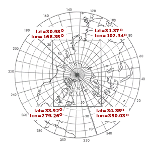
Information on the gridcell structure is provided here . On the left is a diagram from that reference; on the right is a plot of downloaded sea ice information ( downloaded in a 304×448 matrix, with the 448 column then reversed so that the plot function matches.) The coordinates of the corners are thus available from this diagram. Note that the rectangle is slightly asymmetric and that the north pole is not at the center of the rectangle (though it’s close).
 |
 |
The form of the plot on the left appears to be a “polar stereograph”. Whether I’ve named it correctly or not, each 10-degree circles seems to be uniformly spaced, so the projection does not preserve area. The url mentioned above says:
The polar stereographic projection specifies a projection plane or grid tangent to the Earth at 70 degrees. The planar grid is designed so that the grid cells at 70 degrees latitude are 25 km by 25 km. For more information on this topic please refer to Pearson (1990) and Snyder (1987). This projection often assumes that the plane is tangent to the Earth at the pole. Thus, since there is a one-to-one mapping between the Earth’s surface and the grid at the pole, there is no distortion at the pole. Distortion in the grid increases as the latitude decreases, because more of the Earth’s surface falls into any given grid cell, which can be quite significant at the edge of the northern SSM/I grid where distortion reaches 31 percent. …. To minimize the distortion, the projection is true at 70 degrees rather than at the poles. This increases the distortion at the poles by three percent and decreases the distortion at the grid boundaries by the same amount. The latitude of 70 degrees was selected so that little or no distortion would occur in the marginal ice zone.
It doesn’t seem like it would be that hard to construct an equiangular projection. According to my interpretation of this, the relative distortion from the projection used here is given by:
K= (90-70)*pi/180 / (sin ((90-70)*pi/180)) ;K
f=function(lat) K* sin ((90-lat)*pi/180) / ( (90-lat)*pi/180 )
#f(c(85,70,60,45)) #] 1.0193054 1.0000000 0.9746015 0.9188631
According to my calculations, the distortion at the North Pole is 2.06% and at the most remote of the grid is about 15%. I can’t replicate their distortion numbers, but the calculation is only high school geometry and my calculation looks sound to me.
I’ve made a function to calculate sea ice area incorporating the above information. So, here’s a pretty way in which you too can calculate your own daily sea ice area for a given day.
Calculating Daily Sea Ice
Here’s a nice simple way that you can calculate daily sea ice area for yourself:
source(“http://data.climateaudit.org/scripts/seaice/nsidc.functions.txt”)
day=5;month=7;year=2008
test=read.arctic(day,month,year);dim(test)
area_seaice(test) # 9.57941
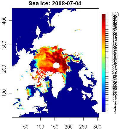
Here’s a way to plot this (requires the package fields, available from http://www.r-project.org):
library(fields)
plot.arctic(test)
title(paste(“Sea Ice: 2008″,month,day,sep=”-“))
The satellite may affect measurements – a factor that I haven’t seen discussed at length, though obviously it’s the sort of thing that the specialists keep track of and do the best they can. In 2008, both the f13 and f15 satellites are up. Here’s the corresponding f13 area:
test.f13=read.arctic(day=5,month=7,year=2008,sat=”f13″);
area_seaice(test.f13) # 9.41061
Since 2007 measurements were done with f13, which measured about 160,000 sq km less than f15, a consistent f13 comparison would close the gap commensurately. These numbers are close to, but don’t reconcile precisely to published daily numbers. I haven’t located exactly how the daily numbers are calculated. In my “Race Reports”, I’ve been using daily totals from JAXA, which don’t seem to tie in exactly to NSIDC.


22 Comments
A question. Here is a definition of how the area and extent are calculated. They say that the area is adjusted by the square of the map scale. If I’ve interpreted the map right, shouldn’t this be scaled as I’ve suggested in the post, rather than as stated here?
That makes little sense. A plane can only be tangent to a sphere at one point, and for a polar stereographic projection it must be at the pole. They may mean “secant” at 70 degrees (i.e. cutting through the 70th parallel) rather than “tangent” (touching). If so, it makes no difference apart from a scaling constant.
Some back of the envelope calculations, unchecked so they may be wrong:
For a polar stereographic projection, the circle produced at latitude X has radius proportional to tan(90-X/2) = cos(X)/(1+sin(X)) and so area proportional to the square of this. Taking the derivative of the area gives a value proportional to -cos(X)/(1+sin(X))^2 which is negative since the circle gets smaller as the latitude increases.
Meanwhile in the real world (or at least the surface of a sphere) the area enclosed by the circle at latitude X has area proportional to 1-sin(X) and this has derivative proportional to -cos(X), negative for the same reason.
Taking the ratio of these two derivatives gives something proportional to (1+sin(X))^2. Note this takes the value 4 at the pole.
So if I am right and their calculations are correct, with the 664 km^2 pixels being at the poles, then 382 km^2 pixels would be at about 31°N and 443 km^2 pixels at about 39°S.
Steve: The farthest corner of their rectangle isi n Florida about 31N.
#2. I probably should have added that with 664 km^2 pixels being at the poles then using (1+sin(X))^2 at 70°, the area of a pixel would round to 625 km^2. So it is credible that they started with 625=25×25 for their scaling. They would have got the same result had they started with 25.777×25.777 at the pole.
As for small squares on the sphere projecting to something close to small squares on the map, this is a property of conformal projections, and the stereographic projection has that property. So the edge of a pixel in the projection at latitude X is about
25.777×(1+sin(X))/2 km.
Steve I think that the difference between the two satellites is the size of the polar ‘spot’, which for the purposes of extent it is assumed to be all ice.
#4. I don’t think that the polar spot is the main difference. I don’t think it matters between f13 and f15, though it does with n07. More like calibration issues.
There’s information on the polar stereographic method as used in the remote sensing community in a variety of places. Here’s one. http://www.remotesensing.org/geotiff/proj_list/polar_stereographic.html
The formulae are complicated by eccentricity adjustments which don’t matter much for what’s puzzling us. The factor below is very close to 1.
[(1-esin(lat) ) / (1 + e sin(lat))]^(e/2)
The key formula seems to be
t = tan (pi/4 – lat/2)
which goes from 0 to 1 from pole to equator at a different schedule than a straight line.
Steve, FYI: ftp://sidads.colorado.edu/pub/DATASETS/seaice/polar-stereo/tools/, which includes the cell areas (psn25area_v2.dat), and lat-lons.
Here’s another take which might explain gridcell areas (I’ll check against the ref in #6). The true latitudinal radius increases proportional to the cosine of the latitude, which is faster than a linear change at the N Pole. The polar stereograph function is tan (pi/4 – lat/2) (lat in radians), which is also plotted below. This has the opposite curvature to the cosine function at the pole and the area distortion will accordingly be worse than a polar coordinate plot with the latitude arranged linearly. To get an area-preserving polar projection, I think that you’d need to dilate the radii from the pole by the sine of the co-latitude (cosine of the latitude). I wonder why the polar stereographic method is so common?
#6. OK, we have another one of these annoying binary formats. The page says:
psn25area_v2.dat: 304 columns x 448 rows, range = [382.068, 664.465]
IF a use readBin on ftp://sidads.colorado.edu/pub/DATASETS/seaice/polar-stereo/tools/psn25area_v2.dat with size =1. I get values between 0 and 255. So I’m getting something, but not the right things. They don’t make things easy.
Steve, basically because of its primary use in navigation where the angle-preserving (conformal) map property is preferred. (Like why Mercator and gnomonic are used away from the poles)
In the case of the NSIDC the projection is based on the 70th parallel to reduce overall distortion (a secant plane though, not a tangent as their description incorrectly states).
It says just above that the data is integer data (the real data scaled by 1000).
I suspect you want size=4 endian=BIG.
Steve shouldn’t size=4?
I’m looking at it… looks like… integer, size =4, little endian
readBin(handle, ‘int’, 448*304, size=4, signed = FALSE)
It’s fixed point, so it’s a floating point number multiplied by some scaling and stored in an integer.. in this case, 1000.
The first value is 382.068
Sorry, I could/should have included that information. In IDL world, you’d read it in as a ‘lonarr(304,448)’ and then divide by 1000. And you need to swap the endians if you’re using Unix. So, indeed, the first value is 382.068 as Dishman indicated.
They don’t make things easy. The data is little-endian, while the areas are big-endian. Arrgh. Anyway, we’ve got the areas now and can push the peanut along a little.
When these values are plotted up as a contour, they make sense. Larger areas at the pole.
Re: 13
You may want to consider changing your name to Steve Middleware.
Why don’t they do away with the 2-D maps and just put the data on a 3D ellipsoid of the earth that you can manipulate with your mouse? The only projections would then be the projection of whatever view you have on the screen.
(I know 3D and ellipsoid are redundant but it sounds better)
Earth would be an oblate spheroid type of ellipsoid. (i just went to wikipedia for a refresh)
Pete, like Google earth?
How hard do you suppose it is to make R spit out KML files anyway?
I hope somebody is still reading this…has anybody else attempted to digitize Cryosphere Today’s graphs for each individual Arctic sea?
I just did and the results are not exactly identical to the values reported for the whole Northern Hemisphere. Am I missing a sea or what?
NSIDC has a document comparing the F11 and F13 sensors and show that the differences are very small (perhaps negligible in most cases), but can be large in some regions. Nothing is said about the near real time data, which incorporates the F15 sensor, so these have both F13 and F15 data. Looking at a few subsets of both sensors, the differences do seem small again, but missing data pixels are not the same. I wonder whether it would be sensible to fill these missing pixels with data from whichever sensor does have data to produce a grid with fewer missing data…
Dear. Steve McIntyre
I recently use sea ice concentration data from NSIDC.
I’d like to plot daily sea ice concentration figure.
I want to consult your utilities for reading sea ice data but I can’t see in this page.
I’m looking forward to your good reply.
Sincerely,
from Lyla