No single topic seems to arouse as much blog animosity as any discussion of Hansen’s projections. Although NASA employees are not permitted to do private work for their bosses off-hours (a currying favor prohibition, I suppose) – for example, secretaries are not supposed to do typing, over at realclimate, Gavin Schmidt, in his “private time”, which flexibly includes 9 to 5, has provided bulldog services on behalf of his boss, James Hansen, on a number of occasions.
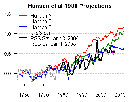
In January 2008, I discussed here and here how Hansen’s projections compared against the most recent RSS and MSU data, noting a downtick which resulted in a spread not merely between observations and Scenario A, but between observations and Scenario B, sometimes said to have been vindicated. For my January 16, 2008 post, I used the then most recent RSS data (as well as UAH version which showed a lesser downtick. However, a few days later, RSS revised their data to be more in line with UAH. On January 23, 2008, I updated my graphic, using the revised RSS data, which caused a slight modification. Some blog commentators have suggested that I had made in error in my Jan 16, 2008, but these suggestions have no purpose other than defamation. I had used the then current data and promptly updated my graphic within a few days of RSS revising their data. In the latter post, I criticized RSS for not issuing a notice of the change.
In a post today, Andrew Bolt used the earlier version of this graphic from January 16, 2008, rather than the January 23, 2008. A couple of blog commenters have criticized Bolt for using the earlier graphic, with Tim Lambert additionally criticizing me for not having placed a notice of the update on the Jan 16, 2008 post (which I’ve now done.)
However, rather than engaging in further exegesis of the January versions, I thought it would be useful to update the graphics to include satellite data up to June 2008 and GISS data up to May 2008. Ironically, the new data has resulted in a downtick that is more substantial than either of the versions published in January. Lucia has also done many posts on this topic and I urge readers to visit her blog.
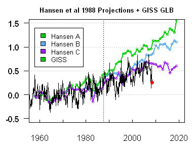
I’m going to post up a few different versions in order to forestall pettifogging about provenance as much as possible. On the top left is May 2007 graphic comparing observed versus actual from Hansen bulldog Gavin Schmidt (which I also showed in my Jan 16, 2008 post). On the top right is Hansen projections (realclimate version plotted against monthly GISS GLB to May 2008), both in native units (1951-1980 for GISS GLB; Hansen forecasts seem to have a similar centering). On the bottom left is the same for GISS land only and on the bottom right the same for RSS satellite. RSS satellite is a bit lower than GISS, but the effect is the same.) I’ve re-centered RSS to match GISS GLB on 1979-1997.
 |
 Color code in legend needs to be fixed. |

|
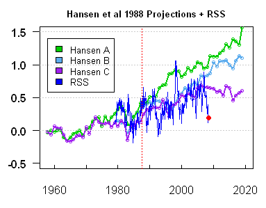 |
Figure 1. Hansen 1988 projections versus observed – see text for description.
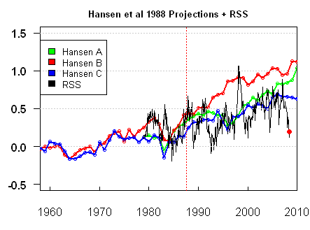
The next set of graphics compares the present RSS version (illustrated above) to the two versions presented in January 2008, with the RSS version re-color coded to match the January coloring. On the top right is the January 16 version using the original RSS version (then current). On the bottom left is the revised Jan 18, 2008 RSS version. I’ve plotted the current information in a monthly format in order to bring matters up to date and tried to de-spaghetti the graph by simply plotting extra versions. I’ve plotted these versions ending in 2010 (the upper panel ends in 2020) because the January graphs ended in 2010. Given the events of the months following January 2008, Bolt’s use of the January 16 version, as opposed to the January 23 version, has not resulted in any over-statement of the downtick. On the contrary, the downtick has been greater than observed at the time.
 LEgend color code needs to be amended. |

|
|
Figure 2. Hansen projections against satellite observations. Top left – current; top right – Jan 16; bottom left – Jan 23. The centering in the January versions is a little different (the effect is not material). Hansen’s projections do not center on 1951-1980 and it’s hard to tell what the actual centering was. Any attempt to re-center Hansen projections to a common reference period with observations seems to cause shrieking, so I’ve used native units, as the re-centering effect to 1951-1980 is not large in any event. I’ve re-centered the satellite data so that its mean in 1979-1997 matches the GISS GLB mean.
In my opinion, there is enough autocorrelation in these series such that, statistically, the uncertainties in the trend are much wider than sometimes thought and are sufficiently wide that neither Hansen’s Scenario B (nor scenarios with lesser and greater “true” increases) can be said to be rejected – contrary to the views of many readers. However, that’s a different story. I am also not commenting – either to approve or disapprove of other aspects of Bolt’s posts. My concern here was simply to reconcile results that I’d presented.
Update Note: People have inquired about actual forcing in these terms. I spent quite a bit of time earlier this year trying to decode Hansen forcing estimates by GHG type (which is important) versus observed resulting in the following graphic – on the right is observed plus present A1B forecast. In terms of forcing projections, B is the closest scenario. As noted in my earlier post, Hansen provided opinions on several different occasions, but my sense of his own forecast is this statement of his: “My guess is that the world is now probably following a course that will take it somewhere between A and B. (p. 51)” – see prior post for reference. One has to distinguish skill as a GHG emissions forecaster from model evaluation – a distinction that Hansen fairly makes. I think that Scenario B is close enough to observed emissions that, in the absence of NASA being able or willing to re-run the actual 1988 model with actual forcings, one can be reasonably use Scenario B for comparisons.


84 Comments
Script is here: http://ww.climateaudit.org/scripts/models/hansen_1988.projections.version200807.txt
While the trend uncertainties may not preclude the A and B scenarios, an objective observer would certainly say that scenario C is the most likely based on the actual data. In other words the real world is reacting to CO2 as if it presently has no effect, although it may have up until the time that the scenarios started. Therefore a logical conclusion would be that since CO2 is still rising that the effect has reached a saturation point.
GISS 2008 isabsolutely 100% out to lunch. It is so obvious, I don’t know how anyone takes that data set seriously anymore.
At best, (BEST!) the planet temperature is progressing just below a fictitional scenario where CO2 emissions had been held stable for the last 8 years
(scenario C). It is ludicrous to continue to believe that these scenarios represent reality in any way. We’re so far off Scenario B(business as usual, right?) it’s laughable.
SteveM. Colour code key for GISS, top right, should be black? Steve: yes
How about GISS Continental USA?
Steve McI, FYI
The script posted downloads and runs a script that has a broken link in it. The script /sphagetti/tlt3.old.glb.txt tries to download the file RSS_Monthly_MSU_AMSU_Channel_TLT_Anomalies_Land_and_Ocean_v03_0.txt, which was not shown in the directory listing when I checked it on 07/28/2008 10:25pm CDT. All other *v03_0.txt files are there.
Steve: That series isn’t used. It was carried forward from Jan reconciliation and I’ve commented it out. Shouldn’t have had any impact.
BarryW…. You would be being kind to Hansen with that assessment…. the loose correlation between the apparent observed temps and his scenario C, is more than likely just the natural variation of climate coupled with an ardent wish by Hanson for a link to hypothesised effects….
Correlation does not imply causation in any case.
To me it’s just three lines trying to find a good guess with highly manipulated surface temp data…. But of course that is just an opinion of mine.
#3. As I recall, Scenario A was the “Business As Usual” scenario, but B was what Hansen thought most likely (A has really high CFC forcing.) As I said in the post, the data is highly autocorrelated and IMO the results neither disprove Hansen Scenario B nor do they vindicate it.
Steve,
Thanks. It didn’t have an impact other than having the script throw an error. The programmer/debugger side of me wanted to be sure that the error could be safely ignored.
From 1980 Hansen guessed 1, ,8 and .6 and RSS answer was … 0.
Missed it by thaaaaaattttttt much.
How sweet is that, to have a turnkey script to call on in times like this?
#11. Doncha think it’s amusing that blog posts are better documented than academic articles. The inefficiency of current documentation practices is really quite breath-taking when you realize how efficient the documentation of methodology can become merely by archiving a script.
Where R changes things relative to the Fortran practices of climate scientists is that the language is so algebraic that it’s often little more than writing down equations. You don”t have a lot of subscripts running around like Fortran.
If I was producing the graphs I could not imagine not showing the name, date time, and origin of the data sets that were used to produce each line. By doing so it gives the viewer access to all of the information presented in the graphical summary. To not leaves the viewer in question of the veracity of the presentation.
#13. If you’re talking about me, even though this is a blog, all the data sources for this post are documented in the scripts. You can produce these graphs for yourself in about 1 minute if you’re so inclined. But for the record, the scripts were run this evening and data are versions as of July 28, 2008.
If you’re talking about climate science, I agree that the lack of documentation of data provenance, be it in Nature, Science, GRL, is shameful and I’ve done what I can to draw attention to the problem. It’s a disgrace.
Steve
I really appreciated the publishing of the scripts because they are so important I feel they should be directly associated with each graph. I know that you had to have done the work, but the science side tells us that we must always be able to deconstruct the work. The versioning allows the viewer to more easily see the adjustments that have been made. I realize that a lot of your work has been to guess what the ‘professionals’ have done and as such it is hard to quantify any given position without yourself being seen as the ‘author’. Leadership in this area might cause the other methods of presenting data to begin to properly show their work.
Steve: I’ve included comments in the script identifying which graph is created. I don’t understand what else you want. I’m not arguing as the purpose of the scripts is to be useful, I just don’t understand. Sometimes I insert scripts in articles themselves, but I don’t think that it was material here. IT would make sense to note in the main article that the data was downloaded on July 28 and that the sources can be identified in the scripts and I will add that to the post.
Why do you compare monthly measurements to yearly projections?
Steve: The projections only come in annual form, while the data comes in monthly form. For 2008, we don’t have an annual result yet anyway.
What I find amazing is all the wiggling of the graphs in the projections. I mean, the very idea that one might be able to predict which years temperature would go up and which years it would go down is silly. Why does that purple line jump up for two years sometime around 2012, drop back down and then rise again? Is Dr. Hansen talking to aliens who know the future or something? Judging from the track record of actual temps to the “projections” his aliens are selling him a bill of goods.
#19 I think I can answer that. They do that with the projections because that way it looks right, it looks real. If they plotted a straight line, people would be highly suspicious… Also, their graph is only an average of multiple model runs. They would need infinite runs to make it a straight line, and if they repeat the runs they will get again different results. 2012 may be a drop down next time. They can plot nothing but the average of the model runs because anything else would be made up by them, which doesn’t sound scientific. So they prefer it to be “the model” which makes up the temperatures, and you can only blame the model.
#19, #20, don’t forget that Hansen included big volcano eruptions in 1963, 1982, 1995 (and 2015 and 2025, not shown in these graphs) in scenario B & C. Although that obviously does not explain all the wiggling, it explains the big dips.
In scenario A are also forcings for, as Hansen calls it, “some speculative trace gas changes”, not sure what their influence is exactly.
Steve: I analysed this issue in previous posts. The CFC forcings in A are very large, something that few people seem to have realzied.
As I understand it, scenario C is a measure of what would have occurred if the world had heeded Hansen, and drastically cut back on CO2 emissions.
In other words, Hansen was offering a carrot and a stick. If humanity was bad, Scenario A would occur, but if we shaped up our act, then maybe, just maybe, we could avoid our doom and Scenario C would occur.
Well, humanity has been very, very naughty, and hasn’t heeded Hansen one hoot. Therefore it seems to me Scenario C should be crumpled up and tossed into the trash. It simply doesn’t apply to the reality of what has actually occurred.
Steve: I looked at which Scenario was closest to what actually happened in terms of “forcings” in an earlier post (Which I’ll try to locate) and, as I recall, the actual forcings were somewhat higher than Scenario B, but not a lot.
19 and 20
I think a much better way to illustrate the range of model projected outputs would be to copy the method used to display projected Hurricane paths. They show the “limits” of their model outputs which show the general direction, and includes projected directional uncertainties. That is, I think, one of the points brought out here continually; that uncertainties are not displayed (or maybe not even discussed) in these projections.
Maybe a meteorologist could share what level of confidence those hurricane projection limits illustrate.
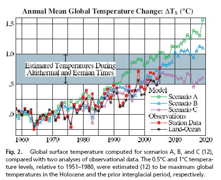
The one thing that stands out for me in the Hansen projections is the [snip ] claim that current temperatures are in the same range of a few degrees as the altithermal and Eemian periods.
During those times, the treeline stretched all the way to the Arctic ocean, well beyond what is possible today.
snip
Steve – some words that I ask people not to use were used
When comparing Hansen’s earlier projections to what actually happened in reality, only one conclusion can be drawn:
Hansen is no longer even in the ballpark.
# 17, # 24, Nathan, John A
According to Hansen, it is OK to compare series with different time-scales.
( http://www.climateaudit.org/?p=483#comment-207677 )
#19, crosspatch
Because the projection is really a smooth guestimate of A-CO2
effect + realization of red noise. Monthly projection would wiggle
even more. But monthly projection has larger uncertainties. Just kidding.
Earlier ‘wiggles’ discussion:
http://www.climateaudit.org/?p=2602#comment-199553
http://www.climateaudit.org/?p=2620#comment-201575
Steve: Clever as usual, UC. Can you expand a little on what’s happening in http://www.climateaudit.org/?p=483#comment-207677 ? Where did the blue come from to start with? Is it simulated? I can’t tell from the description.
The modelers are now saying that there is warming to come in the pipeline (given that temps have not kept up with their model predictions.) So we will have to wait another 10 to 30 years before one of them says “we over-predicted the sensitivity.”
But Hansen’s Scenario C in which GHG forcing stabilizes in the year 2000, only predicted about 5 more years of very minimal (0.1C) warming in the pipeline.
If the model was so wrong in 1988, what should give us faith that the newer models are so much more accurate. Hansen’s climate sensitivity estimates (actually produced by the models themselves rather than calculated) have changed very little since 1988.
In the post, I expressed my view that this data does not “refute” Hansen. People are looking for too much in these squiggles on either side.
Let me try phrasing it this way. There is a “settled” scientific basis for why additional CO2 should have an upward impact on temperature; in a way, it’s as much an engineering problem to determine the sensitivity as it is a “scientific” problem. You wouldn’t say that an engineering design was “refuted” because some parameters were mis-specified; you’d use different terminology to criticize it. I would encourage readers and others to use more nuanced terminology in discussing these predictions.
In order to get catastrophic warming, like 5 degrees C/100 yrs, you need .5 deg/decade — as much as occured during all of the 20th Century. Even given some nonlinearity (more will occur as CO2 rises later in the century), it is hard to see how we are on track for such rates. Given scenario B or C, the effects on humans would not be catastrophic, yet the call to urgent action is predicated on the high end projection.
#12
Institutionalized science is as much (if not more) about advancing one’s reputation among one’s peers as it is about the advancement of science. In the past,if an article passed peer review, that was that. Nobody cared whether the data was archived for a non-peer to get their hands on and reevaluate. Two things have changed. One, science is no longer just institutionalized, it is politicized (and the scientists can blame themselves for this), which means that the results of science will be now subject to much more scrutiny. Second, the Internet (and the WWW) has demonstrated how easy it is to exchange data, removing a barrier to entry that scientists who so chose (not all would) could in the past hide behind.
Blogs are changing the rules of the game in many different aspects of modern life, including science. So continue to show the way, CA.
I believe that it has been suggested in the past that someone get Hansen’s model and run the model using the best information about what emissions actually have been over the last twenty years. Then the output of that model could be compared with actual temperatures. Has anyone done that?
The newest model ensemble forecasts from the IPCC are still predicting 0.2C per decade increase (a little less than Hansen’s 1988 Scenario B.)
On a longer time series, going back 140 years to when CO2 first starting increasing, temperatures are up about 0.6C to 0.7C (depending on how much you are smoothing the trends out and ignoring the significant decline over the past year.)
http://hadobs.metoffice.com/hadcrut3/diagnostics/global/nh+sh/
Starting at 1870, you get 0.05C per decade of actual temperature increase.
Start at 1920 and you get 0.07C per decade
Start at 1980 and you get 0.1C per decade.
Start at 1970 and you get 0.125C per decade.
Start at 1940 and you get 0.07C per decade.
Start at 2000 and you get 0.0C per decade.
I’ve added a link to a prior post in which I analyzed HAnsen’s forcing assumptions. For practical purposes, Scenario B seems reasonable to use for comparisons with observations.
#33
Basil gets it right.
Steve – With respect to comparisons of observed global average surface temperature anomalies and trends with the model results, it is important to recognize the major uncertainties that remain in the measured data, as we summarize in
Pielke Sr., R.A., C. Davey, D. Niyogi, S. Fall, J. Steinweg-Woods, K. Hubbard, X. Lin, M. Cai, Y.-K. Lim, H. Li, J. Nielsen-Gammon, K. Gallo, R. Hale, R. Mahmood, S. Foster, R.T. McNider, and P. Blanken, 2007: Unresolved issues with the assessment of multi-decadal global land surface temperature trends. J. Geophys. Res., 112, D24S08, doi:10.1029/2006JD008229.
http://climatesci.colorado.edu/publications/pdf/R-321.pdf.
As just one example of the issues, we have identified a significant warm bias in the observed analysis; see
Lin, X., R.A. Pielke Sr., K.G. Hubbard, K.C. Crawford, M. A. Shafer, and T. Matsui, 2007: An examination of 1997-2007 surface layer temperature trends at two heights in Oklahoma. Geophys. Res. Letts., 34, L24705, doi:10.1029/2007GL031652.
http://climatesci.colorado.edu/publications/pdf/R-333.pdf.
As estimated from this study, we found a conservative estimate of a warm bias resulting from measuring the temperature near the ground at just one level of around 0.21°C per decade (with the nighttime minimum temperature contributing a large part of this bias). Since land covers about 29% of the Earth’s surface, the warm bias due to this influence explains about 30% of the IPCC estimate of global warming. In other words, consideration of the bias in temperature would reduce the IPCC trend to about 0.14°C per decade; still a warming, but not as large as indicated by the IPCC.
And this is just one of the substantive issues with their data.
Here’s a thought experiment: Suppose Hansen was locked in your basement for the last 20 years and you showed him the temperature graphs (along with his projections) and asked him to guess which emissions scenario had taken place.
Logically, his best guess should be Scenario C.
From the paper cited in #39:
Volcanos in Scenario B:
It should be noted when comparing actual data to Hansen’s 1988 prediction that he added volcanoes in the future. The one added in 1995 to scenario B did not occur.
“In scenarios B and C, additional large volcanoes are inserted in year 1995 (identical in properties to El Chichon), and in year 2015…”
Hansen. et al., 1988, p. 9345
Remove the non-existent forcing to the scenario B model run and scenario B compares even more poorly with actual data.
Greg
From the second paper cited in #39:
a warm bias not accounted for in an IPCC graph? heretics.
I’m sure this has been discussed, but does anyone know why all three of the (presumably hindcasts at that time) model results dip down around 1984-ish yet the recorded temps seem to spike? Is this a case where some of the natural oscillations are (were) not emergent in the modeling results…even in a hindcast situation?
#46, I’m guessing because Hansen did include the 1982 El Chichon volcano in his model, but not the very strong 1982/83 El Nino.
Re 36
I believe that the NOAA position is that the actual situation falls between A (increasing rate) and B (constant rate). I don’t know if Hansen’s rates are the same values. Lucia had a discussion here from which I would infer that B is at least a conservative bet for forcings.
from here
Roughly from the graph we should have seen about .2 deg per decade from either A or B, and we are about half that. If the uncertainties in the models are large enough to make the A and B scenarios still unfalsified then the C scenario is also unfalsified. If the models have a predictive capability then at what time span do we need to exceed before we can adequately test them? If by holding a parameter constant (CO2) the model output has a best fit to the actual values the question becomes does any other parameter change produce a better fit? If it doesn’t then wouldn’t you have to assume that something about CO2 is wrongly modeled?
snip I’ve been watching the various postings of Eli Rabett on numerous blogs [beside his own] that seem to be made right in the middle of the work week. Maybe Eli should use the time instead to improve his teaching.
I think you guys are missing an important point (i’ve said this elsewhere on the net) and that is that “forcings” (basically that is tantamount to “effective quantities of ‘greenhouse’ gases” in the atmosphere) are actually slightly under scenario B if I recall correctly so according to the scenarios, Hansen was not actually too far off.
The big miscalculation is that “business as usual” has not let to the forcings used in scenario A. ie vast quantities of emitted CO2 have just disappeared, as have other “big effect” trace gases. We clearly don’t even properly understand what happens to the gases we emit – simply saying they are going to end up in the atmosphere as forcings is clearly incorrect. Knowing that we can’t even calculate this “step 0” properly, how can we predict the longer term effect of our emissions ?
#25 Steve
Blue is simulated 1/f -like noise series, code in here http://www.climateaudit.org/?p=483#comment-207353
The target of this indirect criticism was, of course, Hansen’s Global temperature change (2006) Figure 5. (and Fig.2 as per John’s post). Hansen can now claim that 1/f is not realistic in the case of global temperatures. But even a random google hit tells that
Next claim will be that Hockey Stick doesn’t show 1/f. But that’s another story. ( Updated my code BTW, global cooling trends added )
UC,
Analytical chemists for one are very familiar with 1/f noise. It’s referred to as flicker noise or drift and is generally the limiting factor in the precision of an analysis. The presence of 1/f noise means you can’t increase precision forever by averaging more and more measurements or increasing integration or counting times. You can sometimes get around this if the flicker noise in the signal and background is correlated so by measuring both simultaneously, the flicker noise can be canceled when the background is subtracted from the signal. In emission spectroscopy this is done with an array detector.
Steve et al,
sorry guys, excuse my ignorance but can someone please explain something:
in the “Hansen et al 1988 Projections” graphics near the top of this post, there’s quite a big discrepancy from around mid 1970s to around 1980, where the GISS temp is much lower than any of Hansen’s scenarios.
Presumably Hansen’s modelling was done in 1988 (?), so what’s the accepted reason for why the model couldn’t validate the mid 1970s temperature record? A brief answer will do – thanks in advance.
(ps: Steve, I thought your summary of the recent UK OFCOM judgement was impartial & spot on, unlike much of what I saw elsewhere from all sides of the debate. well done)
re: anonymous #58; Sorry that is not correct.
Hansen’s paper says he increased CO2 in Scenario B by 1.9 ppm per year. Since 1987, the concentration has been increasing at 1.7 ppm per year.
Methane might be slightly lower than Hansen assumed since concentrations have stabilized now (although there was a slight uptick last year.) Hansen had Methane growing by 0.5% per year by the year 2000 which also might not be far off taking into account the slight increase last year.
anonymous @ #58
Per Steve M’s constant reminder from above we know that:
We have gone back and forth on when Hansen knew that CFCs would probably decrease over time, but if one recalls that Hansen is a political animal and seemingly interested first and foremost in policy and further that these scenarios were revealed to a Congressional hearing on climate, it takes no great imagination to assume that he put a scenario out there that might just scare and attract attention and particularly if he can see that that scenario may be called “business as usual”.
That he provided deniability with Scenarios B and C and that he, or at least his supporters, could claim that the modelers are only responsible for the models given the correct inputs and further that no one is going to run the models with the actual correct inputs makes Jim Hansen, in my eyes, one shrewd politician.
John Lang, you have firmly grasped the wrong end of the stick. Scenario A was as i’m sure you are aware “business as usual”. We have had MORE than business as usual, we have had business positively booming it terms of vastly increased CO2 production, but – as you point out – the atmospheric concentration of CO2 has not increased accordingly.
Why has a massive increase in fossil fuel use not led to correspondingly massive increases in atomospheric CO2 ppm counts ?
The answer is: we don’t know and Hansen doesn’t know.
If we don’t know how our produced GHG’s get into the atmospheric forcing count, it’s difficult to make any kind of prediction about how our output will even affect the forcings, never mind even discussing the accuracy of the models built on the assumed forcings.
Steve: HAve you read any of my posts? I discuss Scenario A at length and you are describing this incorrectly. There are enough real issues without distracting ones.
Kenneth, its more than just ridiculous calculation of CFC growth in scenario A. As far as CO2 production goes, we have vastly exceeded the expectation of scenario B (which does not include the crazy CFC growth) in terms of CO2 production, and yet the ppm count in the atmosphere is slightly lower than what Hansen would have been expecting from capped growth with flat consumption after 2000 (if I remember scenario 2 correctly).
Hansens ratio of CO2 generation to CO2 ppm in atmosphere appears to be way off.
Steve: Again, have you read the analysis of forcing. You are describing Scenario B incorrectly.
Yeah Steve, sorry I appear to have incorrectly described scenario C as B – thanks for correcting me (it has been some time since I read it).
However – the statement that global hydrocarbon usage (and hence CO2 production) has continued to surge greater than the 20th Century average, and Hansens scenario B was for less than 20th Century average in growth of CO2 was correct. That the atmospheric ppm counts have turned out similarly is a coincidence; it appears that we can continue heavy production of CO2, while earthly cycles somehow maintain a much more pedestrian growth in atmospheric CO2.
Increases in the rate of anthropogenic emissions of CO2 do not keep pace with the rate of increases in atmospheric CO2, because the CO2 from anthropogenic sources are negligible enough to be on the limits of detectable measurement. Consequently, the measurements of anthropogenic sources of CO2 and their significance or insignificance are a sharply contested issue, scientifically and politically.
I don’t know if I’m right with this, I’m no scientist, but Hansen’s graph seems to be simply a matter of the long base line.
I guess, this 30-year base line produces too much error deviation. To keep those error outliers small, I tried to reconstruct the data to a decadal base line, which is still adequate and reduces error outliers, as you can see here in Fig.1
http://umweltluege.de/sceptics/giss_lie/index.php
This error corrected data I now plotted against MSU LT 5.2 data in Fig.2, and there is nearly congruence with a correlation of 0.803.
I think that Hansen’s intention was to chose a 30-year base line only to show his doom more aggressive. He was deliberately calculating with the error deviation for eye-wiping, I guess.
Folks are making a mess of this thread, whose topic is Hansen Update. Not Hansen. Not Hansen’s projections. Not Hansen’s scenarios. Not Hansen forecast accuracy.
Before commenting, consider reading the related threads where the scenarios were discussed in depth:
Thoughts on Hansen et al 1988
Hansen 1988: Details of Forcing Projections
If, after researching all that, you still think you have something to add …
It is pretty lame that NASA and other modelers will not re-run their model with actual forcings….
Speaking of Hansen’s 1988 predictions and GCMs in general, Demetris Koutsoyiannis’ paper has been published, evaluating 18 years of climate model predictions of temperature and precipitation at 8 locales distributed worldwide.
The paper is open access and can be downloaded here:
http://www.atypon-link.com/IAHS/doi/abs/10.1623/hysj.53.4.671
Here’s the citation: D. KOUTSOYIANNIS, A. EFSTRATIADIS, N. MAMASSIS & A. CHRISTOFIDES “On the credibility of climate predictions” Hydrological Sciences–Journal–des Sciences Hydrologiques, 53 (2008).
Abstract “Geographically distributed predictions of future climate, obtained through climate models, are widely used in hydrology and many other disciplines, typically without assessing their reliability. Here we compare the output of various models to temperature and precipitation observations from eight stations with long (over 100 years) records from around the globe. The results show that models perform poorly, even at a climatic (30-year) scale. Thus local model projections cannot be credible, whereas a common argument that models can perform better at larger spatial scales is unsupported.”
In essence, they found that climate models have no predictive value.
Steve,
You say:
Fair enough, but let’s say Scenario B was the projected earnings on a fund and the RSS values were the actual earnings. While the actual earnings might not refute the projection, would you buy into the fund? ^_^
Regarding the monthly ups and downs, do you have any 12 month running temperatures to compare against 12 month running Hansen A, B, and C projections. I’d sure love to see it! Thanks
Looking at the graphics as a strictly visual exercise from the start-to-end of observed temperatures, it looks like a close run thing between Scenarios B and C.
So although it’s correct not to discount B as unlikely, it does beg the question why the temperature record is so close to C. I see Steve commented previously on this in his January 16th 2008 post:
“The separation between observations and Scenario C is quite intriguing: Scenario C supposes that CO2 are stabilized at 368 ppm in 2000 – a level already surpassed. So Scenario C should presumably be below observed temperatures, but this is obviously not the case”
From what I’ve read at CA, there seems a general consensus on actual forcing mechanisms – so the only assumption someone can make is that something significant may have been underestimated in Hansen et al’s model? (eg. nature)
PS – If anyone’s got a spare 5 minutes I’d appreciate a quick answer to my query in #45 above please, about model’s validating the temp. record of 1975-80(approximately)
#58 TerryB:
I’ll take a stab at answering your question, although I am not a climate scientist. There has been discussion in some threads (and the subsequent post on the Koutsoyiannis paper) that the climate has a significant internal variability that can lead to measurable, even fairly long-term changes in mean temperature. Another, related point is that the actual climate is a single realization of the possible outcomes that might occur with subtle differences in initial conditions. Thus, climate models that follow the historical climate exactly would be suspect because climatic variation (based on the exact same driving forces) might lead to significant differences in actual temperature if we could go back in time and “run” the climate again.
As I remember it, Hansen Scenario A was based on CO2 output similar to the output we are experiencing today, actually less than we are emitting today. Nobody predicted we would be pumping out as much CO2 as we are. The economy of the world has made enormous progress over the last 20 years resulting in much more CO2 output. So, if anything we should be seeing temperature changes similar to scenario A in Hansens lingo or even larger. Scenario B was some kind of “limited” CO2 emissions where everyone signed on to Kyoto and actually followed it. Scenario C was where everyone was able to cut CO2 output and flatline CO2 output. It really appears to me that we are UNDER the scenario C curve, not above the scenario A curve. Doesn’t this then prove that his sensitivity assumptions are clearly way above the actual sensitivities?
I just find it so depressing that scientists refuse to acknowledge simple things like this because it degrades science so much for scientists appearing to be grasping at straws or denying reality to their dying breath. Why don’t the APS and others simply admit something is wrong in Springfield. This brings me to the Monckton paper in the APS published last month.
If one looks at the American Physical Society debate the APS did not put out a paper defending the models or even the sensitivity of the temperature to forcings. The paper they used to attack Monckton did not even postulate a temperature change for a doubling of CO2. All they did was calculate the forcing. They made no attempt to defend the models or any specific temperature prediction for a doubling of CO2. This is telling that they don’t believe the science around all this sensitivity or the models or the feedbacks. If nobody believes the models or sensitivity calculations with any level of confidence then how come we can’t get scientists to admit that the whole debate has become too political, they aren’t sure of what is going to happen and please wait while we continue to work on the science and the models.
For me right now it is increasingly bizarre to imagine how we are going to get to a 2.0 degree sensitivity to a doubling of CO2 because it would require a massive increase in temperature. Such a massive increase seems incredibly unlikely because the ARGO buoy system shows the oceans getting cooler. On top of that we have these well documented weather phenomonen called the PDO and AMO which both show a multi-decadal drop in temperature likely (just like the 1945-1975 one). I am confused why these phenomenon would suddenly “stop”. The models ascribe the reason for the 1945-1975 pause in temperature to aerosols however this pause can also at least partially be explained by the NAO/AMO phenomenon. The temperature rise in the north atlantic/arctic can also largely be explained by these phenomenon. Is there any model which understands the physics of these phenomenon and correctly incorporates them into the calculations? Such a modified model would have much lower sensitivities to CO2 and aerosols than the existing models. This would also explain why the troposphere is not showing the heat spike everyone is looking for and why antarctica isn’t showing warming to the degree of the north pole (another grotesque miss by the models).
It seems to me that the “modelers” or the AGW crowd has to admit soon that the 2.0-4.0K/CO2 doubling is way overestimated in the IPCC AR4 and come up with more moderate assumptions. When this is announced the political repercussions will be enormous but at least everyone who is a scientist can feel less dirty that we have come clean. We simply don’t know what the effect of doubling CO2 will have but there must be many models which work as well or better than current models which show far less sensitivity to CO2.
Steve: I did a detailed post on Hansen’s forcings and asked people to look at this before venting. You have misdescribed Scenario A.
Steve, thanks I think I read your entry on that. I miss the A scenario difference but I believe it is a high CO2 output scenario similar to what we are experiencing today.
Hansen and some other modelers says he has 99% assurance that we are going to get 2-4K from a doubling of CO2 because his models match past behavior.
We have very little data when CO2 was high. Most of our data is problematic before 1979 and in any case CO2 was low during these times. It seems to me to be extraordinary to base the effect of CO2 on such sparse data especially because CO2 levels were low the effect was minimal and therefore our ability to measure accurately its effect must also be extremely inaccurate. Whatever error bars are on measuring the temperature sensitivity in 1910 to CO2 ( which must be huge) must mean when translated to higher CO2 levels of today a similar level of accuracy must prevail. Otherwise one cannot use the data from 1910 as a basis for concluding anything about sensitivity. Because of the low levels of CO2 100 years ago any level of sensitivity doesn’t result in much difference in the result at that time and looks consistent with data at that time. That puts huge error bars on what CO2 sensitivity could be. Therefore our ability to calculate sensitivity is limited to using data from the current 30 years of data we have today. Unfortunately that doesn’t give us a lot of time to understand all the factors that could also be affecting the environment besides CO2. Not being able to use prior periods means that we can’t be assured at all that many other factors are going on.
It is therefore erroneous for them to ever include past data in their charts and analysis or as Smith in his rebuttal to Monckton uses a 120 year chart to calculate sensitivity. The CO2 levels were too low and therefore sensitivity calculations must depend ONLY on current data. Now we have 10 years of flat temperature at the end of the time period from 1977-2007 which must drastically reduce the calculated sensitivity from the one calculated looking only at the first 20 years of data.
Because he can’t account for anything else that would cause the 1977-1997 rise in temperatures and since there is a good correlation during that time period to CO2 he must entirely rest his case on CO2 (as do most AGW enthusiasts) on the presumption that the 20 year period between 1977-1997 proves the importance and sensitivity of CO2. That is simply inadequate to conclude he has 99% assurance on anything as he stated just 2 weeks ago.
It is interesting that the WSJ published a paper in 1933 which showed that temperatures had been rising for 100 years tells me that this overall temperature increase has been going on for a very long time (probably since 1725 and the end of the little ice age).
It seems to me this is the basic argument of the high CO2 sensitivity crowd. We can trace temperature variations since 1725 to production of CO2 and the start of the industrial age. I have no idea when the industrial age started and when our CO2 output climbed suddenly so this seems specious. I have never seen a proof of CO2 output climbing in 1725 to trigger an end to the little ice age. One must ask how did we get into the little ice age anyway? Nobody disputes the little ice age do they? Maybe there is still controversy on the extent of the MWP but nobody questions that the little ice age existed right? I am struck that people can speak with such assurance about CO2 sensitivity and absolute 99% assuredness that all our modern heating is the result of an environment highly sensitive to CO2 when they can’t seem to explain the little ice age. The models can’t explain a lot.
It is clear the models don’t understand the following phenomenon:
1) the NAO/AMO/PDO phenomenon which have been clearly very influential on arctic and earth temperature for a century or more.
2) the lack of understanding of the LIA or MWP
3) the lack of understanding of the current 10 year haitus
4) the lack of understanding ocean temperatures
5) the lack of understanding antarctic temperatures
I think that until the models incorporate these phenomenon into their results and show us they really get the long picture right and the general earth geometry right (oceans and antarctic problems) and can explain longer wave phenomenon like the NAO and PDO then we can have no faith in these models and Hansens 99% assertion from a week or so ago must be denounced as political shenanigans having no relation to the state of the science. It is so galling to see a person at NASA one of our premiere scientific institutions making completely unsupportable claims like the 99% assertion. It seems to me his statement has no more validity or science to back it than the moon walker who declared that we have been invaded by aliens.
At a minimum Hansen should admit as I said in the last post that his sensitivity calculations must be way off because we are below his C model in temperature results and we have above his A model CO2 output. Clearly something is wrong in Springfield. Clearly it is impossible for the sensitivity he assumes in all his models to be correct. Any scientist or person of integrity must admit this. Also, it is beyond beyond that he continues to assert the models have any proven validity. I continue to belabor this point but a model that has been fit to data cannot be subsequently vindicated by looking at how well it matches the data it was fit to. Yes, I understand it isn’t that simple but still in every sense of the word the Hansen and IPCC models are “fit” to the data they have and then we are subsequently assured the models work great because they fit the data they fitted it to. This is contamination of the results. That is obscene. They do amazing things that are shocking like to use the models themselves to predict temperatures for stations and locations they don’t have data. Then proclaim isn’t it amazing how well the data we calculated with the model match the model!!!! It’s all too bizarre to believe more than 2 or 3 people would fall for this absurdity. Anyone who has actually modeled data with computer programs as I and thousands of others have must be aware that it is possible to come up with thousands/millions of models which show any level of accuracy desired to the data only to fail miserably when the very next data point is measured. Of course this is what happened after 2001. The models have failed miserably since 2001 and unfortunately for them this is the only time period that is relevant therefore the onus must be on them to show us why we should believe for one second their models have any validity at all.
We shouldn’t even be in the position of having to convince people that the models are incorrect. The models have simply failed to show any correspondence with the only important data of relevance which is data after 2001 when they were issued. Therefore the models have ZERO confidence. Their past conformance to old data is completely suspect and irrelevant. Any number of models can be built by any number of scientists that show a better correlation with past data than their models do. It means nothing that they have been able to fit the models to past data other than that would be a minimum requirement of a model that could even be considered as a possible contender. So, I am amazed that people even mention the models in civil society. They have been complete failures from day one and have almost nothing to argue on their behalf.
Okay, maybe this is overstating it a bit. It is the case that Hansens first models came out in 1988 and he did seem to correctly predict the spiking temperatures up until 1998 and the El Nino seemed to show the scary Scenario A behavior he described. So, this is really the basis of his credibility. He had a lucky period from 1988 to 1998. Gore and everyone else is now so impressed with that lucky shot in the dark that they are hanging on for dear life placing bet after bet on the roulette table based on his cockamamie theory of high sensitivity and massive feedbacks. I remember a friend who told me of his strategy for betting at the roulette table once. We bet at the table according to his strategy while he was there and went down in flames losing every penny we came there with. I suspect that Gore and others are in a similar position. Yes, Hansen got lucky between 1988-1998 but since then his luck has foundered and all the people betting on his strategy are starting to really get hit. I suspect the anger will be a lot worse than the anger I unleashed on my friend for helping me lose 500 bucks.
Steve: ONce again you have completely misdescribed Scenario A and I urge you to read my post on forcings and to be calmer.
Just a Question Off Topic:
Desmog is running a thread on ClimateAudit based on the Hansen Update thread with “Which is why it’s so surprising to see McIntyre accepting Hansen’s work now.
They are claiming you are now support Hansen’s work and (infered) the Hockeystick.
True?
Re #62
Gary,
I assume you are capable of reading Steve McIntyre’s posting and come to your own conclusions. Do you need anyone else’s help in that regard? Please read the post at the top of this page in its entirety and let us know what you think of the veracity of what Desmog is posting.
I expect the kind folks at other blogs have trouble interpeting Steve McIntyre’s final paragraph, which includes the following:
One has to distinguish skill as a GHG emissions forecaster from model evaluation – a distinction that Hansen fairly makes. I think that Scenario B is close enough to observed emissions that, in the absence of NASA being able or willing to re-run the actual 1988 model with actual forcings, one can be reasonably use Scenario B for comparisons.
Observed forcings are close to Scnario B. Observed temperatures are below Scenario C. Does recognition of that constitute accepting Hansen’s work and the hockey stick? It must be a pretty twisted logic pretzel whereby one can reach that conclusion.
Dear Earle #63, I completely agree with your analysis of Richard Littlemore’s DeSmogBlog statement. He confuses the proposition that “an emissions scenario (input) is reasonable” with “the predictions of temperature in this scenario (output) are reasonable”. Input and output are two somewhat different things, in fact, they enter with the opposite sign when the value of a paper – a transformation of the input to the output – is evaluated. Because the inputs and outputs run according to very different scenarios, the map (by Hansen) is wrong.
The links in post #33 erroneously include periods. They should be
http://climatesci.colorado.edu/publications/pdf/R-321.pdf
http://climatesci.colorado.edu/publications/pdf/R-333.pdf
Interesting articles, by the way – worthy of a careful read.
Re #64
Lubos,
Yeah, that little bit seems to get overlooked by too many folks. Love your blog by the way. Too much geo and not enough physicist in my education to grapple all the issues you post, but your style carries through.
Admittedly, Hansen’s work has been discussed in thousands of posts, of which I have read a fraction, and understood a fraction of those. Nevertheless, here is an opinion:
Hansen, in forecasting future temperatures, was forecasting these 3 things:
1. Greenhouse gas emissions, 2. Greenhouse gas retention in the atmosphere, 3. The impact of the greenhouse gases in the atmosphere on surface temperatures.
For the first, he provided 3 scenarios, indicating perhaps a certain uncertainty about what would happen after his forecast. Looking at these GHG emissions scenarios, it looks like a pretty big variation in what might happen. However, he did not provide us with scenarios or error estimates on the other 2 forecasts, those of GHG retention and any impact of such retention on the measured temperatures. I would argue that these 2 elements are not settled science, even today. Yet the use of point estimates in his model suggests that these elements were know with precision. If the researcher had provided reasonable error estimates for all of the relationships modeled, I think the predictions would have come with very wide error bars, probably even permitting an ice age in time, because so many of the relationships are poorly understood. If, as I think we should, we implicitly place very wide error bars on the 3 scenarios, then the current temperature record would fall comfortably within the error bars of all 3 scenarios.
In other words, the model was largely a means to illustrate a point to get some specific policy actions.
A year later, what are the graphs looking like now?
Steve (redirected here from your 02 March 2013 blob post):
I accept that Scenario A doesn’t match reality, due to the grossly overestimated CFC and Trace Gas emissions (especially toward mid-century).
However, I am confused on a couple of aspects from your January 24 2008 posting with respect to CO2, specifically the following:
1) “Sixth, none of these calculations deal with feedbacks. So the sort of numbers that result from these calculations are in the range of 1.2 deg C for doubling CO2…”
– Hansen refers to a feedback of 4.2 deg C in §6.1 of his 1988 report. This doesn’t tie in with the 1.2 deg C mentioned above.
2) Looking at the figure comparing relative GHG forcing vs time (at end of this posting) Also under Figure 2 from https://climateaudit.org/2008/01/24/hansen-1988-details-of-forcing-projections/
– The greater CO2 effect for Scenario B vs. Scenario A makes absolutely no sense.
Scenario A called for a constant CO2 emissions growth rate of 1.5% p.a. from 1988.
Scenario B called for a reduction in CO2 emissions growth rate (to 1.0% in 1990, 0.5% in 2000 and 0.0% in 2010).
Reality was a CO2 emissions growth rate of 1.9%
Regarding CO2, Scenario A is an underestimate. Regarding all GHG, Scenario A is an overestimate.
Clearly the growth in atmospheric CO2 has not tied in well with Hansen’s assumptions (as a function of emissions – for Scenario B CO2 emissions were supposed to result in 1.9 ppm/y).
Since we got approximately that (with far more severe CO2 emissions), one has to assume that the oceanosphere-biosphere system is retaining far more of human CO2 than envisaged.
The general public is NOT being told this, however (nor is it apparent in a straightforward read of Hansen et al 1988). Was this made clear to the AGU audience during Mann’s Dec. 2012 presentation?
Kurt in Switzerland
Steve; thanks for transfering your comments on the Scenarios to a thread on topic. even if a few years old, it keeps track of the theme.
Hi Steve – could you tackle my two questions?
1. Your comment of a CS of 1.2 (vs Hansen’s statement of 4.2)
2. Pls explain why the forcing of CO2 with time grows faster under Scenario B than under Scenario A (in Figure 2 from your Jan 24 2008 post, also repeated above). This is counter-intuitive.
Kurt in Switzerland
P.S. I felt it was “on-topic” to Mann’s AGU presentation as I consider it misleading to refer to Scenario B as what Hansen “expected” vs. what “happened” in terms of forcing (without referring to the same in a presentation). The main public discourse is about anthro- CO2 (CFCs and OTGs are secondary). The discrepancy between human CO2 emissions in Scenario B and actual human CO2 emissions since 1990 is massive. IMHO, letting Mann off the hook for using Scenario B w/o making reference to this discrepancy is far too kind.
P.P.S. I recommend you try to avoid releasing a response to a comment if the original comment itself never got past moderation. This is of course frustrating and confusing for all.
“The discrepancy between human CO2 emissions in Scenario B and actual human CO2 emissions since 1990 is massive.”
The actual CO2 ppm of
Hansen’s scenario B for 2012 was 392.9 ppm. NOAA’s average surface CO2 for 2012 was 392.58. Not a massive discrepancy.
Nick,
With all due respect: there is a difference between Anthropogenic Emissions and Atmospheric CO2 content, n’est-ce pas?
Kurt in Switzerland
Kurt,
No. The origin of the CO2 has no bearing on the forcing, which is the input to the model.
Nick,
The model is of course based on estimated atmospheric concentration. Agreed.
But “policy” should be based on human emissions (as I understand it).
Hansen’s Scenarios were clearly defined in the text as {What would result given a particular trend in the emissions}:
Notice the word “emissions” (as opposed to “concentrations”)
“4. RADIATIVE FORCING IN SCENARIOS A, B AND C
4.1. Trace Gases
We define three trace gas scenarios to provide an
indication of how the predicted climate trend depends upon
trace gas growth rates. Scenario A assumes that growth
rates of trace gas emissions typical of the 1970s and 1980s
-will continue indefinitely; the assumed annual growth
averages about 1.5% of current emissions, so the net
greenhouse forcing increases exponentially. Scenario B has
decreasing trace gas growth rates, such that the annual
increase of the greenhouse climate forcing remains approximately
constant at the present level. Scenario C drastically
reduces trace gas growth between 1990 and 2000 such that the
greenhouse climate forcing ceases to increase after 2000.”
So unless I’m reading this incorrectly, with regard to CO2 (ignoring CFCs and OTGs for now), Scenario A represented BAU and Scenario B represented his “realistic” wish for “climate policy.”
Kurt in Switzerland
Nick, as I observed at the time, the Scenario B is a reasonable projection of atmospheric CO2 levels. However, I think that the point that you are objecting to is a little different: CO2 emissions are measured in tonnes of CO2 emitted; atmospheric CO2 levels in ppm is affected by emissions but is not the same thing – a point that one would presume that most climate scientists would be aware. Over the past decade, the rate of increase in CO2 emissions (in tonnes CO2) has actually increased faster than the corresponding increase in atmospheric CO2 (in ppm). It’s an interesting phenomenon that hasn’t been discussed as much as it should be.
Reasonable people can disagree on the meaning of Scenario B in terms of CO2 emissions since it is expressed in ppm. My guess is that CO2 emissions in tonnes would rise more steeply than Scenario B if plotted against the Hansen graphic. Collating CO2 emission numbers on a consistent basis requires some care in data handling. I’ve looked at this a little, but not posted on it. I’ll do this exercise some time.
Steve,
The ratio of human emissions to increment in air ppm is called the airborne fraction, and I think Wiki gives a fair summary of opinion about it – it had been thought to be remarkably stable, but some people think it is changing recently. There have been assertions here that there is a mismatch, but I don’t see anything quantitative.
But in terms of the functionality of Hansen’s model, this is not relevant. That model works out the temperature response to a forcing. The time history of the forcing is the scenario input. The model was not expected to be able to determine airborne fraction. It doesn’t even add knowledge of the relation between gas ppm and forcing in watts/m2; for that it uses published empirical relations.
Nick,
What is it about the term “emissions” which you don’t comprehend?
There are two poorly-understood relationships regarding Carbon Dioxide:
1) how emissions affect the atmospheric concentration (short and long term)
2) how atmospheric concentration affects “global climate”
Granted, #2 is the sexier of the two (and gets most of the attention).
But the public policy discussion is all about emissions (and not about concentration). And both are important to complete the picture.
My point (summarized well by Steve) is that Hansen got it very wrong on the relationship between the human emissions and the climate; this involves steps 1 and 2 above.
Clear now?
Kurt in Switzerland
“My point (summarized well by Steve) is that Hansen got it very wrong on the relationship between the human emissions and the climate;”
He was modelling forcings and climate. But anyway, where are your numbers that show he got it wrong?
Nick,
Read my posting above. BAU [wrt CO2] (Scenario A) called for an annual increase in anthro emissions of CO2 of 1.5%.
Source: Global Climate Changes… Hansen et al 1988
“Ch. 4.1 Trace Gases
Scenario A assumes that growth rates of trace gas emissions typical of the 1970s and 1980s will continue indefinitely; the assumed annual growth averages about 1.5% of current emissions, so the net greenhouse forcing increasese xponentially.”
Instead, from 1990-2010, human emissions went up 45%, or 1.9% p.a.
Source: http://edgar.jrc.ec.europa.eu/CO2REPORT2012.pdf
Table A.1.2 P28
Kurt in Switzerland
Kurt makes an excellent point. Predicting forcing as a function of emissions is critical for policy and Hansen got that very wrong. He of course erred in making it seem much worse than it is, so typical in this field.
David,
Scenarios don’t predict anything. They are an acknowledgement of the numbers that are needed for the calculation that can’t be predicted by the analysis methods being used. That’s why there are A, B and C, to cover the range of what might happen. You check afterward to see which came closest.
He made that very clear in the introduction:
“In this paper we study the response of a 3D global climate model to realistic rates of change of radiative forcing mechanisms.”
Response to forcing. That’s what his analysis calculates. Not airborne fraction etc. And he’s entitled to assume that readers of that journal would understand that.
***Scenarios don’t predict anything.***
As usual Nick is playing with words. As soon as you project into the future you are predicting. Hansen is only covering his butt by using 3 “scenarios”. That way in the future he can say it was “accurate”.
Nick Stokes, you said
“Scenarios don’t predict anything. They are an acknowledgement of the numbers that are needed for the calculation that can’t be predicted by the analysis methods being used. That’s why there are A, B and C, to cover the range of what might happen. You check afterward to see which came closest.”
True that scenarios don’t, but projections are predictions under certain conditions(e.g when the words “most likely” are attached). See definitions pages at IPCC and WMO.
This is from IPCC data distribution centre
“Projection
The term “projection” is used in two senses in the climate change literature. In general usage, a projection can be regarded as any description of the future and the pathway leading to it. However, a more specific interpretation has been attached to the term “climate projection” by the IPCC when referring to model-derived estimates of future climate.
Forecast/Prediction
When a projection is branded “most likely” it becomes a forecast or prediction. A forecast is often obtained using deterministic models, possibly a set of these, outputs of which can enable some level of confidence to be attached to projections.
Scenario
A scenario is a coherent, internally consistent and plausible description of a possible future state of the world. It is not a forecast; rather, each scenario is one alternative image of how the future can unfold. A projection may serve as the raw material for a scenario, but scenarios often require additional information (e.g., about baseline conditions). A set of scenarios is often adopted to reflect, as well as possible, the range of uncertainty in projections. Other terms that have been used as synonyms for scenario are “characterisation”, “storyline” and “construction”.”
3 Trackbacks
[…] you read any of Hansen's stuff? Sounds to me like he feels he is acting for the common good. Hansen Stuff – Many Links […]
[…] evidence. Note the RealClimate article fails to mention scenario C at all in their post. See ClimateAudit for details of the scenarios and […]
[…] […]