
In a story featured on the cover of Nature, Eric J. Steig, David P. Schneider, Scott D. Rutherford, Michael E. Mann, Josefino C. Comiso and Drew T. Shindell report to have found “significant warming” that “extends well beyond the Antarctic Peninsula to cover most of West Antarctica, an area of warming much larger than previously reported.” (“Warming of the Antarctic ice-sheet surface since the 1957 International Geophysical Year”, Nature, Jan 22, 2009).
Specifically, they state that
We find that West Antarctica warmed between 1957 and 2006 at a rate of 0.17 ± 0.06°C per decade (95% confidence interval). Thus, the area of warming is much larger than the region of the Antarctic Peninsula. The peninsula warming averages 0.11 ± 0.04°C per decade. We also find significant warming in East Antarctica at 0.10 ± 0.07°C (1957-2006). The continent-wide trend is 0.12 ± 0.07°C per decade. (p. 460)
However, in another recent paper, Santer et al. (2008) point out that “In the case of most atmospheric temperature series, the regression residuals … are not statistically independent…. This persistence reduces the number of statistically independent time samples.” Such a reduction of the effective sample size can cause Ordinary Least Squares (OLS) standard errors and confidence intervals to be too small, and the significance of coefficients to be overstated.
Steig commendably provides a detailed table of the paper’s Thermal Infrared (TIR)-based temperature reconstruction on his University of Washington webpage, that allows these trends to be re-estimated and checked for serial correlation. In fact, there is substantial AR(1) serial correlation, but the authors have made no correction for it, despite their claim to the contrary in their online Supplementary Information (SI).
When the standard errors reported by Steig et al. are corrected for serial correlation, using either the standard method or a simplified method used by Santer et al., the reported trends remain statistically significant, though not at as high a level as reported in the paper.
When the 600 monthly values for 1957-2006 are averaged over the 5509 locations in the file, the estimated continent-wide average temperature anomaly illustrated in Figure 1 below, does indeed show an upward trend of 0.1178°C per decade, which is within rounding error of the 0.12°C per decade reported by Steig et al:
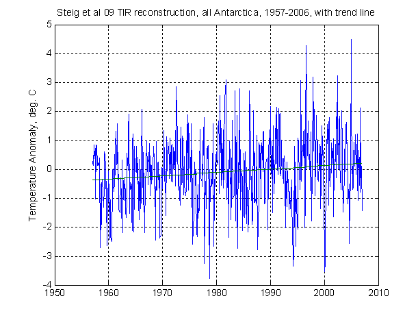
Figure 1
Steig et al. report a 95% CI of ± 0.07 °C/decade for this trend coefficient. Assuming a t critical value of approximately 2, this means that they are estimating the se to be about 0.035. Using the above data, the OLS standard error (“seOLS”) is 0.0330. Twice this value is within rounding error of 0.07. It indicates a very high level of significance (p = .0004).
However, the first order serial correlation of the residuals, r1, is 0.318, and is highly significant (p = .0000). With this serial correlation, the standard AR(1)-corrected standard error (“seAR”) is 0.0458, i.e. 44% larger. This leaves the slope still highly significant (p = .0103), but not nearly as significant as is implied by the published CI. The simpler approximation presented by Santer et al., which is based on a 1952 formula by Quenouille and therefore identified here as “seQ” (see below for details), gives the same numerical value as seAR, namely 0.0458. Using either seAR or seQ, the corrected 95% CI is ± 1.964(0.0458) = 0.0900, which is clear inconsistent with the 0.07 reported by Steig et al.
Table 1 below reports similar figures for all the 1957-2006 TIR reconstruction trends for which Steig et al. report numerical values. Implicit Steig standard errors, obtained by dividing their reported 95% CI’s by 2, are given in square brackets [ ]. p-values are given in parentheses below the respective standard errors. Slopes and standard errors are all in °C/decade.
| Region | Steig slope |
Steig [se] |
OLS slope |
seOLS (p) |
r1 | seAR (p) |
seQ |
| All Ant. | .12 | [.035] | .1178 | .0330 (.0004) |
.318 | .0458 (.0103) |
.0458 |
| Peninsula | .11 | [.02] | .1196 | .0198 .0000 |
.262 | .0259 (.0000) |
.0259 |
| West Ant. | .17 | [.03] | .1839 | .0311 (.0000) |
.312 | .0429 (.0000) |
.0430 |
| East Ant. | .10 | [.035] | .0984 | .0374 (.0087) |
.290 | .0504 (.0512) |
.0504 |
In all four cases, Steig et al. are clearly using seOLS, not seQ or seAR. In the caption to Figure S4 of their online SI, the authors state that
Black lines separate areas of significant vs. insignificant trends (>95% confidence based on two-tailed t-test with number of degrees of freedom adjusted for temporal autocorrelation). (SI p. 4)
The reference to adjusting the number of degrees of freedom would imply that they are using the Santer/Quenouille seQ adjustment. However, the confidence intervals they report in fact show no correction for serial correlation, by either method. The article’s Figure 3, showing regions of significant and insignificant trends, is therefore erroneous.
When the implied standard errors are appropriately corrected, many of the reported trends in Table 1 do remain significant, but only at a greatly reduced level.
The famous cover photo on the 22 Jan 2009 issue of Nature, shown above, appears to be based on Figure 4e of the text, which shows mean annual trends for the shorter period 1979-2003. Steig et al. give no numerical values for this period, but they are easily computed using the online TIR reconstruction file. Table 2 below gives the same statistics as Table 1 above, but for this shorter, 300-month period.
| Region | OLS slope |
seOLS (p) |
r1 | seAR (p) |
seQ |
| All Ant. | .152 | .102 (.139) |
.356 | .148 (.305) |
.149 |
| Peninsula | .2590 | .0604 .0000 |
.195 | .0735 (.0005) |
.0736 |
| West Ant. | .3472 | .0929 (.0002) |
.263 | .1213 (.0045) |
.1216 |
| East Ant. | .091 | .117 (.438) |
.339 | .165 (.582) |
.166 |
Thus, although the trends for the Peninsula and West Antarctica shown on the cover are both significant, the trends for the continent as a whole and for East Antarctica are not significantly different from zero, with or even without a correction for serial correlation. It is curious that the trend for West Antarctica is even stronger than that for the Peninsula, even though the authors admit that the limited surface data for West Antarctica shows less warming than Peninsula stations do.
The slight differences that sometimes arise between my point estimates of the trend in Table 1 and those given by Steig et al. for the Peninsula and West Antarctica may be simply due to the manner in which ties induced by rounding error at the boundaries of the regions were resolved: On p. 461 of their text, they define W. Antarctica as 72 °-90° S, 60°-180° W. I interpreted this to include all 3 boundaries plus the pole. They define East Antarctica as 65°-90°S, 300-180°E. I took this to include 65° S, but to exclude the two longitude boundaries, which I included in the other two regions. They define the Peninsula to have the same westerly longitude boundaries as W. Antarctica, and to be north of 72° S. I took this to exclude 72° S, which I had included in W. Antarctica, but to include the two longitude boundaries, as with W. Antarctica.
In fact, Steig et al.‘s regional definitions unambiguously place a sliver of the Peninsula in East Ant., place one pixel of Thurston Island in the Peninsula, and leave out the very tip of the Peninsula altogether. They may have modified their definitions manually to correct these anomalies, but I just took their definitions as published.
In this note, I am just taking the TIR recon as given. Until Steig posts the Matlab code he used to apply RegEM to the satellite TIR data, it remains uncertain how valid that reconstruction is and therefore how valid the derived trends are. It is also unclear why Campbell Island (52°S) and 4 other temperate-zone oceanic weather stations were included in the 42 occupied weather stations used to measure Antarctic ice-sheet temperature, as listed in Table S2 of the SI. Amsterdam, at 52°N, would surely not be included in a study of Arctic temperatures. Without knowing the details of how RegEM was applied to the satellite data, there is no way to check how robust the reconstruction is to the exclusion of these 5 stations.
FORMULAS:
In a regression of the form
y = X β + ε,
where X is an nXk matrix of regressors, the OLS estimate of β is
β-hat = (X’ X)-1 X’ y
When Cov(ε) = σ2 I,
Cov(β-hat) = σ2 (X’ X)-1.
This may be estimated by
CovOLS = s2(X’ X)-1, where
s2 = e’ e / (n-k) and
e = y – X β-hat
is the vector of OLS residuals. The standard errors are then
seOLS = sqrt(diag(CovOLS)).
If instead there is first order Autoregressive (AR(1)) serial correlation of the form
εt = ρ εt-1 + vt,
where the vt are white noise, then
Cov(β-hat) = σ2 (X’ X) -1 X’ Γ X (X’ X)-1,
where Cov(ε) = σ2Γ with
Γ = (ρ|i – j|).
The standard estimator of this is
CovAR = s2 (X’ X)-1 X’ G X (X’ X)-1,
where
G = (r1|i – j|),
and
r1 = ∑(etet-1)/(n-k-1) / s2.
In the early days of concern about serial correlation, before modern computers were available to crunch through the above matrices, Maurice H. Quenouille (Associated Measurements, 1952, p. 168) gave a formula for adjusting the standard test for the significance of a correlation between two variables (or equivalently for the significance of the slope in a simple regression of one on the other) for the loss in effective sample size when there is serial correlation of a general form in both variables. In the special case of a trendline regression (so that the low-order correlations of the regressor are virtually one) with AR(1) errors, and not too large a value of ρ, it can be shown that Quenouille’s formula implies, in the large sample limit,
CovAR ≈ CovOLS / Q,
where
Q = (1 – r1) / (1 + r1),
is the factor by which serial correlation reduces the effective sample size.
This factor is used by Santer et al. (2008, p. 1708), and may be seen to give almost identical results to the more computation-intensive CovAR in the present application. It is not clear to me who first proposed this special case of Quenouille’s more general formula. Quenouille himself attributed the formula identified with him to an even earlier article by M.S. Bartlett (J. Royal Statist. Soc. 1935, 98).
(The Quenouille adjustment is specific to the problem of the significance of a linear trend coefficient. For more general regressors, seAR is more appropriate.)
It should be noted that in the presence of serial correlation, s2 as calculated above is in fact a downward-biased estimate of the variance of εt. Furthermore, r1 as computed above is a downward-biased estimate of the true ρ. The standard CovAR and therefore CovQ are therefore both downward-biased estimates of the true sampling variance of β-hat. I am working on a new estimator of ρ which should correct both these deficiencies. However, although this improved estimator can make a big difference as ρ approaches 1, preliminary calculations indicate that this improved estimator makes very little difference for the present data, in which rho is never as high as 0.4.
Another important model of serial correlation, which UC has commented on here, but which goes beyond the scope of the present post, is that of long-memory or Fractionally Integrated errors.
J. Huston McCulloch
Economics Dept.
Ohio State University
The above Nature cover image comes to you directly from http://faculty.washington.edu/steig/nature09data/cover_nature.jpg


155 Comments
Queue up the smug and all too typical, “But J. Huston McCulloch is a professor of economics, not climatology, so we can safely ignore him” ad hominems in 3…2…
Re: Ward S. Denker (#1), And in which field was Einstein credentialed? Great minds and clear thoughts are not pigeon-holed to letters that follow a person’s name…
Let me get this straight. Each point in Figure 1 is an average, and not a single data point itself. Has that been taken into consideration in computed the regression SE’s?
Re: Basil (#3),
Basil, you are absolutely right! Each point is an average of 5509 grid point values. Wow!
Only one problem… the values each happen to be a linear multiple of the same three PC series. With simple algebra, it isn’t difficult to show that that average is itself a linear combination of the same three series. In essence, it has the same amount of information in it as a single grid point series. The average of all these series is no better than any single one of the series because they are so completely interdependent with each other (becuase any three of them can predict every single other grid series).
The averaging is a red herring. Steig et al. would have been just as well off by generating the continental “average” in the first place.
RE Basil #3, RomanM #5,
The fact that each point in Fig 1 is an average of 5509 grid values is not in itself a problem. Nor is the fact that these 5509 values are just linear combinations of 3 PC series (aside from the fact that the 4 regions reported in my table in fact have only 3 independent degrees of freedom).
The real problem is how the 3 PCs were concocted from the 42 Antarctic + non-Antarctic station data. I suspect now that some of the stations must have had negative weights in their contribution to these 3 PCs, in order to get W. Antarctica to have such a strong trend in the late period. These negative weights would be the natural outcome of the negative empirical correlations that occur randomly when sufficiently many zero correlations are estimated with limited data, as documented by Steve on the recent Antarctic Correlations threads.
Re: Hu McCulloch (#6), Hu, it has been years since I was formally schooled in statistics, but I recall this being an issue. You’ve got to acknowledge the loss of degrees of freedom somehow. Now, I don’t know that it is a “big” issue, with that many observations (5509) for each data point, but it shouldn’t be dismissed. And then what about “errors in variables?”
I’m not challenging your concerns about the PCA. Maybe that’s the most fatal issue here. But that doesn’t mean there are not other problems.
Steve, Quenouille gave a complex formula for calculating the loss in effective N when there is autocorrelation. This includes the autocorrelation, not just at lag 1, but at all lags. It is given by:
where r1, r2, etc. are the autocorrelation at lag 1, lag 2, and so on.
Is this the formula that you are simplifying above?
w.
As usual, wordpress screws things up. The “8230;” in the formula should read “…”
w.
Upon re-reading, I see that I should have addressed the above comment to Hu, who wrote the most interesting lead post.
w.
Where do you start to get insight in how to perform this kind of post-mortem analysis (speaking as a former Math major with an advanced degree in computer science)? Cool stuff.
Re: humble admirer (#10),
Hey, all you have to do is read the 1500+ blog entries and tens of thousands of responses here and you too could be a post-mortician.
A post-mortician
fills the veins of dead bodies
with formaldehyde.
Re: Dave Dardinger (#9), Wow, that is a priceless Haiku.
#6,#12:
“The fact that each point in Fig 1 is an average of 5509 grid values is not in itself a problem. Nor is the fact that these 5509 values are just linear combinations of 3 PC series.”
the latter is quite an issue, because every other selection of the number of PC’s gives a lower temperature trend.
Steve M,
Using R’s gls() function you can pass it your AR1=0.318 and have it do the regression in the presence of this serial correlation. Look at the “correlation” parameter described in help(“gls”).
A bit too short series for that kind of analysis. But for sure there must be independent white error process added to AR(1) to make the H0 model realistic. Try AR(1) with r=0.95 and variance 0.4 plus white noise with variance 1, for example. No more significant trends 😉
Re: UC (#13),
..and to compare models it is always good to check what they predict, simple Kalman filter will do in this case:
If I had time I would add trend uncertainties, but my wife said I must not audit any climate for a week, so be it 😉
That’s easy to check. The following additions will do for Schneider’s RegEM code (similar additions to Steve’s R-code; Steve, I think this is something you also needed before in other contexts):
#1:
#2:
#3:
Now call your RegEM as
and you will have all regression coefficients for input values in a list BS (each index correspond a single record). My preliminary test with AWS reconstgruction indicates that there are plenty of negative station contributions (to imputed AWS values) as I also expected.
BTW, many of B’s are the same (all the records with the same “missing pattern”) as the algorithm does not account for the autocorrelation (only changes in “missing pattern”, which is relatively nonrandom in this application). That’s relatively funny in the light of Steig et al:
Jean S writes, #16,
Talk about flipping proxies! If you can use a station’s anomaly as a negative indicator of another station’s temperature across the continent, you can get some pretty strange results. Constraining the covariances to be a non-negative, decreasing function of distance (as in Kriging) makes a lot more sense, IMHO.
RE Willis, #5-7, I’ll get back to you later today. This will take a while to compose.
Does anyone else find Steig’s claim that Antarctic peninsula warming is 0.11C/decade interesting?
Hu, thanks for formalizing this analysis. It appears that I am in reasonable agreement with your calculations for the entire Antarctica. The differences between what you and I calculate for the separate regions is probably caused by my arbitrary choices for divisions of the Antarctica into East, West minus the Peninsula and the Peninsula.
My calculations are here in Post #’s 164 and 341 at :http://www.climateaudit.org/?p=5151#comments
I am not certain how you finally use the Santer application for AR1 adjustments, but I obtain the following from the Santer Et al. (2008) text.
This persistence reduces the number of statistically independent time samples.
Following Santer et al. (2000a), we account for the on-independence of e(t) values by calculating an effective sample size ne: ne = nt (1 − r1)/(1 + r1)
By substituting ne – 2 for nt – 2 in Equation (5), the standard error can be adjusted for the effects of temporal autocorrelation (see Supporting Information). In the RSS example in Figure 2A, ne ≈ 16, and the adjusted standard error is over four times larger than the unadjusted standard error (Figure 2C).
Equation 5 gives the standard error squared as SE^2 = 1/(nt-2)*sum of [e(t)^2]
When I do this substitution the ratios of the unadjusted SE and adjusted SE becomes ((nt-2)/((nt/Factor)-2))^(1/2) where Factor = (1+r1)/(1-r1).
I have a question about using the AR1 correlation adjustment when that correlation cannot be shown to be statistically significant. There were a very few cases where AR1 was not significant in my calculations over the various time periods and regional divisions that I used. Also I see higher order ARn correlations that are statistically significant in my calculations. Should we be concerned about that when we attempt to adjust for autocorrelation?
I think it is most important to also keep the claims of Steig et al.(2009) in the perspective of the choice of starting time for the trends they report. There also should have been a discussion of the ice core reconstructions in Steig concerning the findings of West Antarctica that for the 20th century the warmest decade was from 1935-1945 – findings by Steig.
Re: Kenneth Fritsch (#20),
The higher order autocorrelations do matter. You can’t ignore them. See my comment to Steve on how to use R’s gls() function for specifying autocorrelated errors (all orders, low & high). I believe it was in “unthreaded”?
Re: Paul M #19
I don’t think Dr. Steig had any choice but to make this claim due to the decision to reconstruct with 3 PC’s. It imposed an artifact of .11C trend on the peninsula through reduced eigenvector weighting. As has been discussed progressively higher order eigenvectors would have eventually found something reasonable for the peninsula, but (if I understand this correctly) this would have come at the expense of the overall continental warming trend being claimed.
Re: Layman Lurker (#21),
It would likely mean that the trend doesn’t exceed the uncertainty – necessary to make the trend statisticaly “significant”.
+.05 (+/-.07) per decade doesn’t get you the front cover of NATURE 😉
I have compared the reconstructed TIR, reconstructed AWS and GISS trends over the periods 1957-2006, 1965-2007, 1975-2006 and 1980-2006 and one can readily see that those trends are statistically significant for the 1957-2006 period. Coming forward only a few years from 1957, the trends are no longer significant. AWS and GISS are in reasonably good agreement whereas the TIR trends diverge (warmer) from AWS and GISS coming forward in time.
Post #292
http://www.climateaudit.org/?p=5151#comments
I think the point in Steig et al. (2009) was to be able to show a warming trend were they could and then essentially ignore what occurs coming forwards (or backwards, for that matter), i.e. starting time sensitivity. They also do not detail differences between AWS and TIR over various time periods and for the 3 regions in the Antarctica.
Re: Steig Graph. Why all the fuss? Just leave out the 60’s (an arbitrary starting point)and there is no duscernable temperature gradient.
Re: Sam Glasser (#24),
After all, we have been instructed repeatedly that 30 years is “climate”
Another important model of serial correlation, which UC has commented on here, but which goes beyond the scope of the present post, is that of long-memory or Fractionally Integrated errors.
#22 Keneth Fritsch
Hmm… let’s see we have the choice of start date, the autocorrelation with Chladni, the choice to truncate at K=3 rather than at a higher order, RegEm not being able to weight inputed stations by geography, a clearly un-natural artifact in PC3…
Layman Lurker, the autocorrelation Chladni patterns and the (presumably though claimed otherwise) un-natural artifact in PC3 are the same issue.
Continuing on #22
…Oh and CI issues (sorry Hu)
#29
You are right. What I would say is that PC3 (and truncation at K=3 being a problem) is dependant on Chladni. The amount of warming smeared by K=3 also depends on RegEm processing of the peninsula.
I understand this is really a mathematical/statistics oriented site. In this instance, I do not see any comment about the fact that Steig acknowledges that from the 70’s to the present, the East Antarctic cooled at an approximate rate of .2 C per decade. Setting aside the artificial temperature creation for the East for all years prior to the beginning of satellite date ( 1979 if I recall correctly ), Steig admits that the East has cooled about .6 C and the clear conclusion is the East is cooling with no indication of abatement. 85% of the Antarctic ice is in the East. The East was not melting in 1970 when it was warmer. It is not melting now. He selects 50 years and extrapolates some temperatures from the West, applies them to the East, and, voila,”on average” it was warmer in (the Western extrapolation transplanted to) the East. Steig then states that ‘on average’ it has warmed. This is bunkem on its face. If the East has been cooling for at least three decades, we can all sleep easily for the next 500,000 years or so. Steig’s own report demonstrates the critical area of ice, the East, is not only not melting, but any suggestion that the Antarctic ice will melt and flood the planet is a bold faced fabrication. No stats, just his own words.
Re: p.j. moran (#32),
Coming forward in time from 1957 into the early 1960s and beyond all one can say (using Steig’s TIR and AWS reconstructions) is that the data yield CIs sufficiently wide to say that the overall Antarctica temperature anomaly trend is not significantly different than zero, i.e. neither cooling nor warming.
That is the issue of this thread: wide CIs (after adjustment) equal uncertainty in temperature trends.
If one breaks down the Antarctica into regions of East, West minus the Peninsula and the Peninsula then one can say (using Steigs reconstruction) that the warming of the Peninsula is statistically different than zero and has been warming continuosly over the past 50 years. But then we already suspected that was happening.
Will CA audit this?
http://nsidc.com/arcticseaicenews/
“near real-time data” adjustment still = AGW story thank you
Re: VG (#33),
From the article you reference,
I disagree. Absolute ice can melt and produce diverse effects. Relative ice is a figment of the imagination, a mathematical device of convenience.
Maybe some climate scientists should seek the advice of terminologically didactic statisticians.
The choice of starting points is important given there was a global cooling trend from the 50’s to the 70s. It means he gets to start his series at a time when it was known to be cooler, so it stands to reason it would be warmer now on average.
I’d like to see a chart of an 11 year running average temperature change and correlate that against the solar cycles…
Re: Mike Lorrey (#34),
I wouldn’t.
Re 36
There are other problems with the “relative ice”. There is too much of it during the 1989-2003 period as even a cursory look at the time series at Cryosphere (http://igloo.atmos.uiuc.edu/cgi-bin/test/print.sh) shows. Take a look at the ice in the Baltic on July 1, a date when there is positively never ever any ice there. During 1989-2003 there is always a fair amount of ice shown in northern and eastern parts. Presumably the ice in the Arctic Ocean is similarly overestimated.
Re: tty (#37), I wouldn’t be surprised if there never is ice in the Baltic on July 1, but I’m not familiar with the region. Is there a non-CryosphereToday source of ice info for that period, or some temperature charts from Finland?
Re Willis Eschenbach, #5-7,
Q was concerned with the correlation between two variables, say y and x. Let’s say
y = a + b x + ε
and that Cov(&epsilon) = σ^2 Γ, for a general stationary correlation matrix Γ = (γ(|i-j|), γ(0) = 1.
WLG assume mean(x) = 0, so that X’X is diagonal and inv(X’X) is also trivially diagonal. Set Sxx = ∑x(t)^2. Then if
Γ = I,
varOLS(b-hat) = σ^2 / Sxx.
However, when Γ ≠ I, the general formula for Cov(β-hat) becomes
var(b-hat) = σ^2/(Sxx^2) ∑∑ x(i)x(j) γ(|i-j|)
= (varOLS(b-hat)/Sxx) (Sxx + 2γ(1) ∑ x(i)x(i-1) + 2γ(2) ∑ x(i)x(i-2) … + 2 γ(n-1)x(n)x(1))
= varOLS(b-hat) (1 + 2γ(1) w(1) + 2γ(2) w(2) + … + 2γ(n-1) w(n-1)),
where
w(i) = ∑(i = j+1:n)x(i)x(i-j) / Sxx
is what I call the weak autocorrelation of x at lag i. It is “weak” because n-i terms are being divided by n terms, so that this is a downward biased (but still informative) estimator of corr(x(t), x(t -i)). For large n and/or small i, the bias is negligible, however.
Quenouille (Associated Measurements, 1952,p. 168) wrote,
Following the source you copied back on 11/24/06, in Comment 143 of thread 903, you have the sum running to n, rather than n-1 as it should. In fact a series of length n can have only n-1 autocorrelations. Q himself was not explicit about where to end the sum, since he treated the all but the first few terms as negligible in is examples.
If the two series are y and x, r(i)’ should in fact be the weak autocorrelation of x, not an unbiased strong autocorrelation. Q himself probably had in mind corr(x(1;n-1), x(2:n)), which downweights x(1)^2 and x(n)^2, but that is a minor distinction. Also, r(i) should be the autocorrelation of the errors, not of y, though under the null b = 0 these are the same thing.
When estimating a time trend, the w(i) are nearly 1 for low values of i. As long as the r(i) die out quickly enough, var(b-hat becomes
var(b-hat) ≈ varOLS(b-hat) (1 + 2γ(1) + 2γ(2) … )
If in addition the errors are AR(1),
var(b-hat) ≈ varOLS(b-hat) (1 + 2 ρ ∑(i=0:inf)ρ^i)
= varOLS(b-hat) (1 + 2 ρ / (1-ρ))
= varOLS(b-hat) (1 + ρ) / (1 – ρ).
The ordinary estimate of ρ is the r(1) of the errors, whence the reduction of the effective sample size is what I called “Q” in the post,
Q = (1-r(1))/(1+r(1)).
The above “Q-factor” formula is equation (6) in Santer+Nychka+15 (2008). They in turn attribute it to a 2000 Santer+Nychka+others paper that I have been unable to obtain. It is also discussed (and a bias-reducing variant proposed) in a 2000 UCAR technical paper by Nychka+Santer+4 that is no longer online at UCAR. (See CA thread 4216, “If Nychka Standards applied to Mann.”) Conceivably it is due to Santer and/or Nychka, but I strongly suspect it goes much further back. We ought to find out, just to set the record straight. Meanwhile, I think of it as a special, limiting cae of Q’s concept, and therefore reasonably attributable to him.
Re #38,
make that
w(i) = ∑(j = i+1:n)x(j)x(j-i) / Sxx
RE Bender, #12,
I’m not familiar with R, but GLS+AR(1) would re-estimate the coefficients, with an effect similar to the almost-as-old-as-Quenouille Cochrane Orcutt (aka CORC) method.
However, the GLS estimates are optimal only if you know the covariance matrix up to a multiplicative constant. If you in fact are estimating the shape of this matrix from the data, the results can be unstable. Hayashi’s recent text therefore suggests sticking with the imperfect but stable OLS estimates and just worrying about their precision. That’s what my CovAR does in the text, and what the Q factor approximately does.
Re: Hu McCulloch (#40),
Hu, my primary point is this: with modern software these days it is SO BLOODY EASY to try to make a correction for serial correlation that failure to do so should be considered to be an egregious error.
.
That the correction is approximate is a secondary issue. At least you’ve got to try!
OT (sea-ice): #33, #36, #37
Re: Hu McCulloch (#40),
In my books that goes without saying. But I suppose it doesn’t hurt to say it. Any time you are estimating something and then assuming it to be correct you are propagating error – a fact which is often (i.e. almost always) conveniently overlooked. The reality is the estimated AR(1) = 0.318 in Steve’s example has a standard error associated with it. To measure the degree of instability pointed at by Hu you could run your regression with the top and low ends of the 95% confidence interval, i.e. AR(1) = 0.318 ± 0.2, for example.
Re: bender (#41),
I asked this very question in previous post on Santer et al. (2008) about how one would handle the CIs for the estimation of the AR1 when using them to adjust the standard error for AR1 and did not receive an answer.
It would appear that the GLS method is iterative like the Cochrane Orcutt method applied by Lucia in determining the statistical significance of current temperature trends deviating from model predictions.
I could do the R version, but it would be like a blackbox application for me. Could not hurt to compare adjustments, I suppose.
Hu, we prefer to see R code here at CA, but that from Matlab will do in a pinch.
Re Bender #41, 42,
Good point — the uncertainty in ρ affects the distribution of β-hat in much the same way that the uncertainty of σ^2 does. But in the former case there is no simple Student t distribution that untegrates out the uncertainty. An ambitious researcher would try to do this numerically, but I’m feeling lazy at the moment. (BTW the .318 is my figure, not Steve’s. As post author, I get to have power-pink comments!)
Re #42, yes Steig committed an egregious error by not even applying the simple Santer-Nychka Q factor. It didn’t much affect the significance of the 1957-2006 trends he reported, or even those for the 1979-03 period that apparently was used for the cover diagram, but it makes trend much more fragile and sensitive to starting/ending period when the serial correlation is taken into account.
Ken Fritsch has already noted this sensitivity in his posts #164 and 341 on the Deconstructing Steig thread. (See #20 above)
There is never ice in the Bay of Finland or Botnian Bay in the beginning of July. Similarly there is no ice in the White Sea along the southern coast of Kola Peninsula during the same time of season. Still the same site show ice in Kola peninsula during the same time span, 1989-2003. I was on Kola Peninsula in 2004 and there is no doubt about the state of ice conditions there, it is absolutely sure that it is ice free in July.
Something is completely wrong with the interpretation of satellite data of ice.
CryosphereToday show no ice in 1980-1988 and 2004-2008 in the Baltic and White Sea. In 1989-2003 they show ice.
Larry Huldén
Finnish Musuem of Natural History
RE VG#33, Geoff S. #36, tty #37, AnonyMoose #46, Larry H #47,
Arctic sea ice is way off topic on this thread. Please move this discussion to Arctic Sea Ice – End of Game Analysis (#3819), or else to Unthreaded.
I’d use my Superpowers as poster to move these posts, but I’m afraid I might hit the wrong button and set off an irreversible melt-down of the Antarctic ice sheet instead if I tried!
Re: Hu McCulloch (#48),
You are quite correct and I apologise. I have a general concern that errors, their calculations and representation are often poorly done and now I have made one. Geoff.
Re 46
Here are daily AMSR-E ice maps for the Baltic from 2002 on:
http://www.iup.physik.uni-bremen.de:8084/baltic/baltic.html
If you check the maps for 2003 you can see that the last ice in the Bothnian Bay melted around May 20 (which is a few days earlier than average).
There is a vast amount of historical data on ice in the Baltic, going back to about 1700 AD, but very little orf it is online.
RE Bender, #23,
Bender, I can’t find that comment using CA’s search engine. Can you give more explicit directions?
Thanks!
Re: Hu McCulloch (#50),
I am not certain that this was what Bender had in mind, but here is a method from R with a reference to the original source.
http://math.furman.edu/~dcs/courses/math47/R/library/sandwich/html/weightsLumley.html
In order to give a better feel for when the uptrends occurred in W. Ant and the Peninsula, here are graphs for those regions corresponding to the one in the post:
East Antarctica is pretty flat so I didn’t post it.
The West has a big upsurge from about 1985 to 2000, but other choices of endpoints would generally give a smaller trend. Steig et al chose 1979-2003 for their Figure 4, which seems to be the source of the cover picture. They gave no reason for these dates. 2003 just includes the big positive outlier at 9/02, but then 1979 just misses the big negative outlier at 8/78. 1979 is sort of when satellite data begins, but then they state that it isn’t complete enough to use until 1982.
A few points stick out. Their identify may give some
insight into how the series were constructed:
West:
line yr mo error temp
549 2002 9 +4.8392 +5.0343
260 1978 8 -4.5474 -4.7952
498 1998 6 +4.2168 +4.3338
476 1996 8 +3.8627 +3.946
357 1986 9 -3.3564 -3.4556
249 1977 9 -3.3457 -3.6103
517 2000 1 -3.2958 -3.1497
18 1958 6 -3.0797 -3.6984
571 2004 7 -3.0025 -2.7736
516 1999 12 -2.9285 -2.7839
Peninsula:
line yr mo error temp
549 2002 9 +3.5363 +3.6548
498 1998 6 +3.2491 +3.3168
357 1986 9 -2.4626 -2.5355
260 1978 8 -2.4511 -2.6207
572 2004 8 -2.1776 -2.0362
19 1958 7 -2.1546 -2.5644
513 1999 9 +2.0274 +2.1100
476 1996 8 +1.9703 +2.0160
571 2004 7 -1.8954 -1.7549
380 1988 8 +1.8836 +1.8337
9/02, 6/98, 9/86, and 8/04 are among the top 4 or 5 in both cases. W. Ant has an interesting Y2K pair: 12/99 and 1/00. Also, the Peninsula has an interesting back-to-back pair: 7/04 and 8/04.
These outliers should in turn show up in one of the PCs (and probably each is only in one), though I haven’t investigated those yet. They may indicate a data error at one of the stations, or some other quirk in the data.
Hu, I have a couple of questions:
Do you include the Peninsula in your West Antarctica calculations?
By error do you mean the residual error from the regression line and in terms of standard deviations?
Hu, what definitions are you using for W. Ant and Peninsula in terms of the grid coordinates?
RE Ken, Roman, #53, 54,
I just followed the definitions Steig et al gave on p. 461 of their paper. See definitions and discussion in the post above, after Table 2. “West” does not include the Peninsula.
They define E Ant as 60W clockwise to 180E, W Ant as 180E to 60W, 72S to 90S , and the Pensinsula as “westerly longitudes” (presumably their 180E to 60W), above 72S.
Steig’s definitions aren’t the ones I would have used — I would perhaps have taken the Peninsula as 50W to 80W, down to say 78S, W Ant as 80W to 170W above 85S, and everything else in E Ant. This would sort the AWS as in Ryan O’s graph at #316 on thread #5151. Including or excluding an AWS site could make a big difference for the AWS recons, but since the TIR recons are averages of smooth functions of location, the definitions of the boundaries probably aren’t as critical. Note that Steig et al seem to place Butler Is and Limbert, I think it is, in E Ant, and leave out the tip of the peninsula altogether. This may have affected their AWS recon, but not the TIR discussed here.
My “errors” are in °C, just y – yhat as defined in the post. Since the trend lines are small numbers, the “errors” aren’t very different from the temperatures. The outliers are essentially the same either way.
Re: Hu McCulloch (#56),
If Steig cuts off the peninsula at latitude 72S, he is putting some of the peninsula, as I would define it,into West Antarctica. I think I like my partitioning better than Steig’s although mine was one of convenience. I would think a proper one would consider the mountain range running down the Antarctica (Trans Antarctica Range??) as a natural dividing line for East and West and separate (all of) the peninsula out from West Antarctica.
I have all the data in a form to determine how much the cut at 72S or 78S would affect the West Antarctica trends.
RE Ken, #55,
The code you give is for computing “HAC” standard errors for OLS coefficient estimates. I regard these as defective, since they truncate the correlations above a low threshold (3 for sample size 100, but slowing increasing with sample size), and downweight those above the threshold linearly with lag length. This makes the standard errors much too small, but researchers love it because it makes their t-stats almost as high as OLS!
For say ρ = .9, HAC does do an adequate job of estimating the standard error for samples greater than 1,000,000, hence its “consistency.” But for smaller sample sizes there could be a problem.
Re UC #13, 15, Ken Fritsch #21, Bender #23,
I have no problem with the serial correlation being more complicated than AR(1), but usually this captures most, if not all, of the problem. Steig et al claimed to have adjusted for AR(1) (or at least to have corrected the DOF, which suggests the Quenouille-Nychka AR(1) factor), and Santer 17 stress the AR(1) case, so for the purposes of discussing Steig, I am sticking with AR(1).
Unfortunately, even in the AR(1) case, the Q-factor is specific to the problem of estimating a time trend. For more general regressions, something like seAR in the post must be used.
More generally, an AR(p) model, with p some slowly increasing function of sample size such as 4(n/100)^(2/9)-1, as is often used in the Newey-West Hac literature, would be able to claim consistency without getting over complicated.
As for fractional integration, I disagree with UC that it won’t work with this small a sample. We know how to write down the likelihood as a function of d, even for d in (.5, 1), using the covariance matrix of the demeaned and otherwise transformed residuals. ML should work fine. This model might be murder on the standard errors, but maybe that’s what we should use. Another day, however.
Re: Hu McCulloch (#58),
Observational noise can be a big problem, as my example shows (underestimated AR(1) coefficient, and result is ‘significant’ trend when there’s no trend). AR(1) + Observational noise is actually a textbook example, Shumway & Stoffer, Example 6.3
With small sample, can we distinguish between fractional and ‘normal’ noise ? I’ve played with data sets with more than 200 000 samples, and then AR(1) + WN etc simple models can be easily thrown out if fractional noise is present.
I have to say that I am very impressed with the analysis here. However, as a lowly biologist, my primary concern would be with the accuracy of the instrumentation used to make the primary readings. If you are going to make claims of warming of 0.07C/decade, you had better have thermometers graduated in thousandths of a degree (and calibrated regularly). No mean feat today, but sixty years ago? Increasing the reported accuracy of data through the generation of means is not scientifically valid.
RE Bryan Watkins, #59,
You make a valid point. However, I would hope that Antarctic data is at least collected consistently, so that errors would average out to some extent over many stations and days. This doesn’t work when the errors are systematic, such as occasional changes in notions about how to read values that are between the lines, round fractions, etc.
RE Ken #61,
The Transantarctica range is the traditional boundary of W. Ant. (see Wikipedia). However, that would be a pretty ragged boundary in terms of coordinates, so most people are just going to use a few coordinate boundaries instead. The Pole is in E. Ant, so E. Ant. ought to include a few degrees about the pole, say 5, which is about what Steve uses in his maps. This just barely places AWS Erin (84.9S) and Theresa (84.6S) in W. Ant, along with Harry (83S) and Elizabeth (82.6S), in accord with Ryan O’s categorization on #316 of thread 5151.
I agree that Steig’s definition is too rough, but it’s his article, not mine and he’s the climatologist, not me. In trying to replicate his trends and CIs, I just tried to duplicate what he says he did as closely as possible. The trends are slightly off, but perhaps that is just due to tie-breaking along the boundaries, and/or understandable manual modifications of his stated regions to correct anomalies.
Given that Steig’s TIR recon is highly smoothed with respect to coordinates, the exact boundaries shouldn’t make too much difference for estimated trends. Definitions make a much bigger difference for the AWS recon, since it’s just averaged over subsets of the 63 AWS sites.
Of course, the penguins on the ground may have a completely different opinion about where the Peninsula is, but we’re not asking them!
Re: Hu McCulloch (#62),
Not to be pedantic about the Peninsula geographic, but I think, as the excerpt below indicates, the Steig authors were much interested in claiming that the West Antarctica was going the way, temperature-wise, of the Peninsula over the past 50 years. I think the split between the Peninsula and the West Antarctica then becomes more important.
What I find interesting from my Antarctica separations and anomaly trends coming forward from 1957 was that the Steig authors could use the TIR reconstruction to make there point of the West Antarctica following the Peninsula, but not the AWS reconstruction.
In the TIR reconstruction the trends over the periods 1957-2006,1965-2006, 1970-2006 and 1980-2006 show for East Antarctica no period trends that were significantly different than zero, while for the West Antarctica the two earlier periods showed a significant positive trend while the later two had no significant trend different than zero. The Peninsula for TIR showed significant positive trends over all four periods. Confusing, however, was that the nominal trends for the Peninsula and West Antarctica were nearly the same over the time periods observed and the trends become more positive over time.
In the AWS reconstruction, and using my Antarctica separations, both East and West Antarctica showed no significant trends over the 4 time periods observed while the Peninsula showed significant trends in all four time periods. Both East and West Antarctica showed decreasing nominal trends coming forward from 1957, while the Peninsula showed a trend that was approximately 0.32 degrees C per decade over the entire 1957-2006 time period. The Peninsula trend was much more positive than that for West Antarctica in the AWS reconstruction.
One might suspect that the TIR reconstruction spread some of the Peninsula warming to West Antarctica. Without some independent confirmation of this, e.g., by way of the AWS reconstruction, the authors claim appears problematic.
My separations for the Antarctica were for the convenience of a novice R user, but I do not think that that would have been a limitation for the Steig authors. I agree that after the TIR reconstruction works its magic that the Peninsula boundary becomes less important, but no so for AWS.
“We need to get rid of the MWP.” Who makes it so?
“We need to get rid of the uncertainty on the warming trend.” Who makes it so?
“We need to get rid of the west Antarctic cooling trend.” Who makes it so?
snip
In trying to reconstruct the regional AWS trends Steig et al would have obtained (but didn’t numerically report), bear in mind that if you take their definitions literally, Butler Island (72.2S) and Limbert (75.4S) are not in the Peninsula. Steig et al round both their longitudes to 300E, which is right on their boundary between E and W Ant, so which way they would go would depend on the tie-breaker rule. (Though with Mann on board, they may have put them in both regions…)
BAS in fact gives the longitude of Butler as 60.2W, which would place it unambiguously in W Ant, and that of Limbert as 59.9W, which would place it unambiguously in E. Ant, by the Steig definitions. However, since Steig takes the trouble to give the sometimes-rounded coordinates as he has actually used them, and puts these at exactly 300E, these stations should be taken as Steig-ambiguous with respect to E/W. But since he rounded their longitudes but not their latitudes, they are unambiguously not in Steig’s Peninsula.
But of course, the classification of the AWS sites does not affect the regional TIR trends given numerically in the article and approximately replicated in the post.
RE #38,
Doug Nychka has helpfully e-mailed me with the source of the “Q” factor (1-r1)/(1+r1) used in Santer et al 2008 and in my post in computing “seQ”.
It turns out this goes back to a 1966 World Metereological Org. volume, Climatic Change, by JM Mitchell, B. Dzerdzeevskii, H. Flohn, WL Hofmeyr, HH Lamb, KN Rao and CC Wallen. I’ve requested a copy from our library’s storage facility.
So it’s not due to Santer, Nychka, or even Quenouille after all!
Hu, the reference I have is an article by Nir Shaviv, wherein he references Rahmstorff’s citing of
Quenouille, M.H., Associated Measurements, 242 pp., Butterworth Scientific Publications, London, 1952.
as the source of the equation I cited above. Kinda third hand, but there it is.
w.
Shaviv also says the first mention of the idea was in 1935,
Bartlett, M. S., Some Aspects of the time-Correlation Problem in Regard to Tests of Significance, J. R. Stat. Soc., 98, 536–543,1935.
I have reported, in the first table listed below, the results of comparing the AWS and TIR 1957-2006 reconstruction trends using three different bounds for the Antarctica Peninsula from West Antarctica. My bounds for the East Antarctica were determined using clockwise 0 to 180 degrees longitude, while those for West Antarctica were clockwise from 180 to 360 degrees longitude. My West Antarctica minus Peninsula was then defined by subtracting out from West Antarctica the Peninsula using the longitude clockwise from 285 to 330 degrees and everything north of -76S. To approximate what Steig et al. used I made the bound for the Peninsula -72S and to approximate what Hu M suggested (I think) -78S.
As expected by Hu M, the bounds changed the West Antarctica TIR trends not at all and changed the Peninsula TIR trends slightly, with the middle bound of -76S showing the more positive trend.
With AWS the change from -76S to -72S reduced the Peninsula stations from 7 to 5 and increased the West Antarctica stations from 14 to 16, i.e. transferred 2 stations from the Peninsula to West Antarctica. On changing the bounds from -76S to -78S, no exchange of AWS stations occurred and therefore the trend changes from -72S to -78S are the same as those to -76S. For AWS, unlike TIR, the boundary change to include more of the Peninsula in the Peninsula does take some nominal warming trend from West Antarctica and gives it back to the Peninsula.
None of the boundary changes appear to affect the number of trends that are significantly different than zero for the various time periods used. Of course, East Antarctica remains unchanged and has no statistically significant trends for any of the time periods 1957-2006, 1965-2006, 1970-2006 and 1980-2006 in either the AWS or TIR reconstructions. West Antarctica has a significant positive trend for the time period 1957-2006 for the AWS and TIR reconstructions and also for 1965-2006 for the TIR reconstruction. I incorrectly reported on this thread that the West Antarctica trend in the AWS reconstruction was not statistically significant for the 1957-2006 time period. The Peninsula has significant and positive trends for all time periods in both reconstructions.
In reviewing my R code and tables for reporting the 3 Antarctica regional trends on the Deconstruction thread, I discovered that I had made some errors in transferring the R script and the AWS AR1 correlations to the post. The errors do not affect the results but I need to show the correct code and tables in this post.
These results are so humdrum status quo it is hard to imagine them constituting a Nature paper. Thanks Ken.
RE #69, thanks, Ken.
On trying to plot maps of the data, it occurred to me that equal averaging of the 5509 cells in the AVHRR (TIR) recon, or any subset of them, gives too much weight to the cells far from the pole, since they in fact have smaller area than the ones near the pole. In order to correct for this, they should be weighted by sin(phi)/phi, where phi is the angle in radians from the pole, i.e. phi = (lats + 90) * pi/180.
I’ll rerun the tables in my post with these weights when I get a chance. Failure to do this weighting would give too much weight to the peninsula and coast in the continent-wide averages, and too much weigh to the coast in the E and W averages. The effect might not be large, but it will be interesting to see.
It’s not clear whether or not Steig et al used these factors. Climatologists routinely area-weight their 5° global grids, so perhaps it went without saying that they used them, or perhaps they just didn’t bother because the adjustment isn’t huge, or perhaps it just didn’t occur to them.
In the AWS recon, this issue doesn’t arise, since it is just the average over the 63 AWS reconstructions, without regard for the fact that their distribution does not represent area at all.
Also, I’m inclining now to computing r1 simply as
∑(e(t)e(t-1)) / ∑(e(t)^2) * n/(n-1),
rather than using s2 with its factor of n-k in the denominator, and then trying to use an analogous factor of n-k-1 on the numerator, as in the post. Unless rho = 0, s2 is biased anyway, so there is no point in using it to compute r1. This change will be barely noticeable with n = 600 or even 300, however.
Without the factor of n/(n-1), this becomes the “weak” autocorrelation w(1) that arises in #38-39 above. But I prefer to use the above “strong” version, which even with this factor is biased downwards as rho approaches 1.
Re: Hu McCulloch (#71),
Hu, I used your sin weightings to obtain an approximate area for my designations of the 3 regions of the Antarctica and then compared them to the TIR portions and the AWS stations for these same areas.
Posted #342 here at :
http://www.climateaudit.org/?p=5151
RE Ken F, #72,
In that post, you say that the Peninsula definition you are using places 221 of 5509 gridcells in the Peninsula, or 4.01% of the total, as in your quote. When you weight the gridcells by sin(phi)/phi, what is the share of these 221?
Re: Hu McCulloch (#73),
Hu, I used latitudinal zones cut by longitude to make my area calculations. For example, using the sin ratios I can determine the relative areas of a zone going around the world from say -65S to -76S and apportioned the amount of this zone that is bounded by the longitudinal lines. My areas were approximate because I eye-balled the latitudes and longitudes. My area for the Peninsula was 6% of the Antarctica.
I think my calcualtions are correct but I am not so sure about by eyes.
A = 2*pi*R^2 [sin(lat1)-sin(lat2)][lon1-lon2]/360
= (pi/180)R^2 [sin(lat1)-sin(lat2)] [lon1-lon2]
http://mathforum.org/library/drmath/view/60748.html
Ken —
It sounds like you are including a lot of open water in your zone-areas. Since the Peninsula zone contains more water than the other zones, you are therefore overstating the relative area of the Peninsula itself.
If your definition of the Peninsula places 221 of 5509 gridcells in it, then since sin(phi)/phi is generally smaller for these cells than for the non-Peninsula cells, the Pensinsula should end up with distinctly less than 221/5509 = 4.01% of the total area.
Re: Hu McCulloch (#75),
Hu, not to beat a dead horse here, but my eyeballing and estimating took into account the open water. There has to be a more direct way to determine whether the Steig grid cell sizes are of equal area. I would guess that they are and that would mean that the ratio of grid cell numbers would be equal to the ratio of areas.
My estimates were just for putting the AWS and TIR weights for my designations of the three Antarctica regions in the ball park. I should have known that was not going to be good enough for someone pointing to the n-1 out of 600 differences. Seriously though if I understand what you attempting to discover here, I think we can quickly determine it. Did not the Steig paper mention the area of each grid cell?
Antarctica (ice covered) = 13,720,000 km²
http://en.wikipedia.org/wiki/Antarctica
From Steig et al. (2009)
13,720,000/50*50=5488. Is that sufficiently close to 5509?
Hu, if you agree that Steig et al. grids are of equal area for the TIR reconstruction, I judge that we can use the number of grids in the three regions of the Antarctica to determine the relative areas of each.
Equal area grids would then also give area weighting to the TIR reconstruction, but would make a AWS to TIR comparison for the whole of Antarctica apples to oranges. It appears from my earlier calculations that the AWS data gives too large a weighting to the Peninsula and under weights West Antarctica. A weighted AWS comparison with TIR for the whole of the Anarctica would appear to make the difference between the reconstructions larger than when using AWS unweighted. A proper weighting of AWS would, of course, have to be more complex than simply using the number of stations in each region.
Out of curiosity and time permitting, I plan to go back and find the ratios of grid numbers for the Steig et al. breakdown of the Antarctica into three regions.
Re Ken F #78,
I ran the counts with and without sin(phi)/phi area weights, using the regional definitions given by Steig et al p. 461 (see above post, after table 2). Out of 5509 TIR coordinates, I get:
West — 1223/5509 = 22.20% of cells, 22.30% of area.
East — 4146/5509 = 75.26% of cells, 75.19% of area.
Pen. — 131/5509 = 2.38% of cells, 2.35% of area.
Other — 9/5509 = 0.16% of cells, 0.16% of area.
As I discuss in the post, Steig’s “peninsula” is rather restrictive. Also, there are 9 “orphan” cells in the tail of the Peninsula with lon > 300 and lat > -65 that don’t belong in any region, if Steig’s definitions are taken literally.
As it turns out, the area weighting doesn’t make much difference, even for the Peninsula, so I didn’t bother rerunning the trends with area weighting.
Although the Steig grid are of (approximately) equal area on an azimuthal equidistant projection, they are not of equal area on the ground. The sin(phi)/phi weighting (where phi is the angle in radians from the pole) takes this into account, but as it happens doesn’t matter much with this data.
When a polar plot (azimuthal equi-distant projection) of the cells is converted to “x” and “y” Cartesian coordinates, they turn out to be about 50.5 nominal km square, not 50. Also there is a slight tilt to the grid. However, in the “x” direction, round(x/50.5) (in Matlabian) gives an integer index, since essentially 0 is one of the x-values used. For some reason, in the y-direction, the first positive value is about +28, while the first negative value is about -28, so that this band is a little wider than the others, and the whole y-grid is offset by about 1/2 cell. However, round(y/50.5 + .5) gives a nice integer index. These integers can then be used to construct a nice matrix grid that can be input to surf( ) for color plots.
Although an azimuthal equi-distant plot measures true distances from the point of projection, distances are not true in other directions. Thus, the grid “squares” have equal “height” along the 0-180, but slightly shrinking true widths as you move away from the pole. Likewise, “squares” along the 90-270 line have equal “widths”, but shrinking heights as you move away from the pole.
Hu, your results like reasonable to me and give a good accounting of how Steig’s (and my) regional designations breakdown area-wise.
It also leaves me concluding that a valid AWS to TIR comparision for the whole of Antarctica would require some weighting of the AWS data and that result would appear to increase the difference noted when making that comparison without AWS weighting.
RE UC # 81,
With a “small” sample (like Steig’s 600 or 300), I’d guess you couldn’t tell them apart, but then an Information Criterion like Akaike’s would select FI, since it has only 2 parameters (d + one variance), whereas AR(1) + WN has 3 (rho + 2 variances, or equivalently, 2 ARMA parameters plus one variance). Either way, the long covariances are going to be jack the standard errors way up.
Squinting at Steig’s TIR data for all-Ant (Figure 1 in the above post, I see why you like AR(1) plus WN — it looks like WN on top of a series with perhaps only 6 swings from positive to negative and back. Do you have actual estimates of the ARMA parameters? I’m not setup to do this in Matlab at the moment.
..and the only way to see who was right is to wait another 50 years 🙂 Some kind of gridlock we have here, apply statistics to prove physical theories..
Kind of first approximation to 1/f world,
from http://www.scholarpedia.org/article/1/f_noise
Re #38, 66, I have now obtained Mitchell’s 1966 WMO technical report, with the Santer-Nychka factor (1-r1)/(1+r1) that I am calling “Q”.
It’s there on p. 71, but he attributes it to Brooks and Carruthers, 1953, Handbook of Statistical Methods in Meteorology, Air Ministry M.O. 538, HM Stationery Office, London., and also to a 1960 article by R. Sneyers in French that appeared in a German journal that OSU doesn’t have.
Also, Mitchell is only using it to adjust the se of an estimate of the mean, not of a trend slope line. When estimating a mean, Quenouille’s r(i)’ are all exactly 1, which simplifies the derivation. But when estimating a trend or the slope on any other highly trending variable (like GDP), r(i)’ are very near 1 for value of i for which rho^(i-1) has not yet vanished. Therefore it works for a trend slope se as well, if not for a less highly correlated regressor.
Perhaps Nychka’s student and co-author on Nychka et al 2000, Rachel Buchberger, was the first to apply it to the trend slope se.
Anyway, I’ve sent for our library’s copy of Brooks and Carruthers to see what they have to say.
Hu, I don’t have access to a library on the small island where I live. I just wondered if you’d found the 1935 paper I cited above.
Thanks for all your good work on this most interesting question.
w.
Re: Willis Eschenbach (#85),
Willis, I have a copy. Can I drop it somewhere for you?
RE 85,86,
Thanks, Bender — I have now obtained this one as well, and could also send Willis one if that’s easier.
-Hu
RE UC #81,
The easiest way to estimate an AR(1)+WN process (aka ARMA(1,1)) is to match its moments to r(1) and r(2) (which is basically all OLS does to estimate an AR(2) model). But using the residuals of the all-Antarctica full sample TIR regression, r(1) = .3183 and r(2) = .3188. This would imply the AR(1) rho = r(1)/r(2) is slightly > 1!
It sounds like an AR(2) would raise fewer red flags. Or AR(p), where p is a fixed increasing function of sample size that guarantees consistent estimation of the covariation function.
(Above I used the “strong” sample autocorrelations I define in #71 above, rather than the “weak” autocorrelations w(i) defined in #38. For present purposes, it doesn’t much matter which are used. In any event, when estimated from regression residuals rather than the errors themselves, each is the ratio of two inconsistent estimates of error moments. For present purposes we can just live with that bias.)
Re: Hu McCulloch (#88),
Something wrong here, using Stoffer’s notation, for h more than 0, the ACF of the observations is
Should’n we start with r(2)/r(1) ? And is r(2)=0.3188 correct ?
RE #23,
Bender, even though I’m not using R, I’ve downloaded the 2722 pp R Ref Index PDF, which presumably contains the same info as online Help. However, the entry for gls( ), on p. 2274, is pretty cryptic. Am I looking the wrong place?
Thanks!
When I first compared the AWS and TIR reconstructions by looking at the trend slope of the AWS/TIR differences being significantly different than zero, I was not able to establish that difference until I moved the start year up to 1983. Since I had confined my start years to 1957, 1965, 1970 and 1980 previously I considered that 1983 a data snoop. Since doing that analysis and reading on this thread I found that the AWS reconstruction was weighted too heavily in favor of the Peninsula region. The AWS station breakdown for my regional designations was Peninsula = 11%; West Antarctica = 22% and East Antarctica = 67%. The breakdown using the number of grids from the TIR reconstruction (which should very closely approach the portions of areas) was Peninsula = 4 %; West Antarctica = 31% and East Antarctica = 65%.
I wanted to take a second look at the difference trends for TIR versus AWS reconstruction coming forward from 1957, but using a region weighted area trend. First I wanted to establish that the three regions were different in trends from 1957-2006 for the AWS reconstruction. I did this by differencing the Peninsula versus West Antarctica trends and the West Antarctica versus East Antarctica trends. The results are listed in the table below and show that the differences are significant.
The second part of the analysis involved weighting the three regions to produce an overall Antarctica AWS reconstruction trend to compare to the TIR reconstruction and then determining if and when the difference trend of AWS weighted versus TIR was significantly different than zero. The weights used were those determined from the portion of TIR grid numbers as noted previously. The difference trends were adjusted for trend slope (TS) confidence intervals (CI) using the AR1 correlations as was done in previous calculations on this thread.
The table below shows that the trend differences between the AWS weighted versus TIR reconstruction becomes significant some time after 1970 and before 1980. In other words the crude area weighting method used in this analysis for the AWS reconstruction shows an earlier departure between AWS and TIR trends than if the weighting is ignored.
All trends are given in degrees C per decade. The generic R code used is listed below.
Re #90,
Right on both counts, UC — The AR(1) ρ (Stoffer’s φ) would correspond to r(2)/r(1), not r(1)/r(2). Also, r(2) is only 0.1529 (I don’t know where I got 0.3188 from). This is more than r(1)^2, and would make ρ = 0.4804.
Using Quenouille’s general formula in #38, this would jack the variance of the trend coefficient up by a factor of approximately (1 + 2 r(1) ∑(0:inf)ρ^i) = (1 + 2r(1) – ρ)/(1-ρ), rather than (1 + ρ)/(1 – ρ) as in the pure AR(1) case.
Since r(1) = .3183, this makes the variance factor 2.22 and the se factor 1.49, instead of 1.93 and 1.39, resp., as without the WN. This whittles away at the already reduced significance of the trends, but still does not exactly overwhelm it.
Incidentally, in Stoffer’s formula, if y is the observed series, I think the ratio in the denominator should be var(noise)/var(AR innovation), rather than var(y)/var(ω), regardless of what ω is.
Re: Hu McCulloch (#92),
Not sure what would be the best command in Matlab to try this (and one should always prefer the Ritson method ), but
suggests 0.5354, quite close to your estimate.
It seems that the image that appears on the cover of Nature is posted at NASA at: http://earthobservatory.nasa.gov/IOTD/view.php?id=36736. It is calibrated to trend rate, and is supposed to represent the entire period 1957-2006:
(Click on image for 2.3MB blowup).
I had assumed from the text that it was based on Figure 4e, and pertained only to 1979-2003.
I first found this image incorporated into the Wikipedia Antarctica article, giving Steig et al as its source.
Re: Hu McCulloch (#93), Hu – Just to clarify – the trend is degC/decade. That pic. has appeared all over without the accompanying scale. Here is the 1st para of the NASA release you link:
Last para:
Sorry if this repeats what loads here know but the shot is so dramatic I think the words that go with it are important.
Re: Hu McCulloch (#93),
That seems to be the new hockey stick,
http://yle.fi/uutiset/luonto_ja_ymparisto/2009/03/ilmasto_lampenee_pahimpiakin_ennusteita_nopeammin_613048.html
( in Finnish, the key message is that the worse than worst-case IPCC scenario trajectories are being realised )
Nice work. I find it odd that the original Steig et al model didn’t test for randomness of the residuals in a ROBUST way. Elementary OLS type tests especially in economics or for that matter any time series based analysis. I guess this reflects somewhat the myth of an open and independent academia.
Re #95,
Thanks, Curious. Yes, the page is worth reading, and you have highlighted the most interesting parts. I had to load the image twice in order to get a version with the scale.
Given that co-authors Comiso and Shindell are both with NASA, I think this can be taken as a semi-official release from the authors.
Perhaps Comiso can be prevailed upon to post his pre- and post-processing TIR data, and cloud-screening algorithm, on a subpage of this page. This would not require imposing on Steig to put it on his site.
Hu:
library(nlme)
help(gls)
help(corAR1)
#Assumes “MyData” is a datafame with three columns: y, x1, x2.
MyModel <- gls(y ~ x1 + x2, correlation=corAR1(0.3188), data=MyData, method=”ML”)
summary(MyModel)
RE UC, #98,
The image certainly sounds twice as scary when I see it described in Finnish! 😉
The impression one gets is that 1/4 of the frying pan is already on fire, and it’s just a matter of time until the conflagration spreads to the other 3/4.
I must admit that TIR EOF2 does an excellent job of delineating the Transantarctic Range, and therefore the boundary of W. Ant, just from AVHRR correlations and without using any topographical information. Kriging-like distance weighting is ordinarily more than adequate, but could never be quite so precise.
But until we see how the calibration to surface temperatures was done, and why PC3 unnaturally flatlines before 1982, there is no way of knowing how valid this recon is.
Re: Hu McCulloch (#99),
Re: UC (#100),
How do you put CIs on a picture?
Is that picture in your link part of the new campaign I have heard that implores the climate scientists to better show the urgency of the AGW crisis? Can I assume that that ring of fire is being stoked with coal?
Re: Kenneth Fritsch (#102),
It has been in Mann’s homepage for very very long time!
Re: UC (#104),
You must have access to Mann’s site that I do not. Anyway I have never gone beyond the 10 pictures of the Mann himself that can be shown in 10 Megabyte renditions where I have attempted to estimate his age by way of a wrinkle proxy.
Re: Kenneth Fritsch (#102),
No uncertainty whatosever when it comes to religious iconery. Like the original hockey stick of MBH98.
RE Bender, #12, #97,
Thanks for the help. I’ve now looked up nlme (Non-Linear Mixed Effects), gls, and corAR1 in the 13.0 MB R PDF manual, and have an idea what they do.
As I understand it, you are feeding corAR1 the .3188 that was estimated from the OLS residuals, and then corAR1 constructs the correlation matrix from this, and gls( ) re-estimates the parameters with this correlation matrix. If the errors were truly AR1 with this correlation, the resulting standard errors will be valid, and the new parameter estimates will be efficient.
GLS is the efficient estimator if you know the correlation matrix, but if you’ve estimated it from the data, and so are doing “Feasible GLS”, authors like Hayashi point out that its properties are not so clear. GLS will give different coefficient estimates than OLS. A full GLS AR(1) ML estimation (which R’s gls( ) doesn’t seem to do, but EViews’ AR(1) feature does) would actually go one step further and re-estimate the AR1 coefficient simultaneously with the slope coefficients.
The approach I follow in the post is to just take the OLS estimates as given, and try to correct their se’s. This is the same approach Santer, Nychka et al (2008) and Nychka, Santer et al (2000) take. (The Newey-West HAC procedure, which is very popular in econometrics, likewise takes the OLS coefficients as given, and just tries to correct the se’s, but I argue that it under-adjusts, and that this procedure is therefore inadequate.)
When I was a young perfectionist, Feasible GLS seemed to me like the only way to go, but now that I’m older and mellower, I’m agreeing more with Hayashi that OLS point estimates have a nice solidity to them, even if the OLS se’s need major correcting.
Re: Hu McCulloch (#103),
Interesting. Can you provide the full Hayashi ref. and any pointers to software documentation? One of the things I like about R is nothing is proprietary, not even the source. Other software might be more powerful, but if it lacks the transparency, then that’s a definite downside. (Imagine using a package called, I dunno, “TeamStat” – where none of the decades-old Fortran source could ever be examined.)
RE UC, #101,
Is ARMAX in an add-on MATLAB toolbox? I don’t find it in the online help with my configuration, so maybe I need to put in a requisition.
Re: Hu McCulloch (#105),
In System Identification Toolbox, I used Version 7.0 (R2007a)
RE #5, 38, 66,
It turns out that the “Q-factor” (1-r1)/(1+r1) for approximately adjusting the effective sample size does go back to Maurice S. Bartlett (1910-2002), “Some Aspects of the Time-Correlation Problem in Regard to Tests of Significance,” J. Royal Statistical Society, 1935, pp. 536-543, at p. 537.
Bartlett in fact gave an even more general version that does not require the regressor to be perfectly or almost perfectly correlated (as is the case with a trend line regression). If r1′ is the first order serial correlation of the regressor, Bartlett gives the formula as (1 – r1×r1′)/(1 + r1×r1′). This is the correct limit of Quenouille’s even more general 1952 formula quoted in #38 above, in the case when both autocorrelations are AR(1). Bartlett in fact seems to take it for granted that all serial correlation is AR(1), although Quenouille does not.
Both Bartlett and Quenouille are interpreting r1 etc as the serial correlation of y rather than of the error terms in a regression of y on x, but under the null that the slope is 0,this are the same thing.
The 1966 WMO report by Mitchell et al, cited in #66 above, does give the “Q” formula (which perhaps should now be the “B” factor, for Bartlett?) on p. 71, as a factor for adjusting a test for equality of two means. Its use in climatology therefore goes far back before Santer et al (2008) or Nychka et al (2000). In fact, I’ve received a new e-mail from Doug N., who reports, “Well gosh, I always thought this was a standard formula everyone in times series knew!”
I’m guessing that the famous Bartlett Window (aka Filter, Kernel) is named for electrical engineer Albert C Bartlett (who wrote in 1920s), and not for this MS Bartlett.
Speaking of vintage literature on serial correlation, it turns out that exact p-values for the Durbin-Watson stat can easily be obtained with MATLAB function DWTEST. A routine by the same name exists in R. In large samples, r1 is approximately N(0, 1/n), but in small samples the exact distribution depends on the number of regressors and their own serial correlation. The traditional DW tables just give upper and lower bounds for the 5% 1-tailed critical values, corresponding to the best and worst case X matrix. DWTEST instead requires you to give it the actual X matrix, and then it computes the exact critical value, with no need to worry about the traditional “dl” and “du”.
Note, however, that the default in DWTEST is a 2-tailed test for either positive or negative SC, rather than the traditional 1-tailed test for positive SC. I think DW originally just used a 1-tailed test, because the felt that positive SC should be corrected for since it can overstate results, whereas negative SC can only understate results and therefore is not as big a concern. Today, some practitioners would instead jump at any opportunity to overstate results!
Unfortunately, DWTEST requires you to input the residuals and X, rather than just the DW-stat and X, so it can’t be used to construct a graph of critical values for a trendline regression as a function of sample size. If anyone knows of such a routine, please let me know!
I have some results with using DWTEST on annual vs monthly AWS and TIR trend regressions that I’ll be reporting on the “It’s a Mystery” thread.
Re: Hu McCulloch (#109),
I have Bartlett’s book Bartlett, M. S. An introduction to stochastic processes with special reference to methods and applications (1960) somewhere, used it before in another thread here. Will check if there’s something useful.
Re: Hu McCulloch (#109),
I posted some DW test results at http://www.climateaudit.org/?p=5151 on the Deconstructing the Steig AWS Reconstruction thread at posts # 281 and #292 (for a GISS Antarctica comparison).
RE #111,
It’s at http://www.meteo.psu.edu/~mann/Mann/research/research.html, at the bottom of the inset frame. Here I thought it was a spoof that UC had made up!
Re: Hu McCulloch (#113),
Now that I see it, how appropriate that those fires would be burning way down below – just surprised that I do not see some fossil fuel CEOs down there also. Maybe the campaign does need to heat up some more.
RE Mann’s “Global Warming! by Mann et al” image, #100, 113, 114 —
I’ve saved a copy of this self-parody of Mann-made Global Warming, lest it disappear from his site before we get a chance to use it in future discussions of Mann et al (eg Steig, Mann et al 2009, to take a case in point).
I tried to archive it for posterity by uploading it to CA, but got an error message that it is not really in GIF format. When I try to open the copy I saved on my computer with Photoshop, all I get is the burner and thermometer, with no globe or animation. Does anyone see what’s going wrong?
RE Mann-Made Global Warming self-parody, #115:
Despite the error message, the upload went through and works OK. The archived URL is http://www.climateaudit.org/wp-content/uploads/2009/03/global_warm.gif, but be sure to give credit to http://www.meteo.psu.edu/~mann/Mann/research/research.html as its source if you use it.
Re: Hu McCulloch (#116), I note with irony that they have used an inverted cryosphere for their graphic.
Hu, I did the dwtest(lmtest) in R for the TIR annual reconstruction 1957-2006 (trend slope = 0.11818 degrees C per decade) and obtained a DW stat = 1.5933 and a 2-tailed p-value = 0.05331.
The p-value differences between R (my rendition) and MATLAB are not trivial.
Sorry to dredge up an old topic, but I can’t think of another place to put this question.
.
When computing their verification statistics, Steig performed 1,000 Monte Carlo analyses per grid cell assuming AR(1) noise and using the first coefficient from the actual satellite data (in each grid cell). They then calculated r^2, RE, and CE and compared the 99th percentile values to the early/late cross validation statistics. I replicated this awhile ago and found that AR(8) is more appropriate, but in any case, the 99th percentile r^2 values from the millions of noise series ends up being only 0.019 – so AR(1) or AR(8) didn’t really matter there.
.
However, it strikes me now that this is an inappropriate way to determine r^2, RE, and CE thresholds for their reconstruction.
.
While the real satellite data has 5,509 spatial doF, the reconstruction has only 3 (the 3 eigenvectors). I don’t see how performing Monte Carlo analyses by grid cell using the actual data allows them to set their thresholds. All that says is that AR(1) noise in a given grid cell doesn’t reproduce the temperature in that grid cell very well. Great. I could have told them that. I also could have told them that it has nothing to do with their cross validation statistics, which are a description of how well the 3 PCs and 3 eigenvectors reproduce actual data.
.
What would make sense, then, is to perform Monte Carlo analysis using the autocorrelation coefficients from the PCs and calculate the resulting 99th percentile r^2, RE, and CE values from reconstructions where the PC loadings are replaced by red noise. This would set the appropriate threshold values.
.
The reason I ask is that I’m starting to frame a paper, and this is a critical question.
RE #119 —
This is as good a place as any for this question, but I’m not sure I’ll have the answer. Perhaps others who have figured out CE and RE can help out.
My impression of CE and RE is that they were well-intentioned efforts by Fritts in his c. 1972 book to check the out-of-sample fit of a model. He invented these ad-hoc statistics by analogy to the in-sample R^2, but they don’t have a well-defined distribution and aren’t used outside of dendro so far as I know. It’s not clear to me what they mean even if you simulate their distribution with artificial data whose characteristics sort of match the real data. Even the verification R^2 (or r^2 ?) doesn’t have the clear interpretation of the calibration R^2.
So I’d generally put primary credence in the standard full-sample calibration statistics instead, such as t and F (adjusted, of course, for at least AR(1) serial correlation), rather than these ad hoc “verification” statistics. The calibration R^2 is just a transform of the “Regression F” test, that tests that all coefficients other than the intercept are 0.
One could then break the sample in half or thirds and do a Chow (switching regression) test if desired, just to double check that there is no conspicuous variation in the coefficients. This has a clear distribution (for pre-specified break points). Breaking in thirds is in the spirit of what MBH do, with their “verifications” on the first and last third of their data. Or, more ambitiously, one could do something like k-fold cross-validation, for which there is also an established theory.
I’ve done some playing with the Steig manned station data, together with the unrestricted covariances from his AVHRR matrix, but without PCA or RegEM, and have and have been getting an even stronger point estimate of the full-period slope for W. Ant. than he does. However, this is dominated by Byrd station in the heart of W. Ant, which was only active for the first 15 years or so. After it stops reporting reliably, the W. Ant. record interpolated from more distant stations like Adelaide-Rothera and McMurdo becomes pretty flat, even when the up-trending extreme Peninsula stations are included. I haven’t done any significance tests yet.
One reason I’m getting stronger point estimates of the early trend is that I’m using what I call “trending anomalies” rather than the usual zero-sum anomalies Steig presumably used. If every station had a full or almost full record, it wouldn’t make any difference. But when most have only fragmentary records, computing zero-sum anomalies for each could erase any trend signal. If you’re looking for a 50-year trend in the continent, you have to concede that there might be a 50-year trend in each of the individual station records. A station like Byrd, then, should be anomalized about its 50-year trendline (passing through 0 at mid-sample), rather than about its own mean. This creates a lot of extra measurement error in the anomalies, to be sure, but I haven’t tried to take this into account in the se’s yet.
Unlike Steig’s primary AVHRR-guided recon which takes no account of geography except to classify gridcells by region, I’m taking the relatiavae coordinates of the stations and the gridcells into account. I identify each station with the 50-km AVHRR gridcell it lies in. Then, using the comprehensive AVHRR covariance matrix, I can use the standard MV Gaussian conditional expectation formula to construct the expected temperature at each AVHRR gridcell, using the stations that are active at each point in time.
Doing this, I couldn’t help but notice that 6 of the extreme “Peninsula” stations turn out to be on the S. Sandwich Islands (most or all on K. George Island), which are separated from the Peninsula per se and the nearest AVHRR gridcell by a c. 100 km channel. I’m including these as representing their nearest gridcell (#1, with O’Higgins) despite the channel, but am excluding the 5 oceanic stations, which are at least 700 km from the nearest AVHRR gridcell and so can’t reasonably be identified with one.
Be all this as it may, you’ve done a great job replicating Steig with his own arcane methods, so by all means write up what you found, complete with CE and RE! I’ll think some about your question, but don’t guarantee any insights.
Re: Hu McCulloch (#120), I’ve mentioned before that I don’t like RE or CE – especially RE. Really they seem simply to be a test for stationarity. Be that as it may, the reason for using RE and CE in the response to Steig et al. is for comparison purposes. So I think RE and CE must be included, though I am certainly not opposed to showing more informative and definitive statistics.
.
By the way, I did a similar thing (but using the eigenvector coefficients rather than the raw covariance matrix) and calculated a reconstruction using regularized least squares to estimate the PC loadings. To do this, however, I first have to use the EM algorithms to estimate missing station data, so I’m very interested in what you get using Gaussian conditional expectation. I assume that you just use the station data as-is (without infilling) and estimate grid temperatures using whatever stations happen to be available for a particular time.
.
Along with that, I also directly used the AVHRR covariance matrix to obtain estimates for missing station data rather than using an EM algorithm. The difficulty I had was that this method was subject to extreme overfitting during periods where few stations were available. The results from experiments where I deliberately withheld data and tried to predict it were much poorer than the results from the EM algorithms. Because of that, I did not pursue this more direct method much further.
.
I should also mention that including or excluding the off-grid Peninsula stations does not have any material impact on the reconstruction using either an EM-estimation of the PCs or regularized least squares – and this goes for both trend magnitude and geographical location.
.
In the meantime, I would be appreciative of any insights you might have on the way Steig calculated his verification statistics (regardless of the particular statistic chosen). To me, it makes no sense to substitute red noise for the original data and compare that back to the original data. What would make sense is either to:
.
1. Substitute red noise for the original data and perform a reconstruction, and then compare the resulting reconstruction to the original data; or,
.
2. Substitute red noise for the PC loadings and compare the resulting reconstruction to the original data.
.
All Steig’s method accomplishes is to show that red noise doesn’t fit the original data very well. It cannot make any statement about the accuracy of the reconstruction because the reconstruction is neither used nor compared to the result.
BTW, Hu, of the two statistics (RE and CE), my opinion is that CE is the least crappy. It’s the same as average explained variance (R^2) with calibration period information censored. What I’ve been doing lately is simply withholding all the data from a particular station and calculating r, R^2 (though calling it CE), and rms error from the resulting reconstruction to the original data.
.
I forgot to mention that the regularized least squares method is identical to using the full AVHRR covariance if all AVHRR eigenvectors are included. I’ve done this, and the answer doesn’t change much once you get past ~13 eigenvectors. The difference, then, is how much the final answer depends on the EM algorithm infilling. That’s why I’m very interested in what you find.
What I like about the Steig reconstruction is that it continues to draw attention and we do not “move on” so fast we do not afford it a thorough analysis. I personally learn more from these extended analysis.
Hu,
.
On the autocorrelation issue, the maps provided in the SI are not corrected, either. This may have been pointed out before. Anyway, just using the 95% CIs from the OLS standard errors, you get this:
.
.
Which exactly replicates the pattern shown in the SI.
.
After correction for serial correlation, the picture becomes this:
.
.
Script for calculating the CIs:
Thanks, Ryan, but the first chart didn’t come through. Can you retry?
I trust that in the second chart you mean that insignificant areas are shaded green.
What happens if you just lop off the first 10 or 15 years, when Byrd was active, and compute the trend for say 1972-2006?
Re: Hu McCulloch (#125), For some reason, that first chart doesn’t always show. If you hit reload, it usually pops up the second time. Most image hosts are blocked at my work, so I have to use crappy ones. I’ll try a different one this time.
.
Here’s unadjusted (1972-2006):
.
.
And adjusted:
.
.
Not much difference in this case. By the way, the value I get for r1 is generally a bit higher than yours (~5% or so). I’m using the acf() function in R rather than the equation you presented. It doesn’t change the answers much, but my 95% CIs are just a tad larger than the ones you presented in the initial post.
It works now — thanks!
Ken Fritsch in #22 above and #292 and 294 of the Deconstructing Steig thread he links there has already shown that the W. Ant. uptrend vanishes if the start date is moved up to 1965. What do your graphs look like from such a start date?
Of course, cherry-picking the start date compromises the critical values, but still it’s worth knowing if the apparent W. Ant warming is driven entirely by the first decade of this study, when CO2 levels were much lower than today.
Re: Hu McCulloch (#126), The West Antarctic trends remain significant for any choice of start date in the TIR recon (unless you choose a really short time interval). I think Ken was doing his analysis on the AWS recon.
RE #128,
In http://www.climateaudit.org/?p=5151#comment-327940, Ken reports adjusted p = .02 for TIR 1957-2006, p = .20 for 1965-2006, and p = .45 for 1970-2006, along with AWS and GISS values. So there appears to be some discrepancy.
Both your new graphs look the same. Are you sure they are identified correctly?
Re: Hu McCulloch (#129), Sorry. Corrected map:
.
.
For Ken’s stuff, I thought he was referring to the overall TIR trend, not specifically West Antarctica. I find that the overall trend stops being significant in 1963. Although it approaches significance in 1982, it never quite makes it.
.
.
.
.
.
.
Plotting script:
Re: Ryan O (#130),
Ryan, I think then that our calculations are in essential agreement. I am thinking, on rereading my post, that presenting the CIs as plus/minus with the trend as you have done is preferable to what I did by showing the CI limit range (to show whether or not those limits included zero).
Re: Hu McCulloch (#126),
I’ll have to remember that comment when I cherry pick starting dates next time to make a point. I call it sensitivity testing (for start dates). While I agree that Steig had a reasonable (sort of) a prior reason for his start date (it coincides with the start of temperature measurements at some of the Antarctica surface stations), no time was spent in the Steig paper on his own work and published paper that showed from ice core measurements that the 1935-1945 period was the warmest decade of the century in West Antarctica.
Re: Kenneth Fritsch (#132), Not sure how much of a cherry pick it is, since out of the entire 50-year period, there are a total of 6 years (1957, 1958, 1959, 1960, 1961, and 1962) for which the linear trend ending in 2006 is statistically significant.
Re: Kenneth Fritsch (#132) and Re: Hu McCulloch (#131),
.
Here are some more geographically correct masks I did for the Steig reconstruction. The masks are simply vectors of column numbers. I “mask.west.a” is a vector for West Antarctica that excludes Ross; “mask.west” is a vector that includes Ross. “mask.pen” and “mask.east” are the Peninsula and East Antarctica, respectively. They provide the following areas in the recon:
.
.
.
I’ll put the masks at the end of this if you guys want to use them. I really never liked Steig’s definitions for the areas. Anyway, with these masks, the trend in East Antarctica is not significant for any period:
.
.
For the Peninsula, you really have to cherry-pick to find a date that provides an insignificant trend. 1986 was the first year I could find where the autocorrelation-corrected CIs included zero:
.
.
.
And although West has the highest trend, there are a range of dates (still rather cherry-picked) that do result in insignificant trends. The first set of dates is in 1970. The early 80’s also do the trick, as does about 1990 and onwards. Of course, this is truly just cherry-picking; visually, it is quite easy to tell that both the Peninsula and West Antarctica have positive trends in Steig’s recon.
.
.
.
THE MASKS:
Re: Ryan O (#134),
Thanks, Ryan, for those distinctly contrasted color trend maps of the Antarctica. My grandson and I both understand them – after years of watching cartoons.
Rereading his #292, I think you’re right.
Several comments about the Steig Corrigendum that were formerly here have now been moved to a new thread on that topic.
Hu,
Real Climate did a post today for you, I don’t think you’ll like it. I wrote it up at the pingback link for 140.
Hu, Nic Lewis and I have been talking about DoF issues with respect to anomalies. Conversion to anomalies results in the loss of 12 DoF. Should not the trend CIs also be adjusted for these lost DoF?
Re: Ryan O (#144), Ryan, I’ve been wondering whether temperature anomalies should be treated as statistical residuals, in terms of loss of DoF. After all, anomalies are supposed to reflect some deterministic process, such as trends in net temperature change. Therefore they should reflect deterministic processes to some degree and, according to theory, therefore show some autocorrelation. Reducing the DoF according to a statistical criterion implies that the autocorrelation is random; perhaps showing red noise. So applying a noise model to temperature anomalies implies the physical theory that temperatures have no deterministic trends.
Of course, some of the autocorrelation may be due to random persistence, but some of it (an unknown amount) should be deterministic. So, it seems to me that the loss of DoF in temperature anomalies should be smaller than the prescription calculated for autocorrelation of strictly random residuals.
RE Ryan O #144,
You’re quite right. In fact, 12 seasonals have been removed from the data, not just 1 mean, so the OLS se’s for the slope should be computed with n-13 DOF, not just n-2.
But with n = 600, the difference between these values is pretty small, so I just ignored it. If this is taken into account, the true se’s are a little larger than I indicated. Serial correlation makes a much bigger difference.
Re: Hu McCulloch (#146), Cool. While from a standpoint of 600 it may not make much difference, after correction for serial correlation, you end up with ~350 (even fewer for some regions with higher autocorrelation), it does affect things a bit. But mostly, Nic and I just want to make sure that the math is right. It’s not a hard thing to correct for the DoF.
.
The other thing is that this DoF correction should also be incorporated into the imputation algorithms. There it might make more of a difference, as you go through 100-1000 or more iterations. Small differences may compound.
In the original post, I mentioned that I was working on a new approach to estimating ρ, which I now call the “Moment Ratio” estimator, since it matches r1, which is the ratio of two sample moments, to the corresponding ratio of population moments. The AR(1) case (which is all I have worked out so far) is treated in a working paper at http://www.econ.ohio-state.edu/jhm/papers/MomentRatioEstimator.pdf.
As I mentioned in the post, this refinement doesn’t make much difference for Steig’s trend regressions, because we are not very close to a unit root and the sample is pretty big. Here are the “AR” se’s from the post and the “MR” counterparts:
***** seAR seMR

All. .0458 .0461

Pen. .0259 .0260

West .0429 .0432

East .0504 .0507
So although in my mind “seMR” is the way to go, for purposes of discussing Steig, there is no point in introducing this complication. In fact, as I showed in the paper, “seQ” gives almost identical results to “seAR”, so if you just want to use the “Q” adjustment, you may as well go ahead. The climate people won’t give you any argument, in any event.
As noted in the post, I obtained seQ just by multiplying seOLS by sqrt(1+r1)/(1-r1)). This is equivalent to adjusting the DOF (n-k) by this factor, rather than n itself and then subtracting k. Quenouille and Bartlett actually did this differently, but Quenouille pointed out that since it is only a large sample approximation anyway, it doesn’t matter which interpretation you give the factor.
One thing B and Q didn’t discuss was whether the adjusted DOF should also be used to find the t critical value. This would make sense, but there isn’t any theory that I know of behind it. Here, even the adjusted DOF are so high that you’re off the end of the standard t-table, so you’re essentially using the normal critical value anyway.
Back to Ryan’s question in #144, then, to properly take into account that 12 seasonals have been removed from the data and not just 1 mean, the trendline should ideally be estimated in a regression with 12 seasonal dummies plus a time trend. OLS will then divide e’e by n-13 instead of n-2 when estimating the regression variance, and may also give a slightly different slope estimate than when the deseasonalized temperatures are used.
But the difference in slopes, if there is any, would be very slight, so it would be reasonable to just do OLS on a constant plus a trend with deseasonalized data, and then multiply those standard errors by sqrt((n-2)/(n-13)) to allow for the seasonals before multiplying again by sqrt((1+r1)/1-r1)) to allow for the serial correlation.
Hu – thanks. I’ve already incorporated the seQ as it was the simplest. I’ll do the last approach for the DoF correction for anomalies.
Another quick question that Nic Lewis brought up as well. It would seem appropriate, then, when estimating the sample covariance matrices that n-13 should be used instead of n-1.
RE Ryan #149,
The adjustment for a standard trendline regression (constant plus slope) would be n-2, not n-1. Often we don’t think about the constant, because with demeaned data and demeaned trend variable, its estimate always ends up being zero. Nevertheless, this is an uncertain “zero” because we didn’t really know what the population mean of the data was. Since we effectively estimated this with the sample mean, we have really estimated two parameters (constant and slope), not just one (slope). OLS won’t know this if you just give it the demeaned variables and ask for only the slope, but it will get it right if you ask for a constant and a slope.
With 12 seasonal dummies and a slope, OLS will correctly count 13 parameters and use n-13.
Re: Hu McCulloch (#150), Thanks. But I wasn’t referring to the regression, I was referring to calculation of sample covariance matrices – such as that in RegEM. Basically,
cov(X) = [t(X) * X] / sqrt(n-1)
If you have 12 missing DoF due to anomalies, then it would seem appropriate to estimate covariance by:
cov(X) = [t(X) * X] / sqrt(n-13)
RE Ryan #151,
But there are just 12 monthly means and no slope being estimated, the correction would be (n-12), not (n-13).
Re: Hu McCulloch (#152), Thanks. Duh. Nic Lewis corrected me on this as well.
.
BTW, I was wondering if you might be interested in reviewing and commenting on the paper once I have a draft completed. Right now, I’m at about 70% complete on the main paper and 20% complete on the Supplemental Information.
To Hu et multi al.,
thank you all for an extremely interesting and convincing reading. I want so sum it up (for a forthcoming book for Sweden-Norway-Finland-Denmark-Iceland and Germany-Switzerland-Austria on the incredible climate hoax) after telling the ‘McKitrick/McIntyre vs Mann’, the ‘Peiser vs Oreskes’ and the ‘Hu vs Steig’ story (because it is, again, so convincingly typical for deliberate and biased ‘junk science’ in this field) like this:
(Re: Antarctica HU vs Steig)
“Ironically, just this situation could by now be changing due to the paradox effect of the higher reflection from the large white Antarctica Polar ice and snow cap, as explained by Svensmark.* It has no corresponding area in the North Pole region, as Greenland is so much smaller. It is to consider if not this phenomenon alone could be responsible for what has been vaguely noted as the ‘North-South swinging’.
(*As Henrik Svensmark pointed out, Antarctic temperatures tend to go the opposite way to the rest of the world. His explanation is that clouds are less reflective than the Antarctic snow and ice, hence when albedo decreases globally and thus heats the planet, Antarctica becomes more reflective so cools down. And vice versa. Since global cloud cover has started increasing and we are now in a global cooling phase, we can expect Antarctica to become warmer.)
…It is also clear by now, that the time period the authors (Steig et al.) have chosen for their study includes many years of the cooling period 1940-1976, before the onset of the recent moderate Global Warming period, that of comprehensible reasons (Svensmark again) may have spared the Antarctica. What the authors have shown with low significance is thus, that it was a little colder in the 1950s than in 1990-2006 – which is a fact already well known from every temperature record on the surface of the earth. Their own data show, that – chosen a starting point between 1965 and 1980 – there was no significant warming of the Antarctica whatsoever: Kenneth Fritsch (27.2. 2009) checked the trends coming out of the Steig et al. data set over the periods 1957-2006, 1965-2007, 1975-2006 and 1980-2006 and could readily show that the published trends are statistically significant only for the 1957-2006 period. That means that coming forward only 8 years from 1957, there was no significant signs of Global warming any more. A truly sensational finding that the authors failed to mention.
“There also should have been a discussion of the ice core reconstructions in Steig et al. concerning the findings of West Antarctica, that for the 20th century the warmest decade was from 1935-1945…” (Kenneth Fritsch, 27.2. 2009), which neither were mentioned in their final conclusions, which thus omitted two more serious blows to the AGW theory from their summarizing comments.
That is exactly the one-eyed style climate ‘research’ that for decades has confused and bluffed the world. It was just a ‘search’ for some biasing verifications. (K R Popper would rotate in his grave.)
No newspaper in the world has ever (aside from the Hu McCulloch critic) made these findings known, in spite of their truly belonging to the ongoing AGW discussions that according to the IPCC and other recently praised Nobel laureates, such as Al Gore, Rajendra Pachaury and Barack Obama, are “over, finished, closed, the facts clear, the science settled.” They could have given this Nobel Prize even to Bert Bolin, Michael Mann and Jim Hansen, because they are the prior culprits by spreading their biased disinformation for so many years. They turned referenced science into main stream ‘referended’ bias.
‘Climate research’ was no real science under their auspices, but a politicized Great Carneval, for which the mentioned Nobellaureates acted Cheer Claque leaders.
But – how come?
My psychological explanation for how this could happen, put down as when I signed the ‘Minority Report’ of the US Senate:
“I am physician, epidemiologist and book author, especially interested in the history and the psychology of collective errors, which is also my motive for signing the Minority Report of the US Senate on the AGW climate hoax:
The whole incredible AGW climate issue (in its core a HGW issue (H for Heliogenic) and since 1998 turning into a HGC issue (C for Cooling) is the deplorable outcome of classical ‘group think’. Like so many other eclectic groups before them (such as the famous historical Academy of Science in Paris that found plague and tuberculosis “not infectious”), the scientists of the IPCC haven’t understood the clues of Karl R Popper, the philosopher who has shown that no hypothesis ever can be ‘proven’ by ‘verification’ alone. His convincing cloue: Thousands of positive confirmations cannot really confirm any truth. However, one single falsification can disprove the whole theory cogently.
Aware of this crucial insight the IPCC scientists should have actively searched for counterarguments, instead of disposing all those scientists that held contrarian views. Only by due diligence in incessantly disproving every single objection and counter-argument that may be found, their theory could have become more and more plausible and finally convincing. They chose the inverse strategy – a road astry: to scold and sever the sceptics and ‘deniers’. Thus, it was an indeed fatal blunder to publish a sea-level chapter unchanged in the IPCC report that by the world’s leading expert on sea-level measurement (NA Mörner) had been judged pure rubbish. It doesn’t help then to put his name on the report to assure scientific solidity – that’s just chutzpah.
‘Group think’ always tends to – in the course of time – slide on its own bias by selective omissions, arrogance, ignorance and intriguance into collective errors ad absurdum. To revise own convictions is, for sure, no favorite human pastime, but science has to resist the insideously comfortable trait of self-assurance and petitio principii often prevailing in selected groups. I’m sure, the AGW hoax will serve for generations after us as a warning example for this unlucky human shortcoming.”
For us witnesses of an important scientific debate it is, of course, crucial to hold it stringent and scientifically detailed see the oustanding, sagacious analysis of McCullough & McKitrick: Check the Numbers: The Case for Due Diligence in Policy Formation, Fraser Institute 2009, 43 pp (ISBN 1918-8223).
Who said: “The object of life is not to be necessarily on the side of the majority, but to escape from finding oneself in the ranks of the insane.”? Already Marcus Aurelius. [I chose this as the motto for my book, working title: The Power of Ideas over Reality: the ‘Climate Catastrophy’] So the problem is not a new one…
As I assume you all know McKitrick’s Taken by Storm, I only want to add two similarly urgendt recommendations: Nigel Calder: The Manic Sun (1997), Nigel Calder & Henrik Svensmark: The Chilling Stars.
But I would also like to mail to the leader of your discussion group three extremely informative texts of some of the most brilliant and experienced solarists in the world – if you are interested. In so case let me know, please – to which e-mail address?
Yours sincerely Michael
RE Ryan O, #154,
Please do send it along. My e-mail is mcculloch dot 2 at osu dot edu.
I was able to get some interesting results using Steig’s AVHRR data plus the manned stations, but without using RegEM or PCA, simply by computing a covariance matrix from the avhrr file, associating each of the 42 (or fewer — see below) manned stations with its avhrr cell, and then projecting the value of each avhrr cell for each month from that month’s available stations.
Unfortunately, my scripts went down in a disk failure (backup! backup!), and I’m too busy with something else to reconstruct them now, but here are some of my observations:
1. Several of the stations are not within 50 km of any of the 50-km AVHRR gridsquares representing the ice cap. Several (6 or so) are on K George Is in the S. Shetland Is, about 100 km away from the coast, so I just assigned them to the nearest gridsquare, which happened to also contain O’Higgins on the Peninsula. Others (S. Orkneys etc) were 700-2000 km from the nearest avhrr grid square, so I declared these unusable.
2. Stations sharing gridsquares effectively are multiple observations on the same temperature by my model, and so may as well just be averaged together to a single record for that gridsquare (as available).
3. The only covariances that are required are those between the (somewhat fewer than) 42 gridsquares with station data and the 5509 gridsquares. Therefore at most only a 42×5509 covariance matrix needs to be in memory. This is fortunate, since 5509 x 5509 is getting pretty unwieldy.
4. Plotting the covariances of several key stations — Byrd, Scott-Amundsen, McMurdo, O’Higgins, Russkaya, Adelaide, etc with the entire continent shows plausible and useful patterns — there is generally close correlation up close, with decaying correlation as distance increases, but the AVHRR correlations clearly show that the Transantarctic Range is a big barrier to weather — Byrd correlates with W. Ant, but not S. Pole, while S. Pole correlates with E. Ant but not W. Ant. O’Higgins (plus S. Shetlands) doesn’t correlate much with W. Ant, but Adelaide (which shares its cell with another station whose name I don’t recall) does correlate at least with the adjacent part of W. Ant., and has a long record. So Steig’s AVHRR strategy does have a lot to be said for it over simple Kriging. Lubos did find that distance has a lot of explanatory power for correlation, but the AVHRR correlations should be even better.
5. Ordinary demeaning of the station data will virtually eliminate any continental time trend, since there are very few stations that cover the entire period (Scott-Amundsen at the S pole being a notable exception). If there is a continental trend (which we must be open to if we wish to determine empirically whether or not there is one!), demeaning each station relative to its own observation period will bias the results towards no trend (either way). In order to preserve any trend signal that is present (while allowing the trend to vary with location and therefore region), it is necessary to compute what I call trending anomalies, ie. fit each station’s data to a time trend passing through 0 at the middle of the period (month 300.5), with seasonal dummies adding to zero for each month of the year, and add the residuals to the trendline. (sentence corrected 10:57 AM EST)
A station like Byrd, which has a distinct uptrend during its 15 years or so of reporting early in the 50-year study period, will therefore end up having distinctly negative trending anomalies, but would have anomalies averaging to zero using simple demeaning. Since it dominates W. Ant while it existed, this will make a big difference for the regional trend.
The resulting extrapolated trending anomalies will contain a lot of spurious noise, but that will just be part of the noise in the final reconstruction, and should just average out or cause big CI’s if it is not for real.
6. The peninsula trend ends up much stronger than Steig found, since his 3 PC RegEM approach blurs the detailed covariance information obtainable from the AVHRR file. W. Ant ends up with a bigger point estimate than Steig found, but weaker than the peninsula, and much more localized toward the peninsula and away from McMurdo than Steig finds. I didn’t get around to scrutinizing its significance, but it probably was significant. E. Ant wasn’t doing much.
But of course replicating and scrutinizing Steig’s findings with his own RegEM methodology, which is your goal, is also worth doing and publishing.
Re: Hu McCulloch (#155), A couple of quick notes . . . the spatial structure is different if you compute the 42×5509 covariance matrix rather than computing the 5509×5509 matrix and extracting the 42 locations. The latter approach is what we (effectively) ended up doing, as it provides better cross validation statistics. I say effectively because the optimal number of retained AVHRR eigenvectors (in terms of cross validation statistics) is approximately 80 and the statistics change very little between using 80 and all 288.
.
Jeff Id did a similar exercise using trending anomalies (so we could have a sanity check that does not depend on any fancy infilling algorithms and PCA). I don’t remember off the top of my head which post it is at tAV.
.
BTW . . . did you use Steig’s geographic definitions or more fine-tuned ones?
RE Dr. Michael Koch, #153,
Best of luck with your forthcoming book, but I’m afraid you’re greatly overstating my own contribution to the Steig Antarctica subject. My only claim to “fame” here is to find that Steig et al somewhat overstated the significance of their results by neglecting to take the elementary precaution of testing and correcting for serial correlation in their time series residuals.
As it happens, the key W. Ant. trend for their full period of study was still significant (though less strongly) after this was corrected (as replicated in the subsequent Steig Corrigendum), so I can’t be said to have reversed their conclusions.
Of course, you’re welcome to cite discussion here by Kenneth Fritsch of the robustness of Steig’s results to shorter time periods, and by Ryan O, the two Jeffs and RomanM on Steig’s use of RegEM, but please attribute those findings to their respective authors.
RE Ryan O #157,
I’m not quite sure what you mean. Computing the full 5509×5509 covariance matrix and then extracing the 42×5509 submatrix you need should be equivalent to just computing that submatrix in the first place, without having to use up .2 GB or so of memory for the full matrix. AVHRR covariances between unoccupied gridsquares can easily be computed, but aren’t necessary for inferring unoccupied square temperature anomalies from occupied square anomalies.
In any event, Steig’s results are obviously wrong — given this data, there has to be more trend in the peninsula than in W. Ant., but he has it the other way around.
I ended up modifying Steig’s literal regional definitions a little to make them more reasonable — I included the tip of the peninsula and its entire west coast in “Peninsula” rather than cutting it off at 60 dW and above some latitude as Steig said he did. I also included a few degrees in all directions from the S pole in “East Ant”, rather than allowing “W Ant” to come right up to the pole as Steig said he did. I think I used 3 degrees, but maybe 5.
See the BAS map of “Antarctic Peninsula” at http://wattsupwiththat.com/2009/11/14/every-cloud-has-a-silver-lining-antarctica-glacier-retreat-creates-new-carbon-dioxide-store/ for a conventional definition. They go all the way down to 75S (not 72S like Steig), and then impose an 80W boundary. I just used Steig’s 72S, plus an eastern boundary somewhere to exclude the tip of Thurston Island.
If Steig really did impose the 65dS north boundary that he describes. that would have eliminated the strongly trending King George Island stations, and might account somehow for his weak Peninsula trend. (Just a guess.)
Re: Hu McCulloch (#158),
As I recall Steig admits that he gets the Peninsula trend wrong, but waves that off by stating it is small price to pay for getting the rest of Antarctica correct and besides we know that the Peninsula is heating up due to all the measurements we have of that area.
The main thesis of the Steig paper, in my judgment, was that counter to treating the Peninsula of Antarctica as a special and isolated climate area, one could show that the warming of the Peninsula had spread into West (especially) and East Antarctica.
Showing that the Peninsula is warming at a much faster rate than the remaining 95% of the Antarctica area and to even the exclusion of much warming in that larger area would not have made the cover of Nature. If the authors artifically spread some of that Peninsula warming to West Antarctica their conclusion as captured by Nature is misleading.
Re: Hu McCulloch (#158), My bad. If you do a truncated SVD on just the 42 locations you get different spatial weights than if you do a truncated SVD on the full 5509 locations and extract the 42 . . . but you’re not doing any truncation because you’re not doing SVD in the first place. I’m just so used to the SVD methods now . . . 🙂
.
I did masks that follow the traditional delineations if you find it helpful.
.
Peninsula: A line from Cape Adams to the mainland south of the Eklund Islands ( http://en.wikipedia.org/wiki/Antarctic_peninsula ).
.
West: West Antarctica is that portion of Antarctica lying on the Pacific Ocean side of the Transantarctic Mountains. ( http://en.wikipedia.org/wiki/West_Antarctica )
.
East is everything else. I also did a mask for just the Ross Sea. These are refined from what I did earlier. The full West Antarctic mask is simply “mask.west.a” plus “mask.ross” and east would be all grid cells not allocated in these masks.
.
mask.pen=c(1:114, 117:128, 140:152, 166:181, 195:208, 223:235, 250:260, 278:287, 310:317, 345:350, 383:386, 420:422, 457:459)
.
mask.west.a=c(115, 116, 129:139, 153:165, 182:194, 209:222, 236:249, 261:277, 288:309, 318:344, 351:382, 387:419, 423:456, 460:495, 497:535, 538:575, 578:615, 620:657, 663:700, 707:743, 752:787, 797:832, 843:878, 891:924, 938:970, 988:1020, 1043:1074, 1101:1131, 1163:1184, 1187:1192, 1227:1246, 1252:1256, 1292:1310, 1357:1374, 1424:1442, 1493:1505, 1560:1567, 1628:1634, 1696:1701, 1765:1770, 1835:1840, 1907:1912, 1978:1982, 2049:2053, 2120:2123, 2191:2194, 2262:2265, 2335:2337, 2407:2410, 2482:2483)
.
mask.ross=c(1185:1186, 1247:1251, 1311:1319, 1375:1383, 1443:1449, 1506:1516, 1568:1582, 1635:1649, 1702:1717, 1771:1785, 1841:1854, 1913:1925, 1983:1996, 2054:2066, 2124:2136, 2195:2206, 2266:2277, 2338:2348, 2411:2416, 2418:2419, 2484:2486)
.
mask.west=c(mask.west.a, mask.ross)
9 Trackbacks
[…] co-authors, FYI, I have recently posted a comment on your 2009 paper in Nature on Climate Audit, at http://www.climateaudit.org/?p=5341 . While I was able to replicate or virtually replicate the 1957-2006 trends you report on p 460 for […]
[…] In an entirely unrelated development, Steig et al have issued a corrigendum in which they reproduce (without attribution) results previously reported at Climate Audit by Hu McCulloch (and drawn to Steig’s attention by email) – see comments below and Hu McCulloch’s post here. […]
[…] co-authors, FYI, I have recently posted a comment on your 2009 paper in Nature on Climate Audit, at http://www.climateaudit.org/?p=5341 . While I was able to replicate or virtually replicate the 1957-2006 trends you report on p 460 for […]
[…] at Climate Audit by Hu McCulloch … see comments below and Hu McCulloch’s post here [referring to McCulloch’s CA post of Feb. 26, entitled “Steig 2009’s Non-Correction for Serial […]
[…] Climate Audit, at http://www.climateaudit.org/?p=5341 […]
[…] Simply averaging anomalies relative to each station’s mean (as in the much-discussed Steig et al 2009 study of Antarctic temperatures) greatly understates any trend there may be in the data, while […]
[…] In an entirely unrelated development, Steig et al have issued a corrigendum in which they reproduce (without attribution) results previously reported at Climate Audit by Hu McCulloch (and drawn to Steig’s attention by email) – see comments below and Hu McCulloch’s post here. […]
[…] from Hu McCulloch, covered by Pielke Jr here and Jeff Id here. Hu’s original post is here and the most recent CA discussion here. Hu’s complaint is […]
[…] for autocorrelating based on a single delay coefficient, and there is a widely used approximation (Quenouille). I’ve described here how you can plot the autocorrelation function to show what is being […]