Post by Ryan N. Maue, Florida State University COAPS
Global hurricane activity has decreased to the lowest level in 30 years.
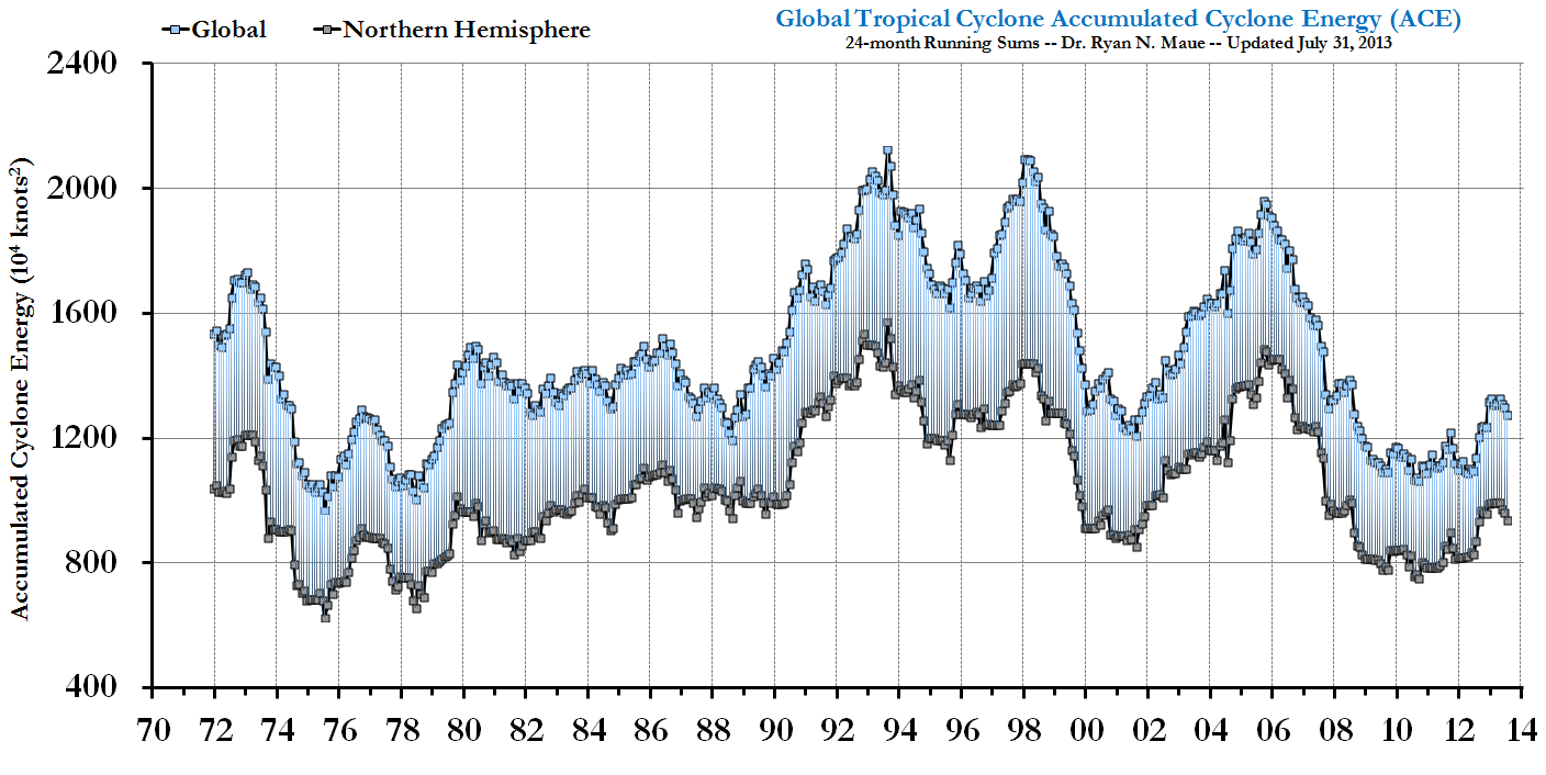
Figure: Global 24-month running sum time-series of Accumulated Cyclone Energy updated through April 21, 2009.
Very important: global hurricane activity includes the 80-90 tropical cyclones that develop around the world during a given calendar year, including the 12-15 that occur in the North Atlantic (Gulf of Mexico and Caribbean included). The heightened activity in the North Atlantic since 1995 is included in the data used to create this figure.
As previously reported here and here at Climate Audit, and chronicled at my Florida State Global Hurricane Update page, both Northern Hemisphere and overall Global hurricane activity has continued to sink to levels not seen since the 1970s. Even more astounding, when the Southern Hemisphere hurricane data is analyzed to create a global value, we see that Global Hurricane Energy has sunk to 30-year lows, at the least. Since hurricane intensity and detection data is problematic as one goes back in time, when reporting and observing practices were different than today, it is possible that we underestimated global hurricane energy during the 1970s. See notes at bottom to avoid terminology discombobulation.
Using a well-accepted metric called the Accumulated Cyclone Energy index or ACE for short (Bell and Chelliah 2006), which has been used by Klotzbach (2006) and Emanuel (2005) (PDI is analogous to ACE), and most recently by myself in Maue (2009), simple analysis shows that 24-month running sums of global ACE or hurricane energy have plummeted to levels not seen in 30 years. Why use 24-month running sums instead of simply yearly values? Since a primary driver of the Earth’s climate from year to year is the El Nino Southern Oscillation (ENSO) acts on time scales on the order of 2-7 years, and the fact that the bulk of the Southern Hemisphere hurricane season occurs from October – March, a reasonable interpretation of global hurricane activity requires a better metric than simply calendar year totals. The 24-month running sums is analogous to the idea of “what have you done for me lately”.
During the past 6 months, extending back to October of 2008 when the Southern Hemisphere tropical season was gearing up, global ACE had crashed due to two consecutive years of well-below average Northern Hemisphere hurricane activity. To avoid confusion, I am not specifically addressing the North Atlantic, which was above normal in 2008 (in terms of ACE), but the hemisphere (and or globe) as a whole. The North Atlantic only represents a 1/10 to 1/8 of global hurricane energy output on average but deservedly so demands disproportionate media attention due to the devastating societal impacts of recent major hurricane landfalls.
Why the record low ACE?
During the past 2 years +, the Earth’s climate has cooled under the effects of a dramatic La Nina episode. The Pacific Ocean basin typically sees much weaker hurricanes that indeed have shorter lifecycles and therefore — less ACE . Conversely, due to well-researched upper-atmospheric flow (e.g. vertical shear) configurations favorable to Atlantic hurricane development and intensification, La Nina falls tend to favor very active seasons in the Atlantic (word of warning for 2009). This offsetting relationship, high in the Atlantic and low in the Pacific, is a topic of discussion in my GRL paper, which will be a separate topic in a future posting. Thus, the Western North Pacific (typhoons) tropical activity was well below normal in 2007 and 2008 (see table). Same for the Eastern North Pacific. The Southern Hemisphere, which includes the southern Indian Ocean from the coast of Mozambique across Madagascar to the coast of Australia, into the South Pacific and Coral Sea, saw below normal activity as well in 2008. Through March 12, 2009, the Southern Hemisphere ACE is about half of what’s expected in a normal year, with a multitude of very weak, short-lived hurricanes. All of these numbers tell a very simple story: just as there are active periods of hurricane activity around the globe, there are inactive periods, and we are currently experiencing one of the most impressive inactive periods, now for almost 3 years.
Bottom Line
Under global warming scenarios, hurricane intensity is expected to increase (on the order of a few percent), but MANY questions remain as to how much, where, and when. This science is very far from settled. Indeed, Al Gore has dropped the related slide in his PowerPoint (btw, is he addicted to the Teleprompter as well?) Many papers have suggested that these changes are already occurring especially in the strongest of hurricanes, e.g. this and that and here, due to warming sea-surface temperatures (the methodology and data issues with each of these papers has been discussed here at CA, and will be even more in the coming months). The notion that the overall global hurricane energy or ACE has collapsed does not contradict the above papers but provides an additional, perhaps less publicized piece of the puzzle. Indeed, the very strong interannual variability of global hurricane ACE (energy) highly correlated to ENSO, suggests that the role of tropical cyclones in climate is modulated very strongly by the big movers and shakers in large-scale, global climate. The perceptible (and perhaps measurable) impact of global warming on hurricanes in today’s climate is arguably a pittance compared to the reorganization and modulation of hurricane formation locations and preferred tracks/intensification corridors dominated by ENSO (and other natural climate factors). Moreover, our understanding of the complicated role of hurricanes with and role in climate is nebulous to be charitable. We must increase our understanding of the current climate’s hurricane activity.
Background:
During the summer and fall of 2007, as the Atlantic hurricane season failed to live up to the hyperbolic prognostications of the seasonal hurricane forecasters, I noticed that the rest of the Northern Hemisphere hurricane basins, which include the Western/Central/Eastern Pacific and Northern Indian Oceans, was on pace to produce the lowest Accumulated Cyclone Energy or ACE since 1977. ACE is the convolution or combination of a storm’s intensity and longevity. Put simply, a long-lived very powerful Category 3 hurricane may have more than 100 times the ACE of a weaker tropical storm that lasts for less than a day. Over a season or calendar year, all individual storm ACE is added up to produce the overall seasonal or yearly ACE. Detailed tables of previous monthly and yearly ACE are on my Florida State website.
Previous Basin Activity: Hurricane ACE
| BASIN | 2005 ACE | 2006 ACE | 2007 ACE | 2008 ACE | 1982-2008 AVERAGE |
| Northern Hemisphere | 655 | 576 | 383 | 431 | 557 |
| North Atlantic | 243 | 83 | 72 | 144 | 104 |
| Western Pacific | 301 | 274 | 212 | 185 | 280 |
| Eastern Pacific | 97 | 204 | 55 | 82 | 156 |
| Southern Hemisphere* | 285 | 182 | 191 | 164 | 229 |
* Southern Hemisphere peak TC activity occurs between October and April. Thus, 2008 values represent the period October 2007 – April 2008.
The table does not include the Northern Indian Ocean, which can be deduced as the portion of the Northern Hemisphere total not included in the three major basins. Nevertheless, 2007 saw the lowest ACE since 1977. 2008 continued the dramatic downturn in hurricane energy or ACE. The following stacked bar chart demonstrates the highly variable, from year-to-year behavior of Northern Hemisphere (NH) ACE. The smaller inset line graph plots the raw data and trend (or lack thereof). Thus, during the past 60 years, with the data at hand, Northern Hemisphere ACE undergoes significant interannual variability but exhibits no significant statistical trend.

So what to expect in 2009? Well, the last Northern Hemisphere storm was Typhoon Dolphin in middle December of 2008, and no ACE has been recorded so far. The Southern Hemisphere is below normal by just about any definition of storm activity (unless you have access to the Elias sports bureau statistic creativity department), and the season is quickly running out. With La Nina-like conditions in the Pacific, a persistence forecast of below average global cyclone activity seems like a very good bet. Now if only the Dow Jones index didn’t correlate so well with the Global ACE lately…
Notes:
Hurricane is the term for Tropical Cyclone specific to the North Atlantic, Gulf of Mexico, Caribbean Sea, and the Pacific Ocean from Hawaii eastward to the Mexican coast. Other names around the world include Typhoon, Cyclone, and Willy-Willy (Oz) but hurricane is used generically to avoid confusion.
Accumulated Cyclone Energy or ACE:

is easily calculated from best-track hurricane datasets, with the one-minute maximum sustained wind squared and summed during the tropical lifecycle of a tropical storm or hurricane.


213 Comments
Judith?
I predicted this decline 3 years ago at CA and further predicted it would rebound and peak ~2010.
Re: bender (#2)
Can you elaborate on the basis for your predictions? Wild guesses that happened to be correct are not that interesting.
Simple, Raven. Blind statistics and some faith that “climatic chaos cascades to span all time scales”.
bender: Who needs blind statistics, if you have chaos at all time scales?
Great post Ryan!
Re: jae (#5),
You do. Problem is: you don’t know what the “chaotic cascade” implies. Statistics might work for a while and then break down suddenly, inexplicably. That’s why my comment is self-ironic: “I predicted that!” 🙂
Ryan, I had read somewhere (can’t remember where, unfortunately) that the most active North Atlantic (or it could have been whole Earth) hurricane season on record was in the late 1800s. Is that true? And at what point in our history did we reach our current level of detection of hurricanes?
Thanks!
Re: Jeff Alberts (#6), For the Atlantic and the Western North Pacific between Guam and Japan, routine aircraft reconnaissance began in roughly the 1940s. Satellite observations came online during the 1960s and 1970s, with consistent global coverage in the past several decades. I would not trust storm statistics from the late 1800s at all.
Our current level of detection is constantly evolving as the number and variety of satellites continuously evolves. Large hurricanes in the Atlantic are likely well observed since the mid-1940s within the domain of recon, but smaller tropical storms are likely to have gone unnoticed until consistent satellite coverage during the 1960s. Even then, subjective categorization by forecasters is required, which introduces additional biases. Thus, interpreting frequency or counts of Atlantic storms (or any other basin) is fraught with huge problems.
Re: Ryan Maue (#7),
Thanks, Ryan.
So we can’t really know, tropical cyclone-wise, whether we’ve seen anything unprecedented on any reasonable time scale?
Re: Ryan Maue (#7), There is an interesting distinction in severe hurricane frequency (cat 3 or higher) over the 20th century in the Atlantic. First half of the 20th Century saw little overall warming compared to the second half (according to AGW claims), yet there were some 50% more severe hurricanes in the early period vs the later period. Conventional AGW consensus would say the opposite should occur (due to the obvious tendency toward disasturbationist hype in search of research dollars), however it becomes obvious that since the only region of real warming was in the arctic and northern temperate regions, it thus follows that the delta-T between equatorial winds and arctic winds would be less severe under northern regional warming. Any engineering undergrad can tell you that a smaller difference in temps between two regions will result in less pressure or force to do work with, thus less severe hurricanes would result. So even if there was more severe warming in the latter 20th century (caused by solar, ENSO, NAO, or whatever) the net result is that warming as experienced is good for humans in that it reduced damage risks from hurricane storms.
A related article recently featuring Kyle Swanson: Global warming on hold…is also fodder for discussion here.
Re: Ryan Maue (#9),
Ryan M
Thanks for the opening post – it is very informative. I enjoy hard learning 🙂
BTW, we Aussies do not call a cyclone a wily-willy. Cyclone is a well-understood term globally (one recent occurrence flooded the Aus NE inland a few weeks ago, resurrecting Lake Eyre again – this is a very interesting and long-running history).
A willy-willy is a very mild to tiny ephemeral whirlwind, generally seen in the arid inland regions. Scale is orders of magnitude below a cyclone.
Re: ianl (#13), and Ryan
In Australia a willy-willy is a dust devil. However there has been quite some discussion as to the origin of the term. It is believed to stem from the aboriginal language and it is likely that aboriginal people described both a dust devil and a cyclone dissipating inland by the same term “willy willy”. That is why the confusion over the usage of the term. However willy willy is now the accepted terminology for dust devils which are quite frequent, usually innocuous, but in extreme cases can damage buildings. For example the thunderbox in the back yard was liable to be under threat.
Re: Len van Burgel (#30),
I’ve seen a working drill rig “discombobulated” by a willy-willy 🙂
Nonetheless, we don’t use that term in relation to a cyclone. Orders of magnitude difference …
Re: ianl (#12)
As far as the NHC naming “thunderstorms” is concerned, I think perhaps you’re confusing 2008 with 2007. In 2007, it is debatable as to whether or not a good bit of those “tropical cyclones” should have been named (a few come to mind, of which are: Barry, Chantal, Gabrielle, Jerry (this one actually takes the cake, since it never even remotely resembled a tropical cyclone, more like a cutoff low that briefly acquired some deep convection), and possibly Melissa) during that year.
But if you really are referring to 2008, perhaps you can enlighten me and everyone else here on what storms you think shouldn’t have been named, because they were “thunderstorms” rather than tropical cyclones? I personally thought the NHC did far better with naming the storms in 2008 than in 2007 — at least the storms they named actually resembled tropical cyclones.
Re: Ryan Maue (#9),
Very interesting post.
The Discovery article you cite ends with this interesting quote from Swanson:
Ryan, maybe you could do a post here at CA on “global warming on hold” (or as some call it “global cooling since 1998”).
Re: Deep Climate (#23),
I find it ironic that Swanson can say that after having said this earlier in the article:
“This is nothing like anything we’ve seen since 1950,” Kyle Swanson of the University of Wisconsin-Milwaukee said. “Cooling events since then had firm causes, like eruptions or large-magnitude La Ninas. This current cooling doesn’t have one.”
I didn’t have ACE data at a global scale at the time, but here you go, Raven, jae:
More bender on hurricane counts
I did not predict a 30-year low in global ACE. That’s pretty remarkable. All I predicted was a 2008 drop in “activity” followed by a 2010 and then a 2015 resurgence. Of course I laugh at the “prediction” because unlike the Team I do not believe atmospheric circulation follows an iid noise model. Or wait … what do they believe?
.
I believe I was the first to post an R script at CA.
It seems like they were almost naming thunderstorms in the Atlantic last year. Maybe that will get the ACE up?
Any feel live regressing the ACE against the DOW? Looks awfully similar. Probably correlates better than temps.
Re: Raven (#14),
ACE = TLA
DOW = TLA therefore
ACE = DOW
QED
DED
Re: Raven (#14), I have to admit I agree, you look at Ryan’s initial post and it’s classic technical analysis, support, resistance, head&shoulders, could nearly make you believe in an external thoughtful forcing, this stuff only happens in the markets because of the herd instinct. Perhaps the accepted herd instinct is just another realisation of chaos theory with AR(n)
Re: Ian (#16)
Herd Instinct == Random Walk?
Not quite the same. But it is raises an interesting question. The gyrations of the stockmarket are largely driven by short term positive feedback mechanisms that breakdown as these become unsustainable. Perhaps there are aspects of the climate system behave similarily. Rising temperatures cause more El Ninos which cause more warming. Until we get a big blow out like the 1998 El Nino which disrupts the cycle ushers in a series of La Ninas where the process works in reverse.
Ryan,
Nice Post, very clear.
Question for Ryan:
The ACE takes maximum recorded wind speed squared integrated over time. However, for a relation to climate (heat energy dissipated) should we not also integrate over space. For example, a tornado has very high sustained wind speeds, but it’s extend is much smaller than a hurricane. I would think the radius R from the center where the maximum wind occurs could be the space dimension.
Spatial Accumulated Cyclone Energy or SpACE:
SpACE = sum(delta_t*V*V*R*R)
Re: Willem Kernkamp (#18), absolutely. However, you need a 2 dimensional wind field at the surface that has some semblance of reality. Reanalysis datasets fail in this regard, since they have too coarse grid spacing to resolve the strongest winds near the core. Clearly a subject of ongoing research to determine what is the climate impact of 2004 Charley at Category 4 (a very small storm) versus Katrina at Category 4 strength in the central Gulf (monster).
I am working on this, and hope to provide an update in the near future. Judy Curry has a student as well on the case…
Re: Ryan Maue (#20),
Ryan,
I started thinking about how to get a good typical radius. Let’s assume an irrotational flowfield where V=Ro*Vo/R. If you take the band of flow between some peak Vo and V1=Vo/e (where e is the base of the natural logarithm) you get SpACE=2*pi*Ro*Ro*Vo*Vo. This measure is insensitive to the estimate for the peak velocity. If we did not have the resolution to pick up the peak velocity near the center we would find, say, Va = Vo/2 at Radius Ra=2*Ro. Now our upper bound would be Vb=V1/2 at Radius Rb=2*R1. As you can see, the velocities are cut in half, but the radius is doubled. The net effect is that the integral is unchanged. This means that any pick of a pair of speeds with a constant ratio within the irrotational vortex will give the same number. This seems to me a desirable result.
I was very happy for a moment, but then I realized that we still would have a very poor climate signal. Just look at the large difference in ACE scores between the Northern and Southern Hemispheres. It is not that the Southern Hemisphere is less windy, but the wind energy is not organized as well into cyclones. This suggests to me that we should survey wind energy over the entire globe not just in cyclones. It is easy to do, because gridded wind data is readily available in the form of Grib files. I recently used them for planning purposes in the Virtual Regatta Vendee Globe using the zyGrib program. You may even know of better sources. The beauty is that it can all be easily automated, because it does not involve any judgement about the proper bounds of a cyclone.
Re: Willem Kernkamp (#48), Hi Willem – I’ve had a quick look at the zyGrip site and it looks as if the data is modelled by “le modèle GFS du NOAA”. From UK windspeed over land data there are significant differences between measured and modelled values. I guess I’d worry this wind pattern is similar to a GCM where a global pattern is being projected from a low base of physical measures. Perhaps for shipping there is a global network of monitors around but I’m suspecting they will be sparse and suffer from similar problems of location, calibration and quality control as the temperature network? For example I think for wind turbine evaluations there is little substitute for site specific time series data. I’d be interested to know more from the sailing shipping point of view? Thanks
Re: curious (#52),
Virtual regatta is a sailing game that runs in parallel with important real world regatta’s. You are correct that the NOAA wind fields it uses are generated by a Global Climate Model. Since I did not care about real weather, just about the game weather it is perfect. However, for the climate analysis it is maybe not so good. That is why I would leave it to Ryan to select the best global dataset.
I have not made a thorough comparison with actual winds. However, I do know that they continuously update in response to actual weather as it develops. When you download zyGrib, you can check for yourself how the multi-day projections change over time. Even if the windfield is imperfect, it would still be consistently imperfect if they do not change the program or the method of bringing the weather closer to actual.
“During the past 2 years +, the Earth’s climate has cooled under the effects of a dramatic La Nina episode.”
Not as dramatic as 1988/89 though, which still had higher hurricane energy. However, 1988/89 didn’t have such a dramatic PDO shift as in the last couple of years…..
Latest state of PDO index: Feb 2009 at -1.55 the lowest Feb value since Feb 1976.
http://jisao.washington.edu/pdo/PDO.latest
Re: Chris (#19), yes, the negative PDO “looks” like La Nina in the North Pacific and vice versa for El Nino. Kyle Swanson and A.A. Tsonis have some fascinating and well-worth reading/research on this topic… Perhaps no surprise that 1977 was such a record low year as well.
Ryan, I have read your recent paper (this layperson needs at least two reads to really comprehend the full scope) and I must say that you appear to have taken on a major task to integrate the entire historical NH TC activity.
I would be interested to hear what you have to say about the cyclical decadal trends that might be present in the TC activity for the various individual TC regions. When you combine the activities of the separate regions I would suspect that the cyclical aspects get suppressed.
What has bothered me in the past is some papers on NATL TC activity that point to starting their analyses with the 1970s because that is when more “reliable” data became available (which is an ok a priori in my book) but then neglect to warn of the potential cyclical nature of TC activity in the NATL that would make the trend measurements very sensitive to starting points.
#22 Thanks Ryan for the link – it reminds me I should be reading more papers such as these now that I am nearing the end of my MSc! But I probably need to do a little more revision of my atmospheric dynamics module before I can claim to understand hurricanes properly…….
(Not such a pressing subject here in the UK of course – though I do remember the Great Storm of 1987:
http://www.metoffice.gov.uk/education/secondary/students/1987.html
“…The Great Storm of 1987 did not originate in the tropics and was not, by any definition, a hurricane – but it was certainly exceptional…
…South-east of a line extending from Southampton through north London to Great Yarmouth, gust speeds and mean wind speeds were as great as those which can be expected to recur, on average, no more frequently than once in 200 years…”)
Ryan, thanks for the post, tons of interesting reading material. It’ll certainly take awhile to get through it with all the embedded links.
If you’re correct about 2009 for the Atlantic, it’ll be interesting to see if any of the global low levels of activity will be reported as the dire warnings for the Atlantic are sounded. I’ll certainly be interested in your future posts you mentioned.
I would be very interested to see your thoughts on the marked cooling of the NE Atlantic over the past year, and whether this is likely to weaken the offsetting relationship.


Ryan,
You state you use ACE “with the one-minute maximum sustained wind squared and summed during the tropical lifecycle of a tropical storm or hurricane”.
The WMO standard is a 10 minute wind. It is what is used in Australia for warnings and cyclone categories. A one minute wind used by the US is I understand 14% greater. How are the data sets homogenised?
Re: Len van Burgel (#32), please acclimate yourself to the IBTrACS dataset, which is freely downloadable. I use the suggested conversion factor of +14% to convert from 10-minute to 1-minute.
A few years ago, in central Australia, I was hit by a willy-willy when I got out of my 4WD to open a gate. This one was quite turbulent, although it didn’t come close to knocking me over. It did, however, very effectively coat me with red dust!
FWIW, I have never heard the term willy-willy applied to a cyclone.
Thanks Ryan for that link.
You may be interested in this paper:
A review of historical tropical cyclone intensity in northwestern Australia and implications for climate change trend analysis
Bruce A. Harper1, Stan A. Stroud2, Michael McCormack3 and Steve West4
1Systems Engineering Australia Pty Ltd, Brisbane, Queensland
2Woodside Energy Ltd, Perth, Western Australia
3Consulting Meteorologist, Perth, Western Australia
4Bureau of Meteorology, Perth, Western Australia
Aust. Met. Mag. (2008) 121-141
Click to access harper_hres.pdf
The authors were involved in the reanalysis of the tropical cyclone data set for Northwest Australia. The resulting data set known as the WEL data set, is compared with Neumann (1999) and the BoM data.
They found:
“Both the BoM and Neumann data-sets exhibit increasing trends in ACE and PDI, the latter being of somewhat similar magnitude to that presented by Emanuel (2005) in respect of best track derived PDI for the combined Atlantic and NW Pacific basins, which were shown to have nearly doubled from 1970 to 2000. By contrast, the WEL reviewed data-set shows no trend for ACE and only a very slight increase in PDI.”
Further they note:
“The identified WEL-reviewed Category 4+5 trend is significantly less than the trend obtained from the equivalent BoM modified data-set and the Neumann data-set over the same comparison periods. These results therefore suggest that the Neumann data-set (forming the basis of theWHCC analysis in the southern hemisphere) could contribute a significant and unjustified trend of increasing Category 4+5 class percentage changes into the WHCC global analysis. Importantly, the subsequent objective analysis of the post-GMS period by Kossin et al. (2007) adds confirmation to this conclusion, whereby no trend in intensity in the Southern Indian Ocean was evident over the period 1983 to 2005.”
Ryan,
A clear exposition, thank you.
As an Australian, I see a few of us are noting some terminological inexactitude, but a willy willy in the never never is come and go. Rotations like willy willys commencing on land don’t seem to have the ingredients to reach the storm intensity of cyclones. Orders of magnitude differences.
In the calculation of ACE there has to be a time term (unless I have misread). Quite a few well-tracked Australian tropical cyclones have gone from sea to land, then continued over land for up to 1800 km. And this is typically really dry desert land in summer, when water is scarce.
Is it definitionally correct to include this time over land in the ACE formula? This leads to a question which as a non-specialist I have to pose awkwardly: Once one of these cyclones hits land, does it have adequate angular momentum to persist for 7 days or so, or is there an ongoing renewal process over the land? Should the ACE calculation cease once over land? I know that D Patterson has been giving me answers on Unthreaded at 502 (which has a nice map), 511, 524 and 568 and I appreciate these responses. It might be appropriate to move the discussion to your post if you think my points have merit.
“The North Atlantic … deservedly so demands disproportionate media attention due to the devastating societal impacts of recent major hurricane landfalls.” Or, as a sceptic might think, due to North Atlantic hurricanes frequently damaging the USA.
I’m sorry, this is just not in the spirit that scientists should be following (see link):
“Scientists urged to step up climate warnings
One of the UK’s leading climate change diplomats [John Ashton, special envoy for climate change at the Foreign and Commonwealth Office] has today called on the scientific community to paint a more vivid and accessible picture of the threat posed by climate change [he should know]… We need a much stronger sense of urgency,” Ashton said….Ashton argued that the onus was on scientists to make the threat “much more vivid than it is perceived to be”.
http://www.businessgreen.com/business-green/news/2238156/scientists-urged-step-climate
Ryan,
Did you get Joe Romm’s approval before posting? (Everybody knows only storms from the Gulf, Carribean and Atlantic “count” as “global”.)
Here are the three Ocean indices of note over the period, the AMO, PDO and ENSO.
Note how they are all in negative territory now.
How about a reduction of sunspot activity the past wo years..?.
Thanks Ryan.
The numbers should always tell the story. Rather than the story telling us what the numbers should be.
Let’s think about this on a bigger picture and take a look at the source of ALL the energy for the earth. The sun, which happens to be at a minimum in terms of activity and at levels not seen in a long time would be a primary culprit for both cooler global temps over the past 18 months, Alaska glaciers growing for the first time, and even lower hurricane activity. One would think that this would have an impact. Just follow the source!
http://science.nasa.gov/headlines/y2006/10may_longrange.htm
http://www.nasa.gov/home/hqnews/2008/sep/HQ_08241_Ulysses.html
http://solarscience.msfc.nasa.gov/SunspotCycle.shtml
http://www.mcclatchydc.com/homepage/story/53884.html
Hi Ryan M.,
I found this while looking at a paper by Leif Svalgaard. If you see on page 3 the IMF from the Ulysses spacecraft normalized to distance of 1 AU. There is a offset of about 2 to 3 years but is close to your ACE plot.
Click to access Most%20Recent%20IMF,%20SW,%20and%20Solar%20Data.pdf
Swanson, Hansen, and Gore(of the famous Gore effect) other true believers will not relinquish their mantras, but I expect that they will make the full Reformation of their faith from “Global Warming” to “Climate Change” before the re-glaciation reaches Chicago.
The thing that mystifies me is the way the MMGW/CC “scientists” seem to ignore or minimize the largest thermal mass and climate engine, the oceans, and focus on the atmosphere. Of course the data coming in now indicates that the oceans aren’t warming so they will ignore it for now until they figure out how to graph it to scare the masses.
Thanks for your work Ryan, but watch your back, I’m sure ALGORE and Hansen are making lists of heretics such as your self.
Ryan, thanks for you work on this. Jim Arndt #44; I wondered at the solar correlation but used the Oulu neutron count as an inverse proxy for solar activity. When inverted in Y, it has a similar shape as ACE but appears to lead ACE by 3-5 years. If there is a causal relationship, the plunge in ACE may continue for a few years.

Ryan, I see your website is now linked from the Drudge Report (“Global Hurricane Activity Reaches New Low”)
Re: David Smith (#47), yes, Climate Audit was originally linked at 10AM, and the website was dreadfully slow. I asked Drudge to link to my FSU site which has gigabit bandwidth, and he immediately helped me out. Between 10:30 AM and 2:15 PM today, my tropical website has 21,000+ unique visitors and is the top “bytes out” at FSU, by a lot.
Ryan, thanks for the post. Just the right depth for a layman, with good links. Well done.
Steve Keohane #46
Looking at that graph, the lag doesn’t appear to be constant.
Rather, it appears to be increasing.
HI Ryan, time for a few quick comments. I am now convinced that the data prior to 1980 in the southern hemisphere and also in the northern Indian Ocean in the IBT data set don’t have much credibility, but the story is pretty much the same if you leave off the 1970s. Other than that your analysis of the conventional ACE parameter seems solid, and also your interpretation re La Nina.
However, your calculation of ACE is a crude estimate of the actual kinetic energy of the storms, which depends substantially on size (horizontal extent). Recent (as yet unpublished) calculations of Integrated Kinetic Energy (IKE) (using size information and a radial wind model) tell a very different story, more on that this summer once our paper is submitted, but size is more important than max wind in terms of IKE. And IKE looks pretty different from ACE.
I don’t agree with is your interpretation of what your analysis means for the global warming-hurricane link. I would agree that your paper refutes the assumption of a global increase in ACE, which is arguably an inferebce from Kerry Emaunel’s analysis of a substantial increase in PDI based on analyses in the N. Atlantic and W. Pacific. However your analysis does not refute in any way Webster’s analysis of the % of cat45. If you look at the same data set you used in your analysis and calculate (N CAT4-5)/(N CAT1-5), you will find a substantial increase, and 2006 and 2007 were very large years (with 2008 being lower but above average).
It is becoming increasingly evident that the signal of global warming in hurricanes is in the % CAT45, as originally hypothesized by Webster et al. This increase in % CAT45 is associated with little change in average intensity, owing to an increase in the number of tropical storms. A new paper by Webster is in the review process that provides new insights into how this works.
Not very satisfying I know, to talk about papers in the review process or in preparation. But I want to go on record as to why Ryan’s paper doesn’t convince me to reject the Webster et al. link between global warming and the % increase in CAT45.
Re: Judith Curry (#53), Judy, thanks for chiming in. I was convinced a long time ago that the data in the SH and NIO prior to 1980 was of dubious quality, but that leaves about 70% of the world’s activity to play around with.
You’ll have to be more specific about what you disagree with. I think I am being fair when I say that my little graph does not contradict previous studies but compliments them. Integrated energy is a whole different ballgame than counts and percentages. I agree with the theoretical estimates of SST/Hurricane intensity increases. However, I am not convinced we are accurately perceiving those increases during the past 30-years and may be falsely attributing ENSO impacts, as one example. A line in the recent Elsner et al. (2008) paper [strongest storms are getting stronger] goes like this: (paraphrasing) we did not consider the effects of ENSO, or anything climate related except for increasing SST due to AGW. This appeared in Nature. Forgive me if I admit that I am a little unsatisfied when I see such disclaimers.
Along the same lines, I presented this at AMS 2008 New Orleans. The poster PPT is still on my website somewhere. However, with the data I used [Kossin’s new radial wind approximations, HWIND, extended best track, and de-biased reanalysis], I found that on a storm-by-storm basis, ACE of course is a poorly correlated to maximum wind speed. ACE per storm is a more useful and exciting 😉 metric to use. However, at a certain point, the duration component in the convolution calculation begins to dominate.
I plopped in a modified Rankine vortex into the Power Dissipation equation (Emanuel and Bister’s handiwork) and you end up with this: ,
and you only need to know the radius of maximum wind (R), the 34-knot TS radius (r0), and the maximum sustained wind. The beta is 2-3*alpha from the mod. Rankine vortex approx. My calculations showed that after a storm reached 100 knots or major status, the average power dissipation for Category 3-5 plateaued as a function of maximum wind speed, over the last 25-30 years. In other words, for every Charley (2004) you have a Gert (1999). I think it is then the large-scale climate (i.e. ENSO, AMM, phase of the moon) that gets to modulate the availability and favorability of intensification corridors (tracks). I am waiting to be convinced that global warming signal can be perceived/measured with the current datasets. I hint at the results in this future paper (of course to be submitted, as is the custom), in my recent GRL article.
What does increasingly evident mean? Why should the number of weak short-lived tropical storms be important and have a climate signal related to the SST-maximum potential intensity (MPI) link proposed by Emanuel? [You say this: If you look at the same data set you used in your analysis and calculate (N CAT4-5)/(N CAT1-5), you will find a substantial increase.]
Man, what is it with unpublished papers or “to be submitted” being cited in the tropical meteorology / climate science field?
After over three years, it is perhaps a good time to take a look back at Emanuel (2005) and Webster et al. (2005) and see just what legs they still stand on…
Re: Judith Curry (#53),
IMO that’s not the question – whether or not there is a link. The question is quantitative: what’s the magnitude of the effect? For example. Take your average cat 4, add in the amount of 20th c. warming attrributable to GHGs (assuming IPCC correct), and what does the average cat 4 increase to? cat 4.1? 4.2? And what are the confidence levels on that change?
.
That’s the kind of analysis the insurance industry wants done. Not qualitative hand-waving about “links”.
Re: Judith Curry (#54),
I don’t understand the value of Dr. Curry’s proposed metric. For instance, a season that has 5 hurricanes all that momentarily reach cat 4 would get 5/5=1 in this metric. A season that has 10 storms that stay at cat 5 for a week and 10 solid cat 1s would be only 10/20=0.5 in this metric.
The metric lacks what is know in some fields as “face validity”.
Dishman #51, I would assume there are other effects to be held accountable, such as what point the ocean cycles are in. I find it interesting that there seems to be any correlation at all considering some say solar effects on the oceans have an 800 year hysteresis in giving up their heat to the atmosphere.
How long will it be before we start hearing that global warming is causing a decrease in hurricanes that will be as disastrous as an increase in hurricanes? Many tropical and subtropical areas will suffer from unprecedented droughts because they no longer receive the rainfall from hurricanes and tropical storms that was necessary to fill their reservoirs and rivers.
Re: Patrick Minnis (#55), sounds like you have a publishable paper title already.
Willem above – thanks for the extra info. To my mind it seems that using one aspect of a modelled data set (wind speed fields) to draw conclusions about the validity of another aspect of the same data set (climate change signal) is not a good approach. I doubt it will be consistently imperfect due to the complexity of modelling wind fields. Apologies if this is not what you are driving at.
Re: curious (#59),
Curious, you are correct that this method is far from perfect. However, it has the potential to be more representative of the global wind energy in a given year. I understand that the number of Cyclones is important to people that get hit by them. However,I am trying to look for measures that allow global warming to be tracked. Cryosphere is such a site. It tracks sea ice at both poles from satellite data. It would be useful to have a similar site for global wind energy.
Let’s rememebr and for those who do not know,
That IPCC Hurricane expert Chris Landsea resigned from the IPCC
Landsea Link
Because
” the IPCC Observations chapter Lead Author – Dr. Kevin Trenberth participated in a press conference on the topic “Experts to warn global warming likely to continue spurring more outbreaks of intense hurricane activity” along with other media interviews on the topic. The result of this media interaction was widespread coverage that directly connected the very busy 2004 Atlantic hurricane season as being caused by anthropogenic greenhouse gas warming occurring today.
These media sessions have potential to result in a widespread perception that global warming has made recent hurricane activity much more severe.
All previous and current research in the area of hurricane variability has shown no reliable, long-term trend up in the frequency or intensity of tropical cyclones, either in the Atlantic or any other basin. The IPCC assessments in 1995 and 2001 also concluded that there was no global warming signal found in the hurricane record.”
Landsea goes on…
I have witnessed AGW proponents claim that Hurricane Katrina was caused by AGW. The same proponents who ctiticize skeptics for mentioning any weather events.
Re: Howard S. (#61),Both of those addresses have errors, thought you should know!
…fixed
It sounds to me like Webster started with the assumption that the signal was there, and was amazingly able to find it.
If you start with the assumption that a signal is present, with enough filtering, you will always be able to dig it out, even if the signal in’t actually there.
All you actually end up seeing is a pattern that matches what you were looking for.
The more important it is to you to see what you want to see, the less you’re able to see any kind of warnings that your sight might be imperfect, flawed, or even wrong.
ryanm. Please don’t imply that Webster was doing junk science by “phishing” for a predetermined answer.
Go to the site that Ryan provides. Count the number of category 4 and 5 hurricanes each year. Then divide by the total number of hurricanes each year. Plot the number for each year (should probably throw out the numbers prior to 1970). See the big trend, plus the very large numbers in 2005, 2006, 2007 (which is after the 2004 cutoff used in the webster et al. paper).
Bender asked for my comments, here they are. Scientific research takes time, especially to get it through the peer review process. But in the mean time, i won’t pretend it doesn’t exist if asked. If you would like to take a look at some of the research we have forthcoming, check out a .ppt that i gave a few months ago. http://www.eas.gatech.edu/static/pdf/ins_tampa_09.pdf. note the plot i refer to in the first para is included in this presentation, but go ahead and plot it for yourself.
Re: Judith Curry (#67),
The first graph I see at your link above shows a flat trend of the ratio of Cat4/5 to total hurricanes since the 1990 or so and indicates that the trend results from the the low ratio in the 1980s. I think one has to be very careful that they do not ignore the sensitivity of trends to starting point and the cyclical nature of TC activity (no matter what metric you select for measuring it).
Re: Judith Curry (#67), Judy, as an extension of your comment, can you explain why there are a certain number of hurricanes each year? Not the 80-90 tropical cyclones which include 34 – 63 knots but hurricanes, which typically are first observed/described when they have “eyes”. This part of your ratio is or is not sensitive to global warming?
Re: Judith Curry (#67),
Re: Kenneth Fritsch (#68),
I agree with Kenneth to the extent that the increase in average cat45 percentage from the 1980s to the 1990s appears greater than the increase from the 90s to the 2000s. But the trend is still up.
Also note that the Cat45 percentage over longer sub-periods (e.g. one decade) is not necessarily clear when looking at annual percentages, as different years may also have very different total hurricane counts. It might be interesting to calculate the cat45 percentage decade by decade as another indication of the trend over the last three decades.
Judith, if increasing ocean temperatures are driving more hurricanes (which itself seems to be less than clear), what is the physical/logical reason for there to be a higher relative proportion of Cat 4/5s?
Shouldn’t there just be more tropical storms, more Cat 1s, more Cat 2s and so on, leaving the ratios relatively constant (within some variation level / error margin of course)?
How many Cat 4/5s will we have and how would the ratio change when the ocean surface temps increase +2.0C in 50 years or so?
Re: Bill Illis (#70), global tropical cyclone frequency has not changed and isn’t suggested to change. Is of the premise of your question is that the only factor controlling this Cat45/Cat12345 ratio is increasing ocean temperatures? I remain unconvinced that global warming explains more than “a pittance” of the variance associated with that ratio. Still waiting to see the impacts on that ratio by ENSO…
Re: Bill Illis (#70),
Pat Michaels wrote a paper that related hurricane intensity to localized SST and showed evidence that hurricanes tend to reach a limiting intensity as SST increases, i.e. a plateau on the the intensity versus SST curve.
I am not sure how that study would relate to the ratio of Cat4&5 to total hurricanes that is being discussed here, but in general that plateauing would create a higher ratio of the more intense hurricanes. Also the ranking of hurricanes itself has an upper limit, i.e. there are no Cat 6 storms.
My point, that I will continue to inject in this discussion, is how sensitive is the trend to starting date. I also do not see why one would would reject all data prior to a given point in time. The data just might be able to suggest a cyclical nature of TC activity without being able to provide an inelastic ruler for getting the trend precisely correct.
Re: Kenneth Fritsch (#74), I agree. The data in the Western Pacific and North Atlantic on average represent about 60% of global cyclone activity on average. Prior to 1970, the data quality is not so poor that it is unusable. It is no secret that starting an climatology at 1970 occurs at a bottom in Atlantic activity.
Webster et al. (2005) should be updated with ALL available data, and then put error or confidence bounds on that data. Million dollar question is what are those error bounds?
Ryan, the question was more directed to why is the ratio increasing in Judith’s analysis.
I always look for a physical explanation, a physical basis for why climate numbers might be changing rather than just noting that they are changing. If there is no physical / logical reason for something to be occuring, then one should just view it as a spurious statistical artifact.
The claim has been made that hurricanes will increase as ocean temperatures increase. Ocean temps have increased some and I can see that there might be a physical explanation for there to be an increase in storms with increasing ocean temperature (although it is more likely there needs to be an increase in pressure and temp differentials for that to happen rather than just the whole system adjusting to higher levels. There needs to be an increase in temperature (or humidity) differentials between 10N and 30N or between 1000MB and 200MB for that to occur).
Ryan,
Great post. I enjoyed reading it and learned a great deal.
Re: Judith Curry (#67),
Judith,
Thank you for the link to your presentation. On slide #4, you shows what is basically a declining trend in the 1990s with a couple of outliers yet the 1990s was a decade of unremitting warming of the oceans. It appears 1998 had a very low % of cat 4/5, yet it was a very warm year for the oceans. In the same graph, 2002 is a big year for % of cat 4/5, but the trend is down thereafter. According to Josh Wills at JPL, ocean heat content has not increased since 2002 so I would guess you would not expect to see the % of cat 4/5 to go up. But would you expect it to go down as it did? I think it would be helpful if you could graph the % of cat 4/5 to the SST or OHC. It would help consumers of the research to better understand the relationship.
Also, you make a number of interesting forecasts. Are you familiar with the discipline of scientific or evidence-based forecasting? The discipline has been around for about 25 years now, so it is still new and it seems like many climate researchers (and the IPCC) are unfamiliar with it. There are two peer-reviewed journals on forecasting theory: International Journal of Forecasting and Journal of Forecasting. And one journal on applied forecasting: Foresight. Consumers of forecasts are becoming more sophisticated and are demanding more information about the methods used to generate forecasts and the way the forecasts need to be presented.
Seems like [n cat4-5/n cat1-5] is a very noisy metric with only a short span of reliable data. Why would anybody rely on that?
I do have a question, how is a hurricane categorized? The literature is pretty consistent in that it says that a storm is categorized at a certain level on the SS scale if maximum sustained winds are above a certain value. That’s all common knowledge at least in the context of this board. So now I want to know what the definition of maximum sustained winds is. There are two definitions, one uses a 10 minute time scale and other 1 minute. So the question then becomes, how many data points, maximum sustained winds at a given velocity, does it take to categorize a hurricane? Is one ok? Does the community require a sustained level of intensity before it can be categorized? I guess my point here is this. Are we categorizing something a cat X if the standards for cat X are met only once during a storm (where “once” is determined by the duration specified in the definition of “maximum sustained wind”)? If such a statement is true how could one reliably compare modern measurements to era’s where the instrumentation was not as accurate?
Another thing that bothers me about using the SS scale for something other than warning the populace and communicating to them the intensity of the storm about to hit them, is the granularity of the metric. Its discrete and goes from 1-5 but it is supposed to say something meaningful about a meteorological event that lasts days with a continuum of values for pressure, wind speed, etc and all of these values vary continuously at all points in the 3d thing called a hurricane. Seems gratuitous to me to use something that crude, data that is binned “with extreme prejudice”, for trend analysis.
Don’t worry about global warming fears diminishing just because the planet is cooling and global (TC) activity has utterly collapsed. Fortunately the 15 to 20 percent of global (TC) activity from the atlantic should be above average Thanks for all your work
ryanm,
My intent was not to impugn Webster’s motives or professionalism. My apologies for coming across that way.
I was attempting to point to “confirmation bias”. It appears to me that the indicators of risk are present.
Personally, I take as a given that my “sight might be imperfect, flawed, or even wrong.” That generally doesn’t come out in my writing.
“I slept with faith and found a corpse in my arms on awakening; I drank and danced all night with doubt and found her a virgin in the morning.”
Re: Dishman (#81), As an example, Emanuel in 2005 published his paper in Nature and has always conducted research that sought to continually challenge well thought out hypotheses. Along the way, he found and reported research contradictory to his Nature paper, but did not attempt to equivocate. Instead, he even-handedly explained his results. That’s all we can ask for in the future from all scientists involved in the tropical meteorology field.
As an aside, I am tired of the sunspot emails.
Re: 82, I wish we could leave the “warming hoax” sort of stuff out of these discussions. If you hold that opinion, fine, but that’s not what’s really at discussion here (or on any other part of CA, for that matter, leastwise not in the major threaded discussions). This blog does a great service by picking out the justifications for the presence or lack of climate trend signals in given datasets and debates them on their merits, ideally in the most dispassionate way possible.
This site can (and should) debate the claims of published papers supporting or discrediting AGW, especially if they appear to make claims that are not well justified by the technical/statistical methodology employed. When particular papers/studies are held up as the final word in science (or, perhaps, as proof that the current science is wrong), particularly when they have policy implications, it’s appropriate that these papers are looked over in a careful way to see if their claims are merited… a process that journal peer review prior to publishing cannot begin to undertake with unpaid, voluntary reviewers. Doubtless there are bad technical/statistical justifications made in the published literature for branches of medicine, mineralogy, astrophysics, and other scientific fields… anybody remember cold fusion (which incidentally fell apart when nobody could independently replicate it)? How many people have heard of “luminiferous ether” or “caloric” (both great examples from physics of ideas accepted for extended periods of time, only to be dramatically disproved)? Science moves forward through continual debate, debate that is the saving grace when widely held views turn out to be dead wrong and provides a requirement for sufficient rigor when widely held views are correct.
This site benefits enormously from the technical expertise of scientists in the AtmosSci community, including Judith Curry, Andrew Dessler, Steve Sherwood, Ryan Maue, and many others, when they are willing to share it. Many of them likely do not hold the same opinion as some readers of this site… and that’s ok. The effectiveness of this blog is DIMINISHED when serious scientists who would consider contributing feel they’re not welcome here by dint of the “heretical” opinions they hold… heaven knows the tone with which “heretical” contributions are treated on RC devalues the discussion there.
Forgive the moralizing, but think, folks, before you pile on or make a snide remark impugning the motives of well-meaning people, as it does little to strengthen your argument (and may just strengthen their’s, whether or not it has sound technical justification).
I am an avid weather observer now for over 50 years and have kept detailed records for our area (SW Ohio) for over 20 years. My travels have taken me to 77 countries – so I’ve seen about every type of climate on Earth except Antarctica. As you study history and look at the geologic record left us by the forces and time of nature’s progress, you can’t help but conclude that there is nothing anyone can do to control the forces of nature, not the least of which is the climate of the Earth, which has seen eons of ups and downs in global temperatures, and it’s resulting climate influences. We’re along for the ride – why waste brain cells trying to figure out why – even if we knew – we can’t do a thing about it anyway! The only things that appears to make any sense in explaining climate changes is it’s correlation to sun spot cycles, but once you get back beyond the last 100 years with “modern” record keeping technniques and more global observations, it’s really hard to do anything but guess, and using such a short time to “fast-forward” projections of future events is a futile effort. We can’t even forecast with much certainty a five day forecast and 15 day forecasts become totally “new” every few days with constant updates. With track record, even the “tried and true” forecast methods are meary guesses going forward a year at a time. The proof of change is in the history and right now we appear to be in a global cooling trend – certainly nothing we’d want to intensify, even if we could, which we can’t thank goodness.
Re: Dennis Kelly (#85), you do a good line in denialism, and many readers on this blog will no doubt agree with most of what you say. I certainly agree with you about the sunspot correlations 🙂
However, this blog is aimed mainly at scientific analysis, which is why it won Best Science Blog in 2007. So I don’t think your negative attitude to the challenge of working out what on earth [sic] is going on with the climate is really going to find much rapport here. There is surely a lot of good challenging science to be done.
Rich.
I have a question about categorizing hurricanes. If a hurricane meets Cat X criteria for 15 minutes of its week long life, is it categorized as a Cat X for these “studies” regarding severe hurricane frequencies?
Re: Jaye Bass (#87), yes, by definition that storm reached a maximum intensity of Category X. Since the best-track datasets report every 6-hours, it happens often that the maximum intensity occurs in only one observation.
That’s one example why there are advantages to using other metrics than counts and percentages when researching the role of hurricanes in climate.
Re: Ryan Maue (#88),
That’s what I thought. Unless one is using these numbers in a self serving fashion, seems like its a very noisy metric to rely upon. Also seems like it would make it nearly impossible to reconcile Cat X determinations from different eras with different measurement procedures/accuracies.
Re: Ryan Maue (#88), Re: Jaye Bass (#89),
Good point and one that I did not mention (or think of) in a post earlier about the hurricane intensity being limited to Cat 5 – is why I think RyanM has ACEd this one.
Maybe David Smith or Bob Koss have looked at this call from a historical perspective.
A few questions for anyone familiar with the IBTrACS database.
The IBTrACS is, for unfamiliar readers, an attempt to merge storm estimates from the various world agencies (NHC, JTWC, Japan, Hong Kong, Australia, France, India, etc) into one apples-to-apples database:
Q 1: Here is Table 3 from the IBTrACS statistics webpage :
Is this table saying that, for example, in the South Indian Ocean for 1987-2007 the reported intensity estimates showed somewhere between 34 and 74 cat 4/5 storms? In other words, if the greatest storm wind estimates from the agencies for each storm were used, one finds 74 cat 4/5 while if one uses the lowest estimates then one gets only 34 cat 4/5?
(I assume that everything is converted to a 10-minute windspeed basis for this table.)
If that’s correct, then it seems like there’s still considerable disagreement in wind estimates for the Southern hemisphere and West Pacific storms.
Q 2: Several years ago a reanalysis of old satellite imagery was started for the historical storms in remote regions. Has that been completed and are the results incorporated into IBTrACS?
Q 3: The Dvorak technique using daylight and IR imagery began about 1984 or 1985. Were storms prior to 1984 then reanalyzed using this technique. In other words, is there a discontinuity in satellite analysis method around 1984/1985?
Thanks
Re: David Smith (#91), for Question 2. Yes, an automated objective satellite reanalysis was undertaken by Kossin et al. (2007). An incarnation of that data was used in the Elsner et al. (2008) Nature paper. The wind speed max for the Elsner paper and all storms cranked through the objective technique are located here. Due to different viewing angles and a lack of Indian Ocean geostationary coverage for a long time, until 1995, the Indian Ocean has considerable data uncertainty. However, there are polar orbiting imagery that is being spliced into a new AVHRR database that hopefully will shed some light on the Indian Ocean.
Since some of the data going into that best-track is of dubious quality with perhaps poorly documented observing practices, e.g. which Dvorak technique, when, etc. this table is perhaps a little misleading.
Thanks, Ryan. I plan to look through the global data but that’ll have to wait until time allows in a few weeks. I did make a quick plot of global intense storm count (rather than percent) and overlaid global tropical SST (24N-24S, 0 to 360 long.)
Re: David Smith (#93),
In his post, David Smith once again shows that a well-conceived and revealing graph is worth a thousand words. However, since I am not one to conserve on verbiage, I would like to point the periods 1980-1993 and 1994-2008 and probably the obvious.
We see a steep climb of Cat4/5 hurricanes in the early period, while the SST for the zone 24S-24N appears to be essentially flat. Conversely for the later period we see an essentially flat frequency for Cat 4/5 hurricanes while the SST for 24S-24N shows a relatively steep increase.
Looking at the graph in the two separate time periods begs the question of a distinct relationship between Cat4/5 hurricanes and SST, while looking at the period as a whole or at least as 2 regimes one can point to a lower SST in the early period being “associated” with fewer Cat 4/5 hurricanes and a higher SST in the later period being “associated” with more Cat4/5 hurricanes.
I think one can see these differences by comparing a year by year correlation of Cat4/5 frequency versus SST (expected to be poor) and a filtered or moving average for Cat 4/5 and/or SST correlation (expected to be better). I plan to do these calculations as an exercise.
I think, that before one concludes a reasonably distinct Cat4/5 frequency relationship with SST, one has to explain in some detail the regime change apparent in the David Smith graph.
Re: Kenneth Fritsch (#106),
1. Are the dynamics quantitatively adequate to explain stronger storms by a half degree C elevation in SST? Can that incremental heat energy be transferred fast enough and efficiently enough to make a difference? Is there enough latent heat surplus in any case with 0.5 deg?
2. In any case, many storms do not originate the hottest part of the neighbourhood. Why would this be?
For Ryan Maue in general –
3. Pardon the repetition please, but what mechanism drives these West Australian cyclones over hot desert for many days and many hundreds of miles after they have gone from sea to land? (Map courtesy publishers ‘Australian Geographic’)?
Re: Geoff Sherrington (#107), Kerry Emanuel has proposed these guys be called agukabam.
Re: Ryan Maue (#108),
Thank you for the lead-in, Ryan, I can browse from the ref. There is some dislike here for using strange names like “agukabam”. In the Nth Hemisphere where the spin is reversed maybe they are “mabakuga”. Sounds almost Hawaiian. I’ll read the papers, but I’d have thought that the considerable rain that precedes the eye of these land cyclones would have the effect of significant cooling of the land.
Re: Geoff Sherrington (#107),
Ryan,
My interest is in the mechanisms that sustain the West Australian cyclones over land for several days and for many kilometres. The paper that you referenced by Emanuel at al
ftp://texmex.mit.edu/pub/emanuel/PAPERS/mwr_final_2008.pdf
does not address these. Instead, it does some modelling of “Aigail” a system that stayed well to the North of Australia which at that time of the year is probably hotter, more moist and with higher air humidity than the non-tropical ends of the WA cyclones.
From the abstract,
Well, they do not. That is why I asked.
The model for Abigail is like perpetual motion. Rainfall ahead of the storm wets the soil, increases its thermal conductivity and allows adequate heat transfer to sustain the storm by sucking up warmed water. Then, as the storm eye passes, it rains again. I can’t see how the cyclone over land can hold enough water to repeat this process continuously for a week or so. Maybe I’m wrong in my figuring.
So, I’d reserve caution about favourite models for cyclones and hurricanes over sea until there is a proper explanation of these cyclones over land. They are not rare. They appear understudied.
In the philosophy of science there is academic satisfaction in solving 99% of the elements of a model. The model is not complete if there is a 1% of the story that can blow the model out of the water, so to speak.
Re: Geoff Sherrington (#127),
Geoff, your questions and comments do not appear to recognize or note the differences between the warm core tropical cyclones, cold core extratropical cyclones, and cyclones which are in transition from a warm core tropical system into a cold core extratropical system. Cold core extratropical cyclones have inherent properties which allow them to persist across continental landmasses. Western Australia is well situated in the path of all three forms of these cyclones. Extratropical transformations of tropical cyclones is quite complex and and highly diverse in possible results. Accordingly, an extensive discussion of these different cyclones and their intermediate forms is required to describe how the interplay between SST, heat budgets, humidity, cyclogenesis, frontogenesis, and tracks affects persistence of the systems over Western Australia and other landmasses. See:
Does this source answer some of your questions?
Re: David Smith (#93),
David, thank you for this graph. This is exactly what I was asking Judith for in comment #74. This is an instance of a well-calculated image being worth 10^3 words. I cannot help but wonder what Judith might tell an audience if someone slipped this slide into her presentation.
Re: Kenneth Fritsch (#106),
Your idea of a filtered or moving average graph is interesting and I look forward to seeing it. But I cannot help but wonder what the physical theory would be? Can warmer water one year cause more Cat 4/5 storms in later years? I have a difficult time understanding how that would work.
Re: Ron Cram (#111),
1. 20 years of data is not a lot.
2. This “1000-word picture” is deceptive because the framing has been fixed and you don’t know that the 1996/1997 split-point wasn’t cherry-picked. You need some assurance that the similarity of the curves is robust to choice of split-point.
3. With only 20 years of data you don’t have much choice of split-points to test robustness.
4. That is why people tend to do trend analysis rather than change-point analysis. Or better still, causal modeling.
5. Accepting an image uncritically because it favors your assumptions is a dangerous source of bias. Data are easily spun any which way.
6. David often presents these change-point graphics. I like them because they highlight features he is discussing. I hate them because they are too easy to accept uncritically as meaningful or interpretible. (Reminescent of the earlier discussions about “patterns in clouds” in reference to Chladni patterns & Antarctic teleconnections.) Changepoints are so easily imagined in red noise & 1/f noise data. Without a causal model there is a danger you are just image surfing. [Mind you, David is clearly piecing the bits together. His graphs are not unconnected.]
These are some of the things that Judith could say, off the top of my head.
Re: bender (#113),
bender, you comment related to a different graph than the one I was referring to. I was referencing the earlier image. So I would still like to know what Judith would say.
It does seem problematic to me to use storm categories (4/5) as Judith does rather than something like ACE because before the satellite era wind speeds were only known approximately (estimated) or were obtained from planes flying through them, but planes were only sent out if the hurricane was approaching land, and rarely in e.g. the Indian Ocean. Even satellites were not initially able to give frequent estimates of wind speed (as I recall). Thus there will be a downward bias in 4/5 incidence in earlier years. Ryan?
Ryan:
Maybe I should read more, but a question:
Has the energy of the NorEasters ever been included/considered? What I mean, does the incidence of severe WINTER storms (which can have hurricane force winds) follow the ACE plot?
Most of these could be considered as North Atlantic.
Re: henry (#96), extratropical cyclones are not included in this metric, especially those that occur during the winter months. They derive their energy mainly from the upper-level winds associated with the jet streams of the world, not the warm sea-surface temperatures.
Storm tracks are modulated by large-scale climate as well. It is likely that there is a relationship between the tropical activity in the fall and the winter storm activity.
Craig, the same measurement problems with intensity will influence ACE as well as % cat 4/5. One might argue that the problems are worse with ACE since they include windspeed**2.
ACE convolutes number, duration and intensity. %cat4/5 only includes intensity. So they are measuring very different things. Also, the main hypothesized link between global warming and hurricanes is only tied to intensity, not number or duration.
Re: Peter Webster (#98),
I am confused. As you have said many times, there is no reason to believe that all intensity errors are biased upwards. I am showing an integrated metric comprising 24-months worth of observations. If ACE is too “convoluted”, then replace with Hurricane Days or Major hurricane days. Also, there is no need nor impetus to “smooth” this.
OMG! What was this paper about then if not frequency?
Holland, G. J., Webster, P. J., 2007: Heightened tropical cyclone activity in the North Atlantic: Natural variability or climate trend. Proceedings of the Royal Society A, 365, doi: 10.1098/rsta.2007.2083, 2695-2716.
Ryan, he said the “main” hypothesized link not the “only” hypothesized link.
Re: jeez (#100), then enlighten me to the “other” hypothesized links.
This is interesting. I had read something about this on the Nasa Website. It said that basically, Global Warming is causing the normal air currents and various other air movements in the atmosphere to change direction. It goes on to talk about how wind shear (sorry if its spelled wrong) actually is changing so that it prevents the formation of hurricanes. Its possible, and plausable but only if it is backed by sufficient evidence…
Don’t even get me started on Dark Enthalpy again.
One doesn’t need to study hurricanes all one’s life to understand that %cat4/5 is a junk metric that can’t reliably be linked with measurements 30-50-100+ years ago.
The World’s Weather Authority: Accuweather has weighed in on the 2009 Atlantic hurricane season.
Models haven’t been doing so great predicting that trend toward neutral-El Nino conditions over the past couple years?
Ryan M, thanks for this interesting post. I’m glad that it attracted attention for you elsewhere. Cheers, Steve
Here’s a plot of storm maximum windspeed distribution. Two periods are covered: 1997-2006 (where 2006 is the most-recent data in this particular best-track dataset) and 1987-1996 (the ten years prior to 1997-2006). This plot covers global storms in those two periods except for the very weak 35kt and 40 knot (tiny Tim-like) cyclones:
There may be a somewhat higher fraction of cat 4 and cat 5 storms in the most-recent ten years but the increase, if any, is of modest size. (I need to see how sensitive the curve shapes are due to the inclusion of Atlantic storms, as that red curve includes the AMO-driven upswing in North Atlantic activity while the blue curve mostly does not.)
I believe that Webster hypothesizes that the tail of the plot (the right side) will become “fatter” as AGW proceeds. His idea is that, if a storm reaches hurricane intensity, AGW makes it increasingly likely that it will grow to cat 4 and cat 5 size.
These particular curves contain enough warts (cover only 20 years, based on non-ideal database used by me for convenience, ever-shifting detectiuon technology, etc) so that they carry little weight but it’s a good, quick familiariztion exercise.
The reason I present this warty plot is to show the interesting “hump” (“A”) on the right side which peaks at about 130 knots. We’ve seen this hump rather regularly in plots of Atlantic storms. What’s up with that hump?
My sense is that the tropical cyclone population contains two subgroups. One are the garden-variety storms which smoothly tail off at perhaps 120 to 130 knots.
The second is a group which has some structural difference (core structure, outflow channel, ventilation, etc) from the first group. Storms in this second group have a “hump” distribution centered around 130 knots. The majority of storms in the second group are characterized by a rapid pressure drop at some point in their intensification. It’s rare for a cat 4 or 5 storm to have gotten there by slow and steady intensification – rather, they “bombed” on the way to cat 4 and 5 at least once in their existence.
The combination of the first group and second group give the observed distribution.
Judith mentioned that Peter Webster’s upcoming paper will offer some rationale on why cat 4 and cat 5 storms are favored with increasing AGW. I look forward to reading his thinking and see if that somehow ties to this two-group conjecture.
Re: David Smith (#110),
Surely the hump is the empirical evidence of the positive feedback between windspeed and warm surface waters that physically generates hurricanes? If so it would make some sense to treat cat 4/5 separately and it would also make sense to hypothesize as Webster does. Then the only issue – and it’s is a familiar one – is magnitude of effect subject to what uncertainty over what time scale? Dr. Curry has twice now dodged my focused and well-posed question on this topic, and it’s becoming annoying.
Re: David Smith (#110),
Another informative graph. I visually cannot see a difference in the time periods compared. Would a chi square comparison test be appropriate here?
Re: Kenneth Fritsch (#119),
In R, use:
chisq.test()
on the count vectors in David’s histogram.
help: http://wiener.math.csi.cuny.edu/st/stRmanual/chisq.test.html
Alternatively, use
ks.test()
on the raw storm intensity data vectors used to make David’s histogram.
help: http://www.math.unb.ca/~rolf/R/library/stats/html/ks.test.html
The two methods should yield the same result.
Hi, bender. Indeed, the hump may reflect a SST/storm relationship or it may reflect proximity to land (and the end of the storm) or it may be created by some other factor or combination of factors or it might be just noise. It’s a question which is ripe for exploration of the data.
Changes in tropical cyclone intensity remain one of the biggest, and maybe the biggest, challenges in that part of meteorology. I wonder if we’re missing or underappreciating some piece of the storm machinery and we don’t yet know all we need to know about storm structure, particularly smaller-scale features. That’s why I wonder if the data hump is somehow tied to that mystery.
Re: David Smith (#114), while the Atlantic does have benefit of aircraft recon in order to come up with an intensity measurement, other basins rely on the Dvorak satellite interpretations by geostationary imagery. The values table for the Dvorak prescribed intensities may be reflected in the maximum wind speed disproportionately, maybe even in the Atlantic. The Dvorak scale is not in 5 knot increments, and goes from 127 knots to 140 knots. Wikipedia table appears accurate.
Re: Ryan Maue (#116),
This information is not correct.
1. AMSU (microwave) intensity measurements are as, or more accurate, that Dvorak estimates and are routinely given more weight, especially in weak to moderate intensity storms. These measurements are used by all (good) warning centres.
2. The best estimate of intensity is generally found use a consensus (SATCON) approach.
3. Taiwan have, for a number of years, conducted typhoon recon mission (though not penetrating the eye wall). A group of countries (including the USA, Taiwan, Japan, France, the UK and Germany) conducted aircraft recon in the eye wall and around the peripherary of typhoons in the western Pacific in 2008. The French have a surface drogued drifting balloon that penetrates into the eyewall – though this is not in common useage.
4. Dvorak estimates go from 25 knots to 170 knots (one minute mean wind).
I had trouble parsing your comment – The values table for the Dvorak prescribed intensities may be reflected in the maximum wind speed disproportionately, maybe even in the Atlantic – if you could explain it would be appreciated
David Smith – could you take the data you used for the graph at #93 and plot cat4/5 storm count (x axis) versus tropical SST (y-axis). It would help visual the extent of correlation, if any, between these parameters.
Thanks.
I have cherry picked a break point in the regression of the Cat4/5 hurricanes versus tropical temperature anomalies for the zone 24S to 24N in an attempt to show the sensitivity of the correlation to start dates and time periods used. I used the Cat 4/5 hurricane counts from David Smith’s graph above Re: David Smith (#93), and the GISS temperature anomaly data from here:
http://data.giss.nasa.gov/gistemp/tabledata/ZonAnn.Ts+dSST.txt .
I selected a break at years 1993 and 1994 and below I show the regression results for the time periods 1980-2008, 1980-1993 and 1994-2008. The trend slope is in number of Cat4/5 hurricanes per year for the globe per degree C. The R code is listed below.
What this analysis shows me is that we have two periods of time that can be selected where the correlation between SST and Cat 4/5 hurricane counts is poor (with trends no where near being statistically different than 0). If the time periods are put together with the earlier period being lower than the later one we obtain a better correlation, but one that remains without statistical significance for a trend different than 0.
The obvious explanation for this difference is that factors other than and/or in combination with temperature anomalies are operating here – which in turn questions what are the relative effects of the factors involved and why do they change over time and specifically in these time periods.
Further analyses could include looking at a univariate and multivariate Poisson model for the Cat 4/5 storm counts and using R to determine whether a change point exist in this time series that can be determined objectively.
1980-2008:
Trend slope = 9.6; SE = 5.68; Adj. R^2 = 0.07; p= 0.095
!980-1993:
Trend slope = 3.1; SE = 11.4 Adj. R^2 = 0.00, p= 0.791
1994-2008:
Trend slope = 1.4; SE = 8.0 Adj. R^2 = 0.00, p= 0.869
Re: Kenneth Fritsch (#117),
And how does the intercept vary between the two time periods? Are they significantly different from each other? Looks to be nearly the case as the full 1980-2008 trend is bordering on significant. I think it is glm() that allows you to specify a non-gaussian error distribution (e.g. poisson)?
Re: bender (#118),
I suspect that they are statistically different and I want to look in detail at the Poisson model. It will have to wait as She Who Must Be Obeyed must be obeyed.
Re: Kenneth Fritsch (#117),
This is very intriguing to me. Keep up the good work!
Re #115 Bob, here’s the plot. Note that the SST in #93 was a five-year average, for easier visualization, while the plot below uses unsmoothed data:
I plan to redo this using a different SST database and geographical area and to use a couple of alternate storm databases. I doubt that the changes will make a material difference, but we’ll see. At the moment I’m traveling (Starbucks stop) and headed to the farm so it will be a while before I get to those.
And, an exploration of the hump is in order – maybe it is noise or a measurement phenomena or maybe there is a physical aspect. It’ll be an enjoyable detective job.
In this post I have compared the world-wide TC maximum wind speed counts for the periods 1981-1993 and 1994-2006. I used the data from a source that David Smith provided from the SI of an Elsner paper discussed below. From a contingency table for the maximum wind speed counts for the periods 1981-1993 and 1994-2006 I did a chi square test for independence. I used both the Elsner adjusted maximum wind speeds and those for best track. For best track I did the comparison with and without the “Tiny Tim” TCs included.
In my previous analysis I used the 24S to 24N zonal land and sea temperature anomalies to regress against the Cat4/5 hurricanes. In this analysis I used the Kaplan SST series for that zonal area that was obtained in the link below. For some yet unknown reason I had to first download the file directly to my computer and than load it into R instead of doing directly into R. The Cat4/5 hurricanes as derived from best track and the Elsner adjustment were used in regressions for the periods 1981-2006, 1981-1993 and 1994-2006.
http://www.cdc.noaa.gov/data/gridded/data.kaplan_sst.html
The results of the analysis are tabulated below along with the generic R code.
From the SI for the Nature article “The increasing intensity of the strongest tropical cyclones” by James B. Elsner, James P. Kossin & Thomas H. Jagger we have a tabulation of the best track TCs maximum wind speeds and the adjusted maximum wind speeds per Elsner et al. as described below. The table included the global TC activity from 1981-2006 and is linked here:
http://myweb.fsu.edu/jelsner/extspace/globalTCmax4.txt
Contingency Test for Independence for 1981-1993 Versus 1994-2006 Annual Maximum Wind Speeds for Global TCs in Increments of 10 Knots:
Best Track: X-squared = 32.26; df = 12; p-value = 0.001
Best Track Minus TC with Max Speed below 55 Knots: X-squared = 25.02; df = 11; p-value = 0.005
Elsner Adjusted: X-squared = 14.36; df = 11; p-value = 0.214
Regression Cat4/5 Hurricanes Versus SST Temperature Anomalies for Zone 24S to 24N:
1981-2006:
Best Track: Trend Slope = 12.9; Std Error = 4.8 p-value = 0.01; Adj R^2 = 0.20; AR1 Corr = 0.12 (not significant)
Elsner Adjusted: Trend Slope = 3.4; Std. Error = 3.0; p-value = 0.27 Adj R^2 = 0.01; AR1 corr = -0.15 (not significant)
1981-1993:
Best Track: Trend Slope = 8.1; Std Error = 9.6 p-value = 0.41; Adj R^2 = 0.00; AR1 Corr = 0.27 (not significant)
Elsner Adjusted: Trend Slope = 0.04; Std. Error = 4.6; p-value = 0.99 Adj R^2 = 0.00; AR1 corr = 0.20 (not significant)
1994-2006:
Best Track: Trend Slope = 8.9; Std Error = 6.3 p-value = 0..18; Adj R^2 = 0.08; AR1 Corr = – 0.18 (not significant)
Elsner Adjusted: Trend Slope = 3.1; Std. Error = 5.4; p-value = 0.58 Adj R^2 = 0.00; AR1 corr = – 0.47 (not significant)
The results above show a large and significant difference for the maximum wind speed comparisons between the Elsner adjusted wind speeds and those derived from the Best Tracks. My point here would be that neither source of maximum wind speed derivation is necessarily correct but to point to the difference between the derivations. We have discussed the Elsner derivation here at CA and there were some reservation about the techniques and results and particularly where the lowest wind speeds with the Elsner adjustment result in considerably lower counts than the immediately higher wind speeds.
While with the Elsner adjusted wind speeds there were no trend slopes significantly different than zero for any of the time periods for the regression of Cat 4/5 versus SST, the Best Track did show a significant trend slope for the period 1981-2006 but not for the intermediate periods 1981-1993 and 1994-2006. The Elsner adjusted wind speeds distributions for 1981-1993 and 1994-2006 could not be shown to be independent while with the Best Track the independence was highly significant.
Nice work, Ken, and I admire yout documentation. For me, your results focus attention on the integrity of the early 1980s data in the regions (SH, NIO) which depended on the Dvorak technique and had limitations on satellite coverage.
Somewhat related to that, there is a nice presntation, “The Dvorak Technique through Time”, which discusses the important 1984 technique change, Dvorak historical accuracy, etc. It’s an admittedly dry topic but I found it worth the time to view.
Re #129 Oops, the link is at the bottom of the page under External Links (Other) at Wikipedia
Re: David Smith (#130),
David, I watched/listened to the lecture while I cleaned the windows in my office area. The window work might not pass inspection with the QC lady (it seldom does), but I thought the presentation was informative, relevant to the current issue and well presented. Thanks.
I have updated the Category 4 and 5 hurricanes counts to 2008 for 5 TC basins using Weather Unisys Best Track designations and linked below. The basins used were North Atlantic (NATL), Western Pacific (WP), Eastern Pacific (EP), Northern Indian (NI) and Southern Indian (SI). The totals appear in good agreement with Elsner’s data used in previous analyses on this thread. I did not use the Southern Pacific basin from Weather Unisys as it had data only back to year 2000.
http://weather.unisys.com/hurricane/index.html
Since reading the changes that have taken place in judging hurricane intensities it would appear that the year 1984 makes a reasonably good starting point for the most reliable and uniform tracking of Cat45 hurricanes. I did regressions of annual Cat45 counts for all 5 basins versus the SST temperature anomaly for the zonal region from 24S to 24N. Several regressions were calculated using differing start dates: 1981, 1984, 1987, 1990 and 1994. The R code used for those regression was generic from earlier calculations is not shown here.
The second part of this analysis involved looking at the goodness of fit of the Cat45 hurricane counts to a Poisson distribution over the period 1984-2008 for all 5 basins used in the analysis described above. For this analysis I used two functions from R: goodfit(vcd) and fitdistr(MASS). Fitdistr calculates lambda and the standard error for lambda. Goodfit does a chisquare test and produces the X^2 square and the probability that result occurred by chance. The generic R code for those analysis is given below. The data originated from an Excel file and thus the read.table(“clipboard”) transfers to R.
The results of the analyses are listed below along with graphs of the “goodness of fit” to Poisson distribution for each of the 5 basin Cat45 counts. The graphs shift the actual count histogram bars up or down to match the theoretical Poisson distribution.
While the global Cat45 counts versus SST have positive trend slopes for all time periods tested, the only period that shows a trend significantly different than 0 is 1981-2008. The goodness of fit test for all 5 basins shows good to excellent fits to a Poisson distribution over the 1984-2008 period with the NATL having the worst fit.
Putting the results of these analyses together shows that the conclusion that the trends are not occurring by chance (and controlled by SST) is difficult to demonstrate statistically. More analysis using a multi-variate Poisson model, that included climate variables such as SST, wind shear and climate indexes such as AMM, might produce better fits to a model, but the existing good fits to a simple Poisson could be difficult to improve upon.
Regression of annual global Cat45 counts versus zonal SST from 24S to 24N:
1981-2008: Trend slope =11.9; Standard Error = 4.7; p =0.02; Adj R^2 =0.17
1984-2008: Trend slope =9.1; Standard Error = 5.0; p =0.08; Adj R^2 =0.09
1987-2008: Trend slope =6.1; Standard Error = 4.9; p =0.23; Adj R^2 =0.02
1990-2008: Trend slope =3.8; Standard Error = 5.6; p =0.50; Adj R^2 =0.00
1994:2008: Trend slope =7.7; Standard Error = 5.4; p =0.17; Adj R^2 =0.07
Fit of Cat 45 Counts to Poisson Distribution for 1984-2008:
WP: Lambda = 7.32; SE Lambda = 0.54; X^2 = 7.9; p = 0.54
EP: Lambda = 2.76; SE Lambda = 0.33; X^2 = 1.2; p = 0.94
NATL: Lambda = 1.68; SE Lambda = 0.26; X^2 = 4.7; p = 0.32
NI: Lambda = 0.48; SE Lambda = 0.14; X^2 = 1.5; p = 0.46
SI: Lambda = 3.76; SE Lambda = 0.39; X^2 = 2.5; p = 0.92
Ryan
I believe your use of operational tracks to support your hypothesis is flawed. You would need to show that there is no intensity or duration bias in the operational tracks compared to subsequent best tracks for their inclusion to be warranted.
Ryan: The changes between operational and best-tracks are small and inconsequential to ACE in the 24-month running sum. While individual 6-hourly observations will be updated or reanalyzed after the season and may be different, my conclusions will not be affected.
Your reliance on JTWC operational tracks as a proxy for best track analysis can be criticised in a number of ways. Country of origin re-analyses generally incorporate surface data that is not operationally available to JTWC. Additionally AMSU data availability lags Dvorak data – and back adjusting is a common occurrence during re-analysis. A hypothesis could be reasonably formed that operational tracks from JTWC underestimate intensity compared to country of origin best tracks.
Ryan: true and you have provided a good criticism. Your hypothesis is reasonable about the JTWC data, but there is published literature that shows JTWC is indeed biased high intensity-wise. In the Atlantic and Eastern Pacific, operational and best-tracks differed by 2 and 0.5 ACE points, respectively. From following the 2007 season and gathering statistics operationally, the final best-track tallies were not significantly different (statistically or meaningfully). I see no nefarious reason to expect otherwise for 2008.
To present a balanced perspective I note that TC Gabrielle has been downgraded by the Australian analysts however TC Ilsa showed a 43 to 46 knot AMSU intensity at 03170900 zulu where your data indicates a 25 knot system at 03171200 zulu.
Your data is also worryingly incomplete – TC Ken’s final intensity is shown as 70 knots (going extra-tropical), whilst Fenele’s last data point is at 75 knots (heading towards land). This system subsequently re-intensified to TS status.
Ryan: worryingly incomplete? If you have “more complete” or your own personal archive of perfect data, please let all of us know.
Ryan
You have provided no guidance on how you manage extratropical transition. There are large inconsistencies in how warning centres handle ET, and policies have varied strongly through time. I suggest you filter your data latitudinally. You may find useful trends by grouping in 15 degree bands, or by excluding north of 30 north and south of 30 south.
Again, there is a great risk that if you don’t, or haven’t managed this systematically, you can easily introduce spurious trends.
Ryan: This has been addressed in several other posts through Climate Audit. It is a legitimate and overlooked issue when examining TC climate. I do not include extratropical stage cyclones. Emanuel (2005)’s dataset did not differentiate between extratropical, subtropical, and tropical cyclones in his best-track dataset included online used in his Nature paper. The PDI differences were between 1-10% for specific years in specific basins. No spurious trend was included. I checked this years ago.
Of course anything is possible with stats. If we expand to a 5 year running mean:
Ryan: why use a 5-year running mean?
Re: T.N. Noti (#136),
Eyeballing your graph, I see no trend since 1993 or 1994 to present.
A quick update: Southern and Northern Hemisphere [GLOBAL] tropical cyclone activity as measured by ACE is at 30-year lows, still.
Also related, the Big Red Spot on Jupiter has been shrinking.
Ryan
Re #133
1. No comment?
Re #134
2a. Your phd would sink if you tried to defend with a stetement like that!
2b. Your defense of JTWC data being over relies on Atlantic and East Pacific values where recon is undertaken. Different story in non-recon areas.
2c. A quick google of TC Fanele – your max value 100kn, actual 115kn (apparently). You have two storms (Fanele and Ken) that have data ceasing with values above hurricane strength (one of your metrics)
Re #134
3. I see no doucmentation on how you exclude TC’s moving into the high latitudes. How on earth am I to reproduce your results? Again .. TC Ken is at 70 knots and moving southwards .. is this in or out?
Re #135
4. Exactly. Why use a 2 year mean?
Phd’s are hard work – loose ends aren’t tolerated. Your statements in this blog may or not not be valid – but your processes are too easily attacked for them to be taken at face value.
Re: T.N. Noti (#139), it must really bother you that the globe’s hurricane activity is at record lows — and no matter what you say, this fact will remain. I was trying to be nice earlier by intimating that your comments had merit in the hopes of possibly learning something new or profoundly interesting about TCs. However, you instead have resorted to typical claptrap “appeals to motive” and ad hominem attacks about my PhD supposedly sinking. It must be amateur hour down there in Australia.
This business about Fanele, Ken, etc. is irrelevant, and the notion that you have somehow found important loose ends is nonsense.
You can reproduce my work by extracting the operational tracks from the NRL website. A 2-year running sum is explained in the post above. Hell, I even provided the data for you. Data can cease at hurricane strength and often does. That’s what happens when a TC undergoes intensification during ET.
Re: Ryan Maue (#140),
Ryan:
I’m not botherred either way whether activity is high or low. Like many others I have concerns about the length of the data set, and the quality of data – and am cautious about assigning trends or making bold assertions. However, I am bothered by your approach to reasonable questions.
Steve Mc has set a high standard in reviewing data quality and assessing statistical processes. I would expect that you should be able to calmly and rationally defend your data and processes to the same degree.
There are no “appeals to motive” and “ad hominem attacks” in my commentary. I do not expect your phd to sink (you seem very committed and enthusiastic) but relying on undemonstrated conclusions has scientific consequences.
I’d have a close look at the way you’ve responded to my reasonable questions, and compare that to some of the complaints Stece Mc has made about reponses to his reasonable questions.
Re: T.N. Noti (#141), Nothing you have brought up in your posts rises to the level of relevance necessary for a defense nor affects any of the conclusions I have made. Clarification perhaps… And along with my responses, your concerns about the datasets can be answered by reading through many assorted and interspersed posts and comments throughout ClimatAudit.
I have already published on various aspects of tropical cyclone climatology several times in the peer-reviewed literature. I don’t need to defend any of these so-called “undemonstrated conclusions” against appeals to motive, or authority.
I encourage you to simply jot down in a comment what you think, defend it with your data, and then we can go from there. Also please realize that we have gone through all of this already data-wise almost 3-years ago with the Emanuel (2005) and Webster et al. (2005) papers.
On a separate note, I hate blog police.
Ryan
I’ve checked the best track of Fanele at RMSC La Reunion here : http://www.meteo.fr/temps/domtom/La_Reunion/TGPR/saison/07_table.html.
Fanele ace is 9.5, up from 5.4.
Upon closer inspection all of your SH data appears to be 10 minute mean wind – rather than one minute mean wind.
Hamish reached 150 kn one minute, not 130 kn. Assuming that you extracted all of your data from RAMMB, it appears this is 10 minute data. I have not checked thoroughly as I am not privy to the BoM best track data.
Hamish ace would then be 28.3, up from 21.5.
Re: T.N. Noti (#143),
Ryan
I’ve crosschecked Hamish with a separate online data source and the values you have for Hamish appear to 1 minute means, the source I initially referenced was suffreing from 10 minute/one minute confusion.
Ryan
I went to the La Reunion website and downloaded their TC data, mulitplied by 1.14, and rounded to the nearest five, looking at 35 knots or greater.
Re Union < 30s RM Data
2 asma 2.2375 2.2375 2.885
3 bernard 0.65 0.65 0.565
4 cinda 2.57 2.57 2.81
5 dongo 4.8825 3.0825 2.08
6 eric 2.42 2.175 1.1025
7 fanele 9.455 9.3325 5.36
8 gael 20.865 17.415 18.5125
9 hina 5.5575 5.5125 2.5475
10 0.3675 0.3675 0
11 izilda 2.805 2.805 2.5225
Sum 51.81 45.1475 38.385
Using all best track La Reunion data – the ACE was 35% higher. Limiting the data to north of 30 South, ACE was 18% higher.
Unfortunately the formating fell apart once posted. The first column is all Reunion data (ace = 51.8), second column is data north of 30 south (ace = 45.1), last column is RM data (ace = 38.4) (corrected, third time lucky)
Re: T.N. Noti (#148),
T.N. Noti, I would like to offer a little advice as a layperson in this discussion.
1. Knock off your emotional and personalized harangues.
2. Provide more comprehensive and detailed countervailing evidence of your own and avoid anecdotal sniping on the margins.
I have been spending time comparing various sources for hurricane category 4 and 5 hurricanes counts and how well they fit a Poisson distribution – so I am interested in learning more about the differences in various Best Track sources and what might cause those differences.
I strongly suspect that using the metric ACE avoids some of the problems with a metric like counts of Cat 45 hurricanes where in the cat45 case I have found that a difference of 5 knots in maximum wind speed over a short time can affect the counts – a difference that would not significant affect the ACE metric. At the other end of the TC scale whether a “tiny tim” storm is counted as a TC (when using a total TC count metric) or not will have only a small effect on ACE, since a tiny tim ACE value will contribute little to the overall total.
Re: Kenneth Fritsch (#148),
Re your 1 and 2: Please read the posts carefully, especially 140 and 142. I believe the opposite is true. If you have a problem with this – I’m sure Steve will be remove offending posts.
The simple facts are: at http://www.meteo.fr/temps/domtom/La_Reunion/TGPR/saison/saison_trajGP.html is the RMSC La Reunion TC track data. These values give aces that are 35% or 18% higher than Ryan’s data (depending how hard you prune the southern extremites).
I would extend my analysis to other regions – but the track data is not available (yet). I have provided very limited evidence to support my hypothesis that JTWC data operational tracks significantly underestimate ACE in non-recon areas. If Ryan could advise what process he uses to prune southern and northern extremities then I can quantify that more accurately.
Re: T.N. Noti (#149), since this is a thread that I started, if any offending posts are included, I will also remove them. However, there is no need to nag about policing each other’s comments. Like pornography, we will all know it when we see it.
The Reunion tracks are no more “official” than the JTWC tracks. During the past half-century, there are considerable differences between maximum intensities of literally hundreds of cyclones in the Southern Hemisphere. The evolution of the visible vs. infrared Dvorak technique may be one explanation for differences. That is why the IBTrACS or International Best-Tracks have been initiated to compare various center’s best-tracks. Here is a brief bibliography. Continued work is ongoing by the authors and developers of the IBTrACS to determine the biases and error characteristics of each center’s data. Clearly this should have been done years ago, and before the plethora of papers came out in 2005.
For my climatological comparisons, I use the IBTrACS average intensities. Until the work is completed on what is true, this is the best option in my opinion.
Until the best-tracks are compiled for 2008-2009, which will be later this summer, the ATCF warning intensities are sufficient. I include disclaimers about the accuracy of the data all over my websites and graphics.
The JTWC is “hot” intensity wise especially in the 1950s, which is a recon era. Since 1987, the only areas regularly reconned in the world are the North Atlantic and far Eastern Pacific. I am not certain your hypothesis can even be tested.
Re: T.N. Noti (#149),
T. N. Noti, the premise of the thread is the trend in ACE over time with regards to global tropical storm activity. I am having trouble following how the data that you have brought to the table here impacts on that premise.
The several sources of data may differ in abosolute terms but what effect does that have on the trends that one might calculate from those data?
My advice was not meant to censor you, just to better keep the discussion on topic – or at least as I understand what it is you are attempting to say.
Hi, T.N.
I’m intrigued by the differences you show in #146 between Reunion and NRL data.
When you calculated the Reunion ACE, did you include the extratropical stages? The current-season NRL data referenced by Ryan, as best as I can tell, excludes the extratropical stage.
Reunion designates the extratropical stage at their website, plus they do not estimate a T-number for those stages. So, it’s easy to see where they make the split between tropical and extratropical.
Using the Reunion extratropical designation seems cleaner than using a 30S latitude screen.
This is a side issue and nothing turns on it. I’m simply trying to better grasp the large percentage differences reported in #146.
Thanks
For Gael, Reunion reports a tropical-stage ACE of 18.31. NRL/JTWC/ATCF where I get my operational tracks reports ACE of 18.51.
NOTE: in the post above:
Anyone confused by this? These must be one of those “loose ends” that aren’t tolerated in a PhD defense.
I took a shot at calculating the 2008-2009 SIO ACE values using the Reunion data and excluding the extratropical stages:
(Note: The Reunion 10 min windspeed values were multiplied by 1.14. No rounding was used.)
(Note: if the estimated 1-minute value was below 35 knots then it was excluded.)
The 35kt threshold presents an interesting twist and sensitivity, which I’ve tried to illuminate via two columns for Reunion. Reunion uses 25,27,28,30,32,33 and 35 kt 10-minute estimates (wow). I split the 25, 27, 28 and 30 kts into the depression stage, as they are less than 1-minute 35 kts, while 32,33 and 35 kt 10-minute estimates fall into the tropical cyclone classification and are thus counted in the ACE calculation. The first column reflects that division.
The second column shows ACE if the 30kt depressions were counted as tropical cyclones.
Now, I’m not arguing one way or the other on how to classify the 30kt systems, as frankly there is little/no objective basis for discriminating among weak systems to the nearest 2kts. The estimates are educated guesses, with a high guess-to-education ratio. The point is that the ACE comparison is sensitive to this rather minor issue.
One storm, Fanele, does show differences between Reunion and NRL at higher windspeeds. The differences occur as major hurricane Fanele was approaching the coast of Madagascar. Reunion’s estimates were higher than NRL’s. If Reunion had warning responsibility for Madagascar then, if I was Reunion, I would err on the high side in my estimates. I’m not saying that is what Reunion did but rather that I would probably do that.
re: #151
I took a latitudinal approach to mananging ETT. The reason for this are that the approach by different agencies varies through time and space dramatically. I know certain agencies never report ETT – others have changed their definition through time. In fact, the classification itself is somewhat arbitrary (even through the use of phase space diagrams which is a recent addition that may have increased the reporting of ET). If we’re after trends then arbitrary definitions will fall apart quickly. Thats why I suggested Ryan look at trends in latitudinal bands. If and when I can download the data set then I plan to show this in action. I’m sure Ryan will appreciate another set of eyes looking at this.
re: #152
No probs. My interest is having the correct data and processes. Then we can see about trends.
re: #153
Agreed. See above why I took a latitudinal approach.
Talking of loose ends – could you explain Jan06 and Feb06 NH Ace on your home page? I’ve downloaded the IBTracs 2006 data but can’t see the Jan and Feb storms that generated these ace values. When I summed the NH Ace values on your homepage for 2006 I got 592 – your sum has 576. I ended up with 570. I checked pretty carefully – but I guess I may have missed something. If you could point out what I did wrong I’d be a happy man.
re: #154
It took me a while to nut out exactly what Ryan has done – I initially guessed he had multiplied by 1.14 and rounded to the nearest 5 (most agencies work in 5 knot multiples – that is a 30 knot 10 minute wind is usually equated to a 35 knot one minute wind). I get the closest match with Ryan’s data if I round to the nearest 1.
From the people I’ve talked to I can assure you that reputable warning agencies let the cards fall where they lie. Playing games with intensity only leads to trouble.
Re: T.N. Noti (#155), you are correct. The data in my website table was mis-transcribed from my script. FEB06 is 0.0 for the NH. I had the 15 for the South Pacific Ocean (SP), which goes along with the 27.5 to come up with the SH total of 42.91… JAN06 appears to be mostly Tropical Storm Zeta from the North Atlantic never-ending season of 2005.
Extratropical transition is best determined using objective techniques on satellite or model data. Latitudinal sorting will not be able to tell the whole story. The Jones et al. (2003) paper mentioned in post Re: D. Patterson (#145) is a good reference to get started.
Re: Ryan Maue (#156),
Thanks for acknowledging and correcting you page Ryan. Whilst the documentation that I’ve read suggests that ACE should be maintained in the year that the storm formed, (and in IBTRAC it is easier to use this convention) I’m not sure there is any point quibling on this very minor issue (and its arguable in the first place if its a wise convention).
First up – some checksums. Using the .csv version, taking the “average” wind speed, multiplying up by 1.14, rounding to the nearest one, and including values 35kn or greater, and excluding ET, (but including MX) I get:
SH
2005 282.5 (rm 285)
2006 182.6 (rm 182)
2007 192.7 (rm 191)
NH
2005 659.8 (rm 655 plus 5 for Zeta)
2006 570.1 (rm 576 minus 5 for Zeta)
2007 389.4 (rm 383)
I guess the discrepancies are mostly very small (taking into account that Zeta adds 5 to NH 2006 and subtracts 5 from 2005 in your data) – the biggest being NH 2007. Your main NH tally is 383, but the sum in your monthly table equals 386.6, so I guess my total of 389.4 is fair. If you could let me know which is the correct value I can tune my processes a little more.
Hi Ryan
I did one more test on the SH data. Was puzzled that I had many years overestimating ACE, some by as much as 10%, compared to your data at http://www.coaps.fsu.edu/~maue/tropical/sh_ace.dat.
Turns out that in seasons like 1986,1991, 1997, 2003 there were significant tropical systems in May and June. Overall 19 years had storms in them. The correlation for each of my years with too much ace and the ace in these storms is 0.93. I guess I found some missing ace.
Is this another case where your linked data is incorrect but your actual sums are right? All this auditing is slowing me down!
Hi Ryan
Of course, it pays to read the fine print on the bottom on the page. * All years are for the season from October – April for the Southern Hemisphere. Mind you, it would be good if you could improve the description on the link in!
The title to this thread indicating that hurricane activity has reached new lows led us into a discussion of the metric for hurricane intensity using Peter Webster’s category 4 and 5 hurricanes. Webster had found a large increase in the cat45 hurricanes using data available at the time of his analysis. The Webster et al. (2005) Science paper is linked below along with an article in Weather Underground where the Webster paper was analyzed.
http://www.sciencemag.org/cgi/content/full/309/5742/1844
http://www.wunderground.com/education/webster.asp
The discussion captured in the Weather Underground article, which included Greg Holland, Chris Landsea, John Knaff and Bill Gray, appeared to show that the 80% increase in cat45 hurricanes claimed by Webster for the period 1970-2004 was based of questionable data from the early periods of that time interval.
Since then a reanalysis from the U WI led by Jim Kossin has shown that the reanalyzed data yields no global trends in the cat45 counts for the period 1983-2005 (Kossin et al actually used 2 sigma hurricane intensity events in place of cat45 criteria. The link to that paper is listed below.
Click to access Kossin_2006GL028836.pdf
A second reanalysis was reported by Elsner et al in the paper linked below along with its SI that I used in my analysis that is described below.
Click to access ElsnerKossinJagger2008.pdf
http://myweb.fsu.edu/jelsner/extspace/globalTCmax4.txt
In the Elsner paper, as I recall, the authors make no direct claims about cat45 hurricanes, but when I extracted the global cat45 counts and regressed them against SST for the global zone from 24S to 24N for the period 1981-2006 the slope was not significantly different than zero. See my post here.
Re: Kenneth Fritsch (#128),
On this thread in the post linked below I did a second regression using the current UNISYS cat45 global counts (see link below) versus SST for 24S to 24N for the periods 1981-2008, 1984-2008, 1987-2008, 1990-2008 and 1994-2008. The only time period that showed a trend slope different than zero was 1981-2007.
http://weather.unisys.com/hurricane/index.html
Re: Kenneth Fritsch (#132),
The Weather Underground article linked above discussed why the Best Track methods should have improved in accuracy coming forward in time from 1981.
In this same analysis I looked at the fit of the five basins East Pacific (EP), West Pacific (WP), North Atlantic (NATL), North Indian (NI) and South Indian (SI) cat45 counts to a Poisson distribution using the goodfit function in R for chi square goodness of fit. All basins showed a good fit to a Poisson distribution.
In the meantime David Smith pointed out to me a potential problem in the UNISYS data series with the counts for the SI after 2000 and the that the counts for SI were actually for SH which combines the SI and South Pacific counts. See here.
http://weather.unisys.com/hurricane/s_indian/index.html
I went back and recalculated the UNISYS Poisson fits for annual cat 45 counts and the regression of cat45 counts versus SST with the corrected data and a correction of a couple of minor transcription errors that I found for the original calculation. The recalculations are listed in the table below. I also included an R goodfit function calculation using maximum likelihood. Also included are calculated Poisson fits for the data at the current sources from which UNISYS bases at least most of their data series. The sources used by UNISYS were the TPC advisory Best Tracks for the NATL and EP counts and JTWC advisory Best Tracks for the WP, NI and SH counts. Links to these sources are listed below.
https://metocph.nmci.navy.mil/jtwc/best_tracks/shindex.html
http://www.nhc.noaa.gov/pastall.shtml?text#hurdat
I have also noticed that earlier version Best Track data from 2005 that was published in the Weather Underground article linked above differed from the current UNISYS, TPC and JTWC Best Tracks for cat45 hurricane counts. It would appear that, by way of Best Track changes over time and reanalysis, the cat45 hurricane counts are a work in progress.
The table below shows that the maximum likelihood statistic generally gives lower p values but that the p values show reasonably good Poisson fits of cat45 counts, except the JTWC current version where the p value, from the chi square test, indicates that the distribution is significantly different than a Poisson.
The trend slope is significantly different than zero for the 1984-2008 time period and not significantly different for the periods coming forward in time. Note that in my original UNISYS trend calculations the 1984-2008 time period had a trend slope that was not significantly different than zero.
I think I can safely conclude that like much of climate science these days, once one gets beyond the initial conjecture the uncertainty that can be attached to it builds. I think that is also a thesis that one finds in Ryan Maue’s threads.
Re: Kenneth Fritsch (#160), as a general comment, the UNISYS tracks should not be used for research purposes. There are too many missing tracks, data points, and storms to be of the necessary quality to do climatology research. IBTrACS is the way to go…
Re: Ryan Maue (#161),
Thanks Ryan for the advice. As a la(z)yperson I often use the most accessible data series and I would agree that it would not necessarily be the best. I went to IBtrACS website and found that it uses a several sources for its finl version and is not a reanlysis – as noted below.
It appears on initial reading that the file downloading should not be a problem, but if you have any advice on a quick way to obtain cat45 data I’d be interested.
Ryan M.
Colorado came out with their revised forecast of I believe 12 named and 6 Hurricanes. What is your forecast?
Re: Jim Arndt (#163), I think David Smith would be in charge of the forecasting endeavors for 2009. Colorado State is clearly forecasting an average year compared to 1995-2008 period.
On a separate note, USA tornado activity is at a 4 year low from January – March (and into April).
Ryan
I see that reporting of ET has a trend in the IBtrac data.
Specifically, average yearly ET ace (identified by ET or MX in the database) in the period 2000 to 2007 is more than double the average yearly ET ace in the period 1980 to 1989.
Is this a real trend? or an artifact of ET being reported more frequently?
Re: T.N. Noti (#165), probably a combination of both: as more TCs recurve into the midlatitudes, there are more opportunities for extratropical transition. As ET became more widely studied and recognized during the last 10-years, warning agencies began to pay more attention to extending the tropical tracks into their extratropical phases.
I downloaded the IBtracs data into R and then used R to extract the Cat45 counts for all the TC regions. The total counts were approximately 1/2 the total counts that I found using other data series. Then I read the excerpt below and now assume that when I used the 114 kt limit for Cat45 for other series it is based on a 1 minute averaging and the TBtracs data on a 10 minute average. Therefore I need to go back and use 114*0.88 =100.3 limit for extracting Cat45 hurricanes. If I do not hear otherwise, this will be my corrected procedure going forward. Actually using the R script makes a change like this one rather easy to apply.
Re: Kenneth Fritsch (#167), the 1.14 conversion factor is the best suggested, and there are some that have used slightly different numbers.
The IBTrACS is invaluable because it has all the centers’ various intensity estimates all in one place.
Ken, as another test, assume that reports were only issued at 00Z and 12Z each day, or only 06Z and 18Z, to correspond with local daylight — for the allowance of visible satellite imagery to be examined. I recall looking at the NHC best tracks and finding a bias in the intensity changes or persistence especially with the weaker systems, which required first-daylight to even find the center.
I went back to my R script and used the limit of >100 knots for extracting the Cat45 hurricanes from the IBTracs data series and came up with a few more counts than I found with the UNISYS data series. This was to be expected and gives me confidence that I have Cat45 counts on a basis nearly the same as was used for the data series analyzed in previous posts in this thread. I give the R code I used for the downloading, extracting the Cat45 counts, Poisson fits for the counts by basin and the regression of counts versus SST for the global zone from 24S to 24N.
The results are reported below in the usual form of p values from the Chi Square and Maximum Liklihood tests for the Poisson fit and the trend slope, standard error of the trend slope, the adjusted R^2 and p value for the regression of Cat45 counts versus SST.
The Poisson fits with the IBTracs data show fits to a Poisson distribution for all the basins except the Western Pacific (WP). The fits are not as good with the IBTracs data as they were for the UNISYS data. If the two years with abnormally low counts for the WP (1985 and 1999 with 1 count each) are removed a Poisson fit redone the fit improves but remains a poor fit. I had count data for SH from the individual basins of SI and SP and in the table below show both the separate basins and the combined SH=SI+SP basin. The North Atlantic was broken down by NA and SA but since SA contributed no Cat45 storms NATL is reported as NA.
The total annual global Cat45 counts versus SST are plotted in the graph below and are in line with the regression fits over the various time periods that are shown below. The graph can visually provided a rather decent fit for counts to SST over the entire range or appear to show an upward trend with Counts to SST at the lower SSTs and then no trend at higher SSTs. Of course, an alternative explanation to the two explanations above would be an increase in Cat45 counts that are cyclical in nature corresponding by happenstance with an increase in SST.
Ryan, I will attempt to look at Cat45 counts by what time of day the maximum wind speeds were detected. That sounds like the type of sensitivity test that I like to run.
Kenneth, rather than # cat 4,5, try % cat 4,5, this is where the larger signal is
Re: Judith Curry (#171),
Um, there is more than one way for the % to go up that does not involve a specific increase. For example, if the total went down but number of 4/5 ‘canes stayed the same, then the % would go up. If the total has remained relatively constant, than % is identical to increase, so it is meaningless. If the total increased AND % went up, then maybe you’d have something. Otherwise, simply picking the metric that gives you “the larger signal” is akin to chartsmanship.
Also, heaven forbid, if our ability to detect higher strength improved, that would cause an artificial increase. I’ve heard it discussed, and dismissed, but I’ve never heard it convincingly argued this is not the case.
Mark
Re: Judith Curry (#170),
I have used the counts of Cat45 hurricanes here for reasons of convenience for looking at the fit of the counts to a Poisson distribution. Counts are a very straight forward measure to use for Poisson distributions.
What I have found with Poisson fitting of TC counts in the NATL is that if one accounts for cyclical nature of the storm occurrences by use of the AMM index and the ease of TC detection one obtains good to excellent fits for TC and hurricane counts. I do not have the where with all to apply such adjustments to the global TC basins, and, therefore, I looked at unadjusted Cat45 counts. I have assumed that Cat45 hurricanes should be more uniformly tracked over the past 20 to 30 years than other TC activity.
Using a percent Cat 45 hurricanes metric would require some justification along the lines, at least for this layperson, that SST has less or little effect on the number of TC events generated/occurring (the number in the denominator for calculating the percent), but once TC activity occurs the SST has a very profound effect on the storm’s potential intensity. No matter how one wants to measure Cat 45 activity one has to look first at the annual counts per basin and then changes in the total global counts over time.
What I have concluded from the regressions of global Cat 45 counts versus SST temperature anomaly (zonally from 24S to 24N) by alternatively using the UNISYS and IBTracs data series for Best Tracks and the Elsner and Kossin reanalysis is that over the time periods from the early 1980s to present, the two Best Track series show a significant positive trends that become insignificant (although remain positive) moving forward to the late 1980s and early 1990s to the present, while both of the reanalysis series do not show any significant trends from the early 1980s to the present.
I went back to the IBTracs data series that I used in the previous post in this thread to look at what a percentage of Cat45 hurricanes to Total TC for the globe would look like when regressed on an annual basis versus SST from 24S to 24N. In doing so I noticed that the column I had selected in my previous post from the IBTrac data series was for the maximum reported Maximum Wind Speed and not the average Maximum Wind Speed. Since IBTracs uses several sources and averages the results I judge that the average value would be more appropriate than the maximum one. To that end I recalculated all the Poisson fits and regressions using the average Max Wind Speed derived Cat45 counts in the manner used in the previous post. I also included the regression using the ratio of annual Cat45 to total TCs globally and placed those results in parenthesis in the table with counts regressions. I also present below the corrected graph of the average Maximum Wind Speed counts versus SST for the period 1981-2007.
The corrected Cat45 counts provide overall better fits to a Poisson distributions for the TC basins, and particularly so for the WP. The regression of Cat45 counts versus SST with the corrected counts show trends that are not statistically different than zero for all the time periods used from 1981-2007 forward to 1994-2007. The regression using the ratio of Cat45 to total TCs shows a significantly positive trend from 1981-2007 and then a drop off to no significance for the time periods used coming forward in time.
I ran 20 trials using n = 27 and 25 trials with n = 200 and lambda =3.5 using the R code below. The code randomly generated Poisson distributions and then tested the goodness of fit using the R functions Maxilik and ChiSquare functions. See results below. These are the tests that I used in my above posted analyses of testing the fit of annual Cat45 hurricane counts to Poisson distributions.
library(vcd)
X=rpois(n=200,lambda=3.5)
gfX=goodfit(X, type=”poisson”,method=”ML”)
summary(gfX)
gfX=goodfit(X, type=”poisson”,method=”MinChisq”)
summary(gfX)
My problem with these trials is that the Maxlik test invariably gives a lower p value for the goodness of fit than the ChiSquare test and the Maxlik test also appears to generate too many p values less than 0.05. The ChiSquare test gives me what I think I should expect from these trials while the Maxlik appears to be way too conservative.
What am I missing in my understanding of these tests that led me to expect the tests to give results closer in agreement?
Lambda = 3.5 and n = 27 with results listed as Maxlik (ChiSquare) :
0.22(0.82), 0.05(0.38), 0.26(0.49), 0.03(0.43), 0.69(0.97), 0.24(0.78), 0.39(0.95), 0.06(0.46), 0.84(0.90), 0.00(0.00), 0.68(0.94), 0.26(0.48), 0.48(0.79), 0.01(0.36),0.58(0.70), 0.01(0.36), 0.58(0.70), 0.62(0.91), 0.00(0.09), 0.18(0.60), 0.16(0.19), 0.01(0.41)
Lambda = 3.5 and n = 200 with results listed as Maxlik (ChiSquare) :
0.03(0.21), 0.94(0.98), 0.30(0.35), 0.67(0.81), 0.17(0.34), 0.07(0.24), 0.03(0.13), 0.46(0.68), 0.82(0.99), 0.08(0.43), 0.00(0.08), 0.20(0.66), 0.01(0.11), 0.52(0.74), 0.07(0.17), 0.38(0.41), 0.04(0.07), 0.20(0.59), 0.18,(0.69), 0.31(0.57), 0.00(0.00), 0.64(0.73), 0.49(0.76), 0.31(0.57)
Re: Kenneth Fritsch (#174), are you using the “merged” data from IBTrACS for the counts of Cat 4/5? This data can encompass from 1 to 4 different centers intensity estimates averaged together. I am not convinced that this “average” is suitable for counts. For ACE, I see the merged data as a more conservative source of data. Still back at square one in determining which center is “correct”.
For reference, the un-merged data is located somewhere around here. THIS is the archive to really get wrapped up with in terms of counts, if you haven’t found that out already…
Re: Ryan Maue (#175),
Ryan, in my view, an average of the maximum wind speed from all sources is better than using the maximum wind speed from all sources.
Unless someone has shown one source to be more accurate than another I do not see why an average would not be a valid metric. I have used several different individual sources and the IBTracs merged data.
Your link listed thousands of separate .nc files where the properties information for the files indicated they were all merged data. What are unmerged data? Is it where someone has objectively, with a selection algorithm, picked the best data series for a given event?
Re: Kenneth Fritsch (#176), I took an example file, named 2006198N08152 – Typhoon Kaemi, which has data from JTWC, Tokyo, CMA (China), and Hong Kong — so four centers.
Here is the netcdf dump of the file contents. The best-tracks of all of the data are matched up according to time, which is wonderful. All of the data is in a format (unwieldy) that is consistent and easily sortable.
An ASCII output of that same files shows the following stats for:
The formatting would be preserved, but if you follow with your cursor, the mean-wind speed is reported at 72 knots (*10 minute), with a min / median / max of 57 / 76 / 80. That’s quite a spread for this storm. I dug into the NRL satellite imagery archives and pulled out this AQUA visible image at 05Z or about 45 minutes prior to the 06Z analysis in the best-tracks. In fairness, it is kinda hard to see the eye in this image, which would clearly solidify this cyclone as a Typhoon (> 64 knots 1-minute wind).
Now switching to microwave imagery with the same AQUA satellite, we can see half of an eyewall, open to the North which in my estimation is due to dry air intrusion on the storm core. Thus, in fairness I can see how there could be a spread in the interpretation of the intensity of Kaemi.
You can look through or parse the un-merged data to find instances where borderline Cat 4-5 storms have much different intensity estimates between centers. I will set up a little script to parse these out this weekend.
Re: Ryan Maue (#177),
Ryan, for my purposes I am looking for data that were from measurements that were consistent over time. If the measurements had a consistent bias, it should not affect the results of a regression of Cat45 hurricanes versus SST over a 20 to 30 year time period. Neither should the Poisson fit be affected. Of course, absolutely correct data over time would be the best.
Re: Kenneth Fritsch (#174),
When I looked at the fits of the 6 global basins for annual Category 4 and 5 hurricane counts (Cat45) to a Poisson distribution using the goodfit function in R, I was surprised that the fits did have larger p values (better fit). When I did Monte Carlo simulations for random Poisson distributions with a lambda value approximating the lambda of the basin Cat45 counts, I also obtained low p values. After consultation with RomanM I found that the binning for the good fit function does not account for the end bins with low counts (less than the prescribed 5).
I redid my Poisson fits for Cat45 counts from the IBTracs data series using the 10 minute observed maximum wind speed converted to 1 minute using the factor 1.13 and average maximum wind speed of the sources used by IBTracs. The period was from 1984-2007 – as this is the period that has the most consistent observational criteria.
I simulated 10,000 Poisson distributions for lambdas approximating the lambdas from the basin Cat45 counts and obtained a distribution of p values for the fit of the distributions to a Poisson distribution. Before the simulations I determined the optimum binning strategy that would give the largest number of bins with at least 5 counts in a bin. I then used that binning for the Cat45 counts for the 6 basins and determine the p values for a Poisson fit.
I have listed the generic R code below and a table with a summary of the results. The table shows the basins, Western Pacific (WP), Eastern Pacific (EP), North Atlantic (NATL), South Pacific (SP), South Indian (SI) and North Indian (NI); the p values for the Poisson fit (p) and the percentage of simulated distributions with a lambda approximating that of the basin that had p values less than that calculated for the basins (%D). I guess, in order to avoid a “too good to be true” result, I would have preferred those fits to be closer to a 50% of the distribution.
Seeing all these basins with these levels of apparent fit to a Poisson for CAT counts leads me to conclude that these hurricanes result primarily from a random gathering of conditions and cannot be associated strongly with SST. I suspect that a next logical step would be to do a Poisson model that includes possible factors such as SST and wind fields, but at this point I do not see how the fits would improve.
I would need convincing that averaging several centers’ intensity measurements for counts is better than using the “best” center. How to go about determining which center has the least uncertainty? Kossin’s objective Dvorak database is an admirable first attempt at developing an intensity measurement dataset independent of the best-tracks. However, I am not convinced that this is “better” than the best-tracks.
Re #173 and several posts following. No one claims that SST has anything to do with the total number of TCs. All of the hypotheses about global warming and hurricanes relate only to INTENSITY. And specifically to the increased % of stronger hurricanes. Plot this number vs time. It is relatively pointless to do a scatter plot of annual counts with SST, since there is large year to year variability associated with ENSO (La Nina means weak activity in the western pacific, which has a substantial portion of the global TCs). Hoyos et al. (2006) showed that there is shared information in the time series of SST and % cat 4,5. this is the appropriate way to do the analysis. So there are alot of ways to do this analysis statistically that don’t make sense in terms of what we know about the physics and climatology of the TCs.
Re: Judith Curry (#180), Re: Judith Curry (#181),
I am not sure I follow what point you are attempting to make in these two posts. Claims have been made about SST and its effects on TC counts, but that is not what I was regressing and fitting to Poisson distributions in my post above. I was using annual Cat45 counts and regressing them against SST as the claim is that the intensity of TCs and SST are related.
If higher SSTs cause more intense hurricanes why would not the number of those hurricanes increase with SST – unless, of course, one were to assume that SST decreases total TC counts. Obviously, when one looks at goodness of fits to Poisson distributions, counts are the only thing that count. The better the fits of those counts to a Poisson distribution, the more likely that those events occured by a chance and repeating set of conditions.
It sounds to me that you saying by showing that the ratio of Cat45 hurricanes to total TCs increases over times leads to a conclusion that the effect was SST and without SST ever entering the calculation or comparison.
I have calculated the trends of both the annual counts of Cat45 hurricanes and ratio of Cat45 hurricanes to total TC counts over various time periods from 1981-2007 coming forward in time. I will post them in this thread but as I recall the trends were no more significant, than when I regressed the same values versus SST.
If you have something more substantial, detailed and specific to this case, I would very much like to hear it.
Re: Judith Curry (#180),
See:
Re: D. Patterson (#183), Ditto, cross-reference my previous comment #98 in this thread … Re: Ryan Maue (#98)
In reading post 179, i see i didn’t make my comments explicit enough. Regressing any parameter related to TC characteristics against SST is not useful unless you are merely trying to look at the global signal of ENSO on TCs. Plot the time series of the hurricane characteristics (in particular, % cat 45)
Ryan, have you looked at the new EPA and supporting docs. Lots of refs to obsolete hurricane data and “coherent” trends. I haven’t parsed it, but it looks a bit like a 2009 brokerage report showing the market up to 2006 or 2007.
Re: Steve (#185) For the limited page-space, a few paragraphs, the tropical cyclone related assessments are fair, and especially deferential to the large uncertainties still present in the data record and with respect to modeling activities. This EPA report is an amalgamation of the CCSP and IPCC AR4 reports.
No problem with that.
I have posted the time series statistics here for the annual global Cat45 counts and the annual ratio of global Cat45 storms to total global TCs from the IBTracs data series that I used previously (the average maximum wind speed reported by the various sources contributing to IBTracs.
Annual Cat45 counts over the noted time periods:
1981-2007: Trend = 0.24; Std Error = 0.09; Adj R^2 = 0.19; p =0.01
1984-2007: Trend = 0.20; Std Error = 0.11; Adj R^2 = 0.09; p =0.08
1987-2007: Trend = 0.18; Std Error = 0.14; Adj R^2 = 0.04; p =0.20
1990-2007: Trend = 0.09; Std Error = 0.18; Adj R^2 = 0.00; p =0.62
1994-2007: Trend = 0.18; Std Error = 0.27; Adj R^2 = 0.00; p =0.53
Annual Cat45 as a portion of total TCs over noted time periods:
1981-2007: Trend = 0.003; Std Error = 0.001; Adj R^2 = 0.32; p =0.00
1984-2007: Trend = 0.003; Std Error = 0.001; Adj R^2 = 0.26; p =0.01
1987-2007: Trend = 0.003 Std Error = 0.001; Adj R^2 = 0.20; p =0.02
1990-2007: Trend = 0.003; Std Error = 0.002; Adj R^2 = 0.10; p =0.10
1994-2007: Trend = 0.004; Std Error = 0.002; Adj R^2 = 0.11; p =0.13
One can see from these results that coming forward in time from 1981 the trends remain positive but that the trends are no longer statistically different than zero from 1984 on for the counts and from 1990 on for the ratios. Of all the statistics employed in my analyses on this thread the time series for the portion (%) of Cat45 versus total TC holds up the best coming forward in time. Who would have thought?
I will reiterate here what I have already referenced above with links.
http://www.sciencemag.org/cgi/content/full/309/5742/1844
This is a link to the Webster paper making the claim for increasing percent of CAT 45 to other TC events.
http://www.wunderground.com/education/webster.asp
This link is to an article that in my mind does a good job on analyzing the Webster paper and the data sources used. The claims by Webster for percent Cat45 events go far beyond the percentage that would be commonly derived from theoretical considerations. The early data is also questionable.
Click to access Kossin_2006GL028836.pdf
This is a link to the Kossin reanalysis where the authors show both 2 sigma (very close to the Cat45 levels) level maximum wind speed events as both counts and as percent of total TC events using there reanalysis data. The global time series show no trends from the early 1980s to 2005
Click to access ElsnerKossinJagger2008.pdf
http://myweb.fsu.edu/jelsner/extspace/globalTCmax4.txt
These two links are to the Elsner reanalysis paper and SI from which I extracted Cat45 counts and found no significant trend globally since the 1980s.
I suppose one can use and promote any metric that one wants, but looking at other data and doing sensitivity testing is more satisfying for me. It might be of interest to look at the sensitivity of the percent metric to where one makes the divide from less to more intense TC events, but then that might be beating a dead horse.
Re #183: the papers you refer to are about North Atlantic tropical cyclones. In terms of global tropical cyclone numbers, no one is claiming that the global number is increasing. In the North Atlantic, there is a debate over whether total number of TCs is actually increasing, and whether this increase is related in any way to the global warming. Given debates about the quality of the historical TC data, a convincing argument will require a physical mechanism for such a link, and such an argument has not yet been made.
Re #187, #190: yes, what Webster and I have been saying for the past 4 years is that the %Cat4,5 is the metric that shows the signal of an increase, thank you for confirming this with your analysis. The satellite data set of Kossin et al. isn’t easily analyzed in terms of the conventional wind wind categories, but the results of Elsner et al. are consistent in terms of an increasingly large proportion of the strongest TCs. Kerry Emanuel also demonstrated this in his downscaling analysis of the 20th century IPCC runs (unpublished, but i have a copy of his plot in my .ppt presentation on my web site). So the “who would have thought” is pretty clear, a lot of people have been thinking this based on the Webster et al. paper and the confirmation by the Kossin data set and Elsner paper, and the consistency with Emanuel’s downscaling technique.
And again, the link of this intensity increase to global warming requires more than a simple correlation with local or global SST, because of the large role of ENSO and spatial variations in the SST. The analysis of Hoyos et al. (2006) demonstrated that there is shared information in the trends in SST, %Cat4,5. The physical link between the warming and the increase in %Cat4,5 is the increased intensity of the tropical convection. Why global warming increases the intensity of the tropical convection in the summer hemisphere is a topic of current research.
Re: Judith Curry (#192),
I posted some questions for you in comment #74 above which you must have missed. I would very much like to read your answers. Perhaps my questions were ill-posed and I should try to restate them.
If your claim is that the % of cat4/5 hurricanes goes up with warmer oceans, why does your presentation not have a graph showing that? In accounting it is very important to match revenues to expenses within the same period. It would seem to me that if the physical theory requires warmer oceans to increase the % of cat4/5 hurricanes, then the same principle applies. After all, there are no “hurricanes in the pipeline” coming in later years if the oceans were warmer previously, correct? In 1998, the oceans were warm but we had a lower % of cat 4/5. Many other years show a similar disconnect with the theory you are supporting. Using statistics to hide the fact no correlation exists between the years when the oceans are warmer and higher %cat4/5 is not helpful.
In your comment above, you attempt to connect the intensity increase of hurricanes to the increased intensity of tropical convection. I feel the theory you support is amorphous and therefore not subject to validation methods. If there is a way to falsify your theory, please tell us what it is. Otherwise, this discussion will continue to go in circles.
Re: Judith Curry (#192),
I have reread your last paragraph at least four times and I think I have the picture now. You have data showing a multiyear increase in SST warming and a multiyear increase in % cat4/5 hurricanes. You had assumed a causal relationship. When shown the warmer years do not actually increase the % of cat4/5 canes, you modify your theory to say the physical link is to tropical convection. I may be jumping the gun a bit here, but I am assuming you believe tropical convection has multiyear properties or else you still have the same problem. However, you do not have any evidence of a physical link between tropical convection and an increase in % cat 4/5 canes. So you write:
So, in other words, yours is a theory in search of evidence. Is this correct?
Re: Judith Curry (#192),
The reply above is in agreement with my observation below.
Re: Kenneth Fritsch (#191),
The annual counts of Cat45 hurricanes over the time period 1984-2007 has a trend that is not significantly different than zero while for the ratio of annual Cat45 counts to annual TC counts has no significant trend from 1990-2007. Without some rather detailed explanations, I do not see how one can reconcile these analyses with the validity and usefulness of using the %Cat45 metric. In addition the Webster claimed increase in %Cat45 way over states the commonly accepted increase that would be expected from the increase in SST over the time period analyzed.
Furthermore, the rationale for ignoring the relationship of Cat45 hurricane counts and SST on an annual basis needs more than armwaving and reference to a paper without presenting here a more detailed mechanism in support of the rationale- whether that be supported by theory or conjecture.
Re: Ron Cram (#194),
Ron Cram, that is the question that I would also pose here.
Ron, re the link with the trend in SST, that was established in Hoyos et al. (2006)
Click to access Hoyos_Science312.pdf
Kenneth, the tropical convection story (lead authors Webster and Hoyos) is in the publication process. The link with intensity of convection is not a simple correlation with local sea surface temperature, atmospheric circulations are also involved. A few of these results are shown in my presentation at
Click to access ins_tampa_09.pdf
(see especially slides 10-12)
only using local correlation and regression is not very insightful for these problems.
Re: Judith Curry (#196),
My first thought is that your non-responsive reply indicates Kenneth and I understand the situation correctly. The linked paper (authored by Hoyos, you and others) does not address any of the questions Kenneth and I raised regarding correlation on an annual basis. The paper does make this statement:
This mechanism only applies on an annual basis, not a multiyear basis. Yet the paper makes no effort to link the two on an annual basis. The result is the paper’s claim that
is invalid. In order to support the claim, you would have to show a correlation within the time periods in which a link is possible.
Re: Ron Cram (#199), Your logic is correct. MPI theory is a “local” theory.
Re: ryanm (#203),
Great! So where’s the evidence for this theory, matching more intense TCs to warmer SST in the same year?
Re: Ron Cram (#204), MPI theory is based upon more than simply SSTs, but also atmospheric column moisture and upper-troposphere temperatures. Observations of TC count/power/intensity distribution increases as reported by Webster et al. (2005), Emanuel (2005), Elsner et al. (2008) and others are all outside (much higher) the expected changes due to the past 30-40 years of basin wide SST increases. This is one of many issues in interpreting the IPCC AR4 ensemble model output as well as any downscaled TC climatology simulations (e.g. Tom Knutson’s work). The GFDL site is a more moderate view, and clearly less alarmist.
Re: ryanm (#205),
Thank you for the link to Knutson’s work. It is clearly less alarmist, as you say, but it also fails to do what I am expecting from a reasonable analysis of the available data. Perhaps Emanuel or one of the others has developed a reasonable analysis of annual changes in SST and TCs, but I still have not seen it yet. Emanuel’s graph comes close but compares to PDI instead of % of cat 4/5.
Before I will buy any claims about a link, here are the questions I expect to see answered: If we have 30 years of reliable data for a given region, how many of those years had rising temps and rising TC intensity? How many years had rising temps but stable or falling TC intensity? How many years had lower SST but stable or increased TC intensity? How many had lower SST and lower TC intensity? How much of an increase in TC intensity can you expect from a 0.5C increase in local SST? What factors may contribute or confound the linkage, such as atmospheric column moisture or upper troposphere temps?
Your post indicates hurricane activity is at the lowest in 30 years, yet we know global SSTs are not at the lowest in 30 years. From this alone, it seems to me MPI theory is highly suspect.
Re: Ron Cram (#207),
Ron, I think that the shared information in the SST and CAT45 time series should answer your questions in a very general sense. After all these variables have an MI of 0.51 bits and, of course, we all know what that means.
Seriously though with all the factors that are thought to affect TC activity and the potential for interactions, I was surprised that the Hoyos et al. (2006) paper did not consider a multivariate approach to mutual information.
See here:
http://en.wikipedia.org/wiki/Mutual_information
If Judith Curry is still here, I would have to ask about the missing confidence limits in using MI.
Re: Kenneth Fritsch (#208),
The Hoyos paper may be considered of some value to people who have already bought into MPI theory, but for a skeptic like me – well, I found the paper did not answer my questions. I am not an expert in mutual information but it seems to be built on circular reasoning. If you believe the theory, you may identify certain information as causal. But if you do not, you cannot.
Re: Ron Cram (#210), Note: this was moved from the EPA Hurricanes thread: To be fair, Hoyos et al. (2006) Deconvolution of factors … does attempt to ascribe causality through the usage of MPI Intensity theory. However, the abstract of the paper is a contradiction to that theory, in my opinion.
Since MPI is more than a measure of SST, but includes other aspects of the environment such as moisture and upper-tropospheric temperatures, it is inconsistent to invoke MPI theory yet rule out these “other aspects of the tropical environment” as responsible for the changes in Cat 4/5, without decomposing the individual pieces of the MPI calculation.
Re: Judith Curry (#196),
After a first read of the linked paper by Judith Curry in the post referenced above and the corresponding SI linked below, I have some questions/comments that I would usually reserve for a second read and a better understanding of the statistic used.
http://www.sciencemag.org/cgi/data/1123560/DC1/1
It would appear that the method used in the paper attempts to resolve a mutual dependence measure between two variables into an overall trend (low frequency/longer term?) and into a high frequency correlation (like I assume one would calculate by way of a regression of the two variables on an annual basis). What bothers me is that I see no probabilities or CIs for the mutual dependence measure.
Anyway it appears that the dependence measure for Cat45 counts and SST shows less high frequency dependence (annual) but does show a higher long term trend dependency over the 1970-2005 time period. The graphs in the paper for the variables tested for dependence SST, specific humidity, wind shear anomaly and 850mb stretching deformation all are plotted using 5 year moving averages. I am not certain whether the calculations for measuring shared dependence used single years or 5 year MA and whether the differences in df were considered.
It appears that there is dependence shown between all the variables with SST not necessarily scoring the highest. As I understand the detrended test the non-SST variables show more short term variability dependence. What I fail to connect is the statement that the long term trend of CAT45 must be dominated by SST. The short term variability dependence would indicate to me that if a did a regression of the CT45 counts versus non-SST variables I would get a better correlation than with SST. If true what would that imply?
A passing reference was made to the reanalysis TC data and instead of using a reanalysis series for their mutual dependence test, the authors did their global analysis with and without the NIO basin data.
After a little thinking on the mutual dependence test, as I currently understand it, the test would have a greater likelihood of showing a mutual dependence between 2 variables that were linked spuriously than one that was linked by cause and effect. The tough test for cause and effect would the short term variability correlation (unless a priori the conditions were rationalized for a longer term dependence with a reduced shorter term one – which in this case I did not see the authors do.
I am not sure at this point if the mutual dependence test is a commonly used statistical measure with known testing capabilities or more inline with the r versus RE and CE statistic used by Mann et al – or worse.
Re: Kenneth Fritsch (#206),
SI:
Entropy of N(0,1) rv is 1.4189 in nats and 2.0471 in bits, IIRC, how to get 3.7 ?
Re: UC (#209),
You can’t. In the “maximum” case where the correlation is 1, the theoretical mutual information is infinite. See the box at the right hand side at the formula for the entropy of the multivariate normal on the Wiki page. The determinant of the covariance matrix in this case is equal to one minus the square of the correlation and this approaches 0 as the correlation gets closer to one.
Presumably, this is why they generated those 500,000 random normals and then binned them into 30 bins. However, the maximum value can be calculated very simply mathematically.
If you are going to bin X and Y into thirty bins each, then the pair (X.Y) will have 900 possible cells in a square array. As the correlation approaches 1 (-1), all of the pairs (X,Y) will fall in the cells located on the positively (negatively) sloped diagonal of the array (since X and Y are identically distributed). The frequencies in those cells will equal the frequencies in the corresponding bins for X and Y separately and doing a little math easily shows that the mutual information is equal to the entropy of a single 30-binned standard normal random variable.
The actual result will depend heavily on the choice of the bin endpoints. The overall maximum over all possible choices will be log2(30) = 4.906891 corresponding to equal probability (not equal- length) bins. For the equal-length bin case (except for the two end bins), I wrote a little R program for calculating and graphing the log2 entropy:
Note that there are two bin-size candidates for achieving a value of 3.7. Go to R:
pretty obviously, a bin-size value close to .32 would have been used in their calculation – this looks about right in their figure S1.
My question is why on earth would they give an example using the normal distribution when none of the elements in their original paper have anything to do with normals. A much more appropriate and informative look would be to detail the multinomial situation actually done in the paper.
Some elaboration is in order in putting the Elsner paper linked above in perspective. An excerpt below explains the essence of what the authors found. I would think that those findings present as many questions as any that might be answered. For example, why would there be no trends in the annual average wind speed maximums.
The Figure 1 part A graphic shows the above noted relationships. Part B of that graphic shows that at the 90th percentile (top 10% of individual storms’ maximum wind speeds) the trend over the time period 1981-2006 is barely statistically different than 0 (the authors use a 90% CI instead of the commonly used 95% and thus makes this estimate of significance more difficult to eyeball from the charts). Of course, the authors did not move forward in time as I did to see that trends deteriorate to not significantly different than zero.
The Cat45 hurricanes are closely approximated at the 95th percentile (according to Kossin in his reanalysis paper linked above) and thus indicating from the trend of trends in this graph that if one were to, let us say, use a divide of Cat345 versus total TCs the counts over this time period and ratio would probably fall to insignificance.
Remember also that Elsner is using annual quantile divisions from 0.10 to 0.90 (and in some cases higher quantiles) and thus he is looking at individual years with the quantiles representing percentages of total TCs for that year. In other words, a year with more storms might, but not necessarily, include more storms in the higher quantiles with lower maximum wind speeds. Later in Elsner et al. they regress the quantiles versus SST and do not find a trend significantly different than 0 for even the highest quantiles.
I have not used quantile regression and thus am unfamiliar with its exact techniques. I have a problem reconciling annual quantiles of 90% and higher when the annual TC counts globally tend to be in the range of 90 to 110 and for individual basins, where the authors report quantile results at the 99th percentile, where the counts can run by basin from 20 to 30 (WP) and 10 to 20 (EP) and around 10 (NATL).
In the individual basins, the trends reported in Elsner for the 90th percentile were significantly different than 0 only for the NATL (see Figure 2).
Ron, for about the 20th time on this site: Annual correlations between local SST and TC intensity mostly reflect ENSO. It is the shared information in the trends that is relevant, as shown by the Hoyos et al. (2006) paper.
Re: Judith Curry (#200), The trouble is that when you smooth or trend the data like that, you enormously decrease the actual information in the data. At that point, one can show a correlation with almost anything. If you need to remove the effects of ENSO, then a different method other than smoothing/trending is needed because otherwise you might have good science but you definitely have bad statistics.
Re: Judith Curry (#200),
Interesting reply. I think I am beginning to see your perspective now, but it is still not entirely clear and it was very easy to miss entirely as you only mentioned ENSO twice above, in comment #180/181 and in comment #192. The Hoyos paper never mentions ENSO. Although the paper does discuss shared information, the shared information relates to the different factors which contribute to total TCs like “specific humidity, wind shear, and stretching deformation.” The paper does not explain how “it is the shared information in the trends that is relevant.”
Based on your reply, let me see if I can rephrase the physical theory involved. If local SST rise in one part of the world, ENSO may cause an increase in hurricane intensity somewhere else on the globe in a different year because ENSO is bringing warmer water to the TC region. Is this correct?
If this is correct, then you still cannot escape the fact local SST have to be warmer in the year the stronger TCs are generated. If you want to support this theory, why not produce evidence warmer local SST correlate to stronger TCs in the same region in the same year? It seems to me you (and the Hoyos paper) is assuming a correlation that has never been demonstrated.
If my restatement was incorrect, can you explain the physical theory and the role of ENSO in this time-traveling teleconnection of warmer SST and more intense TCs?
Ah, ok, in Matlab
probs=diff(normcdf(0.31935*(-(30-2)/2:(30-2)/2),0,1));-sum(probs.*log2(probs))
ans =
3.6998
Minus signs seem to be missing from Hs in the SI Eqs. And the jump from page 19 X and Y equations to the real world data seem to be quite long.
Re: UC (#212),
Not only are some of the signs wromng, but the equations are inconsistent with each other…
Inexpert Elicitation by RMS on Hurricanes
Just saw this at Prometheus: Inexpert Elicitation by RMS on Hurricanes
It’s early May and time to launch the 2009 CA Hurricane Prediction Contest!
High-confidence forecasts may be developed via
* the latest long-term atmospheric prognostications
* recent forecasts and reasoning from veteran seasonal forecasters
* various peer-reviewed articles on hurricane trends
* recent 150m Atlantic SST temperature anomaly charts
* a nice Merlot or Cabaret Sauvignon
This year our contest will cover July 1 thru November 30. This is to align us with the UKMet forecast period. June activity is excluded.
The contest winners will be those who correctly forecast the seasonal ACE category. The five categories are –
Well below average (lowest 20% of Atlantic season ACEs, which is an ACE range of 0 to 40)
Below average (next 20%, which covers 40 to 85 ACE)
Average (85 to 100)
Above average (100 to 150)
Well above average (150+)
Since we’ll likely have multiple category winners, please also offer your forecast for the number of named Atlantic storms so as to possibly become our Grand Winner. Tropical systems only, subtropical ones do not count.
A sample entry is, “Above-average ACE with 11 named storms”.
Get your entry in soon!!! No knowledge is necessary, in fact it may get in the way. Winners will be immortalized via an end-of-season Certificate of Accomplishment.
Ryan, Your graphic in the head post seems to have gone missing from its server [http://www.coaps.fsu.edu/~maue/tropical/global_running_ace.jpg].
Bump: In light of the Knutson et al. (2010) Nature Geosciences paper — whose up for some “I told ya so’s” on the TC and global warming stuff?
10 Trackbacks
[…] Posted by pwl on March 12, 2009 Don’t read this if don’t want factual criticism of global warming. […]
[…] noes! Global warmingz Climate change has struck again! Global hurricane energy reaches a new high a new low! Where have all the cyclones gone, long time […]
[…] Centro di Studi di Previsione per l’Oceano e l’Atmosfera della Florida State University su ClimateAudit, l’indice di attivita’ globale degli uragani e’ adesso al minimo degli ultimi […]
[…] “Global hurricane activity reaches new lows“, Ryan N. Maue, Climate Audit, 12 March 2009 — To the lowest level in 30 years. […]
[…] Hurricane activity at record low Climate audit reveals 30 year low in hurricane activity Prison planet looks at storm […]
[…] hurricanes: “Global hurricane activity reaches new lows“, Ryan N. Maue (Center for Ocean-Atmospheric Prediction Studies, Florida State U), Climate […]
[…] activity has been steadily dropping since 2006. In fact, the years 2008 and 2009 represent a thirty year low in hurricane activity. That’s the reason that you don’t hear much about the supposed connection […]
[…] hurricane activity has steadily dropped since 2006. And 2008 and 2009 represent a 30-year low in hurricane […]
[…] Hurricane activity at record low Climate audit reveals 30 year low in hurricane activity Prison planet looks at storm […]
[…] “Global hurricane activity reaches new lows“, Ryan N. Maue (Center for Ocean-Atmospheric Prediction Studies, Florida State U), Climate Audit, 12 March 2009 — Here’s the COAPS website with the underlying data. […]