The 2009 Climate Dynamics paper “Unprecedented low twentieth century winter sea ice extent in the Western Nordic Seas since A.D. 1200” by M. Macias Fauria, A. Grinsted, et al. discussed already on the thread Svalbard’s Lost Decades pre-smooths its data with a 5-year cubic spline before running its regressions.
There’s been a lot of discussion of smoothing here on CA, especially as it relates to endpoints. However, splines remain something of a novelty here.
A cubic spline is simply a piecewise cubic function, with discontinuities in its third derivative at selected “knot points,” but continuous lower order derivatives. This curve happens to approximate the shapes taken by a mechanical spline, a flexible drafting tool, and minimizes the energy required to force the mechanical spline through selected values at the knot points. The “5-year” spline used by Macias Fauria et al presumably has knot points spaced 5 years apart.
While splines can generate nice smooth pictures, they have no magic statistical properties, and have some special problems of their own. Before performing statistical analysis on spline smoothed data, William Briggs’ article, “Do not smooth time series, you hockey puck!” should be required reading. His admonition,
Unless the data is measured with error, you never, ever, for no reason, under no threat, SMOOTH the series! And if for some bizarre reason you do smooth it, you absolutely on pain of death do NOT use the smoothed series as input for other analyses!
is as valid as ever.
A function y(t) that is a spline function of time t with knots at t = k1, k2, … is simply a linear combination of the functions 1, t, t^2, t^3, max(t-k1,0)^3, max(t-k2,0)^3, … Given data on n+1 values y(0), y(1), … y(n), the coefficients on these functions may be found by a least squares regression. The smoothed values z(t) are just the predicted values from this regression, and these in turn are simply weighted averages of the y(t) observations.
Figure 1 below shows the weight each z(t) places on each y(t’) when n = 100 so that the sample runs from 0 to 100, with knots every 5 years at k1 = 5, k2 = 10, etc:
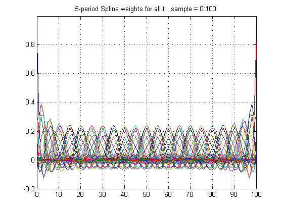
Figure 1
Figure 2 below shows the weights for z(50). Since t = 50 is centrally located between 0 and 100, these weights are precisely symmetrical. However, unlike a simple rectangular 5-year centered filter, the weights extend far in both directions, so that spline smoothing can induce serial correlation at leads and lags far in excess of 5.
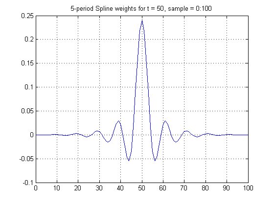
Figure 2
Figure 3 below shows the frequency response function for the weights of Figure 2. The amplitude is near 0 for cycles with periods under 5.7 years and is .50 for 9.0 year cycles. Unlike the frequency response functions we saw in the discussion of Rahmstorf’s smoother, comments #34, 37, 178 and 203, however, there is actually magnification of some frequencies above unity, reaching a peak of 1.22 at 11.2 years.
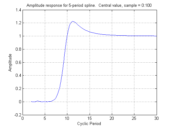
Figure 3
Figure 1 shows that the weights when t is between knot points are somewhat flatter than when t is right at a knot point. The frequency response between knots is therefore somewhat longer than at knot points, so that there is no unambiguous frequency response, even far from the end points.
Figure 1 also shows that the weights for z(t) behave very differently as t approaches the end points. Figure 4 below shows these weights for the very last point, t = 100. Clearly they are highly skewed.
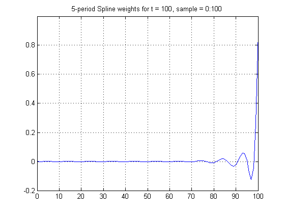
Figure 4
Because of the skewness of the weights for t = 100, the frequency response is a complex-valued function, shown in Figure 5 below. The overall frequency response is given by the magnitude of this function, shown in red. The magnitude is above 0.6 for all periods above the Nyquist period of 2, and amplifies by a factor of about 1.4 at 6-8 year periods, a very strange frequency response indeed. Furthermore, when the complex part is non-zero, there is also a phase shift.

Figure 5
Although a cubic spline produces values for z(t) for all values of t, the ones near the end of the observed sample are particularly noisy and erratic unless some additional restriction or restrictions (like the zero second derivative of a “natural” spline) are imposed.


187 Comments
I’m baffled; if you are anyway going to fit the data using least squares, or the like, why on earth bother to smooth or filter it first? There’s no legitimate advantage. I say again, this sort of stuff wouldn’t pass muster in a final year undergraduate research project.
I was wondering about that. And on a related note, I was also wondering if wavelet analysis was really the best tool in the box for some of these problems, or if it was just the newest, coolest toy that you just have to use if you want to be one of the cool kids.
It seems like there’s an unstated belief that high frequency components are all noise, and low frequency are all data, and these filters simply remove error from underlying physical phenomena, leaving pure, perfect physical data. At least that’s my sense of how these filters are being used.
What effect would it have on their conclusions if this step were left out? Is there a reason given in the paper for this seemingly extraneous filter, and if so, is it valid?
The goal in “climate science” appears to be to make their data visually appealing before analysis. An interesting approach for sure, but can it really be called science?
As a practical matter, McCulloch is going to have to re-run the computations on the original data with no smoothing, or different filters altogether, for him to impact the ideas of the people he’s trying to reach.
The statistics involved in climate studies become every more elaborate nonsense…
Although I have to say, Briggs is a real buzz kill! No smoothing at all? Where’s the fun in that? 🙂
No, no, I get what’s wrong with it. It’s constraining but it makes sense.
What’s even more funny, is that any cubic spline, particularly piecewise, can’t be used for prediction
Nick
Re: Nick (#7),
Neither can any other kind of curve-fit that isn’t based on a physical model.
This is what caused the real estate bubble; people who thought that positive exponentials can increase unbounded. It’s a most amazing thing in retrospect, how many “smart” and powerful people threw so much capital at something so obviously flawed.
And they still don’t seem to have learned their lesson. They’re still throwing astronomical resources at unsustainable goals based on simple-minded extrapolation.
Smoothing functions do have their uses: presenting noisy information in graphic form and getting some insight into the behaviour of random processes.
The problem that occurs when smoothing is done before doing regressions is that the end result understates the error inherent in the estimates of the parameters and predicted values and severely overstates the effectiveness of the regression procedure. Apparent correlations are magnified, Rsquares are higher, but it is no longer possible to carry out proper hypothesis testing without determining the adjustments which may be needed.
It is exactly this exaggeration that people who do not understand the drawbacks find so attractive: “Look at how great the results we get are; the p-values are real small” – without realizing that in fact they have violated the assumptions under which those results are interpreted.
In some cases, the correct error bounds can be calculated for such procedures, but it should be understood that they are invariably larger than those when the procedure is done correctly on the unsmoothed data.
Re: RomanM (#9), Macias et al explain why they used the 5-year spline smoothing. They believed their ice core data did not have reliable annual time resolution:
And they were aware of the resulting autocorrelation, and took fairly elaborate corrective measures:
Re: Nick Stokes (#16),
The problem here is that there are two effects going on. The underlying data may be autocorrelated to start with. This is then complicated further by the smoothing procedure involving cubic polynomials with varying coefficients along the sequence. To think that it may be corrected by AR methods and Monte Carlo white noise could be a bit of a stretch. I think a theoretical solution would be necessary.
Out of curiosity, is anyone here aware of specific properties of cubic splines that could particularly useful for correcting dating errors? I can’t think of any such offhand.
Re: romanm (#17), No smoothing technique can correct dating errors, or lack of measurement resolution. The best you can do is to acknowledge it, and reduce associated noise.
Smoothing with cubic splines is widely used in all kinds of scientific activity. This paper by the statistician Grace Wahba sets out some of its attractive properties.
The way Macias et al handle autocorrelation after smoothing corrects for the effect of all correlation in the smoothed time series, not just that which was introduced.
Re: Nick Stokes (#20),
Hmmm, this does look interesting. Thanks Nick.
From mr. BNriggs;
Oh, how simple life is.
This is the biggest frustration I have, anmong many others. It is something I find hard to extend to non-techies, be they not scientist or engineer.
RomanM.
When one is designing and building a radio communication system, smoothing the incoming signal at the receiver will not produce a lower Bit Error Rate. One must filter out the noise. To do that, one must know what that noise is. In general, one doesn’t, and it is a fool’s errand to attempt to do so.
I reckon the same applies to noise in natural signals.
BTW Has anyone done an investigation of the Signal-to-Noise Ratio of the “global temperature”? I guess not as we don’t know the signal but we see a lot of noise.
Re: Robert Wood (#11), Bingo.
RE Nick, #7,
You can extrapolate the last segment of a cubic spline, but being cubic, it’s headed fast either for plus infinity or minus infinity, and hence probably meaningless. The standard errors on such an extrapolation also blow up cubically with the distance extrapolated, and usually indicate the meaningless of the extrapolation. And the noisiness of the smoother as you approach the endpoints.
Since Macias Fauria et al are running smoothed sea ice on smoothed proxies, the terminal end of their projection (where the modern “unprecedented” values occur) is subject to noise both from smoothing the proxies and from the effect of the terminal smoothed SI series on the regression coefficients.
Re: Hu McCulloch (#12),
A lot of people don’t see that as a problem. This is what’s so pernicious about the hockey stick and other similar graphs; if I were to take 100 people at random, and ask them what it means, 90+ would say that it’s going to go up forever, and fast.
Re: Hu McCulloch (#12),
I agree that using a cubic for extrapolation is a bad idea, but the coefficients of the cubic give you an estimate of the first, second and third derivative which you could use for extrapolation if you had a suitable model.
Climate science seems to involve way too much unjustified curve fitting.
When one fits a curve, one makes assumptions about what is data and what is simple, random, measurement noise.
Most of the wiggles we see in climate data have a physical basis, I think — in other words, they are rarely random measurement noise to be “smoothed or filtered out”.
I do not understand statistics, a closed book, but I do understand a little about pcm data.
I suspect that most of statistics is not applicable to sequence related data, domain error and yet in climatic every man and his dog do so, what I call bucket people. (yup, we collected 5 buckets that month) Problem is often the use of common average where it is not applicable. (worst is moving average, worst possible filter)
Splines are cosmetic. Smoothing is not a term from signal processing.
The Briggs point about not using smoothed data (totally agree) is unfortunately somewhat pointless: go on then, when is the last time you were given raw instrument readings? I wish…
You can however legally decimate and then use the new dataset, provided nyquist and shannon are honoured. Both points are often violated.
The Shannon issue is rarely recognised. One part of it is there is a trade between time and resolution, ie. reduce the sample rate and the number of digits necessary rises. The ultimate example being the 1 bit data converter: starts very fast at one bit and ends at 20 or more bits much slower, perhaps counter intuitive. The data represents exactly the same data shape *within* nyquist and shannon limits.
When a one sample a year climatic data set is given, truncating to few digits is bad. Common practice.
Figure 2 in the article is very similar to the sinc() function, perhaps it is, which is the fourier transform of a step, the brick wall low pass filter. This is usually windowed, hence the impulse response is curtailed to finite. sinc has interesting properties, including to do with interpolation.
http://www.dsprelated.com/dspbooks/mdft/Sinc_Function.html
What happens if you convolve windowed sinc with a time series? An abrupt low pass filter.
Seems to me spline is a joke version of proper low pass filtering. Why not do that instead?
This is filtering. (spot the mistakes… stated periods are inverted, noise breaking through filter floor, whilst I was developing the filter routines)

Note too that is end corrected, obviously very wrong… who said it cannot be done? Just recognise the limitations and don’t push too hard, is conditional. (actually related to the filter impulse response, not filter length)
Is this useful or misleading? That is a call everyone has to make, there is no right nor wrong.
“Quote; “Rules are for the guidance of wise men and the obedience of fools.”
http://en.wikipedia.org/wiki/Douglas_Bader
A fun one… you have few data points yet want to produce a plot. You could oversample for display. This adds no actual data but does produce many points for plotting. A twist here folks: if the data is valid PCM data it must be put through a reconstruction filter before usage. This is what ought to be done with data rather than allowing graphing software to jaggy line. Few data though are valid pcm.
Note that this mentions 2D as well, images.
http://en.wikipedia.org/wiki/Reconstruction_filter
For anyone who’s curious, the Cook and Peters paper is here.
RE Nick Stokes #16,
The correction for autocorrelation in the Macias Fauria paper is discussed a further length in Comment 76 of the Svalbard thread.
Excellent point. I think the reason that fossil fuel depletion models, such as peak oil, work so well is that they are based on well-founded physical principles. Thus, all the curve fits that come out of the models lead to extrapolations that work well as projections. Unfortunately, climate change is not as simple as the bean counting that goes into oil depletion calculations.
Thanks, Hu M, for a more detailed discussion of the some of the potential problems of the paper in question.
Re: Nick Stokes (#20),
Nick, you seem quite sure of your diagnosis here – and without the inputted data. Are you a statistician – and a mind-reader?
Regardless, this is all good stuff from a learning standpoint.
Re: Kenneth Fritsch (#22), Kenneth, I’m a mathematician who has done a lot of statistics, and I read text. They have described their method in detail, following the quote I gave. It is a conventional identification and correction of autocorrelation, and makes no distinction between autocorrelation originally present and that introduced by smoothing.
Re: Nick Stokes (#23),
Hi Nick, have you given peters and cook a read. I’m a bit dubious of a method developed for tree rings being applied to this problem. The referenced paper has some interesting notes about end point problems and proceedures. Over my head, but it might be worth a read since they rely on the method
Re: steven mosher (#24), Yes, I did read it. It’s written in a tree-ring context, but it’s a straight presentation of regular spline mathematics. The issues in time series smoothing are much the same for any data. The program was developed for tree rings, but the method is general.
The endpoint issues are similar to those that Hu is noting (in more detail). A spline smoothed point depends on data at considerable distances. So extending the range has effects beyond the extended region, as their Fig 4 indicates. They have an impulse response in Fig 2, corresponding to Hu’s Fig 2, although they have an extra parameter p which determines how “stiff” the spline is.
Re: Nick Stokes (#25),
I was wondering if the conditions presented by tree rings were met in the new application. I recall that discussion happening around page 50 or so. It might be good to present what those conditions were.. sorry off to bed.. no time to be clearer
Re: steven mosher (#27), The only issue I could see there concerned the number of data points, which is not special to tree rings. The lengths of the series are roughly comparable. Maybe more tomorrow … 🙂
Something incomplete in the discussion so far. If the process (see ice extent, tree ring wdith, etc.) is autocorrelated (and stationary) prior to smoothing, then that is a feature that can be used to make forecasts of future states. Autocorrelation is not some hideous property that needs to be eliminated before any conclusions can be made. One needs to distinguish between first order autocorrelations arising from nonstationary trend vs. first order (and higher) autocorrelations arising from the process itself. Detrend the series. Then the first type of autocorrelation is a non-issue. The question here is whether recent low values of sea ice extent in 2007 and 2008 tell us anything about what we can expect in the near future (2009, 2010, …). If the process is naturally cyclic (higher order negative autocorrelations) you could expect some short-term rebounding before the declining trend resumes. If not, then there should be no such rebounding; the series should bounce randomly around a declining trend.
Smoothing splines in this case are unhelpfully amibiguous in their treatment of trend vs. cyclicity vs. noise.
Just for the record, here’s the MATLAB that generated the above graphs, plus a couple more for t = 45 and t = 47.
% SplineResponseFn
% For cubic spline with knots every 5 periods.
t = (0:100)’;
n = 101;
X(:,1) = ones(n,1);
X(:,2) = t;
X(:,3) = t.^2;
X(:,4) = t.^3;
j = 5;
for k = 5:5:95;
tk = (t-k).*(t>k);
X(:,j) = tk.^3;
j = j+1;
end
% This spline basis is ill-conditioned in single precision (real*4),
% but is usually OK in now-standard double precision (real*8).
% The “B-spline” basis is better conditioned, but is mathematically
% equivalent, and unnecessarily complicated in most cases.
W = X*inv(X’*X)*X’;
% If y is 101×1 vector of observations, spline model is
% y = X*beta + e, and vector z of smoothed values is
% z = X*inv(X’*X)*X’*y = W*y
% Plot selected weights:
figure
plot(t,W);
title (‘5-period Spline weights for all t , sample = 0:100′)
ylim([-.2 1])
grid on
figure
w50 = W(51,:)’;
plot(t,w50)
title (‘5-period Spline weights for t = 50, sample = 0:100′)
grid on
figure
w47 = W(48,:)’;
plot(t,w47)
title (‘5-period Spline weights for t = 47, sample = 0:100′)
grid on
figure
w45 = W(46,:)’;
plot(t,w45);
title (‘5-period Spline weights for t = 45, sample = 0:100′)
grid on
figure
w100 = W(101,:)’;
plot(t,w100)
title (‘5-period Spline weights for t = 100, sample = 0:100′)
ylim([-.2 1])
grid on
% Compute Response functions:
p = 2:.1:30;
p = p’;
np = length(p);
response = zeros(np,1);
r47 = zeros(np,1);
r100 = zeros(np,1);
for i = 1:np
c = cos(2*pi*(t-50)/p(i));
response(i) = w50’*c;
e47 = exp(1i*2*pi*(t-47)/p(i)); % 1i generates sqrt(-1)
r47(i) = w47’*e47;
e100 = exp(1i*2*pi*(t-100)/p(i));
r100(i) = w100’*e100;
end
% Plot Response functions:
figure
plot(p,response);
title (‘Amplitude response for 5-period spline. Central value, sample = 0:100’)
xlabel (‘Cyclic Period’)
ylabel(‘Amplitude’)
grid on
figure
plot(p,[real(r47) imag(r47) abs(r47)]);
title (‘Amplitude response for 5-period spline. Value for t = 47, sample 0:100’)
xlabel (‘Cyclic Period’)
ylabel(‘Amplitude’)
legend(‘real’, ‘imaginary’, ‘magnitude’)
grid on
figure
plot(p,[real(r100) imag(r100) abs(r100)]);
title (‘Amplitude response for 5-period spline. Value for t = 100, sample 0:100’)
xlabel (‘Cyclic Period’)
ylabel(‘Amplitude’)
legend(‘real’, ‘imaginary’, ‘magnitude’)
grid on
Re: Hu McCulloch (#31),
just for fun, I transliterated part of the matlab for the R-users among us. The function hu.splwt calculates the weight matrix when the predictor sequence and the knot locations are input:
Hu’s first two graphs are drawn and the smoothed sequence can be calculated.
R has several libraries for dealing with splines and spline smoothing. One of them is the package splines. A function specifically for spline regression smoothing is sreg in the package fields.
I had two essential points and questions about the paper in question. The first has been talked about here, but I think I need the answers to be a more detailed.
The first point was about how to correct for smoothing routines those statistical processes that use degrees of freedom in the calculations. As a layperson who has played around with smoothing, I know those processes can increase the auto correlations found in a time series. My question at this point is whether a simple adjustment for auto correlation to the degrees of freedom is sufficient or is a further adjustment required for, say in the case of a moving average, using the average of n data points.
The second was asked and replied to by Hu M at the other thread here on the paper in question. The authors use a lag 1 and lag 2 for each of the explanatory variables for sea ice extent in their model would seem to be susceptible to both over fitting their model and data snooping as the values of the variables and the number of them would appear to me not to be made apparent by the authors a prior reasoning. As Hu M notes after running the data through a 5 year cubic spline the gain sought by the authors is not so apparent – but then I would conjecture: why do it?
I could see cases where a study such as the one under discussion would not have combined the data for the two explanatory variables but rather have used a comparison of both to confirm one against the other. Again, as layperson with regards to statistics and the science involved in relating SST to ice extent and tree rings and O18 to SST and ice extent, I have to look for explanations within the paper that demonstrate that the authors understood a prior those relationships. I was only able to find generalities that well could have been made after the fact, and not any detailed information that would imply a prior knowledge of the details of their finished model.
Finally, my meanderings here have led me to an OT question about a model selection process such as AIC, that the authors of this paper used, I believe, for modeling the auto correlation but not the final model selection, and how this evaluation would affect the degrees of freedom. A step wise selection process using a statistical null hypothesis test would, in my mind, require an adjustment such as a Bonferroni correction, but from what I have read an AIC evaluation/rating of models that compares all the model alternatives simultaneously would not require the same amount of correction. Of course, the AIC selection process cannot be used in hypothesis testing and thus is not directly related. I can also see that providing a number of alternative choices for the model in one step is different than doing a step wise test, but is not the AIC process almost as prone to data snooping as a step wise process given that a prior reasoning is missing or poorly understood?
Finally, Bender, I think anyone who recognizes the auto correlations of the stock market, unemployment rates and inflation rates and the problems that that relationship avoids (most of the time) on planning on a day to day and month to month basis does not find auto correlation to be a bogey man. It is simply a fact of life that needs to be considered in our decisions and certainly compensated for when determining the significance with hypothesis testing.
I’m curious. What is the mean value for each of the spline weights. This would give some kind of estimate of the average first second and third derivatives. Looking at your figures, the spline seems to be a good filter for the intermediate points but not such a good filter for the end points. Of course, you could always translate the piecewise sections if you truely wanted to use it as a filter.
Is not it true that, while data manipulation using cubic and bicubic splines have logical and straight forward practical utilizations in algorithms for such processes as photo interpolation and lens making (as I recall for a bicubic spline), when these tools are borrowed for other fields their applications can be abused? The arguments for me are not whether these splines are useful, but where they are being applied and how.
RE Nick Stokes, #26,
I’m not familiar with the Peters and Cook article Steve Mosher and Nick are discussing, but they are probably using “Smoothing Splines” rather than the fixed knot splines that I assume Macias Fauria et al are using for “spline smoothing”.
“Smoothing Splines” were developed by Reinsch, “Smoothing Spline Functions,” Numerische Mathematik, 1967, 117-83. These are spline functions that place a potential knot point at every data point. By itself, this leaves the function underdetermined since it has two more parameters than observations. It also would ordinarily be exceptionally erratic between observations. But in order to tame it down and make it determinate, a penalty consisting of a “stiffness parameter” times the integrated squared second derivative is added to the sum of squared residuals. As I recall, this loss function can then be minimized using quadratic programming. The third derivative of the resulting function has discontinuities at only a few of the knot points, and which ones these are depends on the data. Cross validation is a popular way to select the stiffness parameter.
These “Smoothing Splines” happen to be popular for dendrocalibration of 14C dating (not to be confused with dendroclimatology). The Stuiver and Kra Calibration Issue of Radiocarbon, for example, has several charts of treering age versus conventional radiocarbon age, along with smoothing spline approximations. The smoothed curves are then used to adjust conventional 14C dates for natural variations in the 14C content of the atmosphere. This seems like a reasonable application of them.
BTW, the variations in 14C measured by the dendrocalibration people (as well as a Be isotope that occurs in ice cores) are thought to be an indicator of solar activity, and therefore, indirectly, a potential proxy for temperature, to the extent this is induced by solar activity. A few people have done this, but it deserves to be further investigated.
Since Macias Fauria et al are using “5-year splines” for smoothing rather than “smoothing splines”, I assume they are just placing a knot every 5 years and estimating by least squares, rather than using the more involved “smoothing spline” procedure.
Hu McCulloch, thanks for the response. That was interesting 🙂
I think that smoothing is bad but averaging/accumulating can be good.
Let me explain. Smoothing is bound to introduce autocorrelation and make correction for this more fraught. And a linear regression routine doesn’t want to see smooth data, it wants to see Gaussian data with non-smooth errors (because they are supposed to be uncorrelated for the simple analysis which most mathematicians can understand and believe in).
However, if autocorrelation over short periods is suspected, and if the resolution of the data is doubtful, then simply making the bucket bigger, i.e. (non-moving) averaging over a number of time periods, can be helpful. The averaged data should have lower autocorrelation, and one deliberately avoids trying to resolve the time domain to unrealistic accuracy.
Keep It Simple Stupid!
Rich.
Re: See – owe to Rich (#39),
Well, for regression you can always whiten the data but perhaps that defeats the purpose of smoothing. I think maximum likely hood is preferable to regression anyway and we can include the noise correlation introduced by smoothing in a likelihood function. I’m not sure the effects of smoothing if a maximum likely hood approach is used but perhaps in some cases it could reduce numeric error.
It turns out that the covariance matrix of the fitted spline values has exactly the same formula as the weight matrix when the errors have unit variance. The square root of the main diagonal of this matrix gives the standard errors, plotted below:
Because the beginning and ending values are not tied down on both sides, they have much higher standard errors than the interior values. The confidence intervals of the fitted values therefore naturally “trumpet” out at the ends.
A regression run with a spline-smoothed dependent variable must therefore use Weighted Least Squares to take into account the greater variance at the ends, in addition to adjusting for the serial correlation generated by the smoothing.
The greater noise at the ends also means that a spline smoother has a good chance of producing a Hockey Stick purely by chance.
Re: Hu McCulloch (#41), Thank you for another good post. Very interesting.
On another note, I’ve been thinking a bit about maximimum likelyhood. I presume your error at the end points makes the white noise assumption. I’m thinking about what might be a good way to express the variance in a likelyhood function for a smoothed domain.
In this post:
http://www.climateaudit.org/phpBB3/viewtopic.php?f=5&t=763&p=14937#p14937
I discuss the measurement covariance as a result of model error. I’m thinking that the covariance in the smoothed domain should have three parts, the covariance, introduced by transforming white noise in your raw data domain, into the transformed (A.K.A smoothed) domain. The variance introduced by model uncertainty, and the variance caused by white noise in the transformed domain.
Therefore I think that the variance in the likelihood function should have two parameters for white noise, and the rest of the parameters should be based upon the statistics of the model parameters.
Re: Hu McCulloch (#41),
For the information of the other readers, the covariance matrix of the fitted values is the weight matrix, W, multiplied by the transpose of W. You were certainly aware of this because the square root of the diagonal of this product is in fact what you have graphed in the comment.
What I find strange is the saw tooth shape of the curve with the highest local uncertainties at the knot points,except for 5 and 95 where the maximum is at 6 and 94.
All of this agonizing over smoothing misses a critical point. This is that we can determine experimentally the exact amount of end errors in any given dataset using any given smoothing. I wrote a paper to GRL pointing this out in re: Mann’s bogus end pinning strategy … they said I was too mean to poor Mr. Mann. I probably was, pisses me off when someone acts like a statistician and they don’t have a clue. But I digress.
In any case, what one has to do is to create a host of shorter datasets. These are made by shortening the dataset to each possible length greater that the width of the smoothing. Then apply the smooth to the shortened dataset, and get the smoothed value for the end point. Finally, compare the end point value to the value you get for that point with the complete dataset. This gives the error for that end point.
This lets us measure the average end point error of any given smoothing, and allows us to pick the smoothing that results in the least error. It also lets us put accurate error bands on the end point of the dataset.
Not sure if I’ve explained this clearly, but I assure you that you can compare any number of smoothings for any given dataset and pick the best one.
My best to all,
w.
Re: Willis Eschenbach (#43),
“All of this agonizing over smoothing misses a critical point. This is that we can determine experimentally the exact amount of end errors in any given dataset using any given smoothing.”
We can’t determine the error but we can estimate the error based on the curve we used to fit the data. Of course the parameters of this curve will also have uncertainty. So really it comes down to what is the objective function we are trying to minimize in the estimation problem. Is it weighted mean squared error, maximum likelihood or something else.
The rest of your post makes since but I’m not sure if it is optimal. However, I think it is a good sanity check to see how well, any smoothing/estimation technique works on subsets of the data. I believe I’ve seen Steve do this a few times.
Re: John Creighton (#44), what we are comparing is the error of the end points compared to the final smooth when we have all available data. This (I believe) can be determined experimentally. This, as you point out, is not the total error, merely the end point error.
hu the paper is linked above. I don’t believe the application to ice core data is as straight forward as nick implies.
Nice article, Dr Hu. Thank you.
This is not important, but I have been trying to think of other fields where the ends of a data stream are of more interest than the body. I guess this follows from mining work, where one is more interested in where the drill has entered, transitted and left the deposit than what it did in getting there and after it passed through. Financial forecasting is of course one as it noted above. The other newness that I am encountering here is the desirability to rid the data stream of anomalous values. In mining & exploration, it is the anomalous point values that can be most attractive against a monotonous background, so I’ve had to adjust thinking.
The main way this seems to express itself is that effects that are supposed to be global often have regional texture. Our BOM today announced we might have the warmest winter on record in Australia, to which the Kiwis replied that they are having one of their coldest.
So I’m more comfortable staying away from end points, though wiser for your explanation of this variation.
A smoothed sea of numbers never made a skilled mariner.
– Spliny the Elder
Wikipedia on smoothing time series.
http://en.wikipedia.org/wiki/Time_series
Re: bugs (#49),
May I suggest that you first read what is on a web page before you link to it. The Wiki article gives NO information on smoothing whatsoever on that page. The only use of the word “smooth” on that page is in the descriptive text on a small graph used as a pictorial illustration: “Time series: random data plus trend, with best-fit line and different smoothings”.
RE Steve Mosher #45, the Cook and Peters 1981 paper linked by MJW at #19 and discussed above by Steve and Nick applies the 1967 Reinsch smoothing splines to treering width data. As noted in #37 above, this is a somewhat different approach to splines than the fixed knot (every 5 years) approach used by Macias Fauria et al on the Svalbard data.
As C&P note, the advantage of either type of spline over a polynomial is that whereas the shape of a polynomial over one small interval determines its shape everywhere and vice-versa, the shape of a spline in one inter-knot interval is pretty much independent of its shape a few intervals away. This allows you to fit a locally smooth curve without imposing a global shape.
In either case, you have to impose some smoothness by deciding on either the number of fixed knots to use, or the value of the “stiffness parameter”. C&P provide the general guideline,
I’ve been fitting splines to bond yield curve data and thinking about this problem for a long time (see my 1971 J. Business and 1975 J. Finance papers and US Real Term Structure webpage). It seems to me now, in the spirit of C&P’s remark, that the universal objective is to find a smooth function, subject to appropriate end conditions, such that the errors are serially uncorrelated “white noise.” Too little flexibility causes positive first order (and higher) serial correlation, while too much flexibility can actually cause negative first order serial correlation.
The obvious solution, then, is simply to increase the flexibility by just enough to eliminate evidence of first order serial correlation in the residuals, as evidenced, eg, by the Durbin-Watson statistic. No one has ever tried this, to the best of my knowledge, but it would be straightforward to apply. The only issue I can see is whether to stop when the serial correlation is no longer significantly different from 0 by the DW stat, or when the Moment-Ratio estimate of the first order serial correlation is actually zero.
As for the end conditions, an unrestricted spline often goes berserk at the ends, which is why, in the case of yield curve fitting, I now impose a “natural” (0 second derivative) restriction at the long end of the log discount function, which permits the discount function itself to be extrapolated to infinity as a simple exponential decay. I don’t know what would be appropriate for treering or ice core data, but since the Reinsch/C&P smoothing spline penalizes the integrated squared second derivative somewhat, it will gravitate toward a reduced (if not 0) second derivative at the ends. The first derivative could be doing anything, however, which may or may not be appropriate.
I would like to see some critical discussion of the limitations of Briggs’ criticism of “smoothing.” No doubt the criticism touches on a propensity to misuse, or even abuse, various smoothing methods, especially as devices for inferring future rates of change in time series. This owes, not only to the end point issues we often see, as are being discussed here, but also to the discarding of data relevant to any distribution of errors in inferring future rates of change. Simply put, the smoothing of data makes it look like there is a lot less variability in the series, thus overstating confidence intervals, correlation coefficients, and so forth. Having recognized all that, are there any circumstances where smoothing yields valuable insight or information into the properties of time series? I’d appreciate it if the critics of smoothing would address this question.
I ask this because I have been exploring the use of Hodrick-Prescott filtering for the investigation of natural climate variability, and believe that it has some interesting usefulness in that role. I say “filtering” rather than “smoothing,” because I think it is the more appropriate term, but the end result is often indistinguishable, and as soon as some see the “smooth” result we get with this technique they dredge up Briggs’ criticism. But is it applicable? I will proffer a simple example, if Hu, or anyone else, is willing to engage me in further discussion. But first, some definitions.
Arguably, a time series can be decomposed into various components. Here let us say those are T, for a long term linear time trend, C, for a cyclical pattern in which the trend speeds up and slows down over shorter periods of time, and n for an irregular pattern we treat as “noise.” While the Hodrick-Prescott filter was not originally intended for this purpose, it easily lends itself to decomposing time series this way. Here is an example:
Now what we are looking at is the data is outputted with the stat program I used (gretl), so it is depicted in the way economists typically use the Hodrick-Prescott filter. In particular, their focus is on the “Cyclical component” in the bottom panel. But as I’m using it here as a method of decomposing a time series into T, C, and n, the bottom pane is n, the “noise” around the C depicted by the red Hodrick-Prescott “smooth” in the upper panel. I could show that the cycles we see in the upper panel are the same as what are revealed by traditional methods of frequency-domain and wavelet analysis.
Okay, so what? How is this on topic? Well, suppose we want to use this information to say something about the future, or recent past. It so happens that, more or less by design given the way the Hodrick-Prescott filter works, a linear fit through either the original data, or through the smoothed data, yields the same coefficients. But of course the standard errors of the latter are much reduced, making our measures of statistical significance appear much greater than they really are. That is, we cannot extrapolate from this data and simply ignore the historical volatility present in the data (here represented in the bottom panel). That would be a misuse, or an abuse, of the smoothing process. And that is what I see as one of the great shortcomings of all the various kinds of smoothing we see coming from climate studies these days. They appear to impart a greater degree of certainty to the results than are warranted. They are in fact discarding relevant data, and losing degrees of freedom in the process, and this can never result in greater certainty about what the underlying data truly signifies.
But that is not the same thing as saying that the smoothing has no utility or valid purpose. Here it is shown to reveal cycles that can be corroborated by other means, and is thus useful as a descriptive technique for studying the dimensions of natural climate variability. Yet, because of Briggs’ dicta, many will now refuse to even consider that the technique could have any merit.
Re: Basil (#53),
“But that is not the same thing as saying that the smoothing has no utility or valid purpose. Here it is shown to reveal cycles that can be corroborated by other means, and is thus useful as a descriptive technique for studying the dimensions of natural climate variability. Yet, because of Briggs’ dicta, many will now refuse to even consider that the technique could have any merit.”
I disagree with Briggs. If it is the case that in the original signal the errors are not statistically independent and we have a method to filter out these errors, then I think that a mean squared error fit can be improved by first filtering out these errors. Of course all this really does is whiten the data. So a high pass filter would whiten a signal that has low frequency noise.
I suppose in some cases a low pass filter could also whiten the signal. For instance, perhaps the high frequency noise is very narrow bandwidth, or the noise is such that the power of the noise increases with frequency. If we believe the noise is already white then there relay is not much point in smoothing the signal.
RE Roman #50,
But since W = X*inv(X’*X)*X’, W = W’ and W*W’ = W back again!
For y = X*beta + e, the OLS estimate of beta is betahat = inv(X’*X)*X’*y. The fitted value of z is then z = X*betahat = W*y, where W is as above.
But the OLS covariance of betahat is inv(X’*X) times the variance of the errors, which I am normalizing to unity. The variance of Z = X*betahat is then the “sandwich” matrix X*Cov(betahat)*X’ = X*inv(X’*X)*X’ = W again! So the variances are just the peaks of the individual curves in my Figure 1 above, and the se’s in #41 are just the square roots of these.
Since the weights get increasingly skewed as the end points are approached (compare Figures 2 and 4 in post), the peaks are not necessarily the midpoints, as you note for t = 5 and 95. The “sawteeth” in #41 are more than I would have expected, but I think they are correct.
Re: Hu McCulloch (#54),
I figured this out while driving to the golf course after posting my comment this morning. Without going through the details of the math as you did, from the symmetry of W, I realized that W*W’ = W2. The latter was just a second application of the regression to the predicted values of the first regression which which would give exactly the same result for the new predicted values (Imagine fitting a straight line to the predicted values of a regression – you get the same straight line which they are already in). Hence W*W = W.
I also played on R with the what happens to the standard errors when the smoothing is applied to an AR(1) sequence. For lag1 correlation .5 or larger, the standard errors of the endpoints at 0 and 100 exceed 1 so that the smoothed values become noisier than the actual end values.
Nick and others.
Here we see the purpose of the smooth or spline. To minimize small dating errors. I’ll make a couple points.
The splining that Peters and Cook discuss is designed to remove NON climatic signals in tree ring width. So,
my first question would be: can we determine that the dating errors result from non climatic signals, or are
the dating errors correlated with changes in climatic signals. Further, can we determine that smoothing, in fact,
minimizes the effects of dating errors? Since the ice record contains some annually determined points (volcanoic activity) shouldnt the splining process be constrained by this? What happens to the analysis if you allow for dating error and report that? If we have two or more annually resolved reference points can we characterize the dating errors?
Ok – I’m baffled here.
I admit I’m rusty on maths so I could be missing a lot of the arguments – apologies if this is the case – but isn’t Brigg’s point still valid? “The data is the data”? If I’ve understood correctly he is saying this specifically with reference to time series data (including proxy data) at identified discrete measurement points.
In the case of temperature records that could include a hot day in history during a cold spell. A day when a hot temperature was recorded is a valid manifestation of a climatic event. Why throw this information away by smoothing? Inherent in the discussion so far is the view that these “odd” events are in some way “errors” or “noise” corrupting a signal. IMO they are all information (“signal”) not noise. If later investigation of specific measurements shows that (say) instrument malfunction was responsible then perhaps an informed decision can be taken that certain measurements are noise, but to just put a spline through points seems totally arbitrary.
My recollection of splines is as described in Hu’s head post: a mathematical representation of a least energy curve with a shape dependent on stiffness. In the case of end points stiffness is absent and hence external constraints need to be applied to determine end conditions in addition to location. If we assume for a certain sampling rate no conditions other than location (“value”) are imposed, the spline’s shape will be determined by its stiffness. (I’ll set aside considerations of spline stiffness but for data modelling I’d be interested to know how this stiffness choice could/should be made – I didn’t see reference to this in the headline paper but may have missed it). Now lets say the sampling rate is halved. In the example laid out by Hu IMO this would be equivalent to choosing data points at interval k=10. Now the same stiffness spline with the same dataset could take up a completely different shape and, as a result, I fail to see how it can be considered representative of the information in the data.
Apologies if I’m missing the maths that shows how this is not a problem. In the case of dendro or ice core data where there is some natural smoothing (smearing?) of the data from uncertainty of the time value of the measurements perhaps this goes some way to justify a mathematical smoothing? I looked at the papers referenced up thread but Wahba seems to be based on the stated assumption that the spline is being used to approximate a “smooth” (single variate?) function g(.) and Cook and Peters is dendro specific. I do recognise the headline paper is discussing ice extent but IMO this is not defined by a single variable.
Coming on to Basil’s point which seems to relate more to Hodrick-Prestcott filtering, again I’m baffled. What new information has been revealed in the figures presented? Is the red C line offering any useful data? How is the difference between this and the original (reconstructed?) ersst data useful?
Apologies if the above comments make it obvious I have missed the essence of the arguments or repeat points already well understood. My rusty knowledge of splines is from a drafting point of view and the idea of using a pinboard and wire to model, and interrogate, recorded data is (perhaps obviously) beyond me!
Re: curious (#58),
I am wondering about this too. Why so much effort in smoothing out the data? Why not show everything complete with all the anomalies?
Re: David85 (#60),
The smoothing is used to minimize dating errors. If you look at the ice core dating literature ( i just skimmed it)
You will see that there are various methods for dating ice cores. At some depths in some places you get annual resolution. As you go deeper ( ice compresses, flows, etc) then you get less resolution, years smear together.
So, you take a chunk of ice, you crush it, you analyze the trapped gases. What year does it come from?
at some points you know this +-2 years, other points +-10 years, and at some points you might know the year
exactly ( volcano deposits). What I would like to see is a synthetic test that demonstrates that splining is the best method for reducing small dating errors. I see that assumed, but I don’t see any analytic support for that. In the referenced article splining is used to remove non climatic signals in tree ring widths. Not to adjust a dating methodology. The splining is a standardization technique as far as I can tell ( like standardizing for growth patterns that are not related to climate). In any case I don’t much support for using that method on handling the dating errors problem. I’m not saying it’s wrong or there is a better way, just that this is an interesting problem that romanm and Hu and others can probably chew on for a long time. Anyways. neat problem.
Re: steven mosher (#67),
I think it depends. In one since smoothing may reduce this kind of error but in another since it accentuates it. If the problem is that the data is a blended version of the temperature, then you may want a filter that is somewhat inverse to this (In a way this is opposite to smoothing), however, if the time blending is random then then trying to naively find an inverse filter could just increase the noise.
If the blending is uniform (like a linear filter) then the inversion problem is one like. There is the actual temperature plus white noise (White noise A), and this gets smoothed by the ice to produce a smoothed temperature record plus smoothed white noise (Comes from White noise A), plus additional white noise (White Noise B).
Now, we don’t want to find exactly the inverse filter to whiten the data because this will accentuate white noise B even if it does whiten the correlated noise produced by the ice. However, the filter should still be somewhat inverse, but perhaps contain a smoothing term for real high frequency noise.
Therefor if we want to recover the temperature recorded I contended that in some circumstances we may want to do the opposite of smoothing (depends how you define smoothing) and depending on how the proxy sample/s is related to the actual temperature data.
Re: John Creighton (#68),
Sorry to be a word Nazi, but you’re using “since” when you should be using “sense”…
Example: “How long has it been since your last AGW hysteria?”
Example: “I sense that you’re becoming more hysterical.”
Re Basil, #53,
Cogley and Nason (“Effects of the Hodrick-Prescott Filter…” J Economic Dynamics and Control) debunked the Hodrick-Prescott Filter back in 1993, showing that it can extract meaningless “business cycles” from a random walk. The average duration of the bogus cycles is determined by the “tuning parameter” that the user selects. Unfortunately, the HP filter is almost universally used in economic studies.
Actually, Briggs did start off with the qualification, “Unless the data is measured with error…” If the explanatory variable(s) in a regression contain measurement error, OLS will give biased results. Total Least Square will correct for this, but it is cumbersome and requires knowing the variance of the measurement errors (which cannot be inferred from the regression alone.) In such a situation, there might be a case for reducing the error in the explanatory variables by first smoothing them.
But the dependent variable is entirely different — its measurement error just adds into the regression error, and OLS does its thing with it. Smoothing the dependent variable will generate serial correlation in the errors where none was present before, while at worst smoothing the independent variables will just erase their signal.
I’ll be away for a few days and unable to answer further questions until Saturday.
Re: Hu McCulloch (#59), Hu,
Thank you for replying. I’m disappointed, though, that you fell back on a criticism that doesn’t apply here. Even though you may not be around to respond for a few days, I’ll go ahead and post my reaction to your reply now, while it is fresh on my mind, and perhaps we can pick it up again later.
First of all, showing that HP can extract “cycles” from a random walk no more “debunks” it than showing that you can fit a linear regression through a random walk debunks linear regression. All tools have appropriate uses, and limitations on appropriate use. Just because HP can be used inappropriately doesn’t mean that the tool is per se useless. Having spent a considerable amount of time recently studying its usefulness, I think you are probably right to deplore the way it is so widely used by economists (of which I am one, so I can say this, along with Hu, with perhaps more authority than one could who is not an economist). But I explicitly stated in my comment that I was not using the HP filter the way economists have traditionally used it. So until you deal with HP on the terms I’ve presented, rather than on the terms with which you traditionally associate it, I do not think you’ve fairly responded to my comment.
So, for the sake of further clarification, especially for anyone monitoring this exchange, let me repeat myself. In the image I posted in #53, when an economist uses HP filtering, they focus on the “cycles” they think they see in the bottom pane of the diagram. That is why, in the bottom pane, the gretl software which generated this image says “Cylical component of …” But I’m saying “No, let’s look at this differently.” I’m saying “Let’s look at the bottom pane for what it really is, which is simply a plot of residuals about the resulting smooth in the upper pane.
So if we look at it this way, what are we looking at? One way of describing what we are looking at is that the resulting smooth, in the upper pane, is a kind of local regression, with the degree of locality controlled by the value of lambda. As we increase lambda, we lose the local focus, and in the limit we simply end up with a linear regression. But I would also note that no matter what value of lambda is chosen, it doesn’t alter the “long term trend” in the data. That is, if you fit a linear regression through the smooth, it has the same slope and constant as a linear regression through the unfiltered data. So the smooth is just representing oscillations around the long term linear trend.
My contention is that the oscillations observed this way — again, the oscillations in the upper pane, not the so-called cycles in the lower pane — are, when applied to time series climate data, real representations or depictions of “natural climate variability.” In my original comment I wrote:
So rather than being any kind of spurious result, HP smoothing here is just another way of depicting natural climate variation in time series climate data. I suppose someone might wonder, then, why bother? If it is just another way of looking at what we can already see using spectral analysis, or wavelet transforms, what more does it add to our understanding of the underlying data? Well, unlike spectral analysis, it shows the oscillations (low frequency changes in rate of change) in the time domain exactly as they occurred. In this, it overlaps wavelet analysis. But it also presents the amplitude of the natural climate variability in a more natural, intuitive way, IMO.
In any case, whatever the merits of the approach, as opposed to traditional spectral analysis or wavelet transforms, my point here is that this is a case where smoothing may have its uses. That said, I would certainly cede your points, or Briggs, about being cautious how the smoothed data is used in any further regression analysis. For now, I’m simply contending that this makes use of the Hodrick-Prescott filter in a particularly useful way as a descriptive statistic or technique.
Actually, I might want to go a little further here, at least for purposes of discussion. All of the hoopla over smoothing comes about because of someone wanting to say that their smoothing shows that recent trends (in climate data) have significantly increased, thus constituting some kind of proof of AGW. The image I posted in my original comment shows how “heroic” such claims must be. This use of smoothing discards data that should not be discarded. We should have a “rule” that says that any smoothing technique should be depicted along the lines of the image I posted, where in the bottom pane we have the data that has been “discarded.” I.e., what are the residuals about the smooth? In any inferential or forecasting use of the data, those “residuals” are relevant and cannot be ignored. Looking at the data in the particular case I chose to represent in the image I posted, the data in the bottom pane is implicitly evidence of the standard error of the range of natural climate variability. It is huge. Any claim to have found a recent “statistically significant” rise in temperatures (or whatever other metric of climate change we’re considering) which has discarded, or ignored, this evidence of volatility in the range of natural climate variation should, indeed, be immediately suspect.
David85 – I don’t know but I think Hu’s papers referenced in comment 52 will be worth a look (I only saw them after posting). As far as the headline paper goes table 1 shows the improvement in r and r^2 provided by using the 5 year smoothed data. Unfortunately my maths is too patchy to know if this has been addressed in the discussions above. FWIW to my mind a spline is a useful presentation tool and I don’t see how it provides new insights to time series data. Happy to be enlightened though!
Please excuse that I’m not up to date with the right tech words. It’s about the carrying forward of errors, including near end points. My personal origins are in geostatistics where the semivariogram attempts to discern the separation of points that cease to have predictive value on each other. Let’s work in time domain, using temperature.
We take a temperature at noon today. One minute later it is likely to be much the same. Predictive power is good. If we use the same value, the bias is likely to be small.
What will be the temperature at midnight? No sun at most places outside one Pole, so likely to be cooler. Hard to predict the midnight temperature from the noon temperature. Bias likely to be large.
Proxy, we estimate the midnight temperature from midnight the night before. There will be some bias error. We can try to improve this by assuming stationarity and saying “let’s average the midnight temp on this date for the last 20 years and use that”. A different mixture of bias and imprecision will arise, from some different mechanisms.
We can also construct a model curve that might be like a sine curve, for each day of the year, from a long term data set. This gives a different set of bias and precision in the estimate of midnight temp. There are many days when a sine curve is a really poor shape to use.
As we increase the time elapsed between an actual reading and a forecast reading, both bias and precision worsen. Introduce autocorrelation corrections and concepts and it worsens again. Our predictive confidence can be poor at random time separations, but can improve at certain times, like 24 hours later, 365 days later, then into Milankovitch cycles etc. So there is really no single bias estimator that covers all bases.
At some time interval, or by using some statistical method, we can estimate a duration beyond which a measured temp becomes unreliable in the estimation of missing temps or the forecasting of future temps.
I am having problems with the way that authors are confusing bias with precision; with the coupling of temperatures that have no forecasting ability on each other; and this in steady periods, with a far bigger problem at the ends of smoothed data sets.
Would it be out of court to suggest that in reality, the actual “global” temperature has not changed within properly constructed error bounds within the last century? I keep encountering incomplete estimates of errors, even when dealing with past “settled” data.
So much has been written on CA, but I cannot recall an account of the proper accumulation and carrying forward of errors through known mechanisms and their comparison with measurement where possible. So often I see error bounds used as if they were bands of relatively fixed width that flop around, almost symmetrically, like limpet fish on a shark, about whichever new mean value has resulted from an adjustment to method.
In essence, there has been much discussion on statistical error estimation, especially when different stats approaches are used; but seemingly less discussion on real life error estimation, with the hope that large numbers of observations will cure bias. They won’t.
Steve,
Your copy of the graphic is truncated because the original is actually TWO images side by side:
and
I suspect because the second one (the animation with blinking “we are here” dot) is updated regularly and the first one is (should be) unchanging.
RomanM: Three things wrong with this comment:
1. It’s my graphic not Steve’s.
2. This is posted in the wrong thread. It belongs in the NASA: Sea Level Update thread.
3. This was known and a good way to copy the comment was addressed by Anthony Watts , in comment 31 of the Sea Level thread 5 days ago.
The curve you’re fitting to is your physical model. If it’s just one that seems to fit, you’ve created a physical model based on no understanding at all.
Of course there’s a real difference between curve-fitting and model-based estimators. A model-based estimator is going to come up with a current state estimate (and hence predictive capability) based on a physical model based on your best understanding of the physics.
I’m wondering if the smoothing functions being used currently represent current best understanding of the physics?
There’s always the possibility that there are multiple, important observables that aren’t being captured by “global mean temperature”, or whatever the input metric is called these days. That would be a problem, of course.
Statistical fiddling is a convenient smokescreen obscuring the fact that current understanding of the earth’s climate is too primitive to support the assertions of the alarmists. Arguments about the appropriateness of Kopfschmerz’s algorithm vs. Katzenjammer’s lead us to forget that 3-month forecasts are useless for planning a picnic; therefore 3-decade forecasts ought to be suspect in driving laws that plan the world’s energy economy.
“Mathematics may be compared to a mill of exquisite workmanship, which grinds you stuff of any degree of fineness; but, nevertheless, what you get out depends on what you put in; and as the grandest mill in the world will not extract wheat flour from peascods, so pages of formulæ will not get a definite result out of loose data.”
~Thomas Henry Huxley, 1825-1895, Quarterly Journal of the Geological Society of London 25: 38, 1869.
Which is saying “garbage in, garbage out” in elegant 19th century English.
I didn’t have much to add. It’s an interesting post Hu. I’ve read it several times now, and found the comments as interesting as the post. I knew the frequency response would be weird but not that weird. It makes sense though.
Completely off topic. I’ve done a post on CPS distortions based on various signal/noise ratios if people are interested in seeing more Mann08.
This concept of adjusting for dating errors by splining bothers me. It seems to rest on the assumption that the datum itself is perfectly accurate (in the y-coordinate), the only uncertainty is the time. Do we have a good reason to assume that? And I’m not questioning the precision of the isotope analysis, but aren’t we also building a half dozen other assumptions into the proxy relationships?
There have been a number of comments about never smoothing data made on this thread and I think that some context and clarification might be useful.
Statistical procedures can be viewed as coming in two basic flavors: descriptive and inferential. Descriptive statistics deals with the principles of summarizing and presenting information in data. In this context, smoothing can be a useful procedure to present features of the observed data that might be of interest. Trends in particularly noisy data can be emphasized. When used as an exploratory technique, appropriately chosen smoothing techniques can give insight into the behavior of the data. There is room for misuse, particularly, as we have seen in the past, in the behavior of the smoothed curves at the endpoint which are the result of the choices made in generating the result. However, it should always be remembered that in this situation what you are viewing is the data and not necessarily properties of the mechanism that generated it.
The second flavor has to do with making statements about the generating mechanism from which the data came. This includes error bounds, confidence intervals and tests of hypotheses. In this context, many problems can arise if smoothing becomes a part of the procedures which are normally used. The assumptions under which these procedures have been derived are invariably violated by the smoothing process and the stated results are invalidated. It is possible to correct these results for some but not all types of smoothing. As in Briggs’ admonition, it is extremely easy to be misled ( and to mislead others). This is also the reason that I cringe anytime I read “First, we smoothed the data and then we …”. Unfortunately, it is usually also an indicator of a high level of statistical naivety of the authors.
My advice to a researcher would be that smoothing can be used for the descriptive aspect of a study. Pick a smoothing method which has known positive properties for the type of data on which it will be used. Understand the parameters of the procedure and what effect they have on the process itself. Do not over-interpret by inferring that what you see can reliably be ascribed to the mechanism that generated the data – you can’t form and properly test hypotheses from the same data set. If you really want to smooth AND do inference, get professional help from someone who understands what is going on.
Re: romanm (#71),
Or you can read and post here and get some professional advice free of charge – or at least for the price of a tip every now and then. Of course, my view is from some one seeking a general understanding and not one who is on the verge of publishing a paper.
Re: romanm (#71),
Either that or they are signal processing folks that are filtering/smoothing data in search of an a priori quasi-known waveform. 🙂
It is interesting, the parallels between statistical analysis and statistical signal processing. The tools are essentially identical – other than some terminology and mathematical convention differences of course. The assumptions, however, and often conclusions, are not.
Mark
Re: Mark T (#73), Correct. That’s actually something that has happened in the past 30 years; in ’79 statistics and signal processing had almost nothing to do with each other; now, they’re almost the same toolkit. But what you also say is equally true; even though the tools are the same, the objectives and constraints are different.
The dangerous thing about these tools in the hands of the Team is that they treat their data reconstruction problem like signal processing problems, which, as you say, implies some a priori knowledge of the expected actual signal. This can easily lead to a self-fulfilling prophesy if you’re implicitly assuming the outcome in what is supposed to be a scientific investigation.
Re: romanm (#71),
I think you offer a reasoned perspective.
Re: romanm (#71),
The unfortunate issues I see with this very clear and reasoned separation of when to smooth occurs in electronics fairly often. As an exercise I often try to think of the most extreme examples and see if a paradigm still fits. In this case electronics can provide a lot of real world extreme cases that have noise on the signal of a known frequency and behavior (e.g 60hz or other frequencies).
The noise which is fully separable from the often heavily oversampled long term signal. While it’s pleasant and comforting to have such strong statements from Briggs, it’s hard for me to justify not smoothing data prior to processing when the source and behavior of the noise is known and separable from the signal.
In climatology this is often not the case, especially in unverified proxy data. So I wonder if Hu, Briggs or Roman would agree to filtering prior to other statistical processing when the noise is of known characteristics and/or of very different frequencies from the signal? It’s a slippery slope for sure but maybe it’s correct to walk the line.
Re: Jeff Id (#80),
Pulling a signal with known characteristics from noise is what your TV and radio do every day. Digital ATSC tuners for high definition TV are improving by leaps and bounds with each new generation in sensitivity and resistance to things like multipath distortion. A problem with temperature reconstruction from proxies is that the known signal, the instrumental temperature record, is likely nowhere near as precise and unbiased as assumed.
Re: DeWitt Payne (#81),
Ditto to the ditto power.
However, I see no harm in trying to extract a signal and then using that to make predictions. For example, Basil
did some work with the HP filter and temp data and solar/lunar cycles. No harm in that, except to count as science he would have to make a prediction from the signal he “discovered” Apply HP to a random walk and as was shown above you will find cycles. Now turn that into a model to predict things and you’ll fail or have very little power. In electronics
you have the benefit of being able to build a circuit and test it with new live signals. You typically know the characteristics
of the signal ( roughly lets say in some electronic warefare or signal intercept application). In climate science people are running a SETI type operation. They assume there is some life out there and try to rule out random stuff and believe that if they find a signal it must result from some intelligent process.. or something like that.
Re: steven mosher (#86),
Isn’t that a little more like ID? The signal proves that there’s intelligence which proves that there’s a signal?
Re: steven mosher (#86),
Well, we (Anthony and I) did make a prediction. We fit a sinusoidal model to the cycles, and came up with this:
Of course, curve fitting and extrapolation, without an underlying hypothesis, is just numerology, not science. The phase reversals, and long term patterns here, may be evidence in support of Katya Georgieva’s (and her colleagues’) theory of a solar north-south hemispheric asymmetry influencing long term trends in zonal versus meridional terrestrial atmospheric circulation. It will take another two decades to know for sure, but the projection in the above figure implies a moderation of temperature increases, and even net cooling, over the next couple of decades.
One thing I might add to Steven’s comment about needing a “prediction” for something to be “science,” is that the predition, combined with a plausible hypothesis, is sufficient to validate the methodology. The economists among us will be familiar with Friedman’s philosophy of the method of positive economics and its implications for the trade off between models and “reality.” Models all involve some degree of abstraction from what we call “reality.” But if the abstractions yield testable hypotheses, and useful predictions, then “the end justifies the means.” This is why I’ve never understood the effort to distinguish the IPCC GCM based “scenarios” from “predictions.” That is a distinction without a difference. For each set of assumptions used to generate a scenario, the result is a prediction that tests the validity of the assumptions. If GCM’s are not intended to produce testable predictions, they have no place in the endeavor we call science.
In any event, the relevance of the preceding paragraph to the discussion is that if “smoothing” yields a representation of the data that can be plausibly be related to testable (or falsifiable) hypotheses, then that is sufficient to validate the use of smoothing. There is no scientific justification for rejecting smoothing a priori. That does not mean that we should not be cognizant of the “negatives” associated with smoothing, especially in light of the propensity of some to use smoothing as a tool for cloaking confirmation bias. Thus I applaud Hu, Steve, William Briggs, the Jeffs, and others, for exploring the limitations of the various smoothing methods (include principle components here as a smoothing method) that are being used to allege support for various flavors of the theory of AGW. But in a sense, it doesn’t matter. If the proponents of AGW are wrong, and in their smoothing of this and that they are merely fooling themselves, their predictions will fail, and will in time be discarded. In that sense, science has an internal logic of its own that cannot be defeated. But meanwhile, we see the so-called scientific, peer-reviewed, literature filled with works of questionable value. Auditing and critiquing the methodology of these works is part of the scientific endeavor, and if this helps to hasten their demise so that we do not have to wait decades to see the predictions fail, then bring it on.
But let’s stop criticizing smoothing per se.
Re: Basil (#89),
Thanks for posting that Basil. I would say I have to agree with you ( as an instrumentalist) that all that is REQUIRED
is a testable hypothesis. So, for example, if you predict that the temperature will follow such a pattern that is a testable hypothesis. Ideally, of course, one wants to be able to connect the model to other models and put words and “physical” laws on it, but if the model works that’s enough ( I think epicycles worked ). However, you also need to recognize that I may still prefer a GCM to your model. Primarily because a GCM ( however flawed) will also say something about precipitation, and ice, and el nino, and the list goes on. Your model, even if it were superior on predicting temps would not tell me anything about hemispherical patterns or sea level or… you get the idea. So there is something to be said for a model of the climate that works from accepted physical models. WRT the word smithing that the IPCC does with prediction versus scenario. I think it is just prophylactic PR. The scenarios of course lay out a whole raft of assumed profiles, none of which will actually be met.
Re: steven mosher (#106),
The problem is you have no way of knowing if the GCM is saying the RIGHT things about precip, ice, etc. Just because it may get it right sometimes, it could be totally by chance. There’s just no way to know.
Re: Jeff Id (#80),
I think you’ve got it pretty much right. All methodologies are subject to possible misuse. This is why when teaching statistics, it is always important to spell out the assumptions made in deriving a particular procedure. The end user learns not only how to carry out a particular analysis, but also when not to do so (or to properly adapt the method to incorporate the type of data being analyzed).
I concur with your assessment that there can be situations where smoothing can (and should be done). The specific cases I have seen come from the areas of biomedical engineering and kinesiology. In one case, measurements were done on nerve impulses over a period of time under different conditions with the intent of differentiating beteen the conditions. In another, video of ice skaters accelerating from a standing start was digitized to examine the knee flex angles. Both of these cases involved the “heavily oversampled long term signal” you refer to with various types of noise. Smoothing the data before analyzing the signal does not present a particualr problem to me despite Briggs’ slightly arrogant dictum.
it is pretty clear that proxy data does not have the same information properties nor is the sampling as frequent as the examples mentioned above. The choice for the type of smoother is often dictated by “signal” properties (e.g. 40 year smoothing) which may not apply to the time series at hand. Not only does this induce changes in the correlation structure, but it may also induce bias in the values of the “actual” climate parameters being estimated.
Walking the line carefully is important. Stating all of your assumptions and verifying independently the form of the relationship between proxies and the climate “signal” under study would be a good starting point.
(I can’t believe I actaully agreed with everything you said… 😉 )
In many cases the two fields do join in common math, but not quite in the expected places. Same toolkit is dangerous.
Nothing wrong with looking for things in data, everyone does this. Declaring so is when it gets dodgy yet even an absence might have meaning.
Little connundrum.
Lets say there is a reasonably valid air pressure dataset, sampled every 10 minutes. This is published as monthly data by some organisation, who say nothing about how they decimated (and deny original data). Anyone able to explain how, which is somewhat in context of this thread?
Basil, please listen to the comments of Briggs, Hu, and Curious. At least two of them are professional statisticians, so they know what they are talking about. What you call C in your red curve is just a consequence of your smoothing. As you choose different values of your smoothing parameter you get different red curves. There is nothing special or magical about the HP filter.
Here is some noisy data. It looks like there is cyclic behaviour, at least in the first half. Above it (offset for clarity) is the HP-smoothed data, clearly showing the cyclic signal with the noise removed.
Furthermore, if I do an FFT of the data (sorry, cant be botherd to do a wavelet transform!) I see a clear peak around frequencies 9-11 corresponding to the oscillations in the picture, so the cycles are really there.
The only trouble is, my data is a random walk, in Matlab: cumsum(rand(1000,1)-.5)
Re: PaulM (#78),
I’m hearing what they are saying. And yes, you can get cycles out of random walks. But does not mean that all cycles come from random walks. All it means is that if attributing a cause to the cycle, one should rule out the likelihood of a random walk.
As for
Yes and no. If you reduce lambda, you’ll see more curves; in that sense “you get different red curves.” But you still have the curves/cycles from the result you got using a larger lambda. The HP filter isn’t creating anything that isn’t there. As I said in my reply to Hu, it can be viewed simply as a form of local regression with the degree of smoothing controlled by lambda.
So,
Who said there was? As I’m using it, it is simply a low pass filter, with the degree of filtering dependent on the value of lambda. Whether the filter should be applied to a given dataset, and what to make of it if we do, are completely different questions.
It is reasonable to suggest caution in using the HP filter with data from a random walk. It is not reasonable to dismiss it altogether because of that. The problem you (and Hu) are raising lies in the data, not in the tool.
Polynomial splines and HP “filtering” are essentially least-squares curve-fitting exercises that differ crucially from digital filtering in many respects. Their results of the former are subject to record-length variations, whereas those of properly applied digital filters are not. Moreover, their frequency response characteristics are data-dependent, whereas those of digital filters are fixed. These distinctions loom large in the analysis of geophysical time series, which are discrete-time samplings of continuous underlying signals, often superimposed upon each other in field measurements.
To illustrate, put a pressure sensor on the seabed. It will register simultaneously the contributions of sea-swell, shelf-waves, tides, barometric and sea-level variations to the pressure record. Inferences about any of these multiple signals from the raw data will be corrupted by the presence of other components. This situation requires precise frequency-discriminating filters to isolate the signal of interest. In the case of the tides and/or sea-level variations , which are well-separated in frequency from sea-swell and shelf waves, a straightforward low-pass filtering (i.e., smoothing) suffices.
The viewpoint of statisticians inexperienced in the analysis of real-world discrete-time-sampled signals is often curiously naive. Accustomed to dealing with data from independent trials of controlled experiments or discrete samples from any population, they assume that raw data is entirely relevant to the issue at hand. That is seldom the case in geophysics. Moreover, they think of time-ordered data decimated (i.e., averaged in non-overlapping blocks) into monthly averages as simply “bin-averages,” without any regard to the crucial issue of the aliasing of the harmonics of the diurnal cycle into the lowest frequencies. The blanket proscription against any data smoothing is particularly curious in the context of climate studies, which are–after all–concerned with variations at the lowest frequencies.
Indeed, as Roman M (#71) advises, inferences from the analysis of geophysical time-series should be left to professionals.
Re: John S. (#83),
Your pressure sensor example is an excellent one for indicating the complexity of some time series in the climate science context. To me it indicates the need for a proper specification of a (mathematical/statistical) model for how all of these factors contribute to the entire structure before simply passing an arbitrarily chosen smoothing procedure over the observed results. In this case, I imagine that separate time series information on the various factors may also be available to be used in the analysis.
Since many of the methods used in such an analysis are not my strong suit (although I try to pick up on the unfamiliar ones every chance I get), I had better follow John’s advice myself and leave it to those who know more of what they are doing in that field.
By the way, anybody wanting to run some Hodrick-Prescott filters (and several others) in R, they are available in the R package mFilter.
Re: romanm (#85),
Actually, with many of the factors in John S’ example occupying different frequency ranges in the spectrum, there’s little need for models in isolating the signals. The beauty of digital filters is that they can remove unwanted components in the record without knowing anything about their structure other than the frequency range. The smoothing is done on that basis, rather than arbitrarily. It’s only when the spectral ranges overlap (as they do with barometric and sea-level variations) that structural information about the physically distinct signal components is required.
Re: sky (#90),
So without any information/knowledge/assumptions about the structure and the various interactions, where do the estimates of “errors” in the noise come from?
Re: romanm (#91),
As far as I know, you would have to assume something about the noise structure and then estimate the noise based on that. So perhaps you assume the noise is an ar1 process and then estimate the noise based on this assumption.
Re: romanm (#91),
With measured data, estimates of the noise level come from tests of the measurement system. Modern scientific pressure transducers sitting on the sea floor produce very “clean” signals. The practical issue is not measurement noise, but signal separation, which is easy when the frequency ranges of the signals are known to be disjoint, and complicated only when they are not. The former applies to sea and swell. The latter applies to sea-level, whose fluctuations are very small in relation to the tides and overlap those of atmospheric pressure in their spectrum. This makes estimates of eustatic level quite error prone. It’s here that physical knowledge/models come into play in interpreting/compensating the data.
DeWitt and Roman,
You guys better be careful who you agree with. Like a temp proxy, you never know what they’ll do next.
Whoa, smoothing. Who’s a hockey puck?
But that is my point. Unless the noise structure is introduced via the original components throught a model, there is not reason that the result of the interaction of various factors would produce an ar1 or similar random component structure. I would prefer knowing the structure through a derivation rather than through a assumed guess.
Re: romanm (#93),
Well, you can take a guess at the structure of the noise by looking at the power spectrum of the residual. Each peak, can be approximated with a two pole model where the time constant is inversly proportional to the band width. For the the low frequency components of the noise you only need one pole. The fewer number of states you need to approximate the noise the better you will be able to distinguish between the noise and the signal of interest.
I’m sure there are more sophisticated approaches of doing what I described. Another alternative is to use a wiener filter. If you apply the wiener filter in the frequency domain, then all you need is an estimate of the power spectrum of the noise, and the spectrum of the correlation between the signal of interest and the actual data. And I’m sure there are many more techniques.
“Noise” comes not only from measurement error from from the randomness in the system that you are measuring. Values are affected by all sorts of factors besides the one which you view as being signals with associated frequencies. Unless the assumptions are made at the start in a systematic manner, you are reduced to analyzing the “resdiuals” using ad hoc methodologyin the manner of the climate scientists who keep turning to models with unknown properties to “validate” their results.
I believe that the difference in our approaches is based on professional differences. To me the signal theory approach to climate science is based on undeclared (but implicitly present) assumptions which do not lend themselves to proper analysis. This ends up in hockey sticks “validated” by spurious techniquues accompanied by completely unrealistic error bars.
Re: RomanM (#96),
I’m just curious, what do we disagree on? I agree much of the analysis done in climate science is questionable. I agree they use systems that aren’t well understood. I agree that you can fool your self when trying to estimate the noise from the residual. As for ending up with hockey sticks, I think they end up with hockey because they believe their are hockey sticks there (conformation bias). To some climate scientists they my not care if noisier endpoints lead to hockey sticks because they believe that is the best estimate from their Bayesian assumptions.
Re: John Creighton (#98),
I do not disagree with you regarding the usefulness of many of the mathematical methods which have been developed in signal processing in their application to time series. What I find problematical is what I perceive to be a disregard of the uncertainty components present in the data. The data seem to be treated as deterministic and “error bars” on the results are often ad hoc additions as a final step.
In contrast, a statistician would start by “modelling” the situation by making assumptions on the structure of the mechanism which is generating the data. These would involve the definition of the parameters of interest and randomness components and interrelationship format for the data. These assumptions would reflect the physical situation as much as possible.
Within this model, it is then often possible to develop and apply statistically optimum procedures for estimating the parameters and making decisions about them. These procedures may very well include some of the signal processing methods we have discussed on this site. Questions of methodological bias can be addressed and the propagation of the “errors” through the analytical process can be calculated. The distribution of the statistics and resulting error bars are a function of the initial assumptions, not an assumed add-on at the end of a complex series of intermediate calculations.
The relative validity of the results now depends on whether the assumptions were reasonable and whether appropriate statistical procedure were used and applied correctly.
It is possible the use of signal processing techniques (with use of terms such as “40-year smoothing” and “high frequency signals” but with undisclosed methods of calculating unrealistic confidence bounds) by some climate scientists has given me a skewed view of the entire field. If so, I would appreciate being corrected.
Re: RomanM (#99),
Imposing a mathematical/statistical model upon the analysis of bona fide time series is the last thing that should be done. It defeats the whole purpose of measurements, which is to inform us about physical reality–without any preconceptions.
In the case of very broadband measurements, as in the example of the pressure sensor on the seabed, the selection of the frequency range of interest is driven by physical considerations alone. Nature itself confines certain signals to a frequency interval and smooths the signal of surface gravity waves by (zero-phase) hydrodynamic attenuation, whose amplitude respone is physically known. Any additional pre-filtering that may be done to isolate the signal of interest is akin to deciding what radio station one wants to tune in. Radio tuners operate on exactly the same principle, without any model of the program that any station may be carrying. Regardless of the nature of the signal (transient, periodic, or stochastic), the recorded data are entirely deterministic, within usually negligible measurement error bands. Confidence intervals on actual measurements make no sense!
Now, the situation can be quite different with statistically constructed time series, such as “anomaly” indices, or with proxy series, so commonplace in “climate science.” With typically fragmented records from individual stations or proxies of uncertain dating and/or relationship to the measurand, a whole set of problems arises that are not amenable to smoothing to isolate the “signal.” The fundamental problem of the variability of aggregate spatial-average indices in the face of geographically uneven, temporally inconsistent global data coverage requires a very different approach. Certainly the S/N ratio cannot be altered in any frequency band, because simple filters discriminate only by frequency. (Nor can noise be suppressed, contrary to vulgar belief, by throwing away higher-order principal components.) Dating uncertainties may be concealed, but by no means are lessened by smoothing. And the often pititful coherence of the proxy with the measurand at the lowest frequencies cannot be improved. Putting confidence intervals on such constructed time series based upon some simplistic a priori model of its autocorrelation is merely an exercise in academic hubris.
There are optimal reconstruction filters based on the Wiener-Hopf Theorem that can be useful in many instances, but the practical utility of their results is quite contingent upon the signal being narrow-band. In more general cases, the optimal reconstruction comes at the expense of highly reduced total signal variance. Alas, although climate-related time series are ubiquitous, scarcely anyone is interested pursuing the plethora unsolved problems through the rigorous methods of signal anlysis. That’s one of many reasons why I always write “climate science” in quotation marks.
Re: John S. (#113),
“Putting confidence intervals on such constructed time series based upon some simplistic a priori model of its autocorrelation is merely an exercise in academic hubris.”
Isn’t better to have some idea of uncertainty then no idea even if the uncertainly is based on a set of assumptions? If we use maximum likelyhood to parametrize the noise model, then we can get some estimate of the magnitude of the noise even if this estimate is based on a set of assumptions. Actually, though, having a model of the noise helps to give a criteria for falsify of the model.
Re: John Creighton (#114),
Confidence intervals have to show the sampling uncertainty of the measurand and not just provide window dressing in an empty display of erudition. This is a formidable problem when the measurand has a complex spectral structure that may not be stationary, is decidedly spatially inhomogenous, and is inadequately sampled in space with inconsistent constituents and erratic data dropouts in time. All of these features are found in temperature anomaly indices. If there are any statisticians out there who can provide a reasonable model of this situation, I’ll listen gladly and humbly. But they will have to bring more to the lectern than the primitive notion that time-series consist of a trend, cyclical components plus high-frequency wiggles and that the notoriously weak Durbin-Watson statistic shows that the wiggles are white noise or some simple autoregression thereof.
Real-world uncertainty comes in many flavors beyond the academic confectionary. The IPCC idea that it depends only on the autocorrelation of an anomaly index constructed piecemeal from incomplete, largely urban records biased by UHI effects is simply not credible. That sample autocorrelation cannot tells us anything reliable about the global ensemble-average time-series and is totally irrelevant–in principle–to the crucial issue of spatial coherence.
Re: John S. (#113),
No, I think that you are somewhat missing the point of what I wrote. In general, a mathematical/statistical model might be set out loosely as follows. The form of the model would depend on whether the study in question was exploratory or inferential.
The first step for specifying a statistical model is to identify exactly what all of the relevant parameters are in the “physical reality” which you are studying. What the heck is the exact meaning of a “signal of interest” in the given situation? Before I try to estimate something, I had better define and state what it is.
The second step is to identify as much as possible the structure of the measurement variables themselves. This includes their parameters, uncertainty distributions and inter-relationship structures when known in advance.
The third is to relate the measurement variables to the parameters identified in step 1. This part may very well be developed as part of the analysis using the information in the observed data to “inform us about the physical reality”. Despite your phrase “without any preconceptions”, virtually every procedure makes implicit assumptions about the measurements and their relationships.
Given the above model structure, appropriate procedures can then be used to carry out the analysis. Criticism of the results can be based on whether the assumptions in forming the model were appropriate and whether the procedures in the analysis were correctly done in terms of satisfying the assumptions necessary for the application of those procedures.
Some parts of a model may be stated explicitly and others implicitly but understood due to what is required when the model is analyzed. It is exactly the lack of understanding the implicit model context that produces “analyses” such as that discussed in Santer et al 2008. The pseudo-statistical evaluation involved averaging of the model runs and applying unsubstantiated confidence bounds without stating what assumptions were necessary for the analysis to be meaningful. What exactly is the “reality” estimated by the average of the model runs? What assumptions are necessary for the confidence bounds to be meaningful? Without a model, it ain’t statistics.
Re: RomanM (#121),
No serious physical scientist is a stranger to the academic prescription that you set out. To us, however, statistics is not an end in itself but a tool, and the design of field experiments goes well beyond the elementary steps in your little lecture.
The whole point of my example is that different physical factors or processes (parameters in your lingo) appear in field mesasurements and the signal each generates occupies a distinct frequency range. One is seldom interested in more than one of them, say sea-swell (which has nothing to do with tides or barometric fluctuations). The sea-swell signal is then extracted quite exactly from the record of total sea-bed pressure by high-pass digital filtering. The statistical properties of all the much-lower frequency factors are quite irrelevant to the task.
There is no uncertainty beyond measurement error (and hydrodynamic attenuation) in the extracted time-series and the analyses proceed in ways suitable to the physical process. If the interest is in what actually happened at the site during the recording period, then the data tells us that exactly. Statistical inference comes into play only if the interest lies beyond. In that case, since wave fields are fairly homogenous over limited areas, estimates of the power density spectrum obtained from the finite record serve as an ex-post model of wave activity in the vicinity, from which various statistical inferences may be drawn. Given the unpredictable variabilty of sea-swell regimes, to prescribe a model a priori would be foolish. Only in the case of the determinstic astronomical tides can a truly successful model be prescribed ex ante, and even there local bathymetric effects can render the model results less than satisfactory. It may not be statistics, but that’s reality.
Re: John S. (#126),
“Little lecture” – sorry. Hard habit to break. 😉
We seem to be at cross-purposes. let’s leave it at that.
Re: RomanM (#127),
There certainly was no offense intended in my wording.
To my mind, the “cross-purposes” stem from the notion that uncertainty due to noise is a major factor in geophysical time-series. Bona fide noise is seldom a practical issue with proper measurements. The unpredictabilty of most geophysical variables stems from the chaotic behavior of the system itself. Thus the physical signals at any time and place are themselves random in character. They are analyzed as such on a purely empirical basis using the highly developed methods of random signal analysis. No adequate general model is possible in the general case to provide a clue of the course the time history may take in the long run or has taken in the distant past.
I suspect, however, that your orientation is more toward the synthetic time series of computer models and/or proxies, where errors and biases are indeed plentiful and seldom thoroughly accounted for. They offer neither proper statistics nor a reliable view of reality. Perhaps we can agree on that. I leave the final word to you.
Re: John S. (#128),
No offense taken.
It does not appear that we are in disagreement at all. My use of “cross-purposes” was in reference to the fact that the signal tools were being used in two different situations. While you were talking in the context of one of these, I was referring to the other where the series are indeed often cobbled together and choices for their use are made on spurious grounds. How anyone can expect to get a credible “signal” out of them is a mystery to me.
Re: John S. (#128),
John S., might you please resend me your email address please? Lost it in an address book crash. Geoff sherro1@optusnet.com.au
Anyway, I think here is the basic assumption of any statistical approach.
Assumption: The component of the noise which is correlated with the signal over the interval of the data is small relative to the signal.
If this assumption is violated there is not a thing we can do about it unless we either have more data or a way of estimating the noise which is correlated with the data based on the part of the noise that is not correlated with the data. For instance, perhaps there is a relationship which describes the ratio of noise at one frequency to that at the other frequency (harmonics).
FWIW
Click to access kekno3.pdf
Some interesting notes on dating.
Re Basil #53, 74, 78,
What is the series you are using in #53? The caption says sd_ersst. ERSST must be NOAA’s Extended Reconstructed Sea Surface Temperature. But SD_ suggests this is not ERSST itself, but the standard deviation estimated from the divergence of the several observations about their mean. This would account for the absence of a trend or long swings in the series, but how can a SD be negative half the time? A trending series like HADCRUT3 or ERSST itself would be more characteristic of the type of data we are primarily concerned with.
Also, what HP tuning parameter did you use? The HP default is usually 1600, since with quarterly US GDP data, this gives an average length to the “cycles” in the residuals comparable to the average period of NBER-filtered business “cycles”. With annual data, the equivalent tuning parameter is about 1600/(4)^2 = 100, while with monthly data, it is about 14400 = 1600*3^2. The average NBER “cycle” length being targetted is the outcome of Burns and Michell’s arbitrary decision that no TPT or PTP “cycle” should be less than 24 months, taken together with the uptrend relative to volatility in most economic time series, even if the underlying data is a drifting random walk with no meaningful cycles.
But these considerations, dubious as they are in economics itself, are completely irrelevant to climate data, so there is no reason to use even similar tuning parameters there.
It is true, as you point out, that whereas economists focus on the stationary residuals as the supposedly mean-reverting “cyclical” component of the series, climatologists would instead look at the smoother itself, as the supposedly “climatic signal”. Often economists just say they “HP filtered” the data, without saying which output they used.
It occurs to me now that the HP filter is going to be very similar to a Reinsch/Cook&Peters “smoothing spline”, since both minimize the sum of squared residuals plus a penalty times the cumulative squared second derivative. The principal difference is that whereas HP uses the sum of squared arc-second-deriviatives, the smoothing spline uses the integrated squared second derivative, as interpolated off a cubic spline with a potential knot at every point. This in itself can’t make much difference.
A second difference is that whereas HP only consider the value of the function at the observed abcissae, giving it the same number of unknowns as observations, an unconstrained smoothing spline actually has 2 more unknown parameters than observations. This probably lets the smoothing spline flip more at the ends, but otherwise wouldn’t make much difference either.
A smoothing spline could easily be given the “natural” constraint of a zero second derivative at each end. This would eliminate the two extra DOF, and make it even more like the HP filter.
A graph I saw somewhere recently of the weights (Impulse-Response function) implied by a smoothing spline look a lot like my graph above of the weights implicit in a 5-year fixed-knot spline, except that with the smoothing spline, the oscillations end after the first negative swing, instead of going on forever (with considerable damping) as with the fixed knot spline. The HP filter generates a similar pattern of implicit weights, with a central peak and negative side lobes, though I forget whether the oscillations continue or not. (The cardinal sine or sinc function has oscillations similar to my 5-year fixed knot spline weights).
It turns out that the HP “filter” is exactly the Kalman smoother for a process whose “signal” is a pure I(2) process, observed with noise, and the tuning parameter equaling the ratio of the two variances involved. This is very unlike a plausible model for any economic process. However, since it ends up being so similar to a smoothing spline, perhaps it is not any worse.
It should be noted that the HP “filter” is what is called a “smoother” in the Kalman/state-space literature, since it looks both forward and backwards. I don’t think a 1-sided HP true “filter” is ever used, though one could be constructed by running a conventional HP program repeatedly with expanding data sets, and reading off the final values.
RE PaulM #78, were you running your FFT on the data, the smoothed series, or the residuals?
Re: Hu McCulloch (#101),
Hu,
Thanks for the feedback. I apologize for not giving more detail about what you are viewing in the image I posted. It is the sst series, which I just happened to have handy, and used for illustration. But “sd” is not standard deviation, but the seasonal difference. So what we have on the y-axis is an annualized measure of the rate of change in ersst (actually ersst2). As for the value of lambda (“tuning parameter”), I used 129,000, which, if you are familiar with the econometric literature, is now more common for monthly data than 1600.
After discussing the values for lambda common in economics, you wrote:
I’m looking at this simply as a bandpass filter. Here is a “before and after” image of what HP does to HadCRUT3, when applied similarly:
The scale on the left is 2n where n is number of months. So with a value of 129,000, we’re filtering out data with frequencies of less than ~26=64 months. As for a rationale appropriate for climate science, the objective is to isolate frequencies, or cycles, on decadal, bidecadal or longer time spans.
Exactly.
The rest of your post contains some fascinating information which I will take the time to consider. I would just add that from my perspective, the choice of HP versus some other similar smoothing spline is probably less important than how/what is being smoothed. In what I’m doing, the key is to difference the data first, or if smoothing it first, then to difference the smooth afterward. Differencing transforms the perspective from one of what is the value of the data, to what is its rate of change. For that is all a “cycle” is in nature — a speeding up and slowing down of the rate of change in a climate variable. I think this kind of smoothing has some useful properties for the study of “natural climate variability.” If we zero in on the smooth in the data depicted in #53, we get something that looks like this:
Now I’m just making some off the cuff remarks here, to illustrate how this might be useful. There clearly seem to be cycles of roughly a decade in length in the sst’s depicted here (at least since the 1940’s). There seems almost to be evidence of some kind of “boundary condition” in which when sst’s reach a sustained annual rate of change of ~0.2° or ~0.3°, something happens to reverse the process and the rate of change begins to decline. A significant physical homeostatic process of some kind? To the extent there has been “warming” since the mid 20th century, it seems to be less a case of “warming” than it is a lack of “cooling” with the bottom of each cycle rising since 1960 (until the latest). Weaker La Ninas, for some reason?
As I said, these are off the cuff remarks, simply intended to show how such data depiction might be relevant to the study of natural climate variability.
Thanks for the feedback.
Re: Basil (#102), You should change your caption to read “Morlet,” not “Morelet,” as the latter is actually a typo that has propagated over time. Jean Morlet, the inventor of the term wavelet (and obviously, one of the inventors of wavelet concepts in general), died in 2007, btw.
Mark
Well, the superscripts worked in preview, but for some reason got stripped out in the upload. I hope it is clear where they were being used.
Re Basil #102,
Thanks, Basil, for clarifying your chart.
I think a big factor in the popularity of wavelet analysis of late has been the cool “lava lamp” diagrams that emerge, especially when plotted with modern color graphics! Those in Moberg et al 2005 turn out even more colorful than yours!
Re Basil #89,
So you must be the Basil Copeland who wrote “Evidence of a Lunisolar Influence on Decadal and Bidecadal Oscillations in Globally averaged Temperature Trends” with Anthony, as reported on WUWT. (I’m a bit slow on the uptake sometimes…)
I see that some of your graphs here are drawn from that paper. I remember seeing that you and Anthony were using HP filters, but didn’t have time to comment there at the the time. I’ll take a closer look at it now.
RE Basil, #102,
Indeed there are 15 peaks (not counting a few weak “cycles”) in 150 years. But that’s using the HP default monthly tuning parameter of 129,000, approximately 9 = 3^2 times the 1600 that generates NBER-like “business cycles” with quarterly data.
Other values will generate apparent “cycles” with different periods. What happens if you use 4 times 129,000, or 1/4 times 129,000? Does the period double and halve? Were these cycles in the data itself, or did you generate them yourself by choosing to use a tuning parameter of 129,000?
Re: Hu McCulloch (#105),
Hu,
The cycles are in the data itself, as you can see in the Morlet (to Mark T: I know the correct spelling, and catch myself correcting myself in typing it all the time. I had missed the misspelling in the diagram, however.) diagram. If you increase the tuning parameter to 4×129,000, or even some higher figure (gretl goes to 999,999 in the gui, and I’ve tried it), you indeed get fewer cycles. If you view this as a bandpass filter, a higher lambda smooths/filters out the shorter cycles, leaving the longer ones, for any given value lambda you choose.
While delightful for the color, the real purpose of the wavelet analysis is to demonstrate the effective cutoff value of the chosen lambda. If we chose a very low lambda, we’d see the cutoff value at a lower value of 2^n (where n is number of months), and we will see more cycles. With a higher lambda, the cutoff value would be higher, and we see fewer. So the tuning parameter doesn’t create the cycles, but it does determine how many we see. While I originally chose 129,000 because it has become conventional in business cycle analysis, when I saw that it acted to filter out cycles of less than ~5-6 years, leaving the decadal or bidecadal cycles, I kept it at that for the latter reason.
Back early on in the our use of the HP filter this way, Paul Clark, of http://www.woodfortrees.org, posted this to WUWT:
Again, the cycles are in the data. These are all just different techniques of presenting them. If it is reasonable to conclude that the longer cycles result from processes other than, or independent of, the processes driving shorter cycles, then this use of the HP filter is analogous to isolating a “signal” from background “noise.”
I certainly invite your insight into all of this.
Re: Hu McCulloch (#105),
My previous attempt to post this didn’t go through. So I’m splitting it up, and trying again.
Hu,
The cycles are in the data itself, as you can see in the Morlet (to Mark T: I know the correct spelling, and catch myself correcting myself in typing it all the time. I had missed the misspelling in the diagram, however.) diagram. If you increase the tuning parameter to 4×129,000, or even some higher figure (gretl goes to 999,999 in the gui, and I’ve tried it), you indeed get fewer cycles. If you view this as a bandpass filter, a higher lambda smooths/filters out the shorter cycles, leaving the longer ones, for any given value lambda you choose.
While delightful for the color, the real purpose of the wavelet analysis is to demonstrate the effective cutoff value of the chosen lambda. If we chose a very low lambda, we’d see the cutoff value at a lower value of 2^n (where n is number of months), and we will see more cycles. With a higher lambda, the cutoff value would be higher, and we see fewer. So the tuning parameter doesn’t create the cycles, but it does determine how many we see. While I originally chose 129,000 because it has become conventional in business cycle analysis, when I saw that it acted to filter out cycles of less than ~5-6 years, leaving the decadal or bidecadal cycles, I kept it at that for the latter reason.
The rest:
Back early on in the our use of the HP filter this way, Paul Clark, of http://www.woodfortrees.org, posted this to WUWT:
Again, the cycles are in the data. These are all just different techniques of presenting them. If it is reasonable to conclude that the longer cycles result from processes other than, or independent of, the processes driving shorter cycles, then this use of the HP filter is analogous to isolating a “signal” from background “noise.”
I certainly invite your insight into all of this.
Re: Basil (#109),
I’m afraid this is complete nonsense, but quite an instructive example of bogus cycle manufacture and a good example of Briggs’s rule that you should never smooth a series and then do something else like differentiate.
If you take a DFT, remove anything beyond a cutoff frequency, take an IDFT, then differentiate, you will see a bogus signal that is your choice of cutoff.
The reason is as follows. Consider random data. The DFT is random, ie a flat but noisy spectrum. After filtering, your DFT is flat for a while, then drops to zero. Now differentiating corresponds to multiplying the DFT by its frequency k (and by i), so after differentiating you have a DFT that increases linearly up to the cutoff frequency and is then zero. In other words, the dominant frequencies are those just below your cutoff. (Taking the IDFT then differentiating is the same as multiplying by i k and then doing the IDFT).
If anyone doesn’t believe this or can’t follow the math you can run the following Matlab code or convert to your favorite language.
n=300;
data=rand(n,1)-0.5;
f=fft(data);
cutoff=15;
f(cutoff+2:n-cutoff)=0;
datasmooth=ifft(f);
plot(diff(datasmooth));
title(‘Bogus cycles in random data’)
You will see a clear cyclic signal. And amazingly, if you count the number of peaks, it will be roughly the value of cutoff or slightly below.
And it’s the same for the Hadcrut data. The graph you link to has cutoff=15 and shows 13 peaks. But there is another graph,

and this one has 16 peaks.
In fact you can click on “interactive” at the woodfortrees site and produce your own bogus graphs by selecting Fourier, Low-pass, Inverse Fourier, Derivative (but don’t let Briggs see you do this).
Re: PaulM (#120), I’m surprised the woodfortrees guy would advocate implementing a frequency domain filter in such a manner anyway. Throwing away components like that is equivalent to applying a boxcar filter, which creates significant ringing in the time domain. Even without the differentiation there will be cyclical components in the data.
Mark
Re: Mark T (#125),
Since windowing in the frequency domain is equivalent to convolution with the Fourier transform of the window in the time domain, don’t you mean sinc-function filtering instead of boxcar? I agree with you that it’s a poor way to filter, because the off-frequency components are distorted.
Re: sky (#130), Boxcar in the frequency domain. It is rarely a good idea unless all of your signals are bin centered to begin with. That’s rather unrealistic, however, and sort of implies zero noise.
Mark
Re: Mark T (#133),
Although the frequency response is (or should be) paramount, I’m accustomed to describing filters by the form of their weights (bimomial, gaussian, etc.). But that’s just a minor semantic point. My major objection to “FFT filtering” applied to non-periodic signals is not what it does to noise, but to non-harmonic (“off-frequency”)signal components that are omnipresent in most actual time series. The end of my #141 comment states that objection succinctly.
Re: sky (#142),
I should have said “brickwall,” though I used the term “boxcar” in reference to it’s appearance (which is a boxcar). I figured the context would have made that clear since we were discussing frequency domain filtering – my bad.
.
Re: Paul Clark (#146),
Yes. Just take the FFT of the filter you want to implement, then multiply it by the frequency components of the signal you want to filter. The actual implementation is a bit more difficult but not hard to find somewhere on the web.
.
Recall that multiplication in the frequency domain is convolution in the time domain. Therefore, since an FIR filter is a time-domain convolution, it is equivalent to multiplying in the frequency domain with the desired frequency response.
.
However, the problem lies in the other time-frequency duality issue: compact support in time means infinite bandwidth, and compact support in frequency means infinite time. Thus, when you do the brickwall in the frequency domain, the only way you won’t have an issue in the time domain is if every component of the signal has exactly an integer number of cycles (these signals “look” like infinite time sinusoids to an FFT). Any signal that does not have an integer number of cycles has a “step” from the end of the data to the beginning. Basically, the tighter the filter’s frequency response, the more artifacts that will result from this step.
.
I should also note that there is no real advantage to filtering in the frequency domain from a quality standpoint. There is an advantage in the time it takes when the filter is large, but that shouldn’t be a problem for many people.
.
Mark
Re: PaulM (#120),
Do not let your knowledge get in the way of your understanding. The only nonsense would be to suggest that we’re somehow making cycles up here out of whole cloth. If you want something instructive, consider the following graphic:
In the upper left quadrant is a raw, unfiltered graph of HadCRUT3 seasonal differences. In the other three quadrants we have progressive (moving clockwise) degrees of smoothing with Hodrick-Prescott. Please understand what you are looking at. These are depictions of cycles, or changes, in annual rates of change, or as I like to say, “trends in the trend.” In the upper right quadrant, with modest smoothing, we pick up intradecadal variation in temperature changes, likely dominated by ENSO. In the lower left quadrant, with greater smoothing, we filter out much of the ENSO signal, and isolate changes on decadal and bidedcal scale. In the lower right, with aggressive smoothing, we’ve nearly filtered out the decadal variation, and are looking at bidecadal and longer cycles in temperature trends.
If you know anything about the history of global temperature variation, you can see the warming in the early 20th century quite clearly in the lower right quadrant, with the cooling that followed midcentury, and then the warming at the end of the century. You can see the recent cooling in all the smooths, if you look closely. (Whenever the smooth has a negative value, the trend in temperature is negative.) My particular interest is in the pattern depicted on decadal and bidecadal scale in the lower right, because of a plausible linkage to lunar nodal and solar cycles on those scales. The is a phase shift in this relationship circa 1930 that may correlate to the Chandler wobble.
The cycles are real. They just vary according to the scale we choose to look at them with. If it helps, think of what you are looking at as moving averages (which they are). When we use greater smoothing, we are averaging the trend over a longer period (cycle). As I noted parenthetically above, whenever the smooth has a negative value, that implies a negative trend in temperature. The methodology depicted here is useful in studying how climate varies on various scales.
RE bugs #88,
Good point — In Loehle and McCulloch (2008), each series was passed through a tridecadal (29 year) MA before being averaged together with the others. The motivation here was Briggs’ “Unless the data is measured with error”, since there was considerable error in the temperatures. Also, the observation dates on the 18 series were often irregular and out of synch, and so often had to be interpolated and/or smoothed in order to be commensurate. Although we tabulated the reconstruction annually for plotting purposes, each value should be taken as at best a tridecadal average rather than an annual reading. Since some of the series in fact were interpolations from an even longer observation interval, it would probably be best not to make much of movements lasting less than a century.
In any event, we did not try to use the constructed series as the dependent variable in a linear regression with an annual observation period. My understanding is that this is exactly what Macias Fauria et al (2009) did with their spline-smoothed sea ice index, with the result that the serial correlation generated by their smoothing compounded whatever was already present in the data. They make an effort to correct for the serial correlation, but the task is made much harder by having smoothed the dependent variable and therefore the regression errors.
Grinsted et al (2006) likewise report allegedly significant correlation coefficients beetween variables that have been smoothed with a 5-year MA (Table 2) or a 15-year MA (Table 3). However, they make no mention that they made any adjustment at all for the serial correlation that is surely present after smoothing. In Table 2, they indicate that they smoothed in order to make the results insensitive to dating errors. If this was necessary, they could have simply used every fifth observation on the 5-year MA, in order not to overstate the effective sample size.
As statistician Briggs himself noted,
In both cases, since the complete Lomonosovfonna ice core data has not be archived, there is no way to replicate the regressions of either paper to check whether the reported significance levels survive after serial correlation has been correctly taken into account or removed, by not smoothing the dependent variable in the first place.
(UC will also be interested that on p. 6, Grinsted et al regressed temperature on ice core d18O, rather than correctly attributing d18O fluctuations to temperature. The R^2 (.22) will be the same either way, but the reconstruction will be very different, and the serial correlation and hence adjusted significance might change. But calibration itself is not the topic of this post.)
Re: Hu McCulloch (#110), This (quoting Briggs) I agree with:
I might add, or put it differently, that in smoothing, you are discarding information, and thus losing degrees of freedom, that reduce the degree of confidence you can have about the inferences you can make from your statistics. Failure to account for this is what leads to being “too certain of your final results.”
Re: Hu McCulloch (#112),
Same thing with Macias et al. Fig 2 ? How to reproduce this figure? I found only the result,
http://www.helsinki.fi/science/dendro/data/WNordicSeas_1200-1997_MaciasFauria_et_al_2009.txt
RE #101,
According to the documentation for Matlab’s hpfilter routine in the econometrics toolbox, the HP filter is actually equivalent to a cubic spline filter. It’s not indicated whether this requires imposing a “natural” zero second derivative restriction at the end points.
Regarding the pressure sensor at the bottom of the ocean –
Good pressure sensors are generally pretty good as instruments go, but in addition to errors that can be characterized as nonlinearity, drift, and noise, they also have an obnoxious property called either “deadband” or “hysteresis”. That is, there’s an offset that changes slightly depending on whether pressure is rising or falling. Again, this is very small with the good instruments, but when you’re trying to measure sea level changes in mm, every idiosyncrasy will come into play.
It’s not obvious to me how this would show up in a statistical model, but wouldn’t it show up as a bimodal distribution? Is there a way to deal with that? In a broader sense, is it really possible to accurately attempt to filter errors, if we haven’t made a complete list of the errors intrinsic to the method, and then tried to characterize those errors?
Re: Calvin Ball (#115),
Hysteresis produces phase delay and harmonics: See Describing functions:
Click to access EEncyc_final.pdf
Re: Calvin Ball (#115),
Re: Calvin Ball (#115),
Optical-lever gauges with multi-scale readouts overcome the hysteresis problem of many mechanical pressure transducers and provide decidedly sub-millimeter accuracy suitable for sea-level measurements. The STG-100 tide gauge has been available since the 70’s. But even high-quality mechanical transducers never show enough hysteresis to produce bi-modal data distributions in field data. The practical problem in long deployments on the seabed is changes in instrument response (largely at sea-swell frequencies) due to biological fouling. I really don’t want to get into an OT discussion, however, of hardware issues or stochastic linearization.
With regards to my last post see page 15. To calculate the phase delay compute the angle of the complex valued function in equation 15.
Correction that should be equation (24)
Well, my description about “moving clockwise” is wrong, but I think the rest is clear enough.
RE PaulM #122,
Thanks, Paul, for clarifying the smoother used by Paul Clark on woodfortrees.org, as cited by Basil in #108 above.
I tried your MATLAB script on a pure time trend, by replacing your white noise “data” with data = 1:n.
The resulting “smooth” is plotted in green below with the original (straight line) “data” in blue:
Since the Fourier functions include only a constant and trendless harmonics, they have a hard time fitting the trend, whence the big errors at t = 1 and n.
The first differences of the smoothed series have conspicuous spurious cycles, and spurious downblips at both ends:
Note that there are exactly 15 cycles in the differenced series.
Compare Clark’s following diagram using HadCRUT3, cited by Basil in #108 above:
Clark’s precise lowpass filter is very similar, in spirit, to the Baxter-King filter proposed as a “refinement” to the Hodrick-Prescott filter. Whereas HP is just an approximate high pass filter (as used by economists), BK use the precise “brickwall” high pass filter, and combine it with a low pass filter to create a bandpass filter, ordinarily set to 32 quarters and 6 quarters to generate nice-looking “business cycles”.
Christian Murray (Rev. Economics and Statistics, May 2003, pp. 472-76) makes an argument similar to that of Cogley and Nason re the HP filter (J. Economic Dynamics and control, 1995), to show that BK will generate spurious cycles of about 32 quarters when applied to trending data like GDP (or HADCRUT3). When applied to trending data, the high frequency cutoff has much less effect than the low frequency cutoff, since the power spectrum behaves like 1/(freq)^2 to start with.
Unlike Clark, however, BK use the infinite sample limit of the precise discrete bandpass filter to make it symmetrical, and then truncate it at +K and -K to keep it finite, at the cost of making it only approximate. This means they have to discard the first and last K points, but also conceals the implied conspicuously wild end-point behavior.
Re: Hu McCulloch (#136), Btw, Hu, that’s the ringing I was referring to. It is due to the time frequency duality: compact frequency requires infinite time (and vice versa).
.
I don’t know enough about the HP filter to comment on Basil’s latest post, but Paul Clark’s use of the FFT is “making cycles up here out of whole cloth.”
.
Mark
Re: Hu McCulloch (#136),
Paul (of woodfortrees) was aware of the wild end point behavior in his “quick and dirty” attempt to emulate what we were getting with HP.
Some of what you are saying here would seem to me to apply to traditional frequency domain methods, and to wavelet analysis. Do you believe that the patterns depicted in the wavelet diagram in #102 are spurious? What about spectrum analysis? The periods we can derive using HP smoothing are “independently” verified using spectrum analysis.
Basil
Using the brickwall (boxcar as I confusingly stated) filter is a newby mistake in signal processing circles. I cannot understand why anybody, upon being notified of the problems with such an approach, would continue to do so.
Mark
RE Basil #139,
My understanding is that smoothers that are based on global functions, like polynomials or harmonics, generally have more problems fitting odd shapes than ones that can be expressed in terms of functions with only local support, like splines or wavelets. Since the HP filter is very similar to a smoothing spline (equivalent in fact, according to MATLAB’s notes, though they give no reference), it is probably more like the latter approaches.
Nevertheless, any form of smoother acts like a lowpass filter, and therefore will have a tendency to generate the appearance of spurious “cycles” that are in fact just an artifact of the choice of smoothing parameter.
Re: Hu McCulloch (#140),
This applies only to “smoothers” that are not genuine digital filters, with a fixed frequency response throughout the entire domain of application. Well-designed FIR low-pass filters do not generate any spurious cycles. They simply attenuate/remove signal components in the transition/stop band, without introducing any artifacts.
The common confusion on this issue stems from a failure to understand the properties of discrete-time sampled data and from using artificial examples. Any digital low-pass filter obtains smoothed values at (an interior subset of) the cardinal time-points at which the data was sampled. The behavior between these time-points is not explicitly specified, but is given by Shannon’s Theorem for bandlimited signals. A finite ramp is not a band-limited signal. Where digital filters shine is in being able to operate effectively and exactly on all frequencies of a band-limited signal, not just the harmonics of record-length that are obtained by the DFT. The latter smears off-harmonic frequency components into a whole set of adjacent frequencies, which upon removal in “FFT filtering,” create spurious signal components in the IDFT reconstructed “filter output.”
What should always be suspect in smoothing are methods that essentailly claim to overcome the end-point problem. That’s where spurious results arise.
Re: Hu McCulloch (#140),
I understand your point, though the word “artifact” might be interpreted by some as synonymous with “spurious” and that would be incorrect. You can see “artifacts” of the choice of smoothing parameter in the figure in #134. But that does not mean that the results are spurious. “Spurious” implies attribution to something that is not there. As for “artifacts,” if one were to look closely at amplitudes of the smooth in the period around 1928 in the bottom two panes of the image in #134, you’ll see that with greater smoothing (right pane)the peaks around the “wobble” have less amplitude, while the trough has greater amplitude. This is consistent with viewing the smooths as moving averages, with the right pane involving a longer period (higher cutoff). But the curves will integrate the same, and a linear regression through either one produces the exact same slope and coefficient as a linear regression through the raw unfiltered data. So we are just varying the scale at which we “cycle” around the linear fit (with HP smoothing becoming the linear fit in the limit).
Thanks to all for an interesting discussion.
Basil
Folks,
I enter here with some trepidation, because I’m not a professional statistician and my maths is at best rusty! The idea that there could be such a thing as a “Clark filter” is flattering (unless suffixed by the phrase “is meaningless” ;-), but seems rather ridiculous…
My interest in all this – and the genesis of the idea for the WoodForTrees site – was indeed triggered by Basil and Anthony’s work on cycles on WUWT. Years ago I played around with digital audio synthesis and filtering and I thought it might be applicable here. So I wrote some basic code to do it (just DFT, not FFT) and rather tentatively posted the result, as Basil has quoted.
I haven’t yet had time to absorb all the above, but as Basil says I was aware there was a problem with endpoints. Up until now I had thought it was only a problem with the blips at the edges of the series, but Hu’s demonstration above certainly shows that spurious cycles (“ringing”) can be induced as well.
I can indeed replicate Hu’s curves on WFT:
Low-pass filter on sawtooth
Low-pass filter on sawtooth, differentiated
Going back to the original HADCRUT3 plots, I’ve also tried various options to reduce the ringing:
1 (red): Unmodified input (as original)
2 (green): Detrended input, then retrended at the end for comparison
3 (blue): Hann window on input
HADCRUT3 low-pass at harmonic 15
HADCRUT3 low-pass at harmonic 15, differentiated
Now clearly the ‘ringing’ on the unmodified version is introducing spurious signals at the edges, but it looks like in the centre of the plot they are pretty coherent. So my question to you experts here assembled is this: are the apparent cycles in the centre also artefacts? Is, as “Mark T” suggests, the whole idea of “boxcar” filtering (dropping harmonics) invalid? Should I just stick to video streaming? 😉
Thanks for your help
Paul
(Also many thanks to Hu for pointing this discussion out to me)
Re: Paul Clark (#145), and following
DFT analysis simply fits N sinusoidal harmonics of the record length to the N data points. The only case where frequency domain filtering is legitimate is if a) the signal is strictly periodic b) the record length is an exact integer multiple of the period, and c) there’s no aliasing of higher-frequency signal components into the baseband. Such cases are almost never encountered with time series obtained in the field.
Irrespective of the signal or the above conditions, the IDFT reconstruction of the data series is always exact. The behavior of the IDFT between the cardinal sampling points, however, is determined by the sampling rate, which sets N, and any filtering that may be applied. Signals with sharp features such as the sawtooth wave, require very frequent sampling. In that case the finite Fourier series of the DFT does not show much of the oscillatory Gibbs effect due to truncation of the Fourier series at N. If the sampling rate is inadequate or smoothing removes higher-frequency components, then the Gibbs effect is strong. That leads some statisticians to mistakenly claim that “spurious” signal components are created. They simply don’t understand the Fourier composition of signals.
Quick update: I copied MarkT’s use of “boxcar” but I agree that’s a confusing way to describe dropping harmonics to zero in frequency space, since it’s usually applied to averaging in time space (I think what I – probably equally confusingly – call “compress” in WFT). “brickwall” seems to describe it nicely, though.
Which leads to a follow-up question: If “brickwall” is a bad idea, is there another easily-defined operation in frequency space that would be better?
Following this point about the choice of cutoff directly influencing the apparent periodicity of the result:
Using the detrend/retrend trick as above (green curves) to try to remove the edge effects, but varying the cut-off:
HADCRUT3 with low-pass cutoff at harmonics 15, 20 and 10
HADCRUT3 with low-pass cutoff at harmonics 15, 20 and 10, differentiated
I think this rather answers my own questions in #145 above. Oh dear.
I’m still struggling to understand why this should be, though. I think (as through a glass, darkly) I get the reason why frequencies near the cutoff would be emphasised if you have an overall linear trend, but I’ve removed the trend and the same effect is still occurring. Is it because even with the linear trend removed the signal is still highly non-harmonic in other ways – which is why this trick works in audio (without emphasising high frequencies, as far as I remember), but not here?
Thanks again
Paul
Re: Paul Clark (#148),
Paul,
I’m not sure I understand your concern. Think of a “moving average” here, which I maintain is what we we’re looking at, especially in the derivative. With different cutoffs, you are basically changing the period over which the frequency is measured. To my mind’s eye, everything I see in your second (differentiated) chart makes sense. To explain, look closely at the period around 1920. Look first at the green line, where you filter with a value of 20; here, you get less smoothing because you are measuring the change rates over a greater number of periods. Moving to the other extreme, the blue line, where your cutoff value is 10, you are now measuring the change rates over a fewer number of periods. Just as the plot of a moving average will change, as you change the denominator of your average, here the plot of change rates will change as you change the number of periods you will be smoothing it over. That is to be expected. Over a given period, were you to integrate the area under the blue line and the green line, the area should be the same.
As I’ve said several times now, these plots, whether yours, or the ones I’m generating with HP, are like moving averages through time, showing how rates of change vary over time, with the pattern depicted depending on the number of periods our respective techniques average the data over. To reprise the image I posted in #134
we’ve got a more longer term “moving average” in the bottom right panel, than in the others. Because we are “averaging” over fewer periods (cycles), we have our average still trending downward at the end of the graph in the bottom right panel, while it has begun to trend upward in the upper right and lower left panels. As I said to Hu, this is not an “artifact,” but a logical result of what we’re doing here. When we look at the data plotted over shorter periods (frequency wise), there has already been an uptick in global temperatures. But when we plot the data over the longer periods (frequency wise) in the bottom right panel, the data is still trending downward at the present time. This certainly demonstrates the need to understand what our smoothing method is doing, but the fact that one choice of parameters yields one result, and another choice of parameters yields another result, is not per se evidence of spurious conclusions.
Suppose I plot the following:
Shown are two moving averages through the HadCRUT seasonal differences. One is a 5 year moving average, and the other is a 30 year moving average. At times, the “cycles” represented in the plots are almost exactly out of phase. Should we conclude we did something wrong, or that the results are “spurious” or “artifacts”? Why? What we see is just the logical consequence of the choices we made to depict the data. Neither choice is right or wrong; it is what it is. My contention, re HP smoothing, is that the choice of lambda (the tuning parameter) is no different than the choice of the number of periods to use in computing a moving average: it depends. It depends on one’s objective. In your smoothing with cutoff values of 10, 15, or 20, the fact that you get different smooths with different cutoff values doesn’t mean there is some deficiency in the technique. It just means you need to understand what the choice of one or the other means to whatever interpretation you might aim to take away from the analysis.
Basil
While I find the discussion of “Clark’s filter” interesting (I’m glad to see you here Paul!), how does any problem it might have bear on either HP smoothing, or on what we’re seeing using the different approaches? With Paul’s latest (in #145), the frequency of the cycles, and much of the amplitude, remains the same, except near the end points. Is anyone implying that the HP filter is going to have similar volatility in the end points? (I’ve acknowledge, and demonstrated in #134, that the number of cycles is determined by the tuning parameter.) If so, I’d appreciate a more precise demonstration. In any case, that would likely only impair attempts to make inferences near the end points, or to make short range projections (with a horizon defined by the cycle frequency) from the end points. (Note that in two of the three smooths depicted in the image in #134, the smooth is trending upward at the end, while in the last one, it is still trending down. That is not an “artifact.” It is the logical consequence of “averaging” the change rates over longer periods/cycles. But it still serves to be cautious in projecting from the end point.) It would not seem to undermine the basic observations I made in posting the image in #134.
In particular, I think that climate scientists might want to pay attention to, and investigate, the fact that temperature trends seem to have an upper limit, and that the warming of the second half of the 20th century came not in a movement in that upper limit, but in “less cooling” during the cooling phase of natural climate variation. If not clear what I’m saying, look at it this way:
Is this just an “artifact,” or is a valid representation of the recent behavior of natural climate variability? I’m not expecting a detailed response. Rather, I’m just trying to illustrate something of the usefulness that can come from “smoothing” the data.
Re: Basil (#149),
I agree with you that smoothing has a legitimate place in time-series analysis. It’s necessary to know, however, exactly what the smoothing is doing to the data. With FIR filters, a complete specification is given by their frequency response function and the effect of smoothing upon any subsequent analysis is clearly determined. I’m not sure that HP “filters” really have a fixed response function. They seem to be an adaptive form of curve-fitting, instead of a consistent linear operation upon all the data.
A simple test whether HP acts like a genuine linear operator is to take two different time series and HP smooth them identically. Then take the sum of the two series and apply the identical HP smoothing. I wouldn’t be surprised if the latter result differred materially from the sum of the two individual smoothings not just near the end-points, but at the interior points as well.
Btw, taking first differences of a time series is a fine operational way of eliminating the mean level and reducing any linear trend to a constant. But it resembles differentiation only coarsely, primarily at the lowest frequencies. The amplitude response is given by 2sin(omegan), where omegan is the radian frequency normalized by the by the sampling rate. At zero frequency, the response is zero and the phase lead is pi/4. At Nyquist (omegan = pi/2), however, the amplitude response is 2 and the phase is zero. Both amplitude and phase responses change monotonically between these two extremes. It’s a distinct high-pass operation that is best described as the discrete rate of change.
Re: sky (#158),
Wikipedia links to comparisons with the Kalman filter, which is just that, an adaptive smoother of sorts (single sided, btw).
.
Guess spam karma didn’t like something in my reply to Hu. At any rate, in the mean time, thanks for posting the response for me, Hu.
.
Mark
Re: Mark T (#160),
I would expect HP not to have a fixed frequency domain representation, just like the Kalman filter (which, of course, has to be unilateral to be useful as a predictor). It’s definitely data adaptive in an unspecified way, otherwise it couldn’t produce smoothed values for all the points in the series. This may be turn out to be a question independent of the linearity of operation. In any event, it’ll be interesting to see what Basil’s new example really shows, when I return from a gliding weekend.
Re: sky (#159),
You mean like this?
First, two smooths, one of the seasonal differences of HadCRUT3, and the other of the seasonal differences of sunspot numbers:
Now, the sum of the raw data, and a smooth of the sums:
Finally, the sum of the individual smooths, compared to the smooth of the raw sums:
Not only is the difference not material (“not just near the end-points, but at the interior points as well”). The two outcomes are exactly the same.
I’ve stated a couple of times now, no matter what value of lambda (the tuning parameter) one chooses in HP smoothing, a linear fit through the smooth has the same slope and intercept as a linear fit through the unsmoothed data. In that since, it is an exact linear operator. This is why I keep referring to HP smoothing as a form of local regression.
Re: Basil (#164),
With a scale difference of nearly 3 orders of magnitude between the two series in your example, it’s hard to tell whether HP smoothing truly satisfies the Superposition Principle of linear operators. The tiny influence of HADCRUT anomalies upon the end result (dominated by sunspot number) is effectively buried in the width of the graphic line.
It would far more telling if you chose two series of comparable scale, say, those of annual average temperature at two well-seperated stations. (Pittsburgh and Salt Lake City, which are virtually incoherent with one another throughout the spectral baseband, come to mind.) Inasmuch as first-differencing attenuates the lower frequencies that smoothing is intended to display, that operation is best omitted. And any difference between the sum of smoothings and the smoothing of the sum of the two series should be computed directly. Only if that difference is everywhere zero to within rounding error will you have demonstrated HP to be a linear operator.
Re: John S. (#167),
Fair observations. So here’s something closer to what I think you are looking for. First:
These are from US regional temperature datasets. Grey is for the Pacific NW, red is for the Southeast region, and blue is just the difference, to show that there is significant variation in the two series. Next:
These are the individual smooths of the two series. Next:
This is a sum of the two series, and the smooth of the sum. Finally:
In the data columns, from the left, are (1) the smooth of the sums, the (2) sum of the smooths, and (3) the difference. The difference is plotted beneath the data columns. Close enough for government work? 🙂
Thanks for observations.
Re: Basil (#169),
Well done, Basil. You’ve provided a transparent and convincing demonstration that HP operates linearly. (Aah, if only government agencies worked the same way–and without double overtime pay.)
BTW, your chosen example also shows how incoherent the low-frequency temperature variations are in different regions, with differences that are as large or larger than the variations. Similar disparities are often seen between intra-regional stations. A “global temperature signal” is merely a statistical construct, rather than a ubiquitously measurable reality.
What remains unclear is the specific frequency response of the apparently symmetric smoothing and the treatment of the data near the ends. You might want to see whether the smoothed vales change there if you lopp off a dozen or more data points. I take up this question further in my comment to Hu McCulloch.
Re: John S. (#167), Okay, now I’ve been hit by the “waiting for moderation” gnome. Maybe too many graphics in my post? I’ll wait and see if it gets approved as is, or will try to break it up.
But the short reply, for now, is that those are fair observations, and I’ve tried to craft an example more in line with your suggestions. It still looks good, for concluding that HP is a linear operator.
RE UC, #147,
So far as I know, the Macias Fauria et al sea ice reconstruction in their Fig 2 is unverifiable, if only because the Svalbard data, collected some 10 years ago, has never been archived. Aslak Grinsted deferred to Elisabeth Isaksson on this point on the Svalbard thread, so I gather she controls it. Perhaps if she and other relevant co-authors were now contacted, this oversight would be corrected. Maybe Steve has already asked for it in the past and can tell us what turned up.
I’m not sure whether the FennoScandian Scotch Pine treering index they use has been published or not. Again, Steve has probably tried to obtain this in the past and can tell us more about it.
MF attribute their TR to two back-to-back 2002 papers in The Holocene, Part I by Eronen, Zetterbert, Briffa, Lindholm, Merilainen and Timonen, and Part II by Helama, Lindholm, Timonen, Merilainen and Eronen. Part II regresses the average of observed July mean temperatures from Karasjok Norway and Karesuando Sweden on the index and one lead of the index to obtain a temperature reconstruction that
looksshould look a lot like the index. The index itself (Fig. 6 in Part I) clearly shows a strong Renaissance Warm Period in the 16th c, followed by a warmish 19th and 20th c, but a clearly declining trend in the 2nd half of the 20th! On the other hand, the temperature recon derived from this series (Fig. 1b in Part II) shows an uptrend throughout the 20th c, culminating in temperatures almost as high as the 16c RWP!Perhaps if we knew someone who could make verbal contact with these authors in Finnish, they might be more forthcoming?
The observed Sea Ice series is from Vinje 2001 and/or Shapiro, Colony and Vinje 2003. I can’t say if it is archived, either.
That said, assuming you had the data, equation (1) in the paper regresses the 5-year-spline smoothed SI on a constant, one lag of smoothed FennoScandian TR, and 2 lags of smoothed Svalbard d18O. Here, it’s not obvious which way to run the regression, since all 3 series are presumably only the indirect effect of regional temperature. Perhaps incorporating whatever temperature readings are available would have made sense. In principle, CO2 should have been included to account for unusual fertilization in the last 50 years, but now looking at the TR index, this would likely have a negative sign.
Part II refers to a “100-year smoothing spline”, citing Cook and Peters. This makes me wonder if the “5-year spline” used by Macias Fauria and some of the same authors might not be a smoothing spline, rather than a fixed-knot spline as I had assumed in the post. Aslak hasn’t corrected me on this point, but perhaps he wasn’t involved in this part of the computation. Although a smoothing spline is normally characterized by its “stiffness parameter”, this can be translated into years in terms of the half-amplitude frequency reponse or some such.
Even though the text of Part II says that Figure 1b uses a 100-year smoothing spline, the caption says that it is a low-pass filter with a cutoff of about 8 years, so I’m not sure which was really used.
RE Paul Clark #145, 146, 148,
Thanks, Paul, for checking in! I’m sure the signal processing experts here know more about these issues than I do. I’m just learning as I go along here.
OK, thinking about this more and re-reading PaulM’s comments at #122, it would seem the problem with spurious cycles (as opposed to edge effects) comes from the differentiation rather than anything essential in the “brick wall” filter, which is why the effect remains even after the detrend.
This feels right given the two sets of graphs I gave above, because the undifferentiated ones actually do appear to be fair (if rather aggressive) smoothings of the original data.
I was always slightly unsure why the differentiation step was needed, actually, apart from the fact that it was an easy way to remove the overall trend (or at least, turn it into a fixed offset). It certainly never occurred to me it would have any fundamental effect like this. But my initial aim was simply to replicate Basil and Anthony’s graphs by radically different means. I don’t know enough about the theory of HP filtering to know whether I also succeeded in replicating their errors, if any 🙂
Re: Paul Clark (#151),
Differentiation changes the focus from the level of the data to its rate of change. Changing the focus to rate of change is appropriate because natural climate variation is characterized by periods of rising and falling rates of change in climate metrics. Transforming to differences is what allows us to see frequency changes in the time dimension. It is more or less what we see in a wavelet transform, but in a more conventional time series representation.
Re: Paul Clark (#151), Differentiation exaggerates the effect, but it is there without it. The cyclical components result from the sinc response of the filter itself. Recall that sine and cosine functions are derivatives of each other, i.e., if you have a sine wave, it’s derivative is a cosine wave of the same frequency.
.
If you’d like to see what the filter itself looks like, and you have MATLAB, enter these commands (from PaulM’s example):
.
n=300;
cutoff=15;
freqdomain=ones(n,1);
freqdomain(cutoff+2:n-cutoff)=0;
timedomain=fftshift(ifft(freqdomain));
plot(timedomain);
.
Hu’s plot above is the derivative of this (without the shift). Relaxing the filter rolloff tapers the oscillations thereby reducing the ringing in the time domain.
.
Mark
RE Mark T #154,
Here is the output of your script:
Boinngggg!
The central 5-year spline weights in my Figure 2 above are similar, but die out much more quickly because of the spline’s non-globality.
I guess Mark’s point is that if you take the residuals of my first plot in #136, and then “fftshift” the results by swapping the first and last half, you get this graph. Do these weights apply to all the points, or just the central one?
How does “tapering the oscillations by relaxing the filter rolloff” relate to the “multitaper method” I often see mentioned?
Ooh, thanks Hu. My WordPress Kung Fu is not yet worthy of such a feat!
.
Re: Hu McCulloch (#155),
Uh, seems to be correct. Something looks upside down between your original plot above and the one I generated, but the effect is obviously the same (and more important to the discussion).
.
All of them. What you’ve plotted for me is the actual FIR filter equivalent resulting from PaulM’s MATLAB script. This is what would be convolved with the time domain signal to effect the FFT filter as described. In other words, if you convolve the data with the time response shown in your latest plot, you’ll get the same result as the FFT/IFFT method (not counting derivative), with all the leading edge and trailing edge data (2*N – 1, or 599 points).
Oh, I don’t know off hand. As you go from a brickwall filter to one that has a gradual rolloff (generally with some content in the zeroed bins), you wind up applying a decay to the sinc function filter above (among other things). There are a variety of tradeoffs as well as methods used for balancing such trades, e.g., Parks-McClellan, that all tinker with the basic sinc function in one fashion or another.
.
Mark
Since when do comments require moderation?
Mark
Re: Mark T (#157), Are you sure you it was a comment held for moderation? I’ve had comments fail to post because of something in it the blog software doesn’t like, specifically an embedded link with the “http://” included in the linked text. Took that out, and the comment posted.
Re: Basil (#161), It said “your comment is awaiting moderation” but it has since posted. Spam karma (or, as I now see, Bad Behavior) works well but it is not perfect. It probably just flagged something and rather than boot the post to the curb, it put it in the moderation tank.
Mark
Hu: I misinterpreted what you asked above regarding the convolution (you mentioned “the central one”). I’ll post more later today.
Mark
In an attempt to put some of these mathematical exchanges into an everyday context, perhaps we can digress to chest X-rays for medical diagnosis.
In the past, such X-rays have taken on film, which is slower than today’s digital equipment. Which quality protocols should be mandatory for digital X-rays?
Much of what has been written above can lead one to conclude that useful information can be manipulated away from digital X-rays and that spurious information can be added. Or both. Or in the middle or at the edges.
Now the physician who is less than prudent might want to do Photoshop enhancements on the digital files as received. Some of these are like the filters above, applied in 2D. The original files themselves are probably stretched and contrasted by the manufacturers’ programs in any case, because the signal from the digital detector elements has to be converted to a visual image by mathematical processing, which might include smoothing and filtering and linearising. How are such files to be created according to a gold standard from instrument to instrument and how are factors like stationarity to be incorporated? How is the ability to replicate going to be introduced?
This is more than an academic discussion. It has real life consequences. And when you get my age and X-rays are a possibility (I used to smoke but I never exhaled) then the mind tends to be focussed by these interchanges.
Can medical X-ray procedures teach us more? Or do we merely believe that they have the same difficulties as presented by these climate science examples?
Re: Geoff Sherrington (#166),
Despite the added mathematical complexity in 2D filtering, egregious errors/artifacts often prove to be easier to spot. There’s a wonderful ability of human perception to recognize something amiss in a picture more so than in a line graph. All I can say about such filtering applications in the medical arena is that they are often handled by highly qualified professionals, typically EEs. It’s the laboratory tests, pharmaceutical prescriptions and surgical work that worry me far more. And then, of course, there are psychiatrists who write books on climate change.
Re: John S. (#168),
Mostly agreed, but how can you spot something that should be there, like a small malignant lump spot, if the software has removed it? My wife has has wrong chest radiographic diagnoses twice, possibly because of the repetition of features like ribs (as agreed by the radiographers) and hence maybe autocorrelation problems.
Re: Geoff Sherrington (#174),
Heaven forbid that I should start practicing radiology without a license, but the description of repetitive rib images sounds more like an X-ray echo problem rather than a result of inappropriate smoothing.
Yes. It wouldn’t be very adaptive if it had a fixed response, hehe.
Mark
The four graphs you provide have mechanisms attributed to them. href=”#comment-354904″>Basil (#134)
What assurance can you give that these mechanisms or interpretations are both necessary and sufficient to explain the response for graphs 2-4?
Take the hypothetical case where climatologists were still unaware of ENSO, but were aware of some other unrelated physical processes. Would the graphs be labelled with these other processes? Would they be any more right or any more wrong than your attributions?
What if there exists an undiscovered mechanism that accounts for parts of graphs 2-4?
There is a danger in the assignment of such graphs unless the individual nominated responses have been studied with all other factors held constant and a calibration obtained. This is the fundamental failure of proof of the GHG proposal, as Steve had noted so many times.
The failure (or inability) to do this is a recurring failure in climate science.
Indeed, one might even adopt a disclaimer for climate papers along the lines of “Cēterīs paribus excluded…” meaning loosely that “we have not examined if all other parameters are constant or accounted for”.
This couples with http://www.numberwatch.co.uk/warmlist.htm, a list of hundreds of parameters reported as linked to global warming, all referenced.
Re: Geoff Sherrington (#173),
Well, we know now that Newtonian mechanics does not account for everything we can observe in the physical world, but the fact that there existed undiscovered mechanisms that account for part of what we observe in the physical world doesn’t invalidate the usefulness of classical mechanics. I didn’t suggest that the mechanisms I was attributing to the various graphs were capable of explaining them comprehensively. I was really making a much less grandiose claim than you would have make. It is a truism that climate varies on all time scales. I was just illustrating that with the graphs. That’s all. I wasn’t proposing a general theory of climate.
RE Basil #169, etc,
It is well known (though offhand I forget why it’s true) that the HP “filter” is equivalent to the Extended Kalman Smoother for a model that consists of a pure I(2) process plus a pure white noise. As such, each smoothed value is just a linear combination of the data, with coefficients that depend on the tuning parameter but not on the data. So as long as the tuning parameters are the same, HP(x) + HP(y) = HP(x+y), as Basil claims.
Re Basil #161,
CA has for some reason started having comments show up as “waiting for moderation” and yesterday even just disappearing into “the Akismet queue” (sp?), whatever that is. I think this is just a fluke of new software that hasn’t been worked out yet. Meanwhile I’ll try following Basil’s suggestion when I put a link in a comment.
Re: Hu McCulloch (#175),
HP has been used very little ouside of econometrics and many of us here are trying to fathom its operational principles. If, for any set value of the smoothing parameter, HP indeed uses a fixed linear combination of data uniformly throughout the record, then the frequency response can be calculated from the coefficients (or weights). I’ve not seen this done anywhere. Although one can supposition some correlation structures that would render the Kalman filter no longer data-adaptive, it remains inherently a unilateral (i.e., causal) operation. This raises anew the question of end-treatment. Given the apparent zero-phase response of HP, one expects it to be–by contrast–bilaterally symmetric, with smoothed values provided everywhere by circular treatment of data, similar to IDFT reconstruction. Perhaps you can point us to the econometric literature where these specifics are discussed.
RE JohnS #178,
Wordpress isn’t letting me upload files to CA at the moment, but here is a MATLAB routine that computes the HP filter and its weights:
function [y,W] = hodrickp(x, lambda)
% y = hodrickp(x)
% y is smoothed version of x
% Formula derived in Ekkehart Schlicht, “Estimating the Smoothing Parameter
% in the So-Called Hodrick-Prescott filter”,
% http://epub.ub.uni-muenchen.de/304/1/schlicht-HP-3-DP.pdf
n = length(x);
P = toeplitz([-2 1 zeros(1,n-2)]);
P = P(2:n-1,:); % P generates second differences
W = inv(eye(n) + lambda*P’*P);
y = W*x;
% This routine is inefficient for large n. An interative routine
% based on the Extended Kalman Filter exists that takes
% less memory and is faster.
The weights in W are nearly symmetric near the center of the sample, and become highly skewed towards the ends. They do not respond to the data (x), but do respond to nearness to the endpoints. Furthermore, they are bilateral, in that they reach both forward and backwards (except at the last point, of course). Near the center, the weights have a bell-shaped center, with 2 negative wings, but no oscillations beyond the first overshoot, unlike the “Clark” filter in #156, or even the spline in the post.
Re: Hu McCulloch (#179), Since I don’t have matlab, when you can, I’d appreciate seeing your graph of this.
John S, #176
Yes, my chosen example illustrated how different the low frequency variation can be regionally, but within the 9 divisional data sets available to the US, they do break out into three roughly coherent regions, along geographically rational subdivisions (the two coasts, and the continental interior). As for a “global temperature signal,” that it is a statistical construct doesn’t mean that there might not be discernible influences on it. Just like stock market indexes remove the “systematic risk” of individual investments, a global average removes a lot of the variance in regional temperatures, leaving behind something notionally indicative of what is happening globally to terrestrial temperatures.
Re: Basil (#180),
There is a categorical difference between constructed indices and measurable reality. In the case of surface-station data, physical processes–known and unknown–determine the time history (signal) of temperature at the measurement site. “Global” indices constructed from highly incomplete geographic coverage of sites are nothing more than statistical samples of the concurrent average temperature troughout the globe. Such averages, even if known quite completely, do not necessarily conform to the laws of physics, because the dry bulb temperature alone is an inadequate measure of prevailing energy levels. And in your example of stock market indices, until the advent of index funds, futures and options, the common saying about index values was “you can’t trade on them.”
Re: Hu McCulloch (#179),
Thank you for revealing that HP uses variable weights for a fixed value of the smoothing parameter. This makes it a linear curve-fitting operation (in contradistiction to proper linear filtering) and renders it unsuitable for scientific work, where the precise effect of data smoothing upon the spectral (or autocorrelation) structure needs to be known for a host of purposes.
RE #179,
Here is the graph of the HP weights for n = 100 and 5 selected y(t) values.
Graphing them all at once as in Fig. 1 in the post creates a visually interesting pattern, but it is hard to see the individual curves. Unlike the fixed-knot spline, the HP weights have modes that do not oscillate with t.
Yep, there is no free lunch in time-series analysis. HP may be linear, but the smoothing is inconsistent, being dependent on record-length. This also applies to the Fourier composition of any finite data series that some would “filter” by manipulating the F. coefficients. By contrast, genuine FIR filters always produce the same result over the applicable stretch of record. End of story.
I think I now understand why the DFT Brickwall filter illustrated in #136 and used by Paul Clark gives such goofy end-values.
The following shows the Brickwall weights for y(150) with a cutoff of 15, to operate on data vector x(0:300). This is essentially the same as the graph in #156 above, except now t = 150 is exactly in the center of the sample, since there are now 301 points running from t = 0 to t = 300. The weights are exactly symmetrical about t = 150, and are a discrete modification of the sinc weights that apply in continuous, unbounded time.
The next graph shows the same thing, but now for y(250). The weights have just rotated to the right 100 time units, with the weights that have dropped of the right end being added back on the left end. This rotation occurs because the DFT actually thinks the data is periodic, ie x(301), if observed, would be exactly the same as x(0). In other words, the DFT brickwall filter is equivalent to using the symmetrical filter for the center point, and then endpadding the the missing last 100 or whatever points with the first 100 or whatever points.
With stationary noisy data this wouldn’t have an obvious effect. However, with uptrending data it creates a cyclic effect as the left and right ends of the data alternately get positive or negative weights.
When you rotate the weights clear to the end , the endpadding becomes even more noticeable with trending data, because now x(0) and x(1), etc are getting almost as much weight as x(300) and x(299), etc!
This is why the first and last smoothed values are almost equal in the first graph in #136 above.
The Brickwall DFT filter’s peculiar other-end-endpadding makes its end properties even stranger than Mann’s double-flip or Rahmstorf’s extrapolative endpadding. At least they are endpadding with data from the same end of the data series!
Yes, Hu, that’s what I was getting at when I said “all of them.” I was thinking circular convolution but wrote convolution. I had intended to write up something similar but got sidetracked.
.
If you want to see how signal processing folks get around the problem (and it is a problem), look up “overlap-add method” over at Wikipedia. That requires, however, successive FFTs from a long string of data, not just a single record the same length as the FFT.
.
For very large filter applications, the FFT method, even with the added cost of the overlapping, is much, much faster than a convolution. Implementing brickwall filters is still not recommended because there will still be ringing in the time domain, but other filters can be effectively implemented if it is done properly.
.
Mark