Two comments from UC on smoothing CET using Mannian smoothing, a technique peer reviewed by real climate scientists (though not statisticians).
I think these coldish years do matter, maybe now there will be some advance in smoothing methods. mike writes (1062784268.txt) ( I think this is somewhat related to CET smoothing (?) )
The second, which he calls “reflecting the data across the endpoints”, is the constraint I have been employing which, again, is mathematically equivalent to insuring a point of inflection at the boundary. This is the preferable constraint for non-stationary mean processes, and we are, I assert, on very solid ground (preferable ground in fact) in employing this boundary constraint for series with trends…
mikeI assert that a preferable alternative, when there is a trend in the series extending through the boundary is to reflect both about the time axis and the amplitude axis (where the reflection is with respect to the y value of the final data point). This insures a point of inflection to the smooth at the boundary, and is essentially what the method I’m employing does (I simply reflect the trend but not the variability about the trend–they are almost the same)…
And now this leads to following figure:
Jones also mentions CET:
Normal people in the UK think the weather is cold and the summer is lousy, but the CET is on course for another very warm year. Warmth in spring doesn’t seem to count in most people’s minds when it comes to warming.

And later here:
Yes, extrapolations are problematic if someone bothers to check those later:
Can’t understand what Mann means by ‘preferable constraint for non-stationary mean
processes’.. I’d prefer no smoothing at all if there is no statistical model for the process itself, something like this maybe:


Update (UC, 8 Jan 2011)
Code in here .
For CA readers it is clear why Minimum Roughness acts this way, see for example RomanM’s comment in here (some figures are missing there, will try to update). But to me it seems that the methods used in climate science evolve whenever temperatures turn down (Rahmstorf example is here somewhere, and you can ask JeanS what has happened in Finnish mean temperature smooths lately).


75 Comments
What are the units on x-axis in the third graph?
Re: oneuniverse (Jan 7 23:57),
Months, methinks, with 13 = 1, etc.
Ok, the plot repeats a month on the right..
Thx, chopbox. I’m also unsure what the series are in Fig. 1.
I’m content to goggle – I thnik I get fig. 2 re: sensitivity to endpoints.
I like the silkworm-graph. It is a great illustration of the point where science morphs into art.
Clearly weather is lived on a day to day basis, and so measurements are collected at least daily. Often an actually temp at a given fixed time, but frequently Max or Min temp. We need to respect that. The basis treatment using months is a Christian cultural artefact not in the raw data. It makes routine operations treating missing days problematic. They are not even the same length, and do not even have consistent meaning as much the record predates the universal acceptance of the Gregorian calendar.
People have so little access to the raw data as collected that is common practice to call monthly figures raw. Crops can be lost due to one night frost. When transport is blocked by snow, it is usually snow lasting days, a week maybe, but not months.
If you want to smooth properly, start with the daily data and avoid the already smoothed monthly data.
My view is that any extrapolation is asking for trouble. One can either smooth up until the point where your filter runs out of forward data (a 21 yr filter would have to stop in 2000) or use backward looking smoothing (I think Ryan Maue does this with ACE). There is political gain in running it right up to the present year to accent the danger we are in…but then you are open to hilarious figures like above. Really made my day, by the way.
I may be misreading your comment, but why would one stop a filter before the end of a sequence? In the process control industry, where I worked for many years, we HAD to filter, & use real time information. One of our best tools were signal conditioner IC’s, with a built in FFT. This let us use Fourier filtering to get the best up to date state of the process. I have also used the Fourier filter to influence projections, at the end pt.
Here is an example I did some time ago, used for evaluating long term central & western European temperatures. These were 14 of the longest term records, starting before 1800. Included were the central England & Debilt data, plus Berlin, Paris etc. supplied by Rimfrost
http://www.rimfrost.no/
The raw data was “anomalized” (1960-1980) plotted. I then used three 40 yr filters, MOV, Fourier Convolution, and a forward & reverse (MATLAB “filtfilt” ) Chev. 2 pole filter. That produced the following:
Plus a comparison of how Fourier filtering compared to current satellite & ground based temp reading. Hadcet, E. England & Ave14 (14 oldest temp records from Europe) from
http://www.climate4you.com/
This produced, somewhat out of date:

Note carefully Craig’s claim: “One can either smooth up until the point where your filter runs out of forward data … or use backward looking smoothing …”
I too am in the controls industry. Of course, for real-time control you cannot use “forward data” because it has not occurred yet. So any filtering or other processing must be “backward looking” (i.e. causal).
My customers occasionally experience confusion because our actual control algorithms use backward looking filtering/processing (as they must), but our after-the-fact data plots by default use symmetrical forward/backward looking filtering/processing, because these give a better sense of what actually occurred.
“but why would one stop a filter before the end of a sequence?”
He means that you stop when the last data point has entered the filter.
The MATLAB command filtfilt is non-causal, btw, since the current output relies on future inputs. This isn’t a problem for graphical presentation, but the data should not be used in any further processing (how can your current result depend upon future data?)
Mark
Check the impulse response for the middle value and the last value. doc filtfilt,
i.e. same problem with that. For signal processing people the problem is something like
Zero-phase filter cannot be causal – We don’t know the future values – We need to predict future values – We need a model for the signal
..and statisticians need a model at least for the ‘noise’-part, preferably for both signal & noise to implement Kalman smoother, for example. From both viewpoints it is clear that there is more uncertainty near the start & end than in the middle. That should be indicated in the figures somehow.
J. Bob comments that they “note the error” in his post below. Wouldn’t THAT be nice coming from the general community. 🙂
Mark
“My view is that any extrapolation is asking for trouble”
Sometimes, the climate community reminds me of sandwich board guys proclaiming the end of the world. ‘Twas funny.
My primary point was to look at other filters that allow one to go up as close as possible to the end, or last data point, and still keep the filtering process. While the MOV is a filter, there are others, such as the Fourier, that get closer to the end point.
In the end, there is a matching, of the process with the filter methods, as to what will produce the most accurate results, or best insight into future behavior of the system.
What do you mean by “the Fourier?”
Anyway an IIR can go up closer to the end… Kalman filtering does, too, but you need to figure out the distinction between signal and noise (endless discussions on this.) There are trailing edge filters, too.
Mark
Mark T, what I mean by Fourier Filtering, is another name for Spectral Analysis using the Fourier transform. It involves using the Fourier transform to convert real time information to the frequency domain, masking out unwanted freq., and converting back to the real domain. In 2-D image processing, it’s know as “spacial filtering”.
A good start would be to read “Measurment of the Power Spectra” by Blackman & Tukey.
As far a Kalman filtering is concerned, if memory serves me right, don’t you have to include a model? And doesn’t your results depend on the quality of the model?
The roughness figure above, we used to call a “milliped” graph, was used to show how good filtering predictions were.
I know what it is, just wanted to understand what you were referring to. Fourier analysis as well as filtering methods still have an edge effects problem. Remember that finite frequency translates to infinite time and vice versa. Furthermore, for such methods to work properly, you data needs to be cyclical. If there aren’t an integer # of cycles of each ccomponent, you get specral bleeding (a consequence of the time-frequency relationship I mentioned.)
I do believe I mentioned you need to know what signal and nnoise are for Kalman filtering to be useful. In other words, you need a model.
Bottom line: tthere’s not much you can do with this sort of data.
Mark
Mark
Re: mark t (Jan 11 11:25),
That’s right, using a Fourier transform implicitly assumes the data is periodic. There was an example recently where ‘The Team’ messed up over this, but I can’t remember the context.
There was some discussion of this in the comments on my post on spline smoothing. See, eg https://climateaudit.org/2009/08/23/spline-smoothing/#comment-192385
Unfortunately, the links to figures in the comments didn’t survive CA’s changeover to wordpress late in 2009, and they aren’t even embedded in the source text for the comments.
The issue was some graphs David Clark had posted on his Wood For Trees site. The periodic smoothing of a Fourier filter resulted in the end of the series being padded with the beginning values, resulting in nonsense end values.
A Fourier filter could make sense for a series that is truly cyclic — such as temperature at the equator. There, it is legitimate to endpad beyond +180 deg with -179, -178, etc. But it makes no sense for a time series.
Clark seemed to agree there was a problem with his graph.
I remember that thread (and I was commenting!)
For my Hilbert problem mentioned above, I simply ignore the beginning and end data rather than doing the overlap methods (I don’t have enough processing power for real-time execution of such methods.) I have enough data in-between for the ECKF to converge to the solution I’m looking for anyway.
Mark
I shouldn’t post from my phone. Wretched double letters and an inability to move around to correct errors. Grrr…
Mark
Mark T, that’s true, you can get into trouble with “bleeding” if your not careful. One of the ways we check for problems with this type of filter was to “echo” the “unfiltered” freq. domain data, back into the real, and note the error.
However on the whole, this method does a pretty good job with this type of data. I compared it with results using the Empirical Mode Decomposition (EMD) method:
http://www.ncbi.nlm.nih.gov/pmc/articles/PMC1986583/
Here is a comparison graph showing EMD and Fourier filtered results.

The Fourier method held up quite well, even to the end.
Fortunately for signal processing applications, data tend to be continual/perpetual (though processed in blocks) and techniques such as overlap-add and overlap-save can be applied removing the edge effects. From my standpoint, the only reason to use frequency-domain filtering is that it is faster than time-domain (particularly an FIR filter) for very large blocks of data, albeit much more complicated to implement.
I actually ran into this problem recently attempting to create an analytic signal out of data that contained a very low frequency component (a few Hz in data sampled at several kHz.) This was complicated by a minimum update rate requirement that limited the length of data sets I was able to work with. Performing a Hilbert transform in the frequency domain doesn’t work so well when you don’t have a full cycle of signal in the data. UC: you would have loved this problem (an extended complex Kalman filter followed the Hilbert transform, btw.)
Mark
Mark T. You comments using Kalman filtering, bring back memories of when standing under the wing of “FIFI” ( a WW-II B-29), when a co-worker of mine came up. During WW-II he had been a pilot of a B-29. In discussing about the various systems of the plane, we got around to the gun turret fire control system. In the B-29, a gunner (except the tail) would have a optical sight only. He had to put the reticule, or “pip”, on the target and follow it. The fire control computer would then compute the lead angle, based on among others, slew rate of the reticule assembly. This info was fed into the actual, and separate, gun turrets. So in essence, there was a model of the bullet’s trajectory, “programmed” in the fire control “computer”. Since this was a analog device, the “programming” was with resistors, caps and induction coils.
We kind of figured that this was a out growth of the MK-14 anti-aircraft system used on manually operated small caliber guns. The MK-14 was developed by Dr. Charles Draper of MIT. It was also known that Dr. Norbert Wiener worked on anti-aircraft problems, among other things, during WWII, at MIT.
Considering Draper’s & Wiener’s expertise, we speculated that these gun sights may have included a early form of the Kalman filter.
The early Kalman papers regularly compare rresults with Wiener filters. There are rather fundamental differences that I don’t recall off-hand (I want to say the Wiener uses a fixed noise model.) Didn’t Draper invent the alpha-beta filter?
Mark
Ah, Draper = inertial navigation.
I found the paper I was thinking of, btw. The Wiener gain is the Kalman gain after convergence, but the Wiener gain is fixed (for a given block of data.) Anyway: Robert A. Singer, Kenneth W. Behnke, “Real-Time Tracking Filter Evaluation and Selection for Tactical Applications,” IEEE Trans. Aero. and Elec. Systems, Vol. AES-7, No. 1, Jan. 1971.
Mark
With time-invariant system models and stationary noises the Wiener filter is equivalent to steady state Kalman filter. The proof doesn’t fit the margin here.
Yes. I think I’ve proved it before in one of my classes, though we did not know we were proving anything related to the Kalman at the time (Detection/Estimation Theory – Van Trees text, IIRC.)
Mark
Mark T. With all the comments on various filters, and methods of prediction, it would be interesting to put these comments into practice. It would be a contest, something like this:
1- One would pick a publicly available data set (RSS, Hadcet, GISS, etc.)
2- One would choose a filtering/prediction method (Kalman, Fourier, or whatever)
3- One would print out 10 years of prior data (yearly data points only)
4- One would print out predicted temp. 1 & 2 years out (2 dec. places max.).
Next year this time, Steve could award the Order of the Oak Leaf Cluster to the best prediction. Ditto for the 2 year prediction, but with 2 clusters.
Or as one of my old Chief Engineers’ would say, in more polite terms, “Walk the Talk”.
I made a prediction in Aug 2008 for monthly HadCRUT3 (NH+SH)/2
http://www.climateaudit.info/data/uc/GMT_prediction.txt
It is still doing quite well, but it has no AGW in the model so I expect it to fail soon.
Dec 2010 now available,
2010/12 0.251 ,
less than I predicted (0.26551)
As as been noted in the past, HadCRUT’s annual anomaly is different from the average of the monthly anomalies. This year, the annual is 0.498 and the average of the monthlies is 0.475. They do some sort of adjustment to “better account for high latitudes” or something like that (make them look more like GISS?), but this year’s difference seems larger than in the past.
Although it’s “only” 0.02 degrees, that is after all the bottom end of the “catastrophic” rate of annual increase (“2 deg/century”).
I’m sure there is something very interesting here, but I have no clue what the figures represent.
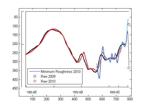
Figure 1 has two contradictory horizontal axes, no vertical axis label, and no indication what is being ploted. There is mention in the post of CET, but CET doesn’t go back to 1000 AD, and doesn’t have 800 observations, even monthly. The black and red lines look like they might be Lamb’s series, but then what is the vertical axis? Is the blue line CET?
Figure 2 looks like it might be based on CET, in which case the end points of the threads would be actual annual CET (since Mannian smoothing endpegs), and perhaps the black line is the latest version? Is this based on annual averages?
Figure 3 might be plotting raw monthly CET by month, since as Chopbox observed the horizontal axis looks like months. Indeed the colored dots correspond to x = 1…12, but then what is plotted at x = 0, 13 and 14?
Well, For Fig 3, the x-axis is mod 12, so f(0)=f(12), f(1)=f(13), etc.
I’m in agreement with Hu here. I see so many graphs all over the place with no axis labels, or confusing axis labels. I’m guessing the idea isn’t to obfuscate, but a bit more Usability in presentation would be nice. It may be obvious to the experts of course…
Hu,
the first is update to Jones09 “High-resolution palaeoclimatology of the
last millennium: a review of current
status and future prospects” Figure 7, as discussed in here https://climateaudit.org/2008/05/09/where-did-ipcc-1990-figure-7c-come-from-httpwwwclimateauditorgp3072previewtrue/
Not sure if it is really minimum roughness, Jones’ email doesn’t reveal everything, and I think it is not 50-year Gaussian as the caption of Jones90 says.
Fig 2, yes, and the code is now here http://www.climateaudit.info/data/uc/mr_cet.txt
Fig 3, just repeated the months, makes it IMO a bit easier to see how variability changes in different months
Thanks, UC — this post appears to be a continuation of the discussion on the thread you mention, https://climateaudit.org/2008/05/09/where-did-ipcc-1990-figure-7c-come-from-httpwwwclimateauditorgp3072previewtrue/ , which provides context for the diagrams.
I think the black line in Fig. 2 would be more effective if it were in the same color scheme as the other threads, perhaps with a symbol at the end to represent 2010.
Also, since you only show the Mannian smoother after 100 years of data have accumulated, the raw data for the first 100 years is not represented, so we don’t see the actual noise back there. Perhaps these years could be plotted with free symbols (little circles, perhaps). Continuing the little circles on the threads would then reinforce the fact that Mann’s method endpegs.
An interesting point in Fig 3 is that while it has happened a few times that both January and February have been exceptionally cold, it has never, ever happened in the CET that both December and January have been very cold the same winter.
Perhaps some comfort to our english commenters here.
While I tend to agree with Craig above, there could be a case for continuing a centered filter to the end of the series to provide a minimum (or at least smallish) variance forecast of the ultimate value of the centered filter. However, UC’s Figure 2 shows that Mann’s double flip endpoint pegging does a terrible job of even this!
The optimal forecast would depend on the precise properties of the series in question, but Mann is implicitly assuming properties very unlike typical climatic series.
In any event, any change in the formula (eg from centered filter to truncated asymmetrical filter) should be accompanied by a change in the form of the line — eg a dotted line in place of a solid line.
CET months months collected pre 1752 and after are not comparable, unless you know for a fact the data in the Julian months have been translated to Gregorian. Plus the CET data is very weak at the start. From memory some the early external temps were estimated from temps inside the observers house!
I would be very surprised if the CET was not adjusted for the Julian/Gregorian calendar. Gordon Manley who compiled it was a meticulous researcher very different from the current generation of climate scientists.
It is true that some early records are from “indoors”. In the 17th and early 18th century it was common to place the thermometer in an unheated room with northern exposure, which would of course cause a warm bias, though considering the nature of 17th century houses, perhaps not a very large one!
He did correct for it, and what’s more he documented it (and a lot more):
Click to access qj53manley.pdf
Click to access qj74manley.pdf
“But to attempt to assess that future calls for extrapolation, which, as the designer of the De Havilland Comet said after he found out why Comets were coming apart in the air, is the fertile mother of error”
Herschel Smith (1986). “A History of Aircraft Piston Engines” Sunflower Universiry Press page 207.
Manley work is absolutely the best given the resources and the technolgy at the time. Ignoring a little spin by a man rightly proud of his work; my reading of “The mean temperature of central England” is that Manleys says he can not satisfactorly adjust as most of the records he had were already in months. Plus the gaps and other problems at this time make the record all but useless. This is not to say you could not go back to the observers recording and find the dailies. You would need a student or two to do a bit of digging. I am just not aware of any papers saying time had been spend doing this. Hence any kind of arguement about smoothing in the very early period is missing the point.
‘Tis true that the winter of 1739-1740 was shockingly cold in the context of the CET. The winter snow lasted well into April and people starved or froze to death in huge numbers both in Europe and the American colonies.
I remember it was suggested that that particular winter was caused by volcanic cooling, but I cannot recall which volcano was named as the source.
Mount Turamae in Hokkaidō underwent a Plinian Eruption, VEI 5 in 1739.
Mount Asahi, also in Hokkaidō, also errupted in 1739.
“This is the preferable constraint for non-stationary mean processes…”
Huh?? I missed this. Is Mann saying the he believes surface temperature is a non-stationary process? If he believes this, then he knows (I assume) that much of his OLS regression methods would be mis-specified and therefore unreliable.
You’d think so, wouldn’t you? It is amazing they openly state this then do it anyway, but, I think these guys also realize the average reader does not understand what a lack of stationarity implies.
Mark
Here’s similar smooth, HadCRUT3 (NH+SH)/2, along with reported 95% uncertainty ranges from the combined effects of all the uncertainties. Uncertainty should expand near the end points, but it doesn’t.
On the other hand, IPCC AR4 Fig. 6.10.b smooths (padded with 13 year adjacent mean, I guess) do not have as large effect. ( BTW, http://www.cru.uea.ac.uk/~timo/datapages/ipccar4.htm shows no unsmoothed data for 6.10.c, where can I find the published multi-decadal time scale uncertainty ranges? )
I’m of the opinion that using any technique which changes previously charted values when new data is added. This is a practical consideration – suppose we make a decision today based on what the chart shows us as historical performance. The same time frame charted later with added data could lead us to make a different decision even if we limited our consideration to the exact same time frame. In this sense, the technique may be interesting, but it doesn’t provide answers.
UC: Your “silkworm” plots show how misleading smoothed plots can be when various techniques for “padding the end” of a dataset before smoothing are applied to the middle of the dataset. Intuitively, it seems that this type of analysis could be applied to the complete dataset with the goal of extracting a measure of the uncertainty introduced by end padding and smoothing. Then one could plot the smoothed curve as a line with shaded or open “wedges” on the ends of the line to describe the uncertainty introduced by padding and smoothing. This would allow one to show a smoothed curve incorporating all of the data without grossly misleading the reader. If an “uncertainty wedge” turns out to be so big that the curve is essentially meaningless near the end, the author would probably prefer to truncate some (or all) of the wedge region rather than include a meaningless blob on the end of a smoothed curve. For example, authors using 21-year smoothing might want to show the smoothed curve to roughly five years before the last time point instead the current extremes of ten years (overly conservative, ignores most recent data) or zero years (misleading and arbitrary).
If different techniques for end padding gave “uncertainty wedges” that were smaller than other techniques and if such wedges became a standard feature of smoothing, authors would prefer to show the smallest wedges, rather than selecting the method that produced a smoothed curve reflecting the author’s prejudices.
Everybody in climate science deals with time series, yet virtually nobody does serious time-series analysis. They seem to prefer home-brewed, ad hoc methods that ignore the largely unknown structure of the underlying signal and the constraints upon the information available at any point in time.
Mark T is entirely correct in pointing out that “FFT filtering” presupposes that the data is strictly periodic. Furthermore, the available record must be an integral multiple of that natural period for the filtering to work exactly as expected. Neither condition is satisfied by station records, whose spectra are wide-band continuums rather than discrete lines. The pitfalls of “FFT Filering” in such cases is readily demonstrated by taking a 512-point temperature record, splitting it into two 256-pt subrecords and forming an overlapping 256-pt subrecord with 128 points from each segment. Whatever “filtering” is done by zeroing out DFT coefficients at certain frequencies, upon reconstruction via the IDFT the three subrecords will differ materially from one another.
Despite various attempts at feasting on such, there is no free lunch in digital signal processing that allows zero-phase filtering over more than a certain interior portion the available record.
Interestingly, sky, Tamino is apparently employed as a “time-series analyst” of some sort and he regularly fails to recognize such concepts.
Mark
I visited Tamino’s site once, discovered he thinks the raw periodogram (with its measly 2dof) is the definitive power spectrum–and never came back. If he’s a paid “time-series analyst,” then maybe I should seek employment as a neurosurgeon. The salary would certainly increase.
Yeah, engineers don’t get paid enough, IMO.
Mark
As a consulting scientist I’m paid considerably more than an engineer, but of course nowhere near what a neurosurgeon makes nowadays. Tamino-like ersatz “analyses” deserve no pay whatsoever.
sky says
“Despite various attempts at feasting on such, there is no free lunch in digital signal processing that allows zero-phase filtering over more than a certain interior portion the available record.”.
Which is why one uses a variety of “tools”, necessary to get the job done, and done right the 1st time.
The only way to ensure that zero-phase filtering is performed EXACTLY with a KNOWN amplitude response–irrespective of the structure of the signal–is to use symmetric filters and accept the end-losses. Everything else is hunting for faeries.
Did anyone notice that we have a record La Nina since the late 1950’s.
Here’s similar plot for TAR 2.21 instrumental, assuming it is minimum roughness smoothed. The caption says “All series were smoothed with a 40-year Hamming-weights lowpass filter, with boundary constraints imposed by padding the series with its mean values during the first and last 25 years.” but I don’t believe it.
Multimedia Testing
http://v7.tinypic.com/player.swf?file=opw75u&s=7
Tube version, minimum roughness and MBH99:
Minimum Roughness seems to be excellent tool for making the ‘present’ year a record in a given sequence. Running white noise through MR,
I get some 200 records (maxima) with series of length N=981! This is quite different from what you get from white noise directly, u(N) apprx ln(N), about 7 records.
u(N)= number of records in (1…N)
To bring my monologue to an end,
In Global surface temperatures over the past two millennia by Mann & Jones, Fig 2. description “the constraint employed by the filter preserves the late 20th century trend” indicates minimum roughness smoothing. In the text it is said “This warmth is, however, dwarfed by late 20th century warmth which is observed to be unprecedented at least as far back as AD 200”. For such conclusion the minimum roughness is clearly a wrong smoothing method, as one can see from the videos above.
—
A bit OT, but if you take u(N), = number of records in iid series (1…N), and multiply it by prime-counting function pi(N), number of prime numbers less than or equal to N, the result is (approximately) N :
Natural logarithms disappear, math is interesting 🙂
Very interesting, as usual, UC! Unfortunately, the figures in RomanM’s comment on the background 9/2/08 thread must have gotten lost in the post-Climategate transition to the new WordPress system. However, I’m not able to edit into the comments to see if I can recover the link unless I’m the post author.
Hu, it seems that links to the figures are gone. Luckily the code is archived, not difficult to update.
1066166844:
This can be seen from the videos clearly. But, Butterworth is IIR, what if one uses FIR? Mark T / some other filtering expert, can you explain to layman what Mann talks about here?
Where is this taken from? Also, is he speaking of a time-domain process? If so, he doesn’t know what he is talking about.
“Spectral leakage” is a frequency domain issue and it has nothing to do with filtering. It is merely what happens when a signal is not bin centered in an FFT, i.e., when a signal does not have an integer number of cycles and you perform an FFT. There’s even a Wikipedia article on it.
If he’s using an IIR, then yes, that is why the response is longer than the “filter width.” In fact, it is infinite, hence the use of the word in the phrase infinite impulse response. An FIR would not do this because it has a finite impulse response. You are absolutely correct, UC. Mann doesn’t know what he’s talking about.
Mark
Mark,
it is from this mail, http://www.eastangliaemails.com/emails.php?eid=373&filename=1066166844.txt
So, “smooth is effected beyond a single filter width because I chose to use IIR filter” would be more accurate and compact description.
Yes. That he attributes this to “spectral leakage” is bothersome. Why are people that don’t understand certain methods implementing them anyway? If he does not understand this simple concept, what other holes exist in his knowledge?
Mark
Thanks UC, this is a brilliant post. Loved the Tube.
But in their series, isn’t the terminal (c 1998?) unsmoothed annual value higher than all the previous unsmoothed annual point estimates, so that their statement is true in that sense (aside from the issue of confidence intervals)?
Is the problem you are addressing that they try to make the final value appear much more unprecedented than it really is, by comparing its unsmoothed value (or equivalently, Mannian endpegged value) to the previous smoothed values, while presenting both as “smoothed”? (A comparison of apples to orchards, so to speak!)
Yes, new level of unprecedentedness can be obtained with MR:
See also the TAR figure above, https://climateaudit.org/2011/01/07/uc-on-mannian-smoothing/#comment-252233
It is quite a trick to use MR and not to mention it in the caption.
Compare and contrast with how Marcott et al. (2013) create their multi-millennial “smooth” graph to end in a sudden “unprecedented” uptick.
Their methods smoothed away all the high frequency data until one sudden last uptick… Comparing apples to orchards, indeed.
New op Ed by distinguished biologist E.O. Wilson points (unwittingly) to how large are the problems between many practicing scientists and uses of statistics and mathematics. Wilson asserts almost boastingly how onfident he is that one can do top scientific work in nearly all areas of silence while “semi literate” in mathematics. That may be true in many aspects of conceptual innovation, but may also point to why so many in climate science might be over confident in their abilities to just wing it on hunches and intuition.
http://online.wsj.com/article/SB10001424127887323611604578398943650327184.html?mod=WSJ_LifeStyle_Lifestyle_5
One Trackback
[…] Source: https://climateaudit.org/2011/01/07/uc-on-mannian-smoothing/ […]