In the last couple of days, there has been much to-do in glacier world about an error in the Times Atlas on Greenland glaciers. See for example here here here.
Unlike the authors of 1000-year temperature reconstructions, glaciologists seem to be concerned about things like using data upside down. As of today, the Times Atlas has issued a somewhat contradictory press release, resiling from its press release, but standing by the atlas:
we issued a press release which unfortunately has been misleading with regard to the Greenland statistics. We came to these statistics by comparing the extent of the ice cap between the 10th and 13th editions (1999 vs 2011) of the atlas. The conclusion that was drawn from this, that 15% of Greenland’s once permanent ice cover has had to be erased, was highlighted in the press release not in the Atlas itself. This was done without consulting the scientific community and was incorrect. We apologize for this and will seek the advice of scientists on any future public statements. We stand by the accuracy of the maps in this and all other editions of The Times Atlas.
The error has occasioned considerable speculation as to the provenance of the error, which, like Hansen’s Y2K error, looks like it originated in a change of datasets between the 1999 edition and the 2011 edition.
This is evident from comments at Cryolist by Martin O’Leary, a graduate student at Cambridge, as follows:
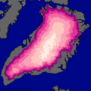
As fun as it is to bash The Times, the images I’ve seen of the erroneous map do bear a striking resemblance to the following map which I was able to pull up on the NSIDC website by poking about looking for ice thickness information: http://bit.ly/o3iV6i
Anyone from NSIDC care to comment on what the data source being used here is? I’m sure it’s just an issue of definitions over what’s an “ice sheet” and what’s an “outlet glacier”, but it’s pretty easy to see how an atlas-maker could use that as an authoritative source on what’s going on in Greenland.
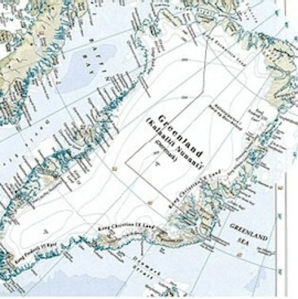
The NSIDC Atlas of the Cryosphere is here. If you zoom into Greenland a few times and, for the Java button “Glacier Basemaps”, select “none”; for the Java button “Greenland Basemaps” select “ice sheet thickness”; and for the snow extent button and sea ice extent buttons, select none, you’ll get the map shown by O’Leary, which matches the Times Atlas version sufficiently closely that one can say with considerable confidence that this is the provenance. I’ve shown the NSIDC map and the Times 2011 map below (the latter rotated to match NSIDC):
 |
 |
Figure 1. Left – NSIDC with Glacier button set at “none”; right – Times 2011.
A later commenter, responding to O’Leary, observed:
Your map of ice thickness plots the thickness of the “Greenland ice sheet”. If you choose a map showing “glaciers”, you can cover most of East Greenland. The Times Atlas should have shown the area of glaciers. The precise distinction between Greenland ice sheet (Indlandsisen?) and (local) glaciers is a useful one for professional glaciologists but not something that the Times Atlas should bother itself with.
The thickness map suggests zero thickness in the coastal regions while the surface elevation map suggests there is ice in the coastal regions. My guess is that the thickness map refers to the main ice sheet only whereas the elevation map includes all peripheral ice caps and glaciers as well.
Nevertheless, I have to agree with Martin that this is confusing and begs misinterpretation by journalists and other non-experts.
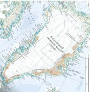
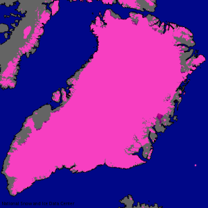
If one returns to the NSIDC Atlas of the Cryosphere and changes the java button “Glacier Basemaps” from none to glaciers – a setting that seems more plausible to me if one is making a cryosphere map – then one gets a far more “realistic” map. If one compares this to the 1999 version of the Times Atlas – which was used as a starting point in the comparison, you can readily see that the 1999 version almost certainly showed glaciers as well as the icesheet simpliciter.
 |
 |
Figure 2. Left – NSIDC with Glacier button set at “glacier”; right – Times 1999.
Glaciologists have sent a critical letter to the Times Atlas for the error, but their letter did not precisely diagnose its provenance. It appears almost certain that the “15% decrease” is an artifact of comparing area of ice sheet plus glaciers (1999) to ice sheet without glaciers (2011).
Maybe the glaciologists will take a look at bristlecones, Yamal and Upside Down Mann.


52 Comments
Good catch by O’Leary! It looks like the ice has receded a little in some places, and advanced a little in others.
So what’s the difference between an ice sheet and a really big glacier? Even ice sheets flow (I think).
I think you mean 1999 on the right.
Steve – fixed.
There is no clear-cut difference between a “glacier” and an “ice-sheet” except size. Both flow. A mass of ice that has stopped flowing is no longer a glacier – in swedish it is called “dödis” (dead ice), and it will just stay in place and melt.
As for the ice having grown or receded since 1999, I would say that it has probably very largely receded, but the change is far to small to even be visible in such a small-scale map. Under extreme conditions, such as occurred during the Early Holocene when temperatures were warmer than att present while there were still large residual ice-caps the ice-front can recede as much as several hundred meters per year. Even this would be invisible in the Times map, and the current recession is much slower than that.
The Dictionary of Geological Terms (1976) and The Facts On File Dictionary of Geology and Geophysics (1987) differentiate between glaciers and ice sheets based upon directional versus radial ice movement. In effect, an ice sheet is a coalescent structure that forms as ice accumulates faster than the topography can shed it through glacial flows. Being larger scale than the topography of the land form they occupy, ice flow in an ice sheet is primarily defined by the structure of the sheet itself. It will follow the mean gradient of the underlying topography rather than the detail.
Too thick to understand “thickness”…and until they come out clean I’ll stick to my Wikipedia explanation 🙂 (see WUWT)
Might possibly be that Wikipedia got their data from NSIDC and made the same mistake as the Atlas authors.
Never subscribe to malice …
Indlandsisen = Ice cap (Danish)
It shows that the authors and editors expected to find a large decrease in ice coverage, just as Hansen expected to see a temperature increase.
The mistake is only made one way, in favour of AGW, and is not recognised so many times.
Yup. An error going the other way would have been spotted instantly.
Climate Science finds the trends it wants to find.
The following UK Met office study “a spatial analysis of trends in the UK climate since 1914 using gridded data sets” contains the following statement in the conclusions. “However there was vitually no trend in mean temperature between 1914 and 1987, and it is only since 1987 that the temperature has notably started to increase.”
Click to access UK_climate_trends.pdf
I would be suspicious that the analysis of data only found an increasing trend when it became scientific consensus. Perhaps the data since 1987 contains confirmation bias similar to this thread.
confirmation bias. again.
Steve:
As usual, good detective work!
Times Atlas MUST have used experts. A 20-year old clerk drawing the maps had to take orders from somebody or something. Who was it? Who were the experts consulted for this artists’ rendering? May I suggest a few names?
Gore
Romm
Trenberth
Mann
Hansen
Editors of Science, Nature, Sci Am, NY Times
Chu
Pachauri
Lord xxxx
Prince yyyy
Who is on the payroll as a consultant?
What did Romm know and when did he know it?
As a matter of fact much of the missing ice is indeed connected to the main ice-sheet. The reason it is not in the NSIDC ice-thickness map is simple: the area around Scoresby sound was not covered by the flights that measured the ice thickness (see figure 2 in this paper: http://nsidc.org/data/docs/daac/nsidc0092_greenland_ice_thickness/parca_paper1.pdf).
The reason for this in turn is almost certainly that this area is the highest and most mountainous in Greenland. I’ve overflown the area a couple of times, it is a heavily dissected high plateau that reaches to about 11,000 feet. The area is very strongly glacierized and there are several fairly large icecaps (the Renland cap for example), but mostly it is a complex network of huge valley glaciers. Measuring the thickness of the ice in this area from an aircraft would be next to impossible, so it is understandable that NSIDC skipped it.
Ironically this is almost certainly the part of Greenland that has been ice-covered for the longest time, and which would not become ice-free even during extreme global warming. It is known that tidewater glaciers has existed in East Greenland for >30 million years and the enormous glacier-carved fiords in this area must have taken a very long time to form. Scoresby Sound, the biggest fiord of all, actually has Pliocene deposits right inside the fiord, proving that it already existed in essentially its’ current form even before the Quaternary glacial period begun.
Just as a curiosity the Old Norse knew of Scoresby Sound and called it “Öllumlaengri”, ‘the longest one of all’.
At a book discussion once I spoke to a CRESIS engineer and mentioned that Greenland was bowl shaped. He responded that it was higher in the middle, and had a divide. I subsided, until I realized he was talking about the ice mass, too. When I tasked him again with the generally bowl shaped island, he said that the shape of the land couldn’t be told well through the ice.
The meme that the whole mass could slip off suddenly is the preferred one.
================
Greenland is indeed largely shaped as a shallow bowl. If the ice was to melt the center would become a large fairly shallow freshwater lake surrounded by lake-dotted lowlands. There would be low hills around most of the periphery, except for the east and south-east where the mountains would rise to 6-10,000 feet.
This would be temporary though. Once the isostasy had adjusted (probably a few hundred thousand years without ice would be required) most of Greenland would be a flat Precambrian plain, much like the Canadian or Fennoscandian shields. The mountains in the east (like the ones in Norway) are a result of the process that Greenland from Scandinavia 60 million years ago.
So the depressed bowl is the shield resiling from the icecap, and the isostatic adjustment in rebound is the shield resiling from the earth?
98 more times and I’ll have it, Teach.
==================
“Öllumlaengri”
nice.
@tty
Thank you for your informative posts – much appreciated
“The conclusion that was drawn from this, that 15% of Greenland’s once permanent ice cover has had to be erased”
That’s cool. They erased the ice and the land mass appeared. It’s like one of those magic colouring books my kids used to get.
Typo: 2nd paragraph “… resiling from its press release, but standing by …”.
I may simply not be aware of Canadian usage, but when I search for definitions of “resiling” in Google, the closest it can come is information on a certain grape varietal used for white wines, which which I’m already familiar. And I rather doubt it grows in Greenland, or will even by 2050.
How was that sentence supposed to read ?
resile: “to jump, to bounce, to spring back. To come back into position after being pressed or stretched.” Websters New World.
resile v.[no obj] abandon a position or a course of action (Oxford Dictionary of English)
Too bad the folks at the Times don’t know how to use Google maps.
“Resiling”? “Simpliciter”? Take it easy on the country folk, Steve. You don’t want to sound like Monkton, do you?
Etymology: 16c: from Latin resilere to recoil or leap back.
….one of the benefits of an Oxford education……..
As someone who frequently compiles a variety of data for others to use, I find it strange that sources evidently were not cited somewhere in the atlas. The publishers certainly didn’t take the measurements themselves so why not give credit (or plausibly share some blame) if the data are erroneous? And does failure to cite sources here border on plagiarism?
There should be citation instructions with the datasets.
I dont have time to check.. so someobdy else go look
Here is NSIDC’s use and copyright statement:
Its a very valid question — why no citation?
Much of the data shown on maps and charts and in alases will have bene derived from the work of innumerable people msot of whom arte long dead. So if, the coast of Vancouver Island was surveyed by Captain Cook in the 18th century, does this mean that his work and that of all earky naviagtors would have to be cited. This seems very impractical to me.
Not necessary to cite essentially public domain information such as the original surveys. But new measurements of ice extent definitely should be cited – to credit those who did the work and to let users of the product (the atlas) judge its credibility or contact the originators.
As far as I can see the data are well described and labelled. However you do have to read and understand the descriptions. Further the division between “icecap” and “glaciers” is rather artificial. In most cases the “glaciers” are contiguous with the icecap, and in the cases where they are outlet glaciers from the icecap they are in my opinion most definitely part of it, whatever NSIDC may say. In other cases they form separate small icecaps that are from a glacier-dynamic viewpoint separate entities, though you can walk from them to the main icecap without ever stepping on rock. Finally there are physically separated glaciers like the Renland icecap and the glaciers in Washington land, north of Scoresby Sound. In my opinion it is only the last are not part of the Greenland Icecap.
This is probably a ‘valued added’ activity, whereby sources and methods can never be revealed.
Ouch! That’s gonna leave a mark. 🙂
Does this mean that the Editor of the Times Atlas will have to resign? (not holding my breath on that one!)
Only if he or she corrects the error! 😉
Are any other data sources referenced anywhere else in the Atlas?
Infowar really, just some activist cell moving the thickness/coverage goalposts to reinforce the North pole melting meme. What’s really interesting, is the science “establishment” pulling up the green propaganda machine for once. Perhaps the shape to things to come?
Pointman
It doesn’t stop at Greenland; according to James Delingpole the atlas is to pull the same trick with some South Pacific islands (by omitting them). In his Teleraph blog, Delingpole writes, “In its upcoming 14th edition, unconfirmed rumours suggest, it will completely omit Tuvalu, the Maldives and major parts of Bangladesh in order to convey the “emotional truth” about “man made climate change.”
Wonderful concept that, “emotional truth”; seemingly well known in literary criticism but it could catch on in science, especially science of the post-normal style.
This morning, at least two Maldivian newspapers reported Delingpole’s sarcastic blog as if it were a news report and a Maldivian opposition MP texted all his followers blaming the imminent erasure of the Maldives on the president.
Acts of commission follow where acts of omission fail to adequately convey the needed ’emotional truth’.
============
“emotional truth”
Vs “Rational Reality”??
Here’s some apparent confirmation that the Times cartographers used NSIDC ice-sheet thickness data rather than elevation data and treated all areas covered by ice less than 500m thick as ice-free land.
The edge of the ice on the Times map more or less matches the 500m ice-thickness contour on the NSIDC map. The elevation contours within the Times’s ice sheet match the other NSIDC ice-thickness contours.
That’s the easy bit. Now for some daftness.
The NSIDC ice-sheet map at the Atlas of the Cryosphere treats the Petermann Glacier as part of the ice sheet. (Its tongue is part of the purple protrusion in the centre of the map on the right.) This means that, perhaps uniquely, that part of the NSIDC ice-sheet map shows floating ice.
The floating ice is less than 500m thick. What happens if you choose not to show ice that’s less than 500m thick and assume that everything beneath that ‘thin’ ice is land? Most of an enormous fjord becomes land.
(The elevation bands for the real land around there look a bit dodgy, too.)
It’s been observed in other commentary that the Times shows glaciers of less than 500 m in other parts of the world. The tropical glaciers are all less than that and sometimes much less than that.
You’ve probably already seen this, but just in case:
http://www.spri.cam.ac.uk/media/pressreleases/timesatlas.html
Tom Gray – your “explanation” doesn’t sound reasonable. Surely it should be easy, a matter of course and mandatory for the Atlas compilers to include citations for the stuff that they’ve changed for the new edition? On what other basis would they change any detail on any map?
Reveling their data source would, no doubt, damage international relations, have an adverse effect on intellectual property rights, and destabilize the orbits of neighboring planets.
The “Clarification”:
Re: “resiling”. Thank you. Learn something new every day at this site. I’ll toast my new knowledge with a glass of chilled Riesling.
Just for curiosity, I downloaded the data from the NSIDC, rasterized the glacier shapefiles and compared it to the Greenland Ice sheet without glaciers.
This was only counting cells in one dataset minus the other, so there are, for sure large errors due to projection, errors in the rasterization, etc.
A graphical result showing surface elevation + glaciers (blue-green-red) + Ice Sheet (greyscale) is here: http://img822.imageshack.us/img822/6374/greenland.jpg
The results are:
Total Glaciers – (Ice Sheet >1m) ~ 11.8 % change
Total Glaciers – (Ice Sheet > 100m) ~ 14.3% change
Total Glaciers – (Ice Sheet > 500m) ~ 20.2% change
So it looks very likely as a possible explanation
Has anyone looked at the report noted at RC by Tedesco et al, 2011, which suggests a near record melt of Greenland ice in 2011. Is this mostly modelling?
Here you have the report:
http://greenland2011.cryocity.org/
I have drilled on the east coast through 300m+ of ice in 2008… I don’t think its all gone, just yet.
One Trackback
[…] Source: https://climateaudit.org/2011/09/20/the-times-atlas-and-y2k/ […]