Richard Muller sent me the BEST list of “very rural” sites – see http://www.climateaudit.info/data/station/berkeley.
I took a quick look at the “very rural” stations in two tropical countries – Peru and Thailand – in order to groundtruth their classification methodology. These two examples were chosen because several years ago, I looked at Hansen’s “rural” Peru stations, most of which were actually urban; and because one of my sons is in Thailand.
Berkeley classified only two stations in Peru as “very rural” – Huanuco and Quince Mil. However, the population of Huanuco, according to GeoNames, is 147959; it was classified by Hansen as urban. Why the Berkeley algorithm classed it as “very rural” is unclear. Quince Mil is a small town recently featured in Time magazine here. The Berkeley record only has a few sporadic values after the mid-1980s. The BEST urban-rural comparison in Peru looks to me like it has no meaning.
The Berkeley classification in Thailand also looks very suspect. As in Peru, many of the “very rural” sites are small cities. Some locations look suspicious. “Bangkok Pilot” is shown as “very rural”, but when googled is associated with Suvarnabhumi, the name of the very urban Bangkok airport (data is sparse, so it may be something else, but anything associated in any way with Bangkok can hardly be “very rural”)
There are five “very rural” Thailand sites with a minimum of 120 values: PHETCHABURI (population 46,501), KO LANTA (population 20,000), TAKUA PA (population 35,337), KO SAMUI (population 50,000) and MAE HONG SON, a relatively long record in the northwest hill country near the Myanmar border. (We visited Pai which is near there a couple of years ago.) A picture Mae Hong Son airport is shown below:

The Bangkok metropolis data set is the longest series in the area. For reasons that remain obscure, the Berkeley version for Bangkok runs hotter than the CRU version:

The CRU stations in the CRU gridcell are all highly urban: BANGKOK METROPOLIS (!), ARANYAPRATHET (population 73813), CHANTHABURI (population 488397), SIEMREAP (population 85,000), KAMPOT (poluation 39186), PHNOM-PENH (!). Although we keep hearing of the unimportance of UHI, Bangkok has increased 0.24 deg C/decade relative to Mae Hong Son.


263 Comments
This is really important stuff. I would like to do some ground truthing for Australian rural sites; many are very isolated and show almost no temperature trend trend. e.g. http://www.bom.gov.au/jsp/ncc/cdio/weatherData/av?p_display_type=dataGraph&p_stn_num=80015&p_nccObsCode=36&p_month=13
I dont see 80015 in the list. Is there a different numbering system or is this just not ‘very rural’?
Have a look at carbon-sense.com/wp-content/uploads/2009/08/mcclintock-country.pdf for more detail on how the data has been manipulated to switch a negative trend to a positive trend. Note also that the ‘Climate’ department within BOM have dumped pre 1950 data … to help the Cause?
>Note also that the ‘Climate’ department within BOM have dumped pre 1950 data … to help the Cause?<
Well, at any rate, the 1940's "blip" cannot be graphed off this
so “very Rural’ not the “best” description of these sites!
If there was a prize for the most photogenic Climate Audit post would this be in the top five? Beautiful and evocative.
I wonder where the weather station for Mae Hong Son is?
Any bets on it being at the airport?
Ko Samui is an island with lots of tourist accomodation and an airport where the station would now be located. It has a mild climate with plenty of rain.
see here http://en.wikipedia.org/wiki/Samui
Koh Samui and Ko Lanta are both major tourist resorts. They are very rural in about the same way that Palm Beach or Key West are very rural.
Koh Samui has a fairly large airport which is probably where the weather station is situated.
I was there in 1987 and it did not have an airport then So the weather station might not be at the airport.
Come on, get real : there are no 25 story buildings on Samui or Lanta. Population density is nothing compared with that of those US places. Just like the main Bangkok airport is actually situated in the middle of a huge swamp. This is not Manhattan.
Its not rural.
we first have the Bangkok temperature measurements, and then, from those measurements we get the BEST and CRU “Bangkok temperature time series” …
their difference being non-zero just confirms to me the little importance I want to give to a “calculated world temperature” … because it is a calculation, with lots of inaccuracies and suppositions, and not a measurement …
sure the world has been warming a bit during the measurement age, but the simple truth is that we really have just a few decades of worthy world temperature measurements, i.e. the satelites …
I spent many hours classifying sites in Australia, starting with pristine, from a BEST list of 650 sites. Do you have a list of Australian sites, perchance, named “very rural” for comparison? I’m happy to share classifications.
If you seek ethereal beauty, there is a weather station not far from here at Nhulunbuy, Northern Territory, about 12 deg S, 136 deg E. Image –

I’ll bite, what is that? Tailings pond?
Major bauxite open cut mine.
Geoff, look at climateaudit.info/data/station/berkeley for their list.
Thanks Steve. Just to confirm same base lists. Have a beaut Christmas Geoff.
As an admirer of abtract expressionism, I’m impressed by what mining looks like from the air.
In haste – I’ll get back with more after the Christmas break.
IMHO the station classification method is useless. It is described in Wickham et al 2011 http://berkeleyearth.org/pdf/berkeley-earth-uhi.pdf
Of the 1313 Australian stations in Berkeley’s site_detail.txt, 878 are (as per the file posted on CA) “very rural” and the other 435 are “other”.
The 878 “very rural” stations include 100+ airports and 111 post offices. I suspect that heaps of the stations are in minor or moderate conurbations which are just as susceptible to UHE as major towns and cities. As Anthony has pointed out, growth and change matter more than size.
Happy Christmas all.
Except all the science that actually measures this says that size matters.
“growth”
lets see. Suppose u grow from 1 mm of pavement to 10 mm of pavement
Suppose u grow from 1 sq km of pavement to 5 sq km of pavement.
The growth in the first is twice the growth in the second. Which will impact temperature more?
of all the proxies we looked at “growth” was the least informative.
Now, when I started I listed to a lot of people who said “growth” growth..
So I looked. the answer was not as clear as their rhetoric.
Mosh, while I see your point, perhaps you missed something – trends. It’s the *trend* at the station that matters, right? So *size* of UHI doesn’t matter to the trend if it’s static, because with no change, it won’t affect the trend – growth in UHI *will* affect the trend. So, can you see a difference in the trend of temp by growth of UHI – dunno, and don’t have the data, tools, time or skills to check..
Oh, and don’t forget to use a log scale…
Hey. THIS is only a tiny sample, people. But let’s just say it isn’t a promising start to a substantial audit.
I know Huanuco (Peru) and its station near the city airport. Not a very rural location indeed. Quince Mil is a small town at the eastern slope of the Andes near the start of the Amazonian jungle, but I don’t know the exact location of the station. However, the main road running through the town has heavy truck traffic and there is also a small airport (the station might be there). One may concoct a definition by which the Quince Mil station is somewhat “Rural”, but definitely not “Very rural”.
Both towns are in specific microclimates inside narrow Andean valleys, and both on the lower and more tropical microclimates at the Eastern side of the Andes range. Neither is quite typical. Huanuco is not typical for the Peruvian Highlands region as a whole, where most of the area is inter-Andean valleys at higher altitudes and also extensive High Plateaux at about 4000 masl; and Quince Mil is at a relatively high elevation to be representative of the eastern (Amazonian) Jungle region. Neither is remotely representative either of the Coastal, Highlands or Jungle regions of Peru (though Huanuco is technically in the Highlands and Quince Mil might be seen as a “jungle” town due to its borderline location between Highlands and Jungle).
In the rugged orography of Peru, conditions at one such station (especially in the Highlands) cannot be extrapolated over the surrounding moors and valleys, probably at different altitudes, separated by high mountains and possibly having a quite different microlimate (altitude in that country is far more important than latitude and longitude). Amazing that only those two very peculiar stations are included for such a complex and diverse country with such a varied geography.
Hector M.: I enjoyed reading your contribution–thorough and detailed, and fascinating. Thanks!
Seconded. Had me heading to Google Earth.
Cute to find one very rural station in a microclimate UHI boiler, amazing to find two, and in the same country. Stout Balboa couldn’t have been more astonished. A vast panorama of negative UHI unfolds.
=================
Hector:
The key to UHI is the rate of growth. Do you have a sense of how fast the towns are growing population wise? Have there been any significant changes in local industries?
GISS has Mae Hong Son (228483000000) located at 19.30N 97.83E (per this), which is far from the airport (19.301111,97.974722). Right at the Myanmar border, in fact. If BEST used the listed lat/long, it isn’t surprising that they classified it as very rural. [Naturally I have no idea where the station really is.]
Suvarnabhumi airport is only about 5 years old. It took over international flights from the old Don Muang (still in operation for domestic flights). Suvarnabhumi would be a very poor choice of location for longer time series.
The Samui airport is surrounded by increasingly urban development. I visited the place in 2002 when it was a charming collection of bamboo huts. Last year I was there again, and you could not recognise any buildings, it had all changed.
Don memory Muang
For circumnavigation.
Say sawadi khap.
========
For those looking for UHI on their own, take a look at Tmin if you can rather than just Tmax or mean. CG e-mail 4938, Rob Wilby to Phil Jones, September 2008:
“Taking a quick glance through, probably the TWO most important differences
between your analysis and mine is that I refer mainly to the nocturnal (Tmin) UHI which is much more pronounced than daytime (Tmax) – see Tables 1 and 2 in the attached PDF of the 2003 Weather paper. Second, I use Wisley as the rural reference station.
Looking at changing differences in *mean* daily temperatures between these urban-rural sites will tend to weaken the UHI – especially when you see that Tmax trends are roughly the same at both sites (Table 2). So my results are not inconsistent with yours – we’re just looking at different things!”
Does he mean RHS Wisley? That extremely ‘rural’ site blighted by the M25 and I forget which dual carriageway off the M25? That beautiful garden no longer peaceful because of the motorway traffic noise and squillions of visitors arriving by car and coach? It may have been rural once, but no longer.
The A3 Ripley bypass.
Search Wisley, Surrey in Google maps, then find the RHS garden. From there, find the swirly garden feature (it’s pretty obvious). The weather station is about 100m SE of there.
Some polytunnels, flowerbeds, and an orchard are the surroundings. Probable irrigation of the flowerbeds, hot air coming out of the polytunnels in warm weather.
Not exactly pristine (I would pick a clearing in a wood – not even a clearing, if you want to know what the thermometer would have measured in primeval Britain.
Weather station are found at airports becasue its important for air movements to know the current and predict future conditions , AT THE AIRPORT
There not designed to be used for anything else but because this data is available its used to provided information for a wider area , the trouble is by their nature airports can be very unlike the rest of the area , especially in remote locations were they may be the only built up zone for miles around so in fact very poorly represent the area . In the past that was not a problem as they were designed to know the current and predict future conditions , AT THE AIRPORT, now however when great claims are being made on their back it really is a problem . Its a bit like claiming the temperature of a cooker in house tells you the temperature of the whole house.
Lumping the bad data in with the good data in the hope that all the data will be transformed into good data is just poor thinking.
BEST should just start with the known and properly defined best data available and then proceed from there. There will come a point in this process where it will recognised that you can only go so far with the data at hand to have full confidence in the results.
For what its worth I ran the Best stations through my classifier and
about 3000 of their very rural sites failed my test.
meh.
Now we see why their end analysis was so bad. At least in part.
Is it ok to say I am thoroughly disappointed in BEST?
well you would be wrong there
at AGU they presented new results. Those results indicate a UHI bias of .02C per decade
in the 1950-2010 period.
1. That comports with what many others have found (jones, various papers on china and japan)
2. it is consistent with what zeke nick menne and I found
3. it goes a ways toward explaining some of the difference between satillites and ground records
Here is the problem
BECAUSE the difference between rural and urban is small ( on the order of .01C-.1C decade)
any classification errors your make ( moving urban into rural or rural into urban) will
make the detection of the signal more difficult. So, for example, in BEST they classify 344 sites as rural that are actually at airports. What we found ( zeke,nick, menne) was that removing
these “suspect” rural stations, moved the bias found up.. from .02C to more like .04C
per decade ( 1979-2010) remember this is for the land record only.
The bottom line is this. If you look at the land record since 1979 you will see trends
from all methods and from various data sources that runs about.. .27C per decade.
If you look at satellite estimates over land for the same period, you’ll find .2C per decade
That leaves you about .07C per decade that Might be attributed to biases ( all biases combined) in the land record.
UHI does not make global warming disappear. it is real. we can estimate the bias using many methods. every approach to estimating the effect on GLOBAL trends suggests figures in the
.01C(jones) to .1C (McKitrick) Range. Regional studies studies in areas that have seen
huge increases in urbanization ( china ) indicate values in the .05C range and japan in the
.1C range. Personally, I’m happy with our estimate of .04C/decade, however with the addition
of more data from china and india and South america I could see that increasing slightly.
Finally, a good homogenizer makes most of this vanish.
I think that you’re understating the discrepancy a little here – the satellite trends are less than you stated here.
Also it seems to me that Menne homogenized data runs hotter than averaging. I am far from convinced that Menne homogenization has been demonstrated as an unbiased method in the presence of trends + bias.
I see UAH at .18, RSS at .2 and I think Star will come in at .22.
However, we can just call the Land .28, call the satellites .18 and that wouldn’t change
the story appreciably. The story is that there is effectively a “budget” for all biases
in the Land product and that budget is < .1C decade.
WRT Menne homogenization its the new approach that Im talking about, zeke discussed it
at Lucias.
Didn’t Christy just say it UAH was .14 here: http://wattsupwiththat.com/2011/12/21/ben-santers-damage-control-on-uah-global-temperature-data/
Over land versus full globe
@2x(Steve M) I made a similar comment nearby but wanted to expand. Don’t let the readers forget that the differences in satellite vs. surface data are not just due to possible biases in surface data.
Obvious sources of difference:
1) Possible biases in surface data (notably UHI warm bias)
2) Possible biases in satellite data (no current strong indications of this)
3) Elevation of measurement and tropospheric amplification, or lack thereof, or the inverse, see GCMs, etc.
4) Areal coverage (land vs. global) which obviously can be broken out – and not sure if when you guys are quoting these ranges are you using the “land only” satellite record?
I know you guys know this but not ALL readers do. Though a reminder would be good. Thanks for letting me pontificate.
Mosher – I think all the above contribute to more uncertainty on your “bounds” than you are giving away in your statements. Could go either way.
Mosher – I see your “land only” above, sorry bout that one. Maybe this answers Richard Patton’s question.
“Land only” satellite record. There’s a loose end here as there is a divergence between land-only and ocean-only. If you downscale from ocean-only satellite to land-only surface using ratios from the models, the divergence is rather large. Doesnt show where “the” problem is, only that there are other discrepancies.
An interesting potential bias along these lines that I noticed in a technical blog but didn’t post on is the increased continentality of the present inventory of stations. The observed that inland warming in the post-1979 period is more than coastal warming and suggested that inland station representation in the 1930s was less than at present. I don’t know whether this is true, but it was an interesting potential bias that’s worth deconstructing.
BillC
WRT amplification Gavin was down for .95 +-, and 1.1 was floating
about. so, I’ll use 1, until a better argument comes along
“Those results indicate a UHI bias of .02C per decade in the 1950-2010 period.”
Do they show .24C per decade for Bangkok?
Looking at the Bangkok trace, i would imagine that the scalpel may cut it in a few places. That in practical terms is a form of homogenization.
Simply, what you might expect to see pre homogenization is probably double
what you see post homogenization. That’s about what Ive seen in other
cases.
The point is the average station in the database is not in a place like bangkok.
30=40% of the stations are inplaces that are low population and unbuilt.
Until they can prove that they get some of the stations right (say the top 250 with UHI), there is zero reason to believe they have any of them right.
Steve and Steve, it might be below thread, but it would be good to remind the readers here that the discrepancies b/w satellie and land records are not due only to biases, also due to areal coverage and measurement altitude.
Is it not the current thinking that absolute UHI contribution is proportional to the log of the population density? If so, then the UHI contribution to measured warming rate in units of deg C UHI/decade would be proportional to the population density growth rate? A 50% population increase in a hamlet with a GISS thermometer can show just as high a UHI warming contribution as a 50% population increase in Bangkot.
It is fine to show temperature records compared to the population today (urban, rural, very-rural). But until you show the temperature records to the population GROWTH RATE, you are missing more than half the story.
Finally, don’t look at just population. Total Gross Income Density might be a more theoretically justifiable measure of UHI effect. Total Gross Income Density can increase from an increase in population and an increase in standard of living (higher energy use?).
Is it not the current thinking that absolute UHI contribution is proportional to the log of the population density?
#########
no that is not the current thinking. That is based on a very limited study done by Oke. More recently, Imhoff and others, have been able to relate UHI to the urban area. basically, you get UHI from changing the material properties of the surface, heat capacity and albedo and surface roughness. Population is a proxy for THAT
To test this of course we looked at around 3000 stations that had 30 years of data. If you try to explain the
trend as a function of population or log of population, or density or change in density, well you dont have much
success. On the other hand if you look at factors such as Distance from coast, latitude, and urban area, then
you will find that these regressor are significant. Think of this way, if you build it they will come.
So its far better to look for the “building” the transformation of the landscape.
The other thing that makes the log of population a horrible approach is Oke’s insight ( later in his career) that UHI is determined by the character of the RURAL. Imhoff ( 2010) also shows this. What does that mean
1. Take a million people, cut down a forest, and put the people in a city there.
2. Take a million people, clear grassland, and put the people in a city there
Which will see the greater UHI?
Well log(pop) sees no difference between these. In fact, embedding a city in a forest biome creates
a greater differential with rural than embedding it in a grassland biome or semi arid biome.
Why? think evapotranspiration. Its the change in surface properties that drives UHI. Cutting down
a forest and replacing that with concrete is a big swing in evapo. WIth grassland and semi-arid
there is less of a swing. Further. Log(pop) totally misses where that city is. Put 1 million
people on a coast and 1 million people inland. UHI trend will be different.
Put 1 million people at a low latitude and 1 million at a high latitude. also a big difference.
Basically log of pop was a good start toward an understanding. It’s a good rule of thumb for bigger cities.
the other thing is the functional form makes no physical sense. I’d suggest a sigmoid function or some sort.
im playing with that a bit..
The thinking in Paris and Tokyo is that UHI is largely caused by pumping vast quantities of hot moist air out of air conditioners into the city.
Such UHI would occur anywhere there is an increase in A/C units since 1950.
Click to access 505252main_demunck.pdf
Of course you did not check the sources that this powerpoint refers to
Tokoyo UHI? due to Air conditioners? Does this happen every day? during all seasons?
No. You need to read the papers
http://journals.ametsoc.org/doi/pdf/10.1175/JAM2441.1
And they used a model.
If you like those model results, then I suppose we can use that model to do calculations for other places.
Be careful attributing all of UHI to AC. you know when UHI was first discussed?
“It is fine to show temperature records compared to the population today (urban, rural, very-rural). But until you show the temperature records to the population GROWTH RATE, you are missing more than half the story.”
actually not. the problem with growth rate can be shown pretty easily. I have any number of stations
with zero population from 1950 to 2000. in 2005, the population goes to 1. whats the growth rate?
or, stations that start with 1 person in 1950 and go to 2 people in 2000.
It’s best to look at the actually physics of what causes UHI.
However, to amuse myself I selected every long rural series. Population densities average 5-10 people
per sq km. and from 1950 to 2000 or 2005 you do see a range of growth rates. Some negative, some zero,
some large ( like going from 0 people to 10) Was the growth rate correlated with the trends at rural stations?
nope. again, growth rate is not a physical cause of UHI. Growth rate is an effect of changing the landscape so that more people can live there. Its the physical change to the landscape that causes the change in temperature, so its best to look at causes NOT colinear effects.
Gross Density Income is similarly misguided. As you note this may be tied to energy use. It’s an effect.
If you are interested in energy use then a good proxy is nightlights. Its a good proxy of electrification.
But even here you can find places where people put up lights in the wilderness. crazy but true if you have spent enough time with nightlights data.
I think you misunderstood. I’m not saying UHI is the source of detected global warming, I’m saying that if 3000 of their stations fail the test to actually be classified what they classified them as (I trust your work over theirs), that’s some serious problems with data management. The fact they originally were saying UHI was coming out negative (I did not know they revised it somewhat for AGU) would be explained by the horrifically bad and mismanaged data classifications, among other reasons.
It’s a very basic, but foundationally important, thing for them to get wrong.
There were a few reasons why 3000 of there stations fail my test
1. They look 0.1 degree around each site for a BUILT pixel. Well, at the equator .1deg = 11112 meters
as you go poleward .1deg in longitude gets shorter. AT 45 degrees norther where most of the stations
are located they are actually search about half the area the search at the equator. There definition
of rural is latitude dependent. This is bad because UHI increases with increasing latitude (imhoff 2010)
2. If they find no built pixels, they declare the site rural. That approach has a problem with sites that
are “mislocated” out to sea. the ocean is unbuilt. The way I do things stations mislocated
out to sea are dropped.
3. Modis can miss small airports ( about 350 in there database, about 230 in mine )
4. Alaska. Since they only use Modis they can potentially have issues with some northern cities that
had snowcover during the modis overpass. If you check there list Aurora Alaska is a good example.
That place shows no built pixels. However, since we supplement Modis with ISA and nightlights we
can pick out some of these weird little cases.
The bottom line is this. If you read the modis literature, calibration and verification you will see that
modis is great at picking out urban. The commission error rate is 2%. If modis says its Built, its Built
On the OTHER HAND if modis says its UNBUILT it may not be unbuilt!. The ommission error rate is greater
than 2%. This is why we apply multiple proxies to classify rural.
Mosher: “This is why we apply multiple proxies to classify rural.”
Where is the list of stations that you classify as rural?
Mosher: “Finally, a good homogenizer makes most of this vanish.”
Again, this is absurd. You can’t get rid of UHI by spreading it around among all stations. All that it does is hide it as a difference between urban and rural. But every bit of it’s effect is still in the trend.
Mosher: “WRT Menne homogenization its the new approach that Im talking about, zeke discussed it at Lucias.”
No, he didn’t. Zeke never explained how homoginization wasn’t simply spreading the UHI effect around rather than removing it. He completely avoided that issue.
Wrong again
Which part of this math do you not understand
1. You look at the trend of the urban. .28C per decade
2. You look at the trend of the rural .26C per decade
3. You look at the trend of all .27C per decade
4. you Homogenize
5. You look at the trend of all .265C per decade
Do you want to know why its hard to find UHI in homogenized data?
duh. cause its homogenized.
But personally I dont think that is the way to go. However, mashers mash. SO very simply
if you take two series and use the rural to adjust the urban, you Surprise!
get something back that looks closer to the rural. Not rocket science.
Now I get it – climatologists use the same winnowing method that the bankers did with sub-prime mortgages. Put all station data into a bag and skim off the AAA sites, then shake the bag and skim off the second tranche AAA sites. Lather, rinse, repeat. Eventually ALL the station data ends up rated AAA and we are assured of ‘robust results’ from the carefully selected data. After all, things turned out so well for the economy when that method was followed, right?
Think climate scientists are looking with envy at this?
http://www.guardian.co.uk/world/2011/dec/21/bird-flu-science-journals-us-censor
Steve – in the ’80s, I stayed in Huanuco several times when working on a hydro project in the area. A population of 150,000 is improbable, but there would certainly not be any UHI effect in this impoverished town.
The video shows a lot of people crammed into a narrow valley.
00:43 and on …
UHI in Bangkok
“The diurnal variations of UHIs have been examined using mean monthly value in
hourly basis for three months within different seasons averaging from 5 year period
(2000 -2004). The results show that the UHI effect is most severe in winter which the
largest UHI of 6-7°C, followed by summer and wet season. The wind, clouds, and
precipitation are inversely proportional to the UHI magnitude. Thus, they are the
major factors governing the UHI development.”
Click to access HeatIsland.pdf
Yes,
you dont get UHI when it is windy ( typically wind speeds greater than 7m/sec)
you dont get it when it is cloudy, or rainy.
That is why you cannot rely on single day or single season reports to estimate the magnitude.
The study used hourly data from 9 urban sites and compared it to 5 minute data from the Asian Institute of Technology north of the city.
I suspect having hourly data was a great advantage over daily Tmin and Tmax values.
On purely meteorological grounds, valleys are terrible places to place sensors for this sort of study. “Mountain generated winds” screw around seriously with your mean temperature trends. It’s the last place I would look at to study UHI.
A site like Phoenix would be a much better choice. And of course hourly data is available there too.
The study was for Bangkok.
More importantly the study doesnt look at Tave OR look at the Trend in Tave
The global record is a record of tave. It is not a record of the highest UHI you can find on the right day under the right conditions.
of course i could say that the study also found a UHi of -2 to -3C. which it did
next time you want to cite something read it.
then get the data for the paper.
Then when you see that it doesnt apply to the actual question
“how much is the trend in Tave biased”
you should not distract people with it.
Look, all I’m asking is that they prove that they have a few hundred right before I bow to their authority and even remotely consider they have 30,000 right.
With their track record I’d be surprised if they have any right.
I dont think you understand the question. Bangkok, has 92% of the 380 surrounding kilometers as built. In the database of stations that is very rare. The population density is one of the highest in the database. You can expect a high UHI when compared to a rural station that has NO built
area within 380 sq km and 2 people per sq km.
If your question is “can you find a day in bangkok which is warmer than the surrounding area?”
Yes. That is not the point.
If your question is “can BEST match a paper you found that doesnt provide data?”
answer. No. The daily data is out there. I’ve written a package to download it.
knock yourself out when you get the data from the paper you cited.
SM found .24C per decade. What did BEST find?
And thinking about your assertion that Bangkok is rare, I doubt it. The massive urbanization throughout the world over the last 30-40 years is not unusual at all.
“17.8% of the population of Third World societies lived in cities, but in the fifty years since 1950 that percent has increased to over 40%” and by 2030 it will be 60%.
Bangkok is RARE in the DATABASE OF STATIONS
Lets consider the 27060 stations that I have.
Bangkok is off the charts in turns of built area
Bangkok is off the charts in terms of population
bruce you still dont get it.
every city is not bangkok
Bangkok is at the TAIL OF EVERY METADATA DISTRIBUTION
Mosh, while Bangkok is off the charts, CRU’s data set is very heavily populated by long urban series, perhaps not as extreme as Bangkok but urbanized all the same. I agree with you that urban effects need to be examined in physical terms – it’s too bad that the agencies funded to collect temperature data have been so uninterested in the actual subject of their measurements.
“Bangkok is RARE in the DATABASE OF STATIONS”
You say that (despite massive population growth of +300% since 1950 and huge increases of urbanization), but you are still tap dancing around the question.
SM found .24C per decade for Bangkok. What did BEST find?
Wikipedia suggests:
796 urban areas of 500,000+
205 urban areas of 2,000,000+
How many of those 796 have weather stations used by CRU or NOAA or GISTEMP?
How many 100,000+ urban areas now exist that did not exist or have 100,000+ in 1950?
Bruce
“Wikipedia suggests:
796 urban areas of 500,000+
205 urban areas of 2,000,000+
How many of those 796 have weather stations used by CRU or NOAA or GISTEMP?
How many 100,000+ urban areas now exist that did not exist or have 100,000+ in 1950?”
Let’s first get you a straightened out about bangkok. Because galloping away from points you dont understand
is not productive.
Of the 27060 stations in Ghcn Daily only 74 stations had a Higher Modis Density than Bangkok.
summary(X$ModisArea)
Min. 1st Qu. Median Mean 3rd Qu. Max. NA’s
0.00000 0.00000 0.00256 0.05927 0.02953 1.00000 64.00000
Bangkok registers .9280344
Do you want to know what 74 places are more urban than Bangkok?
dex.9280344)
> X$Name[dex]
[1] “BUENOS AIRES OBSERV ” “GRANVILLE SHELL REFINERY ” “VILLAWOOD ARCHIVES ”
[4] “SYDNEY OLYMPIC PARK (SYDNEY OL” “KEW ” “MELBOURNE REGIONAL OFFICE ”
[7] “SAO PAULO (AEROPORT ” “SALVADOR ” “TORONTO ”
[10] “TORONTO CITY ” “TORONTO DOWNSVIEW A ” “TORONTO BROADWAY ”
[13] “TORONTO EAST YORK ” “TORONTO ETOBICOKE ” “TORONTO ISLINGTON ”
[16] “TORONTO NORTHCLIFFE ” “TORONTO SCARBOROUGH ” “TORONTO WILSON HEIGHTS ”
[19] “WEXFORD ” “HUNG CHIA ” “TEMPELHOF ”
[22] “JAKARTA/OBSERVATORY ” “TOKYO ” “YOKOHAMA ”
[25] “ATSUGI ” “MEXICO CITY ” “NINOY AQUINO INTERN ”
[28] “SCIENCE GARDEN ” “MANILA NF ” “MANILA NF ”
[31] “MANILA ” “CULVER CITY ” “DOWNEY FIRE DEPT FC107C ”
[34] “LONG BEACH AQUARIUM ” “LONG BEACH PUB SVC ” “MONTEBELLO ”
[37] “SANTA ANA FIRE STN ” “SANTA CLARA UNIV ” “DENVER WATER DEPT ”
[40] “EDGEWATER ” “WHEAT RIDGE 2 ” “CHICAGO CAL TREAT WKS ”
[43] “CHICAGO GRANT PARK ” “CHICAGO NORTHERLY IS ” “CHICAGO SPRINGFLD PUMP ”
[46] “CHICAGO WB CITY 2 ” “CICERO ” “BERKLEY ”
[49] “DEARBORN ” “DEARBORN #2 ” “DEARBORN HEIGHTS FD ”
[52] “EASTPOINTE ” “LOWER ST ANTHONY FALLS ” “MINNEAPOLIS WB DWTN ”
[55] “CRANFORD ” “ELIZABETH ” “PATERSON ”
[58] “RAHWAY ” “HEMPSTEAD GARDEN CITY ” “MINEOLA ”
[61] “WESTBURY ” “HOUSTON HEIGHTS ” “MILWAUKEE WB CITY ”
[64] “FULLERTON MUNI AP ” “HAWTHORNE MUNI AP ” “HOUSTON WB CITY ”
[67] “MITCHELL FLD ” “PARK RIDGE ” “CHICAGO UNIV ”
[70] “LONG BCH DAUGHERTY AP ” “LOS ANGELES INTL AP ” “DENVER WSO CITY ”
[73] “LOS ALAMITOS ” “LOS ANGELES DWTN USC
Basically, you are looking at the very extreme end of urbanization. In this class of stations you will find two things
1. Urban stations that are already SATURATED ( you dont see a UHI trend)
2. Stations that had large growth between 1950 and 2010.
In short, this is one of the most extreme cases you could look at comparing Bangkok to a rural partner
with zero population and zero built pixels. Looking at extremes is a good thing to do, but it doesnt
help you one bit in understanding how the global trend is effected.
11 of the 74 stations “more urban” than Bangkok are in Toronto.
Bruce:
“796 urban areas of 500,000+
205 urban areas of 2,000,000+
How many of those 796 have weather stations used by CRU or NOAA or GISTEMP?
How many 100,000+ urban areas now exist that did not exist or have 100,000+ in 1950?”
The way you ask the question illustrates that you really dont get the issue. But this might help you.
One of the difficulties of using population figures is that they are tied to administrative decisions
about how to count people ( incorporated versus unincorporated areas) also, there is the issue
of stations having names associated with cities without actually being in the city. Instead you need to
look at the population around the site. You can do that on a density basis or count basis. so, for the
5 minute grid around the sites ( roughly a 10km grid ) 75% of the stations had population count
less than 8000 people. The maximum was 2.7Million
1000 of the 27060 stations had a population of greater than 100K. However, you will have multiple
stations reporting from the same area, so you really are not counting cities.
about 100 sites are located in grids that have over 500K people
[1] “WIEN ” “SAO PAULO ” “SAO PAULO (AEROPORT ”
[4] “SAO LUIZ ” “NATAL ” “JOAO PESSOA ”
[7] “NDJAMENA ” “POINTE NOIRE ” “BRAZZAVILLE ”
[10] “WU LU MU QI ” “XINING ” “LANZHOU ”
[13] “DATONG ” “SHIJIAZHUANG ” “JINZHOU ”
[16] “BEIJING ” “TIANJIN ” “CHENGDU ”
[19] “KUNMING ” “XIAN ” “YICHANG ”
[22] “CHONGQING ” “GUIYANG ” “GUILIN ”
[25] “SHANGHAI/HONGQIAO ” “FUZHOU ” “WUZHOU ”
[28] “SHANTOU ” “HUNG CHIA ” “DOUALA ”
[31] “BOGOTA/ELDORADO ” “ADDIS ABABA-BOLE ” “JAKARTA/OBSERVATORY ”
[34] “PATNA ” “AHMADABAD ” “RAJKOT ”
[37] “SURAT ” “BANGALORE ” “BANGALORE/HINDUSTAN ”
[40] “BHOPAL/BAIRAGARH ” “BOMBAY/SANTACRUZ ” “NAGPUR SONEGAON ”
[43] “POONA ” “JODHPUR ” “MADRAS/MINAMBAKKAM ”
[46] “TIRUCHCHIRAPALLI ” “NEW DELHI/SAFDARJUN ” “CALCUTTA/DUM DUM ”
[49] “TABRIZ ” “MASHHAD ” “NAPLES ”
[52] “BOUAKE ” “ABIDJAN-VILLE ” “FUKUI ”
[55] “NAGOYA ” “TOKYO ” “YOKOHAMA ”
[58] “CHIBA ” “OSAKA ” “NAGOYA ”
[61] “ATSUGI ” “INCHEON ” “TAEGU ROK K-2 ”
[64] “YEO I DO K-16 ” “LA CALZADA ” “GUADALAJARA ”
[67] “RAYON ” “MOLINO BLANCO ” “MONTERREY (CITY) ”
[70] “MEXICO CITY ” “LAHORE CITY ” “NINOY AQUINO INTERN ”
[73] “SCIENCE GARDEN ” “SANGLEY POINT ” “MANILA NF ”
[76] “MANILA NF ” “ST. PETERSBURG ” “MOSCOW ”
[79] “RIYADH OBS. (O.A.P. ” “DAKAR-OUAKAM ” “DAKAR/YOFF ”
[82] “MADRID – RETIRO ” “MALAGA AEROPUERTO ” “BANGKOK METROPOLIS ”
[85] “BENSONHURST ” “BRONX ” “LAUREL HILL ”
[88] “NY AVE V BROOKLYN ” “NEW YORK BENSONHURST ” “NEW YORK BOTANICAL GRD ”
[91] “NEW YORK LAUREL HILL ” “NY CITY CNTRL PARK ” “TASHKENT ”
[94] “TAN SON HOA ” “SAIGON
If we look at places with more than 1 million
37 out of 27060
[1] “SAO PAULO ” “SAO PAULO (AEROPORT ” “BRAZZAVILLE ”
[4] “TIANJIN ” “KUNMING ” “XIAN ”
[7] “SHANGHAI/HONGQIAO ” “WUZHOU ” “HUNG CHIA ”
[10] “DOUALA ” “BOGOTA/ELDORADO ” “ADDIS ABABA-BOLE ”
[13] “JAKARTA/OBSERVATORY ” “AHMADABAD ” “BANGALORE ”
[16] “BANGALORE/HINDUSTAN ” “BOMBAY/SANTACRUZ ” “POONA ”
[19] “NEW DELHI/SAFDARJUN ” “MASHHAD ” “FUKUI ”
[22] “TOKYO ” “TAEGU ROK K-2 ” “YEO I DO K-16 ”
[25] “GUADALAJARA ” “RAYON ” “LAHORE CITY ”
[28] “NINOY AQUINO INTERN ” “SCIENCE GARDEN ” “MANILA NF ”
[31] “MANILA NF ” “MOSCOW ” “BANGKOK METROPOLIS ”
[34] “LAUREL HILL ” “NEW YORK LAUREL HILL ” “NY CITY CNTRL PARK ”
[37] “TAN SON HOA
In short. 1/10th of 1 percent of all the stations have populations like Bangkok.
As long as people try to understand UHI by only singling out the most urbanized cases and comparing them to the least urbanized cases, nobody will learn anything. That will show us what we already know. We know
that Tokoyo, bangkok, LA, Houston have UHI. duh. What we want to know is what happens
if we remove ALL URBAN STATIONS WHASOEVER. from the town of 8000 to the megatropolis. That is the question.
No how much does Houston have or reno or timbuktoo. What happens if we remove all urban?
You wanna know what happens? You want to know what consistently happens across multiple datasets, using multiple methods? using multiple proxies? using nighlights, ISA, Modis? The trend goes down. Slightly.
Not by .25C decade, not by .2C decade, but by somewhere in between .01C and .1C depending on
the choices you make. You cannot transform every place into bangkok or tokoyo or philidelphia.
I didn’t think I’d get a straight answer out of you.
Bruce,
You first need to ask a cogent question
“796 urban areas of 500,000+
205 urban areas of 2,000,000+
How many of those 796 have weather stations used by CRU or NOAA or GISTEMP?
What 796 urban areas of 500K??
Get a list of those urban “areas” with their latitude and longitude.
I have no idea what 796 urban areas you are talking about, what their coordinates are or if that data is even correct. So, YOU go get the list. Then YOU go get the station lists and do the comparison.
It will not tell you a damn thing about the QUESTION BEST IS ASKING.
its just another one of your diversions. Go do some work besides googling abstracts and reading wikipedia
Mosher, I’ve looked at some of the BEST “data”. Its very poor. The data for Canada is bad. And you claim about 27,000 stations seems very unlikely unless you count 10 station moves as 10 stations.
But you seem to be missing the points.
I don’t think Bangkok is that unusual at all. I think the world population has almost tripled since 1950 and there are more people living in cities today than were alive in 1950. And they use A/C units in vast quantities to pump hot moist air into the cities causing UHI.
And to me it doesn’t matter if there are 100,000 people in a city. It matters that they now have 5,000 A/C units in 2010 where they once had 0 or 5 in 1950.
In order to audit BEST, we need to know how close BEST comes to to Steve’s .24C / decade for Bangkok.
Urban areas dominate CRU et al. And many of those 27,000+ records are incomplete and very unreliable.
“As long as people try to understand UHI by only singling out the most urbanized cases and comparing them to the least urbanized cases, nobody will learn anything.”
In order to Audit BEST’s claim and yours, we need to pick some places to analyze closely. Why are you so annoyed that auditing is taking place.
The internet is full of papers on UHI that conclude it is real and it is significant. I know you are defending your CO2 theory by trying to minimize UHI but it isn’t working.
Mosher, in your list, where is Paris?
Wikipieda has 205 over 2,000,000
http://en.wikipedia.org/wiki/List_of_urban_areas_by_population
Bruce,
Where is paris? We dont use Paris. that is why your comments about Paris make no sense relative to what we found.
get it?
UHI is not the only issue to be looked at. Surrounding topography is another factor that confounds. Topography at a site may not change over time, but the mix of stations making up the land record does. So both effects require quantification, not just UHI.
Bender I agree and it’s not only topography but also vegetation. Trees or other vegetation growing near your thermometer will change your ground based readings depending on whether its day or night, windy or still, atmospheric inversion layers dependant on the seasons or not. etc. etc. etc. All these variables have to be compensated for by statistical methodologies making ground based measurements dodgy at best, with little attention to the error bars
yes,
However the bottom line is this
The bias budget is around .1C per decade
You can split that budget any way you want
1. Sampling bias
2. Structural bias ( in your method)
3. UHI bias
4. Land use bias
5. microsite bias
6. dog ate my homework bias
So folks can raise any bias issue they want, the problem is that all of those biases get summed into
a series that differs from the satellite by roughly .1C decade. So go knock yourself out on any one
of those individual biases.
here is what we know. they are all small. they are so small that finding them is a bitch. If they were
big, you’d find them with the crudest methods.
Steven Mosher,
Please believe me when I say that I am not trying to be obtuse or belligerant. And please understand that I have not just employed Google or Wikipedia. I have looked at the Australian temperature data sets produced over decades by Jones, and Torok & Nicholls (names that crop up in the Climategate 2 material, involving both the BoM and the CSRIO)and Della Marta.
I have looked at the rurality of the stations that have been described in their papers and found the description of rural to be often incorrect. I have seen the adjustments of early records down, and mid to late 20th century records up, with poor justification. So…while I understand your contention that the “law of large numbers” will level all things out, you still recognise a warming bias in the various methodologies of about .1 degrees celsius per decade. My question is.. what is the anomolous warming per decade decribed by CRU or NOAA or GISTEMP and is that anomoly outwith the bias thet you describe?
Cheers, Marine_Shale
To be clear
1. I do not recognize a warming bias of .1C decade. From 1979 to 2010 one can estimate a ‘budget” for
bias in the land record. That budget goes from 0C to a maximum of .1C per decade. We found a portion
of that bias could be explained by UHI.
2. Before one looks at stations to assess the “rurality” one better have an objective criteria for
deciding. That criteria should be shareable with others who can repeat your assessment and derive
the same categorization.
3. Gistemp probably sees .01C decade. Jones and others probably .02C . Many regional studies
of china and japan ( heavily urbanized in this time period ) show slightly higher rates.. upwards
of .1C decade.
Again, folks need to attend to the fundamenetal facts: the air 2m above the surface is warming at
about .28C decade from 1979 to 2010. At the Lower Trop, we see a rate of .18C (or more).
That difference .1C decade can be
A. error in the satellite
B. bias in the 2m data
C. some of both
D. some of all plus error bars.
In short, UHI does not explain all the warming we see since 1979. It doesnt explain 50% of it.
It’s real. but its more on the order of 10-25% of the warming over land.
Once people wrap there heads around the math of it, then you will see why its been so hard
to ferret out the signal in the global record. When the difference is small and the noise
is large, mis classifying rural stations can bugger up the answer. If the effect was large
it wouldnt matter if you mis labelled 10 or 20% of the stations
Re: Steven Mosher (Dec 25 16:34),
Statistically that may be correct, but if, say, both sets of data are off a bit in the proper directions then the difference might be .15C per decade. And, of course, it appears that temperatures are or are about to go down, so the % temperature difference explained by UHI may rise in the future. In any case, the question is how 1) how large the CO2 doubling sensitivity is and 2) whether the sensitivity is actually constant, which I consider very unlikely. Far more likely is that the climate has a set point given a particular set of starting parameters and the farther from equilibrium it gets the larger the negative feedback via clouds, etc.
Re: Steven Mosher (Dec 25 16:34),
.or
E. warming is different at Lower trop, and “unexplained” difference is something else than 0.1C
Unless you establish that E) can not be true (I thought models had something to say about this), you really can’t quantify precisely enough the “room” left for “bias” as you donẗ know how big “unexplained difference” really is.
Mosher: “here is what we know. they are all small.”
No, they are definitely not small. Imhoff’s finding of 2C per settlement globally tells you that they are certainly not small. But even .1C per decade is not small. It’s half the projected IPCC warming trend.
Imhoff did not find 2C globally for SURFACE AIR TEMPERATURE
He found 2C in LAND SURFACE TEMPERATURE.
LST is greater than SAT
Further, Imhoff looked at settlements that had MORE THAN 10 sq km of urban area
The stations used in the global records Are NOT universally located in these types of areas.
Lets take the 27000 stations we looked at.
Only 2000 of them were located in areas that met Imhoffs criteria ( ISA between 25% and 100%)
So you keep comparing apples to oranges
1. Imhoff defined URBAN as an area that is > 10sq km of Impervious surface
2. He used a 25% cut off. you needed > 25% of the surface to be man made
3. He looked at LAND SURFACE TEMPERATURE, not the AIR temperature 2 meters above the land
Bottom line. The stations in the record are generally NOT LOCATED in areas that meet Imhoffs criteria
Some ARE, a small number ARE, but the vast majority lie OUTSIDE the zone imhoff defined.
Further, he measure the PEAK UHI on cloud free windless days! those are the only days
you can get a modis image of the LST.
So stop comparing apples to ornages
LST is not SAT
Imhoff urban is much more urban than the average station
he measured a peak UHI, in terms of season and in terms of time of day
This is not the first mention of Mae Hong Son at CA. A Climate Audit report on Spirit Cave in Mae Hong Son province is here.
>>Lumping the bad data in with the good data in the hope that all the data will be transformed into good data is just poor thinking.<<
True. But it worked REALLY WELL for packaging mortgages into debt securities. (For awhile…)
At least Richard Muller is communicating. He will get some good feedback here, possibly make some changes and improve his process.
This is a key point. Long may it continue.
The BEST vs CRU graph is very strange. They seem to be similar till the 50’s then go nuts. Either there’s a “correction” in one of the datasets or they’re not the same sites after 1950.
They calculate normals differently. I don’t know exactly how BEST does it. It looks to me like they adjust the original data after calculating normals. I couldn’t tell from the documentation and am not sufficiently interested to worry about it right now.
BEST scalpel and suture is a high pass, low cut frequency filter. The result is there is a low frequency “instrument drift” not present in temperature studies that pay attention to absolute values and not just trends.
BEST scalpel and suture is the WORST method to detect long term trends and low frequency signals. The Lui-2011 Fig.2 Power Spectrum from their study is a good illustration of the mistake BEST makes. The Best Scalpel effectively removes all frequencies in the grey shaded area below 0.08 cycles/year. The suture might return some counterfeit low frequencies to the final result, but those low frequencies are artifacts and completely untrustworthy.
Instrument drift of a magnitude of the sought GW signal is not surprising. The BEST vs CRU comparison is the smoking gun. Pay heed. BEST is throwing away the low frequency data and keeping the high frequency noise. It cannot be trusted.
Here are CA links from (Best Menne Slices thread to supplement my argument above:
Nov. 4: Summary of Objection based upon Fourier fundamentals
Dec. 8: Using Lui-2011 as illustration of importance of retaining Low frequencies.
I’m glad that someone else comprehends that BEST’s “slice and suture” approach is a precarious ad hoc procedure that bastardizes the lowest-frequency components of climatic time series. It is precisely those components that determine the highly volatile regressional “trend” that naiive analysts constantly harp upon.
Jack Linard,
the population of the head municipality of Huanuco (which may include some peri-urban areas) was in 2007 about 267,000 people (as per the 2007 Population Census, see http://www.inei.gob.pe). About 160,000 were connected to the electricity network, which may be a proxy for “core” urban population, although peripheral areas of the city are probably still lacking electricity.
The town is of course poor, as befits a backwater provincial capital in the Andes, but the met station is I believe at the airport, thus exposed to extra heat from air traffic and land vehicles, concrete surfaces, and paved road connecting airport and downtown. The airport itself is not outside the city. It is not, of course, an UHI effect as you may experience in Harlem, NY or the East End of London, but it is a UHI effect nonetheless, especially because the town (and its air or land traffic intensity) has been growing rapidly in recent decades.
May be different now, but the airstrip was not paved back in the ’80s and there were maybe two flights a day
You have to understand their perception of rural. Hansen lives in New York City. The BEST people live in or around Berkley. Jones at CRU lives in or about Norwich UK which is over 350000 people. For these people a city/town of 100K is small. Out in the sticks. I have first hand experience with this. My sister in-law is from New York City. She now lives in a western city of 2 million and thinks she lives in the “sticks” as she put it. Back in NYC, anything north of Harlem is “up state”.
They don’t really understand rural. I’ve lived in towns as small as 2000 and regularly travel through towns as small as 25-50. Now that’s rural.
Actually, if you think that a population of 25-50 is rural the BEST actually picks out places that have LESS population than 25-50.
lets take their approach. within .1degrees of the site their can be no human built area. ( the pixel size is 500m)
When you select rural that way about 1/2 of the sites have no population within 5 arc minutes. And the rest have populations less than 30 people/sq km.
I can get actual population counts, but evrything I’ve looked at suggests that if Modis indicates that the land hasnt been built on, then generally people dont live there. Note however that a farm, two barns and an outhouse will show up as ‘unbuilt” because of pixel resolution.
Mosher: “Actually, if you think that a population of 25-50 is rural the BEST actually picks out places that have LESS population than 25-50.”
No, it doesn’t.
Mosher: “lets take their approach. within .1degrees of the site their can be no human built area. ( the pixel size is 500m)”
There is no such rule, Mosher. You are pulling that out of your butt.
Tilo, It does.
Don’t be too hard on BEST. There’s a large volume of data and a large number of variables to account for. The physics of UHI at night is probably rather different to that at day and so it’s asking a bit much for a first pass study to be a catch all. It’s even possible that you need to look at each site closely before doing the math on UHI – not just for siting, but for next order levels. e.g. a site at an airport can be quite fine if it’s low use, far from tarmac, etc. At night, one of my main concerns is the increasing use of artificial heating/cooling of buildings running 24/7. IR has some significantly different properties to visible light; how do you account for that using 2 temperature measurements a day? If you have a genuine interest in UHI, don’t sit back and snipe, develop your own base and do your own study. That’s a major way to get new ideas get incorporated into Science.
Don’t expect miracle answers overnight. It’s patient, plodding work to get a credible outcome. I’ve allowed more than a year to get a first indication from the Australian data.
Hey Geoff,
Is the data you are using the original raw data from the BoM, or the data they have posted on the web site, which is all data that was adjusted by Torok and Nichols in 1996 and then a little bit more by Della Marta in 2000.
Also, do you have the file of all the adjustments that Torok and Nichols made?
It used to be in the BoM “anon” files and Steve linked to it some years ago. I can no longer find it at the BoM but I have copies I downloaded a couple of years ago if you need the adjusted data.
I love the fact that Torok and Nichols said that they had made very large adjustments but they must be accurate because the adjusted data correponded to general rainfall data and the previous adjustments done by Phil Jones in Australia, a very sound validation process……
Cheers Marine_Shale
Marine_Shale,
Your note of a year ago was gladly picked up and the implications of alladj file etc were studied. The problem was, when there are adjustments, one has to know what was adjusted. Was it the really raw data that was adjusted, or partly homogenised, or what? The biggest impediment to independent reanalysis is the answer to that question. I suspect that BOM has a large backlog of part-processed metadata that is impeding progress; and that it is moving very slowly. However, a couple of years ago I did pick up the 1990 discontinuity where some data strings of Tmean are half Tmax+Tmin, while others are the average of 3 temperatures spread through a day. I do wish that it was consolidated and version numbers were put on the compilations.
The data I have been using are in the former class as sold by BoM on a CD. If I am correct, these are partly homogenised. Some are identical to early records in occasional publications. Answer is, for a given data string, I do not know. sherro1 at optusnet dot com dot au
Bangkok os one of the most urban places in our classification
92% of all pixels within 11km are built
lightlight is 500
ISa is 100%
Mae Hong Song is rural.
Later I’ll pull the temp records for both
based on the Biome they are embedded in you can expect to see the highest UHI.
Is a theory that can relate urban growth to UHI available. So with an increasing area of buildings, an increasing density of buildings, change in height of buildings etc. change in type of buildings, are these factors found in an theory of UHI. I am really just asking the question and not making any statement. I have not seen any discussion of UHI beyond the commonplace observation that big cities show urban warming. With the urge to intensification, many urban areas are losing their low rise buildings and becoming condo cities. Will this affect UHI determination?
Yes. there are models of the urban energy balance
The AREA of the built enviroment is important and is the height
At this stage All I can do is point out some of the area differences.
Bangkok is heavily urban by my measures of area
Have a look at the built pixels for this part of Thailand. Built is green
What you can do is show a relationship between the built area and the UHI signal.
At 92% Bangkok is a out at the tail of the distribution. 75% of the stations we call
urban are more like 25% built. UHI varies linearly with the built area
Here is a plot. Theory would say that those stations within heavily built have higher UHI
crosses mark the stations in this zone
The population density of bangkok is 15K people per sq KM. 4x what it was in 1950
The average population density is around 600 per sq km ( for urban ) and 0-10 for rural
So. Bangkok is at the tail of : population density, population growth, urban area, nighlights, ISA, EVERY urban measure. Its not suprising that you see .24C decade when you compare it to
MAE HONG SON
MAE Hong SON: population density and growth ( at the site ) is <5 people and no growth.
No built area, no ISA, no nightlights..
19.3 97.833
for google maps
See peter oneille’s note on the updated Position for the site given by WMO.
that puts it at the airport
Hi Steve, Have you ever looked at the differences between stations closer to home? Say Pearson and Muskoka airports?
Or Pearson, Buttonville and Petawawa
I know that when I drive into the city from the country, it is much warmer in Toronto than on the outskirts.
On a macro level, as I observed in a previous post, satellites show warming over land and they represent some sort of base case that act as a cap to potential UHI contribution of (say) 0.1 deg C/decade over the past 33 years or so. The contribution in fast growing cities might be larger but the macro argument is that there are enough non-major urban stations to reduce this effect.
As I’ve said on a number of occasions, I’ve urged readers over and over not to think that there’s some smoking gun in the temperature data. (I find the proxy reconstructions more interesting and more problematic.)
However, the lack of craftsmanship in the temperature data is hugely frustrating. Even if there are offsetting errors and the answer is “right”, it is bizarre that serious decisions are being made in part on anything that depends on GHCN metadata. Improving the metadata is not a conceptual problem. It’s routine diligence. It’s frustrating that the several agencies funded to prepare temperature data don’t do their job. At this point, Mosher, for example, is much more knowledgeable about the metadata than Rohde or Hansen or Jones.
I would very much like one of the studies that purports to estimate the overall contribution using 8000 stations or 39000 stations to demonstrate the groundtruthing of their methodology at a gridcell level on a step-by-step level.
I would say that peter oneill is very far ahead on the station location issue. I’ve left that for later, its a very thorny problem that probably requires station by station auditing. See MAE HONG. It’s brutal work.
and very hard to replicate.
The only sensible way forward is with the 8000 station approach. At some point I think we should build a
community tool for checking/fixing station locations. As it stands now Im trying to get WMo corrections
upstreamed to the data sources I use as opposed to doing fix files.
correction files are a nightmare.
Gavin and I spoke about this. In one case they upstreamed location fixes to the NWS source.
next month the source unfixed the fix.!!
Arrg. I have had the same thing happen, where I upstream a fix.it gets fixed and then the next
download the fix is un fixed.
Steve,
My subjective experience is that the warmest parts of the city are in a band about 5 km on either side of the 401 (big highway that runs through the city for ~40 km). This overlaps the weather station at Pearson airport (GTAA?) which has its own problems due to massive expansion over the last 30 years.
I once started looking at comparatively studying the Pearson record with the downtown Toronto record. During the 60’s the downtown weather station was at Bloor and Spadina just behind UTS. Since then it has moved by fits and starts to Philosopher’s Walk just south of the ROM (it may have moved again). During the 60’s Pearson (Malton Airport then) was one terminal two runways and surrounded by farms (mostly). A direct comparison of the two records shows the downtown record getting warmer compared to the airport record as the area was built up (666 Spadina Ave, Tartu, etc.). Subsequently the airport catches up with the addition of Terminal 2 and more runways.
It became very complex (too many degrees of freedom) and I sort of lost interest. One day I hope to plot out the local and regional urban development and add the island Airport into the mix.
Steve: Small world. I went to UTS in the 1960s (class of 1965.) Never thought about weather stations. 🙂 But I can vouch for the microgeography for Bloor and Spadina. Do you know where the weather station was located exactly? When I was a boy, 401 was originally built as the Toronto bypass.
Re: Jeff Norman (Dec 22 19:49),
The Toronto weather station that you mention is shown at lat-long at 156 St George St, which is almost next door to my fraternity at the U of Toronto (160 St George). Little did I know that I spent so much of my youth so close to the Toronto weather station – altogether 11 years counting junior high, high school and university – all one block from Bloor and St George.
After Christmas, I’ll explore for the site.
Steve: You, like many others, have stated that you think the UHI has had relatively little effect on the reported warming trend at weather stations around the world. The entire focus seems to be on whether a rural area is still a rural area, and whether an urban area has greatly increased in size or has changed in physical nature. I agree that these factors are important, but almost no one pays any attention to what I consider to be a huge factor. Geoff Sherington touched on it this evening. Even if the population of an urban area has not greatly increased, and the general physical nature of the urban area has not greatly changed, the temperature trend (i.e. rate of increase of temperatures) in urban areas will be much greater than in truly rural areas because of the major change in lifestyle in virtually all urban areas. Consider air-conditioning (in the summer in northern cities, and year round in southern cities). Anyone who has stood outside near an air-conditioning vent can attest to the rush of hot air being introduced to the local environment as warm air inside the building is being expunged, and replaced by cool air. Fifty years ago, only wealthy people in northern cities had air-conditioning in their homes. (I’m sure you remember, when you were a youngster, people in Toronto going to movie theatres on a hot summer’s evening – not because they cared about the movie being shown, but because the theatre was advertised as being air-conditioned!) In Europe, as recently as twenty years ago, air-conditioning was an outrageous extravagance that even the rich didn’t have. Today, while not as common as in North America, air-conditioning in Europe is not at all uncommon. The huge migration from the north to the south in the United States over the last forty years or so was made possible by the fact that in urban areas of states like Florida and Texas (where the summers are quite uncomfortably hot), virtually every indoor place you go to has air-conditioning, and the air-conditioning is set to temperatures that don’t just make it bearable, but make it outright cool! Lifestyle in the wintertime brings another unaccounted factor. Fifty years ago, many homes in the northern cities did not have central heating. In southern cities and in Europe, almost no homes did. On cool nights, you wore flannel pajamas and put extra blankets over you. On very cold days, you might try to heat up the one room you were in, while leaving the rest of the house with relatively little heat. Today, many people forget about winter pajamas and extra blankets, and just turn the thermostat up to keep the whole house nice and warm. This of course, also keeps the environment close to the house relatively nice and warm too. Thus, just the increased use of heating and air-conditioning causes a quite measurable increase in temperature in urban areas that would be very minor in many rural area, and not exist at all in uninhabited areas. As you know, most of Canada (area wise) is uninhabited, but almost all of the weather stations (for obvious convenience sake) are in inhabited areas.
So.. I live near Cheyenne, WY, which has about 57,000 people in it. Largest city in Wyoming. According to Berkeley, it must be a totally empty wasteland.
I guess I shouldn’t be surprised that a group was NOT assigned to use google earth (or like sources) to check the actual station location attributes before classifying them.
Acually, the process works like this.
Modis takes a picture of the earth.
The spectral properties of the retrieval are process to determine the make up
of every pixel.
Then 10000 sites were selected in google earth to check and calibrate the modis
classification. Additionally the data is calibrated and verified against
other datasets ( landsat and a couple hundred cities)
BEST uses this modis product as do we.
After our classification we look at the stations in GE.
However, GE cannot tell you
what percentage of the area is built? 1% 3% 92%. At best GE can confirm
that urban are urban. However because of Modis calibration and verification
we know that its commission error rate is roughly 2%. So basically you are trying to find the 2% that modis thinks are urban when they are not.
good luck with that.
Personally, GE, is useful to study “weird” cases. Cases where there are no built pixels and high nightlights. or no built pixels and high ISA values.
Those weird places exist, and once you see the visual its clear what the issue is.
Finally, You would not start with GE to classify unless you have an objective measure for classifying. That is a measure that uses numbers. that you can describe.
that other people can repeat and get the same results.
in short GE is a good ‘checking’ tool after you apply an objective metric
or objective classifier.
Mosher: “So basically you are trying to find the 2% that modis thinks are urban when they are not.
good luck with that.”
More BS Mosher. The problem isn’t in classifying places as urban when they are not, the problem is in classifying places as rural that still have significant growth and population density – and then pretending that those places are not effected by UHI.
Tilo,
Do you know what the ommission error rate of Modis is?
Do you know how it was assessed?
If you did, you would understand why I’ve argued that you need multiple proxies. Not just Modis.
the ommission error rate is greater than the commission error rate and it depends upon the spatial extent
of the urban area.
have you even read any of the primary literature or worked with the data? its open and free.
Rural areas with population?
When we use Modis to classify a place as rural , we also run a check on population.
lets see. When we look at stations that have records from 1979-2010 we find 16K stations
Then lets look at the stations that have no built pixels within 11km of the site location
that’s about 7 thousand stations
50% of those stations have a population density of less than 2.5 people per sq km.
20% of those stations have ZERO population
and thats without applying the ISA screen and the nightlight screen and the airport screen
applying the Nightlights screen improves this and 75% of the rural stations have densities
less than 10 people/ sq km
You like Imhoff, Imhoff describes rural as less than 14 people per sq km.
Using Spenser population database 50% of our rural have less than 1.5 people
Its pretty simple. When you look for areas that have no been built on you also end
up with areas that are low population and low growth.
Further, I take all the rural stations and then try to see if there is a difference
between the stations that have zero people and the stations that have 10 people.
Answer? no difference. The trends at rural stations are explained by other factors
Latitude, distance from coast,
“Then 10000 sites were selected in google earth to check and calibrate the modis
classification.”
You used Google Earth, which routinely alters their own dataset to cover up things people don’t want to be seen, and which uses very low-res images for much of the planet, which won’t even show buildings, much less be usable for deciding if something is urban or not?
Not to mention the random seasonality of their various images: you will often find spring landscapes merged with autumn or winter ones.
Using Google Earth as a calibration is, well, a really bad idea.
This is without even considering the UHI effect for smaller suburban or rural towns. I know this exists, and at a detectable level. Ride a motorcycle through some “rural” villages (of 10,000 or so) some time and you’ll literally have it smack you in the face.
No, I did not use 10000 GE sites, I’m describing what the Modis group did.
I dont think you understand how GE was used, and perhaps I wasnt entirely clear. Its used in training
and in final validation. For validation a 4 meter map is used.
4 meter data is not low resolution.
perhaps you should do some reading.
http://iopscience.iop.org/1748-9326/4/4/044003/fulltext/
“To assess the accuracy of the MODIS 500 m map, we compiled a geographically comprehensive set of Landsat-based maps for 140 cities (30 m resolution, Angel et al 2005, Schneider and Woodcock 2008). The cities were selected using a random-stratified sampling design based on population, geographic region and income, and are independent of the training exemplars used during classification of the MODIS 500 m map. We conducted an independent assessment of the 140 Landsat-based maps to ensure that these data provide a statistically defensible basis for characterizing the accuracy of the MODIS 500 m map (Potere et al 2009). Using an independent set of 10 000 random samples labeled from very high resolution imagery (4 m) in Google Earth, the pooled confusion matrix results showed that the maps range in accuracy from 82.8 to 91.0%. While this accuracy assessment is based on subjective labeling of sites as urban or non-urban using photo-interpretation of very high resolution data, we employed multiple analysts in a double-blind procedure to reduce uncertainty and bias during analysis. Thus, we feel confident that these data are suitable as reference data in this study.”
Frankly, you should read the literature before spouting off about the “low resolution” of Google Earth
and whether or not it is a good verification tool for this purpose
Steve-
“So basically you are trying to find the 2% that modis thinks are urban when they are not.
good luck with that.”
Maybe 2% is no big deal for climate science, but I’m used to tracking and fixing fractional percent errors in data sets tracking 2000-20,000 individual parameters. I don’t see this as more complex. Nominally Google earth would be subjective. I don’t have a big problem with this, it’s just a limitation, and means multiple trained people have to classify the individual locations. Then the automated classification results get compared to the manual, differences resolved, etc. That’s a lot easier and faster than what’s done all the time in integrated circuit measurement.
I’ll point out that to guarantee an error rate of less than 1%, basically all station classifications would have to be double checked.
Perhaps I can make the point another way
Suppose you think that the Rural Trend is 0C/decade and the Urban Trend is 1C/decade
What does a 2% error rate in identifying urban do to your result?
Suppose you think that the rural rate is 0C and the urban trend in .1C
what does a 2% error rate do to your final result.
There are several things you want to consider:
1. your expected effect size ( how big you think UHI is )
2. The Std dev of the trends ( how noisy is your trend data )
3. What effect a misidentification will have to your SNR
Simply, if you think UHI bias is big, #3 doesnt swing a big bat.
In any case, It might be fun to hand people 100 sites and see how they classified them.
My sense is that some people would call a stevenson screen “urban landscape”
Some people have suggested that even having a human record the temperature made the site “urban”
hey its a population of 1.
I have been doing some calculations with USHCN Adjusted monthly data series and have determined the correlations, trends and AR1s for nearest 7 neighbor stations. The trends and AR1s are from difference series of nearest neighbors. What I find of interest from the results is that while the correlations are high and apparently well behaved and the AR1s consistent, the trends vary considerably. The variations I see, strongly indicate to me that finding statistically significant differences in trends for any number of possible factors would be difficult without the differences and number of samples being large.
Am I somehow naive here that I think sometimes analyses obtain a high degree of confidence in looking at nearest neighbors because of the good correlations that are calculated when in fact the end result of the analyses are the trends and those trends can vary considerably? For this reason I asked at another blog of the authors of the paper that Steve Mosher referred to here and of which he is a coauthor, about the CIs for the urban/rural differences that they were reporting. Did I miss these CIs that were somewhere in the paper, Steve Mosher?
I also agree with SteveM on the issue of the validity of the Menne algorithm used for homogenization of GHCN station data and the need for further analyses of it. The application of the algorithm is not at all easy to analyze, but I have found that the algorithm and/or the infilling of missing data going from the TOB to Adjusted series may be over homogenizing the data. I have been able to convincingly find breakpoints in the Adjusted and TOB series that I can contribute to climate and not station changes. What I find is that some of these climate related breakpoints in the TOB data are not in the Adjusted series, i.e. they did not move to nearby breakdates, but rather the Adjusted series has no breakdates.
If I assumed that all the changes from the TOB to Adjusted series (that I can detect from the plateaus I find in the difference series between TOB and Adjusted series for a given station) arise from breakpoints, I have not been able to reproduce all the necessary breakpoints in the TOB series. As I recall I see on average about 6 changes for the entire duration of the USHCN series on going from TOB to Adjusted, while the average breakpoints found using the most sensitive parameter setting for the breakpoints function in R is around 3.
Another point that might not be evident to those who have not done hands-on calculations of the TOB and Adjusted data is that the TOB series has lots of missing data that all gets in-filled on going to the Adjusted series by averaging data from nearest neighbor stations. That process must involve averaging out some variations in the station data.
Kenneth
“Steve Mosher referred to here and of which he is a coauthor, about the CIs for the urban/rural differences that they were reporting. Did I miss these CIs that were somewhere in the paper, Steve Mosher?”
yes you missed them. They are reported on the slide. At this stage the approach was very simple.
You have a urban series of anomalies — 1979-2010. You have a rural series 1979-2010.
The two are differenced leading to a difference series and the CIs are calculated on that.
I’m currently implementing Nick stokes latest version ( with residuals, done monthly ) so
That will probably give us the ability to treat the CIs differently.
“I also agree with SteveM on the issue of the validity of the Menne algorithm used for homogenization of GHCN station data and the need for further analyses of it. The application of the algorithm is not at all easy to analyze, but I have found that the algorithm and/or the infilling of missing data going from the TOB to Adjusted series may be over homogenizing the data. I have been able to convincingly find breakpoints in the Adjusted and TOB series that I can contribute to climate and not station changes. What I find is that some of these climate related breakpoints in the TOB data are not in the Adjusted series, i.e. they did not move to nearby breakdates, but rather the Adjusted series has no breakdates.”
For the UHI issue the analysis is done differently for the US. Some on going research so I’ll just
refrain from commenting on work that others are doing. The point is rather simple. and just like
Hansen UHI. if you take a urban network and rural network and put them through any kind of
“masher” it will, on average, mash them together. Many people part company here
1. More better mashers !
2. Throw out the urban and live with spatial error
Personally I fall into camp 2, although I would love to build a more better masher
“Another point that might not be evident to those who have not done hands-on calculations of the TOB and Adjusted data is that the TOB series has lots of missing data that all gets in-filled on going to the Adjusted series by averaging data from nearest neighbor stations. That process must involve averaging out some variations in the station data.”
err, Im working directly with daily. I do no infilling. If a month doesnt cut it, it gets cut.
No infilling. At some stage I may look at the mashers. too much other stuff to do.
But, in general, mashers mash. I dont know how one puts CIs on the final mash. Thats why I preferr
a rural only series.
“1. More better mashers !”
A Mosher Masher.
Steve and company,
My latest ‘find’ from the Climategate files – a decade of ‘hide the decline’ evidence in code spanning from 1998-2008 and for numerous ‘studies.
http://strata-sphere.com/blog/index.php/archives/17772
I have no clue how the code was used and whether its products were actually in studies, but on its face it looks pretty damning.
Steve: I wish that you would dial back on your editorializing. Any valid points will make their way without a whole lot of adjectives.
I’d like to hear an innocent explanation for AJ’s findings.
============
The hiding of the decline was likely justified on Ed Cook’s hypothesis/assumption that the decline itself was anthropogenic in origin and unique to the 20th century. In the absence of independent data for statistically estimating and removing this effect, they simply deleted the offending data. Yes, they did this to multiple series. The assumption is that this made them MORE independent, not less, because the offending common signal, unique to the 20th century, was removed, thus weakening the linear dependennce amongst series.
That would be their best possible defense.
In which case you have to ask if Ed Cook’s argument was correct. But because we still have no definitive answer, we are still in limbo on that one.
But this thread is supposed to be about UHI, not hockey sticks and hiding of declines.
Steve – I looked at Cook’s argument at the time of the NAS panel. His argument is based on a very small data set with strip bark foxtails having a strong influence on the “conforming” data. Although they describe the Briffa (actually Schweingruber) data set as only localized, it is much larger than opposing examples. If the argument were running the other way, they wouldnt let the Cook argument stand for a moment. It’s a classic example of bias in the correction process – errors going one way are corrected almost instantly, while errors going the “right” way are left unattended.
Sorry to be impertinent, b., but is it revealed in the studies that this hiding of the decline was done?
=============
Bender,
I appreciate you passing on their pretzel logic, but reading the emails indicates the studies into possible anthropogenic causes have come up with nothing.
And the proper assumption is the data is RIGHT, and therefore the current and past climates are equivalent until they can PROVE otherwise. And these caps are not for you but for them.
As Kim said, did they expose their little tricks in the studies?
Kim et al,
some important updates are on the post, confirming the artificial adjustments in 2006-2007
If we were to assume that the UHI effect is reasonably large and changing with urban growth and development, but that the stations are located within that urban area in micro climates such as to make finding that UHI effect difficult and/or indicating that it is small, does not that imply that micro climate effects can be large (in overcoming the UHI effect in this case)and thus that analyses should concentrate on micro climate changes around stations regardless of the stations general classification?
There is actually a climategate 2 mail on this.
Further peterson 2005 ( ? I think, memory fails me kennth, but I think
its his 2005 paper) Says something similar. Oke says as much.
the biggest effect is within 100m
Steve: Yes, they discuss Oke and distinguish between “meso” and other effects.
Kim,
Me too. And there were more files with similar comments.
It would seem to me that if one is looking for a climate signal, it wouldn’t so much matter how urban a location is so much as the change in the area that has happened. For example: a town that had 10,000 people in 1940 and has 10,000 today might seem adequate to me. What would seem to me to cause the most problem is a town that went from 4,000 to 140,000 in that time and changed from a rural farming community to a suburban town with practically no open space (e.g. Sunnyvale, California) there would be a major problem.
Maybe other things contribute, too, such as an urban area with dirt streets and wooden roofs to going to blacktop streets/parking lots and flat tar roofs. In other words, the nature of the city can also change and create a difference in the UHI even without a change in population. A parking lot full of cars on a summer day exposed to the sun are like a thousand little solar heaters sitting there. Cities get too complicated, in my opinion, for trying to find a climate signal amidst all the other changes that can go on.
More importantly, how many A/C units in 1950 compared to 2010.
“The use of AC systems, while cooling the inside of buildings, releases waste heat in the atmosphere.
• In Tokyo, a study showed a 1-2°C increase in air temperatures due to AC usage during weekdays (Ohashi et al. 2007).
• Energy consumption due to AC in August 2003 represented 10% of total electrical consumption.
• France is expecting a 180% increase in energy consumption due to AC by 2020 (EECCAC 2003)”
Click to access 505252main_demunck.pdf
To impact Tmax the AC units have to raise the temperature above the Tmax recorded for the day.
It is not enough to raise the temperature at some time in the day, the temperature must be raised Above Tmax.
So, for example, if Tmax is achieved at 1230 pm ( say 20C) and later at 430 Ac units raise air temperatures
from 17C to 19C, then Tmax will not change.
So, bruce you actually have to look at the time of day the temp is raised and compare it to Tmax.
Tmax generally occurs well before the peak power demands. Those demands are tied to AC.
In fact you can hunt around and find UHI studies that show a heat SINK effect during the peak temps of the day.
Generally UHi works by raising Tmin. by changing the surface properties ( heat capacity ) heat is storied during the day and released at night effecting Tmin.
The papers contradict you assertions.
“The air-conditioning used to meet the cooling needs of Paris buildings during a heat wave increases street air temperatures.
The increase in street temperatures due to air-conditioning is greater at night time than day time, which exacerbates night time thermal stress.”
Its not just the waste heat pouring into the cities, its the fact it is moist heat.
Think of it this way. 5GW is dedicated to A/C in Paris in the summer (page 8 of the referenced article).
1) A large portion of Parisiens end their work day at 5pm and go home.
2) Some (most?) of them come home to an empty apartment and turn on their window A/C unit.
3) That A/C unit pumps hot moist air into an already hot city until midnight or even all night long.
4) If not for all those A/C units, Tmin would have been 19C overnight. Now it never gets below 20C.
5) The next day begins and all the daytime solar energy and A/C units start heating the city which starts the day at 20C instead of 19C.
6) The Tmax gets to 26C instead 25C.
7) and so the cycle goes until summer wanes.
8) And the daily average of Tmax and Tmin is always warmer than it would have been. 3C warmer many days.
You cannot just surmise that Tmin would be effected ( since it happens at dawn) you actually have to SHOW IT.
you cannot surmise that Tmax gets effected. You have to show it.
But lets take your example
You’ve got a 2C increase in Tave. For the peak of the summer, on wind free days
2 * 1/6 = .3C
Thats for Paris. Now go figure that there might be 100 cities like Paris
in the database.
Guess what? there are 5000 urban areas that are NOT paris. That dont have a UHI of .3. They have very small UHIs. and when you avaerage ALL the urban areas together, you end up with an AVERAGE effect that is less than the PEAK that you see in paris.
Every city and small town and suburb is not paris.
there are only 2000 stations of 27000 that are located in cities of any
size ( with ISA >25%)
So again, you cannot find the MEAN effect by looking at the worse cases.
What you can do is get a good idea of the peak.
Paris has a 7C UHI compared to surrounding villages.
Page 5 of this reference: http://www.nasa.gov/pdf/505252main_demunck.pdf
Mosher: “Now go figure that there might be 100 cities like Paris in the database”
200+ at a minimum. Possibly 700+. Maybe more.
What percentage of CRU / GIS / NOAA stations do you need to have a UHI of 7C to cause ALL supposed warming?
NASA found 40+ in the US Northeast alone that had a 7C to 9C UHI in the summer.
http://www.nasa.gov/topics/earth/features/heat-island-sprawl.html
You know what would be more productive? Look for cities that don’t have a massive UHI in the summer.
Paris has a 7C UHI compared to surrounding villages.
Page 5 of the reference
(Longer post stuck in moderation)
Oh the modelling they did.
See page 5.
See the line called REAL-AC
See the following pages.. try to quate the real numbers rather than the results from a modelling
exercise
Their model correlates well with the measurements NASA did with satellites in the US northeast that showed UHI of 7 – 9C.
And I think direct measurement of UHI with satellites or experiments is the the only way to proceed. Your methods of manipulating bad data are not believable. And your avoidance of specific cases means you want us to skip the audit. And that isn’t going to happen.
What did BEST say about Paris and Bangkok and Tokyo again …. ?
Bangkok Pilot is a station in the bay of Bangkok. It is an artificial island where pilot boats tie up. Not a very rural site I think.
See http://www.klimaatgek.nl, choose your language at the upper right corner.
Heh, temps ameliorated by the Bay. Is this a land surface temperature? No. Is it a sea surface temperature? No. OK, gentlemen, start your algorithms.
===============
Obviously, no need for skepticism anymore. Let’s have a press conference. What’s that whirring sound I hear?
===============
“gentlemen, start your algorithms”
Ooh, I’ll be using that.
I’ll look at the Berkeley list later, but here are six of the seven stations in your post, using their WMO coordinates, from the flatfile updated for higher precision at WMO Volume A. Mae Hong Son and Ko Samui would be classified as periurban by Gistemp on this basis. Thailand is indicated as update complete, Peru is not indicated as updated. (Quince Mil is not a WMO station, and is not included here, but GHCN v2.inv coordinates place it in a region showing as “very rural” on the basis of nightlights. “Very rural” classification can be problematic. I commented on a list of long term “rural” stations at Just 440 stations, almost all WMO stations, where the nightlight criterion, using WMO coordinates instead of GHCN v2 coordinates (plus a little common sense – blunders even in the updated WMO coordinates are not unknown) showed 24 of the 102 non-US stations in that list as periurban or urban, not rural. There were some reclassifications among the 338 US stations too, but a smaller percentage of these stations were also WMO stations, so for clarity I concentrated on the 102 non-US stations – even if the US metadata is of higher quality, the US still covers only a small part of the world.
Using nightlights (F16 2006, at http://www.ngdc.noaa.gov/dmsp/download_radcal.html, rather than the deprecated world_avg_dat.tif used by GISS. Overall, the radiance values from the deprecated version are generally similar, and the classification of stations in the GHCN inventory as urban or rural is generally the same, but examination of known small towns in both versions shows that the contours derived from F16 2006 seem to capture the illumination pattern more accurately).
In these images the heavy yellow contour is at value 10, the Gistemp rural/urban dividing line, the light yellow contour is at value 5 (rural), and the cyan contour is at value 20 (periurban). The WMO location (-9.867, -76.2) is shown for Huanuco, as the image is recentered to show the town as well, while the Thai images are centered at the WMO coordinates, with lat/lon shown. Huanuco illustrates some of the problems classifying stations as rural/urban – the GHCN v2.inv coordinates are clearly erroneous, 49.5 km away from the WMO location, and in very unlikely surroundings (as well as no airport). But the WMO coordinates are also obviously less than fully accurate – airport stations are presumably going to be located at runway altitude for air safety reasons, not on the hillside 300 m above the runway.
Huanuco [84564, airport]
Mae Hong Son [48300, airport]
Phetchaburi [(48465]
Ko Samui [48560]
Takua Pa [48561]
Ko Lanta [48566]
Peter,
we should coordinate on station location fixes.
alternatively, I could fix you up with a metadata package, but its gigabytes of data and some of the
programs take days.
if you are having difficulties upstreaming fixes, let me know I might be able to get something done
Re: Peter O’Neill (Dec 22 15:58),
The images seem to have been stripped from my comment. As links, they are:
Huanuco [84564, airport]
Mae Hong Son [48300, airport]
Phetchaburi [(48465]
Ko Samui [48560]
Takua Pa [48561]
Ko Lanta [48566]
I hope these make it this time!
Steven Mosher, on second look I found the following in the poster for trend of difference series and CIs. I see CIs for the spatial method but none for the pair method. I assume the CIs for the spatial method were calculated in the normal straight forward method from a difference series. Was auto correlation considered in the calculation? How would the uncertainty of the data points going into the one final difference series be manifested in the final CIs? What would you obtain if you made many samplings of randomly selected portions of the data points in obtaining a final difference series?
Urban and Rural Spatial Temperatures via MODIS Proxy
Difference in Trends: 0.039 C +/- 0.030 C per Decade
Urban and Rural Pair Temperatures via MODIS Proxy
Difference in Trends: 0.025 C per Decade
Steven Mosher, on second look I found the following in the poster for trend of difference series and CIs. I see CIs for the spatial method but none for the pair method. I assume the CIs for the spatial method were calculated in the normal straight forward method from a difference series. Was auto correlation considered in the calculation? How would the uncertainty of the data points going into the one final difference series be manifested in the final CIs? What would you obtain if you made many samplings of randomly selected portions of the data points in obtaining a final difference series?
####################################
yes, the CI for the spatial method was straigtforward, done on the difference series. I believe that
zeke did a auto correlation correction. I think as we move forward we will probably evolve that.
The Pairs approach. In that approach we had one urban base and then a regional pair estimate.
So, thats a difference of over 2000 pairs. I could go dig up the CI, but that exercise was
more of a check on results. That still needs work as a method. doings pairs with good spatial
coverage is a challenge..expanding the database will help
So, in one way you can see the work as a ton of work on methods and proxies and database.
And, there is still work on station location that has to go into the mix, but for that I think
we will upstream fixes.
Urban and Rural Spatial Temperatures via MODIS Proxy
Difference in Trends: 0.039 C +/- 0.030 C per Decade
Urban and Rural Pair Temperatures via MODIS Proxy
Difference in Trends: 0.025 C per Decade
Let’s look at 2 ends of a spectrum.
1. A settlement grows to a town, to a city. The weather station stays in one place. Classically, you’d expect to be able to pick up UHI in a time series, roughly determine the population at the time the change started, you’d be able to correlate with lights (if not North Korea).
2. Same scenario, except that a multi-level building was erected quite close to the weather station. It reflected the late afternoon sunshine onto the weather station, it shadowed the weather station in the morning, it glowed with IR at night, its air conditioning outlet blew at non-predictable times onto the thermometry and many more cars passed it than before, on new asphalt. There is a good probability of a discontinuity that interferes with an all-in-together time series analysis for the country. The change is not shown by lights, nor by population and it does not show up in satellite measurements. Add a further complication – the scenarios differ if the building was erected when it was a small settlement, a town or a city that had already nearly plateaued on UHI. In an extreme scenario, a seemingly insignificant physical change close to the thermometer will complicate the data, possibly beyond the ability to correct.
For reasons like this, repeated in many locations, it is asking too much to expect a comprehensive, combined stats analysis to pull out the right answer. The more I read, the more I come back to the need to treat each case in isolation. Quality versus quantity of data is critical.
I’ve looked at about 60 truly pristine sites from Australia over a 30 year period. I can’t make head nor tail of the outcome. Tentative conclusion is that the signal is hidden in rather too much noise. It’s not worth the bother going on to the next class, rural with weather station distant from the town.
you might try taking out the “natural” variation ala tamino ramesdorf.
Geoff: “Quality versus quantity of data is critical.”
Exactly. No place on the earth is going to have a trend of it’s own that is independent of what is happening on the rest of the earth for long time periods. Convection will see to that. So the BEST approach of using thousands of stations and temperature fragments of questionable quality and assuming that the method can turn them into good data seems absurd to me. It seems to me that you could use a couple hundered pristeen, topographically representative stations that have not been moved, have always been rural, and haven’t had their reading time changed and get a better representation of global land temp than what BEST is doing with their thousands of thermometers. And with a couple of hundred thermometers you could do the physical site inspection and the site history work to a level of detail that would exclude most potential errors.
Looking at the Berkeley “Very Rural” list, with nightlight contours, there seem to be quite a few dubious “rural” locations. I count 825 reaching the Gistemp periurban level, of which 56 reach the Gistemp urban level.
For the current season, here is one such station, 111478 NORTH POLE, at 64.752 -147.328 (should NORTH POLE be permitted below the Arctic Circle? NORTH POLE
In this case, new contour colours appear, heavy blue for value 35 (the Gistemp periurban/urban dividing line and salmon for value 40 (urban).
I’ll post some more image links later. For now, here are the 56 stations reaching the Gistemp urban level
Re: Peter O’Neill (Dec 22 23:03),
The last value for each station above, missing an entry in the header line after “nValues”, is the nightlight value (for example 79 for HEIDRUN) found for the corresponding latitude/longitude. WMO ID = -9999 indicates a non-WMO station.
Here is another image showing a number of “very rural” stations in the Fairbanks region.
[Steve – Peter, to insert images, use the img button rather than the link button]
Orange contour is nightlights value 60, red and purple are higher still, but I do not have the values to hand as I am posting this from a different machine.
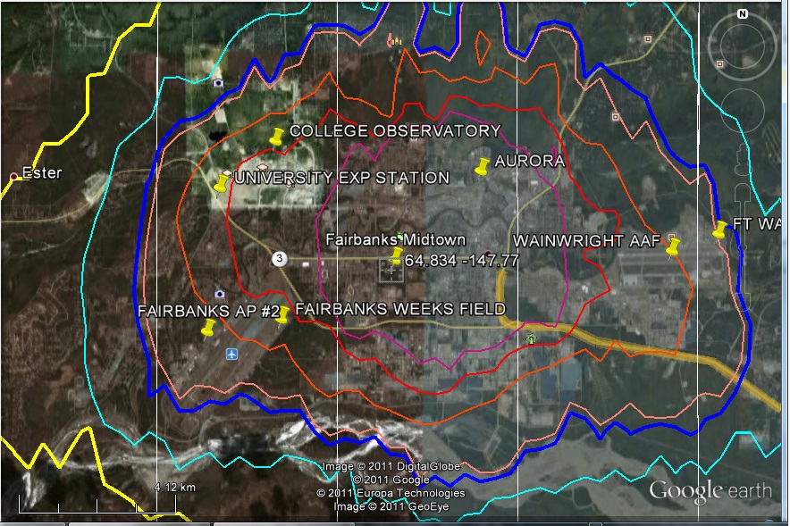
Re: Peter O’Neill (Dec 22 23:38),
I did try the img button the first comment I made above, but it failed, hence the set of links I added next. I may however have used the URLs before cropping, rather than the new URLs after cropping. I’ll try the img button again in another comment below in a few moments.
I’ve now checked, and the red and purple contours are nightlight values 80 and 100.
Peter you will find that a good number of the alaska sites for Berkeley will be wrongly classified
The reason is that Modis classifies those pixels as “unbuilt”. Im pretty sure that the reason has to do with snow cover. Hense the importance of checking multiple proxies: Modis, ISA, Nightlights.
I’m also a bit curious how you are specifying the cutoff in nightlights.
Mosher: “Hense the importance of checking multiple proxies: Modis, ISA, Nightlights.”
You are still living under the delusion that automated methods will give you what you need. Nothing but individual, ground level looks at the sites will give you what you need. And nothing but sites with no roads or structures nearby will be uneffected by UHI.
more baseless assertions.
Re: steven mosher (Dec 23 02:06),
Cutoff as in Gistemp, up to 10 rural, then periurban up to 35, urban above
Did you adjust the DN for the different aperature size of F16 and apply the correction factors?
Re: steven mosher (Dec 23 15:06),
Math.Pow(value_in_tif * 1.51586, 2.0 / 3.0) ?
I’m checking on that. I don’t believe it’s correct. I’m not sure you need the 2/3 power.
I went through this with a sensor guy and I think you just need to do the multiplication. I will
check back with the sources. For us it doesnt matter terribly since I just do a sensitivity on it.
In any case I will get back to you, after checking on the sources,
Re: Steven Mosher (Dec 25 15:52),
On my reading of the documentation with the TIFF the 2/3 power is needed. Without it values would get driven even further towards urban levels. As an empirical validation, compare the contours below for the two GHCN stations in the Dublin area, first derived from the older deprecated TIFF used by GISS, then from the F16_2006 TIFF. (As a bonus, you can also see that the F16_2006 derived contours relate better to the coastline and urban/suburban development than those from the deprecated TIFF). Some increase in night time illumination would be expected here for the F16_2006 image, due to the later date. For areas I’ve looked at where the level of illumination would be fairly similar for the two image dates, the contours show more similar levels, whereas dropping the 2/3 power would drive these up in the F16_2006 derived contours.
These contours are generated for a box 0.4 degrees wide by 0.4 degrees high centred at the station. As a box centred at Dublin Airport does not include Casement, the other GHCN station in the Dublin area, and a box centred at Casement does not include Dublin Bay, and contouring is less reliable if the box is made too big, I have included two images for each TIFF. (The vertical white line in the images is part of the box boundary)
The contour values are 5 (yellow, light), 10 (yellow, heavy, rural/periurban change), 20 (cyan, light), 35 (blue, heavy, periurban/urban change), 40 (salmon, light), 60 (orange, light), 80 (red, light) and 100 (purple, light)
Dublin contours from deprecated TIFF, centred around Dublin Airport
Dublin contours from F16_2006 TIFF, centred around Dublin Airport
Dublin contours from deprecated TIFF, centred around Casement
Dublin contours from F16_2006 TIFF, centred around Casement
Re: Peter O’Neill (Jan 6 22:27),
A small correction: I should have remembered that the functions in the R raster package may shift this bounding box so that it is not centred at the station. There is a shift in longitude for these images. The bounding box for Dublin Airport (longitude -6.25) is instead centred at longitude -6.2, while that for Casement (longitude -6.433) is instead centred at -6.4
Re: steven mosher (Dec 23 02:06),
Not just Alaska (see also the Fairbanks area image in another of my comments), but also northern Finland, Norway and Sweden, for example
I’ve not yet looked at MODIS. Can snow cover really disguise built areas such as these?
Re: Peter O’Neill (Dec 23 12:12),
I’ve just tried the img button again, without success. I left the image width blank, to accept the default size. Could this be the problem. The image (link this time again) is: Gallivare
yes, snow cover does effect Modis in these areas which is why I use ISA and nightlights in addition to Modis
there are two error rates for modis
Commission
Ommission
Commission: Modis says its urban and its not: 2%
Ommission: error rate is dependent on the size of the area you are detecting
for large areas the rate is close to zero, for small areas it is higher.
BEST does not use a multi proxy method so they will have errors in areas where the photos were taken with snow cover.
That is my assumption, based on looking at Modis for all of alaska.
I can write the PI and ask her
modis dates are in feb
so snow is likely to be an issue
Peter,
You seem to have a double-up on Moomba and Barrow Island. They’re both oil/gas and I’d question the urban status due to location
Re: Another Ian (Dec 23 04:34),
I’ve just posted an image for Moomba below, and here is one for Barrow Island
, and again as a link as I have difficulty posting images here for some reason, Barrow Island
In a similar vein, Danish stations 121493 GORM (AUT/MAN) and 121500 TYRA OEST appear to be North Sea platforms, although no platform is visible in Google Earth (low resolution imagery for sea areas for storage reasons perhaps?)
Assuming you are Australian, can I have a translation for “double-up”. My daughter gets married in Australia in a few months time, so I need to start learning Australian English!
# 33 on the list is Jean, Nevada. Latitude 35.78, Longitude -115.31. Jean is a
very small watering hole 10 miles south of Las Vegas with a population of 3000. It is
truly very rural since there is nothing around for miles except open desert. It would
make a good rural-urban pair with Las Vegas to detect UHI. Gistemp classifying this as
urban is incorrect, Berkeley’s classification of this as very rural is right.
Have you looked at Roy Spencer’s work on the population levels where UHI picks up. Don’t let the “urban” in the name fool you. The point is to figure out how much structures, roads, parking lots etc., around the thermometer are effecting it. This can begin to happen at very low population densities.
Here is a photo of Jean, Nevada:
http://www.ziprealty.com/property/1657-EMERALD-AVE-PAHRUMP-NV-89019/82513455/detail
Nice try, EdeF.
“Jean” 35.7833 -115.3167 is an airport 500 m SE of I-15 at the NV-165 Goodsprings Road intersection, 20 mi from Las Vegas and 28 mi and 58 minutes from the address you posted.
It is certainly a population << 3000. Neither is a place with that much concrete "very rural". I'll give you, "contaminated" rural owning to the I-15 traffic. But what's the point if the most recent measurement is 1915?
Whoa, Nellie!
A population of 3000 is ‘truly very rural’?
That’s not my idea of very rural.
10 miles south from [the center of THE] Las Vegas? That doesn’t classify as rural. That a suburb.
What is a definition of very rural that can pass a laugh test?
Suggest a definition.
For BEST: no built pixel within .1degrees
For Hansen: Nighlights 25%)
For what we did: No built pixel within 11km, no airports, no urban lights, ISA <10%
And we varied those parameters to see the sensitivity to our choices.
So, suggest a definition. It must be objective. measurable.
Ok, let’s be objective.
What do you mean by “built pixel” How built? At what resolution? Even an outhouse is “built”
Nightlights 25% — of WHAT? Bangkok? seems a little generous.
“No urban lights”… isn’t that a circular definition?
I googled ” ‘very rural’ ‘ISA’ ” and found this tread.
Do you have a link that defines ISA for us?
“Built” according to the modis definition. 50% of the 500 meter pixel has materials that are man made.
please read the literature which is freely available on the web.
An outhouse is built, however, it will not show up at 500meter resolution. That is why one must take
some care is controling for the ommission error rate. At the limit since a thermometer in in a structure
you could say that everything is built. Basically the argument goes like this
People complain that every site is in Paris or Tokoyo or bangkok.
They cite huge figures for these special cases.
You show them that there are thousands of sites located in rural areas…
They change the definition of rural and think they are being clever.
Sorry, my browser messed up my post.
Hansen: defines it using nightlights
ISA is impervious surface area.
http://en.wikipedia.org/wiki/Impervious_surface
Typical definitions. Imhoff, who some people here cite but never read, used a 25% cutoff
That is a 1km pixel that is 25% impervious surface is designed as urban. Wimbleton, for
example, shows up as Non Urban. with nightlights however, wimbleton shows up as urban
( nightlights > 30)
So, define urban. This definition should be
1. objective
2. tied to the physical causes of UHI.
For example we know that changing the surface from grass to pavement causes UHI. These causes should be documented in some study of UHI.
So, for example, we know that the percentage of ISA is linearly related to UHI. More ISA, more UHI.
Less ISA, less UHI.
I have a post from 12/24 12:37pm that is still awaiting moderation.
This post makes a parallel of using a Hammer chart for Gravity Bouguer Terrain Corrections and applying a similar process for UHI effects.
The crucial concept between the two is that the correction needed is dependent upon both the size and distance from the station.
“we know that the percentage of ISA is linearly related to UHI.” Do we know that it is linear? I’ll by it as a generalization, positively correlated – yes, but a generalization you wouldn’t let anyone else get away with.
As you point out a few days ago, UHI is a lot more complicated than a simple relationship. The type if impervious surface certainly matters, Concrete, blacktop, building height, and mitigated by tree cover. If you really believe UHI is linearly associated with ISA, then UHI is at a maximum when ISA is 100% and nothing else matters. You object to “UHI is proportional to logPopulation)” (other things being equal), yet you can hold that it is linearly related to percent ISA.
“500 meter resolution” and “1km pixel”. I shake my head in disbelief. It is possible to not find UHI if you are looking in the wrong place or at the wrong scale. A tennis court, 100% ISA, 25 meters from a thermometer probably contributes more to UHI to that site than the rest of the section. http://www.surfacestations.org/odd_sites.htm
Is it possible we are discussing different things? Is UHI by some definition only resolvable at >1-kilometer scales and the climate community calls sub-kilometer heat contamination something else? If so, why did BEST comingle surfacestation.org data with its UHI investigations?
“we know that the percentage of ISA is linearly related to UHI.” Do we know that it is linear? I’ll by it as a generalization, positively correlated – yes, but a generalization you wouldn’t let anyone else get away with.
##################
If want to see the papers just go looking, start with Imhoff. Its linear up to a threshold. Of course there is scatter because others things play a role as well
“As you point out a few days ago, UHI is a lot more complicated than a simple relationship. The type if impervious surface certainly matters, Concrete, blacktop, building height, and mitigated by tree cover. If you really believe UHI is linearly associated with ISA, then UHI is at a maximum when ISA is 100% and nothing else matters. You object to “UHI is proportional to logPopulation)” (other things being equal), yet you can hold that it is linearly related to percent ISA.”
################
have you ever wondered why the early research in to UHI focused on population and later people moved away from
it. Log of Pop was indictative of maximum uhi intensity? Also mots people dont relaize that Oke
had one curve for North America and another for Europe. he later found that regional windspeed was an
important factor. later researchers would find different ( lower) curves for different parts of the world.
Its INDICATIVE only. Part of the driving factor behind the different curves is different building
practices. 1 million people living in a small compact area, driving cars, operating plants, living in
high rises has a differnt UHI than 1 million people living in a spread out shanty town. But concrete
is the same every where.
“500 meter resolution” and “1km pixel”. I shake my head in disbelief. It is possible to not find UHI if you are looking in the wrong place or at the wrong scale. A tennis court, 100% ISA, 25 meters from a thermometer probably contributes more to UHI to that site than the rest of the section. http://www.surfacestations.org/odd_sites.htm
Well, then read anthony’s paper. They found no bias to Tave. That said, we do find a bias that is correlated
with the size of the built area.
Is it possible we are discussing different things? Is UHI by some definition only resolvable at >1-kilometer scales and the climate community calls sub-kilometer heat contamination something else? If so, why did BEST comingle surfacestation.org data with its UHI investigations?
The argument is pretty easy. If, for example, we find that 100% of the pixels in a 10Km place is
built we can expect there to be UHI. We comapre that to the places where there are no built pixels
and we see a differece
Implicit in all your arguments is that sub-500 meter resolution of UHI contributions are unimportant to the study of temperature trends.
I reject that notion entirely. UHI contributing concrete doesn’t have to cover much of the sq-km, if most of it is a stone’s throw away from the station.
Furthermore, concrete is not the same everywhere. Not when it is painted tennis-court-green, not when it is resurfaced by asphalt. And certainly not when it is poured next to what used to be a Class 1 temperature station.
Here is a suggestion that is measurable, and while tedious, at least it can be automated.
This suggestion takes its pedigree from the Hammer Chart for Bouguer Gravity Terrain Corrections (see page 52, Fig. 2.6, in this reference). Ref: Hammer 193
A Hammer Chart is a polar coordinate system with cells of in bands of radii. Each radial band is associated with a column in a table. Each row is a range of feet of difference in elevation from the surface station that warrents a specified correction.
For instance, at the B Zone (6 to 54 feet away), an average 10 ft difference in elevation, you add 3 (1/100 of a mGal). (milligal is 1/1000 cm/sec^2, or about 1 millionth of earth’s gravitational acceleration.) To warrant a 3 correction in the E zone (558 ft to 1280 ft) the terrain must be 126-148 feet different from the station, and in Zone J (about 3 – 4 miles) it must be 1183-1403 feet different. [ref: http://gravmag.ou.edu/reduce/hammer.xls%5D
Oddly enough, it doesn’t matter whether the terrain anomaly is higher or lower than the station, you add the correction in either case. IF there is a mountain above you, it is pulling of the gravimeter, reducing its reading. If there is a canyon next to you, the missing mass reduces the meter’s reading. Therefore, to remove terrain effects and adjust for a flat terrain, you add the correction, always.
The upshot is, you should be crazy to make a gravimeter reading next to the Washington Monument, or in fact any building. The largest correction listed for Zone B (6 – 54 ft) is 10 (1/100 of mGal) for a 27-30ft elevation difference.
So the closeness of the terrain aberration is vital to the calculation of the Terrain Gravity correction.
… Just as the closeness of a Urban Heat Sources to the Thermometer is essential to the calculation of the UHI correction. [RE: surfacestations.org].
So here is a 80 year old method that can be adapted to the UHI problem. Use a Hammer-like grid, calculate a quantitative adjustment by night-light in each grid cell * its correction as a function of brightness and distance. Use on site inspection where distances are below pixel size. Once you quantify each cell, you can even apply a sensitivity or bias based upon prevailing winds.
You can forget about the two Swedish sites Gällivare and Malmberget being “very rural” if they are in the indicated positions. Those are two mining towns that have now more or less coalesced. They have about 15 000 inhabitants, and incidentally the coordinates given for Malmberget is actually in Gällivare and vice versa.
Actually the Gällivare site may well be at the airport nowadays, in which case it might perhaps really be “very rural”, but if so the coordinates are off by about 7 kilometers.
The Danish Gorm and Thyra sites are interesting. They are oil fields out in the middle of the North Sea. Is an oil production platform rural or urban?
The norwegian site Tromo/Skatto is actually Tromsö, the largest town in northern Norway with 55,000 inhabitants, though the actual coordinates given are about 100 meters offshore. Most likely it is actually at Tromsö/Skattöra, in which case it is misplaced by about 9 kilometers.
There is another site “Tromso”, which is presumably also in Tromsö. In this case probably at the airport, the coordinates are fairly close, though the actual coordinates for this site is also in the sea.
Heidrun, Norway is an offshore oilfield like Gorm and Thyra.
And so it goes on. What is needed is to check the sites one by one, manually and find out where they actually are and what they are. Tedious and difficult, but unavoidable, because the metadata are so very bad that this sort of urban/rural exercise is essentially meaningless now.
If Steve does not mind, here is a summary (saved in Excel 2003, available in Excel 2010) of 43 pristine Australian sites from 1972 to 2006 (dates chosen because of data availability). The main derived parameter is the LLS slope, which is not ideal, but which helps the eye. Expressed in units of deg C per century, the individual slopes range from +4.7 to -2.5.
My starting hypothesis was that slopes at pristine sites would group quite closely, allowing a baseline to be set, so that UHI, if present, would rise the slope at other sites.
Do look at the effects graphs at the very bottom.
Perphaps tamino might be able to discern signal from noise, Mosh. After all “Die Zauberflöte” contains beautiful signals.
http://www.geoffstuff.com/030303CONDENSED%20PRISTINE%20SLOPE%20AUSTRALIA.xls
Peter O’Neill,

If I show you a picture of Moomba Australia, with the location of the weather station as coordinates near the airstrip, would you classify it for me for UHI category? It’s a large natural gas producer in the middle of a desert in the driest State of Australia, where one cannot purchase land for a home on the lease and where the working mode for many is FIFO. The population is hard to guess, but for lights it’s a 24/7 operation like a beacon. Aptly, one of the first parts of the industrial process is stripping CO2 from the natural gas. Where is it vented? I think, to the air, but I am not 100% sure.
Geoff, I assume that you know that UHI differences for extremely dry, arid areas are very small. The countryside in such an area acts almost like built area. The maximum UHI effects are seen in cities built in the middle of densely vegetated areas.
Re: Geoff Sherrington (Dec 22 23:28),
Here is Moomba with nightlight contours
and for safety, a link, as I have a problem getting images to work here, Moomba with nightlight contours
Re: Peter O’Neill (Dec 23 12:20),
I have a few comments stuck in moderation since December 23. I’ll try reposting one here, and send a screen capture to Steve to show the comment with Image inserted before clicking the “Post Comment” button to see if he can spot anything strange causing my image insertion problem.
As tty already posted a comment about Gallivare, one of the comments stuck in moderation, I’ll post the Moomba comment again now:
Re: Geoff Sherrington (Dec 22 23:28),
Here is Moomba with nightlight contours
Re: Peter O’Neill (Dec 28 09:22),
And as the image has disappeared again, I’m posting the screen capture to Steve now
Testing whether disabling CA Assistant will get around my image posting problem.
Re: Geoff Sherrington (Dec 22 23:28),
Here is Moomba with nightlight contours
As that failed, now trying again with Internet Explorer instead of Firefox in case the problem is browser related:
Re: Geoff Sherrington (Dec 22 23:28),
Here is Moomba with nightlight contours
Re: Peter O’Neill (Dec 28 21:11),
And a last (I hope!) test, as disabling CA Assistant and using IE both failed, I will try Firefox again with CA Assistant enabled, but try using the source code tag button after the image tag button, to see what gets stripped out (the source code tag button worked for an earlier comment):
Re: Geoff Sherrington (Dec 22 23:28),
Here is Moomba with nightlight contours
and some “code”
The preview shows the image correctly (but the sourcecode tags appear). How will the comment look when posted however?
Steve: try posting the link. I can edit in editor mode.
Re: Peter O’Neill (Dec 28 21:34),
Too soon. the “sourcecode” shortcode worked when posted, but the img tag did not. Perhaps the embed shortcode?

[embed]http://oneillp.files.wordpress.com/2011/12/moombaca.jpg[/embed]
Steve: use img src= “” inside
Re: Peter O’Neill (Dec 28 21:53),
“Smart” quotes needed rather than plain quotes for the img tag? Or is this WordPress “smarting” your plain quotes, and img src=”” needed within embed shortcodes? Trying both to see which works
Smart quotes:
img src in embed: [embed]img src=”http://oneillp.files.wordpress.com/2011/12/tromsoca.jpg”[/embed]
<
Steve: use sharp brackets rather than [embed]/
Re: Peter O’Neill (Dec 28 22:46),
So I take it that the smart quotes in your hint just above were put there by WordPress, in the same way my plain quotes for “Smart” and “smarting” became smart quotes. The img tag stripped out had smart quotes, and this seems to happen every time I add an img tag, such as

WordPress also seems to display my plain qoutes in that embed attempt as closing smart quotes at both ends. Giving up for now and going to bed!
Steve: dunno. I manually changed to sharp brackets.
Moonba is one of the weird aussie stations.
population is zero because there is no official population.
Lights are urban, we classify it as urban.
The majority of weird stations are down under
Mosh,
Weird in what ways?
(‘Tis Moomba, not Moonba).
Well lets take population. If you used population to determine rural, then you will find stations in australia that have zero population, but they have massive structures. Why? well because of the way population data is collected. Places like moomba and other “fly in” places have zero population. Its not that nobody lives there, its that they are not reported. So, when people blather on about population data I really wonder if any of them every read the papers for the datasets– maybe they just go to wikipedia. Australia also has some weird places where there is no population, small structures, and huge lights. In short, every proxy for rural/urban is going to have weird cases. The approach, we took was to use multiple proxies to try to reduce the misidentification rate. There WILL BE misidentifications. Here is the rub. The smaller the UHI effect, the more important the misidentifications are.
If UHI is huge then we can live with some mixture of urban into rural and rural into urban. If UHI is small, then you need to be more concerned about it
For example: if you have 1000 rural sites with a trend of 0C/dec and 1000 urban sites with a trend of
1C per decade, what happens if you identify some rural as urban.. say 10%. well, not much
Instead of 1000 rural sites you have 900, and they still have a 0C trend. The urban sites get
“polluted” with 100 rural sites, so you have 1000 sites with a 1C trend and 100 with a zero C trend.
Now, do the same problem but suppose that the urban trend is .1C
The smaller the difference between urban and rural, the MORE important the classfier is.
So, folks who care a a lot about errors in classiication, must think the difference is small.
Thanks Mosh,
Got me wondering about the Census data. Even with a full FIFO crew, should the population be non-zero?
I am not suggesting that it makes a material difference in this case. But what other quirks might there be in census data and do any of these have the potential to bleed over into another analysis.
The counting rules vary by country.
Population is a necessary but insuffiecient metric
Oh my, #09 on Peter O’Neill’s list: Tar Island! Suncor’s land reclamation is good, but not that good.
Tar Island was an island in the Athabasca River, used by Great Canadian Oil Sands as part of the foundation for its first oil sands tailings pond, in the late 1960s. The outer slopes were revegetated in the 1970s and the inner bowl fully reclaimed – the first “toxic tailings pond” fully reclaimed to dry landscape – within the past few years. But the Tar Island weather station is a station servicing the weather needs of a huge industrial complex. No, not “very rural”. Granted, around about 1965 it was absolutely rural, accessible only by boat from Fort McMurray, 30km away. People who check out the listed coordinates on Google Earth will laugh out loud.
But by 1966 we could get there (to Tar Island) over a gravel road. And once there we found a work camp of about 2,000 men building up the most amazing series of mining buildings, stacks, towers, ponds and roads. Featuring a magnificent “bucket wheel” machine the size of a large building that walked across the earth gobbling up the tar sand. Anyway any temperature information within a mile of two of that place would be the furthest thing from ‘very rural’ although most of the earth for hundreds of miles all around it is exceedingly rural. I just looked the place over on Google Earth to remind myself that I didn’t ever notice any real “island” in the two months that I lived in that camp and worked on that plant. Still can’t find the island. But the extent of the development in the past 45 years is amazing. I can’t think of a worse place to use to measure temperature trends in the area.
A good spot, Bruce. This might be a good case study for estimating the magnitude of UHI at similar sites. Set up some thermometers N, S, E, W, 20 and 40 km from the mine for a year. Compare the temperatures from these controls with the thermometer(s) used at the official site. At the very least, it might define real uncertainty bounds and mean bias for the sites used for extended “interpollation”.
Thanks for the reply, Steven Mosher. My next question was anticipated by your reply below: The number of pairs used in the study. I can use that number in making my own estimates of CIs.
“The Pairs approach. In that approach we had one urban base and then a regional pair estimate.
So, thats a difference of over 2000 pairs.”
My anecdotal evidence of UHI and micro climates can be summarized as follows:
I live 40 miles west of downtown Chicago and on hot summer days the temperature can dramatically decrease as one approaches the city due to the “lake effect” of Lake Michigan. My brother lives near the lake and his growing season can be 3 to 4 weeks longer than mine – but he suffers through cooler springs than I do. This year we had an unusually extended time between killing frost in our local area and there were parts of my yard were the killing frost differed by more than 2 weeks – same plants used as indicators. During the summer I spend a lot of time in the backyard with my grandson and on very warm days I can find spots that are much more tolerable than others and I do not see this as a shade or wind movement difference.
Steven Mosher and others trying to guess UHI insist on compressing reality into their assumptions. UHI will obviously NOT be consistent at stations for magnitude or time period. Averaging a full temperature sequence to compare UHI’s will LOSE most of the data as the UHI will have changed in virtually ALL stations over time and may have risen and dropped several times. Without detailed analysis over short periods of time comparing stations to themselves and others they are wasting their time and returning NO data that is identifiable as UHI.
You’re correct that UHI is highly station-specific and cannot be isolated at any given location from climatic variations without generally unavailable pristine baseline data. Analyzing short stretches of data, however, doesn’t overcome that obstacle.
What can be done with sufficient century-long records is to establish a STATISTICAL discrepancy between urban and non-urban locations in a region with demonstrably coherent yearly temperature variations. Such LONG-TERM analyses invariably show very significasnt mean discrepancies that resemble logistic curves over the course of the 20th century. It’s a matter of of economic development as well as population density. That is the expected regional UHI effect that is never adequately dealt with in the global index compilations.
Sky,
Show me.
You have no way of separating the components of the trend any more than Moshpup and the rest do. As the TREND from UHI is dependent on CHANGING the environment around the station, population changes would be a somewhat reasonable indicator. Population has NOT changed at a consistent rate at all stations and even with a changing population the UHI may not change due to other issues. Using short sections you can at least determine whether the change in trend is associated with changes in metrics that may be indicative of a UHI as opposed to a natural or GHG change in trend. Still poor, but, using long term trends is not particularly useful in seeing what is happening with any of our climate metrics.
If you were able to compute an accurate trend from the end of the ice age till now, what would it really tell you about what has happened in the interim??
With UHI effects on the order of ~1K/century, short term discrepancies get obscured by the high year-to-year varibility . I’ll try posting a chart to show you some revealing century-long results when I get back to my office late next week.
The statistical distinction between trend-components can be made where century-long non-urban records are sufficiently dense, simply by forming geographically balanced regional estimates of yearly average temperature variations from entirely disjoint urban and non-urban stations. The discrepancy between the two time-series estimates, centered on their respective century-long means, provides a robust indication in the aggregate of the UHI effect.
The first graph at “http://s1188.photobucket.com/albums/z410/skygram/?action=view¤t=Publication1.jpg” shows that discrepancy for the continental USA, with the non-urban limit set at a population of 50 thousand. It is apparent that the USA urban records manifest a non-linear rise in deviations from their mean that raises the temperature by ~0.7K over the course of the 20th century relative to their non-urban counterparts. Similar results obtain in other developed regions around the globe where adequate records are available.
I about half suspect the urbanization and/or land use change effect is going to be the long term difference between the land based and the satellite based temperature series. This is a one cylinder, two-cycle algorithm, needing manual oiling.
=====================
Koh Samui, being an island location, would seem be be overly influenced by nearby sea surface temperatures.
Mae Hong Son is rapidly growing.
Re: SteveSadlov (Dec 23 19:48),
wow, first bender and now Sadlov … this thread is quickly becoming a meeting point of all “old-timers” I’ve been missing 🙂 Happy seasonal greetings to all of you!
Dear Steve
I don’t think this is off topic because its Christmas eve.
Merry Christmas to you, your family, contributors and all posters. I also wish you all a Happy and Prosperous New Year.
Steve your’s and Ross’s next project? There’s something wrong with the front end of the runners on Santa’s sleigh they just don’t look right 🙂
Please keep up your good work.
Regards
S
Ko Lanata has undergone rapid development over the past 15 years, as cars and motorcycles are now allowed on the island.
When we first visited Ko Lanta 20+ years ago, there were no cars or motorcycles, only bicycles We returned and stayed often for months at a time because it was one of the few places in Thailand that were quiet. Most of Thailand has a noise problem because of a widespread belief that mufflers and engines do not belong together.
Changes due to land use are hard to identify by comparing land to land. However, comparing land to ocean should give a measure of the effect. About 0.2C per century.
http://www.woodfortrees.org/plot/hadsst2gl/trend/plot/best/trend
Actually it is easy to identify
You start by comparing Ocean to Coast. As theory predicts the ocean warms more slowly than the land.
Then you compare Coast to inland. As theory predicts Inland warms more rapidly than Coast.
Then you can compare land to land, but you need historical land use data. You will find small
differences driven by changes in albedo and evapotranspiration. But nothing like the differences
between ocean and coast and coast an inland.
3rd order effect
I have to think that comparing BEST to SST gives a better idea of UHI in the BEST dataset. We know BEST is an outlier anyway.
There three graphs show rather dramatically that warming due to land use for the most part affects low temperatures only. Surface temperatures over land are becoming less extreme, not more extreme due to human activity.
http://www.woodfortrees.org/plot/hadsst2gl/trend/plot/best-upper/from:1850/trend
http://www.woodfortrees.org/plot/hadsst2gl/trend/plot/best-lower/from:1850/trend
http://www.woodfortrees.org/plot/hadsst2gl/trend/plot/best/from:1850/trend
Here it is all in one graph, showing the effect of land use on temperature.
http://www.woodfortrees.org/plot/hadsst2gl/trend/plot/best-lower/from:1850/trend/plot/best-upper/from:1850/trend/plot/best/from:1850/trend
Change those dates to 1950 and the last 60 years shows UHI to be .1C / decade.
I get 0.17 per decade, T(lower) land as compared to sea.
T(upper) is not much difference.
I looked at the mean. I’m pretty sure it is .6 over 60 years. Thet start at same point in 1950.
http://www.woodfortrees.org/plot/hadsst2gl/from:1950/trend/offset/plot/best/from:1950/trend
http://www.woodfortrees.org/plot/rss-land/from:1979/trend/offset:-.1/plot/best/from:1979/trend/offset:-.44/plot/gistemp/from:1979/trend/offset:-.36/plot/crutem3vgl/from:1979/trend/offset:-.33/plot/uah-land/from:1979/trend/offset
I agree. BEST is totally divorced from reality.
http://www.woodfortrees.org/plot/rss-land/from:1998/trend/plot/best/from:1998/trend/offset:-.39
Even more dramatic. BEST vs RSS land with 1998 as the pivot
http://www.woodfortrees.org/plot/rss-land/from:1979/to:1998/trend/plot/rss-land/from:1998/trend/offset:-.3/plot/best/from:1979/to:1998/trend/offset:-.36/plot/best/from:1998/trend/offset:-.556
Or, if you dont like Best data
http://www.woodfortrees.org/plot/hadsst2gl/trend/offset:-.06%20/plot/crutem3vgl/from:1850/trend
that’s a .2C difference over 16 decades. Nothing.
Or
http://www.woodfortrees.org/plot/hadsst2gl/from:1979/trend:%20/offset:%20/plot/crutem3vgl/from:1979/trend/offset:-.06
which is a story of .25C over 3 decades. < .1C decade
Or
http://www.woodfortrees.org/plot/hadsst2gl/from:1979/trend:%20/offset:%20/plot/best/from:1979/trend/offset:-.16
which is about .4C over 3 decades approx .13C decade
So lets sum that Up
Using satellite data, we see a budget for bias of around .1C per decade for UHI bias in the land
Using SST, it is going to depend on the land record we use: CRU? <1.C decade. Best: .13C decade
If we go back to 1850 the choice of land record becomes interesting. Using CRU, we show no UHI.
Now lets really Bottom line it.
the land is 30% of the total.. whats 30% of .13C
arrg dont do math when getting ready for christmas party
@Ferd Berple, that is an easy but nice way to estimate the UHI!
It’s Christmas Eve. Best wishes to Steve, all the McIntyres, and the many contributors here.
Steve
A vey Merry Christmas. Thank you for all you do. The world is and will be a better place because of you. You are a great Canadian, and i am proud to have you as one of our own. God Bless
Christmas Day, mathematics, international cooperation and intractible problems.
Merry Christmas all!
Anyone with spare time on their hands is welcome over at the talkshop for the Christmas Quiz
Winner gets a ‘raid at talkshop towers’ Josh Cartoons mug.
Mr Mosher, no amount of citing the ‘laws of large numbers’ overcomes the problem of crappy data. Posters on this thread have cited numerous reasons why the inputs might be wrong, misleading or just not comparable.
The tedious and unfashionable work of people like Steve M. and Geoff Sherrington, who actually track down the data sources and assess how valid they might be, is apparently way too pedestrian for high level ‘climate scientists’.
The dismissiveness of your ilk really came home to me when a poster asked a question about Paris. Your answer was ‘we don’t take Paris into account’. End of discussion.
This kind of arrogance leads to major mistakes.
Season’s greetings to Steve M. (thanks for appearing on Australian TV recently), contributors and commenters. An especially big basket of good cheer to FOIA, whoever or wherever they might be.
Paris is not in our dataset.
There is not much more to say.
If it was the answer would not change.
You could add 10 cities like paris and the answer would not change.
How about 1000?
Unfortunately there are not 1000 Paris’ to add.
However you can do the math your self.
Rural = .26C decade
Urban = .3C decade
there are 5000 rural and 9000 Urban
Assume that I’m hiding 1000 Paris Frances station in the rural pile.. Take them out.
Doesnt make much of a difference now does it?
The assumption that UHI = Urban – Rural is not backed up by experimental proof.
Come back when you have evidence.
NASA satellites have shown UHI to be an average 7C to 9C in the summer in 42 cities in the US northeast.
Thats evidence. It is also evidence that there might well be over 1000 Paris’s worldwide. Or 9000.
By the way what is your claim for the UHI for Paris and Bangkok. Show your work.
In the 1950’s I grew up on a farm-this I considered “rural”. My uncle and aunt lived in a nearby town of 1600 people. It had one main street about 3 blocks long with stores, many of them brick construction. In this time before air conditioning, on hot summer evenings, my uncle and aunt would go for a ride in the country to cool off. There were enough buildings and pavement to hold the heat and trees to cut down on the breeze to make it noticeably more uncomfortable.
Under the Homestead Act of 1862, land was granted in parcels of one quarter of a square mile, or 160 acres. To me, a natural definition of “rural” would be areas with less than 4 houses (homesteads) per square mile. But this still is an arbitrary definition lacking in scientific basis. A more rigorous defintion would be a site that is uninfluenced by adjacent build up areas, as determined by on the ground measurement of radiation and convection effects. This should include setting up a grid or a line of temperature measurements through the station being checked which would extend into rural areas.
I did a calculation of the US raw max and min average temperature trend area weighted by state. It was interesting to note that the max temperature shows no increase, but the min temperature does. This is a possible indication of the urban influence on the measured temperature, caused by greater thermal capacity in urban areas and reduced circulation during the evenings. My calcualtion, code and data are at http://socratesparadox.com/?p=205. I welcome your comments on my approach and analysis at this site.
BRK and other generally,
This has been posted elsewhere, it’s been called fundamental and unfashionable, but have a read of it and a think about it.
The NOISE level might be high. Until the fundamental difficulties are solved, there’s no point in getting complicated and sophisticated.
Click to access Extended%20paper%20on%20chasing%20R.pdf
P Gosselin:
“But perhaps it isn’t the surrounding population that counts, but simply the closest heated dwelling. To test that hypothesis, this author researched each station at the SurfaceStations.org website, and found the distance from each measurement sensor (MMS) to the nearest heated building.
…
As can be seen on the plot, town population made almost no difference to the trend. The dots are nearly completely random with respect to population. On the other hand, the distance from a heated dwelling made a much larger difference. The two coolest sites were more than 100 meters from the nearest building. Within the population limits of this study, the Urban Warming Influence is simply the distance to the nearest heated building, not the size of the city.”
http://notrickszone.com/2011/12/27/heated-thermometers/
I have looked at the yearly temperature plots for several cities in the western US and compared then with surrounding small towns.
Some of the cities have a huge increase in average yearly temperature over the last century, although you do see the well known
increase in temps in the 30s, followed by the 30 yr drop off. I do not see the same magnitude increase in the surrounding areas. Las
Vegas has a 4 deg F increase from the 50s to the 2000s, but Searchlight, NV located south of LV shows only a mild increase in average
yearly temperature over the same period, mainly from the 80s on-ward. I have looked at Portland, OR, Las Vegas, NV, Salt Lake City, UT,
and Reno, NV. In each case the warming in the cities are much higher than in the surrounding countryside. Cities are useful for compiling
temperature records because they usually have more complete records stretching back longer. Many areas in the western US have only been
peopled since the second world war. There is a giant black hole in 1930s-1940s temperature data in the countryside. I would exclude all
large cities from climate reconstructions, although I do not know where to make the cut-off.
Looking at more raw temperature data from Western Regional Climate Center data sites
for urban and rural stations in the western US. Phoenix, AZ has had a 6 deg F spike
in the last 50 yrs, which I expected. In addition, the use of AirCon in the summer,
especially with cloud cover would lead to higher night-time temps and thus higher
min temp. Very fast growing desert city, massive increase
in both population and irrigation. Nearby smaller towns flat as a Crepe Suzette.
Was surprised to see relatively little change at Denver, CO. Likewise massive
population growth in the last 50 yrs. I suspect they have isolated the weather station
from the surrounding growth. I am seeing some really bizarre data; Sierraville camp
in the Mid Sierras has a fast 20 deg F jump. I suspect someone moved the Wx station
to the back of a Burger King or something. I hope that whoever is processing this data;
ie CRU or BEST actually does some quality control on this and exclude 20 deg jumps.
Which leads me to another thought; all of the errors in the data are likely to error
on the “warming” side such as a deteriorating or moved Wx station location and none
on the cooling side. Have not seen any 20 degree drops in temp. Assuming you have
1000 stations with 25% heavily urban with the 75% showing no temperature increase
over the period and the 25% showing a 4 deg F temperature increase. The overall
averaged increase is therefore .25 X 4 = 1 deg F. High temperature increases in the
heavily urban stations can bias the results, even though the vast majority of stations
show little increase. I am not sure what the point of the BEST very rural data is:
the number of stations is much too small to be helpful and they cover a very small
area of the land. Have actually seen some gradual cooling from some rural stations
over time. Am disappointed that some rural stations that say they have data back to
1893 have huge gaps in data; 5-10 blank years in some cases or some years where 2 to
3 months are missing.
Why are the rural stations or smaller towns not showing much temperature increase
over the last 100 years when some of the large cities are showing huge temperature
increases?
I am surprised that Misawa AB, Japan and the Fairbanks, AK areas are considered
very rural. Misawa has a giant USAF base there, has since end of WWII with local
population of 42,000 and 6,000+ servicemen. Fairbanks metro area has a population
of 100,000+. Now, in the western US there are untold number of really, really rural
sites. How about Wildrose ranger station at the west end of Death Valley NP. There is
a dirt road running past the wooden ranger station building on a road that goes up
to Telescope Peak campground. This is quintessentially rural. And the temperature
record for the last 40 yrs matches BEST overall trend nearly exactly. About 2 deg F
increase since the 70s.
I’m sure this one would be considered very rural, out on Orcas Island in Western Washington State, if you were looking at 500m resolution, but it’s right up against a dwelling, and not at the correct height.
One Trackback
[…] […]