As a mild break from Lewandowsky’s fake data and false results, I am going to revisit IPCC 1990 Figure 7, which I discussed in several Climate Audit posts from 2005-2008 – a topic that was raised at Lewandowsky’s blog by conspiracy theorist John Mashey, who, rather than confronting the problems of Lewandowsky’s use of fake data, recently went into paroxysms of ecstasy at the discovery of an incorrect citation in an early Climate Audit post. An incorrect citation in a Climate Audit post – it doesn’t get much better than that for Mashey. Mashey feverishly extrapolated a simple incorrect reference to belief in a flat world.
Normally, I’d just ignore this sort of deranged commentary, but the Climategate emails contained interesting context on IPCC 1990 Figure 7.1 that I’d noticed but not previously commented on. The emails also place the discussion in Jones et al 2009 in an interesting context. Today’s discussion will not be complete: there are interesting points in the Climategate emails about the understanding of the IPCC 1990 graphic that I’ll try to return to on another occasion.
It is true that a Climate Audit post in early 2005 contained an incorrect reference. I try to be careful, but do not claim to be infallible. Recognition of fallibility is one of the reasons for replication and audits. In this case, I had incorrectly referenced a graphic from IPCC 1990 to IPCC 1995. The misunderstanding on my part was very brief. By June 2005 (here for example), I had tracked down the correct reference and used this correct reference in all subsequent posts. Unfortunately I forgot to back and correct the reference in the earlier post at the time. Now that the matter has been drawn to my attention, I have added an update at the earlier post. Mashey’s frenzied excitement at the discovery of this incorrect reference seems, however, more than a little over the top.
Mashey noted that Ross McKitrick had picked up the correct reference by July 2005, but failed to mention that I had already picked up the correct reference in June 2005 and that I had used the correct reference in many subsequent posts. By neglecting all posts and discussions from June 2005 on, Mashey built the incorrect reference in a Climate Audit post into a huge tangle of conspiracy.
I’ll pick up today with a 2007 post that was critical of the reification of the IPCC 1990 graphic in Martin Durkin’s Swindle. I thought that there was an interesting story to be told about the transition from the IPCC 1990 graphic to the IPCC TAR adulation of the Stick, but it was a different one than the one that Durkin had told. In my post, I took the position that the most important criticism of the IPCC 1990 graphic (that it was only representative of one location) applied even more strongly to the MBH Stick (whose MWP-modern comparison also boiled down to one locality, Graybill’s bristlecones, proxies that were not necessarily an improvement.)
William Connolley responded to my post in a post entitled “TGGWS / IPCC ’90 fig 7.1.c“. Connolley (as far too often) misrepresented what I’d actually said, accusing me of “uncritically” accepting the IPCC 1990 graphic. Connolley added the further curious criticism – that I’d accepted the 1990 graphic “uncritically” “despite its lack of good source”, adding that “if McI didn’t like the IPCC ’90 fig, he would be ripping into it as sourceless.” Connolley cited a Wikipedia article (that he had written) on the lack of provenance of this figure.
At the time, the lack of precise provenance of IPCC Figure 7.1 hadn’t been on my radar. If pressed, I would have presumed that it was derived from Hubert Lamb and not the stuff of mystery.
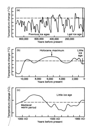
In 2008, I took a look at the provenance of the graphic. I located a graphic in Lamb 1965 (Figure 30) that convincingly seemed to be the origin of the IPCC panel. The figure below is taken from that post and shows the IPCC 1990 graphic (digitized) plotted against the data from Lamb 1965, comparing this to the top panel of Lamb 1965 Figure 3 – showing that the Lamb 1965 figure is unmistakably connected to the IPCC graphic.


Top – Comparison of digitized IPCC 1990 to re-plotted data from Lamb 1965; bottom – Lamb 1965 Figure 3 top panel.
In one of the comments, reader Brent made an inspired find that placed the iconography in a new light (one that remains unexplored). The graphic that we had been looking at was the bottom panel of IPCC 1990 Figure 7.1, which was actually a three-panel triptych, in which the top two panels were schematic temperature histories over the past million years and the past 20,000 years. Brent observed that an almost identical three-panel triptych occurred in the 1986 edition of a 1977 book by Crispin Tickell, who attributed it merely to the “British Antarctic Survey”. [Update Sep 30 11 pm: a reader has consulted Tickell 1977 and states that the triptych at Tickell’s website for his book is not in Tickell 1977; the website says that Tickell revised the book in 1986; the 2nd edition needs to be checked. I’ve accordingly amended references to Tickell (1977) in this post to a generic reference to “Tickell” to reflect this.] The two three-panel diagrams are shown below. I don’t believe that anyone can reasonable doubt that the IPCC 1990 Figure 7.1 is derived from the same iconography as the Tickell triptych.
It’s not quite the same in detail. The top panel is most similar. The middle panel is the most different: more smoothed in the IPCC version. [Richard Drake observes in comments that the IPCC middle panel only covers 10,000 years as well.] The closing portion of the bottom panel has been changed to remove the downturn in the Tickell version – as discussed in my 2008 post, it looks like a point has been added.

|
 |
Left: from Crispin Tickell website; right: IPCC 1990 Figure 7.1/
For what it’s worth, I recently noticed a graphic in a UK geography textbook that is either derived from the Tickell book or, more likely, from a common “Ur-document” that remains unknown.

Climategate Reaction to My 2008 Post
My 2008 post caused considerable consternation behind the scenes among Climategate correspondents. It turns out that they had been trying to identify the provenance of the IPCC 1990 graphic since early 2007 (see 2007 Climategate 2 emails) and were planning to publish an article including a discussion of the topic of my post: the provenance of IPCC Figure 7.1. According to 2007 Climategate emails (which I’ll review on another occasion), they had concluded that the IPCC 1990 graphic had been taken from a 1989 UK Department of the Environment pamphlet and had been inserted into the IPCC 1990 report at the very last minute. They had independently traced the 1000-year panel back to Lamb graphics, later also citing Lamb 1965 Figure 30 in Jones et al 2009 (and a similar graphic in Lamb 1982.)
My 2008 post, also tracing the provenance back to Lamb 1965, caused considerable concern among the Team that I had “scooped” them. Within hours of my original post, Gavin Schmidt wrote to Mann and Rahmstorf (CG2-3079) that I had “almost” worked out the source of the figure and that they were being “scooped”:
On another subject, McIntyre has worked out where IPCC 1990 fig 7.2 has
came from (almost). We are being scooped!
Further in this post, I will examine the exegesis of Jones et al 2009 with a view to identifying what was “almost” about my post. (It seems to me that my 2008 post contained an exact link to Lamb 1965 and that the Jones et al 2009 linkage to Lamb 1982 is either immaterial or, more probably, incorrect. It’s hard to see the basis of “almost”.)
Mann immediately forwarded Schmidt’s email to Jones, and in true Lewandowsky conspiracy style, presumed that information on their plans to reveal the provenance of the IPCC 1990 graphic had been leaked to me and that my motive for the blog post was to scoop them:
Please see the below–any update on the Wengen paper? It appears that McIntyre is trying to scoop us, must have somehow learned that we’ve tracked this down. It would be nice for the paper to be officially ‘accepted’ before he figures the story out,
Jones immediately conveyed his worry to Briffa and Osborn, worrying that we were “close” to finding out what the IPCC figure was based on. Jones also noted the unknown-to-him Tickell reference, speculating (incorrectly) that it was after 1989.
CA are getting close to finding what the IPCC figure from 1990 is based upon. They haven’t found the original source, nor any of the CRU pubs that show Lamb is wrong anyway. ..
#50 and the link to Crispin Tickell’s web page is interesting – back to BAS pub. If you have time can you follow this one up. I think CA have the dates wrong and this should be after 1989.
In their final article, they make no mention of the Tickell triptych despite its unmistakable iconographic precedence. Jones’ surmise that we had the Tickell date wrong was incorrect.
Jones et al 2009
Jones et al 2009 set out the Team’s exegesis of the provenance of IPCC Figure 7.1. Needless to say, they did not mention the independent Climate Audit discussion that had traced IPCC 1990 Figure 7.1c back to Lamb 1965 or that had identified the iconographic precedent in Tickell.
Jones et al 2009 wrote:
So where did the schematic diagram come from and who drew it? It can be traced back to a UK Department of the Environment publication entitled Global climate change published in 1989 (UKDoE, 1989), but no source for the record was given.
Jones et al 2009 did not give any further bibliographic details on the UK Department of Environment publication. According to a 2007 Climategate email, Jones got a copy of the pamphlet from David Warrilow at DEFRA; I recently wrote to Warrilow asking for the same document, but thus far have not received an acknowledgement. It will be interesting to see this graphic though I presume that it is pretty much identical to the IPCC triptych.
Jones then reported that the figure could be traced back to Lamb 1982 Figure 30 (noting that this figure was similar to the Lamb 1965 Figure 3 that had been reported at Climate Audit). Jones justified the derivation from Lamb 1982 because of its “vertical resolution”, while noting that there was no relevant difference in the underlying data between the 1965 and 1982 versions:
Using various published diagrams from the 1970s and 1980s, the source can be isolated to a series used by H.H. Lamb, representative of central England, last published (as figure 30 on p. 84) by Lamb (1982). Figure 7 shows the IPCC diagram with the Lamb curve superimposed – clearly they are the same curve. The ‘Central England’ curve also appeared in Lamb (1965: figure 3 and 1977: figure 13.4), on both occasions shown as an ‘annual’ curve together with the extreme seasons: winter (December to February) and high summer (July and August).
…
The IPCC diagram comes from the 1982 publication as the vertical resolution of the annual plot is greater. The data behind the 1977 version are given in table app. V.3 in Lamb (1977), but these are essentially the same as previously given in Lamb (1965). All three versions of the plot have error ranges (which are clearest in the 1982 version and indicate the range of apparent uncertainty of derived versions). The 1982 version dispenses with the three possible curves evident in Lamb (1965, 1977) and instead uses a version which accounts for the ‘probable under-reporting of mild winters in Medieval times’ and increased summer temperatures to meet ‘certain botanical considerations’. …
Here is a side-by-side comparison of the two figures. It is evident that Lamb 1965 Figure 3 top panel and Lamb 1982 Figure 30 top panel are plots of the same curve, though the 1982 graphic is simplified from the earlier graphic:
|
|
|


Left: From Lamb 1965; right – from Lamb 1982.
Back to the Climategate Emails
In the Climategate emails, Jones, Mann and Schmidt told one another that I had “almost” discovered the provenance of IPCC 1990 Figure 7.1, but seemed to think that I had not quite pinned it down. So what, if anything, had the Team discovered about the provenance of IPCC 1990 Figure 7.1 that had not already been published at Climate Audit?
I didn’t know about the intermediation of the 1989 UK Department of the Environment pamphlet, but that was a relative minor point in the exegesis of Jones et al 2009. Not mentioned in Jones et al 2009 was Ammann’s observation (CG2-4039) that the UK DOE pamphlet had “‘expertly’ extended” the version in Lamb 1982 (and the identical Lamb 1965):
just for comparison, here is the superposition of Lamb’s central England
(what ever season that might be) on the UK Dep. of Environment report
graph. This appears very much to be the same data, note all the little
bumps and wiggles are just the same, and then in the tails its
‘expertly’ extended.
Other than identification of the DOE pamphlet in the lineage of the iconography, the only difference was their attribution of the IPCC graphic to Lamb 1982 rather than Lamb 1965, relying only on the vertical scale. However, the vertical scale of the medieval panel of the Tickell triptych corresponded to the vertical scale of the IPCC 1990 figure diagram – firmly refuting the Jones et al 2009 theory that the Lamb 1982 diagram figured into the iconographic history of IPCC 1990 Figure 7.1.
To the extent that they differentiated their exegesis from the Climate Audit exegesis by placing Lamb 1982 in the iconographic lineage of IPCC 1990 Figure 7.1 – a rather minor distinction on which to refuse at least an acknowledgement of Climate Audit – their iconographic history was a retrogression from the Climate Audit derivation.
Their failure to refer to or discuss the Tickell triptych and/or look for its predecessors was also an important retrogression from the Climate Audit discussion. There’s not a doubt in my mind that any iconographic scholar would unhesitatingly place IPCC 1990 Figure 7.1 in the iconographic tradition of the Tickell figure. It is virtually impossible that Tickell himself originated or even modified the Tickell triptych. There is almost certainly an “Ur-graphic” preceding the Tickell graphic, which Tickell presumably obtained (as he said) from the British Antarctic Survey. It is entirely possible, perhaps even probable, that the IPCC 1990 figure derived from that Ur-graphic without intermediation by Tickell 1977. (I’ve written to Tickell asking for the provenance of the triptych diagram, but have not yet received an acknowledgement.)
By the way, the origin of the other two panels is somewhat interesting. The top panel is almost certainly derived from a foraminifera O18 series from Emiliani that caused great interest in the 1970s. This series appears in different versions in contemporary literature; I’ve not tracked down the precise version used in the triptych. I don’t know where the middle panel comes from: from the labeling, it looks like a British source.
In hindsight, Jones et al were clearly aware of Climate Audit’s prior discussion arriving at almost exactly the same conclusion. If one of their pals had independently published a blog post identical to the Climate Audit post, I’m sure that they would have acknowledged it. But since it was Climate Audit, they didn’t.
Connolley
Connolley’s role in this is curious. Connolley’s blog avatar Stoat is (aptly enough) a weasel, an avatar that Connolley regularly lives up to. Connolley was well aware that the incorrect reference in the early CA post did not imply any ongoing “confusion” on my part as to the provenance of the IPCC 1990 graphic. As noted above, he had even done a post on IPCC 1990 Figure 7.1 linking to a Climate Audit post.
But rather than pointing this out to Mashey at Lewandowsky’s blog, Connolley immediately materialized at Climate Audit, so excited that he was almost out of breath, and offered to provide me a re-education camp on the differences between IPCC 1990 and IPCC 1995 if I were “confused” on the point:
No. The pic you’re showing is from IPCC ’90. http://en.wikipedia.org/wiki/MWP_and_LIA_in_IPCC_reports has the details, if you’re confused.
Needless to say, Connolley was well aware that Climate Audit had discussed IPCC 1990 Figure 7 on multiple occasions, that the incorrect reference was limited to an early Climate Audit post and a contemporary presentation and that the correct citation had been made in all discussions subsequent to June 2005. But rather than pointing this out to Mashey, Connolley, lived up to his weasel avatar.
In reviewing this material, I also noticed interesting 2007 Climategate emails that contain new information on how the IPCC 1990 graphic was perceived in the early 1990s, leading up to the notorious “get rid of the MWP” comment, that I’ll try to review in another post.


163 Comments
I really enjoy vocabulary like “fulminated” and “paroxysms” very refreshing!
He would “put on a show,” would this Stoat
Hoping somehow to alter the vote
For your auditing skills
Make them fear funding kills
So to them, you are rocking the boat!
But you know he’s not talking to you
There’s a quite different audience in view
He will brag to his friends
Of his “means to the ends”
And like Mashey, it’s all he can do.
===|==============/ Keith DeHavelle
I presume your usage of ur-graphic is a precise way of indicating a prototype graphic rather than simply an earlier copy.
I was going to say hell will freeze over before any of that crew would give you kudos for anything. Then I discovered there is a community in Michigan named Hell which I expect would occasionally freeze over. http://en.wikipedia.org/wiki/Hell,_Michigan On the other hand the wiki page shows the US Weather Bureau has a monitoring station in Hell. So I can’t be sure.
Bob Koss @4:43 PM:
Well, you never know.
Ultimate source, and context is important, but I don’t understand the issue of “scooping” on identification of the Lamb/Tickell figures; this is simply history, isn’t it? Why would it matter who contributed to tracking down sources?
Steve: it’s not the sort of thing that anyone sane would worry about. But we’re talking about the Team here. For example, here’s an email from Mann to Jones the same month about a sea bucket issue that I’d noticed several years earlier that had just been announced by the Team : “we also need to debunk the notion that McIntyre in any way figured this out on his own”. Rather than simply acknowledging that I’d also commented on the topic, arriving at roughly similar conclusions.
Phil Jones was writing emails about buckets to me at about 2006. I don’t seek to steal Steve’s thunder here as he said that he had more to write, but the 2008 Climategate correspondence on this thread more fully (without mine) is:
cc: Stefan Rahmstorf
date: Thu, 29 May 2008 11:43:02 -0400
from: Michael Mann
subject: Re: Thompson et al paper
to: Gavin Schmidt , Phil Jones
we also need to debunk the notion that McIntyre in any way figured this out on his own.
What is the date of the first talk that was given publicly about this? we can assume that
McIntyre could have learned about what Phil et al were doing on this as early as then. It
would be good to have the timeline to demontrate the falsehood of his claim to have
independently discovered this.
Michael Mann wrote:
yes–some sort of urgent reply seems essential here. it was probably a mistake to publish
this w/out at least some initial estimate of the actual extent of the corrections.
Phil–is there any way to do a back-of-the-envelope calculation on the correction?
Otherwise,McIntyre’s ridiculous figure, is going to spread like wildfire–you can be sure
that all of the usual, right-wing outlets will be promoting this as evidence that our
knowledge is deeply flawed.
also, note that there is no consideration of the buoy problem (which increases the recent
warming) here.
we need to do something quick,
mike
Gavin Schmidt wrote:
If there is an wildly inappropriate exaggeration to be made, you know
who will make it:
[1]http://sciencepolicy.colorado.edu/prometheus/archives/climate_change/001445does_the_ipccs_main.html
This last URL still works. It’s interesting.
I think John Daly was discussing the impact of bucket sampling for SST measurements long before this.
Correct, Jeff. Phil threw in some free observatiuons to me while on another topic. No way would I detract from the pioneering Daly work. An example follows, but the paper referenced has been lost in a crash years ago –
From: Phil Jones
To: Geoff Sherrington
Sent: Monday, March 27, 2006 8:57 PM
Subject: Re: Early global temperature data
Geoff,
First, I’m attaching a paper. This shows that it is necessary to adjust the marine data (SSTs) for the change from buckets to engine intakes. If models are forced by SSTs (which is one way climate models can be run) then they estimate land temperatures which are too cool if the original bucket temps are used. The estimated land temps are much closer to those measured if the adjusted SSTs are used. This doesn’t address in any way your questions, but I thought I’d send it to you.
Back to Australia: there is a serious problem with Australian temperatures before the early 1900s because of the screens used. Unlike NZ, the various Australian states didn’t switch over to Stevenson screens very early and when the change occurred it was different in different states.
If SSTs from either buckets or intakes (which themselves differ) agree with land temps in New Zealand, but only in some parts of Australia, then how was the multivariate conflict resolved? It could ONLY be resolved by the arbitrary adjustment of data to make it seem more in line. This is not science. This is rigging, as formal Inquiries have found.
working hyperlink to Pielke, Jr’s Prometheus blog linked by Geoff above:
Prometheus blog May 29, 2008 Does the IPCC’s Main Conclusion Need to be Revisited?
This inability/refusal to give proper credit to Steve, Ross, CA, etc., which we have seen in such vehemence from Michael Mann, Phil Jones, Gavin Schmidt, et al is truly pathological. It is anti-science and lacking in elemental integrity.
Apparently they assume that if they give the slightest acknowledgement to anyone outside their tight little circle of wagons that something terrible will follow…. what…. honesty? More open dialogues?
They know that giving acknowledgement to Steve or any of the other skeptics will grant them legitimacy. It is much harder to demonize and dismiss one’s critics if you have given them even a shred of legitimacy. Therefore they cannot give an inch, despite how foolish it makes them look. This strategy is appalling and, as you noted, anti-science. Yet it has succeeded quite well, for there are many people that refuse to consider anything Steve might write because….he has no legitimacy from the team.
Sadly, the recent Karoly/Gergis behavior hasn’t been any better, since they are trying to deny Jean S., Steve, and CA genuine credit (as opposed to backhanded grudging aside) for identifying problems with Gergis et al (2012)…. btw has anyone heard anything of that paper which was supposed to be re-submitted end of July, er Sept., er?? The point is simply that “The Team” cannot allow any credit/credibility to Steve or anyone at CA.
Weird. Maybe we’ve got so used to this kind of thinking from The Team that we forget how weird it is. I know the conventional explanation is that “your auditing skills make them fear funding kills”, as Keith neatly puts it, but for me it doesn’t remotely do the job. Where did the paranoia come from? Irrational ideas can have sources, just like graphs.
Another fascinating chapter! It seems that Mann, Hansen and Schmidt believe they “own” climate science — one among many pathologies.
This should take you directly to Mashey’s bloviation on the subject:
http://www.shapingtomorrowsworld.org/news.php?p=4&t=200&&n=167#2069
To his arrogant question:
I guess the answer would be
D. See Above
What a great example of the duplicity and lack of professionalism of the core “cabal”
Steve: nearly everything else in Mashey’s post is incorrect or deranged. I’ll try to pick some other spitballs off the wall in another post.
After slogging through his deranged, multi-colored attack on Wegman (preceded by 105 pages on McShane Winer for some odd reason), I have a very specific and unflattering mental image of Mr. Mashey. His paper, Anderegg Prall et all, and now Mr. Lewandowsky are defining science down. As for Stoat, once or twice a year he writes something interesting. Most of the time he’s just as far out there.
The lack of comment about the quality of their output by those on the consensus side speaks volumes about how completely political their stance truly is.
Steve: sort of like this?

Mashey’s post should be screenshot and preserved as a classic example of extreme anti-McIntyre hysteria and the lengths people will go to discredit him. I read it, and as a layman, my initial reaction was, “What on earth is he talking about? “Dog Astrology Journal”?”
The post reeks of desperation and fear, the same fear that the Team shows in the Climategate posts that Steve cites above. They are obsessed with him.
After all that – flat-earthers, NASA denial, dog psychology etc we come to the next post and find a reasoned reply to another, though representing the skeptic case, and it ends with “(-snip-) Moderator Response: Inflammatory snipped.” Was it inflammatory? We’ll never know, inflammatory snipped.
Yeah, I was struck by that as well. That guy’s Inflammatory sure must have been bad, if Mashey’s manic diatribe was fine 🙂
Slight boo boo on my behalf, dog astrology not psychology! Now imagine going over to Skeptical Science under the guise of a warmist and running with the dog astrology link to skeptics, point out that Mashey made the connection and see how far you can get with it. Whoops, should have kept it private 😉
Dog astrology?! You’re not Sirius are you?
The whole thing’s barking.
Just to note one of Mashey’s more obvious mis-statements of fact. In trying to rewrite a false history of the MWP issue, Mashey asserts that,
But this pretense is belied by the the fact (as I have linked elsewhere on this thread) that Crowley, not exactly a fringe figure, used this graphic in a Winter 1996 article:
http://www.gcrio.org/CONSEQUENCES/winter96/article1-fig1.html
This shows Mashey’s attempted rewriting of history to be a farcical misreprentation of the status of the field in the in mid-90s.
Another item which falsifies Mashey’s fictional history is the FACT that debating the possible significance of any MWP was still a live issue for IPCC co-authors in 2005-07, even as Overpeck was railing against “myths” associated with Holocene Optimum or MWP:
The Climategate emails prove Mashey is simply wrong to claim that
10 years after 1995 they were still concerned…. It was still quite a live issue for IPCC co-authors by 2005, although to the consternation of Overpeck.
Not only the Climategate emails prove Mashey wrong. From Dr. David Deming’s statement to a Senate Committee in 2006:
Some members of the alarmist cabal have used accusations of plagiarism as a ploy to attack the integrity of those who are skeptical of alarmist claims. This includes a person called “DC” on deepclimate.org, John Mashey and Sam Cohen. According to them, if you miss a single citation, that is plagiarism. In my book “Assessing Climate Change” I have 1,348 citations, and 411 direct quotes with attribution. Apparently, I slipped up in a few places and did not give proper attribution. DC and Mashey made wild accusations, and Cohen tried to get me fired. Bouville (2008) wrote a treatise on plagiarism in which he concluded that copying a few sentences that contain no original idea is of trivial concern compared to stealing the ideas of others and the label of plagiarism should not be used for such minor errors.
Steve: this is OT for this thread. No discussion of this please.
Sam Cohen proved to be a nasty, vicious accuser of plagiarism. In emails to me, he claims to be the one who “turned Wegman in” and said it “could be fun to watch” Wegman’s demise. He also assures me that “The hockey stick is fact” But he admitted “I don’t know Wegman and I have no real understanding of his work”.
By what leap of faith do you conclude that a graphic in a 2002 textbook is derived Tickell 1977 (or some ur-document) rather than, for example, IPCC 1990?
Further, why do you suggest the obscure Tickell 77, which is not referenced by IPCC 1990 as the source over Lamb 1988, which is referenced (along with Alexandre 1987) as the source of information suggesting a warm north Atlantic region in the MWP, in the text adjacent to Fig 7.1?
Apparently, Steve, for you speculation trumps evidence whenever it allows you to make accusations against climate scientists.
Steve: why do you consider discussion of the source of the text book diagram an “accusation against climate scientists”?? It’s nothing of the sort. You’re getting excessively chippy, Tom. But since you ask, the textbook diagram contains in-diagram labels that are also found in the Tickell diagram, but are not found in the IPCC diagram. Plus the middle panel graphic matches the Tickell diagram not the IPCC diagram. Take a closer look and let me know if you agree.
The Tickell triptych includes the million year panel derived from EMiliani data in the top panel, as does the IPCC graphic. No one to date has located such a triptych in Lamb. Nor am I aware of this triptych in Lamb 1988. Can you give me a page reference to the triptych in Lamb 1988 or are you just throwing a spitball against the wall?
No Steve, you know how it works – of course you found the incorrect reference _before_ Mashey but hadn’t gotten around to publicly reporting it yet. But we thank him none the less for his efforts, even though they were redundant.
Tom Curtis:
Because they look so remarkably similar? (And faith by the way is the evidence of things not seen, as even the Book of Hebrews says.) Here are Steve’s actual words:
One valid criticism here is that the IPCC version’s second panel is of the last 10,000+ years, unlike the Tickell, which covers 20,000+. But even with that said, I agree with Phil Jones:
Was Jones letting speculation trump evidence here? The more interesting question is why no mention was made of Tickell 77 in the end. That must have been close to the point that old Crispin turned from being a anthropogenic global cooling catastrophist to an AGW one. Why did Jones think the graphic must have been after 89?
Richard,
It occurred to me that it may be quite interesting and educational to compare Tickell’s 1977 version to the revised 1986 one given Tickell’s quite central role. However I wasn’t successful in getting access to the materials I wanted when I initially tried and I let the matter drop.
It also seems that there is quite some sensitivity on Tickell’s part to anything that could appear “off message”
“Mike, Be aware that Tickell dislikes Tom Wigley; this isn’t hearsay – I know this for a fact”
http://foia2011.org/index.php?id=2038
Wigley
“Crispin is not only ignorant (in the economics area) but also a *real* snake in the grass.”
http://foia2011.org/index.php?id=5123
Much as we are all aware of the reluctance of the “scientists” regarding transparency, I think there will be even more intense reluctance to be transparent from the diplomats.
I haven’t found the exact quote I wanted from Lindzen, however from memory he once commented to the effect that the answer was given before the research really started.
And it is giving more credence/support to such a view that the activists will want discourage at all costs IMO.
all the best
brent
So can we submit a plagiarism accusation against Mann for stealing ‘hide the decline’ from IPCC 1990?
More evidence that RC/FOIA browsed ClimateAudit to determine which emails were relevant.
They were steeped in CA more like, from every piece of evidence.
No one has ever suggested that RC/FOIA was uninterested in or unfamiliar with Climate Audit.
A reader emailed me as follows:
I’ve amended the post to reflect this information, changing references from Tickell 1977 to a generic Tickell. I noted the update in a comment within the post.
Re: Steve McIntyre (Sep 30 23:18),
yes, the introduction (and the figure) seems to be from the 1986 edition (as it is said in Tickell’s page). You can see this by going to books.google.com, and searching “Figure 2” inside the book.
Tickell returned to London in 1983 after serving as UK ambassador to Mexico and began to bend Prime Minister Thatcher’s ear about the possible catastrophic effects of mankind’s ‘big experiment’ with CO2 emissions, leading to her major speeches on the subject in 1988 and her pushing of John Houghton at the foudning of the IPCC. So a not insignificant date for a not insignificant graphic.
Re: Richard Drake (Oct 1 07:01),
Interesting, any chance he attended the same seminar as Tom Wigley:
Wigley, T.M.L., 1989
“Scientific assessment of climate change and its impacts.”
In: Seminar on Climate Change (Presentations). UK Department of the Environment.
Tickell was UK ambassador at the UN 87-90, during the formation of the IPCC – perhaps making sure a version of his graphic came through in 1990? That’s a little bit facetious of course. I don’t have a sufficiently accurate diary for him in 1989 but it looks unlikely he would have rubbed shoulders with Wigley on that occasion.
What I’m sure people on CA will find even more unlikely is that I should find an innacuracy in Wikipedia as I check the background to all this. According to her own autobiography cited by the wiki, Tickell didn’t help to write Thatcher’s famous speech to the Royal Society in September 1988 – that was George Guise, Christopher Monckton’s successor at Number 10. Monckton confirms this in his interesting commentary on Thatcher and global warming on 16th June 2010. The first time I’ve read that article, which I have to say I find convincing on a number of levels, though it greatly reduces the conspiracism necessary in this particular neck of the woods.
My change to Tickell’s Wikipedia page may also be of interest to climate wiki nerds – the foremost in my view these days being Jonathan Jones, I was delighted to learn from the physics professor in the pub in Oxford the other day.
Yes, here is the Google books link to the 1986 edition showing the caption to Figure 2. A comparison of the 1977 and 1986 versions of the book is instructive. More on that story later…
Tickell’s website explicitly places the figure in the Introduction to the 1986 publication. If it does not appear in the 1977 publication, then the correct date must be 1986. He states on his web page that the entire text of the 1986 version is available on line at the site.
I have to admit I skimmed over the Mashey posts whenever they appeared on the Saving The World site, since he always seemed to be settling scores with posters and bloggers about other subjects in intensely impenetrable OT ways (Strangely these ramblings where left up last I checked).
So I missed this topic. FWIW I have to say personally I have always assumed the Lamb graph appeared only in IPCC 1990 and assumed I picked up that knowledge on Climate Audit. Probably because I am a victim of cyber ghetto behaviour I know didn’t risk finding it out from Connolley at the time 😉 I think the clincher here is Steve showing that Connolley also knew that Steve knew, yet Connolley now is attempting some leverage on the historical timing of an error as if he can gain some retro discrediting!? I’m sure this will play within the denizens of certain cyber ghettos but it seems bizarre.
I am beginning to think Steve’s coining of “anti-sceptic” as the definitive single identifying grouping in climate discussions identifies the elephant in the room everyone has been missing.
Maybe Steve has contributed to the psychological domain by identifying this potential AS (Anti-Skeptic) study group? 😉
The fact that skeptics exist from positions varying across the extremes can be accepted as non-pathological and the AS group can be isolated for study as a group who seem just interested in the meta work of trying to discredit anyone from any side who does *any* analysis that smells critical when applied to the climate subject.
Sorry, but I have no further interest in a person who calls himself/herself a scientist, on a matter if likely global significance, conspiring in secret, as extracted from the exchanges I posted above…
It was probably a mistake to publish
this w/out at least some initial estimate of the actual extent of the corrections.
Phil–is there any way to do a back-of-the-envelope calculation on the correction?
Otherwise,McIntyre’s ridiculous figure, is going to spread like wildfire–you can be sure
that all of the usual, right-wing outlets will be promoting this as evidence that our
knowledge is deeply flawed
Sorry, if people are afraid of global warming, they should be more afraid of back of envelope calculations that become part of the belief of the deeply-flawed. Particularly, how could these people know which was the ‘right’ figure and which was the ‘wrong’? The criterion seems to be that Steve had to be wrong. This is not of a standard to be named ‘science’. It’s junk, pure and simple.
Steve’s threads are important because they highlight the crazy acceptance of these guys as authorities accepted by The Establishment. It’s time for the Establishment to cross the line, to become driven by proper measurements, not by the backs of envelopes.
It is time. Thank you Geoff.
Tom Curtis
Posted Sep 30, 2012 at 9:12 PM | Permalink | Reply
By what leap of faith do you conclude that a graphic in a 2002 textbook is derived Tickell 1977 (or some ur-document) rather than, for example, IPCC 1990?
Further, why do you suggest the obscure Tickell 77, which is not referenced by IPCC 1990 as the source over Lamb 1988, which is referenced (along with Alexandre 1987) as the source of information suggesting a warm north Atlantic region in the MWP, in the text adjacent to Fig 7.1?
Apparently, Steve, for you speculation trumps evidence whenever it allows you to make accusations against climate scientists.
Steve: why do you consider discussion of the source of the text book diagram an “accusation against climate scientists”?? It’s nothing of the sort. You’re getting excessively chippy, Tom. But since you ask, the textbook diagram contains in-diagram labels that are also found in the Tickell diagram, but are not found in the IPCC diagram. Plus the middle panel graphic matches the Tickell diagram not the IPCC diagram. Take a closer look and let me know if you agree.
The Tickell triptych includes the million year panel derived from EMiliani data in the top panel, as does the IPCC graphic. No one to date has located such a triptych in Lamb. Nor am I aware of this triptych in Lamb 1988. Can you give me a page reference to the triptych in Lamb 1988 or are you just throwing a spitball against the wall?
Curtis cocks it up again ? Foot-Boot-mouth.
Indeed, foot in mouth – although the suggestion that it is “again” is not warranted.
Having had a closer look at the details, I note:
1) The geography book is indeed probably derived Tickell or Tickell’s source based on text.
2) The IPCC third panel and Tickell’s third panel differ in detail as can be seen if the curves are overlaid. Most obviously the IPCC graph shows peaks at 1500 and 1700 rather than at 1525 and 1725 as shown by Tickell. There are other differences in the curve, most notably a greater inflection around 1300.
3) Curiously, the geography book also displaces the peaks relative to Tickell, but in the opposite direction. However, with proper scaling, the curve from the geography book from the start of the LIA to 1900 can be exactly aligned with Tickell, something which cannot be done with the IPCC graph. This suggests the geography book has is graph formed by rescaling the Tickell graph (or ur-document graph) relative to time period, truncating any period post 1900, and modifying the MWP section of the graph (which cannot be made to align). In contrast, the IPCC graph cannot be made to align with respect to either the MWP or the LIA, although very similar, and is probably an independent smoothing of the curve.
4) The significant difference in the second panel suggests the IPCC graph was not derived from Tickell. (Unless the standard is that similarities are permitted to show common origin, but differences are not admitted as evidence to the contrary.) As an aside,the second panel in Tickell appears to be the Camp Century ice core (see figure 5 in link below)
http://books.google.com.au/books?hl=en&lr=&id=CzWZxCuKQ3UC&oi=fnd&pg=PA288&dq=dansgard+1969&ots=mkXRG5wN-T&sig=VtowAGGCOc9zq0xVEqMGKOxNLkw#v=onepage&q=dansgard%201969&f=false
5) The common use of a triptych is irrelevant as evidence. The devise is so common, eg, in the Time Concise Atlas of World History (1982), that it in no way provides evidence of common origin.
Given that all agree that the IPCC graph originally derives from a smoothing of a graph by Lamb, and given that the IPCC graph differs in detail from that in Tickell, McIntyre has presented no relevant evidence that the origin of the IPCC graph is via Tickell or the document Tickell consulted rather than, for example, “UK Department of the Environment publication entitled Global climate change published in 1989 (UKDoE, 1989)” as suggested by Jones.
Steve: the Camp Century graphic is an interesting nomination for the middle panel: it’s the right vintage of series. Here’s the graphic linked by Tom compared to a flipped IPCC 1990 middle panel. The timing at 10000BP looks different in detail. Also the Holocene Optimum is more pronounced in the IPCC version. I don’t think that it’s the precise source, but it’s an interesting try. My guess is that the IPCC graphic has somewhat different (but related) provenance.
Otherwsie, Tom, I think that you’re arguing at cross-purposes. I didnt argue against that the UK DOE pamphlet being the direct iconographic predecessor of the IPCC pamphlet. Nor did I say that the IPCC graphic derived from the Tickell graphic without modification: I noted the difference in detail of the third panel and the difference in time scale of the second panel. My point was a little different: the iconographic tradition of the IPCC 1990 Figure 7.1 (and presumably the similar DOE figure though I haven’t seen the DOE figure yet) appears to draw on earlier iconography, of which the Tickell triptych is an exemplar. And while you draw attention to the iconographic differences (which are real enough and which had already been noted), the iconographic parallels are, in my opinion, also very striking.
It would be interesting to see the DOU pamphlet. I asked Warrilow for a copy of the pamphlet that he sent Phil Jones, but no acknowledgement. I guess that I’ll have to send an FOI request. It would also be nice to identify the predecessor diagram to the Tickell triptych since it is implausible that Tickell himself originated it.
Steve, I was suggesting that the Camp Century ice core was the middle panel of the Tickell triptych. The FAR 7.1 middle panel is clearly just a schematic, and may well be original to the IPCC, although we would need to see the UK DOE pamphlet to be sure.
Allowing that we are arguing at cross purposes, I do not see the point of your inquiry. It is in the first instance, unlikely that you can trace such exact lineages for the diagram given that the limited data on past climates in 1990 restricted the possible original sources of climate data so that independent use of the same data (Lamb, Shackleton and Opdyke) for similar purposes is not unusual. It would be like trying to deduce common origins of different publications due to common use of a graph of the dH data from Vostock. Further, so little seems to hang upon it. The third panel of IPCC FAR Fig 7.1 did not even represent a best estimate of global temperatures by the relevant experts in 1990 as is made plain by qualifications in the surrounding text. It represents a rough estimate (not reconstruction) of regional temperatures in the North Atlantic and surrounding lands, with the text explicitly indicating that it was not generalizable to global temperatures for the MWP, although it could be for the LIA.
In any event, here is a copy of Skackleton and Updyke 73 for comparison with the first panel (see fig 9).
Steve: Tom, I agree on some point and not on others. Jones, Mann, Schmidt and others seemed to think that there was a point to establishing the origin of IPCC 1990 Figure 7.1 and were concerned that I had scooped them. I don’t see any harm in establishing its iconography. As you observe, there are a relatively small number of series involved – I think that this makes it easier, (rather than harder) to establish the lineage. I also think that its interesting to see which series informed their views at the time for historical perspective.
The other panels are also from proxies at single locations, which are interpreted as being representative, in some sense, of global climate. For example, the top panel is a deep sea O18 core and is only “one location” but is presented as an indicator (proxy) for global temperature. Vostok is used similarly in many presentations e.g.Inconvenient Truth. No one seems to take offence at that.
The Lamb diagram is, similarly, from one location – a point that I noted in my 2008 exegesis. However, it was captioned in IPCC 1990 as a schematic for “global” temperature. I agree that other language in the text places a caveat about its representativeness, but I do not agree that the language walks back from the caption as unequivocally as you suggest in your comment. Nor do other contemporary articles support your position as the Lamb diagram was used in other venues by core paleoclimatologists up to 1996: I have some work pending on Bradley and Eddy 1991 and Crowley 1996, both of which have been mentioned in the past that will show this.
Steve, Jones and others were concerned with a minor detail of historical iconography only because Durkin had massively misrepresented the status of the graph, a misrepresentation which has spread throughout the “skeptical” community without serious attempts of rebutal by “skeptics”. Even your supposedly critical post linked in the OP only criticizes Durkin’s narrative without actually bothering to rebut Durkin. Your most critical comment is:
“In this case, I think there was a very powerful story line connecting the IPCC 1990 graphic to the Hockey Stick – one which Ross and I have used in presentations on several occasions. Had Swindle followed this exposition, I think that, on the one hand, it would have been a much better exposition and, on the other hand, it would not have been open to complaint about biased use of obsolete versions.”
What is worse, you then go on to misrepresent the graphic yourself, saying,
“The IPCC 1990 graph is an important reference point. Ross and I have used it in presentations – but differently than Swindle. We said loud and clear that this is what the specialists thought in 1990 — providing a specific reference to IPCC 1990.”
What the experts actually thought, and stated “loud and clear” in 1990, was:
“Since the end of the last ice age, about 10,000 BP, globally averaged surface temperatures have fluctuated over a range of up to 2°C on time scales of centuries or more. Such fluctuations include the Holocene Optimum around 5,000-6,000 years ago. the shorter MEDIEVAL Warm Period around 1000 AD (which may not have been global) and the Little Ice Age which ended only in the middle to late nineteenth century. Details are often poorly known because palaeo-climatic data are frequently sparse.”
IPCC FAR WG1 Chapter 7, Summary for Policy Makers
One wonders if your and McKittrick’s narrative you bothered to inform audiences that in the experts opinion in 1990, the MWP “may not have been global”, and that the details were “poorly known” and the data “frequently sparse”. Certainly these salient facts receive no mention in you 2007 post.
You could, of course, more accurately have said that the graph is an important reference point, stating the uncertain opinion of the experts expressed with much qualification – but that narrative wouldn’t have “sold much stock” for all the fact that it happens to be truthful.
As to other contemporary articles, it is hard to say. However, if the caption from Consequences in 1996 is at all representative, the graphic is clearly considered to be representative of regional rather than global temperatures:
“Figure 1 Example of regional variations in surface air temperature for the last 1000 years, estimated from a variety of sources, including temperature-sensitive tree growth indices and written records of various kinds, largely from western Europe and eastern North America. Shown are changes in regional temperature in° C, from the baseline value for 1900. Compiled by R. S. Bradley and J. A. Eddy based on J. T. Houghton et al., Climate Change: The IPCC Assessment, Cambridge UniversityPress, Cambridge, 1990 and published in EarthQuest, vol 5, no 1, 1991.”
http://www.gcrio.org/CONSEQUENCES/winter96/article1-fig1.html
What is more, in the work of individual paleoclimatologists, you find the opinion of individual paleoclimatologists, not that of the community as a whole. If you were to survey the literature on the MWP circa 1985-1995, that would be interesting and informative. Finding individual paleoclimatologists in the period who claim the MWP was global and presenting them as evidence of the views of the “experts” will be anecdotal at best, and blatant cherry picking at worst.
As to the use of a single site, there is a clear difference between using a single site to represent global temperatures in the holocene, during which variations in regional temperatures have been of the same magnitude as centenial variation in temperature within individual regions; and using a single site to show the timing of onset and end of glacial and interglacials over the last million years. Despite that, the IPCC FAR clearly labels the first panel as a “schematic” thereby showing they make no claim that minor fluctuations are reproduced globally. Further, I personally far prefer the use of multiple site proxies such as that by Lisiecki and Raymo even for glacial/interglacial intervals.
http://lorraine-lisiecki.com/stack.html
Tom – if you read my 2007 in full, I take note of the criticism of the Lamb graphic as a single site, but observe that the MBH reconstruction, underneath the bells and whistles, was subject to the same criticism: the distinctive HS shape was due to the Graybill bristlecones, which were said by the originators not to be a temperature proxy. Thus IPCC TAR did not achieve the proclaimed advance.
the duke:
see
http://rabett.blogspot.co.uk/2011/03/we-got-winner.html
John Mashey said…
JSE = Journal of Scientific Exploration, or the dog astrology journal, of which McIntyre/McKitrick and Montford are fond.
Yes, I found the pdf of the actual paper. If you go to the link he provides and scroll down past hundreds of other papers they published over the years to Volume 21, number 2, you will find the article in question.
Talk about an obscure reference . . .
It is interesting to read the 1977 version of Tickell’s book. Tickell says the 86 version is a “substantial revision and update”. The 1977 version was written at the height of the 1970s ice age scare, which many of us can remember but which history-rewriter William Connolley tells us never happened. Here’s how the introduction starts:
P 39 starts with
This is followed by a page of the dire consequences, saying that most of Europe and North America would be ‘buried under ice hundreds if not thousands of feet thick’ (much of this remains in the 86 version).
P 45 talks about how in the 70s ‘cold spread southward from the north pole’ and ‘record low temperatures were recorded in Greenland’; various droughts and floods are then ascribed to the cooling.
There is no mention of the MWP in the 77 version, though the LIA comes up a a couple of times.
and the bottom panel of the 86 triptych has that projected trend (with a question mark) heading cooler.
Paul, can you scan some of the interesting sections of the Tickell book.
I’m trying to locate an article by J. Eddy and Ray Bradley, Changes in time of the temperature of the earth, EarthQuest, vol 5, no 1, 1991. Earthquest was a publication of the US Global Change Research Information Office (I think). If anyone can locate and scan this article, I’d appreciate it.
Steve, have you seen this graphic which Crowley (1996) sources from Eddy and Bradley (1991):
http://www.gcrio.org/CONSEQUENCES/winter96/article1-fig1.html
just something I found while Googling, apologies if it’s old news
It was linked as Figure 1 for this article by Crowley (1996):
http://www.gcrio.org/CONSEQUENCES/winter96/geoclimate.html
I think all of this from the CG emails is related to what you are looking for, but maybe you’ve already seen it:
http://www.assassinationscience.com/climategate/1/FOIA/mail/1167752455.txt
From above: “I believe this graph originated in a (literally) grey piece of literature that Jack Eddy
used to publish called “Earth Quest”. It was designed for, and distributed to, high
school teachers.”
I looked at the library for GCRIO and they have no publication named EarthQuest.
Money quote from Bradley:
…. And that’s how we know that the world’s leading climatologists operate only by he most rigorous and scrupulous scientific standards and practices….
I think the publisher is not the correct one to reference.
The brief searches I have done for EarthQuest Newsletter has come up with UCAR as the Publisher.
University Corporation for Atmospheric Research
Anderson, Barbara (editor)
“EarthQuest is a newsletter issued quarterly by the Office for Interdisciplinary Earth Studies, a program-driven activity administered by the University Corporation for Atmospheric Research on behalf of all disciplines that study the earth as an interconnected system. The purpose of the Office is to serve the needs of the U.S. Global Change Research Program through advocacy, the dissemination of information, and the definition and instigation of
interdisciplinary research in the study of the earth system.”
The contact address is UCAR as well
A strained reading of the Oxford Directory of newsletters (via Google books) shows the same information about publisher with address, and they have the start date as 1987, which would put Vol 5 in 1991.
Steve,
Here it is.
http://web.archive.org/web/19970624010946/http://www.circles.org/Round3/Curric/EarthSys/earthquest1-3.html
Gotta love the wayback machine.
A paper with actual scans of some of the images from the EarthQuest document –
Click to access ClEffects.pdf
“We need not rely solely on history for documentation that a warmer climate
brings good things; the modern world provides ample evidence that climate change is
likely to produce more benefits than losses.”
How times change.
theduke-
I noted that Thompson Webb document above in the thread, it’s the same reference that Steve was getting at in his 2008 post – although he didn’t have or provide the exact reference.
The problem is that Bradley provides several of the documents from that series on his site (the ones he authored?) but not the one from Thompson Webb.
The TW site doesn’t include a reference or a link to the document.
So my comment concluded, more digging?
Steve –
You noted here that Bradley provides an article from Global Changes of the Past (1991) on his website that doesn’t include the images in question.
The EarthQuest document provides a reference to the same compilation. Unfortunately, those pages are not among the several provided on Bradley’s website.
“Prepared by J.A. Eddy, OIES, and R.S. Bradley University of Massachusetts. Reference: Thompson Webb lit, The spectrum of temporal climatic variability, in Global Changes of the Past, R.S. Bradley, ed., OIES, Boulder, 1991, 61-81.”
More digging?
Re: DGH (Oct 2 06:02),
Google books has vol 1-4 of EarthQuest (but not 5):
An online CV for John A. Eddy say he was
From the CV of Thompson Webb III
It seems like Eddy prepared the graphic for the paper by Webb.
schnoerkelman –
I got the impression that the images were prepared by Eddy but Webb was a reference for some of the material. But the reference is confused and I could go either way.
Having spent a good amount of time wading through scores of references I have a couple of observations –
1. The people – most of them – who referenced this document probably never even saw it. If they did then one should ask – did you really reference a high school level document as a reference? Real scientists I suppose.
2. Many of the references are confused – wrong titles, etc. See how Webb references the Bradley publication? Records of Past Global Change. Whereas, Eddy calls it by the correct name, “Global Changes of the Past.” It makes things damn difficult to track down.
I love the reference to this document as gray literature. And the even funnier part is that people derived new graphs from the sketch. Gray squared. The whole thing is a cluster* and Steve is hardly to blame.
DGH:
Bradley:
http://foia2011.org/index.php?id=4571
From the same link:
“Dork!”
It’s evolved allright–into a tightly knit, closed warmist shop.
If anyone can locate and scan: Thompson Webb III, The spectrum of temporal climatic variability, in Global Changes of the Past, R.S. Bradley, ed., OIES, Boulder, 1991, 61-81, I would appreciate it. Thx.
Re: DGH (Oct 1 22:24),
And here’s a pretty Wiki workup in color with the original text (with references) from the EarthQuest article.
Nice. Is that only in the Russian version?
Re: schnoerkelman (Oct 2 06:37),
English page is here
Funny is this on the talk page
Thanks, very useful. In answer to your later question, I don’t have the physical copy Steve needs a scan of, in fact physical copies of 20-year-old climate science papers isn’t really what I do. In 1991 I was leading a software team in minerals exploration database management. I was rubbing shoulders with exploration geologists every day but not with climate academics. I’m not an academic now and my library tends to be digital only. There are others much more likely to dig out what Steve is looking for.
Steve,
Did someone forward a scan of the article yet?
“Thompson Webb III, The spectrum of temporal climatic variability, in Global Changes of the Past, R.S. Bradley, ed., OIES, Boulder, 1991, 61-81”
Steve: yes. I’ve got some work pending on this.
The middle panel looks a lot like the Camp Century isotopic proxy.
Getting closer…http://gcrio.org/gccd/gcc-digest/1991/d91nov9.htm
it doesn’t work. It’s a differenct journal. Volume 5 number 1 is found in 1993, I believe.
This paper uses the term “Science Capsule” to describe the publication. I’ve found that elsewhere, too. Might be worth working that term through google.
It also has a rendition of the Eddy/Bradley graph from the 1991 paper.
http://ojssandbox.library.arizona.edu/index.php/jrm/article/download/18616/16655
JOnes’ response to the Bradley email I linked above:
http://www.assassinationscience.com/climategate/1/FOIA/mail/1168022320.txt
He’s very concerned.
Re: theduke (Oct 1 11:04),
Reading that email it looks like Jones for a time had held the mistaken assumption that the Lamb graph appeared in the 1995 IPCC report.
I note Connolley was cc’d on that exchange back in 2007 so when he says “There are some emails you’re not privy to” maybe he’s implying he sent a correction to Jones after seeing this?
Actually, tlitb1, that was Jones quoting Bradley in #4. Not sure why he’d say that . . .
Re: theduke (Oct 1 18:56),
Ah! Thanks, a boo boo by Bradley not Jones. A boo boo by me there!
Folland wrote his own version?! But, how could this have happened?
Did we not learn from the noble Muir Russell, during the course of his “exoneration” of Jones & Briffa, that the time-honoured IPCC “process” is that no individual can be held accountable/responsible for anything written in the IPCC reports because it’s all a “team effort”?
From 9.5 Conclusions [of “The Independent Climate Change Email Review”]
Oh, well, I guess this must be an E-mail that Muir Russell et al must have (very conveniently) overlooked.
[Sorry, O/T, I know. Snip if you must, Steve, but I couldn’t let this one go by:-)]
Steve: on the contrary. A very apt comment.
Where is Folland et al 1990 which is referred to in other papers?
Thanks, Steve … and if I might be permitted to push my luck … May I take a parsing look at the last sentence of Muir Russell’s “exoneration” (which has always struck me as being of the pea and thimble variety):
Considering the “context” of this particular sentence, translating from “Muir Russell-ese” (which in this instance, IMHO, closely approximates the Gavinesque™) …
One could infer that Muir Russell does not seem to be disputing that Jones and Briffa “prevent[ed] or sought to prevent proper consideration of views which conflicted with their own”, but that (in doing so) they did not “behave improperly” because in accordance with (or contra depending on one’s perspective) the Folland exception/exemption™, their actions did not constitute “improper” behaviour.
TeamIPCC … there’s nothing quite like it, is there?!
An interesting interview of Jack Eddy by Spencer Weart for some background history: http://www.aip.org/history/climate/eddy_int.htm
A list of Bradley’s publications:
http://www.geo.umass.edu/faculty/bradley/bradleypub.html
There is a paper co-authored with Jack Eddy in 1991-92, but the graph in question is not in it.
The EarthQuest mag was published by Office for Interdisciplinary Earth Studies at UCAR by Eddy. My ancient computer keeps crashing, but it may be available through WorldCat as best I can tell. WorldCat also lists libraries where it is available, but that is where I crash. Good luck.
Stoat on the 1990 graph in June, 2010:
http://scienceblogs.com/stoat/2010/06/07/ipcc-1990-fig-71c-again/
I remember reading in some CG documents some mail exchanges where Team Members – especially Mann – were jubilating ; indeed at some point of their research as to the origin of the 1996 graph, they ah come to the interim conclusion that Lamb’s graph had been drawn on a restaurant napkin…
There seems to be a copy of Earthquest in the closed stack of the Radcliffe Science Library which I can try to call up.
I’ve put in a request for Earthquest vol 5.1. May take a few days
I see the weasel Connolley is back in business rewriting history & science (not to mention the history of science) at Wikipedia. Sad to think what effect his efforts have on the reliability of that resource.
Indeed…
Congratulations to Connolley! /sarc
http://en.wikipedia.org/wiki/Wikipedia_talk:Articles_for_deletion/Marcel_Leroux
Re: TomRude (Oct 4 12:55),
That link is a sad commentary to Wikipedia’s apparent lack of standards. To allow one who was removed for cause for abusing the process, back in, where he is clearly and admittedly doing exactly the same is ridiculous.
Leroux’ bio is saved here at WP and ultimately safe here on my embryo wiki. If this interests you please email me.
Send questions to Folland
“his is all getting quite complex. It clearly isn’t something that
> should be discussed online on RC – at least till we know all
> the detail and have got the history right as best we can. A lot
> of this history is likely best left buried, but I hope to summarise
> enough to avoid all the skeptics wanting copies of these
> non-mainstream papers. Finding them in CRU may be difficult!
>
> As for who put the curve in – I think I know who did it. Chris may
> be ignorant of the subject, but I think all he did was use the
> DoE curve. This is likely bad enough.
> I don’t think it is going to help getting the real culprit to
> admit putting it together, so I reckon Chris is going to get the blame.
> I have a long email from him – just arrived. Just read that and he
> seems to changing his story from last December, but I still
> think he just used the diagram. Something else happened on
> Friday – that I think put me onto a different track. This is all like
> a mystery whodunit.
And Wigley also added some details.. I think I covered this in the book.. the part about
not embarassing Hubert. basically, they knew it was wrong, but buried the refutation
in an obscure journal.
The point I made about this was that “personality” and loyalty was trumping a correct record.
And of course it bites you in the ass
Wigley
At 18:02 06/01/2007, Tom Wigley wrote:
>> Phil,
>>
>> I see the problems with this in terms of history, IPCC image,
>> skeptix, etc. I’m sure you can handle it. In doing so, you might
>> consider (or not) some of these points.
>>
>> (1) I think Chris Folland is to blame for this. The issue is not
>> our collective ignorance of paleoclimate in 1989/90, but
>> Chris’s ignorance. The text that was in the 1990 report (thanks
>> for reminding us of this, Caspar) ameliorates the problem
>> considerably.
>>
>> (2) Nevertheless, ‘we’ (IPCC) could have done better even then.
>> The Rothlisberger data were available then — and could/should
>> have been used.
>>
>> (3) We also already knew that the Lamb UK record was flawed.
>> We published a revision of this — but never in a mainstream
>> journal because we did not want to offend Hubert. I don’t have
>> the paper to hand, but I think it is …
>>
>> Wigley, T.M.L., Huckstep, N.J., Mortimer, R., Farmer, G., Jones, P.D.,
>> Salinger, M.J. and Ogilvie, A.E.J., 1981: The reconstruction of European
>> climate on decadal and shorter time scales. (In) Extended Abstracts,
>> First Meeting, Reconstruction of Past Climates Contact Group, EEC
>> Directorate-General for Science, Research and Development, Brussels,
>> Belgium, 83
Cant find the paper online
Strange. I found this referenced, same name, but only two authors and a different year:
Farmer, G. and Wigley, T.M.L. 1984. The reconstruction of European Climate on Decadal and Shorter Time Scales, Final Report to
the Commission of European Communities, Contract No. CL-029-81-UK(H), 380 pp.
Click to access Jones,%20IJC,%201999.pdf
Stranger still, this seems to be an unpublished report.
http://tinyurl.com/9xgytnn
What these RC/IPCC apologists did not realize is that they cannot (honestly and accurately) dump off all responsibility on Chris Folland because as late as 1996 Crowley (and Eddy as editor) embraced the MWP curve:
So this is not only an IPCC issue or a Chris Folland issue or a 1990/91 problem for climatologists to wave away.
Anybody ever read the 1975 NAS report “Understanding Climatic Change”? It’s referenced all over the net, especially by the stoat, but I don’t find an online copy. It supposedly contains reconstructions of the last 850,000, 10,000, and 1,000 yrs. according to a NatGeo article from nov. 1976.
At page 130 there are five graphs. The “Global Ice Volume” goes back 850,000 years and looks remarkably like the top panel of the Tickell tryptich. It is described as “Fluctuations in global ice-volume during the last 1,000,000 years as record by changes in isotopic composition of fossil plankton ini deep-sea core V28-238. (Shackleton and Opdyke, 1973).” [Quarternary Res., 3:39-55] It is also at p. 159. The line terminates about 850,000 y.a.
Also some hockey-stick multi-plot action on pp. 146-47, and some graphs at p.157, that if truncated, might have a kinship with the middle panel of Tickell.
RE: the hockey stick multi-plots, they are attributed to an unpublished paper. It was later published in the Proceedings of the WMO/IAMAP Symposium on Long-Term Climatic Fluctuations 97-104, Norwich, 18-23 August 1975. Article is, “Variance Spectrum on Holocene Climatic Fluctuations…” by Kutzback and Bryson. Variances plotted over time scales.
This paper is very much worth reading for its historical perpective. It appears to be an early precursor to the hockey stick studies; in fact it is cited in Mann & Lees 1996 and Moberg et al 2008. From the concluding remarks:
“the North Atlantic sector is a rather sensitive indicator of climatic fluctuations over a large portion of the globe (see Lamb et al, 1966)…”
Lamb in his later works links the CET with the White Mtn. BCPs.
“Tree ring, ice core and historical records, and pollen records from varved sediments should play an important role in defining details of the climatic spectrum in the intermediate range order of 100 to 1000 years.”
An interesting related document re the 70s ice age scare is this one from 1974, apparently from the CIA, found by Maurizio Morabito. It has graphs over the last 700k and 10k years.
Ohio State University library has a copy of the 1975 edition, plus a 1980 edition, under title “Understanding climatic change: A program for action”. Author United States committee for the Global Atmospheric Research Program. Washington: NAS, 1975, and Detroit: Grand River Books, 1980.
Check your local university library. I haven’t looked at it.
You may also want to check the tetraptych on page 152 of the NAS report. Clearly the NAS report is not the source of the schematized version of Lamb:

Also of interest in the same period are the figures in “Energy and Climate: Studies in Geophysics” (1977). Of particular interest are figure 2.2 (a pentaptych) and 2.4, an apparent reproduction of figure A9 from the NAS report (although it is not credited).
http://www.nap.edu/openbook.php?record_id=12024&page=53
http://www.nap.edu/openbook.php?record_id=12024&page=55
(Amazing what you can find by reading Stoat.)
Thanks are due Mr. Connolly for posting 2 pages of the NAS report after we mentioned it. However the book is worth reading for the other graphs that Follow the Money mentions above and for the view as to what CC was about at the time.
a reader:
I’ve seen it referenced as both:
GARP: 1975 “Understanding Climatic Change: A Program for Action” National Academy of Sciences
W. Gates, Y. Mintz (eds) 1974 “Understanding Climatic Change: A Program for Action” Nat. Res. Council, National Academy of Sciences
but haven’t found online copy yet…
Cheers
This might be that for which you are looking. 🙂
http://www.agu.org/pubs/crossref/1975/RG013i003p00661.shtml
Naw. That’s not it. Too soon on the post button.
Stephen, the squished side-by-side figure problem I’ve previously told you about occurs with the “Left: From Lamb 1965…” graphic herein, but not with the “Left: from Crispin Tickell” graphic. Occurs in MSIE 8.0…., not in Firefox 4.0.1. The images seem to be panes-within-pane format with a single file name, whereas the “Left: from Crispin Tickell website…” is two separate files. That might help understand what is wrong.
Barry Palynchuk:
I read this article as showing that the Team of conspirators goes out of its way to try to eliminate credit for Mr. McIntyre’s work. You have to ask why they would do that. I say its because he regularly exposes their errors thus they’ll do anything they can to drag down his reputation.
According to theduke’s link above at 11:04AM, John Mitchell also thinks it is from the “Understanding Climatic Change” NAS 1975 paper.
More data to be found at http://vademecum.brandenberger.eu/themen/skandal/manipulation-1.php#temp
I don’t read German, so I’m not sure if it adds to what is known.
Includes “The Medieval Warm Period – Global Phenomenon”, with many graphs plus one version of the hand drawn shetch on another page. It might lead to other sources, I do not know.
Hmmmm, it seems there was/is natural variability. That’s a chilling thought.
C’mon, kim, you’re getting hackneyed.
=====================
Kim,
Don’t get hackneyed. Try putting the lines =========== ABOVE the haiku, for variation.
Jones09:
“The blue curve is a smoothed version of the annual instrumental Central England Temperature record from Manley (1974, updated) including the last complete year of 2007. This has been smoothed with a 50-yr Gaussian weighted filter with padding (Mann, 2004).”
Remember always to update the Mann-smooths as the new data becomes available, here’s up to 2010, Gaussian filter with minimum roughness padding, thin blue:
UC —
Interesting point as usual, but I can’t figure out either of the horizontal axes. The vertical axis doesn’t make sense either.
Re: Hu McCulloch (Oct 2 12:13),
Hu, don’t worry about the axis, UC has just layed two figures on top of each other: original from Jones et al (2009) and his own plot (with meaningles axies). So the real axis are the one from Jones et al (2009).
Also, how can the light green (cyan?) line be a 50-year smoother if it has pronounced 25-year interior wiggles?
I need reproducible experimental description for
“This has been smoothed with a 50-yr Gaussian weighted filter with padding
(Mann, 2004).”
to answer your question.
This gives quite good match:
sigm=(sqrt(75));
w=exp(-(-75:75).^2/(2*sigm^2));
w=w/sum(w);
% pad
out=filter(w,1,padded_temp);
% cut the padded values
Almost ten hours it took? You’re slipping.
===============
kim,
10 hours to find the code from my hard drive;) I made this figure a year ago. Match is good but not perfect, it would be good to have the exact code used in Jones09 Fig 7 to see how the figure changes when the new data comes available.
UC —
I find that with sigma = sqrt(75) = 8.66… the half-amplitude period is about 46 years, and the half-power period is about 65 years, using a cutoff at 5*sigma. Both are much longer than I would have expected, but neither is 50 years. Where does sqrt(75) come from?
“Where does sqrt(75) come from?”
Trial and error, http://www.climateaudit.info/data/uc/ipcc50_75_100.png
UC –
Try the following filter:
L = 50/4;
w=exp(-(-2*L:2*L).^2/(L^2));
w=w/sum(w);
This is equivalent (except for filter length, which isn’t critical) to your formulation with sigm=L/sqrt(2)=sqrt(78.125), so not very far from what you have now. It has the advantage of being more logically truncated to a length of 50 years.
It looks about right for the interior points. I don’t think I have the “Mann smooth” exactly correct, but it’s a good match on the edge regions too, up to the last few points.
Steve: the Mann smooth is a butterworth filter. See old CA posts on this.
Sorry, that was a silly typo on my part. What I meant was the “Mann padding”, not smoothing. It’s clear that UC’s curve for data ending in 2010 [dark blue here] uses end-reflective padding. But I can’t quite reproduce Jones09 or UC’s original, for data ending in 2007 [green & light blue], with either end-extension or end-reflection padding.
HaroldW,
Doesn’t seem to make much difference with sqrt(75). To see what number we should use we need a definition for ’50-yr Gaussian weighted filter’. Padding might be ‘minimum slope’ as well, but as Steve noted, the Mann’s code uses Butterworth. So we need to modify lowpassmin.m to use Gaussian filter.
I’m off doing some mining business yesterday until tomorrow and will check in on this. I have some documents by email – Earthquest. ANd will post them up tomorrow.
I’ve managed to dig up volume 5.1 of Earthquest. “Changes in Time in the Temperature of the Earth” is part of the “Science Capsule” insert, and consists largely of six graphs with notes, which are very similar to those at http://sh.wikipedia.org/wiki/Datoteka:Iceage_time-slice_hg.png (hat tip schnoerkelman) but in black and white and with the time axes reversed.
There’s also an interesting article by Eddy in the main issue entitled “Global Chenge: Where Are We Now? Where Are We Going?” which talks mostly about general environmental issues, but includes the paragraph
Boy, he was off message.
Richard: He was not a true believer. Here’s from an exchange with Spencer Weart that Sue linked above.
It’s near the end of the interview, which is fascinating. Very interesting guy and a real jack-of-all-scientific-trades.
Re: Richard Drake (Oct 2 13:49),
Do you have a physical copy? If so, did you see Steve’s request below ?
Two typos: “Chenge” -> “Change” and “momotonic” -> “monotonic”.
===================
‘Tis hale and hearty
Wan’dring through the hills and dales,
Searching for some truth.
H/t Geoff, Bob, and the Cap’n.
================
I’ve been to the University library and my head is spinning. The top panel in the IPCC triptyck 1990 is attributed in many books as from Shackleton and Opdyke 1973. See Lamb’s “Climate:Present, Past and Future” V.2 page 324 fig. 15-4 for example. However, the IPCC version looks hand drawn instead of an exact copy. More like the version in “Understanding Climatic Change” p.130 fig. A.2(e) also attributed to S&O 1973.
The bottom panel has to be Lamb as McIntyre says.
But the middle panel only looks vaguely similar to the Lamarche 1974 referenced in the two books above. I think Hilary may be right that the whole thing may have been hand drawn at the last minute. Several of the old books from the 70s and 80s have schematic drawing. My not very valuable 2 cents worth.
Stephen, the problem with MSIE8 squishing the Lamb figures laterally is a combination of the code on your page and MSIE.
The code for the Lamb figures is much more complex than for the Crispen Tickell/IPCC figures.
I tested by modifying the HTML source code in a file on my computer and opening it while online. In that lashup the file on my computer has to use the page code to display the figures, since they are not on my computer. It displays Them correctly.
My modification uses the same source code for the Lam figures as the others, but of course the different URLs for the Lam figures. (I did not bother to include the figure title that is in your code, as I doubt it relevant, the complexity is in the main figure callup.)
I’ll leave that with you as I do not know how you are generating the code, odd that it would be different for the same type of display – two figures side-by-side.
The specific cause on your page of MSIE 8 not displaying the images correctly is the " tag in the image width tags.
& by itself would command display of the ampersand character (&), which makes no sense in this context.
" by itself would command display of a double quotation mark (″), which makes no sense in this context because the line of code is to define the width not display quotation marks.
Together I dunno, that could be the problem – MSIE8 does not know what to do or misinterprets.
Removing the " from the and first tags results in MSIE8 displaying the figures close to correctly.
There may be some fancy coding approaches that want the offending bit of code, perhaps XML compatibility, but one risk is that they aren’t compatible with other than the very latest browsers.
argh – your page did not display what I posted correctly.
So spelling them out in order I used them (sentence 1,2,3,5):
ampersand symbol semi-colon quot
ampersand symbol semi-colon
ampersand symbol quot
ampersand symbol semi-colon quot
FAR Chapter 7 only contains the word medieval 3 times:
In the SPM
“Since the end of the last ice age, about 10,000 BP, globally averaged surface temperatures have fluctuated over a range of up to 2°C on time scales of centuries or more. Such fluctuations include the Holocene Optimum around 5,000-6,000 years ago. the shorter MEDIEVAL Warm Period around 1000 AD (WHICH MAY NOT HAVE BEEN GLOBAL) and the Little Ice Age which ended only in the middle to late nineteenth century. Details are often poorly known because palaeo-climatic data are FREQUENTLY SPARSE.”
In the main body
“The late tenth to early thirteenth centuries (about AD 950-1250) appear to have been exceptionally warm in WESTERN EUROPE, ICELAND AND GREENLAND (Alexandre 1987, Lamb, 1988) This period is known as the MEDIEVAL Climatic Optimum. China was, however, cold at this time (mainly in winter) but South Japan was warm (Yoshino, 1978) This period of widespread warmth is notable in that there is no evidence that it was accompanied by an increase of greenhouse gases.”
Then in the diagram. The caption reads
“Figure 7.1: SCHEMATIC diagrams of GLOBAL temperature variations since the Pleistocene on three time scales (a) the last million years (b) the last ten thousand years and (c) the last thousand years The dotted line nominally represents conditions near the beginning of the twentieth century”
My emphasis.
The caption didn’t spell out that the data for the 3rd curve was from just a single location in England – the CET record reported by Lamb. Perhaps they should have modified the caption to read something like “…(c) the last thousand years(this data is from one location in England) The dotted…”.
Perhaps back in those innocent days they assumed that if someone wanted to check this out they would go and read the references cited – that being the usual practice in science.
And from this the entire “They ‘disappeared the MWP'” meme has bred like crazy in the Blogosphere? Says something pretty substantial about the overly-fertile imaginations of so many people that this meme exists at all.
The FAR never said that the Medieval warming was global, in fact it explicitly said it may not have been. As it said, data is sparce – surely they wouldn’t have included a graph from just one location if there was more detailed data available.
So they made one small error. They didn’t spell out in the caption that the third graph, although being described as a ‘schematic’, wasn’t from a data source that could be called global. Perhaps the naievely thought that the report would simply be read as an assessment of the existing science of the time.
I’m absolutely certain that they never expected people would be poring over the report 1/4 of a century later, feverishly looking for any i’s not dotted or t’s not crossed, hoping for some sort of gotcha moment. ‘Ahah!, look at this! Found them out!’. Obsessive or what?
Really, don’t folks have anything better to do with their time?
And from this the entire “They ‘disappeared the MWP’” meme has bred like crazy in the Blogosphere?
Not at all.
The issue, for me at least, is that the IPCC linked scientists continue to disappear it.
Their shenanigans in doing so are amusing – in an “OMG, did they really do that?” sort of way. But that is just (more) proof of their bad will.
What matters is that the MWP pretty much kills the “unprecedented warming” argument stone dead. And without that AGW has zero political traction. So they will never admit it.
Glenn: “The caption didn’t spell out that the data for the 3rd curve was from just a single location in England – the CET record reported by Lamb.”
The CET record (which comes from Manley, by the way) goes back to 1659. Lamb’s sketch of the MWP (aka MCO) owes nothing to CET.
While it’s true that FAR mentions China’s cold winters, the text (rightly or wrongly) describes the MWP as a “period of widespread warmth.” Your claim that the chart comes from just one location is a product of a “fertile imagination.”
Actually, Glenn, your little rant is so misleading it’s hard to know where to begin…. but MWP was still a “live” issue for leading mainstream climatologists from Crowley to Overpeck and Briffa at least in 1996-2005 so it is utterly deceptive of you to pretend this is only some obscure issue of FAR or 1990-01 or CET. I don’t know whether current temps are “unprecedented” or not in the Holocene but it is deeply deceptive to pretend the matter was resolved decisively and honestly in the ’90s. THAT is what the discussion is about, not (only) about Lamb or sources for FAR.
Indeed, David Karoly and Joelle Gergis were recently (May 17, 2012) anxious to try to thwart any discussion of a MWP in the SH with their remarks about the Gergis et al (2012) paper that has been in such publication limbo since. What is interesting to me is how much trouble certain climatologists and their apologists have discussing these issues openly, honestly, and accurately.
To add to Skiphil’s response to the rant…
Gosh Glenn,
Is it possible you missed WHY it’s being discussed here again?
If you’ve got a problem with this being discussed after a quarter century, you might want to pass that by Mashey (and Connelley too.)
Briffa, Overpeck, Jansen, and Crowley in 2005 were still having more of a debate about the extent and significance of any “MWP” than IPCC apologists pretend had been long-ago resolved and laid to rest (compare with what the SkS crew claims had already been permanently settled in the text of the FAR in 1990):
Whatever any MWP was or was not in extent or significance, it was not merely some figment of the 1980s. “It” needs to be analyzed and properly understood, not ignored.
Skiphil: “Whatever any MWP was or was not in extent or significance, it was not merely some figment of the 1980s. “It” needs to be analyzed and properly understood, not ignored.”
~ ~ ~
Yea, yea, sure, if you got all the time in the world to waste. MWP/LIA are products of our planet’s climate variability. Now can we worry about properly analyzing the product of society’s radically increasing our atmosphere’s insulating abilities??
What about spending more time focused on how we have changed our atmosphere now and how society’s radically increasing GHG levels are impacting today and promise to disrupt tomorrow?
How about worrying about what we are witnessing in the Arctic and the oceans and how that’s changing weather patterns?
How about acknowledging the extreme droughts and heat waves and extreme storm events we are witnessing and what that promises for the future?
This constantly flogging the state of the science twenty years ago – while ignoring what has been learned since then and what we are experiencing today and how that promises to impact tomorrow is awful.
We have a live one in the fray,
Who knows but naught of science
But charges in here anyway,
All full of wild defiance
With terrified and anguished screams
Of droughts and storm events
And says they’re “radical” “extremes”:
Mere data won’t convince.
===|==============/ Keith DeHavelle
Your post is entirely OT and full of misinformation.
I was responding to “CitizensChallenge”….
Make a comment and “i’m charging into the fray”
Sorry guess this must be a private party.
But you see I’m soo sick and tired of all the economic/politically motivated hand-waving intend on misdirection and ignoring what we are witnessing in front of our eyes, that yesterday’s visit got the better of me and I decided to toss in my two cents. Not that it would make a difference to any one here (lordie I know how hopeless that is from Skepticforum among others).
PS. fears and projects that were made during the early 70s (my high school years) & 80s & 90s & 00s and laughed at by the good’ol … crowd, are happening with a vengeance and the more obvious things get – the more ruthless you folks get. Having kids and grandkids and happening to love this fantastic planet I got to know has me scared and pissed at the bs.
Steve: I too have kids and grandkids and also disdain bs. I try to be accurate in my comments and avoid misdirection. I’m careful, but, if I make errors, I try to correct the record as promptly as possible. If I’ve made any specific comments that you believe to be inaccurate or incorrect, I’d appreciate it if you would draw them to my attention so that I consider the matter and make any amendments or corrections to ensure that the comments are accurate.
Re: citizenschallenge (Oct 8 06:49),
Apparently, you and I are contemporaries. I,too, have kids and grandkids, and I’m also pissed at the bs- just not the same bs you’re pissed at. It’s why I stop by here almost daily- to get the latest on what bs some climate scientists are up to now. It’s very enlightening to watch their bs behavior.
opps:
fears and “projections”
are happening . . .
Sleeper wrote: “Apparently, you and I are contemporaries. I,too, have kids and grandkids, and I’m also pissed at the bs- just not the same bs you’re pissed at. It’s why I stop by here almost daily- to get the latest on what bs some climate scientists are up to now. It’s very enlightening to watch their bs behavior.”
~ ~ ~
Well than, why do you ignore what has been happening throughout our biosphere, including the oceans, over these past decades? You have been paying attention to the news and Earth observations also, haven’t you?
It seems to me like you folks demand impossible standards from natural earth scientists/science, when it’s always been a little sloppy around the edges. Demanding an accuracy and purity of 99.99% – when in fact 97% or 95% tells us more than enough to realize we need to stop ignoring what we continue injecting into our atmosphere?
My suspicion is that it always get’s back down to this political/economic philosophy of the free(corporate)market über-alles, rather than an intellectually honest pursuit of learning.
Steve: I don’t demand “impossible standards”. I expect scientists to disclose data. I expect scientists to report adverse results e.g. Mann should have reported his verification r2 of ~0. I do not take issue with accuracy of 97% or 95%, but I do take issue with accuracy of 0%.
Nor do I take issue with making decisions with incomplete information. People do so all the time. I’ve never suggested that 99.99% certain is required to do things, nor do I think that. You must be mixing me up with someone else.
Regarding Steve’s comment to mine which I didn’t notice till after I sent the above.
I wish I had the free time to dig into that challenge, but I don’t. And besides, like an excellent lawyer I imagine you’d find some way to tie me into knots. But, I do know from reading many of the “damning” Climategate emails, that they have been taken out of context and twisted into stuff they simply were not.
As for this particular thread – look at your hostile nasty presentation:
“…recently went into paroxysms of ecstasy at the discovery of an incorrect citation in an early Climate Audit post. An incorrect citation in a Climate Audit post – it doesn’t get much better than that for Mashey. Mashey feverishly extrapolated a simple incorrect reference to belief in a flat world.
Normally, I’d just ignore this sort of deranged commentary…”
“…Mashey’s frenzied excitement…”
~ ~ ~ ~ ~ ~ ~
This all about emotionalizing the issue.
Unfortunately, that’s all I have time for this morning. But I will chew on your challenge. Until then my previous comment, pretty much sums it up.
Steve: My question to you was: “If I’ve made any specific comments that you believe to be inaccurate or incorrect, I’d appreciate it if you would draw them to my attention so that I consider the matter and make any amendments or corrections to ensure that the comments are accurate.” You have drawn attention to a post in which my language was more florid than usual. However, while the language was admittedly florid, I do not agree that it was inaccurate or incorrect.
Mashey identified an an incorrect attribution in a Climate Audit post in March 2005 (failing to mention that I had used the correct attribution from June 2005 on) and built an entire fantasy from this incorrect attribution. I think that it was both a fair comment and accurate to say that Mashey was ecstatic about discovering an error in a Climate Audit post and that his subsequent commentary purporting to connect an incorrect attribution in a blog post to Dog Astrology was “deranged”.
If you’re unable to take issue with any other supposed inaccuracy in the thousands of words that I’ve published here, then that surely stands as testimony to the general carefulness of my commentary.
Yea, it stands as testimony to the fact that I’m forced to work way too much to devote the attention to your manipulations that they deserve.
How I wish I had the time to devote to that exercise – although my attention would extend well beyond the limits of this Mashey tidbit.
Unfortunately, I don’t. But, it’s not a fantasy that you constantly try to demonize and polarize. And your comments are often way more “florid” than a serious pursuit of learning justifies.
A appreciate your attention, and will get back to you when I can, with something more specific.
Re: citizenschallenge (Oct 18 07:13),
This is pitiful. You make reckless broadside accusations, cannot substantiate them, and then make lame excuses. Then you reiterate some of your careless smears. Why don’t you simply admit you don’t have anything to add to the discussion?
it stands as testimony that citizenchallenge can’t back his bluster up with anything other than more unsubstantiated comments. Duly noted.
“By their own words they convict themselves.”
One Trackback
[…] Audit that includes a intermediate version of the graph in Tickell 1986—and further discussion here and here. I am grateful for the feedback that lead to these changes as posted below and on Bishop […]