Reader ^ drew our attention to Marcott’s thesis (see chapter 4 here. Marcott’s thesis has a series of diagrams in an identical style as the Science article. The proxy datasets are identical.
However, as Jean S alertly observed, the diagrams in the thesis lack the closing uptick of the Science. Other aspects of the modern period also differ dramatically.
Here is Figure 1C of the Science article.

Now here is the corresponding diagram from the thesis (Figure 4.3a):

The differences will be evident to readers. In addition to the difference in closing uptick, important reconstruction versions were at negative values in the closing portion of the thesis graphic, while they were at positive values in the closing portion of the Science graphic.
I wonder what accounts for the difference.
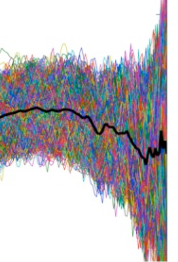
A similar phenomenon occurs with the simulation diagram, that has been widely distributed as Stick support. Here is a blowup of the recent portion in Sciencemag:

Here is a corresponding blowup from the thesis.


114 Comments
In the thesis graph the trends show a… oh what’s the word, you know where it starts to go down at the end, but this disappears in the Science paper, almost as if they are trying to remove from view the part where it goes down at the end.
Is Marcott now declining to respond to queries and hiding this tendency?
Looks like Marcott may have used “a good way to deal with a problem” for this paper.
He’s obviously played a blinder…
Me thinks an interesting result is pending!
Just an aside, the two quotations with which Marcott opens his PhD dissertation are indeed and inspiring and can be quoted back to him (and others) if there is much friction or resistance in sorting through what has been done in Marcott et al. (2013) and the related mediastorm:
[emphasis added]
The Steve M. Blow ups above are sufficient to back my feeble suppositions. Des none have an alternative explanatio!o
sorry, messed up formatting for bold above
[emphasis added]
“Somewhere, something incredible is waiting to be known.”
Carl E. Sagan
“Science is the belief in the ignorance of experts.”
Richard P. Feynman
hmmm…. well I was trying to bold both quotations and authors, I don’t know why it’s not happening, sorry
It looks like another Mike’s Nature trick to me. It’s contagious.
Can I guess? Old fashioned pen plotter got stuck and dragged off the page. He never noticed.
Why is the x-axis scale reversed in the top two graphics?
Ok, I see why. I just downloaded his thesis and see he used 0-2000 AD for that scale while using 2000-0 BP for the science graph.
It gets curiouser and curiouser.
Yup. Big time.
The two Science figures published in The Atlantic article “We’re screwed: 11000 year of climate data….New research takes the deepest dive ever…” seem (oddly) much higher resolution than the supplementary material graphs on the Science website.
http://www.theatlantic.com/technology/archive/2013/03/were-screwed-11-000-years-worth-of-climate-data-prove-it/273870/
Comparing the two shown, I do not understand why Marcott’s minima in the 2000yr span is higher than in the 11000yr figure. Shouldn’t the hump in the curve have moved it higher for the longer?
Why does Mann’s “1999 reconstruction” in fig.A extend more than 50 years into the future?
How can an article written in close collaboration with Marcott say: “Previous historic climate reconstructions typically extended no further back than 2,000 years”?
From line 395 in the supplement: “We first high-pass filter the Mann et al. reconstruction, excluding the post-1900 AD 395 interval to avoid the large anthropogenically forced signal over this time” From 1900 to 2050? 1900 is when “it” began?
Click to access Marcott.SM.pdf
My eyes and brain were strained by the stroboscopic repetition of “Mann et al” in the supplementary text, so I may not be thinking straight.
Bob – 6:51
I expect the difference in x axis is that the top one was years before today while the bottom one is Year. You’ll notice that the bottom one ends about 1950, the “present” while the top one runs a good deal later.
Presumably a PhD or a Science paper needs to be withdrawn…or at least reworked.
I was just about to pay my $20 to purchase this paper, but maybe now I’ll wait for developments here.
Obviously that final point on the graph is the difference between a published and unpublished thesis – and mucho press besides.
“We’re not Screwed”. Nut.
“We don’t know if we’re Screwed”. Nut.
“We might be Screwed”. Nut.
“We’re Screwed”. Booyah!
We’re Screwed: 11,000 Years’ Worth of Climate Data Prove It
Exactly. Write a PhD Thesis without a blade and you are a nobody from nowhere that nobody ever heard of. Add a blade to your stick and you are a world famous climate science super-hero.
Imagine what he could do if his blade were only “robust.”
Over at Mann’s Facebook where this paper is under discussion they’re calling it a scythe!
Re: DaveA (Mar 15 02:16),
Shaun’s scythe — I like it! Josh!!!
It’s like one of those long handled pruning saws for tree work, but there’s not a very catchy name that I can think of…. still, it’s a very artificial creation.
Josh could have fun with this, Mann and friends waving around long handled pruning saws, a danger to themselves and everyone else.
I say it’s a rake – if they stand on the end of it, chances are they’re heading for a smack in the face.
Seems to me that the data in the graph from the thesis ends some time prior to 2000 (looks like the 1970s) even though the time scale goes to 2000, while the graph from the Science piece starts at “0” (i.e. ~2010) and goes backwards and the up-tic seems to start in the graph around where the thesis leaves off (i.e. the 1970s)
BP zeros at 1st January 1950 in paleo reconstruction circles. Carbon dating was invented at the end of 1949 and widespread nuclear weapon testing rendered it useless – going forward – soon afterwards.
Thanks for your reply, however I’m no expert in these matters but was just trying to see what could be the source of the dependency between the graphs, so I’m afraid I don’t understand your comment in that context. Could you kindly clarify in layman’s terms! Thx
Steve, this is just lovely.
I cannot wait for the next post.
You want a ringside seat, the $20 bucks is well worth it. You have the SI and the raw data. Plus the paper itself.
Beautiful.
What we are missing is the computer code. My persoal opinion is that will not matter. Maybe it will, in which case we will need more details..
Rud,
Maybe, but then aren’t you rewarding the publisher for publishing this piece of work?
As soon as I saw that Shakun character talking to Revkin I knew something was seriously wrong.
Cute one moment. Puppy dog. Then cool. Then understanding. Then serious. Then overbearing. Then the jock. Then the Harvard superiority. Then backing down. Then being the allright guy.
All fake.
Sounds like a master manipulator to me….
If I ever saw one.
Weird that an intelligent guy like Revkin seemed to be totally oblivious.
Revkin’s a reporter. He caught a lot of flies with honey in that interview.
What I found most striking is how convinced the young man Shakun is that temperatures are going to rise dramatically in the future. Not a shred of doubt. In effect he is saying, “I know all there is to know and it’s going to happen.” To me, that is not only a sign that he has been mis-educated in the sciences, but that he has been thoroughly indoctrinated by the climate elite. He’s being exploited. In a way, I pity these young guys. They have just been thrown into an intellectual meat-grinder. Sacrificial lambs as it were.
Pottereaton: future temperatures is not even what their paper is about.
Understandable, though, that he would rather discuss someone else’s research than his own, although recently finished.
Makes perfect sense.
But his blade is not robust.
Folks, as posted elsewhere, the S3 ‘hockey stick ‘ above has nothing to do with data. it is a replication of MC simulations preturbing ‘reality’.
Per the SI itself.
So means nothing ‘real’.
This thesis also doesn’t show much of a MWP. He should talk with people like Ed Cook.
Hi,
I’m sorry but could someone direct me to the posting by reader where the discovery to the thesis was revealed and discussed prior? I have been searching but missed it somewhere.
Thanks so much.
Link to the Marcott 2011 PhD dissertation (Oregon State) was provided in this comment:
Yale Alumni Mag. has just come out with a COVER STORY on the victimization of Mann — not one mention of McIntyre.
http://www.yalealumnimagazine.com/articles/3648
Perhaps I don’t understand peer review of scientific journals very well, but how could the editors or reviewers of Science not have cross-checked the thesis and asked questions about the differences. Would that be reasonable behavior–to not check? I am just trying to understand what the norms of scientific journal editing would require. Are the editors of Science really that far in the tank? Thank you for any insight.
A reviewer’s curiosity might lead him to the earlier work but there is no duty to check it. The amazing thing is that reviewers allowed the blade of the graph to be published. As Marcott told McIntyre, the blade is not robust.
Steve & JeanS:
Again I am in awe of your work – and it was accomplished at almost the speed of light. At the risk of adding even more work – I believe both Marcott’s and Shakun’s theses deal with the same proxies and with similar statistical tricks. IMHO, the two theses (Shakun’s is four different papers)are way too much to look at in any detail, but I do think their theses may shed more light on their statistical approach.
Re: bernie1815 (Mar 14 21:50),
Bernie, I was just about to post the following re Clark, Shakun, and Marcott when I saw your comment!
Shakun and Marcott worked under Peter Clark at OSU, and both have very high-profile papers arising out of their PhD dissertations.
This is OT but worth keeping in mind as Shakun, Marcott, and the adviser for both their recent PhDs (Peter Clark) are either transforming understanding of CO2 and ice ages, interglacials, hockey sticks, etc. or else they are over-reaching from the limited data available. Can their analysis and methods be adequate to the huge and far-reaching claims they are making?
Rising CO2 Levels Linked to Global Warming During Last DeGlaciation
Re: Skiphil (Mar 14 21:55),
Willis had two posts last year at WUWT on a Shakun et al (2012) paper in “Nature” which included Peter Clark and Shaun Marcott as co-authors, and he was highly critical of the proxy analysis there.
Clark and students at OSU seem to have created a new climate science industry with Nature/Science and NOAA:
Shakun Redux: Master tricksed us! I told you he was tricksy! Posted on April 7, 2012 by Willis Eschenbach
Willis’s take on Shakun is very interesting but from an entirely different view.
Many of the proxies used in the earlier study Shakun et al 2012 were used in hte later study Marcot et al. However, there are changes in the versions used – the differences are interesting,
Re: Steve McIntyre (Mar 14 22:32),
fyi, Shakun is now a post-doc with Huybers at Harvard:
Shakun a Visiting Fellow in Huybers group at Harvard
It will indeed be a “small world” of paleo if Huybers should take any interest in these matters now.
Skiphil:
Thanks for the follow up. I recognize that at least Shakun is heavily into other paleo issues as is reflected in his thesis. I raised the two theses simply because they illustrate how these guys think about statistical tools and methods. My attention was initially drawn to Shakun use of PCA in the same old climate science way, namely, as a data exploration tool that suddenly becomes a theory when a factor fits without ever really commenting on the physical meaning of the factor(s). This is kind of what I saw Mann doing – thanks to Steve’s work. For years I used PCA to confirm an expected underlying structure in the data – this is pretty standard in psychometrics. But there was also enough cases to show that the factor structure was stable or wasn’t being driven by a subset of cases.
They are overreaching. Radiocarbon dating isn’t nearly good enough to prove what they claim. This is particularly true for the end of the last glaciation where changes in the global carbon cycles causes “radiocarbon plateaus” where samples of different ages have identical radiocarbon content.
The only reasonable way to study the relation between temperatures and CO2 is to use one and the same ice-core where errors in chronology (which are present, even in the best ice-cores) cancel out.
Incidentally the CO2-lag is systematically much larger at the beginning than at the end of glaciations, something that strangely I have never seen mentioned in the the literchur.
tty, can you think of a reason why the CO2 lag was larger at the beginning of the glaciations?
My poster at AGU and a follow on talk I gave was about this very topic. http://www.abeqas.com/DevilsHoleNMAWRAannounce.html
Very interesting presentation – would make a good paper if it could get published.
Thanks Geoff!
Barring an unforeseen event, I am publishing part of that presentation in a peer-reviewed proceedings volume soon. Most of the ‘snark’ has been removed. The volume is associated with a meeting this coming May in New Mexico on “The Carboniferous-Permian Transition”
I coauthor with Cheryl Wilgus, a subject matter expert on some aspects of paleo-oceanography. I’m working hard on it now.
Very good news. Yes, please keep the snark out of the published literature, but do document the omissions. I hope an electronic version will be available. Cheers…
It seems that for quite a few years CA remained tenaciously focused on “the Hockey Stick”, its provenance and its calculation. My recollection is that for much of that time it was argued by others that the science had ” moved on” and it was just no longer that important. Yet even now IMHO it remains the icon summarizing “Climate Science”.
And here, yet again, it rears its ugly head!
Steve: although people keep saying that I’ve been fixated on the Mann version, CA has mostly been about related studies. There are relatively posts after 2005 about MBH. I have focused on proxies because I know them well and find them interesting.
Steve, your insight and tenacity in remaining focused on the Hockey Stick for all these years has really paid off. Even mere “members of the public”, like myself, know well the numerous errors hidden therein. I can’t even look at Marcott’s work without asking similar questions.
You definitely deserve our gratitude!
I take it that in Marcott’s Science submission there is no discussion of his prior thesis data and calculations?
Yes, I agree. It is your focus on the related studies and proxies that has been so enlightening and interesting.
I have been noticing that a lot lately, and by lately I mean over the past 12 to 18 months or so. It seems we see the publishing of information that just can’t possibly be true and is very easily checked (much easier than this) but it is as if they don’t even care anymore. It looks like they are just throwing out everything they have, even the kitchen sink in the hopes that if they just throw enough out there, some will “stick”.
Here’s the transcript of an excerpt of Revkin’s interview with Shakun:
A hockey stick so super that the blade shatters the first time you make a slap shot.
“A similar phenomenon occurs with the simulation diagram … in Sciencemag:”
I don’t have the remainder of the graph and detail blowups can be misleading but:
Why does the upward trending edge of the recent bottom part of the band look so different from the rest? Why is the edge so smooth? Is it because the trend is so steep that the outliers don’t visually stand out?
If this was some general graphics and not a graph from a scientific paper I’d think that the corner was brushed away in Photoshop.
Data sets identical? This should be checked. My impression so far, Steve, is that the analysis procedure is unreliable (not robust in the original meaning). It contains Monte Carlo work, isn’t it? Could it be the case, that reviewers asked for a reanalysis of the thesis results? I would like to see what a number of repeated analyses would show. We should have the code but in my opinion Marcott has the duty to show results of one hundred runs on the same data.
Re: Mindert Eiting (Mar 15 02:04),
I believe the original data sets are the same, but they may have been “prepared” differently.
I don’t believe it’s a result of chance. See the two last figures in this post. The figure from the paper is based on 1000 runs and it’s “distribution” in the end is highly skewed to the uppward direction (as the mean — thick curve — shows). On the other hand, the corresponding figure from the thesis is based on 10 000 runs (*), and its “distribution” is almost symmetric in the end. You can think of chances of picking randomly 1000 curves from those 10 000 curves in order to produce the figure in the paper.
(*) They didn’t even bother to change the graphic in the paper to reflect this change, see Figure S2 in the SI.
Jean S:
I don’t know about the thesis data but they have made changes to at least one of the original data sets. The data reported in the Marcott et al SI for Lake Njulla does not seem to correspond with Laroque’s data as reported here – ftp://ftp.ncdc.noaa.gov/pub/data/paleo/insecta/chironomidae/europe/sweden/abisko2004.txt
The SI data for Lake 850 is identical to the original data.
Lake 850 and Lake Njulla are within a few minutes Longitude from each other in N. Sweden.
Also you can see that there new dating for the Lake Njulla data seems to be driven by some kind of algorithm – changing the dating from integer years BP to fractional years. It is not a seasonal adjustment since the fraction is not constant.
Also look at the “Standard” line in Figure 1C. The Standard stack is just an arithmatic mean. In the thesis, Standard ends at -0.4. In the Science paper it ends around +0.3 (you have to zoom in, it’s pretty well tucked behind the 5×5 grid version). I was thinking the addition of gridding was the big change, but it looks like the underlying data is different, maybe by using the updated dating. The shape of the line in figure 1G (number of records over time) is different between the two papers.
Steve: yes, it’s the re-dating. I’ll show the effect for the alkenone subset today.
Jean, could the different Jitter value used in Marcott11 and 12 make a difference? Marcott11 used J=200 (page 197 of the pdf) and Marcott12 used J=150 (page 7 of the pdf). I have no idea, but it’s a difference I noticed.
From 10 000 to 1 000, understandable, the simulations are expensive ( http://www.youtube.com/watch?v=95EErdouO2w ).
Marcott, please save everyone a lot of trouble and tell us your trick!
I wonder too.
Steve, please remove the comment from the troll using my handle at mar 15 2.41am
Thanks
Rog TB
Jean S: Done.
How the heck does he get here:
… from here:
And where the heck were the peer reviewers on this? Do we know the peer reviewers?
Shakun tells Steve (and obscurely notes in the paper) that the hockey stick portion was essentially meaningless, pretty much worthless in providing any useful insight. Yet in his “media” efforts he stresses the new hockey stick, after first “pre-priming” the debate by referring to going up against the skeptic trolls.
Truly amazing.
A. Scott,
The video interview by Revkin is with Shakun (co-author) but the 2nd item you post is email from Marcott (principal author)…. so the comparison is still relevant, but your “he” might make the new reader think you are talking about the same person. “Shaun” is Marcott not Shakun, though they both need to explain how a scientifically “not robust” result is allowed to get us to a “super hockey stick”….
Skiphil … thanks – you are correct – it was late 😉
Scott, good point that the spike could be created as Marcott describes in the email to Steve, (though Steve notes the spike is everywhere) through over-representation in the Monte-Carlo sampling. I looked up the reference to the MC method in their paper [6] which goes to the SI not a publication. The SI contains no cite to the method. Black mark. It looks like a ‘roll your own” method as I don’t think weighting like that would be an acceptable statistical validation procedure — too much deviation from the uniform (uninformative) prior — and so too much built in bias.
Scott: “Do we know the peer reviewers?”
I think we can surmise one of the reviewers was a prominent scientist liberally mentioned in the text but not mentioned in the acknowledgements.
Steve, please preserve the comment in trash and let me have the IP address. Thanks
Rog TB
Bottom line , the Thesis had to be scientifically valid , the ‘research’ politically useful for ‘the cause ‘ and its the stick where all the political ‘value ‘ comes from .
Reblogged this on Climate Ponderings.
In order to find more hints how this trick was performed I checked the Shakun et al paper (in Nature last year), which contains very similar methodology. In the SI I found this:
I presume that’s the Science paper. So where’s the code? Is Nature going to ensure they release it?
Different issue, but Shakun’s statement below indicates a level of resolution for cause-and-effect from their methods for CO2/temp. which is highly ambitious (paradigm setting). Below is simply a statement for the public in an end-of-year bulletin for Oregon State’s College of Earth, Ocean, and Atmospheric Sciences. However, it is interesting for what Shakun regards their methods as capable of determining in relation to CO2 and temp. at the end of the last Ice Age:
Shakun in 2012 on implications of his study in “Nature”
We’ve been here before.
It is called “Hide the Decline”.
Oh come on!! It is entirely reasonable that the uptick wasn’t present in the thesis work. In a more public forum like Science, the average reader won’t recognize the raw graphs significant relationship to unprecedented temperature if the data is not filtered appropriately.
Even the most dimwitted reader has to admit that unprocessed data itself cannot be expected to understand the implications of catastrophic global global warming. Good science is required to tease out the subtleties of the true signal!
I hope someone has contacted Science about this discrepancy.
Apparently Paul Matthews plans to…
http://bishophill.squarespace.com/blog/2013/3/15/marcott-in-freefall.html#comments
His comment is:
Mar 15, 2013 at 12:21 PM | Registered CommenterPaul Matthews
And Paul’s invited Rob Wilson to join him.
Yes. This is good news. Although Rob’s initial response gave me a chuckle. Send a note to Gavin… What’s he got to do with this??
“nTropywins et al.
I do have severe misgivings about the paper and have now even done some very quick (20 minutes) analyses. Emphasis on the quick!
I have sent my observations to Gavin Schmidt for his thoughts have urged him that if indeed there are problems with the basic conclusions of the paper that RealClimate should make some sort of blog post about it.”
Rob
Mar 15, 2013 at 2:32 PM | Unregistered CommenterRob Wilson
I’m sure Rob’s note was much appreciated the other end. 🙂 I think what Paul is doing could be called putting a man on the spot, in the nicest possible way. And there’s something rather pleasing about Rob Wilson being on the blogs in positive mode the week Mr. FOIA said farewell. Can one call that symmetry?
From the paper:
In addition to the previously mentioned averaging schemes, we also implemented the RegEM algorithm (11) to statistically infill data gaps in records not spanning the entire Holocene, which is particularly important over the past several centuries (Fig. 1G).
So they infilled data gaps (heavily in the past century). I’m guessing he didn’t ‘infill’ in his thesis. The infilling is practically the same as splicing on thermometer data. You convert thermometer data to proxy data, infill, then they can claim “we didn’t splice!” when functionally they did.
Science is a good magazine, except you have to throw out everything they say about climate science apparently.
Steve: it is unhelpful when people make assertions as facts when they are guessing. There is an issue with the uptick, but it is not infilling. Too many people are repeating this as though it’s established.
Using the rough eyeball method of the charts, the difference from the thesis to the journal paper isn’t so much the addition of positive hockeystick(s), but rather the removal of negative hockey sticks.
Steve: yup. By re-dating. More on this today.
Another “eyeball” difference is that in the thesis, the uncertainty range increases noticeably in the last 500 years (i.e., 500 BP – 0 BP), while in the Science paper, the width remains approximately constant.
Here’s one of the views of the Marcott data that’s been about a bit:
Now as Steve M and Jean S have noted, the uptick was not present in the original thesis. Also noted has been the fact the the slope of the uptick is impossible given the resolution of the source data.
What I’ve not seen noted is that the graph shows the Mann et all uptick in the last 60-odd years of the graph – that’s ok, as the baseline for BP is 1950, and the Mann uptick is clearly post 1950.
But the Marcott uptick is pre 1950. Nobody, not even Mann et al, have ever reported a pre-1950 uptick.
So even the excuse of Mike’s nature trick cannot expain this uptick.
I think that Mann’s uptick is exactly before 1950. Mann’s data end in 1980, he did not have any for the period 1980 onwards. That was the reason that Steve asked the “paleo community” to bring the proxies up to date.
1) They don’t know how to create a script in R or Mathematica to show their computations? Come on…did they do it in Excel? Did they add the data columns by hand?
2) “infill” can mean using instrumental data to extend into the future. They need to verify that they did NOT do this or the whole thing is kabloowee.
3) I am highly sceptical of renornimg data by time segments, like Mann likes to do, since it can jump a series up or down for that period. If you have a common period for creating an anomaly, do that and leave it alone.
4) This “try every method” approach to reconstruction is just crazy. We’ll just try Regem, PCA, Monte Carlo, renorming, and every other thing we can think of…is a method? Where is the verification that this method works properly?
Steve: their main method is fairly simple averaging. The issue lies elsewhere
They used pre-calibration and simple averaging as a method to avoid discussion of variance loss. I need to re-read the paper again because it is getting more fun.
Steve: that part of their method was similar to Loehle and McCulloch 2008.
I found in his thesis what I assume are the 73 proxies used by Marcott in the Science paper. The individual proxies from a reconstruction away from the spaghetti mess that is often used for presentation are what I always zone in on when reviewing these reconstructions. These proxy series in Marcott’s thesis show the usual aimless meanderings seen in other temperature reconstructions and with little agreement with one another within the expected ranges of temperature changes occurring during the period of interest. How can one seriously combine these proxies using whatever statistical machinations into a reconstruction and by the magic of averaging out the bad noise expect to obtain a meaningful reconstruction?
I agree with you Kenneth. I actually don’t have a big issue with some sort of “averaging” across the series being used as long as the scientist that does this discusses the nature of the distribution shown and the confidence intervals for the mean of the entire population vs the sample mean. Now, from what I have seen of the results from the original proxies if you plotted the distribution of the results for any given date, you would end up with a rectangular distirbution from which it would be clear that the real mean might be way outside the sample mean.
In this case I presume that “averaging” of any kind is not the cause of the problem, since avergaing is a low-pass filtering and in this example they have take naturally low-pass data and found a way of inserting some high frequency results! Quite an achievement which one would have hoped would have set off alarm bells with at least one of the reviewers!
I see these departures from the usual statistical representation of results all the time in these climate papers. It real isn’t acceptable. As an engineer that deals with this kind of thing all the time, the question you ave to ask yourself is “are my measurement results showing me anything useful?” and “can I do something valid with my results that will tell me anything useful?”. What I see with climate analysis is they are always taking measurements that on eyeballing you would say “there’s no useful information there, it is all noise” then they take this noise and apply some bizarre mathematical approach without ever really explaining why it is valid and voila! they have the hockey stick they were hoping for, despite not one of the measured proxies showing any such event.
Thank you, Kenneth and Ryan. I’m glad I’m not alone in being suspicious of multiproxy reconstructions.
From “My Climate and Me” (UK Met Office)
myclimateandme says:
March 15, 2013 at 3:07 pm
“The authors’ 5°latitude×5°longitude resolution is the same as that of the global Climate Research Unit and Met Office instrumental data sets. The authors’ procedure therefore appears to be sound. If you’ve read the paper, you’ll note that the authors explore uncertainties in the paper, but if you wish to know more, you can contact the lead author on marcotts@science.oregonstate.edu.”
http://www.myclimateandme.com/2013/03/12/new-analysis-suggests-the-earth-is-warming-at-a-rate-unprecedented-for-11300-years/comment-page-1/#comment-50
Some people on the WUWT thread
are plotting some useful graphs – see several comments from Lance Wallace and Bill Illis.
Just in case there was any glimmer of doubt left, these confirm that there is no C20 uptick in the proxies in the Marcott et al excel file.
Bill has an interesting theory (5:54am) which is that the curve is smoothed in time and uses a Mannian boundary condition at 1950 that forces the curve to go through that particular point where the few remaining proxies are relatively high (before declining again). That’s a possibility that should be fairly easy to check.
Steve: I thought about Mannian smoothing, but the difference lies elsewhere. I think that I’ve got the key points figured out. I’d organized the data from spreadsheets and did plots on day 1. See http://www.climateaudit.info/data/marcott-2013.
Wow.
I am stunned.
Have you received their computer code?
That’s against the law in the sovereign state of ClimateHockeystan.
Ha. And openness was such a theme of all the Climategate reports. I was obviously not party to the secret protocols.
It’ll be interesting to see what ‘trick’ they used this time.
I’m not a PhD or a scientist, so excuse my ignorance but I don’t understand headlines being made from doctoral dissertations. These are written by young pups, where’s the body of knowledge and judgment only attained from years of experience? Are these straw men that academics and career scientists manipulate and operate behind? Seriously, these are STUDENT papers, right?
MinB –
Doctoral dissertations normally, as you suggest, are written by young people without years of experience. HOWEVER …
– They are normally produced by people at the peak of their creativity
– They are written by people who have utterly immersed themself in their subject almost every waking hour for three, four or five years.
For the thesis to be accepted, it has to contain original work of sufficient stature and relevance to be published in a refereed journal.
The years of experience come later but don’t underestimate what goes into a doctoral thesis.
Martin A
I’m not sure I’d agree that a PhD graduate is at the peak of his/her creativity. I certainly agree that the PhD is usually a very solid piece of work.
What PhD graduates typically lack is the experience of seeing apparently impressive results fall by the wayside as flaws are exposed. I’ve found this experience this to be very useful in my career. It helps give one the intellectual confidence to question orthodox thinking. Simply knowing that paradigm shifts took place in someone’s pre-career past isn’t quite the same thing.
I feel a little sorry for PhD students in climate science. From statements they make I get the impression they many have a bunker mentality. I like to think that, were I a PhD student again, and Steve M. was examining results in my field, I’d try to engage with the guy rather than see him as the enemy.
Mister Mc Intyre should look more carefully at these graphs. Those of Marcott ends in 1950 while the one in science ends in 2000.
Are we looking at two different Science papers?
The only plot showing anything past 0BP (i.e.1950) is Fig. 1A. However, the curve which is later than 1950 is a plot of Mann’s “CRU-EIV” composite. It appears to me that ALL of the Marcott plots end before then.
I would also suggest that you get a blog name other than “Robert” for use at CA . There is already an individual using that name who is quite active here and I can see you are not that person.
However, the distinction is immediately and clearly obvious, and the difference provides a useful and informative lesson.
======================
If Steve McIntyre is so certain of his results, he should do what every other reputable scientist does and publish them in a reputable peer-reviewed science journal instead of posting them on a blog.
Steve: I try to be accurate in my commentary and believe that comments on Marcott et al are accurate. If you disagree with any of the results presented here, I’d appreciate any input that you can provide and would be happy to correct any inaccuracies.
There was extensive favorable blog commentary on Marcott et al; did you object to that blog coverage as well?
I have a problem with your comment because you seem to think that peer reviewed journals would support Steve’s deconstructions of various papers that they publish. But at least one influential journal makes it very difficult to critique the papers they publish. I tried to correct factual misrepresentations in an article on climate change in NATURE last year through the conventional method of writing a Letter to the Editor. But I was told that I had to purchase a $200/year subscription for the right to write.
Whatever the deficiencies of review-by-blogger, it’s certainly as transparent as one could imagine, and helps a lot in the big picture, given that many journal Editors don’t seem to understand what their academic priorities are.
14 Trackbacks
[…] […]
[…] Read the full report at Climate Audit […]
[…] the new Marcott paper is still being hyped by the media, but being destroyed by actual scientists digging into the paper (including Marcott), we learn some interesting […]
[…] the new Marcott paper is still being hyped by the media, but being destroyed by actual scientists digging into the paper (including Marcott), we learn some interesting […]
[…] the new Marcott paper is still being hyped by the media, but being destroyed by actual scientists digging into the paper (including Marcott), we learn some interesting […]
[…] Here is the link explaining the dissertation by Marcott. It turns out that the data reconstructions don’t match anywhere else as well. […]
[…] https://climateaudit.org/2013/03/14/no-uptick-in-marcott-thesis/ […]
[…] No Uptick in Marcott Thesis […]
[…] i ett inlägg (länk) här på TCS. Artikeln har kritiserats också på andra blogginlägg.(länk1, länk2, länk3). Dagens inlägg är endast ett urval av den kritik som redan framförts i dessa […]
[…] I have been enjoying climate blogs recently again. Joe Romm provided a bit of entertainment on March 8 with his delightfully uncritical eye to the new Marcott, Shakun, Clark and Mix hockeystick. The paper, which unfortunately was the wishful extension of a thesis (some pun intended), that was debunked by Steve McIntyre before most of us had read the SI. By debunked, I mean really, really trashed. I have seen some weak engineering work but wow, this paper was special. Jean S even noted that there was no blade on the stick in the original thesis but the publication picked up by the press had a dad-would-be-proud blade on it. […]
[…] McIntyre of Climate Audit blog pointed out an interesting anomaly in a recent Science paper published by researchers from OSU and […]
[…] PS. As I said, I’d wait for scientists more qualified than I am to try to poke holes in Marcott’s paper. As Mann and Marcott predicted, it has begun. Perhaps they were so defensive, in advance, because they expected it to be a doozy. No special qualifications are required to spot the startling difference between the charts Marcott used in his Ph.D. thesis and those he created for his Science paper. Over to Steve McIntyre. […]
[…] It is therefore not surprising that their tone is getting shriller even as the evidence threatens to slip-slide away (as a recent example for this, see the re-invention of the Mann 'hockey stick' graph, in a new and improved version that could be called 'extra hysterical'. It is also beginning to raise a lot of questions). […]
[…] No Uptick in Marcott Thesis […]