[Update 04/08/13: Josh has once again a brilliant view what’s going on here and in some other cases. Enjoy!
 ]
]
No researchers in this field have ever, to our knowledge, “grafted the thermometer record onto” any reconstruction. It is somewhat disappointing to find this specious claim (which we usually find originating from industry-funded climate disinformation websites) appearing in this forum. Most proxy reconstructions end somewhere around 1980, for the reasons discussed above. Often, as in the comparisons we show on this site, the instrumental record (which extends to present) is shown along with the reconstructions, and clearly distinguished from them.


146 Comments
Heh, nice spot. Didn’t Mann and Jones cook up something similar for a WMO report back in the day with no colour distinction between proxy and instrumental?
A thousand words.
Many of them impolite.
Bazinga!
Gazoomba … schlook !
Cue the response: “Michael Mann was not responsible for the cover…”
Michael “Mann is not responsible” could be understood in a couple of ways…
That’s just Mean!
Dang! I’m sure no one was supposed to notice that bit. 🙂
Well done!
Mann has chutzpah — no news on that front.
I’ll save everyone’s time and preload the Nick Stokes arguments:
– “Of course it is obvious which part is the reconstruction and which is the instrumental period – the instrumental line is in red”
– “The instrumental record is not ‘grafted’ to the reconstruction, it is merely appended – ‘grafted’ is something completely different”
– “It is a customary practice in the field to not clearly distinguish between reconstructions and instrumental record when it is on a book cover”
– “It is unfair to call Michael Mann a hypocrit – after all, he did clearly say ‘often’ and not ‘always’ ”
That cover it Nick ?
A cover is a cover. It is done for artistic effect by cover designers, and I have no interest in it. I do not believe anyone beyond this rather odd collection of folks is scrutinising the pixels.
Tom is right – what matters are the contents with explanation and caption.
Duly noted that ‘None’ predicted that response. ^^^
I had actually thought about adding ‘blame the graphic artist’ shtick. But I rejected including it because it was way too pedestrian for Nick, and not nearly sufficiently complicated or obscurely irrelevant enough.
I admit that I expected to fail in my objective. But somehow, I am dissappointed.
Nick,
“scrutinizing pixels”
You are the most amusing commenter on every thread you participate in. No climate scientist ever exaggerated the threat of global warming… check. No climate scientist ever made a substantive error… check. Projections of extreme sea level rise over the next 80 years are 100% correct… check. Mike Mann’s statistics are perfect… and always have been.. check. And in this particular case.. Mike is not in any way responsible for the accuracy of his book cover… check. Racehorse, (er.. Nick) please spare us all this.
i think its better to say that changing the color and making it “clearly distinguished’ would actually ruin the cover from an artistic perspective. The graphic is designed to center the gaze and not run off to a corner. Adding a different color detail in the corner would ruin the purpose of the cover art. And lets not forget it’s cover ART not cover science.
plus maybe he counted on it being covered up by a star burst
“On sale” sticker
Re: Steven Mosher (Apr 8 14:58),
and the FB upper toolbar … I’ve been waiting someone to ask where did the image come from … it’s his FB cover image! Here’s the link.
Tom, please visit the link … Mike is in need of your wonderful image analysis skills!
Actually, I have that book. The cover image replicates a graphic early in the book. Exactly! It’s that graphic (in the book, not in the cover) that I though of immediately upon reading Dr. Mann’s claim. He makes others like this in the book – I just think he honestly believes that he is a “scientist,” and therefore, much smarter than all “non-scientists” (read: non-PhDs). I know a few PhDs who find that idea quite amusing!
You’ll never get through to a guy like that.
Re: RichG (Apr 7 16:50),
Hah!
Mann is (still) happy to host this image, which was published in the NYT when MBH99 came out back in 1999:
“Quoted without comment,” as the New Yorker phrases it.
🙂
The smoothed series also clearly shows Mike’s Nature trick (as diagnosed by UC), not Briffa’s crude deletion of data. Mann added instrumental data before smoothing and then peeled back the smooth to the last year of proxy data. Math-challenged Jones screwed this up in his WMO graph. See https://climateaudit.org/2011/03/29/keiths-science-trick-mikes-nature-trick-and-phils-combo/ for an exposition of UC’s analysis of Mike’s real Nature trick (as opposed to Briffa’s trick.)
That’s hilarious, Steve, two different errors in one graph! The grafted temperature records, and Mike’s Nature trick, all in one, and on the cover of his book! The mind boggles …
w.
Steve:
Does your comment also apply to Figure P1, page xv?
Re: Steve McIntyre (Apr 7 17:09),
I actually noticed the cover thing already a while ago (now I just noticed a high-res version). The reason I was “scrutinising the pixels” (thanks Nick, I like it!) was that Mann apparently did some restructuring of his web page in the beginning of December, and some images I had not seen (re?)appeared. The key finding was this image (original in Postscript):
It clearly shows that the trick was indeed used already in MBH98, so “mike’s Nature trick” is not a misnomer. Further, it is possible to exctract the curves from a Postscript figure, so we got a digital version of the smoothing. This lead (me and UC) to a long research in order to figure out exact details of the trick smoothing. I think it is a rather interesting story (and IMO things are “worse than we thought”). I’ll try to make post or two about it once I’m bit less busy, and other thing on this site calm down a bit. Skiphil has kindly volunteered to help with the language 🙂
Among other things I found while scrutinising the pixels is that there is at least an instance where Mann himself has plotted the smoothed MBH98 without the trick. Ironically, it is here (see figure 4): False Claims by McIntyre and McKitrick regarding the Mann et al. (1998) reconstruction.

” I’ll try to make post or two about it once I’m bit less busy, and other thing on this site calm down a bit. ”
Interesting stuff in the pipeline. Marcott Fig 1 CRU-EIV uncertainty.. Mann telling that “In some earlier work though (Mann et al, 1999), the boundary condition for the smoothed curve (at 1980) was determined by padding with the mean of the subsequent data (taken from the instrumental record).” ( https://climateaudit.org/2010/02/26/the-trick-timeline/ ) …
Oh, I see, if it is padding, it isn’t splicing, right? You skeptics just use words wrong…
Craig,
It’s more complicated. Why gavin says ‘This has nothing to do with Mann’s Nature article’? And why Mann says ‘the mean of the subsequent data’? And then they leave digital versions of the curves floating around showing these statements are untrue..
And why 10 point Butterworth becomes de facto standard in 2004?
Jean S Posted Apr 8, 2013 at 2:53 AM
The second graph down in the Jean S post is the one that a science community and its defenders would be showing (and attempting to explain) if that community and its defenders were not so torn with advocacy and not wanting to reveal the uncertainties of their work to the lesser scientific voting public. The puzzle left with that graph would be not knowing what the reconstructions show beyond the end point of the series. If the series continues to meander after that point then a logical conclusion is that the proxies in the reconstructions do not respond sufficiently well to temperature to be considered historical thermometers. A truly science based response would take this time to talk about those reconstructions that have shown divergence in the later part of the instrumental period and relate it to the weakness of not using an a prior selection criteria based on the physic/chemistry/biology of selected proxies. At the very least, the inclination of a truly science based community would be a call for bringing the existing reconstructions up to date simply as a matter of obtaining some out-of-sample results and knowing how much more important those results are than the in-sample ones. Until the climate science community and its defenders take these issues seriously it is difficult for me to take them seriously.
Jean:
Sorry this late in the thread but I just received an email from the Publishers of Mann’s HSCW identifying the source of the cover diagram, if there was a question.
Being the simple kind of person, I sent an email to the cover artist Milenda Nan Ok Lee asking her where the graph came from. She must have forwarded it to Columbia University Press. They politely replied
This turns out to be AR3 and the graph I believe is Figure 2.2 in WG1. The label for the figure reads:
In my mind, there is little doubt that Mann pointed them to this particular graphic. Figure 2.21 looks familiar as well.
Please correct the Figure 2.2 from to Figure 2.20. Thanks
But as Jean S said, it gets worse than we t hought.
What goes around, comes around.
Touché, Jean S.
1) One, and so obviously that a previous commentor has tried to weaken the impact with a silly comment, Michael Mann did not design the cover of his book.
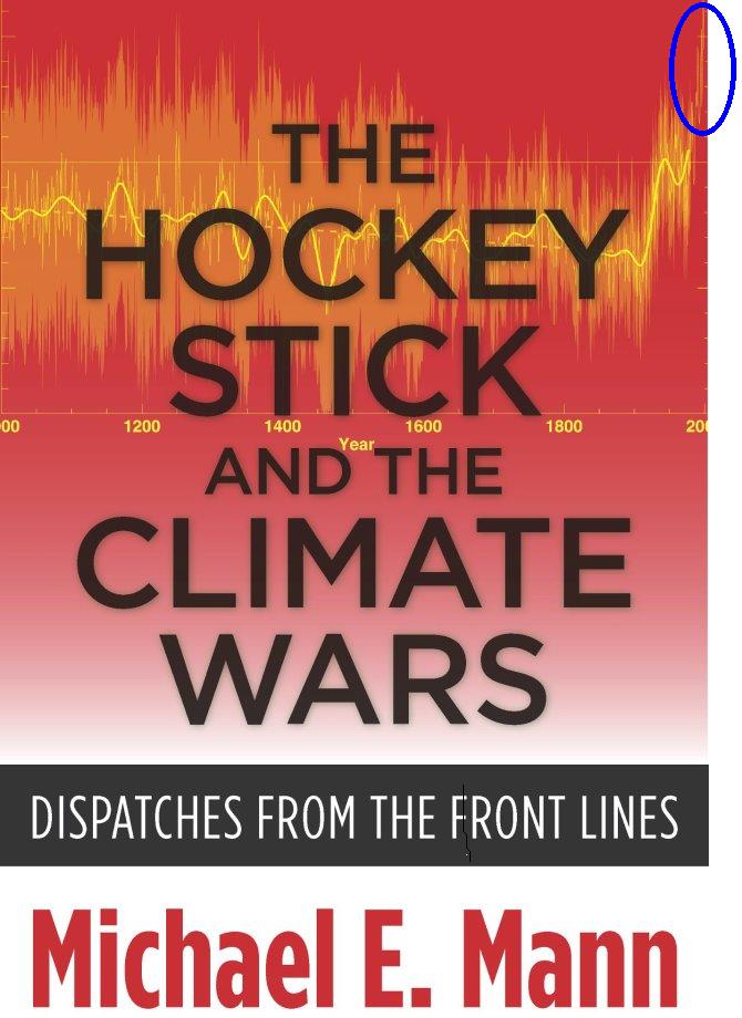
2) The highlighted section is a different colour to the reconstruction, which ends in 1980. To be fair, it is not clearly distinguishable from the error of the reconstruction by colour, though it is by form.
3) The graph is obviously produced by rendering the original graph in grey scale, then converting that to an orange colour.
4) It is a cover! I mean seriously, just how petty are you that you need to ignore the convention that covers are stylized representations in order to take a potshot at Mann.
So, to summarize, a stylized representation of the graph from MBH99, from a part of publication over which Mann has no control, appears on the cover of a book. It shows the instrumental and reconstructed temperaures in a different colour. And that represents a “bazinga” moment. ROFL.
Mann may not have designed the book cover – may!
But he certainly approved the design of the cover, so he has no excuse.
Peter, from various comments by authors it is obvious that authors do not even have control over the title of their book. They can suggest the title, but that suggestion can be and has frequently been ignored. Why should you imagine that the author gets a veto right on the cover.
That, however, is a side issue. The fact is that the instrumental data is distinguishable from the reconstruction. Have a look at the “brightness” of the line. It is also distinguishable from the uncertainty (which has about the same brightness) because it is a line, not a “fill”.
Jean S reveals his prejudice by trying to beat this up into something worthy of comment. If he were serious, he would take issue, if there was any, with the production of the graph in the main text. Except, of course, that that graph very clearly distinguishes between instrumental records and reconstructions:

Having published two books I am quite sure that for trade paperbacks the author (a) sees the proofs ahead of time, (b) has to sign off on them, and (c) can ask the publisher to change anything he objects to.
Tom
I have published two books and on both instances I was asked for ideas for the cover design and I had to sign off on the final design, which was done by a third party.
Anyhow, as someone wrote recently: trying to whitewash Mann is like trying to polish a turd. It just can’t be done.
Tom polishes, hilarity ensues.
This is in keeping with all things Mannian (and Climate Science) related. The error on the cover does not change the main conclusion of the book. So the error remains uncorrected. The error becomes old hat, no longer discussed, and everybody loses sight of it. The book becomes a reference – cover and all – no longer qualified.
Soon it is the whole truth, and nothing but the truth.
Rinse – repeat.
Tom, how many books have you written? Wondering where your seeming claims of expert knowledge arise from.
(Yes I’ve published, though just one book, I did supply the artwork for mine, as I am sure, did Mann for this book.)
Re: Tom Curtis (Apr 7 17:46),
I find it absolutely hilarious that you end your rant by linking to the graph (from Mann’s book!) that I find the best published demonstration what is the visual effect of Mike’s Nature trick! See carefully the end of the first two (smoothed) curves (MBH99, MBH99 “30-70 lat band”): the difference is almost entirely due to the fact that the trick was used in the first but not in the second!
re: 1)
This is a academic (university) press (Columbia University Press). Do you actually assume that the graph got into the cover art without Mann’s knowledge and/or participation and/or approval?
Possible but not likely. If they didn’t get the graph from Mann it would be surprising if they didn’t seek his input and approval for such a “scientific” aspect of the cover. Don’t conflate the “design” aspects of a cover with all of its content when dealing with a book on scientific topics. If Mann had no knowledge or approval of that aspect of the cover art, and some designer or editor just plucked a graph from wherever they wanted, that will be another story. But it can’t be assumed that it happened that way.
In any case the real point (however much you disagree) is that it is (should be) *embarrassing* for Mann to have that as his book cover in light of his quoted vehement, contemptuous comment rejecting such graphs.
I know who should be embarrassed by this incident, and it is not Mann.
If Michael Mann shouldn’t be embarrassed by this book cover, who should be?
“I know who should be embarrassed by this incident, and it is…” Tom Curtis. Mr. Curtis, you have been refuted by authors and an employee of major publishing houses, and as of this posting, we have not seen a correction issued by you. Is there one forthcoming?
Lest you forget, Mr. Curtis, the numerous “hockey stick” graphs published in the main stream media did not include any color distinction allowing the lay reader to possibly realize that something was apparently different between the proxies and the instrumental record.
i.e., however it came to be there that is the cover of Mann’s book. There is nothing inappropriate about Jean S comparing Mann’s quotation with the cover of his own book.
If Mann wants to condemn the cover of his own book as appalling to him and beyond his control, that would be an interesting story. It would not invalidate the comparison Jean S noted.
I’m with you Skiphill. Seems to me that if I was feeling a little touchy about a particular accusation, I’d be especially careful, in word and in deed, to make darn sure the accusation could never, ever again, however remotely, be dropped at my door.
Representations on book covers may well be out of my control, but on receiving a ‘hot off the press’ copy, after first doing an “Oh no!” head smack, I’d immediately tell the world that that the cover was not my idea and that it was the result of artistic flair on the part of book sellers.
Pay no attention to that man behind the curtain.
Yea, I’m sure the publishers when they publish a book on global warming just pull a chart from Wikipedia or Skeptical Science and put that on the cover without asking the author if it’s relevant.
You missed out one from RichG’s post above
Definitely ROFL 🙂 🙂
Tom: Please enlighten us. Which industry-funded climate disinformation website made this specious cover and snuck it onto Mike’s book when he wasn’t looking? I’m sure Steve, Anthony and the Koch brothers must be involved! Please explain. ROTFLMAO indeed!
Tom: Thanks for engaging. The issue is that the original graph was misleading. The smooth was calculated by improperly mixing data types and smoothing across them. The color scheme was also subtle enough to obscure important differences, which allowed the graph to play on two sides of the fence: among the insiders it could be defended that, “See, this line is a (subtly) different color”, but among the public it provided an iconic infographic. The second issue is arguable, the first is not.
Many of us who are skeptical of your side of the debate are skeptical at least in part because of how your side presents things. It’s like the Old School dad who will never admit he’s wrong. Even when it’s obvious that he’s wrong, he will never say the words because he mistakenly thinks it will be seen as weakness.
If you’d say, “Hey, the original Hockey Stick graph was misleading in several ways and should not have been used. But the book is about the Hockey Stick — it’s in the title, after all — so putting it on the cover is an artistic decision. If you skeptics want to be taken seriously, you should criticize papers and results, not art.” I, for one, would respect that and would feel that you’d taken the wind out of the topic.
As it is, though, you spend your time trying to say that the original graph wasn’t all *that* misleading — ignoring the smooth line’s math issue — and then, after circling the wagons and refusing to admit any problems at all, you say, “It’s just art!”.
Somebody obviously got at ‘The Dispatches’.
Well, that certainly rates a 9+ on the Homer Simpson D’OH! meter….
Hilarious. Mann clearly thought ‘this specious claim’ was a terrifically good idea.
You know… this jogged my memory about something regarding the Marcott et al study. The main conclusion that study was attempting to show was that there was no similar jump in temperature within a 150 year period (that we’re seeing in the present) throughout the entire Holocene, reflecting the unprecedented-ness in today’s anthroprogenic temperature track.
While I get that today’s anthroprogenically dominant forcing provides a uniqueness to the spike in the modern temperature record, one of the legs the Marcott study stands upon is that claim of gentle natural variability throughout the entire Holocene, only now interrupted.
Clive Best and Grant Foster’s volley regarding whether spikes could go undetected in the chronology significant enough to matter for comparison to the present (0.9C since 1850, right?) The most important aspect of this was the ‘required physical basis’ that would allow a spike to be plausible beyond just playing around with error bars.
Michael Mann himself wrote something about proxies not catching spikes a little while back, though they were volcanically induced cold spikes:
http://www.realclimate.org/index.php/archives/2012/02/global-temperatures-volcanic-eruptions-and-trees-that-didnt-bark/
Each one perhaps being good enough for a 0.9C down and a return to normal. Tamino also was part of the paper that demonstrated the continued anthroprogenic forcings as part of the temperature record: http://skepticalscience.com/foster-and-rahmstorf-measure-global-warming-signal.html
Taken together, I wonder if indeed there is enough AMO, ENSO, TSI, etc. to combine with a recovery from a volcanic spike (Minoan eruption of 1600 BC for example?) to get to that 0.9C/Century threshold, and for it to go undetected…Seems like there might be, and the work of Mann and Tamino might be a party to how it can happen.
I do not know what is more pathetic: Mann’s obfuscation on this matter or the attempts of those, like Tom Curtis, to defend that position. I do know that if the divergence issue was being handled in a scientific fashion it would be front and center in the climate science community. The divergence issue and problem goes back to what might well be predicted when temperature proxies are used without a thorough a prior understanding of the physics/chemistry/biology involved that could then become a basis of the criteria for an a prior selection process. Instead we have a selection process, that in effect, uses in-sample testing and without acknowledgment from the climate science community of what that portends.
Further, defenders arguments on this matter that never seem to delve into the basic problem of divergence and what it implies for reconstructions nor never condemn the tactic of tacking the instrumental record onto the end of reconstructions as an obvious attempt to mislead at worse or to muddy the waters at best are but an indication of the problems that arise when mixing advocacy and science.
“Further, defenders arguments on this matter that never seem to delve into the basic problem of divergence and what it implies for reconstructions nor never condemn the tactic of tacking the instrumental record onto the end of reconstructions as an obvious attempt to mislead at worse or to muddy the waters at best are but an indication of the problems that arise when mixing advocacy and science.”
Absolutely correct. Could we please demand empirical work to verify proxies? Could we please agree that using instrumental data beyond where proxies end should be prohibited?
“No researchers in this field have ever, to our knowledge…”
and right there with that disclaimer I instantly switched off recognising the unknowledgeable were interrupting any reasonable scientific discussion.
c’mon folks, don’t you know that “The Great Graphsby” (TM-Lewandowsky) has been defended as of world historic importance, in the most florid language, by none other than Stephan Lewandowsky, in one of the instant astroturf reviews (h/t John Cook of Skeptical Science) that appeared on Amazon within hours of the book release:
Lewandowsky on “The Great Graphsby”
Proving that hysterics lack all sense of irony, it seems to have escaped the notice of Prof. Lewandowsky that the novel “The Great Gatsby” was about the rise and fall of UNETHICAL, vacuous people who value only their own success + enjoyment. Yes, perhaps Michael Mann is aptly known as “The Great Graphsby” — thanks, Prof. Lewandowsky.
“war on science…….perpetrated by characters who put their own short-term profits über alles in the world.”
I don’t know, it sounds to me like Ol’ Professor Lew is describing some sort or conspiracy theory.
I wonder what he thinks about the moon landings?
Oh, the lost ironing.
cn
Lew gets bonus points for invoking Godwin. “Über alles”? Seriously?
(And should it be considered holocaust-denial if someone compares the effects of CO2 emissions on climate change with the genocide committed by german fascists?)
He is the most interesting Mann in the world.
Mann’s Hitchcockian stare. What’s he trying to do, creep out his undergrads?
Well, I suppose someone has to say it and since Mann’s supporters didn’t: “Don’t judge a book by its cover.”
You beat me to it, Ric, but I was trying to figure out some witty pun using “book” and “cover.” Something along the lines of, “He’s booking a ticket out of here to cover his…” However it is too late in the weekend to be witty, I suppose.
While in the midst of a litigation it is probably best to not book a judge who’s seen your cover.
I spent most of my career in publishing, as a researcher (working closely with authors) and in other roles, often for academic presses. I’ve worked at some point for almost every major British publisher over the last forty years, inc OUP and CUP.
Of course Mann had veto rights over his cover and would have been closely consulted as to what image was used, and sent the roughed out artwork and first proofs. If he didn’t like the way the graph was represented on the cover he could have had it re-cropped.
Jean’s amusing observation is quite justified.
Sara, would an author be expected to attest to the veracity of illustrations and photos in a book he wrote ?
How would an obviously altered photo get into a book ?
Certainly: authors choose their own illustrations for academic books (and picture researchers are expected to find exactly the correct image if the author can’t supply it). In the case of graphs or other scientific artwork, these are always supplied by the author, or commissioned from a specialist graphics studio with his or her input.
Before a book goes to press for an academic book, there is always a pic picture meeting, or at least one between researcher, editor and author, to approve all images to be used. Covers are slightly different – the art and marketing depts have a big input – but an author would certainly have right of veto over a misleading bit of artwork, as in this instance, if s/he chooses to exercise it. Some authors are much more particular than others about cover art.
Sara,
It appears that the embellishments in the cover graph are theatrical in nature. Kind of like how Daisey justified his actions-
Daisey defended his behavior by insisting that his work was theatrical and never meant to be journalism. But his misinterpretation of events embarrassed Glass and This American Life’s producers. Meanwhile commentators criticized the show for allowing the blurring of journalism and entertainment at the expense of factual reporting.
http://inhabitat.com/lies-about-apple-factory-abuse-leads-to-this-american-life-retraction/
Sara – check out the altered photo in the Eric Lax book about Florey and penicillin. The original photo has been altered to include a person who was not present when the photo was taken.
Sara, regardless of your history, you seem unable to distinguish the fact that the temperature record and the reproduction are produced in different colours. Ergo Jean S’s point, which relies on their being indistinguishable, is not valid.
That the authors and readers of this blog treat the mere grey scale reproduction of a graph on the cover of a book as evidence of misconduct by Mann is bizarre beyond belief. That is the sort of “evidence” you expect from 911 “troothers”.
“Bazinga” is right, but in this case it is Jean S and those who take his post seriously who are the joke.
Tom: when my books were in press I got cover are IN COLOR exactly as it would appear. For Mann to not notice that the colors lead to a misleading impression is sloppy at best, especially given his vehement repudiation of “grafting”.
Tom, the piece which is tacked on is of the same color as the error bars. But the underlying curve is missing. So how exactly would you interpret a curve consisting of only the errors bars? No values but lots of errors?
Re: Tom Curtis (Apr 7 20:08),
re: “evidence of misconduct”
Tom, we may be talking past one another, at least in part. I can only speak for myself, but I did not regard the thread as providing “evidence for misconduct” since obviously a mere book cover can be a bit abstract, in this case hazy, presented without sharp color contrast or temp. scale (on the ‘Y’ axis), and hence is not exactly a “scientific” claim that could be the object of a misconduct allegation. This is indeed more like an “art” presentation of a graph without all its detail. I saw this thread as more about humor and irony, that MM could have denounced a practice that the graph on his book cover “seems” to represent. The colors are only slightly distinguishable, the busyness of the error bars make it hard to see what is going on in that color scheme. You think people are accusing Mann of “misconduct” per se over the book cover. I don’t think it’s an issue of misconduct on the book cover, but one of amusing lack of precision from a guy who complains so vehemently about his critics. Pot, kettle, and all that.
Skiphil, you claim you don’t think it is an issue of misconduct, but Watts clearly did when he called “the ultimate fib”, and oddly, when you commented on that thread you felt no need to correct him. You cannot consistently call it both a lie (fib) and not a case of misconduct. So which is it? Are you alleging misconduct, or are you to gutless to correct your friends when they make false allegations?
Re: Tom Curtis (Apr 8 02:28),
Tom, I was pointing to how the usage on “misconduct” can slide between more focused, rigorous meaning of “scientific misconduct” as defined by a university committee or journal or scientific society, and the wider public uses for which someone is not going to be brought up on “charges”. Do I think that Mann is going to be charged and sanctioned for his book cover? No. Do I think it is a bad graph/cover which qualifies as a “fib”? Yes. Is it the “ultimate fib”? I have no idea, there are endless comparisons to be made to judge “ultimate” but that is rhetoric.
Do you spend your days and nights challenging every word of rhetoric that appears on SkS or related sites? I know I don’t have time for such projects. I don’t doubt that the chart is a “fib” (lie) but whether it is “ultimate” anything I don’t know.
OK, so you and Watts think this the cover was an untruth presented with an intent to deceive. That being, of course, what “lie” (and its synonym, “fib”) mean.
That despite the cover using a different colour for the instrumental record and reconstruction, and hence not being untrue. And that despite the fact that there is zero evidence of intent to deceive.
And you wonder why I think it is Jean S, and his breathless supporters in this thread who have made themselves the joke.
Tom ..
Are you really not aware of why the various and dubious machinations wrt hockesticks always tend to ‘modify’ the picture in exactly the same way?
Are you aware of that your argument now is that in a full-blown pixel-picture you could arguably notice that the error bars and the subsequent temp record can be distinguished?
Has it come to that? Really?
Why are you so quick to delve into “evidence of misconduct?” Who raised that issue with this cover?
What was posted here was that Mann’s own book shows something Mann made out to be a fossil fuel funded fairy tale. It’s funny. It’s a gotcha.
I’d say your reaction is more along the lines of a 911 Truther when something in “Loose Change” was found to be hilariously untrue.
Janowski, it can only be a “gotcha” if the instrumental record and reconstruction are in fact the same colour. They are not. So all it shows is the desperation in some quarters to criticize anything related to Mann; and the fact that they do not always engage their critical faculties when they do so.
Re: Tom Curtis (Apr 8 10:43),
Tom,
Mann’s hyperventilating claim has been discussed from time to time here for a number of years. The falsity of Mann’s claim has been known for a long time. The EIV reconstructions of Mann et al 2008 also splice temperature and proxy reconstruction with no distinction whatever. The version used by Marcott is an example.
You say that at a pixel level, the color in the extension is a little different than the rest. I haven’t parsed the pixels, but will take your word for it. Nonetheless, it seems to me that it remains true that this does not rise to being “clearly distinguished” and can legitimately be used to poke fun at Mann’s claim.
They have to be the “same colour” for the graph to be misleading? Get real. The eye can be deceived by similar colors just as easily as identical colors.
An image can have a hundred distinct colors that the eye perceives as identical. That there is a difference doesn’t matter for visual effects. What matters is how much of a difference there is.
So all it shows is the desperation in some quarters to criticize anything related to Mann; and the fact that they do not always engage their critical faculties when they do so.
So all it shows is the desperation in some quarters to defend anything related to Mann; and the fact that they do not always engage their critical faculties when they do so.
###################
The interesting thing I find is the series of defenses that get employed and the expansion of exceptions. Nothing wrong with exceptions, the question is do we apply them fairly.
case in point:
Let’s take attitudes toward other non scientific publications.
Note, one mainline of defense for folks has been “this is ok because this is not a science journal”. That defense should work for this, But Dana doesnt think so
http://answers.yahoo.com/question/index?qid=20100305120156AAf5Obj
or take everything Monkton does. None of it is science or published as science, yet people hold him to the standard of science. The point is simple. Exceptions carved out for mann and others apply to Monkton and those like him.
You basically get a choice. No exceptions. Exceptions applied equally. Exceptions applied ad hoc in a self interested manner.
I prefer no exceptions. Then of course one applies a sanction based on the circumstance. Like so: is the cover misleading?
yes, it’s a book cover. It’s meant to market. In the grand scheme of things how bad is this? hmm Jaywalking. Does it make the science wrong. No, it’s a book cover. Does it make his critics look silly? of course, they are having fun. Does it make his defenders look silly. ya, they are hyper sensitive and over protective. How does Mann look? no worse than before. That would be impossible.
I think any scientist worth his salt would do his best to not give a misleading impression in a graphic. Mann could have accomplished that by using starkly different colors for the different parts.
Here is an example where even identical colors give a misleading visual impression.
Oops. Linked to the explanation of the illusion instead of the illusion itself.
Correct link for illusion is here.
Mosher, can you find one instance of me criticizing a “skeptical” publication based on the graph produced on its cover? If not (and you will not) your charge of hypocrisy is out of line. Of course, had Mann produced inside the book a graph in which the MBH99 reconstruction was spliced to the temperature record, you can be sure Jean S would have criticized that; and I would not have defended that on the basis that it was “not peer reviewed”. But as the image I link to above shows, Mann did not do so.
Bob Koss, that is an impressive illusion.
I even checked it by taking a screen shot, cutting a section of square B and aligning it with square A, and yes, they are the same colour.
It is also irrelevant because:
a) The colours on the graph are clearly disinguishable; and
b) When you repeat the procedure above (and I did do something equivalent), they are still clearly distinguishable. Ergo it is no illusion.
That our brain may deceive our eyes sometimes does not mean it does so always, and in particular does not mean it does so in this case.
Interestingly, when you colour pick and create a thick parallel lines of the smoothed value, the annual figures and the error, and then colour pick the instrumental value and lay a line of that colour across the other colours, a similar illusion occurs. It appears as though there is a visible border between the instrumental colour and the error colour, but on close examination you can’t pick where the border is. The “border” is an illusion, and they are in fact the same colour (as I have said previously).
The point?
McIntyre asks whether the colours are “clearly distinguished” but there is no difficulty distinguishing by colour between the reconstruction and the error of the reconstruction. There is also no difficulty distinguishing between the temperature series and the error of the reconstruction in that the former is a line while the later is a field (as noted before).
‘Mosher, can you find one instance of me criticizing a “skeptical” publication based on the graph produced on its cover? If not (and you will not) your charge of hypocrisy is out of line. Of course, had Mann produced inside the book a graph in which the MBH99 reconstruction was spliced to the temperature record, you can be sure Jean S would have criticized that; and I would not have defended that on the basis that it was “not peer reviewed”. But as the image I link to above shows, Mann did not do so.”
Tom, can you find me charging you or anyone with hypocrisy?
I merely observe. I observe people making exceptions. Sometimes you, sometimes me, sometimes others. I observe that this practice of making exceptions can sometimes leave us with difficult choices:
A) stop making exceptions. This is my preferred path.
B) make exceptions and apply them equally ( this may be your preferred path )
C) make exceptions, but don’t apply them equally. I provide an example of this behavior from Dana, and I would note the defenders of Monkton engage in this as well.
I make no judgement about which path you should prefer or in fact do prefer. I note the three paths. In the case of mann’s book cover I would call it Art and not science. It’s cover art. It does not in my opinion make him look any worse. is it misleading?, of course. Heck you should see the crap we put on the cover of our book. Does it matter? not enough for me to construe it as a faithful representation. In short, it does not matter enough for me to go through the effort of talking about who controls book covers, or the shade of pixels or anything . Misleading, ya sure fine whatever, important or probative? not really. That allows me to avoid quibbling over details that dont matter. Yes yes his cover could have been more clear, yes yes technically it kinda looks like a grafting job. easily conceeded, what’s the bigger point? Nothing, oh well.
Tom,
After a careful review of relevant FAA records I can find no evidence that Dr. Mann flew an airplane upside down scraping his head along the pavement. Josh’s reenactment is clearly false and misleading.
Additional questions and observations arise –
– Mr. Josh, if that’s his real name, spells Birdmen (not Birdmann) incorrectly
-The song goes, “keep your noses off the ground” not “helmets.
– Would a scraping helmet produce star shaped sparks?
– Does a spinning propeller look anything like a cheesy mustache?
As for this stylized book cover, I wonder if Steve and his ilk understand that Mike’s graph wasnt intended to be realistic? You might consider counting the number of pixels of each color that appear in the plot. This data will prove beyond a shadow of a doubt whether the cover was reddish orange or orangish red.
It is high time for an SKS post debunking all of these issues. In that JC has all but vanished, no Tweets since 3/28, I suggest Dana should be your co-author.
And please, do not give me credit for any of this. The Hat Tips are all yours for exposing that this post is simply a joke.
To be fair, the temperature curve is a different color than the reconstruction as you say: yellow vs. orange. On the other hand, nobody reading the book will pick up on that distinction… but in the grand scheme of things this doesn’t really matter.
I took the post to be a joke at Mann’s expense, not a serious complaint; in this way, I would agree that it is a “joke”.
Steve, your claim re Mann 2008 EIV is straightforwardly false. If you look at Fig 2 of the paper, the EIV reconstruction is clearly shown as distinct from the instrumental record. In Figure 3 (the main spaghetti graph for the NH), the two EIV reconstructions terminate at 1850, being a different colour from the two instrumental records shown and vertically seperated from their terminations so that there can be no confusion between them.
In the data as provided on the net, the EIV reconstruction terminates at 1849 with instrumental values shown thereafter which is poor as it allows no independent check of the validation statistics. However in the description, this practise is clearly stated, with a note saying, “Note: values from 1850-2006AD are instrumental data”. Ergo it is not true that “The EIV reconstructions of Mann et al 2008 also splice temperature and proxy reconstruction with no distinction whatever.”
Beyond that, it was false that “No researchers in this field have ever, …, “grafted the thermometer record onto” any reconstruction.” at the time Mann said it, for Jones had done so in the WMO report. But absent evidence that Mann had read the WMO report, there is no reason to think that the claim “No researchers in this field have ever, to our knowledge, “grafted the thermometer record onto” any reconstruction.” was false when uttered.
Tom, I disagree on this point. We spent quite a bit of time Mann et al 2008 at the time. Mann didn’t archive any unspliced reconstructions. HIs NOAA archive http://www.ncdc.noaa.gov/paleo/pubs/mann2008/mann2008.html contains only spliced versions.
Aside from the hide the decline email, there are other incidents where scientists spliced proxy and temperature. I discussed one then prominent reconstruction (Crowley) where Crowley had done precisely this. I wrote this up at the time, noting that Mann had appeared to notice this because of hte way Mann handled this series in one of his articles, contradicting Mann’s never claim.
Tom, this comment demonstrates an honest man, (you) clearly working to defend his point of view while maintaining his ethics. The fact that you can admit Jones’s actions and inherently believe that perhaps Mann just didn’t know at the time is praiseworthy even if, from my point of view, misguided.
We have many examples of Mann’s disingenuousness or lies as they are more commonly known.
My favorite is his claiming he never emailed Eugene Wahl asking him to delete emails.
Or his referring to using accusations that he used Tiljander data upside-down as “Bizarre”.
Or even referring to this website as an industry-funded disinformation site.
See, we know Mann from his actions. He’s a liar. Therefore, because we have a realistic model of his behavior we can use it to extrapolate. So, Mann loses the benefit of the doubt. We know this to be true, so the fact that there is a possibility that he was speaking the truth is not enough for us to believe that he was in fact speaking the truth.
Re: Tom Curtis (Apr 8 17:54),
re: Mann and Crowley:
To suggest that Mann, whose self-regard is legendary, would not have pored over every detail of the cover before the book was published beggars belief. Further, any publisher who is using the author’s own material on the cover (be it a graph, a photograph, a drawing – whatever) would require the author’s clearance in advance for copyright reasons.
Tom, there are many reasons that different colours are used in graphic design. The most common one is to highlight something which is considered important, to catch the viewer’s eye.
Highlighting that “I am not grafting the instrumental record onto proxies” is not a reason that either graphic designers or the general public of bookbuyers are familiar with.
^^^ What she said. ^^^
I wonder how Mikey is going to spin this one.
If recent efforts are anything to judge by it will probably be perceived as yet another ‘threat’ against his person…
Seems to me that, as has been his pattern, Mann will simply ignore it.
But since you’ve mentioned this Mannian-reflex response of perceived threat against his person … Not only does he seem to be “ignoring” this post, but also (perhaps inspired by Romm?) he’s unleashed** a mini-volley of “poor me” tweets against Delingpole.
YMMV, but this strongly suggests to me that the very thin-skinned Mann’s grasp of the use of metaphors is on a par with his grasp of the use of statistics, i.e. for all intents and purposes, virtually non-existent.
** I fully acknowledge that the sequence of events/timing may simply be coincidental, rather than a convenient diversion.
@ Tom Posted Apr 7, 2013 at 8:08 PM
“you seem unable to distinguish the fact that the temperature record and the reproduction are produced in different colours”
Isn’t that why when producing grey scale figures people use patterns and dashed lines instead of coloured lines for figures?
Its conventional to mark the units of measurement on a Y-axis. (Yes I checked other copies of the book cover and the axis is missing too). To me this sloppiness says it all. 😉
Tom Curtis,
Splicing instrumental data is not new. I have plotted PDO reconstructions of various datasets against each other that squabbled incessantly for centuries and then converged in sudden harmony with the instrumental record. These should also have disclosed their method. But then again they didn’t deny the obvious.
Y’all subscribe to Neo-Scholasticism, the modern authority of scripture. Your problem is your scribes are corrupt. For example, failing to disclose and explain the discrepancies between Marcott’s thesis and the PR article in Science.
Please note that the chapter in Marcott’s thesis is an article by the same authors who submitted the article to Science. Both that chapter and the final Science article are joint efforts. Both include Peter Clark, Marcott’s and Shokun’s thesis advisor. I believe that the additions to the Science article are as much the work of Clark as they are Marcott. It was apparently Clark who organized the FAQ response.
re: Peter Miller Apr 7, 2013 at 6:09 PM
While it is true that you cannot polish one, you can roll it in glitter. I do wish I could remember where I first saw that. 😉
cheers,
gary
So instead of nit-picking the pixels, everyone should be cherry-picking the pixels.
The sad truth is, if so many uninformed like minded drones didn’t take this foolish and misleading one tune zealot so seriously, the continuing comedy of errors(?) would be at least somewhat entertaining!
I have great respect for the thorough grasp on statistical techniques here. I also know that nobody digging up mud can tell me the temperature outside over 1000 years ago; if they try I am offended.
Did the original idea come from here?

‘Earth in the Balance’, Gore, 1992 facing page 95.
The cover is a graphic from the book converted to grey – (orange) scale.
Why not complain about the truncation of the “2000” date to various lengths usually “20” as this could mislead numskulls to believeing the plot ends in the Roman warm period.
Is the hardback edition cover the same as the paperback – dont think so! One is trimmed with the book the other is full image
Poster is correct:

His copy terminates at “2” of “2000” and has no additional data:

Who looks at the cover of a book trying to discern data from a graph behind text when ther is a coloured version with full explanation in the text.
By the way, this would be a great time to show us some of the team’s impressions of Mann’s work as they actually wrote them in the Climate Gate………
Nick Stokes: A cover is a cover. It is done for artistic effect by cover designers, and I have no interest in it.
I am not so easily bored…
:>)
I think there is a typo in several of the above posts. They write “grafter” when I think they meant to use “grifter”.
So what Nick & Tom are saying is that the *cover* is a scientifically meaningless squiggly line drawing. Wink wink. 😉 😉
Andrew
It’s certainly scientifically meaningless. There’s no title, no y-axis marked – could be anything. It’s obviously intended to stir memories of people who have seen the HS plot.
Re: Nick Stokes (Apr 8 08:59),
re: “scientifically meaningless”
yes, that’s what Steve, Jean S, and others have argued about quite a bit of the output of “hockey stick” studies….
Nick, are you sure that it’s ok to misrepresent science for the sake of selling books?
Andrew
Nick says: the graph “could be anything.”
What a hoot! Yeah, maybe it is some guy’s heartbeat or a measure of Mann’s blood pressure over time or something else totally unrelated to climate science. On the other hand, perhaps a reasonable person might think it has something to do with Mann’s hockey stick reconstruction, ya know, because of those massive words “THE HOCKEY STICK” plastered right over the graph. I agree book covers aren’t the biggest deal, but the efforts to defend the graph are hilarious. Why is it so hard to say “OK, he screwed up. Hopefully it won’t happen again.”
More substantively, does the graph appear elsewhere, or just on the cover? After all, all the defenses we are hearing from Nick and Tom are because “it’s only a book cover; no big deal.” However, Warren above in this thread says the same graph appears early in the book as well. Hmmmm, if that is true then what say ye about how irrelevant that cover graph is?
But you’re right, it is probably just an accidental stray mark on a page, a glitch of the publishing process, something the nefarious publishers snuck in there without Mikey’s approval. Sure. After all, it “could be anything” . . .
It’s a misrepresentation of a misrepresentation. Only in climate science.
Andrew
I think he’s referring to the IPCC Reports?
The big problem is that people are so easily misled by this kind of graphic – that’s why it’s put on covers: to sell a book and an idea.
I looked this morning at the reviews of this book by readers on both Amazon and on the Facebook service ‘Goodreads’. These two sites are where most people and esp almost all younger people interested in any issue get their recommendations on what to read, overwhelmingly so.
There are several reviews on both sites for this book (and others by Mann), and they are almost overwhelmingly by people who have swallowed the hockey stick thesis, in toto. It would be a good idea if those who thoroughly understand the issues got to work on these sites to give another and better informed pov.
The problem is that those giving five stars ie full approval are always at the head of the reviews! So potential readers see these first. That needs to be borne in mind!
Re: Sara (Apr 8 08:33),
re: “misled” yes, and as I linked upthread, one of the first reviews at Amazon described this as one of the most important graphics in human history, on a level with graphics about Copernicus and Napoleon. That feverish review came from Prof. Stephan Lewandowsky, psychologist to The Team.
Haha, Skiphil – you couldn’t make him up, could you? 🙂
Well spotted. I love your posts, here and at WUWT, btw.
I hope you’ll get on the Amazon/FB case…
“Humor can be dissected, as a frog can, but the thing dies in the process and the innards are discouraging to any but the pure scientific mind.”
— E. B. White
Actually Johnny carson could make the explaining of a joke funny. However, for it to work, the joke first has to bomb.
In this case a dead joke is ressurrected by forensic examination. Kinda like lazurus, or a phoenix.
or a dead parrot….. or a hockey stick….
Anybody interested in disscussing:
“How many hairs constitute a beard”?
Wondering if the wood pulp for the cover came from Yamal.
I seem to remember a while back (possibly 18 months to 2 years ago) that Lord Monkton came under quite a bit of criticism from the Mann side of the debate for a graphic that he used (truncated/cherry picked or something of the kind).
It would be interesting to revisit what both sides of the debate said about that case.
Steve Mosher sums it up, as he frequently does, extremely well:
“How does Mann look? no worse than before. That would be impossible.”
One final comment, as this is wasting too much time.
It has always been, and remains incredible to me, that “skeptics” can obsess over such minutiae as the presentation of the graph on the cover of a book, or whether or not Mann padded, not the reconstruction, but the smooth of the reconstruction with the mean of the instrumental period after 1980, but pass over in silence, or even publish such graphic manipulations as Salby’s.
http://bybrisbanewaters.blogspot.com.au/2013/04/on-24th-of-july-2012-murry-salby-gave.html
Mosher is right that a very clear double standard is being applied in the climate science debate. He is just wrong about which side applies it.
Was anyone here was even aware of that particular issue before you brought it up? I’m not sure I even know who the post is about. I don’t know how I could “pass over in silence” something I didn’t even know existed.
As for “wasting too much time,” it’s interesting you’d say that. You just complained people don’t discuss something not tied to anything discussed on this blog. In other words, you wasted your time to complain people don’t waste their time.
Tom, I think the difference (in general) is that Mann has influence over the IPCC and therefore potential influence over global economic decisions that impact billions of people, whereas Salby has influence over nobody of importance. Correspondingly, more attention is paid to climate scientists than climate skeptics’ work. Salby’s work (at least what you linked to) appears to be garbage, if that helps the discourse at all.
In this specific case, Mann’s book cover is somewhat misleading but technically ok due to the orange vs. yellow… but even if they were the same color, this doesn’t matter and is a waste of time to seriously analyze since it’s just a book cover. As long as everybody here is taking this to be a bit of a joke rather than a serious point of significance, we should all be ok with an occasional waste of time for amusement. If people here are taking this seriously, I would think they are going too far and acting a bit nutty. I enjoy your contributions here recently and wouldn’t want you driven off by such non-serious topics.
Re: Tom Curtis (Apr 8 18:05),
No, Mann padded with the direct instrumental record. UC was only quoting Mann saying that he padded with the mean of the instrumental. In fact, that claim was one of the motivations to our new (and rather time consuming and laborious) “research” to find out exact details of his MBH9x smoothing.
You “challenged” me to take “an issue” from a graph within the book and even linked to a graph. But you have not commented anything to my response. I presume it was because I didn’t make any explicit question. So I do it now here: do you think there is any “inappropriate” “graphic manipulation” going on in the figure you linked? I know you really don’t need it, but I reproduced the interesting part from a color version (*) by removing all things not related to the point:
The difference between the blue and cyan curves is almost entirely due to trick/no trick smoothing. Red is the instrumental.
[Edit: For Steve and other experts in the matter, there is also something possibly new to you within the above figure … do the blue and cyan curves have the same end year? :)]
(*) Actually, this original figure (later published in IPCC TAR) is among those now found as a Postscipt figure in Mann’s webpage. The production of that figure seems to have a rather interesting history (explaining among other things why MBH99 has the trick included, but others do not), which can be partially followed from Climategate emails (Mosher, take a notice!). Additional clues come from the PS-figure itself.
I am taking notice.
Mosher’s assessment re Mann’s trajectory: “impossible” to look worse.
Until someone wrests the shovel from MM’s hands, this hole will only get deeper.
I have observed collectors and other bibliophiles debate much less apparent differences between editions: ‘what was the author’s intention?’
‘Mosher is right that a very clear double standard is being applied in the climate science debate. He is just wrong about which side applies it”
Well, Tom since I have said that it applies to those people who let Monkton get away with crap, I guess you are right and I have backwards.
Mikey’s book cover graph is amost equivalent to a buxom woman on the front cover of a mystery novel–it attracts attention. “Almost equivalent” because there’s a scintilla of a chance the mystery novel is worth reading.
I noticed yesterday, Tom Curtis referred to here and claimed
Well, that graph appears to contain Mike’s Nature Trick. I can’t confirm that personally but compare Steve McIntyre’ description here, and it sure looks like the one inside Mann’s book has the up-pointing S-wiggle). And, it appears that only Jean S has noticed the irony of that Curtis comment and link.
So, when Curtis more recently says
it’s pretty clear he’s not understanding the existing c
“pretty clear he’s not understanding the existing criticism”
Ugh, I meant to link to this graph, supposedly inside Mann’s book, and about which Curtis says “If he were serious, he would take issue, if there was any, with the production of the graph in the main text.”.
Only in climatology can you be caught red handed doing something that you claim no honest researcher would ever do and yet still people come leaping to your defense…
…but on the upside The Ford Prefect seems to be disinclined to mount a defense.
Was in the printing business for 25 yrs, and there is NO WAY that this was printed without being signed off on. Contact the publisher and they might provide the signed camera ready copy board.
So if Mann had no control over the cover, does that mean the cover artist can show absolutely any random graph he/she wishes to paint? Would a graph depicting a warm medieval period be okay? Or would Mann have opposed that?
Tom Curtis,
you have not answered to my direct question.
IMO, it would be more than fair that you would give an honest answer to the question as it was brought to my attention that SkS is grossly twisting my words only because I (who is not a native English speaker) was (in retrospect) misguided to use the word “diverge” in my November 20, 2009, post. The first line attributed to me in the SkS article is not mine, and the rest is describing exactly the thing my question above concerns and not the tree-ring divergence problem (what the SkS article is about). I also wish that you take what it needs to correct this matter over SkS.
The meaning of “is” strikes again. So mischievous!
3 Trackbacks
[…] https://climateaudit.org/2013/04/07/clearly-distinguished/ […]
[…] Clearly distinguished « Climate Audit […]
[…] https://climateaudit.org/2013/04/07/clearly-distinguished/ […]