A guest post by Nic Lewis
Introduction
Global surface temperature (GMST) changes and trends derived from the standard GISTEMP[1] record over its full 1880-2016 length exceed those per the HadCRUT4.5 and NOAA4.0.1 records, by 4% and 7% respectively. Part of these differences will be due to use of different land and (in the case of HadCRUT4.5) ocean sea-surface temperature (SST) data, and part to methodological differences.
GISTEMP and NOAA4.0.1 both use data from the ERSSTv4 infilled SST dataset, while HadCRUT4.5 uses data from the non-infilled HadSST3 dataset. Over the full 1880-2016 GISTEMP record, the global-mean trends in the two SST datasets were almost the same: 0.56 °C/century for ERSSTv4 and 0.57 °C /century for HadSST3. And although HadCRUT4v5 depends (via its use of the CRUTEM4 record) on a different set of land station records from GISTEMP and NOAA4.0.1 (both of which use GHCNv3.3 data), there is a great commonality in the underlying set of stations used.
Accordingly, it seems likely that differences in methodology may largely account for the slightly faster 1880-2016 warming in GISTEMP. Although the excess warming in GISTEMP is not large, I was curious to find out in more detail about the methods it uses and their effects. The primary paper describing the original (land station only based) GISTEMP methodology is Hansen et al. 1987.[2] Ocean temperature data was added in 1996.[3] Hansen et al. 2010[4] provides an update and sets out changes in the methods.
Steve has written a number of good posts about GISTEMP in the past, locatable using the Search box. Some are not relevant to the current version of GISTEMP, but Steve’s post showing how to read GISTEMP binary SBBX files in R (using a function written by contributor Nicholas) is still applicable, as is a later post covering related other R functions that he had written. All the function scripts are available here.
How GISTEMP is constructed
Rather than using a regularly spaces grid, GISTEMP divides the Earth’s surface into 8 latitude zones, separated at 0°, 23.58°, 44.43° and 64.16° (from now on rounded to the nearest degree). Moving from pole to pole, the zones have area weights of 10%, 20%, 30%, 40%, 40%, 30%, 20% and 10%, and are divided longitudinally into respectively 4, 8, 12 16, 16, 12, 8 and 4 equal sized boxes. This partitioning results in 80 equal area boxes. Each box is then divided into 100 subboxes, with equal longitudinal extent, but graduated latitudinal extent so that they all have equal areas. Figure 1, reproduced from Hansen et al. 1987, shows the box layout. Box numbers are shown in their lower right-hand corners; the dates and other numbers have been superseded.

Figure 1. 80 equal area box regions used by GISTEMP. From Hansen et al. 1987, Fig.2.
Where the distance from a land meteorological station to a subbox centre is less than a gridding radius (limit of influence), normally set at 1200 km, its temperature anomalies[5] are allowed to influence those of that subbox.[6] Figure 3, reproduced from Hansen et al. 1987, illustrates the areas thereby influenced in 1930 by the set of stations originally used. Almost all land outside Antarctica was by then within 1200 km of a meteorological station. Coverage was slightly poorer in 1900.
The 1200 km limit of influence was set to equal that at which the average correlation of annual temperature changes between pairs of stations falls to 0.5 at mid and high latitudes, or 0.33 at low latitudes. It is implicitly assumed that correlation of annual changes is indicative of similarity of trends, which may not be entirely accurate. Hansen et al. 1987 found no directional dependence of annual correlations, but while temperature trends have no general longitudinal dependence they do vary systematically by latitude.
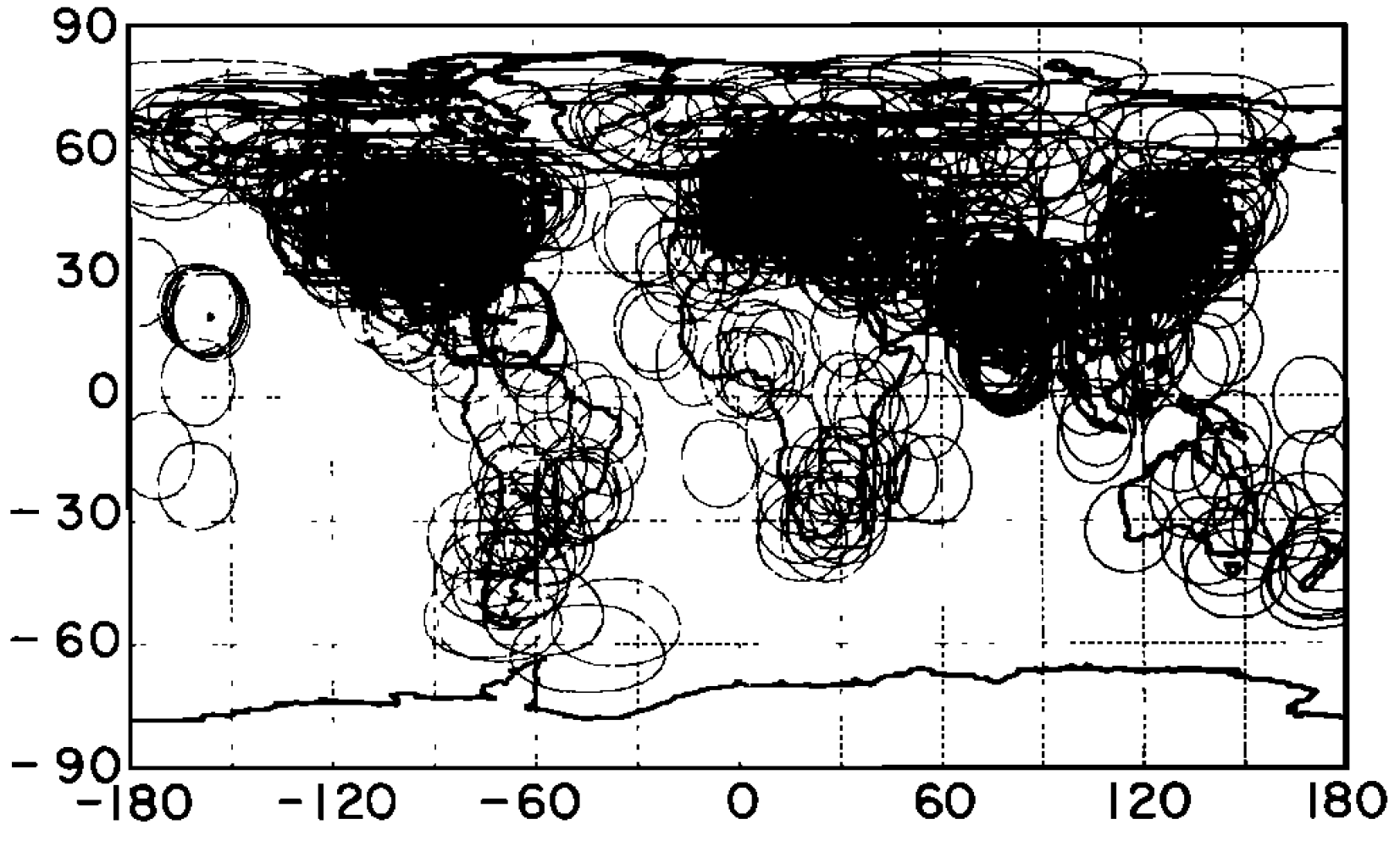
Figure 2. Distribution of land stations and their 1200 km radii of influence in 1930. From Hansen et al. 1987, Fig.1.
Subboxes in ice free ocean areas use SST data – and are therefore not subject to influence by land stations within the 1200 km limit – whenever it is available, provided that at least 240 months SST data exist and that at no time was there a land station within 100 km of the subbox centre.[7] Although ERSSTv4 SST data is complete in ocean areas, Hansen et al. 2010 stated that SST data is only used in regions that are ice free all year. The effective ocean area is on this basis reduced by 10%, to 64% of the global surface area, from its actual fraction of 71%. Although the Hansen et al. 2010 statement seems to be inaccurate,[8] in most calendar months SST data appears to be used only over a fairly small fraction of the ocean north of 60°N and south of 60°S.
Figure 3, reproduced from Hansen et al. 2010, shows the ice-free ocean area. The added lines showing the extent of the GISTEMP polar latitude zones. Their position indicates that temperature anomalies in those zones are dominated by land station data. The use of land station data to infill temperatures over sea ice hundreds of kilometres away appears to provide a preferable measure of surface air temperature to the use of equally distant SST data (or to setting the temperature in sea ice cells to seawater freezing point), provided the intervening sea ice cover is almost complete. Where, however, a significant proportion of the ocean surface in or near the grid cell concerned is open water, as in areas of broken sea ice, it is not clear that using land temperatures is appropriate.

Figure 3. Ice-free ocean area in which GISTEMP uses SST data. From Hansen et al. 2010 Fig. A3, with
lines (red) added showing boundaries of the northern and southern polar boxes latitude zones.
Records for each box are built up by combining records from each constituent subbox with data, equal-weighted, after first converting them to anomalies.[9] Records for each latitude zone are then built up from each constituent box, weighted according to the number of its subboxes with data.
A peculiarity of the GISTEMP method for combining land and ocean data is that their relative weight in each latitude zone, and hence the global, temperature anomaly time series changes over the record, as the availability of land station data varies. It also depends on the limit set for a land station’s influence. With a 1200 km limit variation in the relative land and ocean weights should be small after 1900 save in the southern polar latitude zone, but with a smaller limit the variation would be larger and the land weight might increase significantly over time. Prior to 1900 the land weighting may have been materially too low in the two tropical latitude zones, at least, even with a 1200 km limit.[10]
The GISTEMP global record was originally created by combining latitude zone temperature anomalies weighted in the same way. But in 2010 an important change was made. In subsequent versions of GISTEMP, latitude zone anomalies have been weighted by each zone’s area, even if it only has defined temperature changes over part of its area.
The relevance of the 1200 km limit of influence
Hansen et al. 1987 stated that using alternatives to the 1200 km limit on a station’s influence had no significant effect on global temperature changes. Hansen et al. 2010 stated more specifically that the global mean temperature anomaly was insensitive to the limit chosen for the range from 250 to 2000 km, and that the GISS Web page provides results for 250 km as well as 1200 km. In support of this insensitivity, it gave the 1900–2009 linear trend based change in global mean temperature as 0.70°C with a 1200 km limit and 0.67°C with a 250 km limit.
I was surprised that the GMST trend was not more affected by the limit on a station’s influence, and decided to examine the sensitivity for the current GISTEMP version. Unfortunately, GISS appears no longer to provide global mean LOTI data using a 250 km limit on their Web pages. However, very commendably, GISS makes available computer code to generate GISTEMP.[11] The code has recently been rewritten in the modern language Python and, although I am unfamiliar with that language, the code and procedure for running it are well documented and I found it simple to run and to modify parameters it uses.[12]
I checked my results, with the gridding radius set at the standard 1200 km, against those from output on the GISTEMP web pages.[13] The global trends were within 0.01°C/century of each other over 1880-2016, 1900-2009 and 1979-2016. The linear trend based change in GMST over 1900-2009 I obtained was 0.89°C, a remarkable 27% higher than that given in Hansen et al. 2010.
Global mean comparisons
Figure 4 shows a plot of global temperature computed for GISTEMP using 1200 km (green) and 250 km (red) limits on land stations’ influence, and also on an intermediate 500 km limit (blue). It is relevant to show the NOAAv4 global time series (orange) for comparison, as like GISTEMP it is based on ERSSTv4 ocean and GHCNv3.3 land data.[14] Unlike the post-2010 version of GISTEMP, NOAAv4 area weights the temperature anomalies of all cells with data.[15] To provide a fairer comparison with GISTEMP, I have computed a NOAAv4 global time series (black) giving, as for post-2010 GISTEMP, a full area weight to each of the eight GISTEMP zonal latitude bands irrespective of how many of the cells in it have data.[16]
.
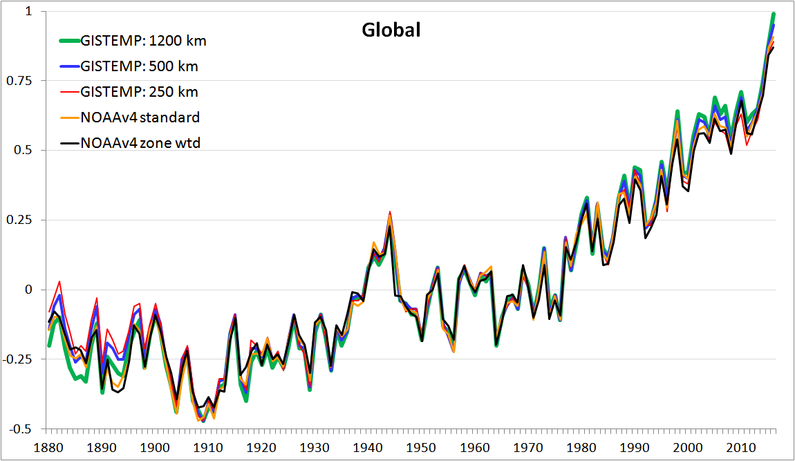
Figure 4. Global temperature anomalies (°C) for GISTEMP at different limits of influence, and for
NOAAv4.0.1 area weighted by grid cells with data (standard) or by 5° latitude bands with data
Although all the global time series follow each other closely over most of the record, there are clear differences in the first half century or so and over the last few decades. In the late 1800s, and to a modest extent during most of the 1915-1935 period, the GISTEMP 1200 km line tends to lie below the other lines, although the NOAA lines fall some way below it for several years in the 1890s. Contrariwise, in the late 1800s the GISTEMP 250 km line generally lies above the other lines, with the GISTEMP 500 km line next. Over the last few decades, the GISTEMP 1200 km line is generally the highest, followed by the GISSTEMP 500 km line. These tendencies are reflected in the linear trends for the different global time series over various periods, given in Table 1.
| Dataset / trend period | 1880-2016 | 1880-1950 | 1950-2016 | 1979-2016 |
| GISTEMP 1200 km | 0.72 | 0.37 | 1.42 | 1.72 |
| GISTEMP 500 km | 0.66 | 0.28 | 1.38 | 1.64 |
| GISTEMP 250 km | 0.62 | 0.22 | 1.30 | 1.52 |
| NOAAv4 standard | 0.68 | 0.37 | 1.35 | 1.62 |
| NOAAv4 zone weighted | 0.65 | 0.34 | 1.29 | 1.60 |
Table 1. Linear trends in GMST (°C/century) by dataset and period
The GISTEMP GMST trend I obtain over the full 1880-2016 record is 0.72°C/century when using a 1200 km gridding radius. When this limit of influence is reduced to 250 km, the trend becomes 0.62°C/century. So, using a 1200 km limit rather than 250 km now leads to a 16% higher full record trend, rather than the 4½% higher trend as reported in Hansen et al. 2010. Slightly over half the difference appears to relate to the early decades of the record. The average GMST anomaly over 1880-1900 was approaching 0.1°C warmer when a 250 km rather than 1200 km limit of influence was used. However, a substantial part of it arises over recent decades, when global land station coverage is much more complete. Over 1979-2016 the GMST trend is 1.72°C/century with a 1200 km limit of influence, but only 1.52°C/century with a 250 km limit. So, the claim in Hansen et al. 2010, the latest paper documenting GISTEMP, that the global mean temperature anomaly – and by implication the trend in GMST – is insensitive to the limit on a station’s influence over the range 250 km to greater than 1200 km is simply not true in relation to the current version of GISTEMP.
Examining temperature anomaly time series for the latitude zones where varying the limits of influence has the greatest effect provides some insight into the sources of the trend differences. It turns out that the largest contributions to differences in the 1880-2016 GMST trend come from the polar zones.
Southern polar zone comparisons
Figure 5 shows time series for the 90S-64S GISTEMP latitude zone at different limits of influence.

.
Figure 5. 90S-64S latitude zone temperature anomalies (°C) at different limits of influence (km)
The 90S-64S latitude zone time series at 1200 km influence limit is remarkable. The wild swings between 1903 and 1943, not exhibited to any extent when a limit is set at 250 km or 500 km, turn out to be caused by a single meteorological station, Base Orcadas, located in the South Orkney islands, some way outside this latitude band. The South Orkney Islands have a climate of transition to polar cold weather, not participating in the polar regime; weather conditions can vary markedly from year to year.[17] Despite it being at 60.7°S, the centres of 18 subboxes in the 90S-64S zone are within 1200 km of Base Orcadas. Although a station’s weight in a subbox declines linearly with distance of the subbox centre from the station, reaching zero at its limit of influence, in the absence of other data for the subbox the station’s influence does not diminish until the limit is reached.[18] As there were no other data for the 18 subboxes involved, their temperature anomalies were set equal to those of Base Orcadas. And because there were very few observations in this latitude zone until after WW2 – a smattering of ship SST readings in the ice-free ocean area during summer months – the Base Orcadas data dominated the southern polar zone temperature anomaly for the 1200 km limit time series over 1903-1943; its weight only fell below 33% in 1955.[19]
After working this out, I found that the influence of Base Orcadas on GISTEMP’s 90S-64S zone had been pointed out back in 2009.[20] However, at that time the effect on GISTEMP’s global time series was completely negligible, as until 2010 the weight given to each latitude zone in determining the GMST anomaly was proportional to the area in it for which there was data, which for the 90S-64S zone was only a small fraction of its total area prior to 1955. However, in 2010 GISTEMP switched to weighting each latitude zone by its full area irrespective of how many of its subboxes had data.
Are changes in temperature at Base Orcadas representative of those for the 90S-64S zone, which is dominated by continental Antarctica and the ocean adjacent to it? I very much doubt it. For a start, the correlations of annual temperature changes at Base Orcadas with those at stations in the interior of Antarctica (with records starting circa 1957) are low.
With Base Orcadas dominating them, temperature anomalies for the 90S-64S zone during the first decade or so after 1903 and during the 1930s were generally strongly negative. By contrast, those from data restricted by a 500 km or 250 km limit of influence were only weakly negative, which mirrors much more closely the behaviour of anomalies in the adjacent 64S-44S zone, where data was much less sparse. In my view, the standard GISTEMP methodology is unsuitable for application in the southern polar zone prior to the mid 1950s. While the influence of Base Orcadas on GMST trends is only minor, it is not completely negligible even over the entire record. If pre-1955 Base Orcadas data is removed, the GISTEMP 1880-2016 GMST trend, with a 1200 km limit of influence, falls by 0.01°C/century – over a quarter of the excess of the GISTEMP trend over that for the standard version of NOAAv4.
One other unusual feature of GISTEMP in this latitude zone is that it uses a reconstructed record for Byrd station in Antarctica, the only location in the interior of West Antarctica with a useful pre-1981 record. The reconstruction stitches together, without any offset, the records of two stations having somewhat different locations, construction and instrumentation, and whose records are separated by some years. This procedure, which produces a fast warming record for Byrd, is not in accordance with normal practice for temperature datasets. The reconstructed Byrd record is not used by in HadCRUT4v5 nor to my knowledge in any other dataset apart from the Cowtan & Way infilled version of HadCRUT4. However, its contribution to the GISTEMP global temperature trend is very small.[21]
Linear trends for the different 90S-64S time series over various periods are given in Table 2.
| Dataset / trend period | 1880-2016 | 1880-1950 | 1950-2016 | 1979-2016 |
| GISTEMP 1200 km | 0.60 | -1.54 | 1.25 | 0.71 |
| Ditto ex Orcadas pre 1955 | 0.27 | -1.30 | 1.32 | 0.70 |
| GISTEMP 500 km | 0.23 | -1.10 | 1.06 | 0.56 |
| GISTEMP 250 km | 0.10 | -0.75 | 0.72 | 0.94 |
| NOAAv4 zone weighted | 0.08 | -0.66 | 0.35 | -0.86 |
Table 2. Linear trends in 90S-64S anomalies (°C/century) by datasets and period
The GISTEMP 1200 km limit southern polar temperature trend over the satellite period, 1979-2016, during which Base Orcadas had limited influence, exceeded that using a 500 km limit.[22] A comparison with ERAinterim, arguably the best reanalysis dataset, suggests that the standard GISTEMP 1200 km limit version produced an excessive trend in southern polar latitudes since 1979.[23]
Northern polar zone comparisons
I now turn to GISTEMP’s northern polar zone. Figure 6 shows time series for the 64N-90N GISTEMP latitude zone. Here, there are noticeable differences between the various datasets in both early and late decades in the record. These differences are larger than for the southern polar zone, if one ignores the impact of Base Orcadas, despite data being less sparse in the northern than the southern polar zone, especially early in the record.
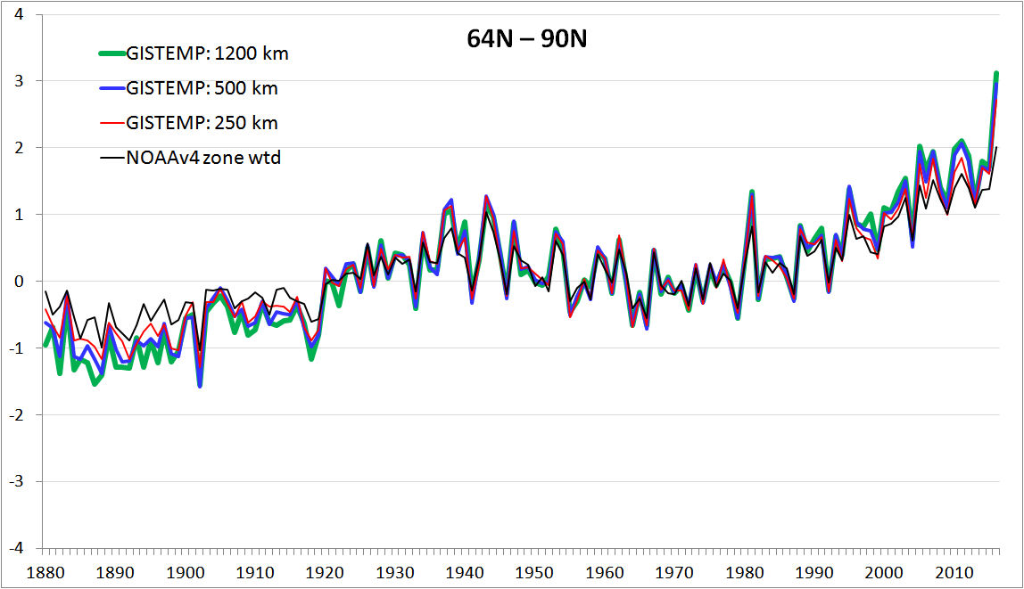
Figure 6. 64N-90N latitude zone temperature anomalies (°C) at different limits of influence (km)
The lower temperature anomalies up to 1900, relative to those over the stable period from 1903 to 1916, when using the 1200 km limit of influence are questionable. The NOAAv4 dataset weighted in the same way as GISTEMP shows a considerably smaller increase, as (to a lesser extent) do the 250 km and 500 km limit GISTEMP versions. The Cowtan & Way infilled version of HadCRUT4.5 warms only a third as much as the standard 1200 km GISTEMP version in this latitude zone between these two periods.
Linear trends for the different 64N-90N time series over various periods are given in Table 3.
| Dataset / trend period | 1880-2016 | 1880-1950 | 1950-2016 | 1979-2016 |
| GISTEMP 1200 km | 1.77 | 2.85 | 3.16 | 5.74 |
| GISTEMP 500 km | 1.60 | 2.61 | 3.02 | 5.44 |
| GISTEMP 250 km | 1.42 | 2.32 | 2.75 | 4.96 |
| NOAAv4 zone weighted | 1.11 | 1.68 | 2.39 | 4.34 |
Table 3. Linear trends in 64N-90N anomalies (°C/century) by datasets and period
The large divergence between all GISTEMP variants and NOAAv4 in the 64N-90N latitude zone almost certainly relates to the treatment of sea ice. In a non-infilled record like HadCRUT4, cells with sea ice have no data; their temperature anomaly is effectively treated as always equalling the mean for the region over which anomalies are averaged. In HadCRUT4 this is entire hemispheres, although it would be possible instead to average over latitude zones, as in GISTEMP.[24] In NOAAv4, the spatially complete ERSSTv4 ocean data is used in cells with sea ice. The temperature for such cells is set to -1.8°C, near the freezing point of seawater. In GISTEMP, as the ERSST SST data is flagged as missing in subboxes with sea ice, their temperature anomalies are set equal to those of any land stations with data within the 1200 km (or 500 or 250 km) limit of influence, on a distance-weighted basis where more than one such land station exists. The Cowtan & Way infilled version of HadCRUT4 effectively does much the same through its use of kriging.[25]
Insofar as temperatures over sea ice do reflect those of land temperatures within the radius of influence used, the NOAAv4 method can be expected to understate surface air temperature changes for cells with sea ice; this is also so (to a lesser extent) for the HadCRUT4 method.
It is unclear why the 1200 km GISTEMP version has warmed faster than the 250 km and 500 km versions in 64N-90N in recent decades. Possibly it reflects a higher weighting being given to the highest latitude land stations, and an even lower weighting being given to the very small ice free ocean area included in the zone. Comparisons with the ERA reanalysis dataset suggest that the GISTEMP 1200 km limit version produced realistic trends in arctic temperatures from 1979 until the late 2000s, with a slight underestimation of warming since then.23
Conclusions
The answer to the question originally posed, “How dependent are GISTEMP trends on the gridding radius used?”, is that they are much more dependent than claimed, with use of a 250 km, rather than the standard 1200 km, limit producing materially lower GMST trends over all periods investigated. That does not mean use of a 250 km limit produces a more accurate record. In my view, a 1200 km limit is in general preferable to a 250 km limit, although use of some intermediate value between 500 km and 1200 km might be best. In any event, a 1200 km limit is clearly unsuitable for use in the southern polar zone prior to the middle of the 20th century, since doing so results in unrepresentative temperatures at Base Orcadas – some way outside that zone – dominating temperature changes for the entire 90S-64S zone.
In principle, GISTEMP as currently constructed has several features that arguably make it more suitable for comparisons with global climate model simulations of surface air temperature than HadCRUT4 or NOAAv4, the most prominent other global temperature datasets.[26] GISTEMP:
- gives a full area weight to all latitude zones (unlike HadCRUT4)
- uses nearby land temperatures rather than SST to estimate temperatures where there is sea ice
- uses ocean temperature data that were until recently tied, on decadal and longer timescales, to marine air temperature rather than SST records.[27]
However, against this GISTEMP has a few problematic features that seriously detract from its suitability as a global temperature dataset. GISTEMP:
- fails to ensure ice-free ocean temperature anomalies are weighted by the area they represent
- uses a simplistic infilling method that sets cell anomalies equal to the weighted average of those for land stations up to 1200 km away, with no kriging-like reversion towards the mean with distance.
By contrast, the Cowtan & Way infilled version of HadCRUTv4.5 does not suffer from either of these shortcomings, while matching GISTEMP as regards all but one of its positive attributes identified for making comparisons with climate model surface air temperature data. And while HadCRUTv4.5, and hence Cowtan & Way, use HadSST3 for ocean temperatures rather than the marine air temperature data linked ERSSTv4 dataset, over 1880-2016 the two datasets have essentially identical global trends.[28] Although simulations by the vast majority of global climate models show that ocean surface (2 m) air temperature warms marginally faster than SST, it is not clear that their behaviour in this respect correctly reflects reality. Such models do not properly represent the surface boundary layer, within which steep temperature gradients exist; their uppermost ocean layer is typically 10 m deep. The fact that HadSST3 has warmed as fast as ERSSTv4 (and HadNMAT2) suggests that ocean surface air temperature may not actually warm any faster than SST.
If one is after a globally complete dataset for comparison with global climate model simulations, the Cowtan & Way infilled version of HadCRUT4 therefore looks a better choice than GISTEMP. Interestingly, it is only prior to 1890 and during the last decade that the Cowtan & Way GMST estimate systematically differs from the unfilled HadCRUT4v5 one; the two datasets’ 1890-2006 trends differ by under 1%. IMO, no infilling technique will be that successful prior to 1890 – there isn’t enough data to go on, and data accuracy is also an issue. It is much more plausible that HadCRUT4v5 understates warming since the early years of the 21st century, a period when the Arctic – where there are limited in-situ temperature measurements – warmed very fast. However, over the fifteen years to 2016 the HadCRUT4v5 and Cowtan & Way GMST trends, of 0.138°C /century and 0.160°C /century respectively, are equally close to the 0.149°C /century ERAinterim trend; the GISTEMP and NOAAv4.0.1 trends are both above 0.17°C /century.
Nic Lewis
[1] GISTEMP LOTI, combined land and ocean data: see https://data.giss.nasa.gov/gistemp/
[2] Hansen, J.E., and S. Lebedeff, 1987: Global trends of measured surface air temperature. J. Geophys. Res., 92, 13345-13372, doi:10.1029/JD092iD11p13345.
[3] Hansen, J., R. Ruedy, M. Sato, and R. Reynolds, 1996: Global surface air temperature in 1995: Return to pre-Pinatubo level. Geophys. Res. Lett., 23, 1665-1668, doi:10.1029/96GL01040
[4] Hansen, J., R. Ruedy, M. Sato, and K. Lo, 2010: Global surface temperature change. Rev. Geophys., 48, RG4004, doi:10.1029/2010RG000345
[5] Changes from the mean for the corresponding month over a reference period.
[6] Stations without, for at least one month, data for a total of 20 or more years are dropped.
[7] Hansen et al. 1996 states that “A coastal [sub]box uses a meteorological station if one is located within 100 km of the box centre.” But in fact, if there was at any time a station within 100 km GISTEMP throughout the record uses data from all land stations within 1200 km.
[8] It is unclear whether the GISTEMP code accurately implements this condition. The GISS-pre-processed ERSSTv4 data it uses appears to have had subbox SST data removed throughout the record but by individual month rather than for all year. I presume data was removed for all calendar months in which the subbox concerned contained sea ice in any year of the record. If SST data remain for at least two calendar months then the 240 months minimum data requirement will be met and SST data used for those calendar months. The presence of sea ice appears to be deduced from the subbox SST being cooler than –1.77°C. It is not evident that the ice-free condition was applied before 2010, but it was irrelevant when GISTEMP started using ocean SST data since then used dataset only covered 45°S–59°N.
[9] Curiously, monthly means over 1961-1990 are subtracted to compute subbox temperature anomalies, while an anomaly reference period of 1951-1980 is used when combining subboxes into boxes.
[10] Judging from the January 1886 land coverage for HadCRUT4 shown in Figure 5 of Morice CP, Kennedy JJ, Rayner NA, Jones PD, 2012. Quantifying uncertainties in global and regional temperature change using an ensemble of observational estimates: The HadCRUT4 dataset. J. Geophys. Res. 117: D08101..
[11] The data files it uses are GISS supplied, with sea-ice affected areas of ERSSTv4 data already masked out and the reconstructed Byrd record substituted for the original.
[12] The GISTEMP code is available via https://data.giss.nasa.gov/gistemp/sources_v3/. I used frozen data files from the provided input.tar.gz file, both for speed of processing and to ensure consistent results from different runs. The data files were dated 18 January 2017; slightly different results may be obtained if downloaded current data is used instead, as some pre 2017 values may have been revised. I ran the code on a 64 bit Windows 7 computer with the Anaconda36 implementation of Python, which includes required library modules, installed.
[13] File https://data.giss.nasa.gov/gistemp/tabledata_v3/ZonAnn.Ts+dSST.csv, downloaded 4May17. I also checked the trends produced by the Python code against those I calculated from a global time series produced by weighting each month the anomalies for individual boxes making up each latitude zone by the number of subboxes with data to give zonal anomalies and then combining these latitude zone anomalies, area-weighted. They were almost the same globally.
[14] NOAAv4 anomalies, which are relative to the 1971-2000 mean, have been restated relative to the 1951-1980 mean used by GISTEMP.
[15] In NOAA’s case, 5° latitude by 5° longitude grid cells, not equal area subboxes. However, cell anomalies are area weighted when combined to give zonal anomalies, so the difference should in principle be unimportant.
[16] To simplify the calculations, I reduced the monthly grid cell series to annual mean anomalies before rather than after combining them into zonal latitude bands and then a global time series. NOAA grid cells falling into two GISTEMP zonal latitude bands had their area weight split appropriately. As in GISTEMP, zonal anomalies were derived by combining on an area-weighted basis anomalies for all cells in the zone with data, but each zonal anomaly was given a full weight in computing the global anomaly irrespective of for what proportion of its area cell data existed. Note that a similar comparison is not given for other global temperature datasets since they do not use ERSSTv4 data.
[17] Argentina National Meteorological Service http://www.smn.gov.ar/serviciosclimaticos/?mod=elclima&id=68
[18] Since with only one data source the divisor in the calculation of the weighted subbox anomaly is the same as the weight given to that data source.
[19] Between 1945 and the mid-1950s, both 1200 km and 500 km limit 90S-64S zonal anomalies were also influenced by data from Esperanza Base station, located near the tip of the Antarctic peninsula, 1° outside the zone.
[20] https://chiefio.wordpress.com/2009/11/02/ghcn-antarctica-ice-on-the-rocks/#comment-1471
[21] The inclusion of the reconstructed 1957-2016 Byrd record nevertheless increases the 1957-2016 warming trend in GISTEMP’s 90S-64S region by approximately 0.25 °C/century, compared to when using the original Byrd and Byrd AWS records.
[22] Use of a 250 km limit gave the highest trend over the 1979-2016 period, due to it producing lower temperature anomalies in the 1980s and 1990s.
[23] Simmons, AJ et al., 2017. A reassessment of temperature variations and trends from global reanalyses and monthly surface climatological datasets. Q. J. R. Meteorol. Soc. 143: 101–119, DOI:10.1002/qj.2949. The comparison is for the a 30 degree latitude band around the pole.
[24] I did this in 2014 using 10° latitude zones; the effect on HadCRUT4 GMST trends was very small (zero over 1850-2013), indicating that sparse polar coverage in HadCRUT4 has not of itself led to any significant bias in GMST estimation.
[25] Although as the distance away from any station falls the anomaly for a cell with sea ice will gradually tend towards the global mean land anomaly.
[26] A potential understatement of warming arising from use of temperature anomalies when sea ice cover reduces has however been pointed out (Cowtan, K., et al., 2015: Robust comparison of climate models with observations using blended land air and ocean sea surface temperatures, Geophys. Res. Lett., 42, 6526–6534). This occurs even when sea ice anomaly temperatures are land-based, as the change to SST in temperature anomaly terms is generally less than the change in absolute temperature. However, bias arising from using temperature anomalies when sea ice cover is reducing is likely to be substantially smaller than suggested by the climate model simulations carried out by Cowtan et al., since the reduction in Antarctic sea ice extent simulated by climate models during the period over which they find a bias developing has not occurred in the real world.
[27] In ERSSTv4 ship sea surface temp (SST) measurements, on decadal and longer timescales, are adjusted to match movements in night-time marine air temperature data (per the HadNMAT2 dataset).
[28] As they do over the ice-free 60S-60N latitude zone, which is more relevant to their use by GISTEMP and Cowtan & Way.


357 Comments
The Berkeley Earth land/ocean dataset is also quite similar to the Cowtan and Way one, but has a bit better spatial resolution over land where it kriges individual stations rather than precomputed HadCRUT grid cells: http://berkeleyearth.org/data/
Thanks, Zeke; kriging based on individual stations makes sense, but I wouldn’t have thought it would make much difference on a global or zonal basis.
I believe BEST also homogenises land station data differently from HadCRUT4, and hence from Cowtan and Way.
It does, though the homogenization makes relatively little difference over land globally, at least since 1950 or so (though some regions like the U.S. and Africa are more strongly affected). HadCRUT4 also uses homogenized land data, but obtains it from national MET offices rather than via a consistant automated process.
Here are Berkeley and C&W anomalies over time: https://s3.postimg.org/m7o8ml0er/global_temps_1850-2016_berkeley_C_W.png
They have models to figure out how CO2 affects temperature which in turn is a modelled value and that model may be tuned to match the predictions that CO2 will affect temperature.
“Models All The Way Down” (TM) IPCC.
Thank you Nic. I remember John Daly puzzling over this a couple of decades ago.
Nic,
The paucity of data is evident in your plots, especially in the Southern hemisphere. If one wanted to compute
an approximation of the mean temperature (integral of T over the sphere above integral of the sphere), one would need a very fine equally spaced grid to do so accurately (I believe if T is smooth the actual accuracy could be computed using a standard local numerical error analysis). In any case the error using the current available observational data would probably be on the order of 100%, i.e., completely untrustworthy. Thus I find the arguments about global temperature trends nonsensical. And comparing those temperatures with global climate models that are based on the wrong reduced system of equations is pathetic. I am not saying there isn’t some global warming, just that the climate scientists science is not science.
Jerry
Plus, Jerry, they ignore instrumental resolution. It’s apparently a little known fact that climate thermometers are infinitely accurate.
The spatial estimate or prediction will always represent more precision than the observations. The prediction represents what you would have measured with a perfect sensor.
It’s not an average of the observations. It’s a prediction. Very different animal than yo u are used to.
And we actually test the prediction.
Citation please, not that Mosher ever, ever, exaggerates, but…
And of course, the esteemed Dr. Mann notes that predictions are not falsifiable. I must talk to my Astrologer about all of this.
Steve Mosher brings up the field of prediction, and changes from accuracy to precision. Since a thousand runs of a single GCM with similar initial and/or boundary conitions will yield a thousand different outcomes, how does the statement “The spatial estimate or prediction will always represent more precision than the observations” actually have any meaning?
I wonder what the rationale behind this statement is. Precision is a very different animal from accuracy, not to mention how it relates to measurement error and uncertainties. Estimates are different from predictions as well. I believe that the claim here by Steve Mosher is not supported by fact.
Pat Frank brings up the much claimed accuracy of observations, which is said to be high since there are thousands of measurements and by applying the well known formula you reduce measurement uncertainty to zilch. Apart from the inconvenient fact that the formula is not appropriate for the system being measured. The fomula states that if you have a number of independent measurements of a parameter, then the unceratinty of each measurment can be reduced in the average of all measurements by the inverse of the square root of the number of measurements. Insert “thousands of measurements” and the uncertainty reduces to almost nothing.
However, in the climate system this means you would have to have thousands of simultaneous measurments at each location, since the air mass being measured changes over time, both in composition and density. Composition is of course the main variable of these. Obviously, we do not have such a measurement system, and the claim of reduced uncertainty is thus bogus.
Instrumental resolution is not a precision problem. It’s a problem of the instrument itself unable to detect the difference between two external magnitudes.
The undetected difference is data lost forever. It remains an error in the record, forever.
Every single instrument will contribute its resolution error. It enters the record as an irreducible uncertainty in the measurement. No amount of averaging will ever remove it.
Instrumental resolution is the lowest possible limit of accuracy. It is entirely ignored in the published air temperature record; set aside.
Pat,
Do you have a contact for Roy Spencer?
Jerry
Hi Jerry — I’ve emailed it to your hxxxbb_at_cmcst account.
Actually Gerry, this is a good point. In areas where the stations are sparse, its equivalent to having a very large grid for the integration and errors in the integral could be large.
dpy
” errors in the integral could be large”
That’s just guessing. People actually work it out. It’s treated as coverage uncertainty in Sec 5.3 of Morice et al, 2012. It is a substantial part of the overall error quoted. I discussed in here, with tests here and here. It’s not nothing, but not huge.
dpy
” errors in the integral could be large”
That’s just guessing. People actually work it out. It’s treated as coverage uncertainty in Sec 5.3 of Morice et al, 2012. It is a substantial part of the overall error quoted. I discussed in here, with tests here. It’s not nothing, but not huge.
Nick, I’ve now approved both your comments that were stuck in moderation; sorry for the delay. However, they seem to be near duplicates?
If you have a problem with comments containing links getting stuck again, please post a comment asking for them to be released from moderation.
David,
“a short paragraph giving the essence of the argument that the mathematical error estimate is not applicable”
It comes back to my initial statement – you don’t have a derivative. I’m pretty sure that you and Jerry are thinking about integrating things determined by PDE. That tells you about derivatives – pressure gradient implies acceleration etc. But here we don’t have that. We just have a sampled field variable.
Numerical integration here basically makes an interpolation function based on the samples, and integrates that. So the question is, how good is the interpolation. The JB formulae would say, fit a polynomial based on the derivatives, and the error is attributable to neglected higher order terms. Here we can’t do that. The basis for saying interpolation is possible is correlation. That is why Nic’s post talks about 250km, 1200km etc. Correlation doesn’t have to work at all times (eg fronts) – it just has to work well enough on average for integration.
Jerry refers to his spherical harmonics example. I think that is instructive – I use SH integration extensively, and find it gives similar (good) results to triangle mesh. I posted here
moyhu.blogspot.com.au/2017/03/residuals-of-monthly-global-temperatures.html
a study of residuals, with a WebGL globe picture, especially of SH (following posts also are on integration accuracy). The number of SH is limited, because the scalar product is not an exact integral (unobtainable) but a product on the observation points, and so orthogonality fails. When the high-order SH start to have wavelengths on the order of gaps in the data, the failure is total (ill-conditioning) and you have to stop. When you do, the residuals are still large, and if you use a random model for them, you will deduce a large error.
But the residuals I show are clearly not random. They actually look very like a combination of the higher order SH’s that couldn’t be used. And the point is that, though the amplitude is large, those SH have zero (exact) integrals. The large residuals have been pushed by the fitting process into a space that makes almost no contribution to the integral.
Nic,
Thanks for releasing. The sameness is becauseI was exploring for the limit on links – I though three might work where four didn’t.
Thank you for the “here” links. They are priceless. I will try to keep things to a minimum.
In the first, you are heavily-focused on the standard deviation. The first laugher is this one:
“…So the spatial error is reduced by a factor of 8, to an acceptable value. The error of temperature alone, at 0.201, was quite unacceptable…”
The “error of temperature alone” was 1.69% of the mean value. The error for the mean anomaly was over 13%! It’s apples and oranges when you look at the magnitude alone. When you look at the relative error, it paints a different picture.
Then you go on and use area-weighting – which you apparently failed to implement correctly the first time (“Update: I had implemented the area-weighting incorrectly when I posted about an hour ago.”). You point out that, “Now I think it is right, and the sd’s are further reduced, although now the absolute improves by slightly more than the anomalies.” The absolute improved, yes…from 1.69% to 1.13%. But to say that it “improves by slightly more than the anomalies” is wrong. The standard deviation of the anomalies did drop from 0.025 to 0.016. But the mean value dropped from 0.191 to 0.101…so the error went from 13.1% to 15.8%! In whose world is that an improvement, other than yours? Yet you insist that, “For both absolute T and anomalies, the mean has gone up, but the SD has reduced. In fact T improves by a slightly greater factor, but is still rather too high. The anomaly sd is now very good.” The anomaly sd is only “very good” when you don’t look at it relative to the anomaly, and the absolute sd only looks bad when you don’t look at it relative to the absolute mean!
This was all for the 1981-2010 base, allegedly. You state that, “Does the anomaly base matter? A little, which is why WMO recommends the latest 3 decade period,” then “I’ll repeat the last table with the 1951-90 base.” Ok, great. Not sure why you’re going 40 years instead of 30. And then your table says…”Base 1951-80, area-weighted.” So which base did you really use? 1951-90? 1951-80? I can only assume the latter. But nobody in your echo chamber noticed this, and I am not convinced you calculated these property based on everything else I’ve seen. It seems amazing that the absolute T and it’s sd would be identical for those two 30 year periods – 12.102 vs 12.103 for T and 0.137 vs 0.136 for sd. Really? Back-to-back 30-year periods with a mean T difference of 0.001 and sd difference of 0.001? That doesn’t strike you as the least bit unusual? Or at least worthy of mention? Absolutely remarkable. But the anomaly was 0.620 for the 1st period and 0.101 for the 2nd? Not so sure.
Remarkably, your conclusion is that, “Spatial sampling, or coverage error for anomalies is significant for ConUS. Reducing this error is why a lot of stations are used. It would be an order of magnitude greater without the use of anomalies, because of the much greater inhomogeneity, which is why one should never average raw temperatures spatially.”
Again, the magnitude of the error is because the values being measured are more than a magnitude apart! The relative error of the absolute temps is an order of magnitude better than that of the anomalies for 1981-2010.
Repeat your exercise with T/100 as your parameter instead of just T, and you’ll get even smaller sd values in magnitude. Does that make it better? According to your logic, it does. Well then, how about T/100,000? T/1,000,000? Need I go on?
————————————————————
As for your second “here”…you took a look at one month and identified that the mean anomaly was close to 0.9 as you culled stations down to a count of 60. In some cases, the anomaly went up. In some cases it went down. You didn’t notice any bias. Wow, you really needed to run an exercise to tell you that? “An important thing is that the mean anomaly seems to remain fairly level at about 0.9°C. Culling obviously increases spread, but doesn’t seem to bias the result.” I started laughing and stopped reading after that “important” find. Was this an exercise for 7th grade algebra students?
“The “error of temperature alone” was 1.69% of the mean value. The error for the mean anomaly was over 13%! It’s apples and oranges when you look at the magnitude alone. When you look at the relative error, it paints a different picture.”
This is complete nonsense. It never makes sense to talk of the % of a temperature. There is always an arbitrary offset. The % of °C is quite different to % of K, yet it actually makes no difference which you use here. An anomaly subtracts off the mean, so of course the % is larger. This elementary fallacy permeates your comment.
“I can only assume the latter.”
Correct. The 90 was a typo (for 80). The meaning was obvious.
“Repeat your exercise with T/100 as your parameter”
Complete nonsense again. There was a factor of ten reduction in the magnitude of error. That is the same in any units.
“Wow, you really needed to run an exercise to tell you that?”
Yes. The second exercise, where SST was successively eliminated, did introduce a bias. We know that having fewer stations increases uncertainty. The fact that it doesn’t seem to introduce a bias is significant.
“…This is complete nonsense. It never makes sense to talk of the % of a temperature…”
Ummmm Nick, sure it does. People do it all of the time. It’s the relative error expressed as a percentage. It doesn’t matter if you’re talking measurements of temperature or widgets. Sure, you’ve got to be careful of misapplications. But you don’t need to express it as a percentage. You can just leave it as the ratio of the error to the mean if that makes you feel more comfortable.
“…The % of °C is quite different to % of K, yet it actually makes no difference which you use here…”
No it does not in this case (but certainly more appropriate to use with Kelvins). Relative error is not the end-all, be-all. But to just ignore it and immediately decry an error to be unacceptable on magnitude alone as you did, or proclaim that a method offered improvement when the relative error increased…pfffft.
“…Correct. The 90 was a typo (for 80). The meaning was obvious…”
The intended meaning was obvious. What period you based your calcs on had to be assumed. You’d already admitted mistakes on that page and weren’t fully convincing that even those had been fixed.
“…Yes. The second exercise, where SST was successively eliminated, did introduce a bias. We know that having fewer stations increases uncertainty. The fact that it doesn’t seem to introduce a bias is significant…”
That it didn’t seem to introduce a bias overall was to be expected. Again, I laughed and stopped reading after the first exercise. Oh, so eliminating sea surface temps introduced a bias in an additional exercise? Shocking. You mean land and SSTs aren’t in lockstep with each other? Who’da thunk it.
Nick,
Evidently you have never has a course in Real Analysis.
Relative norms are used all of the time to compute relative ((percentage)
errors between two functions in Banach or Hilbert spaces.
Jerry
Jerry,
“Relative norms are used all of the time”
You are talking more and more nonsense (and yes, I do have a PhD in maths with plenty of undergrad in Real Analysis). This is an elementary blunder. At issue is that I calculated a mean of station temperatures, 11.863°C, and sd. 0.201°C. I then calculated the mean anomaly, 0.191°C and showed that use of anomaly reduced the sd to 0.025°C. I think that is a big gain. But Michael J wants to argue, but no, the relative error in mean temp was 0.201/11.863 = 1.69%, and taking anomaly increases it.
This is, as I said, juvenile nonsense, and for reasons nothing to do with Banach etc. Relative error, or % is dimensionless. But here the temperature scale has an arbitrary offset. If I did the calculation in F (quite valid) the relative error is 0.362/53.35 = 0.68%. If I did it in kelvin, equally valid, the relative error is o.201/285 = 0.07%. It is a totally meaningless calculation.
I repeat, it never makes sense to take a ratio or logarithm of Celsius temperatures. Every Victorian schoolboy knows that.
Good try Nick,
When a function has a large mean you use the norm of the difference
(where the mean cancels out) divided by the norm of the function minus the mean. A simple example is the surface pressure where there are two digits that are constant with variations two orders of magniitude less. It is the accuracy of the variation of the pressure that one is interested in and including the mean in the denominator gives a misleading idea of the accuracy. If you read our 2002 manuscript then you see that this is the correct way to determine the accuracy of small perturbations on a large mean. Do you keep up on the literature?
Jerry
Jerry,
“If you read our 2002 manuscript then you see that this is the correct way to determine the accuracy of small perturbations on a large mean.”
You don’t seem to engage with the actual issues at all. These are not functions. They are measured temperatures, in °C. “large mean” is, well, meaningless. You can have any mean you like by rebaselining the temperature scale.
Nick,
You have forgotten that there are both continuous (integral) and discrete (summation) norms. Better go back and reread your real analysis text.
Jerry
Except they are not. You can test this. That would end rank speculation.
Nick,
I looked at your triangulation games . You have the same large number of knobs to turn as a climate model.
Give me a break. Where is the theory?
Jerry
Steven, It’s a mathematical point. The error in the integral is proportional to the maximum grid spacing times the first derivative of the function. At least that’s the rigorous bound. We have seen things like this in Antarctica where there have been papers that made these errors as I’m sure you know.
That’s wrong Young.
It is wrong. The key difference is that the integrand has only a finite number of known values (and no derivative). Any gridding will yield either very large grid cells, mixing inhomogeneous values, or smaller cells where some have no data points. It is the problem of dealing with those missing cells that creates most of the coverage uncertainty. GISS’ two-level system is a way of trying to get around this, but can only go so far.
There has been much work to estimate coverage uncertainty. Morice et al 2012 is much quoted.
whut,
I suggest you read a numerical analysis text on the approximation of an integral using a discrete number of points.
Or read my counter example in the text below. The mean is defined by the integral of the function over the surface of the sphere divided by the area of the surface, not a sum of a few points divided by the number of points. Numerical analysis tells us that the the numerical approximation of an integral for a smooth function requires a fine grid to be accurate. The more points the more accuracy. Note that temperature across a front is almost a discontinuity.
And that means you would need a huge number of grid points to compute the mean accurately.
Jerry
“And that means you would need a huge number of grid points to compute the mean accurately.”
But what is huge? No quantification here. I have investigated this extensively at my blog Moyhu. I can’t give links here, because that causes the comment to go into moderation – two of my comments have now been there for 3 days. But on April 5 2017 (see archive) there is just one of several studies (others linked) which show that the number of grid points is ample to establish an integrated monthly global mean reliably. And of course there are studies in the literature – I mentioned above Morice et al 2012, but it goes back to early Hansen.
Nick, Can you explain what the mathematical basis of your claim is? Forward error analysis might be nice. I think Gerry’s point is that in regions like the Southern hemisphere, where data is sparse, the normal mathematical analysis would yield a quite large error. The exact size depends on how smooth the function is.
An analogy you know well is aeronautical test data. Even a very large number of pressure measurements at discrete points give a very inaccurate estimate of global forces and moments, which are always measured by smart engineers separately.
David,
“The exact size depends on how smooth the function is.”
The exact size is important, but all we have here is hand waving. It isn’t like PDE solving, where you basically create the integration data. It isn’t even really like pressure testing, which I don’t think you would try to interpret without some mathematical model based on the physics of flow. You have just a number of isolated anomalies, and you have to have some basis for interpolating (and integrating the result) to get a global average. That basis is usually correlation.
I’ve referred to one method of estimating error (coverage uncertainty) which is subset selection. I spoke of a a post where I did this systematically for one month integration. moyhu.blogspot.com.au/2017/04/global-60-stations-and-coverage.html
Other methods are used. Morice et al used model results restricted to the measuring points. You can’t use methods that depend on an estimate of derivative – that is more uncertain than the integral. But you have to find some quantification.
Thanks for the response Nick, but could just give me a short paragraph giving the essence of the argument that the mathematical error estimate is not applicable? I usually avoid this area as it seems very complicated and not very interesting, but Jerry does seem to me to have a valid point that is pretty obvious and rigorous in its origins.
David,
I misplaced my response on the sub-thread above.
Nick,
Try your interpolation scheme or other gimmick on my counterexample and tell me what the mean is. Any interpolation method also relies on the smoothness of the function being interpolated and that smoothness is used by standard numerical analysis to determine the error. What is the numerical error in your interpolation method? The only person doing hand waving is you.
Jerry
Jerry,
“The only person doing hand waving is you.”
You have given no numbers relevant to the integration of temperatures on Earth. I have, and I have been putting this into practice on my blog, calculating the average from raw data every month for over six years now. I post this each month in advance of the others, and it agrees very well with what they get, by other means. And I have extensively analysed and tested the errors.
In terms of your “examples”, yes, one observation of a sinusoid in a period will give an unreliable mean. One hundred, randomly placed, on the other hand, will do very well. And I have dealt with your spherical harmonics example above, with link.
Nick Stokes, “And I have extensively analysed and tested the errors.”
It is to laugh.
Nic –
“If pre-1955 Base Orcadas data is removed, the GISTEMP 1880-2016 GMST trend, with a 1200 km limit of influence, falls by 0.01°C/century.” This does not seem consistent with the values of Table 2, which gives 90S-64S trend for 1880-2016 (1200 km) is 0.60 °C/century; sans Orcadas, 0.27 °C/century.
HaroldW – Table 2 is for the 90S-94S zone, which has an area and hence weight of is only 5% in the global mean. 5% of (0.60 – 0.27) is 0.0165 °C/century. That is still slightly higher than the GMST trend change of 0.01 °C/century (0.009 to 3 decimal places). The difference doesn’t seem due to the minor influence Orcadas on the 64S-44S. It might be because the GISTEMP code only outputs zonal and global temperature anomalies to 2 d.p., or to the data being converted from monthly to annula values before trends were calculated.
Thanks Nic. I misread the text, didn’t realize that it referred to global anomalies with and without Orcadas.
Welcome back Climate Audit!
Thanks for the work!
Question at Zeke, have you guys published your homogenization algorithm?
Back in 2013. Its available here: http://static.berkeleyearth.org/papers/Methods-GIGS-1-103.pdf
Published and tested in double blind studies. Nevertheless..folks continue to speculate. Speculation. Arm Chair science. Never touch the data just speculative thoughts.
Mosher,
I suggest you try this simple test. Generate a spherical harmonic function
using Spherepack with a reasonably realistic temperature in physical space (my guess is that any non constant function with several harmonics will be sufficient). Then use the locations of the observations to generate the mean temperature for the function and compute the error. What is the relative size of the error ?
Jerry
Mosher,
I assume you know what a counter example means. Assume you have a two pi periodic function that has a single observation at pi/2. The value there is 5. What is the mean of the function? Any answer you guess is wrong. And that is because the observations are not dense enough to correctly determine the mean. If there were sufficient obs to compute the necessary integral of the function accurately, then the mean could be computed. So much for the double blind (climate scientist) test.
Jerry
Gerald Browning,
Why generate climate data? There is plenty of synthetic data from models, reanalyses, or real data with global coverage that one can play with.
Like this example: Throw away 99.83 percent of the spatial information, and see if you can reconstruct the whole..
Do you still have doubts about sparse sampling? Do you believe that global warming in the long run can hide between those 18 dots?
Olof R,
You assume models are an accurate depiction of the atmosphere. They are not. The equations they are based on were derived for the troposphere (Charney) and are not applicable in the boundary layer. The boundary layer parameterization error destroys the accuracy of the model approximation of the tropospheric equations in a few days (see manuscript by Sylvie Gravel et al.). And that is assuming the hydrostatic equations are the correct ones which they are not (Browning and Kreiss 2002). The artificial diffusion in the models destroys the numerical accuracy
of the spectral method (Browning Hack and Swarztrauber) and I haven’t even begun to discuss the inaccuracy of the physical parameterizations (maybe you can explain why there are so many different versions).
Reanalysis data is a combination of these questionable models with obs data, i.e., the large errors in the models are included in that data.
As for the obs data itself it is essentially absent over the ocean (2/3 of the planet) and sparse over many land masses (especially the Southern hemisphere as can be seen in Nic’s plots).
Numerical analysts test various numerical methods on both simple and difficult analytic functions and then compute the errors. That is exactly how we found out how the excessive dissipation in the models is destroying the spectral accuracy (BHS).
I provided a simple analytyic counterexample in order to inform the reader that one must be wary of conclusions when the observations are sparse. I could easily make the example more complicated, but the point has been made in an easy to understand case.
Jerry
Olof R,
Please provide a citation or details of the method you used. I must admit I am tired of going thru these less than rigorous manuscripts only to find the gimmick that was used to obtain the result wanted by the author. Steve McIntyre
has done an excellent job on many of these tricks and that is why I so admire him.
Jerry
Jerry
“I provided a simple analytyic counterexample in order to inform the reader that one must be wary of conclusions when the observations are sparse.”
Your “analytical example” is trivial and pointless. Of course it is possible that an integral could be inadequately sampled. The question is whether in fact they are, and on that you have nothing useful to say. Olof’s example is not from models involving boundary layer parameterizations or any such. Nor is it from reanalysis. Nor is it based on observations which may be sparse over the oceans. He is using UAH V6 lower troposphere data measured by satellites. And his simple, relevant point is that by subsampling just 18 points, he gets essentially the same result as in integrating with the whole dataset. The same point I made with subset selection on the surface data with triangular mesh.
“What gimmick did you use?”
His process is perfectly straightforward, if you actually read it. I see no reason to doubt his method is valid.
“…The average is formed by area-weighting, which I prefer to think of as a spatial integration method…”
You “prefer?” Is it or is it not?
I “prefer” to think of infinity as my available funds.
Jerry & Pat
Re: errors. Have you included artificial anthropogenic warming/cooling (aka “fabrication”)? See:
Fabricating Temperatures on the DEW Line.
https://wattsupwiththat.com/2008/07/17/fabricating-temperatures-on-the-dew-line/
David,
Quite amusing and one more fact to support the case about questionable
data accuracy. Of course Nick and Olof will ignore this by not providing
error bars.
Jerry
Olof R,
Interesting that the many of the 18 points are in data sparse regions. Did you compute the means from the original obs data and if so how did you weight the individual obs? The method is just an interpolation of 18 points over large areas. What gimmick did you use?
Jerry
Nick,
Oh so now we have it. Let us talk about the accuracy of satellite data. It is well known that the inversion of the integral used to determine the temperature from the radiances is an ill posed process and very inaccurate over cloudy
areas. Now just how much of the earth is cloudy at any given time? And did he pick the 18 points to give him the answer he wanted? And how long has the satellite data been available?
Jerry
Jerry,
” Let us talk about the accuracy of satellite data.”
I’m sure you can go on forever about how we can’t know anything about anything. But in fact we’re talking about the accuracy of integration of satellite data. As to choice of 18 points, it looks like a regular grid with 120 spacing in longitude and 20 in latitude.
Satellite temperatures are no more accurate than about ±0.3 C. You can integrate all you like Nick, but they’ll never be better than that.
Jerry, global cloud cover is about 67%.
Pat,
I knew that the cloud cover is a large percentage of the earth. I was waiting for Nick to admit it. 🙂
Nick,
I looked at your web site. The triangulation of the surface of the earth can be manipulated to provide any result
you want because the answer will depend on the distribution and size of the triangles. And how many triangles (parameters) do you have? As many as Carter has liver pills?
I am waiting for a citation on a manuscript by you or Olof. Have Olof overlay his plots with those from IPCC
and plot the difference between so we can get a feel for the variation between the two.
Jerry
Pat,
Where did you obtain the accuracy of the sat data? As you know tomography is also an ill posed problem (inversion of an integral) but works for the large scale features because they have so many different angles ( and lots of radiation for the patient). My experience has been that the sat temp data only works reasonably well in clear skies and when there is a ground based measurement to anchor the result. There should be different errors for the clear and cloudy sky cases with and without a land based measurement?
Jerry
Jerry,
“The triangulation of the surface of the earth can be manipulated “
The triangulation is the unique convex hull of nodes, determined just by node location. There are necessarily approximately twice as many triangles as nodes. As to manuscripts, there are plenty of published indices, which you apparently dismiss. If you want to see overlaid results, I show them here:
moyhu.blogspot.com.au/p/latest-ice-and-temperature-data.html#Drag
The triangle result is called TempLS mesh, and you can compare it over any period with any of the regular indices. If you want to compare numbers, there are tables here, with different anomaly base periods:
moyhu.blogspot.com.au/p/latest-ice-and-temperature-data.html#L1
The different integration methods that I use are shown by pressing the TempLS button.
Troposphere temperature measurements use a microwave range which is little affected by clouds.
Hi Jerry, the accuracy I mentioned is a lower-limit estimate, based solely on the field calibration of the physical instrument itself. Other sources of error will add to that minimum.
Here’s a set of citations to temp sensor accuracy I posted once, elsewhere:
Radiosonde air temperature measurement uncertainty: ±0.3 C:
R. W. Lenhard, Accuracy of Radiosonde Temperature and Pressure-Height Determination BAMS, 1970 51(9), 842-846.
F. J. Schmidlin, J.J. Olivero, and M.S. Nestler, Can the standard radiosonde system meet special atmospheric research needs? Geophys. Res. Lett., 1982 9(9), 1109-1112.
J. Nash Measurement of upper-air pressure, temperature and humidity WMO Publication-IOM Report No. 121, 2015.
The height resolution of modern radiosondes using radar or GPS = 15 m = (+/-)0.1 C due to lapse rate alone.
That makes the lower limit uncertainty of modern radiosonde temperatures (inherent + height) rmse = ±0.32 C.
Satellite Microwave Sounding Units (MSU): ±0.3 C accuracy lower limit:
Christy, J.R., R.W. Spencer, and E.S. Lobl, Analysis of the Merging Procedure for the MSU Daily Temperature Time Series Journal of Climate, 1998 11(8), 2016-2041 (MSU ≈±0.3 C mean inter-satellite difference)
Mo, T., Post-launch Calibration of the NOAA-18 Advanced Microwave Sounding Unit-A IEEE Transactions on Geoscience and Remote Sensing, 2007 45(7), 1928-1937.
From Zou, C.-Z. and W. Wang, Inter-satellite calibration of AMSU-A observations for weather and climate applications. J. Geophys. Res.: Atmospheres, 2011 116(D23), D23113.
Quoting from Zou (2011) “Although inter-satellite biases have been mostly removed, however, the absolute value of the inter-calibrated AMSU-A brightness temperature has not been adjusted to an absolute truth [i.e., the accuracy]. This is because the calibration offset of the reference satellite was arbitrarily assumed to be zero [i.e., the accuracy of the satellite temperature measurements is unknown].”
The inter-satellite calibrations and bias offset corrections that are used to improve precision do not improve accuracy.
Infrared Satellite SST resolution: ±0.3 C
W. Wimmer, I.S. Robinson, and C.J. Donlon, Long-term validation of AATSR SST data products using shipborne radiometry in the Bay of Biscay and English Channel. Remote Sensing of Environment, 2012. 116, 17-31.
Land surface air temperature uncertainty,
Lower limit of measurement error: ±0.45 C (CRS LiG thermometer prior to 1980); ±0.35 C (MMTS sensor after 1980, but only in the technologically advanced countries).
Hubbard, K.G. and X. Lin, Realtime data filtering models for air temperature measurements Geophys. Res. Lett., 2002 29(10), 1425; doi: 10.1029/2001GL013191.
Huwald, H., et al., Albedo effect on radiative errors in air temperature measurements Water Resources Res., 2009 45, W08431.
P. Frank Uncertainty in the Global Average Surface Air Temperature Index: A Representative Lower Limit Energy & Environment, 2010 21(8), 969-989.
X. Lin, K.G. Hubbard, and C.B. Baker, Surface Air Temperature Records Biased by Snow-Covered Surface. Int. J. Climatol., 2005 25, 1223-1236; doi: 10.1002/joc.1184.
Sea Surface Temperature uncertainty: ±0.6-0.9 C for ship engine intakes:
C. F. Brooks, C.F., Observing Water-Surface Temperatures at Sea Monthly Weather Review, 1926 54(6), 241-253.
J. F. T. Saur A Study of the Quality of Sea Water Temperatures Reported in Logs of Ships’ Weather Observations J. Appl. Meteorol., 1963 2(3), 417-425.
SST uncertainty from buoys, including Argo: ±0.3-0.6 C:
W. J. Emery, et al., Estimating Sea Surface Temperature from Infrared Satellite and In Situ Temperature Data. Bull. Am. Meteorol. Soc., 2001 82(12), 2773-2785.
R. E. Hadfield, et al., On the accuracy of North Atlantic temperature and heat storage fields from Argo. J. Geophys. Res.: Oceans, 2007 112(C1), C01009.
T.V.S. Udaya Bhaskar, C. Jayaram, and E.P. Rama Rao, Comparison between Argo-derived sea surface temperature and microwave sea surface temperature in tropical Indian Ocean. Remote Sensing Letters, 2012 4(2), 141-150.
Those are all 1-sigma uncertainties and none of them represent random error. They do not average away.
Anyone who understands measurement uncertainty must conclude from the above published calibrations that the 95% lower limit uncertainty bounds for air temperatures are:
Surface air temperature: ±1 C
Radiosonde: ±0.6 C
Satellite: ±0.6 C
The climate consensus people never produce plots with physically real error bars.
The entire field runs on false precision.
Gerald Browning,
The 18 point subsampled UAH TLT are 18 gridcells (2.5×2.5 deg) in the center of 18 zones, 30 degrees heigh and 120 degrees wide. The points are area weighted by cosine of the latitude, which KNMI Climate explorer does automatically when I run the UAH field with such an 18 gridcell mask.
This was the first attempt. Next attempt was 36 points, filling the gaps in longitude between the first 18. This gave a clearly better result with reduced noise and a trend even more similar to the complete dataset.
Disclaimer, the chart was done in Nov 2016, so 2016 is only the year through Oct, but I dont think an update would change it very much.
I have done the same exercise with Hadcrut kriging through all 167 years. “18 points” surface temperature looks a little bit noiser than TLT, but there is no long-term bias compared to the complete global dataset.
Pat,
Do you trust the observational community (radiosondes, satellite, etc.) to be perfectly honest in their instrument accuracy estimates?
Jerry
Nick,
On your own website you show how changing the number, size, and location of the triangles changes the result. That is exactly what one would expect as it changes the weights in the calculation of the mean. No error analysis when you
have clearly shown that that you are tuning the result just as climate models do so you can provide the answer you want. Where is your reviewed publication in a numerical analysis journal if you are so confident in your scheme (or in any reputable journal)? Numerical analysts would immediately see thru your game just as I have.
Jerry
Hey Nick,
Here is a quote from your web site:
“The average is formed by area-weighting, which I prefer to think of as a spatial integration method. ”
So you are stating that it is an approximation of an integral with variable weights that you can control. Oops.
I dare you to submit this to a numerical analysis journal claiming that it is accurate for general integration
giving your choice of triangulation (weights) and an error analysis.
Also I wanted an overlay of Olof’s curves with those of IPCC during the same years, not yours.
Jerry
Jerry, my perception on reading the papers is that the people actually working to calibrate the instruments do an honest job.
That includes John Christy and Roy Spencer, though they never publish their T-series with the error bars they reported in the more technical literature.
The major problem comes with the people compiling the air temperature record (GISS, UEA, UKMet, BEST). There’s an entirely tendentious and universal assumption, openly stated, that all measurement error is random and averages away.
The SST people assume that the data from every “platform,” i.e., ship, has a single constant error distribution. It’s incredible. One gets the impression that none of these people have ever made a measurement.
Jerry
“On your own website you show how changing the number, size, and location of the triangles”
No, I show how culling the nodes changes the results. When you decide the nodes, the triangle mesh is determined as the convex hull. And I show how varying the culling modifies the results within a limited range.
“I dare you to submit this to a numerical analysis journal”
It would be rejected for unoriginality. It is bog standard finite element integration. Triangle elements with piecewise linear basis functions. It is also, as I say there, the 2D equivalent of trapezoidal integration.
Every numerical integral is a weighted sum of values at the quadrature points (OK, maybe derivatives too). And those weights represent the area (or volume etc) of something. The task of numerical integration is to find the right weights.
Nick,
You are trying to muddy the waters. Changing the nodes changes the triangles. Don’t use fancy language. Convex hull
just means that you connect the nodes with triangles so the enclosed domain is convex.
Anyone can start a blog and make claims about the results. It is only when the method is published in a reputable journal after review by 2 or more unbiased reviewers that the result is (possibly) acceptable.
The task is not to find the right weights. The weights for all well known and accurate numerical integration schemes (e.g. Gaussian quadrature) are well known. You are choosing triangles (nodes as you like) to obtain a result close to what you want, not for numerical accuracy. If for numerical accuracy of an arbitrary smooth function the triangles would not be clustered around observational sites.
I am still waiting for the citation for Olof’s manuscript.
Jerry
Jerry
“If for numerical accuracy of an arbitrary smooth function the triangles would not be clustered around observational sites.”
Again, we aren’t integrating an arbitrary smooth function. We are integrating a field function observed at a finite number of points which indeed were not chosen for optimal integration. They are the readings we have. The point of my culling is to de-cluster – to eliminate nodes in regions of concentration.
“Anyone can start a blog and make claims about the results”
Yes. You are making claims on a blog. I make substantiated claims.
“Convex hull just means that you connect the nodes with triangles…”
It means more than that. It means that the mesh is uniquely determined by node locations. But it also means that the mesh has the Delaunay property, which is important.
Nick,
Decluster is equivalent to tuning. You are not fooling anyone but yourself. I am trained in numerical analysis, partial differential equations, and have worked on climate models in my early career. I have published over 35 manuscripts in reputable journals that were reviewed by
reviewers that did not want the information to be revealed, but could not kill the mathematics. They spouted BS just like you and Olof, lots of talk and no mathematics or theory to back up the nonsense.
Jerry
Pat and Jerry See post above from: Fabricating Temperatures on the Dew Line
Interested in the topic, but the writing style makes it extremely hard to process.
This entire phrase is the subject of the first sentence: “Global surface temperature (GMST) changes and trends derived from the standard GISTEMP[1] record over its full 1880-2016 length”. An 18 word nominative phrase. You have to wander through that entire tortured set of words to figure out that this is just the subject and then a verb comes.
While the topic is technical, that does not mean the writing should be obscure.
May I suggest you compose a better sentence that conveys the same information? I am interested in what you would say instead.
“According to the GISTEMP record, the Earth has warmed faster in recent years than according to X record or Y record.”
That is a more reader-friendly topic sentence. You don’t have to overload the first sentence with every caveat and qualifier. After all, several sentences will follow.
Also, it is a bad idea to have such a long meandering phrase as a subject. The reader has to read far too long to see where the actual verb is in the sentence in relation to the subject (actually has to read forever to see that that whole phrase is acting as an 18 word noun). Has to parse 18 words and scratch skull to see that there is not an action taking place within that monstrosity.
Again, the topic is interesting. I would love to learn why the different temperature records differ. But the topic is poorly explained. Having to deal with that 31 word monstrosity of a first sentence to open an essay will just turn many people off. And it doesn’t have to be that way.
It has just been shown that an insufficient number of observations can lead to a mean that is completely wrong.
Thus the time series are not trustworthy to any extent and the arguments based on those series are nonsense.
Mathematical analysis cannot be refuted, though I am sure that climate “scientists” will try.
Jerry
David and Pat,
Does my counterexample prove the point we are trying to make. It is amazing how poorly educated some of the climate “scientists” seem to be.
Jerry
Davi and Pat,
The next piece of enlightenment is to have them understand that the climate and forecast models are based on the wrong set of equations. There is only one well posed reduced system of equations for a hyperbolic system with multiple time scales and for the atmospheric equations of motion that is not the hydrostatic equations. Minor problem. 🙂
Jerry
I know Jerry, but the standard method is to add unspecified dissipation to make the scheme stable and then claim that somehow that dissipation doesn’t impact accuracy. It’s not very satisfying.
David,
In fact we did compare the accuracy of the spectral method when the typical dissipation used in climate models is added. (I had to insist that the accuracy comparison of the three methods be added for this case.) And as you can see in the included BHS manuscript the accuracy of the spectral method was reduced by two orders of magnitude.
https://drive.google.com/open?id=0B-WyFx7Wk5zLR0RHSG5velgtVkk
So adding unrealistically large dissipation substantially degrades the accuracy of the numerical method, i.e., the dissipation is a poorer approximation of the differential equations (and a better approximation of the heat equation 🙂
Jerry
Yes Jerry I completely agree. It’s a symptom of a deeper problem of modelers not being sufficiently interested in rigorous analysis. “Every time I run the code I get a good result” is analogous to “Every time I perform a vertebraeplasty, the patient feels better.” Neither has any real scientific weight.
Nic,
This post is interesting, but I believe that the issue with 250 km,1200 km (or other ) influence radius is even more important in the met station only index, Gistemp dTs.
Almost all attention is on the blended surface indices nowadays, but I have reason to believe that Gistemp dTs is much closer to the true global 2m SAT compared to Gistemp loti or other blended indices.
Since you have the Gistemp code up and running, you could tweak Gistemp dTs to 2000 km influence, or more, to achieve complete global coverage.
Right now dTs has the trend 0.218 C/decade for 1970-2016, whereas the CMIP5 multimodel mean is 0.211 C/dec. Gistemp loti is only 0.182 C/ decade.
It looks like Gistemp dTs trend will converge to about 0.215-0.216 C/decade when the globe is completely infilled.
The ultimate test of the global SAT representation by Gistemp dTs would be to mask model data in space and time to mimic that of dTs, then run this data with the dTs code, and see how much it differs from the complete global model dataset.
I am not the man to do such a complex analysis, so I have done it in a simpler way. I have made a simple dTs-emulating global index, by subsampling 100 evenly distributed dTs gridcells (more or less the RATPAC method), and also made an exact model equivalent of this:
https://drive.google.com/open?id=0B_dL1shkWewaSUx2S21SWXgwLTQ
The conclusion is that dTs exaggerates the global SAT by less than 0.01 C/decade (best guess 0.006), which is a much nearer estimate than Gistemp loti.
Olof R,
It does not seem to me appropriate to seek to reconstruct a GMST estimate from land station data only, as it is well known that, for good physical reasons, land areas warm substantially faster that the ocean.
Both in CMIP5 GCMs and observations a typical land-ocean ewarming ratio would be in the 1.4x-2x range. The main reason is the more limited availability of moisture at the land surface. The claim in a number of published papers that the (primary) reason is that the ocean has a greater heat capacity tham land is wrong; that has a fairly minor effect.
Nic, the Gistemp dTs index works well because it is spatially dominated by maritime met stations (coastal and island), just like the world is dominated by oceans and maritime conditions. (The same applies to the RATPAC index or the similar Gistemp 100 in my chart above)
If we for instance use the land/sea mask at KNMI climate explorer and split the gridded dTs in land and sea, the land SAT trend (1970-2016) is 1.4 times larger than sea SAT. This ratio becomes even larger if we exclude ocean zones that are ice covered.
Gistemp dTs is not perfect, sea areas are somewhat under-represented, and with 1200 km influence, stations that are far from sea may sometimes get extraplolated over sea areas.
However, the global representation can be tested with apples to apples model data, and I have still no reason to believe that blended global datasets are closer to the true global SAT than Gistemp dTs or similar indices.
Olof,
Interpolation is difficult and only works if the function is sufficiently smooth and the grid sufficiently fine. Extrapolation is completely unpredictable and dangerorus. Have you had any numerical analysis training? If so you would not be making the claims that you are. I look forward to the citation for your manuscript and the comparison of your curves with those of the IPCC.
Jerry
Jerry,
I’m only dealing with long-term large-scale changes in temperature. I suppose that these patterns are so smooth that it actually works with crude sampling/interpolation.
Olof,
Please provide a citation of your manuscript so I can review the results. Thank you.
Jerry
Jerry,
Manuscript? Hopefully I’ve provided sources and enough information, so that everyone who wishes can check my claims..
Olof,
So you have no manuscript but are making questionable claims? What sources? It appears that Nick and you are playing the same games.
Jerry
Olof,
The closest thing to a source is your brief explanation below. I want to read your published manuscript in detail
to determine exactly what you did compared to mathematical and numerical analytic theory. If it hasn’t undergone editorial review then any claims you make are suspect.
Jerry
The 18 point subsampled UAH TLT are 18 gridcells (2.5×2.5 deg) in the center of 18 zones, 30 degrees heigh and 120 degrees wide. The points are area weighted by cosine of the latitude, which KNMI Climate explorer does automatically when I run the UAH field with such an 18 gridcell mask.
This was the first attempt. Next attempt was 36 points, filling the gaps in longitude between the first 18. This gave a clearly better result with reduced noise and a trend even more similar to the complete dataset.
Disclaimer, the chart was done in Nov 2016, so 2016 is only the year through Oct, but I dont think an update would change it very much.
I have done the same exercise with Hadcrut kriging through all 167 years. “18 points” surface temperature looks a little bit noiser than TLT, but there is no long-term bias compared to the complete global datas
Olof,
If you provide your real name, I can find your published manuscripts so I can read them in more detail.
Jerry
Jerry, there is no manuscript… I just describe a simple exercise that was done with the excellent resource KNMI CIimate explorer. If you can’t handle that, or do similar things by other means, I can’t help you any further..
Olof,
Please show global plot of temperature data from one point (one instant
of time) on your curve. I have read some of the info on UAH 6
and have a guess as to what is going on. note that there are 9000 lines of code in v6 and obviously plenty of tuning parameters. The old code, v5.6, relied on models to compute drift and there is plenty of smoothing
Going on in both versions.
Jerry
Reblogged this on I Didn't Ask To Be a Blog.
Pat Frank,
I looked a bit at the description of how the UAH v6 data is obtained.. There are 9000 lines of code and parameters through out. At first glance I would be very skeptical of the accuracy?
Jerry
Pat Frank,
Look at
http://www.accuweather.com/en/weather-blogs/climatechange/some-of-the-issues-with-satell/54879902
From my mathematical knowledge of the method used to obtain temperature from radiances (inversion of an integral) the above skepticism of the accuracy of satellite temperature accuracy is no surprise. And with 9000 lines of code?
Jerry
Hi Jerry — that site is an implicit defense of the warmer surface record.
The satellite critics are Mann, Trenberth, and Dessler, all of whom are AGW stalwarts and all of whom are committed to the wonderfulness of the surface air temperature record.
So, they go after the satellite record and leave the surface record unexamined.
Of the two, the surface record has a much larger load of offal to haul.
I’ve no doubt the satellite record has errors beyond the instrumental accuracy. So does the surface record. Of the two, since 1979, I’d pick the satellites to have a lower over all uncertainty than the surface record. But that’s a qualitative judgment.
The new USCRN network will give pretty reliable surface air temperatures so long as they remain calibrated, because the sensors are aspirated. But they’ve been in place only starting in 2003.
Try talking to Roy Spencer about your concerns. He knows the UAH system intimately, and comes across as an up-front guy.
Nic Lewis, thanks for this article.
Once again I detect the signature of a person who wishes to educate, rather than just win an argument.
michael hart, thanks for your kind comment.
Pat,
I know that both data platforms have problems. The radiosondes are mainly over land in the Northern hemisphere, while the satellite data covers the entire globe but has serious calibration problems. Supporters of one platform like to point fingers at supporters of the other, especially when the data does not agree with their respective desires.
The article is definitely written by warmers (some that use questionable mathematical methods as pointed out on
this site), but it does point out some of the legitimate issues with the satellite data. I know that there are also articles that point out accuracy issues with radiosondes.
The main point is to bring out these issues so that the general public is aware that there are serious issues with all of the data used by climate “scientists” to make questionable conclusions.
Jerry
Hi Jerry – all your points are good.
Apart from the Skeptic article, I’ve also published two papers on systematic error in the surface air temperature record,
Paper 1: http://meteo.lcd.lu/globalwarming/Frank/uncertainty_in%20global_average_temperature_2010.pdf (869.8 KB)
Paper 2: http://journals.sagepub.com/doi/pdf/10.1260/0958-305X.22.4.407 (1 MB)
and an over-view paper on the thorough-going neglect of error throughout consensus climatology.
They’re all ignored by the field. 🙂
The overview paper is “Negligence, Non-science and Consensus Climatology,” http://journals.sagepub.com/doi/abs/10.1260/0958-305X.26.3.391
This last includes a discussion of paleo-temperature reconstructions, showing them to be no more than pseudo-science; something Steve McI has already shown in spades.
Email if you’d like a reprint of the negligence paper.
Hi Jerry, I replied to your post, but the comment (with links) didn’t make it out of moderation.
It linked to papers I’ve published on problems with systematic error in the air temperature record; all ignored in typical fashion.
[mod: sorry, we don’t have many moderators, so sometimes it takes a bit before “trapped” posts are released. Jerry and others, just so you understand: no human is blocking posts. WordPress is cautious about any post with links so it tends to auto-hold them for review.]
thanks mod — I didn’t mean to be personally critical. 🙂
“In NOAAv4, the spatially complete ERSSTv4 ocean data is used in cells with sea ice. The temperature for such cells is set to -1.8°C, near the freezing point of seawater.”
Is this correct? It would be a reasonably good approximation for the water temperature beneath the ice but completely irrelevant for the air temperature. The 1.5-meter air temperature in sea-ice areas is reasonably well known qualitatively. In winter it is similar to, but generally somewhat milder than nearby land temperatures, in summer it is kept very constant just above zero by the melting ice.
It’s true that ERSST reports the literal sea temperature, and says it is -1.8C in the presence of ice. I don’t think NOAA uses that directly, though. If you look at one of their monthly maps, eg
the sea ice areas are greyed out, indicating no data. The effect of that is, as Nic says, to attribute to it the mean anomaly of the averaging region, here globe, unless something better is done (as I would hope). If -1.8 data had been used, the anomaly would have been zero.
However the greyed-out areas do not fit very well with sea-ice areas, particularly in the Pacific sector of the Southern Ocean or the Barents Sea.
I think they include the sea ice regions. Some cells may not be frozen but still not have data.
Olof R (data masseur),
Here is what you did. You smoothed the monthly data until it is almost a constant. It doesn’t take many points to interpolate a constant. I include below the original data. Note that it has data for each month while yours has data only each year.
To prove me wrong (if you can), use your 18 point interpolation on the original unsmoothed monthly
data and then plot the curve. Doing this is equivalent to using sparse data each month and I bet the resulting curve is quite different.
Jerry
All,
Here is the url to the original UAH data:
http://www.drroyspencer.com/2017/03/uah-global-temperature-update-for-february-2017-0-35-deg-c/
Jerry
Nic, thanks for the very informative Post which I wasn’t aware up to now ( due to the long pause of CA). Perhaps your “deep digging” may solve a problem from this post: https://judithcurry.com/2016/10/26/taminos-adjusted-temperature-records-and-the-tcr/ . In the fig. 6:

is shown a surpressed variablity of GISS between about 1970 and 1996 in relation to other sets. The figure was generated after smoothing the residuals of the forcing-regressed GMST. Is there a hint in the GISS-processing which could be enlightning in this case?
Frank, I can’t think of anything in the GISS processing that would account for this effect. I imagine that a good part of the difference relates to the SST sources used. HadCRUT, C&W and BEST (Berkeley) all use HadSST3. GISS (and NOAAv4) use ERSSTv4, which until the early 2000s largely reflects, over a decade or more, changes in marine air temperatures. The increase in HadSST3 from the 1980-90 mean to the 2000-10 mean was 0.28 K, vs 0.22 K for ERSSTv4. Reflecting that, HadCRUT, C&W and BEST all rose 0.36-0.38 K between those periods (and corrected ERAinterim 0.36 K), but NOAAv4 only rose 0.31 K and GISS 0.335 K.
Thanks Nic for clarification. Your conclusion that C/W is a better choice to compare the GMST with model derived data and the consideration of BEST after the arguments of Zeke in the discussion leads to a TCR of 1.35 /1.34 in the cited post for CW/BEST respectively. Very close together!
Nic,
As I understand, ERSSTv4 only uses NMAT to adjust ship readings (buckets or ERI), not the data from buoys. So NMAT’s influence decline from 1980 when buoys were introduced. In 1998 buoy data was about 50% of the total, and 2011 90%. Furthermore, ERSST4 give buoy readings seven times larger weight than ship readings because they are considered more accurate and reliable.
Olof, ERSSTv4 does indeed only use NMAT to adjust ship readings, which have declined as a proportion of all measurements since buoys were introduced. Hence my saying that ERSSTv4 “largely” reflects, “until the early 2000s”, marine air temperatures.
Although buoy data may have just exceeded 50% of the total by 2000 in terms of raw numbers, I believe the proportion of grid cells that it influenced was considerably smaller, as buoys were more concentrated in particular areas. Hence the proportion of buoy data may overstate its influence on global ERSST values notwithstanding the 6.8 x higher weighting given to buoy observations when they are present in a 2 deg x 2 deg grid cell.
Olof R,
I am waiting to see the results of running your 18 point interpolation on the unsmoothed monthly data. Can the refusal to do so be an admission that I am correct in how you obtained your misleading result?
Jerry
Jerry, can you please stop with your ill-conceived allegations..
There is no difference in trend between monthly and annual anomalies, except for the minor ones that can be caused by drift in the climatology behind monthly anomalies (eg winter warms faster than summer). There is of course more noise in monthly data compared to annual, but no bias.
I think you are confusing weather, weather patterns, short-term variations with climate change, the latter taking place over periods >30 years, or so.
You also have to learn the difference between noise and bias..
Olof R,
So run the test I said to prove me wrong. Eighteen point interpolation of an overly smoothed and almost constant field is not equivalent to an eighteen point (sparse) interpolation of individual noisy fields. You have the code, what is holding you up? Are you embarrassed by the result?
Jerry
Jerry,
“Eighteen point interpolation of an overly smoothed and almost constant field is not equivalent to an eighteen point (sparse) interpolation of individual noisy fields.”
In fact, it is, in terms of ways to find the annual mean. The annual means on the grid are just the means of the monthly data, for each point. There is no missing data, the grid is the same. It makes no difference whether you calculate the annual mean by integrating the monthly and averaging the 12 results, or integrating the annual point data. Exactly the same arithmetic in different order. Another nonsense objection.
Okay, I happen to agree with Gerald Browning and D P Young more than you about this issue because of my own experience with computer numerical approximations to mathematical integration. I also agree with him about the inversion of satellite and other remote sensing device’s outputs to integrate a thermodynamic temperature from flux intensity, flux density and voltage proxies for flux density and intensity.
So I issue you a challenge. Release your code and let us run the experiment that you seem to be unwilling to do yourself and provide us with a presentation of the results.
Put up or shut up, as the saying goes.
Nick,
You seem to have forgotten that smoothing daily, monthly, or yearly data
makes a huge difference in the result, especially when different smoothers are applied. Actually I should have asked Olof to apply his 18 point interpolation to the Nic Lewis data and produce a curve as that is
where we began, i.e., sparse data is not sufficient to compute a global mean. Olof changed the subject by using heavily smoothed global satellite data without including the details. So if he makes claims he needs to provide sufficient info so that the method can be checked for robustness.
It is just like you tuning your triangles.
Jerry
“Put up or shut up”
So what are you all putting up? Nothing but handwaving.
There is quite a lot of data to download to do Olof’s calc, but I verified just one year, 2015. For the full mesh, I got monthly:
0.294 0.185 0.171 0.086 0.266 0.311 0.157 0.241 0.230 0.412 0.323 0.443
and annual: 0.26
You can check against Roy’s results here
http://www.drroyspencer.com/2017/03/uah-global-temperature-update-for-february-2017-0-35-deg-c/
For Olof’s 18 point mesh, I got, monthly:
0.499 0.128 0.253 0.130 0.266 0.489 0.158 0.308 0.313 0.827 0.583 0.587
and annual: 0.376
The annuals match the points on Olof’s plot.
Here is the R code:
if(1){ # read and scrub up UAH file b=readLines("tltmonamg.2015_6.0") b=gsub("-9999"," NA ",b) b=gsub("-"," -",b); i=grep("LT",b); b=b[-i] v=scan(text=b) dim(v)=c(144*72,12) } for(ik in 1:2){ # first full mesh, then 18 nodes lon=0:2*48+24; dl=8; lat=0:(48/dl-1)*dl+20 if(ik==1){lon=0:143; dl=1; lat=0:71} k=rep(lon,length(lat))+rep(lat,each=length(lon))*144+1 n=2:length(lat) a=c(0,(lat[n]+lat[n-1])/2,72) a= rep(-diff(cos(a*pi/72)),each=length(lon)) # weights wa=Sum(v[k,1]*0+a)*100 # integral of 1 s=1:12 for(i in 1:12){ s[i]=round(Sum(v[k,i]*a)/wa,3) } print(s) print(mean(s)) }Jerry,
“especially when different smoothers are applied”
You are so persistently off the beam. Smoothers are not applied. See my code above. The integral is just a weighted sum. And the weights, by latitude, are exactly the same for monthly as annual. If you want it in math terms, it is either
Ann = sum_i (w_i * sum_j (m_ij)/12) # i over stations, j months, summing station annual averages
or
Ann = sum_j (sum_i (w_i * (m_ij)) /12 # summing monthlies
w_i are just area weights for the grid.
And again, my triangles are standard finite element method.
In my code above, I used a local library function. To run, replace
Sum(x) by sum(x, na.rm=T)
“let us run the experiment that you seem to be unwilling to do yourself”
OK, here is my emulation of Olof’s plot (to 2015):
And here is the code. Go for it!
ann=matrix(NA,37,2) mon=array(NA,c(12,37,2)) iq=1:37; x=1978+iq for(ip in iq){ if(1){ # read and scrub up UAH file b=readLines(sprintf("http://www.nsstc.uah.edu/data/msu/v6.0/tlt/tltmonamg.%s_6.0",x[ip])) b=gsub("-9999"," NA ",b) b=gsub("-"," -",b); i=grep("LT",b); b=b[-i] v=scan(text=b) dim(v)=c(144*72,12) } for(ik in 1:2){ # first full mesh, then 18 nodes lon=0:2*48+24; dl=8; lat=0:(48/dl-1)*dl+20 if(ik==1){lon=0:143; dl=1; lat=0:71} k=rep(lon,length(lat))+rep(lat,each=length(lon))*144+1 n=2:length(lat) a=c(0,(lat[n]+lat[n-1])/2,72) a= rep(-diff(cos(a*pi/72)),each=length(lon)) # weights wa=sum(v[k,1]*0+a,na.rm=T)*100 # integral of 1 s=1:12 for(i in 1:12){ s[i]=round(sum(v[k,i]*a, na.rm=T)/wa,3) } mon[,ip,ik]=s ann[ip,ik]=mean(s) print(s) print(mean(s)) } } png("olof.png",width=900) plot(x,ann[,2],type="n",ylim=c(-.6,.8),xlab="year",ylab="Anomaly",main="Integration of UAH mesh and Olof's subset") for(i in 1:2)lines(x,ann[,i],col=3-i,lwd=2) for(i in 1:2)points(x,ann[,i],col=3-i,pch=19,cex=1.5) for(i in 1:9)lines(x,x*0-0.4+i/10,col="#888888") legend("topleft",c("Full 2.5 deg grid","18 points"),text.col=2:1) dev.off()Nick,
What this proves is that the data has already been smoothed in space by UAH. I am loading R and will
provide plots of T at individual points on the graph to show that this is the case. Satellites provide swaths of data at different times and combining those swaths requires all types of manipulations (9000 lines of code).
Jerry
Jerry,
I am not a fan of satellite temperature data processing.
Here is their April map:
Thanks, Nick.
And May is here http://www.nsstc.uah.edu/climate/2017/may/MAY_2017_map.png
Michael,
Both monthly plots show large scale features as one might guess from the necessity to patch together different swaths of satellite data at different places and times. I want to see a yearly plot and match it to Olof’s full domain and subdonain plots.
Jerry
And here is map of annual anomalies for 2016 in UAHv6 TLT
(from KNMI Climate explorer)
The UAH global anomaly is 0.50 C in 2016. Subsampled by 18 points it is 0.48 C
Olof,
As expected the yearly mean plot is smoother than the individual monthly plots. Now overlay your 18 points on the yearly mean plot. Does the majority of the value for 2016 on your 1d curve come from the north polar region? You subtract a value called clim8110 from the yearly mean. What is that value and where does it come from? Obviously changing that value will alter the results.
BTW thank you for the plot. I have learned R and dissected Nick’s code and am close to plotting the yearly mean.
But I wouldn’t have subtracted any value as you do.
Jerry
Some comments above seem at cross purposes. There are two different issues:
(1) Given a function with a small derivative (very smooth), how does grid size affect approximation of its integral? As pointed out by dpy above, not much (taylor theorem!).
(2) Given a sample of points, what can be said about the ‘accuracy’ of a functional interpolation (through these points) from a specified class (of functions). As the Browning example above suggests, sometimes not much. In fact, this is a current research area in machine learning (see eq Smale S).
Nic Lewis,
A few requests to clarify some issues:
1. Can you plot your series for the same period and vertical scale as Olof?
2. If possible can you compute the relative l_2 difference ( sqrt [sum of difference between curves squared above sum of your curve squared])? We should be able to obtain a feeling of the error from the pot above, but it would be nice to quantify it.
3. Did the IPCC use satellite data in their computations of the mean surface temperatures? If not why was that the case?
4. Can you apply the 18 point filter (see Stokes R code) to your data and plot the curve for comparison with plot 1?
That is what I initially asked for but Olof and Nick changed the subject.
Jerry
Nic,
I now have Nick Stokes code running on my machine. Are you facile in R? If so you can run a slight modification of his code on your data. I am working on making 2d contour of the UAH data.
Jerry
Jerry,
I have written a similar code for the GISS 2×2 grid. 18 nodes does not work as well as for UAH; a few more than 18 are needed. I show 18 and 108. As might be expected, the grid with 1200 km interpolation works better than 250 km. As a check, official GISS monthly for 2016 was
1.12 1.31 1.28 1.06 0.93 0.78 0.83 0.99 0.88 0.88 0.87 0.79
I get with 2×2 mes integration:
1.10 1.28 1.25 1.05 0.94 0.76 0.82 1.02 0.87 0.90 0.88 0.79
GISS itself shows numbers on its maps which come from 2×2 integration, and differ from the official GISS by comparable amounts. They explain somewhere why.
Here are the plots:
And here is the code. The files it downloads are each about 100 Mb. But it only does it once. It needs the R package ncdf4.
(install.packages(“ncdf4”))
# A program to integrate the 2x2 degree data of GISS to see how well it manages with limited subsets. iy=c(250,1200) for(ix in 1:2){ # over 250/1200 km f=c("","ftp://ftp.cdc.noaa.gov/Datasets/gistemp/combined/Xkm/") f=c(paste(f,"air.2x2.X.mon.anom.comb.nc",sep=""),"gissX.png","Integration of GISS Xkm interpolation, 2x2 grid and 2 subsets") f=gsub("X",iy[ix],f) # insert 2500/1200 in strings if(!file.exists(f[1]))download.file(f[2],f[1],mode="wb",method="libcurl") library("ncdf4") nc=nc_open(f) v=ncvar_get(nc,"air") # dim 180,90,1648 (months since 1880) nc_close(nc) x=1992:2016 yrs=range(x); N=length(x); iq=x-yrs[1]+1 m= (yrs[1]-1880)*12 + 1:(N*12) u=v[,,m] dim(u)=c(180,90,12,N) ann=matrix(NA,N,3) # to fill with annual averages mon=array(NA,c(12,N,3)) # and monthly # Range of years for(ip in iq){ # loop over years for(ik in 1:3){ # first full mesh, then 18 nodes if(ik==1){lon=0:179; lat=0:89} # giss lon/lat goes 1:359:2, 89:-89:2 if(ik==2){lon=seq(0,179,60); lat=seq(15,65,10)} if(ik==3){lon=seq(0,179,30); lat=seq(5,80,5)} y=u[lon+1,lat+1,,ip] # flattened subset data matrix n=2:length(lat) #weights by exact integration of latitude bands a=c(0,(lat[n]+lat[n-1])/2,90) a= -diff(cos(a*pi/90)) # weights a=rep(a,each=length(lon)) # normalising denom; with same pattern of NA as data s=1:12 for(i in 1:12){ # integral of 1 wa= sum(y[,,i]*0+a,na.rm=T) s[i]=round(sum(y[,,i]*a, na.rm=T)/wa,3) # integrating and /wa } mon[,ip,ik]=s ann[ip,ik]=mean(s) } # end ik (mesh subsets) } # end ip (years) # Plotting annual curves png(f[3],width=900) plot(x,ann[,2],type="n",ylim=c(0.1,1.3),xlab="year",ylab="Anomaly",main=f[4]) # sets up for(i in 1:3)lines(x,ann[,i],col=i,lwd=2) for(i in 1:3)points(x,ann[,i],col=i,pch=19,cex=1.5) for(i in 1:12)lines(x,x*0+i/10,col="#aaaaaa") # gridlines legend("topleft",c("Full 2 deg grid","18 points","108 points"),text.col=1:3) dev.off() } # end ix (250,1200)I believe there is more noise in surface data compared to troposphere data.
I don’t run code, I just apply the following 18 cell mask to the gridded fields at KNMI climate explorer. (If it doesn’t fit perfectly to the grid, there will be some interpolation with info from more than one gridcell. It fits perfectly to the UAH grid though)
https://drive.google.com/open?id=0B_dL1shkWewaZWVEek1MSXV1ZHM
In the long run there isn’t much bias in this 18 cell sampling. Here’s a try with 450 years of model surface temp data.
https://drive.google.com/open?id=0B_dL1shkWewaaVhLbzJDS1A0d2c
A good fit through all 450 years, but possibly a slight warm bias (0.1-0.2 C) in 18 points data the last 100 years. I guess that the 18 points have a decent balance of latitude zones and land/sea, and represents global averages relatively well.
Olof,
I am waiting to see the yearly plot with your 18 points overlaid. And what is the value of clim and where did it come from?
Jerry
Nic,
Are you going to answer any of my questions to help clarify the issues? If as indicated Olof’s main result is based on results from the north polar region, the 18 points with your data should be quite different.
Jerry
is the other guy from this blog dead?
did he kick the bucket
did he buy the farm
hop on the last rattler
https://en.wikipedia.org/wiki/List_of_expressions_related_to_death
he knew also a fair bit of “R” before the gang caught up
venus, do you miss Nic Lewis? He’s on holidays IMO. So be patient, he’ll be back!
Effects of undetected data quality issues on climatological analyses
Our findings indicate that undetected data quality issues are included in important and frequently used observational datasets, and hence may affect a
high number of climatological studies. It is of utmost importance to apply comprehensive and adequate data quality control approaches on manned weather station records in order to avoid biased results and large uncertainties.
Click to access cp-2017-64.pdf
Bang on, John.
Jerry
Nick,
I loaded the files for April 2016 and there appears to be no data near the north pole although Olof’s plot seems to indicate considerable heating there.
Here is the simple code:
ip=1; x=1978+18
if(1){ # read and scrub up UAH file
b=readLines(sprintf(“http://www.nsstc.uah.edu/data/msu/v6.0/tlt/tltmonamg.%s_6.0”,x[ip]))
b=gsub(“-9999″,” NA “,b)
b=gsub(“-“,” -“,b); i=grep(“LT”,b); b=b[-i]
v=scan(text=b)
dim(v) <- c(144,72,12)
}
xgrid=1:144
ygrid=1:72
for(i in 1:12){
contour(x = xgrid, y = ygrid, z = v[,,i], xlab = "lon", ylab = "lat")
}
stop()
and you can run to see output.
Jerry
Nick,
Looks like I have the wrong year. Will try again
Jerry
Nick,
Use 1978+38 instead of 1978+18. Still missing data near north pole. I will run rowmean to see annual plot.
Jerry
Nick
New code below. Largest (unweighted) values near north pole although polar vales still missing. If those values
are the main contributor to annual mean and those values are included in the 18 points, then that would explain why the 18 points result is close to the full mesh results.
ip=1; x=1978+38
if(1){ # read and scrub up UAH file
b=readLines(sprintf(“http://www.nsstc.uah.edu/data/msu/v6.0/tlt/tltmonamg.%s_6.0”,x[ip]))
b=gsub(“-9999″,” NA “,b)
b=gsub(“-“,” -“,b); i=grep(“LT”,b); b=b[-i]
v=scan(text=b)
dim(v) <- c(144,72,12)
}
xgrid=1:144
ygrid=1:72
for(i in 1:12){
contour(x = xgrid, y = ygrid, z = v[,,i], xlab = "lon", ylab = "lat")
}
ann = rowMeans(v, na.rm = TRUE, dims = 2)
contour(x = xgrid, y = ygrid, z = ann, xlab = "lon", ylab = "lat")
stop()
Yes, there are polar holes in satellite data. The missing area north/south of 82.5 degrees is less than one percent of the global surface. If the holes were infilled with nearest data the global trend would increase about one percent, ie global and 18 point trends would become slightly more similar..
Olof
Run your subset with just the northern most 3 points and show the two curves (full and 3 point).
This should be a trivial mod to your current method.
Jerry
If those values are the main contributor to annual mean and those values are included in the 18 points, then that would explain why the 18 points result is close to the full mesh results.
UAH’s TLT linear estimate for the Globe in 1978-2016 is 0.124 ± 0.008 °C / decade; for the NoPol region (60N-82.5N) it is 0.251 ± 0.023; for the 80N-82.5N stripe alone, it is 0.420 ± 0.044.
Please look again at the distribution of the 18 points in Olof’s graph:

Where do you see any inclusion of the North Pole’s values in Olof’s 18 points?
bindidon,
It is very interesting that the April data has its maximum values near the northern most 3 points of Olof’s subset.
Let us see what happens when Olof uses those as a subset.
The north polar region is cloudy 65% of the time and partly cloudy some of the remaining. That is when the radiance inversion is most likely to be inaccurate plus there are no ground stations to help the inversion
process or to check it.
Clearly I have looked at only one month, but if the satellite data is showing that the northern region is warming faster than the rest of the globe ( and ice is certainly melting there), that could certainly explain why the 18 point subset works. A minor code change for Olof. Let us see. I will also begin to look at other months.
Jerry
I’m afraid you still did not quite understand what Olof shows (and btw me too, I sent a long comment with a comparison of 32 / 128 / 512 cells with all 9,504 in UAH’s 2.5° grid; it is certainly in moderation for a while).
We aren’t talking about aprils or novembers. We talk about the linear trend estimates for the entire 38 year satellite era.
Then Olof won’t mind running the test!
Jerry
Please have a look here:
https://moyhu.blogspot.com/2017/06/integrating-temperature-on-sparse.html?showComment=1497385745532#c3140334949387254680
All,
I looked at 2008 (big spike) and it also has large values near the top 3 points (and one near the bottom three).
The run with the top 3 (and possibly one with the top and bottom 3) should be very illuminating.
Jerry
Maybe I can manage to help you in getting rid of this fixation on Olof’s chart being influenced by North Pole warming or whatsoever.
Months ago I produced a chart out of four monthly time series, extracted out of four evenly distributed cells within UAH’s 2.5°grid, for the period dec 1978 – dec 2016:
– 60S-90W (near Cape Horn and the Peninsula antarctica)
– 20N-90W (in Mexico near Yucatan)
– 20S-90E (between Madagascar and Australia)
– 60N-90E (in the middle of Siberia)
In addition you see in the chart:
– the average of the four cells plus linear trend (blue);
– the average of all 9,504 UAH cells plus linear trend (red).
Does this help?
Enjoy the difference between 1998 and 2016!
bindidon,
You did not run the three points of the northern most part of Olof’s rectangle.
And you are assuming the satellite data is accurate ( the 9000 line code has been changed a number of times with different results each time).
I await Olof’s run. Then I will look at yours. First things first.
You have a dip at 2008 while Olof has a spike.
Jerry
Hi Jerry
Here’s a plot of the Arctic only:
There’s some noise but the 3 point data follows the full dataset relatively well.
The full UAH arctic trend is 0.24C/decade, and that estimated by 3 points 0.26C/decade.
However, if the Arctic hole is infilled by nearest data (80-82.5N)the trend becomes 0.26 (rounded to two digits).
Sorry that should be 1998 spike.
Jerry,
Thanks for the code. I tinkered with it a bit to show the 18 points. R has a handy addition to contour – filled.contour, which does color shading. I added a bit to store the plots in png files.
With posting code, putting it between <pre> and </pre> tags helps. Not only does it keep the layout (mostly) but it stops the system changing to different quote characters etc.
Here’s an annual plot with shading and points marked:
and here is the code:
ip=1; x=1978+38 if(1){ # read and scrub up UAH file b=readLines(sprintf("http://www.nsstc.uah.edu/data/msu/v6.0/tlt/tltmonamg.%s_6.0",x[ip])) b=gsub("-9999"," NA ",b) b=gsub("-"," -",b); i=grep("LT",b); b=b[-i] v=scan(text=b)/100 dim(v) <- c(144,72,12) } xgrid=1:144 ygrid=1:72 nodes=cbind(rep(seq(60,300,120),6),rep(seq(-40,60,20),each=3)) for(i in 1:12){ png(paste(month.abb[i],".png",sep=""),width=700) filled.contour(x = xgrid*2.5, y = ygrid*2.5-90, z = v[,,i], xlab = "lon", ylab = "lat", plot.axes = { axis(1); axis(2);points(nodes,pch=19,cex=0.7) }) dev.off() } ann = rowMeans(v, na.rm = TRUE, dims = 2) png("ann.png",width=700) filled.contour(x = xgrid*2.5, y = ygrid*2.5-90, z = ann, xlab = "lon", ylab = "lat", plot.axes = { axis(1); axis(2);points(nodes,pch=19,cex=0.7) }) dev.off()Nick,
I am only a newbie to R and am more comfortable in Fortran. I am still learning and appreciate the code that you have included!
Jerry
Nick,
Try the nodes from 0 to 240 in lon and -80 to 80 in lat. A much different plot (if I did it right).
Jerry
Jerry,
“Try the nodes from 0 to 240 in lon and -80 to 80 in lat.”
I get a similar result. It’s in blue here, with 18 in green and full mesh red:
and here is the code
N=38 # number of years ann=matrix(NA,N,3) # to fill with annual averages mon=array(NA,c(12,N,3)) # and monthly iq=1:N; x=1978+iq # Range of years op=!file.exists("uah.sav") graphics.off() if(op){uah=array(NA,c(144,72,12,N))}else{load("uah.sav")} for(ip in iq){ # loop over years if(op){ # read and scrub up UAH file b=readLines(sprintf("http://www.nsstc.uah.edu/data/msu/v6.0/tlt/tltmonamg.%s_6.0",x[ip])) b=gsub("-9999"," NA ",b) b=gsub("-"," -",b); i=grep("LT",b); b=b[-i] v=scan(text=b) dim(v)=c(144,72,12)/100 uah[,,,ip]=v }else{v=uah[,,,ip]/100} for(ik in 1:3){ # first full mesh, then 18 nodes if(ik==2)lon=seq(0,120,48); lat=seq(4,44,8) if(ik==3)lon=seq(24,120,48); lat=seq(20,60,8) if(ik==1){lon=0:143; lat=0:71} y=v[lon+1,lat+1,] # flattened subset data matrix n=2:length(lat) #weights by exact integration of latitude bands a=c(0,(lat[n]+lat[n-1])/2,72) a= rep(-diff(cos(a*pi/72)),each=length(lon)) # weights # normalising denom; with same pattern of NA as data wa=sum(y[,,1]*0+a,na.rm=T) # integral of 1 s=1:12 for(i in 1:12){ s[i]=round(sum(y[,,i]*a, na.rm=T)/wa,3) # integrating and /wa } mon[,ip,ik]=s ann[ip,ik]=mean(s) } }# ip years save(uah,file="uah.sav") # Plotting annual curves cl=c("red","blue","green") png("jerry.png",width=900) plot(x,ann[,2],type="n",ylim=c(-.6,.8),xlab="year",ylab="Anomaly",main="Integration of UAH mesh and Jerry's subset") # sets up for(i in 1:3)lines(x,ann[,i],col=cl[i],lwd=2) for(i in 1:3)points(x,ann[,i],col=cl[i],pch=19,cex=1.5) for(i in 1:9)lines(x,x*0-0.4+i/10,col="#888888") # gridlines legend("topleft",c("Full 2.5 deg grid","33 points","18 points"),text.col=cl) dev.off()Nick,
I ran your code, but received the following error:
Error in dim(v) <- c(144, 72, 12)/100 :
dims [product 0] do not match the length of object [124416]
Execution halted
Also I wanted you to run (to see if moving the longitudinal extent of the box to a different location had any impact)
if(ik==2)lon=seq(0,96,48); lat=seq(4,68,8)
and (to see how much of the result came from the polar regions)
if(ik==2)lon=seq(0,96,48); lat=seq(4,68,64)
Jerry
Jerry,
“Error in dim(v) <- c(144, 72, 12)/100 "
Sorry about that – I misplaced a late amendment. The /100 should not be there:
dim(v)=c(144,72,12)
Incidentally, the amendment was to fix that the UAH data is multiplied by 100.
I’ve tried variants, but haven’t been able to find any node configuration that gives substantially different results.
Nick,
I am having a problem with your weighting.
It weighs the poles less than the equator. However it does not appear to be the standard weighting that one would use to compute in the integral of the temperature over the sphere divided by the area of the surface of the sphere.
Rather a difference between the cosines of adjacent longitudes? I think I will try the standard approach.
Jerry
Jerry,
For the latitudes 40S, 20S,…60N, my weights are the exact areas of lat bands (-90:-30), (-30:-10), … (30:50), (50:90). The usual thing is to use cos of the node value, but this inexactitude is serious for, say, (-90:-30). Cos of the midpoint of those ranges would be OK, by trig formula, as in cos(-60), cos(-30).. But cos(-40), cos(-20) isn’t right.
Nick,
Since the weights are largest for the equatorial region, I will try just that region.
Shouldn’t the weights be based on the area of each box and not the area of a latitude band?
Jerry
Jerry,
the weights should be 1/3 of lat band. But since normalized by sum of weights, constant multipliers don’t matter.
Nick,
It appears to all be from the tropical region.
Try
if(ik==2)lon=seq(0,96,48); lat=seq(20,50,8)
I will try narrowing it further.
Jerry
Jerry,
There was an error in my code; the conditions should be
		if(ik==2){lon=seq(0,120,48); lat=seq(4,44,8)}
		if(ik==3){lon=seq(24,120,48); lat=seq(20,60,8)}
		if(ik==1){lon=0:143; lat=0:71}
I had left out the braces in the first two; the if() in R only binds the statement immediately following. The effect here was that in the case you want, I had overwritten with Olof’s latitudes. I have recalculated and updated the figure – it makes very little difference.
I also in the posted code didn’t put in the proper place for dividing by 100, which is here:
v=scan(text=b)/100
Nick,
Please check this run of your code where I only used 2 lats on either side of the equator? The main change is the line
if(ik==2) {lon=seq(0,96,48); lat=seq(36,37,1)}
If I didn’t make a mistake, please post the plot and then everyone can discuss it.
Jerry
N=38 # number of years
ann=matrix(NA,N,3) # to fill with annual averages
mon=array(NA,c(12,N,3)) # and monthly
iq=1:N; x=1978+iq # Range of years
op=!file.exists(“uah.sav”)
graphics.off()
if(op){uah=array(NA,c(144,72,12,N))}else{load(“uah.sav”)}
for(ip in iq){ # loop over years
if(op){ # read and scrub up UAH file
b=readLines(sprintf(“http://www.nsstc.uah.edu/data/msu/v6.0/tlt/tltmonamg.%s_6.0”,x[ip]))
b=gsub(“-9999″,” NA “,b)
b=gsub(“-“,” -“,b); i=grep(“LT”,b); b=b[-i]
v=scan(text=b)/100
dim(v)=c(144,72,12)
uah[,,,ip]=v
}else{v=uah[,,,ip]/100}
for(ik in 1:3){ # first full mesh, then 18 nodes
# if(ik==2) {lon=seq(0,96,48); lat=seq(20,50,8)}
if(ik==2) {lon=seq(0,96,48); lat=seq(36,37,1)}
if(ik==3) {lon=seq(24,120,48); lat=seq(20,60,8)}
if(ik==1){lon=0:143; lat=0:71}
y=v[lon+1,lat+1,] # flattened subset data matrix
n=2:length(lat)
#weights by exact integration of latitude bands
a=c(0,(lat[n]+lat[n-1])/2,72)
a= rep(-diff(cos(a*pi/72)),each=length(lon)) # weights
# normalising denom; with same pattern of NA as data
wa=sum(y[,,1]*0+a,na.rm=T) # integral of 1
s=1:12
for(i in 1:12){
s[i]=round(sum(y[,,i]*a, na.rm=T)/wa,3) # integrating and /wa
}
mon[,ip,ik]=s
ann[ip,ik]=mean(s)
}
}# ip years
save(uah,file=”uah.sav”)
# Plotting annual curves
cl=c(“red”,”blue”,”green”)
png(“jerry.png”,width=900)
plot(x,ann[,2],type=”n”,ylim=c(-.6,.8),xlab=”year”,ylab=”Anomaly”,main=”Integration of UAH mesh and Jerry’s subset”) # sets up
for(i in 1:3)lines(x,ann[,i],col=cl[i],lwd=2)
for(i in 1:3)points(x,ann[,i],col=cl[i],pch=19,cex=1.5)
for(i in 1:9)lines(x,x*0-0.4+i/10,col=”#888888″) # gridlines
legend(“topleft”,c(“Full 2.5 deg grid”,”33 points”,”18 points”),text.col=cl)
dev.off()
Jerry,
“please post the plot and then everyone can discuss it”
I ran it – I modified the text on the plot. The main thing is that it is now just six points, and really just three locations, since the lat separation is only 2.5° astride the equator. So it naturally shows more variation. Here is the plot (new in blue):
bindon,
Look at the new plot I had Nick post.
We have now found that all of Olof’s curve can be duplicated by 3 points 1.5 degrees on either side of equator, the rest is irrelevant. No wonder he was able to get away with 18 points. Only the 3 dominant ones at the equator are needed. SO much for sparse interpolation.
Jerry
Nick,
So we now see that Olof’s plot is a bit of a scam. It really only takes his 3 points on the equator to very well reproduce the full mesh curve. This explains how sparse interpolation supposedly worked because it is really only the dominant points on the equator (due to the weights) that count. It would be interesting to see how one point on the equator works? 🙂
Now what does Olof have to say?
Jerry
“No wonder he was able to get away with 18 points.”
I don’t think there is anything special there about the equator. It’s just showing that you can manage with even less than 18 points, with a corresponding increase in noise. Here is the corresponding plot with the six nodes moved to += 20°. That divides the surface fairly neatly into thirds. It’s hard to see much difference.
Jerry,

“So we now see that Olof’s plot is a bit of a scam.”
I really don’t see what you are on about here. All Olof and I are doing is demonstrating the basis of the Riemann Integral. Here is Wiki’s illustration:
and their caption:
“A sequence of Riemann sums over a regular partition of an interval. The number on top is the total area of the rectangles, which converges to the integral of the function.
…
The partition does not need to be regular, as shown here. The approximation works as long as the width of each subdivision tends to zero.”
The same works in 2D with areas. The key is that there is a unique limit, which will be approximated by small divisions (of no particular shape). How “small” depends on the smoothness of the function. What Olof was originally saying is that it is smooth enough that 18 points will get close to the limit (annual data). All you are showing is that 6 points, variously arranged, is even not too bad.
That is true for UAH – not so much for surface, where I suggested for GISS something more like 100 would be better. The point is that they regularly use something like 10000, and that is ample.
You can click on that missing Wiki image symbol to see it, or I hope it will appear here:
Nick,
What concerns me is that if the sun is getting hotter (which it will sometime and does so periodically even now)) then the equatorial band is exactly where one would see it.
Interesting that the equatorial region is one of the most sparsely observed areas on the globe (other than
by satellites) so very little way to cross check the satellite results there.
Jerry
Rats! That is the regular version. Here is the irregular
Nick,
Olof claimed that you only need 18 points to obtain basically the same result as the global set. What he didn’t know or didn’t state is that the majority of the curves come from just 3 points on the equator. I objected to his claim that such a sparse interpolation would correctly interpolate even a smooth 2d function and now we know he was basically just interpolating one line with 3 points.
I wonder if he knew or was himself just fooled by a black box?
Jerry
“Olof claimed that you only need 18 points to obtain basically the same result as the global set.”
He didn’t just claim – he showed it. And you’re showing it too. What you are overlooking is that the process of a global average suppresses a lot of small scale variability – it is meant to. Here there is further averaging over the twelve months. So when the whole mesh says that 1998 was a warm year, so does the 18 point subset, and even a six point set. You could probably find exceptions (but haven’t yet). But basically sampling at just a few arbitrary points gives results similar to sampling at many. No-one is saying that you should prefer using the smaller sample. But if it does as well as we see here, one can have much more confidence in the full integration.
Nick and Olof,
Do you know what the ITCZ is? It is one of the cloudiest regions on the earth and sits in the region between -20 and 20 degrees. Might the satellite have a problem there with the inversion of the integral and all of the latent heating?
Jerry
Nick,
BTW my training is way beyond basic calculus.
Jerry
All,
I suggest reading this article to understand my last comment better.
https://courseware.e-education.psu.edu/courses/earth105new/content/lesson07/03.html
Jerry
Jerry,
I am quite sure that three points along the equator can decently reproduce global temperatures and trends.
That is because the NH and SH are balancing each other in the satellite era.
However, with three points you wouldn’t have a clue whether NH is warming faster than SH, or what’s going on in the tropic, midlatitude and polar zones in each hemisphere.
Loss of points means loss of spatial detail, but not necessarily bias in long-term large scale trends
Above, you asked for an Arctic 3 point comparison. I produced one but you dodged the subject… (didn’t you like the result?)
Its a common “skeptic” claim that infilling the Arctic like Cowtan and Way is wrong. (if the Arctic trend were lower than the global average it had likely been “right” to infill)
Anyway, I claim that HadCrut has a bias in the 60-90N zone (contributing to a global bias), and that a simple three point sampling catch the long term trend (and its contribution to the global average) better than the Hadcrut mask..
Much more noise probably, but less bias in the long run..
Most of the relatively short term (< 5 years) temperature variation in the satellite record is due to ENSO, and ENSO mostly influences temperatures within the latitude band of the Hadley circulation. So naturally, looking at only points within that band will exaggerate the short term ENSO driven variation, which is what the graphs of tropics-only data show. The long term trend should be not much influenced by ENSO, so long as starting and ending dates are not cherry-picked to maximize or minimize the trend.
I appreciate efforts like those by Nic Lewis here in differentiating various temperature data sets and versions within a data set, but I see the ultimate comparison as that that could be derived from the efforts of benchmarking of homogenization algorithms for various temperature data sets by the International Surface Temperature Initiative given that the benchmarking is properly based on testing the limitations of these methods. I have not been able to obtain a current status of this effort other than knowing that it has been a long time in getting it together. Perhaps Zeke Hausfather can give us an update.
http://www.surfacetemperatures.org/benchmarking-and-assessment-working-group
http://www.surfacetemperatures.org/
Click to access 11.5%20Intro_ISTI-POST_Venema.5.pdf
Nic I have a post in moderation due to 3 harmless links.
Hi Ken,
Can you give me a clue at to your comment without the links? 🙂
Jerry
My comment without the 3 links”
“I appreciate efforts like those by Nic Lewis here in differentiating various temperature data sets and versions within a data set, but I see the ultimate comparison as that that could be derived from the efforts of benchmarking of homogenization algorithms for various temperature data sets by the International Surface Temperature Initiative given that the benchmarking is properly based on testing the limitations of these methods. I have not been able to obtain a current status of this effort other than knowing that it has been a long time in getting it together. Perhaps Zeke Hausfather can give us an update.”
I have had a past interest in determining the limitations of these homogenizing algorithms where the non climate changes at stations occur slowly and where there is a relatively high level of noise in the temperature signal. The key to benmchmarking is to provide the truth for potential non climate events at stations and determine how well a particular algorithm can find those events and the true affects on the temperature series. Since we do not know well these non climate changes a benchmarking scheme should be carried out at various levels of difficulty that would ultimately provide limitations.
I am also a bit puzzled why the benchmarking effort is taking so long to apply.
I found the simplest remedy is to post links with the first 7 chars (htt..//) omitted. That still works if pasted into the browser, but isn’t counted as a link.
Ken, Comment with links now released. Sorry for the delay. I have been rather tied up with other things since I got back from holiday.
we need more graphs
anything , as long as its scratches lines colors blobs in 2D squares
I am trying my links per Nicks’s suggestion:
http://www.surfacetemperatures.org/benchmarking-and-assessment-working-group
http://www.surfacetemperatures.org/
http://www.wmo.int/pages/prog/gcos/AOPC-22/presentations/11.5%20Intro_ISTI-POST_Venema.5.pdf
Gerald Browning on Jun 13, 2017 at 7:44 PM
1. You did not run the three points of the northern most part of Olof’s rectangle.
I did not indeed! Because there was no reason to do. Simply because Olofs idea was to compare the time series and its trend for an 18 cell subsampling of UAH’s cell grid with the time series and its trend for all cells.
Here is another example showing you (this time monthly) time series and their 60 month running means for 32, 128, 512 and all 9,504 cells:
2. And you are assuming the satellite data is accurate ( the 9000 line code has been changed a number of times with different results each time).
Believe me: that is a point I am quite aware of! I could show you amazing charts comparing UAH6.0 with UAH5.6…
The point is that a vast majority of climate skeptics refuse all surface measurements but accept those done on satellites.
Posted Jun 15, 2017 at 7:56 PM | Permalink
bindon,
Look at the new plot I had Nick post.
We have now found that all of Olof’s curve can be duplicated by 3 points 1.5 degrees on either side of equator, the rest are irrelevant. No wonder he was able to get away with 18 points. Only the 3 dominant ones at the equator are needed. SO much for sparse interpolation.
Jerry
bindidon,
Before you smooth the hell out of the curves, please compuute the relevant l_2 error between the full mesh and the reduced meshes. After Olof,s false assertions, I am not excited to track down your gimmicks.
Jerry
All,
As the spin begins let us summarize what has been proved mathematically or not refuted.
Climate Models
1. the climate models are based on the wrong set of differential equations, i.e., the hydrostatic equations instead of the well posed multi-scale hyperbolic system or the well posed reduced system (Browning and Kreiss 2002).
2. The use of the hydrostatic system leads to columnar heating for the vertical velocity. In order to reduce the noise introduced by the point wise (lat,lon) heating, an unrealistically large dissipation must be applied and this reduces the numerical accuracy of the spectral method by two orders of magnitude (Browning, Hack and Swarztrauber and ECMWF plots shown on this site).
3. For a model based on the hydrostatic system the accuracy of the numerical approximation is destroyed by the boundary layer parameterization within a matter of days (Sylvie Grsvel et al. on this site).
4. There are no mathematical or numerical justifications for running a numerical model beyond the point where numerical accuracy is lost, let alone when it is based on the wrong equations and inaccurate parameterizations.
Sattellite Data
1. It has been admitted (and can be shown by references) that the satellite data changes with each change of the 9000 lines of code (not to mention tuning parameters). Therefore its accuracy is in question.
2. It has been claimed (Olof) that the global heating curve results can be reproduced by an 18 point subset sparse interpolation (a questionable numerical result even for smooth functions). It turns out that the majority of the curve comes just from his 3 points on the equator and the curve is even more accurately reproduced by six points on either side of the equator.
That is because the equatorial weights are the largest ones applied to the satellite data. No one has claimed or stated that in the ITCZ (the extremely cloudy area near the equator- see above url) that the satellite data is accurate in that region and that is almost impossible to prove because of the sparsity of land obs in that band.
Land Based Measurements
1. WUWT has discussed the problems with this data in detail.
Proxy Data
1. Steve has shown the questionable derivations of temperature from proxies and the machinations in nonstandard statistical methods to obtain results that are sensitive to minor changes in those methods.
Jerry
Jerry,
The discussion above has demonstrated that you are a talker, not a doer. Shortly, you have a lot to demonstrate to earn your credibility, both in simple and complex matters.
So Please give examples that models are bad in general or in average..
Do you really believe that the largest problems with satellite data are calculation errors/code?
Hint: no, it’s not, it’s the structural uncertainty..
Do you really believe that you can universally describe global or zonal long-term trends with 3 or 6 points in the tropics?
Right answer: No you can’t, but the 18 point sampling scheme can..
So Please give examples that models are bad in general or in average..
Indeed Olof! Maybe Mr Browning (a person we would call in one of my native tongues “Monsieur Je-sais-tout”) has a deeper look at KNMI. I mean here of course:
https://climexp.knmi.nl/selectfield_cmip5.cgi?id=someone@somewhere
bindidon,
Dr Browning to you. I worked with climate models and am fully aware of their shortcomingd. Name calling is about the level of your intelligence.
Jerry
Olof,
Gee, are you a modeler? Please cite manuscripts from any reputable mathematician or numerical analyst that supports your claims about climate models or show where the manuscripts above are wrong (good luck arguing with mathematics or output from the Canadian and ECMWF models).
My credentials and those of my Professor are well established. Where is your list of publications (you never cited a single one).
Evidently 3 points are fine as that is where the majority of your curve comes from. And what about the changes to the satellite data with different versions of the code?
You have not addressed a single one of my points with any substance. Who is the talker?
Olof, evidence for you that climate models are bad in general and can’t predict anything about air temperature.
Here’s my seminar presentation of the analysis on youtube, given at the Doctors for Disaster Preparedness 34th annual Conference in Omaha.
Pat,
please try something simple straightforward like this:
https://drive.google.com/file/d/0B_dL1shkWewabk5pT1dEeU54bzQ/view?usp=sharing
It is the chart from Hansen 1981, with different scenarios. Plotted on that are updated versions of the two Gistemp series, the low estimate (loti) and the high estimate dTs of the true global SAT.
I have also plotted the latest generation of models, CMIP5 RCP8.5 multimodel average, the worst scenario that we sadly follow so far..
Hansen’s 1981 model is perhaps a little bad, with even his worst scenario underestimating the actual temperature increase the first 35 years..
Olof, none of Hansen’s model projections include uncertainty bars. Not one of them. Ever. Right up through the present.
As a consequence, your example projections are physically meaningless.
Look though the “evidence” link I provided above. It provides figures of error propagated through CMIP5 projections of air temperature. It shows such projections are entirely, i.e., 100%, unreliable.
Sorry, but models that can describe what happens make sense to me..
The uncertainty in the CMIP5:s is given by the ensemble, but as long as observations follow the ensemble mean, I see no point with plotting the whole plume or uncertainty intervals in a chart.
Hansen’s projections underestimate the observed warming, hence it doesn’t comfort me very much that error bars are lacking.
Also, I think you are confusing weather forecast and climate forecast..
Pat,
Olof confuses an inaccurate tuned climate model (using the wrong dynamics) with reality.
They cannot cite any mathematical or numerical analysis support for their reasoning, only spout nonsense.
It is hopeless to argue with these people.
Jerry
… that the satellite data changes with each change of the 9000 lines of code…
Nine thousand lines of code! Jesus.
That’s about 0.1 % of the size of a good software package for the prepress industry 🙂
Bindidon,
You forgot to mention how many tuning parameters there are in the 9000 lines.
Jerry
Maybe we should go away from this counterproductive discussion about 18 point subsampling of UAH data, and concentrate on the planet’s surface temperature measurements.
Here is a chart showing the subsampling of the 7,280 GHCN stations by allowing only one station per 2.5° grid cell to contribute to the time series, compared with that of the full GHCN set:
Btw, we see here in addition that the GHCN station set is well distributed over the land surfaces (22 % of UAH’s valid grid data).
Bindidon,
Now overlay Olofs global curve on yours and compute the relative l_2 error between them.
Jerry
Gerald Browning on Jun 16, 2017
No one has claimed or stated that in the ITCZ … that the satellite data is accurate in that region and that is almost impossible to prove because of the sparsity of land obs in that band.
Nowhere I read until now about lack of satellite reading accuracy in the Tropics region; and sparsity of land obs there? Interesting.
Within the latitude band 20S-20N, 1,135 of the 7,280 GHCN stations contributed to measurements.
Considering only one of them per 2.5° grid cell (564 stations) for a time series over 1979-2016 gives the following comparison with UAH TLT Tropics:
Good grief, Dr Browning!
Bindidon,
So it takes only 3 points to recreate Olof’s curve and
you need 564! Overlay Nick’s curve for that area and then compute l_2 errors between his curve and your two.
Are you claiming that the satelliite data is accurate after your statement
above about the difference between different versions of UAH?
Good grief bindidon!
bindidon,
All this says it that the field is very smooth or concentrated at the equator just as in Olof’s case.
Let us continue to compare with Olof’s work and not get into questionable ancient data or proxies (that have been well addressed by Steve).
Jerry
binidon,
Where are the error bars. Compute the l_2 difference between your smooth curves and the monthly data (and between Olof’s curve)
Clearly Olof’s curve is very different looking than yours. Data manipulation anyone?
Jerry
Very good point about error bars, Jerry. Proper ones are invariably left out, such as the lower limit of ±0.5 C systematic measurement error that infects the entire surface air temperature record.
Blog post here, paper here (900 kb pdf).
1. Where are the error bars.
Linear trends with 2σ / decade
– GHCN Tropics subsampled: 0.178 ± 0.013, R² = 0.297
– UAH6.0 Tropics: 0.115 ± 0.013, R² = 0.150
CI from Excel i.e. without autocorrelation, that’s evident. When comparing with Kevin Cowtan’s trend comnputer for UAH’s Globe, a value of ± 0.060 would be more accurate.
2. Clearly Olof’s curve is very different looking than yours.
I thought you are a megaexpert! How can you ask for such trivial matters?
a. UAH’s plot is exactly what Excel produces out of Roy Spencer’s data for the Tropics (i.e. the column 12 in the worldwide known UAH txt file); only GHCN is susbsampled here, as I explained above.
b. It is monthly data, and therefore lacks the averaging of months into years.
Everytime a skeptic doesn’t understand something, his reaction is: Data manipulation anyone?
I’m a simple, humble layman wrt climate matters, Dr Browning, but…
“Clearly Olof’s curve is very different looking than yours. Data manipulation anyone?”
These are really dim-witted accusations. You have been shown clearly how the integrals are calculated, with code and all. It is absolutely standard. The reason that Olof’s and Bindi’s graphs look different is that they are plotting different things. Olof plotted the full UAH global mesh, matching the result posted by UAH. Bindi has plotted the UAH integral limited to tropics, averaged data posted by UAH. Insofar as they are different, they reflect the UAH published data for different places.
In April 2017, in the GHCN V3 dataset used by GISS etc, 2493 stations have reported. Of these 442 were in the tropics. Of course, there is also a huge amount of SST data in the tropics. Now I’m sure you’ll complain (with no evidence) that that is not enough. But the point of Olof’s excellent demonstration is that the amount of data actually required is much less than what is available. I showed that too for the surface (GISS) gridded dataset.
I referred above to my systematic study of the effects of station reduction in an integration of actual station data (GHCN and ERSST). It is here:
https://moyhu.blogspot.com.au/2017/04/global-60-stations-and-coverage.html
I took a particular month, Jan 2014, with initially 4758 nodes, which already represents a degree of culling of the ERSST 2° data. Then I systematically culled by removing 10% of the least needed nodes, as indicated by local density. Repeating this 40 times reduced to about 60 nodes. I then repeated that 100 times, with random variations in the culling decisions. The resulting plot, with both SST and land remaining, is here:
It tells you that the penalty for reducing to 500 nodes is a range of about 0.15°C (sd about 0.05, or l_2 if you prefer). Even at about 100 nodes, it is about 0.1.
Thanks Nick, excellent work, lightyears away from the usual supposing, guessing and claiming we unfortunately experience here and there.
All,
Bindion forgot to mention that of the 7,280 stations only 2,277 are active. And he says ~ half of those are near the equator. The most densely covered areas are the US and Europe. How many are left?
From NOAA’s website:
The Global Historical Climatology Network (GHCN) is one of the primary reference compilations of temperature data used for climatology, and is the foundation of the GISTEMP Temperature Record. This map shows the 7,280 fixed temperature stations in the GHCN catalog color coded by the length of the available record. Sites that are actively updated in the database (2,277) are marked as “active” and shown in large symbols, other sites are marked as “historical” and shown in small symbols. In some cases, the “historical” sites are still collecting data but due to reporting and data processing delays (of more than a decade in some cases) they do not contribute to current temperature estimates.
As is evident from this plot, the most densely instrumented portion of the globe is in the United States, while Antarctica is the most sparsely instrumented land area. Parts of the Pacific and other oceans are more isolated from fixed temperature stations, but this is supplemented by volunteer observing ships that record temperature information during their normal travels.
Look at the plot of stations below and notice the sparsity of stations in the neighborhood of the equator. Most of that neighborhood is in the ocean.
Jerry
You do not need to teach me about that, Dr Browning. I’m aware since years of this picture.
When constructing a time series from 1880 to the present, you collect all the data available so far is has been released:
To pretend “I don’t trust in that older data” is rubbish, and nothing else.
But in one point you are definitely right: for the subsampling of GHCN in the Tropics for the period 1979-2016 of the satellite era, I should, as I did once last year, restrict the station counter to those stations active in that period at the moment I generate the time series.
I’ll manage to correct that. We will then see how many stations remain. The data itself remains unchanged of course.
It is now 03:38 here, time to go to bed.
Bindidon,
So in fact there are few if any active land stations in the equatorial
region just as I stated, not as you claimed. And that means no way to check the satellites in that region. I am very used to checking claims by climate “scientists”.
Jerry
The
bindidon,
You plot the globe and the US instead of the -20 to 20 near the equator. Nothing like not showing misleading info
to confuse the situation.
So is wiki leaks plot wrong – it shows very few active stations in that region?
Jerry
All,
Note that are essentially no active sites outside of the US and Europe!
Jerry
I’m not surprised that a handful of UAH location readings approximate the global mean well. They aren’t tainted by station moves, siting issues, UHI, and other contamination. They are subject to local variability, but this isn’t usually too gaudy with those other artifacts kicked to the curb. The surface record looks more and more like a proxy reconstruction by comparison.
And all of this adjusting and scrutiny for what – a half-arsed agreement on temperature that doesn’t match models well…and even when it does, the models can’t agree on basically anything else, especially on a regional scale.
What a waste.
Gerald Browning on Jun 17, 2017 at 11:42 PM
Here is the plot of GHCN stations per year for the Globe and the Tropics:

The following are, for various periods, the numbers of active stations for the Globe resp. the Tropics (recall: only one station is allowed per 2.5° grid cell, the data of all others in the same cell is ignored).
Start year (till 2017): Globe / tropics
– 1880: 2,107 / 564
– 1950: 2,090 / 561
– 1979: 1,972 / 507
– 1997: 1,590 / 408
– 2016: 1,343 / 340
Thus at least 50 % of the UAH TLT land grid cells can be actually checked against surface measurements by GHCN stations in the Tropics region.
bindion,
Please define “tropics” as used by GHCN. You are clearly a layman as your text is less than precise (intentionallY).
Jerry
Gerald Browning on Jun 17, 2017 at 6:15 PM / 11:42 PM
… And that means no way to check the satellites in that region. I am very used to checking claims by climate “scientists”.
Well Dr Browning I’m a layman here, but in comparison to me you are a novice as far as GHCN data evaluation is concerned, and like all novices, you are very quick in producing superficial information merely based on suppositions or unverified ‘facts’.
Your PhD does not impress me at all. Nick Stokes’ on the other hand does very well 🙂
I propose you to go into somewhat deeper work, starting e.g. with lecture, evaluation and processing of all information and data available in the directory
https://www1.ncdc.noaa.gov/pub/data/ghcn/v3/
… Oh my! I forgot the next step once you got your V3 processor working:
https://www1.ncdc.noaa.gov/pub/data/ghcn/v4/beta/
bindidon,
Are the equatorial (-20 t0 20) station surface only or also upper air. And if both, what percentage of each? As always you omit pertinent details. The satellite data is troposhere and not surface. So surface temperatures cannot be used to check satellite data.
Jerry
Gerald Browning on Jun 18, 2017
Dr Browning,
I allow me to recall your own comment posted Jun 16, 2017 at 1:33 PM:
That is because the equatorial weights are the largest ones applied to the satellite data. No one has claimed or stated that in the ITCZ (the extremely cloudy area near the equator- see above url) that the satellite data is accurate in that region and that is almost impossible to prove because of the sparsity of land obs in that band.
And now suddenly you write
The satellite data is troposhere and not surface. So surface temperatures cannot be used to check satellite data.
Pleas excuse me, but I think it is the right moment for me to stop a somewhat useless communication.
binidon,
You did not mention how many of the equatorial sites are upper air versus land surface only. In fact you forgot to mention that if only land surface they cannot be used to check the satellite data. So you agree that land surface data cannot be used to check the satellites in that area. How many of the sites are upper air and how many land surface between -20 and 20 lat. All you cleverly mentioned was the total number of sited. Cute.
Whatever you do don’t bring out the facts that are important, but spin away.
Jerry
bindidon,
Yes there is quite a bit of tuning of the land data just as with the satellite data. I suggest you read some posts from WUWT for enlightenment on that topic. I think you will find no disagreement with your statements on Real Climate. Evidently that is where you belong.
binidon,
So where is your plot that is the same time as Olof’s and the relative error between the two?
Less talk and more substance.
Jerry
Gerald Browning on Jun 18, 2017 at 12:13 PM
Dr Browning,
you still don’t understand the goal behind my deliberate choice for the 20S-20N Tropics latitude band: the integration of two orthogonal time series (GHCN and UAH) on the basis of a common 2.5° cell grid, though this choice was clearly visible along my last comments.
Moreover, extending the Tropics band from 20S-20N up to 30S-30N would make your own allegation:
So in fact there are few if any active land stations in the equatorial region just as I stated, not as you claimed.
look a posteriori more ridiculous, as then not less than 812 stations would be added to the 1,135 of the 20S-20N band, giving in the sum 1,947 stations, i.e. even more than CONUS with 1,842.
Yes, Dr Browning: I’m a layman, but my text posted on Jun 18, 2017 at 8:24 AM was intentionally precise enough (please look at the chart’s title).
bindidon,
And here is your misleading statement:
Thus at least 50 % of the UAH TLT land grid cells can be actually checked against surface measurements by GHCN stations in the Tropics region.
No mention of the difference between upper air and land surface.
Now cut the number (340) by the land surface only sites.
You did not answer whether the wiki plot is or is not correct.
Give me a break. How many ships are there in (-20,20).
I am waiting for your plot of anomalies with Olof’s so I can compare peaks and valleys.
Jerry
Actually UAH v6 or other satellite data can be checked against the Ratpac radiosonde dataset which hasn’t more than 31 stations in the tropics 30N-30S.
Compare the blue and red graph in the following chart, and you will see that the complete UAH dataset is decently represented by those few station locations only.
https://drive.google.com/open?id=0B_dL1shkWewaZVEtVTBKby13azg
The other take home message is that satellite data has serious problems and can’t be verified by radiosondes after the introduction of AMSUs around year 2000, after which satellites lose about 0.2 C/decade in comparison. The same conclusions can be drawn from global data..
Olof,
We were discussing (-20,20) lat, not (-30,30).
Jerry
Interesting change of mind…
Gerald Browning Posted Jun 18, 2017 at 12:13 PM
Please define “tropics” as used by GHCN.
Olof
Most of the Ratpac stations are not in the (-20,20) lat zone. I counted 20
Out of 85 and most of those were on land. And all kinds of data manipulation going on. When satelllite data is checked against radiosonde data can the satellite use any of the radiosonde info,
e.g., the ground temperature? We found that to be the case before.
Jerry
Jerry,
Yes, there are about 20 stations in the deep tropics 20-20, so the density is similar to that of the wider tropics 30-30. However there are more stations in other major datasets, IUKv2 for instance has about 70 in 20-20.
Another issue is the station dropout in Ratpac. The number in the tropics 30-30 goes down from 31 in 1979 to 25 in 2016. However that is accounted for in my graph above, the UAH subsampling is both in space an time.
Sofar the Ratpac method is robust to dropouts, since there is no major difference between UAH data subsampled in time and not.
I think Ratpac has a decent balance between land and sea. A majority of the stations are maritime, ie island or coastal. I have also tested this by “ratpac” subsampling of globally complete datasets, eg TLT or SAT, and the ratpac method produce trends that differ less than 0.01 C/decade from the global trends over longer periods (my favorite period is 1970-2016).
If you haven’t figured it out, this 18 point thing is just an extreme version of Ratpac, one pick in each of the 18 ratpac regions, the first level of binning. However, the regions are wide, 120 degrees, so I strongly recommend one pick in each end of the zones, making a total of 36 worldwide..
All level data (surface to 30 mbar) from a radiosonde station can be matched with MSU readings. In the chart above I have made a TLT-weighted index to match UAH TLT, but the TLT weighting profile is very similar to 850-300 mbar average (the standard radiosonde index for the free troposphere)
Olof,
I see rather large errors,in later years (50%) . Your comparison of the two UAH curves just verifies what we now know – it only takes a few UAH
equatorial points to match the UAH global curve.
It seems to me that NCEI checking their own results is a bit questionable.
Jerry
Hello Olof,
the comparison works for the 21 sondes of RATPAC’s set in 20S-20N as well (I prefer RATPAC B because it exists in a monthly variant):

But I have a problem in clearly seeing where UAH loses 0.2 °C / decade, be it for the Tropics or the Globe (both TLT over land only of course).
Look how the 60 month running mean pairs (red/blue; yellow/green) are intricated over the whole period.
Years ago Tamino has presented a similar idea. Maybe what he meant was the result of a change point analysis. This of course keeps invisible when using as comparison tool Excel’s running means, that is evident.
Missing detail: RATPAC B selected at 700 hPa.
Bindidon,

The UAH “loss” of 0.2C/decade is the difference in trend with Ratpac after year 2000 (2000 is in the middle of the MSU/AMSU transition), alternatively the trend of differences like in this chart:
However, one could argue that this trendbreak is -0.25 or -0.28 C/decade, since UAH has a slightly larger trend in the MSU era.
Ratpac A and B are similar to 1996 (expert-adjusted), whereafter B is unadjusted and A uses a simple adjustment method, where station series are cut at metadata breakpoints (eg change of sonde types)and the regional trend carried by the neighbour stations over the break.
The divergence between Ratpac B and UAH6 is about 0.15 C/dec globally after year 2000
Monthly data is always nice, but I believe that the NOAA folks have concluded that in the operational dataset Ratpac A, based on 85 stations only, it is too much noise in it to be useful. They have seasonal data in the broader layers though, so it is possible to follow seasonal variations crudely.
When it comes to zonal resolution, the finest in Ratpac A is in practice 30N-30S, NH extratropical, and SH Extratropical. I get the feeling that 20N-20S isn’t endorsed, probably too few stations to be considered quite reliable.
Olof,
Thanks for the bit of honesty:
” I get the feeling that 20N-20S isn’t endorsed, probably too few stations to be considered quite reliable.”
I am looking into how many land stations are active in that region. From the wiki plot it seems only a few, but I want to quantify it.
Jerry
Olof R on Jun 20, 2017
Hello again Olof,
I did not see that you were concentrating on the differences between RATPAC and UAH TLT instead of on the data itself, my bad.
Excel indeed gives me a trend of 0.1 °C / decade for 1979-1999 and of -0.136 °C / decade for 2000-2017. Even a curve as smooth as Excel’s 60 month running mean shows a harsh break there.
But one should be honest and accept that a person with the inverse opnion might rather focus on the trend for the first period being the incorrect one.
*
What imho is somewhat more questionable is that Roy Spencer gave for UAH6.0 TLT in 2015 absolute temperatures around 264 K.
That is 24 °C lower than the surface average. According to a lapse rate of 6.5 °C / km, the difference gives a measurement altitude of 3.7 km i.e. an atmospheric pressure of 640 hPa.
But at this altitude, what RATPAC radiosondes measure is way higher than what satellites do.
bindidon,
Your statement:
“Thus at least 50 % of the UAH TLT land grid cells can be actually checked against surface measurements by GHCN stations in the Tropics region.”
And you failed to mention that the land surface temps can be compared with the satellite surface temps only when it is clear – and (-20,20) lat is the consistently most cloudy area on the earth. Please provide statistics on which days the two methods can be checked on the surface and when they can only be compared with upper air (tropospheric) measurements. And which of the stations in (-20,20) lat are upper air?
Quit hiding relevant info.
Jerry
All,
From NOAA
The VOS Fleet Size:
A peak in total VOS was reached in 1984/85 when about 7700 ships worldwide were on the WMO VOS Fleet List. Since then there has been an irregular but marked decline and in June 1994, the Fleet strength had dropped to about 7200 ships. These numbers have continued to decline and are currently estimated at only about 4000 ships worldwide. As might be expected, realtime reports from the VOS are heavily concentrated along the major shipping routes, primarily in the North Atlantic and North Pacific Oceans. The chart below shows the data sparse areas in all the southern hemisphere oceans. While this situation certainly reflects the relatively small numbers of ships sailing in these waters, it also makes it more essential that ships sailing in these areas should be part of the VOS and thus contribute to the global observing program and consequent enhancement of the forecast and warning services to the mariner. Of course, as VOS reports are part of a global data capture program, their reports are of value from all the oceans and seas of the world, and even the well frequented North Atlantic and North Pacific Oceans require more observational data.
Data sparse areas in the southern hemisphere oceans (see website for plot)
Notice the sentence
As might be expected, realtime reports from the VOS are heavily concentrated along the major shipping routes, primarily in the North Atlantic and North Pacific Oceans.
Ships and planes avoid the ITCZ like the plague. Recall the plane crash of the flight from South America to Europe.
Jerry
Why does a person with a PhD not understand such trivial matters?
Start year (till 2017): Globe / tropics
…
– 2016: 1,343 / 340
Thus at least 50 % of the UAH TLT land grid cells can be actually checked against surface measurements by GHCN stations in the Tropics region.
1. GHCN is a land station network. Thus it contains no tropospheric information. That’s the domain of satellites and balloon radiosondes (IGRA, RATPAC A/B, HadAT2, RICH, RAOBCORE etc).
2. The UAH 2.5° grid record contains 144 x 16 = 2,304 grid cells in the 20S-20N Tropics region. I have a 1° landmask somewhere but let’s do it simple, and assume that the Tropics land/sea ratio is like the Globe’s (30 %).
340 GHCN stations located within 340 different 2.5° grid cells therefore are about 50% of 30 % of 2,304 grid cells.
Bindidon,
I think you better go back to school.
We have seen that only 3 points of UAH (-20,20) lat data is sufficient.That clearly means that the number of cells you are quoting
is meaningless because the UAH temperature is very smooth there (otherwise 3 points would not be sufficient).
You assume one GHCN station per 2.5 cell, but the GHCN stations are not evenly spaced and certainly not under clear skies all the time
And what about the wiki plot showing very few active land stations
near the equator and in the Southern Hemisphere.
Jerry
Bindidon
How many active GHCN sites in (-20,20) lat? According to the Wikileaks plot it is not 340!
Jerry
It’s amazing to read from a person with a PhD “Go back to school” but who on the other hand is not able to read, evaluate and process data available to anybody on the Internet…
In the file
ghcnm.tavg.latest.qcu.tar.gz
located in the directory
https://www1.ncdc.noaa.gov/pub/data/ghcn/v3/
you will find the metadata needed to answer your question.
And now farewell Dr Browning, your incompetence definitely is too boring.
binidon,
Can’t handle the heat. Good riddance.
Jerry
Thanks to Nic Lewis for this interesting article.
I must admit I missed in it BEST data in addition to the usual Had/NOAA/GISS trio. A more or less good reason is their huge number of land stations prefigurating since years the GHCN future (see V4 beta).
Integration of JMA’s 5°grid data wouldn’t have been bad as well, as JMA’s SST data is more “raw”.
*
Many commenters try to show that the claims about an undersampled planet are not necessarily correct, e.g. by cutting a lot of redundant stations off the average. That is imo a legitime reaction.
I understand the skepticism concerning infilling techniques via kriging.
But instead of doubting all the time about its accuracy: would it not be better to do, e.g. by using GISS’ Pythonware as did Nic Lewis, what every software engineer would, namely to test infilling by removing known points and checking how near the infilled result is to the removed known points.
Go for it, people 🙂
bindidon, “But instead of doubting all the time about its accuracy: would it not be better to do, e.g. by using GISS’ Pythonware as did Nic Lewis… (my bold)”
I thank bindidon for succinctly summarizing everything that’s wrong with the consensus approach to the temperature record: ‘never mind about the accuracy, just go ahead and use the numbers.’
Ignoring accuracy is about as mindless an approach to science as it is possible to take, and that mindlessness is absolutely typical of, and standard in, consensus climatology.
The surface temperature record isn’t accurate to better than ±0.5 C, but never mind, just canonize the numbers and use them anyway.
Or, like Nick Stokes, assume LiG thermometers and PRTs have infinite accuracy, and just go right ahead and use their readings to make profound conclusions about climate — all to two or three significant figures past the decimal.
Thank-you bindidon. You’ve captured the essence of the modern negligence-bordering-on-idiocy that is consensus climatology.
Many thanks Dr Frank for your incredibly wise reaction.
At least he doesn’t hide behind an alias like you. You are too chicken to
tell us your real name. I suspect you are warmer in disguise, especially when you respond to tough questions by changing the subject.
I was speaking from direct experience, bindidon.
Dr Frank
Many people were ‘speaking from direct experience’.
Very few did in such an arrogant manner up to now.
And my ‘direct experience’ of a 68 years old guy tells me in my native tongue:
« Avoir obtenu le titre de docteur ne signifie pas pour autant que l’on est docte ».
J.-P. Dehottay
I provided links demonstrating my learning, bindidon (J.-P. Dehottay), here and here.
Those examples do not exhaust my analyses of the nonsense that passes for consensus climate science. As a guess, you haven’t looked at them.
Climate models cannot project climate in a physically meaningful way.
The surface air temperature record is contaminated with large amounts of systematic measurement error, and thereby rendered pretty much useless.
There is no doubt about either of those diagnoses.
In science, when something is wrong, it’s wrong. When it’s wrong, saying it’s wrong is not arrogance. Saying so could almost be seen as a kind of compassion.
bindidon,
The only arrogant person is you. You refuse to read published manuscripts that have been reviewed by qualified reviewers in reputable journals. You just spout nonsense. Once I have the remaining results I need, I will list all of the illogical statements you have made so everyone can see you for what you are.
Jerry
Pat Frank on Jun 21, 2017
I provided links demonstrating my learning…
No Dr Frank, I’m sorry. Your real (and imho well impressive) learning is, as far as I can see, quantified by:
http://tinyurl.com/ycvmw68g
I propose a comparison of your work with e.g.
http://tinyurl.com/y7avq34e
bindidon, page 4 of your search includes, “Supporting Information for “A Climate of Belief” 2008 Skeptic 14 (1), 22-30” and “Uncertainty in the Global Average Surface Air Temperature Index: A Representative Lower Limit.”
Page 5 includes, “Imposed and Neglected Uncertainty in the Global Average Surface Air Temperature Index.”
All of them report physical error analysis of climate science results. They were all peer-reviewed.
Does that help quantify my learning for you? You’re right, I work as a physical methods experimental chemist. I must pay serious attention to experimental error in all of my work, and propagate that error into my results.
This sort of error analysis is exactly what I am doing with climate models and with the air temperature record. According to your search, therefore, I am very well qualified to do that work.
Your A. N. Stokes search has nothing to do with physical error analysis. Neither does Nick.
Well, “Sceptic” and “Energy and Environment” are not reputable scientific journals.
So say you, Nick. Care to confront the actual analysis?
By the way, Nick, the E&E reviewer for Uncertainty in the Global Average Surface Air Temperature Index… found an error missed by five reviewers for the prior submission to AMS Journal of Applied Meteorology and Climatology.
Where does that place the competence?
Rejection at JAMC followed ‘publish’ recommendations by three reviewers. One reviewer bailed, and one had no idea about instrumental error.
The editor personally rejected on the grounds that extensive calibration experiments have no relevance beyond the specific calibrated instruments. That is, he asserted that instrumental accuracy under ideal field conditions had no relevance to the limits of accuracy of the same sorts of instruments under real field conditions.
One can only suppose, being charitable, that he had never made a measurement.
This is the level of incompetence one all too often finds among academic climate journal editors. Climate modelers are just as poor.
A grid-by-grid trend comparison between surface-based and UAH temps would go a long ways in identifying the regions and stations that run too warm. That would seem a useful endeavor.
Michael Jankowski on Jun 20, 2017 at 6:21 PM
You address here a very interesting and legitime point.
I have thought about that months ago, as I obtained from both contexts the info needed to compare:
– the trends for 1979-2016 of all 9,504 UAH grid cells
– the trends, for their respective lifetime, of all 7,280 GHCN V3 stations.
But to process that raw data according to your wishes is not so simple, for example because you have in CONUS not less than 1,842 GHCN stations on little 51 2.5° grid cells! Thus we need to average all GHCN stations located within the same UAH grid cell, and lose btw the link to single values.
Moreover, what do you understand by ‘run too warm’ ? We need a more exact definition for this somewhat vague term.
To compare the anomalies grid cell per grid cell is imho not very meaningful.
A possibility would be to compare the grid cells on the base of the percentages above the mean computed in each dataset.
“Sounds interesting, but there’s just too much data to analyze.” – said no scientist or engineer ever.
“Sounds interesting, but there’s just too much data to analyze.” – said no scientist or engineer ever.
And I didn’t too, so I don’t understand what you mean. A reply to my questions to you on the other hand would have been welcome.
It wasn’t a direct quote, but you seemed to protest at the required effort (then dismissed the analysis as “not very meaningful” in the first place). Then you mentioned a “possible” alternative.
I only read that you asked one question (singular) as opposed to questions (plural), and I felt that defining a self-explanatory term was unnecessary.
Gerald Browning on Jun 19, 2017 at 3:53 PM
1. How many active GHCN sites in (-20,20) lat? According to the Wikileaks plot it is not 340!
2. Once I have the remaining results I need, I will list all of the illogical statements you have made so everyone can see you for what you are.
Maybe this helps you…
http://m.uploadedit.com/ba3s/1498049562924.txt
For the GISS period 1880-today, 1,135 stations located within 20S-20N produced data; 923 did for the period 1979-today, and 479 since 2016.
If you now allow only one GHCN station per UAH 2.5° grid cell to contribute to time series, you obtain the following numbers:
1880-today: 564 of 1,135
1979-today: 507 of 923
2016-today: 340 of 479.
For your attention, Dr Browning: the information concerning GHCN V3 data produced by stations within a given time interval you can’t obtain by just looking at the GHCN metadata (the station list).
Simply because GHCN’s V3 metadata does not contain that information.
I therefore had to modifiy my GHCN data processing software such that it became able to provide you with the info.
OK?
I am talking to the GHCN people as I want only the active sites .
I can use awk to find what I need.
Jerry
It seems, Dr Browning, that you still did not understand the message.
Maybe you do right now, when you see that from 2016 to 2017, the following 33 GHCN V3 stations no longer contributed to the measurements:
http://m.uploadedit.com/ba3s/1498079535971.txt
Thus actually we are at a level of 446 stations.
You can locate the stations using this Google Maps gadget. A few clicks tells you that there were 433 GHCN V3 sites that reported in 2013-4. You can set other periods, other latitudes. You can click on the stations for details, including time range and links to the GHCN data sheets. Here is a snapshot:
All,
From the remss site (2016) – support for Olof’s statement:
“In the tropics, the agreement between TLT datasets is not as good, with RSS typically showing more warming than either the UAH or radiosonde datasets. Both the radiosonde and satellite datasets may contain errors in this region. Many tropical radiosonde stations show substantial inhomogenities, which may be under corrected, leading to a cooling bias (Thorne et al 2005, Sherwood et al 2008) though the amount of this bias in unknown. The differences between the satellite datasets in the tropics are likely to be due to differences between the corrections both groups make for diurnal drift. ”
This in spite of bindidon’s 446 land surface stations between 20S and 20N. Notice the qualifiers may be and likely.
In other words they have not a clue. 🙂
Jerry
“This in spite of bindidon’s 446 land surface stations between 20S and 20N.”
It isn’t “in spite of”. It doesn’t mention land stations, and for good reason. They are in a different place, and can’t be used for checking the TLT data.
Nick,
As bindidon stated the 447 sites are in 20S to 20N, exactly the area we have been discussing. You mean the satellite scientists wouldn’t use any sites that are in that area to determine the accuracy of their measurements?
Or are you admitting, in disagreement with bindidon, that those sites cannot be used to check the accuracy of the satellite data after he made such a big deal of them? The two of you need to get your stories straight.
Jerry
Jerry,
“that those sites cannot be used to check the accuracy of the satellite data after he made such a big deal of them?”
It wasn’t Bindi claiming that they could. You started that one here
“No one has claimed or stated that in the ITCZ (the extremely cloudy area near the equator- see above url) that the satellite data is accurate in that region and that is almost impossible to prove because of the sparsity of land obs in that band.”
As Bindi patiently explained:
“Why does a person with a PhD not understand such trivial matters?
…
1. GHCN is a land station network. Thus it contains no tropospheric information. That’s the domain of satellites and balloon radiosondes (IGRA, RATPAC A/B, HadAT2, RICH, RAOBCORE etc).”
He (and I) set about establishing that there were indeed active GHCN stations in the tropics, contra your (June 17):
“So in fact there are few if any active land stations in the equatorial
region just as I stated, not as you claimed. And that means no way to check the satellites in that region.”
We’re just trying to get the most outrageous fact breaches corrected. Trying to make sense of the logic will have to wait. The difficult we do at once; the impossible takes a little longer.
Nick,
Did you forget that balloons are launched from the land. I did not say land surface obs.
Jerry
Nick,
And my statement that the satellite data is not claimed by the satellite scientists to be accurate in that area stands. And yet Olof and blindidon continue to use it there.
Jerry
1. Once I have the remaining results I need, I will list all of the illogical statements you have made so everyone can see you for what you are.
Thank you very much for this Dr Browning… but everybody can see here whom you in fact should have meant.
2. In other words they have not a clue.
Below some information helping you in computing your own ‘clue level’:
Have some fun in comparing all that 🙂
Best greetings from J.-P. Dehottay the clueless
bindidon,
So is your UAH data any different than Olof’s or is it just smoothed (manipulated) more? Your hero Nick provided the code that allowed me to find that the majority of Olof’s curve came from 20S to 20N. Given that you are using the same data, the result should still be the same. Or are you saying that both Olof and Nick are wrong.
And you are also claiming that the satellite scientists are wrong? Evidently only you are right.
“You are a legend in your own mind.”
Jerry
… or is it just smoothed (manipulated) more?
Ignored.
Given that you are using the same data, the result should still be the same.
There is no mention on “Tropics”. The chart above shows plots of the Globe.
And you are also claiming that the satellite scientists are wrong? Evidently only you are right.
“You are a legend in your own mind.”
Ignored.
bindidon
I see a spread of 50% or 100% in your linear fits depending on which basis you choose (.2 or .4). Both RSS and UAH come from the same satellite data. Tuning anyone?
Jerry
I see a spread of 50% or 100% in your linear fits…
What you see, Dr Browning, is what you get, and it is useless guessing, manifestly due to lack of knowledge. It is up to you to fill the gap through learning as so many did, me clueless guy included.
…depending on which basis you choose (.2 or .4).
The only basis here is common to all plots: it is the climatology used for annual cycle removal in the absolute time series.
The spread in Excels linear estimates is due to the difference, in °C / decade, between these five 1979-2016 time series – to what else could it be?
– UAH6.0 TLT: 0.124 ± 0.008
– RSS3.3 TLT: 0.135 ± 0.007
– UAH5.6 TLT: 0.156 ± 0.008
– RATPAC B 700 hPa: 0.178 ± 0.010
– RSS4.0 TTT: 0.180 ± 0.008
Both RSS and UAH come from the same satellite data.
And you really think that they produce the same output?
That lets me think that you never managed to read, among many other publications, at least Roy Spencer’s explanations
– in july 2011 for the transition to UAH5.6
drroyspencer.com/2011/07/on-the-divergence-between-the-uah-and-rss-global-temperature-records/
– in january 2015 in front of the transition to UAH6.0 ?
drroyspencer.com/2015/01/why-do-different-satellite-datasets-produce-different-global-temperature-trends/
I guess it’s now really time to do, Dr Browning.
Tuning anyone?
Ignored.
bindidon,
So now plot your curves with just those sites.
Jerry
bindidon
I repeat the comment. Please answer the questions and quit avoiding the issues
bindidon,
So is your UAH data any different than Olof’s or is it just smoothed (manipulated) more? Your hero Nick provided the code that allowed me to find that the majority of Olof’s curve came from 20S to 20N. Given that you are using the same data, the result should still be the same. Or are you saying that both Olof and Nick are wrong.
And you are also claiming that the satellite scientists are wrong? Evidently only you are right.
“You are a legend in your own mind.”
Jerry
bindidon,
The RSS and UAH data come from the same satellite data. Thus any differences in your curves between those two shows how tuning can make a difference in the results. Yes or no? Cut the spin.
Jerry
Gerald Browning on Jun 24, 2017 at 11:34 AM | Permalink
So now plot your curves with just those sites.
Please, Dr Browning: stop writing such comments nobody imagines the context of, and explain exactly what you mean.
Gerald Browning on Jun 24, 2017 at 11:41 AM
The RSS and UAH data come from the same satellite data.Thus any differences in your curves between those two shows how tuning can make a difference in the results. Yes or no? Cut the spin.
See the comment: bindidon on Jun 24, 2017 at 6:34 AM
bindidon,
Is the plot for 20S to 20N? The RATPAC B sites are scattered over the globe. Show the ones in 20S to 20N.
You wouldn’t be trying to mislead us, would you?
Jerry
Is the plot for 20S to 20N?
No.
Show the ones in 20S to 20N.
You wouldn’t be trying to mislead us, would you?
Ignored.
bindidon.
I see I need to ask you simple yes or no questions so you can’t squirm out of the answer.
I will noe proceed that way.
Jerry
All,
Here is a url with the locations of the RATPAC sites.
http://euanmearns.com/ratpac-an-initial-look-at-the-global-balloon-radiosonde-temperature-series/
How many do you see in 20S to 20N?
Jerry
How many do you see in 20S to 20N?
I use to look at data, not in pictures.
bindidon,
Compute relative l_2 errors between different straight lines and withnoisy data.
Jerry
All,
A summary of the facts.
1. The majority of Olof’s UAH (University of Alabama at Huntsville) satellite heating curve comes from latitudes 20S to 20N.
2. Satellite scientists in 2016 stated that this is the area with the most satellite verification problems.
3.This area is the location of the most consistently cloudy area on the earth, i.e., the Inter Tropical Convergence Zone (ITCZ).
Draw your conclusions from these facts, not the inevitable spin.
Jerry
bindidon,
Is your UAH data any different than Olof’s. Yes or no?
Jerry
Which UAH do you mean? I guess UAH6.0.
Which of my comments do you mean? I guess the latest one, with the chart:
i1.wp.com/fs5.directupload.net/images/170623/wiwv9w9t.jpg
No Dr Browning: It is not different.
Because Olof used KNMI data based on UAH’s 2.5° grid (what Nick Stokes and I did too, see the comments a few days ago).
This data is, as you can imagine, equivalent to UAH’s own simplified output with 9 regions:
nsstc.uah.edu/data/msu/v6.0/tlt/uahncdc_lt_6.0.txt
Because they have the same UAH source: UAH’s interpretation of the different satellite instruments’ data (evaluation of the microwave O2 emissions).
bindidon,
Well that is a start, except with some extra verbiage.
So you stated yes the UAH data that both Olof and you used are the same.
Now did Nick correctly reproduce Olof’s curve with both full and 9 point meshes? Yes or no.
Jerry
Gerald Browning on Jun 24, 2017 at 10:30 PM
… except with some extra verbiage.
Without these explanations, the probability that you once again misunderstand what I wrote or ask the wrong questions is too high.
Why in the world should Nick Stokes go wrong here?
Nick Stokes on Jun 1, 2017 at 6:49 PM
Nick Stokes on Jun 14, 2017 at 12:52 AM
Nobody did ever mention “9 point” in any comment until now, even you didn’t.
And I am not at all interested in your 3,6,9 point equatorial attitude: for me, an accurate UAH simulation starts with at least 512 of the 9,504 grid cells.
Gerald, bindion: What the hell has the subject you discuss common with the theme of the post?
In my honest opinion: nothing. Sometimes things drive you more than you do them.
But your very well legitimate question lets my ask you in turn: never been at WUWT, frankclimate?
Bindidon,
Did Nick reproduce Olof’s curve with full mesh and 9 points? Yes or no?
Jerry
Bindidon,
So make it 12 or 6. Yes or no?
Jerry
All,
look at Nick Stokes June 15 post for the answer while we are waiting for bindidon’s answer.
Jerry
All,
Here is an interesting article by John Christy:
http://www.al.com/news/huntsville/index.ssf/2017/01/uah_climate_expert_warming_tre.html
Jerry
Michael Jankowski on Jun 25, 2017 at 12:24 PM
Here is a graph I constructed for you, so you can better look at what I mean:

You write “running too warm”; but with respect to what exactly?
What is the meaning of comparing harsh GHCN peaks (e.g. in 1991/92) with the UAH temps at the same places? If you compare GHCN and e.g. GISS, you see that all these peaks are absent in the GISS record: this is due to outlier removal and homogenisation.
Moreover, the UAH grid shows much less warming for the average of the 2,000 cells over GHCN stations (0.10 °C / decade) than for the average of all Globe land cells as performed by Roy Spencer on his own data (0.17 °C / decade).
Thus comparing GHCN with UAH TLT on a grid basis indeed makes few sense… Sorry.
1001 apologies for this nonsense due to a little mistake: UAH grid cells over GHCN stations of course differ in trend from the UAH Globe land series by less than 0.01 °C / decade 😦
All, I
I am checking with John Christy and Roy Spencer if the satellite code uses land station or balloon data over land. I have heard this stated before and if so would explain these results.
Jerry
Bindidon,
Now compute the relative l_2 errors between the different pairs of curves using either one as the reference.
Jerry
bindidon,
You now have the R code (see below) to compute the l_2 errors between the different curves.
Jerry
bindidon,
I repeat
Di Nick Stokes reproduce Olof’s plot correctly with his code on June 15? Yes or no.
Jerry
<"Di Nick Stokes reproduce Olof’s plot correctly with his code on June 15? Yes or no."
This does get tiresome – not just the mindless denigration, but the fog of error – I reproduced Olof’s curve on 1 June, with 18 points, not 9. And then, it never gets anywhere. You shouldn’t need to be spoonfed – the plots are here on the page. But OK, here are the two plots superimposed. I changed my colors to an orange for Olof’s red, and blue for black. It is a correct reproduction.
Nick,
Now use Olof’s points only from 40 S and below and 40 N and above
and show that curve with Olof’s.
The only way to stop bindidon from spinning is to ask him yes or no questions.
I am still waiting for him to answer if your reproduction of Olof’s curves and your result for 20S and 20N is correct (June 15 as I stated) . If he hasn’,t anything to hide,he shouldn’t have a problem answering the yes or no questions.
And if you can show Olof’s curve with the corresponding result from
The Ratpac upper air stations listed by bindidon that are in 20S to 20 N.
Jerry
Jerry,
“Now use Olof’s points only from 40 S and below and 40 N and above
and show that curve with Olof’s.”
Do it yourself. This is never-ending. Those who can, do; those who can’t, kvetch. And I am sick of the kvetching.
Nick,
Will do. Have plot. Just need to post.
Jerry
Nick,
How do you display plots in WordPress without using a URL (in case I have to show some plots).
Jerry
Jerry,
You need to put it somewhere that you can link with a URL. Google Sites certainly works; I think maybe G Drive or Docs. I use a Amazon S3 bucket, which entails a very small cost.
Nick,
I am still waiting for bindidon about June 15.
Both Roy and Chris claim no surface info (land station or balloon info) is used when the satellite is over land.
Jerry
All, Nick
Here is a plot of an equatorial band (25S TO 25N and all latitudes that provides the same l_2 error as Olof’s 18 points.
https://drive.google.com/open?id=0B-WyFx7Wk5zLejVSVWI1dmFpY2c
The point here is that one need not go outside of this band to obtain a good fit to the full mesh.
I am including the code for Nick to see if there are any errors (other than labels of the blue curve).
I also have a plot of the RATPAC data compared to the UAH that I will discuss next.
Jerry
Nick,
Here is the code:
N=38 # number of years
ann=matrix(NA,N,3) # to fill with annual averages
mon=array(NA,c(12,N,3)) # and monthly
iq=1:N; x=1978+iq # Range of years
op=!file.exists(“uah.sav”)
graphics.off()
if(op){uah=array(NA,c(144,72,12,N))}else{load(“uah.sav”)}
for(ip in iq){ # loop over years
if(op){ # read and scrub up UAH file
b=readLines(sprintf(“http://www.nsstc.uah.edu/data/msu/v6.0/tlt/tltmonamg.%s_6.0”,x[ip]))
b=gsub(“-9999″,” NA “,b)
b=gsub(“-“,” -“,b); i=grep(“LT”,b); b=b[-i]
v=scan(text=b)/100
dim(v)=c(144,72,12)
uah[,,,ip]=v
}else{v=uah[,,,ip]/100}
for(ik in 1:3){ # first full mesh, then 18 nodes
if(ik==2) {lon=seq(0,143,1); lat=seq(26,46,2) ; print(lat)}
if(ik==3) {lon=seq(24,120,48); lat=seq(20,60,8)}
if(ik==1){lon=0:143; lat=0:71}
y=v[lon+1,lat+1,] # flattened subset data matrix
n=2:length(lat)
#weights by exact integration of latitude bands
a=c(0,(lat[n]+lat[n-1])/2,72)
a= rep(-diff(cos(a*pi/72)),each=length(lon)) # weights
# normalising denom; with same pattern of NA as data
wa=sum(y[,,1]*0+a,na.rm=T) # integral of 1
s=1:12
for(i in 1:12){
s[i]=round(sum(y[,,i]*a, na.rm=T)/wa,3) # integrating and /wa
}
mon[,ip,ik]=s
ann[ip,ik]=mean(s)
}
}# ip years
save(uah,file=”uah.sav”)
# Plotting annual curves
cl=c(“red”,”blue”,”green”)
png(“jerry.png”,width=900)
plot(x,ann[,2],type=”n”,ylim=c(-.6,.8),xlab=”year”,ylab=”Anomaly”,main=”Integration of UAH mesh and Jerry’s subset”) # sets up
for(i in 1:3)lines(x,ann[,i],col=cl[i],lwd=2)
for(i in 1:3)points(x,ann[,i],col=cl[i],pch=19,cex=1.5)
for(i in 1:9)lines(x,x*0-0.4+i/10,col=”#888888″) # gridlines
legend(“topleft”,c(“Full 2.5 deg grid”,”33 points”,”18 points”),text.col=cl)
compare <- function(base,curve){
#print(sum((base-curve)**2))
#print(sum(base**2))
error <- sqrt(sum((base-curve)**2)/sum(base**2))
return(error)
}
errolof=compare(ann[,1],ann[,3])
errbrow=compare(ann[,1],ann[,2])
cat("errolof = ", errolof,"\n")
cat("errbrow = ", errbrow,"\n")
dev.off()
Jerry,
Yes, I think the program is OK. I can’t easily run it, because if you don’t use the
tags it is messed up by changes to the quote chars etc. If you try to paste and run it yourself, you’ll see what I mean. I thought the denominator in the l2 should probably have the mean subtracted, but it doesn’t matter for the comparison.
But I don’t see the point. You now have a lot of nodes – the full set of longitudes and 5° sep in latitude, between 25 S and N. Olof was showing the effect of a sparse but fairly representative mesh. This tests the integration. You are using a fairly dense set restricted to near tropic. That tests the regional dependence.
If you go to the UAH time series file, they give the tropic integral monthly, along with many other subdivisions.
Nick,
This new result shows that the quality (quantified by norms) of Olof’s “fit” is not unique. In fact if I instead used a 30S to 30N equatorial band, my “fit” would be 5% better than Olof’s. In mathematical terms non-uniqueness
means no definitive conclusions can be drawn from the result. Thus Olof’s claim that his 18 points reproduces the full mesh results (with a 30% error) has not much meaning as it can be done in many different ways as long as a majority of the subset of full mesh points contains a sufficient number of equatorial latitude bands.
As we have now established (personal communication, Spencer and Christy, 2017) that no land based info (land station or balloon) info is used in the computation of temperatures from satellite data, we can use the RATPAC B data to check the accuracy of the satellite data in the equatorial band. In this bamd (25S-25N) there are only 17 stations and only 2 of those out of 20S to 20N (see data below). As I stated before this is the persistently most cloudy region on the earth.
Now the one curve showing the error between RATPAC A and UAH in the equatorial band (30S-30N posted above) is very vague about how the errors were computed. I can’t tell if they used an averaged error from 850 mb to 300 mb or checked at individual balloon levels.So that comparison needs further investigation.
Now that you have the l_2 code I have asked that bindidon compute the l_2 errors between some of his noisy curves. I will be interested to see if he does so.
BANGKOK TH 13.73 100.57 20 48455 00z … …
SINGAPORE/CHANGI SN 1.37 103.98 3 48698 00z … …
NIAMEY-AERO NG 13.48 2.17 227 61052 … … 99z
DAKAR/YOFF SG 14.73 -17.50 27 61641 … 12z …
NAIROBI/DAGORETTI KE -1.30 36.75 1798 63741 00z 12z …
ABIDJAN IV 5.25 -3.93 8 65578 … … 99z
ANTANANARIVO/IVATO MA -18.80 47.48 1276 67083 00z … …
MANAUS BR -3.15 -59.98 84 82332 … 12z …
GALEAO BR -22.82 -43.25 6 83746 … 12z …
ANTOFAGASTA CI -23.42 -70.47 137 85442 … 12z …
HILO/LYMAN US 19.72 -155.07 10 91285 00z 12z …
CHUUK FM 7.47 151.85 3 91334 00z … …
KOROR PS 7.33 134.48 30 91408 00z … …
HONIARA BP -9.42 160.05 56 91517 00z … …
TAHITI-FAAA FP -17.55 -149.62 2 91938 00z … …
DARWIN AS -12.43 130.87 29 94120 00z … …
TOWNSVILLE AS -19.25 146.77 9 94294 00z … …
Jerry,
“Thus Olof’s claim that his 18 points reproduces the full mesh results (with a 30% error) has not much meaning as it can be done in many different ways”
Of course it can. No-one said there was anything special about those 18 nodes. The whole point of the Riemann theory that I showed the Wiki gifs for is that all reasonable subdivisions converge to a common limit, which is the integral. Olof was showing that for the UAH data, convergence is very fast. That is a function of the spatial scales of variation.
Nick,
The error in the Riemann method depends on the number of nodes. if there are not enough nodes, the error can be huge. That is the point I made earlier (May 18 post) that the number of land surface stations is nowhere near enough to compute the mean surface temperature accurately. The climate “scientists ” don’t put error bars on anything, especially climate models as Pat Frank has shown you.
Olof showed no quantification on the error of his subset (30%) and I
showed conclusively that the result can be cherry picked. This is typical
of climate “scientists” science as Steve McIntyre has shown time and again.
I am waiting for bindidon to compute l_2 errors between his noisy curves.
The difference between real science and pseudo- science is the robustness of the result to perturbations. That is what mathematical and numerical analysis is all about., e.g., the difference between a well posed and ill posed set of partial differential equations.
Jerry
Nick,
BTW I also posted earlier that the mean needs to be removed from the denominator of the l_2 norm only if there are a few digits constant in the data, e.g. the surface pressure varies between 1020 mb and 990 mb so a mean of 1000
needs to be removed when computing errors in surface pressure features. That reasoning was used in out 2002 manuscript that revealed the basic dynamical error made by the hydrostatic equations used in all climate models.
Jerry
Nick Stokes on Jun 28, 2017 at 1:20 PM
Hello Nick,
I thought of a little experiment: to select, among the 66 latitude bands in UAH’s 2.5°grid record, two of them being far enough from the Tropics (47.5S-50S and 47.5N-50N) and to compare their average with that of the entire Globe.
The linear estimate for the time series constructed out of the two bands (0.127 ± 0.014 °C / decade) is nearly identical to that of the Globe (0.124 ± 0.008 °C / decade).
Of course the bands differ, in their deviations, from the Globe by a lot. But more interesting is the comparison of the two running means plotted by Excel:

It should be evident from the comparison that a direct influence of the Tropics on Olof’s subsampling, as pretended by Dr Browning, is not clear at all.
bindidon,
Where are the l_2 errors between the two noisy curves and also between the two solid curves?
We can now quantify errors, i.e. no hand waving. Smoothing anyone? I did no smoothing.
Jerry
Have more respect, Jerry. bindidon knows the temperature and trends to three significant figures past the decimal (sarcasm alert). 🙂
Pat,
Yuk, yuk. 🙂
Jerry
Pat,
The l_2 error for Olof’s 18 poinr subset and my equatorial subset is 30%. The l_2 error of bindidon’s mid-latitude subset is 76%
Ain’t mathematical quantification a wonderful thing, i.e., the end of hand waving.
Jerry
Pat,
From my earlier post:
“The difference between real science and pseudo- science is the robustness of the result to perturbations.”
bindidon assumes the UAH data is robust, but we have seen that it changes with every change in the 9000 lines of code. That is far from robust.
Jerry
binidon
BTW thanks for verifying my hypothesis. Both Olof’s and my subsets use equatorial info and yours does not. Thus the largr deviation of your subset from the full mesh.
Jerry
Let us compare the Extratropics (60S-30S + 30N-60N) with the Tropics (30S-30N):

The computation, for two time series vector pairs x and y, of
L2_norm = sqrt(sum((x_i – y_i)^2))
gives the following values:
– Globe >< Extratropics: 4.12
This means that the L2 norm of the comparison of the Extratropics with the Globe bypasses that of the comparison of the Tropics with the Globe by a factor of 44 %.
Iff a mathematician confirms that the comparison of these two L2 norms is a formal indication that UAH’s Globe time series shows a higher dependence wrt the Tropics than wrt the Extratropics, then Dr Brownings hypothesis is verified and of course accepted.
Missing in the comment above:
– Globe >< Tropics: 2.87
bindidon,
What happened to your previous 2 5 degree bands north and south. Embarrassed by the 75 % error?
Jerry
binidon
“The difference between real science and pseudo- science is the robustness of the result to perturbations.”
bindidon assumes the UAH data is robust, but we have seen that it changes with every change in the 9000 lines of code. That is far from robust.
bindidon,
Your relative error for 60S to 32.5S and 32.5N to 60N is 34% and mine from 30S to 30N is 26%.
So the equatorial region is still more crucial relative to the full mesh than your extra tropic subset.
Jerry
Nick,
Here is the code if you want to check my numbers.
Jerry
N=38 # number of years
ann=matrix(NA,N,3) # to fill with annual averages
mon=array(NA,c(12,N,3)) # and monthly
iq=1:N; x=1978+iq # Range of years
op=!file.exists(“uah.sav”)
graphics.off()
if(op){uah=array(NA,c(144,72,12,N))}else{load(“uah.sav”)}
for(ip in iq){ # loop over years
if(op){ # read and scrub up UAH file
b=readLines(sprintf(“http://www.nsstc.uah.edu/data/msu/v6.0/tlt/tltmonamg.%s_6.0”,x[ip]))
b=gsub(“-9999″,” NA “,b)
b=gsub(“-“,” -“,b); i=grep(“LT”,b); b=b[-i]
v=scan(text=b)/100
dim(v)=c(144,72,12)
uah[,,,ip]=v
}else{v=uah[,,,ip]/100}
for(ik in 1:3){ # first full mesh, then 18 nodes
# if(ik==2) {lon=seq(0,143,1); lat=seq(24,48,1) ; print(lat)}
# if(ik==2) {lon=seq(0,143,1); lat=c(16,17,55,56) ; print(lat)}
if(ik==2) {lon=seq(0,143,1); lat=c(seq(12,23,1),seq(47,60,1)) ; print(lat)}
if(ik==3) {lon=seq(24,120,48); lat=seq(20,60,8)}
if(ik==1){lon=0:143; lat=0:71}
y=v[lon+1,lat+1,] # flattened subset data matrix
n=2:length(lat)
#weights by exact integration of latitude bands
a=c(0,(lat[n]+lat[n-1])/2,72)
a= rep(-diff(cos(a*pi/72)),each=length(lon)) # weights
# normalising denom; with same pattern of NA as data
wa=sum(y[,,1]*0+a,na.rm=T) # integral of 1
s=1:12
for(i in 1:12){
s[i]=round(sum(y[,,i]*a, na.rm=T)/wa,3) # integrating and /wa
}
mon[,ip,ik]=s
ann[ip,ik]=mean(s)
}
}# ip years
save(uah,file=”uah.sav”)
# Plotting annual curves
cl=c(“red”,”blue”,”green”)
png(“jerry.png”,width=900)
plot(x,ann[,2],type=”n”,ylim=c(-.6,.8),xlab=”year”,ylab=”Anomaly”,main=”Integration of UAH mesh and Jerry’s subset”) # sets up
for(i in 1:3)lines(x,ann[,i],col=cl[i],lwd=2)
for(i in 1:3)points(x,ann[,i],col=cl[i],pch=19,cex=1.5)
for(i in 1:9)lines(x,x*0-0.4+i/10,col=”#888888″) # gridlines
legend(“topleft”,c(“Full 2.5 deg grid”,”33 points”,”18 points”),text.col=cl)
compare <- function(base,curve){
#print(sum((base-curve)**2))
#print(sum(base**2))
error <- sqrt(sum((base-curve)**2)/sum(base**2))
return(error)
}
errolof=compare(ann[,1],ann[,3])
errbrow=compare(ann[,1],ann[,2])
cat("errolof = ", errolof,"\n")
cat("errbrow = ", errbrow,"\n")
dev.off()
bindidon,
In your own words as to the robustness of the UAH data:
2. And you are assuming the satellite data is accurate ( the 9000 line code has been changed a number of times with different results each time).
“Believe me: that is a point I am quite aware of! I could show you amazing charts comparing UAH6.0 with UAH5.6…”
Jerry
“So the equatorial region is still more crucial relative to the full mesh than your extra tropic subset.”
This is all way off the rails. The head post was about GISS and interpolation. The discussion got onto the requirements for numerical integration, which is the more general issue. Olof showed that for UAH, a very coarse mesh could do fairly well, implying that sparseness of data in the full grid was unlikely to be a problem. It would probbaly have been better to have shown something similar with GISS, but UAH is readily available through KNMI.
Then it went off the rails with red herrings about tropics, 9000 lines of code, sondes etc. There are two separate problems
1. Is UAH a reliable measure of, well, something?
2. Can it be integrated accurately?
The second one is the relevant one for this thread. The dense mesh is available; how a subset of that can be used to estimate the integral is independent of whether UAH is accurate, tropic-dominated or whatever. It is just a set of numbers with various time and space scales, and the issue is a numerical one of convergence. It is an analogue, possibly imperfect, for surface temperature.
Olof sought a representative subgrid, and showed agreement. Jerry has sought a biased grid (tropics) and also found agreement. That probably just means there isn’t much bias; ie the tropics average tracks the global average fairly well. If true, that is just a physical fact about the UAH field, as measured. It doesn’t have anything to do with the integration technique.
And the 75% etc error numbers are a nonsense, just as they were for Celsius. You can’t use temperatures in ratios, at least not if they are not in Kelvin. If they were, you’d get very small numbers which wouldn’t mean anything. The reason is that there is an arbitrary offset (temp differences are meaningful). Here the denominator is an anomaly; choose a different anomaly base and you’ll get a different error.
Nick,
So if it was off the rails why did you provide code to support Olof’s result?
The original post made claims as to land surface stations being able to provide adequate data to determine the global mean surface temperature and that is clearly not the case.
Olof claimed that a sparse (18 point) mesh is sufficient which contradicts all numerical analysis theory unless the field is very smooth (almost constant which is true because of all the averaging) and in his case dominated by a few ( equatoria) values.
1. bindidon’s own statement confirmed the sensitivity of UAH data, i.e., it is not robust so it is a poor indicator of anything even though it is global.
2.If the data is not robust, integration of the data has no meaning. And even if the UAH data were accurate, the accuracy of the sum relative to the true integral is not known.
Any field can be measured by relative norms. The units are the same in the numerator and denominator so the answer being in percentages is perfectly reasonable. Norms were invented exactly to measure the differences between functions.These are anomalies so no mean need to be subtracted in the denominator and the mean cancels in the numerator. And the l_2 norm used here has been a very reliable indicator of the accuracy. I have used this exact relative norm published in many manuscripts accepted by reputable journals.
Jerry
All
Here are curves comparing UAH and RATPAC B data.
https://drive.google.com/open?id=0B_dL1shkWewaZVEtVTBKby13azg
Notice that the RATPAC data is 850 mb (5000 feet) up to 300 mb (30000 feet). Does this seem a bit strange?
I will look into this further but I have my suspicions. 🙂
Jerry
All,
From NOAA:
Although all the data from the flight are used, data from the surface to the 400 hPa pressure level (about 7 km or 23,000 feet) are considered minimally acceptable for NWS operations. Thus, a flight may be deemed a failure and a second radiosonde is released if the balloon bursts before reaching the 400 hPa pressure level or if more than 6 minutes of pressure and/or temperature data between the surface and 400 hPa are missing.
And yet in the tropics they are using info to 300 mb? Anyway I need to do a bit more digging.
Jerry
Thanks to Nic for an interesting post.
Kudos to Nick, Olof and Bindidon for putting up with the fog of errors cast by Dr Browning. It may sound perverse but I learn a lot when knowledgeable people try to educate the less educated.
Cheers
David,
The only real results came when l_2 norms were used to test the accuracy of different curves. You are just another nonsense spouter with nothing to back it up. Bindidon himself stated the non-robustness of the UAH and RSS data. Obviously you read into the scientific facts the result you want, not what the facts state.
Jerry
David,
Credentials please. If the David Hodge in New Zealand shown on linkedin you are a climate warmer and no wonder you can’t see the forest for the trees.
Jerry
One Trackback
[…] « How dependent are GISTEMP trends on the gridding radius used? […]