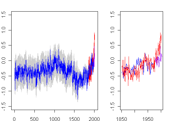
Here is an interesting splice of Moberg and satellite data. Blue is Moberg, grey is Moberg error bars, red is instrumental, all downloaded from the Nature SI; purple is satellite. At right is the post-1850 blow-up. You can see that the post-1980 satellite temperatures are high but not off the charts relative to Moberg’s reconstruction.
To even contemplate use of Moberg, the Hockey Team has to rely entirely on the splice of CRU records, rather than satellite records. Warwick Hughes and others have expressed concerns about how CRU have handled urban heat island effects and other issues. There are some very interesting issues in SST temperatures on how adjustments have been done for change-over from measuring temperatures in buckets to engine inlets, which I’ll post about some time.
A couple of years ago (before I had any notoriety), I asked Phil Jones for the data used in the UHI study published in Nature and relied upon by IPCC. Jones told me that it was on one of dozens of diskettes in his office and he couldn’t find it. I didn’t pursue the matter at the time. You may recall Phil Jones’ response to Warwick Hughes’ request for the underlying station data:
We have 25 or so years invested in the work. Why should I make the data available to you, when your aim is to try and find something wrong with it.
Phil Jones’ construction of temperature data sets has been financed by the U.S. Department of Energy. Whether the CRU data sets are right or wrong, they need to be audited. I don’t see why the Hockey Team should be exempt from audit standards.


5 Comments
Why not ask the DoE for a copy of the data?
Added: It’s interesting how much the surface record warms relative to the satellite record.
What data set are you using for the satellite data?
John Cross
You are assuming that the 1979 MSU temperature anomalies mesh perfectly with the 1979 surface and surface proxy data for 1979. How can you justify this assumption other than to say it is convenient?
I downloaded Moberg’s data from NOAA’s Paleoclimatology website and noticed that he, like Mann et al. and some others, normalizes his data to the 1961-1990 mean. The result of doing that is that all temperature anomalies prior to the 20th century are represented as negative anomalies. It seems rather odd to treat over 1,900 years of temperature data as “anomalously low” when it ought be considered “normal.” Is there a good reason for not normalizing to the mean of the whole 2000-year series?
Every time I see this stitchtogether, I like it less and less. With the noise in the curves, you can’t even see what happens to the proxies in the 20th century. It’s obscured. And it sends a very different signal to an observer than if one just looked at all proxy signals and saw that current temps in moberg are similar to previous MWP temps. And the frigging red color. Sheesh. Have some shame…