Jaemtland is one of the sites used in Esper et al [2002]. Here is some benchmark information on this site to help see its role, if any, in contributing to any hockey-stick-ness in Esper.
As noted before, Esper does not provide data citations (within AGU criteria). However, since I’ve been able to conclusively identify Esper’s Gotland data with the archived swed023 [Gotland], I feel quite confident that Esper’s Jaemtland site can be identified with the archived swed022 [Jaemtland], which was collected in pre-Hockey Team pre-SO&P days and is archived, particularly because the dataset swed022 ends in the early 19th century, as does this illustrad count in the count illustration in Esper et al [2002].
First, here are the histograms for RW and MXD, together with a scatter plot of RW versus MXD. The RW histogram shows an almost identical right skew as Gotland RW; while the MXD histogram shows an almost identical left skew as Gotland MXD. The scatter plot shows a "lobe" going down towards zero. I haven’t plotted up the this graphic for Gotland, but it looks just the same. (I’ll try to make a contour histogram at some point in the future.) The correlation between MXD and RW is 0.23, but I suspect that quite a bit of this is contributed by the lobe and, if you excluded the lobe, the relationship in "normal" times would not be rather less.

Figure 1. Left – RW Histogram; Middle MXD histogram; Right: RW versus MXD
The qqnorm- normality plots are very similar to Gotland. The RW is strongly non-normal; the MXD shows a little close to normal than the histogram suggests; log(Rw,2) is close to normal, suggesting an overall log-normal distribution for ring widths over the entire sample (>22,000 measurements).
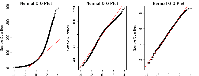
Figure 2. Left – RW; Middle – MXD histogram; Right: log (RW,2)
Next I did scatterplots of RW versus MXD (repeating Figure 1 right panel) and RW versus log(RW,2). Although the visual image of the scatterplot does not sugeest much improvement, the correlation improves to 0.42. The scatter plot certainly suggests a nonlinearity in the relationship, with MXD declining with very large RW values.

Figure 3. Left – RW vs MXD; Right: log (RW,2) vs MXD
Next, here is a plot for Jeamtland in the same format as Figure 3 in Esper’s discussion of Gotland. When this plot is made on line, you can see individual trees starting together in the upspikes. My impression is that the starts are very non-uniform and are bunched in presumably warmer cycles, sufficient to permit germination – which looks to be VERY VERY nonlinear. It is striking that the cores for this dataset do not come further forward than the early 19th century – I don’t know the reason – and that there is a gap in the early portion. I have no idea how they crossdated the disconnected trees or whether this is simply floating. Esper et al [2002] does not give a publication citaiton for Jaemtland; it merely expressed thanks to the originating author. I’ll try to track down some further information on this site
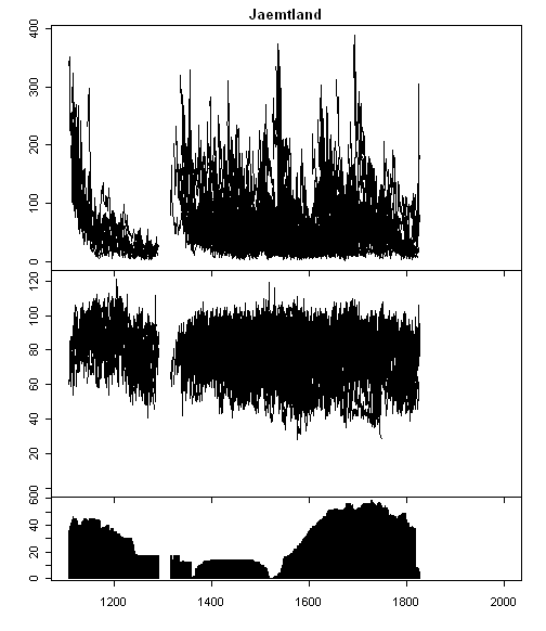
Figure 4. Top – RW; Middle – MXD; Bottom – count
The following grass-plot shows both cumulative RW and "cumulative MXD". I realize that "cumulative MXD" doesn’t make a whole lot of sense as a concept, but it enables a plot that, to me, is more informative than Esper’s format, or, at least, provides an alternative view of the data. You can see that the RW information visually has more "low frequency" information than the MXD plots. Another thing here: the traditional viewpoint for curve standardization between cores is the theory that juvenile growth spurts need to be allowed for. I’ve experimented with fitting parameters in some other sets: in most individual curves, the juvenile growth spurt washes out by about 50-75 years. Surely in this graphic, what is more striking is the tailing off of growth in many trees as they start dying. This is a different phenomenon than juvenile growth; I haven’t thought through how to fit it, but it looks distinctive in this and other similar plots. (Note: "alpha" trees do not tail off at the same age as other trees, so it’s quite complicated modeling if you go to mixed effects.)

Figure 5. Top – RW; Bottom – MXD
Next, here is the age diagram for this site, which becomes the standard for RCS calculations. There is a curious reversal in the MXD diagram (which is observable in many other such diagrams). The average MXD goes down with age and then reverses. What happens is that the very old trees tend to be "alpha" trees (my term without being carefully defined), which just keep on growing. As the weaker trees die off, the contribution of alpha trees increases. So if you fit a simple-minded negative exponential to this sort of curve, you end up with a bias resulting from increased prevalence of alpha trees. I get the impression that sampling from modern sites (modern site bias) is heavily biased towards alpha trees – which is a slightly different theory than in Melvin [2004]. I’m inclined to think that the slope of the RW curve may be strongly biased by "germination bias". The trees tend to germinate in warm periods and die in cold periods. It appears to me that RCS may very well over-estimate juvenile effect by attributing a portion of the warm germination period effect entirely to juvenile effect.
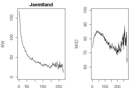
Figure 6. Left – RW; Right – MXD
Finally, a couple of site chronologies. Whatever causes the hockey-stickness of Esper et al [2002], it is not the Jaemtland site (or at least this data set.) It’s possible that there is a complementary data set, which I haven’t located. I’ll take a look some time and see if there’s something in the same lat-long locations bringing the graphic up-to-date.
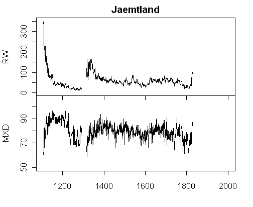
Figure 7: Top- RW; Bottom- MXD.
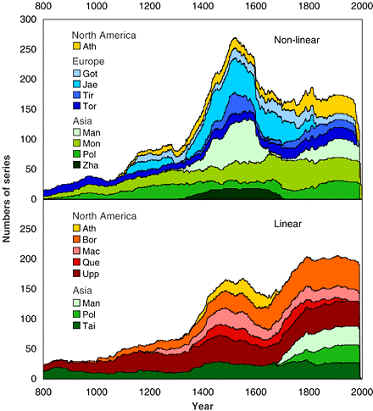
Both Gotland and Jaemtland are classified by Esper et al [2002] as "non-linear" sites, as opposed to other sites classified as linear. I’ve found the distinction (and the basis for the distinction) to be elusive. Now that I’ve got a bit of a foothold on a couple of series, maybe I’ll be able to figure it out.


5 Comments
I suppose “linear” could mean “I think the relationship between temperature could be seen by eye” and non-linear the reverse.
With such a large amount of statistical noise, can anyone discern what relationship can there be with temperature or precipitation?
Also it appears that if “alpha trees” predominate the proxies after out-competing most others, could the extra fertilization of nutrients and carbon dioxide from the breakdown of the others cause a non-climatic boost to the growth of the alpha trees?
(I’m sure this is already done in basic dendro work) but would be interesting to look at the visual issues with samples (or trees) that correspond to different behaviors. For instance are the alpha trees in certain locations (unshaded). anything else? Sometimes when one is troubleshooting something in the plant, and one gathers all these interesting statistical inferences…if you then feed it back to a visual inspection/walktrhough…you get some insights.
If you plot MXD versus 1/RW^0.333, do you get a constant? If so, perhaps then it is considered linear, and if not, perhaps it is nonlinear?
I’ve been attempting some more to decode the Science 2002 article: the linear/nonlinear has to do with the ring sidth (RW) series; there’s no apparent use of MXD in Esper et al 2002. If you do plots of individual cores – see for example my plots of individual cores for Gaspe, you get a wide variety of results. I have no idea how one would go about trying to divide these series into "linear" and "nonlinear" or even what purpose is serve by this distinction. I’m having difficulty seeing what the active ingredients are for Esper’s 20th century being higher than his 11th century – his max occurs in 980 (which is conveniently excluded from the millennial discussions). I’ve done plots for 5 sites now without seeing any with loud 20th centuries. There are 2 California foxtail (bristlecone cousin) pine sites by Graunlich, which are unarchived. I tried to get info from Graumlich a long time ago about sites that were sampled about 15 years ago and she said that she was still planning further publications and would not disclose the data. Esper also uses the Polar Urals data set and Jacoby’s Mongolia data set so there are a cople of the standard overlapping proxies. I can’t think of any reason for creating a class distinction between linear and nonlinear, but I’ll bet it affects the relationship between MWP and modern levels somehow.
I like your grass plots. For some time I’ve wondered about CO2 fertilization at some of the sites. You have addressed this several times and well. Perhaps some graphic might be made that demonstrates or suggests CO2 fertilization. My thought is to plot a site’s data in 3D. X – RW, Y – MXD, Z – Year. Color data points scaled to CO2 in that year. A sort of 3D colored grass diagram. You may have to plot the average around a year for a tree’s RW or MXD so that the individual trees can be followed in the diagram. A twisted idea? Fun to rotate it around and view it.