I plotted up the tracks of all Atlantic hurricanes with peak winds of at lest 110 knots in time-tranches color-coding the track in 30-knot groups. One thing that intrigued me – it’s probably nothing particular remarkable to specialists – is that many of the big hurricanes had surprisingly similar tracks. Look at the plots below and see if you agree.
The order of the color code here is blue, cyan, green, yellow, orange, red. So red is 150 knot plus and very intense. The first figure below shows tracks from 1975 to 1999. Four of the five very intense hurricanes entered the Caribbean south of the big islands, with Allen and Gilbert having quite similar paths going south of Cuba and towards the Yucatan; David following a similar track but spinning north at Haiti; Mitch being a bit further south, with Andrew being the only very intense hurricane with a more northern track.

Figure 1. Hurricane tracks 1975-1999.
Now here’s a similar image for the 2000-2005 hurricanes. Isabel (2003) is the intense hurricane out in the Atlantic. (Ross McKitrick and I met for the first time while Isabel hit Toronto, meeting for lunch near the Toronto airport.) Ivan (2004), Dennis (2005), Emily (2005) and Wilma (2005) all had southern tracks rather similar to Allen and Gilbert. The most intense portion of Katrina and Rita was in virtually the same spot, seemingly on an arc to the north of the most intense part of IVan the year before. The most intense part of Camille (1969) – a bit more intense than either – was also in almost exactly the same spot.
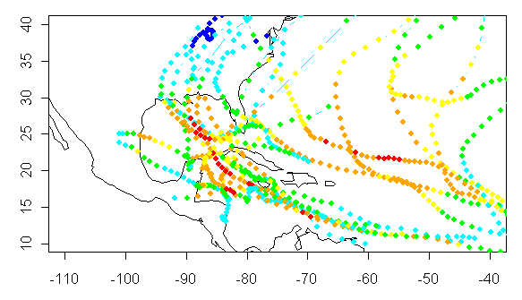
Figure 2. Same as Figure 1 for 2000-2005 hurricanes.
Looking backwards on the same basis, here is the same figure for 1950-1975 hurricanes. You can see the most intense portion of Camille (1969) in the same location as the most intense portion of Rita and Katrina. Again, very intense winds seem to be concentrated in a few locations.
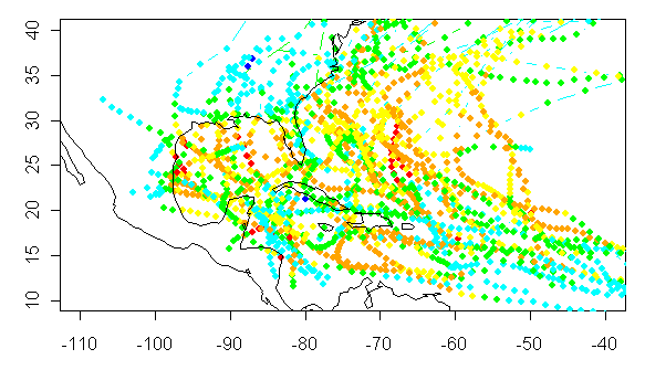
Figure 3. Same for 1950-1975.
Finally here are comparable figure for the periods 1900-1950 and 1851-1899. Based on the location of the most intense hurricanes in recent years, one would want to know how comprehensive was the coverage in the southern “lane” in which hurricanes like Allen and Gilbert developed. I’m inclined to think that coverage and intensity is likely to be under-estimated in these lanes and, if people are doing hurricane re-assessments, this would be a region to look most closely at.
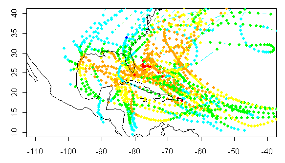
Figure 4. Same for 1900-1950.
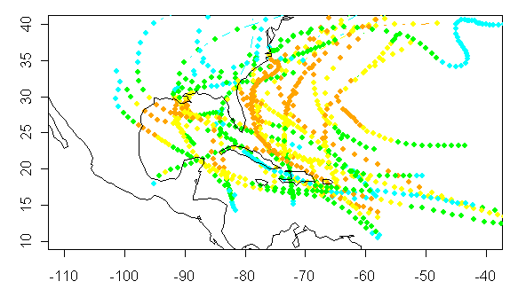
Figure 5. Same for 1851-1899.
In terms of thinking about a statistical model for very intense hurricanes – and I’m just musing here – it seems pretty clear that a hurricane which stays out in the Atlantic doesn’t have much of a chance of developing into a cat 4 or cat 5 hurricane. It reminds me a bit of a game of pinball – if the hurricane gets into the Caribbean or the Gulf of Mexico – its chances of racking up bonus points increase dramatically. Maybe this could account for some of the peculiarity in the distribution.


8 Comments
In that area between Cuba and Yucatan and north from there, you have the combination of highly favorable eddy currents and the proximity of a large tropical landmass with seriously hot areas in its northern and western portions (e.g. Mexico). An intersting fact about that area is that at least some of the monsoonal moisture we get here on the West Coast originates there, coming ashore as easterly waves between Merida and the US – Mexico border, then on across northern Mexico before recurving up our way. Some interesting dynamics.
what might be the differences in SST, wind sheer conditions, or air temperature disparities at sea level and say 40,000 feet between the atlantic and gulf waters? How about ENSO conditions? etc.
Here is a couple of animations of the average conditions throughout the year from 1985 to 1993.
Sea Surface Temperatures peak in the Gulf of Mexico and the Carribean region in week 31 to week 35 of the year at up to 29.5 C. The Temperature maps match up pretty closely with hurrican formation and strenthening areas.
High level jet stream winds peak out in March in the hurricane areas and then fall off over the summer, again matching up with hurricane formation.
http://www.cdc.noaa.gov/ENSO/enso.normal.html
There is a lot of interesting information displayed in the plots.
Michaels et al showed that a necessary-but-not-sufficient condition for a severe hurricane is +28C water. Once the underlying water exceeds 28C then a storm may become severe. If the temperature is less than 28C then it is quite unlikely that a storm would become severe.
The Gulf of Mexico, Caribbean and Western Atlantic near the Antilles/Bahamas reacheds 28C in the late summer. That’s why there’s a concentration of severe storms there and a lack elsewhere.
Also, the deeper the warm water, the better. The warm water is especially deep in the western Caribbean and in the Loop Current of the Gulf of Mexico. The Gulf Loop Current changes location from time to time. Katrina, Rita and (apparently) Camille all passed over the Gulf Loop Current. There’s a Wikipedia writeup here , with some neat graphics.
Also of interest is that there are hardly any yellows and oranges and reds at the shoreline. This is because storms generally weaken as they approach land. So, prior to recon flights, how did anyone know if a storm was cat 3 4 or 5?? How many storm peak intensities were missed due to a lack of measurement? The strongest winds cover only a small area. Ships run away if they are smart. Not-so-smart ships sank, especially older ships.
Steve, it might be worthwhile to plot the 1951-2000 storms on one graph, added at the bottom, for easy eyeball comparison with the earlier 50-year eras. I think the increasing detection of strong at-sea storms post-1951 will become apparent.
There are other factors in determining hurricane tracks, frequencies and intensities. One includes the cooling effect of surface water caused by the evaporation as a hurricane passing over a region. I believe measurements are available for the changes to SSTs caused by Katrina. A second is the infilling effect so that a second storm following a larger one is dissipated or weakened.
An observation: as you go back in time, the storm tracks and intensity deltas get a lot “tidier”/straighter/simpler.
I am pretty sure this represents the fact that they are guesses or interpolations/extrapolations.
What does that say about the chances of successfully statistically analysing the data? Not good, I think.
I created a gif animation of the cat. 3,4,5 plots. I broke it into segments of 1851-1900, 1901-1950, 1951-2000. Didn’t include 2001-2005 as I wanted to keep the year counts equal. One color for all. Nicholas knows about the fiasco I had with trying to post a link to a jpg image, so I tested this in Opera, Firefox and IE6 to make sure it works for most browsers. For those interested, it can be found here. http://img225.imageshack.us/img225/350/cat345animtz1.gif
If I get a chance I’ll post a couple more tonight or tomorrow. It never hurts to see a different perspective on things.
#7 Very nice. I’ll move it to a post here.