Konrad Gajewski of the University of Ottawa wrote a letter to the Hill Times saying:
Further, in a report published this year in The Journal of Geophysical Research, we showed that the general trend was correct, using a completely different methodology and data-source and that the current warming is unusual with respect to the past 10,000 years …We have better ways to waste taxpayer money than to dredge up this dead issue.
However, this claim appears nowhere in his article, which includes an illustration showing otherwise.
Gajewski’s study (Viau et al, JGR 2006) applies pollen diagrams in a large sampling of sites in North America, seeking the closest modern analogue. They describe one of their checks as follows:
Next, we evaluated if any particular region was overly influential by computing regional means. Since climate change at these scales can be of different magnitude and direction, we evaluated if the millennial-scale variations were present in most or all regions of North America. All regions demonstrated millennial-scale climate variability to some degree, although the magnitude and direction of change in some cases differed from region to region (Figure 5). In spite of the small number of sites in some regions, millennial-scale variability is visible in all of the regional temperature time series.
Figure 5 of Viau et al shows the 6 regional components of the Gajewski reconstruction. The above text seems a rather laconic description of the information contained in Figure 5, shown below. One of the 6 regional reconstructions (SW – where the bristlecones live) follows a completely opposite course to the rest of North America. The right hand side of this graphic shows the closing stages of the last glacial period. While the rest of the continent got rapidly warmer as North America emerged from the Ice Age, Gajewski shows that the southwest U.S. reached its maximum cold spell at exactly the same time that the U.S. Midwest reached its maximum warmth. Is the above paragraph a good description of the Figure below?

Original Caption:Figure 5. Regional mean July temperature time series reconstructed from pollen diagrams. NQ, northern QueⳢec (181 sites); CANPR, Canadian prairies (141 sites); MIDW, American Midwest (121 sites); NW: north west (84 sites); SE: eastern United States (162 sites); and SW, southwestern United States (36 sites). Values were rescaled to range between 0 and 1 for visual purposes using (x-min)/(max-min),where x is temperature value (C), min is minimum value of series, and max is maximum value of series.
This result is very puzzling. Now although the first part of the caption says “Regional mean July temperature time series reconstructed from pollen diagrams”, do not be deceived by this. This seemingly straightforward description of the figure is undone later in the figure by the phrase:
Values were rescaled to range between 0 and 1 for visual purposes using (x-min)/(max-min),where x is temperature value (C), min is minimum value of series, and max is maximum value of series.
This is an unusual form of standardization that I’ve seen previously in Crowley and Lowery. Unlike Crowley, Gajewski does not appear to have lost his data and archived here the pre-standardization temperature estimates – something that meets the description of the above caption. Here is a re-plot using the temperature estimates centering each series on its average (an anomaly method if you will.) This shows the puzzling cooling in the SW USA as North America emerged from the Ice Age, with the southwestern USA being warmer in the Last Glacial Maximum than at present, an idea that, to my knowledge, is held by no other paleoclimatologist and, if true, deserves a lot of separate commentary in this article.

Plot of temperature anomalies
Now here’s something even stranger – here’s a plot of the temperatures: as noted by a reader below. The temperatures in the US Southwest are lower than in northern Quebec. On the other hand, their Figure 4 showing a regional map doesn’t show odd results in SW USA, so it’s hard to say what’s going on, but there’s something wrong with the data shown here.

Next here is an excerpt of their reconstruction from their Figure 7. Does this figure show that present warming is “unusual with respect to the last 10,000 years”. As I interpret the graphic, it shows modern pollen-estimated temperatures as lower than many intervals in the past, including the MWP at about 1000 BP.
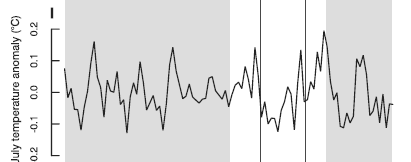

Original Caption: Figure 7. High-resolution Holocene paleoclimatic records…. (i) North American pollen-based July temperature reconstruction (deg C) (this paper).
They go on to say:
Our reconstructed continental-scale temperature variations on century to millennial-scales are remarkably comparable to those estimated for northern hemispheric temperature variations of the last 2000 years using annually resolved proxy-climate records [Mann and Jones, 2003; Esper et al., 2002; Moberg et al., 2005] (Figures 6 and 8). The Little Ice Age (LIA) and Medieval Warm Period (MWP) are the most recent global manifestations of millennial-scale temperature variations, which are observed at the continental scale of North America.
Now I am getting very tired of paleoclimate authors saying that two time series are “remarkably similar” to one another without providing any statistical analysis to support their claim. Here’s a plot of two versions of the Gajewski reconstruction (slightly inconsistent versions are archived – I didn’t notice an explanation of the inconsistency). I think that one could also say that the shape of this curve is “remarkably similar” to the IPCC 1990 diagram, showing a MWP warmer than the present and a colder LIA (but with an attenuated scale here.)

Replot of two Gajewski versions. Black – version in Figure 2; red – version in Figure 7. Blue – difference between versions.
Gajewski created time series for many different pollen cores, which are dated by radiocarbon methods. WDCP has a large archive of pollen data which appears to include most if not all of the sites studied by Gajewski. But this pollen data is different from the site time series and the site time series as calculated by Gajewski are unarchived. While modern sediments are all precisely synchronized, past sediments have considerable dating uncertainty. The average sample in Gajewski’s data is also said to cover about 200 years. Craig Loehle has observed that chronologies from series with dating uncertainty are necessarily dampened since maxima and minima can get out of phase. With uncertain dating, it is impossible to distinguish regional variation from dating error.
Reference:
A. E. Viau, K. Gajewski, M. C. Sawada, and P. Fines. 2006. Millennial-scale temperature variations in North America during the Holocene. Journal of Geophysical Research Vol. 111, D09102, doi:10.1029/2005JD006031, May 2006. http://www.ncdc.noaa.gov/paleo/pubs/viau2006/viau2006.html
ftp://ftp.ncdc.noaa.gov/pub/data/paleo/pollen/recons/northamerica/viau2006namerica-temp.txt


55 Comments
That Figure 7 shows the temp being quite consistent (only 0.3 C from peak to trough) for the past 10,000 years. This seems similar to the Vostok graphs which also shows a fairly consistent temperature for the past 10,000 years. I would love to know why the earth has been so consistent for so long. If the Figure 7 is correct, then what year does 0 represent? This is important to know in order to answer your question as to whether or not the 0.65C warming in the past 100 years is unusual with respect to the last 10,000 years. — John M Reynolds
Well it is unusual in that such temperatires have occurred less than 10%
of the time in the last 10,000 years. Murray
Many of the pollen stratigraphies used in this analysis will probably be archived at http://www.ncdc.noaa.gov, and the modern pollen-climate training set is also publically available (though I cannot remember where), so it ought to be possible to replicate this study, provided the site inclusion rules are clear.
With the modern analogue technique used by this study the quality of the match with modern pollen analogues is critical. If inappropriate analogues are selected, reconstructions are likely to be unrealistic. The uncertainties associated with this method are also typically underestimated.
#1
The scale is years before present, where year zero is conventionally taken as 1950AD.
I’ve had a quick read and need to read the paper more fully to comment in depth but the pollen methodology discussed in this paper DOES NOT! show that the present warmth is unprecedented! If you look at figure 6 from the paper you see a thick black line for the reconstruction based on the pollen methodology which is at the same height as the peak in the medieval warm period about 1000 years ago and another peak as large about 300BC. The pollen data are binned into 100 year intervals so if the last 100 years is averaged then it won’t show the alleged warming of the last 30 or so years.
Where the ‘unprecedented’ warmth comes in is in figure 8 which includes the GISS instrumental record as well and it is this, and this alone, that pushes the record to unprecedented temperatures! (Steve, can you show these 2 figures?).
So this study emphasizes the LIA, the MWP and other warm and cold periods throughout the past several thousand years and the claim made by Gajewski quoted at the head of this post that this study supports the view that the present warmth is unprecedented is completely unfounded – completely the opposite in fact. I would say that this is one of the best and most consistent cases I have seen made for variable past temperature! Modern warmth is again only unprecedented if you graft on the GISS instrumental record as the blade of the hockey stick on just like Mann et al. 98’s attempt.
So if the year the graph starts is before the time at which the GCMs can no longer attribute climate change to non-anthropogenic causes, what is the big deal with this study even if it is absolutely correct? They are saying that temperatures driven by natural variations are hotter now than in the past 10,000 years…so what? If they were that way in 1950, before man’s influence supposedly came to bear on global temperatures (according to the GCMs), then why should we believe that we have the ability to undo what has come about naturally?
Re#2, Looking at the vostok graph, no other time period has had such calm consistant temperatures. Where are the multiple degree temperature cycles? I ask because Figure 7 is the first graph I have seen that compares to the vostok graph for the past 10,000 years.
re#3, so Figure 7 shows that the temp from around 1800 until 1950 rose only 0.2 degrees!?! Even the hockey stick graph and the spagetti graphs Steve discussed last week show more than that. — John M Reynolds
#6
Yes, the climate of the last 10,000 years has been remarkably constant, compared both with the preceeding glacial and earlier interglacial periods. This relative stability was probably rather fortunate for the development of civilisations (given the fragility of past civilisations to climate change). To bad that civilisation may now be about to end this stability.
On Fig 5, the problem is not so much putting the southwestern United States graph upside down, as using totally implausible data. The temperatures (in °C rather than standarised to the range) are cooler there than any other region in the last 13000 years. In the last 10000 years the range given for the SW is 0.5-5.6°C, while the next coolest region (NW) had a range of 7.3-9.0°C.
Whatever the SW line may represent, it is not temperature in the southwestern United States. (It might be a difference between two other calculations.) The referee should have spotted something was wrong and asked a question, as Steve did, from the peculiar graph.
richardT says:
That is not what I read from a number of paleontology etc papers, like this one:
Climate-Controlled Holocene Occupation in the Sahara: Motor of Africa’s Evolution where the abstract says:
That is, climate variability seems to have driven the establishment of civilization.
Also, it is not clear to me that a return to MWP conditions will be bad for the majority of people world-wide. Indeed, I think it will be good. What I find more worrying is a return to colder conditions like the LIA world-wide.
#7, The climate of the last 10,000 years has been all but “remarkably constant”. Gajewski’s global temperature proxy in figure 7 where temp variation are just in +-0,1°C interval is suspect and contradicted by multiple facts, for example by the modern instrumental period, by the Holocene optimum period where most of the current artic permafrost did not exist (hence the frozen mamoths now found in permafrost), by the sea level rise speed of -10,000 to -8,000s…
The last Ice Age certainly had an impact even further south. Big Bend National Park has a forest ecosystem remnant from that period that survives to this day. I’ve often hiked in it with my wife. How it would be there if New Mexico and Arizona were exceptionally warm in the Ice Age I can not imagine. When you say exceptionally warm in the context of the Southwest it isn’t the same as saying it about New England. I think desert, dust-bowl and barrier. Gajewski and Mann can’t think this forest jumped over their exceptionally warm Southwest?
I’ve added a new plot not provided by Gajewski showing his regional temperature estimates (which he archived). The temperature decline in the SW is inconsistent with other evidence that I’m aware of and something that deserves a lot of commentary (none is given in the article.)
Is it April Fool’s Day again or something? I am having a hard time believing this is real! 0.1 deg C of warming over 10,000 yrs raised seas by 60m? SW US at min while MW at max, and concurrent opposite trends of persistent warming vs cooling? MW almost drops to last glaciation while the rest of NA is near peak warmth, then shoots up dramatically in the 20th century while the rest of the US is basically unchanged? Amazing.
Gajewski gets partial credit for this acknowledgement:
He was just talking about the wrong applications, that’s all.
How did this get published?
#12. Steve, your anomaly chart shows temperature anomalies not actual temperatures. Plot the actual temperatures and you will see that the Southwest US numbers are simply implausible for July temperatures in that region.
Let’s see, this was a pollen study, meaning they had to have plant life there. Two of the sites were Northern Quebec and Canadian praries. Going back 14,000 years when there were some pretty thick ice sheets on these two places. Must have been some pretty long roots.
http://www.museum.state.il.us/exhibits/ice_ages/
Or did I miss something?
#14. Here’s the plot mentioned by the reader in #14. The temperatures in the US Southwest are lower than in northern Quebec. Maybe I’m missing something obvious, but it sure looks like Gajewski grabbed the wrong end of the stick. After all, Gajewski did say that his results were “remarkably similar” to Mann’s.
Anyone in doubt can consult the original data at ftp://ftp.ncdc.noaa.gov/pub/data/paleo/pollen/recons/northamerica/viau2006namerica-temp.txt or ftp://ftp.ncdc.noaa.gov/pub/data/paleo/pollen/recons/northamerica/viau2006namerica-temp.xls
I sent the following message to Gajewski:
#17
Check the altitudes of the SW sites. Most are probably high in the mountains.
Re: #18 richardT,
Assuming most of the SW sites are “high in the mountains” then this adds another level of difficulty.
Note the graph Demesure presented in #10. Between 14,000 YA and 7,000 YA sea levels rose about 100 m. This means those SW sites would have been even higher in the mountains 14,000 YA. I would have thought that reducing the elevation (compared to sea level) would have warmed up these sites not cooled them down.
SteveM,
Given that these are studies of pollen, could the rapid influx of agriculture into North America in the last 200 years have contaminated the pollen samples or altered their distributions?
Re:#16 You have to admit, the SW curve does look like the hockey stick.
Re:#15 Kristen Byrnes,
Right on. Great question! Someone should ask the author.
Demesure,
Your graphic in #10 depicts very nicely the deceleration of sea level change since the holocene optimum. Could you explain the measurement and give the source? Thanks.
RE#16, looking at those plots, current temps look pretty much the continuation of natural trends, with the only recent jump being in the midwest US. And since that trendline had generally been cooling slightly for about 11,000 yrs while most of the others were mostly flat, it might just be “catching up” to the others.
RE#20, see description of sources here.
Diurnal variation in the SW US can be massive. Even during the Summer, all areas except the Low Deserts cool off a lot at night. In Winter, for their latitudes, sites here in inland areas are some of the coldest in the world. Add elevation to that, and colder than many areas of Quebec (especially southern, populated Quebec) is not out of the question.
RE: #22 – An anecdote. I had to drive through a blizzard in mid October in southern Utah a few years ago. Elevation of the area in question is about 3000 feet. This is not at all unusual.
There was a response to Gajewski that is interesting.
http://www.nrsp.com/clark_letter_22-03-04.html
Re #24
In that letter, Dr. Ian Clark writes:
Seems to me he’s got it right (though jae will deny the possibility that H2O is a GHG): it all comes down to the GCMs. As Dr. Gavin Schmidt says (and this may be a slight paraphrase): “attribution is fundamentally a modeling exercise”.
Audit the GCMs!
Re: the lack of variation in this reconstruction. First, the data is only every 100 yrs. Second, pollen rain does not make annual laminations, but is mixed for many years together in the sediment. Third, vegetation takes a long time to respond to changing climate, especially trees. Thus pollen data as used in this study is smoothed and integrated over at least 50 to 200 years and then only estimated every 100 yrs.
15: Kristen
Very good observation here’s what Ontatio and Quebec looked like back then.
href=”http://upload.wikimedia.org/wikipedia/commons/b/b0/Glacial_lakes.jpg
Most of Quebec was still under ice as late as 7000 years ago.
In the diagram, the temperatures for Northern Quebec and he Midwest are approximately teh same BUT both are lower than that of tbe Canadian praries. The prairies are north of Midwest. It this odd? I must be missing something
So it was about 12 degrees C when Quebec was covered in ice. Very interesting. I suppose that it’s possible but since the ice didn’t disappear entirely until about 6 to 7 thousand years ago I’m not yet sold on the idea.
As always, I could be wrong. Perhaps the insulating cover of ice caused localized surface warming.
Maybe someone can track down the pollen sites from northern Quebec in the Viau Gajewski corpus.
Also: I remember seeing a nice spatiotemporal portrayal of the north american pollen record on the web at one point. Try googling ShowTime NAPD (North American Pollen Database).
Ottawa is directly adjacent to western Quebec.. One of the tourist sites in the Ottawa area is a place called Stony Swamp. It is a limestone cave system that collapsed under the weight of the ice during the last ice age. One can see stalactictites lying on the surface etc. Another very interesting thing that signs point out are innumerable straight grooves all parallel and lying along a north south line. Tourist signs in the area identify these as having been made by trapped rocks being dragged along by the moving ice.
So as 14 points out, the trees in Quebec must have had very long roots 10,000 years ago, they must also have had very stout trunks to withstand the forces that could collapse a cave system.
Come on guys, there is always snow under the trees in northern Quebec until June. A little ice, a little snow – what’s the difference?
Can we find out who peer reviewed this article?
25, bender:
Reference, please. If I ever said it, I did not mean to. BTW, I am saying exactly the same thing Clark is on Unthreaded!
Grrr, bender, you know darn well that I don’t think that. Water is, by far, the dominant greenhouse gas. All I have said is that it may not AMPLIFY the effects of increased radiation. Indeed, it probably MITIGATES MOST of the effects of increased radiation.
Re #35 Sorry, I didn’t mean to misrepresent you. That’s not my nature. It’s not actually clear to me what you think because you seem to be all over the map on H2O. I wouldn’t even bother commenting except that it sometimes seems to me you are reciting denialist incantations without understanding what they mean. But I could be wrong … it wouldn’t be a first. Again, apologies.
#27 map does not span:
-southern Quebec (ice-free 12000 BP)
-St Lawrence River valley (ice-free 11000 BP)
-Laurentian mountains (ice-free 10000 BP)
Note the NQ series drops precipitously at 12My, consistent with the ice record in Kristen’s animation. Perhaps the pollen in the record prior to that time was entirely wind-borne from other areas. Also, some parts of the prairies were not glaciated. So the details matter here.
Gawd:
Actually, I currently agree in every respect with Clark, as referenced in 24. Does that make me a “denialist?”
37: bender
I would appreciate references for the ice-free dates for Quebec and St. Lawrence Valley. My recollection is that the area wa not free from ice until after 10,000 yBP. Could be just outdated info on my part.
At any rate, a study that measures pollen from 14,000 years ago taken from ground that was under ice until 12,000 years ago has to be a bit suspect.
Of course, it is possible that some part of Quebec was not glaciated at all.
#40 The NAPD, #31. The same data represented in Kristen’s #15 animation, I believe.
#39 I apologized, c’mon.
NAPD:
http://www.ncdc.noaa.gov/paleo/pollen/viewer/webviewer.html
Note: the gaspé cedars were ice-free in 15000 BP.
That’s a terrific graphic. I notice that 1000 years during the MWP that spruce percentages in the Arctic islands were 5-20% and were up to 5% in west Greenland – in locations that are modern 0%. I wonder how that factors into Gajewski’s equation.
Thanks bender
That really is a great graphic, raises a whole bunch of questions about just how warm things must have been at certain times.
For the record, thanks go to Phil Leduc.
Re #41
This is, apparently, the case for Anticosti Island.
#44
Long distance transport of wind blown pollen into areas of low pollen productivity (such as arctic tundra) is a well known problem in palynology. The modern analogue technique uses the taxonomic distance between the fossil sample and the samples in the modern training set to find the best match. Because this uses the entire assemblage, rather than taxon-wise, it is not usually select inappropriate analogues on the basis of a single taxon, unless it dominates the assemblage. The only way to check if inappropriate analogues have been selected is to inspect which analogues have been chosen for each level.
Re #44
According to the legend, white areas represent “no data”, not 0%. Based on that, I don’t see any significant parts of the areas you mention that are green (>5%) at 1000bp, but gray (0-5%) on the modern map. You would think that the sites should have modern counts reported — perhaps it’s a case of “bring the pollen up to date!” (I found the “display sites” and “compare images” settings very useful on this)
Steve,
You write that
This is not correct. The caption to figure 1 in the paper states that the fossil data all come from the North American Pollen Database. This dataset is freely available to download. Pollen analysts have worked hard to archive their data, and deserve credit for doing so.
#51. What I meant by this is that that the individual site time series constructed by Viau Gajewski are not archived as a cross-check against this. You’re right about the pollen data (or at least most of it). I’ll amend this.
Re #50
RichardT,
The NAPD provides pollen counts and chronologies (where they exist) for an impressive number of locations. Are you aware of any archive (NAPD or otherwise) that shows paleotemperature reconstructions for the individual sites used in Viau et al, 2006?
http://www.ncdc.noaa.gov/paleo/napd.html
P.S. Which are the sites used in the compilation?
#52
Most of the reconstructions are probably not archived. The fossil pollen and modern training set are the important things to archive – in this case they all are. The reconstructions can easily calculated from these using the Modern Analogue Technique.
I am far happier with this situation than the contary, where only the reconstruction is archived, but not the raw data. I would not want to use someone else’s reconstruction – I always want to check the reconstruction diagnostics.
Sawada, one of the authors on this paper, has published R code for calculating MAT (I’ve not used his code as I have my own implementation)
Sawada M. 2006, An open source implementation of the Modern Analog Technique (MAT) within the R computing environment, Computers & Geosciences, 32: 818-833.
#53. Richard, from my own experience with other proxies, I agree 100% with your choice if it’s a beauty contest between the two alternatives. There’s an R package for analogue techniques by another person here
http://cran.r-project.org/doc/packages/analogue.pdf , but I didn’t notice Sawada’s code being online anywhere in a first google. Would you be interested in writing a post on what the differences are between the various implementations? Also do you have a digital listing of site identifications so that one could emulate the reconstructions in an automated way (i.e. an R script reading data from WDCP – a procedure that does not cause consternation there)?
#54
There are several implementation of MAT available, if the same options are chosen they should all give the same result. The main differences are in the variety of distance metrics available, and how the number of best analogues is selected, and in the amount and type of diagnostics available. MAT is easy to implement, the only problem comes with dealing with large training sets on computers with a finite amount of memory (the distance matrix created is huge). I can send you my code if you want it.
The modern analogue technique is based on the premise that the modern sample with the most similar biota to a fossil sample has the most similar environment. There are many distance metrics that could be used to measure this similarity (the squared chord distance is the most popular). Gavin Simpson’s analogue package on CRAN offers the widest choice of metrics (these are all implemented in R, rather than in C, so it runs slowly, and I doubt it would process the ~5000 sample North American pollen training set).
While there are other methods, normally the same number of analogues are used for all fossil samples, and this number, typically 5-10, is selected to minimise the training set’s cross-validation error (a procedure that can seriously underestimate both the error and the optimal number of analogues if the training set environment is spatially structured). Viau et al is unusual in that it uses only a single analogue, and interpolates the biota between the pollen samples, rather than making reconstructions directly from the raw data, and interpolating these temperatures.
There are some ‘extensions’ of MAT, called RAM and SIMMAX, devised and used mainly by the foram community that I would not recommend (see Paleoceanography vol 19, PA4014).
I have not worked with the N. American Pollen Database – I intend to, but am still testing the performance of the training set. The data collated before 2000 are available in a Paradox database, so can, in principle, be read into R with RODBC.
Sawada’s code is at http://www.geomatics.uottawa.ca/mattools/ but the package appears to have been compiled for an old version of R.