I did plots for both GISS station data and GISS gridcell data on the same basis as USHCN.
First Try at GISS Adjusted
Here’s a plot for 1765 GISS U.S. stations for trends after 1900. When I inspected the cold anomalies, they turned out to be sites with very incomplete records – some values in the 1960s and some values in the 1980s. Some of the records had insufficient informatino to create a 1961-1990 normal. What does Hansen do in such cases? Only the Shadow knows. How does such patchy network meet any QC standards? (I guess the “high quality” of USHCN data means that it’s not grossly patchy, not that they’ve actually QC’ed the site.
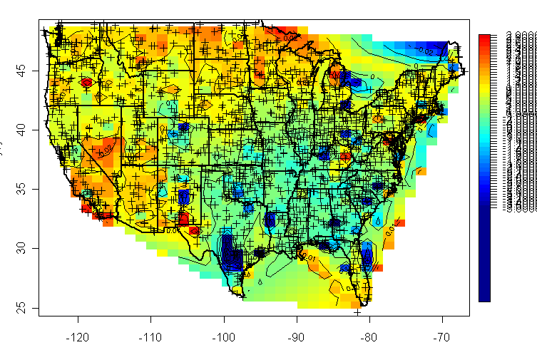
GISS 20th century trends. In deg C./century
I then restricted the populations to stations having at least 1000 measurements and got the following. The regionalization is similar in gross terms to USHCN but the smoothing is obviously much greater. Does this eliminate the impact of bad data? Obviously not – it just spreads it out so it’s harder to isolate.
GISS 20th century trends restricted to sites with at least 1000 measurements.
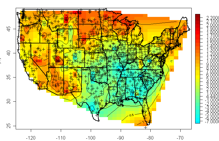
Then I did the same thing for GISS gridded data – this has sort of the same geography, but everything is smoothed even further. The cooling in the southeast has become a slight warming (I apologize for the scale on the legends, but I don’t know how to specify the legend labeling right now.) The most notable warming on this map is actually in the nearshore oceans, which draws form a different data set altogether (and it looks like a much bigger job to tie down the ocean data than it is to tie down the land data.)

Gridded GISS Data, 20th century trends.
If you compare the GISS gridded version back to the USHCN data that underpins at least the “better quality” portion of this, it would be quite a bit of work to see exactly how one gets from A to B, but you can certainly tell Dorothy that we’re not in Kansas any more.


34 Comments
I believe that a quality site is defined as being one that produces the results that the Team is looking for.
Fascinating work, Steve. As they say, one picture (er, chart) is worth a thousand words.
It’s very important, if one wants to make the worst case “killer AGW” case, to depict a substantial positive anomaly over Greenland. This does not show things that far to the northeast, but I reckon that the global view of this would show it.
Steve:
The analysis you are doing is excellent. The data should be available to everyone so many different individuals can analyse the data in many different ways. “SUCCESSIVE APPROXIMATION” & COMPETITION usually produce better & more accurate results.
Some food for thought on possible physical underpinnings is here . Increased precipitation (and presumably cloud cover) are plausible contributors to the relatively cooler conditions in the southeastern US. Any correlation between precipitation and temperature is not consistent across all seasons or regions, however.
Also of interest is the final plot, which shows the annual trends. Warmer US winter temperatures are consistent both with AGW and with increased asphalt in the vicinity of thermometers. It’s also consistent with the 1976 climate shift (= stronger westerly winds and fewer Arctic air penetrations).
* back to vacation *
The cooling trend over South East aligns nicely with the most dramatic change in land use pattern over continental US in 20 century: massive re-forestation. Take a look at Fig.11 here:
http://www.eia.doe.gov/oiaf/1605/gg97rpt/chap7.html
Doesn’t satellite data have surface temperature data over the past 30 or so years?
Could you not make a similar map using that data then compare the two?
Re #6:
Wow! This plays right into the fairly newly published material by Govindasamy Bala showing that temperate forests may cause netwarming. Obviously then deforestation causes net cooling. This is very exciting because it has the power to explain so much of the observed Northern Hemisphere warming in the 20. century. If you make a similar map of the warming and compare it regionally to forests you will find a striking correlation. Most of the warming is limited to the Northern hemisphere forests.
re 8: In areas with snow it’s evident that a forest and a town is warmer than an open field.
http://home.casema.nl/errenwijlens/co2/fingerprintdb.html
An albedo calculation example
For a lattitude of 52N on 4 january with fresh snow (albedo 0.8)
the mid-day (clear sky) insolation is 68 W/m2
The albedo of a forest/town = 0.15
0% forest/town | winter albedo 0.8 | insolation 68 W/m2
10% forest/town | winter albedo 0.735 | insolation 90 W/m2
20% forest/town | winter albedo 0.67 | insolation 113 W/m2
30% forest/town | winter albedo 0.605 | insolation 135 W/m2
40% forest/town | winter albedo 0.54 | insolation 157 W/m2
50% forest/town | winter albedo 0.475 | insolation 179 W/m2
60% forest/town | winter albedo 0.41 | insolation 201 W/m2
70% forest/town | winter albedo 0.345 | insolation 223 W/m2
80% forest/town | winter albedo 0.28 | insolation 245 W/m2
90% forest/town | winter albedo 0.215 | insolation 268 W/m2
100% forest/town | winter albedo 0.15 | insolation 290 W/m2
This thread raises a temporal anomaly. I think it was in the 1950s that the government created a “Land Bank” program where farmers were paid to take land out of crop use and into forest. At about the same time the G.I Bill inspired massive new home construction in the U.S. which increased the demand for plywood. Together those factors made planting and harvesting pine trees very profitable. I got a lot of flight time over the Southeast between 1954 and 1974 and remember huge areas of Georgia and Alabama that were quickly converted from food crops to pine forests. My point is that much of the reforestation, at least in the Southeast, may have been inspired by two or more government programs and may have occurred in a very short time between 1950 and 1970.
Here’s another pilot’s eye view of rapid changes that could effect your charts. Flying out of an airfield in the Los Angeles basin in 1955 it was common to have a smog layer from the surface to about 1500 feet altitude (above sea level) that gave about 1 to 2 miles visibility. At about 1500 feet there would be a sharp horizontal line dividing the smog from virtually unlimited visibility above it. By the mid to late 1960s the smog was denser and the top of it was usually about 10,000 feet altitude rather than 1500. I have the impression from flying into the area commercially lately that the smog has been dramatically reduced.
Andrey
Figure 11 is helpful though I question its accuracy. It is hard for me to imagine that much of Northern and Western Maine were deforested in the 1920s. However, where I live in Eastern Mass I can confirm that much of this is second growth forest – you can see the stone walls in the middle of what is now dense forest.
Question:
How much effect does forest cover have on ground level temperature and is it limited to the immediate vicinity or is their leakage to surrounding areas?
#11: I’ve ‘gatored’ through the air of Orange County and Los Angeles at about 1500 feet with the smog line literally splitting my windscreen. This was in 1995 or so in military helicopters. Clear as a bell in the top half, thick and nasty in the lower half.
The effects of reforestation on albedo are certainly interesting, but rather counterintuitive in this case. I can’t think of a situation offhand where reforestation would increase albedo, as forests will virtually always be darker than the land they are replacing (in the case of the Southeastern US, primarily abandoned farmland).
Unless we can come up with a reason why reforestation of the Southeastern U.S. over the past century would be correlated to a regional cooling trend (or absence of a warming trend relative to other areas), than we can’t readily assume that reforestation was a major driver of the regional temperature trend.
Yes Allen, the air quality in the LA basin has gotten much beter overall than it was. I have been either driving through, flying into, or living in the area for the last 25 years, and I can attest that the air is less thick than it used to be. It’s still not great, but give the population growth, it could be a lot worse (Hong Kong?).
re 14:
More forest, more evapotranspiration, more clouds.
Looking at the contour maps from this (and the previous posting) it is gobsmaking (as other posters have observed) that the net effect of the various poorly documented “adjustments” performed on the raw data has been to increase the measured temperature across the whole of North America. The very fact that these adjustments produce such a systematic change, yet have no clear methodological underpinning, is a major cause for concern and (dare I say it,) scepticism.
Mind you, no cloud is without a silver lining and here I suggest we do as a number of poster have suggested- take a leaf out of “The Team’s” book and do a bit of data mining. What is the betting that some combination of urban sprawl, land use change, energy use etc. will correlate nicely with the observed temperature anomolies?
And when such a correlation is found, I further suggest that they are rolled up and used to beat “The Team” players over the head with.
Don,
The problem is that the media will not let us get away with it. Even though they routinely give their pet scientists a pass.
RE: #10 – Same thing in MS and AR.
RE: #11 – Indeed, air pollution in the LA basin and other SoCal “smog basins” has gone way down, compared with the 60s and 70s.
RE: #17 – There has been smoothing upward, in order to make the areas of intensely concentrated anthropogenic heat flow “go away.” So, instead of cutting out anthropogenic contributions to heat flow and their contaminating effect on the “natural” global lower tropospheric temperature record, they went the other way and raised the background level in order make those contributions stand out less. Cute, eh?
Re#12,16
Bernie:
US forest service indicates 30% increase in standing hardwood and softwood timber from about 600 B cubic feet in 1950 to 780 B cubic feet in 1990 ‘€” with almost linear trend. It is definitely substantial increase.
Hans Erren:
Clouds ‘€” yes, but also direct effects of evaporation, which store sunlight and IR energy in form of latent heat of water vapor, rather then increased air temperature. Forest has superior water retention properties, making water available for evaporation even after weeks of dry weather. This effect most probably is less pronounced in NE, where summer rains are more often.
12, 16, 21: Yeah, but then where is all the “water vapor feedback” that IPCC keeps talking about?
Re#21
A 30% change in one lifetime is quite a change. And yet these changes are slow enough that the general perception, if there even is a perception at all, is that things are as they were. My grandfather shot the last red fox in his county. 50 years later they have started to come back. 50 years from now, perhaps no one will remember they were ever gone.
OT – If you burn 180 B cubic feet of hardwood and softwood timber how many tons of CO2 would you produce?
23: Wood is about 52% carbon. Assume average wood specific gravity = 0.4, so density = 0.4*62.4 = 25 lb/cubic ft. 180 B cu. ft*25 = 4500 B lb wood. 4500 B lb wood*0.52%C = 2340 B lb Carbon = 2340/12 = 195 B moles carbon. Need one mole 02 per mole carbon to make CO2. One mole 02 = 32 lb. 195 B moles * 32 lb/mole = 6240 B lb of 02. 2340 B lb carbon + 6240 B lb O2 = 8580 B lbs CO2 = 8.58×10^12 lb CO2.
Steve,
Where’s the punch line?? How about some numbers on the average (gridded and ungridded) temperature trends for unadjusted USHCN, TOB adjusted USHCN, fully adjusted USHCN, and GISS adjusted data? Inquiring minds want to know.
RE: #22 – It’s negative feedback. The IPCC got the sign wrong.
RE#14 If this is true, how do you think the explosive growth of irrigation in the west and midwest effected the temperature map. This activity took water out of ground storage and out of rivers and evaporated most of it over large areas.
Going from the first “raw” plot the the last, highly “smoothed” one, look at what happened to the apparent situation on the Eastern Canadian Shield (and presumably, Greenland, Nunavut major islands, etc, as well). Fascinating ……
Argh …. Going from the first “raw” plot to the last, highly “smoothed” one
re 28: That’s a processing artifact, there is no underlying data there. Similar to extrapolating CO2 emissions to 2100.
Hans, it’s a procesing artifact alright, but just think what Al Gore could do with it. Conclusive proof of warming. It does make you wonder how many artifacts are being passed off as fact. I’d say watch Eli Rabbet’s site for a note that Steve M has proven that significant warming has occured.
27: Yeah, but that irrigation does not change the humidity that much. The air is still very dry in the West, compared to the East.
RE#32 Sure, overall humidity only slightly changed, but do the surf temp measurements account for the growth of irrigation and thermo-electric power water use from very little in the 19th century, to 150-billion gallons per day in 1950 to 400-billion gallons per day in 2000.
This would produce a much larger change in the drier states, which is what the first map shows. Just food for thought, not a theory.
Steve
An ingenious idea!
One question – what if the earth warms but not for anthropogenic reasons?
Wouldnt this end up being a pointless tax?
thanks