In the various disputes over Hansen et al 1988, Roger Pielke Jr and NASA apologist Eli Rabett (who has been said to be occasional NASA contractor Josh Halpern) have each attempted to disentangle the forcing projections implied by Hansen et al 1988 – Pielke here and Rabett here for CO2 and here for other gases.
Commenters on the previous thread have naturally puzzled over the actual differences in GHG projections between Scenario A, B and C and, in an effort to clarify matters, I’ve attempted to calculate GHG concentrations through to 2030 implementing the assumptions described in Hansen et al 1988. (Roger Jr posted up a chart similar to the ones below for CO2). In another post, I’ll apply these results to calculate radiative forcings. I’ve saved my collations of Hansen projected GHG concentrations for the three scenarios at:
http://data.climateaudit.org/data/hansen/hansenscenario_A.dat
http://data.climateaudit.org/data/hansen/hansenscenario_B.dat
http://data.climateaudit.org/data/hansen/hansenscenario_C.dat
The collation of these tables is shown in the script http://data.climateaudit.org/scripts/hansen/collation.hansen_ghg.txt. I’ll review the results some more when I get to radiative forcings, but the differences between major GHG concentrations in Scenario A and B are very slight and it’s a little puzzling how the differences arise between the two scenarios. I’ll look at each GHG contribution below.
CO2 Projections
One idiosyncrasy that you have to watch in Hansen’s descriptions is that he typically talks about growth rates for the increment , rather than growth rates expressed in terms of the quantity. Thus a 1.5% growth rate in the CO2 increment yields a much lower growth rate than a 1.5% growth rate (as an unwary reader might interpret). For CO2, he uses Keeling values to 1981, then:
A: 1.5% growth of annual increment after 1981. Figure B2 shows 15.6 ppmv in 1980s and opening increment set at 1.56 ppmv accordingly.
B: 1.5% increment growth rate to 1990;1% to 2000, 0.5% to 2010 and 0 after 2010. Thus constant 1.9 ppmv increase after 2010.
C: equals A, B through 1985, then 1.5 ppmv increase through 2000; then fixed at 368
Using my procedures, my scenario C leveled off at 369.5, so up to microscopic tuning, I’m confident that I got his procedures correct here (and for similar interpretations below.) The figure below compares CO2 concentrations in the three scenarios to observed concentrations. While Scenario A is “exponential” and Scenario B is “linear” (and NASA spokesman Gavin Schmidt places great weight on this distinction as an argument in favor of B), in the period to the present, there is actually negligible difference between the two versions – so the explanation of the difference between Scenario A and B temperature projections to 2007 does not lie with the difference between exponential and linear CO2 histories, contrary to the impression given by NASA spokesman Gavin Schmidt in his “spare time”. Observed values are already over Scenario C values. Policy measures to date appear to have had negligible impact on CO2 concentration increases – the Hansen et al 1988 CO2 projections were quite reasonable, other than a very slight displacement caused in the early 1990s by economic turmoil in Russia, and any discrepancy between model results and observed values cannot be plausibly attributed to CO2 concentration increases being a lot slower than anticipated.

Methane
The methane concentration projections presents a very different picture – something that Pat Michaels noted as long ago as his 1998 debate with Hansen. The rate of methane concentration increase declined sharply almost immediately after Hansen’s 1988 presentation and have been stable in the 21st century (NASA data shows 2006 values at the same level as 1999 values.) The leveling off has occurred below even Scenario C values. This has occasioned considerable puzzlement in the specialist community (noted in AR4). As an editorial comment, it seems to me that some people who are unsatisfied with explanations of carbon balance (i.e. certain “skeptics”) might divert some of their energy into mulling over CH4 concentrations and balances.
Once again, there is negligible difference between Scenarios A and B in terms of CH4 impact – so the explanation of lower Scenario B results has to lie elsewhere.
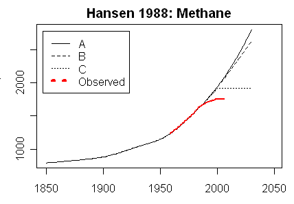
There’s another interesting issue in terms of methane. The figure below shows the A1B (solid) and A2 (dashed) scenarios for methane used by IPCC. While the increases are less than Hansen Scenarios A and B, Scenario A2 in particular shows a very strong continued increase in methane levels, and, even A1B shows continued increases through mid-century. Perhaps the recent stasis is itself an anomaly and methane concentration will resume its earlier increase, but the matter is puzzling.

AR4 doesn’t talk much about methane. The chapter 2 summary says (tautologically?):
Methane concentrations are not currently increasing in the atmosphere because growth rates decreased over the last two decades.
Later they say:
The reasons for the decrease in the atmospheric CH4 growth rate and the implications for future changes in its atmospheric burden are not understood (Prather et al., 2001) but are clearly related to changes in the imbalance between CH4 sources and sinks.
So while lower-than-expected methane increases might well account for one of the lower radiative forcing projections being more appropriate to evaluate Hansen’s model, this is a bit of a two-edged sword: given that substantial methane increases are included in IPCC projections without, according to IPCC, any understanding of the leveling off of methane concentrations, this indicates a substantial uncertainty in canonical IPCC models, an uncertainty that, to the extent that it is disclosed at all, is buried deep in the fine print.
N2O
The figure below compares observed N2O to Hansen A and B projections – Hansen doesn’t mention how C projections are done – together with IPCC A1B and A2 projections. Again there is negligible difference between Hansen Scenarios A and B up to 2007 – only a ppbv or so. Total radiative forcing from N2O is said in AR4 (Table 2.1) to be only 0.16 wm-2: so we’re getting into very slight impacts with the small changes here.

CFC12
Again, the figure below makes the same comparison for CF12, the radiative forcing of which in 2005 was said by IPCC AR4 to be 0.17 wm-2, about the same as N2O. Again there is no material difference between Hansen Scenarios A and B through 2010. As with methane, CFC12 concentrations have leveled off slightly below Scenario C levels. IPCC A1B and A2 scenarios appear to be identical, showing a gradual decline through the 21st century. Update: Since I wrote this, I became aware of Hansen data archived, oddly enough at realclimate, which shows that CFC11 and CFC12 concentrations were doubled in Scenario A as a means of modeling Other CFCs and Traces Gases and this accounts for the main near time difference between Scenarios A and B.

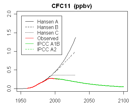
CFC11
CFC11 is said in AR4 to have about 1/3 the forcing of CFC12. As shown below, it has very similar features to CFC11 – negligible difference between Scenarios A and B; actual growth less than Scenario C; projected decline in concentration through the 21st century. Update: Since I wrote this, I became aware of Hansen data archived, oddly enough at realclimate, which shows that CFC11 and CFC12 concentrations were doubled in Scenario A as a means of modeling Other CFCs and Traces Gases and this accounts for the main near time difference between Scenarios A and B.
Other Trace Gases
AR4 Table 2.1 shows other CFCs as having 2005 radiative forcing of only 0.023 wm-2 (about 10% of the two main CFCs) with the total of all other Montreal Protocol gases, on a cursory inspection, looking to have about the same negligible impact as other CFCs. In Scenario A, the “other” trace gases are accounted for by doubling the impact of CFC11 and CFC12, while in Scenarios B and C, they are held to have no incremental impact. So there is a difference between Scenarios A and B here, but it doesn’t look like it should have much impact. Update: Notwithstanding the low forcings in AR4, Hansen et al 1988 accounted for these other Trace Gases by doubling CFC11 and CFC12 forcings, which themselves were estimates. This accounts for the main near time difference between Scenarios A and B.
“Speculative” Forcings
Figure B2 of Appendix B of Hansen et al 1988 mentions “speculative” forcings, which, in addition to other CFCs, includes ozone and stratospheric water vapor. These “speculative” forcings occur in Scenario A, but are not included in Scenario B. Hansen says:
Figure B2 summarizes the estimated decadal increments to global greenhouse forcing. The forcings shown by dotted lines in Figure B2 are speculative; their effect was included in scenario A but was excluded in scenarios B and C.

The size of these “speculative” forcings is surprisingly large – being not dissimilar in wm-2 to methane or to observed CO2 increase, for that matter.
Volcanoes
The final difference between Scenario A and Scenario B is that Scenario B assumed a major volcano in 1995 (and an actual major volcano, Pinatubo, occurred in 1992.) My understanding was that volcanic forcing was transitory and that such forcing could introduce a change over a year or two, but it would wear off, leaving things more or less as though it had never happened.
Differences between Scenarios A and B
As noted above, in my next post, I’ll consider differences in radiative forcing between these scenarios. As a preview, here is Figure 2 from Hansen et al 1988, which shows radiative forcing for CO2 and the total of CO2 and trace gases. As you can see, most of the difference between Scenario A and Scenario B arises from gases other than CO2. Also Hansen Figure 2 shows that a noticeable difference between Scenarios A and B had already arisen by 1987 – something that will need to be examined closely to see exactly which gases are contributing to it, as well as to the increasing differences between the two scenarios for gases other than CO2 by 2010. Right now, based on the review of GHG concentrations, it’s hard to see exactly what is accounting for the difference in radiative forcing. Update: As noted in a subsequent post, the handling of Other CFCs and Other Trace Gases accounts for the near time difference.


80 Comments
Methane Eaters.
http://www.esf.org/media-centre/press-releases/ext-single-news/article/unmasking-the-methane-eaters-343.html
There are bacteria that eat methane. I wonder if they produce Co2 when they oxidize the methane?
If the CFC / Montreal Protocol experience is any indicator, we can expect significant inflection points for all GHGs in the near to mid term future. Possibly confounding factors are Asian countries burning coal, however, given sinking / fixing processes, and now, the advent of carbon credit feel good marketing schemes, even with NICs’ behaviors, I will still bet on an inflection soon, assuming we are not already there.
Doh! … except for, of course HOH!
NASA’s GISS today issued a press release stating that 2007 is “the second warmest year on record”.
In the media package GISS states that the six hottest years on record in descending order, are: 2005, 2007-tie-1998, 2002, 2003, 2006.
Interestingly, given the questions raised in this thread, James Hansen, GISS’ Director stated that: “As we predicted last year, 2007 was warmer than 2006, continuing the strong warming trend of the past 30 years that has been confidently attributed to the effect of increasing human-made green house gases“.
Whatever happened to the revised top-10 temperature leaderboard issued by GISS last summer after Steve McIntyre’s repeated queries?
Steve: As both I and Hansen observed last summer, the error affected U.S. rankings and not world rankings. The U.S. pattern is different than ROW for reasons that are unclear.
Steve- Very well done. Could you post links to the sources for the observations?
It is worth pointing out that Hansen’s Scenario A and B predictions are very similar to the 1990 IPCC “high estimate” prediction with a climate sensitivity of 4.5 degrees. Perhaps later we can compare these explicitly. This makes sense because Hansen’s 1988 model had a climate sensitivity of 4.2 degrees.
RE: #4 – I still question whether or not the “warm 1930s” were limited to No Am. There is substantial evidence of a “warm 1930s” world wide. In which case, this GISS statement is a lie.
I would think that the discrepancies caused by assumptions about all the other greenhouse gases would be negligible. I think that the volcanoes and aerosols are the key. And that would appear to be the case. How accurate were Hansen’s volcano speculations(I say speculations becuase of course he couldn’t possibly say he “knew” though perhaps guessed well)?
So far he hasn’t been that far off the mark on that, in that we have had two eruptions since then about when expected. This is something to watch, however since I see another volcano near (gasp!) 2012. I’m betting it’s conspicuously absent but the cool is there anyway (but I wouldn’t put money on it, and it just might happen that there is a frustratingly inconvenient Super El Nino that year.).
luctoretemergo, the changes were in the US temperature open. Check Again.
very nice graphs Steve, thanks for providing them.
so can we agree that several of “cause factors” underperformed, so we shouldn t hang Hansen, just because the observed warming is slightly below the the most plausible one (B)?
Regarding “Figure B2 summarizes the estimated decadal increments to global greenhouse forcing. The forcings shown by dotted lines in Figure B2 are speculative; their effect was included in scenario A but was excluded in scenarios B and C. ”
If all GHG’s but CO2 have stopped increasing, then the decadal increase in temperature from 2000 on is only 0.8 deg/decade, not the prior 0.16 deg/decade one would get if assuming that all the GHG’s are still increasing by the amounts shown in Figure B2 per decade.
Is this a reasonable interpretation?
Whoops, typo in #11
Should have typed “0.08” deg/decade, not “0.8” deg/decade
apologies
Actual anomalies did not come in “just below” scenario B. Actual anomalies, despite all the weather “noise” were below scenario B anomales in 18 of 20 years. Only El Nino prevented scenario B from being 0-fer. Actual anomalies averaged a third lower than scenario B.
I’m not in favor of hanging anyone, but I am wholeheartedly in favor of LMAO at Gavin Schmidt’s pronouncement that scenario B is “as good as could be expected.” He clearly doesn’t expect much.
Re #4 A point of interest is that the global GISS temperature for 2007 diverges from the satellite values. The last such GISS/satellite divergence I saw was for the US data in the year 2000. We know what evolved there.
All I can say about Hansen and Schmidt’s tapdancing around the rules of conduct of NASA employees, is that both appear to have lots of spare time on their hands.
Summary of my other post:
Hansen scenario A
CO2 emissions +1,5%/year => 384 ppmV atmospheric in 2006
Reality
CO2 emissions +3%/year since 2000 => 378 ppmV atmospheric in 2006
So Hansen’s asumptions about what is emitted and what remains in atmosphere are wrong.
Trying to guess the future from the current and past has its pitfalls.
I am more and more convinced we can predict what’s going to happen less and less as time goes on, now that we are caught up with the way we gather and process the anomaly trend, and things rather remain about the same as they’ve been since all the monthly anomalies started being in positive territory in 1995, a trend which started and was almost complete started in 1980. My opinion is this is why the projections match recently, and will stop doing as well (if they haven’t already; that might be what you’re seeing with this data, Steve.)
If the yearly anomaly ever gets over/under .8C it will probably correlate with the expected population growth between now and 2050; 50%, to 9 Billion. This of course depends on what technology does in the meantime (mainly related to food production, industrial activity, fuel sources and pollution).
# 9
Observed warming is not “slightly bellow most plausible scenario B” but slightly bellow scenario C (see Steve’s previous post). And Scenario B was not “most plausible” in original Hansen’s scenario. He didn’t mention once in his testimony anything like that, but clearly described scenario A as “business as usual”.
Leon Palmer:
How exactly did you calculate this? Thanks.
Re: 4
Steve McIntyre
Steve you say that the US pattern is different from ROW for reasons that are unclear, however you have posted extensively on the various questions that exist around both the extent and “quality” of the ROW data.
It begs two questions:
1] if the US arguably has the best available data both in diversity and quality [with all the shortcomings outlined by Anthony Watts] should not some weighting be attached to this data in the overall global mean temp index?
2] If CO2 is indeed the main driver of temperatures as is argued by Hansen and his team, how come there appears to be no correlation between the US/the North American continent as largest producer of CO2 globally and North American continental temperatures? In Canada, 2007 was the 13th warmest year since unified country-wide records started in 1946.
Re: 14
David Smith reminds us of the ongoing and [it would seem] increasing discrepancies between GISS’ temperature scenarios/published data and RSS/satellite based data. Has GISS commented on this discrepancy in any way [either officially or through the RC outlet] and if so, what was the explanation?
Re: luctoretemergo
NOAA states (my bold):
USA TODAY reported it with the headline 2007 was the warmest on record for Earth’s land areas followed by a clarification in the second paragraph …
For the entire Earth’s surface, including the oceans, scientists report that the global temperature was the 5th-warmest on record.
please do not discuss NASA temperature reports on this thread.
Re #19
Hi Andrew,
Looking at the height of the bar graphs, (use 1980 on right of figure B2)
Looking at the CO2 bar, it’s heigth is 0.08 deg/decade for (as noted inside the bar)a
15.6 ppm increase per decade increase in CO2 concentration.
So my interpretation is that Hansen’s model predicts an increase in temperature
of 0.08 deg/decade for an increase of CO2 concentration of 15.6ppm per decade.
It that’s a correct interpretation, the heigth of the “other GHGs” bar to the right of the CO2 bar
represents a 0.08 deg/decade increase corresponds to some (not noted in the bar) increase in
the “other GHGs” per decade.
If added together, one gets the canonical the claimed 0.16 deg/decade global warming claimed for AWG…
But if the “other GHGs” are not increasing since 2000, if one were to draw this figure
for the year 2000, the CO2 bar would look about the same, but the “other GHGs” bar representing
the decadal increase in “other GHGs” (as Steve’s graphs show) would be zero.
And then the decadal increase in temperatures due to GHGs
(per the GCM that underlies figure B-2) would predict a decrease in the rate of temperature increase
per decade from 0.16 deg/decade to 0.08 deg/per decade started in 2000.
This would jive with the measurements, that the temperature increase is not following Hansen
A or B model since 2000, that it is on a less steep curve (like Hansen C).
That’s my quick analysis. I appreciate any hole-poking.
I’ve now looked at the radiative forcing results for these concentration scenarios as well as the most recent GISS observations. It is very strange.
So far, I’ve been unable to identify material differences in the Scenario A and Scenario B forcing over the 1987-2007 period that account for the difference in temperature between Scenarios A and B.
I have long been under the impression that most climate models assumed an annual increase in ppm CO2 of around 1% (compounded) in the future. Am I mistaken? We see that Hansen is basing his concentration increases in Scenario A on the previous annual increment, rather than on the starting concentration. Is this the normal procedure in the models?
There also appears to be frequent confusion of the concepts of growth in emissions and growth in atmospheric concentration. The Hansen quote in Eli Rabett’s blog specifically refers to the 1.5% as growth in emissions, not concentration. [“Scenario A, since it is exponential, must eventually be on the high side of reality in view of finite resource constraints and environmental concerns, even though the growth of emissions in scenario A (~1.5%/yr) is less than the rate typical of the past century (~4%/yr).”]
I am also puzzled by Hansen’s Figure 2. It seems to suggest that rising CO2 (scenario A) will force temperatures up by just 0.6 degrees C 1988-2050, but when the other gases come into play, the warming increases to almost 2 degrees C. This seems to reduce CO2 to a supporting role. When you consider that most of the other gases effectively stopped rising before 2000, the long-term reliability of the prediction becomes questionable.
#3
“Doh! … except for, of course HOH!”
Climate Science has nothing to do with HOH (only the loss of frozen surface water).
You, of all people, should have learned that by now. CS is all about the temperature (of something relatively undefined),(and a little about Himicanes, if they are frequent enough).
#24
Wouldn’t the “volcano in 1995” included as part of the the plan B scenario be the difference? The slopes of A and B are pretty much the same, but the volcanic forcing at 1995 in B cools the globe for a couple of years before warming resumes.
A lot of work would be involved, but a more comprehensive picture would emerge if all units were expressed in correct physical and chemical terms. That is, temp in degrees K, CO2 in mole per litre etc. Lucia and others went to a lot of trouble to put anomalies onto a constant year term reference base; Steve, your revelation that the increase of CO2 was an increment on an increment for scenario A was unclear to me before because the absolute measure was masked by the incremental language.
You are doing a wonderful job of revealing discrepancies in certain papers and certain reasearch. You are heading to asking some rather telling questions. But sooner or later it would help intercomparisons to have them on the same base. It would then become clearer that e.g. (minor example) oxidation of methane to make more CO2 would cause only a small increase in the latter.
Your next essay, pulling together your last 2 essays in your spare time, is eagerly awaited.
Well, I’ve gone through the Hansen paper looking for an overlooked tidbit that might account for the magnitude of A vs B. I’ve found nothing.
Perhaps it is some odd aspect of his speculative forcings – perhaps their location in the atmosphere (stratosphere) resulted in large “amplification” which later models dropped.
Since Gavin provided data when I asked, I thought I’d plot the scenario data he provided at real climate (at my request, promptly and during Christmas vacation.)
Here are comparisons:
I think AB&C are the scenarios but without the volcanos added. My green line is the historical data. The purple is historical with stratospheric aerosols stripped. (I’m assuming that’s the effect of the volcano. But, if other parts of the contributions in his forcing file are due to volcano,s let me know. I’ll be wanting that information.)
Roger: When are you going to get your comments working?
Posting a comment and having it munched is worse than posting and waiting to get out of moderation! 😦
Whatever else you may say about climate science, there is no disputing the logic of this “if P then P” assertion:
Clearly! After all, if the concentration has changed its rate of increase, there must have been a change in something that was putting it in or something that was taking it out (or both!), and those changes must be asymmetric. Honestly, was there a minimum page count for that section of AR4? How many words does it take to say, “We have no idea what is up with methane”?
#31. Yes, this is quite a startling revelation, isn’t it?
Lucia- Apologies. Really. I am as upset as anyone about the state of our blog. We are in a tech support queue, unfortunately. Very soon, I am told. Meantime, please feel free to email comments, and I can get them up.
“All I can say about Hansen and Schmidt’s tapdancing around the rules of conduct of NASA employees, is that both appear to have lots of spare time on their hands.”
Both appear to take the issue so seriously, they will put their own time into publicising it.
What, and drop the cloak?
Bugs, stop playing dumb. When there are serious uncertainties in a model’s input, you disclose it by running scenarios. When there are parameter uncertainties you disclose it by running sensitivity analyses. If at the end of it all you have no certainty, you have to run with a precautionary principle. This is not about choice of language it’s about honesty in the face of model uncertainty.
AR4 CHAPTER 7 Couplings Between Changes in the Climate System and Biogeochemistry page 542
From this they can conclude.
i)They have no quantitative analysis of the CH4 atmospheric component.
ii)Qualitative apportionment.(source ratios)
iii)Understanding of sink processes(and or mechanisms)
This is applicable to
i)uncertainties in biospheric attenuation and amplification
ii)uncertainties in apportionment of isotopic data, and measurement
iii)The interrelationship with the biosphere(carbon cycle)ozone-Nox-CH4.
A new study suggests that the reason why the atmospheric concentration of methane slowed in the 1990’s was related to the collapse of the Soviet Union.
New York Times Sept 28 2006
American Scientist Online has a list of possible, all unproven at this point reasons for the methane decline.
The models are uncertain, and it is acknowledged. Read the IPCC reports.
Re: 40
From the IPCC 4th AR:
It is true that later they say the following:
A question for you, bugs. Would you know from reading this that some models predict trivial heating and actually some tropospheric cooling?
I think I’ve never heard so loud
The quiet message in a cloud.
==================
#40
LOL 🙂
Here’s why this is funny — in the humorous sense: ClimateAudit exists, and receives millions of visitors, in large part because uncertainty has not been generally acknowleged.
Admittedly, determining uncertainty is usually more difficult than estimating central tendency (which, in this case, is a hard problem itself). We all have trouble quantifying uncertainty.
More generally, what I find funny — in both senses of the word — is the cavalier attitude one often sees from the “consensus” when it comes to frank and rigorous discussion of these topics. Specifically, there seems to be a reluctance to discuss how little we really know about the climate.
For example, while there was nothing unusual about finding that the “hockey stick” was based on flawed data and statistics (bad science gets published every day, often right alongside papers criticizing and correcting previously published bad science), there was something very odd and troubling about the scientific process in this case. Even today — despite clear reports from Wegman and the NAS, not to mention McIntyre and McKitrick — there are still those (including the beloved IPCC) who refuse to acknowledge all the problems that were found and, consequently, the magnitude of our uncertainty about the millennial climate.
The irony is that the millennial climate, by itself, is of little importance. However, we do need to know whether we can trust climate scientists on other topics — specifically what the consequences will be, and how well we can predict them, if we continue to dump GHGs into the atmosphere. Insofar as the “consensus” is seen to be misrepresenting the facts on the “hockey stick” — a case where we can actually determine the truth about the flaws in the data and statistics — it undermines credibility on more elusive topics that really matter. This could present a huge problem for all us.
I happen to have a bit of experience in politics, and my sense is that the “consensus” is deceiving itself about its effectiveness. Nobel prizes and NYT Op-Eds are lovely, but they do not equal policy. For that, one needs to convince elected officials. What I can tell you about elected officials is that, unlike scientists, they live and die in a world where uncertainty and deception are ubiquitous. Those who survive have extraordinary sensitivity to both. And if they think they are being misled, they will respond with hesitation and delay. I think we are already seeing this.
The irony here is that it is so easy to say “I don’t know.” Politicians understand this. Every decision they make, every vote they cast, is clouded by uncertainty. They are really good at dealing with this — much better than scientists, who enjoy the luxury of being able to collect more data or publish corrections.
Acknowledging the full extent of one’s uncertainty is immensely important, in both politics and science, and it is unfortunate that the climate science community has not yet (IMHO) recognized this.
Natural Gas is between 97% to 99% Methane.
The stabilization of Methane concentrations is almost certainly related to the oil and gas industry tightening up leaks in their infrastructure and capturing natural gas for resale/use rather than just letting it out to the atmosphere/imperfectly burning it in the emission stacks.
Natural Gas is now worth $8/GJ and every oil company is trying to use/make money off that value now. Natural gas suppliers have tightened up leaks in pipelines and furnances are now more efficient.
#43, TAC, great post.
snip
lucia, re: #30 What is the green line of “Historical Forcings” that Hansen labeled ‘actual forcing’. Is it something like if anomoly is X, then Forcing=some value. TIA
Steve,
Hansen’s fig 2 middle graph (CO2 + trace gasses), as well as Gavin’s forcings as relayed by Lucia, begin to separate A from B and C almost immediately, with lines diverging in the early 60’s. Look for an early difference in the trace gasses as used in A compared with those used in B and C.
It is bothersome that a simulation published in the late 80’s would use what are clearly different conditions for the 60’s and 70’s to obtain an enhanced difference in predictions for the future. As you are indicating, A and B should not separate much in the near future since they are so close to each other, both in CO2 predictions and in trace gas predictions.
It seems to me that politicians are eating this up like there’s literally no tomorrow. “Obama to end climate change” is a recent headline, as an example. Numerous state governments hiring “green” counselors, it goes on and on. Whether the politicians believe it or not is irrelevant, because they see it as a money maker for them and/or their states. Tax tax tax. they’ll be taxing us to offset our breathing quota before you know it.
44, if you remember what a typical refinery looked like circa 1980, there were huge flares flaring large amounts of gas more often than not. Go by one today, and all you’ll see is the pilot. There definitely has been a lot of work toward saving valuable resources. I don’t know if that’s the whole story about methane, but I can certainly believe that it’s a big part of it.
Ok, maybe I’m being obtuse. But wouldn’t the thing to do be to take the as-observed concentrations of GHG etc. and feed it into the analysis that Hansen used in 1988? That is, as compared to trying to figure out which of the scenarios is closer to the actual observed concentrations.
Can this be done? If so, what is the result? If not, isn’t that a reason to be upset?
One can only wonder whether they’d refer to dropping dead as “a decrease in life expectancy growth rate”.
It’s language usage like this that truly says this is not science, this is an agenda masquerading as science.
CH4 + 2xO2 = CO2 + 2xH20
So what is the net greenhouse forcing impact of burning methane vs releasing methane directly?
Re #52
Methane has a relatively high absorption per molecule in part because it absorbs in a ‘window’. The above equation is not correct, that’s what happens when you burn CO2, in the atmosphere the first (rate limiting step) is the reaction with OH. OH is the limiting reagent in this case and is in short supply in the atmosphere (it’s also consumed in other ‘clean-up’ processes). This means that the half-life of fresh CH4 is ~10years so the enhanced effect of CH4 is experienced for a decade or two. An extra wrinkle is that if the CH4 exceeds a certain level the half-life goes up because the OH level is depressed. Methane has another role in the process as it his believed to be a significant contributor to increased water vapor in the stratosphere (it remains in the atmosphere long enough to get transported across the tropopause where it reacts to form water).
Re: #50
I have posed this question several times over a period of time here at CA and have not received an answer. The major issue to me is why the Hansen modelers/scenario makers have not separated the GHG projections from the models output by doing as you suggest. It would appear to this layman that the inputs for Scenarios A, B and C were made in 1988 into a computer model program that has somehow lost its original form. It may be pointing to a general problem that occurs with models, be it for predicting climate or investment strategies, and that is that “new and improved” versions keep popping out and the older models forgotten with the end result being very short out-of-sample results for testing statistical significance.
These scenario exercises do show that the total projection of climate and GHG emissions is not very good. When climatologists, like Hansen and those involved with the IPCC, make projections one must be very aware of the uncertainties not only in the climate part but in the emission (input) part. When a group of climatologists make projections about future temperatures one must remember that they probably know very little about what the projected inputs will be. This dilemma leads to the scenario format which in turn shows a glaring weakness (in regards to the unmeasured uncertainties for the entire projection process) in the projection process.
Why were the methane and fluoro hydrocarbons concentrations so badly projected?
#53
Thanks Phil.
The question I’m trying to get answered is, what creates more greenhouse forcing, burning methane or releasing it directly into the atmosphere?
lucia, on your chart @30, The volcanic eruptions appear larger than anything I can identify here:
http://www.climateaudit.org/?p=2602#more-2602
Am I missing something, or did you multiply them by two? They look too profound, to me.
Speaking of volcanoes, I seem to recall posting once that the models tend to overdo it on the volcanoes. But I don’t think that’s relevant at the moment. Unless someone with any knowledge of the matter would care to inform me of how the effect of volcanoes is determined?
Re #55
Releasing it directly into the atmosphere is worse from that perspective.
There is a direct effect with statosperic aerosols, but vocanoes can also effect ocean cycles.
Here is a decent link.
Pinatubo was a 6 on the VEI scale, the largest tropical volcano since Krakatoa. It’s hard to imagine that Hansen would have figured in a volcano that large, but in any case the modeled effect of his “1995 volcano” was much larger (by a factor of approx 2) than the actual impact of Pinatubo.
Steve, et al:
In case your not aware, suggest reviewing Dr. Rutledge presentation at…
http://rutledge.caltech.edu/
Dr Hansen was quoted as saying based this…max ~450. I still question the relevance even to these high assumption in light of other factors (H2O, sun, etc.).
Science is based on observational data and reprodicability…which makes his presentation more compelling and relevant.
BTW…I was the Weather Commander at Clark AB during Pinatubo eruption…our radar suggested during main eruption(s), water emission was very high due to beam changes.
Keep up the good work!
54,
Because maybe they don’t understand the dynamics as they assume they do?
Mike B, thanks. The thing that’s bothering me, though, is that modeled effects of volcanoes, historically, appears to exceed their actual effect:
http://www.sciencebits.com/FittingElephants
I really am having a hard time understanding how this all fits together, at the moment, but I suppose I am a bit out of my depth.
Re: #49
Flaring at refineries pales into insignificance compared to flaring in the oil fields in places like the Horn of Africa. There you had wells with high gas content and no way to transport the gas off-site. The light from the flaring was bright enough to be observed from orbit, IIRC. Gas to liquid chemistry is an answer, and Qatar for one has been building plants. Last I heard, though, was that production rates were way below design and building more capacity had been put on hold.
Re #60
At that time the Montreal Protocol hadn’t even been signed never mind implemented.
Regarding Methane we still don’t know why the previously steady growth rate changed in ’92 so that would be rather difficult to project in 87!
#63. The question with the methane projections that I have is: why did the estimates of historical values go down a noticeable amount? Also I don’t fault the 1987 projections particularly, but the A2 projections (particularly) don’t seem to have learned anything from the past: what are they based on?
From the IPCC report. As New Scientist said, could the AGW skeptics lift the level of debate?
Maybe it’s because you can’t predict human behaviour, as well as the uncertainties involved in predicting the climate.
Dewitt,
As the price of energy rises, the cost effectiveness of building pipelines, etc. to capture that gas changes.
Bugs says:
The IPCC may say some things about the uncertainty in the body of the report but it completely ignores those statements in the SPM which is suggests the science is much more certain than it is. To make matters worse, you have AGW advocates like Hanson arguing that scientists should downplay/ignore the uncertainity in order better influence the public/policy makers.
If the New Scientist wants to see a higher level of debate it should start by demanding that AGW activists admit that their is a lot of uncertainity in the science and that they should not pretend that it does not exist.
#65 Bugs. Perhaps you could explain the apparent disconnect between the start and end of the second quote you’ve provided. In summary from where I’m sitting: “there’s lots of uncertainty, but we’re certain…”
MarkW,
Yes, but not as much as you might think because the cost of pretty much everything can be traced back to the cost of energy. Most estimates of the break even point for alternative fuels compared to the price of oil are wrong because they use a static model. This is where the energy returned/energy invested ratio becomes critical.
@Steve Keohane 47
That’s my graph. I took data from the file Gavin provided at here Real Climate. Those forcings are relative to 1880 (I think based on everything being set to zero in 1880. There are negative forcings after Krakatoa went off.)
To get the annual contribution, I summed all the components for a year. Intially, I get a forcing close to 0.5 watts/m^2 in 1955– that’s relative to 1880.
Hansens ABC forcings are relative to 1858. So, to compare these two sets, re-zeroed the historical forcings to make the zero reference 1958.
@Andrew–
The blog post you listed shows temperatures series. That’s different from forcing. I didn’t multiply by two.
I’m doing a little hobby analysis, and I do have a file you can look at — but take with a block of salt. (You can call the model I use to get that climate response “Lucia World V. 1.0 “. It’s the simplest possible model of a climate. I got better volcano data yesterday, and I’m trying to double check all my thoughts and equations and get better numbers.)
However, this chart shows something I call “equilibrium temperature” plotted with actual temperatures. Actual temperature are purple, “equilibrium temperature” is green and my model is the red line.
The “equilibrium temperature” is the hypothetical temperature the climate would reach if a particular level of forcing remained constant– I calculate that based on a model, which provides me a “sensitivity” to increased forcing. So, in this figure, equilibrium temperature is some constant multiplied by forcing.
But, basically, based on parameters I got, if Krakatoa has continued to block the sun at the peak value forever and ever and ever, the world temperature would have dropped 0.7C. Luckily, it stopped exploding.
By showing them together, you can see when the “equilibrium temperauture” exceeds the real temperature, the world temperature increases and vice-versa.
But, the world is damped. (Thank heavens! Imagine how cold it would get after eruptions?!)
Notice in “Lucia World V. 1.0” the response to volcanos is less than in the real honest to goodness world. Hopefully, after I process the refined volcano data Gavin pointed me to, the time constant of my world will decrease and I’ll track volcano eruptions a bit better. Then, I can show graphs of “Lucia World V. 1.1”, which hopefully will show a bit sharper dips after volcanos. (Or maybe it won’t. This is a very crude model.)
The thing to watch for from the IPCC is the SPM, because that’s what “everybody” reads. And it reads like an op/ed trying very hard to make a specific point.
It seems likely that those politicians who have ready the main WGI reports are the ones questioning “the” “warming” and holding panels and trying to figure out what’s really going on.
The ones that most support “doing something” and talk about a “climate crisis” either haven’t ready the WGI stuff, or have read it and have an agenda (or aren’t intelligent enough to understand it).
In answer to somebody’s question; yes, they get paid by the page. 🙂 I’d guess if everything was written more directly (while still being professional of course; they’re not exclusive) you could very likely get rid of 90% of the material.
You don’t think that stuff is written that way by accident, do you? Part of it is the culture, part of it is the career and its writing style, part of it is the group process of compromise and how the writers and reviewers interact, and part of it is the mandate and agenda of the IPCC itself. Throw in some inertial, some pride, the political aspects of the participating agencies the writers work for, and the unstated assumption that the anomaly trend=warming.
Bake it in the oven for 2 hours at 400 F.
Typical of the slander that regularly pops up on this site.
Steve: Bugs, is this your idea of a useful explanation of the methane concentrations:
Can you point to anything more illuminating than this in AR4? Do you think that the A2 or A1B methane projections make sense? Can you point to a valid scientific justification? I’m asking – I don’t know this literature.
#73 typical dodge that pops up from trolls on this site. repondez le question, svp.
Re: #63 and 64
My point has been not to blame the projectors but to emphasize how difficult it is to predict the emissions of GHGs and those predictions are every bit or more important to the scenarios than projecting the climate part of the scenarios. Why not for the sake of analysis separate the two parts of the scenarios since those parts must necessarily come from very different sources and disciplines?
While economics may be better versed in the statistical applications necessary for that discipline (as compared to climate science) it has not established a very good track record in making predictions. And I think that it is difficult by the very nature of economics. I would predict that in some distant time it will shown that climate predictions are by nature less difficult to make with a given certainty than economic predictions.
Re: #75
But don’t the long term climate predictions depend on economic predictions?
#76 yes. the uncertainty compounds.
Re: #76
Long term climate predictions, when made as scenarios, depend on inputs into climate models and those inputs depend on economic predictions, but accuracy of the climate part of those predictions/scenarios depends solely on how well climate is predicted for any set of variable inputs. That’s the whole point of the arguments I have made and I have heard Pielke Jr make many times and that is one needs to separate these predictions/projections in order to determine the accuracy of either and both parts. Pielke has said, in effect, that predicting the correct temperature changes out-of-sample using a set of inputs that does not match the scenario used should not give any amount of good confidence in the climate part of the scenario (or the economic/input part of it either).
Re: #24 Steve M says:
I wonder if part of the solution is that the model estimates a final delta T based upon the cumulative changes in GHG concentrations and then interpolates the steps required to achieve the estimated end point or milestone?
Re: #72 and #73
There may be something to this. It could be that the work ethic of the committe (or at least some of the committee members) which demands that they produce as much paper as possible to justify their existence (and all that goes with that).
Steve: Please note that subsequent to this, I’ve pinned down the difference to the handling of Other CFCs.
All the estimates I have seen for CO-2 forcing, before feedback are global. To put my question simply, how is this number arrived at? Forgetting all the feedback and other complications. Is the intial W-sqm forcing based on global averages? Global average LW infrared radiation, global average doubling of CO-2, global average water vapor, having a global average affect on this doubling of CO-2?
Re: #78
To be more complete in sourcing the inputs for the climate models, I should have noted that the mystery behind the unexplained changes in atmospheric methane concentration trends should be attributed to a third source/discipline that would fall outside the area of climatology or at least that area that uses inputs to predict future climates. I am not sure about how well the fluorocarbon concentrations followed predictions/projections after the Montreal protocols, but certainly these predictions fall into an area other than climate and economic modeling.
Again I say it is not very productive to analyze the Hansen A, B and C scenarios without evaluating all these parts separately. The biggest question would appear to be the evaluation of the Hansen climate modeling as we have a better view of the GHG actuals versus prediction and would have to give pause to any great confidence there.
I would think that one must look long and hard as to why Scenario A was used at all if it did not have some basis in a future reality for those doing the predictions. The only other conclusion one could draw would be that an unrealistic scenario was being used to push climate policy.
Another factor in the climate modeling that bothers me is the acknowledged lag effects and how would one realistically line up the changes in GHG concentrations and temperature anomalies. If the models say that the system has a momentum of X degrees anomaly for existing GHG levels than when some here say we have to give Hansen credit for predicting a temperature increase would that credit not be a more general one dealing with the lagged effects.