During the past 2 months, there has been an active discussion in the blogosphere about the quality of the Tucson U of Arizona weather station. While I have never claimed that the blogosphere is a substitute for academic journals, the thread of Tucson discussions seems to me to be a good example of internet discussion at work, doing something that couldn’t be done very well , if at all, in more formal venues. In this case, I’ll take partial credit for initiating this particular topic as, in a post on June 11, 2007, I observed that the Tucson – Univsersity of Arizona station ranked #1 out of all 1221 USHCN stations in the 20th century trend (using the time-of-observation adjusted version).
The identification of substantial non-compliance with WMO policies at the site with the largest trend in the USHCN network has prompted a small blizzard of commentary on the Tucson station. I’ll document some of these recent discussions here [Note with an update covering discussions since this post added on Sep 4, 2007].
Atmoz, July 24, 2007
Only two days after Anthony reported non-compliance at the Tucson station, Atmoz, an anonymous climate scientist doing business out of the Uriversity of Arizona, defended the Tucson site at his blog here. He argued that the parking lot was “hardly used” and suggested that the cars in the photo had been there for over three years:
The lot is hardly used. The cars and trucks seen in the (at least 3 year old) satellite image are quite possibly the same as the ones that I can see right now.
In response to a comment by the surfacestations.org surveyor that the site was “ringed with 4-10 storey buildings”, he argued that there was only one 10-storey building, as though this were grounds for condescension:
However, there are a few gems hidden in that link. In the caption to that image, it says that the station is “ringed with 4-10 story buildings.” Granted, there is at least one building 10 stories tall nearby, seen best in tucson looking NW2. The building I’m in, directly to the north, is 4 stories. The buildings to the south and southwest are also around 4 stories. The building to the east is, at most, 7 stories tall. Here’s a tip for estimating the size of buildings… count the windows!
He also compared the temperature history from Tucson U of Arizona to Tucson airport, arguing that the histories were roughly similar, a point that I’ll return to.
Herman and Jones, Aug 6, 2007
On Aug 6, two U of Arizona climate scientists defended the Tucson station at Roger Pielke Sr’s blog here. To a considerable extent, their defence was that poor conditions at the U of Arizona weather station was not incompetence by U of Arizona personnel, but had been endorsed by NOAA:
When the station was first located at the current site, the location and instrumentation were approved as an official COOP station by NOAA. When the current electronic instrument package was installed, the local NWS station provided direct input and final approval. ..
Like Atmoz, they compared results from the U of Arizona station to the Tucson airport station, saying that the results were roughly similar. Unlike Atmoz, they acknowledged that there had been tremendous urbanization in Tucson in the 20th century, suggesting that “a good part of this rise is due to the Urban Heat Island Effect” and that while both stations showed trends:
How much of this is due to the growth of Tucson and how much can be attributed to other causes is impossible to determine at this time, but the trend is clearly present in both data sets.
Atmoz Revisits, Aug 7, 2007
On Aug 7, 2007, Atmoz responded to the above post at Pielke Sr. In this case, he located a couple of photographs of the Tucson airport ASOS station, as evidence that this was a “good” site and unaffected by urbanization.
He did not show a Google Earth image of Tucson airport, which (if I’ve got the right location), and the overhead gives a different impression than Atmoz’ pictures. [UPDATE: This has subsequently been confirmed to be the right airport, but the ASOS location within airport property is located slightly outside the frame of this image to the northwest.)

Figure 2. Google Earth image of Tucson airport
Comrie 2000
Both Atmoz and Herman and Jones compared Tucson U of Arizona to the airport site. As it happens, Comrie (BAMS 2000) is a specific discussion of the urban heat island effect in Tucson itself and deserves to be read in full by interested readers. It involved detailed surveying of the type seemingly sneered at by too many climate scientists, surveying in this case done by undergraduates. (A persistent theme here is that just because a task is somewhat menial doesn’t mean that it doesn’t have to be done.) This peer-reviewed study (not cited by IPCC) reported”
Tucson’s urban heat island is ~3°C over the last century, with >2°C of this warming in the last 30 years. The annual average urban warming trend over the last three decades is 0.071°C yr-1 with the strongest effect in March and the weakest effect in November.
They contrasted three “urban” temperature stations: Tucson U of Arizona (Tucson NWSO), Tucson Airport, Campbell Ave Exp Farm) with four “rural” stations: Anvil Ranch, Cascabel, Oracle, Santa Rita Exp Range. I’ve downloaded daily data for these 7 sites from the GHCN daily information and calculated monthly averages (note that this is without all the Karl and Hansen adjustments). As you see, there is a remarkable difference between the urban and rural sites. Given that Comrie (2000) considered Tucson airport to be an “urban” site, the supposed similarity between Tucson U of Arizona and Tucson airport doesn’t seem like a particularly relevant piece of information for justifying the use of this particular series.

Figure 3. Tucson Temperature History: Comparison of 3 Urban Stations with 4 Rural Stations using classification of Comrie (2000)
Ben Herman, August 16, 2007
On August 16, 3007, Ben Herman (whose post at Roger Pielke’s was noted up before) sent an email to Marc Morano, responding to one of Morano’s emails reporting on, among other things, Hansen’s “Y2K” error. In this email, he expanded on an issue relating to “aspirated” screens mentioned in passing in his post at Pielke’s:
—–Original Message—–
From: Ben Herman
Sent: Thursday, August 16, 2007 4:52 PM
To: Morano, Marc (EPW)
Subject: Re: L. Lohan Laments distracting from g. warming – UN Accused of Fudging Data – NBC Embarrasses Itself w/ ‘Deniers’ Segment – DiCaprio’s ‘horror’ film – Round UpHi Marc, it’s me again. I was doing some thinking about the NASA recalculation of annual temperatures and something occurred to me that I had forgotten about, and probably most people never heard about.
Sometime in the mid 1980’s NOAA changed their official thermometers and went with a new company. During the next several years, here in Tucson, the official NOAA reporting sit at the Tuc. Airport started having an unusually large number of record high temperatures mostly in June and July, the hottest time of the year here. These records were being broken when no other stations within a 1000 mile radius were not breaking records. To make a long story short, it was found that the new thermometers had faulty aspirators, which were no more than small fans to blow fresh, outside air over them constantly. Thermometers without
aspirators could read several degrees too warm, as we knew. There were other station acknowledging the same difficulty, and my guess is that there were many other stations that were not publicized. I believe all official NOAA sites eventually were eventually converted over to these new thermometers. Apparently, the aspirators worked well when first installed, and some at least, gradually deteriorated. I have now way of knowing whether or not they all had problems, But I do know there stations other than Tucson that did have problems.At some time in the mid 90’s these thermometers were quietly. apparently, replaced, but temperature data for the time they were in operation, was never adjusted, at least it wasn’t here in Tucson. The record highs we set during that period, are still in the books.
You can see a paper describing the Tucson situation at [Gall et al 1991] “Journal of Climate” Vol 5, page 657″ titled “The Recent Maximum Temperature Anomalies in Tucson: Are They Real or an Instrumental Problem?” url
This issue could be important if the problem was widespread across the U.S. as it occurred during the period of rapid temperature rise of the late 80’s to mid nineties. The fact that no one has mentioned it yet, to my knowledge, is not surprising as NOAA certainly did not advertise the problem, and in fact, probably tried to cover it up here in Tucson, at least. Read the paper, it’s not very long and no equations, just a nice piece of detective work to try and solve why our temperatures here in Tucson had suddenly gotten warmer. I, by the was was not an author, but was involved in some the temperature comparisons of the old thermometers with the new ones.
Have a good day,
Ben
Closing Comments
If one now goes to the current NASA station plot for Tucson U of Arizona, it appears that, despite the publication of this problem in peer-reviewed literature, Harman’s claim that NOAA (and thus NASA) have not adjusted for the aspiration flaws appears correct.

Figure 4. NASA Tucson U of Arizona station (adjusted version)
UPDATE (Sep 4, 2007)
I posted further on previous discussion of the HO-83 thermometer on Aug 22 here here.. The paper cited above (Gall et al, 1992 entitled The Recent Maximum Temperature Anomalies in Tucson: are they real or an instrumental problem? ) stated:
Since 1988, what appears to be an abnormal number of maximum temperature records has been set at the NWS office in Tucson, Arizona (TUS). We present several analyses that indicate that the recent measurement system at TUS is indicating daytime temperatures that are 2 to 3 degrees too high. It appears that the instrument is not appropriately aspirated so that, during the day, temperature readings are significantly warmer than air temperatures, while at night they are slightly cooler. The system at TUS is similar to one that has been installed at many NWS sites around the country. We speculate on the impact that this system may bave on the climate record if the errors noted at Tucson are similar at the other sites.
On Aug 20, Atmoz showed that the ASOS station was located slightly outside the frame of the Google Earth image shown above, which I responded to in a separate post on Aug 22 here, from which the comments below are derived.
In his Aug 20 post, Atmoz omitted the caveat in which I allowed for the possibility of an incorrect location and using climate science methods typical of Schmidt or Hansen, criticized me without linking to climateaudit. He showed the Google image shown below, arguing that this vindicated the original rustic impression that he sought to convey in his original picture and stated that “The airport ASOS is located over natural terrain”, making it appear, especially with the omitted caveat, that I had grossly mislocated the airport, a refrain picked up commenters at Tamino (commenters who do not cavil at Mann’s use of Paris precipitation data in a New England gridcell).
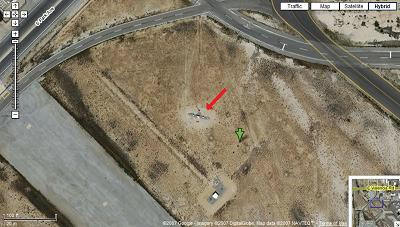
Figure 5. Tucson ASOS location as posted by Atmoz on Aug 20, 2007
I went back to Google Earth to try to reconcile these pictures. Below is a wider view that encompasses both images. The ASOS station location is marked by the pin. It’s at the far end of one of the runways shown in the original overhead that I showed, slightly out of the original view, but hardly in a rustic location, as the station is surrounded by urban settings in all directions and is close to large asphalt runways (known to have an impact from the Asheville CRN experiment.) So yes, this site is slightly outside the original frame, but not by much, and it is hardly in a pristine rustic setting. Comrie included it as an “urban” site which he distinguished from non-urban sites and there is nothing in this wider overhead to cause one to disagree with Comrie’s classification.
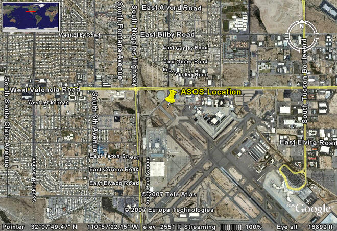
Figure 6. Wider view of airport
In subsequent discussion at his blog, Atmoz in his continuing effort to argue that the above post contained a scandalous error, as I reported here, Atmoz then fabricated a variation of my original graphic in which he inserted a green arrow that he said was my original attempt to locate the ASOS station – a green arrow obviously totally absent in the above graphics and inconsistent with the original caveat. Atmoz:
[Response:I’ve included an image here of the relative location of the station (red arrow) and where Steve showed the fictitious “airport asos station” (green arrow).

Atmoz also argued that if you stepped back even further, you could see desert to the south of Tucson International Airport using the image below. If you step back even further, the Earth will appear as a little blue marble. So what? As far as I’m concerned, Tucson International was Comrie 2000 as an urban site and there’s no reason to dispute that.

I take it that the premise of Atmoz’ objections is his view that the Tucson U of Arizona site is flawed, not because of being located over asphalt – something which is an embarrassment to his department at the U of Arizona, but because of a more generalized UHI – which has nothing to do with his department. Atmoz argues that the time series of Tucson Intl is “similar” to that of Tucson U of Arizona and thus the asphalt is not a problem. At this stage, no one has attempted to separate out the faux contribution of asphalt to the Tucson U of Arizona station; perhaps that will happen another day. For now, there is surely no problem in observing that the station with the largest trend in the entire United States is in a defective location. Yes, there may be multiple defects at the Tucson U of Arizona site: perhaps the generalized urban heat island is as much to blame as microsite asphalt. Again, so what? In addition, I’m unimpressed by arguments demonstrating “similarity” to the Tucson Intl record. Here we have peer-reviewed publications stating that the Tucson Intl record was flawed because of its use of HO-83 thermometers at the ASOS station. According to an email from a climate scientist, to his knowledge, the HO-83 error at Tucson remains uncorrected in NOAA records. Thus similarity of the Tucson U of Arizona record to a record known to be flawed is hardly a convincing argument for the validity of the Tucson U of Arizona record.
References:
Andrew C. Comrie Mapping a Wind–Modified Urban Heat Island in Tucson, Arizona (with Comments on Integrating Research and Undergraduate Learning) , Bulletin of the American Meteorological Society Volume 81, Issue 10 (October 2000) pp. 2417–2431 url
Gall et al, 1991. The Recent Maximum Temperature Anomalies in Tucson: Are They Real or an Instrumental Problem?” url


91 Comments
Steve, it looks like the files you are trying to post for your graphics aren’t in the directory the image link is trying to access.
The files show as being there. I don’t know what the problem is.
Has anyone else noticed that the global temperature trend line looks just like the ‘total adjustments’ (i) in Hansen (2001)? It does make you wonder if the whole warming trend is not just a product of the adjustments?
It looks as though he is complaining that “4-10 storey buildings” means four buildings of 10 stories, rather than buildings of a range of 4-10 stories.
Is there a setting that makes them only accessible to administrators or something? Because I didn’t see them when I was playing with the link to see if it was a link typo.
The pictures aren’t showing up for me either.
Steve, I checked the link for the image, and it doesn’t show up in the directory listing if you remove the file name.
Well there’s even more to Tucson. Way before CA, way before surfacestations.org, even way before Hansen rose to prominence there’s an interesting story to tell. A paper published in 1992 called into question the instrumentation at Tucson airport because a number of record high anomalies were reported, so there was an investigation researched at University of Arizona. It was published in 1992 in the Journal of Climate under this title:
“The Recent Maximum Temperature Anomalies in Tucson: Are They Real or an Instrumental Problem?”
I have it on my website here as a PDF:
http://gallery.surfacestations.org/main.php?g2_view=core.DownloadItem&g2_itemId=21224
Excerpt:
“…during 1986 and 1987 maximum temperature records were being set on 21 days and 23 days respectively. In 1988 this increased to 38 days, and to 59 in 1989.” and “With one exception, in 1988 and 1989, there were no other stations within 1000 miles that set any kind of record on the dates…”
It took 3 years worth of increasingly absurd anomalies to bring a faulty sensor (the HO-83) to somebody’s attention. It appears that the HO-83 instrument was to blame. and there are other example of where this faulty instrument corrupted temperature records. For example, Albany, NY:
http://ams.allenpress.com/perlserv/?request=get-document&doi=10.1175%2F1520-0477(1993)074%3C0215%3ARMTAAA%3E2.0.CO%3B2
I’m the instrumentation guy, so I’ll hand this off the the data guy, Steve McIntyre. Does this faulty data still exist in the records? Has it been adequately “corrected”?
This example of the failure of the HO-83 instrument for over 3 years before detection shows the value of regular quality checking weather stations first-hand rather than just assuming the data is good or trying to correct it sight unseen.
Even Karl agrees that the old network has had some serious problems:
THE NEED FOR A SYSTEMS APPROACH TO CLIMATE OBSERVATIONS,
Click to access sysneedBAMS.pdf
He concludes: “At the present time we do not have an adequate climate observing system. Instead we make do with an eclectic mix of observations mostly taken for other purposes.”
On the roundup thread, a discussion of the significance of the asphalt (and the fact that the station itself is over gravel) developed into a discussion of the theory of operation of these stations. That lead to a discussion of just exactly what the individual components are. Some help identifying the individual components would be helpful in determining whether these stations can perform.
They’re not following their own installation guidelines, but the station operators are saying it doesn’t matter (in so many words). I think this is going to have to be argued on engineering principles in addition to the fact that they’re violating their own guidelines. I think it can be shown that these violations of their own guidelines matter.
I am not sure about the rest of you, but this little discovery is going to be a lot harder to whitewash with a few quick statistical adjustments. It seems to me to go to the heart of the issue of fully disclosing both original data, code for adjustments, instrument records and site histories. Clearly this is a huge amount of data, but them measuring global average temperatures for the last century is also a huge job. It looks like there is a huge embarrassment brewing for Hansen et al purely on the data record – never mind the Science.
So, we’re trying to base fundamental enviroment policy off of data and we have absolutely no idea if that data accurate of not? And in fact, we know some of it is not remotely accurate, but we press on anyway?
Awesome…
“At some time in the mid 90s these thermometers were quietly. apparently, replaced, but temperature data for the time they were in operation, was never adjusted, at least it wasnt here in Tucson. The record highs we set during that period, are still in the books.”
This is astonishing! After all of the recent NASA/NOAA hoopla about average temperatures for a given period being “the highest ever recorded” we now find that faulty thermometers were used for some time and then “quietly” replaced? And their faulty data are still part of the official record!? What else don’t we know about the USHCN?
I predict we’ll find many more surprises as the U.S. (and eventually Global) temperature records come under greater scrutiny.
It’s so bad that even Jojo, the Arizona’s climatologist, couldn’t stand it. If you haven’t heard it yet, Jojo left his home in Tucson, Arizona for some Californian grass. Get back, get back, get back to where you once belonged… 😉
Larry, Here is the original Tuscon station thread, which describes the site a bit more.
Somewhere on ClimateAudit is a counter by, IIRC, the group responsible for the Tuscon site, that the sensor height difference is less than the 1.5′ suggested by Anthony Watts.
Conspiracy of Fools: A True Story, Kurt Eichenwald.
Steve:
I’ve been trying to restrain myself (given my low standard, you need to give me credit for that). But when I see crap like this, all I can think of, is “where’s the damn publications! Where’s the white papers! Where’s the thoughtful conumerical consideration of multi-factor effects in MBH, etc?”
I really, really doubt the reason those papers is not getting published is just evil conspiracy. I think a HUGE part of the reason is that you write poorly in precision (you segue way too much). I base this opinion off of significant observation of your writing. Also think that you don’t like actually being pinned down to falsifiable hypotheses, even hypotheses of flaws in others. Instead you do blog posts. And I base that on significant observation as well.
(END RANT)
#7. I think that I loaded it to the old site. Some tweaking is needed on my addressing.
Oh…thanks for not saying “over asphalt”, for mentioning the rocks, Steve, in this post.
RE8 It appears that I missed parts of Steve’s original post and duplicated some of his work in #8, I got the same email last night and started tracking down the paper too.
TCO, it doesn’t make jack smack difference. What the station is measuring is air temperatures, and that’s a lot more influenced by the large asphalt area than the couple of square feet of gravel (which is also of much lower albedo than the natural desert). It’s a distinction without a difference.
TCO,
If you think SteveM does a crappy job, then steal his ideas and do a proper job.
When I have BMs ( bloody Mary’s not other kind of BM) I think of you. Smooches.
I would note, and others need to know, that TCO dishes out the spleen in equal
amounts to both sides. I saw you on BCL ( i think )… rare form
I have to wonder if the folks who would potentially review his papers would be the same sort of folk who can’t discern the difference between “4-10 story buildings” and “4 10-story buildings”. Another pot calling the kettle black?
Can one trust Hansen or Karl to adjust for faulty sensors in the mid-1980s to the early 1990s? Assuming the sensors were eventually replaced ot corrected for, they will just adjust the late 1980s temps down and make the 1990s and 2000s look even more out of place in terms of warming.
The real issue is the Urban Heat Island and how it has been adjusted for. Large urban stations will have have 3.0C to 4.0C of UHI warming in the trend (even more if they are located on parking lots.) How much has this impacted the global trend? How has the homogeneity adjustments contaminated the rural station data trends?
re: #16 TCO,
Well, I’ve been trying to restrain myself too, but….
Why don’t you go somewhere where your junky posts will be appreciated? You’ve turned into nothing but a troll and worthless to talk to. Steve can get his message out as he pleases and what you think of it (especially when given more than an couple of times) is worth exactly what you charge him for it. Since he’s the one being interviewed all over the world and you (whoever you are), are spewing sour grape juice around here, I think we can all make our own evaluations of whose decisions are better.
Re17 Steve I logged into the new server to look for the images from this post, and they don’t exist in the /wp-images/gridcell folder…so yes it appears they were uploaded to the old web server.
My guess is a hardcoded URL somewhere in the WordPress setup for uploads
Graphics are now online. John A came out of retirement to fix this.
Short lived retirement that was, eh? 🙂 I’m guessing we’ll see spurts of the same in the future, hehe.
Mark
When I look at the site photo, it brings up a question which I think is relevant to all of the surface stations. What, in fact, did the site look like back in 1910, 1920, 1930…? Was this site an open desert, grassy area, were there trees, etc.? There certainly weren’t any asphalt parking lots or tall buildings back then. NASA/NOAA claim they can account for this, but this would only be possible if the metadata for the site included a description of the surroundings. This may be available for some sites (perhaps some old photos of the area) and could be helpful in understanding the urbanization effects on the temperature record.
Somehow, for this Tuscon site, I have an image in my mind of an old grizzled cowboy walking up to this site in 1910 with his pack mule, scribbling a few temperatures on a piece of paper to pass on to some unknown clerk back in town… :^)
#23,
More than likely Hansen would notice that replacing the stations caused a drop in temperature, and apply a correction to increase the new sensor to the value of the old.
I’m still quit you know.
Why exactly does the rural data start in the late ’40s? Is that when they started collecting it? The older stations are all urban (or what passed for urban in Tucson in the early 20th century)?
Sure you are.
Mark
Re – #28
Your imagination is not too far off. A few old photos of campus can be found at (I link directly to the most relevant):
http://www.arizona.edu/tours/history/history11a.php
which answer your question. The campus was originally constructed well away from the town center (now downtown). The top photo centers on the only original building on campus, Old Main. The other shows Steward Observatory which is located on the east side of (but still within) campus.
The urban heat island effect must be hugely important to the long term temperature record in Tucson. After walking by this particular station for several years, I am very surprised to see that it is used in long term measurements of anything *but* the urban heat island.
Also as a UofA alumni, I’m a little surprised by the response by other members of the UofA community on this issue. As an undergraduate there, I took an environmentalism course and the prof, herself, pointed out the problems of UHI in the global temperature records and used Tucson as an illustrating example of the issue!
@ Lubo” Motl
That’s right – Jojo intended to acquire some prime Californian turf to lay under the Tucson U Weather Station and thereby make its measurements more accurate. Last I heard, he met Sweet Loretta Martin there… the rest is history. 😉
RE 12.
Replaced sensors? I imagine that somewhere there is a record of the aquisitions.
I imagine that a properly directed FOIA request would pop that record out.
I imagine if a sample letter were composed bunches of folks would Flood NOAA
( ha ha) with FOIA.
Re: #33
Thanks for the link! Those old photos are really interesting – takes you back to a bygone era.
Certainly no parking lots or asphalt are apparent in those images. But I imagine the “climate cowboy” in my imagination was most likely a UofA student or professor, so the temperature records and instrumentation were probably well maintained. It would be instructive if we could determine how NASA/NOAA correct for obvious UHI effects if some information about development near the site was available (like these old photographs).
Re # 16 TCO “Also think that you don’t like actually being pinned down to falsifiable hypotheses, even hypotheses of flaws in others. Instead you do blog posts. And I base that on significant observation as well.”
What observation? You should note that Dr. Ed Wegman agreed with all of Steve’s points re the Hockey Stick. My observation is that Steve writes better that most of the posters here and on other blogs. You can read the intro to my post #98 on the current unthreaded. Why don’t you stick to science instead of whining? If you do not like this blog there are others to drop down into.
I find the title “Detective” appropriate. Not to go too far off thread…when some of this started, I went to RC because they listed 6 assumptions that we at CA were supposedly guilty of making. When I and others tried to explain our position in the thread, one of the most common themes from Gavin and others can be summed with the statement “the computer (statistical) filtering of the data precluded the errors of microsite and mesoscale (UHI) effects from site locations/problems”. In fact one of the common responses to my and other’s posts was that we would not be able to get a peer-reveiwed papaer from this work becuase we were wrong, and nothing was there. Imagine my and other’s laughter now that we have a link to a “peer-reviewed” paper (I hope it was published) that it is indeed UHI and microsite problems for the Tuscon station. Imagine our further laughter thinking that Gavin and others were right about publishing, not because we were wrong, but because we were right! After all who would want to publish something so old that it was published in 1991, about a site we are just getting to examine in 2007. I have been laughing for hours thinking of this.
But relevant to this thread and others is this quote
This particular time period is most important. The time period for these potentially failed sensors is the time period that the correlation divergence for sun spots occurs, and I also think for the Briffa, etc divergence problems.
Whether this is true world wide, I don’t know. But as any auditor will tell you, if you find a problem in one area, you look for the same type of error in similar areas, or in this case, the same area just in a different location(s).
The HO-83 temperature sensor was recognized by the USAF as having problems too
http://stinet.dtic.mil/oai/oai?&verb=getRecord&metadataPrefix=html&identifier=ADA320370
Here is the details on the sensor, see page 11:
Click to access aum-toc.pdf
The EPA wrote a very detailed analysis paper on the ASOS system and its instrumentation, apparently becuase when the change from manual to ASOS occurred, they had trouble with their atmosphereic mixing estimates for air pollution:
Click to access asos.pdf
I’ve been a long time lurker here and at several other sites, and find the discussions here very enlightening. They also confirm my long held views on AGW. I woke up just in time to hear Steve on the radio this morning. Must be a first for the BBC to actually broadcast something which could cast any doubt on AGW.
Re #33 – isn’t that a Stevenson screen in the top photo?
Re Tucson IA I think the location is 32° 7’53.58″N 110°57’22.63″W. There’s an object there that looks vaguely like the photo. Location is given as 2.131390 (32°07’53″N) -110.955280 (110°57’19″W)on the NOAA site, which is close, and the location description is:
“ON BROAD, RATHER FLAT PLAIN ON E SIDE OF SANTA CRUZ RIVER VLY 3.5 MI E OF SANTA CRUZ RIVER, ON S EDGE OF LARGE URBAN AREA, DRAINS NW. ASOS ON VERY FLAT LAND WITH SMALL GRASSY AREAS”
Re: #16
TCO, while I obviously approve of the comments and observations of amateurs in these matters, I am taking my lead from Wegman and the NAS report on what M&M have contributed to the debate in question. If more needs to be done then, in my opinion, the onus is on the climate science community.
Steve M is doing climate audits (and successfully as indicated by the GISS find — no matter how it turns out) and appears to be enjoying himself. When I see someone nagging an apparently happy person — for having fun, my concern is with the nagger.
TCO — just a suggestion — but try relaxing and enjoying the flow of the blog. And remember it flows it is not Groundhog Day.
Re # 40
“isnt that a Stevenson screen in the top photo?”
I saw the same thing and was thinking it was a photoshop put-on. Of only two old pictures of the campus, one just happens to show the weather station?
Check out the link in #33, top photo, lower right hand corner. I think that answers the question about U of A microsite issues (for 1923 at least). Amazing.
Just an environmental/civil engineer talking here – on some of my projects where I try to find out how far a landfill has expanded over an area over time, I’ve found aerial photos of the subject area at either local Departments of Public Works or from large surveying firms. Sometimes the municipality has photos “shot” for the whole community. Some of the photos track back to the ’50’s and show the growth of neighborhoods (knocking down trees to put in lawns, new roads, new buildings, etc.)
Betcha areas with rapid growth also have extensive photo records – they need those to get topographic date (grades, structures, roads, utilities, etc.) for managing their infrastructure support (sewers, water, storm drain piping, roadwork, etc.). I’ve found the bigger the community, the more aerial photo data is available, or there are some old timers at the municipalities who know where to find the info. They’ll probably help gratis – the old timers are more skeptical of new-fangled theories like AGW and might be willing to help out.
Re #40
I linked to the photos only (don’t know who at the university maintains the page) to demonstrate the growth of Tucson. I wouldn’t have a clue what standard meteorological equipment would have looked like in 1923 (had to look up the term Stevenson screen), so I can’t comment intelligently on what it might be. If it is, then I would be very amused by the coincidence.
I can add that with the engineering building being on the right, I would take this as a photograph facing west. So whatever is pictured, it was directly east of the Old Main building.
Re #45
Here is the current live maps oblique angle aerial photo of the same location, looking west (http://local.live.com/default.aspx?v=2&cp=pc4sh05rmhtr&style=o&lvl=1&tilt=-90&dir=0&alt=-1000&scene=8696300&encType=1) Sorry, I’m not not web-savvy enough to make the link active.
#8 Here is a reference to a paper by Kessler on HO-83 in Albany NY http://adsabs.harvard.edu/abs/1993BAMS…74..215K
Plenty of references to the problems be found in a google search.
Re #45
Last comment on this but the NCDC USHCN station history file lists the Univ of Arizona as having a CRS starting in 1898. CRS is short for “Cotton Regional Shelter” another name for a Stevenson Screen.
46, the way to make it active is not to have parentheses (or another characters) around it. If you have a proper url with a space on each end, it will show up as an active link.
49, thanks for the tip. Okay, let’s put all this stuff in one place.
Here is the link to the 1923 U of A photo that appears to have a Stevenson Screen in the lower right-hand corner: http://www.arizona.edu/tours/history/history11a.php
Here is the link to the same site today: http://local.live.com/default.aspx?v=2&cp=pc4sh05rmhtr&style=o&lvl=1&tilt=-90&dir=0&alt=-1000&scene=8696300&encType=1
Here is a link to an NWS photo of a Stevenson Screen (Cotton Region Shelter): http://www.wrh.noaa.gov/mtr/cpm/crs.php
NCDC station history says this site got a Stevenson Screen in 1898. So unless there were multiple weather stations on campus, it is quite possible that the 1923 U of A photo shows the NOAA station of record.
Where does one go to get the unadjusted raw data (Down to day by day, if necessary) for a given one of the ~1200 USHCN stations?
There seem to be all sorts of history discrepancies that are typically unique to a given site in addition to more systematic changes in equipment or history tracking.
#44 Shh!!! You are not supposed to give out how you (we) do things. You publish a peer-reveiwed paper where you just allude to the methods and answer all questions with “I explained that”, “the computer media are obsolete”, or “concensus rules, denialists drool”. If you do tell the truth and all the truth, anybody could go out and check what you have claimed. It is much better if you just annouce you are always right; you get to publish more papers. LOL. Satire I know. I have posted several times without going into detail all times. I have found that local aviation clubs have some of the best pictures. It is often the case in rapidly expanding areas. The area starts with a small airport mainly for farmers. As the area grows, hobbyists, commercial, and even military start taking pictures. It is amazing what you can find in photo albums, clubs (hobbyist, commercial, military). Often, it is someone who came to the area as military, stayed as a commercial, finally as a hobbyist pilot that can provide almost unbelievable, and definetly worthy pictures. I am sure you have your list of clubs, activities you canvas when you are working. I know I have my list.
Oh, I am an environmental engineer also.
I am a meteorologist and if that is not a Stephenson screen in that pic, I’ll eat my hat!
A. It looks like the content changed in the head post, without an edit indication. Another bad thing about blogging vice real science papers.
B. Where is the temperature instrument in Figure 2? (I’m not seeing it indicated, and you don’t even have the whole airport shown either.)
Having worked as a co-investigator (aerosols and column water vapor) with the GLOBE program for 6 years, I am deeply concerned about weather sites that don’t meet the standards of either GLOBE student sites and WMO sites. Of special concern is the University of Arizona site, which has apparently defended its parking lot weather station by explaining it is placed over a gravel pad that simulates a desert landscape. This explanation does not account for any drift of air heated by the asphalt across the weather station, much less its complete failure to meet the specifications expected of GLOBE students and their schools.
The temperature difference of asphalt and gravel under full sunlight can be significant. I discussed this several years ago in an article for THE CITIZEN SCIENTIST (www.sas.org/tcs) about some observations made on 9 April 2004 along IH-10 in West Texas. Based on recent measurements, the temperature of asphalt is much higher in summer than what I measured in April. For example, in early August the temperature of an asphalt parking lot exceeded 140 F.
Here is the relevant section of the article (please visit the URL to see the photographs of the IR thermometer rreadout superimposed over what was being measured):
http://www.sas.org/tcs/weeklyIssues/2004-04-16/news1/index.html
THE CITIZEN SCIENTIST (16 April 2004)
Solar Warming of Asphalt Roads
By Forrest M. Mims III
As shown in the photographs below, at approximately 1430 hours Central Standard Time with a nearly clear sky, the temperature of the black pavement was 113 degrees F and that of the light pavement was 102 degrees F, a difference of 11 degrees F.
The photos below show that the temperature of the gravel shoulder that borders the highway was typically 87 degrees F, and that nearby native shrubs were considerably cooler at only 67 degrees F.
Because of the phenomenon known as thermal lag, the temperature difference of the two shades of asphalt lasts well into the night. When I drove along the same highway the following morning, a cold front had arrived, and the sky was totally overcast. Yet the black pavement was still a few degrees warmer than the light pavement.
re #54
The stephenson screen is located in the lower right hand corner in pic #1, not #2.
TCO, in this case, your whining is quite misplaced. I noticed that the Tucson station was anomalous and put it out into the blog world as something that should be looked at. People have looked at it and shared their thoughts. I think that the exchanges have been educational. I’m not sure what could have been submitted to a journal in this particular exchange. Or exactly what the benefit would have been in delaying the discussion by a year. Discussion of details like Tucson station are ideal for blog conversations.
Regarding Figure 3:
A. It’s unclear what the connection is with the long preamble regarding the BAMS paper, as that figure is not shown in that paper, and it is your own analysis.
B. Also, I don’t think it’s fair or advisable to compare the slopes of the two straight line regressions over different time periods. If you compared rural to urban only over the time period that both curves exist, the slope differences would be much smaller. As usual, in addition to the flawed analysis, the direction of your flaw is to try to help an argument of yours. It’s like dealing with someone who keeps making mistakes on giving change and they always go in the same direction…
You’re losing me on the closing comments. What are the specific parts of the graph that prove your assertion that the aspiration was not accounted for? What years? What numerical difference from other periods? What p test or other hypothesis test for significance of difference from the rest of the population?
And even if you do lay this argument out, how can you be sure that the aspiration is a red herring and the data is real, that there was a real decadal difference? How can you tell without looking at the physical records? It’s not like the values are so far off the chart that one couldn’t entertain alternate hypotheses.
#16 TCO,
My criteria for good scientific writing is that a moderately skilled engineer can follow the reasoning and the math with due diligence. i.e. it might take a week of effort vs a few hours for some one skilled in the discipline.
Steve McIntyre fills the bill for this engineer. Now I will admit I’m non-degreed so maybe that is an advantage. 🙂
BTW since climate science is mostly settled can you tell me what causes the climate to go in and out of ice ages? That would be really useful to know.
One topic at a time, M. You’ve got a comment on publishing. Then you segue to wanting to settle all of global warming evaluation. Why not hone in on something related to the Tucson post that is what this thread is about?
Oh…and I don’t care your degree. I can evaluate you by whether you can bring it or not.
#22 Chris D ,
I believe the minimum criteria to minimize air flow effects is that the measuring site must be 4X the height from any building (actually 10X is better to re-establish natural flows).
Assuming 10 ft/story that would be 160 ft from a 4 story building and 400 ft from a 10 story building.
As a newby I find it hard to accept that there is general acceptance that temperature data can be “corrected”. When I was validating air data years ago, I took the approach that there had to be good evidence the data was accurate. If there were large swings in successive calibrations, then the data was scrubbed.
If doubt can be raised then data should be discarded and not used. A simple good rule which I think is used in every field other than climate change.
Recently I obtained the past 150 years of temperature records from the Aust. Met Bureau. I was fairly shocked by it. There was corrected data which looked as suspect as the original doubtful data. Whilst temperature was meant to have been read to a tenth of a degree (according to the met bureau) it was only ever read to a degree F. One of the oldest stations (Otway) in recent years had an automated weather station installed. You might expect accurate readings from that but no, the temperature is only recorded to a degree C. Less precision than in the previous 140 years.
At times it is quite clear there are step changes up and down in the temperature record. Different observers?
Overall from Google Earth, I’d assess that there are only 20 rural stations in Australia with a worthwhile 90+ year record.
TCO says,
Why not hone in on something related to the Tucson post that is what this thread is about?
Indeed.
#59 TCO,
Isn’t it up to the “scientists” to prove that they have accounted for all possible factors and have done the corrections properly?
Data. Methods. Source code.
You know. Real science as opposed to “climate science’.
RE61, TCO, I’d like to pass this along to you:
“You can catch more flies with honey than you can with vinegar”
Enough of the vinegar. You aren’t winning any converts here by denigrating the education of others. If you don’t like the content of the thread, I kindly suggest you excercise restraint.
I re-reread the 2001 Hansen paper after reading the Comrie paper. Shouldn’t the Comrie data for Tuscon look like the GISS adjusted data? The huge UHI effect Comrie found made me think that perhaps by chance he used comparative sites that were truly rural and not simply “unlit”. Can we find out what “unlit” stations were used to adjust Tuscon? Perhaps all UHI effects should be treated as micro-climate effects which would take us beyond the problems of trying to measure UHI through what amounts to be a population proxy. How big does a town have to be to create the equivalent effect of putting the thermometer 5′ above an asphalt parking lot? I think all these effects are confounded and that it is the micro-site features that we should be going for – either that or “unlit” stations that conform precisely to NWS standards.
Anthony,
OT but possibly relevant.
Have you considered getting your organizational pages translated into other languages so that we might begin auditing the rest of the globe?
[ #64 Data. Methods. Source code. ]
That’s rather quaint. Go here to see what’s in fashion : http://www.realclimate.org/?comments_popup=465
Re68 Actually they are world ready now, see the language selector in the photo gallery panel on the left.
RE68 I did read RC, and I came away with this amazing comment excerpt, #381
“Bottom line; the actual temperature measured at a weather station does not matter. What matters is how warming affects the plants and animals that we need to survive. What matters is how the heat stresses people. What matters is how the heat stresses our electrical grid. What matters is how heat affects our water supplies. What matters is the expanded range of insect pests and other pathogens. The temperatures measured at at any set of weather stations does not indicate the actual scope of any of these issues. Really, the numerical value of temperature is a proxy for actual damages.”
No comment or correction from Gavin on this one was posted.
Perhaps we should just discard all data and use the “feels like” temperature from now on.
Apparently it also does not matter that warmer temperatures would ultimately lead to many fewer cold-related deaths, which outnumber heat related deaths more than 10:1. And the alarmists “care” about the planet… sheesh.
Mark
Re TCO’s numerous appearances on this blog!
I recall the last time TCO was highly visible – he went very quiet for a while!
In fact, there were at least two TCO’s. TCO1 was a rational, sceptical person, chivvying at Steve Mc for not doing enough papers. TCO2 was an entertaining inebriated person who had clearly had more than enough to drink.
Lately, TCO1 has returned, and is still badgering Steve Mc to do a better job. I suggest, as I did when he last appeared, that TCO apply his undoubted skills to preparing the ‘killer’ papers that he is asking Steve Mc to prepare. I am assuming that we are seeing TCO1, not TCO2. If the latter, that explains stuff!
A psychiatrist showed a number of ink-blots to a patient, who associated the word Sex with every one. The psychiatrist suggested that the patient had a problem with sexual understanding. Indignant, the patient replied. You have the problem. You are the one who keeps making the dirty pictures.
The AGW camp is showing the Sceptical World a number of ink blots. The Skeptical World is responding Proof is in data. The AGW people suggest that the skeptics have a problem with understanding proof and data, but the skeptics can indignantly reply You are the ones who are making up the stories.
The science of climatology is fiddling around with a number of parameters such as surface sea temperature, cloud cover, tree rings, temperature at ground level, glacial retreat, sun spots, solar maxima and minima, earth orbit models, correlation and regression mathematics, ice cores, stable and radioactive isotopes, satellites . and a thing named atmospheric carbon dioxide. Some Skeptics can see relationships between some of these, formally, informally, statistically, logically or intuitively. It is not yet clear which parameter should be taken as the primary one to which all others should be compared, singly, in combination, simply, or with great complexity. It is not clear if all of the possible interacting parameters have been identified, let alone quantified, let alone quantitatively assessed as to the nature of the interaction.
Despite these uncertainties, extremely high accuracy of some models is being claimed by the AGW camp, using code and data that are sometimes concealed from scientific Skeptics with the ability and experience to confirm or to fault them.
For 20 years I was privileged to work with mathematicians far, far superior to me, who estimated the grades of economic substances in mineral deposits. One method of analysis was geostatistics, a branch of mathematics with some strengths in correlations that are out of phase.
About 1990, I ploughed through many years of Scientific American looking for data sets of any variables that were reported over a number of years, preferably on a monthly basis. The longest annual record I found was sunspot count, so for no reason other than availability over a long time span, I used it as a reference to test some of the geostatistical cross-correlation methods in the then literature. From memory, I looked at parameters similar to copper prices on the metals exchange, yields of California tomatoes, the number of pelts harvested by the Hudson Bay Company and about 5 other assorted parameters whose sole criterion was availability. I no longer have the original work, which was lost in corporate reconstructions. I did not study causation.
The principal findings were that strong correlations were found with almost all parameters tested against sun spots. This could mean that the mathematics were not appropriate, or contained errors. It could mean that sunspot activity correlates with many everyday variables, many of which show rhythm over periods of months to years.
I seek a volunteer with far better math skills than my own to take in as much long-term data as can be found, then to see what correlates with what and how well. One day, we might be able to divide parameters into dependent and independent. One day, we might be able to turn the vocation of climatology guess-work into a discipline that has the rigidity and truth of the major mature sciences, and improve its quality.
Such a metastudy would help reduce cherry picking of variables that suit belief-based scientists of the type who should turn in their badges.
#58 TCO. The thread was about temperature anomolies and possible causes with respect to UHI, and WMO noncompliance. The BAMS report was about the effect of UHI in the area of the sites in question. The time period of fig 1 from BAMS for UHI was 1895 to 2000.
Their fig 1 indicates that the population started its accellerated growth about 1945. In the discussion of potential effects to temperature caused by increased urbanization, Steve’s graph is quite acceptable. It supports, or is relevant to the discussion. That may or not be easy to see if the trend extended to 1880. I admit, I wonder about the prior years, but any anomolies of the anomolies prior to 1945 would not necessarily relate to the discussion of the thread.
Of particular note, Steve stated
Looking at the data from BAMS, your B is flawed using population as a proxy for urban versus rural. You said
A. This claim of curves and their relationship you did not support by sharing the graphs with us; B. the pre 1940 data should be considered a rural to rural not urban to rural comparison; and C. the graph was used to make a point. Consider that your lack of a graph in your post 58 leaves the readers with an unknown; Steve’s graph illustrates his point; and your reasoning appears more flawed than Steve’s graph.
Re #51,
O2converter,
There are various places to get USHCN data, some monthly, some daily,
some adjusted, some raw, some many stations per file, some one station
per file.
For raw daily USHCN data, you can get files that include min/max
daily data for most USHCN stations per state at
ftp://cdiac.esd.ornl.gov/pub/ndp070/
I am not aware of a site that offers raw daily USHCN station for
one station per download.
re: #58 TCO
Did you actually try what you suggest? I just put my hand over the part of the screen with urban data which isn’t matched by rural data and looked at where I’d guess the trend line would go. It actually seems to be pretty good as is. You might shift if up a bit on the curve, but that doesn’t change the trend. I could even make the case that the trend would be a bit steeper.
If you just want to say that Steve should add a third trend line using the more recent Urban data then fine. But you’re poisoning the well, so to speak, by assuming the trend will be less based, apparently, on your simple opinion that Steve must be doing something wrong.
TCO has been escorted off the Island for using the f-word and other vulgarities in posts on other threads.
#72
Rehab? Just kidding, I like TCO, but high maintainence.
Re #77 Thank you. TCO is like a scratched vinyl record that plays the same abrasive sound over and over.
RE 65 Anthony Writes:
You can catch more flies with honey than you can with vinegar
Well, let me bring you all another Mosh pit moment.
Long ago a friend invited me to visit him at his new teaching gig in Mississippi.
We drove from Jackson through miles of cotton feilds down on to Natchez where
we dined on catfish and fried dill pickles. My friend, a civil war buff, insisted on
battlefield tours and Antebellum mansion tours. So, The Mosh pit was getting a bit
annoyed and wanted to ring the southern belles.
So, we are on this tour of this spanish moss infested half finished southern Mansion
and the pretty little guide is explaining the fly trap, and how you fill the fly trap
with honey water and not vinager. Because ” darling you get more flies with honey than with
vinager”
I don’t know what possessed me at that moment, but I quipped, much to the delight of
the crowd but the distress of the damsel:
“actually Maam, you get more flies with dead squirrels”
Kinda screwed up my plans for ringing southern belles.
This open letter from the Association of State Climatologists to the U.S. Congress is an interesting read:
Click to access AASC_COOP_PositionFinal.pdf
Jeff C, where exactly is the current location of the University of Arizona weather station?
81, Mack: Thanks for the link. It shows that Anthony and Steve Mc’s efforts are being noticed, BIG TIME! It is truly a disgrace that climate science relies heavily on such a corrupt source of data. And I’ll bet it is WORSE in many other countries.
#50, this is great work. If you look carefully at the modern day photo
http://local.live.com/default.aspx?v=2&cp=pc4sh05rmhtr&style=o&lvl=1&tilt=-90&dir=0&alt=-1000&scene=8696300&encType=1
you’ll note that the Weather Station Shelter http://www.wrh.noaa.gov/mtr/cpm/crs.php is missing — its apparently no longer in the same location as in the 1923 photo http://www.arizona.edu/tours/history/history11a.php
Does anyone know the present-day location for this weather station?
#84 Paul
The current location is about 300 yards SSW of the presumed 1923 site. You can get more info form the site survey at surfacestations.org .Here is the link to the Tuscon page http://gallery.surfacestations.org/main.php?g2_itemId=1606
At this link you can see both locations http://local.live.com/default.aspx?v=2&cp=32.230564~-110.952199&style=a&lvl=17&tilt=-90&dir=0&alt=-1000&scene=8697803&encType=1 The 1923 photo site is on the mall near the top of the page. The present site is near the bottom of the photo just above the construction site.
According to the station history metadata file from NCDC the station was at the same location 1891 through 1954 (the presumed location seen in the 1923 photo). It moved around about a tenth of a mile from 1954 to 1961. From 1961 to 1992 it was at a location 0.9 miles NNE of the 1923 location. It looks to me like it moved to the current location in 1992.
At this link those responsible for the site discuss the history and microsite issues http://climatesci.colorado.edu/2007/08/06/our-response-to-recent-comments-on-anthony-watts-blog-by-ben-herman-and-cyrus-jones/ . They say it moved to the current location in 1997 and they could very well be correct. To me it looks like the coordinates were updated to GPS in 1997 (no actual move) and that the move happened in 1992. However, I’m just reading data files and it’s their site so take my comments for what they are worth.
Comparing two time population’s time series over two different periods seems such a basic and correctable mistake. I’m amazed that you don’t correct this. That it is more important to save face than do the correct analysis.
#81
Mack
That is an interesting letter, particularly the notion that we need 1 station for every 400 square miles on average. That is one station every 30 miles or so. That seems a bit excessive, when one evey 42 miles would half thenumber of stations needed, and one every 50 miles would require roughly 1000 stations. The request is not credible. Wouldn’t it be more important to first plot where there is known significant variability and base the distribution and number of stations on that basis?
For reference, I’ve collated some of the subsequent discussion in later CA posts and elsewhere into an update of this post.
re: #88 Steve,
BTW, I was looking at the original map above you posted for the Tucson airport. I see there’s a grey box in the middle of the picture which is labeled “TUS – Tucson…” which is obviously where the mapping site indicates the actual location you asked for. This is where Atmoz got confused. I guess he assumed that somehow this was where you were locating the weather instruments (and thus marked it with the bogus pin), rather than just the center of the picture you were giving of the Airport as a whole. I obviously don’t know whether Atmoz made his mistake out of ignorance or malice, but I think you might want to be charitable and just assume he didn’t know what he was doing rather than that he was lying.
I hadn’t intended any significance on the grey box, which as you say is what is merely returned from the airport inquiry. I wasn’t even aware of it until you pointed it out. I certainly didn’t have it in my mind that this was the location of the ASOS station; I was merely trying to convey through this image a sense of the general area. But you think that that’s what he thought. Hmmm. Maybe everyone’s been a little quick on the draw in their interpreting of the other side.
Dave, now that I re-examine the location of the grey box and the green arrow, I think that you’re 100% right: they interpreted the grey box as “where Steve showed the fictitious airport asos station (green arrow)”, when it was just an artifact of the Google earth call. TCO must have thought the same thing. I had no idea that that was what they were on about. Good catch.
2 Trackbacks
[…] lot, it is a less than an ideal location. The pictures have been shown repeatedly on Watts Up and Climate Audit, as well as in presentations by Dr. Roger Pielke Sr. The temperature record was defended by both me […]
[…] […]