I’ve been rather looking forward to a post on Waldo in India. I’ve been to India 4 times, though not for many years. I’m probably the only climateaudit reader who’s swum across the Ganges and one of the few pictures of my 1968 that’s survived is me in the Ganges. Today Waldo has another potentially strange adventure – although again I feel like I’m just scratching the surface of this one right now.
First here is a simple plot of station counts in India comparing the number of “urban” and “rural” stations as defined by GISS. (While I’ve not examined the split thoroughly, a spot check of “rural” stations included places with populations more than 50,000). However, the “rural” sites do tend to be smaller than the urban sites.) As you see, there is a large increase in counts in the 1940s-1960s, with a tailing off of counts, especially rural counts, in more recent years to levels similar to the late 19th and early 20th centuries,
Although Hansen likes to say that one of the “reasons” why his network supposedly is not affected materially by UHI is its “predominantly rural” character, in the Indian subcontinent at least, urban stations far outnumber rural stations, even with a generous definition of rural.
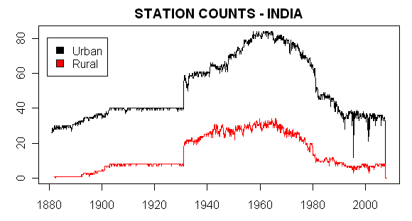
Figure 1. Station Counts – Indian Subcontinent. Stations in India, Pakistan, Bangladesh and Sri Lanka included.
Potential Inhomogeneities
Just by chance, I calculated the monthly average of the urban stations and the rural stations and then converted this to annual averages and compared, as shown below. As you see, there is a striking upward increase in the annual average temperature of contributing rural stations. The very low stating average temperatures come from the first rural station with available data, Leh, which is high in the Himalayan foothills. While the case of the Leh singleton is probably one off, nonetheless we see an overall increase in the mix of warm locations to cool locations as availability changes over time.
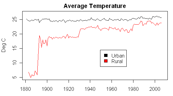
Figure 2. Annual Average of Indian Subcontinent Urban and Rural GISS Stations
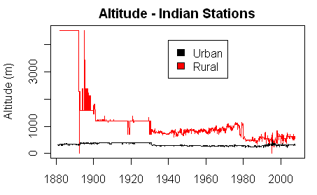
If one calculates the average altitude of rural and urban stations in the Indian subcontinent, one derives the following graphic, showing a substantial inhomogeneity in the average altitude in Indian rural stations, with the average altitude declining remarkably.
AMENDED: Hansen’s adjustment method is based on his “Bias Method”, described in a following note, which is distinct from the more common “anomaly” method. The trick will be to see whether his Bias Method is capable of removing nonclimatic changes of the types present in this dataset from his final answer.


52 Comments
Looks like the rural temp jumps are correlated roughly with the # of rural stations.
Perhaps there is some geographical dispersion inhomogeneities with the # of stations (and time)?
Additionally, with India being a very rural (population distribution wise) country until very recently, and, given the massive run up in population since the mid 19th century, I must conclude that any given rural station there has experienced an increase in nearby population density.
Steve:
Am I reading the graphs correctly: Figure 1 says to me that current station count is about 40 urban and 10 rural stations for the Indian sub-continent? Figure 2 says that there are 24 Urban and 23 Rural? Are these measuring the same things?
2nd plot is in deg C. I’ve fixed the plot.
India which is 1/3 the surface of the USA has less than 10 rural stations nowadays. When you know the diversity of climates in this subcontinent, it seems ludicrous to rely on such kind of sampling.
Besides, the rural increase of temperature is mostly by jumps of nearly 5°C in just some years (!), which is more than probably glitches.
If Hansen believes in his temperatures and in what he keeps yelling about the inabilities of biotopes to adjust to rapid changes in temperature, he should be looking at India and realize something is crap.
If one compares temperatures for the rural dataset with the urban dataset for India, the conclusion would be an UHI effect that DECREASES over the last 100 years, which is nonsensical. Are additional layers of adjustments needed for the rural set before it is used to adjust the urban set for India? Is the entire increasing temperature trend for India a result of rural site locations and quantities of rural sites changing over the past century?
Ugh!
Re #6
The answer is that the Rural sites are no longer rural.
One thought. Possibly the UHI in the Urban designated sites is a constant because they maxed out in density. While they may have increeased in size the actual heat generated has been uniform. The rural sites continued to grow denser raising the UHI.
Barry:
The growth rate will definitely be important. With respect to the cities, a lot will depend on the individual site. site.
Both graphs look relatively flat to me with the rural plot showing artificial jumps. The rural plot shifts upwards in 1930 after the # of stations doubled and shifted upward after 1980 when the # of stations had been reduced by 2/3. The urban plot does not appear to be influenced by the two major # of station changes.
In a densely populated country like India, infrastructure changes (asphalt, concrete, buildings, etc.) may be a more significant UHI influence between and among rural and urban settings rather than population changes. Of course, all is speculation until Mr. Watt eyeballs the individual stations.
Steve, when station history is used to adjust the data, is that done before or after the averages are computed?
I think you can see that if it is done after, there is a problem with the method.
Interesting substantial stepwise increase in the rural temps circa 1890 (prior to which the measurements seem inexplicably cool), 1900, 1930, 1980, etc, otherwise it looks pretty much just like flat random noise. So what’s with the jumps? And why don’t they appear in the urban record? Quite fishy!
Thanks, Steve. That is precisely what I was getting at in my posts on the Salami thread. If they don’t work with anomalies at each station, and if the number of stations changes, the whole dataset could be bogus. The temperature trends could be biased by the number of warmer, low-elevation stations.
#12. At this point, I don’t know what he’s doing; all I’m saying is that he doesn’t mention taking station anomalies anywhere and the lack of normal periods for many stations suggests that the anomalies are not taken at an early stage.
Blending the two figures, it looks like India had only one station at high altitude in 1880-1890.
#14. I said that in the note.
Ooops.
The number of stations – both urban and rural – peaks about 1960 and then declines slowly at first and then precipitously about 1980 to a level equivalent to the first third of the century. This drop-off was post-independence in India, but coincides with troubles in Pakistan and Bangladesh. Could the mixture of stations at different times be contributing to the average temperature increase for the rural stations? Can you plot the reporting periods (x-axis) of the stations in a stack (y-axis = latitude or date of first report, or any other convenient sorting variable) to see which are contributing when?
Is he comparing the distances from one station to the next, or from center of grid….
No scratch that, I just remembered my posts from the other day; the 5x5s at the poles are 14,000 sq km and something like Los Angeles is like 260,000 sq km. So it would have to be station to station. I guess. I think I remember something someplace they said it was from station to station.
Or are they picking random points or the start of the grid at the given coordinates and measuring from there? Or across and between them.
My memory is going. And/or my sanity.
Hi Steve,
Since you are badly needing the source code from Hansen et al, I would suggest you ask him for it again. Hansen’s paper last year on the subject of globally averaged surface temperatures is in the journal PNAS. The methodology in that paper is supposed to be similar to that of Hansen et al 2001.
You might want to remind him of the following clause from PNAS’s policy for authors::
I think you are an eminently qualified researcher, as a published author in refereed journals. You could also ask some academic climatologists to make the same request for Hansen’s source code. Surely he can’t continue to ignore repeated requests from a number of scientists and from PNAS itself.
RE 18.
My sanity went as well. In lighly sampled region, like africa, I suppose it matters less.
In a region like the US.. I kept wondering what the ordering looked like.. .OK I draw a stupid
cartoon to make a point.
The US is a line. 4800 km long. Stations every 100 clicks
0,100,200,300,400…left to the student…. 4800.
Now, how does this operation proceed?
do I start at 0 and use data from stations within 1200km?
Then do I adjust the station at 100? using stations to the left and right?
then do I adjust the station at 200?
Dont stations in the middle get more information from surrounding sites?
The station at 0, gets info from 100,200,300,400,500..1200.
The station at 2000, gets data from: 1900, 2100,1800,2200,1700,2300, blah blah
So, Whiskey Tango foxtrot? Is there a GEOSTATISCIAN IN THE HOUSE?
How could this 1200KM neighbor function be implemented. A single pass thing?
An annealing?
I forgot something.
Now that I think about it, you could go center. For example, if you’re talking about the LA grid (I use it cuz it’s the one I checked on Google Earth, (it’s at 30-35N, 115-120W and has 11 stations) even tho it’s got all that area, it’s only 560 km on the longest side. So you should be able to hit all the stations from the center radiating out. And none of the US squares (I should call them grids shouldn’t I, nothing’s really square when it comes to a globe) 🙂 is going to be very much bigger than that one.
Now if only I could lock in GE to 5×5 or 2×2 lines being shown….
Anyone know how to do that or have an overlay whatever? That would probably be helpful to Anthony.
Anyway, you can get GE and the stn map and look. Use pushpins. Then you can measure the edge length or the diagonal and calculate it on a spreadsheet or whatever. FYI, the grid system for GHCN-ERSST starts at 90N 180E/W for land and 88S 0E/W for sea. According to NOAA at least.
http://edgcm.columbia.edu/ EVA (and edgcm) and StationData.kml file
http://earth.google.com/download-earth.html
One thing, be careful if you do anything at the poles. I spent a while trying to figure out why I had one pin for all the first plots, it’s because all the stuff at lat 0 (long 180E/W 175E 175W)is at the same connection point, doh! (or in other words, you only have to put 1 pin at long 180 at lat 0 and then the other 3 at long 5). Not an issue with the sea, since they don’t do the last 2 degrees.
Also, remember that the system is odd; they start out sea readings over land and land readings over sea.
Makes me wonder who thought that system up!
I have an idea for the “rural”, but it needs to be done by population. The hypothesis is that the large increase in “rural” about year 1931 included definite urban areas based on population resulting in an upward immediate dTemp increase of about 4C. The 2.5C increase occurring about 1980 was caused by the reduction of actual rural (based on population) in proportion to urban (both urban 1931 and by population increases) included in the “rural”, i.e. approxiamtely half of the actual rural 1931-1980 were discontinued. Then in comparison, the urban data is flat since its populations were large and stayed large (large=urban).
Am I understanding this right?
Station is used in finding the average grid-cell temperature for 1949. It closes and so isn’t figured in the creation of the anomaly reference period. This reference average is compared to 1949. That would make 1949 appear different from the reference period even if the still existing stations had no change.
Crude example.
Cell has four stations in 1949 and only three during reference period.
Station temperatures 1949. (1+2+3+4) = 10 / 4 = 2.5 average.
Coldest station lost prior to establishing reference period. (2+3+4) / 3 = 3 average.
No real change in cell temperature but the anomaly calculation indicates 1949 was .5 degrees colder. If you lost the warmest station instead, it would go the other way.
They may assume the lost stations are random, but I think more cold stations are likely to lost that warm ones.
RE: #7 – Indeed. The development pattern in India is radically different than in Western countries. Cities got dense early, not with highrises but with endless 1 – 5 story shoddily built structures. The human population density is immense, 10 people living in a space where one lives in the West. Meanwhile, rural towns became regional small to medium urban centers. Imagine the pattern which emerges when you grow to 1B people in 33% of the US land area, while making agriculture keep up, without lots of automation. That is India.
stephen mosher, you ask:
While I have problems with the theory, the practice seems simple. Pick an empty gridcell. Take a weighted average of all stations within 1200 km. Give the gridcell that value. Repeat until all empty gridcells are filled.
What am I missing here?
w.
#22. There’s an even simpler explanation for at least part of this. The average altitude of Indian rural stations has declined dramatically and the discontinuities correspond precisely to jump changes in average altitude.
Boy, it would be nice to see Hansen’s code to see what the hell he’s really doing.
#23. Bob, we really don’t know what Hansen was doing. Different people have made different suggestions, but let’s try to find out what he really did. I’ve sent a request letter. It would do no harm for others to send similar letters – maybe to different people. I sent mine to HAnsen and Ruedy.
#25. Willis, do you think that he’s averaging anomalies or measured temperatures?
re 25.
Except his grid is non square..( as I recall 2.5*3.5). does that make a difference?
and dont the size of grid cells change with lat/lon?
and dont the number of sites per grid change..
I guess I’m saying this. The text doesnt lead to an obvious implementation. Is that fair?
My thought was some approach that wasnt tied to the arbitray nature of the grid cell…
re 29:
If you would do it properly, you would reproject lat long coordinates to equal area x,y and do the gridding there. Out of the box algorithms have been available for a long time. But I am not surprised anymore if they didn’t use them.
re 25.
OK willis, I should have thought first. you wrote
Pick an empty gridcell. Take a weighted average of all stations within 1200 km. Give the gridcell that value. ”
PICK an empty grid cell.
1. 120W-125W, 35N-40N.
2. Take a weighted average of all stations within 1200km.
A. 1200 km of what? 1200km of each station?
B. 1200 km of the grid? frm the centrid f the grid? edge?
The way I always read the descriptin was this.
For every site
DO:
find neighbors within 1200 clicks
adjust site based on linear weighting of distance.
End DO
End for.
I didnt intuit any grid structure on this.
I got tons of Qs about this approach, but we a swinging blindfolded.
SteveMc. I made nice with Jack. kicks dirt
re #27
I sent the following e-mail Aug 8. I am sure they are busy as I have no reply yet.
#31. I’ve made a collation of all stations within 1000 km for all 7364 stations. There are typically a LOT of stations. So this really gets smoothed out.
CRU takes a different approach and leaves a lot of individual station data intact towards the gridcell. For example, the Barabinks gridcell in CRU is equal to the Barabinsk station, while in GISS it will be smoother over. But intuitively, the smoothings will all cancel out to some extent and should yield similar results n this aspect of the calculation.
#32. Be careful how you phrase these sorts of requests as, in my opinion, you’ve thrown up a softball here that makes it harder for other inquiries. They will just say: the adjustment mechanism has been fully described in Hansen et al 1999, 2001 and you’re left staring at the catcher’s mitt.
What you have to ask for is all source code, manuals and/or any other unpublished documents pertaining to (a) adjustments of station data by GISS; (b) calculation of gridcell averages.
RE #1 & #26
Waldo comes down from the mountains and asks: “Is it getting hotter or is it me?”.
RE 33.
So… I had these ugly questions about 1200KM
Does 1200km see a water boundary? Do sites in Alaska pick up sites in Siberia/japan etc… or not?
do sites in N africa get averaged with sites across the mediterranean?
Canada and greenland?
Simply, does the 1200km filter recognize land boundaries?
More Qs but I have to go get cookie dough!
Re # 20 Steve mosher
I am far from expert in geostatistics but our companiy used it extensively in mining grade estimations. One of the first tests is to estimate the range, that is, the distance between two stations where one ceases to have predictive ability for the other. One then estimates a search ellipse to move over the map, adding in contributions from stations within the ellipse according to some formula (such as inverse square) to weight the importance of stations according to distance away from the centre.
This invariably causes border problems; for example, if you are doing this on land and your search ellipse comes to the sea. The safest approach is to ignore any projections, estimations or guesses over the sea and stick within the areal limits of measured data.
I have been looking and looking to see mathematical estimates of range in surface temperature data. I have not yet found any, though Phil Jones tells me that geostats have been used. Intuitively and without hands-on experience, I would be surprised if it exceeded 20 km. The incorporation of data from stations 1000 kn away seems fantastically imaginative.
So, I just junk the data I see when it uses this fantasy.
The other big problem I see on this thread is that the population density in India is so high that USA definitions of urban and rural are inappropriate. India has had a high population density for a long time, so there might not be more than a handful of truly rural stations that are now useful, and not themselves overtaken by their own UHI. In essence, I think it unlikely that there are enough uncorrupted base points for the Hansen correction method to work AT ALL – even with photos.
Here is what I think should be the correct procedure to determine de average mean temperature of a large region as function of time:
1. take each station data
2. obtain data for the same time interval (for example, interpolate data in time so that each station as a temperature value for each month)
3. correct for altitude
4. correct for urban heat island effect
5. other corrections (?)
6. calculate the temperature of each grid point by using an interpolation function. This interpolation function must take into consideration all stations near the grid point (for example, all station at less than 1000 km)
Cell values can be obtained by interpolating grid points.
(at this moment we have temperatures at each cell for each month)
7. calculate the mean temperature for each cell and for a given reference period (for example, from 1950 to 1955)
8. calculate anomalies for each grid cell (difference between each temperature point and the reference mean temperature calculated in step 7)
9. Calculate the average temperature anomalies of the region for each month.
It makes no difference if steps 7 to 9 are substituted by the following:
7. Calculate the average temperature of the region for each month.
8. calculate the average temperature of the region for a given reference period (for example, from 1950 to 1955)
9. calculate anomalies for each month (7)-(8)
Anomalies must be determined with grid cells and not with stations because we know the temperature for each cell for all time periods but we don’t know the temperature for all stations and time periods (some stations lack data for some time periods).
The procedure above could create wrong results:
1. if corrections for the urban heat island effect and altitude are wrong
2. if there are periods when there are insufficient stations to determine correctly the value of a given grid point. In this case, variations in the number of stations could cause artificial trends.
# 26 Steve Somewhere in IPCC they acknowlegde that lattitue = alpha X altitude. Humans have been settling the lower altitudes and lattitudes for millenia. Using population is a way to try to get a true x versus y (since increase in population is the real result). IPCC doesnt like to admit that all the x vs y that they claim are independent, are actually z=(f(x,y), f(x)~f(y) and f(y)~f(x))!!!
#39. CRU uses anomaly data, which can be justified. We are simply speculating as to what Hansen did: as far as I can tell, although his articles imply that he averages temperatures, it is certainly not impossible or even improbable that he averages anomalies. You can be sure that if one presented alternative calculations and mis-stepped that Gavin Schmidt and Mike Mann would say that the alternative calculations were DEEPLY WRONG.
37.
Geoff S.
Glad to see some one else saw the land/sea boundary issue. I’m wondering how they resolved that?
do they cut off at country boudaries? do they cross oceans?
They other thing that bothers me is this magic 1200km and the linear weighting.
For every site I would imagine there is a CONTOUR of homogeniety, or a contour of similair
trend, or varience and that contour would not necessarily follow regularized forms.
In the post steven says:
But Hansen says he uses grid data to determine the anomalies and not stations data. With grid data the operations are commutative. Each grid point has an uninterrupted data series. The only problem is that, in some periods of time, stations data may be insufficient to produce good grid data.
JM,
Don’t we know a priori that the altitude corrections are wrong? Since the proper corrections are dependent on actual meteorological conditions. i.e lapse rate is not a constant. That is inversions will screw up your data.
««OK, the time series of nearby rural stations – how is this defined? Once again, are these anomaly series or is this a simple average of available temperatures.»»
It must be temperatures and not anomalies. He is using data from stations. He can’t calculate anomalies before converting data from station into grid data.
He say he minimized “the weighted-mean root-mean-square difference of the urban station time series with the time series of nearby rural stations”. So he is not using a simple average. He weights the each value of the time series with a function representing the effect of the distance. He uses every data point of every nearby station.
John Goetz has typed up information from Hansen and Lebedeff which clarified this point. Hansen uses something more like the anomaly method than absolute temperatures. Instead of using a reference period, he says that he calculates the deltas over the period of common data.
It still doesn’t seem possible to yield Kalakan. But maybe there’s some weird period selections that can yield the differences.
It is possible that determining anomalies with stations or with grid point may produce similar problems. Probably a changing mix of warm and cool rural stations is important only when the data of the station is insufficient to produce good grid data. If you have few non-representative stations you will also have a noticeable effect of changes in the mix and poor grid data. So, it may not matter how your data is represented. The problem is always there.
Pune, India shows urban cooling from particulate increases over the 20th century. I suspect this is widespread throughout India.
re http://www.climateaudit.org/?p=2005#comment-132633
Geoff:
The correlation distance of annual climate anomalies is approximately 1000 km
ref:
Polyakov, I., R. V. Bekryaev, G. V. Alekseev, U. Bhatt, R. Colony, M. A. Johnson, D. Walsh,
and A. P. Makshtas, 2002: Variability and trends of air temperature and pressure in the
maritime Arctic, 1875-2000, Journal of Climate 16(12): 2067-2077.
Click to access warm_apr02.pdf
#40 Yes. And I bet they wouldn’t mind providing the code to show you were wrong. LOL.
#45 Steve Hansen also corrected for altitude. Looking at the graphs, the rural meet the criteria of higher altitude = less population. Also, the average goes up as less rural are in there proportionately. If you are looking to repeat Hansen’s work, it would make a differnece if he averaged first for his grid and had to include elevation change.
But he did claim
LOL.
I know it sounds stupid, but have you tried this starting with altitude to see what you get? I would assume that there is somewhere a list of the most central location of each grid that was used and its altitude. Perhaps it is incorrect to make this assumption.
Re # 41 Steve Mosher and
# 48 Hans Erren
Thank you for your responses to my #37.
Steve, you are correct that the result of this type of analysis is to produce (typically) a gradient or contour map. The manner in which an average value is taken from this is one of the key parts of mineral resource evaluation. There are texts of literature about it.
Hans, we are talking apples and oranges. In the paper you referenced (thank you) the data have already been averaged over a month of observations, some outliers have been manually rejected and the required precision of the answer leads to some comment. I have not gone to the source paper from year 2000, but can you tell me if a geostatistical calculation was used?
In classical application, the geostatistical method looks at correlations of values starting with the differences between many adjacent pairs of observations (such as assays down a drill hole), then at the fewer locations spaced two apart, then those 3 apart … n apart … end of data. Then this is repeated between drill holes as well as along them, to give a 3-D search tool. Customarily, there is a break point in data amenable to this type of analysis, which infers that beyond that break point, there is no predictive value from those points futher away than the break point. The search shape, commonly an ellipse for 2-D or ellipsoid for 3-D, is constructed so that values within it contribute eventually to a mean within it, while those outside do not. Customarily, a grid is then designed and values are attached to each grid cell. The size of the grid cell need not be held constant over the whole mass – and its size is derived from the data, not from the availability of world maps on Google.
In geology, there are often discontinuities such as a change in the type of rock that hosts the mineral body. It is not uncommon to derive a different search ellipsoid to use within different rock types. Blending results over adjacent sub-areas or volumes is also much discussed in texts. An analogy here would be averaging land temperature results over a sand desert with those of an adjacent forested area with (say) different albedo.
While the geology assays are comparatively stable and recoverable, this is not the case with climate. For example, the circumference of the earth at the equator is 40,000 km. A point west of another 1,600 km away has an hour of time difference. Another point 1,600 km north is at the same time on the clock (usually). So, the record of temperatures needs to be corrected for the time of day at which the maximum was taken for the westerly case. Noon is an hour later. When one takes 900-1000 km as a correlatable distance, as your reference does, such variables have significance. Not only that, in the geostats method the points at the margins of the search ellipse are weighted almost to zero, so they contribute very little to the mean. Most of the useful information comes from a smallish volume quite close to the axis of the calculation.
In using geostats for orebodies, one tries to estimate grade to two significant figures. The quantification of errors (precision and accuracy) is very important. A body with diffuse ore boundaries can increase rapidly in volume and perceived economic worth if errors creep in. The procedure requires much more rigor than seeking an average climate temperature, yet we see anomalous climate values of tenths of a degree absolute in 290 degrees or so, measured with instruments good to a degree or worse.
There might be experimental value in application of the geostatistical approach to temperatures taken at closely spaced stations (from say tens of m to 100s of km) on an hourly basis if available, over a term of a year (to catch all seasons). I suspect that the “range” of significance will be found in this interval. One reason for this estimate appears in the paper you referenced – that cloud cover varied and exerted an unknown effect on the data. I think this thought experiment is important because of the scarcity of data stations in places like India. As with many stats approaches, large numbers of accurate data are needed to reduce the error. There is no way that I would take a range calculated from the Arctic (sparse in data) and transpose it to India (also sparse in stations) and with radically different topography.
1,000 km range and a tenth of a degree? Dreamin’, mate.
Geoff
Hansen uses a “bias method” that I’ve discussed in a new note. Please consider the information on station inhomogeneity referred to above as only a potential bias that needs to be considered in assessing Hansen’s bias method – in keeping with the various caveats that I mentioned above.
I’ve amended the post accordingly.
One Trackback
Kuriose Temperaturanpassungen…
Wer glaubt, Temperaturdaten von Wetterstationen werden 1:1 für die Klimarekonstruktion eingesetzt, wird sich verwundert die Augen reiben, wenn er fest stellen muss, wie viele verschiedene Anpassungen an diesen Temperaturdaten vorgenommen werden, bevor….