As I was reading section 3 (Global temperature reconstruction) of the Cowtan and Way paper, I came across this text:
The HadCRUT4 map series was therefore renormalised to match the UAH baseline period of 1981-2010. For each map cell and each month of the year, the mean value of that cell during the baseline period was determined. If at least 15 of the 30 possible observations were present, an offset was applied to every value for that cell and month to bring the mean to zero; otherwise the cell was marked as unobserved for the whole period.
Renormalization is not a neutral step – coverage is very slightly reduced, however the impact of changes in coverage over recent periods is also reduced. Coverage of the renormalized HadCRUT4 map series is reduced by about 2%.
This raised the question of the general overall coverage of the hadcrut dataset used in the study as well as the effect of any changes in that coverage due to the methodology of the analysis in that paper. To address these issues, the data available on the paper’s website was downloaded and analysed using the R statistical package. The specific data used was contained in the file HadCRUT.4.1.1.0.median.txt which can be downloaded as part of the full data used in the paper.
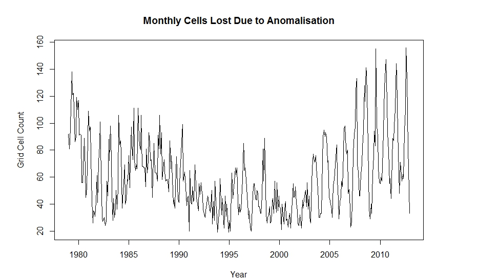
The data was read into R and the reduced to cover the time period from January, 1979 to December, 2012. It consisted of monthly temperature grid values on a 5 x 5 degree grid producing 72 x 36 = 2592 possible values each month. The data was re-anomalised using the time interval and methodology described in the quoted text above. A monthly count of non-empty cells before and after anomalisation was calculated and the results plotted below (showing the percentage of coverage).

Several things are immediately evident from the graph. First, there seems to be a substantial drop in coverage during the last two years. This could possibly be due to late reports of temperatures in the data although that explanation might be questionable because the amount of the decrease is fairly large. The second observation is that there seems to be a large component of seasonality in the coverage with coverage lower in the northern hemisphere summer than in the winter.
The cells lost as a percentage of all possible cell values (missing or not) is 2.32%, approximately the value given in the paper. However, the percentage of cells containing temperatures (representing the real reduction of information) lost through anomalisation is 3.34%. The monthly distribution of the losses can be seen in the following graph. The change in the pattern shortly before 2005 could be related to Steve’s observations in his earlier post on CA.
Which grid cells are losing the information?

It is quite obvious that the losses occurred in those areas which were already short of temperature information thereby exacerbating the problems inherent in trying to create a reliable reconstruction of the gridded temperatures in the polar regions. I would suggest that the paper’s observation that “coverage is very slightly reduced” understates the impact of these reductions by ignoring the geography of where they occur.
Could these losses in information be avoided? If the analysis is done using anomalised data then probably not. The alternative of changing the satellite data to match the HadCrut set is not possible because the lack of overlap of the anomaly time periods. However, consideration should be given to the use of absolute temperatures rather than anomalies. This would require that the HadCrut data be in that form as well as the UAH temperature set. The resulting reconstruction would also be in absolute temperatures whose properties could be analyzed without difficulty.
I have some other questions about the paper (e.g. is the covariance structure of the temperature field dependent on season) but that can be looked at some another time.
Please keep comments civil and on topic. Any personal attacks will likely be snipped or deleted.
The R script for the analysis is given below:
### Libraries needed for plotting
library(fields)
library(maps)
### Function to read data
# Writes a temporary file in the working directory
read.tdat = function(tfile,outfile = "readtemp.txt",form = c(1, 72, 36), na.str = "-1.000e+30") {
alldat = readLines(tfile)
tlen = length(alldat)
ntime = tlen/(form[1]+form[3])
lines1 = seq (1,tlen,form[1]+form[3])
if (form[1] > 1) lines1 = c(t(outer(lines1,0:(form[1]-1),"+")))
subdat = alldat[-lines1]
write(subdat,file ="temp.txt",ncolumns=1)
tdat = read.table("temp.txt",header = F, na.strings = na.str)
tdat = as.matrix(tdat)
out.arr = array(NA,dim = c(form[2],form[3],ntime))
# reshape matrix
nr = nrow(tdat)
out.arr = array(NA, dim = c(72,36,ntime))
st.seq = seq(1,nr,form[3])
en.seq = seq(form[3],nr,form[3])
for(ind in 1:ntime) out.arr[,,ind] = t(tdat[st.seq[ind]:en.seq[ind],])
out.arr}
### Function to Re-anomalize
# crit is the minimum number of obsrvations needed
# anomaly period is st.time to en.time
re.anom = function(tempdat,dat.init =c(1979,1),st.time = c(1981,1),en.time = c(2010,12),crit = 15){
ddim = dim(tempdat)
outmat = array(NA,ddim)
for(ind1 in 1:ddim[1]) {
for (ind2 in 1:ddim[2]) {
dats = ts(tempdat[ind1,ind2,],start = dat.init,freq=12)
subdats = window(dats,start = st.time,end = en.time)
xmonths = tapply(subdats, cycle(subdats),function(x) sum(!is.na(x)) < crit )
monmeans = tapply(subdats, cycle(subdats), function(x) mean(x,na.rm = T))
monmeans[xmonths] = NA
outmat[ind1,ind2,] = c(dats - rep(monmeans, length.out = ddim[3])) }
}
outmat}
###Read HadCrut
# Uses file from C-W web site
hadcrut41.all = read.tdat("HadCRUT.4.1.1.0.median.txt",na.str = "-99.99")
# dim(hadcrut41.all) # 72 36 1956
### Select years 1979 to 2012 incl.
hc41 = hadcrut41.all[,,(1956 - 407):1956]
# dim(hc41) # 72 36 408
###Reanomalize
hadcrut = re.anom(hc41)
### Monthly coverage
time = seq(1979,2013-1/12,1/12)
cover = apply(hadcrut,3,function(x) sum(!is.na(x)))
cover2 = apply(hc41,3,function(x) sum(!is.na(x)))
matplot(time, cbind(cover2,cover)/25.92,type="l", main = "Monthly Coverage of HadCrut 4.1.1.0",
xlab = "Year", ylab = "Percent of Grid Cells",lty =1)
legend("bottomleft",legend=c("Original", "Re-anomalised"),lwd = 2, col = 1:2)
### Difference in coverage
100*(sum(!is.na(hc41)) - sum(!is.na(hadcrut)))/sum(!is.na(hc41)) # 3.340224
100*(sum(!is.na(hc41)) - sum(!is.na(hadcrut)))/(408*36*72) # 2.32238
plot(time, cover2-cover, type="l", main = "Monthly Cells Lost Due to Anomalisation",
xlab = "Year", ylab = "Grid Cell Count")
### Grid pattern for losses
covergrx = apply(hc41,c(1,2),function(x) sum(!is.na(x)))
covergr = apply(hadcrut,c(1,2),function(x) sum(!is.na(x)))
plot.list = list(x = seq(-177.5,177.5,5),y = seq(-87.5,87.5,5), z = covergrx[,36:1] - covergr[,36:1])
image.plot(plot.list,col = two.colors(n=64, start="white", middle = "red", end="black",alpha=1.0),
main = "Frequency of Grid Cell Data Loss")
abline(h = 90,v = -180)
map("world",fill=F,add=T,col="darkblue")


78 Comments
Roman:
Very interesting post. Did you consider calculating (and are you able to calculate) the percentage of data lost based on latitude – i.e., North/south of 90, 75 – 90, 75-75? The graphic representation is visually arresting – and the southern region seems to suffer the worst effects – but what percentage of data gets lost in the northern areas?
Cheers.
Here is a graphic which contains that information:
Black points represent the cumulative percentage loss from the south pole to a particular latitude and similarly red point the cumulative percent from the north.
For example, the cumulative loss from latitude -90 to latitude -50 is 31.4 pct of the monthly values.
Roman, this new cumulative graph seems to be at odds with your frequency plot. Why is that?
I’d expect it to be opposite, that cumulative loss would coincide with increased frequency of loss.
Am I missing something? Or is the sum of SH cummulative loss greater than NH when all the S latitudes with losses are figured in?
I don’t see why you think that. The red areas are more extensive in the south.
If a1, a2, a3, … are losses out of respective totals, b1, b2, b3,…, then the sequence of cumulative percents (not totals) shown in the graph is 100 times the proportion sequence a1/b1, (a1+a2)/(b1+b2), (a1+a2+a3)/(b1+b2+b3), etc. The behavior of these percentages is not always simple to visualize because it depends of how fast both the a’s and b’s are changing as well as the relationship between them.
The initial b’s at the poles are small and a larger portion of them is likely to disappear because of the 15 or more requirement in the anomalisation. This means that the influential sequences creating the krigeing reconstruction are farther from the polar regions with less influence from actual temperature measurements within that region.
“I don’t see why you think that. The red areas are more extensive in the south.”
Yes as I’ve noted, but I was looking at the amplitude of the North Pole peak in your Percent of cumulative losses. The NH band is broader than the SH band in your frequency plot, and the NH band has wider distribution of loss percentages, while the SH band is quite sharp. Lot’s of 100 points in the SH, in the NH, not so many.
It almost seems like the labels are reversed in the new Percent of cumulative losses graph.
Anthony Watts (Nov 23 16:34),
Please look at it again. Are you swapping red for black in your brain?
The NH peak (red, right hand side) is quite sharp and narrow, hitting 100% only at the end.
The SH peak (black, left side) is wide and low, with five data points above 30%.
Clearly, the area under the SH curve (in a sense representative of the total loss) is much larger than the area under the NH curve. And even moreso when considering that the number of stations at 80% or more is quite low.
In particular, you said “Lot’s of 100 points in the SH, in the NH, not so many.” — there’s only a single 100% point, and that’s at 85 degrees north in the NH band. What did you mean by this statement? I’m confused.
Thanks Roman!
From figure 2 above, it appears that the breakpoint observed in this graph Steve produced a few days ago,
Figure 2. Delta between CW Hybrid (basis 1961-1990) and HadCRUT4.
Owes its 2005 up shift primarily to an increased loss of cells starting about that time.
Perhaps because I spend more time looking at audio waveforms than time series, what was immediately apparent to me from RomanM’s first figure is how qua waveforms they drift out of phase starting around 2004. I presume this is the 2005 breakpoint merely observed a different way.
Yet – it is almost as if… they had an old waveform, and a new waveform, and stitched them together… around about 2005. I am of course imagining things in a completely different domain.
Is it possible to take the cells with intermittent temperature anomolies, and plot them against the kriged values of C&W for those same cells when there are values?
We should expect the kriged values to be evenly (normally?) spaced around the real values. If the kriged values tend to be hotter than the actual values, when those exist, it suggests a method that is warm biased. (Of course C&W might be cold biased.)
My apologies for not having the expertise to do this myself.
There are 581 cells which have lost some data (with losses ranging from 1 to 183 observations). This could be a post in itself. 🙂
In figure 3 above, there are two red bands of missing cells. The Arctic band is weaker than the Antarctic one, which is quite pronounced. Note also how the southern limit of the Antarctic band follows the shoreline of the continent almost perfectly. Roman asked if there was a seasonal component.
I think the geography difference and sea ice can explain much of this. Observe this graph from NSIDC:
Above: Sea ice climatologies: Arctic and Antarctic sea ice concentration climatology from 1981-2010, at the approximate seasonal maximum and minimum levels based on passive microwave satellite data. Image provided by National Snow and Ice Data Center, University of Colorado, Boulder.
Note the difference in seasonality of sea ice extent between poles. It is far more dramatic in Antarctica.
We know that for HadCRUT is both land and ocean data.
For the Arctic, there are few manned bases not on land, and a lot of the data in the Arctic ocean is brought in from buoys. The manned Arctic bases on land are supplied almost exclusively by airplane, and they operate 24/7/365 thanks to being supplied. There are no significant fuel/distance limits to aircraft operations since they can hopscotch north. There are no surface readings taken during transport by aircraft. The sea ice extent doesn’t affect the operation of the bases, the aircraft, and mostly doesn’t affect the buoys, though some losses do occur. Sea ice does affect some data gathered by ships though. Only a few icebreakers operate in winter.
In the southern hemisphere, it is an entirely different story.
The sea ice when it reaches maximum in September, creates an nearly impenetrable barrier between the open sea and bases on the periphery of the Antarctic continent. Ships generally can’t operate in this zone during winter. And what little supply occurs (if it occurs) is by aircraft. The bases hunker down for the winter and continue to operate, as do the AWS stations on the continent.
So IMHO, that bright red ring in Roman’s figure 3 above showing frequency of grid cell loss circumventing Antarctica represents the sea ice barrier and loss during those months when ships cannot operate.
As we know, sea ice extent in the Arctic is decreasing, while increasing in the Antarctic. See this graph from NSIDC:
Above Arctic and Antarctic Sea Ice Extent Anomalies, 1979-2012: Arctic sea ice extent underwent a strong decline from 1979 to 2012, but Antarctic sea ice underwent a slight increase, although some regions of the Antarctic experienced strong declining trends in sea ice extent. Thick lines indicate 12-month running means, and thin lines indicate monthly anomalies. Image provided by National Snow and Ice Data Center, University of Colorado, Boulder.
So the Arctic has become more accessible to ships on the periphery of seasonal sea ice boundary, while the Antarctic has become less accessible to ships during the last decade.
As for the seasonal component note the differences in the minimums vs the maximums:
Sea ice extent for the month when its at its minimum (i.e. the end of local summer) Source: James Hansen http://www.columbia.edu/~mhs119/UpdatedFigures/
This looks like a simple case of access to surface measurement having increasing bipolar difference, something the satellites don’t have a problem with beyond 80N and 80S.
I would tend to agree with Anthony that the loss of sea surface temperature data in the Southern Ocean is likely the result of sea ice gains there. In fact, that was my first thought when I saw the map in the post.
And as Anthony also noted, that also likely explains some of the seasonality of the missing data.
Regards
“the loss of sea surface temperature data in the Southern Ocean”
Maybe the krill fleets are decreasing due to overfishing?
As for the high missing grid cell frequencies in Africa and Asia, I’d wager they are late/missing reports. The plot of frequency for those regions center on many countries where political unrest in common. The one black cell in Russia is an oddity. Roman do you know what stations are under that cell?
[RomanM: No, that information is not contained in the paper’s data and it would be a tough task to chase it down on my computer, Sorry.]
Secret missile base? Or their version of Area 51?
It’d be too funny for it to be Yamal!
This is not Yamal. But Yamal is fun too.
I know I ramble. And I will continue to ramble until everyone has understood. The version is a little different with UAH for complete HadCRUT cell, not uninteresting.
Anthony,
One of my discussion points, for almost two decades now, has been that if the IPCC were truly interested in the science of climate change, each Assessment Report would have made recommendations for maintaining and/or improving the systems for monitoring climate change.
It seems like one of those perfect UN micro economics projects where ten people in a third world country are employed to install and maintain a weather station. How much better would the coverage in Africa and Asia be with an additional one or two hundred weather stations? The real cost would probably be on the order of one to two million dollars per year but I am sure they could accomplish it for the special UN price of 20 to 100 million per year.
But as we have known from the start, the IPCC has never really been about the science of climate change.
ICOADS is the source data for the HADSST3 data. I would hope the ICOADS data is also declining proportionally in the Southern Ocean.
Satellite-enhanced sea surface temperature data show cooling there over the past 30+ years:
The graph is from the most-recent update:
That black box in Russia appears to be centered on 77.5N 102.5E. Giss has one station Gmo Im.E.K. F (77.7 N,104.3 E) in that box. Their record for that station is reasonably complete having only 20 missing months since 1979 with two years have no annual data. Of course that doesn’t mean CRU uses that station.
It is the cell corresponding to 67.5N and 102.5E.
There are continuous observations from 1979 to 1992 and several sporadic values in the next two years. After that, nothing. All of the values were lost under the rules set in the paper.
D’oh!
Can’t even count anymore. Screwed up on latitude. Should be 67.5N 102.5E. Only station Giss shows is in that box is Essej at 68.5 N 102.4 E. Giss data ends in 1993 so it would have been discarded from analysis.
Essej doen’t show up in CLIMAT reports, see here:
http://www.ogimet.com/cgi-bin/gclimat?lang=en&mode=1&state=Russ&ind=&ord=REV&verb=no&year=2013&mes=10&months=
This is a very remote and desolate area southeast of the Putorana mountains, though it is famous among paleontologists for its splendid exposures of latest Precambrian and earliest Cambrian rocks along the rivers.
Essej is the nearest place with an airstrip and presumably therefore also a weather station. Any climate data from that square would be Essej or nothing I think.
But how about Arctic amplification? Where does that fit in?
Even according to Cowan and Way, Arctic amplification didn’t exist until 2005.
Afterwards, temperatures receded slightly globally and their increase goes the wrong way for an amplification.
That paper is leaving more questions than giving answers. If the paper is correct, there is no Arctic ampification (hotspot), in addition to no hotspot in the Antarctic and the tropical troposphere, and climate models then fail not only quantitatively but also qualitatively – everywhere.
“However, consideration should be given to the use of absolute temperatures rather than anomalies. This would require that the HadCrut data be in that form as well as the UAH temperature set.”
I don’t think you’ll find grid averages of absolute surface temperatures. The homogeneity issues (eg altitude) that inhibit global averaging also discourage grid averaging.
I thought it would be better not to rebaseline. The net error (in their eq 1) is the difference between the UAH anomaly base (cell average) and it’s kriged value. Since it’s troposphere, there isn’t a lot of local variation in a multi-decadal average, so this difference should be small.
The reanalysis GHCN-CAMS provides global (gridded) land surface temperature data in absolute form. Then again, it’s a reanalysis.
http://www.esrl.noaa.gov/psd/data/gridded/data.ghcncams.html
Absolute temperatures are of course what should be used in the compilation of climate records with the anomalizing for a region happening afterwards. However, there are a series of problems with doing so – particularly issues associated with lapse rates which can lead to completely misleading results in continental regions ETC. The ultimate goal in climate monitoring should be to create monthly absolute temperature maps at a high resolution for the globe and then calculate anomalies from those datasets. Unfortunately spatial interpolation of absolute temperatures is challenging as well. Were you to add the grid climatology to the BEST gridded series you would have a gridded absolute temperature product but it would be in essence modeled – albeit accurately.
The issues associated with changing the baseline period can be tested by comparing the missed values through rebaselining to the long kriged product once rebaselined. The iterative cross-validation results shows that the hybrid approach is reasonable in reconstructing for these cells. Nevertheless it is worthwhile re-examining with the long-kriged series just for comparison’ sake. Any loss of information is a regrettable consequence of the various datasets using different baselines. An interesting comparison would be to use a more robust station averaging method (e.g. Berkeley) on the BEST station data and combine with the Hadley SST data to produce a global record that can be compared for regions unobserved in Hadley but observed in the BEST. This would be an additional means of evaluating the hybrid method performance.
I believe the headline “data dropout may account for most of the recent observed differences” is odd considering that I find no evidence here which determines this to be the impact of the rebaselining? Would Anthony be interested in explaining where this has been shown? What is shown in this post is that the regions which are the most sparse were most susceptible to losing values during rebaselining – an unfortunate but difficult to avoid problem.
“regions which are the most sparse were most susceptible to losing values during rebaselining”
Once those lost values were filled in by your estimation method, did you go back and look at the places where data was lost through renormalization to see if the in-filled data was consistent with the lost data? I would say that if the differences are insignificant, Anthony’s assertion can be rejected.
Lapse rate issues should not arise over the polar ice pack. At least in that region a kriging of absolute temperature seems possible. And those do seem to be the main areas where you are trying to infill missing Hadcrut data. Certainly they are the areas responsible for your headline conclusion.
As a long case-hardened geologist, this is exactly what I expected
So I remain agnostic here
Robert,
R Rohde is finishing up the ocean bits. We started some comparisons with the hybrid method, but are stuck right now turning out AGU stuff, so I suppose we will let folks make suppositions about the effect of data coverage.
For grins I suppose one could ask Roman to estimate the series with his method and Berkeley data.
It might be informative for Mr. Way to see how the temperatures can be worked without having to initially calculate anomalies in a series of several posts starting with the starting with the one here.
When Best does their Kriging, is the same set of covariances used for all of the 12 months or do they vary from month to month? It seems to me that since the variability of stations can vary substantially over the year (higher in the cold season, lower in the warm), the covariance of two cells could also change. The magnitude of the differences of the standard deviations can be seen in a post I did for another purpose.
“The HadCRUT4 map series was therefore renormalised to match the UAH baseline period of 1981-2010. For each map cell and each month of the year, the mean value of that cell during the baseline period was determined. If at least 15 of the 30 possible observations were present, an offset was applied to every value for that cell and month to bring the mean to zero; otherwise the cell was marked as unobserved for the whole period.”
So … if one month only had 14 or less observations, all observations for that cell were thrown out?
Why 15? What would be the results for 16 or 17 or 18 or 19 ….
Did you pick 15 ahead of time? Or did you try other numbers?
Only the data for the specific month in question would be discarded. Other months would be used if they passed the minimum observation criterion.
Sunshinehours1,
Following Hadley’s original approach.
See the references here:
http://www.cru.uea.ac.uk/cru/data/temperature/#sciref
Maybe you could quote from the CRU.
And am I right in saying that if even one month has 14 values out of 30 for that month, all 360 values for the grid cell are thrown out? I think that would be a great formula for throwing away as much polar data as possible.
I’m confused too. Initially I thought the 15 of 30 referred to days of the month. Does it refer to years out of the 30-year baseline period instead?
There is no reference to “days” in this process.
There are 30 years worth of each month in the baseline period of 1981 to 2010 which had been used for the UAH data. The authors decided to re-anomalize the gridded HadCrut temperature series to the same baseline. Their rule was that if for a grid cell, there were less than 15 of those 30 months available (i.e 16 or more missing months), the anomalies would not be calculated and the available values including the four years outside the anomaly period (for that month only) would all be removed.
This could theoretically result in a maximum of 12*18 = 216 values being lost from the possible 408 in a given grid cell. The largest number of measurements actually lost by any cell was 183.
Ahhh, got it.
216 = losing the 14 instances (years) of that month that were retained in the original series, +4 additiona; (1979-1980, 2011-2012).
Darn typos. 216 = 12 possible months to lose * (14 + 4) years of that month.
Annual plot of grid cell months lost by latitude band:
http://tinypic.com/r/nq2q2d/5
The less data, the more warming?
What I am interested in is that I thought the climate field had always resisted comparing satellite to ground based temperature series as they show different trends over the time period they overlap.
How as that problem dealt with or is it unimportant?
This is certainly not unimportant:
A divergence of about 0.1 ° C per decade for land that runs counter the results of CW13.
Using satellite data to fill holes is good, but it is not scientific if only used in one direction.
It’s not a problem for the SkS crowd. They are very open minded and creative with data and lack of data.
-snip-
Please keep comments civil and on topic. Any personal attacks will likely be snipped or deleted.
Well the error bars should increase at these data droput zones then? Not that such a thing would invalidate the models because, as Santer and umpteen other climatolgy ‘experts’ argued, a wider data error gives ‘real’ scientists even more confidence in the models because the data and model error envelopes can then overlap. Of course this makes little sense to anyone from outside the “team” who may be Phillistine enough to imagine that bigger error bars mean even less usefulness for policy.
Measuring coverage in percentage of 5×5 grid cells is misleading because it over-emphasises the poles where the grid cells are very small in area. The world map is misleading in the same way. Brazil’s area should be 4 times that of Greenland. (Yes, I know climate scientists often plot maps like this…)
Secondly, there is no need to do your own analysis of the HadCrut coverage because they do it for you, see
http://www.cru.uea.ac.uk/cru/data/temperature/HadCRUT4-gl.dat
For each year, the first row are the temperature anomalies and the second row are the coverage percentages.
It reached a peak of about 90% in the 1980s, then decreased to about 85%. The numbers are larger than yours for the reason above.
What is important here is which specific cells are affected and by how much. The “total area of the globe covered” by the HadCrut data set can not tell us this.
Each cell/month of data lost produces another value which must be reconstructed as well as losing some possible information which could be used in the reconstruction of temperatures in other neighboring cells. The pattern indicated by the third figure indicates that much of that loss occurs in the regions adjacently circling both poles. This particular fact means the information needed to reconstruct polar temperatures using kriging is provided by cells at greater distances with corresponding weaker relationships as measured by the covariance structure.
Since the enhancement of the polar temperatures is ostensibly a reason for the increase in their calculated rate of warming, I would think that this is an issue worth examining.
/offtopic
thought you guys might like this one 🙂
https://github.com/jtleek/datasharing
Interesting example of a codeless GitHub repository – something that has become a bit of a fad in the last six months. Though the most cited examples use the Issues facility to debate the proposed project (or other subject) much more than this one. (That points to a somewhat recursive example in which Isaac Schlueter, developer of npm, the Node Package Manager, sets off a discussion of how GitHub itself should evolve in future.)
Thanks. Jeff Leeks was a professor of mine in a Coursera R course. This is very similar to some of the rules he laid down.
“Could these losses in information be avoided? If the analysis is done using anomalised data then probably not. The alternative of changing the satellite data to match the HadCrut set is not possible because the lack of overlap of the anomaly time periods. However, consideration should be given to the use of absolute temperatures rather than anomalies. This would require that the HadCrut data be in that form as well as the UAH temperature set. The resulting reconstruction would also be in absolute temperatures whose properties could be analyzed without difficulty.”
It would be interesting if BEST would undertake an analysis of sea surface temperatures at some point. As I understand it their method gives an actual land surface average value, not just an anomaly, if that could be done with the sea surface we’d have that kind of product by combining them.
There is a priori no obstacle to give SST in absolute temperatures (only annoying due to multiple adjustments). For land, it is different. It would be interesting but difficult to achieve due to the inhomogeneity of altitudes. As a result of the method, BEST (and others) can only produce anomalies. If absolute values are given (is this the case ?), it does not have great significance.
we do not work with anomalies.
The method is pretty easy.
The temperature at any given location ( and time ) is a function
of a deterministic component and a random component.
The temperatures are regressed to find the influence of altitude, latitude and season. This is called the climate of the site.
The remainder is the residual or the weather. we krig that and then the temperature at any arbitrary location is just the sum
of the climate field and the weather field.
We done a couple enhancements to improve the regressions ( more precise lapse rate regressions ) and going forward are working on adding other geographical characteristics that explain variance in the temperature ( think albedo, NVDI, slope, aspect, other geomorphology )
As I have said before distance to coast will undoubtedly play a role in this calculation. The residual “weather” field will contain the lapse rate information which is interesting but the question I have is if in the kriging process how much spatial autocorrelation is there in the solution (e.g. do residual weather patterns produce synoptics?).
Or simply kriged noise. The challenge is that in the noise like you said there are clear lapse rate patterns and probably land cover, slope and other geographic patterns that are adding to the random noise and synoptics.
Steven Mosher,
Thank you for your interesting reply. I did not say that you are working with anomalies, the question is whether BEST can produce absolute temperatures that have a meaning beyond the simple order of magnitude. This raises a series of questions, including:
– This would require that you know the altitude corresponding to all series unambiguously. I understood that it was very far from being the case. Is it ?
– In many cases, temperature jumps are not bound to a change in altitude or other modelizable microclimatic phenomena, how is it treated?
Failing to fully assume these points, the result hardly provides more information than anomalies.
Thanks, that’s more or less what I thought.
NCDC also offers climatology to add back into the anomalies for absolute values, but I can’t remember how they derive them-and I don’t think they offer them grid by grid.
At any rate, are they going to do SSTs? Would be pretty exciting!
we solve the temperature field and dont work with anomalies
I could be way off base but it seems in my layman’s opinion that doing a sort of back-casting would be interesting. By randomly removing data to see how well the algorithm reconstructs known data points.
This seems pretty reasonable to me.
“By randomly removing data to see how well the algorithm reconstructs known data points.”
From the paper:
“In the cross validation calculation, a contiguous group of either 1, 3, or 5 latitude bands are omitted from the temperature map data for a given month. The central latitude band of the omitted region is then reconstructed by one of the following methods:…”
and
“The International Arctic Buoy Program (IABP/POLES, Rigor et al. 2000) provides gridded data from ice buoys and land stations from 1979-1998. Rigor et al. found significant correlation between land stations and air temperatures over ice at ranges of up to 1000km in winter, when most of the bias occurs. The land and ocean reconstructions were therefore tested against both this data and the NCEP/NCAR and ERA reanalyses.”
nick,
please see my comment above…i separated station-month dropouts from HadCrut to C&W by year and latitude band…are we saying that once an area of ocean freezes over and the ships can’t get to it, that the surface/air temperature relationship resembles ice-covered land, for which we do have *some* measurements…seems reasonable?
A common road sign in cold countries is one that indicates that bridge surfaces become icy before normal road surfaces. Drivers must be aware of black ice on bridges when other portions of the road have no ice. Bridges are exposed to cold air both below and above. Normal road surfaces are not. Ice covered oceans could be different from ice covered land for a similar reason
I was looking into the issue of where from the C&W actually got their rising trend for the hockeyschtickle divergence since 2005 from Hadcrut, because their result is quite very inconsistent with the (almost already significantly rising) global seaice trends and RSS polar LTT anomaly because I couldn’t believe they would just sraighforwardly fabricated it.
What I’ve found is maybe interesting.
I compared the RSS and UAH polar LTT data and it very much looks that only where one finds a relatively prominent rising trend with satellite data is actually Antarctica LTT land in UAH. Arctica is flat or descending in both RSS and UAH since the 2005. See:
fulsize here. I was also looking into the landstation surface records in GHCN to check whether their trends agree with UAH LTT and the result is inconclusive – sometimes yes, but very often not – for example Amundsen-Scott, Belgrano, Butler island, Byrd, Casey, Davis, Dawson, Dumont D’Urvi, Lettau, Mawson, Mirnyj, Neumayer, Novolazarevsk, Rothera point, Syowa or Vostok – an almost representative sample of the Antarctica surfacestations – quite not (if someone is interested here I´ve ziped graphs) which puts already the UAH Antarctica at very least the LTT-polarland dataset quite into question.
So I was wondering whether there was not an extrapolation of land UAH-LTT trend into the circumpolar ocean seaice strip in the C&W no data exercise, because I quite can’t find any other possible source for their very dubious and most probably spurious global trend – and especially when one looks at the recent literally freezing global seaice trends (-which almost surely will make this monthly global maximum highest since 2003 and likely even since 1999 and most likely very simmilar it will be with the whole yearly average – see e.g. here, here, or here – I note for record that I extrapolated the last two missing daily values for November to get monthly average) it is really implausible – water simply does not freeze upon warming.
It is pretty obvious that that you do not seem to have much experience with the concept of what constitutes a “publication” in a scientific journal.
This post raises some questions for discussion as one might do in a seminar. The purpose of a seminar is to understand a topic and to gain insight and new ideas from the discussion that follows. The seminar would rarely lead directly to sufficient conclusions that would become a completed paper meriting publication as an article in a scientific journal. The value of the post is often the individual knowledge taken away by the participants themselves.
Your comment is appreciated for the value which it has added to the discussion.
Hello All,
Just thought you would be interested in knowing that the Cowtan and Way paper is now openly available at QJRMS.
As described at the link below we have also made available the poster which Kevin presented as well as an update also on the website for the paper.
http://www.skepticalscience.com/news.php?n=2300
robert I just want to thank you for taking the time and energy to engage with the community here. Im sure its not fun reading some of the more intemperate posts, but I hope you are aware of how much many of us appreciate your presence here. thanks.
Robert,
Thanks for making the paper freely available.
I have a question about the kriging methods used in the paper. You state that:
It is a bit unclear to me as what exactly is being done here. Are you saying that the semivariogram is being calculated and used separately for each month or are you calculating a single semivariogram which can then be used for all of the months? The latter might be part of an approach of viewing the situation as a space-time kriging problem.
I consulted with Kevin (Cowtan) to ensure that my response was on the mark. We have tested a million things so it was important to ensure it was coherent.
We used one variogram covering all months but three different methods have been tested.
Time correlation or covariance between different pairs of cells, and mean squared difference as a function of distance.
The latter approach was selected because it gives the most conservative kriging ranges. However, tests on the three methods showed that the resulting temperature series were largely insensitive to the method.
Thanks for the clarification.
Did you consider separating the data by month and using 12 different variograms rather than one? It seems to me that that might better accomodate the annual cyclicity in the variability of the temperature.
3 Trackbacks
[…] Climate Audit, Roman M. has a very interesting analysis that shows the surface grid cell losses from HadCRUT4 in C&W. It hones in on the issue of why […]
[…] […]
[…] the authors first removed some of the HADCRUT4 data, stating reasons for doing so. In total Roman M found it was just 3.34% of the filled-in grid cells, but was strongly biased towards the poles. […]