A propos of nothing, I decided to check out the statistics provided by the webhost (Webserve.ca) on climateaudit.org, since we didn’t know whether the recent statistics were an aberration or a short sample from a long trend.
Using advanced statistical analysis tools (OpenOffice Calc) and image transformation technologies (Krita) I present the real statistics of this weblog:

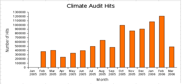
For those who like pictures, here is the dastardly plot:
What else do the stats show?
Well, there’s a 4-5% drop on weekends but a peak viewing (+2%) on Mondays compared with the rest of the working week.
Looking to hourly stats, its appears that most viewers are reading this from work, since most hits appear in the North American morning. I hope your bosses know this.
The stats also show that 50% of you browse using Internet Explorer, 31% use Firefox or Netscape browsers, and Apple Safari accounts for 5%
When you compare this with the Alexa ranking, you can see that ClimateAudit is drastically underrecorded by people stupid enough to install the Alexa spyware toolbar. So there.


11 Comments
Sure looks like a temperature proxy to me.
Re #1 Yep, just like the whacking end of a hockey stick!
You shouldn’t be reporting the March 2006 numbers yet — better to project them from the previous four months totals. Why report real data when projections make a better story?
And while you’re at it, move a few counts from October 2005 to September 2005 since there’s obviously something wrong with your popularity proxy for those two months. I think the technical term is “smoothing.”
This website is CAUSING global warming.
You know, If I were on the Hockey Team, I would be looking for a statistician to counter Steve M’s analyses. Maybe they have looked, and can’t find any?
We can project March’s total would be roughly 488641 x (31/12) = 1,262,000
Now if only I can get Steve to see (Ad)sense…
re: #5 I know a guy in a red suit who’s temporarily unemployed until next December… 😉
If I remember rightly, September was when we had our first big disk space crunch. So I could make the case that September was underreported due to “inhomogeneities” in the proxy network and I should apply an ad hoc adjustment, possibly by extrapolating backwards from the succeeding months using linear regression.
Come now, we all know that real men use custom-modified PC analysis!
Congratulations, Steve! My guess is that you have surpassed the whole climateaudit.org. 😉 Jae: Steve should rotate the graph upside down and use March 2006 as a proof of recent catastrophic warning.
Hi guys
See Timbo Lamberto has a column headed ‘Journalists who don’t get statistics’. Picks on poor journos instead of real statistic criminals such as MBH and A&W. Reckon this shows that it is easy to pick on poor journos instead of real statistians such as SM by Timbo, conspicous by his absence on this site.
(snip )
Regards from New Zealand
Peter Bickle