Paul H made the following statement in the context of the Swindle discussion:
If a practising scientist selected a 1987 data set over more recent versions, failed to cite it correctly, altered the appearance of the data without a clear explanation and didn’t include the data from the last 20 years then I think we’d all be asking serious questions about their professionalism.
One would think that that would be the case in most scientific fields, but in paleoclimate when the Team is involved, the option is to make the scientist a lead author in IPCC AR4. I’ve shown the truncation of the Briffa MXD reconstruction in IPCC TAR previously. I’m in the process of doing an updated post showing this even more vividly. In the process of doing so, I wanted to show the exact effect of the truncation by reproducing the IPCC TAR spaghetti graph with the untruncated Briffa MXD reconstruction.
This is not all that easy to do, since the archived version of the MXD reconstruction in Briffa et al is truncated in 1960 as well. However, there’s just enough information available that I was able to able to emulate the Briffa et al MXD calculation for use in this diagram. This post gives some working notes on that emulation.
In the Appendix to Briffa et al 2001 which I’ve posted online (3.5 MB here), the methodology is described more or less as follows. First 9 regional composites are calculated. These regional composites are archived here. A PC calculation requires all elements to be present. I’ve not heard of “stepwise” principal components calculations outside dendro recipes. Unlike Mann, Briffa reported that he did “stepwise” calculations, even listing the steps. He then reports that he did stepwise regression on up to 6 PCs, doing one calculation to estimate GLB temperature and one to estimate NH temperature (just in case anyone wondereded whether this rose above overfitting, the same procedure is done for both.) Unlike Mann, Briffa recorded the number of PCs used in each step. For the NH reconstruction, only the first PC was retained in all but ne step. I didn’t bother doing the stepwise regression and did a reconstruction using the first PC (PCs calculated using the correlation matrix here). In each step, the PC1 was fitted against the NH temperature in the period 1880-1960 (the Divergence Problem being used as an excuse to use this period). Briffa described a calibration-verification exercise, which I haven’t tried to replicate yet. All 9 networks were present from 1683-1981; this was calculated first. Then the reconstructions for lesser networks were spliced on. This was then compared with the archived version (going only to 1960). The first pass reconstruction was pretty good as shown below:
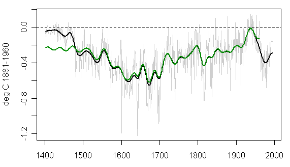
Figure 1. First replication attempt. Black – emulation; green – archived in Briffa 2001.
The problem in the early portion arose because, in my calculation, the PC1 was actually a contrast between the two series, while the PC2 was the average (there are only two series in the network). So simply as an ad hoc device, I specified that the PC2 be used in the first step. I noticed this by comparing the reconstruction to a comparable reconstruction by simply using the average of available regions, rather than PCs (also shown in red in the Figure below.) The reconstruction using the average has a little less low frequency variability than the reconstruction using PCs. One interesting effect that I noticed when I was working on red nosie simulations in connection with MBH is that even conventional PC methods (both covariance and correlation) yield artificial low frequency variability when applied to red noise – not as much as the Mannian method, but a discernable bias nevertheless. Huybers and I corresponded about this a little bit. It would make an interesting article. This effect may be at work here.
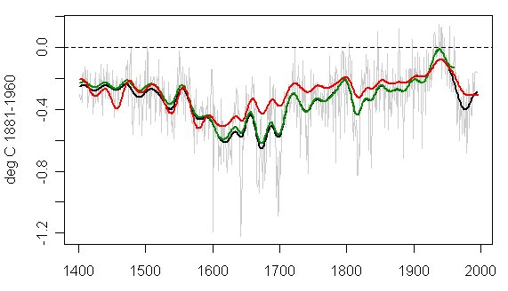
Figure 2: Black – emulation; green- archived; red- reconstruction using average and otherwise following Brifa recipe.
In the main step from 1683-1981, none of the networks are hugely overweighted or underweighted. Here are the weights (the first eigenvector). The horizontal line shows the equal weighting line.

Figure 3. Weights in First Eigenvector in 1683-1981 Step
A CA reader has kindly sent me a very useful digitization of Figure2-21 from which I extracted the information used in the figure below. This figure shows the native scales. The Briffa reconstruction was said to be zeroed on 1881-1960, while IPCC is zeroed on 1961-1990. The fitted difference between the digitized IPCC version and the Briffa version (either archived or emulated) was 0.149 deg C, while the difference between the CRU NH mean for 1961-1990 and 1881-1960 is 0.24. The selected adjustment “works” better, but so far I haven’t figured out what rationale for the actual adjustment other than expediency. The unadjusted versions are shown below.

Figure 4. Briffa Unadjusted Versions: Red – digitized from IPCC; green – smoothed from Briffa 2001 archive; black- emulation from regional chronologies.
For the purpose of showing differences in shape (Without worrying for now about how the up-down adjustment was actually derived), I’ve plotted the figure below using a forced fit of the archived version. On the right hand side, the closing shape is fairly conclusive evidence that, instead of using actual data for the smooth, Mann truncated first and then extrapolated using end-period padding. The effect is not a huge effect, but it’s an all too characteristic form of double-dipping. At the start of the record, the Mannian smooth has a ski jump – what causes this? Who knows? It’s Mann at work. The point at which Briffa and Mann started the deletion is quite clear here.

As above, with forced adjustment to digitized values.
This deletion is also done in AR4. Tomorrow I’ll show the exact impact on the IPCC TAR spaghetti graph, showing that this rises to being an “alteration of the appearance of the data without a clear explanation”.


3 Comments
If I read the graphs correctly, it looks to me that there was a peak in the middle of the last century and that we are rebounding from a dip in the middle of the last 1/2 century but its not as warm as it was in say 1940? The more of this stuff I look at the more I get confused. Help!
Now let’s be clear. A TV documentary does not follow the same rules as a peer-reviewed scientific article. Actually, there are no rules when it comes to presenting “scientific” results to the public. Anything goes. This is true for pro-AGW as well as anti-AGW points of view. So you can’t criticize such documentary using the same criteria you would apply to a peer-reviewed paper. Well, you CAN, but in the end it’s a pointless debate. The fact of the matter is, it’s already difficult enough to determine, or even define, what is and isn’t scientifically sound in the peer-reviewed literature.
I think one should treat any scientific documentary for what it is: entertainment, with a more or less strong ideological message. It is NOT science. If you chose your camp based on Al Gore or TGGWS, thinking that you are basing your opinion on scientific facts, you’re just fooling yourself. Dig deeper and go to the source, that’s really the only way. In an ideal world, scientists would be expected to be ojective. In the real world, unfortunately, you can’t even count on that. Objectivity becomes just another rhetorical argument.
So I fully agree with Steve that the kind of manipulation he finds in the peer-reviewed literature is much more relevant to the debate than any single error in TGGWS.
I’m with Francois on this one, big time! I spent 24 years as a research scientist at University and now I train people in presenting their work at conferences and so on. I’m perhaps more inclined to be generous though: it’s not that “anything goes” perhaps so much as “anything is necessary” because (sadly!) the level of scientific education of “Joe Public” is so low.
Frankly it’s just not possible to provide a balanced argument to the public in one presentation or program or film: the issue is just to big and they gap between what Job Public knows and what they need to know is too big to be covered in a single bound.
S