ABSTRACT: A new method is proposed for exploring the amplification of the atmosphere with respect to the surface. The method, which I call “temporal evolution”, is shown to reveal the change in amplification with time. In addition, the method shows which of the atmospheric datasets are similar and which are dissimilar. The method is used to highlight the differences between the HadAT2 balloon, UAH MSU satellite, RSS MSU satellite, and CGCM3.1 model datasets.
“Amplification” is the term used for the general observation that the atmospheric temperatures tend to vary more than the surface temperature. If surface and atmospheric temperatures varied by exactly the same amount, the amplification would be 1.0. If the atmosphere varies more than the surface, the amplification will be greater than one, and vice versa.
Recently there has been much discussion of the Douglass et al. and the Santer et al. papers on tropical tropospheric amplification. The issue involved is posed by Santer et al. in their abstract, viz:
The month-to-month variability of tropical temperatures
is larger in the troposphere than at the Earth’s surface.
This amplification behavior is similar in a range of
observations and climate model simulations, and is
consistent with basic theory. On multi-decadal timescales,
tropospheric amplification of surface warming is a robust
feature of model simulations, but occurs in only one
observational dataset [the RSS dataset]. Other observations show weak or
even negative amplification. These results suggest that
either different physical mechanisms control
amplification processes on monthly and decadal
timescales, and models fail to capture such behavior, or
(more plausibly) that residual errors in several
observational datasets used here affect their
representation of long-term trends.
I asked a number of people who were promoting some version of the Santer et al. claim that “the amplification behaviour is similar in a range of observations and climate model simulations”, just what studies had shown these results? I was never given any answer to my questions, so I decided to look into it myself.
To investigate whether the tropical amplification is “robust” at various timescales, I calculated the tropical and global amplification at all time scales between one month and 340 months for a variety of datasets. I used both the UAH and the RSS versions of the satellite record. The results are shown in Figure 1 below. To create the graphs, for every time interval (e.g. 5 months) I calculated the amplification of all contiguous 5-month periods in the entire dataset. I took the average of the results for each time interval, and calculated the 95% confidence interval (CI). Details of the method are given in Appendices 2 and 3.
I plotted the results as a curve which shows the average amplification for the various time periods.

Figure 1. Change of amplification with time periods. T2 and TMT are middle troposphere measurements. T2LT and TLT are lower troposphere. Typical 95% CIs are shown on two of the curves. Starting date is January 1979. Shortest period shown is three months. Effective weighted altitudes are about 4 km (~600 hPa) for the lower altitude measurements, UAH T2LT and RSS TLT. They are about 6 km (~500 hPa) for the higher measurements, UAH T2 and RSS TMT.
I love surprises, and climate science holds many … despite the oft repeated claims that the “science is settled”. And there are several surprises in these results, which is great.
1. In both the global and tropical cases, the higher altitude data shows less amplification than the lower altitude. This is the opposite of the expected result. In the UAH data, T2LT, the lower layer, has more amplification than T2, the higher layer. The same is true for the RSS data regarding TLT and TMT. Decreasing amplification with altitude seems a bit odd …
2. In both the global and tropical cases, amplification starts small. Then it rises to about double its starting value over about ten years. It then gradually decays over the rest of the record. The RSS and the UAH datasets differ mainly in the rate of this decay.
3. The 1998 El Nino is visible in every record at about 240 months from the starting date (January 1979).
In an effort to get a better handle on the issues, I examined the HadAt2 balloon record. Here, finally, I see crystal clear evidence of tropical tropospheric amplification.
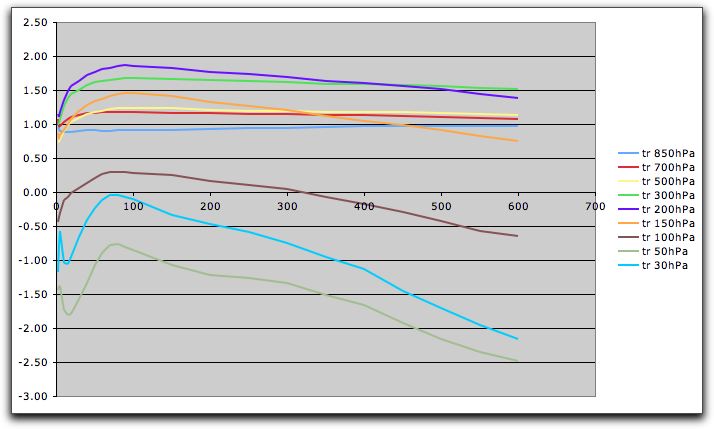
Figure 2. Amplification of HadAT2 balloon tropical data with respect to KNMI Hadley surface data.
This has some interesting features. Up to 200 hPa, the amplification increases with altitude, just as lapse rate theory would predict. However, like the satellite data, it starts out low, rises for about 100 months, and then gradually decays. These features are not predicted by lapse rate theory. In fact, the reliance of some AGW supporters on ideas like “if the surface warms, simple lapse rate theory says the atmosphere will warm more” reminds me of a story of the legendary Sufi sage, the Mulla Nasrudin.
Nasrudin was walking along a narrow lane when a man fell off a roof and landed on Nasrudin’s neck. The man was unhurt, and the Mulla was admitted to a hospital.
Some of his disciples went to the hospital to comfort the Mulla. They asked him, “Mulla, what wisdom do you read in this happening?”
The Mulla told them, “The normal cause and effect theory is that if a man falls off from a roof, he will break his own neck. Here, he broke my neck. Shun reliance on theoretical explanations.”
But I digress …
Now, after doing this initial work, I gave up on Excel. Excel took maybe ten minutes to produce the graph of a single line. Graphing the balloon results took a couple of hours. Plus I knew I’d eventually have to do it in the R computer language … I was just postponing the inevitable.
So, I plunged in. My knowledge of R is poor, so it took me about a week to write what ended up being about a thirty line function. My first results were slower than Excel. Don’t use loops in R. Bad Idea™. My second was faster, it took about ten minutes to graph the balloon data. The current model takes under ten seconds. At this point it is a useful interactive tool.
Using this tool, I compared the balloon data with the satellite data. Of course, I need to use the corresponding time period from the balloon data (the balloon data is longer than the satellite data). Here is that comparison:
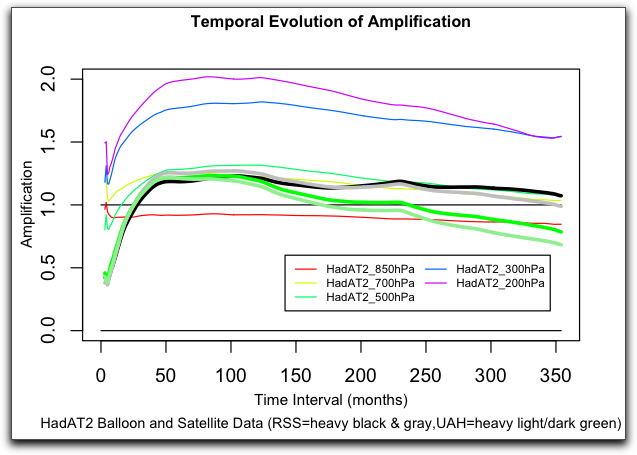

Figure 3. Tropospheric HadAT2 radiosonde data compared with UAH and RSS satellite data.
Now, this is a very interesting result. Both satellite datasets have the same general shape as the HadAT2 balloon dataset. However, it appears that the temporal evolution of the RSS data is much closer to the balloon data than is the UAH data. Hmmm.
Next I looked at the global amplification. This in general is quite close to 1. Here is that result:

Figure 4. Global HadAT2 radiosonde data compared with UAH and RSS satellite data
Again we see the same pattern as before. The amplification starts low, in the global case below 1.0. Then it rises for around 100 months to just above 1.0, and then settles to slightly below 1.0. Curiously, in this case the UAH amplification is a better fit than the RSS amplification, which is the opposite of the tropical results.
Intrigued by this success, I then took a look at the temporal evolution of various random datasets. First I looked at evolution of random normal data:

Figure 5. Temporal amplification of random normal data.
These random normal datasets in general appear to take up a certain value early on, and then maintain that value for the rest of the time. This is quite different from the evolution of random ARIMA datasets. These datasets have autoregression (AR) and moving average (MA) values. Both the surface and atmospheric datasets have ARIMA characteristics. Here is an example of random ARIMA datasets:
 

Figure 6. Temporal amplification of ARIMA data.
The ARIMA datasets take longer to get to a high or low value, and the range is much larger than with the random normal datasets. In addition, many of them go up and come back down again, like the observational data.
Now, while it is possible that the ARIMA structure of the observational datasets are the reason that the temporal evolution of say the HadAT2 data has its particular characteristics, I doubt that is the case. To date I have not been able to replicate the observational structure with any random data. However, my investigations continue.
Finally, I looked at the one full model dataset which I was able to locate. This was from the CGCM3.1 model.
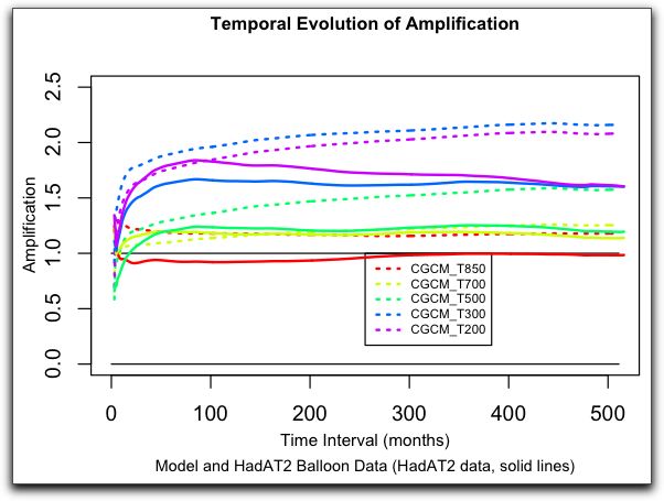

Figure 7. CGCM3.1 model and HadAT2 tropical amplification up to 200 hPa.
As you can see, the model results are very different from the observational data.
1. The model amplification at 850 hPa (T850) is too high.
2. Model T700 amplification is about correct. It differs only in the early months.
3. Model T500, T300, and T200 amplification continued to increase for ~ 450 months and then leveled off, while the corresponding observational amplification peaks around 100 months and then decreases.
4. Model T200 amplification is less than model T300 amplification, the opposite of the observations.
Nor is this dissimilarity confined to the troposphere. Here is the corresponding graph showing all levels of the atmosphere:

Figure 8. CGCM3.1 model and HadAT2 tropical amplification up to 30 hPa (about 20 km altitude).
The higher elevation amplification in the models (T100, T50, T30) is similar to an inverted version of the observational data. The model results all start higher, go lower, bounce up and down, and then rise. The observations do the exact opposite, with larger early swings. Overall, there is very little similarity between the two datasets. They are markedly different on all timescales.
DISCUSSION
I can only hazard guesses as to the reasons for the overall shape of temporal evolution of the amplification as shown in the observations. My suspicion is that it is due to thunderstorms. Thunderstorms destroy the short-term relationship between lapse rate and surface temperature. They do this by concentrating the wettest air in the thunderstorms, so the air in between the thunderstorms does not get much wetter as temperatures rise. In fact, as the dry cold air exits the top of the thunderstorm, it descends around the thunderstorm. This affects the lapse rate in the air between the thunderstorms in the opposite direction from that predicted by lapse rate theory.
However, over the long run, the lapse rate will tend to re-establish itself. I suspect that this is reason for the difference between the short term amplification, which is small, and the medium term amplification, which is larger.
The CGCM3.1 model, on the other hand, shows none of this. I suspect this is because the models do not include the disturbance in the atmospheric lapse-rate structure from the thunderstorms. However, there are clearly other problems with the model, as the stratospheric records are incorrect as well.
FUTURE WORK
My next investigation will be to plot how the temporal evolution changes based on the length of the dataset. As new data is added to a dataset, it changes all of the previous values. I want to look at this effect over time.
In addition, I would like to compare other model results. Unfortunately, I have only been able to locate the one set to date. I’d be glad to be pointed to more model data.
CONCLUSIONS
1. Temporal evolution of amplification appears to be a sensitive metric of the natural state of the atmosphere. It shows similar variations in both the balloon and satellite datasets. It is able to distinguish between closely related datasets.
2. The CGCM3.1 model results are different from observations in almost all regards, at almost all timescales.
3. From this analysis of temporal evolution of amplification, it appears that Santer et al. have posed the wrong question regarding the comparison of models and data. The question is not why the observations do not show amplification at long timescales.
The real question is why the model amplification is different from observations at almost all timescales.
4. Even in scientific disciplines which are well understood, taking the position that when models disagree with data it is “more likely” that the data is incorrect is … mmm … well, I’ll call it “adventurous” and leave it there. In climate science, on the other hand, it is simply foolish.
5. I love the word “robust” when it is used in scientific papers. It tells me that the author likely doesn’t know the strength of their results, which gives me valuable clues as to what I might profitably research next.
Finally, I do not claim that all of this is right. I put it out for comment, to allow people to examine it for mistakes, and to encourage other people to use my method for further investigations.
My very best regards to all,
w.
APPENDIX 1: DATA SOURCES:
KNMI was the source for much of the data. It has a wide range of monthly data and model results that you can subset in various ways. Start at http://climexp.knmi.nl/selectfield_co2.cgi?someone@somewhere . It contains both Hadley and UAH data, as well as a few model atmospheric results.
UAH data is at http://www.nsstc.uah.edu/data/msu/t2lt/uahncdc.lt
HadCRUT data is at http://hadobs.metoffice.com/hadcrut3/diagnostics/global/nh+sh/
RSS data is at http://www.remss.com/data/msu/monthly_time_series/
HadAT2 balloon data is at http://hadobs.metoffice.com/hadat/hadat2/hadat2_monthly_tropical.txt
CGCM3.1 data is at http://sparc.seos.uvic.ca/data/cgcm3/cgcm3.shtml in the form of a large (250Mb) NC file.
I would appreciate any information about where I could find further atmospheric data from climate models.
APPENDIX 2: CODE FOR THE FUNCTION
Here is the R function that I used for the analysis:
# ©2009 Willis Eschenbach, willis AT taunovobay.com. May be freely distributed and used as long as this notice is included.

# Please credit this function if you use it in any published study.
amp=function(datablock=NA, sourcecols=2,datacols=c(3:ncol(datablock)),startrow=1,endrow=nrow(datablock),newplot=TRUE,colors=NA,plotb=-2,plott=2,periods_per_year=12,plottitle="Temporal Evolution of Amplification",plotsub="Various Data",plotxlab="Time Interval (months)",plotylab="Amplification",linewidth=1,drawlegend=TRUE,linetype="solid"){
#----------------------------------------------------------------------------------------- Start Functions
gtrow=function(x, myline) {myline=as.matrix(myline,length(myline),1);row(myline)>x}
shiftblock=function(myline){
shift=function(x) {
as.matrix(c(myline[gtrow(x, myline)], rep(NA, x)))
}
vshift=Vectorize(shift)
x=0:(length(myline)-1)
as.matrix(vshift(x))
}
#-------------------------------------------------------------------------------------------End Functions
nrows=nrow(datablock)
ncols=ncol(datablock)
colors=as.vector(colors)
if(newplot) {
plotlength=12/periods_per_year
plot(c(plotb,plott)~c(0,nrows*plotlength),type="n",ann=FALSE) #Setup for plot
lines(c(0,0)~c(0,nrows*plotlength))
lines(c(1,1)~c(0,nrows*plotlength))
}
if (any(startrownrows,startrow>endrow,endrow>nrows)) {print("Error");break}
results=matrix(rep(NA,nrows,1), nrows, 1)
j=1
for (i in datacols){ # loop through targets
source=as.matrix(datablock[startrow:endrow,sourcecols[j]],nrows,1)
target=as.matrix(datablock[startrow:endrow,i],nrows,1)
# ------------------- Setup Matrices
x1=shiftblock(source)
y1=shiftblock(target)
yz=x1*y1
z2=x1^2
# -------------------------------------------------------------- accumulate data
sumxx = apply(x1,2,cumsum)
sumyy = apply(y1,2,cumsum)
sumxy = apply(yz,2,cumsum)
sumx2 = apply(z2,2,cumsum)
# -------------------------------------------------------------- heavy lifting
N=row(sumxx)
alltrends=((N*sumxy-sumxx*sumyy)/(N*sumx2-sumxx^2))
length(datacols)
finalline=as.matrix(apply(alltrends,1,function(x) mean(x,na.rm="TRUE")),nrows,1)
if (is.na(colors)[1]){# setup colors for plot
mycolors=rainbow(length(datacols))
} else {
mycolors=colors
}
xvalue=3:nrows # setup x values for plot
if (periods_per_year==4) xvalue=seq(1.5,3*(nrows-2),3)
if (periods_per_year==1) xvalue=seq(6,12*(nrows-2),12)
lines(finalline[3:nrows]~xvalue,type="l",col=mycolors[which(datacols==i)],lwd=linewidth,lty=linetype)
results=cbind(results,finalline)
}# end of loop through targets
results=results[,-1]
par(mgp=c(2,1,0))
if (newplot) title(main=plottitle,sub=plotsub,xlab=plotxlab,ylab=plotylab,cex.main=.85,cex.sub=.75,cex.lab=.8)
if (drawlegend) legend(nrows*plotlength*.4,plotb+(plott-plotb)*.3,names(datablock)[-c(1,2)],col=mycolors,lwd=linewidth,cex=.6,lty=linetype,ncol=2)
final=list(results,cor(datablock[,2:ncol(datablock)]),plottitle,plotsub)
final
}
# -------------------------------------------------------------- END function APP
The input variables to the function, along with their default values are as follows:
datablock=NA : the input data for the function. The function requires the data to be in matrix form. By default the date is in the first column, the surface data in the second column, and the atmospheric data in any remaining columns. If the data is arranged in this way, no other variables are required. The function can be called as amp(somedata), as all other variables have defaults.
sourcecols=2 : if the surface data is in some column other than #2, specify the column here
datacols=c(3:ncol(datablock)) : this is the default position for the atmospheric data, from column three onwards.
startrow=1 : if you wish to use some start row other than 1, specify it here.
endrow=nrow(datablock) : if you wish to use some end row other than the last datablock row, specify it here.
newplot=TRUE : boolean, “TRUE” indicates that the data will be plotted on a new blank chart
colors=NA : by default, the function gives a rainbow of colors. Specify other colors here as necessary.
plotb=-2 : the value at the bottom of the plot
plott=2 : the value at the top of the plot
periods_per_year=12 : twelve for monthly data, four for quarterly data, one for annual data
plottitle=”Temporal Evolution of Amplification” : the value of the plot title
plotsub=”Various Data” : the value of the plot subtitle
plotxlab=”Time Interval (months)” : label for the x values
plotylab=”Amplification” : label for the y values
linewidth=1 : width of the plot lines
linetype=”solid” : type of plot lines
drawlegend=TRUE : boolean, whether to draw a legend for the plot
APPENDIX 3: METHOD
An example will serve to demonstrate the method used in the function. The function calculates the amplification column by column. Suppose we want to calculation the amplification for the following dataset, where “x” is surface temperature, “y” is say T200, and each row is one month:
x y
1 4
2 7
3 9
Taking the “x” value, I create the following 3X3 square matrix, with each succeeding column offset by one row:
1 2 3
2 3 NA
3 NA NA
I do the same for the “y” value:
4 7 9
7 9 NA
9 NA NA
I also create same kind of 3X3 matrix for x times y, and for x squared.
Then I take the cumulative sums of the columns of the four matrices. These are used in the standard least squares trend formula to give me a fifth square matrix:
trend = (N*sum(xy) - sum(x)*sum(y)) / (N*sum(x^2) - sum(x)^2)
I then average the rows to give me the average amplification at each timescale.


115 Comments
Thank You Willis.
Very very interesting. I think you should publish this.
A clarification question. In your example for 5 months, do you increment the 5 month window start location by one month at a time, and then average the results to generate the data point at 5 months?
Nice work.
Willis,
Good stuff. In a much simpler analysis, I used a sliding bandpass filter to look at the covariance and I only compared UAH LT to GISS. After bandpass filtering GISS and UAH data I did covariance plots and looked at the slope. My result generated a fairly sharp amplitude drop after 10 years. I compared it to ARMA + GISS and UAH trend and found that the ARMA data didn’t generate the same dropoff.
I’m sure I’m missing something in your first graph. If your surface data was Hadcrut I thought the 30 year trend was approximately .18C/decade (I haven’t done it myself) and RSS global LT is about .15 so the 30 year RSS LT/hadcrut should be approximately 0.83.
1. W. Eschenbach, I like very much and appreciate very much your posts here at CA: readable, thorough. I hope, too, that you publish this.
2. I like very much the humility with which you write; I like the example that sets.
3. Santer: “This amplification behavior..is consistent with basic theory”: We would like to think that he meant to say that the theory was consistent with the behavior, but perhaps this is a telling slip on his part. It’s as though he is saying that the reliability of measurements is judged (by him) according to how well it jibes with (his) “basic theory”. Or maybe I am being too picky here.
Willis,
You’ve made the same mistake as Steve did in his tropical troposphere posts. Temperature analyses of RSS TMT and UAH T2 “wide swathe” data sets contain a significant stratospheric component and are invalid as proxies for temperature at a specific altitude in the troposphere.
Study this graph carefully (from IPCC AR4 Chapter 3, p. 322):
Note that the the troposphere as a whole has warmed faster than the lower troposphere according to the data analysis by Fu et al. Here are the relevant references.
Fu, Q., and C.M. Johanson, 2004: Stratospheric influence on MSU-derived tropospheric temperature trends: A direct error analysis. J. Clim., 17, 4636–4640.
Fu, Q., and C.M. Johanson, 2005: Satellite-derived vertical dependence of tropical tropospheric temperature trends. Geophys. Res. Lett., 32, L10703, doi:10.1029/2004GL022266.
Fu, Q., et al., 2004a: Contribution of stratospheric cooling to satellite-inferred tropospheric temperature trends. Nature, 429, 55–58.
Fu, Q., et al., 2004b: Stratospheric cooling and the troposphere (reply). Nature, 432, doi:10.1038/nature03210.
Fu and Johanson 2005 is especially interesting. From the abstract:
Tropical atmospheric temperatures in different tropospheric layers are retrieved using satellite-borne Microwave Sounding Unit (MSU) observations. We find that tropospheric temperature trends in the tropics are greater than the surface warming and increase with height.
Re: Deep Climate (#6),
Actually Deep, I think you’ve made a very basic mistake in your assertion. The analysis by Fu et al compares the linear trends on the datasets based on source of data. All very well and good for determining error induced by measurement source. However, it uses simple ordinary least squares to get a linear fit and handles the datasets as “chunks”. The only temporal component is where a “chunk” represents a range of years based on the source of collection.
Re: Jedwards (#8) and Andrew (#12),
The point is this:
The McIntyre-Eschenbach method fixes MSU analyses to specific pressure/altitude levels, and then interpolates or analyzes trend differentials on that basis, as if they were discrete narrow layers. This method is “totally bogus”, to use Andrew’s phrase.
I am not aware of any reference to this method in the scientific literature. Even Douglass et al plotted the satellite temperatures apart, without reference to a pressure/altitude axis. If you can provide a reference or support for the Mc-E method in the literature, I would be very surprised, to say the least.
For those who missed it, here is Steve’s “contour” plot from the Gavin and the Big Red Dog post.
In looking through that thread, I notice that cce made the same criticism earlier this month:
By the way, it’s interesting to note that the two use very different pressure/altitude levels for T2LT/TLT.
Willis:
Steve:
I’ll comment on Fu et al later. I would suggest that discussion of these papers should be based on the scientific literature – Google Scholar is a good resource.
Willis, thanks for this intriguing work. I have a quick question and a comment. If these are already addressed in your text and I’ve missed them, my apology.
Question – the method, as I understand it, looks at the surface temperature in month x and then looks at the tropospheric temperature in subsequent months (x+50, x+100, etc). Since the balloon records extend back to 1958 and straddle the 1976 “regime change”, are the balloon results significantly influenced by that 1976 hump? Perhaps a way to test that would be to look at balloon records 1979 forward and compare that with the satellite results from 1979 forward.
Comment – a concern I have about all the amplification studies is that the tropical troposphere is not homogeneous. Broadly speaking, the tropics have “small” regions of ascending air and large regions of descending air. When the data is blended from both types into one “tropical troposphere”, the result is something that may be neither fish nor fowl and so a physical interpretation of the blend becomes quite difficult (for me).
Re: David Smith (#7), David: Thanks for asking questions. Most articles like Willis’s assume that the reader already knows the terminology and theories involved. I think I understand amplification [temperature fluctuation rate in a high thermal mass (Earth) versus resultant T^4 radiation-induced swing rate in low thermal mass air (atmospheric layers)]. Please correct me if that’s bogus.
Re: jorgekafkazar (#10),
I’m having trouble figuring out what Willis is saying too. It appears that he’s simply seeing how an increase (or change) in surface temperature is reflected in the atmospheric temperature measured at various levels. But this isn’t really a cause – effect sort of thing. It’s more a temperature stiffness measure. That is, the surface temperature starts rising, for whatever reason. Then atmospheric temperature starts to rise too. But it takes a long time to catch up, by which time the surface is off doing something else and the atmosphere looks like it’s actually giving feedback to the surface.
OTOH, I don’t think that’s possibly what Willis means so I guess I need to go back and read the post again and the Douglass / Santer papers and see what’s really being shown.
Re: Dave Dardinger (#11),
I don’t think it’s stiffness or it’s a different sort of stiffness. It’s more like there is some mechanism that acts to maintain a constant lapse rate over long time scales. At short time scales the lapse rate decreases with temperature (the atmosphere warms faster than the surface) more or less as predicted. At longer time scales, the lapse rate starts to decrease less rapidly until at some point it may even increase. Large scale flow patterns would have to shift to reduce humidity at altitude or something like that.
Re: Dave Dardinger (#11), Dave & David: Yes, I’m mystified, still, even after rereading the paper. And I’m not ready to read Santer et al, or anybody else who uses “robust” when he should say “BS.”
As I read it, the amplification is dependent on the time frame used to determine the trends: short time frames give different amplification than longer time frames. The cause is unidentified, but a number of wild notions present themselves: │woo-woo ON│ diurnal or monthly cyclical data effects, slow lateral mixing of different supramarine and land amplifications, periodic vertical mixing cells (inversion limiting)or periodic jetstream vertical variation. │woo-woo OFF│
Also, the data show (or seem to show) that upper troposphere layers have less amplification. │woo-woo ON│ adsorption saturation in the lower troposphere? higher thermal mass, upper:lower troposphere? different emission spectra/optical depth, upper:lower? │woo-woo OFF│
Is a puzzlement.
“Don’t use loops in R. Bad Idea™
I found this out for myself in matlab. Turns out an interpreted language doesn’t do well when a for-loop becomes fairly long. I found a way around it: Just compile the code. It runs so much faster. I don’t know however if you can do that with R.
Deep Climate (#6) Fu’s method of coaxing out extra warming aloft is totally bogus and unphysical:
http://www.worldclimatereport.com/index.php/2004/05/04/assault-from-above/#more-66
Both RSS and UAH teams disagree that Fu is getting the correct stratosphere effect corrections. They believe strongly in their methods, and last time I checked, no one was claiming (except Fu) that RSS is wrong. Puh-leeze.
Willis, what effect would a climatic trend in thunderstorm activity, say, more thunderstorms-due to a general increase in rainfall-would effect the long term lapse rate effect?
Willis
I guess I missed something. How do you (mathematically) define “Amplification”?
Ah, yes. Sunlight warms the oceans, latent heat flux removes it, wind moves it away from the tropics. The vapor later consenses and it rains, the that latent heat is released. The air warms, and the atmosphere circulates. There’s also the cumulonimbus et al. I wonder if those in the know consider such amazing things. 🙂
Great work Willis.
On a related note, did anyone else notice that JAXA satellite breath was launched on Friday? Might help keep track of all this in the future.
In any case, when it comes to “amateur scientist and construction manager” papers, this is a for sure one to publish.
Like a number of the 19,000 papers detailing the current thinking of scientists involved in climate.
GCC and terrestrial net primary production
Late Cenozoic uplift of mountain ranges and GCC: chicken or egg?
Massive iceberg discharges as triggers for GCC
GCC and US agriculture
GCC and emerging infectious diseases
Dynamic responses of terrestrial ecosystem carbon cycling to GCC
Future projections for Mexican faunas under GCC scenarios
An oscillation in the GCC of period 65–70 years
Downscaling of GCC Estimates to Regional Scales: An Application to Iberian Rainfall in Wintertime
Potential effects of GCC on the United States. Appendix B. Sea level rise.
(Although I must confess that I wonder how many of them actually discuss how the climate all over the world changes and how it changes, which you certainly are doing.)
First, my thanks to all who have replied.
paminator, you say:
If I understand you correctly, the answer is yes. I take the amplification of all contiguous 5 month periods in the entire dataset and I average them. This gives me the best estimate of the true underlying 5-month amplification.
Deep Climate, you say:
My apologies for my lack of clarity. My point was not whether or not RSS and UAH contain a “significant tropospheric component”, that is a discussion for another time. I suspect that they do, but it is immaterial to this discussion.
My point is that the three datasets (RSS and UAH satellite data and HadAT2 balloon data) all show very similar patterns regarding how the amplification changes over time, while the CGCM3 model shows an entirely different pattern.
I have no argument with Fu’s statement that:
except that it does not specify either the altitude or the time period in question. My analysis shows that his statement, while generally true, is a simplification of a much more complex process. For example, Fig. 2 shows that the amplification at 150 hPa is greater than 1.0 in shorter time periods (tropospheric temperature trends greater aloft than at the surface), while it is less than 1.0 (no amplification) at longer time periods … go figure.
This is an important point. The assumption in Fu’s work, as well as that of Santer and many others, is that atmospheric amplification is generally the same over any time span. This is not true in any dataset I have examined, either observational or modeled, and has led to endless confusion.
David Smith, you ask:
My apologies for my lack of clarity. I am looking at the average amplification for a given time interval. If the time interval is five months, I look at all the contiguous five-month long time periods in the record. I calculate the amplification for each five-month period, and I average them.
In all of the analyses shown above, I have used the same time period for both variables. For comparing balloon to satellite, for example, I used only the 1979- data from each dataset.
jorge kafkazar, you say:
You are basically correct, but the amplification measurement is unconcerned with the cause or explanation for the amplification. It could be from the mechanism you propose, or any other mechanism.
Andrew, you ask:
This is another of those kinds of theoretical questions that Nasrudin advised against above. The answer is, I don’t know, and I don’t think anyone does. The effect of thunderstorms on the long term lapse rate is not well understood.
Jeff Id, you say:
I have used the surface temperature data from KNMI, which is CRUTEM3+HadSST2. This is quite close to HadCRUT3, but not exactly the same. However, the difference is not particularly material for my analysis. Different datasets will give slightly different results, but the overall shape of the temporal evolution curve is very similar regardless of the choice of datasets. I have included the function (in the head post above) so that anyone can experiment with different datasets.
My best to everyone,
w.
Re: Willis Eschenbach (#17),
Thanks for the reply. I have been looking at this same issue for some time as well. It seems to me that your method doesn’t remove long other trends from the short term portion of the graph. Your result is almost exactly like my early work.
What I mean is that by application of a low pass filter, the distribution of your short term i.e. 3yr slopes will have an offset mean based on the long term trend. Forgive me if I’m missing something. That is the reason I chose a bandpass filter for my second analysis, I think it gives a superior result in amplification factor.
Deep Climate
“…are invalid as proxies for temperature at a specific altitude in the troposphere” would appear to be stronger than the reference you gave which is available here.
http://www.ipcc.ch/pdf/assessment-report/ar4/wg1/ar4-wg1-chapter3.pdf
The closest I can find is “some uncertainties remain” which is true about just about everything in life.
Sean
More has come in as I have been typing …
Pat Keating, you ask:
Temperature trend aloft for a given time period, with respect to the surface temperature trend for the same time period. In Excel, this would be calculated as
LINEST(atmospheric temperatures, surface temperatures)
Note that this is slightly different from a simple ratio of the trends (trend aloft / surface trend). A ratio of the trends is highly unstable when the denominator approaches zero. This gives wildly inaccurate results (e.g. an amplification of 637), particularly at shorter time spans.
w.
Re: Willis Eschenbach (#20),
Ok, Willis, thanks for the clarification.
Deep Climate, I don’t care what levels the satellite record represents. That is a red herring. Throw them out entirely if you wish, the balloon record is much longer and more accurate.
Nor do I care what Fu said or didn’t say. Again, this is a red herring.
Once again, my point is that the observational data all shows very similar patterns, and that those patterns are very different from the model results.
Please do not comment on Fu later, this is not a thread about Fu or whether the satellite records are at 500 hPa or 700 hPa. Both of those are immaterial for purposes of this thread. It is about amplification trends over time and the difference between model results and observational results.
w.
So there is only one data point for 350 months, right (there is only one contiguous period of 350 months)?
Willis,
Thanks for the replies.
In your original post, you wrote:
This “surprise” result necessarily rests on a very important implicit assumption, namely that the “upper” layer (TMT/T2) is entirely within the troposphere and not influenced by stratospheric cooling. Obviously, this assumption can not be supported, therefore invalidating the “surprise” conclusion concerning tropospheric “decreasing amplification with altitude”.
Re: Willis Eschenbach (#21),
I do take your point that your analysis rests on somewhat looser assumptions about specific altitudes or interpolation than does Steve’s.
Re: Willis Eschenbach (#17),
The paper does specify these, and it’s very short and readable. Since you expressed interest …
The time period is 1987-2003, and the weighting functions are such that the overlapping layers (designated TT and TLT) are both entirely within the tropical troposphere (i.e. pressure > 100 hPa). TT is influenced by the entire troposphere, while TLT has negligible weighting between 100 and 250 hPa. The weighting functions cross at 375 hPa, so that TT has more contribution at higher altitudes than this level (~7.5 km), while TLT has more contribution below 7.5 km.
It does seem that their analysis of the observational data, which shows increasing tropical tropospheric amplification with altitude, contradicts your result above, presumably for the reasons I have outlined. Of course, I won’t comment any further on Fu unless you have other specific questions about it.
DC
Re: Deep Climate (#24),
This “surprise” result necessarily rests on a very important implicit assumption, namely that the “upper” layer (TMT/T2) is entirely within the troposphere and not influenced by stratospheric cooling. Obviously, this assumption can not be supported, therefore invalidating the “surprise” conclusion concerning tropospheric “decreasing amplification with altitude”.
What “stratospheric cooling” you are talking about? RSS data show flat stratospheric trend 1994-2008.
Willis,
I recently did a comparison between albedo fluctuations and RSS satellite. lower tropo fluctuations over 2 decades (1985-2005). I managed to get a 0.73 correlation with a several month tropo T function delay and an average of 6 months for T data and annual values for albedo. Haven’t had much time to look at it since though.
DC, What on earth are you talking about? This post is barely related to the Fu paper, if at all. Willis is talking about amplification of surface trends aloft over time, obs vs models. You are on about satellites not being true measure of tropospheric temperature? OK, so what? Red herring was kind.
Willis,
Most enterprising. Your graphs like like the evolution of cricket scores in one day matches. The 6-ball “over” average starts off wildly then tends to plateau as more balls are bowled. But you are dealing in ratios, so either numerator or denominator could play a part. With cricket, the noisy start can be high or low. Yours seems always to go low before the plateau. I’d suspect the denominator to be causative for no reason other than likely higher error magnitudes. I have never been happy with ground measurements and would not be as brave as you to invest time in calculating with them.
So apart from your main question of why the models are so different to your calculations, for the secondary question I’d be looking at how to avoid using ground figures. I have not fully digested your paper, but what happens if you use the lowest altitude satellite or balloon measurement in the denominator, rather than a land-sea measurement, then stack the higher altitudes from the same instrument on it?
Please pardon me if this knee-jerk is way off the mark.
Geoff, thank you for your interesting questions. You say:
Although it may look like what happens with cricket scores, please remember that unlike with cricket scores, the value in my analysis for say the 5 month interval is not the value over the first five months of the record. It is the average of all of the five month intervals in the record. For the shortest record considered (satellite, 354 months), this means that it is the average of 349 individual data points. Because of this, it is not subject to the effect you suggest.
In addition, I am not (as mentioned above) looking at a ratio with a numerator and a denominator. I am looking at the least squares estimate of the variance in one dataset with respect to another dataset. Thus, it is also not subject to the wild gyrations that happen with ratios when the denominator approaches zero.
Don’t know the answer to that. Hang on a sec … OK, just gave it a try. The results have the same form (low at first, high in the middle, tapering off at the ends) as when the atmosphere is compared to the surface.
Finally, the advantage of my method is that it does not appear to be particularly sensitive to the details of the surface temperature record. As I mentioned, the results are not that much different when I use the lowest satellite record rather than the surface record.
Regards,
w.
Re: Willis Eschenbach (#28),
Thank you for setting my knee-jerk straight. In the cricket analogy (sorry USA) I’d have to average a large number of matches to see if a consistent pattern emerged. My guess is that it does, because people of higher skill bat at the start of the game and lower skill at the end. And the condition of the ball varies through the game.
Thank you for running the trial within one instrument data set. That gives another dimension to thinking about it.
In rusty times we did quite similar exercises with geostatistics. The semivariogram typically shows similar overall shape to your curves. In brief, one compares assays down a drill hole say at 1 m intervals. First, one aggregates the difference between adjacent 1m assay intervals. The one looks at assay pairs 2 m apart, next at 3 m apart …. finally comparing first with last. The point at which the rise becomes a plateau corresponds to a distance which has been assumed the distance where asays are too far apart to be useful in predicting each other.
Perhaps your turning point shows where the time period has become so large that one measurement no longer can predict a later one. Up to that point, prediction can work, but not after. But this suggestion is derived only by analogy to the common interpretation used in geostatistics. Autocorrelation is small in the geology case.
w., sorry if this is impertinent, but so far as the surface and lowest satellite records compare, how much different are they and how do they differ? Thank you.
==============================================================
Jeff Id, as always your comments are interesting. You say:
My apologies for not answering you sooner. I’ve had to consider your question for a while.
After reflection, I don’t think I want to remove the longer term trends from the analysis, although I’m not sure that I can clearly explain why. What I can say is that I am interested, not just in the short term or the long term amplification, but at the interplay between the short and long term amplification at various time scales. It seems to me that removing either one (particularly when I am not sure of the relevant time scales of the different processes which are likely involved) will not help the analysis.
However, I’ve been wrong more times than I can count. It would help if you could post a link to your later paper that shows your later results, so I can see what they show.
My best to you,
w.
Re: Willis Eschenbach (#30),
Thanks for the reply. I also am often wrong, in fact I seem to have made a hobby of it recently. You define amplification this way.
I think your analysis is correct, well done and interesting, but I’m not sure I would call it amplification factor due to the blending of the frequency response. But if you define amplification like this. – Sorry for the lack of math symbols. (dT(lt)/dt)F / (dT(ground)/dt)F. – Change of lower troposphere temp with time as a function of frequency over the same thing for ground. You can see the actual response of the two metrics at different timescales.
Maybe I’m off the mark still. Can you write your definition of amplification as used above mathematically, if you do decide to publish this work other than CA I think it would be an important piece to the paper.
kim, you ask:
That is by no means impertinent, it is just a question, and all honest questions are valid.
The satellite records at the two altitudes (T2LT and T2 [UAH] or TLT and TMT [RSS] are very similar. The higher record shows less amplification than the lower in both the UAH and RSS cases. If you question is about satellites, I’m not clear what you are asking.
If you are asking about my answer to Geoff Harrington above, the shape of the amplification with respect to the surface has a similar shape to the amplification w.r.t. the lowest layer of balloon data (not satellite data). This is because the lowest balloon layer (T850, see Fig. 8 above) has an amplification w.r.t the surface of about 1.0. Thus, the amplification w.r.t. that layer is about the same as the amplification w.r.t. the surface.
I hope this has answered your question,
w.
Dear Willis,
If I correctly understood, your results validate contention of low climate sensitivity, i.e. prevalence of negative feedbacks in atmosphere. If amplification parameter in all major datasets decreases with passage of time, that means initial disturbance of energy equilibrium by whatever reason (solar influence of human CO2 additions, followed by water vapor positive feedback), is being subsequently dumped by some natural mechanism in tropical troposphere, such as rise in convective cloudiness or Lindzen/Spencer’s “Iris effect”.
Your results, if shown to be correct, will mean major breakthrough in understanding climate sensitivity. You are as close as one can be to “smoking gun” proof, because decreasing amplification parameter for tropical troposphere (as well as global) and higher amplification in lower atmosphere then above are clear evidence that mainstream assessments of climate sensitivity 3 deg C are certainly too high by factor 2 or more. They are based on non-existent positive feedback prevalence and non-existent amplification (i.e. strongly decreasing with time).
Willis:
This comment didn’t get through earlier.
You certainly have shown that differences exist – but how large and significant are these differences? How problematic are they for the overall validity of the models?
Willis: Unless I’m misunderstanding, I don’t see how Deep Climate’s comment that the Fu paper contradicts you is a valid comment. The primary point of your post is to show that the temporal evolution of amplification is inconsistent with the prediction of the models. Fig. 7 and 8 – which are using balloon data – are free from the problems of stratospheric contamination that Fu talks about and they clearly show that the evolution of the amplification differs from model predictions.
.
As a sidebar, the differences between the satellite and balloon data does appear to be in accordance with Fu’s findings, but it’s immaterial to the question of how the amplification changes with time.
.
Or did I miss something?
Thanks much Willis E. for your analysis that goes a step (or two) beyond what was published in Douglass et al. (2007) and Santer et al. (2008). It is efforts like the one you have provided here that keeps me coming back to CA for more.
After doing my own rather extensive reviews of Douglass and Santer in order to gain a reasonable understanding of what they were doing, it was my judgment that an analysis approach as the one you have generally taken here was in order. At the same time I commend Jeff Id for the work that he has initiated on the same topic.
Re: Deep Climate (#19),
DC, your comments are not at all in line with my understanding of what Steve M and Willis E have reported about the T2, TMT, T2LT and TLT. If you want to contribute to the understanding of the science involved and analyses, I would strongly suggest that you reference specific statements and specific details to which you object/disagree. Generalizing in your observations and then making rather blanket conclusions tends to push the discussion away from the heart of the matter.
The monthly TLS anomaly averaged globally being basically flat since 1994 is a somewhat interesting tidbit. But bickering over trends of +/- 1 or less in satellite readings seems rather petty and pointless though.
The satellite data for the lower stratosphere since 1979 shows a downward trend. It’s about -1 over that 30 year period. On the other hand, the trend over the last 15 years is only about -.06
So no, it doesn’t appear the lower stratosphere has been doing much of anything since 1994. (The lower troposphere trend since 1994 is about +.2)
Going back 10 years gives TLS of -.2 and TLT of +.1
This is for the entire range over the globe minus “the poles”; covers 82.5S-82.5N for TLS and 70S-82.5N for TLT
Interesting. Anomaly base period for the microwave sounding units (50.3 to 57.95 GHz) is 1979-1998 by the way.
Data is here; ftp://ftp.ssmi.com/msu/monthly_time_series/
Re: Sam Urbinto (#39),
Sam. Do you have inside knowledge about the instrument capabilities on these satellites? I know they are multi-spectrum, but I do not know the bit depth each spectral channel. It temps are derived would they be whole number, no sig figs after the decimal, or better than that? Also, do they measure an absolute T, a delta T or is it derived from ground truth? These are not trick questions – I guess I’m asking if the error bars on the Willis graphs are wishful thinking by the data gatherers or realistic.
Re: Geoff Sherrington (#71),
This question has been ongoing for me, but I have never seen a published acknowledgment that the satellite data is not an independently derived measurement (admittedly with adjustments). I believe it was Christy who stated this independence of surface temperature in a direct question at the Anthony Watts blog.
The only potential dependence of satellite on surface temperature measurements I can see would be those indirect ones whereby satellite adjustments could be selective (and biased) in the direction of surface measurements.
Jeff (#38) – I believe what Willis is doing is _F – i.e. finding the average for a given time interval (1/F) of the ratio of variation of the air and ground temperatures, with no consideration of time specifically. I’m glad he explained this, because his error bars didn’t make sense to me earlier (he should have seen very large ratios for some time intervals where the denominator headed to zero – which he acknowledges – which would have added to the error bars).
So Willis is not exactly doing what I think everybody else is doing, comparing the trends. I’m not sure whether it matters at all, but I’m pretty sure it at least changes the error analysis significantly…
At the risk of being off topic, a quick back of the non-existent envelope SWAG says that incorporating this feedback revision in the IPCC model group would be worth right close to 2W/m2. Plus or minus quite a bit, but if this were cranked back in and the series re-run what would that look like I wonder? And further, what would be the rationale for not changing that un-modeled parameter and running it to see what the change was? I wonder how fast the NCDC and IPCC folks can get that done and re-distributed?
Let’s try that again (#40) – what I was trying to write, what I think WIllis is doing, is:
Huh – didn’t work in TeX notation either. One more try:

Well, I see that my writing is not as clear as I would have imagined … shocking, I tell you, shocking.
I am proposing a “new metric for amplification”, as I said in the title.
Santer et al. define “amplification” as follows:
This makes sense. The “amplification” is a measure of how much monthly atmospheric temperatures rise when the monthly surface temperature rises, and vice versa. But when they go to measure it, they give two measurements which are not related to their definition:
Neither of those measure the “amplification” that they have defined.
The ratio of the standard deviations is clearly not what they are referring to, as it can never be negative. Since they have stated in the abstract that what they are calling amplification can be “weak or even negative”, it perforce cannot be the ratio of the standard deviations.
Nor can it be the ratio of the longer-term (greater than one month) trends, since this does not measure the “month-to-month variability of tropical temperatures” in the troposphere with respect to the surface. Longer term trends contain no information about the “month-to-month variability” of either the atmospheric or surface, so that cannot be a measure of what they have defined as “amplification” either. In addition, a ratio is a terrible metric, because the ratio can get very large (either positive or negative) when the denominator nears zero. There are time periods in the data when the ratio of trends between the UAH and surface datasets is over 600, and others when the ratio is under -300 … surely no one can claim that this is a reasonable measure of “amplification”.
I am examining the simplest metric of the “month-to-month variability of tropical temperatures” in the troposphere with respect to surface temperatures, which is the ordinary least squares estimate of the monthly tropospheric temperatures with respect to the monthly surface temperatures. It is the slope of the least-squares estimate line. It is the best estimate of how much the monthly atmospheric temperature will change as a result of a given change in monthly surface temperature, which is exactly the definition given by Santer. I am examining how that amplification metric varies as the amount of data available (the time span being considered) changes.
I hope this makes things clearer,
w.
Re: Willis Eschenbach (#44),
Thanks for putting so much time into answering this. It is appreciated and very interesting to me, I have spent hours today considering your comments and post – Strange hobby. My equation above wasn’t intended to be a single slope value (except at the limit of the 30 yr data) but rather a set of two vectors with the result being an average slope of the trend covariance or several slopes(its R think). It’s my fault for writing it incorrectly (wrong again) so I apologize.
I find myself in disagreement with the detail now but I hope not to argue the point.
I still think your short term amplifications are altered by the longer term trend. I understand your clear comment that it would be the best prediction on a short term scale. I don’t think that’s exactly what you have but besides that, extending the curve beyond a year or two with the long term trend in the amplification is hard to get my head around.
As far as short term amplification, consider if we measure a ground temp rise of 0.15 C temp in three months. You look at your curve at three months and multiply by the number you see to predict satellite reaction. Using your curve the satellite reaction is overestimated because the longer term up trend is included in the curve you present but the same longer term trend is already included in the ground value by the nature of the measurement.
I would also like to make the point that the bandpass filter concept I tried to present, should produce good accurate results in the short term trend and if you wanted to look at say a 5 year amplification you have the five year value. It also produces a curve which makes negative feedbacks visible on a longer term scale which might help diagnose the cause. i.e. storms, humidity, goofy models or thumbs on the scale 🙂
After this, I think I’ll work on improving my results using your data sets above. Thank you for providing your data. As always, I may have missed something and I’m open to correction but in the meantime you’ve given me a lot to think about.
Re: Jeff Id (#46),
I too have been attempting to get my mind around what I thought initially I understood about what Willis E’s analysis means.
I have not gone back as yet to the literature on the short term and long term amplification factor for the tropical (or global) surface to troposphere temperature trends. My simple calculations lead me to assume that what Willis E derived for amplification is not going to be materially different than doing surface (TS) to troposphere temperature (TT) trends by difference or ratio.
As I recall the issue of short and long term amplification of the TS/TT has usually been posed to imply that, since the models agree better with the observed results in the short term than the long term, the observed results have uncompensated measurement errors that were made when the periodic instrument changes were made.
What Willis E’s graphs indicate to me is that slices of the trend line of durations shorter than 4 (and one graph of 8) years for the observed amplification (ratios) are below the maximum and then as slices are increased to longer time periods the maximum decreases from there. My question here is: are those time periods in line with what the earlier papers on the subject have noted as a short term for the amplification (ratio) and wherein they have good agreements with the models. It would appear that the short time slices of Willis E’s metric might not be in agreement with the claims in some of these papers. How does one conjecture a cause of the short time slices not agreeing with the models or a normal distribution of random temperatures?
Also, even the models have very short time slices where the trend can can be significantly below the eventual maximum trend for longer time slices. How does that happen?
I have seen time series with decent R^2 values that have clustered short time periods with no trend, but the averages of the individual clusters showing a trend and thus a decent one for the series of individual points. In Willis E’s case, we have short term lesser positive (and in somes cases negative) trends that when put together into longer term trends yield a greater positive trend. Do we have other examples of that from the natural world?
Re: Kenneth Fritsch (#52),
I posted this link in comment 4 above which uses the bandpass method for determining amplification. There’s nothing new there but I think it helps give shape to the feedback amplification curve.
I think it helps identify the timeframe of the different amplification effects, so when you ask questions about the physical properties of what is happening the graph has more meaning. I want to redo my work with Willis E. data just to see the difference.
If someone has some advice on how to write a good bandpass filter with a hard frequency cutoff in R I would appreciate it. I tried a couple of the stock functions but they had a hard time with longer timescales, I’ll work with them some more but I bet someone here has more experience than myself. Also, it was causing some instability in R indicating a memory overwrite. That’s about my only complaint in R, the difficulty with debugging due to the lack of visibility in loops – (it could be the guy operating it though).
Re: Jeff Id (#53),
Jeff, I had read your analysis before viewing Willis E’s here. It lends confidence to see that you and Willis both find a maximum at approximately 4 years.
Re: Willis Eschenbach (#44),
Willis,
I’m not sure you understand the concept of amplification. Think about this: In signal processing, signal magnitude is often measured in logarithmic units relative to a set reference level (e.g. decibels or dB). If I amplify a signal I might increase it by 3 db, while if I attenuate it (i.e. negative amplification) I would decrease it, perhaps -3db relative to the original. In the first case I would have a ratio of signal amplitude > 1, and the second 1 is amplification, 1 you have amplification, while < 1 means “negative” amplification (kind of like “negative” growth I guess).
I hope that clears it up.
By the way, you should check Table I in Santer (here’s an excerpt):
UAH T2LT 0.060
RSS T2LT 0.166
Multi-model mean T2LT 0.215
UAH T2 0.043
RSS T2 0.142
Multi-model mean T2 0.199
Notice that in every case (including model means) T2 trend is lower than TLT. I’ve already given you the reason for this, of course. Perhaps you could explain why you thought your figure 1/result 1 was a “surprise” or somehow “unexpected”. It only would be if you expect increasing amplification with increasing altitude into the stratosphere.
If you understand all of the above, I’m willing to review the rest of your paper when I have time.
DC
Perhaps someone here can explain the origin of those strange linked comments, such as the one Jeff Id just mentioned. I’ve seen them many times before. For quite awhile I assumed they were ‘bot generated spam and avoided clinking on the link in the title. Finally, curiosity got the better of me and I went to one of the linked pages. I discovered they’re benign links to related comments on other sites. But I still don’t understand who (or what) adds them, and why. I’ve seen them on other blogs besides Climate Audit.
Steve: I think that they come from Technorati, but I’m not sure.
MJW, see http://en.wikipedia.org/wiki/Trackback
w.
Thanks Willis for your reply earlier to my poorly posed question. Your response raised more questions than did it answer mine, which pleases me greatly.
=================================================
Willis E, you said the following in your introduction to this thread:
Can you provide the 95% CI in table or graphical form? I did not see them in your analysis posted here.
I think the balloon data reduces the doubt that the RSS and UAH are influenced by a colder part of the statrosphere and hence would show up as a change to the amplification evolution. It’s also interesting that you have readily adopted the Santer principle of linear trend + noise model to create ‘trends’ and yet this is showing a reduction in the amplification in the troposphere over time. The models show that this will saturate but remain positive.
It is almost as if the troposphere characterisitics are changing to provide more cooling as time goes on which is a new mechanism I haven’t seen before, as Ivan pointed out earlier. Fascinating stuff Willis. It is subtle but very interesting.
Darn angle brackets: I’ll retry that – feel free to delete previous mangled one.
Willis,
I’m not sure you understand the concept of amplification. Think about this: In signal processing, signal magnitude is often measured in logarithmic units relative to a set reference level (e.g. decibels or dB). If I amplify a signal I might increase it by 3 db, while if I attenuate it (i.e. negative amplification) I would decrease it, perhaps -3db relative to the original. In the first case I would have a ratio of signal amplitude greater than 1, and the second a ratio less than 1. With ratios g.t. 1 you have amplification, while l.t. 1 means “negative” amplification (kind of like “negative” growth I guess).
Besides, the second measure (ratio of trends) appears to be the same as yours. Note that we have amplification only in the tropical case (ratios greater than 1), which is expected of course.
I hope that clears it up.
By the way, you should check Table I in Santer (here’s an excerpt):
UAH T2LT 0.060
RSS T2LT 0.166
Multi-model mean T2LT 0.215
UAH T2 0.043
RSS T2 0.142
Multi-model mean T2 0.199
Notice that in every case (including model means) T2 trend is lower than TLT. I’ve already given you the reason for this, of course. Perhaps you could explain why you thought your figure 1/result 1 was a “surprise” or somehow “unexpected”. It only would be if you expect increasing amplification with increasing altitude into the stratosphere.
If you understand all of the above, I’m willing to review the rest of your paper when I have time.
DC
Re: Deep Climate (#58),
DC, the first part of your post was nit picking, in my view, and your second part was incomplete. Amplification does increase with altitude to a point then decreases. See the graph below from Santer et al. (2008).
I continue to judge that with more effort you can contribute to these analysis.
Here is what I recollect as the “consensus” view of the short and long term “amplification” of surface to troposphere temperature trends in the tropics. Careful reading would indicate that the amplification that they are talking about in the excerpt for the listed link below is the variation in temperatures in the troposphere compared to the surface and not a ratio of trends or a metric such as Willis E used in this thread where temperatures aloft and on the surface are linked directly at a given time.
They are, I think, saying that month to month and year to year variations are larger in the troposphere without regard to direction and when going to long term like 30 years there is only one direction (positive) and over that time period the tropical troposphere has increased less (or varied less) than the surface during the same time period.
http://www.globalwarmingart.com/wiki/Wikipedia:Satellite_temperature_measurements
Deep Climate, you say:
Deep, I’m not sure you understand the concept. Santer says that amplification can be weak or “even negative”. I say that a ratio of standard deviations can never be negative, so he can’t be talking about that.
Now, to explain this, you are calling an amplification greater than one “positive”, and an amplification less than one “negative”, with an analogy to decibels.
Well … I guess so. But Santer didn’t say that he was dealing in decibels. Nor did he measure in decibels. Nor did he discuss decibels. Nor did he say anything about logarithmic measures of amplification. Nor did he say that greater than one was positive and less than one was negative. So I kind of doubt that’s what he meant.
And the situation is made worse by his other method, that of a ratio of trends. If you define “amplification” in terms of greater than one being positive, and less than one being negative, then how are we to understand a ratio of say -230 (which occurs in the data)? Decibels are a logarithmic measure. Like all logarithmic measures, it maps the area greater than one to the positive half of the number line, and numbers from zero to one to the negative half of the number line … but it has no meaning with respect to negative numbers. There is no log of minus 1. So your analogy fixes the problem w.r.t. the ratio of standard deviations (one measure used by Santer) but fails miserably for the ratio of trends (the other measure used).
Next, I don’t care if you think I should or shouldn’t be surprised. I was. I reported it. So what?
Finally, you say:
DC, that has to be one of the more condescending, patronizing statements you have made. Surely you must know that when you say something like that, people will be more than likely to answer “Gosh, DC, sure, and when you show that you understand all of the above, I’d be willing to read your analysis if I can find the time” …
I’m not here to prove myself to you. If you think I don’t understand something, I’m more than willing to listen. If you want to abuse me because I was surprised, be my guest … it’s meaningless and pointless, but go ahead, it’s also painless.
But setting yourself up as an authority and telling us that you would deign to comment to us plebians only if I can prove myself? Sorry, my friend … doesn’t wash. Bad tactics. All that does is get your vote cancelled and turn people against you no matter whether you are right or wrong. Are you sure you can afford to do that?
w.
Re: Willis Eschenbach (#60),
I cringed when I read it too. I’m glad you responded to it.
I have to take a moment and thank you Willis for your patients and humble tone, your work provided hours of entertainment and it’s much appreciated. It also shows a clear difference between the modeled and measured data which needs to be addressed.
Since I didn’t see it in the comments, I want to add the trend peaking and then dropping to a lower multiplier could also be due to errors in either the ground, balloon or satellite data longer term trends. Since all measurements have substantial corrections and adjustments which result in major trend change, the potential for an explanation exists there as well as in the models.
FWIW re: Amplification (gain) and decibels – http://en.wikipedia.org/wiki/Gain
re. the wikipedia article, I would describe ‘5 microvolts per photon’ as sensitivity not gain.
If I understand correctly, what’s being termed “the temporal evolution of amplification” is the behavior of the time-average value of the slope of the regression of one subseries of M points upon another as the length M of both subseries increases. Thus for series of N total points, there are N-M+1 slope values that are averaged for each M. This makes for a very peculiar “amplification” metric, not only because those slope values are not all independent, but also because each value depends upon the cross-correlation of each subset, instead of just some measure of amplitude. In the present case the results converge smoothly to stable values only because the paired series are strongly correlated and the period 1979 to present is rather short, representing something akin to a rising half-wave of a multidecadal oscillation. Thus the whole series can be reasonably approximated by a straight line and for sufficiently large M the slopes are all positive. Such convergence cannot be expected in the more general case, with much longer series and/or a genuinely evolutionary (non-stationary) cross-correlation.
jeff Id, thanks for your reply. You say:
While this is always possible, there are a couple of things that argue against it.
First is that the same pattern (start lower, go higher, drift slowly downwards) shows up in all of the observational datasets that I have investigated to date. These include the UAH MSU, the RSS MSU, the AMSU, the HadAT2, and the RATPAC datasets. On the other hand, it doesn’t show up in any of the model results that I have been able to locate.
The second is that the HadAT2 balloon measurements of the lowest layer (T850) show an amplification of ±1.0. And the upper layers show the same kind of pattern whether we are comparing them to the surface, or to the lowest balloon layer. So if there is an error, it is an equal error in both the HadAT2 dataset and the surface dataset, which seems doubtful.
Regarding your question about using a bandpass filter, I’ve been thinking about that as well. My conclusion is that it depends on what question you are looking to answer. The question I am answering is “If I start measuring tomorrow, what e.g. 5 month amplification will I be most likely to actually measure?”. This, of course, is some kind of average of short, medium, and longer term trends. This question is slightly different than the question which we might answer by using a bandpass filter.
However, I’m not sure that makes a lot of difference. I say this because the amount of the long term trend (e.g. thirty years) which will show up in an e.g. five month timespan will be quite small.
My strong feeling is that we are looking at different physical processes which occur on different timescales. So in anwser to Santer et al.’s two choices, that:
I would say that Choice A is the more plausible. I find it incredible, in fact, that Santer et al. think a priori that the models successfully capture the global behavior on all timescales. While that is certainly possible, it is definitely not my starting point for looking at the models … and my results bear that out. In fact, the models I’ve looked at to date don’t capture the observations on any timescale.
Re: Willis Eschenbach (#66),
I agree about there being a small difference, it is a pretty minor point we are discussing. The graphs I’ve been working on tonight have a lot more shape to them without the long term trend. They aren’t quite right yet though and I’m getting tired.
I suspect that if you add a step in the RSS data of about 0.15 C at the midpoint and re-plot the curve you may get a substantial difference in your plot’s magnitude yet the overall shape will remain the same (tail ending higher). I also suspect the same will be true if you subtract a linear trend from the surface data. Both of these are also reasonable possibilities due to the history of the data. Because you have done a good job using all the data, the general shape of the curve may have a minimal change.
If the step experiment revealed a visually different shape, it would add a lot of strength to the models being the problem.
sky, I appreciate your contribution. You say:
Since the same pattern (starts low, rises over about ten years or so, and then falls) arises in the satellite series (1979-, 354 months) and the balloon series (1958-, 609 months) as shown above, I can’t see that your claims that my results are length-dependent are true.
Also, perhaps you could address my main point, and explain why the same pattern arises in the observations but not in the models?
Nor do I see how the patterns shown above can be “approximated by a straight line”. How can a series that starts at a value of 1, rises to a value to 2 over about 10 years, and then drops slowly for the next forty years, be “approximated by a straight line” in any but the most vague and useless sense?
Next, look at the amplification for the higher layers in Figure 2 above … you say “for sufficiently large M the slopes are all positive”. What evidence do you have for that statement, given that over a fifty year period some of the linear trend slopes are positive and some are negative? Why should that suddenly change if we go to 75 years?
Finally, you say that my metric is curious “… because each value depends upon the cross-correlation of each subset, instead of just some measure of amplitude.” While that all sounds good, I don’t understand it at all.
First, which is the “some measure of amplitude” are you talking about? Santer suggests the ratio of the standard deviations as a possible measure of amplification, but that doesn’t measure amplification at all as I understand the term. For example, suppose we have two dice. One has the normal numbering (1,2,3,4,5,6) and the other has (2,4,6,8,10,12). Now we start throwing them, and we notice that the standard deviation of the results from the second die is about twice that of the first.
So can we therefore claim that the amplification is 2? … Is that really what you think of as “amplification”? Because that’s not how I understand it. Which “some measure of amplification” are you supporting?
Second, using my measure the amplification is not directly dependent on the correlation. Two different pairs of series could both have a correlation of say 0.80, and the amplification in one could be 1.3 and in the other 2.1 … how do they depend on the correlation? Here’s an example:
x, y, z
1, 2, 3
2, 4, 6
3, 6, 9
4, 8, 12
Clearly, the correlation between x and y is 1.0, as is the correlation between x and z.
But the amplification of y with respect to x is 2.0, and the amplification of z w.r.t. x is 3.0 … so how does the amplification depend on the correlation as you say?
Thanks for your answers,
w.
Re: Willis Eschenbach (#67),
I don’t doubt for a minute that model results do not agree well with any measurements, no matter what metric is used. My comments, however, pertain only to the mathematical properties of the “new metric” that you propose for “amplification.”
Inasmuch as your metric is based upon the slope of the linear regression of one subseries upon another, one has to recognize that the mathematical expression for that slope contains the crosscovariance as the numerator and the variance of the reference subseries as the denominator. There’s nothing mysterious about the dependence of your results upon cross-correlation. If that cross-correlation changes appreciably over time so will the regressional slope, which you average.
A non-negative measure of amplitude, unencumbered by relationships with other series, provides the very basis of rigorous notions of amplification. In signal analysis such measures invariably involve the variance, to which your example of throwing different dice is immaterial. Because your metric is dependent at its root upon the crosscorrelation, it conflates two fundamental concepts.
As for dependence of your results upon record length, in the context of multidecadal (or even multicentennial) cycles, the number of slope values in your averages will clearly vary, and your results need not converge to the same values that you post. I hope this clears up most of the miscommunications between us.
Willis,
I take your point about being condescending. I apologize for that and I hope we can move on.
To me the concept of amplification in this context only makes sense with significant positive correlation between the two time series, or at the very least trends of the same sign. When Santer speaks of “tropospheric amplification of surface warming”, for example, there is just such an assumed relationship. It doesn’t mean that amplification is the same as correlation, only that such a relationship must be present for the concept to be applicable.
It’s clear that at the decadal level the series you are considering have trends of positive slope, and therefore the ratios will be positive. In cases where it’s close to 1, we speak of “weak” amplification (e.g. UAH TLT). In other cases, (e.g. global TMT w.r.t. surface) it’s below 1, or “negative” amplification, a term I’m not fond of as it leads to possible confusion.
For example, when we speak of amplification in the upper troposphere, we understand that that temps are rising faster there and so there is a ratio of trends greater than 1. But we are also assuming some relationship (i.e. positive correlation) between surface and troposphere.
Of course, we’d run into problems at very short intervals, but Santer is only talking about more coherent, longer trends, specifically mentioning decadal.
Amplification works both ways by the way. When the tropical surface temp goes down, tropical TLT tends to go down even more. There is thus more volatility in the “amplified” signal, which is possibly captured by the ratio of the s.d.
Now consider a negative ratio of trends. You did not find these in the data series above when averaging trend ratios, although it’s there in some of the individual ratios at very short intervals as you have noted. But take for example T4 (stratosphere) to surface. Here we also have weak negative correlation as well as opposing trends and I’m not sure it’s meaningful to talk about amplification at all.
One more comment. It seems to me the rising value from near zero (at one month) of your metric is related to the peculiarities noted by sky. After all the “one month” trends are is simply the difference between one month and the next. When you take the ratio of each of these, many of them will be negative and the average will be much closer to zero. As the number of months rises, the metric will become more coherent and converge toward some more stable value.
As to why some of the series drop off (e.g. UAH), I suspect it may have to do with how the middle sub-intervals are over-represented in the data and the presence of the strong El Nino (1998) in the second half of the data. The model “data” is presumably smoother.
Deep Climate, thank you for the apology. You are a gentleman.
Regarding your points, my issue is simple. My method certainly has strengths and weaknesses, as all methods do.
However, the bottom line is shown in Fig. 7. Regardless of the strengths or weaknesses of my method, the model and the observations are very different. All of the observational datasets show the same pattern. Start low, rise over about ten years, and then decay. The model, on the other hand, shows an entirely different pattern. It starts low, rises over about forty years, and then levels off.
Since the various observational datasets show very similar patterns, we’d expect an accurate, realistic model to show that pattern as well. It does not. It shows something completely different. So regardless of what the strengths and weaknesses of my method are, it has one vital strength — contrary to the assertion of Santer et al., it clearly shows that the amplification in the model does not match the observations in any time period.
That is my point. It is not that my method is without drawbacks. Every method has drawbacks.
It is that my method clearly shows that the model is doing a horrible job matching the observations.
I invite you to focus, not on trivialities like whether a “negative amplification” is below zero or below 1.0, but on the massive difference between the model and the observations, given the similarity of the various observational datasets.
w.
PS – the shortest time period in my results is not one month but three months, as mentioned above. Perhaps you might also like to speculate on why the amplification is generally greater at three months than at five months (see Fig. 3) … I ask because, not to put too fine a point on it, I haven’t a clue myself.
However, don’t let that distract you from the main question — is the model showing the same amplification as the observations or not?
Willis E, now that you have spent time answering DC’s peripheral issues could you consider posting an exposition of the CI values that you mentioned in the introduction to this thread. I know that in past postings you have been a strong proponent of showing CIs.
Re: Willis Eschenbach (#28),
Also I would suspect that the CIs for your time slices will be highly auto correlated, since, in the example of 10 years, the moving 10 year trends include the 9 of the previous years. Santer et al. (2008) has a method of correcting for auto correlation, but I am not sure how or whether that would apply to your metric.
W. E.: I for one appreciate all the time, effort and thoughtfulness you put into responding to comments on your posts. Your work in this regard makes for most interesting and enlightening reading for persons like myself, this back-and-forth discussion. In this you make the most of the potential of the internet.
Kenneth Fritch, thank you for raising an interesting issue:
I have (as you might imagine) given much thought to the questions of autocorrelation and confidence intervals. My final conclusion is that my method is not subject to temporal autocorrelation because it is not a time series. This is because my results do not depend on the order in which I take the time slices. For ease of calculation, I have taken them in temporal order, but the results do not change no matter what order I take them in.
For example, suppose I want to evaluate all of the time slices of length n=3 months, from a dataset which is five months long. I could take them as (t1,t2,t3), (t2,t3,t4), and (t3,t4,t5), average them, and get an answer. But I will get the same answer if I take them as (t2,t3,t4), (t3,t4,t5), and (t1,t2,t3). Since the order in which I calculate them is immaterial, it is obvious that the results I am averaging are not a time series, and thus not subject to a correction for temporal autocorrelation.
As a result, the error bars I gave are the standard statistical error bars:
95%CI = 1.96 * Stand. Dev/sqrt(N-1)
My best to you,
w.
Re: Willis Eschenbach (#76),
Willis, if you were doing a regression it would be autocorrelation of the regression residuals with which we would be concerned. Your point about averaging, in no particular order, is well taken, but certainly the assumption of independent and identically distributed for the purposes of statistical inference would seem to be violated for the independent part, since (t2, t3, t4) cannot be independent of ( t1, t2, t3) and (t3, t4, t5). I am curious if you did a goodness of fit of your time slices to a normal distribution and what those results might be.
I have to apologize for not seeing your calculated CIs before reading your reply to me.
Re: Geoff Sherrington (#83),
I had the same idea and plan to do a Willis E metric on other data. I do not, however, want to lose sight of the shape of the curves being different for the observed and modeled results.
Re: Kenneth Fritsch (#84),
Nor would I wish you to lose sight of the model/obs differences, the central theme. In time, there will emerge an explanation as to why the models have any shape at all rather than Monte Carlo. It must depend on assumptions made within them. Not easy reverse engineering, though. Heck I wish I had kept up my programming skills so I could rattle off what I mean in equations rather than generalisations.
I just did a post using the RSS and UAH datasets as presented here, plotted against the hadcrut data.
http://noconsensus.wordpress.com/wp-admin/post.php?action=edit&post=2022&message=7
Re: jeff Id (#78), jeff, the link is in edit mode
Re: jeff Id (#78), Jeff, your link doesn’t work, just leads to the WordPress login.
w.
sky, many thanks for clearing up the misunderstandings. You say:
You are correct that the slope contains the cross-covariance of the two series and the variance of the reference series. However, I’m not sure exactly what your point is. You contrast my method with an unspecified “rigorous notion” of amplification.
I’m also unclear what you mean when you say “A non-negative measure of amplitude, unencumbered by relationships with other series …”. We are looking at the amplification of the troposphere with respect to the surface. This is a relationship between two series, so it’s not clear to me how you propose to measure it without considering the “relationships with other series”.
Perhaps you could expand on this a bit, and let me know what method you might propose for measuring the tropospheric amplification. It is, as you might imagine, of great interest to me to use such a method. I have developed the method explained in this thread because I was not happy with the two metrics that Santer et al. used. These were the ratio of the standard deviations, and the ratio of the trends.
I am in general opposed to the use of ratios as a metric. This is because they gyrate wildly as the denominator approaches or passes zero. In addition, the ratio of the standard deviations is immaterial, it does not measure amplification in any sense.
So I developed the method I used above. However, I do not see this as the be-all and end-all. It is the best method I could come up with. If you have a better one, by all means bring it on. My field is certainly not signal processing … come to think of it I don’t actually have a field, except for “out of left field”, so any assistance is welcome.
Your contributions here are much appreciated,
w.
Re: Willis Eschenbach (#79),
When the interest lies in the relationship between two oscillatory time series, the complex-valued transfer function (see Wikipedia for basic intro) provides rigorous measures of relative amplitude and phase as a function of frequency. This is what is most appropriate for analysis of climatic variables, which generally show irregular oscillations over sufficiently long time-scales. While regression-based methods are perhaps more intuitively more accessible, they assume a fixed linear relationship between all values of the two series, entirely independent of the temporal order. They are not equipped to handle oscillatory series with signifanct autocorrelation, possible phase-shifts between series, frequency-dependence of amplitude and cross-correlation, etc.
Regression might be expected to reasonably emulate the results of the transfer function only in the simplest cases, when both series strongly resemble “noisy” straight lines. That is essentially the case for HADCRUT and GISS annual surface data since 1979, when satellite measurements began. But there is no guarantee of consistent results. In fact, when GISS global annual average is regressed upon UAH LT global through 2005, the 27-year slope is 0.98, showing the fickleness of such regressional measures.
Re: sky (#96),
I considered a phase component to the analysis. My conclusion from visually looking at the data at different annual levels was that while the analysis would be interesting, there doesn’t seem to be a lot gained. There visually wasn’t much phase shift.
Re: jeff Id (#97),
My point, again, is analytical in nature, not necessarily directed at any particular pair of series. Although the relative phase is often near zero for many climatic variables, and might be expected to be such for temperatures at different atmospheric levels, this assumption should not be made a prori.
BTW, when dealing with natural series, rather than with man-made systems, the transfer function approach leads to the overall amplification metric of the square root of the ratio between the frequency-integrated modulus of the complex cross-spectrum and the likewise-integrated power spectrum of the reference signal. From your comments here, it is not clear to me that this is the metric you employed.
Jeff Id, you comment about R:
While (at least on the Mac) there are no breakpoints in R that I know of, there are a couple of methods I use.
The first is to use a print(paste(i,var1,var2,…)) statement to print out the loop index and the relevant variables as the loop is running, so I can see where it goes off the rails.
Once I find where it is going wrong, I will set “i” (the loop variable) to that value and then manually step through the statements inside the loop.
We now return you to your regularly scheduled programming,
w.
Willis, you have put a moth in my ear recause your graphs are so much like, yet so much unlike, others. I have an unresolved fascination.
In the hope that this is a helpful suggestion, what would happen if you took the same time period, selected a couple of locations with a met station and ran a non-temperature parameter such as barometric pressure or rainfall through the same maths. The purpose would be to see if you are currently seeing a pattern that is related to temperature or a pattern that is related to the algorithm.
Otherwise, there is still similarity with geostatistics. You might find it interesting to run a temporal semivariogram for a selected altitude in your data. Cross-semivariograms are also available for combining say surface temp variation and temp variation at a nominated altitude.
http://noconsensus.wordpress.com/2009/01/30/tropospheric-tempereature-trend-amplification/
Sorry about that. I thought it was the operator :).
Last year on DotEarth I compared the modelers to train hobbyists who are running their engines on circular tracks of their own devising. Now, having placed their creations on the ceiling, they are having trouble understanding why it all won’t stay on the tracks.
===============================================================
Internet is out all over the South Pacific, from what I hear. I write in the meantime.
I have been thinking more about the proper way to measure the error bars on this beast. Not a simple question. I’ve realized that I can show the underlying error in a graphic way. This is by looking at independent subsamples of the data. This will give us a look at some different shorter time-period evolutions. The variation in these can serve as a first cut on a confidence interval (CI). Here is that analysis:
Figure 9. Amplification of full HadAT2 dataset (609 months), two independent one-half datasets (304 months each) and three independent one-third datasets (152 months).
A few observations:
1. In general, the greater the amplification, the wider the approximated confidence interval.
2. The largest CI occurs in the middle of the time period of the particular dataset. I interpret this as follows. At one extreme, of a few months, we have a lot of data, although it’s more scattered. At the other extreme, near the full time span of the dataset, we have many less data points, but they are closer to each other. In either case the CI is narrower. In the middle of the dataset, it’s not a lot of data and it’s still scattered, so there’s more variation. The CI is wider. But what do I know?
3. As expected, the longer the dataset, the less the CI at all timescales.
Hmmm … I’m not quite sure how to turn that into reasonable error bars. The CI changes with N, but not in a direct manner. Ideas welcomed.
Internet’s back on, I’ll see if I can send this …
w.
Re: Willis Eschenbach (#88),
Willis E, I appreciate greatly your revealing your thoughts on the CI matter. Those sub samples are informative, but I suspect you are looking to a statistical professional to provide a formal way of calculating CIs. A reply from such a person may take longer than one you could elicit from a layperson attempting to do statistics such as yours truly. The professional works carefully and has a reputation to maintain.
Your analyses have provided much food for thought. It also forced me to go back and attempt to determine what the consensus view was saying about the monthly/yearly versus decadal temperature trends for the surface and troposphere in the tropics. I see what they are saying in a different light now and to me it makes the short/long term differences appear, to me anyway, less contradictory.
Re: Willis Eschenbach (#88),
Curiouser and curiouser. We have kept Steve up to date on the below.
I was working at home on 30 Jan around 3 pm East Aust Daylight Saving time with my son Geoff Jnr. He knows much more about computer internals than I do. I showed I had been trying with no success to get CA the usual way and he could not get through either. (Subsequently we found that several friends, one being David Stockewll, some with differnt ISPs, could not get through either).
So we investigated. Jnr could raise USA addresses through his Hotline email address, which is housed in the USA. He found a quad dotted triple attempt worked (1.1.1.1.etc) from here to USA. He pinged many times and each time got a strange path that went like Melb-Syd-NZ-Perth-Europe (6 switches), Scandanavia, then over the Atlantic to USA and Canada. But this link, though mapped, would not connect. There were increasingly long delays at switches and eventually it timed out. Many tries in a row were identical. We suspected a block of some sort because no “Try again” type message came back. Nothing did.
The next test was to change “climateaudit.org” to “climateauzzit.org/?”. This went through at about normal speed and we got CA up. We suspected a look-up list block was being used and that CA was on it.
Next step was to Google.au “real porn”, which normally gives a host of heavy porn sites. It gave a smallish number of sites mainly essays about the dangers of internet pornography. We repeated this attempt in Alta Vista USA search and got the full monty unfiltered, by the look of the titles.
I express some of this again in the language of Geoff Jnr
Tis is to be read with a 2008 statement from one Senator Conroy of Federal Parliament
Willis, I do not inquire where your ISP is hosted, but maybe the above can clarify whether the Internet was indeed down over the Pacific, or whether the censors were at work.
Re: Geoff Sherrington (#99),
I told Anthony at Watts Up With That about his blog being blocked in China. CA was not blocked. I’m not sure Anthony believed me. His site is definitely blocked there. China’s censors typically err on the side of no access and are not consistent. I hope Australia doesn’t start the same kind of thing.
Please, no general attacks on models or modelers.
Thanks to all,
w.
I read the article and comments and still do not understand what you did. I would be nice if you first wrote down the analytic expression for your derived quantities.
Presumably the data are lists of [ temperature, altitude, time ]. A little explanation of the measurements would be helpful to the uninitiated. Such as, what does altitude mean? An average over a range etc.
Whatever your algorithm, if you are comparing the same quantities in data vs model, it is an impressive result.
Cheers
Willis,
Your comment about the full time span being closer together is another thing I’ve been considering. Since the wavelength of the time shift at 1 year is 1month and at 30 years is 1/360th, the weighting of the long term trends becomes pretty dominant in the curve. It may be more accurate to space the time series according to wavelength, of course that kind of kills the elegance of your calculation.
But consider a weighted average by wavelength of the values when you do your final sum. That might not be too bad.
As always I reserve the right to revise and extend my remarks.
Willis,
Your comment about the full time span being closer together is another thing I’ve been considering. Since the wavelength of the time shift at 1 month is 1 month and at 30 years is 1/360th, the weighting of the long term trends becomes pretty dominant in the curve. It may be more accurate to space the time series according to wavelength, of course that kind of kills the elegance of your calculation.
But consider a weighted average by wavelength of the values when you do your final sum. That might not be too bad.
Stephan Linn, my apologies for the lack of clarity. You say:
The lists that I am looking at (generally called “datasets”) are atmospheric temperatures at various altitudes. The altitudes are generally given as a “pressure altitude” in hectoPascals (hPa). These start at about 1000 hPa near the ground, and drop with altitude. For example, 500 hPa is at about 18,000 feet altitude, and 200 hPa is at about 38,000 feet altitude.
What I am calculating is how much the temperature at altitude changes for a given change in surface temperature. As the change in temperature at elevation is generally larger than the change at the surface, this is usually called “amplification”.
I am indeed calculating the same quantity for the observations and the models. I calculate it as the slope of the regression line, which gives the best estimate of the relationship between the two datasets (surface temperature, and temperature at altitude).
Hope this helps, let me know if you have further questions.
w.
I repeated the analysis above using GISS data.
I did to the temperature anomalies for the GISS global monthly versus the GISS NH monthly what Willis E did to the MSU to surface temperatures in generating his graphs and metric. The temperature series were extracted from the following link and is for the time period 1979-2008:
http://data.giss.nasa.gov/gistemp/
A graph similar to what Willis E used is presented below. I also included a graph of the standard deviations of the collections of trend slopes for various time periods.
I also did a goodness of fit for a few selected collections of slopes to a normal distribution using a chi square test. Those data are posted here with the p being the probability with a rejection level of 0.05 or less for the hypothesis that the distribution is normal. The p level also can indicate the relative goodness of fit to normal distribution.
Months = 10 and p = 0.67
Months = 50 and p = 0.32
Months = 150 and p = 0.08
Months = 250 and p = 0.25
Months = 300 and p = 0.00
I present the data with no further discussion at this time and my apologies to Steve M for not doing this in R and providing the resulting R documentation. I have been spending time learning R and hope to be able to present analyses using it in the near future.
Sky,
I didn’t make the assumption, I looked at the data and it seems reasonably in phase. Because I broke out each wavelength range, it was a no brainer.
Also, the distinction you make between natural and man made is odd to me as I can imagine series which would have out of phase components in man made signals as well. In this case the data are measured at the same time, there may be phase shifted feedbacks in the different layers but they are visually not too big. I simply took the slope of a scatter plot for amplification.
If the series are in phase, doesn’t the frequency integrated modulus break down tho the square root of the sum of the squares of the real and imaginary component and doesn’t the imaginary component become zero resulting in the square root of the square of a scalar?
You have more experience than me on these things I think. Maybe I’m missing something.
Re: jeff Id (#102),
The distinction between natural and man-made systems arises because in the latter case we usually have a closed-form expresion for the transfer characteristic of the system, whereas that is rare in the former case. I didn’t say you made the zero-phase assumption, only that it shouldn’t be made without analytic or empirical basis. Obviously if the relative phase is zero, the modulus simplifies.
Kenneth Fritsch, thanks for your kind comments. You say:
I would love for someone expert in statistics to take a look at the error in this. I hope that Jean S. or UC or one of the statistical heavyweights who post here occasionally might chime in. In lieu of that, I provide what I can …
.
You also say:
I don’t mess much with histograms. I use violinplots instead. A violinplot is a pair of density plots back-to-back. Here, for example, is the violinplot of the shortest timespan I’ve been using. It shows the distribution of all of amplifications over 3-month timespans. I overlay a standard boxplot over it. The data is non-normal, looks much more like some kind of power law distribution.
Figure 10. Violinplot and boxplot of all three-month trends in the HadAT2 tropical dataset. Wide short boxes in the middle of the violinplot show second and third quartile ranges. Half of all the data (second and third quarters) is in that interval. Heavy black horizontal line shows median. Dotted “whiskers” have a length of 1.5 times the interquartile distance. Data beyond that are shown as circles, and are termed “outliers”.
.
Looking at this, I’ve been inspired to make a change that I have been contemplating for a while. This is to use the median, rather than the mean, of the data to represent the outcome. I note that one thing that happens when I use the median that is that it removes the curiosity I had noted above. This was that the amplification was lower at five months than at three months. This appears to have been an artifact, caused by using the mean instead of the median. Other than at very short time intervals, the median is very close to the mean, so its use seems justified. The standard error of the median is typically ~1.25 times the standard error of the mean.
.
Next, you show a graph above of the temporal evolution of the NH vs the Global GISS dataset. You appear to have emulated my procedure accurately. A longer-term look at the data, however, gives a more balanced picture.
Figure 11. Temporal evolution of amplification, GISS northern and southern hemisphere surface air temperature (SAT) datasets evaluated against a basis of GISS global SAT.
I, like you, show an increase in amplification over the first thirty years. But on a longer scale, it seems to balance out. As expected (since the global is simply the average of the two hemispheres), the two hemispheres are mirror images of each other. It is a good test case, because the outcome is predictable. The slight raggedness in the curves is a result of using the median rather than the mean.
Always more to learn.
w.
Willis,
This might help. It might also be off track.
I took consecutive maximum daily temperatures for Melbourne Central climate station from 13 Aug 1917 to 30 April 2007, this being 32,768 days or some 1,100 months. 32,768 is of course 2^15.
I divided the data, in turn, into halves, quarters, eighths etc and took the average of the standard deviations of these columns of shortening day length.
The results are (days, averaged sd)
2^15 6.155 There being only 1 sd for this column of data.
2^14 6.154
2^13 6.146
2^12 6.143
2^11 6.137
2^10 6.128
2^9 6.047
2^8 5.873
2^7 4.852
2^6 4.151
2^5 3.983 There being 1024 sd’s averaged in this calculation.
2^4 and less too big for Excel layout at midnight.
Deduction: That this type of calculation on this single stream of climate data leads to a curve resembling yours a little, but with the turning point before the plateau at about 1 month. I have no idea why the successive reduction of the number of days in a column reduces the sd when averaged over the increasing number of columns. I used the Excel STDEV function which is a divide by (n-1) function since this was a subset of longer data and early and later data presumably would not affect the distribution greatly.
My guess would be that weather systems that come through Melbourne are lumpy and change on a monthly basis or less, or to be more precise, it becomes hard to questionably valid to use data from one month or more to try to predict weather in another month on these figures alone.
Re: Geoff Sherrington (#104),
I think the big thing is that weather gives a sort of noisy sine curve over the course of a year. As long whole years are present in the time average, the SD should be pretty constant. Once you’re dealing with chopped up parts of a year, the periods where you’re at a fairly constant temperature will result in small SDs for that section, so when they’re averaged, the overall SD will drop. You might try using actual sines plus noise and see what results you get.
Re: Geoff Sherrington (#104),
Geoff, I would strongly suspect that as your sample sizes get larger you are misrepresenting the standard deviations by taking an average (though in a strict sense not really, since you are not claiming them to be measures of standard deviations). Does not the standard way of combining standard deviations involve using a pooled estimator of the variance?
Re: Willis Eschenbach (#103),
Willis, I have a more complete series of probabilities for normality versus month lengths (for NH versus Global anomalies) and they show me evidence that use of standard deviations, with assumption of normality, become tenuous when you get beyond 100 months.
Months = 10 and p = 0.67
Months = 50 and p = 0.32
Months = 100 and p = 0.06
Months = 150 and p = 0.08
Months = 200 and p = 0.00
Months = 250 and p =0.25
Months = 275 and p = 0.00
Months = 300 and p = 0.00
I like to look at these phenomena from different angles and that is why your different approach here interests me, but in the end when we produce different and nonstandard metrics and methods we must, like Mann et al., face some frustration from professional statisticians who are probably inclined to ask whether there might be more standard statistical approaches to answering, or at least shedding more light, on the phenomena.
Perhaps we should measure and confirm what the consensus climate science take is on the short and long term variations between the measured/observed and modeled temperature trend ratios/difference/slopes of the tropical troposphere and surface.
Thanks to everyone for their interest.
.
Geoff, you say:
Depends on whether you remove the monthly (or in your case daily) anomalies or not. If you didn’t, all things are possible. With my work, I am removing the monthly anomalies (the annual cycle) before the analysis. Dave is correct that the seasons put a sine curve on the weather. It is usual to remove it (by removing the monthly or daily anomalies) first. To do that, first detrend the data. Then take a month-by-month (or day-by-day) average of the temperature. For each month, subtract the corresponding monthly average from each month of the original dataset. The result is what we normally see plotted for e.g. global temperature.
.
If you have removed the monthly averages, then what you may be seeing there is the Hurst persistence. Hurst showed that natural phenomena like temperature and rainfall do not follow a stable distribution. Instead, the standard deviation continues to increase with the length of the record. Hurst proposed a “rescaled range” statistic, which is the range/std. deviation. This value, called the “Hurst coefficient”, is typically stable over long timespans. A number near 1.0 means lots of persistence, typical numbers for natural systems are 0.8 and up. This is an odd and not completely understood phenomena. Makes it hard to calculate confidence intervals. Koutsoyiannis is the master of Hurst.
Kenneth, you say:
We know they’re non-normal, they’re non-normal at three months. I’m assuming that. It’s why I’m using the median. I’m not much concerned with the standard deviation of the results. Depending on your assumptions, the 95% CI can vary a lot.
.
I’m simply trying to answer the following type of question:
.
What is your best estimate of the upcoming six month amplification, starting now? That is to say, if you had to bet, what number would you bet on?
.
In analyzing historical data to make an informed bet, you have two choices. You can study all independent six month amplifications in the dataset, or all possible six month amplifications (which of course overlap). Which would you choose?
.
The latter choice gives us more information, six times as much, to be exact. So it seems to me that the best estimate of six month amplification is the median of all known six month amplifications. That’s what I’d bet on.
.
Now, how many degrees of freedom are in the mix? Well, few at one end, lots at the other end. In general, it’s length of dataset – length of interval + 1. However, we have the overlap … hmmm. Writing this, it strikes me that I can determine the effect of the overlap on the SD experimentally … another project for the unending lists.
.
Regarding the error estimate, what I am doing is exhaustively sampling all of the n-month subspaces of the data. So it occurs to me writing this that what I need to do is to take the error of the n-month subspaces into account. Suppose I have 17 trends of a certain length. Each one has a standard error of the trend, in which one does need to take autocorrelation into account. Seems like an average of those errors would give a good estimate of the error. It’s going to be a braintwister to do it in R, it might take a bit of time.
.
However, I’m not too concerned about the theoretical error. I say that for a couple of reasons. One is that the instrument is sensitive enough to pick up the big El Nino in 1998 (see Fig 1). The other is that it distinguishes clearly between the different levels of the atmosphere. These are good signs.
.
w.
Geoff, I used the GISS monthly NH temperature anomalies from 1979-2008 and did piecewise calculations of the standard deviations as you did with your daily data. I took consecutive 4, 6, 12, 24, 48, 60, 120, 240 and 360 month slices and calculated the standard deviations. I then averaged the standard deviations for each time slice as you did and then calculated an overall pooled estimate of the standard deviation according to the procedure found in the link directly below.
http://en.wikipedia.org/wiki/Pooled_standard_deviation
The calculated results listed in the table below show, counter to my thoughts in a previous post, that the differences in the standard deviations as one progresses to longer time slices is not driven entirely by whether one uses an average of the standard deviations or the pooled estimate. A large difference, as suggested by Willis E, occurs in the absence of detrending. Even with detrending and using a pooled estimate it can be seen that shorter time pieces give smaller standard deviations. That observation is in line with Willis E’s comments on the Hurst effect.
To better understand the comments made in published papers about the differences in short and long term temperature trends between the tropical surface and troposphere, I think I will use the above approach to look at those two temperature series.
Re: Kenneth Fritsch (#109),
Kenneth and others earlier, thank you.
I was trying to see whether the graph shape, being different to both Monte Carlo and model, was produced by pure mathematics or by a consequence of use of weather data and its patterns. Therefore, I did the simplest exercise I could devise and the graph shape was present. However I still have not answered the question of graph shape, only possibly eliminated some answers.
Willis, when you start to talk about complexities of overlapping systems, you are edging ever closer to geostatistics. You might even end up there. In the next few days, time permitting, I will run some geostats and report the results. I feel, inturively and from past dabbling, that the best answer lies that way. I do not intend to detrend or to remove outliers. That is not done in geological work for which this was developed.
Geoff, you say:
I did not detrend my data, nor did I remove outliers. What I removed was the monthly average of the data, which leaves both the outliers and the underlying trend.
w.
Re: Willis Eschenbach (#111),
In my layperson’s view Geoff’s and Willis E’s metrics are two different animals. Detrending Willis E’s would not make sense, since he is comparing trends. The issue with his metric is the overlap.
Geoff’s metric is comparing standard deviations, not trends, and in my mind the best approach there is to detrend and use a pooled estimator of the standard deviation. Overlap is not issue with Geoff’s metric.
Re: Willis Eschenbach (#111),
Re: Kenneth Fritsch (#112),
Points taken. I am trying to work on different simplified aspects of why that graph shape crops up, but not on model data or Monte Carlo to such a significant degree, so I seek to try different math approaches and then cogitate. I’m so rusty I have to cogitate a lot.
The informal hypothesis is that there is persistence at various time intervals that might not be all annual; and that knowing this might help put brackets around what can be predicted from what, in terms of time lags or event lags.
Willis, I have been trying to reproduce your results and look at this “metric” issue in yet another way, so far with only limited success. A few questions:
* When you are comparing tropical trends, is it correct that the datasets you are using in the first plot (“x” for surface and “y” for troposphere) are the column labeled Trpcs (UAH data from KNMI), the column labeled -20.0/20.0 (RSS data), and the “tropical” HadCRUT3 data available at http://climexp.knmi.nl/data/ihadcrut3_tr.dat, respectively for each data source? If not these, what specifically are you using (full url’s if possible!)?
* Have you tried running your code with “x” === “y” to confirm you get a straight line at 1.0 for the perfect correlation case?
* Your plots here look quite different from the ones you posted over at Lucia’s blog not long before: http://rankexploits.com/musings/2008/who-expects-a-tropical-tropospheric-hot-spot-from-any-and-all-sources-of-warming/#comment-7692 – what did you have to correct to get from those to the above plots?
What I’m seeing that’s different from your graphs so far is:
* the trend ratio for RSS Trop TLT vs. HadCRUT3 (tropics) is greater than 1.50 from 42 months through 253 months, with a peak of 1.564 at 102 months, using what you have claimed as your method. The final decline was only to 1.42 at 359 months.
* Using a simple averaged ratio of the two trends with time (what Jeff Id suggested in #38 here), I see high variability up until about 130 months, then roughly stable ratio of about 1.3 to about 300 months, then declining to about 1.1 at 359 months.
* for UAH Trop T2LT vs. HadCRUT3 (tropics), I’m seeing a ratio greater than 1.50 from 44 months through 144 months, with a broad peak around 1.541 from 78 to 95 months. This declines to 1.16 at 360 months.
* Again using the simple averaged ratio of trends with time, UAH vs HadCRUT3 (tropics) shows very different behavior, with even negative averaged ratios at 129 and 131 months, and for longer periods never exceeding about 0.7, dropping to 0.43 at 360 months.
* I then looked at a third “metric” technique, taking every possible pair of measurement dates, and getting the average and standard deviation of satellite temperature differences for each given range of surface temperature differences. I have some more refinements I want to do on this, but in principle under a regime of steadily rising surface temperatures (not far from reality), this magnitude-based measure should give a similar metric as your time-based one, but with some assurance that there is a substantial surface temperature difference involved to drive an associated troposphere temperature change. For RSS tropical TLT the ratio climbs steadily with increasing surface temperature differential, from about 1.4 (1.1 for UAH) when delta T_surface = 0.2 K, up to about 1.7 (1.7 also for UAH) when delta T_surface = 0.7 K.
Interestingly, just as you find above, this is a decidedly tropical-only phenomenon. Plugging in the global satellite and surface temperatures instead, the ratios stick very close to 1.0 (slightly below 1.0 for UAH).
I’m working on some more refinements but hope to post graphs and everything else shortly – anyway, I’d appreciate clarification from you if I’ve missed something obvious here, because the numbers are turning out not quite to agree with what you have posted here. Thanks.
Arthur, thanks for the questions, apologies for my late answers.
I got as much data as I could from KNMI. In particular, the surface temperature for all of the datasets is KNMI. It is not the HadCRUT3 data you reference, however. It’s from e.g. http://climexp.knmi.nl/data/icrutem3_hadsst2_0-360E_-20-20N_n.dat . I picked that because I could specify the latitude band, as some of the source data is 20N/S, some is 30N/S.
For the others, I got what I could from KNMI. From memory, that was UAH and not RSS. For the KNMI data, I didn’t use preselected datasets. I called out the exact latitude belt I wanted. The UAH data from UAH just say “Trpcs”, and despite looking, I’ve never seen a latitudinal definition. I used true tropics on that one, 23.5 N/S, as I do when someone doesn’t say, but it could be 30N/S.
Yes, but only by accident …
At lucias, I had attempted to use all of the data to determine the overall amplification (regression line). I regressed all of the datasets of a particular length (e.g. 8 months) at once.
I found that it led to instability at longer time frames. In investigating that, I found a better way to do it. The code I posted takes the regression line of each individual e.g. 8 month time span, and then averages (actually, takes the median of) the results for a final answer.
It’s kinda difficult to say much without seeing the graphs. However, it sounds like they start low, peak, and then drop over time. For me, the datasets are all too crude to posit accurate numbers. I look at the shape, to try to understand the dynamics. You’ll get slightly different results with different assumptions about the latitude bands, and with different data sources. For the model results, I took the true tropics for atmosphere and surface. I used the model surface and atmospheric data from the cited location.
I’d like to see your results. It’s an interesting idea. It would be easy to modify the R function to calculate that. Just change the matrices. You say you want “some assurance that there is a substantial surface temperature difference involved to drive an associated troposphere temperature change.” That’s what the regression line shows, I thought. Your procedure will show the change in amplification with temperature, which is a thought that hadn’t occurred to me. It’s kinda like the Kendall Tau procedure, which utilizes the same metric (difference between points). Is the increase roughly linear?
Absolutely. In fact, the effect is stronger at 20N/S. Take a look at the HadAT2 data for that band. I should actually do a look by narrow (say 5°) latitudinal bands on the satellite data, to see where the action is. Another thing for the unending list.
Please post what you find. As long as the shapes agree, the difference in numbers is likely not too meaningful.
The key to me is that despite using different datasets and different bands, there is a common shape. There is not much amplification at short timescales. It increases for five to ten years, then begins a slow decay. That’s what’s striking about the pattern. And I haven’t been able to reproduce that using red noise … and I’ve tried a pile of them. ARMA(.9,-.3) produces a pattern like that, but only one time in ten.
w.
Hi Willis – thanks for replying – and particularly for clarifying what data you used. I agree it probably doesn’t make much difference, but I was wondering why I wasn’t getting precisely your numbers, so that explains that.
I’m still working on this looking at the behavior of some simulated data and trying to get a better understanding of the impact of measurement errors of a couple of different kinds on what this all looks like. Hope to post all the graphs soon, should be interesting.
Ok, finally got my version of this analysis posted here. Willis, I would very much appreciate your comments… I think it’s pretty clear there’s something still missing in our understanding of what’s going on with the satellite (or surface) data – at least their tropical bits. Something is entering in at around the 10-year time-scale or 0.5 degree surface temperature difference to change the statistical behavior of the data, but I don’t have a candidate explanation at the moment.
Re: Check out WUWT « The Air Vent (#47), I didn’t put that link here.
3 Trackbacks
[…] Posted by Jeff Id on January 28, 2009 I spent my blog time today discussing temp trends with Willis Eschenbrach on Climate Audit. Link HERE. […]
[…] as well. Willis Eschenbach did an interesting article which was carried on Climate Audit here. He developed a unique method for determination of the amplification factor which as I understand […]
[…] ” 2008 ” Adagio JournalJul 30, 2007My Latest Lure Test Video – Tackleunderground.comA New Metric for Amplification ” Climate AuditBoing BoingDonations at Bike OvenPlexiglass, Fiberglass, Engineering plastics with the Plastic […]