Earlier this year, David Whitehouse of GWPF drew attention to a striking decrease in the UK Met Office decadal temperature forecast, that had been quietly changed by the Met Office on Christmas Eve. Whitehouse’s article led to some contemporary interest in Met Office decadal forecasts. The Met Office responded (see here); Whitehouse was also challenged by Greenpeace columnist Bob Ward.
Fast forward to July 10, 2013. Using UK Met Office decadal forecasts, Jeff Tollefson of Nature reported as a “News Feature” that “The forecast for 2018 is cloudy with record heat”, covered by Judy Curry here.
An innocent reader would presume that a Nature “News Feature” reporting on Met Office decadal forecasts would include the current Met Office decadal forecast. However, this proves not to be the case. Tollefson showed an older decadal forecast issued prior to the downward revision of the Met Office decadal forecast to which Whitehouse had drawn attention. Tollefson showed the multi-model mean from Smith et al 2012 (Clim Dyn), which has negligible difference from the 2011 Met Office decadal forecast. Had Tollefson shown the “decline” in the current decadal forecast, Nature would not have been able to make the same unequivocal headline.
Three Models
The differences between Met Office GCM versions is probably not as widely appreciated as it ought to be. In the figure below, I’ve illustrated differences between three modern Met Office models: HadGEM2 (red), which was submitted to IPCC AR5; HadCM3 (green), which was used in the old (2011) decadal forecast and in the recent Nature article; HadGEM3 (blue), which is used in the current (2012) decadal forecast. Links to data are provided in the caption to the figure.
As an editorial comment, the more that I look at the graphic below, the differences seem all the more remarkable and well worth a Nature News article that is more searching than Tollefson’s Met Office hagiography. The successive iterations of Met Office models more or less flap to the leeward of observations, like a version of the Gambian flag in the trade winds.
The closing 12 months of the new decadal forecast (more or less 2016.76-2017.75) are a remarkable 0.52 deg (!) cooler than the IPCC submission.

Figure 1. Three recent Met Center forecasts. Red- HadGEM2-ES-rpc45 average downloaded from KNMI here showing “forecast” portion, estimated to be 2010 on; the hindcast is shown in dotted red. [July 16 -HadGEM2 is “uninitialized”, whereas the decadal forecasts are updated to include recent data.] Green – Met Office 2011 decadal forecast obtained by email and uploaded to here. Blue – Met Office 20112 decadal forecast obtained by email, uploaded to here. Black: HadCRUT4. Anomaly 1979-2001 is used to match Tollefson (2013) and Smith et al 2007; 2012. Slightly modified from original version retained here to show hindcast in dotted red.
As Whitehouse had reported, there is indeed a quite dramatic decrease between the 2011 (green) and 2012 (blue) versions of the UK Met Office decadal forecast. There is also a considerable shortening of the period of the forecast, with the later forecast ending in 2017. I was puzzled by some of these differences at the time and requested digital versions of both the old (2011) and new (2012) decadal forecasts. The Met Office were cordial and responsive to the request – the complete opposite of the gnomes of Norwich. I had meant to write a post at the time, but became very distracted by some personal issues.
The 2012 decadal forecast used a newer model (HadGEM3) than the 2011 forecasts (HadCM3) and that HadGEM3 was much more computation-intensive. As a result, there were fewer runs (10 vs 20) and only a shorter time period (5 years vs 10 years.) The Met Office stated:
The 2012 prediction is the first to use the Met Office’s latest experimental decadal prediction system, based on HadGEM3. This includes a comprehensive set of improvements based on the latest scientific understanding. HadGEM3 has been thoroughly tested and has more accurately reproduced temperature variations over the past few decades, suggesting it shows greater skill than was available from previous decadal forecast systems.
The UK Met Office’s contributions to IPCC AR5 were based on HadGEM2, an earlier version. On the basis that this contribution was probably made in late 2009 or early 2010, I’ve estimated that the “forecast” starts in 2010 (as shown below.)
Nature “News”, 2013
The figure shown below is the lead graphic to Tollefson’s Nature News article “The forecast for 2018 is cloudy with record heat.” I’ve verified that the left panel is re-drawn from a 2007 article by Met Office’s Doug Smith (Smith et al 2007(Science); the right panel appears to be a re-drawing of a similar diagram in Smith et al 2012 (Clim Dyn). Tollefson observed that Smith’s revised forecasts call for sharp increases in temperature in the next few years.
As will be shown below, the decadal forecast shown by Nature News is not the most recent Met Office decadal forecast, but a variation of the older 2011 forecast (the contemporary multi-model mean of Smith et al 2012). In addition, what Nature News has captioned “regular simulations” are not the Met Office contributions to IPCC (HadGEM2), but variations of the HadCM3 model used in the older decadal forecasts.
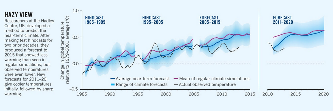
Figure 2. From Tollefson, Nature, July 10, 2013. Click to enlarge.
Reconciliation
In the next graphic, I’ve overlaid the three forecasts from the three different models onto the Nature News graphic.
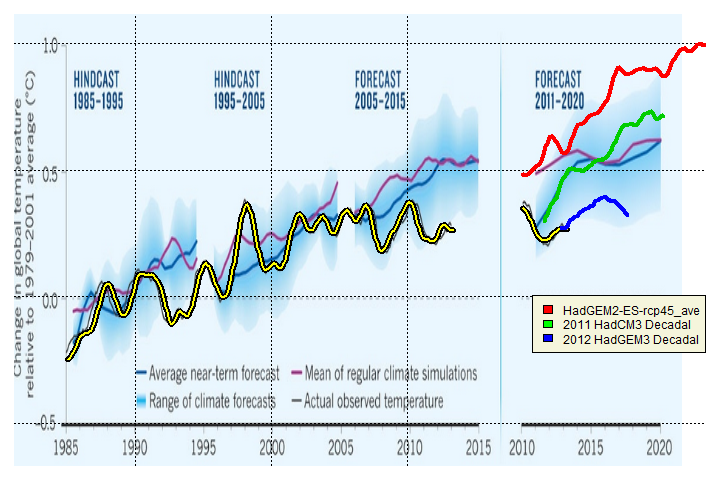
Figure 3. Overlay of three models onto Nature News graphic. Red, blue, green as in Figure 1. Smoothing is Gaussian 25-point.
The decadal forecast illustrated by Nature News, derived from Smith et al 2012, is a multi-model mean of various models, but is similar to the 2011 decadal forecast (green).
Second, the “regular simulations” (purple in the underlying graphic) are not nearly as warm as the CMIP5 contribution (HadGEM2-ES RPC45 average shown here).
Third, the most recent decadal forecast using HadGEM3 is substantially cooler than the previous 2011 decadal forecast (HadCM3) and much cooler than the IPCC contribution (HadGEM2). But by failing to show the current Met Office decadal forecast, Nature News has, to borrow a phrase, hidden the decline in near-term Met Office decadal forecasts.
While most of the discussion arising from Whitehouse’s original article pertained to past trends, surely the revisions in Met Office decadal forecasts is far more interesting. Why are forecasts from the computationally-intensive HadGEM3 so much lower than the corresponding forecasts from HadGEM2? What did longer HadGEM3 runs show? Did they show also show reductions from HadGEM2?
Postscript: Whitehouse’s original article prompted a contemporary discussion of the “statistical significance” of recent trends – a topic that I generally avoid as hackneyed and which I do not propose to discuss today other than the following brief comment. In the contemporary exchanges between Whitehouse and Greenpeace columnist Ward, there was an elision between HadCRUT3 and HadCRUT4, where each side used the version more favorable to their point. Between 1997 and the most recent observation, HadCRUT3 has had no trend whatever: 0.0085 deg/decade. Unlike HadCRUT3, HadCRUT4 has a slight trend over the same period (0.045 deg/decade with adjusted t-value of 2.2). Interestingly, the difference between the two versions, though less, is even more “statistically significant” (0.0370 deg C/decade with a t-value, after adjustment for AR1 correlation, of 4.01). The important issue is whether models are running too hot – an issue which can exist even if there is a “statistically significant” trend (but one that is lower than predicted by the models). I request that commenters limit their commentary to discussion of the changes in model and refrain from attempting to comment on statistical significance on trends.
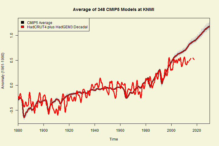
Update July 15: The Met Office contribution to CMIP5 is comparable to the average of the 348 CMIP5 series on file at KNMI, as shown below:


81 Comments
#GET HADCRUT3 AND HADCRUT4 DATA source("http://www.climateaudit.info/scripts/utilities.txt") source("http://www.climateaudit.info/scripts/gridcell/hadcru/hadcru3.txt") had=get.hadcru(hemi="gl",method="had",period="monthly") tsp(had) #1850.000 2013.333 12.000 had3= had-mean(window(had,1971,2000.99)) ###convert to 1971-2000 for decadal fc loc="http://www.metoffice.gov.uk/hadobs/hadcrut4/data/current/time_series/HadCRUT.4.2.0.0.monthly_ns_avg.txt" D=read.table(loc) #dim(D) #1928 12 #start 1850 name0=c("year","anom","u_sample","l_sample","u_coverage","l_coverage","u_bias","l_bias","u_sample_cover","l_sample_cover", "u_total","l_total") names(D)=name0 had4=work=ts(D[,2],start=c(1850,1),freq=12) had4=had4-mean(window(had4,1971,2000.99)) tsp(had4) # 1850.000 2013.083 12.000 delta=mean(window(had4,1979,2001.99))-mean(window(had4,1971,2000.99)) #used to adjust to Tollefson scale #MODEL DATA #centered on 1971-2000 #Smith et al 2007, 2012 and Tollefson 2013 graphics centered on 1979-2001. #2012 NEW loc="http://www.climateaudit.info/data/models/hadley" work=read.table(file.path(loc,"fcst.dat"),skip=3) new= ts(apply(work[,2:11],1,mean),start=c(2012,12),freq=12) tsp(new) #2012.9 - 2017.25 had3new=had3plus=ts(apply(A,1,mean,na.rm=T),start=tsp(A)[1],end=tsp(new)[2],freq=12) D=window(ts.union(had4,new),1990) had4new=ts(apply(D,1,mean,na.rm=T),start=tsp(D)[1],end=tsp(new)[2],freq=12) #2011 OLD work=read.table(file.path(loc,"fcst_2011.dat"),skip=0) old= ts(apply(work[,2:ncol(work)],1,mean),start=c(2011,9),freq=12) tsp(old) #2011.583 - 2020.33 B=window(ts.union(window(had3,end=2011.61),old),1990) had3old=ts(apply(B,1,mean,na.rm=T),start=tsp(B)[1],freq=12) tsp(had3old) #CMIP5-rpc45 loc="http://climexp.knmi.nl/CMIP5/Tglobal/global_tas_Amon_HadGEM2-ES_rcp45_ave.dat" dest="d:/temp/temp.dat" download.file (loc,dest) work=read.table(dest,skip=3) work[work< -900]=NA run=ts( c(t(work[,2:13])),start=work[1,1],freq=12) run=trim(run) tsp(run) # 1859.917 2100.917 12.000 cmip45=cmip=anom(run,1979,2001.99) # plot.ts(window(cmip45,2000,2030)) ############## ##FIGURES ############################# #1. THREE MODELS #png("decadal forecast comparison.png",w=720,h=480) par(mar=c(3,4,2,1),bg="beige") plot(window(had4new-delta,1997), lwd=3, ylab="Anomaly (1979-2001)",xlim=c(1997,2020),ylim=c(-.05,.9)) lines(old-delta,col=3,lwd=4) lines(new-delta,col=4,lwd=4) lines(old-delta,col=3,lwd=4) x=window(f( cmip45- mean(window(cmip45,1979,2001.99))),2010) lines(x,col=2,lwd=4) legend("bottomright", fill=c("black","red","green","blue"), legend=c("HadCRU4","CMIP5 HadGEM2 RCP45","2011 HadCM3","2012 HadGEM3")) title("Met Office Decadal Forecasts") abline(h=.32,lty=3,lwd=2) #dev.off() ##ANNOTATED NATURE DIAGRAM library(png) loc="http://www.climateaudit.info/data/models/hadley/smith_nature.PNG" download.file(loc,dest,mode="wb") imgnew=readPNG(dest) #setwd("d:/climate/images/models/metoffice") #png("tollefson nature annotated1.png",w=720,h=480) par(mar=c(1,1,1,1),bg="white") plot(0:1,type="n",xlim=c(1983,2030),ylim=c(-.6,1.05),axes=FALSE) rasterImage(imgnew,1970,-.91,2030.05,1.2) abline(h=seq(-.5,1,.5),lty=3) abline(v=seq(1980,2010,10),lty=3) x=window(f( had4- mean(window(had4,1979,2001.99))),1985) lines( x,col=1,lwd=6) lines( x,col="yellow",lwd=2) x=window(f( cmip45- mean(window(cmip45,1979,2001.99))),2010) lines(c(time(x))+8.4, x,col=2,lwd=4) x= window( f(had4-mean(window(had4,1979,2001.99))),2010) lines(c(time(x))+8.4,f(x), col=1,lwd=6) lines(c(time(x))+8.4,f(x),col="yellow",lwd=2) lines(c(time(old))+8.4,old-delta,col=3,lwd=4) lines(c(time(new))+8.4,new-delta,col=4,lwd=4) legend("bottomright", fill=c("red","green","blue"), legend=c("HadGEM2-ES-rcp45_ave","2011 HadCM3 Decadal","2012 HadGEM3 Decadal"), inset=c(0,.25),bg="beige") #dev.off() #################### ## TRENDS ############################ trend(window(had3, start=1997),method="AR1") # trend neff se t #0.0082 34.6210 0.0422 0.1942 trend(window(had4, start=1997),method="AR1") # trend neff se t # 0.0452 53.1995 0.0346 1.3057 trend(window(had4-had3, start=1997),method="AR1") #trend neff se t 0.0370 74.5108 0.0092 4.0151I have been playing with the CMIP5 models that KNMI has provided in good form. I’ll not discuss my results here under the guidelines provided by SteveM, but I will put up the question of scenarios and the effect that a changing scenario might have on the results of a model temperature series. Were these model series generated with different scenarios and could that change have resulted in some differences. Hindcasting should have used the known forcings, but not necessarily for forecasting.
I would comment that making confident appearing forecasts and then changing those forecasts as dramatically as appears to be the case here, whether because of model or scenario changes, should require some humility that is all too rare in the climate science community.
Steve: feel free to discuss models. I just want to avoid hackneyed discussions of “statistical significance” of trends.
The Met Office is not being straight forward with its new model HadGEM3 — calling it an experimental “decadal” prediction system and claiming that it has better accuracy and reproducibility, but then only releasing a 5 year prediction. From the shape of the model’s 5 year prediction curve, I cannot refrain from speculating that there is an “obvious hide the decline” in the remaining 5 years of the decadal prediction.
Steve: I disagree. I’m quite confident that HadGEM3 extensions will also continued increased temperatures. The question is whether the increases are smaller than HadGEM2, thus less climate sensitivity.
Steve must be right. A GCM which failed to predict rising temps over a ten year period would be more than heretical, it would be an abomination (a thing contra naturam, so to speak).
Nevertheless, you have to wonder what is going on with that curve and the 5 year prediction. It makes it look as though the Met is actually predicting that the “von Storch test” will result in “failure” (or, which is worse, “re-evaluation”).
For reader,s the von Storch test was reported by Judy Curry here http://judithcurry.com/2013/06/21/week-in-review-62213/
Steve, when Storch said it would take 5 years to get to zero model runs, that’s only if it continues to plateau..but it could take a shorter time than 5 years.
He seems to want to give some breathing room.
Steve: Hmmm… out of 348 CMIP5 runs at KNMI, all but 6 were higher than HadCRUT3 in May and all but 23 higher than HadCRUT4. The differences in the hot runs, as others have observed, are very large.
For anyone interested in directly handling the CMIP5 GLB estimates online at KNMI without the extra handling from Java, here’s a download script:
test=readLines("http://climexp.knmi.nl/CMIP5/Tglobal/index.cgi?email=someone@somewhere") test=test[grep("a href=",test)] n=nchar(test) id=substr(test,13,n-4) work=strsplit(id,">") id=sapply(work, function(A) A[[1]]) out="d:/climate/data/models/cmip5/GLB" setwd(out) K=length(id) for(i in 1:K) { loc=paste("http://climexp.knmi.nl/CMIP5/Tglobal/",id[i],sep="") download.file (loc,dest) work=read.table(dest,skip=3) run=ts( c(t(work[,2:13])),start=work[1,1],freq=12) locout= gsub("dat","tab",id[i]) save(run,file= locout) }Why an additional period of 5 years, other than the fact it gives breathing space for repositioning?
Why not 3, or 8? What threshold WRT physical processes / empirical evidence will have been breached? Or is it purely rhetorical / psychological?
Have they, having lost the toss, proposed best out of three?
My favorite quote from the last few weeks was that the flattening of temp.’s for 15 years only gave us an extra decade. I’m sure if it stays fairly flat for 20-25 years, it still will give us only another decade …….. 🙂
My view, based on two quite recent published papers (much to my chagrin, I’ve lost the links), is that the model-assumed “nexus” between modest temperature rises from CO2(x2) of 1 – 1.3C and consequent increases in water vapour (increasing the temp rise to 5 – 6C) simply hasn’t happened
The papers I refer to here were based on empirical satellite data and concluded that no significant rise in humidity has been observed over the data period (about 30 years)
So the assumed dangerous amplification hasn’t happened
RealClimate hedged their bets a few years ago, and put up a guest post arguing for a 20 year pause in temperatures, at which point global warming would come back stronger than ever. That post was when I really started to think the ‘global cooling since 1998’ might be true.
“AR1 correlation of 4.01” [?]
Lance,
Re-read the sentence. The t-value is 4.01, when one includes an adjustment for AR1 correlation.
Steve: added commas for clarity.
Steve wrote: “What did longer HadGEM3 runs show?” According to the Smith et al. paper which describes HadGEM3 [ Steve: No, it doesn’t] , a bias appears in temperatures after running the model for a while: “This bias is essentially absent … for lead times up to six years… However, [the model] does develop a warm bias in Ts beyond year six, rising to 0.07°C by year nine.”
[Supplemental Information for Smith et al. is here.]
Steve: Please pay attention to the model number. Smith et al 2007 is the older HadCM3 model, not HadGEM3.
Apologies. You’re correct. Delete the comment if you wish.
Interesting find, Harold.
We can draw a couple of mathematical conclusions from that. First, the “bias” has reached six-tenths of a degree per century by year 9. That is approximately the warming over the last century, so the model starts out with an error the size of the observations it’s trying to explain.
In addition, if there is minimum bias in year six as they say, call it 0.01°C in that year, this means that after year six the “bias” is rising at 0.02°C per year … yikes!
And while a long extension of any trend is hazardous, even taking that rising “bias” out 5 years, to year 14, would indicate a “bias” of 1.2 degrees per century … can we call it an “error” now?
w.
Steve: WIllis, watch out for Harold’s misdescription. SMith et al 2007 used the OLDER HadCM3 model, not HadGEM3.
Thanks, Steve, I caught that. Turns out I was commenting on the green line in your post.
w.
Steve: yes. I think that this model was used in AR4.
Thanks for this Steve. The droop in the 2012 model forecast, even though it only runs to 2017, is striking indeed.
Thanks for the clear Figure 1. I’ve been curious about this kind of relationship between climate forecast-not-hindcast and observation for some time, e.g.,
http://rankexploits.com/musings/2013/models-v-observations-ar5-rcp4-5/#comment-117093
and while I can often get the basic idea by eyeballing a mixed-forecast-hindcast graph and using informed guesses at the forecast dates, I seldom get to see it so clearly presented.
The predicted data in the right panel looks a lot like page 6 from this presentation, which (I think) is showing the average from some number of models in the Decadal Forecast Exchange.
Steve: I presume that the right panel is taken from Smith et al 2012 (Clim DYn) – which I don’t have. The “old” curve that I posted is the average of the 20 runs that the Met Office sent me. I presume that slightly different permutations would lead to somewhat different versons and that the version in the linked PPT is a varied average from the HadCM3 model. It seems to me that the relevant issue is the change from HadGEM2 to HadCM3 and then to HadGEM3, and to understand what caused the change.
The abstract for Smith 2012 starts with “We present the first climate prediction of the coming decade made with multiple models, initialized with prior observations. This prediction accrues from an international activity to exchange decadal predictions in near real-time, in order to assess differences and similarities, provide a consensus view to prevent over-confidence in forecasts from any single model, and establish current collective capability. We stress that the forecast is experimental, since the skill of the multi-model system is as yet unknown.” This is describing a multi-model prediction, not an average of runs from one model. I doubt the graph is just the Met Office model alone.
Steve: I don’t see that anything in this comparison turns on whether Smith et al 2012 uses multi-models or not. The plotted graphics are all from data provided or archived by the UK Met Office, the model provenance of which is described. Whether the right panel of the Nature article is HadCM3 only or HadCM3 plus some others is immaterial. Nature News did not show the current HadGEM3 runs.
I think the Tollefson graphic is comparing apples to applesauce. The left panel is almost certainly Met Office model output only. I think the right panel is a multi-model average from the forecast exchange, not HadCM or HadGEM or HadWhatever. I’m just commenting on what the right panel is, I agree with you that the most recent predictions should have been used.
If the latest model is showing less warming ahead, then this must be manifested within the model as some large scale PHYSICAL process change compared to previous model; energy previously manifesting itself as global warming can not merely have disappeared. According to the model, where has it gone ?
I first want to acknowledge the efforts of Geert Jan van Oldenborgh at KNMI for making the climate models from CMIP5 available in good form for doing analyses.
My analyses that I report here are rather simple minded and easy for anyone to do given the model data at KNMI and knowledge of R programming and thus I will not give the details here.
I calculated the t values for a comparison of the trends from 1970-2012 RCP4.5 CMIP5 scenario models with the 3 major Observed series, namely HadCRU4, GISS and GHCN. The trends were calculated using temperature anomalies for the mean global temperatures from 1970-2012 for the annual calculations and 1970-2013 May for the monthly calculations. There were 106 separate model runs for RCP4.5 and 42 models. I averaged multiple runs for a given model.
I used the method of Santer et al. (08) in making these comparisons, but adjusted the Observed series standard deviations by doing Monte Carlo calculations based on the 10,000 simulations of the best ARMA model fit of the detrended Observed series residuals.
The results are given in the link below and show a significant difference in trends between the models and the 3 Observed series for the monthly data and for 2 of the series (GISS and GHCN) for the annual series – with HadCRU4 just missing significance at the 5% probability level. Note that the monthly series allow an additional 5 months of data where the models and the Observed continue to diverge. The failure of the models to track over 43 years has implications in that 1) the models may not be over-fitted to the Observed but 2) with known forcings for model input it might be surprising that models do not track the observed. (See below also).
In another analysis, that I reported at the Blackboard previously, I compared 12-14 year trends of the RCP4.5 models with the Observed series over the period from 1916-2013 May. With this simple minded analysis I found that the models appear to be differentiated by having rather random trend results over the time periods studied while the Observed trends over these periods appear to be biased to one end or the other of the distributions of trends. In other words while one could say the models and observed series track reasonably well over that period of time, the models and Observed series got there by very different routes.
http://rankexploits.com/musings/2013/bayesian-projection-of-rcp4-5/#comment-117561
I have also done some spectral analysis comparing RCP4.5 and Observed series, but have considered, while there are differences between modeled and Observed spectra, that difference arises from the differences in segmented linear trends between models and Observed series. Those differences can be reduced/eliminated when comparing the residuals of ARMA models of the residuals of the linearly detrended series segments. In light of the foregoing the question then becomes one of whether those linear segments are just that or are the segments better represented by some cyclical part of a temperature series. Either way the models do not apparently emulate the Observed series well with this structure.
If I might be permitted a somewhat o/t speculation (from the perspective of the statistically-challenged and relatively Uninformed Lay Person [ULP] that I am) …
The stark contrast between the Red and the Blue (which presumably was not submitted to AR5) suggests that the Red run almost appears to have been designed (for want of a better word) to coincide with how one imagines that a graph of the projections of the dreaded and rapidly increasing CO2 emissions might appear for the same time-period.
But, of course, if such a visually dramatic “coinciding” were to materialize within the context of AR5, it could just be, well, coincidence;-)
But according to the Met Office their forecasts are highly accurate –
“At the time of writing this blog, the Met Office is beating all of its forecast accuracy targets. As an example, 87.7% of our next day maximum temperature forecasts are accurate to within 2C. The target is 80%.”
2C no less!!! And with an 80% target!
http://metofficenews.wordpress.com/2013/07/11/the-spectator-how-accurate-is-the-met-office/
Re: Marion (Jul 15 17:52),
I don’t have the chops to do it myself, but I wonder if you replaced Met Office forecasts with the following:
Max Temp tomorrow = Max Temp today +/- 2 degrees C.
would that have comparable accuracy?
Re: Marion (Jul 15 17:52),
Well, I’m really out of my element, but using the station at Lerwick UK, for the past year, it appears that about 81% of TMax = previous day +- 2C.
So in setting itself a target of 80% the Met is allowing its maximum temperature forecast to be less accurate than the stupidest model possible and still be judged a success. For Lerwick at least. I’ve heard of setting the bar low but this seems a bit generous.
Richard,
Why call it the ‘stupidest model’?
Wouldn’t it be the most simple model?
Re: Marion (Jul 15 17:52),
Hey, I spent at least a minute thinking up that model!
But on a more/less serious note, you should go Marion’s Met link. The Met Office seems REALLY proud of their 3 hour +- 2C forecasts.
It is called “the Persistence forecast”, and when I was reading meteorology it was regarded as a sort of a rock-bottom value. Anybody can say “it will be the same as today”, so a forecast that can’t beat “the Persistence Forecast” isn’t even a forecast.
Incidentally we were taught that for a complete forecast (temperature, wind, cloudiness, precipitation) the persistence forecast for the next day could be expected to be about 60% correct (in Scandinavia that is).
Yes, but when you allow a Persistence Forecast to have such a wide margin as +/- 2C, the success rate can be much higher than 60%.
I can come up with an even better formula for the 3 hour forecast although it may need a supercomputer to calculate.
Temp in 3 hours = Temp now + (Temp 21 hours ago – Temp 24 hours ago) +/- 2C.
Where’s my Met Office Bonus check for exceeding forecast goals?
From a magazine in 1950 (my bold)
63 years later and they are claiming an 87.7% accuracy. It is good to know they are making progress.
Terry,
The difference is that they use computers not and have greater confidence in the precision of their targets.
“now” not “not”
Reading the title in thought “Mother” Nature hides the temperature decline from casual observers. Only after reading further I see that you point at the publication Nature busy with their politics as they seem to be doing more and more.
“The successive iterations of Met Office models more or less flap to the leeward of observations, like a version of the Gambian flag in the trade winds.” Wow! Love it! (And the scuttlebutt is that the same guy who wrote that also does some mean science and plays a mean game of squash as well.)
Steve: the choice of Gambia was intentional. No one seems to have picked up why Gambia out of all the countries in the world.
Re: William Larson (Jul 15 22:34),
So it wasn’t a Bubu Steve?
I thought Mr. Larson got the Gambian reference but did not flag it in a way to banner his jack.
http://www.worldatlas.com/webimage/flags/countrys/africa/gambia.htm
Red/blue/green stripes in the same order as the Met Office Decadal forecast. Pretty obscure.
Steve:horizontal stripes as well. The red-blue-green combo proved distinctive to Gambia. I had to look for a couple of minutes to locate the right flag.
Warmist vs. warmist! Popcorn seems inadequate for the event. Cracker Jacks, at least.
The MET-O decadal forecast revision story was broken at the Talkshop on Jan 5.
Richard Betts is now saying on Twitter that Steve has this wrong because it is not an ‘initialised forecast’
Having looked at the Nature article properly, with the help of Steve’s graphs, one is again gobsmacked by the brass neck of those that produce climate change articles and headlines. Even allowing for the point Richard Betts has made on Twitter – so where should the HadGEM2 have been plotted from? – the suspicion arises that the decadal forecasts have now bifurcated into two quantum-like states:
1. the story as told by Nature’s headline and IPCC AR5 – ‘record heat’
2. the story as told by the revised decadal forecast, which doesn’t make into the headlines but is much more likely to fit observations at a 95% confidence interval level.
All the thimbles one could want for the next generation of peas?
Steve: I edited the graphic to show the HadGEM2 hindcast (dotted). Not because I think that the original graphic was unjustified, but to remove Betts’ excuse, which is tangential to the article.
Re: Richard Drake (Jul 16 03:00),
The headline of the article was Naturemag using an older version of the Met Office decadal forecasts showing the elevated temepratures of their headline. Although I did not discuss this in the article, I presume that Naturemag fact-checked with the Met Office.
Anthony asked for an “explanation”.
Betts said that my graphic of the Met Office CMIP5 contribution “exaggerated” the difference between the Met Office contribution to IPCC and the decadal forecasts.
First, that has diddly-squat, nada, to do with the difference between the old and new decadal forecasts and thus the misleadingness of the Nature article, to which the Met Office has thus far made no objection. Betts and Met Office employees should have pointed out the inaccuracy long before me.
Second, my intent was definitely to highlight the difference between the Met Office contribution to IPCC and their decadal forecasts. Betts seems to object to showing an uninitialized forecast and initialized forecast on the same page.
Given that the graphic also showed observations, I think that it is entirely reasonable to show the most recent initialized forecast as an extension of observations to highlight the discrepancy with models, particularly given von Storch’s five years of waiting.
Nonetheless, as a concession to Betts, I’ve plotted the pre-2010 portion of the Met Office contribution to IPCC in dotted red and noted that Met Office says that it is an “uninitialized? forecast – though I think that it would be more accurate to say that it was initialized differently than the decadal forecasts.
Otherwise, to my knowledge, Betts has registered no other issues with the article.
The Met Office had the resources to ensure that HadGEM3 was “thoroughly tested” and “more accurately reproduced temperature variations over the past few decades”. It seems a pity (and somewhat pitiful) that these same resources didn’t extend to allowing runs of more than 5 years into the future (and that at a limited number of runs).
The MET Office had a new super computer system running in 2011 (consuming 1.2 MW http://www.telegraph.co.uk/news/uknews/5365411/New-giant-supercomputer-will-better-predict-weather-Met-Office-says.html), but that didn’t do apparently as they just got a new new one sanctioned of 100 million pounds http://www.thesun.co.uk/sol/homepage/news/politics/4990100/Ministers-approve-100m-Met-Office-weather-machine.html.
The main question is, do they need new hardware OR new software(models) according to Spectator http://www.spectator.co.uk/features/8959941/whats-wrong-with-the-met-office/
There must be some pretty dramatic difference in the formulation of Hadgem3 vs the other 2 models as Hadgem3 has the 2nd derivative essentially negative all through whereas it varies positive and negative for the other 2.
What are the key differences, are they physics or fudge factors? What odds will anyone give me that reality will have a positive 2nd derivative through the period with the same smoothing?
Whatever skill the models may display, I might expect such skill to be most in evidence during the initial few years of the predictions, before they leave the rails. The change to 5 year forecast suggests the Met Office thinks so too.
With this in mind, the initial rates of change show a huge difference between 2011 HadCM3 Decadal and 2012 HadGEM3 Decadal. I wonder what the given explanation is?
Steve, may I ask whether the claim reported in your post above, that the increased computational intensity of the HadGEM3 runs informed the decision to switch from a 10 year to a 5 year forecasts, originated from the Met Office? It reads like it did, but it’s not clear, or substantiated in the Met Office link that follows it.
I’ve confirmed that the right panel of the Tollefson diagram contains a multi-model mean decadal forecast, which is very similar to, but not a variation of, the 2011 Met Office decadal forecast. I’ve amended the text to show this. Nothing material in the post is affected.
I understand from Markov probability and the persistency factor of weather systems that if you say tomorrow is going to be the same as today you have a 63 percent chance of being correct.
This is beginning to sound like a shampoo ad.
and it has pro-vitamins!
Way to set the bar low.
This reminds of a story I tell about the reason Stonehenge was built: A long time ago some high priests made a complete hash of their prophecies. Their king was not happy so he ordered them to ‘get it right or else’. Knowing that they could not ‘get it right’ they came up with a devious plan and told the the king ‘we need a powerful instrument to ‘get it right’. This instrument involved a massive building project that would occupy the whole kingdom for many years.
Unfortunately for the priests, the king took them at their word, put a huge effort into building the stone monument and … all too soon it was ready.
Just replace “High priest” with “Met Office climate forecasters” … “Stonehenge” with “super high speed computers” … and the story is the same … except we don’t sacrifice our charlatans.
The interval between HadGEM2, which was modern enough for use in an IPCC report that hasn’t even been published yet, and the new HadGEM3, is a mere nanosecond in science. Yet it is enough for near-term climate forecasts for drop by an amount comparable to the entire 20th century mean temperature change. And it all happened long after the science was “settled”.
The decadal forecast from Hadley is for the flatlining of the past 15 years to extend another 5 years or more. That puts us past a deadline by which, without serious warming, modelers (not merely von Storch) have said would point to fundamental problems with models, which embed all the main hypotheses of the scientific mainstream on this topic. Hadley is, in effect, predicting a crackup of the mainstream. And this happens just after the meme has been established that 97% of climate scientists are absolutely confident in the models and the science they embed, and 97% of climatology papers endorse the hypotheses. This is going to be good.
They will not admit they are retreating. They will say they are advancing to the rear.
Reblogged this on Tallbloke's Talkshop and commented:
A tangled web, SteveM gets to work
Do we know what the models predict for say, 2050? Looks like large divergence is
happening even with small forecast ranges of 5, 10 yrs.
Hi Steve
Perhaps it would be helpful if I expanded on my twitter response to Anthony Watts asking me about your post. You asked:
The difficulty is that the question itself is not well-posed, because the HadGEM3 and HadGEM2 ensemble simulations are not “corresponding forecasts”.
[Background note: Both the HadGEM2 and HadGEM3 simulations are ensembles of several simulations with the respective model.]
The HadGEM2 simulations were started from a climatological mean state with near ‘pre-industrial’ (actually 1860) conditions, and then run through the late 19th & 20th Centuries and first few years of the 21st Century with observed changes in greenhouse gas concentrations, aerosols and land use, with the model simulating its own natural internal variability. Since internal variability is unpredictable after a few years, we don’t expect such simulations to capture the specific timing periods of relatively faster or slower warming. This is what I mean by an “uninitialised” simulation – the initial conditions are not for a specific date and/or are so far back in the past that they have no effect on the internal variability simulated by the model.
In contrast, the HadGEM3 5-year simulations were an intialised forecast, initialised with observational data in late 2012.
There are 2 reasons why this difference makes it not useful to compare the 2 simulations over a 5-year period of specific dates (in this case 2012-2017):
1. For any particular 5-year period, HadGEM2 doesn’t ‘know’ what climatic state it should be starting at (eg: 2012 in this case). It’s got it’s own simulated version of the 2012 climate, but we’d never expect that to correspond to the real 2012, due to chaos. Since the mean of the HadGEM2 runs does not include the ‘hiatus’ of the 2000s, the model’s 2012 is warmer than the observed 2012. In contrast, HadGEM3 does ‘know’ the real observed climate of 2012, so it starts at a cooler state than the equivalent portion of the HadGEM2 run.
2. The runs in the HadGEM3 ensemble are all initialised with observational data from 2012 so are simulating internal variability starting from the same conditions. If there is any signal in the internal variability, the different runs should agree to some extent. In contrast, the runs in the HadGEM2 ensemble all have their own individual versions of 2012 and hence their subsequent variability after 2012 will probably be very different. Use of the ensemble mean tends to cancel these out to just give the GHG-forced warming trend over the 5-year period.
So, with HadGEM2 being uninitialised, the ensemble mean starts at a warmer 2012 than in observations and then merely follows a GHG-forced warming trend until 2017, with internal variability in the different runs cancelled out. However HadGEM3 starts at a cooler 2012, as observed, and is able to capture internal variability better.
Hence it’s not at all surprising that 2017 in HadGEM2 started in 1860 is noticeably warmer than in HadGEM3 initialised in 2012.
5-year forecasts could well be dominated by internal variability so don’t particularly tell us anything about the long-term trend. We’ve not yet done future projections with HadGEM3 so don’t know how much warming it will project in the long term.
Incidentally, HadGEM2 was not the only model submitted to CMIP5 / IPCC AR5 by the Met Office. We also submitted initialised forecasts with HadCM3 – see here.
Hope this clarifies my tweet!
Cheers
Richard
Richard, thanks for this. Given chaos, how can HadGEM3 “know” both 1850 and 2012?
Hi Ross
It can’t (not in the sense I meant above). We don’t do initialised forecast runs from 1850 because we don’t have adequate data coverage, especially below the ocean surface – that’s critical for kicking off the model in, say, the right part of the ENSO cycle.
When I said we start HadGEM2 with near ‘pre-industrial’ conditions, I mean we give it the GHG concentrations for that period and let it find it’s own equilibrium. The model is therefore trying to simulate the climatological state around that time, but not any particular year.
Richard, thanks for commenting, but your comment is not responsive to the main points.
First, I had taken particular issue with the failure of the Nature article to show the most recent decadal forecast, a forecast which contradicts their headline. I presume that the Met Office was given an opportunity to fact-check the Nature article. If so, the Met Office should have corrected Nature’s omission of the most recent data. If not, the Met Office should have submitted its own comment to Nature pointing out that their most recent decadal forecast had lower results. Your comment??
Second, HadGEM2 comes in absolute temperatures. In the graphic, it was re-centered on the same centering as the Nature article (which was 1986-2005 following Smith et al.) The divergence comes subsequent to that recentering. Your comment misdirects attention away from this.
Third, you did not respond on my observation that SMith et al 2012 had also compared “uninitialized” models with initialized models over a time period commencing in 2012. Do you acknowledge that they did precisely the same thing that you criticize me for doing? If not, what is the difference?
Hi Steve
Thanks for your response.
Well we’d have to ask Jeff Tollefson about his own thinking (I’ll tweet him), but my guess is that he had seen the Met Office research news article pointing out that the 2012 5-year forecast ensemble suggests that:
and hence he realised that the 2012 forecast does not really make much difference to his story. You’ve shown the mean of the forecast ensemble, but if you look at the range, you’ll see that it overlaps with the range from the earlier forecast.
This doesn’t affect my argument, in fact it reinforces it. As your figure 1 above shows, the 2012 anomaly relative to the centring period in HadGEM2-ES is still larger than the 2012 anomaly in the observations. Yes, the mean of the HadGEM2-ES ensemble has indeed diverged from observations subsequent to the centring period, because the HadGEM2-ES ensemble does not show the hiatus of the 2000s.
Please don’t take my remarks as criticism! In my eyes this is a scientific discussion. But no, Smith et al 2012 are not doing precisely the same thing as you, because they are comparing initialised and uninitialised forecasts over a longer period, enough to make the comparison meaningful. Comparing over just 5 years is not particularly useful, because a period that short is dominated by internal variability in the initialised HadGEM3 forecast, whereas internal variability is not intended to be predicted in the uninitialised HadGEM2 projection. When Smith et al compare over a longer period, they find that the initialised forecast eventually catches up with the long-term trend of the uninitialised run, even though it starts colder.
So, there is a difference between what you did and what Smith et al did. But as I said, I’m not criticising when I tweeted that you were “wrong” I meant “technically incorrect”, and I tweeted in the spirit of making a scientific comment in response to Anthony’s question. It wasn’t intended to be pejorative. Apologies if this is how it appeared!
Thanks for the interesting discussion.
Richard
Richard,
My original point remains: according to the ethical and legal standards that apply to businesses, Nature News should have shown the lower values of more recent decadal forecasts. Further the Met Office should have insisted that they do so either in fact checking if they had an opportunity or as a letter to Nature when it came to their attention.
As to why Tollefson failed to do so, I’ve examined the Met Office article to which you directed me http://www.metoffice.gov.uk/research/news/decadal-forecasting and I agree that it is entirely possible that Tollefson drew from this article which nowhere provides a straightforward graphic showing the difference between the HadCM3 and HadGEM3 forecasts. On the contrary, its money graphic in the Conclusions section conceals this difference by focusing on the comparison between older and newer HadCM3 runs – a misdirection that is all too characteristic of climate science advocates. Thus, I advise readers to always watch the pea and this is merely one more example.
The HadGEM3 decadal forecasts were conspicuously lower than the previous HadCM3 forecasts. That was the difference to which Whitehouse and others had drawn attention and which was invisible in the Nature News article to which I objected. The first graphic in the article showed the HadGEM3 results but did not show the predecessor HadCM3 results. The difference is shown in the graphic below.
Now here is the image accompanying the Conclusions of the Met Office article – the “money” image and the one on which Tollefson appears to have relied, again shown as a blink image. Instead of showing the NEW HadGEM3 decadal forecast against the older forecast, it showed an updated version of HadCM3 and then arm-waved.
When I plotted the newer decadal forecasts on the “money” image, I really had to scratch my head as to the difference. In re-examining the graphic, I could see that the Met Office had changed the comparison to a comparison between older and newer HadCM3 versions. I can see why Tollefson was tricked (TM – climate science) into thinking that there had not been a material change in the decadal forecast: that’s why I urge readers to always watch the pea. Unfortunately, this is merely one more example.
Steve
Not sure if this will come in the right place as I’ve had to hit “reply” from my own post, but this is in response to your post of Jul 25 9:41am
Well I still don’t think we can draw too many conclusions from a 5-year forecast, since this is dominated by internal variability and doesn’t tell us much about the long-term anthropogenic warming trend. What we really need to see is a 10-year (or longer) HadGEM3 run – this will be done in due course.
The point of the final figure comparing the two HadCM3 5-year forecasts was to show that simply changing the start date made a difference, in a way which is consistent with the new HadGEM3 run starting in 2012. I don’t understand why you say the figure “changed the comparison to a comparison between older and newer HadCM3 versions”, as none of the previous figures compared HadGEM3 and HadCM3, so there was nothing to change *from*. The figure was clearly labelled as showing 2 HadCM3 runs – I don’t think it’s fair on Tollefson to assume that he can’t read 🙂
Cheers
Richard
Steve: the Met Office article to which you linked was dated January 13, 2013 and was issued in response to considerable blog discussion, e.g. Whitehouse at GWPF and Greenpeace columnist Bob Ward. Obviously the Met Office itself did not show the comparison between HadCM3 and HadGEM3 in any diagram, but that’s what had been noticed and was being discussed by everyone else. Indeed, the Met Office’s failure to show the difference – in which Tollefson either wittingly or unwittingly participated – was my point. Only showing the older and more advantageous information would not be acceptable practice for any publicly-traded stock. This is immediately and intuitively clear to any professional in a financial industry. In the financial businesses, anyone who did what you and the Met Office did here would lose credibility – perhaps the most important asset of any business. That you do not see any problem with the sort of sharp practice shown here by the Met Office and Nature News is disappointing. You should have agreed that the article did not clearly show the most recent information and undertaken to ask the party responsible to issue an amendment/correction. Unfortunately, too many people in the climate community share your belief that this sort of sharp practice is acceptable and this diminishes the ability of the public to rely on statements from your community. I’m sorry to be so blunt since you’re a welcome participant here, but I think that you should understand why this sort of answer is perceived as weasely and inadequate.
Thanks for sharing your opinion so frankly.
Why is the older information “more advantageous”?
The more advantageous version allows for a Nature headline.
I’d forgotten about this conversation, but was reminded by being pointed here from another thread.
It is not correct that the older information is somehow “more advantageous” for the Nature headline of “The forecast for 2018 is cloudy with record heat”. The HadGEM3 forecast still suggests record global mean temperatures in the next few years.
Leaving aside the fact that the HadGEM3 forecast doesn’t actually extend to 2018 (it’s only for 2013-2017), the average global temperature in that period are still forecast to be most likely above the previous record (0.43C relative to 1971-2000, compared to 0.40C in 1998).
But more importantly, this is the average over 5 years, and individual years will be warmer or colder than this. Look at the thin blue curve in the plot you have reproduced above – each curve is an individual model simulation (of which there were 10 in all). They wiggle around from year to year, and in some cases they reach an anomaly of around 0.6C relative to 1971-2000.
The purple line in your figure above is not the forecast for how temperatures are actually expected to evolve – it is the average forecast for each individual year, with the expectation that some years will be above this average and some will be below it.
So not only is the 5-year average predicted to be most likely above the previous record, some individual years could be well above the previous record.
Consequently there was no reason to ask Nature to change their headline. The new information from HadGEM3 remains entirely consistent with the idea of record temperatures in the next few years.
2018 is predicted to set a record?
Richard, what I’m asking is if your statement indicates that you can be quoted as saying that the prediction is that 2018 will set a new global temp record.
Can we take that as a firm statement?
@thisisnotgoodtogo
No, there is no prediction specifically for 2018. It is not possible to predict whether any specific year in the future will set a record, only whether the chances of a record are changing over time. In this respect the Nature headline is using a bit of journalistic license, but I think people would realise this (I’m pretty sure Steve does). The issue is whether the newer HadGEM3 forecast still justifies the headline about “record heat” in general, irrespective of whether any specific date is mentioned. I think it does.
Thank you, Richard Betts.
It’s then safe to say that you do not support the statement made in the headline.
Can we also say that The Met Office has never intimated the validity of such a declaration?
Can we say that it’s total hogwash?
Can we say that The Met or you, have done anything to have this seeming false attribution to The Met, addressed?
Richard Betts,
My understanding is that a record-setting year is, in theory, an open-and-shut case and would refer specifically to going higher than the standing record year’s temp.
Is the Met or you personally saying that one of the years before 2019 is forecast to be a record-breaker?
If not, why is the headline not an outright falsehood?
Richard, Betts,
Please excuse my need for reformulation. I did read your post, but didn’t respond in kind.
Maybe this is better:
Does the Met predict that a new record will be set before 2019?
If it doesn’t, then to this reader, it means The Met should have a problem with the headline accuracy whether under the interpretation that you provided or whether under a different interpretation.
As you used Steve as someone who you think should agree logically with your interpretation, you used someone who is cetainly not “Joe Average”.
Does The Met have a responsibility to address misrepresentation of their material by media, when it comes from a widely-read scientific journal article? I’m referring to possible mandate to self-correct and explain fully to the very end, where there is any different and quite wrong interpretation to be extracted.
Does this kind of mandate or instruction (for this question I’m presuming one does exist), extend to addressing high profile public misrepresentation by others through “journalistic licence”.
Personally, I would always assume the headline intends to mean exactly what a responsibly behaving author or editor says!
Thank you!
Steve,
Two peas appear to have found there way into your most recent comment/post
What is the scripting language in the first comment?
R
available from r-project.org
It’s nice seeing it called a scripting language.
New Nobel laureate denounces Nature and Science mags. as distorting the scientific process, favoring flashy results over sound science:
http://www.theguardian.com/science/2013/dec/09/nobel-winner-boycott-science-journals
Speaking to the Guardian en route to Stockholm to receive the 2013 Nobel prize for science, Higgs, 84, said he would almost certainly have been sacked had he not been nominated for the Nobel in 1980.
http://www.rawstory.com/rs/2013/12/06/nobel-prize-winner-behind-higgs-boson-says-he-couldnt-get-an-academic-job-today/
4 Trackbacks
[…] Full […]
[…] More: Nature Hides the Decline « Climate Audit […]
[…] Nature-mag Hides the Decline […]
[…] https://climateaudit.org/2013/07/15/nature-hides-the-decline/ […]