AR5 Second Order Draft (SOD) Figures 1.4 and 1.5 showed the discrepancy between observations and projections from previous assessment reports. SOD Figure 1.5 (see below as annotated) directly showed the discrepancy for AR4 without additional clutter from earlier assessment reports. Even though AR4 was the most recent and most relevant assessment report, SOD Figure 1.5 was simply deleted from the report.
Nor can it be contended that IPCC erroneously located the projections in SOD Figure 1.5, as SKS claimed here in respect to SOD Figure 1.4. The uncertainty envelope shown in SOD Figure 1.5 was cited to AR4 Figure 10.26. As a cross-check, I digitized relevant uncertainty envelopes from AR Figure 10.26 (which I’ll show later in this post) and plotted them in the figure below (A1B – red + signs; A1T orange). They match almost exactly. Richard Betts acknowledged the match here.
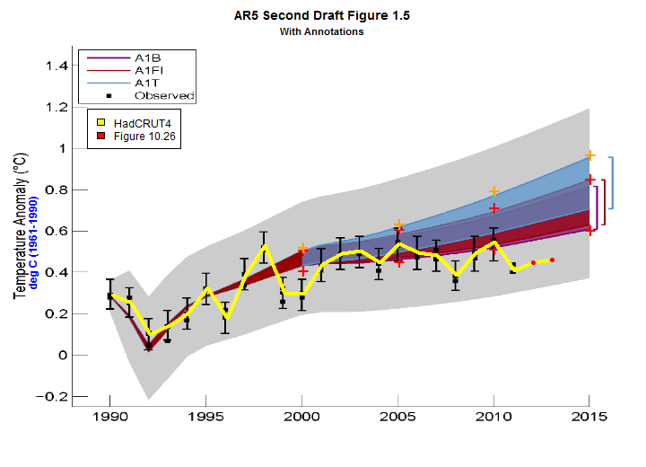
Figure 1. AR5 SOD Figure 1.5 with annotations showing HadCRUT4 (yellow) and uncertainty ranges from AR4 Figure 10.26 in 5-year increments (red + signs).
AR5 Figure 1.4
Having deleted the informative (perhaps too informative) SOD Figure 1.5, IPCC’s only comparison between AR4 projections and actuals is in the revised Figure 1.4, a figure that seems more designed to obscure than illuminate.
In the annotated version shown below, I’ve plotted the AR4 Figure 10.26 A1B uncertainty range in yellow. Unfortunately, Figure 1.4 no longer shows an uncertainty envelope for AR4 projections. Here one has to watch the pea carefully. Uncertainty envelopes are shown for the three early assessments, but not for AR4, though it is the most recent. All that is shown for AR4 are 2035 uncertainty ranges for three AR4 scenarios (including A1B) in the right margin, plus a spaghetti of individual runs (a spaghetti that does not correspond to any actual AR4 graphic.) From the right margin A1B uncertainty range, the missing A1B uncertainty range can be more or less interpolated, as I have done here with the red envelope. I matched 2035 uncertainty to the right margin and interpolated back to 2000 based on the shape of the other envelopes. The re-stated envelope is about twice as wide as the actual AR4 Figure 10.26 uncertainty envelope that had been used in SOD Figure 1.5. Even with this much expanded envelope, HadCRUT4 observations are at the very edge of the expanded envelope – and well outside the actual AR4 Figure 10.26 envelope.

Figure 2. AR5 Figure 1.4 with annotations. The yellow wedge shows the uncertainty range from AR4 Figure 10.26 (A1B). The red wedge interpolates the implied uncertainty range based on the right margin A1B uncertainty range.
AR4 Figure 10.26
Richard Betts recognized that there was no location error in connection with AR4 projections, but argued (see here) that the comparison in AR5 Figure 1.4 was “scientifically better” than the comparison in the SOD figure which, as Betts acknowledged, was “based on” an actual AR4 graphic (AR4 Figure 10.26).
However, if one is comparing AR4 projections to observations, IPCC is obliged to compare to actual AR4 graphics. Figure 10.26 was properly recognized in the SOD as the relevant comparison. It was also cited in contemporary (early 2008) discussion of AR4 projections by Pielke Jr (e.g here) and Lucia (here here)
AR4 Figure 10.26 was a panel diagram, the bottom row of which (see below) showed projections for GLB temperatures under six emissions scenarios, including A1B, with the editorial AR4 comment that the models “compare favourably” with observations.

Figure 3. Bottom row of AR4 Figure 10.26 showing uncertainty ranges for GLB temperature for six SRES scenarios. Original caption (edits show information for bottom row): Fossil CO2, CH4 and SO2 emissions for six illustrative SRES non-mitigation emission scenarios … and global mean temperature projections based on an SCM tuned to 19 AOGCMs. The dark shaded areas in the bottom temperature panel represent the mean ±1 standard deviation for the 19 model tunings. The lighter shaded areas depict the change in this uncertainty range, if carbon cycle feedbacks are assumed to be lower or higher than in the medium setting… Global mean temperature results from the SCM for anthropogenic and natural forcing compare favourably with 20th-century observations (black line) as shown in the lower left panel (Folland et al., 2001; Jones et al., 2001; Jones and Moberg, 2003).
The next graphic shows the effect of AR5’s “re-stated” uncertainty range on Figure 10.26. The right margin uncertainty ranges of Figure 1.4 have been inset at the correct location, with the ends of the uncertainty range corresponding to 2035 values of the red envelope showing the re-stated uncertainty range. Despite the doubling of uncertainty in the AR5 restatement, recent HadCRUT4 values are at the very edge of the expanded envelope.
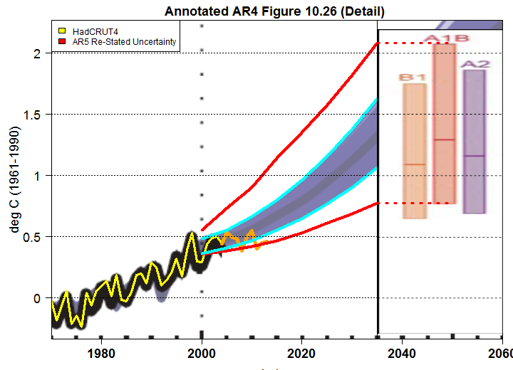
Figure 4. Detail of AR4 Figure 10.26 with annotation. HadCRUT4 is overplotted: yellow to 2005, orange thereafter. Original reference period is 1981-2000; the 1961-90 reference period used in AR5 is shown on the right axis.
Conclusion
In the final draft document sent to external reviewers, SOD Figure 1.5 directly compared projections from AR4 Figure 10.26 to observations, a comparison which showed that recent observations were running below the uncertainty envelope. The reference period for the AR4 uncertainty envelope was well-specified (1981-2000) and IPCC correctly transposed the envelope to the 1961-1990 reference period used in SOD Figure 1.5.
IPCC defenders have purported to justify changes to the location of uncertainty envelopes from the three early assessment reports on the basis that IPCC had erroneously located them in SOD Figure 1.4. Thousands of institutions around the world routinely compare projections to actuals without making mistakes about what their past projections were. Such comparisons are simple accounting, rather than cutting-edge science. It is disquieting that such errors persisted into the third iteration of the documents and the final version sent to external reviewers.
But, be that as it may, there was no reference period error concerning AR4 projections or in SOD Figure 1.5. So reference period error is not a reason for the deletion of this figure.
Richard Betts did not dispute the accuracy of the comparison in SOD Figure 1.5, but argued that the new Figure 1.4 was “scientifically better”. But how can the comparison be “scientifically better” when uncertainty envelopes are shown for the three early assessment reports, but not for AR4. Nor can a comparison between observations and AR4 projections be made “scientifically better” – let alone valid in accounting terms – by replacing actual AR4 documents and graphics with a spaghetti graph that did not appear in AR4.
Nor is the new graphic based on any article in peer reviewed literature.
Nor did any external reviewers of the SOD suggest removal of Figure 1.5, though some (e.g. Ross McKitrick) pointed out the inconsistency between the soothing text and the discrepancy shown in the figures.
Nor, in the absence of error, is there any justification for such wholesale changes and deletions after the third and final iteration had been sent to external reviewers.
In the past, IPCC authors famously deleted data to “hide the decline” in Briffa’s temperature reconstruction in order to avoid “giving fodder to skeptics”. Without this past history, IPCC might be entitled to a little more latitude. However, neither IPCC nor its supporting institutions renounced such conduct or undertook avoid similar incidents in the future. Thus, IPCC is vulnerable to concerns that its deletion of SOD Figure 1.5 was primarily motivated to avoid “giving fodder to skeptics”.
Perhaps there’s a valid reason, but it hasn’t been presented yet.


88 Comments
Superb work and analysis Mr. McIntyre. Well done!!
Kudos to Steve, again.
Does the IPCC care at all about its own credibility and integrity? If so, the IPCC seems to be its own worst enemy.
Nicely done Steve. The uncertainty envelopes from AR4 model projections really are the ones that matter for assessing model performance over the past decade, and the meaning that can be attached to IPCC claims of “certainty”. So it would have made sense for them to show them to the reader, not resort to the obscurantist spaghetti graph.
In my SOD review comments, after pointing out the mismatch between the figure and the text for SOD Figs 1.4 & 1.5, I said
It would not have occurred to me to suggest that they delete both figures, concoct a new one that obscures the AR4 uncertainty ranges in a spaghetti format, and double down on text that claims the observations match the models.
Me neither.
I used to think I had a good imagination, perhaps on occasions an overactive one. Whatever its other achievements, the IPCC has put me right on that.
“…The[IPCC]scientists had wanted to specify a carbon budget that gave the best chance of keeping temperatures at the 3.6 degree target or below. But many countries felt the question was related to risk — and that the issue of how much risk to take was political, not scientific. The American delegation suggested that the scientists lay out a range of probabilities for staying below the 3.6-degree target, not a single budget, and that is what they finally did.”
Steve’s last few lines say it all. When they’ve been caught in dodgy behavior before, they had a choice whether to clean up their act or double down. Despite knowing that people would be watching closely, they made their choice as they did.
NO AGW , no IPCC , they no choice but to ‘double down’
“Nor did any external reviewers of the SOD suggest removal of Figure 1.5”
Do we know this? I don’t think the reviews have yet been published. I suspect there were a number of objections to SOD Figs 1.4 and 1.5, for obvious reasons.
The IPCC seems to think that they are the only ones having read Orwell. They really seem to believe that with the assistance of herds of AGW-reprogrammed journalists, they can control the past and thereby the future. Hopefully someone finds the time to write and publish an overview of all of the rewriting processes of the AGW-minded, from the rewriting of temperature records, disappearing of the MWP and now rewriting of their own projections/predictions.
They see Orwell as an instruction manual, not a warning.
Steve the fact that they redefined the uncertainty cone from published AR4 to published AR5 about AR4 (red versus yellow in your Fig 2) is damning. That is not just delete an accurate figure, and obscure another by cherry picking single runs from low emission scenarios that do not apply to make spaghetti , it is clear revisionist move the goalposts. You have caught them red handed. From hide the decline to hide the hiatus.
Amazing that they would be foolish enough to think this indefensible post review move would not be immediately caught out.
My complements on your work here.
by cherry picking single runs from low emission scenarios that do not apply to make spaghetti
I wondered about this hidden pea.
Is there a table of the scenario runs used for the spaghetti vs scenarios that were used in prior drafts?
Rud, the bottom line is that they don’t care if it’s found out, it’s after the SPM release, after all the MSM has splashed the “findings”.
In the UK, after the first couple of days’ wall to wall coverage on the BBC & broadsheet papers, nothing’s been mentioned further.
Just so
The issue did not rate further mention in the Aus “meeja” after the release of he SPM
Perhaps, just as the IPCC Lead Authors in their wisdom appear to have dropped:
from their new, improved Glossary entry for “Extreme weather event”, when the final, final version of AR5 WGI surfaces, we shall see a new entry in the Glossary: “Scientifically better” – and/or “Scientifically Bettsian”;-)
‘However, if one is comparing AR4 projections to observations, IPCC is obliged to compare to actual AR4 graphics.’
if your seeking for scientific validity then yes . However , and its a big however . They are not , they are trying to ‘convey the message in the most useful manner ‘ in their own terms. The IPCC does not do science, and don’t we know it.
What is the purpose of including all emission scenarios for model comparisons? We should be able to identify actual CO2 emissions as closer to one scenario or another.
According to a RealClimate post by Raupach and Canadell, A1B or A1F1 are the best comparisons, with actual emissions higher than those scenarios. They incorrectly used scenario averages, so for the short term the A1B scenarios are closer to reality through 2008.
Great analysis Steve! It’s a pity that after years of requesting a comprehensive uncertainty estimate, IPCC post peer editing resorts to a larger uncertainty to cover IPCC ….s.
I still suspect that the observational data points are put at the high end of the ranges shown in the original IPCC SOD 1.4.
In the spaghetti graph observations are not shown as ranges but as a single data point. My eyeballs may not be absolute, but to my perspective those data points are higher.
IPCC SOD figure 1.4 observational data points for 2010 looks to be about .48 to .52. The total range for 2010 looks to be .44 to .6.
IPCC approved figure 1.4 plots 2010 observational data point around .6. The range is gone and the data point is the highest of the range.
A question; above the first graph is referred to as SOD 1.5. In the previous post ‘IPCC: Fixing the Facts’ that graph is referred to as SOD figure 1.4. Am I mistaken?
“However, if one is comparing AR4 projections to observations, IPCC is obliged to compare to actual AR4 graphics.”
After reading through the comment thread on the last post, and the comment thread on the same topic at SkS, it occurs to me that the scientists that do climate research – as well as their sycophants – do not see this as self-evident the way most commenters do here. If the actual graphic could have been better, why not improve it now? Since the climate scientists clearly lack the training to understand the role of a prediction in the validation of a scientific theory, the two sides are doomed to talk past each other on this.
Steve: Do you have inside information about what all external reviews said about this Figure in the SOD? It certainly appears plausible that supporters of CAGW would have objected to this Figure and suggested ways around it.
Two comments: one, of all the predictions, SAR seems to have been the most accurate to date. Two, was there any explanation of the discrepancy between the AR4 uncertainty ranges as originally published compared to AR5 Figure 1.4? It seems to me that this needs to be explained, otherwise it simply looks like a mistake and a rather big one to make in what is a prominent graph in a prominent report. Perhaps in rushing to replace this graph at the last minute without review they have made a mistake.
Steve I think you have identified the clear inconsistency in AR5 1.5.
Tamino’s renormalization of FAR, SAR & TAR and the pepper spraying of translucent spaghetti are visual distractions. There is a lot of excellent science in AR5 but at the same time we still must demand scientific honesty. The last assessment AR4 made very clear projections of near future warming post 2000 and this has simply not been vindicated in the consequently measured temperature data. CMIP5 models also fail to explain the current hiatus in warming even including natural variation. 111/114 simulations predict trends that are too high . In IPCC parlance this would translates to : It is “extremely unlikely” that AR5 models can explain the hiatus in global warming (95% probability).. The report states that about half the pause is due to unknown natural causes. To quote:
Thomas Stocker in London also diminished the importance of the recent hiatus in warming and stated that it would need to last for 3 decades before it meant anything significant. Unfortunately as far as I can see the evidence for AGW comes just from the 3 decades 1970 – 1999 !
Why is it so difficult to honest ? If half the pause in warming is natural then about half the rise in warming was probably natural. So climate sensitivity to CO2 looks to be nearer to 2C than 3C. Is that so difficult to admit ?
“Why is it so difficult to honest ? …Is that so difficult to admit ?”
If the global anthropogenic warming is real, but small, it is not scary. Not scary, no money.
BTW, the UN makes money “authenticating” carbon offsets for trades. Therefore, the IPCC’s employer/facilitator has a monetary interest in keeping the bad science going. Then there are the financial houses, weather/flood insurance interests, etc.
“Thomas Stocker in London also diminished the importance of the recent hiatus in warming and stated that it would need to last for 3 decades before it meant anything significant. Unfortunately as far as I can see the evidence for AGW comes just from the 3 decades 1970 – 1999 !”
I think that is part of the strategy here.
The new ‘improved'(or conveniently invented) error bars allow the AR5 graphic to be used defensively up to 2030 – assuming observed temperatures continue on their recent trend.
This is pretty barefaced stuff – but I reckon their logic is if they tough it out for AR5 they are good for another 20 years or so (as long as temperatures rise or remain relatively constant).
Why is honesty such a problem for the IPCC and it’s advocates? Some excellent context provided by physicist R.G. Brown in this comment and in his lead article for same thread:
Thanks for pointing to that Skip. I just got in from hearing John Howard, ex-PM of Australia, speak with great wisdom about the politics of climate in London. And now there’s this from RGB on the science. That constitutes a good evening.
All they have to look forward to is the past!
AR4 managed to do a comparison of the three previous reports’ projections and observations, with a compact scale from 1990 to 2007.
In fact it was Figure 1.1 http://www.ipcc.ch/publications_and_data/ar4/wg1/en/fig/figure1-1-l.png with the caption “Figure 1.1. Yearly global average surface temperature (Brohan et al., 2006), relative to the mean 1961 to 1990 values, and as projected in the FAR (IPCC, 1990), SAR (IPCC, 1996) and TAR (IPCC, 2001a). The ‘best estimate’ model projections from the FAR and SAR are in solid lines with their range of estimated projections shown by the shaded areas. The TAR did not have ‘best estimate’ model projections but rather a range of projections. Annual mean observations (Section 3.2) are depicted by black circles and the thick black line shows decadal variations obtained by smoothing the time series using a 13-point filter.”
This was followed by the telling words “Not all theories or early results are verified by later analysis.” If AR5 had continued this practice, they could then used this to show AR4 was correct in its honest uncertainty.
“Thou Shalt not take my name in vain by using it to hide discrepancies between projections and actual temperature observations”
– The Flying Spaghetti Monster –
Thanks again.
slight typo in penultimate paragraph? “…undertook avoid similar incidents “
Nature is nemesis,
Shards fall through cracks
In the veil of illusion.
============
Steve, you are to be commended for your consistently excellent reviews of the tools the AGW promoters rely on.
Thank you so much Steve for an excellent dissection of the many flaws in IPCC’s preliminary AR5 release. It would seem that no matter what way you look at it they will do everything they possibly can to avoid facing up to the truth no matter how many peas they have to try to hide.
In the absence of the standard charm offensive from Richard, let me attempt an explanation: In climatology, “scientifically better” roughly translates to “what we expect based on preconceptions”. (Applying the normal language of science or accounting in climatology will invariably yield semantic difficulties, as illustrated in this article).
This “Hide the Hiatus” is right up there with Ben Santer’s editing of Chapter 8 in AR2:
http://www.sepp.org/science-editorials.cfm?whichcat=Organizations&whichsubcat=International%20Panel%20on%20Climate%20Change%20(IPCC)
The final draft figure 1.4’s blue envelop for the 2001 TAR’s projections range is a stretch to logic since it’s already +- 0,2°C wide at the date of its publication in 2001 (instead of beeing the real temperature) meaning climate models are not even capable of hindcasting event most recent years.
Referring to this figure from the IPCC’s archive for the TAR : http://www.grida.no/climate/ipcc_tar/slides/large/01.33.jpg , temperatures of the past 15 years are not consistent to TAR’s projections too, not only to 4AR’s projections.
How the guys who commit those spaghettis twisting & facts fixing can sleep with good conscience is beyond me.
The difference in spread between AR4 projections and AR5 projections could be interpreted as winding up the influence of the GCM random nunber generators to make sure the spread of projections is broad enough to cover the real data.
Less certainty in all projections means more certainty one of them will be right.
Neat trick: retroactively adjust the uncertainty to encompass observations. Nice work, if you can get it.
Steve,
In your figure A2 where you drew those red envelope lines on their “improved graphic” should be directly on top of the yellow ones you drew. They were quite misleading with their height and positioning of those ar4 bars on the right-hand side. Those are the bar heights for the year 2100 and would be off the top of the graph if correctly positioned.
I’ve drawn some lines on this ar4 figure 10.26 A1B graphic to make it easier to judge envelope height for 2035 and 2015. The spacing of your yellow lines matches up well.
Steve: my yellow lines were taken from the 10.26 graphic, so they should match. Their right margin CIs are for 2035, not 2100: you’re mistaken on this point.
“Those are the bar heights for the year 2100 and would be off the top of the graph if correctly positioned.” I had not understood this [very good] point in the original post.
Steve: I don’t agree with Bob’s interpretation here.
By eyeballing Bob Koss’s linked graph, the 2035 range looks to be about 0.5. The 2100 range looks about 1.5. Eyeballing the figure 2 above, the A1B1 range looks about 1.3. So, if not AR4 figure 10.26, what is the source of the A1B1 range in figure 2? You say that are “for 2035”, but what is that based on other than their placement next to that end date in the figure itself?
I’m not trying to be argumentative, or picking nits, by the way.
Steve: they said so somewhere in the chapter.
The bars are clearly for 2035 as they line up with those confidence intervals (at least, those that aren’t totally obscured by scribbling or another confidence interval).
Steve,
You are right as usual.
They sure made it a PITA to chase down their -40% to +60% uncertainty range referred to in ar5 by sourcing it as (Meehl et al., 2007) when that is an alternate name for ar4 wg1 chapter 10. Why say directly what is meant when you can do it by use of obfuscation?
Anyway under Figure 10.29 they say:
So, what they are using in their new graph is a 5%-95% projection envelope(about 1.7 sigma?) not the 1 sigma used in Figure 10.26 and shown by your yellow lines. I guess if they loosen their projection standards enough they can cover almost anything.
Let me play devil’s advocate. Maybe not enough attention is given to the original caption of AR4 Figure 10.26, which refers to +- 1 sigma. In order to judge whether 2008 and 2011 are extremely unlikely, wouldn’t it be more appropriate to use 2 sigma instead? I know, they trashed their own procedure, which doesn’t exactly instill confidence. And they conveniently don’t mention that they fail even at 2 sigma. But might there be a case for “scientifically better,” even if still short of scientifically good?
Steve: if you were a securities analyst (or a scientist) and made a forecast with 1-sigma, then that’s what you have to show. You might additionally show a 2-sigma graphic saying that you regret not showing that. The effect of the 1-sigma graphic is different than the 2-sigma graphic and that’s what’s relevant in a comparison of projections to actuals.
My thinking is that if the measured temperature data had dived in the last 15 years,
then that ref, lower uncertainty line would be fast on its trail like a hound dog after
a white-tailed deer. Man, what a plot that would be.
AR5 Fig. 1.4 hides several peas.
Two more that deserve mentioning are:
The graph starts at 1988, whereas the calibration reference period is 1961-1990. Hidden in plain sight.
Also hidden in plain sight are the spaghetti lines from 1988 to 2000, all being plotted in 5% grey, so it is impossible to compare the curve ensemble performance to history. A close look at 1992-93 gives strong evidence that the spaghetti curves overestimate the drop in temperatures. A reasonable conclusion is that the models are more sensitive to forcings than is the real world.
IPCC authors do not want to show that their models do a Poor job of Predicting historical measurements. So, they are doing everything they can to hide those “P”s.
So… what is the official IPCC apologist explanation for the doubling of the AR4 uncertainty range, which is obviously unexplained in the actual text and chart? Either they went to 2-sigma or some other different standard without telling us, or there was an error in AR4 figure 10.26, or there was an error in AR5. Which is it?
Regardless, these all present major problems with the review process and the confidence in these models as compared to the surface temperature data.
And regardless, Steve’s work along with the AR5 SOD figures which were axed and transmorgriphied show that if you compare the AR4 figure 10.26 projections to actual temperature data, the models look pretty bad.
And regardless, even if you look at just the spaghetti monster graph it is quite clear that we are running completely on the cool side of the model ensemble and to increase confidence we need better models (current best guess is they should be less sensitive and less attributive, to say the least).
The pig is turning feral, the IPCC put lipstick all over it, and proceeded to go from 2nd base to 3rd base with it, and bragged about it.
The caption to figure 1.4 states what the AR4 bars represent: “For the three SRES scenarios the bars show the CMIP3 ensemble mean and the likely range given by –40% to +60% of the mean as assessed in Meehl et al. (2007).” The citation [“Meehl et al. (2007)] is AR4 WG1, unhelpfully without a chapter or section identified. However, it’s not hard to trace. From the Executive Summary to chapter 10, “An assessment based on AOGCM projections, probabilistic methods, EMICs, a simple model tuned to the AOGCM responses, as well as coupled climate carbon cycle models, suggests that for non-mitigation scenarios, the future increase in global mean SAT is likely to fall within –40 to +60% of the multi-model AOGCM mean warming simulated for a given scenario.” (Section 10.5.4.6 develops the argument for this statement.) Figure 10.29 (of AR4 WG1) shows -40% to +60% shading; for A1B, this range is about 50% wider than the AOGCM 5-95% range. The extra uncertainty is claimed to derive from uncertainty in the carbon cycle. Section 10.5.4.6 gives the uncertain ranges for 2090-2099, relative to 1980-1999, as: A1B – 1.7 to 4.4 K; B1 – 1.1 to 2.9 K; B2 – 1.4 to 3.8 K.
The shaded region of AR4 figure 10.26, reproduced in Steve’s Figure 4, is described in the caption as “The dark shaded areas in the bottom temperature panel represent the mean ±1 standard deviation for the 19 model tunings.” A simple climate model (SCM) was tuned, in turn, to match as closely as possible the projections of 19 different GCMs. In particular, “[t]hese 19 tuned simple model versions have effective climate sensitivities in the range 1.9°C to 5.9°C.”
I was under the impression IPCC reports were meant to provide policy makers with clean information to make policy. It seems to me that any significant change between past information and current information should be clearly highlighted. That the information is now better from a scientific perspective ought to be highlighted as a good thing, instead of hidden. We are getting closer to the truth, and all that.
I wonder why policy makers would not care about such things too. I would think they too would welcome better information, and also they too would care to make their own assessment of how solid the science is. When it comes to global warming, some of the fixes are pretty expensive.
Steve
Thanks for quoting me – but you seem to have overlooked part of my explanation from last time.
As I said, when comparing with observations over the short period being considered here, it makes more sense to compare with models that include natural internal variability (i.e.: GCMs – as in the final version) than against models that do not include this and only include externally-forced changes (ie: Simple Climate Models, SCMs, – as in the SOD version). That’s why I think it’s scientifically better, as its comparing like with like.
So the uncertainty ranges – which you describe as having been “re-stated” – look at different things. AR4 figure 10.26 (which used an SCM) only showed the uncertainty range for the trend due to external forcing, and didn’t include internal variability. The point of that figure was to look at the simulated long-term changes, which are dominated by external forcings. However, the AR5 comparison with observations focusses on the near-term, and on those timescales internal variability is also important – so the range (based on GCMs) includes internal variability as well.
PS. Hilary: I see my name has joined the illustrious ranks of Ostrovian adverbs, following “Mannian”, “Retwardian” etc. Immortality at last, eh? 🙂
Steve: Richard, thanks for the comment. I agree that apples should be compared to apples. However, AR4 projections are what they are and need to be included in any comparison. If a direct comparison isn’t believed to be apt for some reason and IPCC believes that the comparison needs to be re-stated for some “scientific” reason, then the comparison should show both the original and re-stated projections, together with a reconciliation and explanation of the re-statement. That’s what would happen in a commercial situation. Again, I re-iterate that comparison of projections to actuals are carried out routinely by thousands of institutions and accountants, lawyers and other professionals will have zero symnpathy for trying to gild the lily after the fact. Such a reconciliation cannot be done by merging SOD Figure 1.5 into the unintelligible re-stated figure 1.4.
…or I suppose it might be an Ostrovian adjective, depending on how it’s used….
Incidentally, spaghetti graphs of the CMIP3 GCM simulations did appear in AR4 – see here.
Cheers,
Richard
Steve: Richard, several points. First, as you yourself conceded before, there was no error in AR5 SOD Figure 1.5, which compared observations to AR4 Figure 10.26. Thus, IPCC’s decision to change the basis of comparison to spaghetti graph was not done to eliminate an “error” as SKS and others have alleged, but for some other purpose – perhaps to avoid giving “fodder to skeptics”, perhaps for some other purpose not yet stated. AR4 Figure 10.26 was construed by contemporary readers (and by IPCC authors in SOD) as representing IPCC projections. As you observe, there is a spaghetti graph in AR4, the range of which (AR4 Figure 10.5) is wider than the projections shown in AR4 FIgure 10.26. If IPCC intended this range of projections to represent their uncertainty range, then that is what they should have shown in AR4 Figure 10.26 (which is more consistent with the Technical Summary than the range in the spaghetti graph.) Nor is the AR4 Figure 10.5 spaghetti graph constructed the same way as the re-stated AR5 Figure 1.4. The AR4 spaghetti graph shows the average of runs within a model for 21 models (A1B) and observations fall outside the range shown in Figure 10.5 A1B, giving a much different impression than that of the re-stated Figure 1.4.
In passing, I note the following deceptive practice in the AR5 re-statement. They eliminated the highest trending and most alarming AR4 series from the comparison because of an alleged “drift”:
However, AR4 procedures state that such drifts were removed by comparison to control runs. And, be that as it may, after-the-fact removal of embarrassing runs changes the comparison. This would not be allowed in commercial documents nor should it be tolerated in scientific assessments.
Steve:
Such ‘fixes’ to what is claimed to be a comparison with AR4 make the new graph worthless to all readers including policy makers. By all means make improvements for the future as a second stage of the presentation, with these improvements entirely based on peer reviewed work, but, given the historical importance of AR4 in shaping worldwide policy, a arrow-straight comparison with it was primary and essential.
… models that include natural internal variability (i.e.: GCMs – as in the final version) than against models that do not include this and only include externally-forced changes
Thank you for your comment, civil as usual
My question is how is it decided what quantum of internal variability to exclude from SCM’s ? Over what period are such data collected to allow confident quanta of exclusion ?
Hi – thanks for your question. It’s more a matter of what physical processes are included – SCMs are specifically designed just to look at externally-forced changes. Internal variability arises from within the climate system itself, and this behaviour emerges in GCMs (as in the real world) because they represent the fluid dynamics and thermodynamics of the atmosphere, oceans and their interactions – this is needed for weather forecasts, which GCMs are also used for. SCMs do not represent the detailed processes like this, they just approximate the large-scale responses to external forcings, and don’t include any internal variability. That’s why the projections from SCMs are smooth curves (see the plumes in Steve’s figure 3 above) but those from GCMs are wiggly (see the spaghetti in figure 2).
Thank you for the reply, Richard
So I wonder why there are no published GCMII’s (to grasp for a name) which show only natural variations without assumed external forcings ?
Such modelling may very well mimic actual data and observations, perhaps (embarrassing)
Hi ianI8888
The forcings are not part of the model, they are an input. The GCMs can be run with any combination of forcings, eg:natural only, anthropogenic only, natural and anthropogenic together, different individual forcings (eg: solar, GHGs, aerosols, land use, volcanoes) separately, or no forcings at all. All these permutations are done, and published.
The simulations with natural forcings only (solar and volcanoes) are included in the AR5 WG1 SPM, in figure SPM-6 – see page 32 here.
You can see that these simulations don’t mimic actual data and observations – they don’t reproduce the warming since the 1970s.
Richard Betts: [natural forcing inputs] don’t mimic actual data and observations – they don’t reproduce the warming since the 1970s.
Can you point to a detailed analysis of how well (and why) they reproduce pre-1970’s warming. I see some flat lines and wide grey bars in your reference.
James Smyth
The early 20th Century warming is thought to be due to a combination of natural and anthropogenic factors, but the relative contribution of each of these is not clear. See IPCC WG1 Chapter 10 pages 10-24 to 10-25 for discussion and references.
But the AR4 projections did include the GCMs. The AR4 projections were shown in the SPM inFigure SPM-5, and this shows GCMs from 2000-2100 and then SCMs for the “likely range” at 2100.
(The use of SCMs for the “likely range” allowed the consideration of uncertainties in climate-carbon cycle feedbacks, which were not included in the GCMs in AR4, and also allowed more emissions scenarios to be quantified.)
Keep digging Richard Betts
Richard, from many past experiences, I know that precision in posting is not exactly your forté. However, for the record, I take absolutely no credit for “Mannian”; but I do believe I was the first to coin “retwardian” – and, more recently, “Bettsian”.
That aside, would you care to proffer an explanation of the main point illustrated by my observation (which appears to have escaped your notice); i.e. that the Glossary entry for “Extreme weather event” in AR5 no longer includes text contained in the AR4 glossary for the same term:
blockquoteSingle extreme events cannot be simply and directly attributed to anthropogenic climate change, as there is always a finite chance the event in question might have occurred naturally.
Or do you refuse to answer on the grounds that it might incriminate someone or other – if not the entire crew of Lead Authors for AR5 WG1 whose “intentions” in the use of the term seem to differ from those of AR4 WG1?!
Incidentally, wrt those parts of Steve’s post to which you have chosen to respond, the mileage of others may vary, but my perception is similar to that which Steve had suggested resulted from another of your replies: Your answers are “weasely and inadequate”.
Hillary, We should be kind to Richard, who is always civil and makes some good points. His comments are always interesting to me.
David, thanks very much for your supportive comment.
I do get flak from people who don’t think I should comment on blogs such as this – it is sometimes suggested that it is not possible to have a good-faith conversation in places like this, as people on such blogs (it is said) don’t want to engage properly with the subject. I am told that I risk having my words twisted and being made to look bad. Remarks such as Hilary’s do seem to lend weight to that argument.
However, I think that some readers here are actually interested in the technical aspects and are open to genuine discussion on this, so I’m really pleased to see your post – thanks very much again!
David, I find Richard’s comments interesting, too. But perhaps our “interests” are different!
In light of Richard’s relatively few comments here (compared to those he has posted at BH, for example – which pale in comparison to the wisdom contained in his multi-k tweets), I believe I was being kind to Richard.
And I’m quite prepared to substantiate both my observations and his very own declaration regarding the extent of his commitment to “precision in posting”.
However civil Richard might be (and whatever “good points” he may have made that I obviously must have missed), that Richard chooses to resort to the utterly lame unsubstantiated smear of “blogs such as this” (however civil he might have been in so proclaiming) – not to mention his “blame Hilary” civil but unsubstantiated whine – I have yet to see Richard provide any evidence that anyone(including me!) here or elsewhere has ever ‘twisted his words to make him look bad’.
A well written and right on response!
eeeuww … not sure what WP did to that last comment, but let me try again:
Richard, from many past experiences, I know that precision in posting is not exactly your forté. However, for the record, I take absolutely no credit for “Mannian”; but I do believe I was the first to coin “retwardian” – and, more recently, “Bettsian”.
That aside, would you care to proffer an explanation of the main point illustrated by my observation (which appears to have escaped your notice); i.e. that the Glossary entry for “Extreme weather event” in AR5 no longer includes text contained in the AR4 glossary for the same term:
Or do you refuse to answer on the grounds that it might incriminate someone or other – if not the entire crew of Lead Authors for AR5 WG1 whose “intentions” in the use of the term seem to differ from those of AR4 WG1?!
Incidentally, wrt those parts of Steve’s post to which you have chosen to respond, the mileage of others may vary, but my perception is similar to that which Steve had suggested resulted from another of your replies: Your answers are “weasely and inadequate”.
Hi Hilary
I only addressed the part of your post that related directly to me. I didn’t write the AR5 WG1 glossary – or indeed any part of the WG1 report (although I did review it) so I’m afraid I can’t offer any insights into it.
I’d like to second David Young’s comment. I hope that both Richard Betts and Hilary Ostrov continue to comment here. I’d also like to read Richard’s review comments on AR5 WG1.
Yes please, Richard
I believe that WG1 review comments (with names of reviewers), and the author responses, will be published when the full copy-edited report comes out in January, along with the First and Second Order Drafts of the chapters – this will enable people to see what the comments referred to, and how the authors addresses those comments.
Review comments on the WG2 SOD have been leaked and can be found on the Bishop Hill blog.
It’s too bad that Richard Betts was unwilling to post up his IPCC review comments. For interested readers, I’ve posted up his chapter 1 review comments. I checked chapters 9 and 10, both of which discussed models, and he didn’t comment on those chapters.
It turns out that Richard has been a bit coy as he paid particular attention to Figure 1.4 in his review comments and IPCC paid attention to his comments. Richard suggested that a spaghetti graph of individual AR4 runs be supplied as a figure additional to Figure 1.4. He did not ask them to withhold a direct comparison to actual AR4, but to add a figure to spin/explain the story more in IPCC’s direction. That’s OK. Nor did he suggest that they switch their comparison from Figure 10.26. I doubt whether he intended IPCC to produce a graphic quite as unappealing as the re-stated Figure 1.4.
He also commented on SOD FAQ 1.1 Figure 1 as follows:
and on the Executive Summary:
Well I guess this saves me the bother of finding out whether it would be breaking protocol in posting my review comments before they are officially released! 🙂
Steve: did you make any other review comments?
Yes. Regarding the WG1 SOD, I commented on chapters 1,4,6, the SPM and TS. Regarding the WG1 FOD, I commented on chapters 5,6,7,8,9 and 12, in varying levels of detail.
In WG2, my FOD reviews focussed on chapter 3 and my SOD reviews on chapter 19. I also commented on WG3 SOD chapters 6 and 11 and SPM & TS.
If you want to look these up then feel free. Personally I don’t have a problem with my comments being made public – they will be in a couple of months’ anyway. They should be read in the context of the draft chapters, and when comparing successive drafts for any changes on the basis of these comments, the authors’ responses should also be examined. (Incidentally, I’ve not seen the latter.)
The Russian maxim under communist rule applies here. “The future is certain, it’s the past that keeps changing.”
BINGO! Right on! Like most socialists they have to keep lying about the past and keep forecaating their perfect future.
@Richard Betts post 2:28am above
Thank you for that reply. It certainly contains interesting data to 2010
Steve,
I don’t know if you are still reading comments, but I respectfully suggest you consider looking next at the more blatant political graph – SPM Fig 10 or AR4 TFE.8, Figure 1. This purports to show that man has already burned half the carbon leading to CAGW. It portrays that urgent action is needed to curb emissions now and avoid burning the other half. It has recently been presented to the UK PM + cabinet by chief scientist Walport. Recently on BBC news Myles Allen placed 10 lumps of coal on a table to explain to viewers how mankind had already burned 5 of them leaving just 5 left to burn if we want to avoid catastrophe. However is this scientifically honest ?
When I first saw this graph presented in London I thought there must be a mistake because it showed that all emission scenarios resulted in a simple linear dependence on anthropogenic CO2. The future climate just depended how far we moved along that line. This cannot be correct because it is well known that CO2 radiative forcing increases logarithmically with concentration – not linearly.
The novel feature of this presentation is that the x-axis is not time but instead cumulative anthropogenic carbon emissions. This procedure shrinks all times before 1970 to insignificance while expanding the post 1970 warming period. Different emission scenarios then result in different lengths along essentially the same linear trajectory. At the same time CMIP5 models seem to have shed all those uncertainties displayed in AR4 Figure 1.4 comparisons to give a sharp clear message for the future!
I already started to look into this.
Clivebest: re. SPM Fig. 10 “I thought there must be a mistake because it showed that all emission scenarios resulted in a simple linear dependence on anthropogenic CO2. The future climate just depended how far we moved along that line. This cannot be correct because it is well known that CO2 radiative forcing increases logarithmically with concentration – not linearly.”
Clive, the reason for this is that the x-axis is not CO2 concentration but CO2 cumulative emissions. As more CO2 is emitted and we move further along the line, these CO2 emissions are added to the fraction of previous emissions that remain in the atmosphere (the airborne fraction). So CO2 concentration will be increasing more than linearly with cumulative CO2 emissions. Combined with the logarithmic dependence of radiative forcing on CO2 concentration, this results in the approximately linear relationship between warming and cumulative CO2 emissions. [Note that this linear relationship is an emergent property of these climate models, rather than a prior assumption.]
Of course it isn’t as simple as that, because the airborne fraction will depend to some extent on how quickly we move along the line (i.e. on the rate of emissions). However it turns out that for the range of scenarios considered in the simulations behind SPM Fig. 10, the dependence is mostly offset by a dependence of how much warming is “delayed” by the thermal inertia of the oceans (which will also depend on the rate of change in forcing and hence emissions). That these two processes tend to offset each other is perhaps not surprising, given that both involve the timescale of mixing within the interior/deep ocean.
Finally, the uncertainties have not all been shed. There is still plenty of uncertainty in this… draw a horizontal line at (e.g.) +2 degC warming, and look at the range of cumulative CO2 emissions for which the “cone” representing the RCP range intercepts this line. If you want to see the observed changes, look at the draft TFE.8, Figure 1 on page 119 of the Final Draft of the Technical Summary — the inset (labelled panel (b)) contains observations too. But interpretation isn’t easy, since internal variability and forcings (natural and anthropogenic) other than CO2 can move individual points up and down on the temperature axis without any movement left or right along the cumulative CO2 emissions axis. This draft figure is available here: http://www.climatechange2013.org/report/review-comments-disclaimer.
According to the information on this page, “Using 5.137 x 10^18 kg as the mass of the atmosphere (Trenberth, 1981 JGR 86:5238-46), 1 ppmv of CO2= 2.13 Gt of carbon”. This implies that there is a linear relationship between the CO2 level and the total amount of “carbon” in the atmosphere. Using ppm CO2 on the x-axis instead of GtC should not alter the shape of a temperature x GtC plot in any way. Because the total amount of carbon in the atmosphere is the sum of the natural contributions plus the contribution from anthropogenic sources, the same observation would apply to the graph in the AR5.
The argument that you make that new emissions are added to the existing amounts is reasonable. However, concluding that “So CO2 concentration will be increasing more than linearly with cumulative CO2 emissions” seems specious. Adding 20 Gigatons of emissions increases the cumulative amount of emissions by 20 Gigatons. One could possibly argue that in the case that annual additions are themselves increasing at a sufficient rate, the temperatures might increase in a linear fashion with respect to time. However, in that case, the cumulative carbon would need to be increasing at a rate akin to an exponential and the temperature x GtC plot would still look like the logarithmic relationship of temperature to CO2 levels.
Emergent property? Now this property is new to me. So the feature is not programmed into the emulation process. Does this result not violate the currently held principle of a log relationship between temperature and CO2 content? What exactly is the physical process that would produce this effect in the real world? I would presume that it must have been identified by now if the models are to be believable. Is there a possibly unknown feedback which has not been included in the design of the model or could this just be a failed artefact of the programming? Do you have a reasonable explanation why and how this effect takes place? I would genuinely like to hear it.
Re: RomanM (Oct 19 18:12),
I think the models [assume/are programmed to project that/expect/are parameterized to project that] / CO2 uptake by the oceans, land, and biosphere is becoming saturated and losing the ability to absorb future emissions. Thus, the resulting concentration remaining in the atmosphere will be higher per Gigaton of emmissions than it is today.
So assume, program in, parametize to project that CO2 uptake will decrease, and voila, an emergent property emerges.
In a less cynical vein, a warming Ocean could cause out-gassing of C02 and you could call that an emergent property, or a feeback, or a forcing.
RomanM (and followup to my response to clivebest):
Sorry for the confusion I’ve introduced. You are right that the CO2 concentration will not necessarily be increasing at a greater rate than the cumulative CO2 emissions. I should have limited myself to the main point that I wanted to make to clivebest, which is that the x-axis of this figure is not CO2 concentration and the y-axis is not equilibrium temperature response (instead it is the transient temperature simulated by these models). If the axes were like this (i.e. if the figure showed equilibrium temperature response versus CO2 concentration), then we might expect a logarithmic rather than linear relationship. For the axes actually used, the expected relationship is not expected to follow a logarithmic shape. The actual shape depends on (a) the relationship between CO2 concentration and cumulative CO2 emissions; and (b) the relationships between transient and equilibrium temperature and CO2 concentration. Having said all this, I should then have left it to the chapter text for the explanation:
(from June 2013 draft of Chapter 12, page 76)
“The ratio of global temperature and cumulative carbon is only approximately constant. It is the result of an interplay of several compensating carbon cycle and climate feedback processes operating on different timescales (a cancellation of variations in the increase in radiative forcing per ppm of CO2, the ocean heat uptake efficiency and the airborne fraction) (Gregory et al., 2009; Matthews et al., 2009; Solomon et al., 2009). It depends on the modelled climate sensitivity and carbon cycle feedbacks. Thus, the allowed emissions for a given temperature target are uncertain (see Figure 12.45) (Matthews et al., 2009; Zickfeld et al., 2009; Knutti and Plattner, 2012). Nevertheless, the relationship is nearly linear in all models. Most models do not consider the possibility that long term feedbacks (Hansen et al., 2007; Knutti and Hegerl, 2008) may be different (see Section 12.5.3). Despite the fact that stabilization refers to equilibrium, the results assessed here are primarily relevant for the next few centuries and may differ for millennial scales.”
So, the logarithmic relationship between forcing and CO2 conc is compensated by changes in ocean heat uptake efficiency and the fraction of CO2 that remains in the atmosphere. Gillett et al. (2013) (available here: http://journals.ametsoc.org/doi/pdf/10.1175/JCLI-D-12-00476.1) say similar:
“The proportionality of warming to cumulative emissions depends in part on a cancellation of the saturation of carbon sinks with increasing cumulative emissions (leading to a larger
airborne fraction of cumulative emissions for higher emissions) and the logarithmic dependence of radiative forcing on atmospheric CO2 concentration [leading to a smaller increase in radiative forcing per unit increase in atmospheric CO2 at higher CO2 concentrations; Matthews et al. (2009)]. Negative deviations from a constant TCRE in some models imply that the radiative saturation effect is dominating.”
And I believe that Richard Betts has also given some explanations along these lines in his comment at clivebest’s site.
Hope I’m clearer this time.
Tim Osborn
Posted Oct 19, 2013 at 4:57 AM | Permalink | Reply
Clivebest: re. SPM Fig. 10 “I thought there must be a mistake because it showed that all emission scenarios resulted in a simple linear dependence on anthropogenic CO2. The future climate just depended how far we moved along that line. This cannot be correct because it is well known that CO2 radiative forcing increases logarithmically with concentration – not linearly.”
Clive, the reason for this is that the x-axis is not CO2 concentration but CO2 cumulative emissions. As more CO2 is emitted and we move further along the line, these CO2 emissions are added to the fraction of previous emissions that remain in the atmosphere (the airborne fraction). So CO2 concentration will be increasing more than linearly with cumulative CO2 emissions. Combined with the logarithmic dependence of radiative forcing on CO2 concentration, this results in the approximately linear relationship between warming and cumulative CO2 emissions. [Note that this linear relationship is an emergent property of these climate models, rather than a prior assumption.]
Of course it isn’t as simple as that, because the airborne fraction will depend to some extent on how quickly we move along the line (i.e. on the rate of emissions). However it turns out that for the range of scenarios considered in the simulations behind SPM Fig. 10, the dependence is mostly offset by a dependence of how much warming is “delayed” by the thermal inertia of the oceans (which will also depend on the rate of change in forcing and hence emissions). That these two processes tend to offset each other is perhaps not surprising, given that both involve the timescale of mixing within the interior/deep ocean.
Finally, the uncertainties have not all been shed. There is still plenty of uncertainty in this… draw a horizontal line at (e.g.) +2 degC warming, and look at the range of cumulative CO2 emissions for which the “cone” representing the RCP range intercepts this line. If you want to see the observed changes, look at the draft TFE.8, Figure 1 on page 119 of the Final Draft of the Technical Summary — the inset (labelled panel (b)) contains observations too. But interpretation isn’t easy, since internal variability and forcings (natural and anthropogenic) other than CO2 can move individual points up and down on the temperature axis without any movement left or right along the cumulative CO2 emissions axis. This draft figure is available here: http://www.climatechange2013.org/report/review-comments-disclaimer.
=============
Out of curiosity, which ‘lifetime’ of CO2 in the atmosphere is this based on? 200 years as the IPCC has it, or 14 years?
Bill Marsh: “which ‘lifetime’ of CO2 in the atmosphere is this based on? 200 years as the IPCC has it, or 14 years?”
Neither
Tim Osborn
Tim, first, thanks for your comment.
Next, historically CO2 concentration has not increased “more than linearly” with cumulative emissions as you state. Here’s the data. CO2 airborne concentrations are from NOAA/Mauna Loa, and emissions are from CDIAC:
As you can see, the effect is almost exactly linear. Since the records show that up to this time the CO2 concentration has not increased “more than linearly with cumulative CO2 emissions” as you state, I’m curious why you think that will be the case in the future.
Regards,
w.
Willis Eschenbach: “I’m curious why you think that will be the case in the future”
I wasn’t expressing an opinion about whether such behaviour is correct or not, just was trying to clarify what IPCC Fig. SPM.10 was showing — please also see my clarification to clivebest and RomanM above. As to why the airborne fraction might increase in the future even though it hasn’t during recent decades… Richard Betts (on clivebest’s site) has outlined some reasons (CO2 solubility reduces in warmer ocean water, changes in respiration and photosynthesis as ambient CO2, climate and other factors change).
Tim Osborne says:
Oct 20, 2013 at 1:18 PM
Thanks for your answers, Tim. Since you had stated that atmospheric CO2 goes up faster than emissions, and that hadn’t happened in the past, I assumed you must be talking about the future.
But … but … surely all of those factors would have been occurring during the half-century shown in my graph above. If they were significant, would they not have affected the past? I find myself in the same situation I was in before, still curious about your idea that atmospheric concentrations will rise faster than emissions, when they haven’t in the past.
Regarding your clarification to clivebest and RomanM, you say:
The x-axis is emissions … but as I show above, atmospheric concentration is a linear function of emissions. This means that your claim about the x-axis is irrelevant to the shape of the relationship between CO2 emissions (or concentration) and the temperature (i.e. whether it is log or linear). The shape will be the same regardless of whether the x-axis shows cumulative emissions or atmospheric concentrations.
Your item (a) makes absolutely no difference. I just showed that given current rates of emission growth, CO2 concentration is linearly proportional to emissions. So that claim is simply incorrect, you could use either one without changing the shape.
In addition, for the models, your item (b), the relationship between the equilibrium climate sensitivity (ECS) and the transient climate response (TCR) is also quite linear. Depending on the model, the ECS is on the order of 1.25 – 1.3 times the TCR. This is inherent in the nature of exponential decay. See the Otto study (paywalled), for example, for the reasons why. So that will not change the shape of the alleged forcing-response relationship either.
As a result, I fear we’re still left with the same question—why are the UN Intergovernmental Panel results linear rather than logarithmic?
Best regards,
w.
PS—I gotta admit, to me the idea of “inter-governmental scientific results” is humorous, it’s one of those concepts like “military music” …
6 Trackbacks
[…] Full analysis […]
[…] McIntyre has a new post Fixing the Facts 2 that raises additional concerns about changes in the various drafts and in particular the deletion […]
[…] https://climateaudit.org/2013/10/08/fixing-the-facts-2/ […]
[…] more rigorous treatment of the IPCC trick is investigated by Climate Audit and Roy Spencer among others but this is my simplified explanation for schoolboys and […]
[…] résumant son point de vue pour cette anquête du Parlement Britannique. Par ailleurs, Steve Mc Intyre qui, comme d'habitude, s'est plongé dans l'analyse approfondie du rapport AR5 et […]
[…] but in the instance the now famous [now deleted] AR5 Second Draft Figure 1.5 discussed over at Climate Audit back on Oct 8th we have a figure that contains a curious grey graphic artifact masquerading as an uncertainty […]