
All too often writers like Morgan Goodwin at desmog here or Brian Angliss at S& R here think that tricks are a “good way to solve a problem” (as per Gavin Schmidt at realclimate.)
In a recent post, Angliss moves the pea under the thimble, using an IPCC diagram to supposedly rebut a criticism of Jones’ trick email (about the WMO 1999 diagram), and then, after this sleight-of-hand, accuses me of making claims “not supported by the published record” – relying on this trick to supposedly justify his claim. Desmogblog, without doing any due diligence of their own to determine whether Angliss’ claims are valid, spreads this disinformation.
I’ve described the taxonomy of the different forms of the trick to hide the decline on a number of occasions, most recently in my Heartland presentation. As anyone who’s read any of my posts on the matter knows or should know, there is more than one version of the trick.
One version of the trick is used in IPCC TAR. In this version, Mann replaced post-1960 values of the Briffa reconstruction with instrumental values, then did a smooth, then truncated the Briffa reconstruction back to 1960. Post-1960 instrumental values affected the smooth by the arithmetic of the smoothing filter. The truncation of the Briffa reconstruction in IPCC TAR was first reported at CA in May 2005 here; the construction of the smooth in the IPCC diagram was dissected by Jean S and UC and reported at CA here.
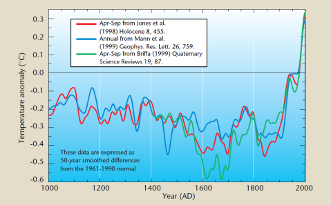
A different version of the trick was used in the 1999 WMO diagram. In this version, post-1960 instrumental values were spliced with proxy values of the Briffa reconstruction. Here is the diagram described in Jones’ trick email of November 1999.
As has been pointed out on many occasions, Mann (RC, Dec 2004) vehemently condemned splicing of proxy data and instrumental temperatures into one series as a methodology, even denying that any climate scientists had ever done so:
No researchers in this field have ever, to our knowledge, “grafted the thermometer record onto” any reconstruction. It is somewhat disappointing to find this specious claim (which we usually find originating from industry-funded climate disinformation websites) appearing in this forum [realclimate].
Despite Mann’s condemnation, in their submission to the Commons Science and Technology Committee in February 2010, the University of East Anglia defended the splicing of proxy and instrumental data, saying that it was the “best way” of illustrating the data:
as for the (now notorious) word ‘trick’, so deeply appealing to the media, this has been richly misinterpreted and quoted out of context. It was used in an informal email, discussing the difficulties of statistical presentation. It does not mean a ‘ruse’ or method of deception. In context it is obvious that it is used in the informal sense of ‘the best way of doing something’. In this case it was ‘the trick or knack’ of constructing a statistical illustration which would combine the most reliable proxy and instrumental evidence of temperature trends.
In a March 31 CA commentary on the report of the Commons Science and Technology Committee, I provided the above quote from the University of East Anglia submission and then commented:
there is no valid statistical procedure supporting the substitution of tree ring proxy data going the wrong [way] with instrumental temperature data to create a false rhetorical impression of the coherence of the proxy data.
Remarkably, Angliss not only took exception to the above statement, but claimed that I had had the temerity to make claim that is “not supported by the published record”, using this as his lead example.
Angliss wrote as follows:
McIntyre wrote at Climate Audit that
there is no valid statistical procedure supporting the substitution of tree ring proxy data going the wrong [way] with instrumental temperature data to create a false rhetorical impression of the coherence of the proxy data.
If the scientists had actually substituted or replaced the tree ring proxy data with instrument data, then McIntyre and Fuller would have a valid claim of fraudulent behavior by Phil Jones et al. However, nothing was substituted or replaced.
Looking closely at the graph shows that the tree ring data was neither replaced nor substituted. The zoomed-in version of IPCC TAR WG1 Figure 2.21 at right shows that the instrument data starts around 1900 (red line, red arrow added) while the tree ring data ends at around 1960 (green line, green arrow added). If the tree ring data after 1960 were simply substituted or replaced as McIntyre and Fuller claim, then the instrument data would have been appended to the end of the tree ring data or the instrument data would be shown in green in order to maximize the potential for misinterpretation. Neither is the case.
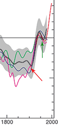
Angliss’ trick is easy to spot. The trick email was about the WMO 1999 diagram; Angliss has shown the IPCC trick – which, as noted above, has a different version of the trick. The blow-up of the IPCC TAR diagram is obviously one that I’m familiar with. I originally pointed out the deletion of post-1960 Briffa data in this diagram in May 2005 here – including my own version of a zoom.
As CA readers know, I avoid making allegations of “fraudulent behavior”. However, under the circumstances, I note that, in the WMO 1999 diagram (the topic of the trick email), Jones “actually substituted or replaced the tree ring proxy data with instrument data” – conduct which, according to Angliss, triggers very serious conduct issues on Jones’ part, which Angliss and desmogblog may wish to pursue.
Angliss made other untrue allegations about me, which I’ll respond to when I get a chance – none of which have any more substance than Angliss’ confusion over different versions of tricks by the Team.
However, Angliss’ inability to tell one Team trick from another obviously qualifies him, along with desmog, for membership in the Gang that Can’t Shoot Straight.
Update June 23 11.20 pm: Brian Angliss has graciously conceded at his blog that this part of his criticism was incorrect and has struck out the relevant paragraphs of his post.


97 Comments
So, basically, he is saying “that’s not what was done over ‘here'” when you describe how it was done “there”.
I think this is the dictionary definition of misdirection.
Hoisted, again. The smog thickens.
I thought there was no controversy over what happened with the WMO cover chart. CRU said
In the email in question Phil Jones had written
Royal Society Research Professor at the University of East Anglia, Andrew Watson, explained this in an article in The Times
Time reported a confirmation of this description
Henry,
There are different versions of the trick. I’m just wondering – did you read what Steve McIntyre wrote above? Were you able to comprehend it? Most everyone who has been following this issue knows what CRU, Jones, Watson and Time have written.
Let’s take some of these comments one at a time:
1. CRU wrote – “This email referred to a “trick” of adding recent instrumental data to the end of temperature reconstructions that were based on proxy data.”
Question: Is adding instrumental data on the end of a reconstruction based on proxies a valid statistical practice? Yes or No
2. Jones wrote – “I’ve just completed Mike’s Nature trick of adding in the real temps to each series for the last 20 years (i.e. from 1981 onwards) and from 1961 for Keith’s to hide the decline.”
Question: What decline was Jones hiding? Is an attempt to “hide the decline” academically acceptable or is it academic misconduct?
3. Watson wrote – “They draw the line to follow the tree-ring reconstruction up to 1960 and the measured temperature after that.”
Questions: Is this a valid statistical practice? Yes or No If the reconstruction after 1960 is not trustworthy, is it possible to know the reconstruction prior to 1960 is trustworthy? Yes or No
4. Time wrote – “simply referred to the replacing of proxy temperature data from tree rings in recent years with more accurate data from air temperatures.”
Questions: Is this a valid statistical practice? Is the practice found in any statistical textbook? Yes or No
I look forward to your answers.
I’m not sure why you are asking me those questions or in that tone. I tend to agree broadly with Steve. The possible misconduct has been after the event in justifying the reconstructions by igoring criticisms.
Your third question would be better stated as “If the reconstruction failed to match temperatures after about 1960, then what is the uncertainty in the reconstruction of temperatures before 1850?”
Henry
I can see why Ron Cram questioned your motives as he did. You appear to support the responses made by the Time mag as well as Jones et al, donc the quetsions are testing if Ron’s interpretation( and mine ) are correct. Tone in script is a difficult one to determine. Words of themselves carry no inflexions, tone etc when written nor does the graamar. It is the reader who adds the tone as he/she reads the words and that tone tends to be a reflection of their own attitudes and baggage.
..”It’s an analytical technique that has been openly discussed in scientific journals for over a decade — hardly the stuff of conspiracy.”
RegEM?
What an odd pairing of adverb and verb in the phrase “richly misinterpreted.” Someone didn’t want to suggest that things were widely misinterpreted? Google finds 1,560 uses of the phrase “richly misinterpreted” and all but one hook up to this same piece of East Anglia gobbledygook.
As a statistician with some experience in handling “messy data”, I am appalled at the cavalier approach that the so-called climate scientists have displayed in their collection, analysis, interpretation and presentation of data.
To begin with, the deletion of tree-ring data due to the divergence problem is simply unbelievable. No legitimate scientist deletes data without a good assignable cause, and the mere fact that no one can explain the divergence problem and its causes means that this data should never have been deleted. Simply assuming that the divergence problem is the result of some unidentified anthropogenic cause is just astounding. These are scientists??? Under what pretext do they ignore fifty years of tree-ring measurements, from 1960 to the present?
Secondly, there was in fact a cover-up of the “trick” to hide the decline. Before Climategate not one of these climatologists was forthcoming about this issue, and they only attempted to explain this away after they were caught. This behavior is reprehensible and is in no way defensible in good science.
Thirdly, why is there ongoing adjustment of data, up and down, year after year? What justification can there be for tweaking the numbers up or down to fit models that appear to be poor predictors of actual climatic conditions?
Lastly, and to me the most damaging, is the general lack of openness regarding raw data and methodology exhibited by the climatologists even today. If the science is as robust and as airtight as they claim, they should be eager to share the data, share the methods of analysis, and challenge the skeptics to take their best shots at the science. The secretive behavior, the lack of openness, the juvenile name-calling undermine whatever credibility these people have.
Climate science has suffered, perhaps irreparably, from the behaviors of some of the leading proponents of AGW, such as Jones, Mann, et al. The poor handling of data is but one symptom of incredibly poor scientific practice. As the climatologists themselves say, “the work is fatally flawed”.
Vito
Succinct!! Muy bueno
Wikipedia’s explanation of “the trick” (which is largely my work) is decent, using graphs provided by UEA to demonstrate quite clearly what Jones was up to — for this partic trick, anyway.
John Tierney wrote in the New York Times that “the graph adorned the cover of a report intended for policy makers and journalists. The nonexperts wouldn’t have realized that the scariest part of that graph — the recent temperatures soaring far above anything in the previous millennium — was based on a completely different measurement from the earlier portion. It looked like one smooth, continuous line leading straight upward to certain doom.” Tierney quotes Michael E. Mann replying to a skeptic who raised this very issue about tree-ring data at the RealClimate blog:
“No researchers in this field have ever, to our knowledge, ‘grafted the thermometer record onto’ any reconstruction. It is somewhat disappointing to find this specious claim (which we usually find originating from industry-funded climate disinformation Web sites) appearing in this forum.”
Tierney continued, “Dr. Mann now tells me that he was unaware, when he wrote the response, that such grafting had in fact been done in the earlier cover chart, and I take him at his word. But I don’t see why the question was dismissed so readily, with the implication that only a tool of the fossil-fuel industry would raise it.” “E-Mail Fracas Shows Peril of Trying to Spin Science”
As you say, no observer who’s done even a modicum of due diligence will believe UEA/Gavin/Nature etc’s protestation that ‘trick’ was “slang for a clever (and legitimate) technique.” (Nature 462 (7273): 545–200. 2009. doi:10.1038/462545a}
Mr McIntyre
Brian Angliss’ argument is based, substantially it appears, on DeepClimate’s exposition of what was actually written about and discussed, pre- and post Arusha in the emails.
To DC’s credit, the CA post in question seemed initially to make the rhetorical impression that the TAR ‘trick’ consisted solely of Mann bringing pressure upon Briffa to delete the post-1960s part of his curve and thereby to ‘hide the decline’. You made an amendment the very next day, based on his feedback, to this post. Contrary to what he claimed however, if carefully read, the post does not actually rely on that rhetoric alone anyway.
DeepClimate resurrected this ‘analysis’ recently, as we know. He should read your posts with an open-mind, which I am afraid he has floundered on, a bit.
The original CA post (?10th December) was written in a period when “the emails have been taken out of context” was the standard line of defense – this post provided the much needed context which appeared damning.
The next line of defense now is: – “we cannot have enough context from the emails alone”.
Steve: He’s criticizing a blog post of March 31, 2010 in which I was commenting on the COmmons Select COmmittee report, not the Dec 10, 2009. As you observe, with further analysis, the context of the trick was further clarified – with the review in my Heartland presentation being my most recent effort, incorporating lines of analysis that were not apparent in the first context. Having said that, the relationship of the trick to effort to appear to show a consensus, which were discussed at Arusha, seem relevant and indisputable to me.
From the front cover of the WMO leaflet:
[http://www] .wmo.int/pages/prog/wcp/wcdmp/statemnt/wmo913.pdf
Front cover: Northern Hemisphere temperatures were reconstructed for the past 1000 years (up to 1999) using palaeoclimatic records (tree rings, corals, ice cores, lake sediments, etc.), along with historical and long instrumental records. The data are shown as 50-year smoothed differences from the 1961–1990 normal…(Sources of data: P.D. Jones, K.R. Briffa and T.J. Osborn, University of East Anglia, UK; …
From the graphic:
Apr-Sep from Briffa (1999) Quaternary Science Reviews 19, 87
from this reference there are 2 similar plots
[http://] post.queensu.ca/~biol527/Briffa%20and%20Keith%202000.pdf
Fig. 1. Northern ‘high-latitude’ temperature changes over the last 2000 years. The curves show selected reconstructions of summer (annual series a + d) temperatures or temperature-sensitive tree-ring chronologies: … The bottom curve is the average of the other data sets after rescaling to give equal mean and variance (over the common period 1601-1974), also plotted as 50-year smoothed values.
This plot is continuous to 1999(?) and is the typical temperature curve. and looks similar to that on the WMO document and obviously requires no splicing of temperature records.
The curve you seem to favour is presumably derived from fig 5:
Fig. 5. An indication of growing season temperature changes across the whole of the northern boreal forest. …The LFD curve indicates low-frequency density changes produced by processing the original data in a manner designed to preserve long-timescale temperature signals (Briffa et al., 1998c). Note the recent disparity in density and measured temperatures (T) discussed in Briffa et al., 1998a, 1999b). Note that the right hand axis scale refers only to the high-frequency density data
How do you know which plot is used on the front of the WMO leaflet (not a scientific peer reviewed publication, by the way!)?
The Briffa document is explcit in the decline problem:
…significant outcome of this ‘hemispheric-scale’ corn¬parison between the summer temperatures and NHD1 (Fig. 5, also confirmed in the low-frequency density curve) is an apparent divergence in the post-1950 trends (Briffa et al., 1998b). High-frequency associations (not shown here) remain strong throughout the whole record, but average density levels have continuously fallen while temperatures in recent decades have risen. The disparity is greatest in eastern N. America and eastern Eurasia (Briffa et al., 1998b) (cf. the recent divergence between density-based temperatures and ring growth at Yamal and Tornetrask in Fig. 1 and the discussion in Briffa et al., 1992). As yet, the reason is not known, but analyses of time-dependent regional comparisons suggest that it is associated with a tendency towards loss of ‘spring’….
It should be noted that data has not been deleted (Vito DiPaola
Posted Jun 11, 2010 at 7:03 PM) It is documented in the referenced publication.
Briffa states explicitly that the do not KNOW the reason for the decline.
There are important implications in this observation not least the possibility of biased regression coefficients in attempts to reconstruct past low-frequency temperature change based on long density series calibrated against recent temperatures. These may overestimate past temperature levels and underestimate the extent of apparent 20th century warming (but see later discussion and that in Briffa et al., 1998c).
I am not sure what people are trying to prove here. Are you saying that because a few tree ring densities show a declining proxy temperature that the instrumental record is wrong. or are you saying that invalid data should not be removed having noted its existence?
Steve: Ford, ford, none of the above. The tree rings were not measured wrong; the data is not “invalid” ; it just didn’t do what Briffa wanted. No one said densities going down meant that temperatures went down – only that the deletion of the data gave a false rhetorical impression of the consistency of the proxy record.
But please … the trick itself has been debated lots of time. You’re just wasting time arguing about it again. What’s at issue here is Angliss’ bait-and-switch, in which he wrongly argues that I mischaracterized the trick. Even you must concede that Angliss switched tricks.
But why does ford allow himself to be so misled? Ford? Do you admit the error? And why do you err thus?
When I rad commentaries such as this I always think of Scholastic philosphers and hosts of angels dancing on the head of a pin.
There are several tools logical tools which could be put to good use here. They are Deduction, Induction, Symmetry and Occam’s (also spelled “Okham’s”) razor.
Deduction – something is absolutely proveable (e.g. a scientific law).
Induction – the preponderance of evidence suggests something is true (if it waddles like a duck, quacks like a duck and looks like a duck, it probably is a duck).
Symmetry – The same rules apply to all sides of an argument.
Occam’s razor – The simplest explanation which fits the available facts is probably the correct answer.
To all of this, I don’t believe TheFordPrefect has met even the veriest scyntella of unobfuscated or misrepresented evidence to support his case.
Use all the above tools you can (you may not be able to use deduction quite often) against the known facts. It ain’t exactly pretty for alarmists…
DeSmogblog has an agenda:
“DeSmogBlog seeks to uncover the spin and propoganda that dirty energy interests masquerade as expert opinion in the theatre of politics. We seek to clear the air and help show readers the bigger picture”
Pardon me but I don’t believe a word of it! IMO, DeSmogblog manufactures smog, to hide the weakness in the CAGW “science”.
Angliss says
But the tree ring data doesn’t “end at around 1960,” it’s the graph that does. That’s the whole point. The post-1960 tree ring data was “neither replaced nor substituted”– it was deleted.
Ross, Exactly so. Also, note the point of the termination of the running mean and the end padding that resulted (Some of the data that helped construct that running mean for 15 years prior to 1960 were deleted).
And this nth discussion has not yet gone back to the handle again, for an explanation of how several different reconstructions were tailored into one.
Is there a graph available that includes that deleted data after 1960 ?
Yes, Steve’s Trinity College presentation includes the before/after graph, see here.
oops. Link: https://climateaudit.org/2010/05/06/trinity-college-presentation-march-2010/
What I find remarkable, on top of all else, is that both sides of the argument have to rely on blown up screen shots to make a point.
“Where’s the data?” is what should be asked.
Why can’t researchers look at the table of data the graph is based on, for god’s sake?
If tried to present a graph at a coporate meeting, with out having the underlying data, and the supporting calculations, I may as well start updating my CV.
Hey, at least they’re recognizing the value of audit. As long as they seek to understand what really happened the truth will gradually dawn on them. In the end they’ll see their heroes for the alarmist shills they really are. High ideals driven by bad science.
I notice that you did not answer my 1st post.
The plot on the leaflet couled be either of the plots shown in the referenced document.
To me it looks like figure 1 without any grafting of data.
Why do you insist it is from Fig 5 with grafted data?
“Are you saying that because a few tree ring densities show a declining proxy temperature that the instrumental record is wrong. or are you saying that invalid data should not be removed having noted its existence?”
Read the blog. There is ample clarity as to what the issues are.
Ford,
Re:
[http://] post.queensu.ca/~biol527/Briffa%20and%20Keith%202000.pdf
Fig 1. Averaged plot.
This is interesting for 2 reasons.
It shows a MWP warmer than the CWP – a property not captured in the WMO graphic.
I can’t find where Briffa explains how he gets the average plot to go up at the end. He’s averaged 9 plots, 8 of which go down over the second half of the 20th century, only Briffa 1992 (Yamal) goes up, to arrive at an average plot which goes up over the last half of the 20th century. Where does he set out his good way of doing that? It’s this particular methodology we need to compare with that used in the WMO graphic.
SM seems to have answered your question directly. Even though the premise of your question is at best imcomplete — which is disappointing coming from a person with perfect in their handle, or is it as perfect a FORD PINTO
The point you seem to be missing is that the post 1960 divergence between the instrumental and the dendro- record came to Briffa et al like the thirteenth stroke of a clock, casting doubt, not merely on its future accuracy (as their apologists would have it) but upon all its earlier chimes. They knew they had a problem in the decline in the dendro- record. The emails reveal their determination to hide it, and the way they went about it. Clear now?
“To me it looks like figure 1 without any grafting of data.
Why do you insist it is from Fig 5 with grafted data?”
I didn’t try to follow your rather interesting URLs, but I’d imagine that he insists that it is Figure 5 rather than Figure 1 because Figure 1 deals with “temperature changes over the last 2000 years”, while the figure on the cover apparently states that it’s “temperatures were reconstructed for the past 1000 years”.
2000 does not equal 1000, therefore they didn’t use Figure 1.
jimT!
Is it difficult truncating Fig 1 at 1000!!
The links by the way are simply split with [] to enable posting without hitting the spam filter. Copy and paste the total link to the address bar and then edit out [] and any spaces.
Bender. Please answer which figure the data for the leaflet is from. Have you asked the WMO? Their leaflet (not meant to be a research paper) simply suggests reading the referenced Briffa document for more information.
The most likely plot is therefore from Fig 1 which has complete data from 1000 to 1999(ish).
This does not require the slicing off and grafting on of the instrumental temperature record that McIntyre claims has been done.
Just asking.
Re: Thefordprefect (Jun 12 05:53),
Ford, is it difficult for you to look at the WMO diagram and see that while the diagram begins in 1000, Briffa’s data begins in 1400?
How hard is it to see that when comparing your two selected diagrams, Fig 1 runs from 0-2000 while Fig 5 runs from 1400-2000. If Fig 1 was used, why did they ignore the data from 1000-1400?
The most likely choice, if I have to pick one of those two, is therefore from Fig 5 which only has data from 1400.
To use Fig 1, they had to mistakenly slice off 40% of the data they wanted for the WMO diagram. That would be even worse than what they did to truncate the inconvenient data from 1960 onward.
Oops. Please be more careful next time you troll through the data.
In any case, this is OT distraction. This has all been discussed before.
MrPete Posted Jun 12,
Of course I see theline terminating at about 1400!
Thank you for debunkning this whole thread:
The most likely choice, if I have to pick one of those two, is therefore from Fig 5 which only has data from 1400.
In other words you do not KNOW which plot is used. Amazing!
I would also like to point out this statement re Fig 1:
is a Siberian pine ring-width chronology from west central Mongolia, at 2500 m elevation (Jacoby et al. (1996a); Note that, even though the whole series is plotted here, the authors considers replication to be too poor before 1550 to be reliable). This is interpreted as evidence of annual (August—July average) temperature forcing and shows very warm conditions in the 20th century, unusual even in comparison to the warm 18th and possibly (much less certain) 16th centuries.
So there was a good reason to truncate at 1500.
Re: thefordprefect (Jun 12 19:21), Reason, logic and tranparency, Ford, would indicate that one should show all the data, perhaps using a different colour or line style where one believes the data is uncertain or unreliable and make a note in the text. That way, even the casual reader will note that there is something “not quite right” and investigate if they so desire. This is especially true given IPCC’s remit to “open and transparent” work – IMO, one cannot use “tricks” to make a case, however useful and desirable that may seem, if one desires openness and transparency.
Neil Fisher Posted Jun 12, 2010 at 7:51 PM
If you read the document by Briffa referenced by the WMO leaflet the decline is well discussed:
Fig 5 description:
Note the recent disparity in density and measured temperatures (T) discussed in Briffa et al., 1998a, 1999b).
text page 96
A significant outcome of this ‘hemispheric-scale’ corn-parison between the summer temperatures and NHD1 (Fig. 5, also confirmed in the low-frequency density curve) is an apparent divergence in the post-1950 trends (Briffa et al., 1998b). High-frequency associations (not shown here) remain strong throughout the whole record, but average density levels have continuously fallen while temperatures in recent decades have risen…
As yet, the reason is not known, but analyses of time-dependent regional comparisons suggest that it is associated with a tendency towards loss of ‘spring’ growth response (Briffa et al., 1 999b) and, at least for subarctic Siberia, it may be connected with changes in the timing of spring snowmelt (Vaganov et al., 1999).There are important implications in this observation not least the possibility of biased regression coefficients in attempts to reconstruct past low-frequency temperature change based on long density series calibrated against recent temperatures. These may overestimate past tem¬perature levels and underestimate the extent of apparent 20th century warming (but see later discussion and that in Briffa et al., 1998c).
and section 5.3 seems a fair discussions on the problem of tree ring use:
5.3. Changing Climate Sensitivity and ‘New’ Growth Influences
In the foregoing discussion, we have alluded to the fact that tree-growth, as represented in various standardised tree-ring chronologies in various parts of the world, often seems anomalous in the 20th century as compared to earlier centuries. Though my no means always true, this is apparent often enough to support speculation that `unusual things are happening’ across large areas…
UV radiation and a host of other environmental factors may all exert their influence on tree growth. To varying extents, such factors have always affected trees, but their recent influences, and especially the extent of their corn-bined influence, requires serious investigation, beyond that undertaken to date.
Please remember the document refered to by McIntyre is a small pamphlet not an in depth peer reviewed document.
From the pamphlet another regerence is:
[http://www] .pages.unibe.ch/products/newsletters/NL99_1_scr.pdf
In the immediate future, work will
continue on important statistical issues
related to the processing and interpretation
of all of the various tree-ring collections.
Potential anthropogenic influences
on recent tree growth will become
an increasingly important focus of the
work. Increased tree productivity during
the 19th and early 20th centuries and
post-1950 declines in tree density trends
have recently been identified in our
data. The extent, detail and implications
of these phenomena have yet to be further
explored. Chronology confidence
and the expression of climate forcing are
most strongly expressed on short (annual
to century) timescales. New
This hidden decline is shouted from the rooftops in numerous articles and publications. How is it hidden?
You understand that the issue is the graph, right? If the graph purports to show the data, and some of the data has been deliberately deleted from the graph, and there isn’t a legend that explains this, or an asterisk that explains it, or a reference to the text that explains it…how would someone just looking at the graph know that there’s a decline?
But what really amuses me about this line of argument is the assumed incompetency of the East Anglia folks. They are the ones who used the words…they intended to hide the decline, because…they said so. Did they succeed at hiding the decline, or is this another example of East Anglia incompetence?
Furthermore, they appear to believe that Mann came up with a clever way to “hide the decline”. Oops. Why are all these gov’t-paid scientists so interested in ways to hide the decline?
Yes, its a line of argument that says Jones isnt deceitful, he is rather a buffoon. I;m not sure which line I like better. both suit me just fine.
Re: thefordprefect (Jun 13 00:40),
“Discussion” is not the same as “showing.” Briffa saw the decline. He discussed it. And then it was hidden in the graphs.
TFP, if you don’t want people to conclude you are deceitful or a buffoon, you need to at least admit what Jones himself says about his own work: he hid the declining data by patching in other data… without revealing either fact.
You’re just digging a bigger hole for yourself. Stop wallowing in pity about this. Accept the facts and let’s move on.
Facts: the data declines; the hockey stick is busted; we need better data to understand paleoclimate.
Yes, it is sad that those who obfuscate what the science says will lose credibility as they come face to face with their own bias. But that’s how science moves forward.
Now we know that better and more careful review is needed, of archived data, methods, results.
If the Team had been required to generate these graphs using the methods of reproducible research, none of this would have taken place. There would have been sunshine on both the data and methods used to produce the graphs.
I have to believe the main reason peer review has been failing to find these things is that the data and methods are hidden behind a veneer of complexity. I.e., it’s too much work for the typical reviewer to actually verify and validate how the result was produced.
Switch to a method that automates reproduction of the results, and any reviewer can peek behind the scenes to see what happened. “Why is this un-sourced data? Why doesn’t this data match the archive? Why doesn’t the spaghetti graph data match the source data? What is this temperature data doing in a proxy diagram?” Those questions would be obvious… and the science would become more self-correcting.
We’ve come a long way in five years… obviously there’s a long way yet to go.
Re: thefordprefect (Jun 13 00:40), Ford, the big issue – for me anyway – is that the casual reader (which is likely to be more than 90% of all readers) of this document, or indeed the IPCC SPM’s, would not be aware that there was an issue that might have a significant affect on their judgement of the reliabilty of the data presented. Almost no-one has the time to chase down each and every reference and to digest the subtlties of various arguements – that is why things like the SPM’s exist in the first place. By “hiding” your uncertainty in the references instead of making them obvious, the authors have, I believe, set out to bias the interpretations of the readers. This, it seems to me, is anathema to an “open and transparent process”. It seems to me to be political staple (such as “we are spending more than ever before on…” without taking inflation into account etc) rather than a review of the facts. Since the SPM’s in particular are billed as being as review of the scientific evidence, I find it rather disturbing that anyone would try to defend any activity that gives the target audience a wrong impression.
In short, if you are billing yourself as independant and unbiased summarisers, you had better make sure that you define clearly and succinctly what is fact and what is opinion, because – as with this case – even a single instance where readers may confuse one with the other casts significant doubt on the entire corpus you have produced. “What else did they get wrong?” as it were. All of this is not to say that any or all of the people involved are being deliberately misleading – in my view, they have and continue to present what they believe to be the truth. But that is their opinion, when they have been asked to provide facts. By doing what they did, they are implying that their opinions are facts.
Re: thefordprefect (Jun 12 19:21),
TFP, you’re barking up the wrong tree.
I myself am a statistical lightweight. I haven’t looked at this issue in any detail. I simply examined the three plots VISUALLY and saw that it’s obvious you’re making up arguments out of whole cloth. I haven’t studied the paper; I’ve only had to look visually at the graphs to see you’re making this up.
You argued strongly for Fig 1. Your argument falls apart based on visual inspection. A mathematical analysis would shred your argument.
The WMO Briffa graph begins in 1400 (not 0, not 1000, not 1500. Care to suggest any other dates other than what we all can see? Obviously they were willing to show different start dates for the data in the WMO graph, so the simple conclusion is they showed Briffa’s data at whatever starting date was appropriate. If 0, 1000, or 1500 were best, why did they pick 1400?
The WMO Briffa graph ends in 2000. Clearly it does not match his own data. Jones’ “trick” email explains why it doesn’t match. What basis is there to presume that Jones (and Steve) are wrong about this, when Jones is the guy who actually pulled off the “trick” in this case?
Those are simple observations, simple questions.
TFP, it’s obvious you’ve got a predetermined conclusion, i.e. Steve must be wrong, and so you are completely unable to accept what is transparently visible in the graphs, let alone what Steve has shown through his analysis. Sad.
Steven Mosher Posted Jun 13, 2010 at 5:04 AM
You are not a nice person!!! Why do you find it necessary and good to denigrate a scientist?
RDCII Posted Jun 13, 2010 at 1:43 AM
The plot is the front cover of a leaflet not a scientific research paper. Do you disagree with the values of temperatures plotted over the last 100 years?
For the general public nice simple plots are required, and this is what was provided.
They should have acknowledged the lats 100 years as instrument records.
Mr Pete Posted Jun 13, 2010 at 6:13 AM
The start date is irrelevant unless prior to 1400
My conclusion is that you have no proof of which plot is used. My predetermined conclusion is that it is irrelevant since the plot shows probable temperatures until 1800s and actual temperatures there after and is suitable for public consumtion.
How can McIntyre analyse something when you do not KNOW what to analyse?
Phil Jones described the grafting procedure in November 1999 e-mail titled “Diagram for WMO Statement”
He confirmed that it had been done in the BBC interview (“joining the earlier valid part of the tree-ring record with the recent, more reliable instrumental record”)
Angliss states that if such grafting happened, Steve would have a “valid claim of fraudulent behavior by Phil Jones et al.”
Which part do you dispute, if any? Not sure if I have missed something. The point is that PJ confirms, does not deny, the procedure. Which figure was targeted is about as relevant as color of PJ’s socks while carrying it out.
Quote above attributed to Phil Jones:
“joining the earlier valid part of the tree-ring record with the recent, more reliable instrumental record”
And how did Phil determine that the earlier part was “valid” and the later part (the part hidden from view) was “invalid”? He didn’t. He merely assumes this because it’s convenient for the alarmist case to do so. The latter portion is in fact valid and the divergence between expectation and observation is a real problem.
This has been stated so many times before that it seems ridiculous to reiterate. But there appears to be a campaign of misinformation going on right now, with uninformed ideologists like “Wott’s up with that” (not “Watt’s up with that”) getting the facts all wrong.
Read the blog. The uncertainty levels are not comaparable through time with these different temperature estimators. That’s why Briffa is right that it is not correct to graphically compare temperatures today to temperatures a thousand years ago: uncertainty balloons through time. That’s why splices are fit for neither public consumption nor policy-maker consumption. Read the blog.
I can’t believe folks are still debating the facts surrounding “hide the decline”. What, are you hoping when people’s memory fades, you can supplant the missing information with misinformation?
I did not write this blog post – Mcintyre did.
Take up your gripes with him,
Wake up, ford, you’re in the ditch! My gripe is with your incorrect statement that the public needs simple graphs. It’s the alarmist movement that needs deceptively simple graphs – to advance their cause. The public needs graphs that make good sense. Briffa was unwilling to argue that modern temperatures are warmer than the MWP. Why did he refuse to go out on that limb? Why did he not just eyeball your public-friendly “simple graph” and come to the same conclusion as your gang? Because he’s no dummy. That’s why.
Especially if you’re trying to fool them.
Exactly my point. That’s why Mann was adamant that no splicing was ever done. Because it would indeed by a foolish thing to do. I would go one step further and argue that error-free spaghetti diagrams should never be allowed, that they are deceptive to the point of unethical.
Where’s ford’s reply? Why does he launch flaming bags of poop at the doorstep of this blog and then run away like an adolescent?
-thefordprefect said:
The plot is the front cover of a leaflet not a scientific research paper. Do you disagree with the values of temperatures plotted over the last 100 years?
RDCII says:
A complicated question..but irrelevant to the issue. The data is what it is…but why do people want to hide some of it?
-thefordprefect said:
For the general public nice simple plots are required, and this is what was provided.
RDCII
Not clear why showing ALL the data would complicate the plot. Unless, of course, the public are idiots.
Re: thefordprefect (Jun 13 07:16),
TFP, give it up. You’re digging only deeper holes for yourself!
The “probable temperatures until 1800s” are just as improbable as those that are hidden.
You just don’t get it, do you.
I think it may be time to close shop on this thread. Anyone who still doesn’t understand needs some elementary logic lessons.
When they rabbit on about “trick” meaning “clever but honest technique” they are making us look at only one pea. There are at least three peas here.
The second pea is the “hide” in “hide the decline.” “Trick” is defined out of significance and into innocence, but “hide” is never mentioned.
In this context, “hide” can only mean “conceal” – to place something where no one can see it (or at least, almost certainly not notice it). Can a scientist concealing some pattern or value in his data be honest? The only answer that occurs to me is, “No.” It must necesarily and always be dishonest.
That means Mann was dishonest and Jones not only approved of his dishonesty, but repeated it.
The third pea is the purpose of the graphs. They allegedly show unprecedently high temperatures recently and an unprecedently high rate of increase. However, “unprecedently” depends on the proxies being an accurate substitute for the instrumental reading for 1,000 years (roughly) prior to 1960.
The instrumental readings are just that. It is only if the proxies are accurate in that sense that the UEA’s submission could be correct. We know they are only “correct” over the calibration period at best and cannot know if the calibration equation(s) hold over the time span of the graphs. We know they don’t after 1960, and Mann, Jones et. al. knew they didn’t – hence the “trick.”
I also know that Osborn is busily trying to fix teh “decline” (I made application for his programs and data with the usual result).
Returning to “trick” briefly: I was originally a chemical engineer. There are plenty of tricks around that profession – meaning techniques that yield acceptably accurate results for the task at hand, but which are actually shortcuts to reduce the computational load or dance around a lack of data or whatever.
However, one needs to be very careful using “tricks.” for example, I remember as a student in 1965 a lecture on the statistical thermodynamics of gases by a Professor Alexander. He was deriving some equations that involved calculating factorial n, where n was the number of molecules in the system under study – normally a humungous number, so that n! is hugungously humungous.
So Alexander says, “Well, there’s a problem here but we can get around it by using Stirling’s approximation for n! whcih is valid when n is large.” (It’s ((2 * pi * n ) ^ 1/2)* (n / e ) ^ n, whcih is computationally feasible even fro large n).
What a great “trick.”
Trouble was, three blackboards later in the same calculation, Prof. Alexander says, “Now, when n is very small …” All hell broke loose in the lecture theatre.
Some “trick.”
I’m going to make an observation, surely trite by now, about that 1999 WMO diagram. Observe that the “normal” about which anomalies are plotted is the 1961-1990 line. Visually one has the jarring consequence that, for 950 years the temperature was subnormal, followed by less than 50 years of above-normal. The “normal” line certainly could not be inferred from the graph itself!
Absent acknowledgement of the nonsequitor that there is anything “normal” about any 30-year period in the temperature record one is likely to select, and ignoring the erasure of MWP and LIA, if one takes this graph at face value it says that the earth has been ABNORMALLY COLD for almost a millennium and has only just rebounded to an extremely brief period of corresponding abnormal warmth. This is before considering that the baseline for “normal” therein contains the second-lowest period of temperatures in the 20th century, during which “scientists”, journalists and politicians were shrilly declaiming the threat of an oncoming ice age. A decade or two that rises above that line is a complete nonevent. An entire millennium below it gives an alarming impression.
On a different note: Steve I hope you have publicly called Mann out on this business of “… this specious claim (which we usually find originating from industry-funded climate disinformation websites)” First, the “claim” does not originate from websites, as I understand it, but was originally raised in your (and others’) comments in the IPCC review process, and subsequently discussed on the web. Second, while it has been discussed in many web fora, I think it would be fair to say that the material fact he is construing here as a specious claim likely “originates” through this site or some closely associated with it. Third, Mann prefers to hide behind categorical statements about websites rather than naming them. Can he be pressed to name Climate Audit? Fourth, assuming so, then he needs to substantiate the modifier “industry-funded”. If he can’t (and as I understand it, he can’t) he ought to be coerced or shamed into a public retraction.
The other point about using a 1961-1990 baseline while deleting the Briffa reconstruction after 1960 is that it should then be impossible to base the earlier data. And this is still half a problem with the other two reconstructions truncated at 1980.
But these are minor issues compared with the unanswered questions about reconstructions which fail to match recent temperature patterns, or the selectivity involved in finding the few trees which do.
If my memory serves me well I seem to recall that the software hack was made to provide a base line measurement
More smoke and mirrors, as usual. Thanks Steve for continuing to shine light where it is needed.
And, OT I know, but Ford: Smell the coffee already! As if proxies on their own are not unreliable enough (given the non-linear nature of many of them, including notably tree rings, as has been demonstrated with the famous ‘divergence’) it is nothing less than scientifically invalid to just replace the bits of data that don’t fit the Story with data from another record to make the story continue as you would have it written. It doesn’t matter that the substituted data was from real observed temps – you’re still mixing apples and oranges, and to understand the invalidity of that practice is to simply go back to your primary school teachings. When looking purely at temperature *changes* over time, Mann’s HS simply shows the change from an apple into an orange. And we know in the real world that is impossible.
Geddit?
The trick email was about the WMO, but the post you referred me to and your “tricking the committee” post both refer exclusively to the TAR. As such I limited my response and claims about your work to just the TAR. I didn’t discuss the WMO in any way, as any reader of my entire post can see.
I’m curious why you claim that I addressed the WMO trick email when I focused exclusively on the TAR.
At S&R you cited Steve’s claim from the “Tricking the Committee” post:
You state that you limited your responses to references to TAR, but Steve’s above quote from “Tricking the Committee” is clearly a response to the Parlimentary Committee’s citation of UEA’s submission (to said committee) and it’s interpretation of Jones’s “trick” email.
Steve: Yup. I just made the same point over at S&R.
Hopefully, Angliss will be less stubborn about conceding simple points than Upside Down Mann.
I just made the same point over at S&R, but it fits here too. I know SOP for climate debating is to be as aggressive as possible – the pitbull technique – but despite the provocation, there’s no need to fall into the trap of thinking it’s reasonable behaviour.
Steve, are you really so thin-skinned by now – I can understand why your thicker skin might have been worn away – that you can’t say to Angliss ‘I disagree with you, and I’m happy to discuss it politely’, instead of responding to his vague aggression with vague aggression of your own? If the two of you take a step back, can either of you imagine carrying on a discussion in this way in any other field of your life, or is it a bit embarrassing that two adults are carrying on like slashdotters?
Steve is right. And the other guy is wrong. And that’s what matters, ultimately. I don’t need a heart-warming dialogue between a guy that is almost always right and a guy with an attitude problem who hasn’t said one right thing since appearing here. Sometimes you’re best just slamming these fakes down in one shot and being done with them. There are too many of these posers now trying to take Steve down with junk ammo. You can’t expect Steve to deal with each and every whacko that things he’s stumbled across something that Steve has missed?
Sorry to sound so partisan, but in the spirit of Michael Tobis – you whackos completely underestimate how qualified Steve is. But, hey, have fun. It’s your 10 minutes of fame.
Speaking of posers, whatever happened to Tom P?
Bender>
Being engaged in debunking doesn’t automatically protect you from the perils of groupthink and/or a circle-the-wagons mentality.
Brian, heed my advice: cut your losses. In the future, email Steve in advance and your analysis is correct before making wild pronouncements on the web. You’re going to hurt yourself, running with scissors.
Brian Angliss has graciously conceded at his blog that this part of his criticism was incorrect and has struck out the relevant paragraphs of his post.
That’s pretty responsive and I actually applaud his diligence. The more he digs, the more he is going to learn about this fascinating case. The more auditors, the better.
Steve
In e-mail 0951763817.txt Tim Osborn states:
“(I’ve already truncated the series at 1960 because of the problems with the recent period.)”
for me this makes it problematic asserting:
“Mann replaced post-1960 values of the Briffa reconstruction with instrumental values, then did a smooth, then truncated the Briffa reconstruction back to 1960”
I would therefore be interested to know on what basis you make this assertion?
Steve: reverse engineering. It isn’t reported by the authors, but Jean S, UC and I have examined the results carefully and reported the results in previous CA posts.
Doing 30 smooth requires 30 years of data. If the last point is 1960 then that usually means that they had data up until 1975. SteveMc demonstrated in other posts that one cannot reproduce the curve unless one uses instrument data for the 15 years from 1960 to 1975.
Within 30 minutes of asking, someone OTHER than Steve gives you the answer. What does that say about the level of familiarity with the issue within the two camps?
Give it up. Climategate is pure bad. There is no face to save. In fact, it gets worse …
Steve – this is one interesting aspect of Judith’s “tribalism” point. There is a large (and well-educated) “community” here that is familiar with minute details of this dispute – a point under-estimated by visiting firemen.
Bear with me here. I am not trolling, just curious on behalf of a friend who won’t read this website b/c he is convinced that it’s a big oil conspiracy. As a stickler for detail, Steve, I’m sure you will appreciate the need to be squeaky clean on all these issues.
The report in question is the IPCC TAR (yes?). The quote from 0951763817.txt is in relation to the preparation of the TAR figures (yes?). How do you reverse engineer who did the truncation in that instance other than looking at the climategate e-mails? My question is not that it was done (clearly it was, to “eliminate the non-temperature signal” (0951763817.txt)!) but who did it. You assert that it was Mann, but I do not see the evidence for that in relation to the IPCC TAR. I am truly sorry if you have covered this in other posts – I thought I had read them all, but maybe you could point me at the ones I am obviously missing.
Keep up the great work, I for one really appreciate all you have done.
It does not matter who had the scissors – ipso facto Mann messes with the end point on Briffa’s reconstruction *after truncation*. Had Mann merely plotted the series truncated at 1960, there would have been a sharp downturn and a dangling endpoint clearly visible. By adding the insturmental series, smoothing, and truncating again, the end point in the TAR graph appears to merge with Jones et al.
If this was not a “trick” to “hide the decline” then why didn’t Mann just leave the truncated Briffa series alone?
As an observer I would say it does matter given the current climate of name calling.
Excuse my density but my reading of all of the above articles (I re-read them) was that it was the *truncation* (and superimposition) that was the trick, *not* the smoothing. As far as I can tell Mann *did* plot the data that Briffa gave to him. The difference in the plots represent the difference in Briffa data, the climategate e-mails say as much. I just don’t see any reference that shows that Mann re-truncated the data.
IANL but it seems Mann could simply claim that he was merely plotting the data he was given.
I dearly want to see my mistake, but its eluding me right now.
Steve- Please read my Heartland presentation for a careful delineation of who did what.
Was this the data he inverted? Or am I confused.
Very nice! That does a good job of putting the “trick” in context. Not sure Mann has a leg to stand on …
All variations of the “trick” can be traced back to Jones’s email where he describes adding the real temperatures to “hide the decline”. All variations of the “trick” necessarily involves a process for splicing diverging series. I’m afraid I don’t understand how you could possibly conclude that the IPCC TAR trick was only about truncation.
You don’t need an email to tell you that the endpoint of the truncated Briffa series was processed. The unprocessed endpoint (even after truncation) turns sharply down and leaves a clearly visible dangling endpoint – not disappearing into Jones et al as it does in TAR. Or are you suggesting that Briffa processed the endpoint of the truncated series before sending to Mann? Not at all likely.
Sorry, the my comment was meant as a reply to andyp at 8:22.
Steve
On the whole I think you’ve made quite a few good points over the years, but the way you keep banging on about the use of the word “trick” is starting to annoy me.
I studied physics at Cambridge in the 70s, and the term “trick” – as used by Gavin – was in common parlance even back then.
Dusting off my copy of Pippard’s (the Cavendish professor of physics at the time) “Forces and Particles”, published as recently as 1972, I note that for the first problem in chapter 2 Pippard gives two solutions, the first headed “A straightforward solution”, the second “A trick solution using a vector diagram of velocities”. The second is much prettier, but both give the correct answer, and Pippard comments:
“The second solution is elegant, and the reader may always be permitted to feel proud when he devises an elegant solution to a problem. He should never forget, however, that it is more important to get a solution than to be elegant, and that the straightforward method is in general the one to aim for.
Personally, I don’t think Mike’s Nature trick is elegant, and hiding the decline is just ugly and wrong, but I wouldn’t fault people for using the word “trick”.
And while I’m here, I can make no sense of your claim that Mann used the Tiljander proxies “upside down”. To my mind this would mean that if the Tiljander data consisted of a set of ordered pairs (x, y), Mann replaced them with the set of ordered pairs (x, -y). Which he clearly did not – the graphs you show in your original article on this topic, while visually inverted, clearly show the same data. It’s just that in one graph the value on the y axis increases from bottom to top, on the other it increases from top to bottom. In terms of data, the two graphs are exactly the same.
The real issue seems to be the bogus correlation between the temperature and varve thickness in recent times. The way the graph looks on the page is neither here nor there.
I agree with you completely on everything, except for the “but” end of your statement. The use in mathematics of intellectual “tricks” to solve genuine problems. is a long appreciated and honoured tradition preceding the example you give. However, you will note that in such cases, one can identify something in the trick procedure approach which is clever and insightful producing an alternate solution or even an only solution in some cases.
Not only is the Mann “trick” not elegant, it is not an inventive alternate (or sole possible clever solution) to a mathematical problem in the sense you describe in Pippard. The real trick succeeds only in achieving the “ugly and wrong” in presenting visually a misleading story.
But that is exactly what has been done. In the ordered pairs, x = time and y = proxy value and, yes, (x, y) was replaced by (x, -y) in the way that the proxy was utilised in the Mann paper. Steve plotted the data to demonstrate this visually by reversing the axis rather than changing the sign. The incorrect use in this manner was indeed a result of the bogus correlation with recent temperatures.
Andrew,
The more complete citation of the venerable words of wisdom from Schmidt is that a “trick” is “a good way to deal with a problem”.
It follows, then, that a proper evaluation of this particular “trick” requires first asking what (and/or whom) was being referenced by the word “problem”. Answering this question will point you toward knowledge of whether or not this particular “trick” was an honest and praiseworthy one — or a dishonest and immoral one.
Regarding the upside-down proxies, I completely echo the responses here of RomanM and MikeN. These two comments deserve an answer from all those who have accused McIntyre of error on this question.
With respect to these inverted Tiljander proxies, the issue is clear, and elementary. The data in question were inverted due to a statistical error unworthy of a college freshman, and partly as a consequence of this, a result set that (assuming it contains valid proxies, which I am certainly not stipulating to) shows conditions that are within the historical range was declared or suggested to be evidence of unprecedented conditions. It is way past time for all those who picked up these false findings and helped to further propagate them came clean and admitted that they were mistaken. Everyone who has seen the actual data plots and the correspondence surrounding them can see what was done. Thus, I highly doubt that anyone who has seen such evidence is fooled by protestations to the contrary.
There is an obvious political bias apparent with many of the efforts to deny what has transpired with the upside-down Tiljander affair. While such bias, under the circumstances, is perhaps unavoidable from those who view mandatory CO2 restrictions as a tolerable burden, it still has no place in a scientific analysis of climatic data.
Richard T. Fowler
Substituting x,-y for x,y also just vertically inverts, but it’s the same data. Now average that x,-y data with other data x2,y2 that is not inverted. Do you see a problem now?
Gents, thanks for the responses, and I need to think about them, but I’m not convinced about the upside down business.
MikeN, when you say “it’s the same data”, that seems to me just wrong. If I were taking off in an aircraft whose trajectory was described by a sequence of ordered pairs (height, time), I would not be comforted to hear, were this sequence to be replaced by the sequence of ordered pairs (-height, time) that “it’s the same data”. I would on the whole feel that the concept “takeoff” had been replaced by the concept “crash”.
You obviously have not been exposed to the Mannomatic School of Climate Statistics. 😉
You can find an initial discussion of the situation here.
The effect is produced by looking in an automated manner at the absolute value of the correlation of the proxy with recent temperatures when selecting which proxies to use. However, the subsequent calculations incorporate the proxy in a manner consistent with the sign of correlation. In the case of Tiljander, the negative correlation is spuriously due to human intervention during the selection time period.
You might expect that a researcher would know in advance what physical processes produce the supposed relationship between temperature and proxy and not use those proxies for which the relationship is in the opposite direction. For Prof. Mann, this does not seem to be necessary.
Roman
This is probably increasingly off-topic for this thread, in the unlikely event that anyone is still listening, so Steve please snip away.
But.. I read Steve’s “Saturday Night Live” post when it first appeared. “My response at the time, when looking at Steve’s graph titled “X-ray Density (inverted)” and the graph from Mann’s paper was “But they’re exactly the same”. Except that Mann follows conventional scientific practice by having values increase along the y axis, and Steve, in the service of (snark ahead) pointless mystification, inverts the y axis so that he can claim that Mann used Tiljander “upside down”.
Surely the point is that there is a bogus correlation between varve thickness and temperature in recent years?
Even Connelley got the true point eventually:
http://scienceblogs.com/stoat/2009/11/tiljander_again.php
Re: andrew (Jun 23 04:26),
Surely the point is that good or bad proxy, one needs to handle the data properly.
Graphs are helpfully “flipped” to visually demonstrate correlations… and Steve clearly documents when he does so. There’s no reason for Y access values to always increase upwardly. It all depends on the analysis performed.
Respectfully Andrew and MrPete, you both somehow seem to have missed stating the two key points. I’m not saying either of you don’t understand their truth or their significance, but I’m going to restate them just for the record.
When McIntyre showed the graph with the y-axis inverted, all he was doing was taking the original graph and turning it on its side. You can see this quite easily, because he puts the original graph just to the left there. All you have to do is rotate that graph 90 degrees clockwise, and you have the graph McIntyre was showing, with the same orientation of the y-axis.
Thus, in that figure of McIntyre’s, McIntyre didn’t invert anything (i.e. y-axis) that wasn’t already inverted by the author(s).
The other key point here is _not_ that there is a bogus relationship. Before the 20th century, there is an approximate relationship which may or may not be valid to use (though just for that location, no need to get into these “teleconnections”). But Mann _flips_ this relationship so that the MWP appears “cold” and the LIA appears “warm”. (Remember your “crash” analogy, Andrew? 🙂 )
He does this ostensibly because the breakdown of the relationship in the 20th century causes an extreme shift in the direction that would have _previously_ suggested record cold temperatures. (This is the charitable view, the one that says we’ll just assume Mann didn’t have any idea about the error being made, even though it gave great support to his hypothesis.)
This error, then, enables the (erroneous and unjustified) inference that the “proxy” is signalling record temps, and since Mann’s code is indifferent to which _direction_ the changes are going in, it just takes the data and “assigns” them the direction that is consistent with the test hypothesis. This causes, not the y-axis to be inverted, but _rather_ the data themselves.
Sorry to get so long-winded about this, but I felt that these things needed to be stated explicitly, even if you both already understand them. There could be others who could come along and read your words — and those words, I believe, lend themselves to the untrue conclusion that only the y-axis was inverted, not the sign of the data.
The sign of the data most decidedly were inverted. The Hocky Team has already admitted this. And that’s the takeaway point.
Why is it important? Because Team supporters are out there right now trying to massively rewrite history, right under our noses, so they can resume denying that they flipped it. Just like 1984, as commenter Oliver K. Manuel has recently noted on this site.
RTF
Can you show us where attempts at rewriting the history of this case are being made?
Re: Richard T. Fowler (Jun 23 09:23),
There is a thread at Collide-a-scape that started June 16, 2010, The Main Hindrance to Dialogue (and Detente), which starts off with this characterization by climate scientist and RealClimate.org blogger Gavin Schmidt of my writing about the Tiljander proxies:
— begin quote —
One of the pathologies of blog comment threads is the appearance of continual demands that mainstream scientists demand retractions of published work or condemnations of specific scientists for supposed errors or other sins. Most often the issue in question has been discussed dozens of times previously and is usually based either on an irrelevancy, or was acknowledged clearly in the original or subsequent paper or is based on some misperception of the science.
— end quote —
Gavin’s comments in the thread are numbers 5, 29, 43, and 54.
My remarks are under both ‘AMac78’ and ‘AMac’, thanks to a C-a-s software problem. Per host Keith Kloor’s request, I avoided discussing specifics of this case until he allowed that in Comment #65. My final comment is #132.
The thread can serve as a snapshot of the current Consensus AGW stance on Mann08’s use of the Tiljander proxies.
Re: andrew (Jun 23 04:26),
I considered the point you raise, and ended up concurring with RomanM. A post on this subject is The Newly-Discovered Jarvykortta Proxy–II. You might find the annotated graphs of XRD vs. Time to be helpful in visualizing what Tiljander et al. (2003) claimed, and what was assumed in Mann08.
I also quote the relevant text from that 2003 Boreas article.
Nice summary, AMac.
Connolley got the point only after I explained it to him at the Cruel Mistress blog. And where did I learn what was happening with Tiljander? From this blog. So don’t tell me St4eve’s writing is confusing, ambigouous or opaque. If I got it, then any half-diligent reader can get it. The irony is that the other side – people like Connolley – demand a transparency that they themselves don’t subscribe to when dealing with us. Why should Steve be transparent if their only goal is to find something wrong in his data? 🙂
Ay caramba! Who would have thought a dead thread had so much blood in it?
Having succumbed to the senile itch to post on ClimateAudit, and having promised myself that my last comment on this thread would really be my last, I find myself compelled to reply to bender.
I’ve read the thread bender refers to, and Connelley’s comments seem perfectly reasonable to me. He takes Steve’s view that Mann used Tijlander “upside down” to mean exactly what any non-diligent reader such as I took it to mean – that Mann had changed the sign on the y values (leaving aside the point that this would mean that varve thicknesses were negative) – and quite correctly points out that this makes no difference to the results of a multivariate analysis.
When bender pointed out the real issue, Connelley said: “This is the first time someone has made a coherent argument over this (perhaps it has been said before but lost in the noise, if so my apologies for missing it).” I’m with Connelley on this. Steve had a point, but made it in an exceptionally opaque and confusing manner (at least to non-diligent readers), and preferred to make fun of “Upside-down Mann” instead of presenting a coherent argument.
Whatever can be said can be said clearly.
And, as a postscript, bender’s comment about “the other side” is a perfect exemplar of Judith Curry’s comments on tribalism.
Over and out.
I didn’t create the tribalism. The debate exists. You blame *me* for that? The one who chose to educate Connolley because he was too lazy and pernicious to read what Steve wrote? Over and out indeed.
Re: andrew (Jun 24 04:38),
There’s no great shame in supporting an argument that one later discovers is a bad one. But shedding logic, evidence, and common sense to support an argument that has already been shown to be defective: such behavior signifies… what?
Premise – If Mann08’s use of the Tiljander proxies is legitimate, there must be plausible “Yes” answers to these two questions.
Question 1 – Are the Tiljander proxies calibratable to the instrumental record, 1850-1995?
Question 2 – Mann08 accepts the only relevant authority’s interpretation of one proxy (darksum), but entirely rejects their interpretation of two others (lightsum and XRD). Is it acceptable practice that Mann08’s authors failed to describe this highly unconventional approach in their paper?
Can you point to any defender of Mann08 who has acknowledged this premise or either of these questions? (Tellingly, the more appropriate terms “addressed” or “rebutted” are much too ambitious.)
Why not?
Had Kaufman never issued a correction on upside-down Tiljander Mann would still be in denial and we would still be arguing this point with Connolley. THAT’s precisely how long it takes to obtain capitulation. Someone has to have the guts to break free from the circled wagon.
Re: bender (Jun 24 12:51),
To my knowledge, Dr. Kaufman corrected his 2009 article by switching the XRD proxy from upside-down (published draft) to rightside-up (final version). But he did not address the above-mentioned premise or questions.
Here is where I set Connolley straight, on Oct 28 2009:
… whereupon he shuffled off to Stoat to gloat that he had the answer.
Connolley could have avoided starting wrong-footed if he had read what Steve wrote and checked the facts himself instead of just swallowing the Team line, hook and sinker.
Review this thread at Cruel Mistress, and see how Connolley loses control of the debate. Retreating to Stoat was his only defense against AMac’s diligence & logic. At Stoat he has editorial control, which he wastes no time in exercising. And who gets the last word in all this? Hank Roberts?!
Andrew,
You are correct that MikeN was not completely accurate in saying, “Substituting x,-y for x,y also just vertically inverts, but it’s the same data.” But his next two sentences are spot-on.
Even the Hockey Team has admitted (in hacked mails) that the Tiljander series was inverted. So if you’re not yet convinced, perhaps you might want to look into it a little more?
Roman is absolutely right to refer to this appalling error as a product of the “Mannomatic School of Climatic Statistics.” If I were a professional climate scientist, I would be going out of my mind at the thought of all that the Team has gotten away with, and how immune they have seemed to be to accountability.
Their “school of thought” is charactarized, above all, by an anything-goes mentality.
Your plane-crash analogy is spot-on, because the change you describe for “height” is exactly what they did for “temperature”, and the possible effect of this inversion on the present-day world in terms of climate policy (i.e. the effect on the debate of a series that paints the Little Ice Age as being a warm period and the MWP as being a cold spell) can be considered to be as bad as (or worse than) a terrible plane crash.
RTF
3 Trackbacks
[…] Desmogging Desmog’s Trick – Part 1 All too often writers like Morgan Goodwin at desmog here or Brian Angliss at S& R here think that tricks are a […] […]
[…] at Climate Audit Steve McIntyre has started a new series on the “the trick.” To this day the trick is still largely misunderstood by nearly […]
[…] wants us to know that Steve McIntyre has begun a series of curmudgeonly posts about his critics, focussing strangely on desmogblog.com‘s summary of Brian […]